B.O.A.C Mid Century Airline Posters Part 2
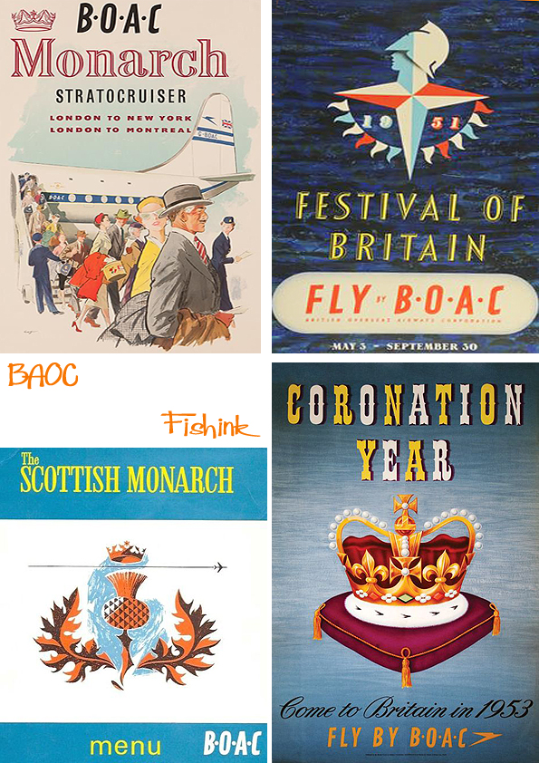
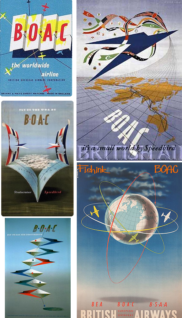
Welcome back to part 2 of my mid-century feature about B.O.A.C.(British Overseas Airways Corporation) and if you missed it, you can view part 1 here. I would love to have been in my thirties in the 1950’s, how wonderful to have been surrounded by such amazing advertising, such as these and to have visited the Festival of Britain. I bet it felt so modern and futuristic !
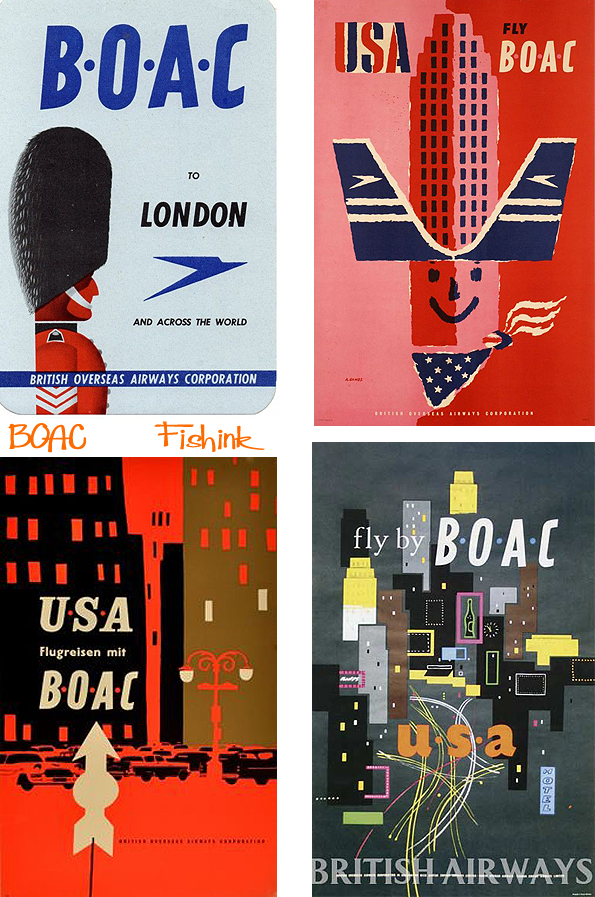
How fabulous are these, simple three colour work on two of the USA posters is striking !! Less is definitely more : )
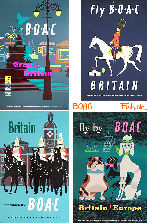
Great Britain and London in particular was a huge destination.
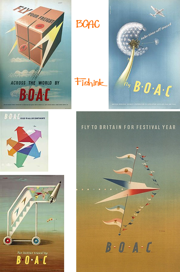
More posters with a Festival theme.
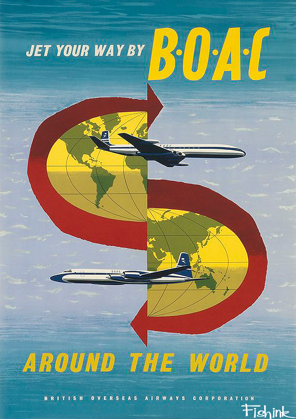
The speedbird logo works so cleverly here.
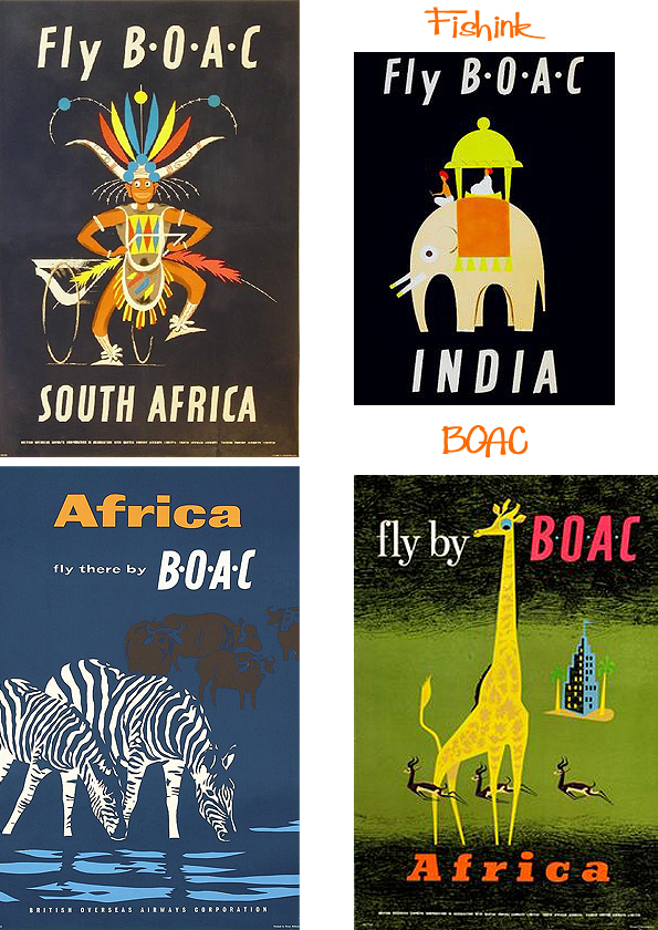
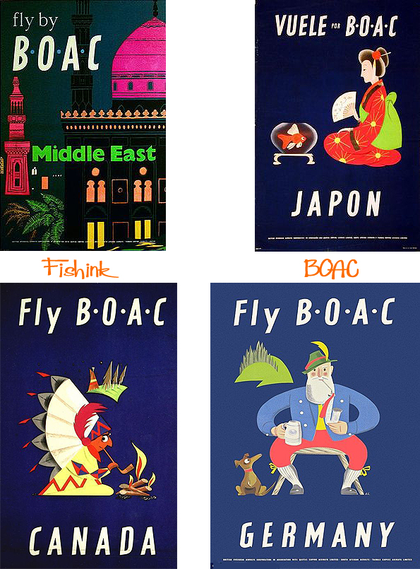
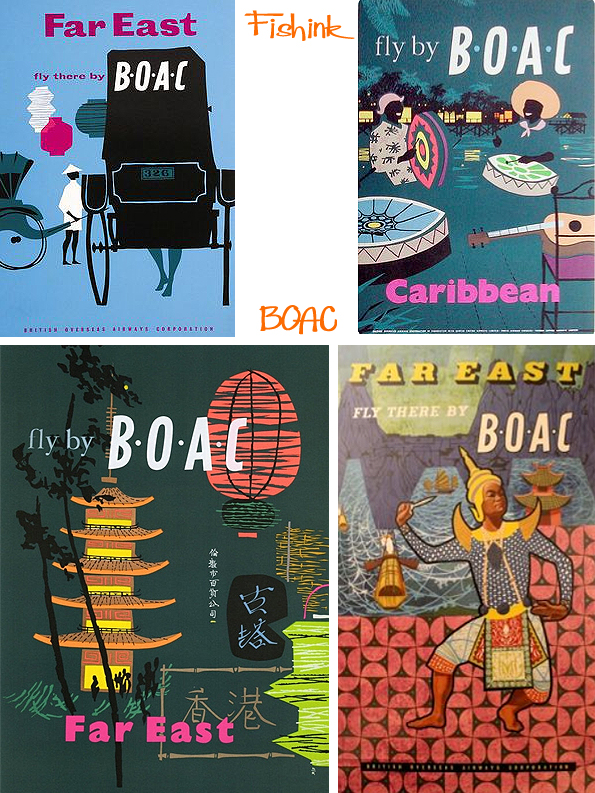
Of course Britain wasn’t the only BOAC destination.
Do any of you remember seeing these images ? What are your feelings about modern day advertising in comparison ?
Save
Save
Save
Leave a comment Cancel reply
This site uses Akismet to reduce spam. Learn how your comment data is processed.


We have lost something in the colour
and simplicity these days. This is such a treat
to look at. Thankyou!
You’re spot on with your comments Jacqui. I quite agree