Mid Century Airline Posters Part 1
I’ve covered many different Airline Posters on Fishink blog in the past. There’s Pan Am, B.O.A.C Part 1 and B.O.A.C Part 2 and Braniff to name a few.
Here’s a great collection that I came across and haven’t seen many of before. I make no apologies if they have appeared on here previously however as they are all rather special!
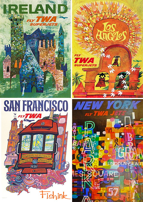
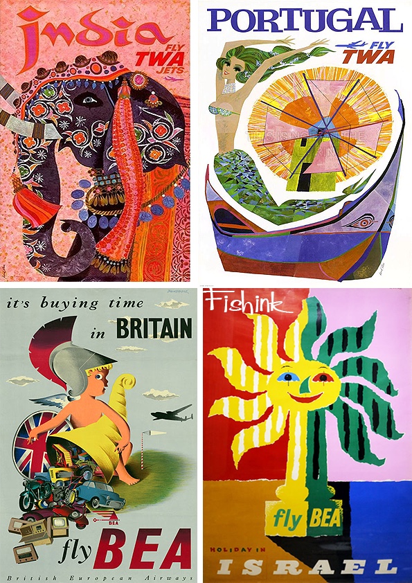
Let’s begin by flying TWA.
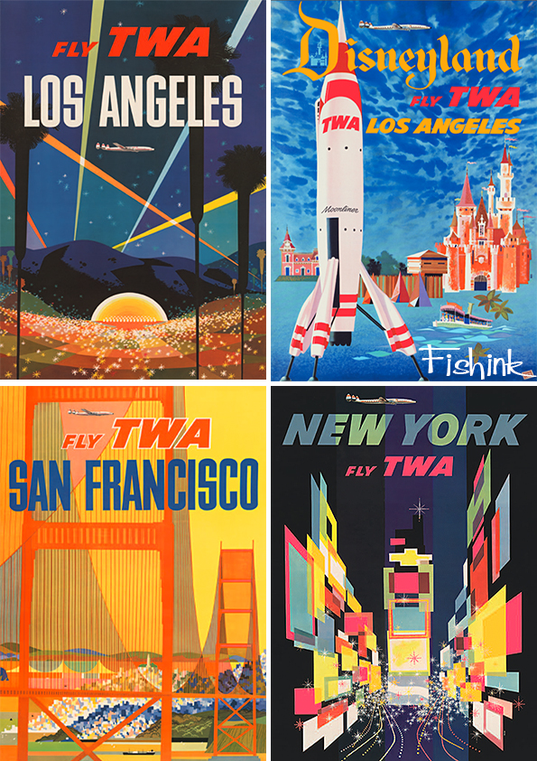
Some wonderful posters, which make me want to hop on a plane right now.

Great use of colour, space and design. They are visually captivating.
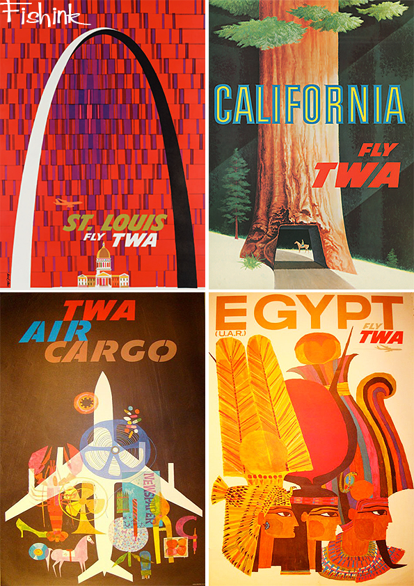
Many of these wonderful posters were designed by David Klein. Such a talented artist.
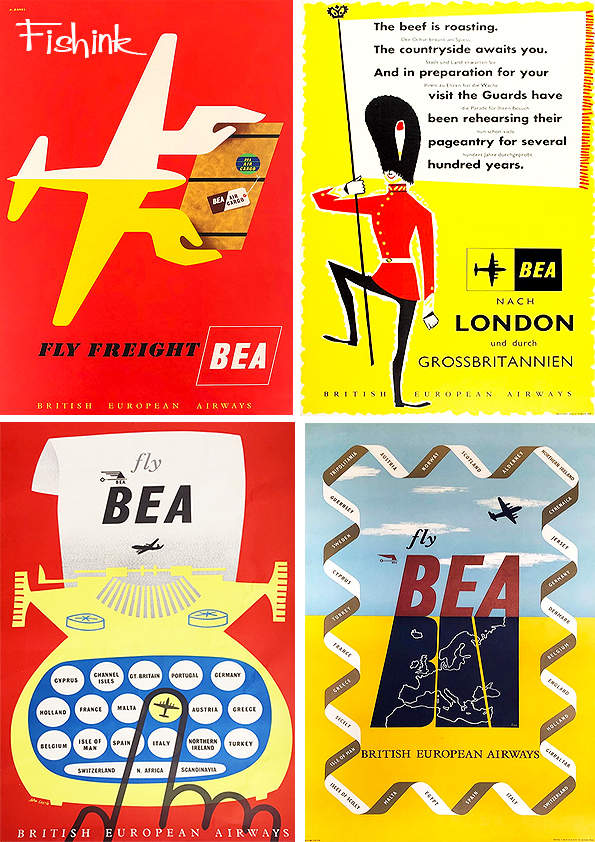
From TWA to BEA.
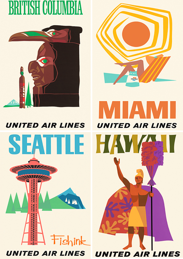
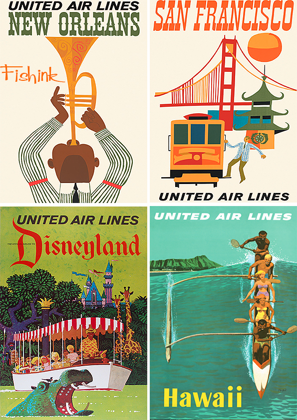
Followed by some fresher United Air Lines posters.

That Miami Sun is fabulous don’t you think.
The San Franciso poster below, makes me think of Miroslav Sasek. Or perhaps they’ve just picked the same elements.

A little more structure from American Airlines.


From Braniff to Japan Air Lines.

A few Pam Am specials to finish for today. Is that Cilla ?

More Mid Century poster madness next week.


Thank you — these are just wonderful. Live the Cilla poster!
Thanks, it’s fun isn’t it .
I thought that England Panam poster was meant to be Mary Quant! A groovy bird, whoever she is!
I do admire your style in choosing topics, Craig – you have impeccable taste! I thing my fave has to be the New York Fly TWA at the start – all those blocks of brilliant colour look totally abstract, and the black background makes the colours dazzle and pop.
Thanks Deirdre, you may well be right saying Mary Quant, I googled her pic in the sixties and it could well be either. Thanks for your compliments too, so glad you also find them fascinating.