Michael English From Pop Art to Hyper Realism.

Michael Jeremy English was born at Bicester, Oxfordshire, on September 5 1941 and educated at boarding school before going on to Ealing School of Art, west London, where he studied under some of the leading British avant garde artists of the day.

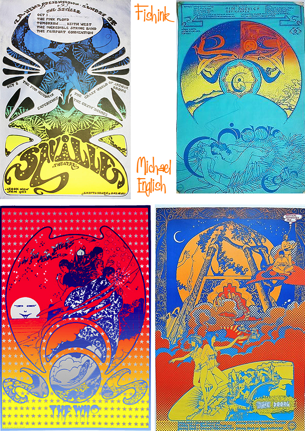
Some of the posters were used to promote gigs by bands such as Pink Floyd, Jimi Hendrix and Soft Machine.
From the beginning they both understood what each other had to offer and, in sharing their talents, they were certain that they could produce a style that was both unique and exciting. English’s talent lay in his ability to balance an unrivalled attention to detail whilst creating the most fluid designs. Waymouth brought to the work a strong imagination bursting with romantic ideas and a facility for figurative drawing. Their very strong sense of colour was also important, given the cost limitations and the strictures of the silk-screen process. At a time when the prevailing fashion was for an indiscriminate use of rainbows and any clashing colour combination, they strived for maximum colour effect without sacrificing balance and harmony. To this end they introduced numerous innovations that have since become common practice. Expensive gold and silver inks had not been used much on street posters before but they made it a regular feature of their designs. English and Waymouth also pioneered the technique of grading one colour into another on a single separation. The effects were startling, bringing an explosive vitality to the fly posters on the London streets. Nothing like it had been seen before or since. Looking at a whole block of some twenty or thirty of a single Hapshash poster was a powerful visual shock. It was not long before people began to tear some of them down in order to decorate their own walls. It was eye candy to match any psychedelic experience.
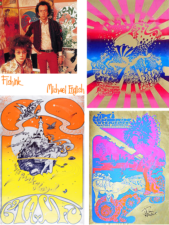
In hindsight, they now realise that what they had done was to bridge a gap between Pop Art and tagged graffiti. The posters often contained subversive elements, including sexually explicit graphics, mystical symbols and dissenting messages. They regarded each poster, whatever it was promoting, not only as an aesthetically pleasing design but also as a pro-active concept. They got away with it because the posters were so charming to look at and the contents, including the words, required closer attention than people could give at first glance. Their immediate audience was the younger generation, sympathetic to the spirit of the times but they also wanted to brighten the lives of people going about their everyday business on the grey streets of London.
In 1967 English and Waymouth released an album, Hapshash and the Coloured Coat: Featuring the Human Host and the Heavy Metal Kids.
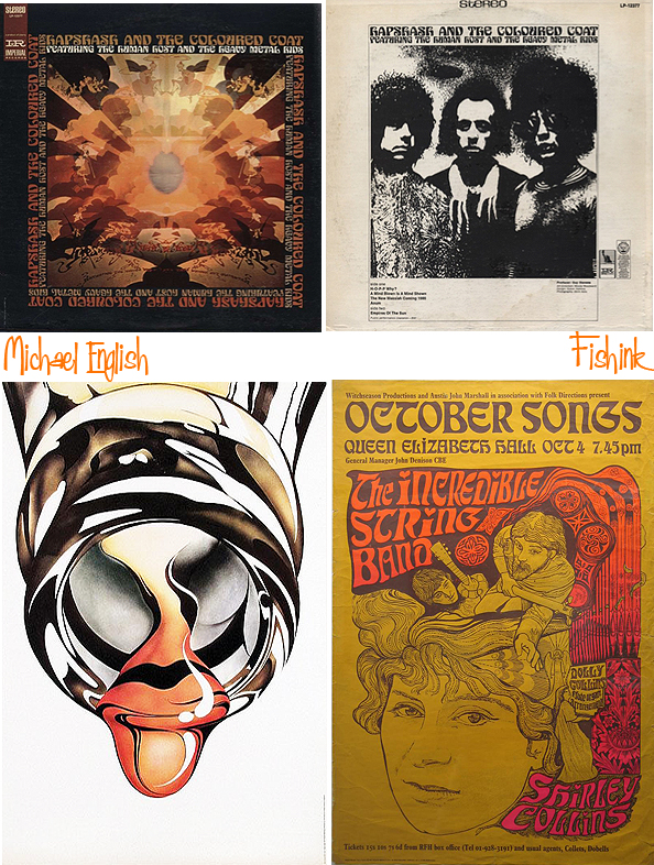
Artist and Designer John Coulthart says : – ” This was a bitter blow coming at a time when I’ve been working on something inspired in part by Hapshash and the Coloured Coat, the 1960s design duo comprised of Michael English and Nigel Waymouth. The two artists, together with associate Martin Sharp, are indelibly associated with the London psychedelic scene of the late Sixties. Whereas Sharp’s posters were often loose and dramatically bold explosions of shape and colour, the Hapshash posters were more carefully controlled in their curating of disparate elements borrowed from Art Nouveau—especially Mucha and Beardsely—comic strips, Op Art, Pop art and fantasy illustration. Their work perfectly complemented the very distinctive atmosphere of the capital’s psychedelic scene which, for a couple of hectic years, saw an explosion of new bands (or old bands in new guises) fervently engaged in a lysergic exploration of Victoriana, childhood memories and frequent silliness. UK psychedelia is generally more frivolous than its US equivalent which had the Vietnam War and civil disorder to deal with; English and Waymouth’s graphics captured the London mood.”

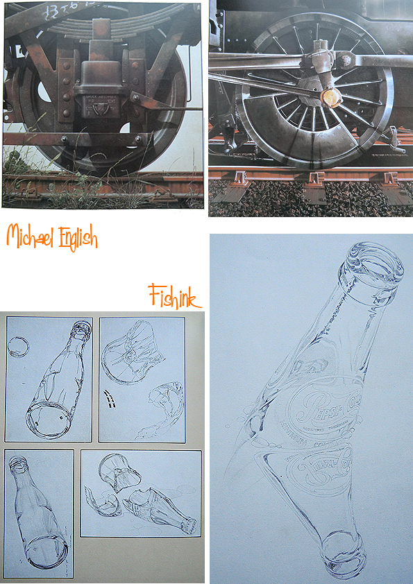
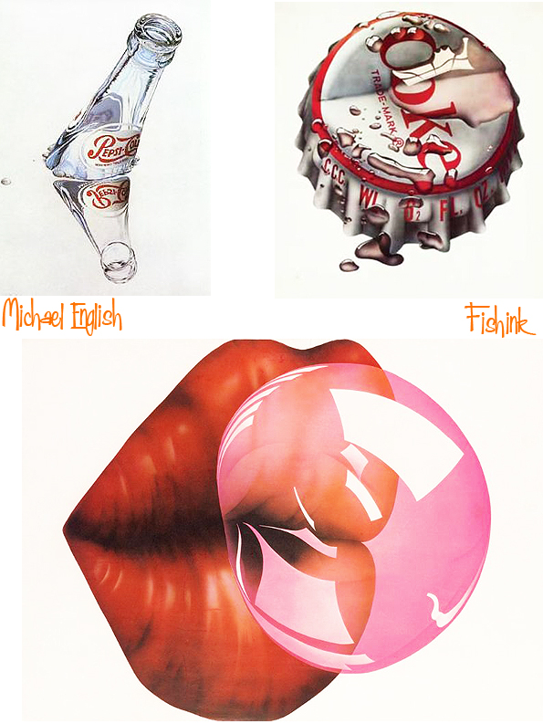
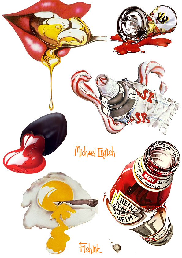
By the early 1970s the hippy movement was all but dead, and English ventured into other avenues. He produced limited edition prints for mass production, which sold incredibly well and in 1973 began to paint, abandoning the hyper-realism of the prints and concentrating on the dichotomy between man-made products and the natural world.

During this period he created minutely-detailed close-ups of machinery, as in Fanjet (1978); sometimes the man-made objects were treated as pollutants, as in his painting No Deposit, No Return (1979), in which a fractured Coke bottle litters a rich green background of vegetation and small stones.

In 1978 he created sets for the Ballet-Théâtre Contemporain at Sadler’s Wells.
In 1988 English made the first of several visits to the island of Praslin in the Seychelles, where the rainforests became a new inspiration for his painting. With his wife Jaki, he took photographs which were later worked up into acrylic paintings on canvas. By the end of his life he had completed about 20 of these pictures, which he viewed as the most important project of his later career.
To finance it he had produced dramatic and colourful advertising posters for some of the world’s leading companies, among them Swiss-Air, British Airways, Porsche, McDonalds and Bertolli. He also created two sets of stamps for the Royal Mail, one based on early buses and the other on old motorcycles; both sets proved highly popular with collectors.

In 1995 English was invited by the BBC to take on the role of artistic director for a projected serialisation of Mervyn Peake’s novel Gormenghast. For the first time he was working with digital imaging, and he scanned in concept paintings to build virtual sets and landscapes within which the actors would perform. The mounting costs of this complex process, however, forced the BBC to call a halt to the project.
Examples of English’s work are held by the Arts Council, the Victoria & Albert Museum, the Museum of Modern Art in New York, the British Council, and the Victoria and Albert Museum, which in 2000 mounted a retrospective exhibition of his work with Nigel Waymouth as Hapshash & the Coloured Coat.
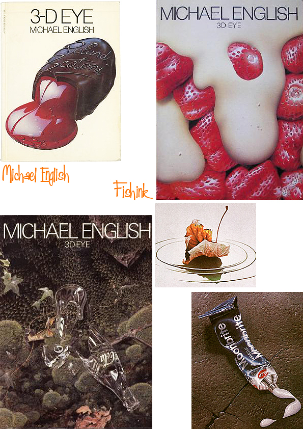
He published a book about his work, 3-D Eye (1979), and The Anatomy of Illusion (1989), a short volume about airbrushing. English was still working until the last week of his life, busy with inkjet silk screen prints which feature a poem by the beat poet Allen Ginsberg.
Michael English is survived by his wife Jaki (née Abbott), whom he married in 1983.
Thanks to Bamalama Posters, the Telegraph and John Coulthart for their thoughts about Michael, that made this post possible.


Hi Craig,
I forgot to ask – could I do a post about you on my blog?
Jo, Hampshire UK Creating My Odyssey – Liberating the Real Me After Thirty Years Of Depression and Anxiety http://www.jo-b-creative.blogspot.co.uk
Thanks Jo for the offer, I’m a little busy at the moment but if you send some questions ovre I’ll see what I can do. Thank you craig @ fishink.co.uk
Just wanted to pop in here and say thanks for promoting the work of Michael English as there does not seem to be very much online about him (searching through Google).
I would class him as a major influence on me growing up in the 70’s in the UK being a teenager with a keen interest in art, I remember having that squashed tomato poster on my wall (the painting was called “Paris Wall” I believe), I was really taken with the realism style paintings that he made, I was too young to appreciate the earlier psychedelic poster works.
I still have the “3D eye” book.
I will have to make a search now for the other book you mentioned in the feature.
Cheers, all the best Philip Gray
Thank you Philip for sharing your own connection with Michael’s work. So glad you liked the post.
Not much back story.
To be expected frankly.
Unlikely anybody would be interested.
I have nearly 100 pieces of never-seen pieces of art by this so-called Michael English standing about in a cupboard gathering dust in case anyone’s interested…
Would be very interested to see them if you can find the time to send a few images over to craig@fishink.co.uk that would be fabulous. How did you come about them ?
Very interested. From what period?
Unfortunately it doesn’t look like it will happen as they posted that teaser way back in 2019.
It had somewhat strange wording, referring to the artist as “this so-called Michael English” it seemed very dismissive of the artist in tone.
It did feel a bit odd at the time, I agree.
I was being more sardonic than dismissive.
Michael English was my father (if you could call it that) and, in about 1995, he ‘gifted’ me a work called “Amen”, which came in the form of a comic strip consisting of the above mentioned 100 or-so pieces.
They’d date from about 1969 (the year of my birth – and the year he abandoned my mum and me). In regards to how the work is realised, it’s a real hodgepodge of styles, encompassing the more famous psychedelic stuff, early airbrush work, photomontage, pencil illustration and… er… other stuff?
Unfortunately, some of the work got water damaged due to flooding a couple of years ago, but it’s been rescued (to a point) and I’ve been wondering how best to restore the damaged pieces.
Ultimately, the work has been a burden to me – it’s enormous, cumbersome, patchy in quality and artistic merit and (personally speaking) somewhat problematic in regards to the narrative it spins.
I promise to try and post a cross section of the work at some point in the near-future.
Some of it has been printed elsewhere originally (in 3-D Eye I think).
There’s another blog knocking about that reproduces a few of the more impressive plates (taken probably from 3-D Eye).
Thanks for your reply. That all makes sense and I can understand completely why the work that you have may now feel a burden. If you get around to phototgraphing it and would like me to show it through my Fishink Blog, I’d be happy to do that too. All the best with sorting it out, cheers Craig