The London Underground in 2013

Not only is it 150 years since the London Underground first opened it’s doors for travel, but last week was also 100 years since the iconic typeface, used all over the underground was created. “Underground” later known as “Johnston” was circulated as a lettering guide for sign-painters and also made into wood and metal type for posters, signs, and other publicity materials used throughout London’s transport network. Edward Johnston, a British calligrapher and lettering artist, was asked to create a typeface with “bold simplicity” that was truly modern yet rooted in tradition. Johnston’s design, completed in 1916, combined classical Roman proportions with humanist warmth. This mix of qualities, driven by Johnston’s approach to the written letterform, also influenced his student Eric Gill, who assisted with the design of the Underground typeface and developed some of its ideas in his own Gill Sans in the following decade. (txt and images taken from Wired article and London Underground )

Artist Sarah Morris’s new art work, Petrobras [Rio], commissioned by Art on the Underground is displayed on the front cover of millions of Pocket Tube maps from December 2012. This vibrant, abstract work is loosely based on the Tube map itself and the colours are an expanded version of the Tube map colours. The work is a diagram of movement depicting a series of interactions. Petrobras encourages us to think about a journey – not a linear journey from A to B but more a slippage where thoughts and interactions occur that cannot be measured or contained.
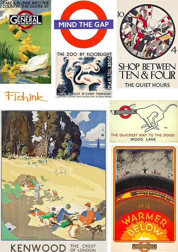
As part of the 150th anniversary of the Tube celebrations, the London Transport Museum has selected 150 of the best London Underground posters from its archive of more than 3,300 for a special exhibition which opens next month.
A collection such as this has not been seen since 1963 when a similar exhibition was held to commemorate LU’s centenary. This 150th birthday show is called Exhibition: Poster Art 150 – London Underground’s Greatest Designs and feature posters by well-known artists such as Edward McKnight Kauffer and Paul Nash, and designs from each decade over the past 100 years. Iconic images, including the surrealist photographer Man Ray’s Keeps London Going pair will feature alongside lesser-known gems, such as rarely seen letter-press posters from the late 19th century.
There are six themes: Finding Your Way, Brightest London, Capital Culture, Away From It All, Keeps London Going and Love Your City. More about the events can be found here.
I know some of the slightly elderly Brits sometimes think we still have an empire, but surely even this is going a little too far lol.


Growing up in London, the tube and its typography, imagery and design were a huge part of my life. Love the tube, Johnston is one of my all time top five typefaces…that wooden type, how much do I yearn for that? Always exciting going on the underground services in other cities and seeing the differences and similarities to the tube, maps, colour-coding lines, upholstery…speaking of which, are you aware of these-
http://www.aboveandbelowlondon.com/Above_and_Below.html
Thanks for the link those shoes are great. If I was a few years younger I’d have a pair now lol There was a fab BBC prog that I watched recently in this series all about the underground http://www.bbc.co.uk/iplayer/episode/b00nqc3l/Art_Deco_Icons_Casa_Del_Rio/ really interesting programme. Perhaps it will be shown again
I’m seriously considering a pair, but just can’t decide which line, age is no barrier….that series on Art Deco is OK, but the presenter drives me nuts…the one on the London Transport headquarters was particularly annoying, it could have been so much better!
lol I know what you mean, he’s shaking his hair around far too much, and I wish tv presenters would keep their hands still, it’s very distracting and doesn’t add any meaning to their words. Go for it with the shoes, I want a pic once you’ve purchased.
Great blog entry, thanks! I’m a big fan of the London Underground design work. I don’t know if you have seen this great collection website but here is an interview about my own London map collection: http://www.obsessionistas.co.uk/collections/2013/1/6/london-transport-maps-0127.html and London bus collection: http://www.obsessionistas.co.uk/collections/2012/11/5/london-buses-0122.html
Hi Kate, thanks for the links. They covers for the maps look amazing, they really do shout out and I liked the buses and your own printwork too. Appreciate the comments.