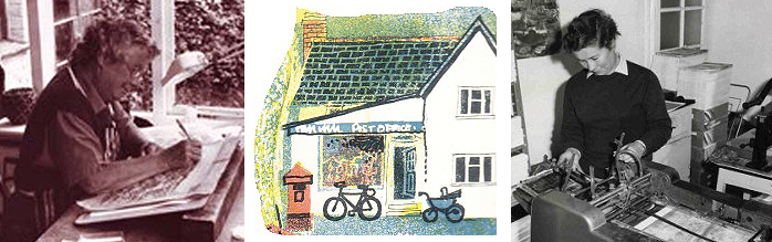
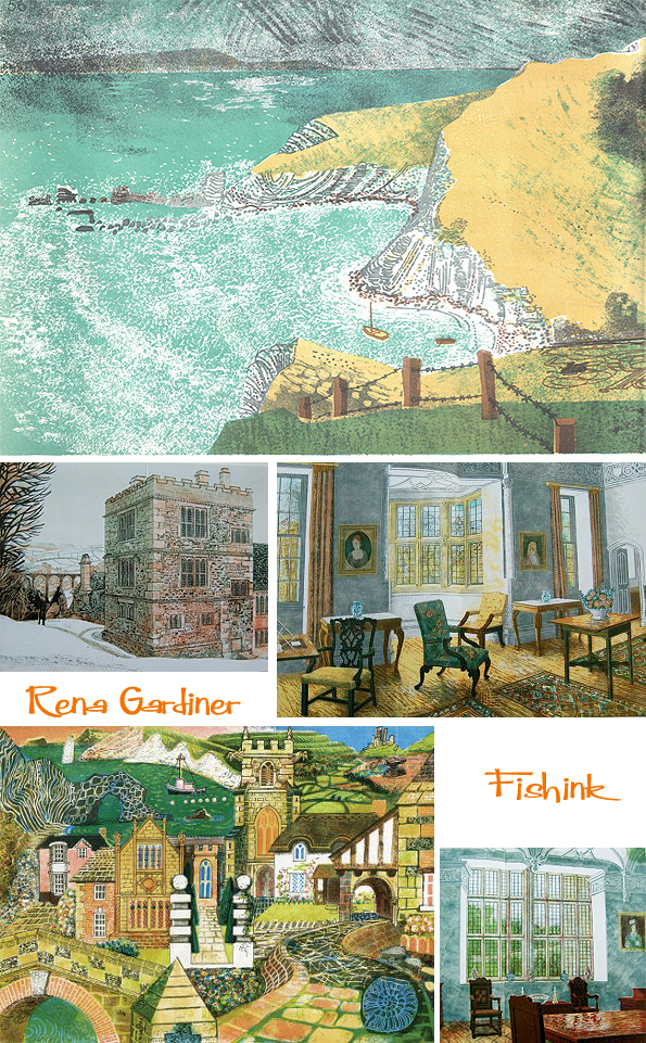
For many years Rena Gardiner (1929-1999) produced illustrated books and pamphlets about the history of buildings and places, working entirely by herself in her Workshop Press, which was housed in part of her cottage at Tarrant Monkton, near Blandford Forum in Dorset. This exhibition showcases a number of these guide books and other printed items. Rena Gardiner’s work is an example of auto-lithography which involves drawing directly onto the printing plate and then printing it on a small commercial offset litho press. She built up the rich colour and texture by over-printing in many colours, using her eye and instinct to decide on the colour separation and treating her press with the flexibility of a handpress.
Rena wrote, illustrated and made her books herself. The work was physically demanding; moving large stacks of paper, collating, guillotining and binding were all tasks undertaken by Rena alone. Her life was surrounded by her work; much of the space in her thatched cottage was occupied by equipment, such as an enormous and ancient process camera, a plate-marker (plates were processed in the kitchen sink) and a folding machine. Her printing technique was based on the discipline and care demanded by a traditional training in lithographic printing on stone. As an art student at Kingston School of Art in the early 1950s, Rena was greatly influenced by the work of British artists such as Edward Bawden, Eric Ravilious and John Piper. Her interest in book illustration was inspired by the series of Puffin Picture Books. Until 1970, she was a full-time art teacher, working on her books in her spare time. Later she gave up teaching (while still keeping her interest in education), and made her living through printing and the sale of her books.


Rena saw herself essentially as an artist, who chose the medium of book illustration to express herself and her ideas. It was of prime importance to her that, despite the obvious limited edition and fine print potential of her work, she wished to reach wider audiences and was content to keep her production costs at an extremely modest level and sell her books for a few shillings, and later for one or two pounds.
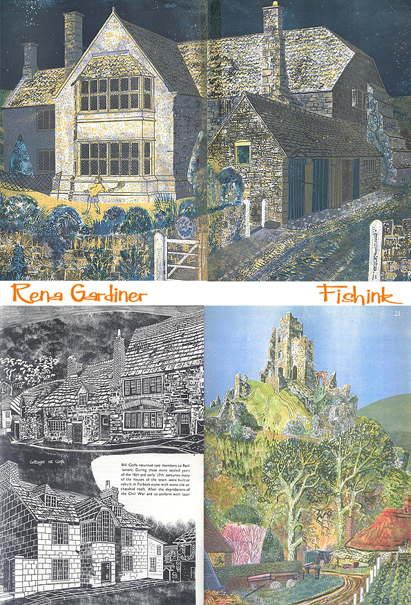
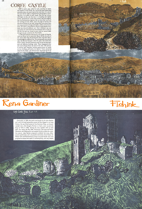
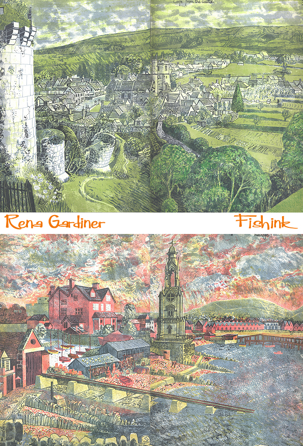
What is fascinating and most significant about her work is that she managed to achieve commercial mass-production while maintaining direct hand control over all the processes involved. Despite printing runs of up to 3000 copies, no two books are exactly the same. Balance of colour and weight of ink vary throughout the run because Rena used her press as a creative tool to develop and evolve her images. The press was not simply a means of reproducing an existing image in an exact and consistent way.
Rena Gardiner’s method of printing can be described as auto-lithography. She drew directly onto an aluminium litho printing plate in just the same way as you would draw onto a litho stone. An accurate final ink drawing was made of each image on plastic tracing film. The drawing was transferred to the plate using tissue paper powdered with dry colour acting as non-greasy carbon paper. The image was not reproduced but was used as a keyline for the colour separations. Usually each image was made up of between four and six colour printings. She did not work from a finished coloured master drawing, but, using her judgement based on years of experience, made up each separation direct on the plate, working out proportions and mixing in her mind. Rena never used process colours but individually mixed her inks. She usually started with the lighter colours (yellow) working towards the darker areas, the final plate being the darkest image pulling everything together. Positive areas to print were usually drawn with crayon or brush and asphaltum, but lines and textures could be created on the same plate in a reversed sense, i.e. light lines out of a dark colour by drawing or painting with gum Arabic acting as a resist.

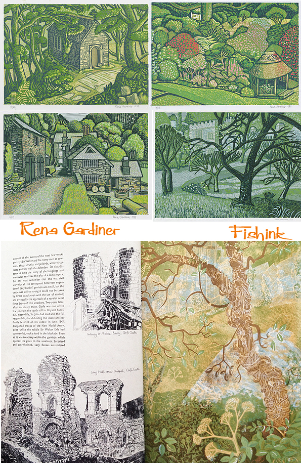
Rena delighted in exploiting this interplay of positive/negative and the flexibility that the technique offered. Experimentation with texture is a feature of the prints: asphaltum was applied to a variety of materials, including fabrics, and then transferred directly onto the plate to create areas of varied pattern. Other effects were created by the brush, sponge and stippling with a pen. The resulting plates were printed on a standard commercial offset litho press. She had a rough idea of the colour scheme for each image before printing began, but final colour proofs were never made, as a run of each colour was completed before the next plate was printed. This is an important characteristic of her process as Rena kept total control of the inking, continually adjusting the flow and even the colour of the ink as the run progressed. Dabs of new colour were often added to the ink duct while printing and sometimes two different colours are used at either end of the duct and allowed to merge in the middle.


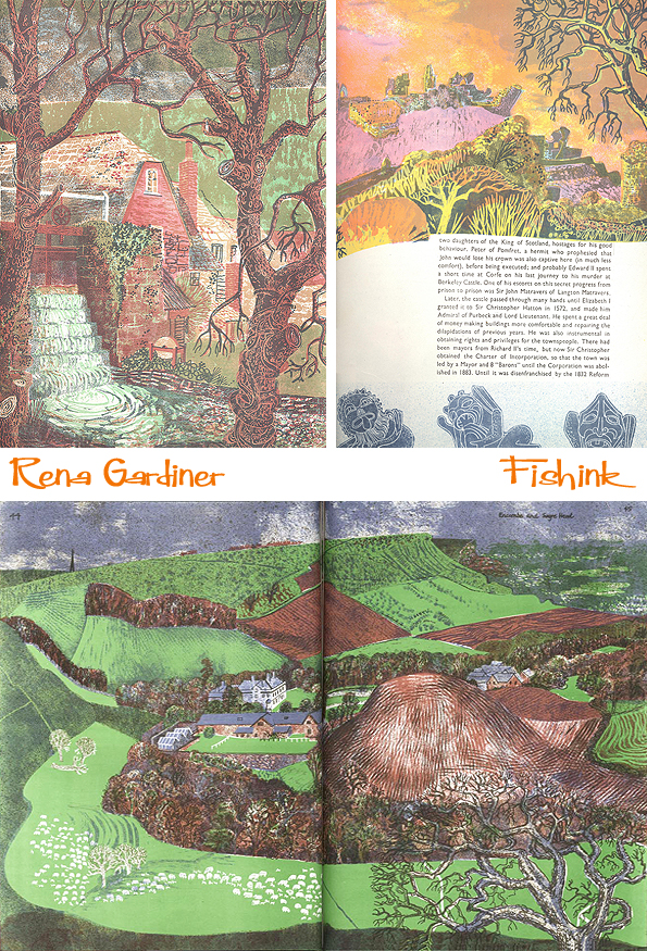
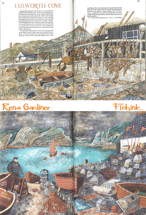
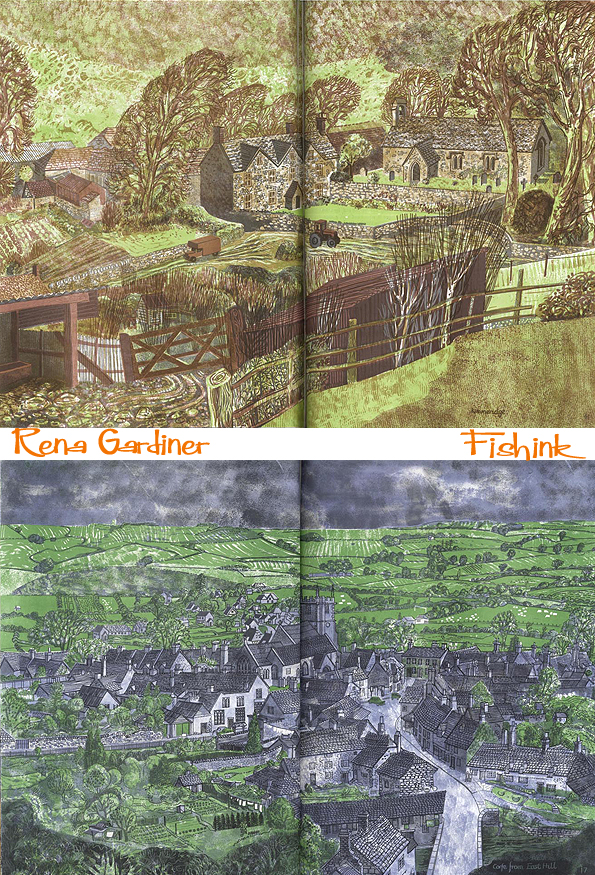
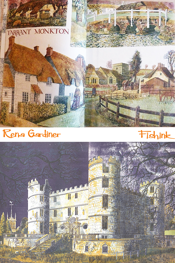
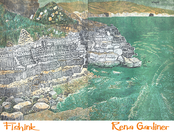
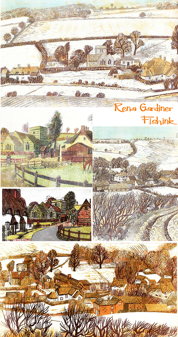
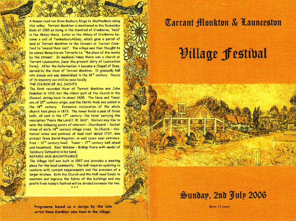
This unorthodox use of a commercial press gave Rena total creative flexibility to allow each image to evolve while achieving long runs. Accidents or effects that fell short of expectations did not mean abandoning the run, as they were exploited or compensated for by adjusting the next printing. The resulting prints have a variety and freshness that can only be achieved by such hands-on involvement. Below are some illustrations she did of the village she lived in and for her local festival magazine.


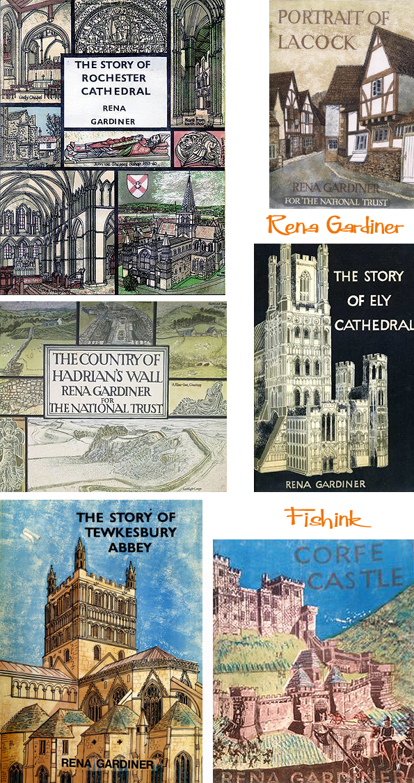
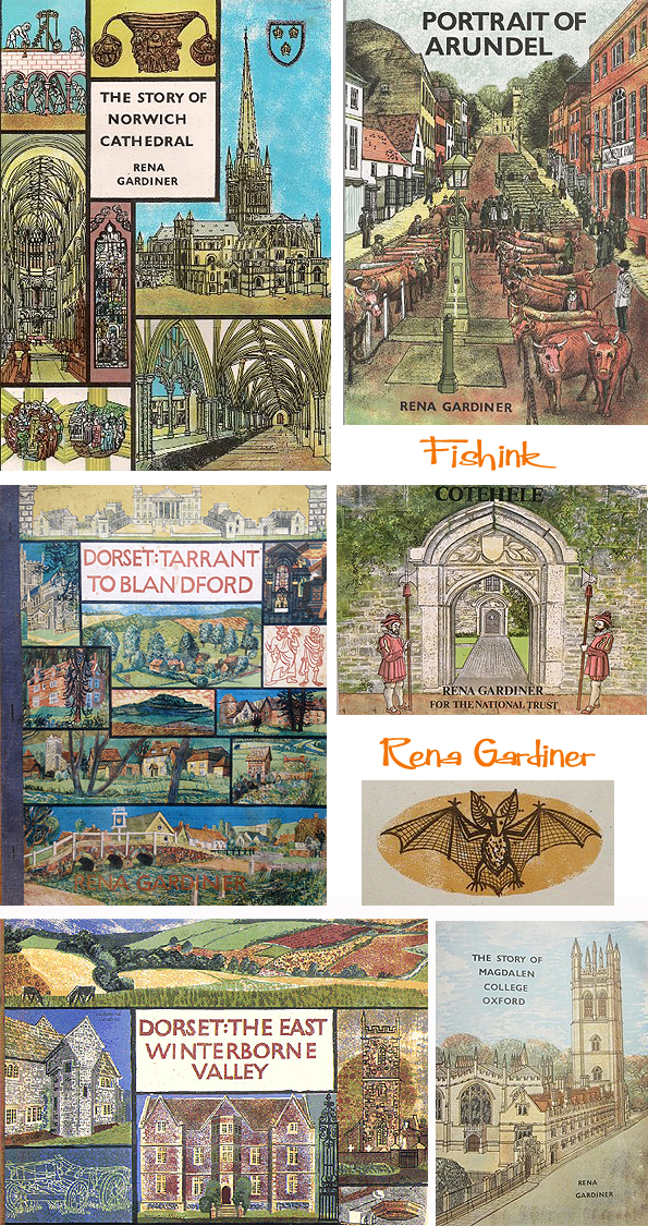
Her bibliography includes:
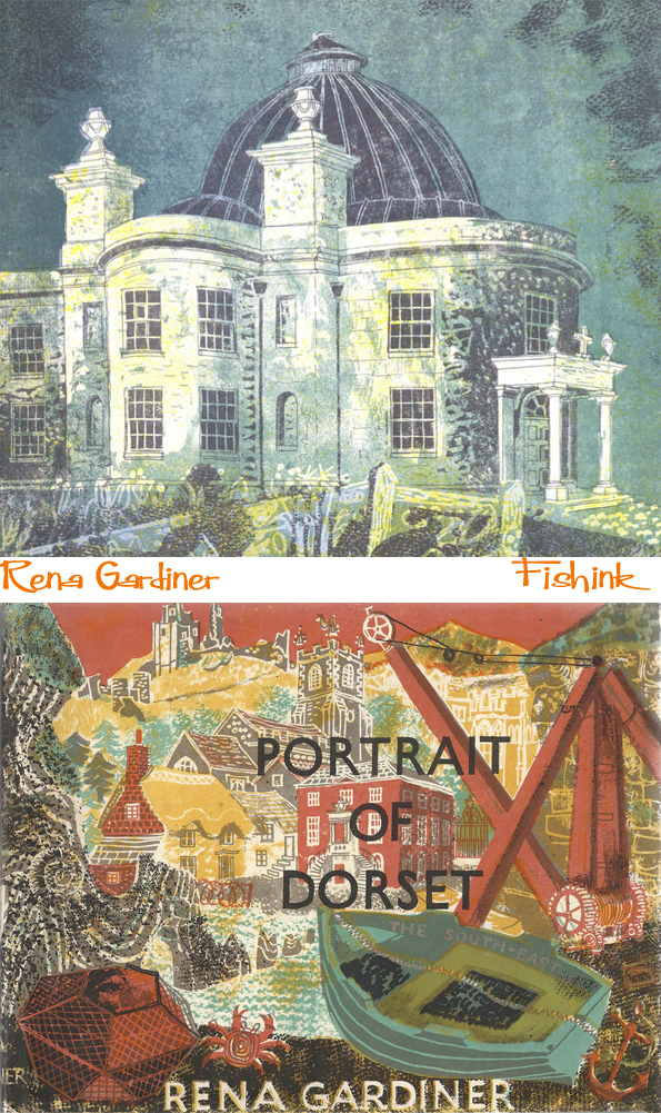
Dorset: Isle of Purbeck
Dorset: Tarrant to Blandford.
Dorset: The East Winterborne Valley.
History in St. George’s Chapel, Windsor Castle
History at Salisbury Cathedral
A Journey of Discovery. A Guide to some Properties Belonging to the National Trust in North Cornwall.
A Journey of Discovery: A Guide to Some Properties Belonging to the National Trust in South Cornwall
Look at Canterbury Cathedral
Look at Brixworth Church
Look at Charlecote Park
Look at Chester Cathedral
Look at Cotehele
Look at Hardwick Hall
Look at Lanhydrock
Look at Montacute
Look at Wallington
Look at Wells Cathedral
Looking at Chedworth Roman villa
A Visit to Hadrians Wall
The Country Of Hadrian’s Wall
The Guildhall of Corpus Christi
The Guildhall, Lavenham, Suffolk
The Story of Ely Cathedral
The Story of Magdalen College Oxford
The Story of Saint Bartholomew the Great
The Story of St Richard of Chichester
The Story of Norwich Cathedral
The Story of Rochester Cathedral
The Story of Ely Cathedral
The Story of Tewkesbury Abbey
A Portrait of Arundel
A Portrait of Lacock
Portrait Of Sudbury Hall Derbyshire
Trerice Cornwall
Many thanks to Martin Andrews, Senior Lecturer in the Department of Typography & Graphic Communication at Reading University, for the text in this blogposting.


These are fantastic!!
Thanks Allyn, quite something eh !
Wonderful stuff- how did you discover her work?
I was lucky to be in touch with fellow artist Ed Kluz and follow his blog http://edkluz.tumblr.com/post/41012208121 which mentioned her work.
They are fantastic and I was lucky to be born in the Tarrant valley in the 1960s and often visited her at her cottage in Tarrant Monkton as a child.
I am fortunate to have a couple of quite unique works by Rena which don’t seem to be commonly known about. I have a blank greetings card and booklet that she produced to raise funds for our village church in Tarrant Hinton. I’m more than happy to photograph and share these special items if anyone is interested?
Thanks Sally, always happy to share more of Rena’s wonderful work if it’s not already featured in this article. you can send photos to me at craig @ fishink . co . uk many thanks