Modern Publicity 1950 – 51. Illustrated Mid century Art, Advertising and Graphics Part 1
September 28, 2014
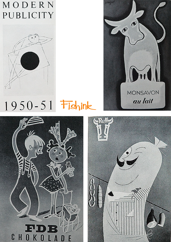
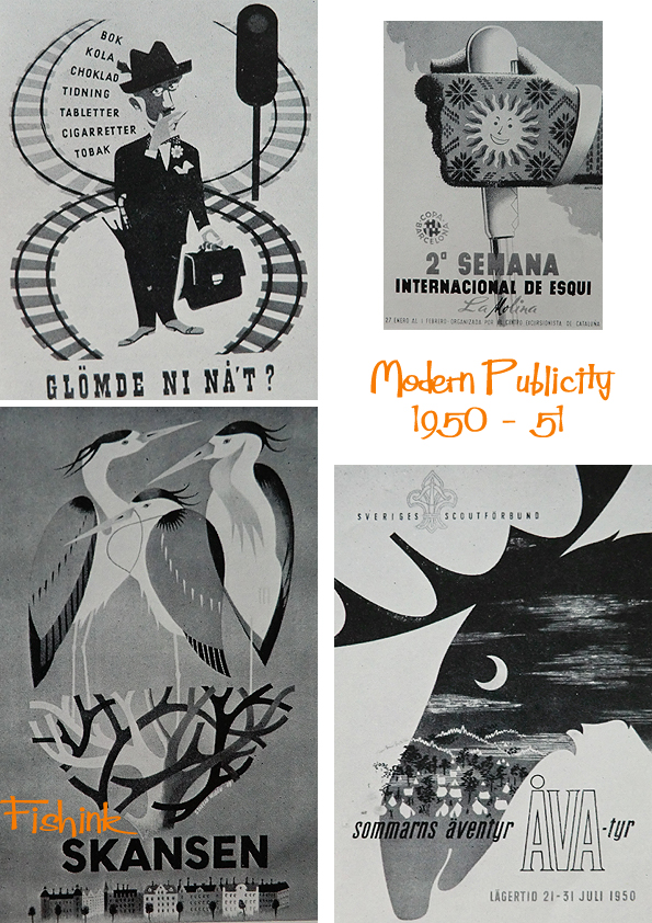
This was the very first Modern Publicity book that I encountered. Many of the images are in black and white but it doesn’t detract from their beautiful retro style and vintage va va vooom !
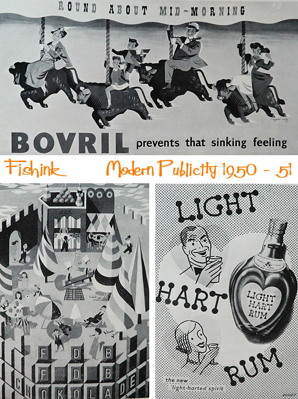
Perhaps you also find that drinking Bovril prevents that sinking feeling… to be honest I get a sinking feeling at the thought if drinking it ! lol
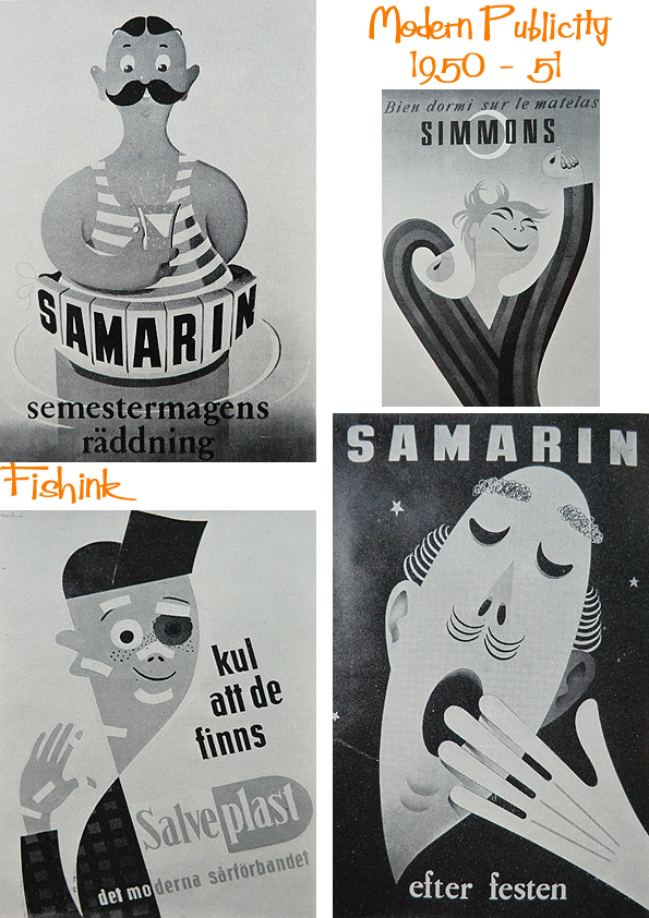
Some beautiful curves here.

A touch of travel with a lovely poster from B.O.A.C. and that mix of man and nature.

You can find more in this series by typing the words Modern Publicity into the search function on the right of this post. Don’t forget to share it and tell your friends about Fishink Blog. Thank you
4 Comments
leave one →


Lovely images. I wonder if they are mainly monochrome as they were designed for newspapers and the like?
I don’t think they are monochrome images, it was just to keep printing costs down at the time sadly for us : (
I agree they don’t lose anything by being in monochrome great graphic images ,must have been exciting innovative for that time post war and austerity.
An exciting time to live although I wonder if people 70 years from now will be looking at our graphics and thinking the same lol