Fishink in London. Part 1. McCauley ‘ Mac’ Conner Paintings from the MadMen era
I’m back from London and had such a wonderful time there. I’ll be talking you through what I saw over the next few posts, and in place of the regular Mid Week Mix, I’m going to talk about my trip instead as I have so much to share with you, that I don’t want the news to become outdated.
My first exhibition had to be the 50’s/60’s artist McCauley Conner or ‘Mac’ Conner. His art is straight out of the original Mad Men era and with the show being exhibited at the relatively new House of Illustration, it had my name all over it !

At the grand age of 101, Mac Conner has seen it all. In 1943 he came to New York to illustrate training manuals for the Navy and found himself caught up in a post-war New York City, pulsing with life and the ambition of young men wanting to make life happen in the Big Apple. Mac began his career as a sign painter. He studied at the Pennsylvania Museum and School of Industrial Art, developing his illustration skills in the Navy during World War II. After the war, he moved to New York and studied under Harvey Dunn at New York’s Grand Central School of Art.
Postwar marriages were booming, sexual relationships were changing and the consumer industries were exploding after the confines of wartime rationing. In 1952 Conner set up the studio Neeley Associates with salesman Bill Neeley and artist Wilson Scruggs and his career as an illustrator really took off. The Saturday Evening Post became a steady client, and other magazines soon followed.
The creation of an illustration for a story was a highly collaborative process. Editors selected manuscripts for publication and art directors managed how they looked in print; matching stories with illustrators, laying out copy to determine the space a picture would fill and guiding the process from inception to production. Conner, like other illustrators, began by discussing the story with art directors, then prepared dramatic ideas and sketches for review. Photography was used to draw scenes from. Conner used pastels on vellum to create colour ‘comps’ (short for ‘design comprehensives’).
When satisfied with the strength of an idea, the art director gave approval to proceed to ‘finish art’. In most cases, this work was executed in gouache; an opaque flat watercolour paint whose quick-drying nature made it particularly effective for fast-paced work. The magazine then photographed the finished gouache for reproduction.
Different fates befell illustrators’ originals; some were retained by art directors and others were returned, though many were thrown away. The work survived because Conner’s agent Bill Neeley was adamant about having his artists’ boards returned.

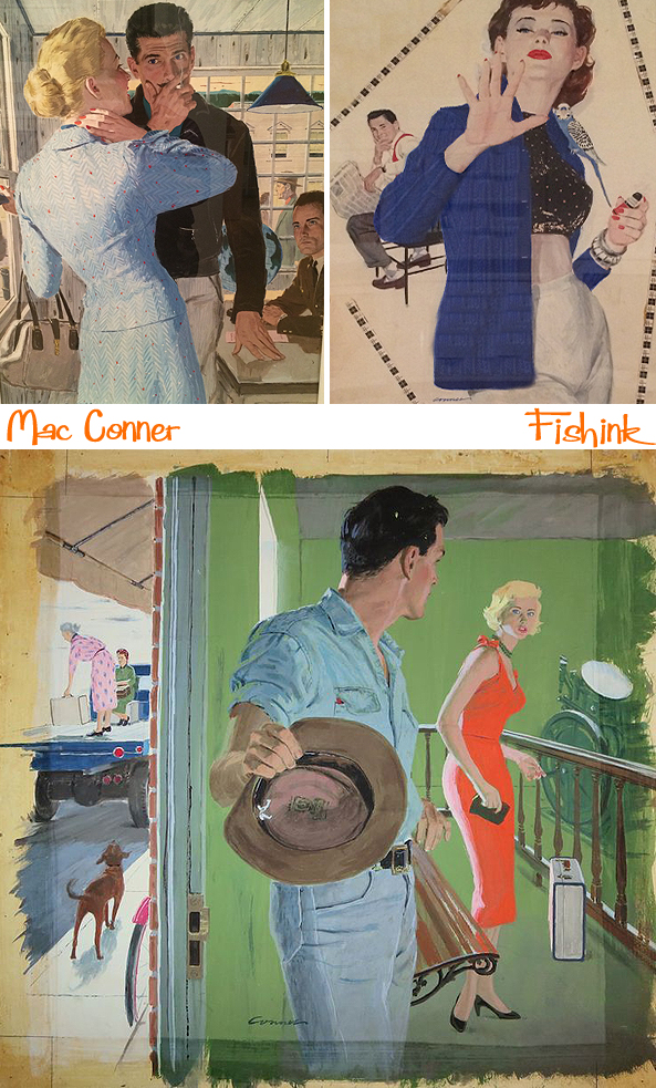
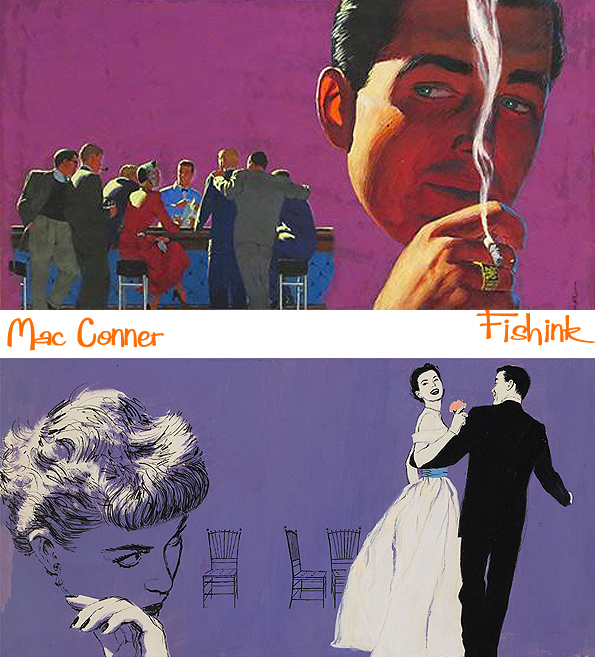
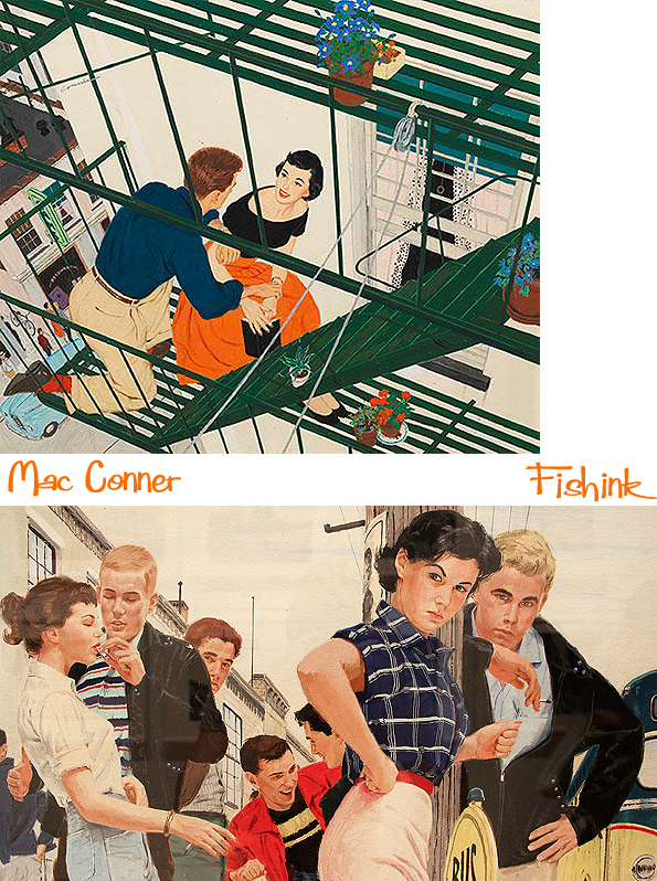
Much of Conner’s work was for the booming field of women’s magazines. They published a range of features, but none were more popular than romantic short stories and serialised novels. Illustrators gave form to the texts in lavish spreads, which appeared at the front of magazines as ‘teasers’ for the rest of the tale.
The stories reflected the social norms of the era. In America, the austerity of the 1930’s and WW2 were giving way to new beginnings. Returning veterans reunited with their former sweethearts, or courted new ones. Women, who had entered the workforce during wartime, were encouraged to surrender their employment and independence. Fiction editors appealed to them with stories that captured a longing for romance and adventure, believably packaged in recognisable, though idealised, female characters.

Fiction about the romantic intrigues of men and women was known in the publishing industry as ‘Boy/Girl’. Mac Conner’s Boy/Girl illustrations ably addressed and intrinsic difficulty: they conveyed intimacy without directly addressing sexuality, which was off-limits in mainstream magazines. Viewed together, the pictures suggest the bigger story of the time: a mass pairing-off was underway.

The women in Conner’s fiction illustrations project a sense of confidence and stylish supremacy. These smart, lively figures embody an ‘everyday’ glamour: Conner’s female protagonists are never without red lipstick and are always perfectly manicured and accessorised. They demonstrated an informal elegance plausibly within readers’ reach. Through their carefully constructed outfits, they celebrate a heightened, yet self-possessed femininity.
Mac paid close attention to the fashion of the day, including the wasp-waisted full skirts that celebrated the end of fabric rationing after WW2. The ubiquitous garments emphasised the figure when worn with restrictive corsetry. Conner credits Jessie Neeley, his agent’s wife, with adding “polish” to his depictions of women by helping him to stay aware of trends in necklines, hairstyles and glove lengths. He also consulted the collections of emhemera and photographs at the NY Public Library, as did many of his peers.
These fictional women exist in a gender-defined world, in which a “feminine mystique” suggests their satisfaction with restricted female roles. However, Conner’s keen eye and creative sympathy place his heroines at the centre of their own stories.

Men are often mere ‘props’ in Mac’s illustrations, which were aimed at a predominantly female audience. When men appear as central figures, they embody the norms of the 1950’s American manhood; sometimes suggesting the rugged integrity of manual labour, at others capturing the alienation that characterised office work in a new age of large corporate businesses . Often obsessed with work, they pose emotional challenges for the wives, girlfriends around whom most stories revolve.
Perhaps because women formed the primary audience for magazine fiction, male characters tended to lack nuance. They were either standard ‘good guys’ or brooding curmudgeons. Men dominated plots steeped in dark emotions like jealousy and revenge. Most often they stay in the background, emerging to provide a practical obstacle or reassuring attendant to women. Unsurprisingly, they are uniformly masculine, conventionally attractive and completely self-assured.


On the ad side, Mac’s illustrations playfully teased out the pleasure and benefits of ownership, from cars to appliances. In a 1953 ad for Blue Bell coveralls (“It’s autumn time, it’s Blue Bell time!”), a pre-teen clad in the client’s tough denim gleefully hangs upside down by his legs from a tree limb while his sister below rakes leaves. This type of film-still perspective is what set Mr. Conner apart from many of his peers.
In the early 1960s, magazines changed. Advances in print technology and the proliferation of photo agencies made photography more affordable and prevalent, reducing the need for realism in illustrations. Magazine art and ad styles also began to relax, featuring humour, abstraction and line drawings—all of which seem to have been outside of Conner’s stylistic approach. Here’s a couple of advertisements and book covers.

The magazine industry had relied on illustrators for most of the century, but by 1960 the ‘Boy/Girl’ approach began to seem less persuasive. A new critique of women’s roles began to emerge, particularly in the writing of feminist Betty Friedan, who criticised the magazines as perpetrators of stultification. The Civil Rights struggle made the all-white world look increasingly dated and irrelevant.
The economic context was also changing. Magazines relied on income from selling space to advertisers and had already lost some of their clients to radio. It was television that diminished their influence after 1950. ‘Colliers’ and ‘Women’s Home Companion’ ceased publication in 1957 and by 1960, ‘The Saturday Evening Post’ was also out of business. Magazine illustration was never again created at the scale it had been at the height of Mac Conner and his colleagues careers.
In Conner’s case , the effects of these changes were compounded by personal tragedy. His agent and business partner Bill Neeley was killed in a household accident just as the market was evolving. Beginning in his 50’s, Conner found other work in educational publishing and romance novel covers. He continued to draw and paint for his own purposes for the next half a century.
Many thanks to the Wallstreet Journal and exhibition itself for the background information in this post. A fabulous show and is running at the House of Illustration 2 Granary Square, King’s Cross, London, N1C 4BH, from now until June 28th.


Not a style I normally go for but I like these 🙂
Yes me too, but I like the drama Mac creates and the story behind his work.
What gorgeous art! Born in 1952, I remember women looking like those in Mac ‘s illustrations, and as a girl, thought I would be looking and dressing like them when I grew up. Nope! I came of age into a completely different, counter – culture setting. Although it has never been a perfect world !
Hi Mary, great to hear your memories of these style of illustrations. Thanks for sharing them with us.
Absolutely fantastic. I remember as a little girl seeing this type of illustration in the magazines my mother had around the home, and I recall seeing my mother dressed exactly as some of these attractive women… the red nails and lips, tight A-line skirts, the form fitting sweaters. Yes, the men featured here were masculine and self-assured, but make no mistake about it, these women were no fools, they knew how to use their feminine assets and intuition to their advantage, just as women do today. The woman in the blue suit (4th photo down with the JFK Jr. look-alike) was up to something! This is also the beginning of the Barbie doll era, with its wasp-waist and impossibly perfect figure, however I am noticing an absence of the big bosom! lol! And check out the ‘sunlight’ on that traveling couple with the airplane, I almost reached for my shades!
Great observations as ever Joy. Thanks for sharing.
I grew up across the street from Bill Neeley, and his son was (and is) one of my best friends. Thank you for this sweet reminder of that era.
My pleasure Neil, and thanks for sharing your memory too.
Very much of the era. Coby, Al and Jon would approve.
Thanks Eric
Thanks for referring me to this entry. I really enjoyed this art!