Hans Schleger Mid century Poster Artist
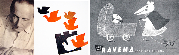
Hans Schleger (Zero) studied from 1918 to 1921 at the School of Applied Arts in Berlin, at a time when there the influences of the Bauhaus played a major role. From 1921 to 1924 Schleger was an advertising and film designer for Hagenbeck. In 1924, he moved to New York City, where he initially worked as a freelance designer, then art director, for an advertising agency. He taught for a while as a visiting professor at the Institute of Design in Chicago, Illinois. During this time he took the pseudonym Zéró and in 1926, established his own studio on Madison Avenue, New York. In 1929 Schleger returned to Berlin and worked for the German office of WS Crawford’s advertising agency. In 1932 he settled down permanently in England and got a British citizenship in 1938.
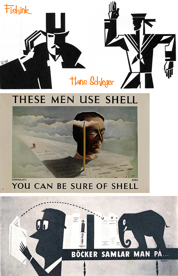
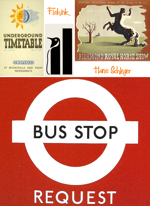
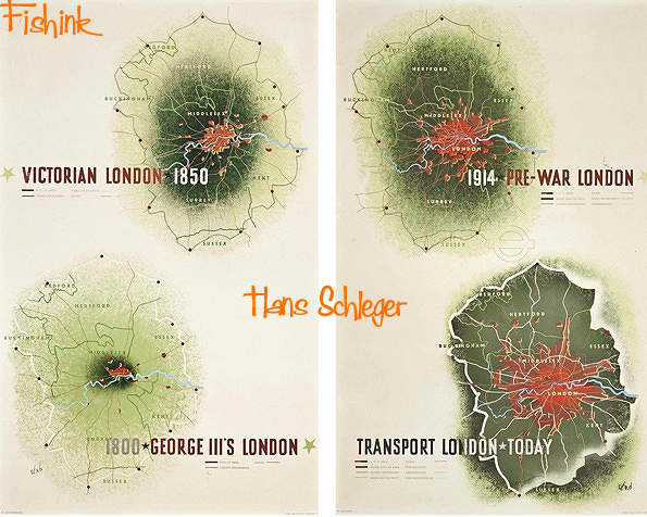
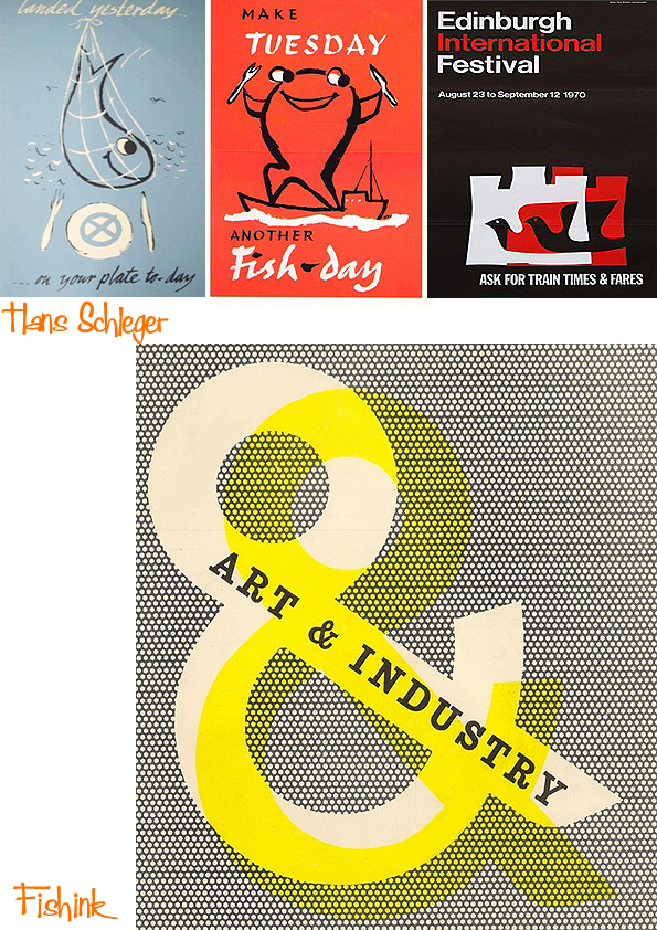
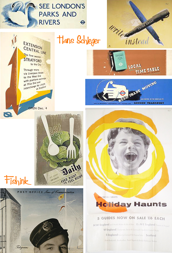
He opened his own studio and was mainly engaged in the design and promotion of British industrial enterprises, including the British Sugar Corporation, Fisons, MacFisheries, Finmar that employs John Lewis Partnership and other companies. Schleger was a close friend of Edward McKnight Kauffer. Both were early representatives of ” corporate identity “. Schleger’s poster designs have an intelligent and humorous approach to modern design techniques such as the photomontage. His campaigns for ” Shell “and the London transport company were particularly popular. In 1935, he modernized the “circle-and-bar” icon of London Transport, which has since been used as a bus symbol.
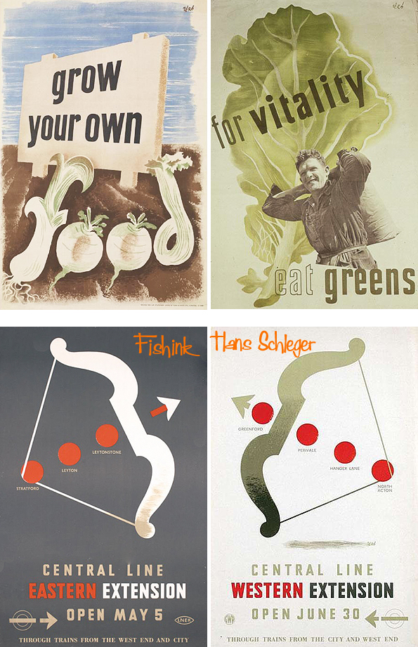
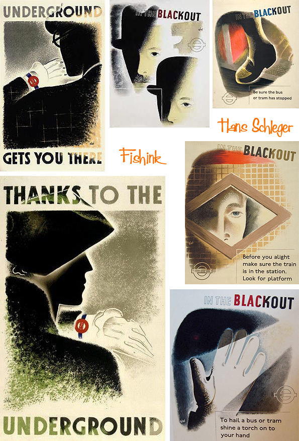
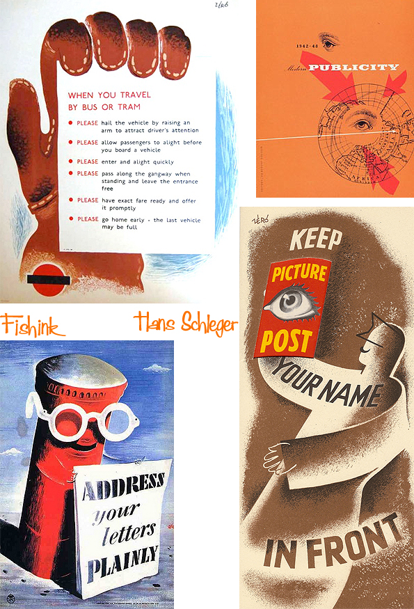
During the Second World War, he designed many posters, for London Transport, the Ministry of Food and other government projects.
I love this series he did to highlight, no pun intended, what to do during the blackout !
In 1946, Schleger was instrumental in the formation of “The Practice of Design”. During the 1950’s and 1960’s he put together with FHK Henrion (1914-1990) the idea of corporate identity through the UK. They worked on this together with advertising agency Mather & Crowther. In 1953 they founded “Hans Schleger & Associates”.
In 1955, Schleger developed the logos for the Design Centre in Haymarket, the triangular bottle of whisky for William Grant & Son’s distillery around 1956 and for the Edinburgh International Festival, ten years later. In 1959 he was appointed Royal Designer for Industry.
Schleger held lectures worldwide and had international exhibitions. He was guest lecturer at the Chelsea Polytechnic, Central Saint Martins, the Royal College of Art, and at the Regional College of Art in Manchester.


For a year he was visiting professor at the Institute of Design in Chicago. Solo exhibitions of his works took place in London, New York and Chicago, in many european galleries, museums and also in Tokyo. In 1964 he participated in “Documenta III” in Kassel in the graphics department.
Some fabulous work don’t you agree ?


Ha ha, he’s a bit like the school prefect – always telling people what to do! I found the poster telling people to shine a torch on their hand when they want to stop a bus in a blackout, during the war, immensely touching. It really brings home what the blackout must have been like.
Yes indeed for those of us fortunate enough not to have to live through those tough times, it does give a feel for what it was like.
They are so evocative of their time if you know what i mean!
Very true Jane.
Such a variety of styles – and yet all of them evoke the times they were made in. I’m also a huge fan of the blackout series – trying to make important posters that people will notice and still trying to make them cheery, yet the seriousness of the times shines through the work too. Thanks for sharing.
My pleasure Jordan, thanks for your comments
Hi Craig, This comedy win made me think of your blog about a “Hans”……ho ho x Edinburgh Fringe: Mobile phone joke voted funniest – BBC News The winning joke was: “I just deleted all the German names off my phone. It’s now Hans free.”
Lol well spotted Mel.