Ivan Chermayeff Collages, Models and Logos
If you’ve ever watched Showtime or NBC, visited the Museum of Modern Art or the Smithsonian, read National Geographic or a Harper Collins book, or shopped at Barneys or Armani Exchange, you’ve seen the graphic design of Ivan Chermayeff and his firm. Since starting Chermayeff & Geismar & Haviv (then just Chermayeff & Geismar) in 1956, he’s created countless logos that are, to this day, ingrained in western visual culture.
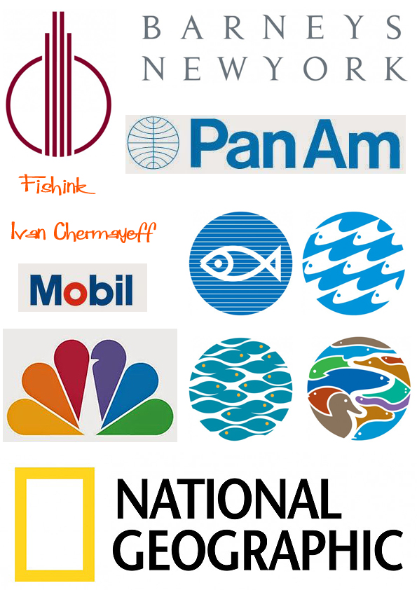
The red ‘O’ in the famous Mobil logo was designed to pop out at you when you are traveling fast down a motorway and make you realise that you need to stop for a fuel top up.
Ivan says ” We started our firm in ‘56. That’s quite a few years ago, and I’d been working away for some years as a student before that, and as a little boy before that. It all adds up to a hell of a long time. It means I’ve done a lot of work because I really like work a lot. When Tom [Geismar] and I started, there was no such expression as ‘graphic design.’ When a cab driver asked what you did, if you said graphic design, you’d have to explain it for an hour. Instead, we’d just say ‘I’m a commercial artist.”
Below (in order) are the St Louis Children’s Zoo drinking fountain, Lisbon Aquarium, Tennessee Aquarium and Osaka Aquarium.

Chermayeff’s love of using found objects began when he was at school, intimidated by the skills of his fellow students. “They could all draw and paint a lot better than I could,” he says, ” I was always putzing around with garbage at home, but whatever I made, my father would say it was great. He really encouraged me.”

Now in his eighties, he is still working and shows no sign of slowing down. “And there’s still a lot of trash to get through.”
When talking about his collages he says “It’s important not to think too hard, most of these collages appeared in about 15 seconds – but I might have some of these scraps lying about for years before they find their right home.”

” I do have a small fear of drawing, and an even bigger fear of painting. That’s why I use scissors, and I have lots: short ones, long ones, heavy ones, so I can cut heavy things. Cutting and tearing has a sort of excitement about it. If you tear things, they have a look of being torn, in contrast to a line which has little emotion. ”

” I can’t sit still no matter where I am. Even if I’m lying on the beach in Cape Cod, I’m arranging pebbles in the sand. It’s always play. Play is a very good word for my attitude, even towards making a symbol that has to stand for a company–arriving at that symbol is still a form of play. ”
Ivan has also produced books, his work makes me think of Paul Rand, Matisse and Kurt Schwitters.

You can discover more about Ivan here and here .


I love that idea of the cut or torn line having more emotion and personality to it. His collages and found object sculptures are great.
I agree Laura, an interesting idea talking about lines and emotions
I love that his father recognized his talent and encouraged him. Also, I have a photo of my son by that drinking fountain at the St.Louis Zoo!
Nowadays it’s so important to encourage anyone who spends time enjoying their art, I can’t believe some schools will stop teaching it altogether. What a sad thought.