Ladislav Sutnar Graphic Input
Ladislav Sutnar was born in 1897 in Plezn, Czechoslovakia. A Renaissance man, like many in his era, his activities were multidisciplinary and he studied painting at the School of Applied Arts in Prague, architecture at Charles University, and mathematics at the Czech Technical University concurrently.
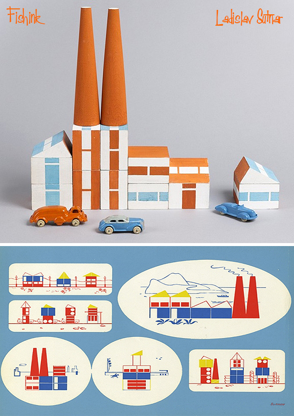
This silkscreen print was published as a promotional kit for the Build the Town building block set Sutnar designed between 1940 and 1943 while living in the U.S. This print is 1 of only 2 promotional materials Ladislav produced for the modern toy design market.
Starting in 1924, Ladislav designed toys consisting of simple geometric structures of animals and puppets.
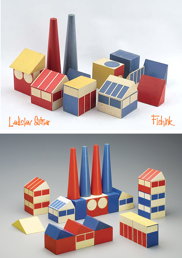
He attempted to introduce modern aesthetics into children’s toys by developing a building kit that consisted of sawtooth roofs, cones, and pieces in the colors of red, blue, and white (this remained a prototype).
The 1960s proved to be a difficult time for the designer as he turned to publishing Strip Street (1963). It was an album of 12 erotic silk-screen prints. He organized two New York gallery exhibitions of his nudes, In Pursuit of Venus (1966) and Venus: Joy-Art (1969). These works outside of his norm still included his hierarchical design approach as a father of modern information design. The term “posters without words” refers to Ladislav’s distinct poster-like design that characterizes the individual prints of this series.
His racy Strip Street compilation has relatively been forgotten. He wrote an essay to accompany these works. “In these disturbed times of cool and alienated society,” he wrote, “if the paintings can inject the feeling, the mission is accomplished.” An influence of Pop is notable despite Sutnar’s dislike of Pop and Pop Art. His paintings are reproduced today in a 392-page monograph.
Ladislav Sutnar is most notably a pioneer in the field of information design. He worked with many media including print, painting, products and interior design.
He went to school to learn how to make utensils, pots and other ceramic works. In 1923, he became the professor of design at the State School of Graphic Arts in Prague, and was later made its director. At the same time he worked as a designer at other firms too. Ladislav also did much work in exhibition design for a number of World Fairs, including the one in 1939 located in New York where he was to design the Czech pavilion. The exhibition ended up being cancelled due to the Nazi invasion of Czechoslovakia. Still, his work brought him to America, where he began a new chapter in his life.
Ladislav transitioned from industrial designer to graphic designer during his time in the States. He responded to the chaotic nature that he saw in American graphic design, starting his influence in information design. His work brought simplicity to the complex. His personal philosophy on visual design was that it should not “sink down” to the level of public taste, but rather inspire the general public to improvement and progress. He believed designers are called to perform to their fullest capacity and should “think first, work later.”
He placed a heavy emphasis on precision and clarity in information display, and on simplifying the complex.
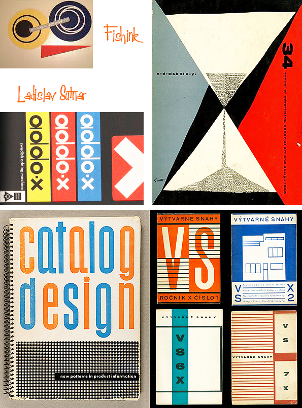
His style reflected this philosophy in many ways, using grids and a strict layout, as well as a limited color palette and choice of typeface. He often used geometric form to guide layout, and also asymmetrical compositions to draw visual interest. Ladislav was also greatly inspired by movements such as Modernism, Bauhaus, and De Stijl. He used vivid colors, especially with his penchant for orange. A distinguishing feature of his work is the use of punctuation symbols to organize information.
After settling in America, Ladislav became the art director at F.W. Dodge’s Sweet’s Catalog Service in 1941 until 1960. His contributions here are seen in use even today. To replace the messy design that originally characterized Sweet’s pages, he created business-friendly templates and layouts for clarity of vast amounts of information and easy consumption by the general viewer. He contributed graphic systems to several companies and manufactured items. Also among his innovations was the use of double page spreads as opposed to only single pages. He was also the one to put parentheses around the area code in the American telephone numbering system.
Ladislav’s contributions to the practice of information design are still applied to graphic design today. The components of web design and navigation today can be accredited to his methodical Modern-style graphics, which are widely borrowed and applied. His designs transformed the face of business data, organizing massive amounts of information into not only comprehendible but visually interesting displays.
Though far from a household name, Ladislav Sutnar is a giant in the history of design. A Czech American who had a prolific career in his native Czechoslovakia in the 1920s and ‘30s and subsequently in the United States. He was an innovator in graphics, product design, exhibition design, and information design—a forerunner of web design. He is particularly known for his work in typography, including the innovation of adding parentheses around area codes in phone numbers, a seemingly small change that makes long strings of digits easier to read and remember.


