Robert Jefferson Ceramic Designer Parts 1 and 2
Morning everyone, I’m so busy with my ceramics at the moment that I haven’t had a spare second to prepare a post, how naughty of me lol so instead here’s not one but two posts sandwiched together about the ceramic work of someone that I admire very much, Robert Jefferson. I hope you enjoy it as much as I did assembling it in the first place.
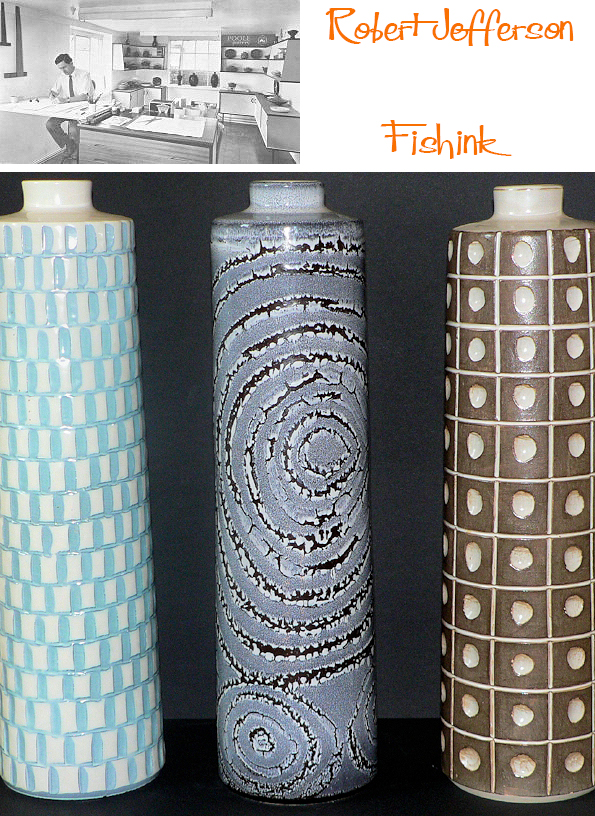
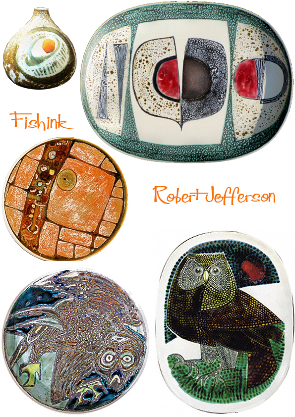
Robert Jefferson was a former lecturer in Ceramics at Stoke-on-Trent College of Art. He joined Poole Pottery in 1958 as full-time resident designer (rather than a thrower) working on domestic ranges and oven-to-table ware alogside potter Guy Sydenham.
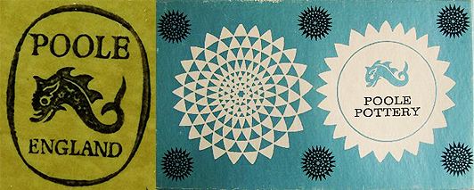
When Poole Pottery was launched in 1921, Poole, Dorset, it was decided to make pottery, which was useful and ornamental, in a style both contemporary and also in the best traditions of potting. It was a very successful experiment.
Launched in October 1963, the so-called ‘Delphis Collection’ reproduced 75 or so vases designed by Robert Jefferson as a standard repeatable range. This allowed trade customers to place orders with a degree of certainty as to size, shape and price. Popular lines could be re-ordered from a catalogue. Although shapes were (to some degree) standardised, the colour, decoration, glazing and carving of each piece was unique.
The early Studio pieces were thrown by Guy Sydenham and decorated by both Tony Morris and Robert Jefferson.

After 1963 new patterns were added and there was a crossover of paintresses from other departments.

It must have been exciting times as there was much room for experimentation, mark making techniques and ideas were flowing.


Quite a variety of shapes and styles, in order to see which would catch the public’s eye and become popular.
There were few other potteries at the time producing studio pottery within a modern industrial environment in this way. (Rye and Denby too).
Robert later also worked for other compaies (like Purbeck) after he left Poole in 1966.

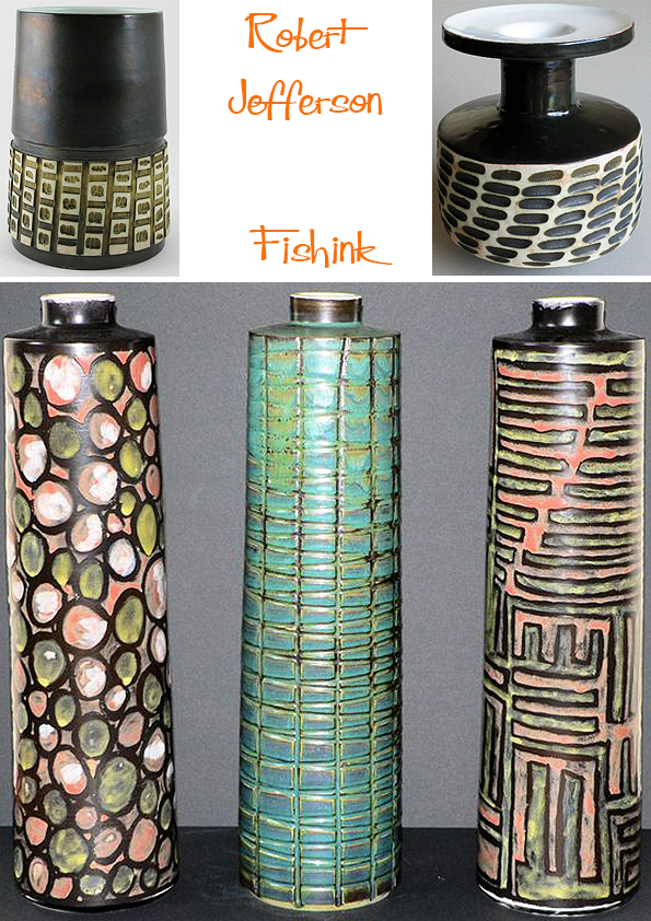
The use of the latest glazes and experimental techniques (such as wax-resist, see below) aided the development of new products and helped to preserve the unique identity of the Pottery. No doubt there was also perceived to be a niche market for highly individual works of art (the retail cost of one plate would be more than a weeks wages for the artist).
It’s Robert’s later work that I first encountered and that I was initially drawn to.
Welcome back to Part 2 of my post about the work of Robert Jefferson.

Robert had a great eye for nature and incorprated it into his work whenever he could.
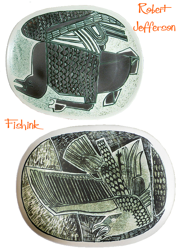
I love the marks that create this seagull above. They add to the drama of the whole piece.

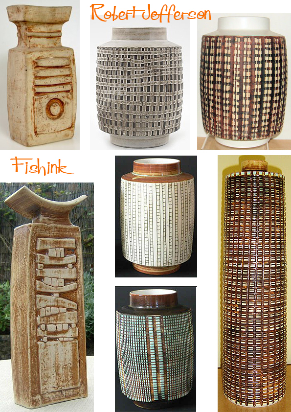
Wonderfully textured ‘Helios’ table lamps and sumptuously curvaceous tea and coffee pots.
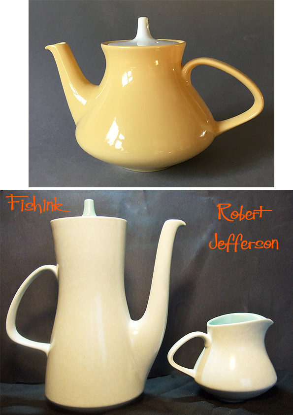
His decorative eye was both clever and precise. Like much Poole tableware these dishes are surprisingly thin bodied and lightweight. The high biscuit firing temperature used (1150c), produced a semi-vitrified body which meant these pots could withstand domestic ovens. Although, they were sold with a warning to avoid thermal shock. This “Oven to Tableware”, proved to be very popular.

As a textile designer, these mark-made vegetables and birds really caught my eye.


The shrimp are practically dancing on these dishes !

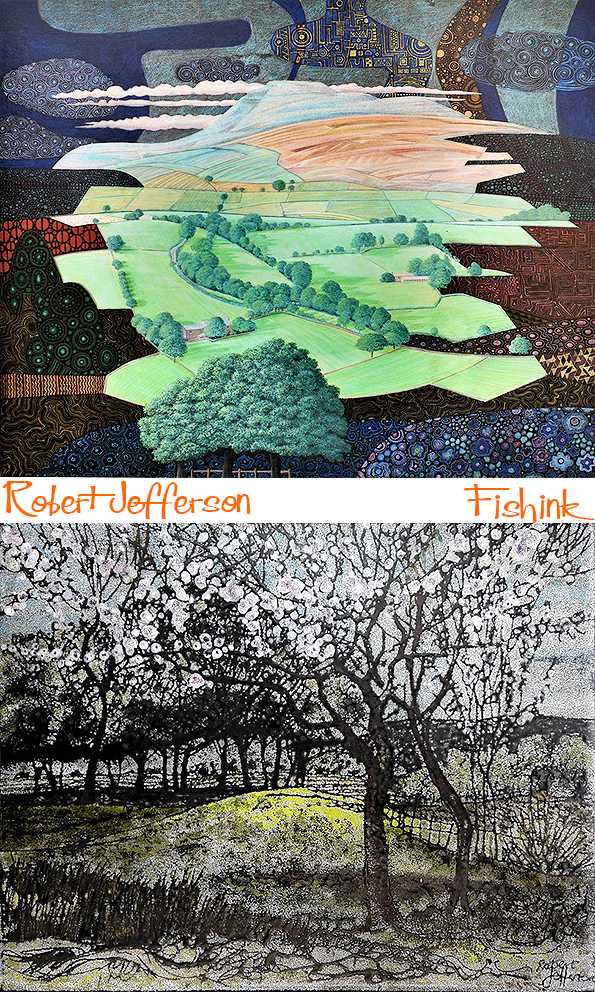
Robert was a great innovator: Introducing new technology to the factory and reinvigorating the Poole catalogue with new shapes and styles in keeping with a new decade. As well as the pots below, he also designed the “Contour” tableware range and “Black Pebble” pattern shown in the Twintone Gallery, together with Helios table lamps and other wares. He left Poole Pottery in 1966, after he had reputedly “designed himself out of a job”. He went on to continue his painting career, giving exhibitions of his work and showing his extensive love of detail and nature.

I wonder if this was his decorative world merging with the real one ?
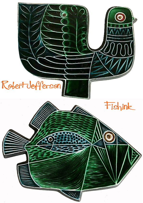
Below are some of the first wall plaques that Robert designed, these were hand decorated in the available studio glazes. The designs were ‘transferred to the production departments when greater output was required. These remain my favourite pieces of his work.

Launched as the 1964 ‘Spring Collection’ the plaques were then produced in the (much more common) standard colours of blue and green that you see below.
Other designs of plaques and dishes soon followed. See more about Poole Pottery and it’s production here.

My favourites are still the birds and I’d love to find a few for myself. I hope you’ve enjoyed this visit into Robert’s creative world.

Many thanks again to The Virtual Museum of Poole Pottery and Rob’s Poole Pottery for helping to make this post possible. Do let me know if you’ve found this post exciting, uplifting or have anything to add. I always enjoy hearing from you.


Lovely post! I’m swooning over that yellow teapot. 🙂
Thanks Ann, I swooned over most of his work to be honest lol
😍 Evertthing! All of it! Thanks for feeding my greedy eyes. Nice start to the week.
Thanks Jen, I’m with you on that one