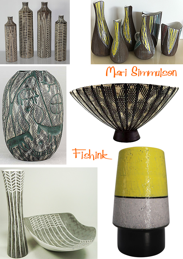
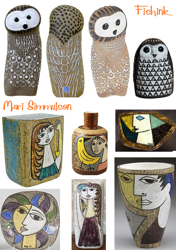
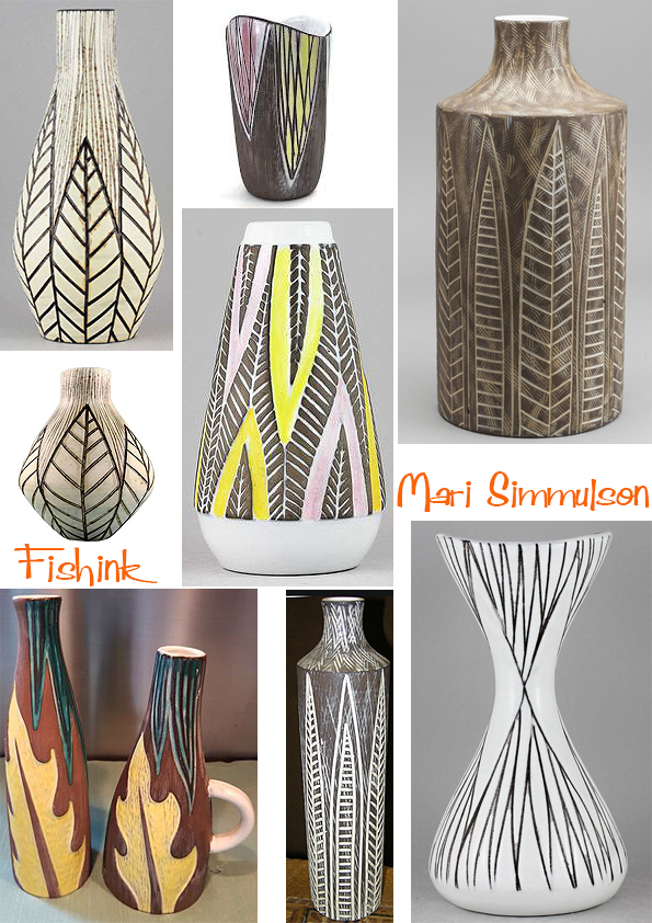
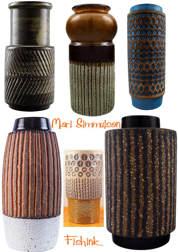
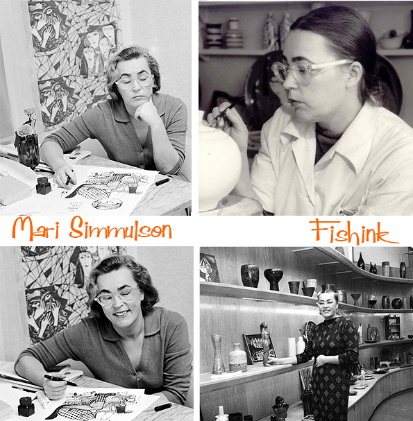
Mari Simmulson Swedish Mid Century Ceramist
Mari Simmulson (1911-2000) is a familiar name when talking about Swedish ceramic design of the 20th century. Born to Estonian parents in St Petersburg, Russia. At the start of the Russian revolution in 1917, Mari’s family moved back to Estonia. During the 1930s, she studied at the State Art School in Tallinn and later further developed her skills at the nearby Arabia porcelain factory in Helsinki.
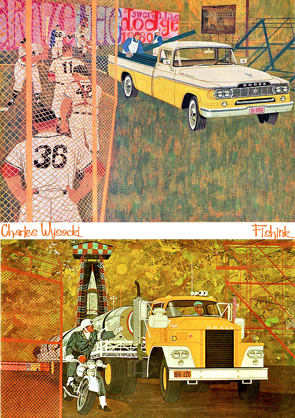
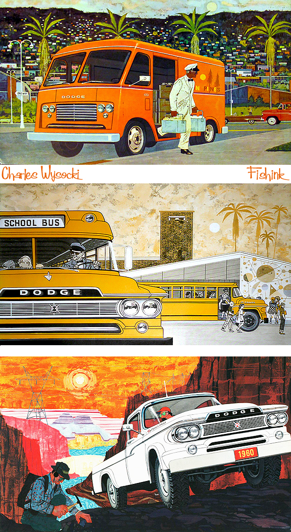
Charles Wysocki Midcentury Illustrator
Charles Wysocki was born in 1928 in Detroit, Michigan. From the time he was small, he always wanted to be an artist. His father was an immigrant from Poland who worked on the assembly line at Ford Motor Co. for over 35 years. His father was not thrilled about his son’s artistic aspirations. Most of his encouragement came from his mother. She fully supported his artistic tendencies.
Charles went to high school at Cass Technical High School and focused on their art program. For a time he worked as an apprentice in Detroit art studios. Then Uncle Sam snatched him up. Charles was drafted in 1950 during the Korean War. He should have been sent to Korea where he may have met his fate, but right before he was to be sent out, he was granted a leave of absence to visit his brother Harry who was very ill.
After he returned to hook up with his unit, the powers that be said, “You’re going to Germany.” He was stationed in Hanau, West Germany from 1951-1952. After his two-year obligation in the Army he decided to trade in his rifle for a paintbrush.
After leaving the Army, Charles attended Art Center in Los Angeles (it is now in Pasadena) on the G.I. Bill. After completing his studies, and majoring in design and advertising illustration, Charles joined the staff of freelance artists at McNamera Brothers in Detroit in 1955. He lived at home with his parents during this time. Charles moved to Los Angeles in 1959. There he formed an advertising agency with three other artists called “Group West” and was very successful doing freelance commercial artwork.
Some of his clients included General Tire, Unocal, Carnation, Chrysler, United California Bank, Otis elevator company, and Dow Chemical Co. to name a few. Here’s a poster he created for General Tire in 1960.
During this time he won numerous awards for his illustrative talents. Then he met Elizabeth, and she unleashed the primitive artist that was buried within him.
Charles and Elizabeth met at an ad agency in Los Angeles. She had just graduated from UCLA as an art major. She was working at this ad agency when she heard about a hotshot illustrator (Charles Wysocki) that was coming in to do some freelance work for them. Well, when they met, it was love at first sight. Elizabeth’s family was one of the first to settle in the San Fernando Valley.
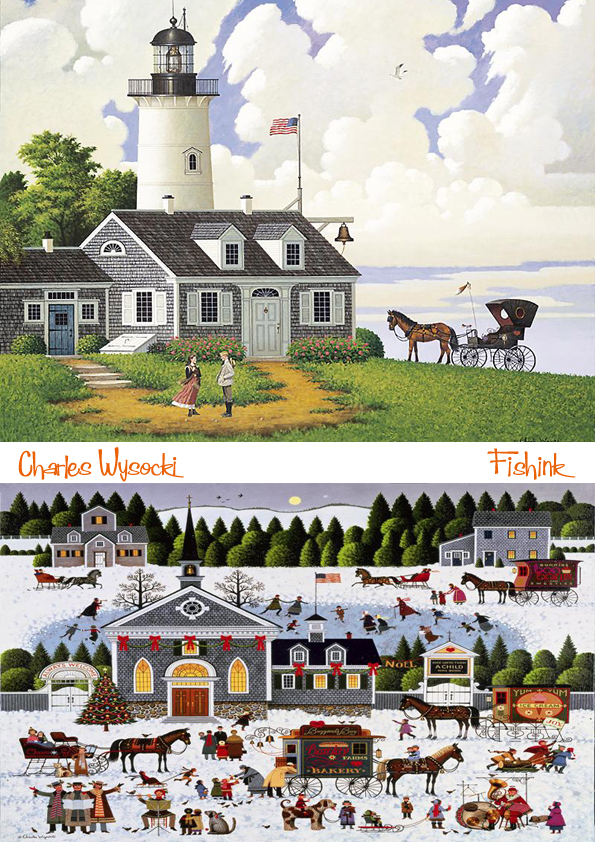
Charles was enamored of the simplicity of this farm life and wholesome values. This influence is what started his whole primitive style that we all know and love. Charles and Elizabeth were married three months after they met, in July 1960. During this time they made several trips to the East Coast. They went antique shopping and visited places such as Nantucket, Martha’s Vineyard, Cape Cod, Boston, Vermont, New Hampshire, and Maine.
In the early 1960’s Charles worked as a commercial artist, but his heart was in the primitive style. At night and on the weekends, he worked on his Americana/primitive paintings. After he did a one-man show at which he sold every painting in this style, he decided to leave commercial art for good and just focus on his Americana art. For most of the 1960’s he made a good living off of the original paintings he sold. He also published greeting cards, posters and a huge number of jigsaws, along with other licensed merchandise of all kinds. During this time Charles and Elizabeth had three children. David was born in 1965, Millicent in 1967, and Matthew in 1969. It is also during this time that they moved from Los Angeles to Lake Arrowhead.
In 1979, Charles published his first limited edition print, “Fox Run”, with The Greenwich Workshop. His published numerous prints with them during this time from 1979-1993. He also traveled around the country and made personal appearances at galleries all over the United States. Charles won many awards for his work including the one he was most proud of, the medal of honor from the Daughters of the American Revolution, the society’s highest honor. Charles also published two books during this time, “An American Celebration” in 1985 and “Heartland” in 1993. He also appeared in People magazine July 7, 1986, and was invited to the White House Independence Day celebration in 1981 (for which he did a painting that still hangs there).
Charles painted his whole life, and up to his death at the age of 73. He died July 29th, 2002 surrounded by family. It was also his 42nd wedding anniversary. He will be sorely missed by many, but his artwork will live on. He is survived by his wife, Elizabeth, his three children, David, Millie, Matt, and his two grandchildren, Emily and Jackson.
For me Charles earlier work from the sixties has much more life and vibrancy to it. I love his painterly skies and textures so much more than the Americana style he later adopted, which although they’re busier, they are also crammed full of people, detail and flatter perspectives. It’s almost as though they are the work of two separate artists.
What are your thoughts ? Many thanks to the the dedicated work of Leif Peng who tirelessly collates all this information on Flickr and who first introduced me to Charles’ amazing work. If anyone else has any other examples of Charles’ work from this era, I’d love to see them.
The Festival of Britain, 70 years on.
Last week marks the 70th Anniversary of The Festival of Britain. I revisited this post from my archives to remind us all what a spectacular event it was.
It’s a few years ago now that I was wandering alongside the Thames river and decided to pop into the Royal Festival Hall which is the heart of the Southbank Centre.
Many of you who know me, will also know about my passion for the 1950’s era, so with a foyer display featuring information, advertising and models of The Festival of Britain, I was again, a happy soul !
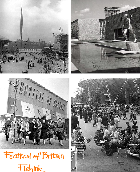
The Festival was a national exhibition held throughout the United Kingdom in the summer of 1951. It was organised by the government to give the British a feeling of recovery in the aftermath of war and to promote the British contribution to science, technology, industrial design, architecture and the arts. The Festival’s centrepiece was in London on the South Bank of the Thames.
The first idea for an exhibition in 1951 came from the Royal Society of Arts in 1943, which considered that an international exhibition should be held to commemorate the centenary of the 1851 Great Exhibition. In 1945, the government appointed a committee under Lord Ramsden to consider how exhibitions and fairs could promote exports. When the committee reported a year later, it was decided not to continue with the idea of an international exhibition because of its cost at a time when reconstruction was a high priority. The government decided instead to hold a series of displays about the arts, architecture, science, technology and industrial design, under the title “Festival of Britain 1951”.
At that time, shortly after the end of World War II, much of London was still in ruins and redevelopment was badly needed. The Festival was an attempt to give Britons a feeling of recovery and progress and to promote better-quality design in the rebuilding of British towns and cities. The Festival of Britain described itself as “one united act of national reassessment, and one corporate reaffirmation of faith in the nation’s future.” Gerald Barry, the Festival Director, described it as “a tonic to the nation”
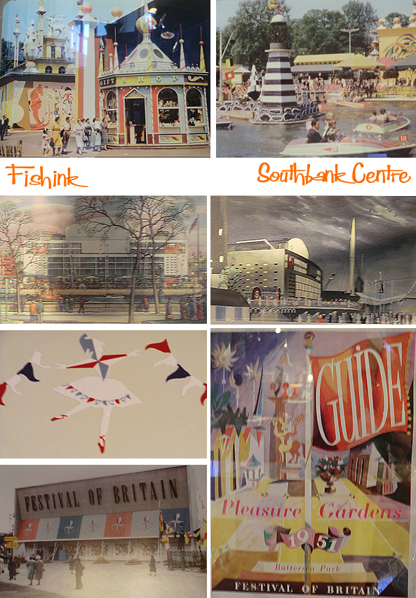
Here’s a model of the site.
It’s hard to imagine how exciting the site must have been for a society who survived World War 2, just six years before.
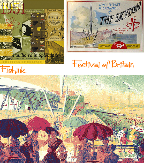
Of course colour was everywhere and souvenirs appeared in all shapes and forms imaginable. Here’s a few head scarves.
These tecnicolour shots give a hint at how wonderful it must have looked. Disneyland in Britain !
I would have loved to have gone. I also remembered the Festival of Britain inspired ceramics and wallpaper by Mini Moderns that I’ve mentioned in a previous post.
More modern day items in the shop and a great display of goodies by Sukie.
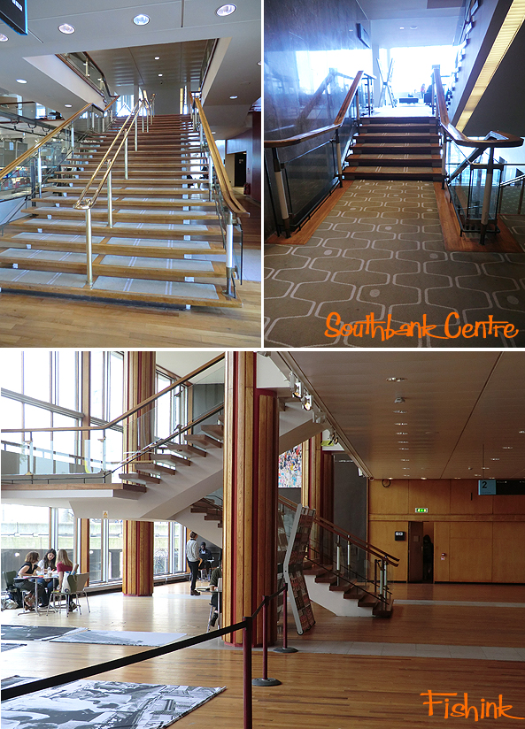
The Royal Festival Hall is a beautiful building. Full of natural wood, light and curves.
I really enjoyed the experience of just being in the building. The views, the dinner jazz, the slow pace and unhurried business of it’s inhabitants and the sun streaming in and bringing it all to life.
I managed to purchase copies of the original catalogues that accompanied the exhibition


The entire volume was in colour and on a high quality paper stock. must have been quite unusual for the fifties.
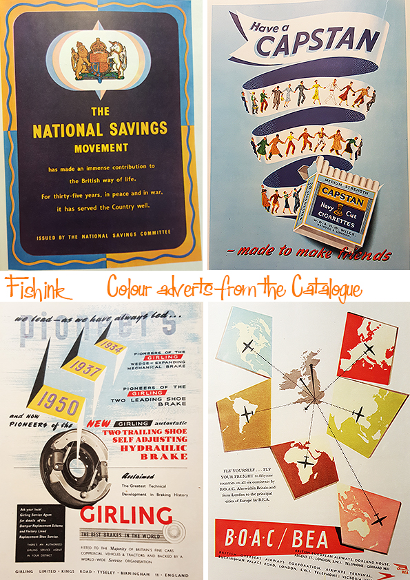
Happy Anniversary Festival of Britain, I feel we need another one soon : )
Just to let you know that Fishinkblog is now even easier to share with your friends, as we’ve dropped the wordpress bit to become just http://www.fishinkblog.com.
More about Mary Blair
In a blog concerned with mid century art, the artist Mary Blair is bound to crop up a fair few times. I recently came across another book about her by John Canemaker. Entitled ‘Magic Color Flair. The World of Mary Blair.
It was created for the Walt Disney Family Museum 2014 Mary Blair exhibit, of the same name, and is an authoritative collection of Blair’s life and work including the precocious paintings she made as a student at the renowned Chouinard Art Institute; the enchanting concept drawings she created for numerous Disney films; her lovely illustrated Golden Books, which are still treasured today; and the rarely seen but delightful advertisements, clothing designs, and large-scale installations that she devised later in life.
Curated by Academy Award winning animator John Canemaker and annotated with fascinating information about her artistic process, ‘Magic Color Flair’ is a bold, lively look into the work of an equally bold and lively creative, whose invaluable influence and keen eye helped shape some of the world favorite Disney experiences.
As I’ve already got the ‘Art and Flair of Mary Blair’, I may have to place this one under ‘future investments’.
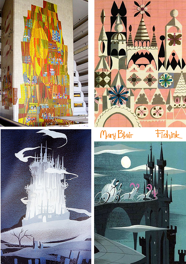
After a little research I stumbled across this piece below which was sold at auction originally from Mary’s estate and dated 1966. It is said to be an early study for Mary’s tiled murals called ‘Tomorrowland’.
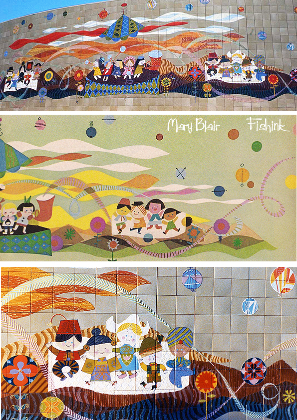
Here’s what the murals turned out to look like.
Such a wonderful array of colour, movement, style and well plain joy to be honest !
She had a great talent for bringing design and illustration to a large marketplace, in a friendly and creative way.
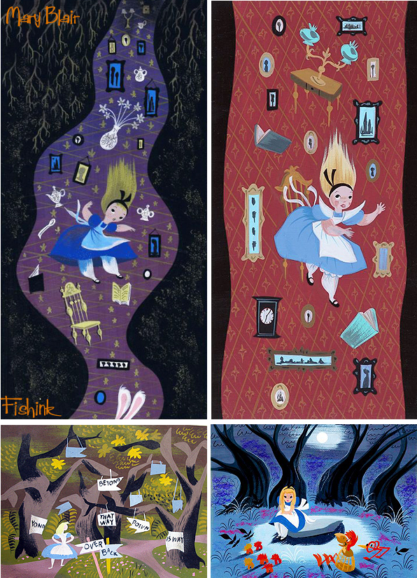
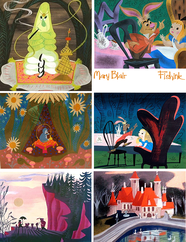
A few more snippets of Mary’s work I’d not seen for a while.
Some old favourites for Alice in Wonderland,
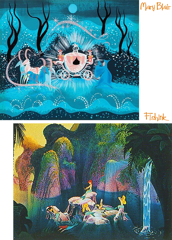
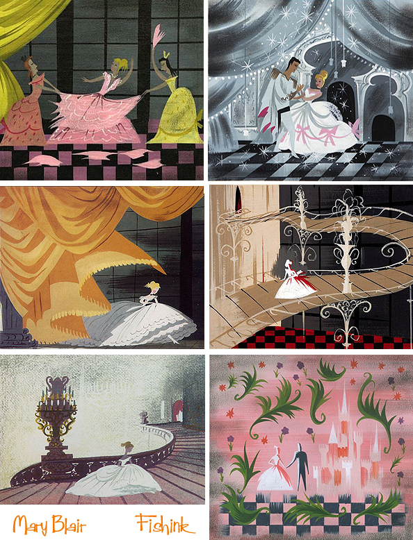
Peter Pan and Cinderella.
The classic rags to riches story.
I love Mary’s great sense of colour, style and application of paint.
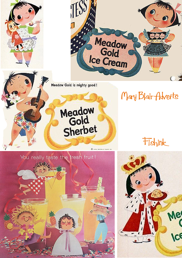
Some mid fifties advertising and an early sketch for some Indian and African inspired designs.
You can also see a short sixties film about the making of the tiled murals for Mary’s designs here. I’ve also created more posts about Mary which you can see by clicking on the links under Mid Century Artists on the right side of my blog. Thank you.
Fishink Ceramics
Good Morning/Evening everyone.
It is that time again when I host another Fishink Ceramic Sale on my Fishinkblog page on Instagram http://www.instagram.com/fishinkblog
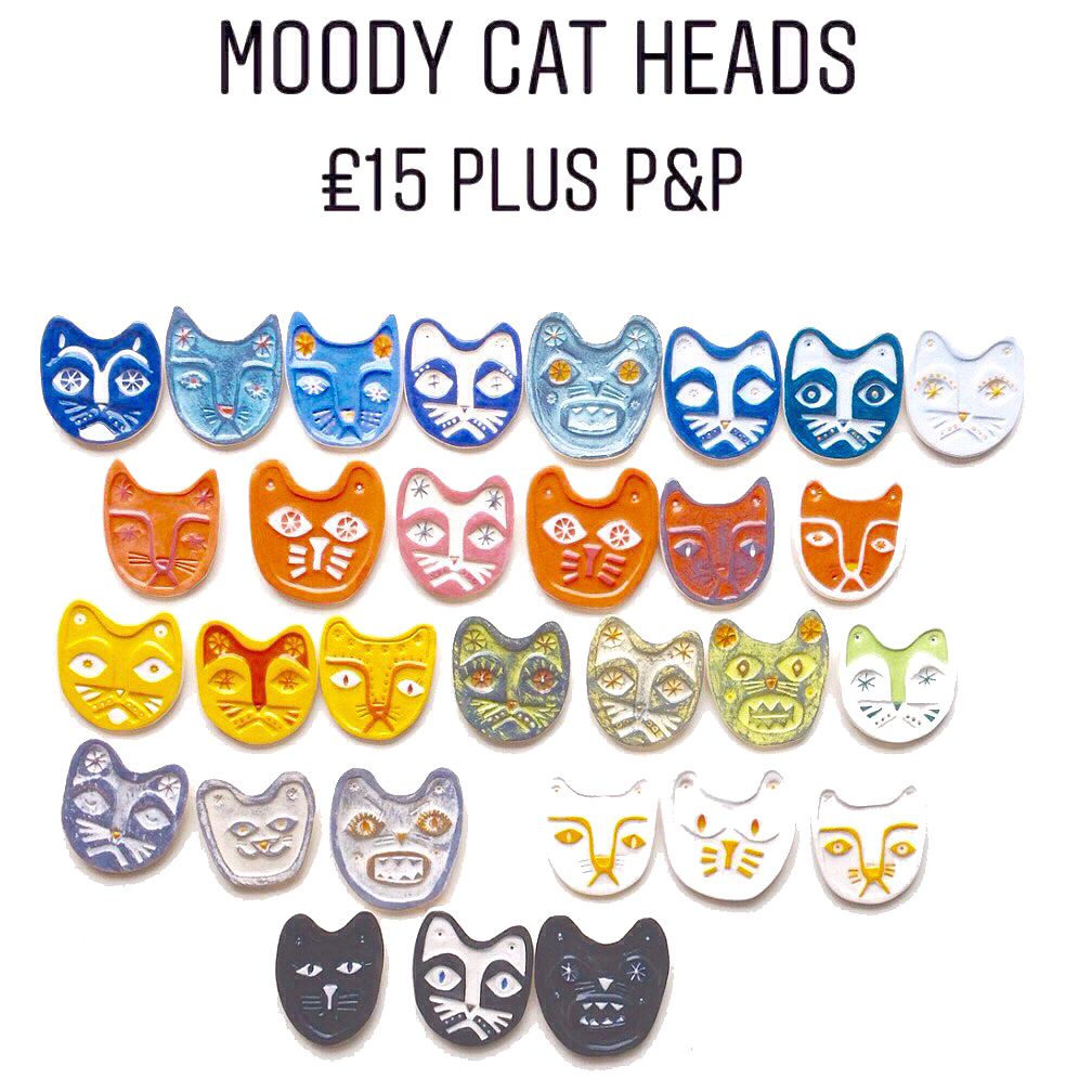
There are many different Cats, like these…
And these
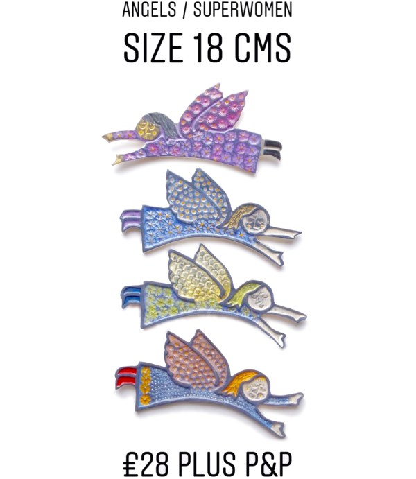
Some Angels.
Rabbits

And a whole range of Magic Trees.
But don’t take my word for it pop over today at 10am UK Time until 5pm or the same times tomorrow to see for yourself ! Many different ceramics at affordable prices, and I can ship worldwide, or send a present to someone on your behalf.
Hope to see you there, or if there is something you have seen that catches your eye, drop me a message at craig@fishink.co.uk and if It’s still available, you can purchase it securely through Paypal.
Catch up soon, thanks Craig
Mid Century Airline Posters Part 2
Welcome back to part 2 of my blog on Mid Century Airline Posters. If you missed part 1, you can find it here.
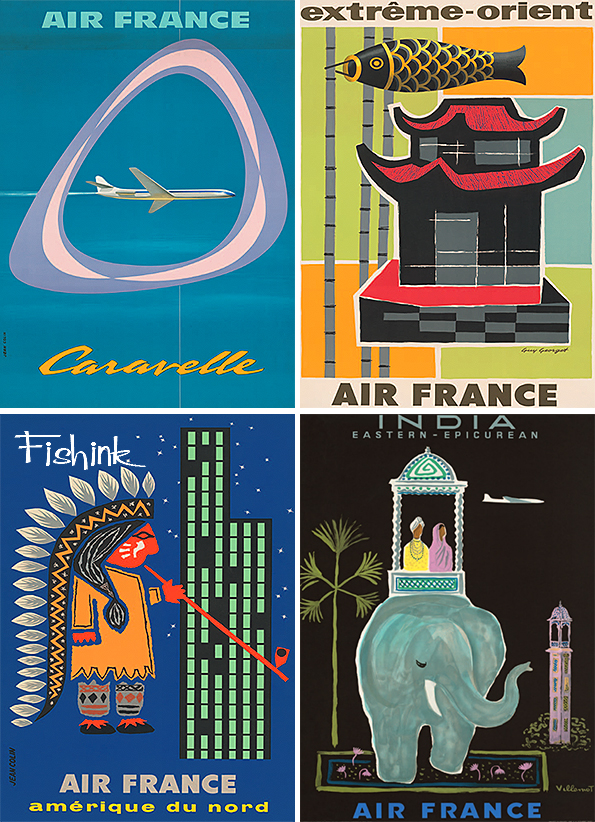
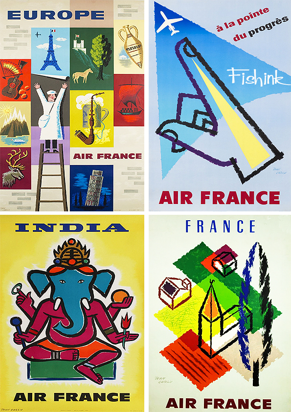
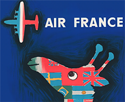
These posters (below) were designed by the artist Jean Carlu. I like his crayon-like lines.
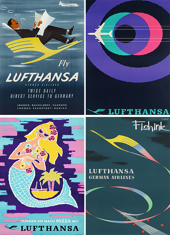
Relax in style, retro-style with Lufthansa.
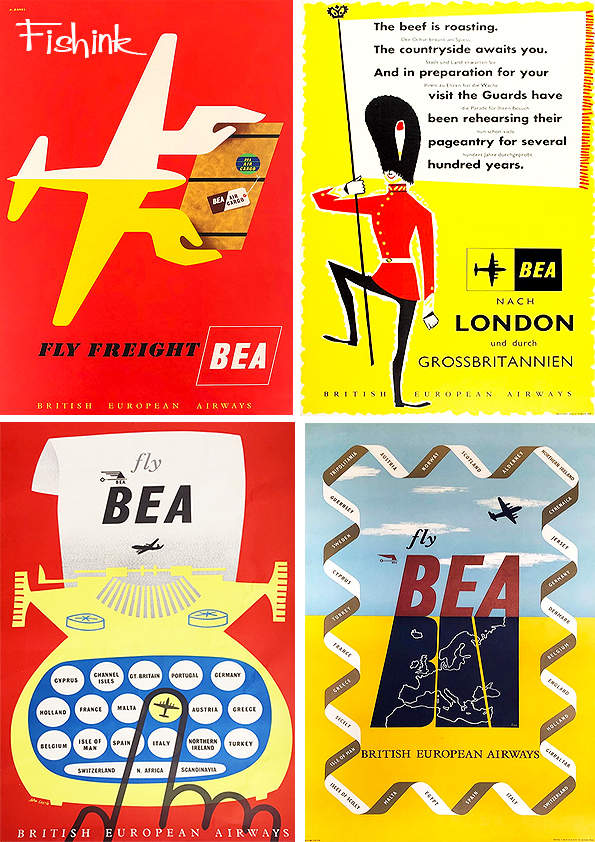
A few more from BEA.
The Spanish poster above was created by John Minton.
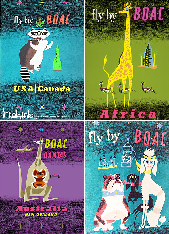
From BEA to BOAC and a graphic style and some quirky animals.
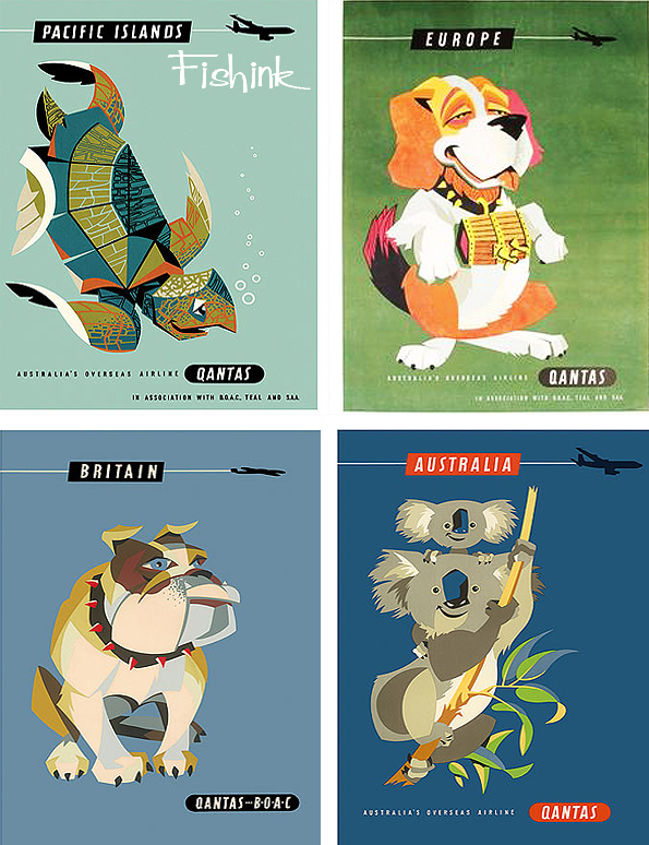
The amusing animals continue into these great Quantas posters.
Simple yet inspirational !
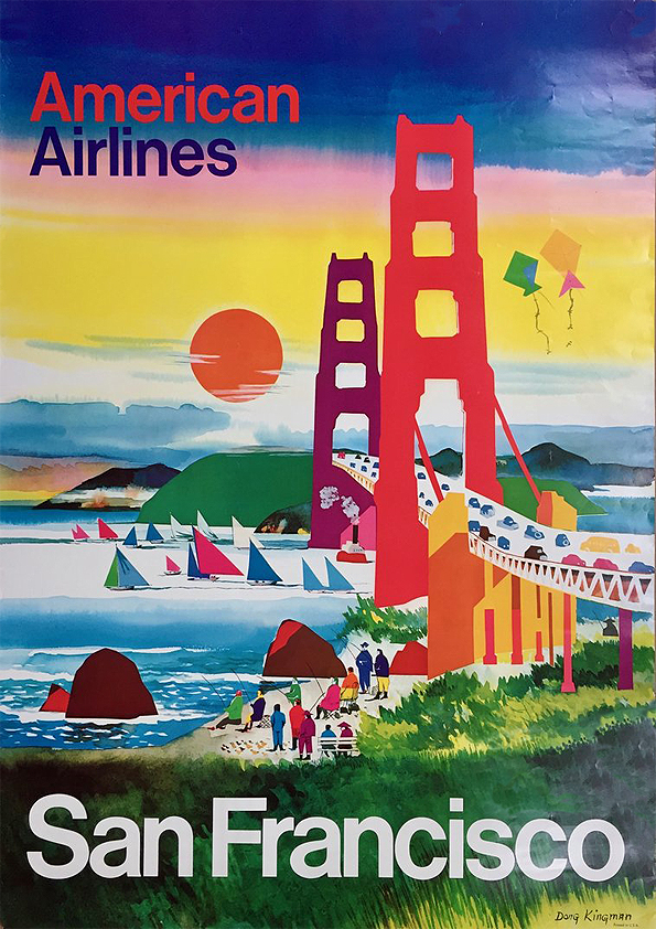
Finally we come to the Golden Gate Bridge and a splashdown at Niagra Falls with American Airlines.
More from Dong Kingman (above) in another post.
If you enjoyed my posts then do check out these similar ones about Pan Am, B.O.A.C Part 1 and B.O.A.C Part 2 and Braniff.
Also please leave me a comment with your thoughts and most of all…. Have a fun start to your week !
Mid Century Airline Posters Part 1
I’ve covered many different Airline Posters on Fishink blog in the past. There’s Pan Am, B.O.A.C Part 1 and B.O.A.C Part 2 and Braniff to name a few.
Here’s a great collection that I came across and haven’t seen many of before. I make no apologies if they have appeared on here previously however as they are all rather special!
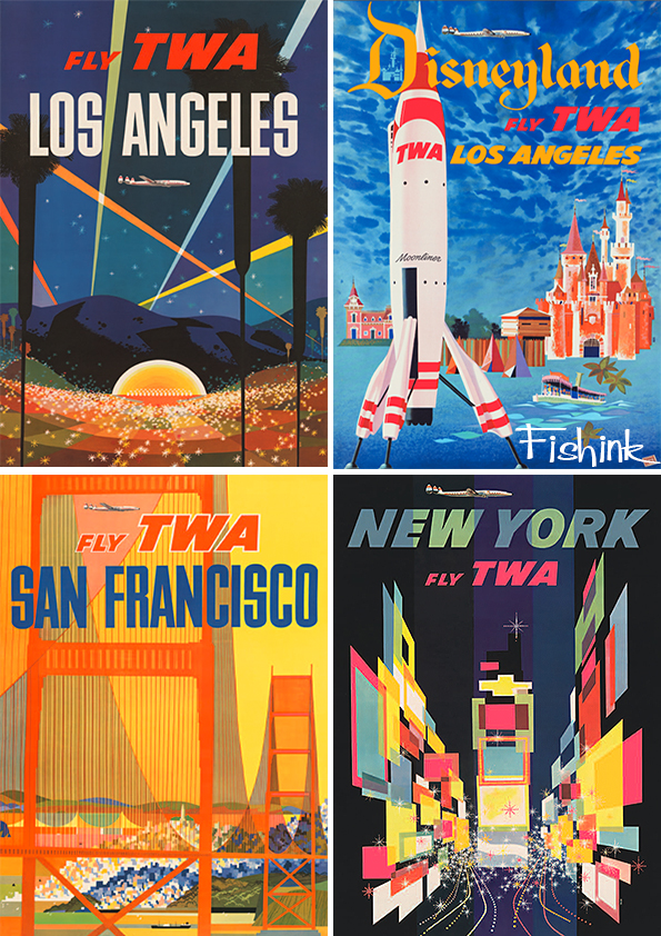
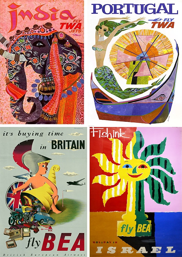
Let’s begin by flying TWA.
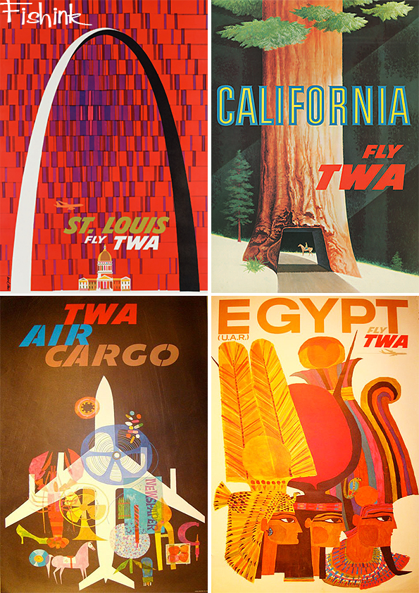
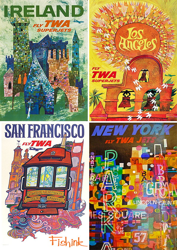
Some wonderful posters, which make me want to hop on a plane right now.
Great use of colour, space and design. They are visually captivating.
Many of these wonderful posters were designed by David Klein. Such a talented artist.
From TWA to BEA.
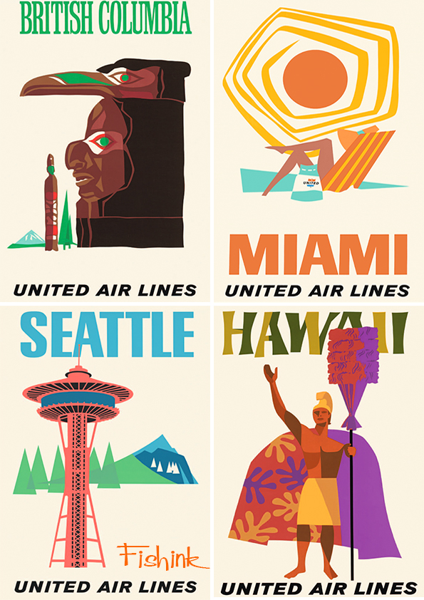
Followed by some fresher United Air Lines posters.
That Miami Sun is fabulous don’t you think.
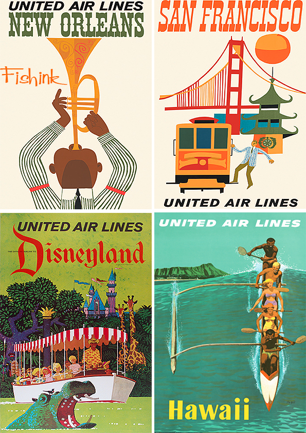
The San Franciso poster below, makes me think of Miroslav Sasek. Or perhaps they’ve just picked the same elements.
A little more structure from American Airlines.
From Braniff to Japan Air Lines.
A few Pam Am specials to finish for today. Is that Cilla ?
More Mid Century poster madness next week.
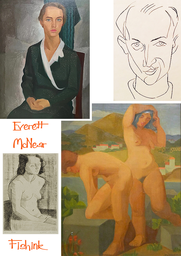
Everett McNear American Mid Century Artist
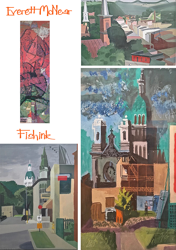
After a year of study at the University of Minnesota, Everett found that the drawing and painting classes at the Minneapolis School of Art were more immediate to his needs than liberal arts courses. In 1924, he made his first contact with Cameron Booth. Prior to his arrival at the Minneapolis School of Art in 1921, Booth had been thoroughly exposed to the key exponents of French painting. His style was firmly rooted in the Cubist and Impressionist traditions. Booth’s influence on McNear was significant.
“Cameron Booth taught me to love the smell of turpentine and the feel of a bristle brush in oil paint. He opened the doors for me. Beyond them I found the rich linear organization of Veronese, the color harmonies of Titian, and the poetic, freely moving space-forms of El Greco and Tintoretto. I began to see that these abstract qualities and relationships were the things that gave a painting a life of its own.” Under the influence of Booth, Edmund Kinzinger, and his fellow students at the Minneapolis School of Art, McNear abandoned the curvilinear forms of his early drawings in favor of a more disciplined aesthetic.
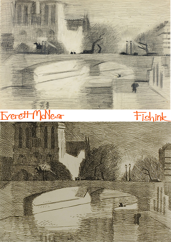
In 1932, McNear made his first of many trips to Europe. Hungry for personal and artistic growth, he scheduled an exhaustive program that would guide him through much of Western Europe, including time spent at the Academie Moderne studying etching with Marcoussis. His travels are particularly important to an understanding of the artist and his work. In his book Young Eye Seeing, his collected letters document this first trip, express his motivations, and chart his goals. French engravings made around Notre Dame and along the Seine.
You can see below first the sketch and then the realisation.
More work in the vacinity. Lovely use of light and shade.
His return to the US in 1933 saw the artist turning to work as an illustrator, and in Chicago, he worked for many years as a graphic designer. McNear also became heavily involved in the art scene in Chicago. He became a member of the Arts Club and won numerous prizes for artworks he exhibited at the Art Institute of Chicago, the Art Directors Club, the Illinois State Museum and the Art Guild. He was a prominent artist, designer, and collector in Chicago and also put together exhibitions at the Art Institute, the Arts Club, and later at the Sears Tower.
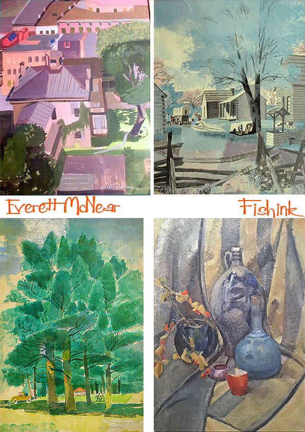
Some illustrative work for Childcraft volumes, a young child’s encyclopedia started in the 1930’s.
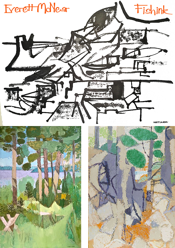
A few watercolours from around the 1950’s.
Others which remind me a little of Rennie Mackintosh’s work.
Painting using different mediums.
Everett and his wife, Ann, were benefactors of what was the Notre Dame Art Gallery (now the Snite Art Museum); they served on the advisory panel and he did the initial gallery installation design. He donated hundreds of his own works to the Snite, plus pieces from his collection including works by Alexander Archipenko, Cameron Booth and Edmund Kinzinger, in addition to African sculptures; Flemish, Spanish, and Italian manuscript pages; Persian paintings and Peruvian textiles.
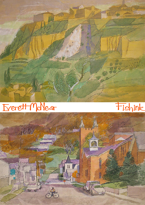
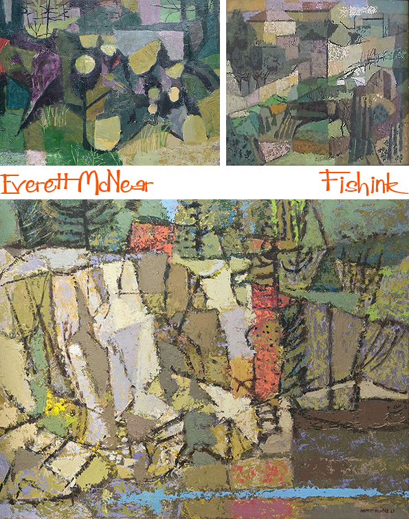
His sixties landscapes show a wonderful transition from Cubist marks to a style of his own.
They feel so fresh and summery
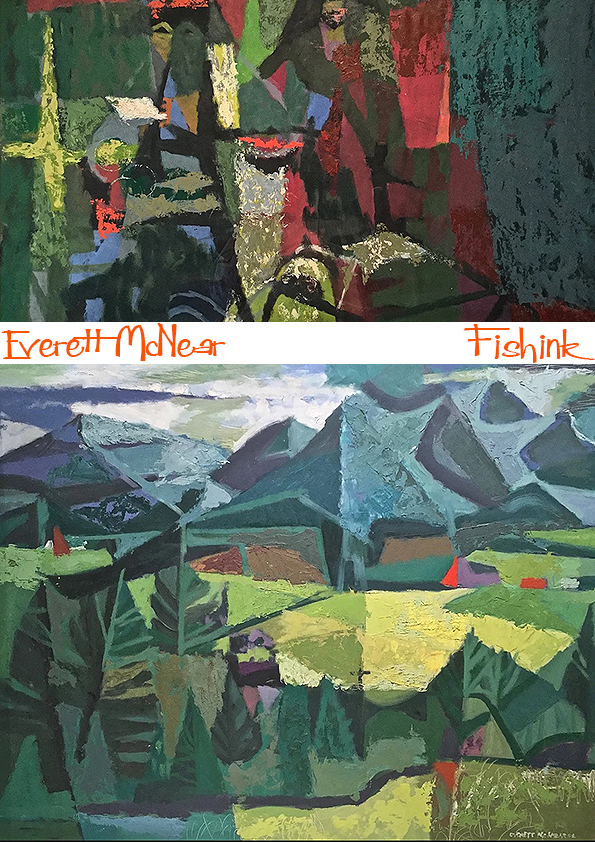
A couple of more abstract paintings.
Before his wonderful land and sea scapes. Breathtaking.
Everett McNear was a happy painter … “There is a genuine pleasure in the transferring of ideas from nature to the canvas, and in the handling of paint.”
A dozen one-man shows in galleries and museums from San Francisco to New York rewarded him for his dedication to the smell of turpentine and the drag of the loaded brush.
Many thanks to Gallery 5004 for the information about this talented Artist.
The Sun
I thought it might be fun to warm ourselves up in this chilly month and learn a few facts about the Sun. For instance, did you know…
The Sun accounts for 99.86% of the mass in the solar system.
It has a mass of around 330,000 times that of Earth. It is three quarters hydrogen and most of its remaining mass is helium.
One day the Sun will consume the Earth.
The Sun will continue to burn for about 130 million years after it burns through all of its hydrogen, instead burning helium. During this time it will expand to such a size that it will engulf Mercury, Venus, and Earth. When it reaches this point, it will have become a red giant star.
The Sun is almost a perfect sphere.
Considering the sheer size of the Sun, there is only a 10 km difference in its polar and equatorial diameters – this makes it the closest thing to a perfect sphere observed in nature.
The Sun is travelling at 220 km per second.
It is around 24,000-26,000 light-years from the galactic centre and it takes the Sun approximately 225-250 million years to complete one orbit of the centre of the Milky Way.
The Sun will eventually be about the size of Earth.
Once the Sun has completed its red giant phase, it will collapse. It’s huge mass will be retained, but it will have a volume similar to that of Earth. When that happens, it will be known as a white dwarf.
It takes eight minutes for light reach Earth from the Sun.
The average distance from the Sun to the Earth is about 150 million km. Light travels at 300,000 km per second so dividing one by the other gives you 500 seconds – eight minutes and twenty seconds. This energy can reach Earth in mere minutes, but it takes millions of years to travel from the Sun’s core to its surface.
The Sun is halfway through its life.
At 4.5 billion years old, the Sun has burned off around half of its hydrogen stores and has enough left to continue burning hydrogen for another 5 billion years. Currently the Sun is a yellow dwarf star.
The distance between Earth and Sun changes.
This is because the Earth travels on a elliptical orbit path around the Sun. The distance between the two ranges from 147 to 152 million km. This distance between them is one Astronomical Unit (AU). Deep in the sun’s core, nuclear fusion converts hydrogen to helium, which generates energy. Particles of light called photons carry this energy through a spherical shell called the radiative zone to the top layer of the solar interior, the convection zone. There, hot plasmas rise and fall like the ooze in a lava lamp, which transfers energy to the sun’s surface, called the photosphere.
It can take 170,000 years for a photon to complete its journey out of the sun, but once it exits, it zips through space at more than 186,000 miles a second. Solar photons reach Earth about eight minutes after they’re freed from the sun’s interior, crossing an average of 93 million miles to get here.
The Sun rotates in the opposite direction to Earth
with the Sun rotating from west to east instead of east to west like Earth.
The Sun rotates more quickly at its equator
than it does close to its poles. This is known as differential rotation.
The Sun has a powerful magnetic field.
When magnetic energy is released by the Sun during magnetic storms, solar flares occur which we see on Earth as sunspots. Sunspots are dark areas on the Sun’s surface caused by magnetic variations. The reason they appear dark is due to their temperature being much lower than surrounding areas.
Temperatures inside the Sun can reach 15 million degrees Celsius.
Energy is generated through nuclear fusion in the Sun’s core – this is when hydrogen converts to helium – and because objects generally expand, the Sun would explode like an enormous bomb if it wasn’t for it’s tremendous gravitational pull.
The Sun generates solar winds.
These are ejections of plasma (extremely hot charged particles) that originate in the layer of the Sun know as the corona and they can travel through the solar system at up to 450 km per second. In addition to light, the sun radiates heat and a steady stream of charged particles known as the solar wind. The wind blows about 280 miles (450 kilometers) a second throughout the solar system, extending the sun’s magnetic field out more than 10 billion miles. Every so often, a patch of particles will burst from the sun in a solar flare, which can disrupt satellite communications and knock out power on Earth.
The atmosphere of the Sun is composed of three layers:
the photosphere, the chromosphere, and the corona.
The Sun is classified as a yellow dwarf star.
It is a main sequence star with surface temperatures between 5,000 and 5,700 degrees celsius (9,000 and 10,300 degrees fahrenheit). The label “yellow” is misleading, though, since our sun burns a bright white. On Earth, the sun can take on warmer hues, especially at sunrise or sunset, because our planet’s atmosphere scatters blue and green light the most.
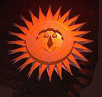
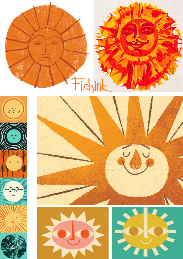
Here’s a few I made earlier.
And one more retro sun to keep this little chap warm. The Sun… we simply wouldn’t be here without it !
Many thanks to the many illustrative contributors today and the fabulous sun facts from The Planets.org and National Georgraphic.com.
Did you learn anything here today that surprised you ?
Abram Games
Abram Games (29 July 1914 – 27 August 1996) was a British graphic designer. The style of his work – refined but vigorous compared to the work of contemporaries – has earned him a place in the pantheon of the best of 20th-century graphic designers. In acknowledging his power as a propagandist, he claimed, “I wind the spring and the public, in looking at the poster, will have that spring released in its mind.” Because of the length of his career – over six decades – his work is essentially a record of the era’s social history. Some of Britain’s most iconic images include those by Games.
Abraham Gamse was born in Whitechapel, London on 29 July, the day after World War I began in 1914, he was the son of Joseph Gamse, a Latvian photographer, and Sarah, nee Rosenberg, a seamstress born on the border of Russia and Poland. His father, who had emigrated to Britain in 1904, anglicised the family name to Games when Abram was 12. Games left Hackney Downs School at the age of 16 and, in 1930, went to Saint Martin’s School of Art in London.

Disillusioned by the teaching at Saint Martin’s and worried about the expense of studying there, Games left after two terms. However, Games was determined to establish himself as a poster artist so while working as a “studio boy” for the commercial design firm Askew-Young in London between 1932 and 1936, he attended night classes in life drawing. He was fired from this position due to his jumping over four chairs as a prank. In 1934, his entry was second in the Health Council Competition and, in 1935, won a poster competition for the London County Council. From 1936 to 1940, he worked on his own as a freelance poster artist. An article on him in the influential journal Art and Industry in 1937 led to several high-profile commissions for Games, from the General Post Office, London Transport, Royal Dutch Shell and others.
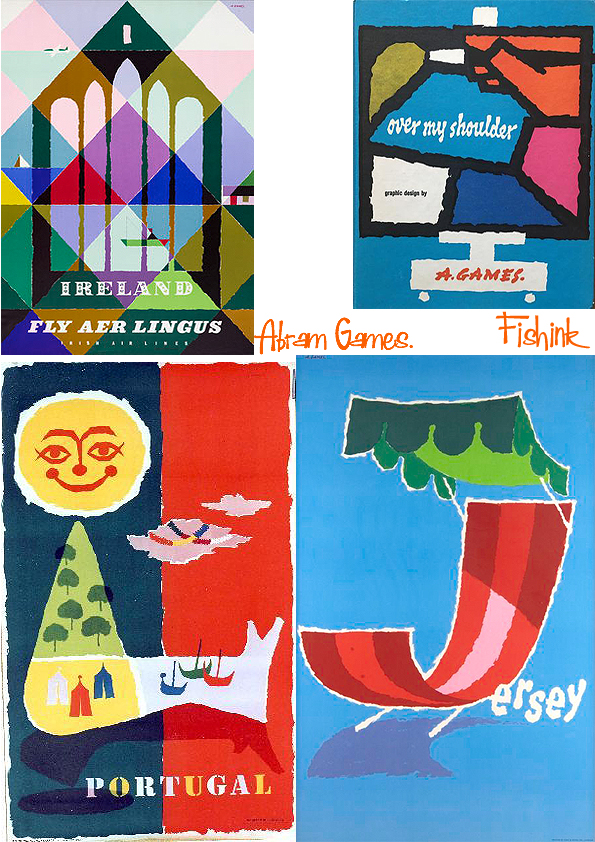
At the start of World War Two, Games was conscripted into the British Army. He served until 1941 when he was approached by the Public Relations Department of the War Office who were looking for a graphic designer to produce a recruitment poster for the Royal Armoured Corps. From 1942 Games’s service as the Official War Artist for posters resulted in 100 or so posters. Games was allowed a great deal of artistic freedom which enabled him to produce many striking images, often with surrealist elements. Among his first designs was the Auxiliary Territorial Service recruitment poster that became known as the blonde bombshell, (below top left).

Games had wanted to challenge the rather drab image of the ATS but the authorities feared that the glamorous image he had produced would encourage young women to join the ATS for the “wrong reasons” and the poster was quickly withdrawn. The design Games replaced it with was criticised by Winston Churchill as being too “Soviet”.
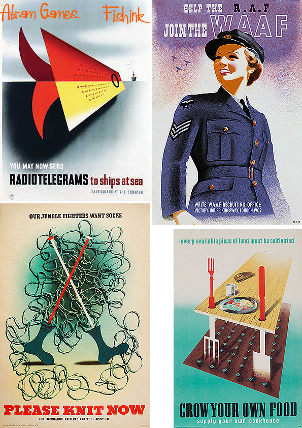
Other notable posters included Your Talk May Kill Your Comrades (1942) in which a spiral symbolising gossip originates from a soldiers mouth to become a bayonet attacking three of his comrades. Games used the photographic techniques he had learnt from his father in that and other posters such as He Talked…They Died (1943) part of the Careless Talk campaign. In addition to his poster work, Games completed a number of commissions for the War Artists’ Advisory Committee.


Later in the War, Churchill ordered a poster Games had produced to be taken off the wall of the Poster Design in Wartime Britain exhibition at Harrods in 1943. The Army Bureau of Current Affairs, ABCA, had commissioned Games and Frank Newbould to produce posters for a series entitled Your Britain – Fight for It Now.

While Newbould produced rural images similar to the pre-war travel posters he had created for several railway companies, Games presented a set of three Modernist buildings that had been built to address poverty, disease and deprivation. The poster that annoyed Churchill most featured the Berthold Lubetkin designed Finsbury Health Centre superseding a ruined building with a child suffering from rickets. Churchill considered this nothing short of a libel on the conditions in British cities and ordered the poster to be removed. Ernest Bevin, the war-time Minister of Labour, had another poster in the series removed from the Poster Design in Wartime Britain exhibition organised by the Association of International Artists.

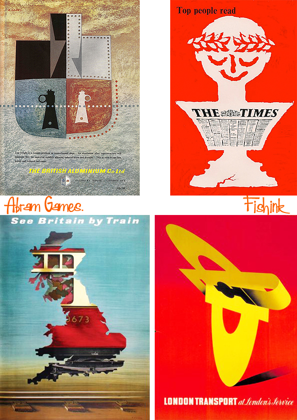
In 1946, Games resumed his freelance practice and worked for clients such Royal Dutch Shell, the Financial Times, Guinness, British Airways, London Transport and El Al. He designed stamps for Britain, Ireland, Israel, Jersey and Portugal. Also, he designed the logo for the JFS school. There were also book jackets for Penguin Books and logos for the 1951 Festival of Britain (winning the 1948 competition) and for the 1965 Queen’s Award to Industry.


Among his pioneering contributions was, in 1954, the first moving on-screen symbol of BBC Television. He also produced murals. Between 1946 and 1953, Games was a visiting lecturer in graphic design at London’s Royal College of Art and in 1958, was awarded the OBE for services to graphic design. In 1959, he was appointed a Royal Designer for Industry (RDI). He also designed the tile motif of a swan on the Victoria line platforms at Stockwell tube station in the late 1960s.


Games had been among the first in Britain to see evidence of the atrocities committed at the Bergen-Belsen concentration camp, when photographs taken there by British troops arrived at the War Office in 1945. The same year he produced a poster, Give Clothing for Liberated Jewry, and would often work to support Jewish and Israeli organisations. Games, who was Jewish, spent some time in Israel in the 1950s where, among other activities, he designed stamps for the Israeli Post Office, including for the 1953 Conquest of the Desert exhibition and taught a course in postage-stamp design. He also designed covers for The Jewish Chronicle and prayer book prints for the Reform Synagogues of Great Britain. In 1960 Games designed the poster known as Freedom from Hunger for the Food and Agriculture Organisation of the United Nations.
Games was also an industrial designer of sorts. Activities in this discipline included the design of the 1947 Cona vacuum coffee maker (produced from 1949, reworked in 1959 and still in production) and inventions such as a circular vacuum cleaner and an early 1960s portable handheld duplicating machine by Gestetner, which was not put into production due to the demise of mimeography.

In arriving at a poster design, Games would render up to 30 small preliminary sketches and then combine two or three into the final one. He would also call on a large number of photographic images as source material. Abram quickly and methodically filled a layout pad with two to three dozen ideas for a poster. Invariably two elements would be combined to produce a third image. Once he had selected a design from the thumbnails, he circled it with a pencil. He wasted no time covering large areas and avoided detail. ‘I never work large because posters seen from a distance are small. If ideas don’t work an inch high, they will never work.’ he said.
Showing his rough ideas to his wife, children and friends, he would ask ‘What does this mean to you?’ If they looked blank, he threw his efforts into a large dustbin and started again. When the final artwork for the poster was finished, he painted ‘A. Games’ in a corner. It hung on his studio wall for one week, inviting criticism from colleagues, family and friends. Only when satisfied, he would add a full stop after his signature. Purportedly, if a client rejected a proposed design (which seldom occurred), Games would resign and suggest that the client commission someone else.


In 2013, the National Army Museum, London, acquired a collection of his posters, each signed by Games and in mint condition. Many thanks to Wikipedia for the information for this post.

