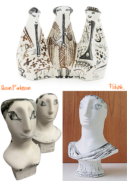
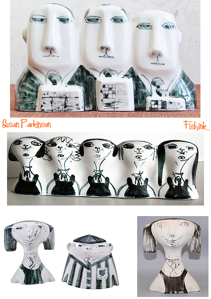
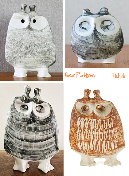
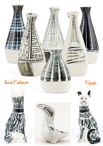
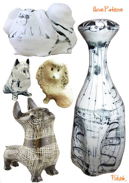
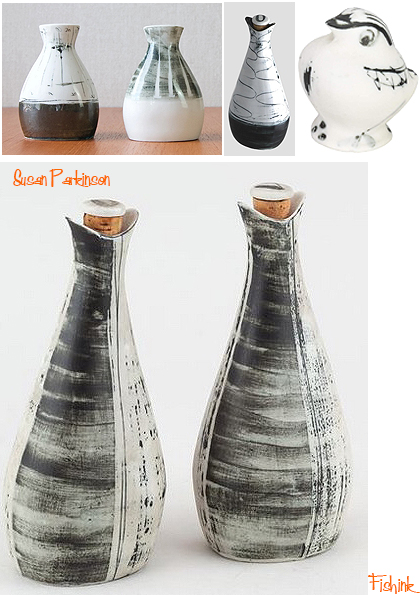
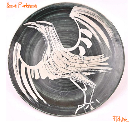
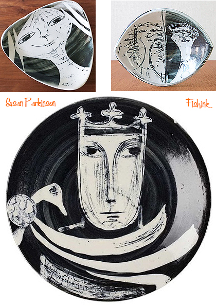
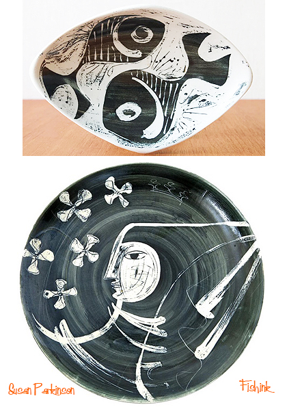
Susan and Richard Parkinson Ceramics
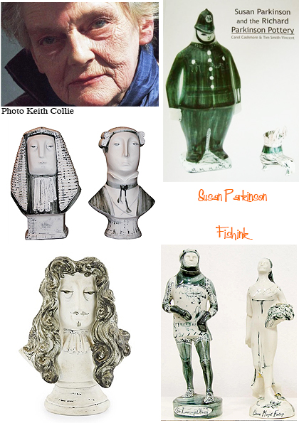
Susan Elizabeth Parkinson was born in 1925 in Calcutta, the younger daughter of a wine merchant (who was also honorary secretary of the Bombay Natural History Society) and his wife. When she was 5 the family left India for a farmhouse in Kent, but she never forgot sailing off Bombay with her father, who would suddenly drop anchor to watch seabirds and who would play Bach on a wind-up gramophone. Her artistic ability was evident at prep school, but she struggled with some academic subjects, realising in later life that she was dyslexic, a concept that when she was a child was scarcely understood. Art was both a solace and a passion, and after art school she studied sculpture under Professors Frank Dobson and John Skeaping at the Royal College of Art, where she became the first sculpture student to win the Life Drawing Prize.
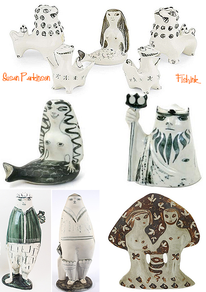
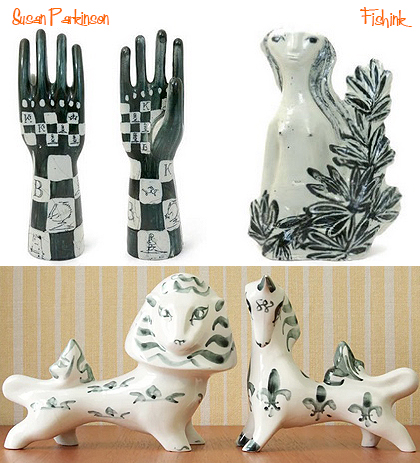
In 1949 she married the potter Richard Parkinson and moved with him to an oasthouse in Kent where, in 1951, she helped to launch the Richard Parkinson Pottery. They had an early success with a whimsical porcelain lion and unicorn, originally intended to be marketed in connection with the 1951 Festival of Britain. Unable to produce a sufficient run in time, they had them approved instead, with the addition of an E II R monogram, as commemorative pieces for the Queen’s Coronation in 1953.
The next year, they launched a characterful porcelain cockerel and hen set, one example of which unsurprisingly found its way via Henry Rothschild’s Primavera gallery in Sloane Street into the V&A’s Ceramic Study Galleries. Some 40 years later, the decorative art dealer Tim Smith-Vincent fell in love with a second-hand set that he saw in a shop window and became an avid collector of Parkinson pieces. In 2004 he co-wrote with Carol Cashmore an overview of their work, Susan Parkinson and the Richard Parkinson Pottery.
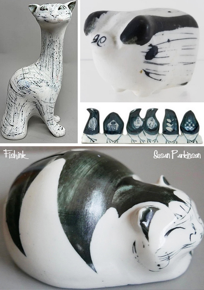
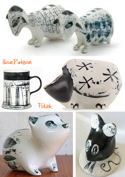
The pottery’s output was never huge, mostly as a result of the difficulties, and expense, of working with the Parkinsons’ material of choice, porcelain — the firing of which requires particularly high temperatures. Too few of their pieces survived the double trial of unglazed and glazed firing, or the difficulties of slipcasting, for the pottery to be viable long term; the expense that such problems entailed was not always something that they appreciated.
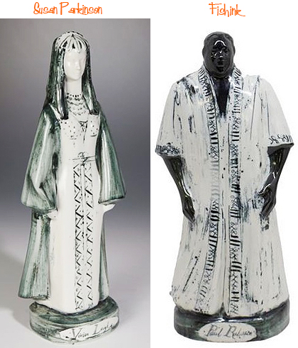
One unfortunate consequence was that they had to discontinue production of their 1958 set of theatrical figurines — the charming 12in-tall figures of Fonteyn, Gielgud, Leigh, Olivier and Robeson, commissioned from them by another pottery that had found its own earthenware unequal to the task. It was agreed that they would be paid £2 a figurine produced, but when the slipcasting proved especially difficult, with the moulds having to be made in several pieces, the Parkinsons realised the project was unsustainable, and production ceased. An idea of the amount by which they had been underselling their talent can be gained from the sums charged by the commissioning pottery when those figurines that were made were sold at the Design Centre in London in 1959: 10 guineas each, 40 guineas a set.
The couple were divorced in 1962. Without Richard’s energetic input the pottery was soon in significant financial difficulty. It closed, leaving Susan with little option but to take up teaching life drawing and sculpture. In 1963, however, she seized the chance of teaching art at Brickwall House, a specialist school for dyslexic pupils in Northiam, East Sussex. Parkinson swiftly became fascinated by her pupils’ artwork. “Compared to the work produced in art colleges where I had been teaching, their creative imagination was simply outstanding and the results amazing,” she wrote. She had the knack of knowing how to encourage and inspire young people, and they responded to her enthusiasm for her subject. Her work on behalf of her fellow dyslexics, both at Brickwall and later with the Arts Dyslexia Trust, was to have a profound impact.
“In those days there was little information available about how to teach dyslexics — no ‘code of good practice’, in fact, little about dyslexia at all,” she wrote. “All of us had to learn from the boys we were ‘teaching’. We listened to them and looked at their way of making things, building, and solving problems, and discovered what worked for them and what didn’t. This is still, I believe, the best training for a teacher.”
The A-level art results and entries to art college were soon proving that her approach worked, and it was not long before the art department expanded beyond the “not very waterproof cowshed with no light or equipment”, as she described the “studio” facilities on her arrival. Other outbuildings were commandeered, and a pottery, a forge and a computer graphics area were created. “The evidence continued to mount, steadily. It was not signs of disability we were seeing, but of exceptional ability in these subjects,” she wrote.
By the time she retired in 1985, she was convinced that there must be some reason why a lack of ability with words so often brought with it a higher than average ability in subjects requiring visual-spatial skills. With the help of an Open University degree course in research methods and statistics, she devoted her early retirement to discovering what that reason might be. Her conclusion was that, “Traditional academic education depends on the use of words and numbers that can only be understood sequentially. The visual thinkers, including many of the talented dyslexics, think three-dimensionally. The differences between these two ways of thinking are profound.”
In 1992, with two others who had taught at Brickwall, she founded the Arts Dyslexia Trust, whose main aims include moving the popular focus away from “correcting” what are perceived as the weaknesses of dyslexics (their problems with reading, writing, learning by rote and organisational skills), concentrating instead on encouraging the high creative potential of visually dominant dyslexic minds.
As the charity’s secretary and chief executive officer, she was heavily involved in organising high-profile exhibitions and seminars to increase awareness of the talents of creative dyslexics, not only in art but also in science and other fields. She also initiated a study into the proportion of dyslexic students among freshers at a major London art school, finding this to be an astonishing 75 per cent, and spent long hours manning the trust’s helpline for dyslexics and their parents with her customary good humour and sensitivity.
Many thanks to The Times for the information used in today’s post.
Fishink Christmas 2019
An updated repost from 2019 ! Hello everyone, and welcome. You’ve found me at the final Fishink post for the year : ( but don’t be glum, because there’s plenty to see : )
I’ve used some of these images before but to be honest when I was assembling ideas for the christmas blog, I couldn’t find much that rivalled what I already had. So I just added more to it to make a soooper bumper post !
I’d like to also say a big H E L L O to all the people who have ‘schnook-in the Fishink Blog backdoor’ and are now fully signed up, (albeit silent), members of the online community. Yes, that means YOU and that lady at the back with the big hair and fifties spectacles ! lol. Welcome one and all, and did you know this blog now has over 1000 email followers who receive my posts every time they are unleashed into the creative ether ! Keep spreading the word to your friends and followers and together we can turn Fishink Blog into a worldwide creative community.
Have a fab, safe and restful holiday.
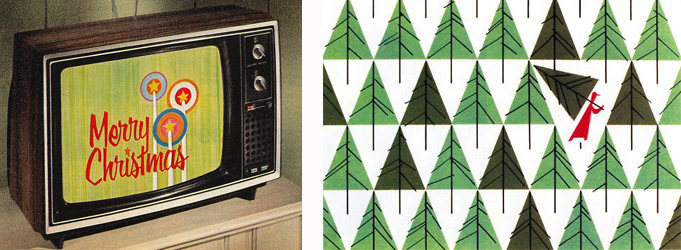
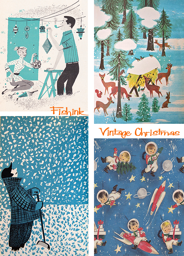
We start off with a few illustrations with Santa Claus. Did you know that he used to be depicted in green clothing and viewed more as a pagan figure ? and it’s influences like Coca Cola from the 1920’s and 30’s that helped turn his clothes red as we know them today.

I’m loving the Beatle Bauble ! Yeah yeah yeah !

Santa on a moped and in a flying bus, I wonder if J.K Rowling had seen these books before Harry Potter ?

A lovely vintage Radio Times cover here.


A few snowy themed book covers too.


Then thinking about christmas stamps.

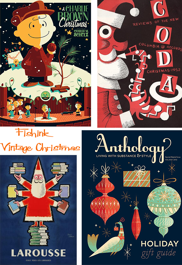
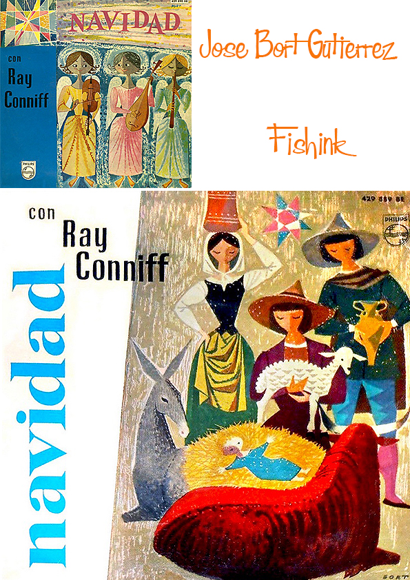
A couple of sixties artists I discovered recently.


Baubles and decorations.


Swish and stylish reindeers.

Christmas trees and wrapping papers.


A few gifts I’m sure you ladies wouldn’t ‘die for’.
The same for you guys.

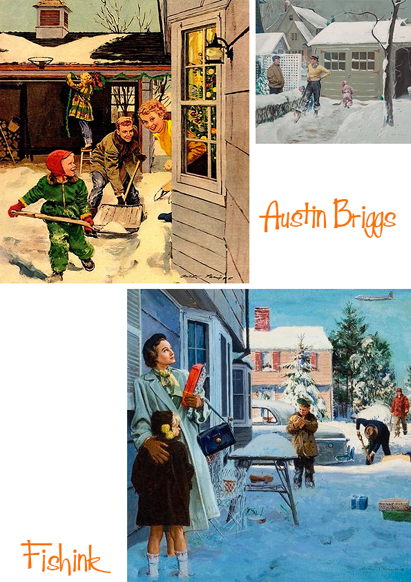
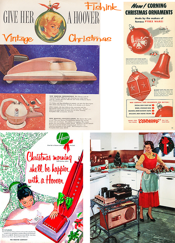
Christmas advertising.

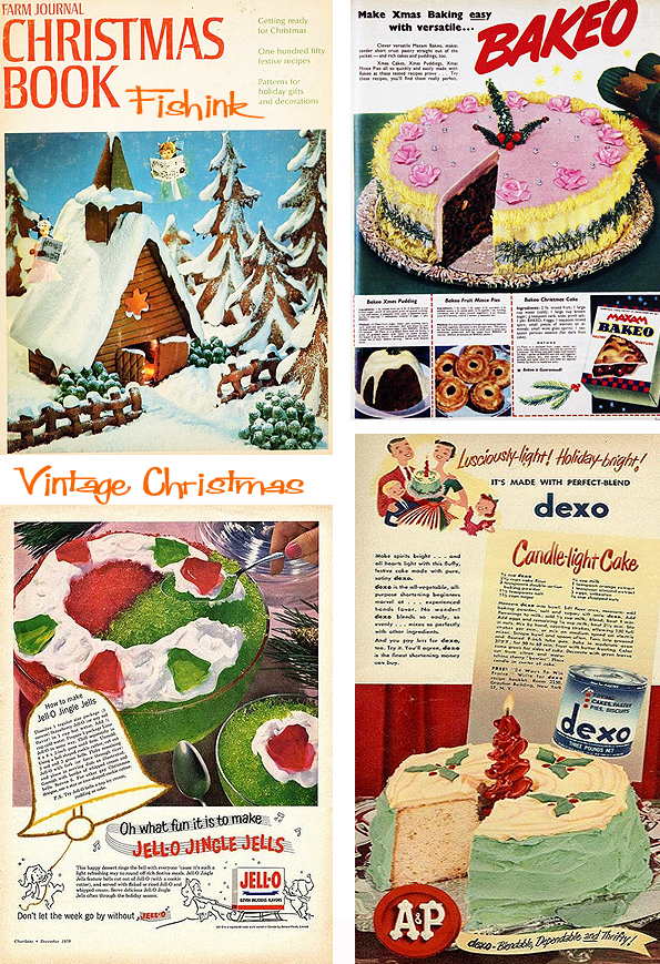
Some rather dodgy looking christmas treats for your table from Jello, Bakeo and Dexo… Oh No !
A little snow from the oriental shores.

And to bring us to a final more restful place. Martin and Alice Provensen and their beautiful version of the Twelve Days Of Christmas.

Happy times to one and all and I’ll look forward to catching up in a few weeks. Thanks for all your regular comments and additions, they are REALLY appreciated and help to make Fishink Blog into more of a community too. Please do let me know your thoughts on the posts, the blog and if you have any ideas for featured artists, or work you’d like to share with us (that you feel would fit the Fishink criteria) then do drop me a line … craig at fishink.co.uk.
If you’re missing Fishink Blog over the holidays do take a look through the back posts, I’m sure you’ll have missed one or two.
Which ones were you favourites of the year ? Have a lovely restful break, be kind to your family and neighbours, and of course a ‘Merry Fishmas’ to everyone, see you in 2026. So it’s goodbye from me and it’s goodbye from Boo too : )

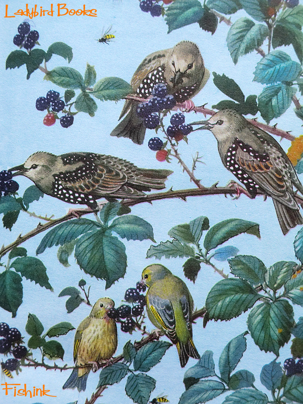
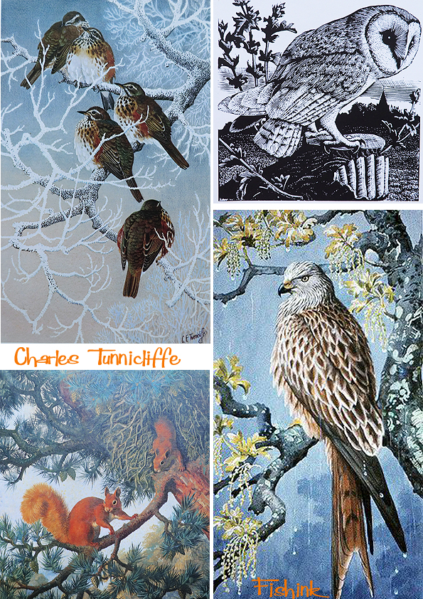
Ladybird Books and Charles Tunnicliffe

What should make a tapping sound against my window as I sat down to write this (I kid you not)…
… I’m hoping that’s the seal of approval now for this post lol.
Like thousands of other children, I grew up with Ladybird books around me. I didn’t collect them, however, like many others I knew (and boy did kids like to collect things when I was growing up !) but I do remember going into ‘Bookland’ (my local book shop) and being confronted with a wall of Ladybird titles. It was quite literally (and visually) overwhelming !
So recently, I happened across a couple of cheap, possible first edition copies, of two familiar titles I remember owning as a child. Part of the ‘What to look for in… (Autumn, Winter, Spring, Summer)’ series. Looking through them as an adult, I remember how beautifully the painted pages were, and I quickly re-associated with these familiar scenes from nature and my youth. What I failed to realise, until I started putting this post together, was that the artist Charles Tunnicliffe, was a name I already had on my bookshelf. These are some of his illustrations for Ladybird books.

Charles Tunnicliffe was born in 1901 in Langley, Macclesfield, England. He spent his early years living on the farm at Sutton, where he saw much wildlife. In 1916 he began to study at the Macclesfield School of Art, and later went on to win a scholarship to the Royal College of Art in London.
He married in 1929 at the Methodist Church, Whalley Range, Manchester, to Winifred Wonnacott, a fellow art student. In 1947 he moved from Manchester to a house called “Shorelands” at Malltraeth, on the estuary of the Afon Cefni on Anglesey, where he lived until his death in 1979.
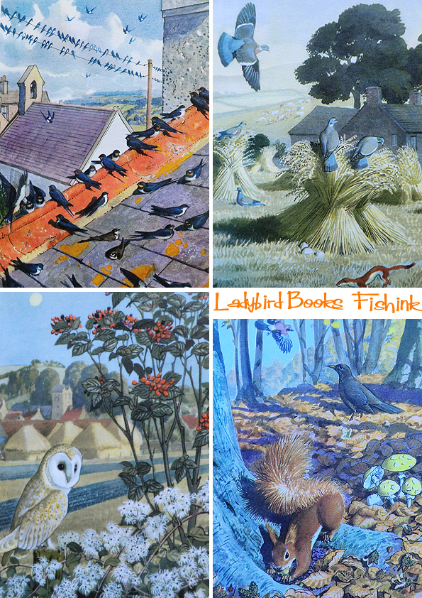
He worked in several media, including watercolor painting, etching and aquatint, wood engraving, woodcut, scraperboard (sometimes called scratchboard), and oil painting. Much of his work depicted birds in their natural settings and other naturalistic scenes. His work was also used to illustrate Brooke Bond tea cards and as a result was seen by millions of young people in the United Kingdom during the 1950’s and 1960’s. Charles’s work was characterised by its precision and accuracy, but also by the way in which he was able to portray birds as they were seen in nature rather than as stiff scientific studies.
From March 1953, he painted many of the cover illustrations for the Royal Society for the Protection of Birds’s (RSPB) magazine Bird Notes, and several for the later Birds magazines. At his death, much of his personal collection of work was bequeathed to Anglesey council on the condition that it was housed together and made available for public viewing. This body of work can now be seen at Oriel Ynys Môn (The Anglesey Gallery) near Llangefni.

His work shows such care and attention to detail, that you can’t help but be drawn into each scene, noticing more and more information as the eye works it’s way around the painting.
Charles also created the wood engravings too.

Here’s the other two covers in the series (below) and the only other ladybird book I owned (above).

And this was the book I had on my shelf already, without realising it was the same artist. Such amazing detailed and dedicated work.
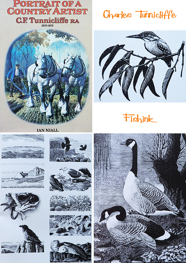
Charles also received much recognition for his work on Henry Williamson’s children’s book ‘ Tarka the Otter’ in 1932.

He created many studies for Tarka, the main character.

Beautifully observed watery scenes.
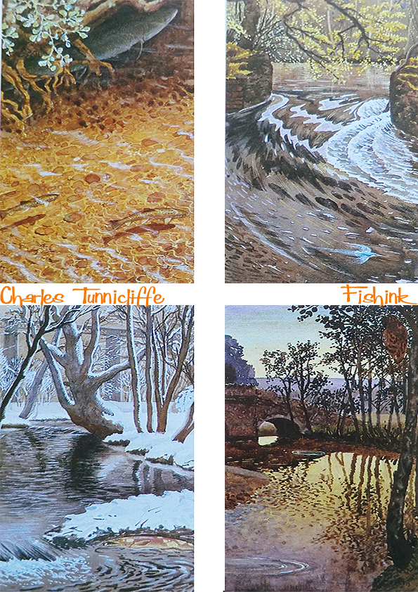
He spent days just observing and creating observational paintings, which were often life-size studies !

Can’t you just feel the frost on this branch below. At least 250 books used Charles’s illustrations on the cover and inside.

Ladybird books had their beginnings in 1915, although the company traces its origins to 1867, when Henry Wills opened a bookshop in Loughborough, Leicestershire. Within a decade he progressed to printing and publishing guidebooks and street directories. He was joined by William Hepworth in 1904, and the company traded as Wills & Hepworth.
By August 1915, Wills & Hepworth had published their first children’s books, under the Ladybird imprint. From the start, the company was identified by a ladybird logo, at first with open wings, but eventually changed to the more familiar closed-wing ladybird in the late 1950’s. The ladybird logo has since undergone several redesigns, the latest of which was launched in 2006.
Wills & Hepworth began trading as Ladybird Books in 1971 as a direct result of the brand recognition that their imprint had achieved in Britain. In the 1960’s and 1970’s the company’s Key Words Reading Scheme (launched in 1964) was heavily used by British primary schools, using a reduced vocabulary to help children learn to read. This series of 36 small-format hardback books presented stereotyped models of British family life – the innocence of Peter and Jane at play, Mum the housewife, and Dad the breadwinner. Many of the illustrations in this series were by Harry Wingfield and Martin Aitchison.
The 1950s to the 1970s are widely considered to be Ladybird’s ‘golden age’. This period saw the post-war baby boomers come of age, creating a mass of new consumers who were open, confident and unrestrained. Ladybird books reflected this optimism with its forward-looking design and illustrations, which depicted a utopian vision of modern Britain.
In the 1960s, Ladybird produced the Learnabout series of non-fiction (informational) books, some of which were used by adults as well as children.
An independent company for much of its life, Ladybird Books became part of the Pearson Group in 1972. However, falling demand in the late 1990s led Pearson to fully merge Ladybird into its Penguin Books subsidiary in 1998, joining other household names in British children’s books such as Puffin Books, Dorling Kindersley, and Frederick Warne. The Ladybird offices and printing factory in Loughborough closed the same year, and much of the company’s archive of historic artwork was transferred to public collections.
Nowadays you can pick up a lovely retro print of a Ladybird book illustration from the company King & MCGAW.

I’ve been told that over 20,000 of the images from the books have been preserved in the world’s first permanent gallery devoted to Ladybird books at Museum of English Rural Life (MERL). The gallery has scores of titles shelved chronologically from 1961’s ‘Learning to read Numbers’ to current titles such as ‘Climate Change’ by the Prince of Wales. His book is one of the new range of “expert” titles for which the first new artwork in over 40 years was commissioned. A proof sheet shows how little the books changed once a standard was established to cope with wartime shortages, a single large sheet of paper printed on both sides gave 56 pages or text, illustrations, plus a cover.
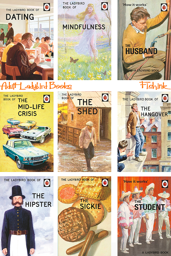
In case you have had your head in the sand for the last year and haven’t noticed, there has been a range of Ladybird books for grown-ups, which use original Ladybird illustrations with up to date, dry humoured and witty, written commentary.
They have been runaway best sellers, earning an estimated £30m for Penguin.

The key illustrators of Ladybird books from that vintage period were: – Martin Aitchison, Robert Ayton, John Berry, John Kenney, B.H Robinson, Charles Tunnicliffe and H Wingfield, (some images of the illustrators exist here).
It is impossible to say exactly how many titles Ladybird Books has published over the past century as records before 1940 no longer exist. We do know that, between 1940 and 1980, Ladybird published a total of 63 different series, collectively containing 646 titles. By 1990, the annual Ladybird catalogue listed over 600 titles still in print, with new titles being published at an average rate of 100 per year. Today, Ladybird continues to publish around 70 new titles every year.
Finally, and before you start asking me what your ladybird books are worth these days lol, I happened across a site that deals in rare and unusual Ladybird publications called The Wee Web. They claim that the rarest book of them all to be ‘The Computer – How it Works’ (1971) – this is not the standard issue but rather a private publication that was especially produced for the Ministry of Defence in 1972. The M.O.D specifically asked for the book to be published in plain covers and without copyright information as not to embarrass their training staff !
Which titles do you remember and possibly still own ?
Many thanks to Wikipedia, Penguin Books and The Guardian for the information in this post. Please share this post with your friends and spread the word about Fishink Blog online, thank you for being a reader.
Save
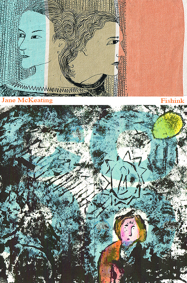
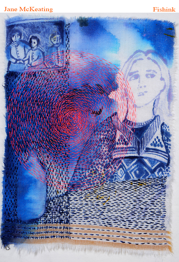
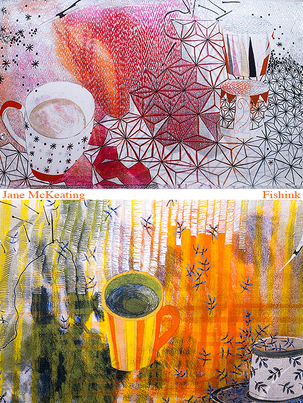
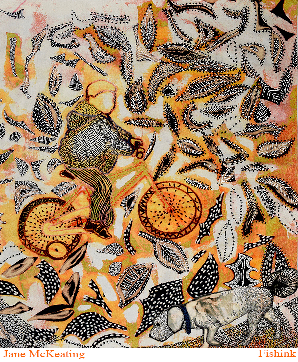
Jane McKeating Embroidered Storytelling
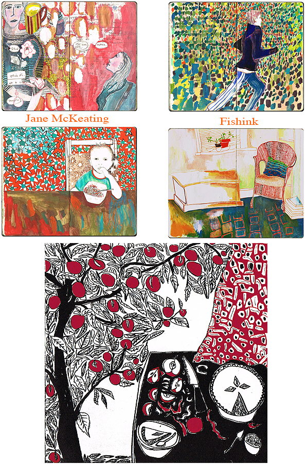
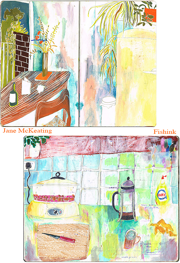
I was fortunate to recently come across the work of Jane McKeating and was instantly and completely taken in by her beautiful illustrative and textural artworks. This prompted me to get in touch and last week we did a great Q&A session which I’m sure you will find as fascinating as I did.

1. What are your first memories of creating Art as a child and was this something that was encouraged by your teachers and parents ?
My mother always encouraged to me draw, my siblings and I sat at the table drawing all the time, mostly maps and imaginary places. When I was at primary school, I was very slow learning to read and was terribly shy, so my teacher gave me a blank book where all the other children had a lined one for writing. She told me I shouldn’t worry about reading and writing and just draw instead. She made me feel special instead of a dunce. What a brilliant teacher Mrs Perrons was, it was the 60s before anyone had heard of neurodivergence and yet she instinctively supported me to find my strengths. I still regard the visual as my first language.
2. When and why did you start to regularly work in a journal. Do you do this to keep your work together, because it’s a handy format to transport or simply as a way to test out ideas that may later turn into something more ?
My sketchbooks are my journals, and I use them daily. I started using them when I was about 17 and have kept them ever since. If there was a fire and I had to choose something to save, they would be what I would save. The valuable bits are the images, I rarely go back to read what I’ve written, but it’s good to write things as it gets it out of my head and I can work stuff out. I often do weird diagrams and then add images over the top. Or draw over the writing so I can only see glimpses of thoughts.

3. You appear to have a love of colour and pattern, where did this start to become important in your work ? Some illustrations almost become patterns in themselves, is this a conscious thing, or do you let your mind and hands just do their own thing ?
My mind and hand definitely do their own thing. I don’t usually plan anything in advance. I am very instinctive. I have always loved colour and pattern. I am synesthetic and I think this really influences my use of colour. As a child I loved images in story books, and I still have many of them. I love the images by Gwyneth Mamlock, and Brian Wildsmith to pick out just 2. Amongst many others they are a strong influence on my visual language. For a while I thought that made me an illustrator, but I have discovered I’m really not, I am just influenced by illustrations with no interest at all in the text that they are designed for. The pattern obsession is what led me into textiles, but it was a bit of an assumption by others that I would go into design, which never really interested me at all. I love how pattern both surrounds us and covers us and makes a crazy jumble of marks. My favourite space to draw is in odd bed and breakfasts where the jumble of colours and patterns can often be at their most bizarre


4. Does your work largely focus on drawing folk around you, in your day to day life or is some taken from photographs, magazines, other sources ? Are there stories in your work that only you know about and how did your idea of painting over your lists and writing come about ?
It’s mostly domestic stuff going on around me. I rarely work from other sources. I have 5 children and 2 grandchildren, and they always say if you stay very long in our house you get drawn. My most frequent model is my husband who is a very still, peaceful man who always wears stripy T-shirts which are gorgeous to draw so the poor man gets drawn very often. His bald head is a great shape too. There are often images that inspire us throughout our lives, and the one for me is Vuillards ‘Interior with mother and sister of the artist ‘1893. I come back to it endlessly; I have worn out the postcard. I love the way the figure emerges from the wall as though she is part of it, and I find the connection between the figure and the environment in which it exists is what inspires me.

The work is all visual stories, but I make up the stories during or after making the work. So, I explore the characters, and they suggest the stories. When I exhibit as part of the ‘62 group’ or the ‘Textile Study Group’, I submit the story as the artist’s statement. They usually have an element of humour. So, there is a story attached to each work, but the story follows the image instead of the other way round. I often work in series, so for example the ‘Cardigan Girls’ were loads of prints and collages about girls in cardigans.
I work over my writing because my writing irritates me, it’s usually of little value just notes about stuff. Because I worked full time in Education for 30 years the only way I could make time to draw was in little moments at work, discretely at meetings, or on the commute, and my office diaries were often all I had with me. I really enjoy the humour of crazy comments about work peeping through images of people and places that are unrelated. Just as these mixes of our lives are scrambled in our brains anyway. I’ve no filing system in my head, so the jumble expresses my personal chaos as well as making the images less precious.

5. You have a love of print and embroidery, when did you begin to intertwine the two ?
I studied embroidery at Goldsmiths college in the 80s. It was in the days where girls were encouraged to do Textiles and boys Fine Art, so I chose it not because I had any interest in embroidery, but because when I looked round University courses I couldn’t find any textiles courses that weren’t design led, and someone at Goldsmiths said ‘oh you can just draw here if you like’, so that’s what I did for 3 years, and then in the last term I discovered I actually quite liked embroidery, and went on to do an MA at Manchester because they had a wonderful repeat Shiffli embroidery machine. Then I taught embroidery for many years at Manchester School of Art and ended up as Associate head of Design, whilst definitely not being a designer.
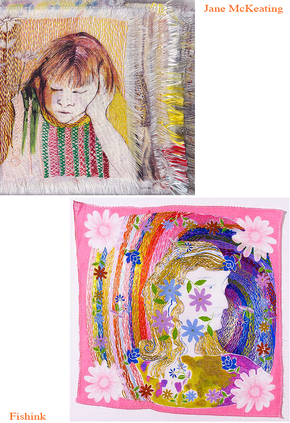
I have always loved print but didn’t have much experience or skills. About 5 years ago I did the complete printmakers course at Hot bed Press which was 3 years long and I just love the mix of print and stitch now. I enjoy the way you can create a plate or a screen of images and then reinvent them in so many different ways by using collage, backgrounds, painting, cutting and stitching. I love combining multiple methods and often only stop when I reach a deadline for work to be sent off. The printed surface is often very flat and the stitch gives it a rich texture because stitch is 3 dimensional.
6. Lovely to see your ideas are being taken into areas of product. Ties, fabric, belts etc. Do you have ideas to move into more areas in this way ?
I turn things into products if the idea asks for it. I haven’t done it recently but might do at any point if it feels right for the images. I like making books particularly because of the sequence.


7. Do you have a favourite way of working ? What are your typical processes ?
I enjoy combining processes. I start usually with drawing, then move into print, then stitch, then cut, then print again, then stitch again until I have drowned it all, and it either works, or it doesn’t. I have a lot of different stuff on the go at the same time and keep going back to images until I feel they say what I want. I use images from years ago sometimes, so someone from decades ago will suddenly pop up and surprise me.

8. There are people who appear in your work again and again, are these folk around you that you see a lot of, or characters that you have developed for your artwork ?
I draw people around me, I drew loads of people at work and could be quite discreet drawing in meetings. I draw family and friends and strangers in cafes and on trains. I do often make people up as well; I love an imaginary friend.

9. When are you happiest with your art ? Is there anything about your ways of working that feels more laboursome or mundane ? Do you have colours or techniques that you tend to favour over others ?
I love being absorbed in a project. I find it hard to start off with new things. In the groups I am in there are often exhibition themes which sound awful and don’t inspire me, but I always find a way in, and once I have found it, I am happy. I don’t plan, but I make drawings and prints and allow the work to tell me what’s happening. My happy moments are where it’s starting to work. I am at that stage with the current project, which is working with horrible, donated polyester from a sportswear company for the British Textile Biennale. I am doing some disperse dye prints which I have never done before and am loving it. The disgusting polyester is transformed and I’m making work about the universal obsession with wearing football shirts at all ages. I am putting myself in there as the grandma who does not really get it. Not sure how it will pan out in the end, but that’s the fun, I am going to call it ‘Polyester United, Circa 2025’


10. Anything else that I’ve failed to ask you that you would like to include ?
No, I think you have covered good things. Not sure if I have given you too much or not enough. Let me know if you need more, or less! I just love being able to work on it all full time now, it feels such a privilege. I read an article about a 90-year-old lady artist who was still working daily, and it made me decide to leave my job at 59, after 30 years because I reckoned, I could have another 30 years as an artist – a second career. 5 years in its going well.

Thanks again Jane, for sharing your descriptive and interesting stories with Fishinkblog. It’s been an absolute pleasure looking through your work and discovering more about your working methods and ideas behind your artwork. To see more of Jane’s work check out her site here.
Any thoughts readers ? Please leave your comments below. Thanks Craig
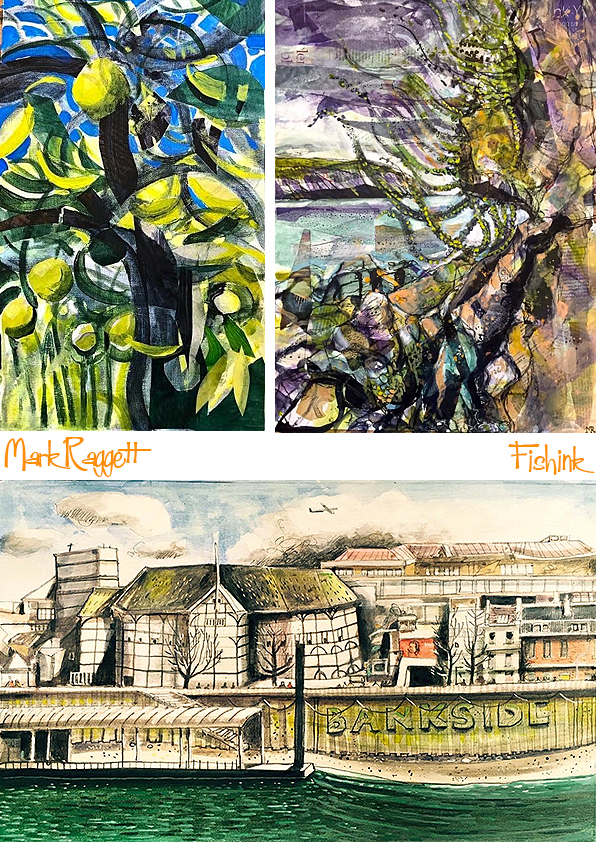
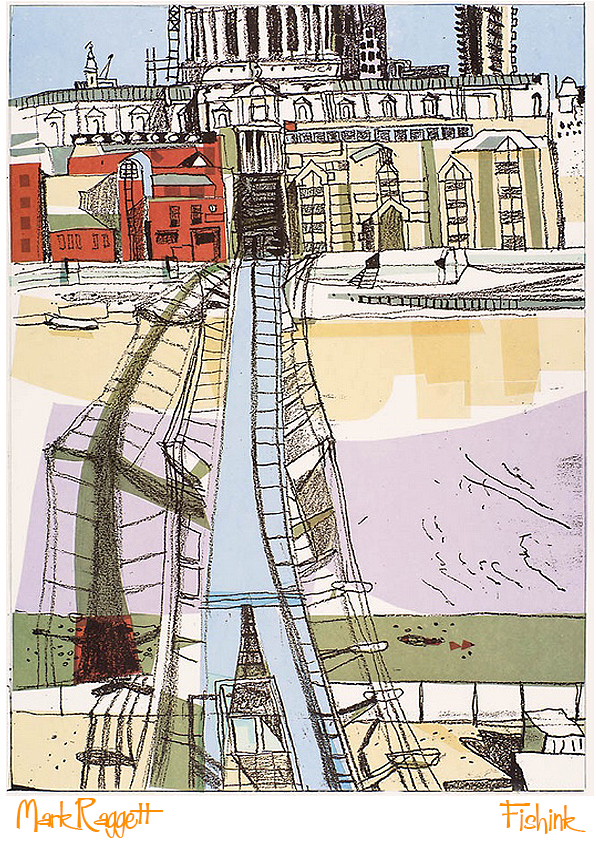
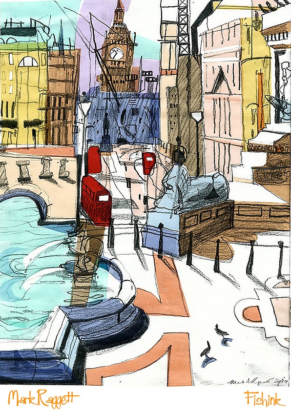
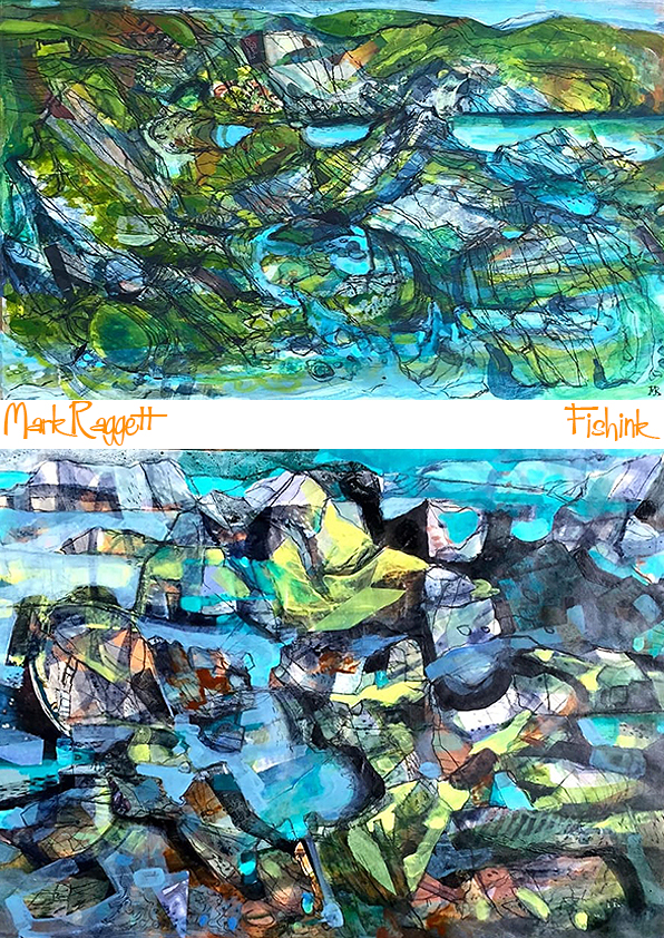
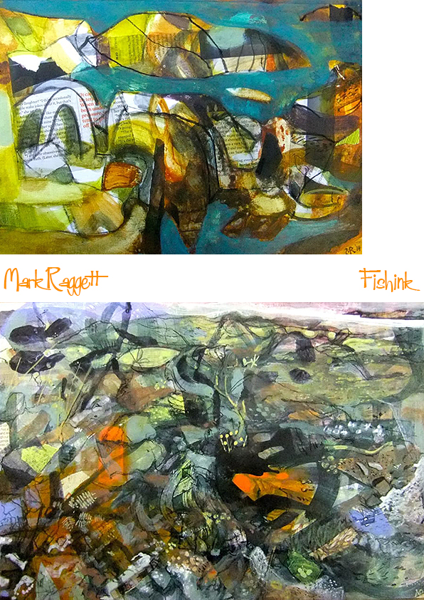
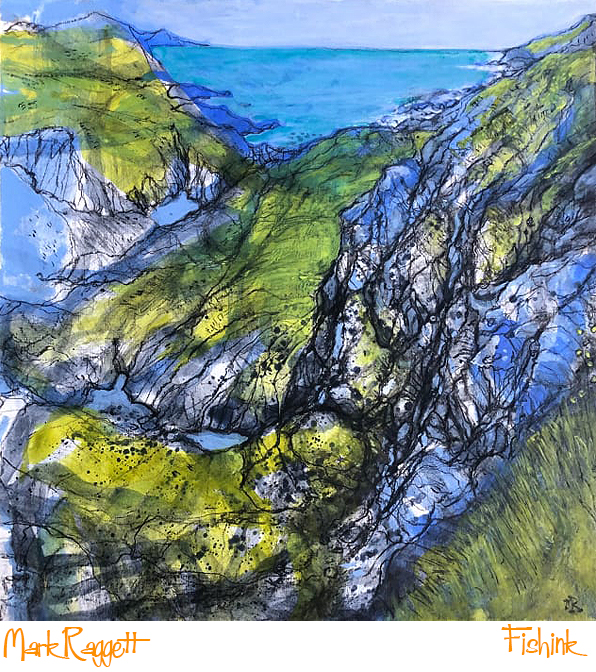
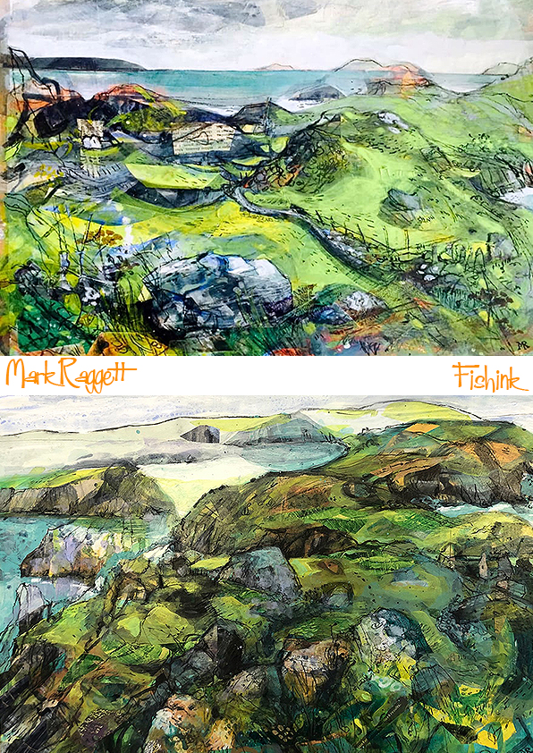
Mark Raggett Watercolourist
Mark was born in Solva, Pembrokeshire in 1953 and was educated in the county. He went to Reading University in 1972 to study Fine Art and received his BA in 1976.

Mark worked in theatre and opera as a scenic artist and prop maker at the National Theatre, Royal Opera House and the Coliseum.

He joined the design department at Thames Television in 1979, leaving in 1984 to pursue a career as an art director in film and television.
He has worked on many films including The Madness of King George, Shakespeare in Love and most recently the Netflix series The Crown.
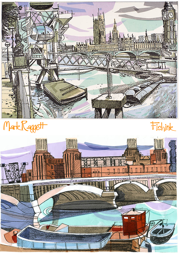
Mark has continued to paint, mainly the landscape of his native Wales but also the West Country, the Lake District and the Isle of Man.


He works mainly in watercolour and acrylic, producing drawings in pen and ink and graphite.
He has exhibited at the Royal Academy Summer Exhibition and currently shows work at the Goat Street Gallery, St David’s and at the Mueum and Art Gallery in Tenby; both in Pembrokeshire, West Wales.
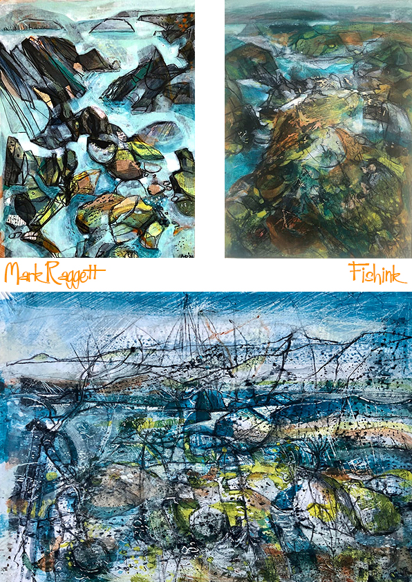
Also find Mark’s work at the Bankside Gallery and on the Royal Watercolour Society site.
Heatons Arts Fair 25 and Chorlton Open Gardens
Well, we’re here and now all set up. If you are around the Manchester area this weekend, It’s the Heatons Arts Trail Summer 2025 and I’m in the lovely house which is VENUE 1, 13 Hooley Range, SK44HU. We are showing a collection of my brand new ceramics and the work of painter Sarah Riley and Illustrator Ian Cameron. There are 12 venues across the Heatons Arts Trail and we are open between 11am and pm today and Sunday. Do pop by, bring your friends and buy some beautiful art direct from the makers. Have a great trail weekend everyone.
#heatonsartstrail 2025Sarah Riley Art @iancameron81 #HAT25


Sunday I will also have a selection of ceramics at 62 Brookburn Rd, Chorlton as part of the Chorlton Open Gardens, so if you would like to purchase a piece of ceramics, grab a coffee and walk around some beautiful garden spaces, it’s the place to head for : ). Look forward to seeing you at one of these places.


Bernice Myers Fondly Remembered
Hi everyone, I want to dedicate this post to the memory of a very special lady. I was very fortunate to interview her 5 years ago with the help of her son and would like to share that post with you again today. In her son’s words ” Mom remained a fan of Fishink and was extremely grateful to you for featuring her work and the Q&A last year. So interesting that before Mom and a couple of others, children’s books were largely overly rendered and formal. She helped modernize the design and graphics by appealing to children directly rather than their spending parents. Quite a revolution”. An amazing lady indeed. Here is the post from December 2020.
I have a wonderful treat for you today and a post that I have been saving up for this very moment. Any regular readers to my blog will know that I am not just a big fan of 50’s and 60’s illustration, but also of the opportunity to introduce, promote and showcase artists who have been mid-century greats and may nowadays be unknown to a more contemporary audience. Today it is the turn of the wonderful, Bernice Myers !! (hearing a fanfare in my head), whom I’ve mentioned previously here and here.
Initially I wasn’t certain that Bernice would care to take part, as I had messaged her four years ago to see if she would answer some questions, but at that point she had politely declined.
Bernice is not only a wonderful mid-century illustrator, but believe it or not, she has just written her latest book at the age of 95 ! and has a back catalogue of over 100 volumes to date. Her editor Grace contacted me to tell me of her latest book ‘Dog Meets Dog’ and then fortunately her son Marc got in touch, and it was with his help, I was able to ask his mum some carefully chosen questions and this post was possible.

Marc told me that basically “She’ll respond if the questions are good” and as we say the rest is history! Phew lol !

Hi Bernice, many, many thanks for taking the time to answer a few questions. I initially created my blog in order to show a contemporary audience the work of artists who’s work perhaps isn’t still in print and very little is known about them, their life, their struggles to find work or just how living in different time periods had it’s own share of problems or benefits that a modern audience may be unaware of. I want to tell people each illustrators story so that we may better appreciate the people behind the work that we have grown up with (and in your case) are probably still reading to our grand children today.
Could you please tell me your background story, i.e. where you grew up, what memories you have of becoming an artist. How you started as an illustrator, what life was like working as a female illustrator when you started, how hard was it to find work, how did you first get ‘discovered’ as an artist. Memories/ funny tales of working for the different publishers etc.
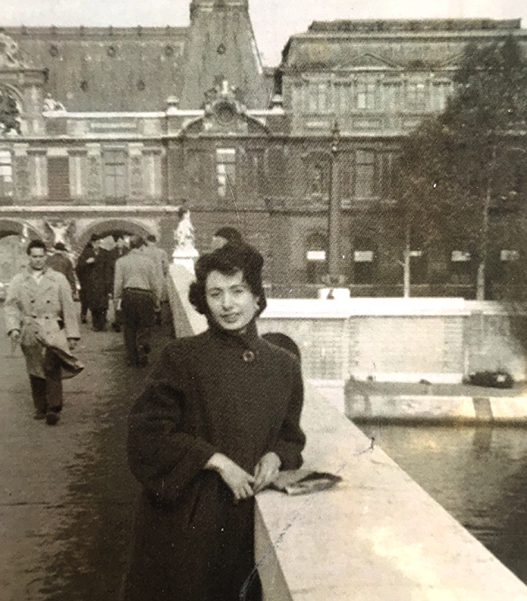
I was born in the Inwood section of Manhattan in 1925. My father, Leo, traveled often to Europe as a costume-jewelry designer and salesman. But those trips ended in the early ‘30s as Europe grew increasingly dangerous with the rise of Nazi Germany. My family managed to survive the Depression. I had a sister who was many years my senior, and my parents were older and weary, so growing up was relatively lonely. I began to draw at an early age, a talent that grew once I began to work in New York’s garment district as a fashion sketcher and model during World War II. Back then, families without means couldn’t afford to send their kids to college, and loans for education weren’t widely available. Only returning veterans on the G.I. Bill were able to get a free college education. So for most of us, you went to work right after high school.

When the war ended, I landed a job at Columbia Pictures in New York in the photostat department. Which meant I was responsible for having photostats made of artwork created by the art department of movie stars for display at theaters in support of upcoming movies. In those days, the movie studios were in Los Angeles, but the business of promoting their films (and recording the scores) often were done in New York. At Columbia, I met my husband, Lou Myers, who was a portraitist in the art department. He had been a war artist in the Navy and portrait painter. After the war, he used that talent to draw and paint actors’ likenesses for theater posters. After we married in 1947, we began taking on children’s-book illustration work together. For a brief time, we received double-billing. My career as a children’s book illustrator began in 1949. One of the first children’s books with my name alone was for “It’s a Secret” (Wonder Book), by Benjamin Brewster. It was published in 1950. “Billy and His Steam Roller” (Wonder/1951), “Mr. Shortsleeves’ Great Big Store” (See Saw/1952), “Bunny Button” (Whitman/1953) and “Peter Picket Pin” (Whitman/1953) followed, among others.

Then Lou and I went off to Europe to hitchhike in the early 1950s and moved to Paris in early 1954. We both illustrated children’s books there for French publishers (among other things) before returning to New York in 1956, where my first son, Marc, was born. After my second son, Danny, was born in 1959, my career grew steadily in the ‘60s as children’s books became easier to print as paperbacks. Schools were provided with book lists and ordering forms for students, and the public education system began to view children’s books as an important part of their curriculum for grade school.

Did you ever look to anyone for inspiration or was your style purely your own?
No one specifically, but I always wanted to stand out. Lou taught me that. If your drawings had a special look, you’d be in demand, especially if you had an eye for design. I’ve always loved children and believed that what was most important in books was the feel of illustrations. I wanted mine to connect with children on an emotional level, not as realistic or photographic illustration. To achieve my feel, I embraced a graphic simplicity that gave children illustrations that were on their level. I left enough space for their imaginations to kick in and for them to identify with what they saw. In other words, by thinking like a child I was able to communicate like one.
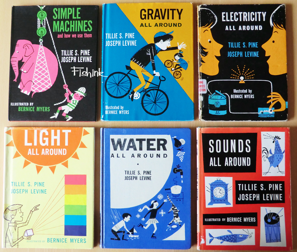
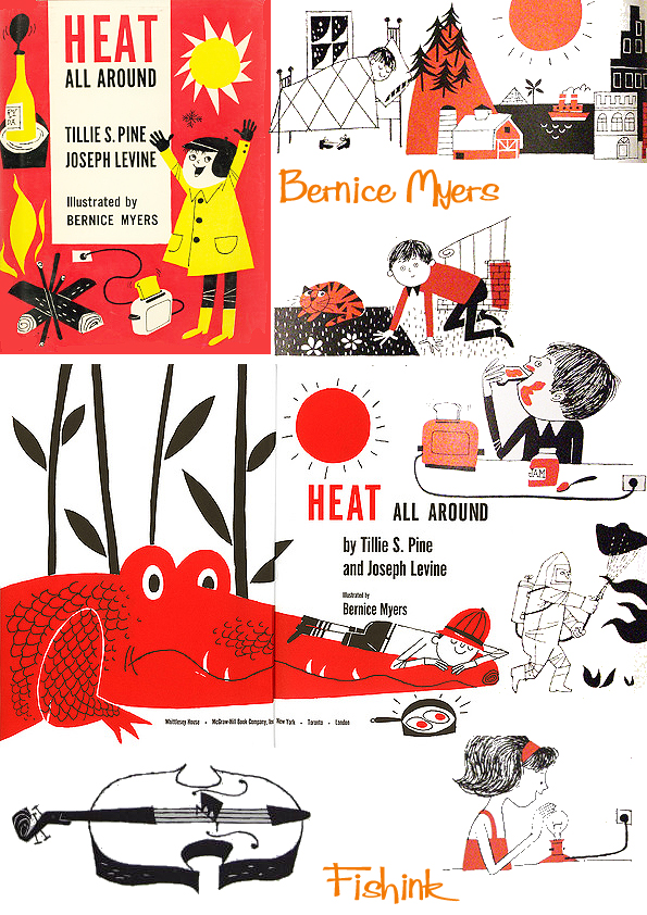
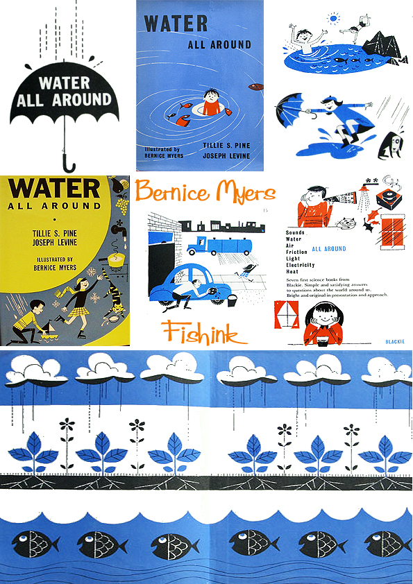
Do you enjoy working in any one style, above others, or in a particular medium, paint, collage more textural for example ? Does it help to have more than one style to be more versatile in the publishing industry ? I notice, for example, that the style you used for the science based books, ( the “All Around’ series) of textures, strong outlines, few colours, is very different from the more animal based books you’ve drawn. (The Pear Shaped Hill, Olivier etc) which is also different from the more cartoony Bears series. Perhaps you created different looks for different subjects as you felt was appropriate to that area of interest, making science books more straight forward and simplistic and the animal stories more colourful and well rounded, to appeal to a younger audience.
I did not consciously set out to project one style or another, nor did I shift styles for different subject matter. The “All Around” series forced me to envision how I was going to fit everything necessary on a single page or spread. In other words, I had to develop a strong sense of art direction before drawing so that each cover and spread inside was animated with action and delivered a high fun factor. The subject matter—space, water, earth and so on—demanded an active, “cool” approach. Sympathetic to children’s short attention spans, I knew that they would have to be pulled and engaged by my drawings if we expected them to read and absorb the material. My other books instinctively felt like they needed texture or graphic drama, again, to command the attention of young minds. My adversary was distraction, so I consciously worked to make sure that what I drew was more interesting than TV, cereal boxes and comic books. What else could I do?
Can you remember what your brief on a book would have been like in the 50’s/ 60’s. Were you given a copy of the text and told to ‘sketch around it’ or did you have ideas of your own for the books , or perhaps worked closely with each different author and took some guidance from them?
Publishers knew I had a strong sense of art direction, so they’d simply send along a manuscript and then turn me loose, so to speak. I was urged to “do my thing” and come up with solutions that were bold and active, in a child’s vernacular. My work was known for leaving children mental blanks to fill in. I found that children don’t need or want lots of detail. They look for engagement and whimsy, something that makes them laugh. When that happens, they sense a friend and identify with the characters and the story. At least in my experience.

During your career were you working mostly as a freelance artist or were you employed by one publishing house at one time ?
I worked as a freelance writer and illustrator, but a number of publishing houses used me often because sales of my books were strong. These publishers included Scholastic, McGraw-Hill and Four Winds among others.
At any time during your career, did you feel that being a female artist either a hindrance or a benefit. I think of the “MadMen” era in particular and hear stories of how badly women were treated or what they were expected to put up with in order to get work.
I didn’t find bias during the 1950s and beyond. Then again, I worked mostly at home, and my editors were mostly women. At first, I worked with my husband on book illustrations. But in a very short period of time, I could handle the work myself, and many women worked in the children’s book market then. It was like the maternity ward of publishing. Where the challenges existed were on the home front. My husband was very successful as a cartoonist and pioneered his thick-line style in print advertising work before the wide use of photography in the 1970s. His style was so well known, he was among the first who was encouraged to include his oversized signature, which was a big deal in commercial advertising.
As a result, we both worked seven days a week to complete the large amount of work that came our way. Up until 1969, we lived in a two-bedroom apartment in Manhattan’s Washington Heights. So in addition to writing and illustrating more than 100 books, I had to raise Marc and Danny—meaning I had to make sure they did their schoolwork, had breakfast lunch and dinner, took them to stores for clothes, etc. I also was expected to shop for food, cook dinner, help Lou get his work out, and deal with our house once we moved north of New York in 1969. I didn’t mind. I always had a lot of drive and energy. But looking back, I have no idea how I managed.
My children’s-book work was relentless, but for my husband and me, work wasn’t work. It was who we were. We both loved seeing our work in print. There was a great sense of accomplishment. As all authors know, the joy of opening a box of newly published books is rewarding, and you instantly forget the hard work that went into those books. Just watching my kids’ faces as they realized their mother had written and illustrated those books was worth it.
Below.. a magazine painting by Bernice for a Fashion spread.

Two books of yours that I really admire are Off into Space and My first book of Weather. The illustrations are simplistic but both endearing and engaging. Do you have a favourite book from your own extensive library of books you have illustrated, and what makes it special for you ?
Thank you for your kind words. I don’t look at my books the way you do. In other words, you delight in elements that came naturally and magically to me. I didn’t think about them that way at the time. They were problems that needed solving. So favoring one book over another, for me, is often a question of how much of a struggle went into creating it and whether I enjoyed the process. But to your point, I am proud of the science series because there were many hurdles to leap to make them come together neatly and excite children. The same with the Space book. The layout choices, the images and the color choices all come together well and they remain remarkable. They still deliver a visual bang, don’t you think?
Yes I do.

Do you have any idea how many books you have had published to date ? Now at the wonderful age of 95, what are your biggest challenges in creating new books ? Obviously you are still working because you enjoy the work which is fabulous. If you hadn’t been an artist was there ever a different career path that might have taken your fancy ?
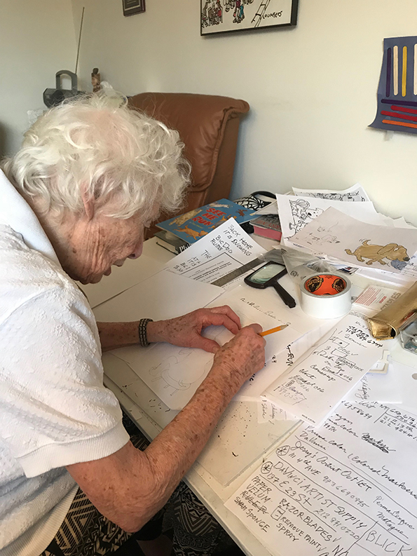
More than 100 books. One day Marc will create a site for me (nudge, nudge) and we’ll know for sure. The biggest challenge with my most recent book after many years in retirement was relearning how to turn my story into graphic ideas and then into finished color prints for submission. I had to track down professional color markers and bleed-proof paper—all things that are relics, since everything is done on the computer today. Fortunately, the materials I once used were still stocked at Blick Art Supplies.
Can you describe a typical day for you when you are working on a book? Does the process get easier the more that you create or is it still a challenge ?
It’s always a bigger challenge at 95. Should the dog look left or right? Should his tail wag or stay still? Hills in the background or not? A moon? Is my work any good? Will children get my humor or are they too sophisticated now? I went through a lot of paper trying to figure it all out. The process takes longer now, but my passion is still there as is my sense of humor and love of the adolescent spirit. But it’s definitely much more difficult, since emotions move faster than brainpower.
What advice would you give to a young artist who would love to follow in your footsteps today?
Observe how children play and note what makes them laugh. Don’t try to please them. Instead, speak their language with illustrations, include humor and leave room for their mental participation. That’s so important. Children are always smarter and more intuitive than we think. They’re naturally honest and kind and “get” things faster than adults. That’s because they are emotional first and think second. My kind of audience.
Many many thanks to Bernice for her incredibly lucid and inspirational answers. I applaud both your work and attitude, alogside the fact that you are still creating now. It shows that the need for talented artists never goes away and that many generations of readers, can appreciate and ‘adopt’ your work, as if it belonged only to themselves. What a lady ! Thank you also to Marc for making this post happen at all, what an inspirational role model you grew up with. I bet you can tell a good story too : )
Please leave a comment below and you can follow me here and over on Instagram here at Fishinkblog, where I sell most of my ceramics.
Until I ‘see’ you next, all the very best and thanks as ever for reading, Craig x
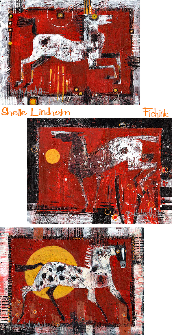
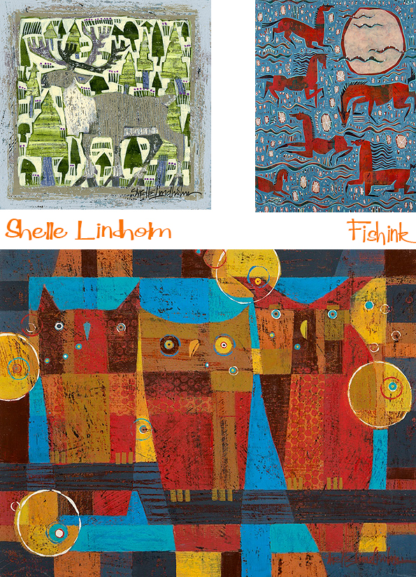
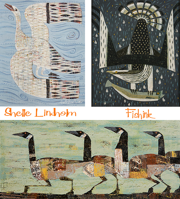
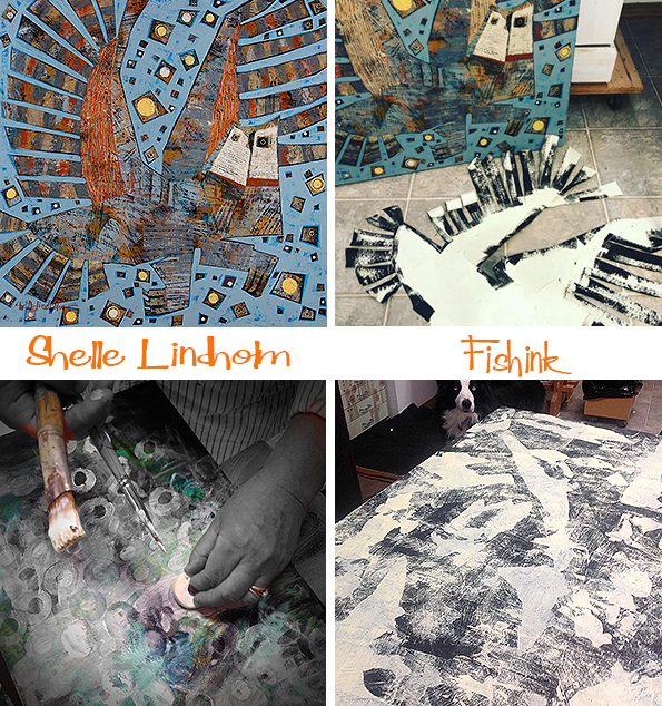
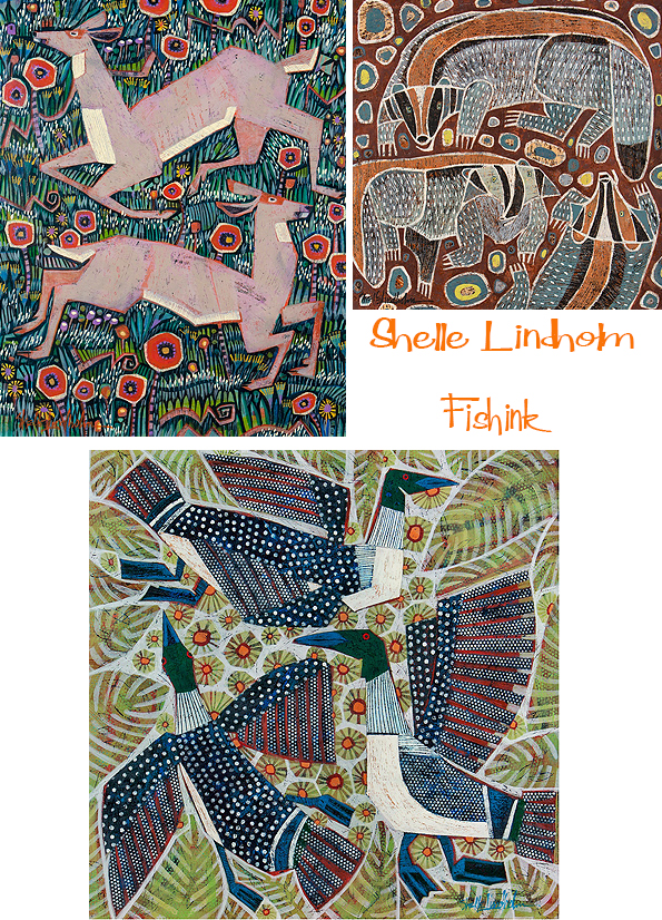
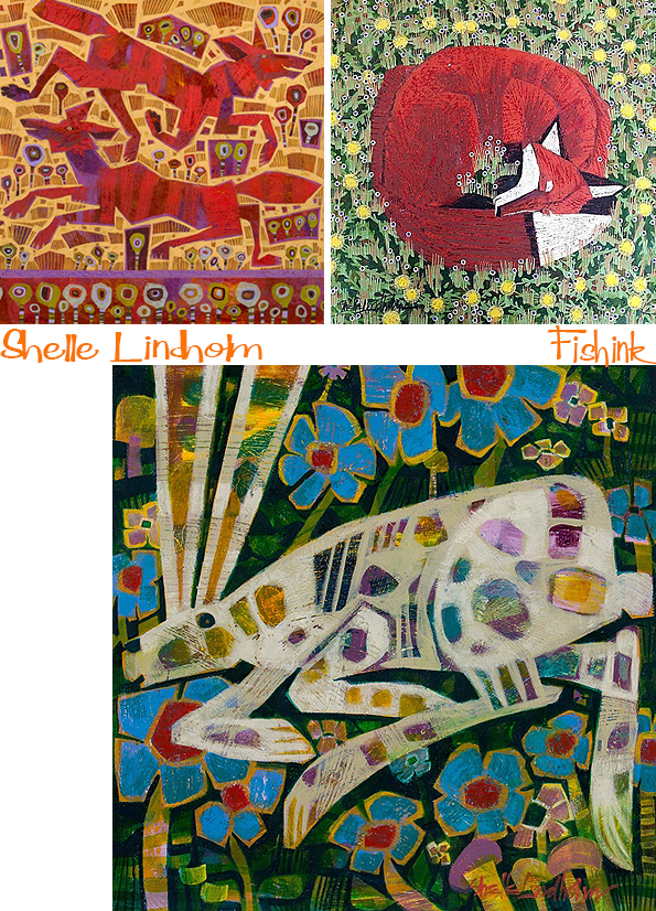
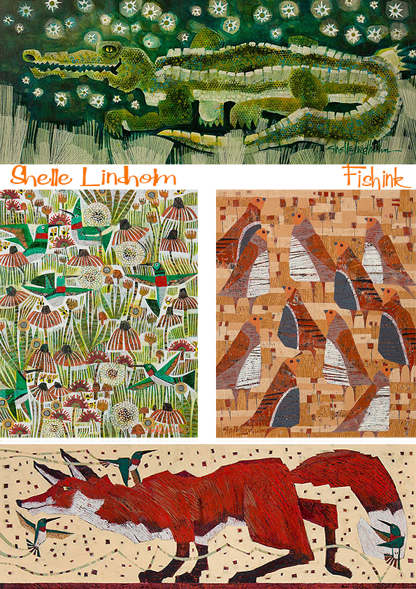
Shelle Lindholm Nature Emerging in Art

I first encountered Shelle’s paintings on Instagram a couple of years ago. Through following her, I would often see new updates or pieces of work and would always like or comment upon them. I think my love for her work came through two connections. My own love of nature and animals and a link (I feel, but don’t necessarily see) in her work to textile design and repeat pattern. I got in touch to find out more.
What do you recall about growing up with art materials and being encouraged to develop your skills from a young age ?
The encouragement was strong. The materials, inexpensive and easily available. Growing up in a neighborhood where friends and family embraced and practiced creativity in all its forms was the best! My mom was an antique dealer. I watched her repurpose and refinish all kinds of “junk” into unique, functional items for the home. I think that is where I discovered the beauty in something worn out, scarred up and bent out of shape! The shop was chock full of textiles – quilts, blankets, tablecloths, lace doilies, old clothes and more. Having a creative Mom and all that cool stuff around. made a lasting mark on my imagination! Dad was supportive too, making frames for our art and hanging it in his doctor’s office.
Can you tell us a little about the obvious connection to your subject matter and your sheer delight of nature.
Love for all things furred, finned and feathered has never waned or gone away so it must be something I was born with???
Being around animals has always been part of my life, as well. My grandparents were farmers who raised corn and livestock. My Dad would take me and my siblings on nature walks, field guides in hand, learning to identify birds, wild flowers, bark and leaves. Our house was loud and lively with dogs, cats, hamsters, rabbits and turtles. Now I live on 6 acres at the edge of the woods in rural Montana. Every day brings surprise visits from a wonderful array of wildlife including deer, elk, fox, coyote, bear, wild turkeys, cranes, owls, hawks, eagles and all sorts of birds large and small.

I see a couple of themes that occur in your paintings. Firstly a representation of an animal as we know it. Secondly an animal that has been dramatised and made into a slight charactature of itself and lastly a style that looks a little more like a textile design and has elements of repeats within the frame. Is there a style or way of working you prefer to work in and if so why ?
Good question!
While the themes may vary, the thinking behind creating the work is the same. What ties the works together is story and intent. The intent is to paint the heart and soul of an animal, not necessarily every hair on its body. The story – the who, what, when and where, is the thinking behind the work. What is this animal doing? Where is it? Why is it jumping, leaping, dancing? Why does it have that look in its eye?
There is also the practical matter of working in 2 different art worlds – the fine art world and the commercial world of licensing. My customers on the commercial side, prefer a little more realism but enjoy the play with color and pattern to reflect the personality of an animal. The discipline it takes to paint for someone else. challenges me to keep up my drawing skills and has made me a better team player. The fine art world allows for more freedom to explore creative ways to portray wildlife. The experimenting and learning keeps my imagination revved up and excited to paint.
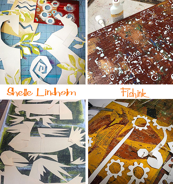
You have a great array of decorative finishes and flourishes. How much of your past career of being a fine artist and furniture painter do you feel influences how you work today, and how do you create your layered paintings ?
I started 21 years ago, as a furniture painter with an idea and a what if. The idea was to combine the paint process I used on furniture, with my lifelong love of wildlife. What if – this paint process can be used to create something more complex than several layers painted on a coffee table? The thought of being a fine artist never entered my mind! I had a fire in my belly and it wouldn’t go away unless I painted, and painted, and painted some more. This process and I now have many years together. We’ve (I’ve) made lots and lots of mistakes. That is where I learned the thrill of its unpredictability’s and the limitations of the materials and myself. Finding the place where this work would thrive and have purpose lead me to the fine art community. It was scary! It still is scary! I started small, stayed local, and worked on creating good relationships with people in my town, which lead to people in my state, which lead to people in my region. The business has grown beyond my wildest imagination and dreams. With the help of a lot of good people, hard work and a never give up attitude, the furniture painter has grown into a fine artist.
The process? Simply put, wax on, wax off! Paint and scrape. It’s a messy business. Wax is sandwiched between layers of acrylic paint. Scraping (with a dull razor blade) removes the wax and reveals layers of paint underneath. Animal forms are created by using hand cut templates. It’s a messy taped up business too. Someone once asked me , “Why do you use so many parts to make the template?” Because that is where I find ”the different”, I say! Lastly, the background is developed into a lively environment for the main characters to live in. Sometimes it’s floating geometric shapes. Sometimes it’s a fantasy world of flora and fauna. A lot of negative painting is involved which I find relaxing and meditative.
Where would you like to see your work going in the next 5 years ?
This job/journey has always had a mind of its own. I set tentative goals for the year and make “wish
lists” aka, future projects, opportunities I’d like to experience or learn from.
“Projects with a purpose” is what I am currently most interested in and on the lookout for.
Have you ever considered creating cards or textiles out of your wildlife ?
Yes. I make cards for special occasions like open studios, commissions or a way to say thank you.
Making textile designs is on my “wish list”.
Do you have a favourite animal or bird that you love to paint ?
I love them all, but seem to never tire of painting the fox, otter, owls, sandhill cranes or the horse.
The bear is the most requested animal I paint.

How do you know when a painting is finished ?
That is THE hardest thing to know, isn’t it?
When I feel I am close to being done, I’ll put the painting in “time out”. It gets stored out of sight. In due time, I’ll pull it out, see it with fresh eyes and know how to finish it up.
If you hadn’t have chosen a career in art, what do you think you might have done differently ?
Hmmm….it would involve working with my hands, be different every day, and would not require math to do the job!
Thanks Shelle for your detailed and informative relies to my questions and for answering, even in the midst of a crazy tornado-type storm when your electricity went down ! Now that’s dedication to your Art ! : ) I think your work would make beautiful greeting cards and textiles too. What do you think readers ?
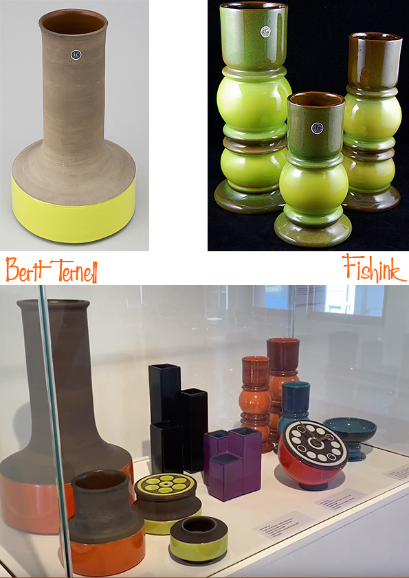
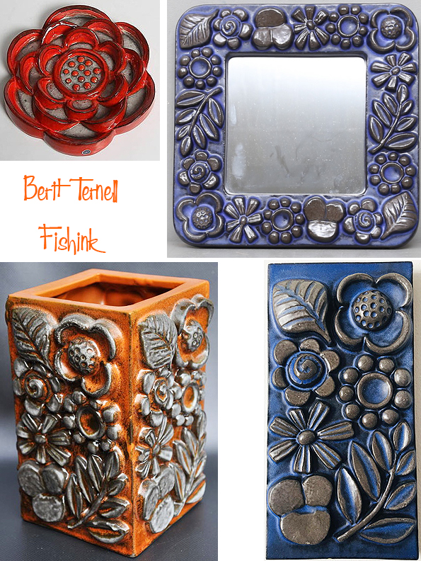
Berit Ternell Swedish Ceramist
Berit Ternell studied at the Handicraft Society School in Göteborg.

After graduation in 1950 she worked for a year as an intern for Upsala-Ekeby where her job included decorative painting of the studio ceramics by Ingrid Atterberg and Mari Simmulson.
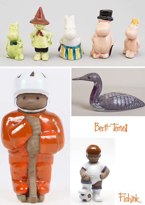

Before being contracted by Gefle (Sweden) in 1957, she mainly worked for Bo Fajans (Sweden) but also for T.G. Green Pottery (England), Reijmyre Glassworks (Sweden) and Rörstrand (Sweden).
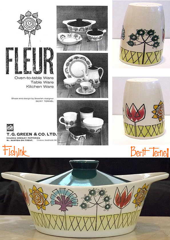

At Gefle she stayed for 14 years designing, the popular ‘Kosmos’ service (1966) in blue & brown, the ‘Cocktail’ and ‘Smide’ tableware, the vases Trio en Reactor and many, may more.


In 1971 she left Gefle and returns to Göteborg where she teaches art at the ‘Högskolan för Design och Konsthantverk’ (HDK), a department of the Arts faculty at the Göteborg University, until her retirement in 1974.
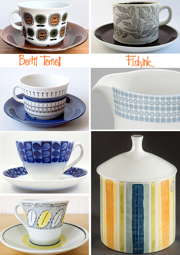
A wonderful collection of well designed ceramics wouldn’t you say !
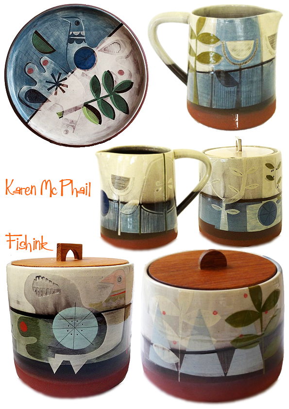
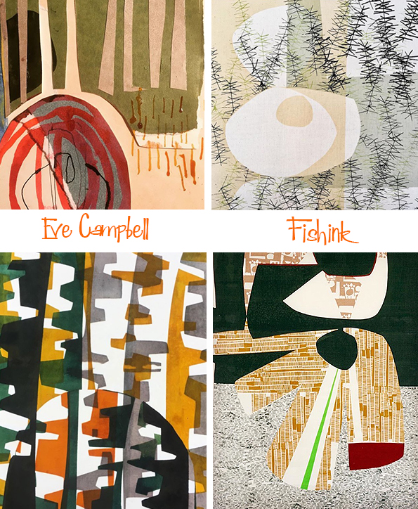
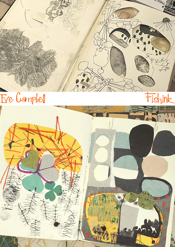
Karen Mc Phail and Eve Campbell. Creativity running in the family
Originally posted in 2020, I think it’s great to view this post again.
There are two words that spring to mind when coming across the work of Karen McPhail and her daughter Eve Campbell, creativity and professionalism. Both graduates of Glasgow School of Art, they presently work from their family home in Renfrewshire, where you can also book to stay in a beautiful lodgehouse or take a sailing course at Carry Farm in the surrounds of Tighnabruaich, Argyll.
As someone who personally trained and worked as a Textile Designer for 25 yrs and who now presently works as a Ceramist, I was interested in finding out how each of these creatives work and think. I set both Karen and Eva the same questions and asked them to work on their answers separately. Here’s what I discovered, first Karen.
What are your earliest memories of doing something artistic ?
I think my earliest memory of creative activity was watching my dad make plaster reliefs in a tiny box room in the upstairs of our house. I distinctly remember the smell and consistency of the white plaster. Thinking back now I’ve no idea what he was actually making but he was an architect and had just finished building our house so I suppose the material was close to hand.
Who was your main/earliest, encouraging influence on becoming a creative person ?
My dad was definitely a creative inspiration, always making and building things. There was a confidence that came from knowing that if you want something you can make it. My gran (dad’s mum) was a embroiderer for Coats Thread Mill in Paisley and she always had sewing projects on the go. She was patient in helping my sister and I make little felt animals and peg dolls. She made me a simple school pinafore and I remember her constructing the paper pattern and then translating that into fabric. Yet again there was the confidence of using materials.

Who inspires you as an artist and who’s work is either influential or pleasing to follow in contemporary circles ?
Obviously I’m inspired by numerous artists and makers. In my final year of art school the sculptor Eva Hesse was a big influence. When my 3 children were young children’s book illustration gave me a lot of pleasure, John Burningham, Maurice Sendak, and Tove Jansson and many others. I think their ability to create ‘worlds’ from their imagery was an influence on my work today. The ceramicist Makoto Kagoshima currently makes work I greatly admire.
What is your favourite type of work to create and what parts of your creative process do you like the most/least ?
Part of the appeal of ceramics has always been the processes involved in turning raw clay into a fired and perhaps functional piece of work. I really enjoy every stage, working with materials and tools, trying to work out new ways of doing things. Decorating is probably my favourite time and glazing, after the first bisque firing, is definitely my least favourite activity. Opening the last firing is like Christmas morning and is a enjoyable end to the whole cycle, and then it is back to the start with raw red clay.
Karen, I can really associate with all of those feelings : ).
How does living and working in such creative surroundings play a part in the work you create ?
Working at carry farm with beautiful wild shore and woods right on our doorstep can’t help but influence my imagery. Living in such close contact with nature, changing seasons, and patterns of weather means that everyday I notice details of structure or colour combinations that infiltrate my work. My husband , daughter and sister also have studios at carry farm and we constantly consult, help and constructively criticise (!) each others practise. My brother in law has a mechanic workshop/boat yard next to our studios and so practical help is always on hand. It is a fun place to work and live.
It sounds idyllic.

Where do you see your work going in the next 5/10 years ?
I hope that people continue to want my work in their homes and that enables me to continue making.
Is there anywhere you would most like to see your work displayed or someone you would really love to collaborate with ?
I make my work hoping it will give people pleasure in their homes. Whether a daily interaction in a tactile mug or biscuit barrel, or a plate or candle holder for special occasions. I also like hiding little bits of work in nature. I took part in an archeological dig last summer and I’d love for my work to be buried perhaps to be found by a child in the future!
During lockdown my husband and I set up dreyworkshop to combine our skills in wood and ceramic. My family are probably ideal collaborators. It gives me particular pleasure to see Eve’s work develop and follow her interactions with other makers etc.
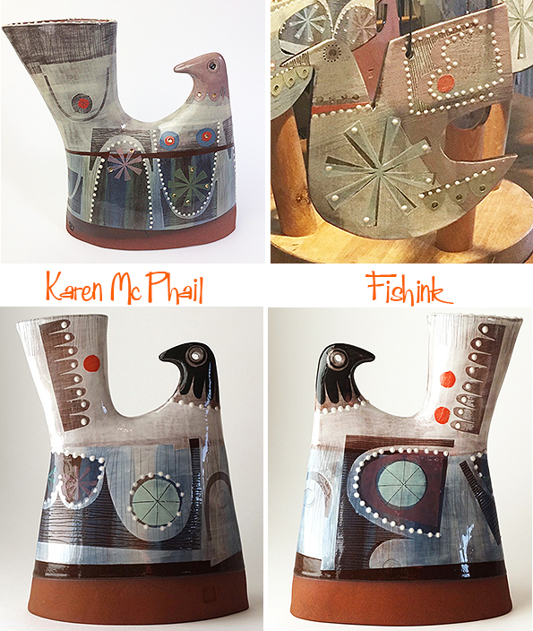
Where did your imagery of bird, arches and people first originate ?
I have only lived at carry farm for 2 years, previously I lived and worked in the house my dad built. During that time I remember driving through Glasgow and seeing a tree shadow cast on a building. The image struck me as exactly what I would like my work to project. The wonder of nature and it’s relationship to the built environment and people. Growing up Eve kept doves in our garden. The way that the birds were free but became connected to her and our house was an inspiration and the bird motif combined with architecture and figures became a regular feature of my work. On graduating Eve did a residency in an Italian silk mill. While there she visited St Marks Basilica in Venice. On her return home we poured over images of her trip and I found the cathedral mesmerising. The combination of architecture and nature through the use of stone, clay, coloured pigments felt connected to the more humble shapes seen in ruins around the Scottish west coast.

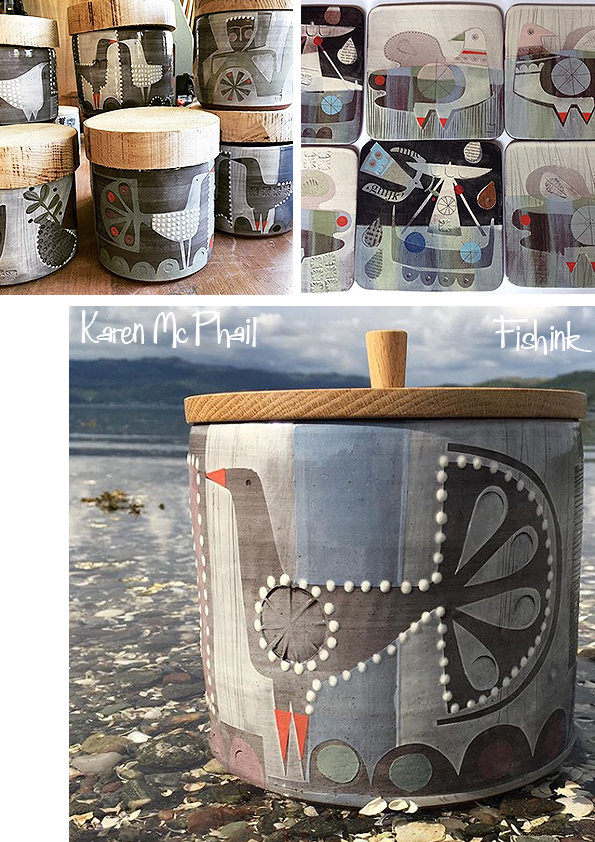
Karen states :- “My aim is to create visually satisfying objects for domestic environments that have a quality of surface and pattern, and that appeal to our sense of touch. My process involves layers of bold and playful decoration while retaining the inherent warmth of red earthenware clay. Simple forms are made on the wheel, handbuilt or using plaster moulds. I collect imagery from daily life and nature to make paper collages and, before the first firing, coloured slips are brushed on to the ‘leather hard’ pieces using cut paper stencils. Newspaper lettering on the final work echoes this process. Layers of applied slip produce a subtle raised decoration and can be drawn though to reveal the red clay beneath. A second glaze firing is followed by a third for the application of printed decals. ”
Such beautiful work Karen.
Now onto Eva’s questions.
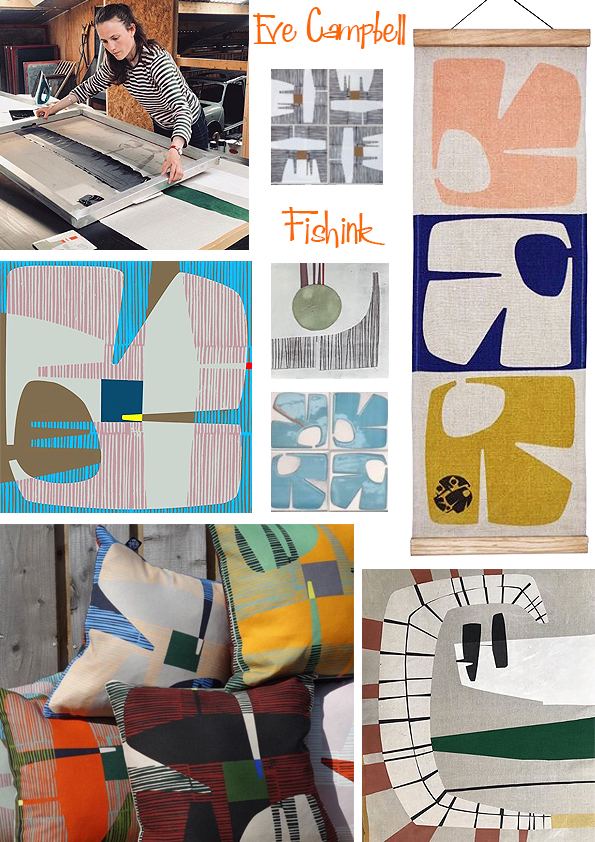


In 2018 Eve was a winner in a competiton for Johnson Tiles and as a result got to turn some of her paper ideas into ceramic tiles.
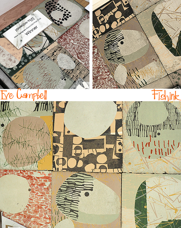
Her sketchbooks are full of energy and ideas.
She was also asked to work with high street brand “White Stuff” and created a line of textile designs for their stores last year. (More info here.)


Thank you to both Karen and Eve for taking time out of their busy day to answer my questions. Such inspirational and creative work from both of you, it makes me excited to put this post together and I look forward to seeing where your ideas take you from here. What do you think readers ?


