Gaynor Chapman Mid century Artist

There are so many fantastic artists from the 1950’s and 60’s who have very little presence online. I feel this is a great shame and that their work should be seen and appreciated by new admirers, it’s always an aim of mine to help promote and reveal these illustrators who’s work I discover and admire. One of those is Gaynor Chapman. She was born in 1935, she attended the Epsom School of Art and was one of the ‘bright young things’ at the RCA in the early 1950’s, where she studied illustration and graphics.

The combination of these two disciplines is very evident in her work, which has a deliberate, compartmentalised graphic structure, emphasised by the use of a visible, irregular black outline. Alongside posters, she also created many book covers and illustrations for other people’s stories.

Some of her most stunning pieces were commissioned by London Transport for its poster series.
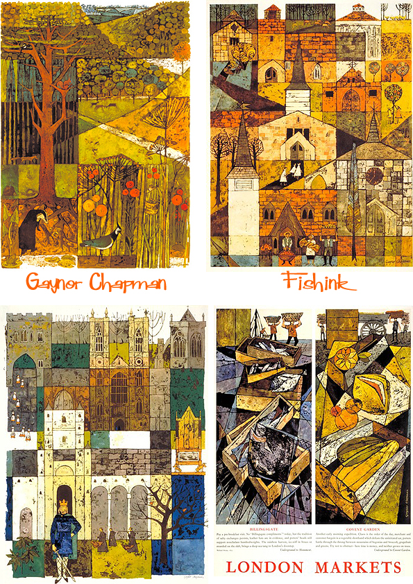


She also produced projects for BP, COI, Shell, ICI and Air France, and she created a large mural for the ship SS Dover.
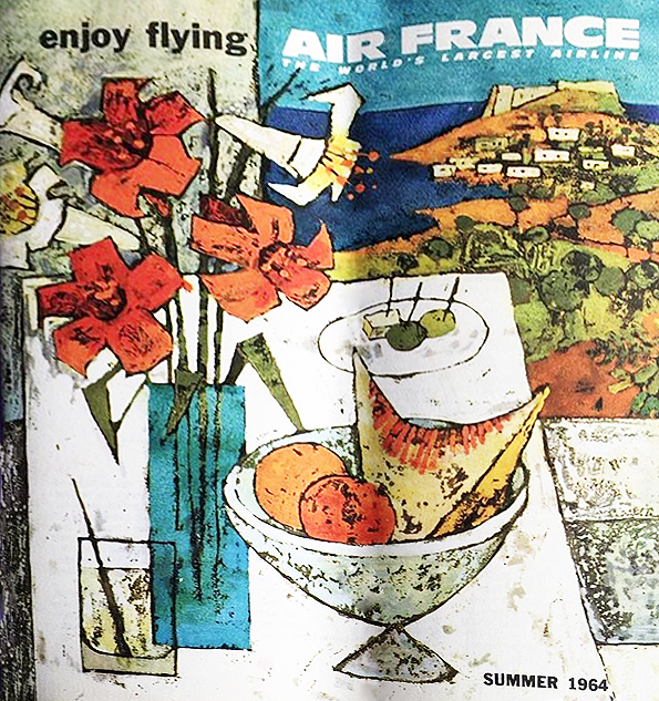 Photo thanks to Airnostalgie
Most of her work appeared in the 1960s/1970s, when she taught graphics at the Brighton College of Art and continued to paint.
She died in 2000, aged 65.
If anyone knows anymore information about Gaynor Chapman or has images you would like to share, please get in touch and I would be glad to do just that. Thank you. Thanks to Mike Dempsey and his wonderful ‘Graphic Journey blog’ for the information used in this post.
Mythical and Mathmatical New Year
In the Chinese zodiac, 2025 will be the year of the Snake. It’s actually the Year of the Wood Snake, which is said to be a time of growth, transformation, and introspection. Being born in the year of the Snake myself, I’ll take that as a positive start.
For everyone interested in Maths, ( and I hear there are some arts & science bods out there) did you know that 2025 is quite a remarkable maths-linked year for at least six reasons..

2025 is a square (45 x 45)
It’s a product of 2 squares (9×9 x 5×5 =2025)
It’s the sum of three squares (40 x 40 + 20 x 20 + 5 x 5 = 2025)
It’s the first square since 1936
It’s the sum of the cubes of all the single digits from 1 to 9 (1 x 1 x 1 + 2 x 2 x 2 … up to 9 x 9 x 9)
And 2025 is also the sum of the first 45 odd numbers ! Wow now who would have known lol

Posters above and below available here
Some folk in the new year’s honours list include author Jacqueline Wilson, film and TV personality Stephen Fry, musician Myleene Klass, gardener Alan Titchmarsh, and actresses Carey Mulligan and Sarah Lancashire.

Painting of Stephen Fry by Artist Jonathan Yeo
Whatever your plans are for the year ahead, I hope they will be healthy, prosperous and rewarding.
Thank you for all you comments and follows too. See you on the other side, Craig x
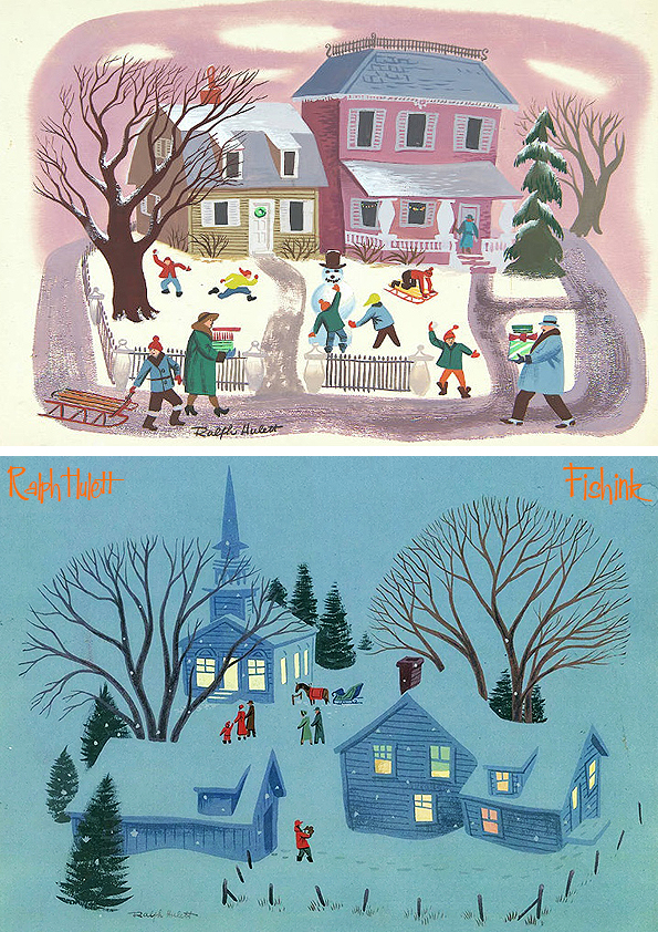
Ralph Hulett 70+ reasons it’s Christmas
Hi Everyone and welcome to my last blogpost for 2024.
I very nearly resorted to using an old post I had assembled before, but then (as if by magic) my rabbit-hole-internet-wanderings took me for a visual stroll through the many Christmas card images of Disney background artist Ralph Hulett (1915-74). In an instant, I was hooked ! Hopefully when you see his work, you will be too : )

With a glint in my eye to the work of Evyind Earle another amazing Disney artist, I took great pleasure in discovering more about Ralph’s work and most importantly for us here today, the huge number of Christmas Card designs he created for the company, California Artists (CA) back through the 40’s to the 70’s.

From someone who worked on the Disney film ‘The Aristocats’,

you might be able to see where some of Raph’s Card ideas may have derived from lol.

Ralph studied at the Chouinard Art Institute when it was located in MacArthur Park during the 1920s and 30s. His teachers included the masters of California landscape painting, including Millard Sheets and Phil Dike. “That was the Disney art school. It’s the beginning of CalArts,” says animation historian Jerry Beck. “Walt Disney knew that in order to mature the progress of the animated film, he didn’t just want cartoonists. He wanted to make animation a fine art. He wanted the respect of the filmmaking community.”

He painted backgrounds and worked on features from the time he arrived at the Disney studios to work on the first feature film, Snow White and the Seven Dwarfs, released in 1937. He contributed to all the features and shorts of the company’s golden age, including Pinocchio, Dumbo, and Fantasia, all the way through the 1960s and 70s with The Jungle Book, The Aristocats, and Robin Hood. “Ralph’s name is on every great Disney feature. The guy is a legend,” Beck says. “You really had to earn that credit. You had to be amazing. You had to be pivotal. If you worked on the film for years and left before it was finished, you wouldn’t get credit.”
Just look at these beautiful secenes of village life, which also reminds me of the work of Mary Blair.
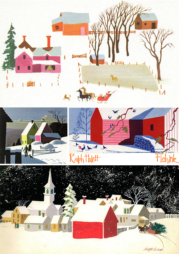
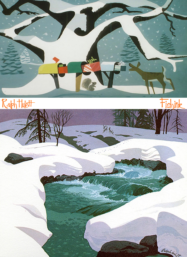
He not only created amazing scenes from nature….


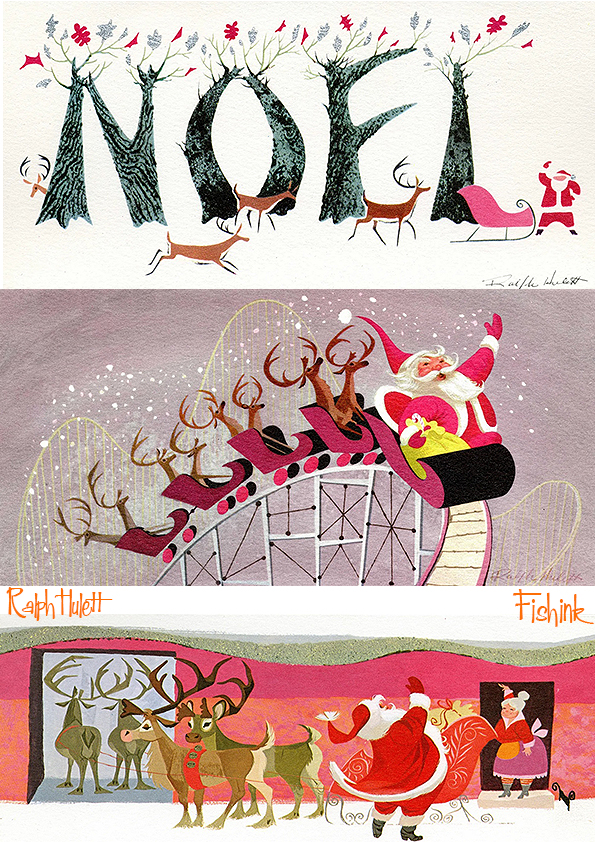
.. but he also had a great sense of humour and a vivid imagination for creating scenes and senarios in which Santa played the staring role… obviously !

I love Santa on the roller coaster ride.


I could feel where the likes of Charley Harper could have been working along similar ideas at a similar time.


Townscapes too.
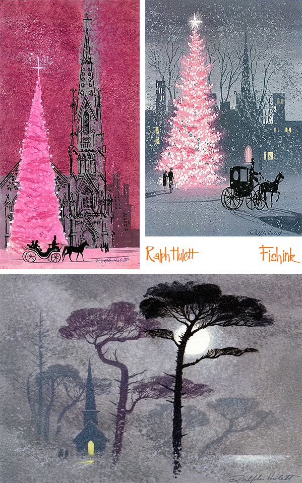

Some with a more religious theme.


And plenty of joy and fun.
Even taking elements from the world around him.

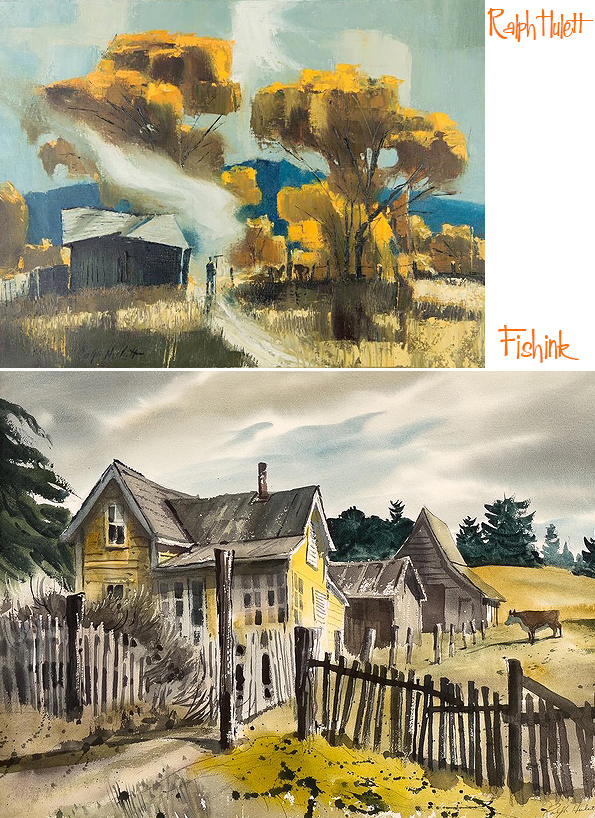
Ralph also was a prolific fine-art watercolorist and oil painter, focusing on cityscapes and landscapes of Los Angeles and Southern California. Here’s just a few.
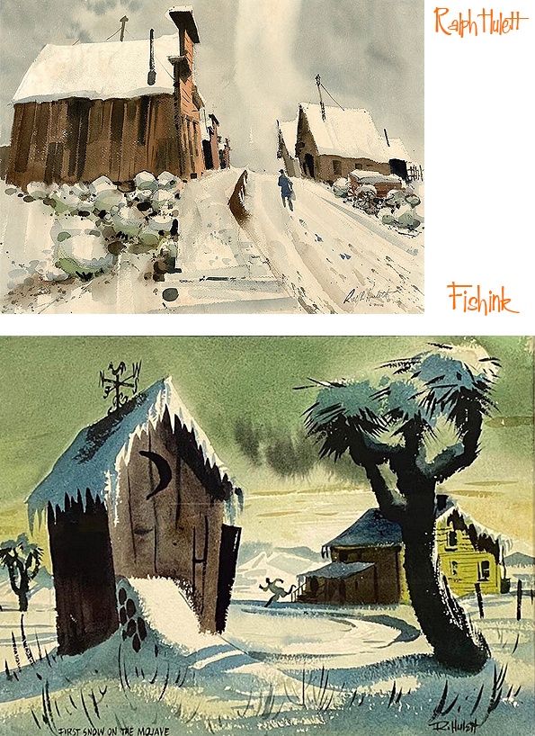


And to end today’s post with a beautiful sleigh driven illustration through the snow filled woodland. What could be more Christmassy ?

If you enjoyed this post you might also like this one about Walt Peregoy .
Wishing everyone a fab ‘n’ festive break, wherever you might be. Please tell your friends about Fishinkblog and if you’d like to support me and make a donation or ceramic purchase, or find out more about my work, do pop over here on Instagram. Many thanks and a very Merry Fishmas, Craig x
Local Manchester Fair
Hi Everyone, my last Craft event of the year is on tomorrow. Hosted by the wonderful Pop-Up Art Show at the old Altrincham Town Hall on Sunday 15th of December between 10am and 5pm, Free Entry with a great mix of hand made makers and artisans.
This is an ideal event to stock up on those Christmas gifts or just to treat yourself. Thanks to Oyez Arts.
Please share this with your friends and hopefully see you tomorrow ! Many thanks : )

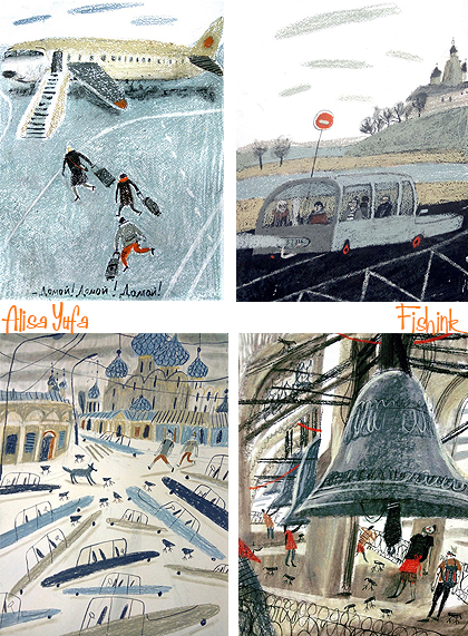
Alisa Yufa
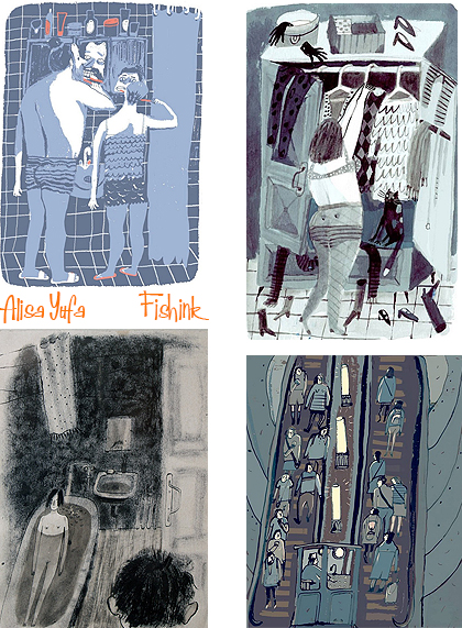
I recently came across the quirky illustrations by Russian artist Alisa Yufa and immediately fell in love with her style and witty observation.
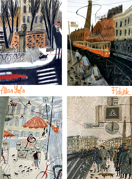
I’ve struggled to find much information about Alisa, but I believe she lives in St Petersburg and was born in 1987. Her work seems to depict the comings and goings of everyday life around her.
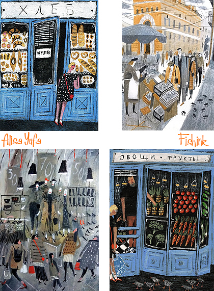
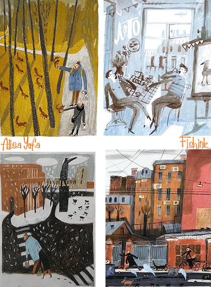
Beautifully observed and often turned into witty senarios. I also like her sometimes limited colour palette.
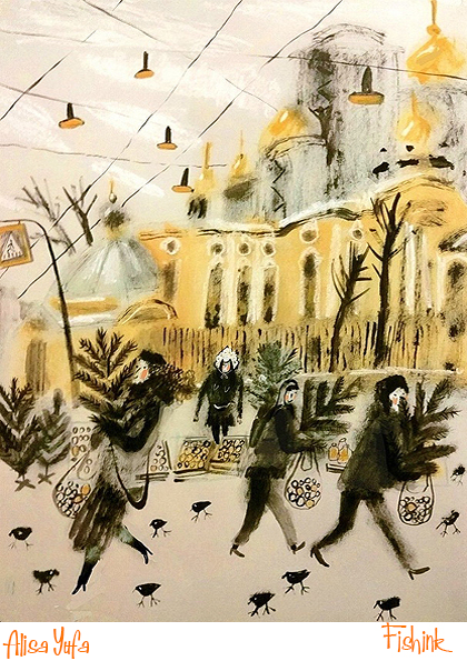
Winter has arrived !
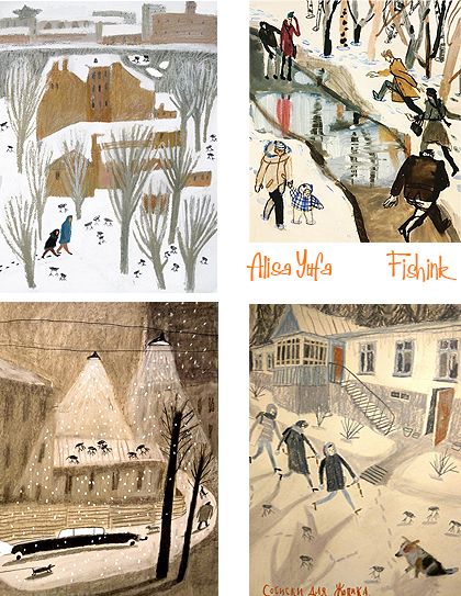
Out and about, people on the move.
From folk selling refurbished music systems.
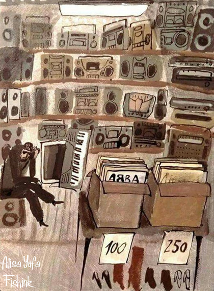
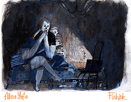
Watching scary films on their laptops,
or just going about their home time day to day lives, she captures it all so well.
Great refreshing work Alisa, keep it up : )
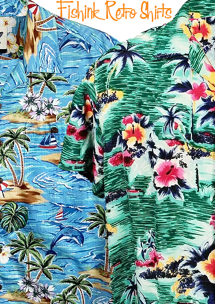
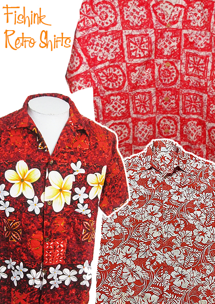
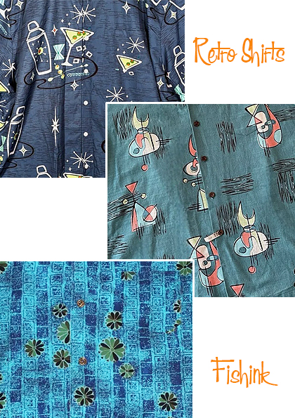
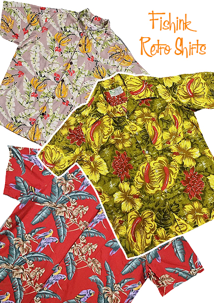
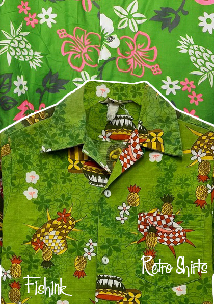
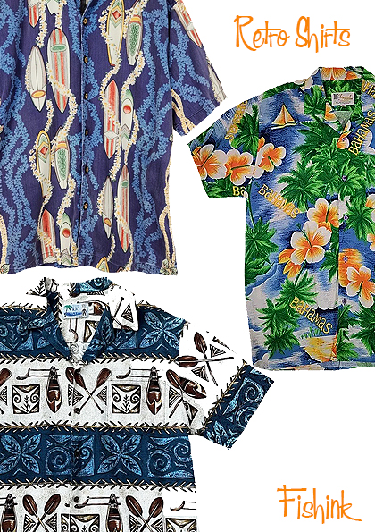
The Hawaiian Shirt
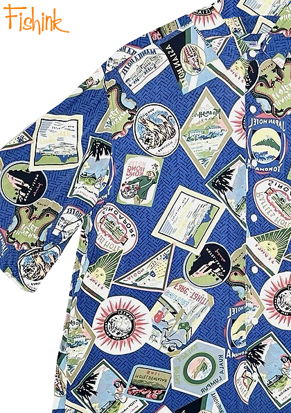
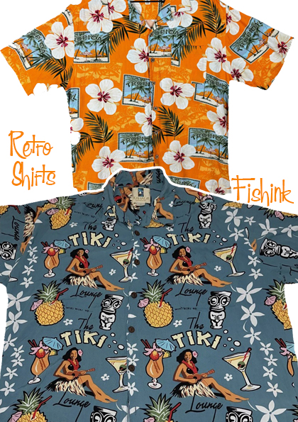
The Hawaiian shirt, is a style of dress shirt originating in Hawaii, also called the aloha shirt (Hawaiian: palaka aloha). They are collared and buttoned dress shirts, usually short-sleeved and made from printed fabric. They are traditionally worn untucked, but can be worn tucked into the waist of trousers. They are worn casually or as informal business attire in Hawaii. I’ve pulled together a collection of possibly vintage ones, to help tell the story of their remarkable popularity.
According to some sources, the origin of aloha shirts can be traced to the 1920s or the early 1930s, when the Honolulu-based dry goods store “Musa-Shiya the Shirtmaker” under the proprietorship of Kōichirō Miyamoto, started making shirts out of colorful Japanese prints.
It has also been contended that the aloha shirt was devised in the early 1930s by Chinese merchant Ellery Chun of “King-Smith Clothiers and Dry Goods”, a store in Waikiki. Although this claim has been described as a myth reinforced by repeated telling, Chun may have been the first to mass-produce or to maintain the ready-to-wear in stock to be sold off the shelf.

The name “aloha shirt” appeared later. By 1935 and 1936, the word aloha was being attached to various sorts of Hawaiian products, so calling the garments “aloha shirts” was hardly original. However, Ellery Chun is sometimes credited for coining the term, perhaps in 1933; Chun’s store reportedly carried window signs that said “aloha shirts”.
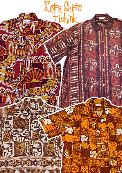
Before the arrival of woven fabrics from China, Japan and the West, native Hawaiians created their clothing from native plants and trees. Men wore a malo, or loin cloth, made of tapa cloth (or Barkcloth), which was fabricated from the inner bark of wauke trees. Tapa material was tough, durable and versatile. It was great for clothing and also made an excellent floor covering. Because it was made from plants and had a relatively flat surface, it was also easy to decorate. Throughout Polynesia, tapa cloth was the artist’s canvas and people hand-painted their tapa creations with beautiful colors and exquisite designs, drawing inspiration from the world around them.
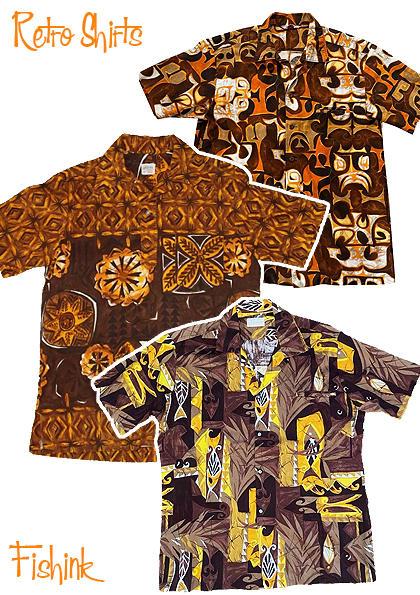
“Tiki Paradise” draws inspiration from traditional Hawaiian tiki culture. The shirt features intricately designed tiki masks and symbols, evoking the spirit of island festivities, like those above.
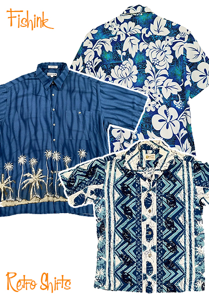

It wasn’t until the mid-1930s that Hawaiian clothing manufacturers decided to produce cloth that was uniquely Hawaiian in design. Watumull’s East India Store led the way by commissioning artist Elsie Das to create fifteen floral designs, leading the way to what we now recognize as a Hawaiian print. Her beautiful hand-painted designs were sent to Japan where they were printed by hand onto raw silk and turned into clothing.

According to Hawaiian fabric designer Elsie Das, a Japanese manufacturer once printed a set of her floral designs on heavy satin by mistake. “These started a vogue in Hollywood. Ginger Rogers, Janet Gaynor and other stars bought bolts of the stuff and had it made into ‘seductive gowns.’ The result was an epidemic of Hawaiian designs, with hibiscus and ginger breaking out on table cloths, napkins and scarves all over the country.” “Elsie Das, Artist Designer,” an article by William Davenport in Paradise of the Pacific, in 1963.


Like all great trends, once Hollywood was involved, movie stars, crooners and politicians did a fine job of promoting Hawaiian clothing, bringing the colorful designs into the mainstream. Montgomery Cliff Burt Lancaster, Ernest Borgnine and Frank Sinatra all wore beautiful Hawaiian shirts in the movie From Here to Eternity. Bing Crosby sported his unique combination of Hawaiian shirt and porkpie hat and Betty Grable did a promo pin-up shot wearing a gorgeous Hawaiian-style swimsuit in the 1940s.

Ross Sutherland was a men’s clothing store in Hawaii with several branches – one in Waikiki, one at Ala Moana and one at Kahala Mall and possibly on the neighbour islands. They closed in the 1990’s. I don’t think they manufactured shirts. I think they purchased shirts and added their label, but in that way they covered a large range of patterns. Other brands like Reyn Spooner helped popularize the shirt from the 1940’s and are still going today.

More designs were also produced with an obviously American slant to cater for the needs of the tourist trade. Cadillacs, surf boards and other memorabilia all helped to connect the Aloha shirt with the largely growing U.S.A and world market demand.


In the 1950s, manufacturers began adding the magical phrase “Made in Hawaii” to their Aloha print garment labels. (The idea allegedly came from a trade commissioner from Los Angeles during a visit to Hawaii in 1950.)
This new label increased the value and desirability of authentic Hawaiian shirts and dresses on the mainland and across the world. “Made in Hawaii” allowed true Aloha wear to stand out in a market that was being flooded by cheap imitations and mail order garments.
The first annual Aloha Week festival was held in 1947. By 1948’s celebration, the local residents were enthusiastically wearing Hawaiian shirts and dresses to help promote local products. The Hawaiian shirt soon became a symbol of Hawaiian industry and pride.

Even today, after more than 50 years, Aloha Week is still going strong throughout the islands. It’s a great excuse to dress up in your favorite Aloha wear, enjoy “ono Hawaiian kine grinds” (local cuisine), and immerse yourself in the music and arts of the islands.
Contemporary brands like Next and Superdry still feature numerous Hawaiian shirts in their yearly collections.
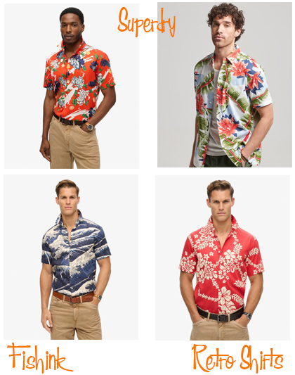
I think this classic shirt design is very much here to stay. However you wear yours.. I hope you enjoy it’s historical sunny references.
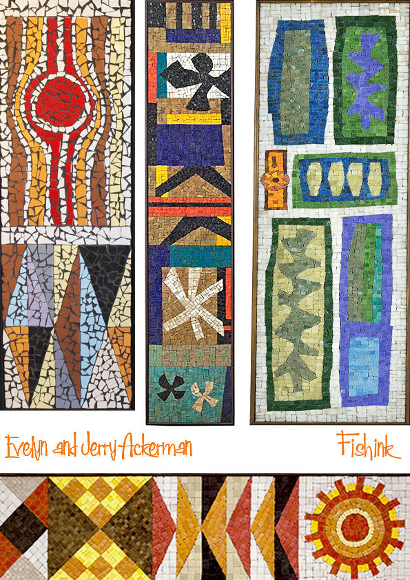
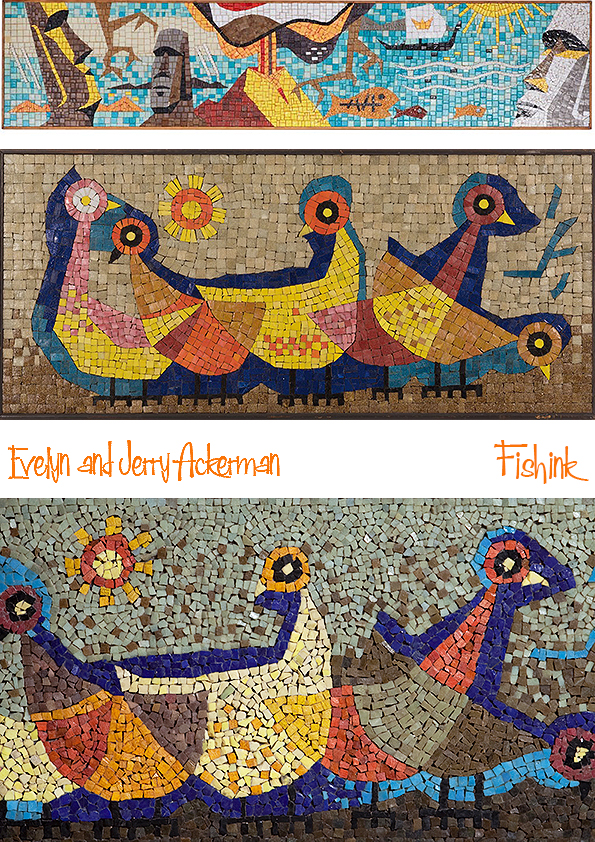
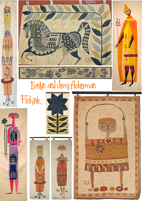
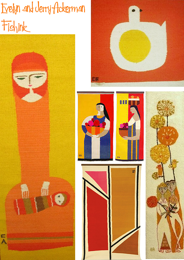
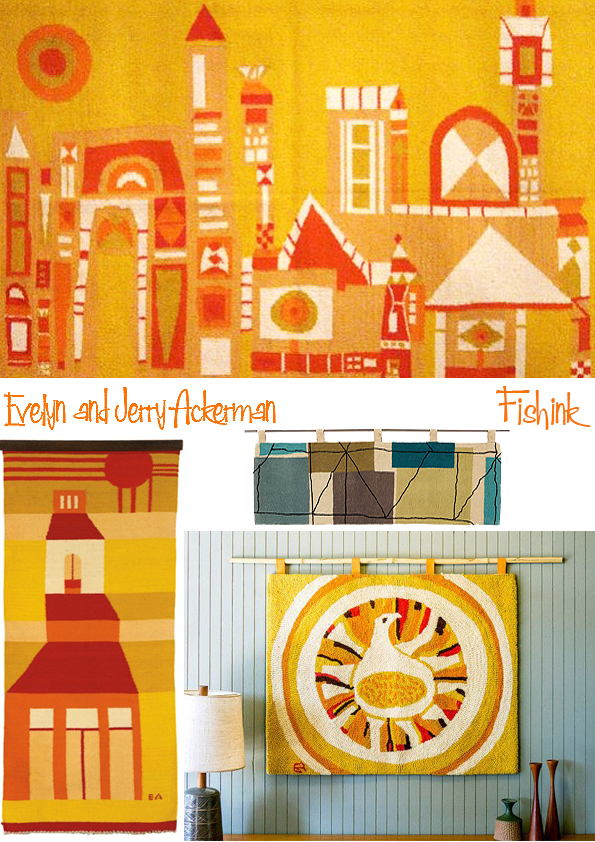
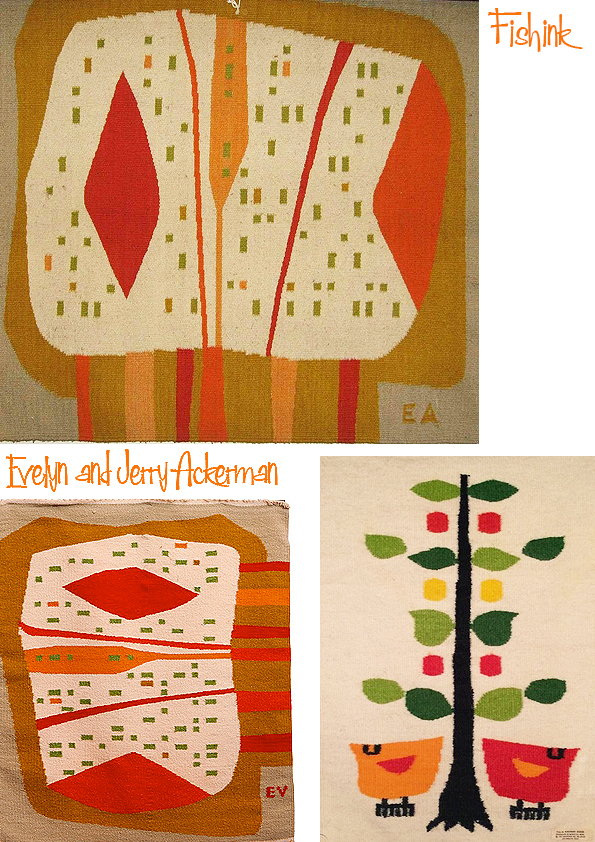
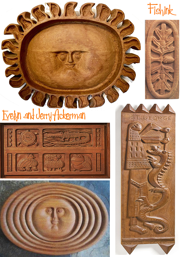
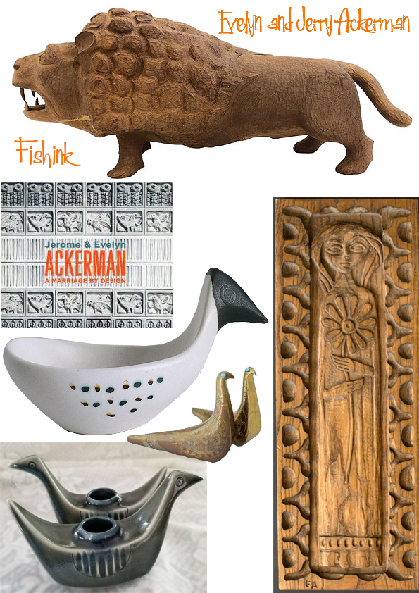
Evelyn and Jerry Ackerman Mid-century dynamic design duo. Part 3
Welcome back to part 3 of my three part posting on the wonderful work of Evelyn and Jerry Ackerman. If you missed part 2 it’s here, and part 1 you can find here. This final post revealing the stylish work of the Ackerman’s, shows their creative imagery through Mosaics.
In the mid 1950s the Ackermans visited San Francisco and saw an exhibition that included mosaics. Interested in exploring the medium, they developed mosaic wall panels and tables with mosaic tops that featured both abstract and figural motifs.
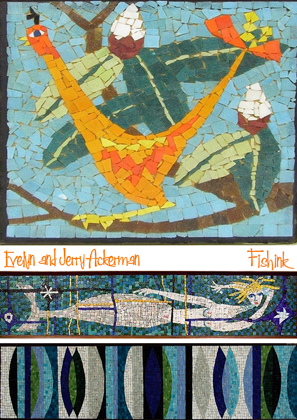
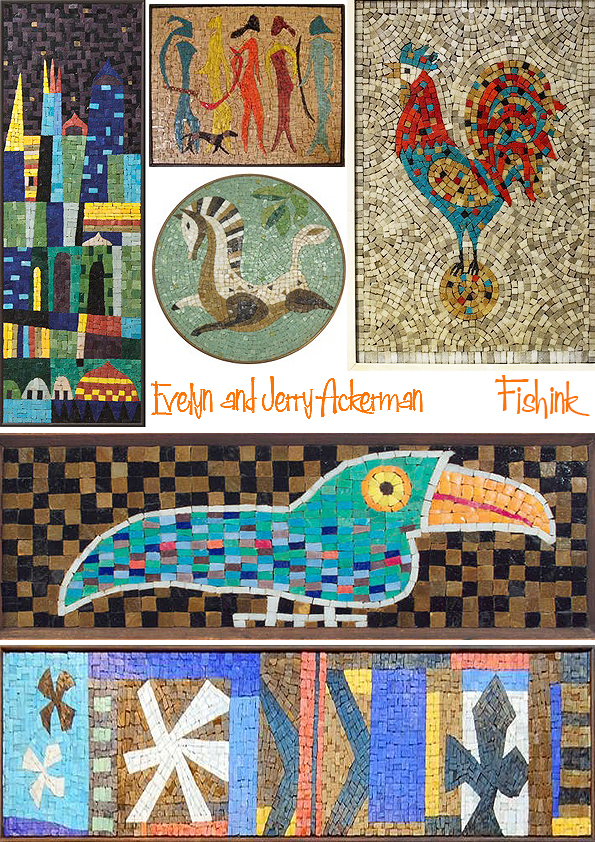
In order to increase production and allow Evelyn to focus on design, they established a mosaic workshop in Mexico. Evelyn created each design and sent a full-size drawing with colours and numbers corresponding to a sample tile board. At the workshop in Mexico, the design was then transferred onto a masonite backing to which the tile was glued, and finished with a simple wood frame.

In 1956 business associate Sherrill Broudy planned an apartment building in West Los Angeles on Kiowa Street. He asked Evelyn to design and produce a mosaic mural for the exterior. Because of its size (16´ x 32´), Fantasy Landscape was made in sections in the Los Angeles Jenev studio. The mural was featured in an article in the Los Angeles Times Home magazine and is registered with the L.A. Mural Conservancy. Evelyn designed a second mosaic mural, Sea, Land, and Sky, in 1957 for a Louis Mazzeti office building in Santa Barbara on Victoria Street, which was executed at ERA’s atelier in Mexico.

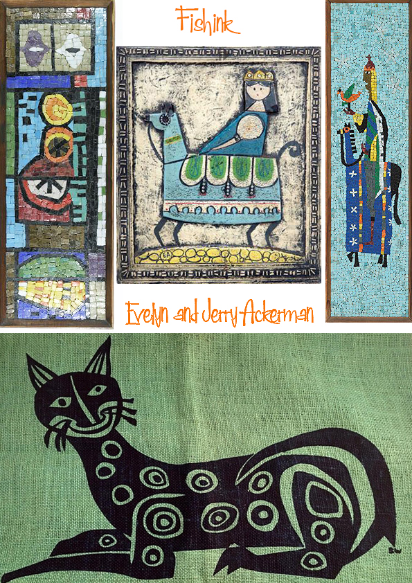
I love the fact that even through Mosaics, the Ackerman’s still manage to have their own distictive style.

I hope you have enjoyed these posts on this engaging couple. Please share my blog with your friends and remember to leave a hello or a comment from time to time. Happy Day Craig ! x
Evelyn and Jerry Ackerman Mid-century dynamic design duo. Part 2
Welcome back to part 2 of my three part posting on the wonderful work of Evelyn and Jerry Ackerman
If you missed part 1 you can find it here.
In the late 1950s Evelyn experimented with silk screening (starting with the drapes in their first apartment) and developed a series of designs. The first, Kites, was produced in Los Angeles by Tony Sharrar and Erick Erickson and was featured on the cover of the Los Angeles Times Home magazine in 1958. Evelyn’s interest in textiles began at the University of Michigan where she had taken a weaving class in 1941. She loved the tactile quality of hand weaving. In the late 1950s the couple decided to offer woven hangings as part of the ERA line. They knew from experience that weaving was a slow process, so they needed a workshop that could produce Evelyn’s designs. They found a well-established cottage industry not far from Mexico City where the workers were skilled at weaving serapes.


To produce the handwoven all-wool tapestries, the weavers followed a full-size drawing color-keyed to yarn samples. Evelyn’s first design in 1958, Hot Bird, was followed by a steady stream of new ones, and the Ackermans maintained a fruitful relationship with the same family of weavers for many years.


Continuing to explore new ways of executing her designs, Evelyn experimented with the hand-hooking technique in the late 1950s. This led to a new group of designs for area rugs, produced by a facility Jerry located in Osaka, Japan. Soon realizing that the rug market was overcrowded, the Ackermans changed direction, moving to smaller hand-hooked wall hangings that were made with both regular and needlepoint loop sizes.
The height of the loop could be varied and the pile could be cut or left uncut, allowing for a great variety of texture and depth. The first designs, Venetian Dusk, Sun and Lion, and Seed Pod, were popular, and ultimately the hookings proved to be the most successful wall hangings ERA sold. Evelyn continued to add new designs over the years, many of which were featured in design shows and publications.


Amazing range of ideas and artwork I’m sure you’ll agree. Keep tuned and look out for part three coming soon.
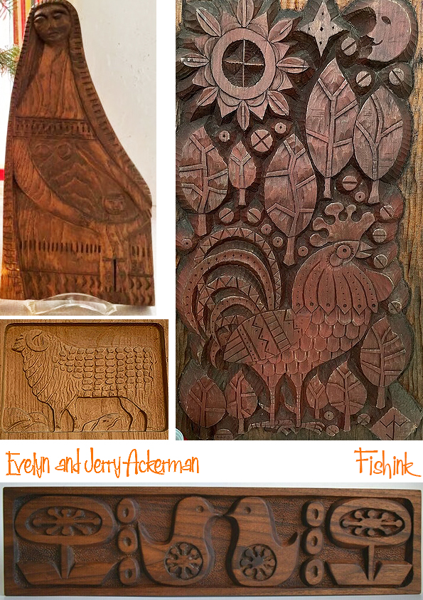
Evelyn and Jerry Ackerman Mid-century dynamic design duo. Part 1
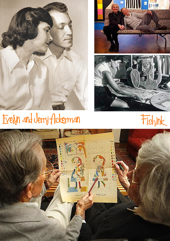
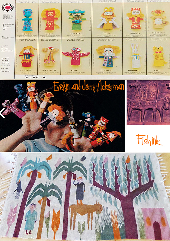
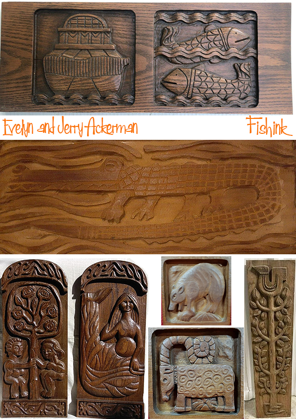
For 50 years, Los Angeles-based artist/designers Evelyn and Jerome Ackerman played a central role in the distinctive aesthetic of California mid-century modernism. Jerome Ackerman (1920–2019) and Evelyn Ackerman (née Lipton) (1924–2012) were American industrial designers who jointly contributed to the aesthetic of California mid-century modern with their ceramics, wood carvings, mosaics, textiles, and enamels in home furnishings and architectural elements. The Ackermans sold their products through their companies Jenev and ERA Industries. Evelyn was an accomplished artist and an author of books on antique toys and dolls.
I have compiled a two-part post, concentrating today on their wooden artwork and in the next post on their remaining pieces.
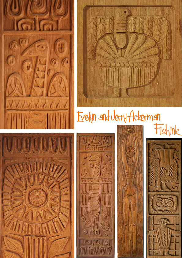
I’m assuming they took a reference from many different cultures for their imagery.

There’s such an array of wonderful imagery.
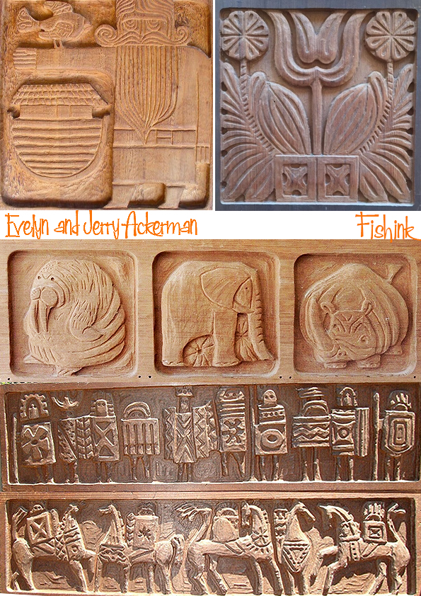
Evelyn designed and Jerry produced their first group of carved wood bas-relief wall panels in 1959. These included St. George and the Dragon and Adam and Eve. Hand carving was time consuming, and the Ackermans recognized the need to increase production while maintaining a handcrafted feel. Turning to the furniture industry, they found Maurey Spinak, a master woodcarver who had a small business employing multiple spindle-carving machines. Each piece was roughed out by machine and finished by hand carvers, providing a very close match to the hand-carved original.
Evelyn created a series of carved wood designs for architectural applications that became the basis for Panelcarve in the early 1960’s. The designs were executed as modular panels with tongue-and-groove detail so they could be assembled easily for diverse architectural and interior design applications. The panels were used extensively in hotels, restaurants, office buildings, schools, and homes.
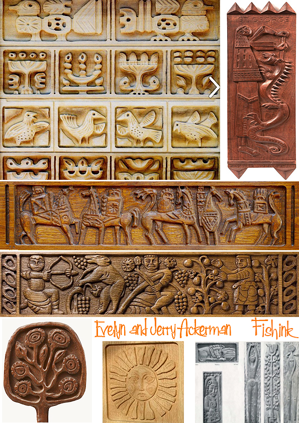
The Ucello series designed by Evelyn was used on the doors and transom of the landmark Alan Ladd building in Palm Springs in 1971. When Panelcarve later became Forms+Surfaces, the Ackermans continued designing for the company and became its distributor.
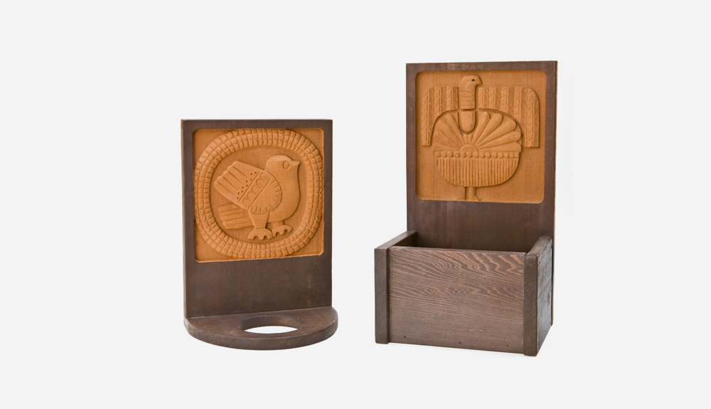
In 1971 Evelyn designed a series of Animal Woodblocks that were carved in thick redwood. The 20 different designs, marketed by both ERA and Panelcarve, worked individually and grouped. The woodblocks were included in the “California Design XI” exhibition and the book California Design. The Ackermans later introduced a series of plaques with a blank lower portion for house numbers, plant holders, and the like, as well as carved wood gourmet accessories such as knife holders and spice racks. All were popular gift items for specialty stores, department stores, and catalogs.
You can discover more about this creative couple on their website here and look out for part two coming soon.
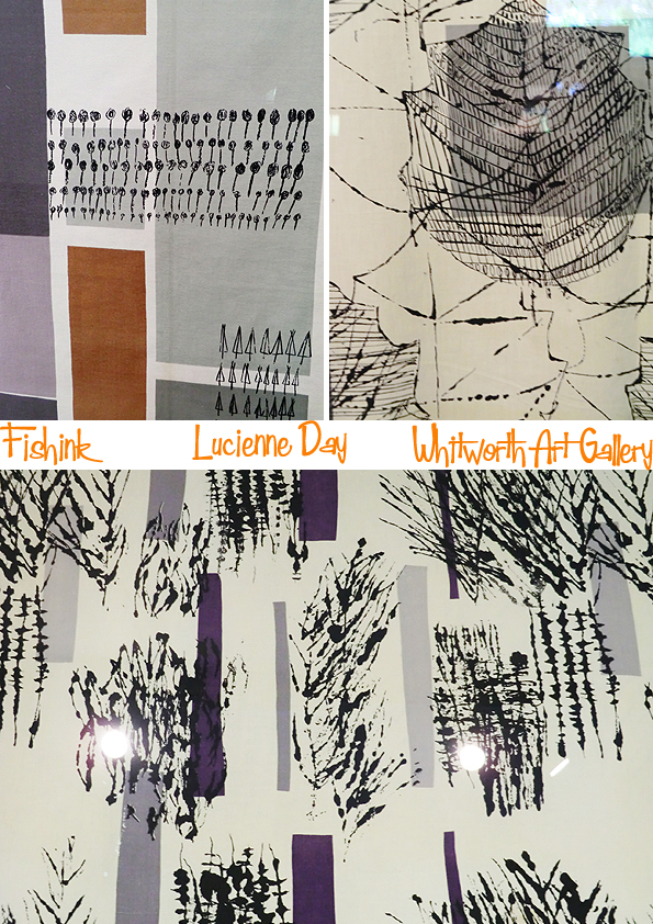
Lucienne Day and Barbara Brown at Manchester’s Whitworth Art Gallery.
This is an older post worthy of revisiting for the lovely textile designers it showcases.
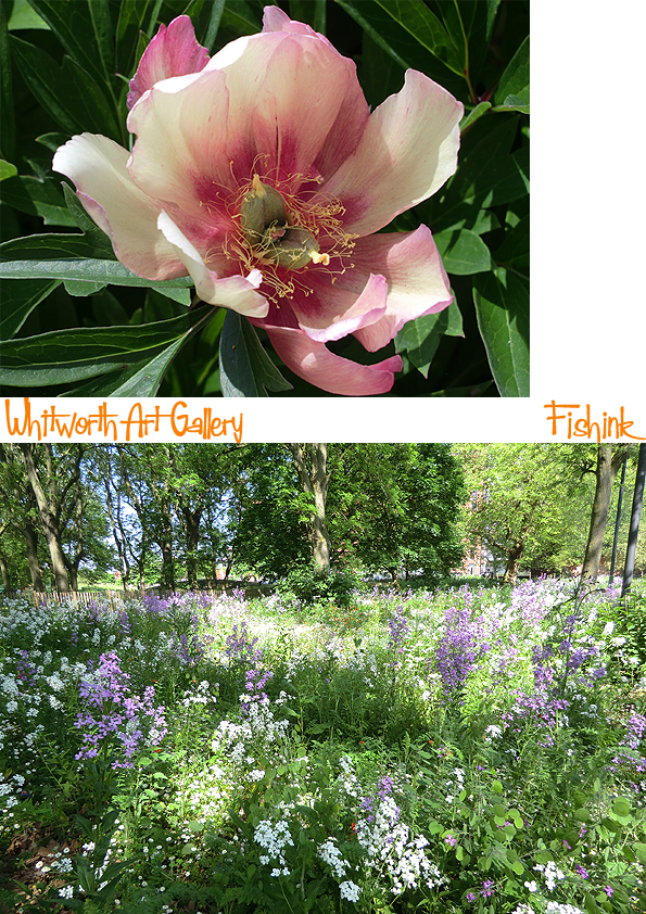
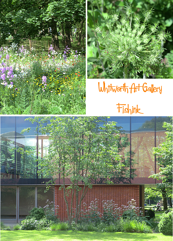
This was an exhibition on at Manchester’s Whitworth Gallery a while ago.
Someone has been very busy scattering seeds and planting at the back of the Gallery as the gardens are looking wonderful just now. The array of plant life, shapes and types, work really well in their new setting.
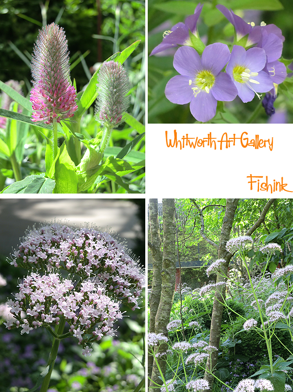
How amazing they looked in the sunshine today, this one below looking like a floral firework caught in freeze-frame!
Born in 1932, Barbara Brown left Manchester in the mid 1930’s with her brother and sister, to live in a care home in Kent, before being evacuated to Dorset during WW2. She studied at Canterbury College of Art and then from 1953-56 at the RCA under the guidance of Humphrey Spender.

At her degree show Barbara’s work was talent spotted by Tom Worthington, the artistic director or Heal’s Fabrics (a leading British textile firm), resulting in her first commercially printed fabric ‘Sweet Corn’ in 1958 (below top left) and subsequently designed for them for the next two decades. Like Lucienne Day, she was working for Heal’s ‘without contract on an exclusive basis’.
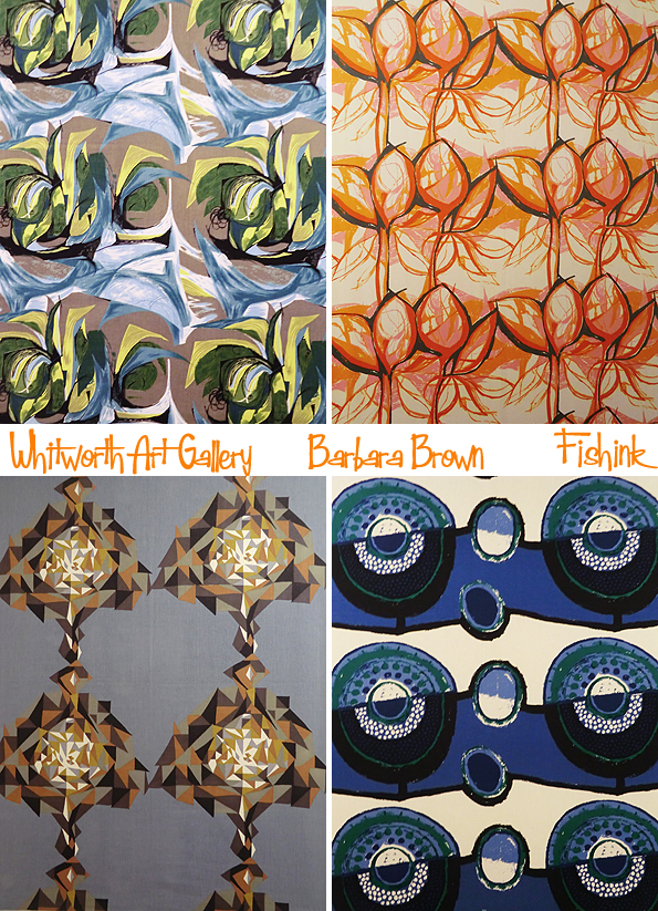
Her ‘Complex’ pattern (below top right) won the CoID Award in 1968,

and ‘Spiral’ and ‘Automation’, two printed furnishing fabrics for Heal’s (below), won two CoID awards in 1970.
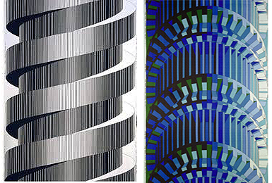
Throughout the 20th century, considerable energy had been directed toward the possible artistic conflict of industrial production and individual, hand-made objects. Here the artist considers the issue visually, creating an aesthetic statement inspired by a gear unit, a common symbol of the industrial revolution. The fabric was hand-printed using individual screens for each of the colours needed to complete the design.
Barbara also acted as a consultant for other companies in Europe and USA, and in 1964, she created ‘Focus’, a pattern for a range of ceramic tableware designed by David Queensberry and made by W R Midwinter Ltd.
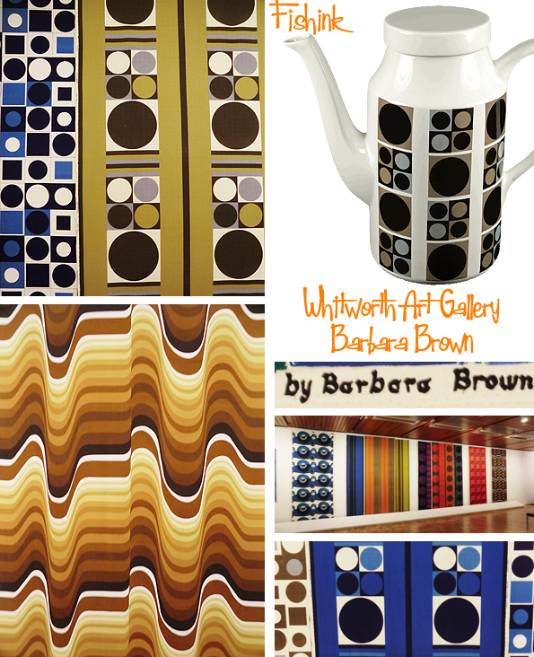
For seventeen years Barbara worked solely for Heals and was regarded as their ‘golden girl’. Avoiding all sense of prettiness, her designs moved from abstract plant forms and geometric shapes to brutalist machine-age patterns. Some were restricted to black and white and others were printed in three to seven different colour-ways. Here’s some of Barbara’s striking, large scale designs.
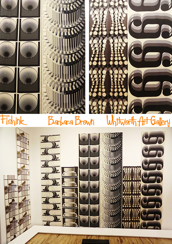
Barbara’s career epitomised many of the difficulties of a female artist in the mid 20th century. Wishing to be a sculptor, she was pushed by her tutors towards a career in textile design. The results are some of the most powerful and usual patterns produced at this time.
Update…
Barbara Brown is now a paper and book artist. Her pieces are often collaborations with poets: for her, there is a certain alchemy that occurs when three dimensional imagery is combined with text. Barbara has been an artist member of WSG Gallery in Michigan since 2004 and curates Beyond Words: A Celebration of Book Arts each year.
So to the second of today’s textile artists Lucienne Day.

Lucienne Day (1917-2010) was the foremost British textile designer of the immediate post-war period. Her work repeatedly drew on the inspiration of flowers, foliage and other plant forms, but she radically reworked the traditional repertoire of the pattern designer, by bringing to it her knowledge of modern abstract art. Day’s textiles speak the visual language of Kandinsky, Joan Miro and Paul Klee combined with a wonderful sense of colour, the designer’s fashion awareness and a quirky sense of humour.

For Lucienne, gardening was a lifelong passion. She was a knowledgeable plantswoman who, at her London home, was largely confined to pot gardening. However in 1964, she finally go some real soil to work with when she and her husband Robin, the furniture designer, leased a cottage in West Sussex as a weekend bolt hole.

‘Calyx’ (below) is Lucienne Day’s most famous pattern from 1951. It was originally designed to hang in the Homes and Garden pavillion at the Festival of Britain. Although Heal’s were initially sceptical about the likely commercial success of the design, it sold in large quantities over many years and was widely emulated by other designers in both the UK and abroad. Highly original and startlingly modern, it proved the springboard for Lucienne’s career as a textile designer. Part of it’s success was the implied message of regrowth and optimism for a nation only just recovering from war.
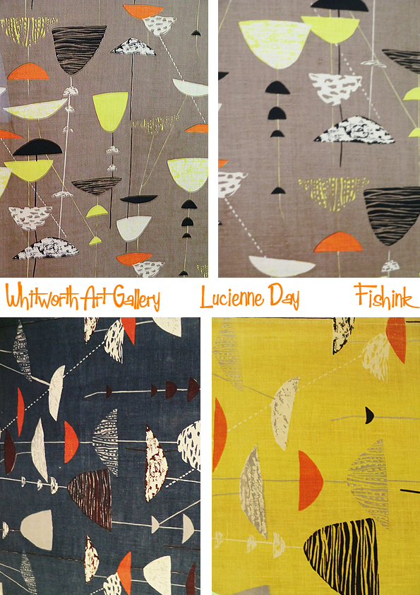
Lucienne’s daughter Paula Day says ” I think (Calyx represents) the moment at which my mother found the courage to embrace her power as a creative artist. The pattern springs up, carefully contrived to work well in repeat yet apparently utterly spontaneous. ‘Calyx’ is at once dynamic and balanced, muscular and delicate, disciplined and free. I’ve come to see that as the signature of the best of my mother’s designs.

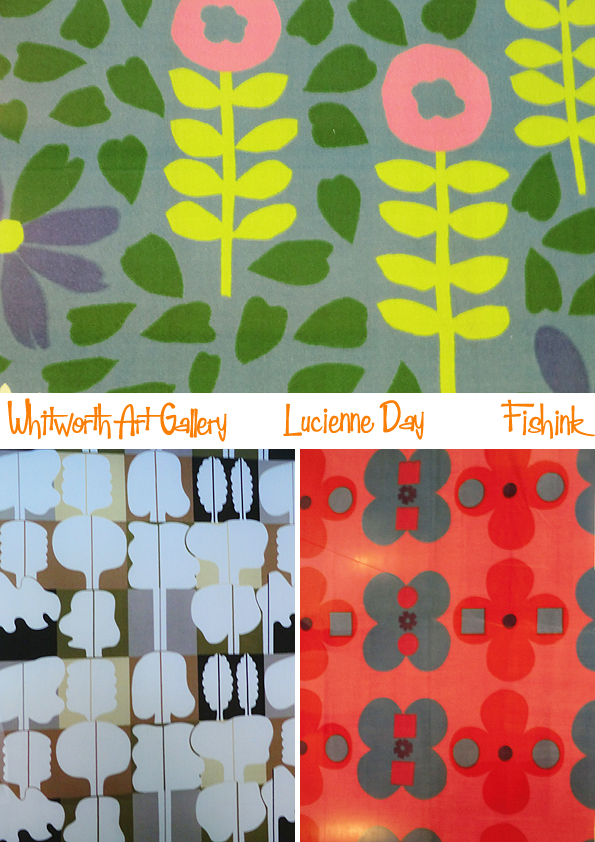
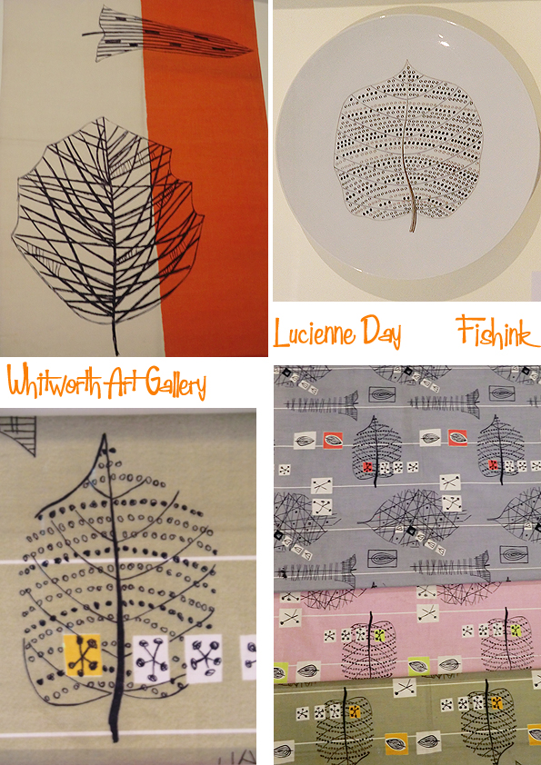

Some more of Lucienne’s designs, not all featured in this exhibition.


The Whitworth began to collect textiles designed by Lucienne Day around 1960, largely gifted by the manufacturers she worked with. The gallery was also the recipient of many textiles from the designer herself, after organising the first retrospective exhibition of her work in 1993. This show is part of the nationwide Lucienne Day centenary celebrations coordinated by the Robin and Lucienne Day foundation. More news here.
Thank you again to the Whitworth for some of the information for this post and for continuing to host such inspirational exhibitions.
Save


