Approaching Fairs and Exhibitions 2019.
Hello everyone, I thought I’d tell you about a couple of interesting Fairs and exhibitions I’ve heard of which are either already on, or fast approaching. Apologies to my viewers from overseas, but these are all in the UK, please do come and visit them if you are travelling here.
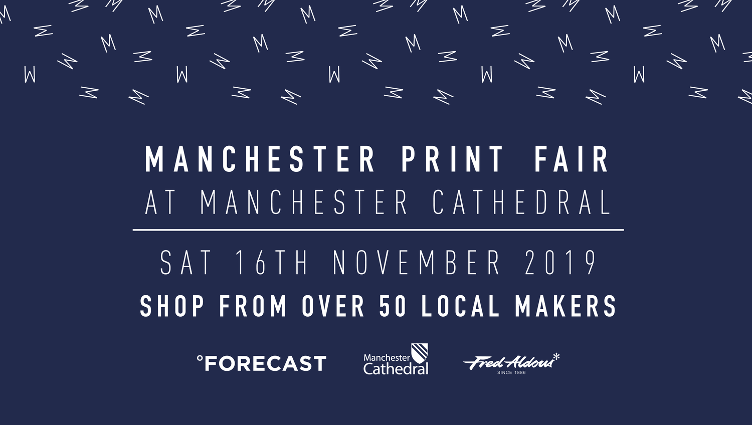
Firstly for the North West locals we have the Manchester Print Fair on November 16th, with around 70 illustrators and artists taking part.
Secondly for all living around the Cambridge area, there’s a similar event on the same weekend, i.e. the 16th and 17th November. It’s called the Cambridge Illustartion and Print Fair and you can register here or admission is only £2.
More info over on the Ink Paper and Print site.

A few exciting exhibitions in London right now.
Firstly the Antony Gormley exhibition at the Royal Academy on until December 3rd. Looks amazing.

Secondly at the Tate Modern until January 5th 2020, the Olafur Eliasson exhibition. Olafur is a Danish-Icelandic artist known for sculptures and large-scale installation art employing elemental materials such as light, water, and air temperature to enhance the viewer’s experience. I watched a fascinating BBC programme about him here, sadly not available to view at the moment.

Also at the National Army Museum there’s a stunning collection of Wartime posters by Abram Games, on until November 24th.

Finally I’ll be exhibiting my ceramics again at the Sale Art Fair’s Christmas Bazaar in St Paul’s Church in Sale, M33 7YA, on Sat November 30th, 10 til 5pm.
One for your diary, more news to come.

I hope you enjoy my quick selection, do let me know if you do make it to any of these and also what you thought.
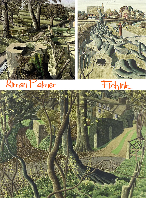
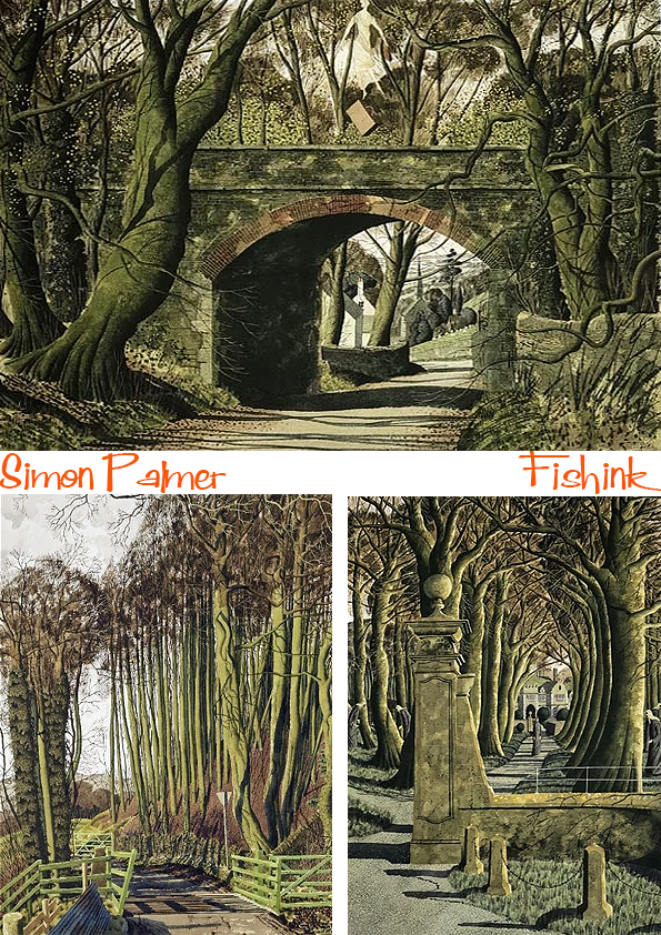
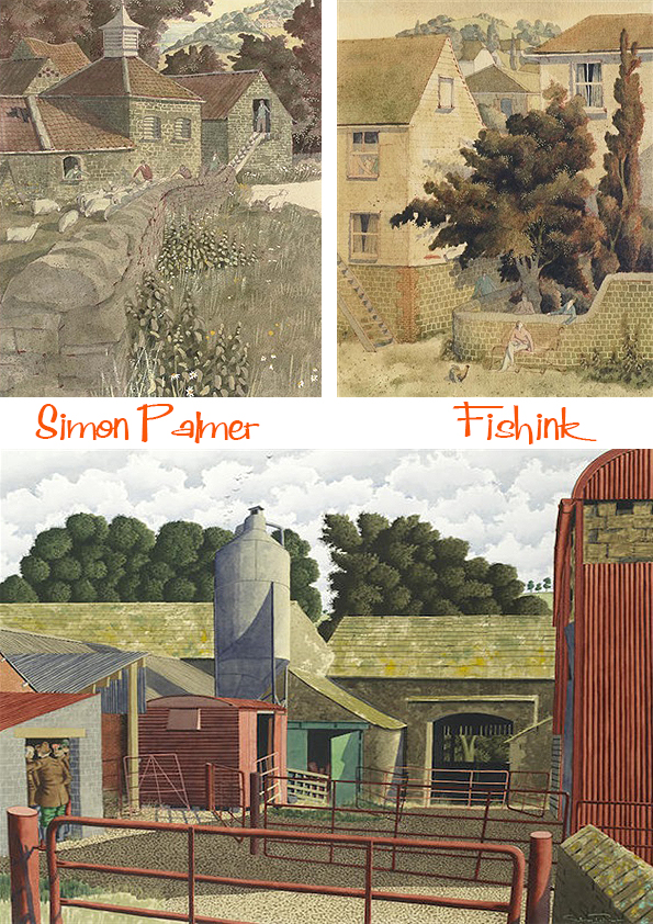
Simon Palmer Painting the Yorkshire Countryside Part 2
Welcome back to Fishinkblog for the second part of my post about the idyllic paintings of Simon Palmer.
If you missed part 1 you can catch up here.
Yorkshire-born artist Simon Palmer has gained a huge following both in the UK and abroad for his stunning watercolour paintings of the Yorkshire landscape. He studied Graphic Design and Illustration at the Reigate School of Art in Kent, but he was encouraged by his tutors to focus his energies upon painting. Simon Palmer’s meticulously detailed paintings are brimming with wit and his evident love for Yorkshire people and their landscape. He has a completely unique style that is immediately beguiling. He works into his paintings using pen and ink to achieve incredibly detailed foliage and tree bark.

HIs work quite often emplores the viewer to enter further into the piece by wandering down a country lane or wooded pathway.

The movement of the land is sometimes exaggerated and the viewer maybe treated to a birdseye perspective, in order to show more of those faraway fields, or some detail off into the distance that a normal ground level view wouldn’t reveal.

Simon’s work is always serene. These are peaceful landscapes where people go about their daily business and everything ticks along quietly.
Sometimes he captures travellers.

Or the changing seasons.

But most of the time it’s simply.. life happening by itself.
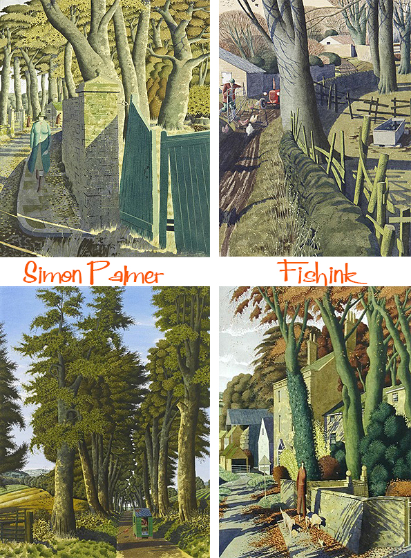
Simon’s landscapes are a visual map of the area where he lives. I feel like I could navigate my way around just by knowing his leafy paths and their twists and turns.

Definitely paintings that you can visually walk into, loose yourself and pop around that bend to see what is happening just beyond the sides of the canvas.

I hope, like myself, you enjoyed the work of Simon Palmer. If you did, send me a comment and let me know.
There’s a great selection of Simon’s work over at The Portland Gallery
Simon Palmer Painting the Yorkshire Countryside Part 1

Welcome to Monday and another busy week ahead. We begin today with the first of another two-part post to celebrate the inspiring leafy watercolours of Simon Palmer.
Simon Palmer was born in Yorkshire in 1956, and graduated from art school in 1977. He has exhibited extensively since 1980, and held ten one-man exhibitions in London with JHW Fine Art. For me his work has flavours of James McIntosh Patrick, Paul Nash, Eric Ravilious, Samuel Palmer, Stanley Spencer and even a tiny sprinkling of Beryl Cook !

” I fell in love with North Yorkshire during a visit to the county in my teens, says Palmer. On leaving art school I moved as soon as possible to live in the county and it has become my spiritual home ”
Simon’s love of the countryside surrounding his home in Ellingstring in Wensleydale is the dominant theme running throughout his work.

His paintings depict the rural setting, with a quirky and witty take on the Yorkshire Dales. It’s not entirely clear what period his work depicts, but from the clothing his wandering visitors wear, I’d say between 1930 and 1940. Perhaps a quieter time in a simpler world.


The result is a unique interpretation of the landscape or even just a trip around the local village.

“Expression of my deep love for the Yorkshire landscape is portrayed in my pictures”
Simon’s work often leads the viewer deeper into his paintings.

Pathways and people are both familiar themes.

A book, The Art of Simon Palmer was published in 2011.
His exhibitions have been widely reviewed, and previous catalogues have included essays by Alan Bennett, Martin Drury, Tom Flynn, Iain Gale, Lynne Green, Ronald Maddox, Elspeth Moncrieff and Jane Sellars. He has written and illustrated three books, including Pebbles on a Beach. His work is often reproduced as book and magazine covers, or used in calendars, brochures and programmes.
Palmer’s work is held in many private collections in Europe, America, Australia and Japan. Salt’s Mill at Saltaire holds a large collection of his work; other collections include the National Trust, the Council for the Protection of Rural England, Mercer Art Gallery and the Penn Club, London.
Check back in next week for Part 2 of Simon’s post.
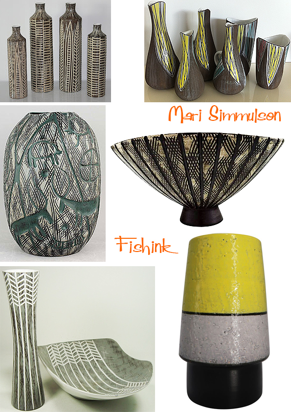
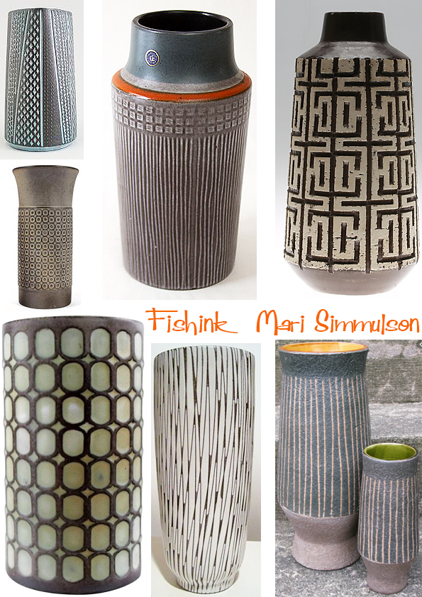
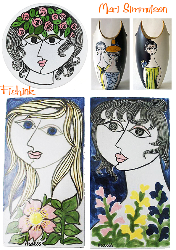
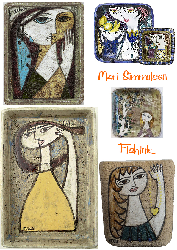
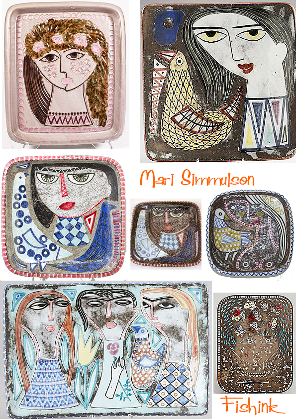
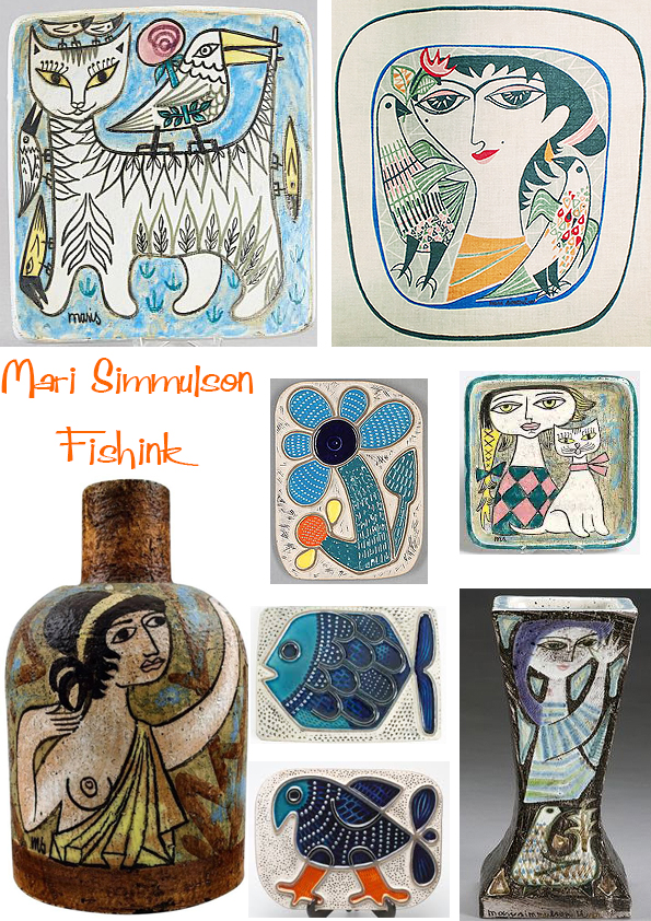
Mari Simmulson Swedish Mid Century Ceramist

Mari Simmulson (1911-2000) is a familiar name when talking about Swedish ceramic design of the 20th century. Born to Estonian parents in St Petersburg, Russia. At the start of the Russian revolution in 1917, Mari’s family moved back to Estonia. During the 1930s, she studied at the State Art School in Tallinn and later further developed her skills at the nearby Arabia porcelain factory in Helsinki.


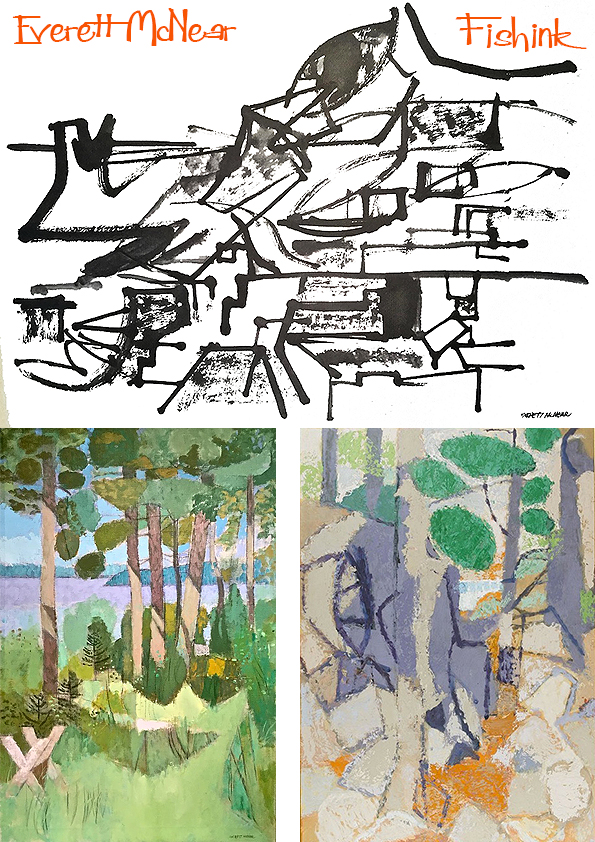
Everett McNear American Mid Century Artist
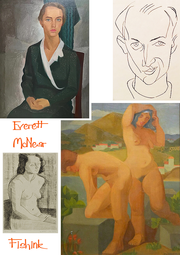
After a year of study at the University of Minnesota, Everett found that the drawing and painting classes at the Minneapolis School of Art were more immediate to his needs than liberal arts courses. In 1924, he made his first contact with Cameron Booth. Prior to his arrival at the Minneapolis School of Art in 1921, Booth had been thoroughly exposed to the key exponents of French painting. His style was firmly rooted in the Cubist and Impressionist traditions. Booth’s influence on McNear was significant.

“Cameron Booth taught me to love the smell of turpentine and the feel of a bristle brush in oil paint. He opened the doors for me. Beyond them I found the rich linear organization of Veronese, the color harmonies of Titian, and the poetic, freely moving space-forms of El Greco and Tintoretto. I began to see that these abstract qualities and relationships were the things that gave a painting a life of its own.” Under the influence of Booth, Edmund Kinzinger, and his fellow students at the Minneapolis School of Art, McNear abandoned the curvilinear forms of his early drawings in favor of a more disciplined aesthetic.
In 1932, McNear made his first of many trips to Europe. Hungry for personal and artistic growth, he scheduled an exhaustive program that would guide him through much of Western Europe, including time spent at the Academie Moderne studying etching with Marcoussis. His travels are particularly important to an understanding of the artist and his work. In his book Young Eye Seeing, his collected letters document this first trip, express his motivations, and chart his goals. French engravings made around Notre Dame and along the Seine.
You can see below first the sketch and then the realisation.
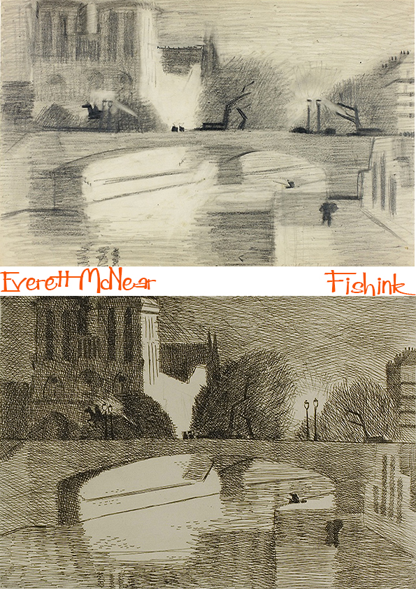
More work in the vacinity. Lovely use of light and shade.


His return to the US in 1933 saw the artist turning to work as an illustrator, and in Chicago, he worked for many years as a graphic designer. McNear also became heavily involved in the art scene in Chicago. He became a member of the Arts Club and won numerous prizes for artworks he exhibited at the Art Institute of Chicago, the Art Directors Club, the Illinois State Museum and the Art Guild. He was a prominent artist, designer, and collector in Chicago and also put together exhibitions at the Art Institute, the Arts Club, and later at the Sears Tower.

Some illustrative work for Childcraft volumes, a young child’s encyclopedia started in the 1930’s.

A few watercolours from around the 1950’s.
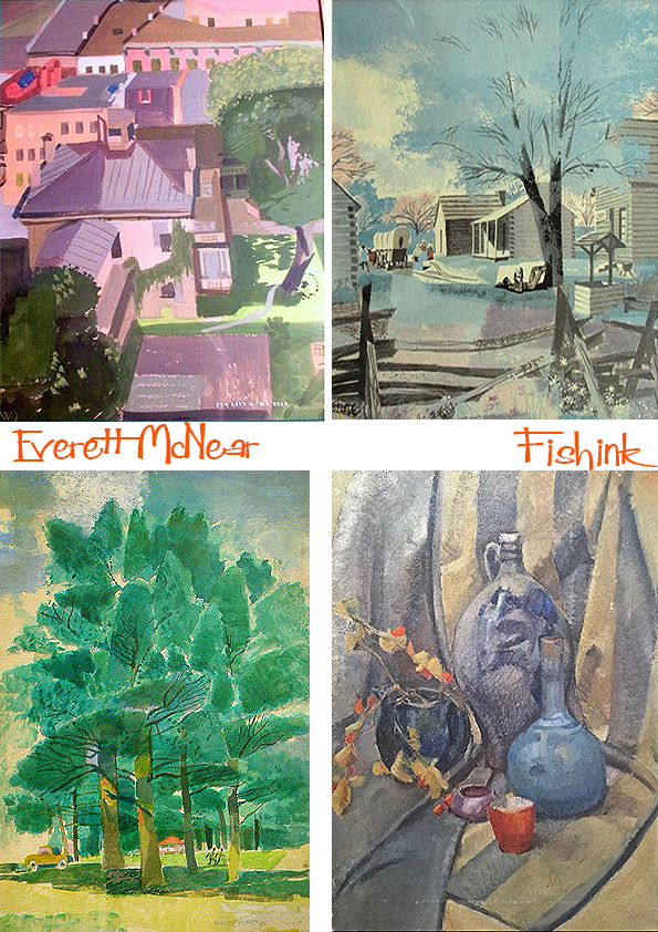
Others which remind me a little of Rennie Mackintosh’s work.
Painting using different mediums.
Everett and his wife, Ann, were benefactors of what was the Notre Dame Art Gallery (now the Snite Art Museum); they served on the advisory panel and he did the initial gallery installation design. He donated hundreds of his own works to the Snite, plus pieces from his collection including works by Alexander Archipenko, Cameron Booth and Edmund Kinzinger, in addition to African sculptures; Flemish, Spanish, and Italian manuscript pages; Persian paintings and Peruvian textiles.
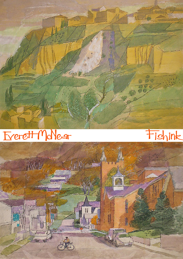
His sixties landscapes show a wonderful transition from Cubist marks to a style of his own.
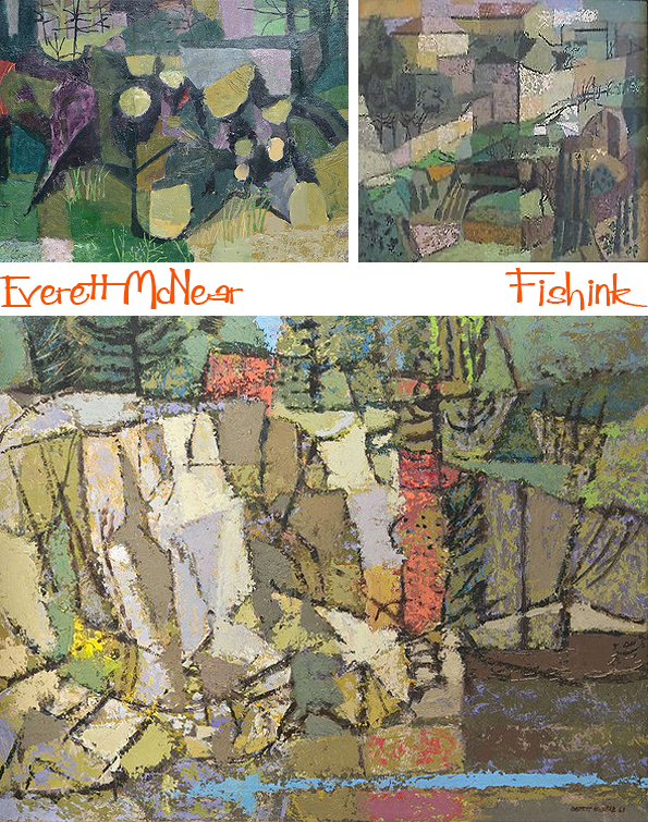
They feel so fresh and summery


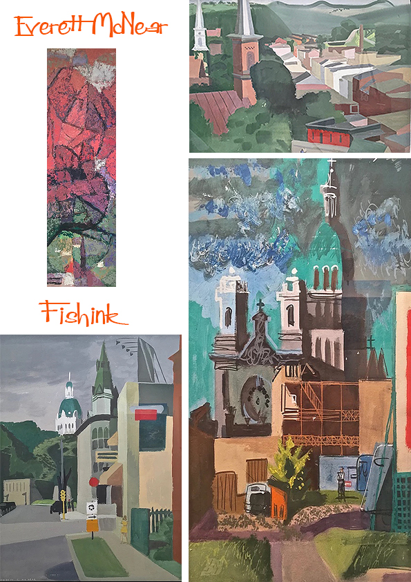
A couple of more abstract paintings.

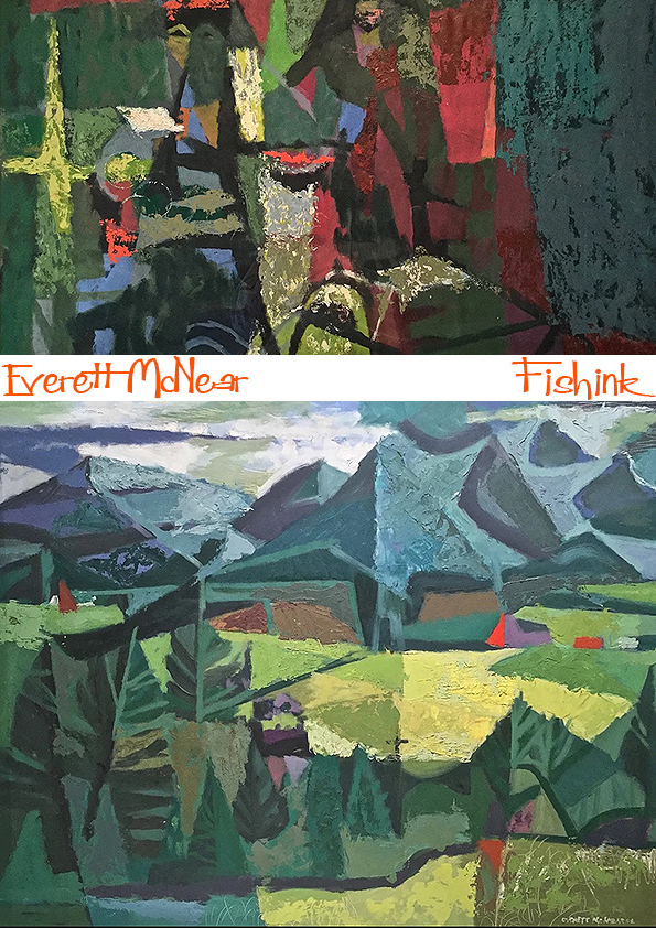
Before his wonderful land and sea scapes. Breathtaking.

Everett McNear was a happy painter … “There is a genuine pleasure in the transferring of ideas from nature to the canvas, and in the handling of paint.”
A dozen one-man shows in galleries and museums from San Francisco to New York rewarded him for his dedication to the smell of turpentine and the drag of the loaded brush.
Many thanks to Gallery 5004 for the information about this talented Artist.
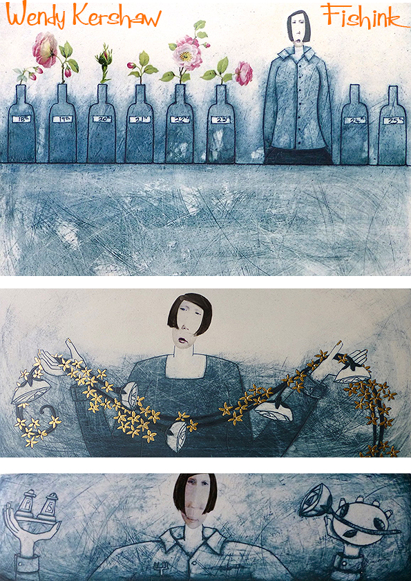
Wendy Kershaw Ceramics
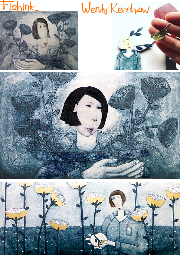
There is something a tad dreamlike about the ceramic work of Wendy Kershaw.
She allows the viewers mind to wander and ponder about the situations that each character is portraying. After destroying some of her father’s roses by digging up clay to make things as a child, Wendy went on to graduate with first class honours from Gray’s School of Art, Aberdeen, followed by a Masters degree at Cardiff. Her ceramic practice has continued over thirty years, as artist in residence in schools, further education tutor, ceramics technician at The Glasgow School of Art and master course leader at the International Ceramics Studio, Kecskemet, Hungary.
She was invited to three residencies in China, in the historic porcelain capital of Jingdezhen, Shanghai, and as part of the UK delegation to the FuLe International Ceramic Art Museums. These rich cultural experiences helped move her work in new directions, with the inclusion of decals and glaze. Her work is part of the permanent collection at Jingdezhen, FLICAM ceramic museums and the International Ceramics Studio.

She uses porcelain to illustrate an intimate world in which small acts of everyday life are imbued with importance. A sensitive balance of bold composition and subtle detail results in a rich narrative that is both weighty and humorous. Her work has playfully interpreted proverbs and poems, and recent work deals with anticipated small joys… often the joys of angels bringing Gin, Tea or Cake ! Her work makes me smile.

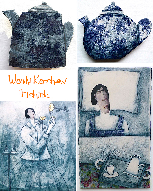
A selection of ceramic books and a glimpse into the studio world of a ceramist.

The books are constructed from porcelain slabs, forms include framed panels, with moveable pages and folding screens. Such delicasy and detail.
The intricate illustrations are etched with fine sewing needles onto the raw clay. Underglaze stains are washed on, erased and built up, and after high firing a layering of decals and enamels are applied and fired on. Sometimes the pieces are fired up to 4 times in order to build up the complex layers, textures and additions.
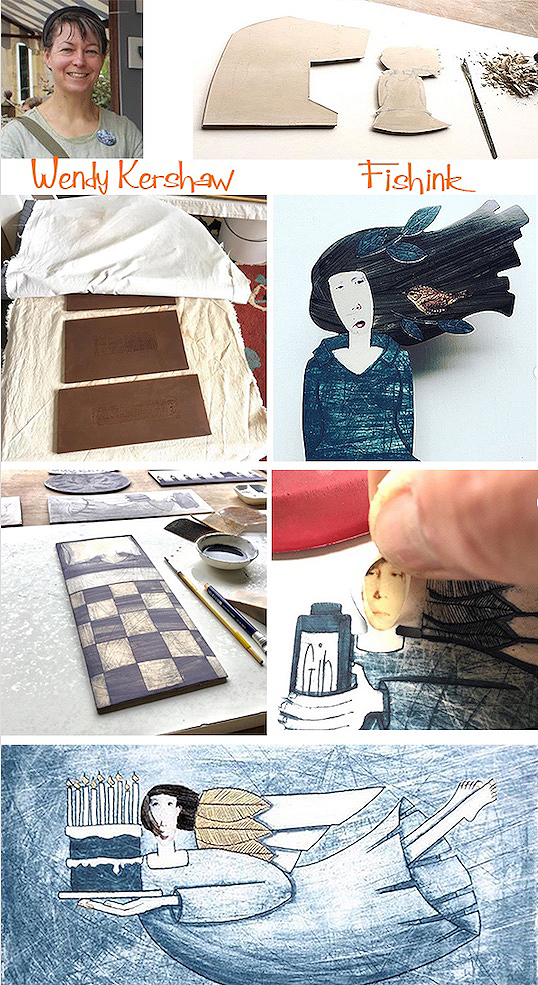
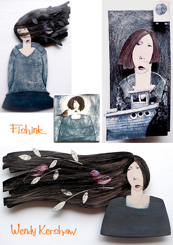
The scratchy surface and the blue layering of washes, contrast beautifully with the calm and serene figures. The decal faces are taken from young relatives and people Wendy knows but then are elongated and taken out of proportion to create the final long faced lasses.
Beautifully detailed work with flowers.
Hints of cooking and cake shops.


More tea anyone !
And the wonderful windy haired girls with branches, leaves and nestling birds.
You can follow Wendy here over on Instagram. Which are your favourites ?
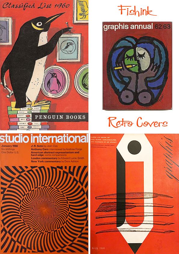
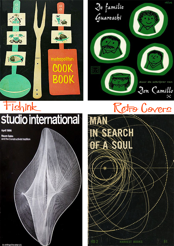
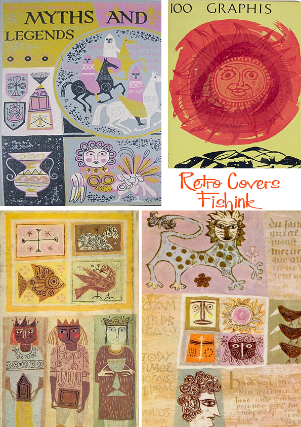
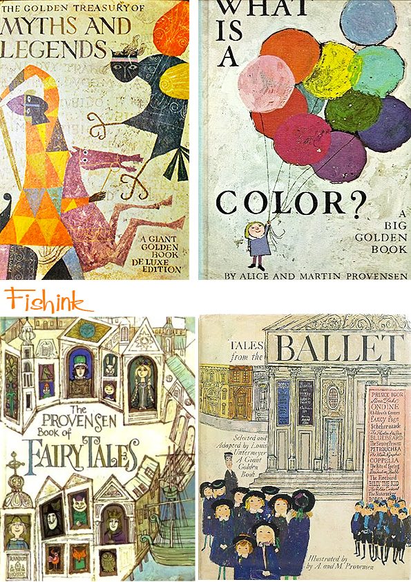
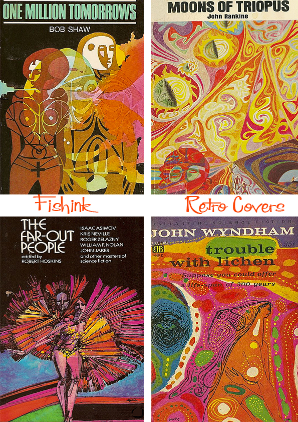
Retro Book and Magazine Covers
Hello everyone, it’s been a while since I’ve selected and shown some of the fabulous vintage Book and Magazine covers that are around. They always make me smile and feel content, don’t ask me why. I’m so glad there’s a modern retro design theme going on in the world of bookcovers at the moment. Looking back in fifty years what will they be known as, retro- revisited covers ?
Let’s start with some funky graphic shapes.

Sculptural, architectural and crafty covers.

Loved these spidery typing fingers.
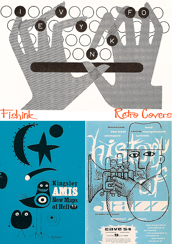
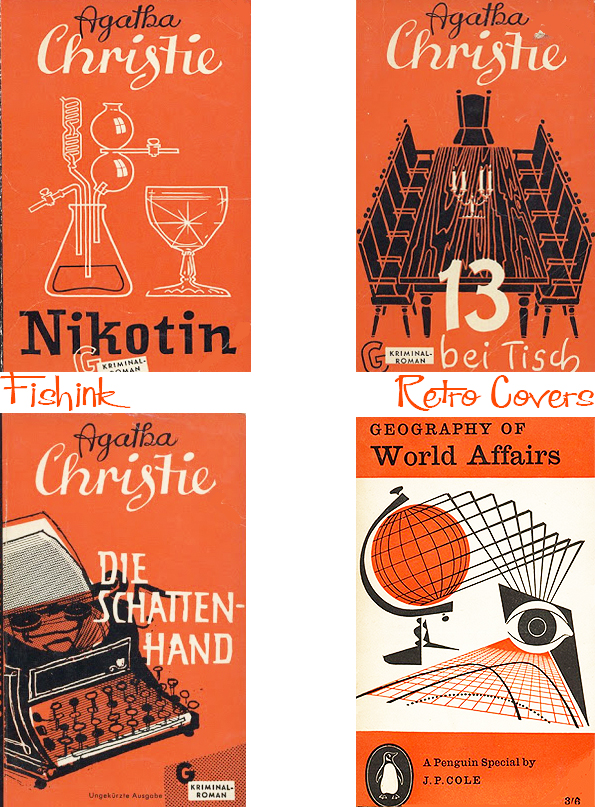
Time for a little red and orange crime relief.
So many great Agatha Christie covers, I wonder how many times her work has been reprinted ?
Interiors… looking at exteriors.
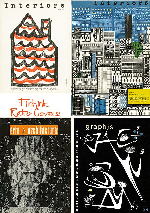
More sculptural shapes.
Some moody blues !

Keeping an eye on the vintage cover.


A couple of fab pages from Alice and Martin Provensen’s Myths and Legends and other volumes.
Some wacky space-age Sci-fi cover illustations.
German designer and animator Henning Max Lederer took 55 vintage books and set the cover graphics in motion to achieve psychedelic results.
Hopefully something for everyone. What floated your boat today ? ; )

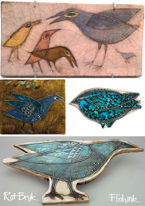
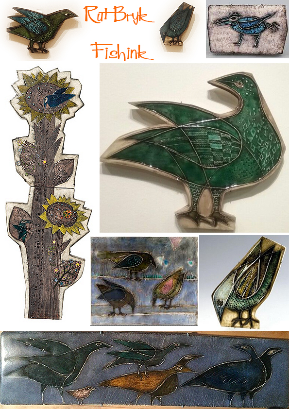
Rut Bryk Finnish Ceramics Part 2
Welcome back to Part 2 of my post about Finnish Ceramist Rut Bryk. If you missed part 1 you can read it here.
The book above was published in conjunction with Rut Bryk’s centenary exhibition (2016) and produced by EMMA (Espoo Museum of Modern Art). Copies are still available here.
In the book. Harri Kalha, who befriended the artist as a young art student, tells Bryk’s story, combining art historical narrative with vivid, intimate details. He introduces us to a timid, publicity-shy experimenter who became a cosmopolitan modernist through her unshakeable faith in the power of art.
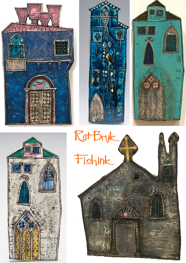
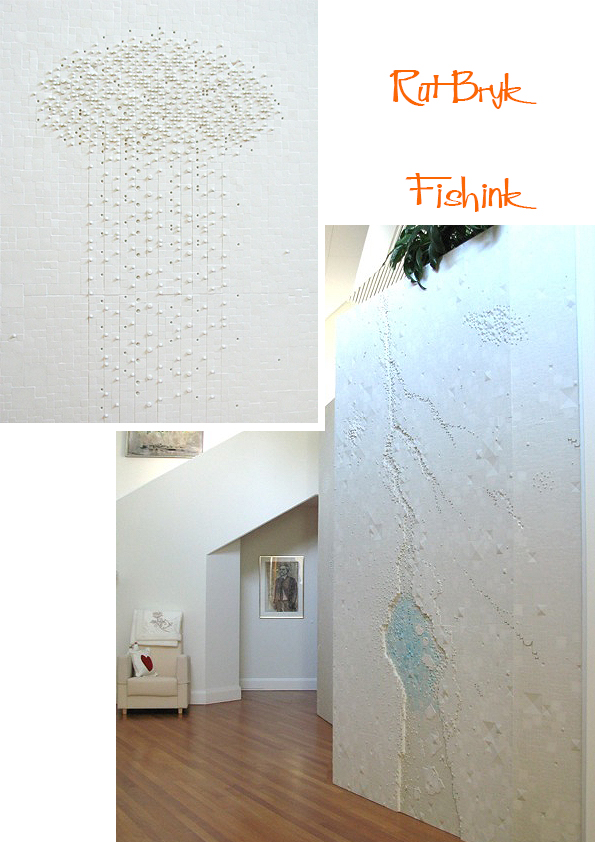
Her houses are a little religious, some apparently were almost half a metre in height !
The walls of the Venetian palace are swaying, and the architecture is asymmetrical, but the edges of the tile make the building a delightful whole. Imagination wakes up – what is happening inside the palace. Through the decorative windows gleams the light. The artist´s color scheme resembles the old stained-glass paintings of the churches.

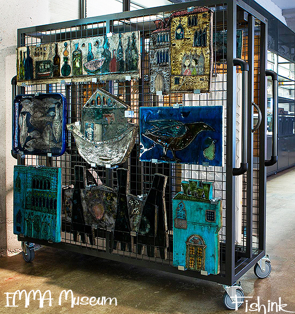
You can better appreciate their scale from this image I found from the storage at the EMMA Museum.
Rut Bryk often portrayed home, buildings, home-related harmonic things. She also described sacred places, such as churches and chapels. The home can be thought of as a sacred place where beauty and creativity flourished. She showed that there was no clear boundary between art and life.
The house is probably one of the quietest object that does not move or change.
The house also closes on the noise of the outside world, and then returns the inhabitants to a state of silence. Closed spaces spark memories but can also help with forgetting and letting go. According to Sigmund Freud, the house reflects dreamers themselves on many different levels. A poorly-built house can tell about her/his own neglect, the closed shutters of the building signal the closure of the outside world, and the broken windows may leave the house to strangers and other people ideas to influence their own minds. The doors of the house also have their own meaning: the door opening outward tells about the need for opening out and the inwardly swinging door reveals the need to examine the interior.
Finding new rooms or secret passages from the house suggests finding new sides of themselves. Finding this before unknown potential is usually a pleasant and restorative experience. Dreaming is like a fairytale stage – whatever is possible.
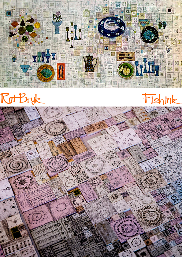
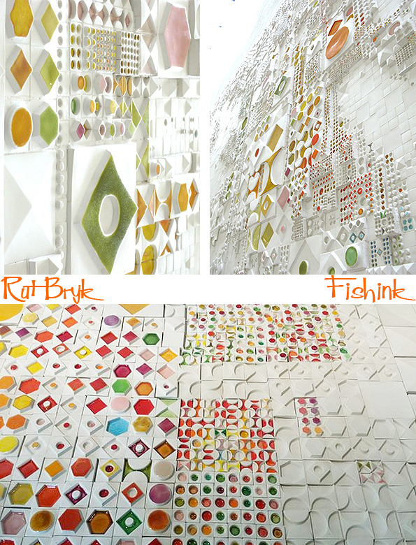
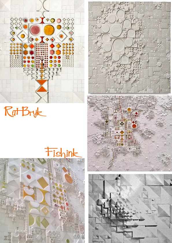
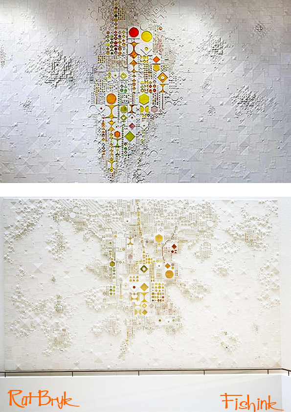
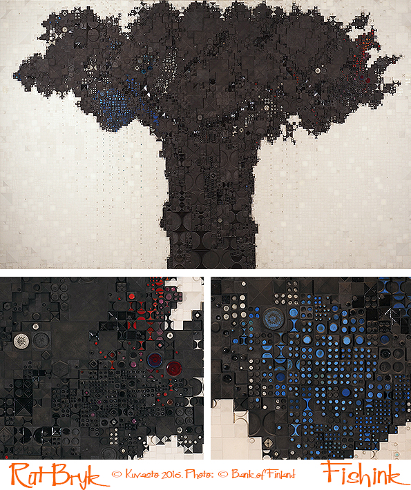
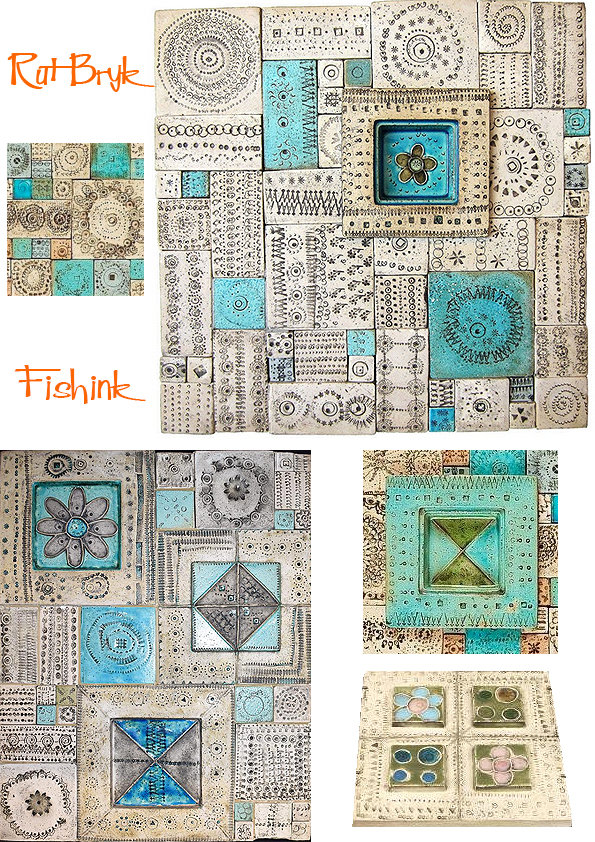
The houses turned from 2D into 3D and became almost like cities.
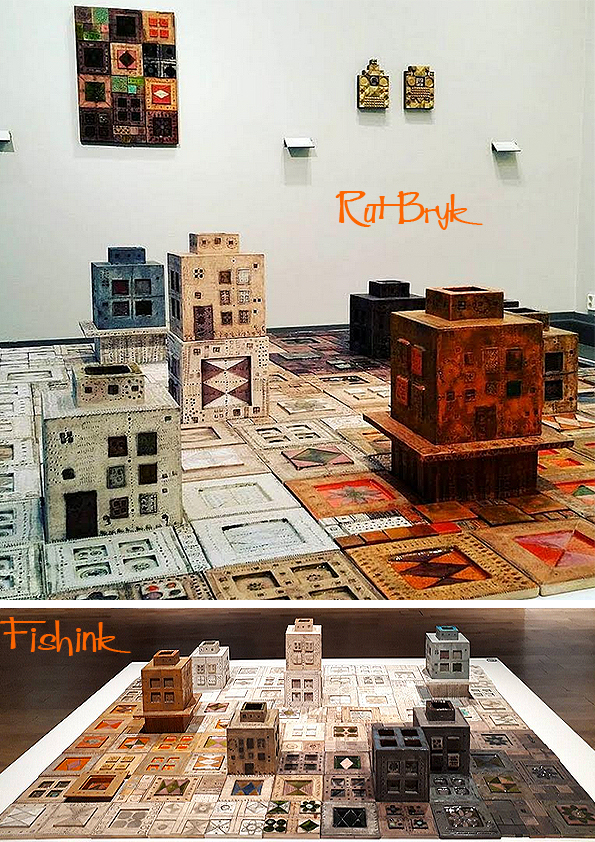
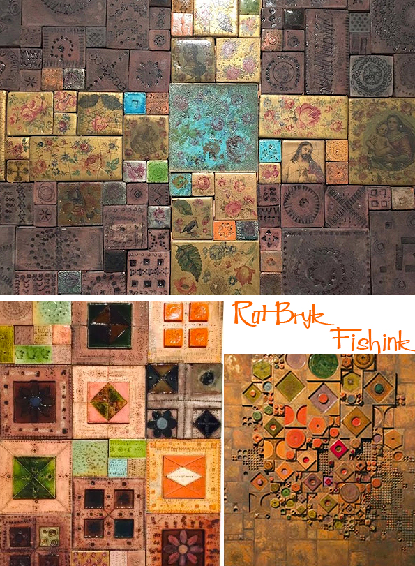
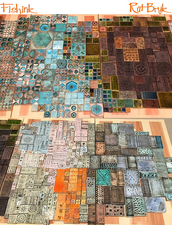
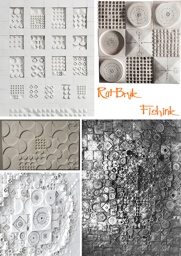
Rut’s work grew in the 1960s as an architectural puzzle of countless small tiles. The colour effects continued to play an important role, but the nostalgic narrative of everyday life decended to geometric structuring. Increasingly large compositions were created from the jewel-like, deep-coloured, matt, and glossy tiles. They could be displayed in a variety of arrangements.
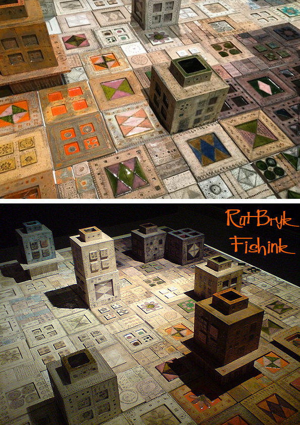
The detail and variety still make me gasp.
During her years at Arabia, Rut’s working method consisted of covering the floor of the 9th floor studio with tiles with the help of her assistant and then getting up on a tall platform to look down at them from above. Over and over again, the two of them would rearrange the tiles piece by piece, then go up and take another look from the platform to see if the arrangement was pleasing.
If the artist is to somehow be described, her attitude can be perceived as animistic, that is, “the rock, the houses, everything” was her soul, and reaching it was the main task of art, otherwise it is just about surface and shaping forms. Rut’s art is like borrowing from a fairy tale. The most important features of the fairy tale are crossing the border of animism in culture and nature, in the world of fairy tales, humans are in contact with natural elements that take on human qualities.
I imagine she enjoyed creating all these ceramic plaques and in using her skills as a colourist to make the end results positively shine.
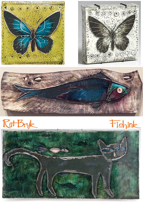
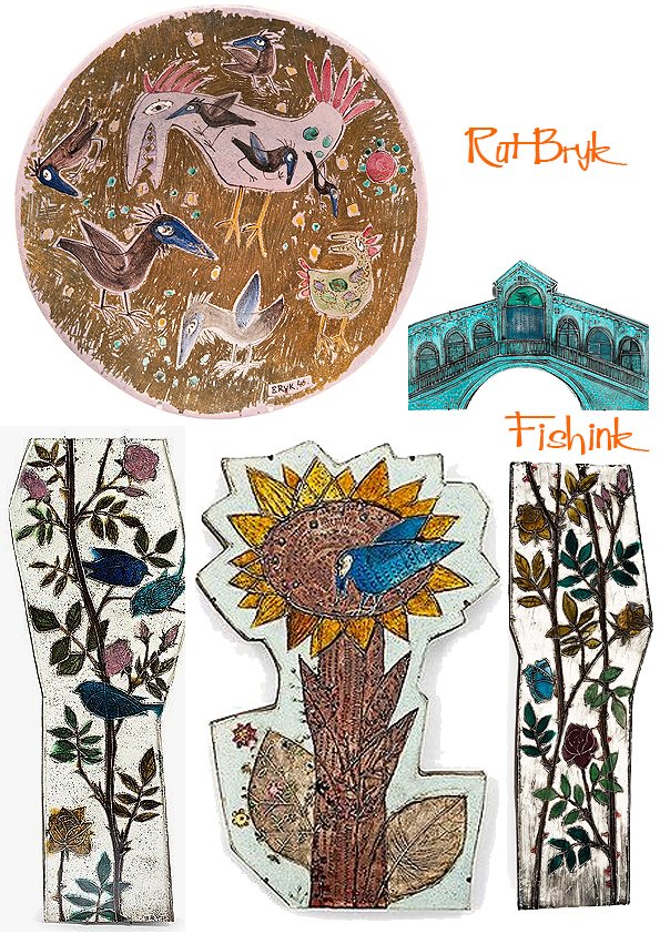
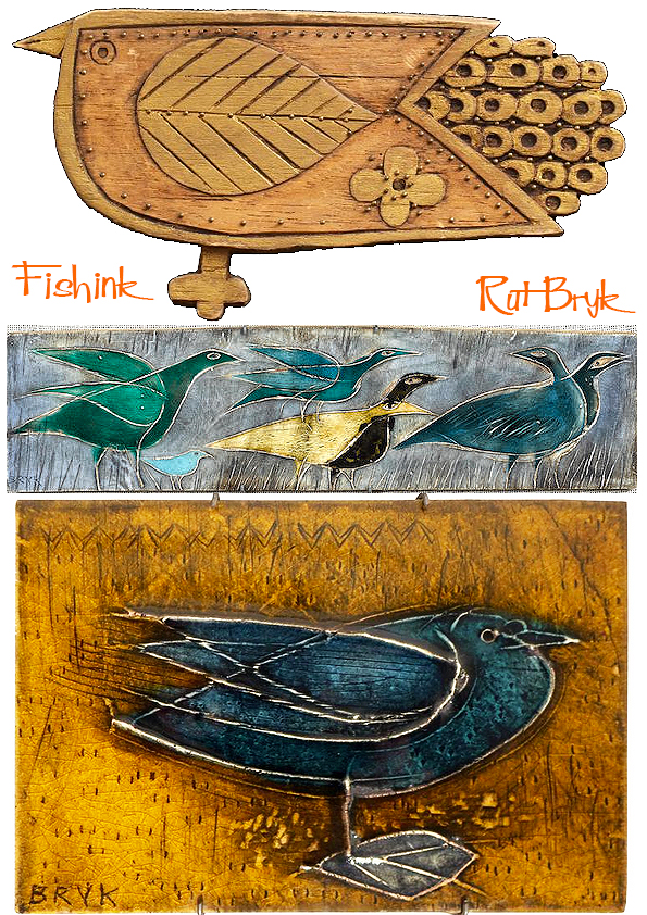
Birds and butterflies were an important theme for Rut. Both represented the artist with the momentary movement of beauty. The bird and egg themes both symbolise the cycle of life. Her favorite bird was a crow, a more earthly symbol rather than a lofty one.
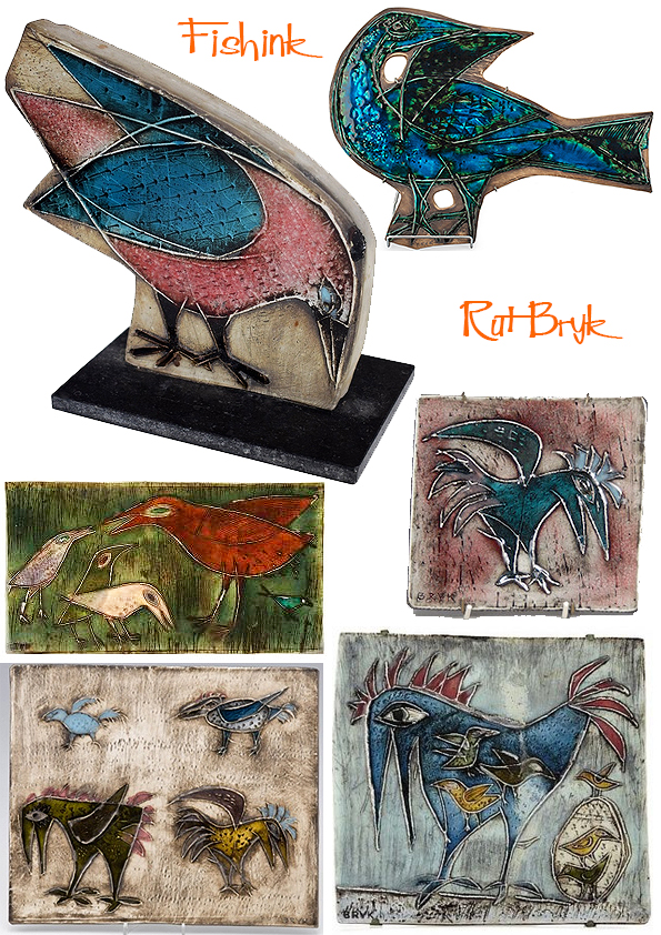
Here we see this rather tatty crow repeated over and over again.
Wonderful contrasts between the long rose panels and her wooden carving and Bird plaques below.
A sense of calm in some of these too.
Beautiful colours, forms and textures here.
Rut Bryk developed her own technique in 1948, making her one of the most celebrated Finnish ceramic artists of the 1950s. The new plaster molding technique was used to produce square tiles in which delicate color schemes were confined to elevated contours. Successful work required several experiments. Colours for ceramic tiles did not appear until they were burned. Rut loved this technique, which was like a magic trick. However, there was a long training period, during which she learnt how to develop and create a very pleasing colour palette.
The imperfection of the glazing and the rough surfaces gave depth. Rut was also fascinated by the ceramic effects created by chance. Over the course of the 1960s and 1970s, the motifs in her work slowly shifted from literal representations of plants, animals and religious themes toward much more abstract compositions inspired by her broad-ranging imagination. Minimal colour gave way to more attention to shape, texture and form.
Some pieces make me think of Mary Blair’s designs for Disneyland.
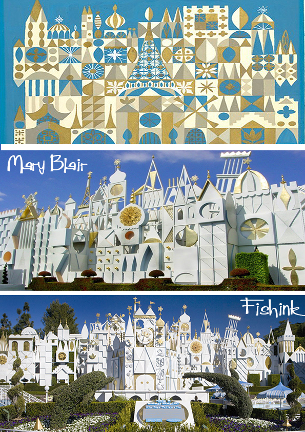
But then Rut had a design style all of her own.
She created many mosaics for public spaces in government institutions, hospitals and corporate headquarters. ‘City in the Sun’ (1975), a ceramic wall relief that covers a large expanse in the lobby of Helsinki City Hall, is beloved by many local citizens.
“Ice Flow” (1987-91), a ceramic wall relief that covers a large expanse of wall in the Official Residence of the President of Finland, depicts the nature and miracles that people may or may not encounter during their life on earth. The scale fills the people who look at it with disbelief, leading both to surprise and a sense of awe and respect.
She created Ice Flow just before the death of her husband. “Making that piece gave my mother the strength to keep on living,” thinks Maaria (her daughter). “If that is so, it’s the greatest tribute to my father.”
Or simply “Tree” which is located at the Bank of Finland. The scale of these installations in themselves are breathtaking and Rut’s attention to detail is truely astounding.
When it comes to how Rut worked, the essentials were: How many pieces, and pieces of what sizes, are needed? What patterns are to be created? What is the extent of the variation in color needed? What about variations in texture? What glazes will work together best? Are 100 patterns needed, or 200? Rut’s work centered not just on preparing the materials. Tending to mundane details may seems the opposite of creative, but the humdrum tasks of actually checking each individual piece and figuring out how the pieces go together was nothing if not essential. But more than that, creating a harmonious composition means using your body, arms and hands in a roundabout process of trial and error. Each attempt requires unflagging effort and a dispassionate eye. In the end the reward is the realization of the image the artist created in her mind.
Her later works have an aura about them that arrests those who view them. The thousands of tightly interlocking ceramic pieces that come together to make up a carefully planned composition concentrate the viewer. It is similar to the experience of a concertgoer who has arrived late and is swept up by the music the minute the door to the concert hall opens. There is an overwhelming feeling that comes with the experience of seeing one of Rut’s later works where her expressiveness is at its most powerful.
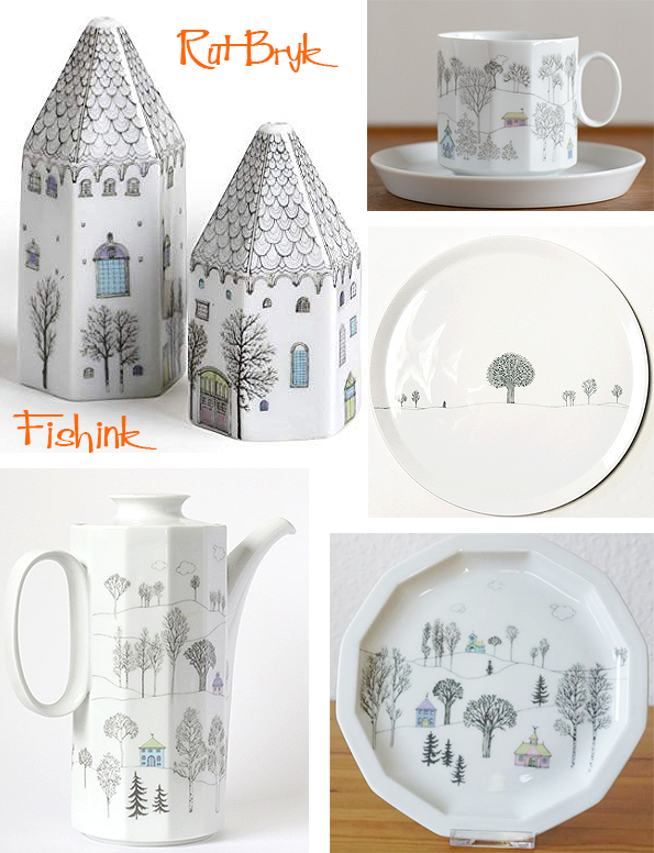
Another well-known set of ceramics by Rut is the tableware she designed in collaboration with her husband Tapio Wirkkala for the German porcelain manufacturer Rosenthal. Their tableware design radiates a tranquility that transcends the fact it is intended for repeated daily use. Again we see themes of trees and houses arise but in a flatter more illustrative form.
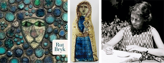
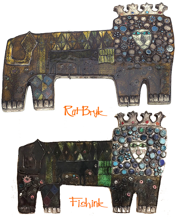
One of my all time favourite pieces of Rut’s work is her ceramic lion.
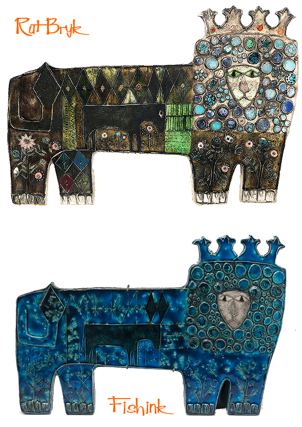
No wonder he’s supporting a King of the Jungle crown. I do think he’s quite splendidly regal.
I hope you’ve enjoyed visiting my site this week and looking through the work of this amazing ceramist with me. If you have, please let me know, just drop me a simple comment to say what you’ve enjoyed or what you might like to see more of on Fishinkblog. Your comments and feedback are so important, however small they all help to make this a shared experience.
For more information on Rut Bryk, visit the Wirkkala – Bryk Foundation and the Espoo Museum of Modern Art (EMMA). There’s a touring exhibition in Japan
and here are more of the tour dates and venues.
2019 7 Sep – 20 Oct. Itami City Museum of Art
2020 25 Apr. – 5 Jul. Museum of Modern Ceramic Art, Gifu
2020 18 Jul. – 6 Sep. Kurume City Art Museum
2020 10 Oct. – 6 Dec. The Niigata Bandaijima Art Museum
I so wish it was a little nearer for me to travel and see her work first hand ! If anyone in Japan does go, please leave me your thoughts afterwards.
Many thanks again to Hiroko Wakai, EMMA and Kunst Portal for some of the information in this post.
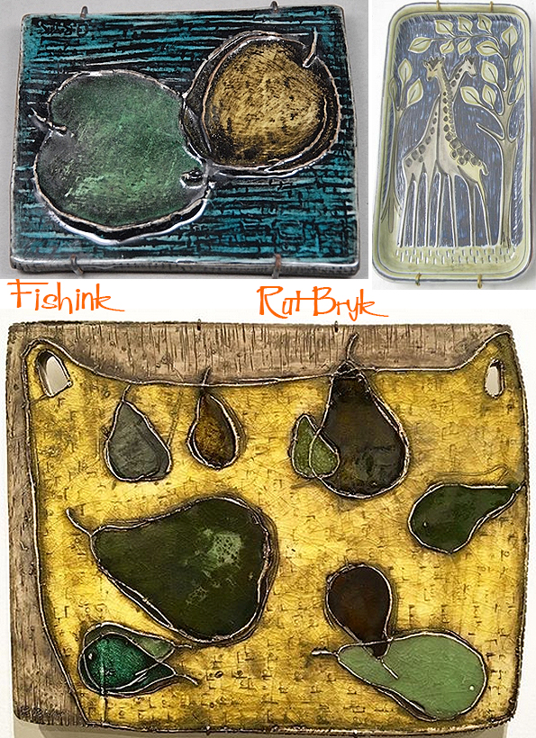
Rut Bryk Finnish Ceramics Part 1

Today I have a real treat for you in store, as I recently disovered the amazing work by Finnish Ceramist Rut Bryk (1916-1999). So rich is the body of her work, that I have not one, but two posts for you to be revealed over the next two weeks ! You lucky people lol
So relax, pour yourself a brew and enjoy.
She was born into an intellectual-artistic family. Her father Felix was an Austrian biologist who worked in Sweden. Her mother Aino was Finnish and came from a family of artists. The well-known national-romantic painter Pekka Halonen (1865-1933) was Aino’s cousin. During the summers the family spent in Finland on the shores of Lake Ladoga, Felix would catch insects as a hobby and for study, and Rut often came along to help. Many of the motifs in Rut’s work derive from the appreciation of living things she developed growing up in this family. This seeming idyllic, at the same time there was a dark side to her childhood. Her parents broke with social convention and divorced when she was still quite young. Around the same time her younger sister died, adding to her suffering. After the divorce she and her mother went to live in Finland. Rut attended and graduated as a graphic designer from the School of Arts and Crafts in Helsinki in 1939.

After graduating she worked in textile design. It was only after Kurt Ekholm (1907-1975), the Swedish-trained art director at Arabia Ceramics, hired her for the fact that her aptitude for sculptural and architectural forms was extrememly impressive.
She was almost a stranger to ceramics when she started experimenting with the raw material that was later to bring her world renown. Her early decorative wall plaques show a magic world of imaginative flowers and fairies dancing in the woods. The colouring is luminous and light. Her faience plaques have a strange and strong glow. Her painted plaques in faience display intense colours due to thick glazing. She also used glazing to enhance the depth dimension of the plaques. In the ”ceramic paintings” from the 1950s she uses delicate lines in relief to emphasise the motifs.

After defeat in World War II, Finland recovered rapidly as if by a miracle and Helsinki hosted the 1952 Olympics. Finland flourished in the mid-century. Finnish artists and designers in many disciplines were finding themselves winners at the art and design show, the Milan Triennale. It was a time of increasing awareness of their work.
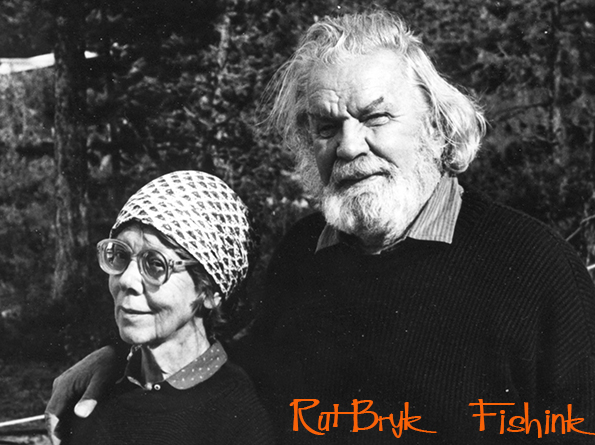
In 1945, Rut married another artist, Tapio Wirkkala, a famed designer and sculptor renowned for his boundless skill and imagination. Tapio was a great supporter of his wife in all her creative endeavours. The couple shared a love of early Renaissance art, a passion that Rut inherited from her childhood home. On their first trip together they travelled to Italy, which over the years became important wellspring of creative inspiration and beloved place to work. Another cherished spot was their wilderness retreat in Lapland, where the couple spent every summer working on their art and enjoying family life.
In 1948 she gave birth to her son Sami and in 1954 to her daughter Maaria. With the two children to take care of in addition to her work, this was a very busy period in her life. Tapio took the Grand Prix in Category 3 at the Triennale in Milan in 1951, Rut’s tiles were also awarded with the highest prize. The couple was established before the eyes of the top of the design world.
The new plaster molding technique was used to produce square tiles in which delicate colour schemes were confined to elevated contours. A successful work required several experiments. Colours for ceramic tiles did not appear until they were burned. She loved this technique, which to her was like a magic trick.

What’s interesting about this period is how the themes of religious faith and nature that ran through Rut’s work evolved in the direction of greater abstraction. Starting in the 1960s she created numerous works that incorporated a wide variety of motifs. These works began to go far beyond simple depictions of the image underlying the motifs. Her work from this period increasingly began to explore her inner world of imagination.

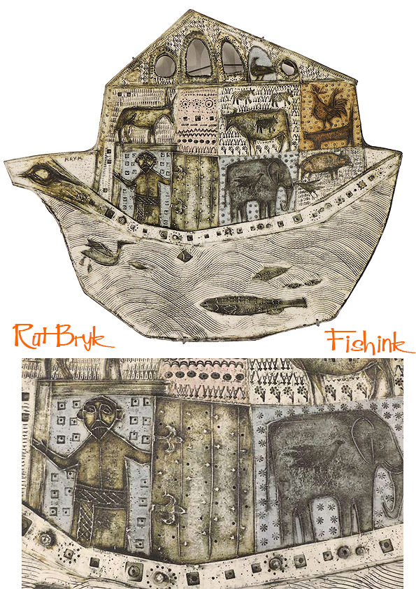
I love this Noah’s Ark.
Various Tree motifs.

Ships, bottles and even a ship inside a bottle.

A collection of heads with different colours and surface treatments.

Flowers in frames and decorative boxes.

Lead into more ideas about compartments and collections of items, objects and textures.

Rut’s imagery is an original combination of elements taken from the Byzantium, early renaissance, folk art and constructivism. Geometric basic forms were used as additional decoration in the idyllic everyday scenes of the ’40s and ’50s, but since the ’60s they have been employed as subjects in their own right.
Check back for part 2 of this post next Monday.
Many thanks to Hiroko Wakai, EMMA and Kunst Portal for some of the information in this post.
Andy Lovell Etching our Landscapes
Hope you had a great Bank Holiday weekend in the UK, I know it was a scorcher here.I was awy for the weekend, which is why you find me here on a Tuesday morning instead, did you miss me ?
I first spoke about the work of Andy Lovell back in 2010. His work pops up in my searches every now and again and I remember what fab illustrations he creates.

He is an artist, illustrator and printmaker who has become known for his abstract etchings, mono-prints and Cyanotype art.

Having originally studied at the Liverpool School of Art and Design, his work is well recognised and his individuality produces striking artwork.

Andy takes inspiration from life which is then revisited through the medium of print.

He is a master of line, colour and mark making.

Taking original sketches and paintings, Andy is able to capture a real sense of mood and place from the places he visits to sketch.
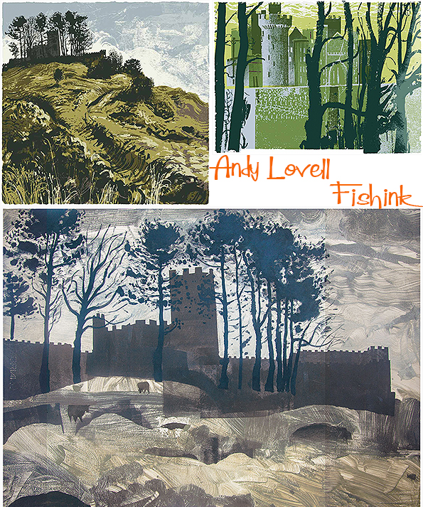
He knows how to add drama and interest to a landscape.

His landscapes speak of earth and furrowed fields. Forest and wildplants throw splashes of colour and shape, adding to the richness of each illustration.


I love these wild moor and lofty hill prints. The clever dragged lines of ink and paint not only help to suggest the landscape but also give a visual direction to each scene.

You can almost feel like you’re standing looking down these valleys.

The hills eventually lead us to the sea.

White cliffs and wild waters.

Tepid tones, swirling skies and seas.
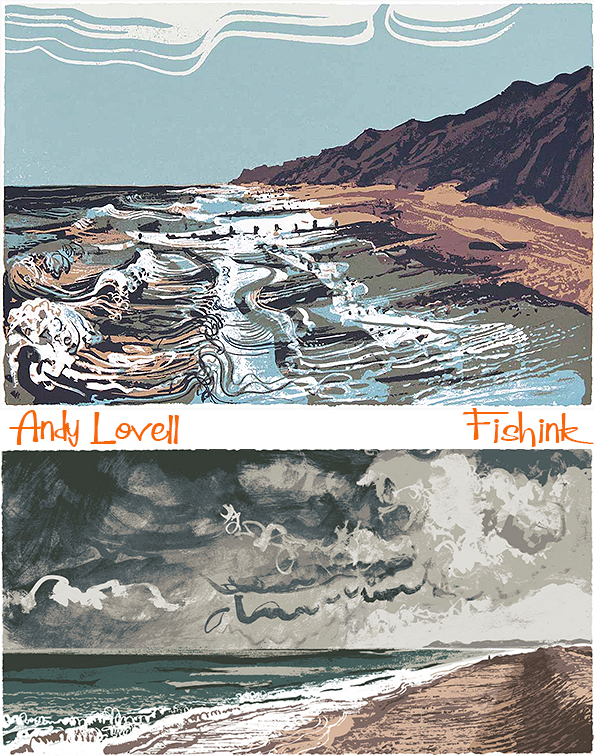

These textured black and whites are wonderful, with a slight sixties retro edge to them.


Breathtaking textures.

You can discover more of his prints for sale here on his website.


