Derek Yaniger Modern-retro styles

Contemporary illustrator Derek Yaniger is a creative guy who has a history with Cartoon Network and Marvel Comics. Nowadays however he works on his own illustration. You can head over to the wonderful Korero Press for an interview with Derek that tells you everything I would normally tell you personally. Needless to say I love his creativity.

His work explores the area of Tiki Art.

Lots of cool dudes and smart hipsters.

Cocktails for the kids, non alcoholic of course!
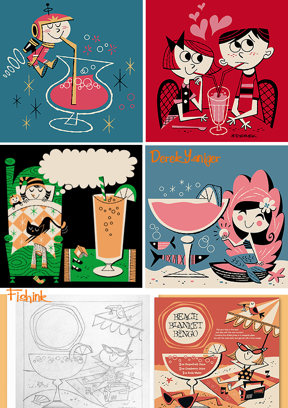
Musical beatniks jamming.

A few shifty characters too.

Such a great style and you can see more on his Instagram account.
Elya Yalonetski Ceramics from another age.

Elya Yalonetski is an award winning Berlin-based artist. Her work appears to stem from another period in time, yet not one that you can easily put your finger on.

A mixture of Greek mythologies, Chagall dreamscapes with a nod to the worlds of folk myths and fantastical wonder.

I smiled as soon as I came across it. I also love how she creates such large pieces carefully balanced on such tiny points. For me this also gives her work a sense of wonder and fascination.
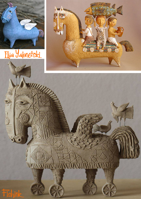
I can’t imagine how long each piece must take to create, such detail and fine line work, I’ve a feeling Elya must be quite a steady handed, patient ceramist.

Her photographs also are like mini stage sets, they show her work off quite beautifully.

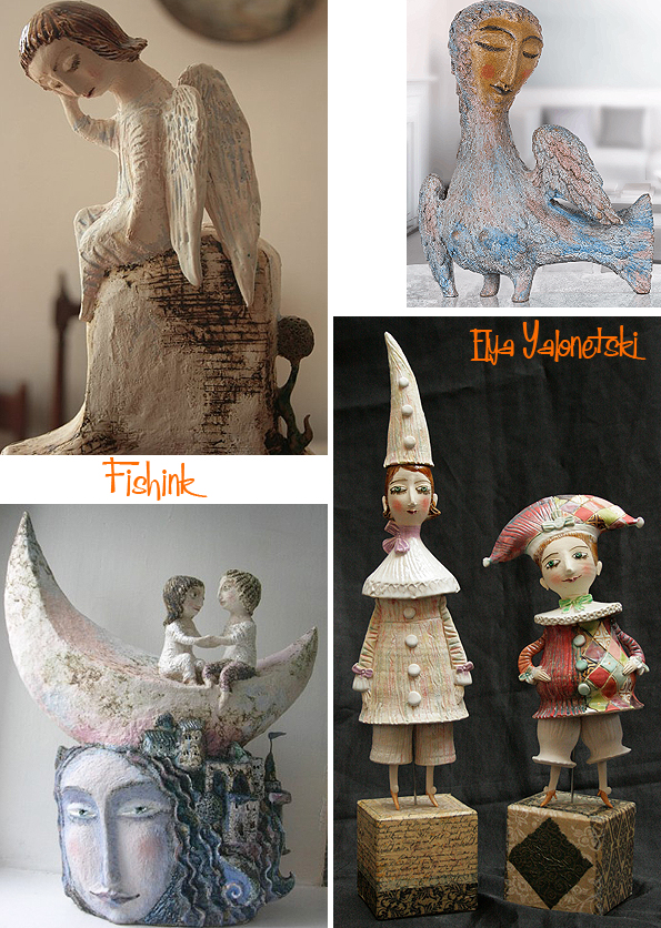
This wonderful Edwardian couple and their tiny tattoos.

Her tower of Babel must have taken weeks with all those characters. Amazing work, don’t you agree.
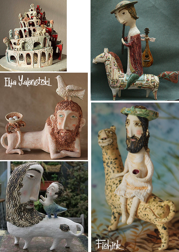
Elya says:- ” I have been working with ceramics for the last 20 years, successfully combining my initial traditional education from the Abramtsevo Art school in Russia with the Baroque and Renaissance elements in my sculptures and figurines. For me ceramic is a very mystical art medium. Being very fragile it can still survive over ages and epochs. Having mostly unknown authors each ceramic piece keeps the personal aura of its creator and whole cultures are named after certain ceramic styles. With over 1000 objects sold to the collectors around the world, I hope that some thousands years later someone will be able to “read” the feelings from my artworks like I can feel them admiring the work of ancient craftsmen in some archaeological museum.”
You can see more from Elya on Facebook and purchase some of her wonderful work here.
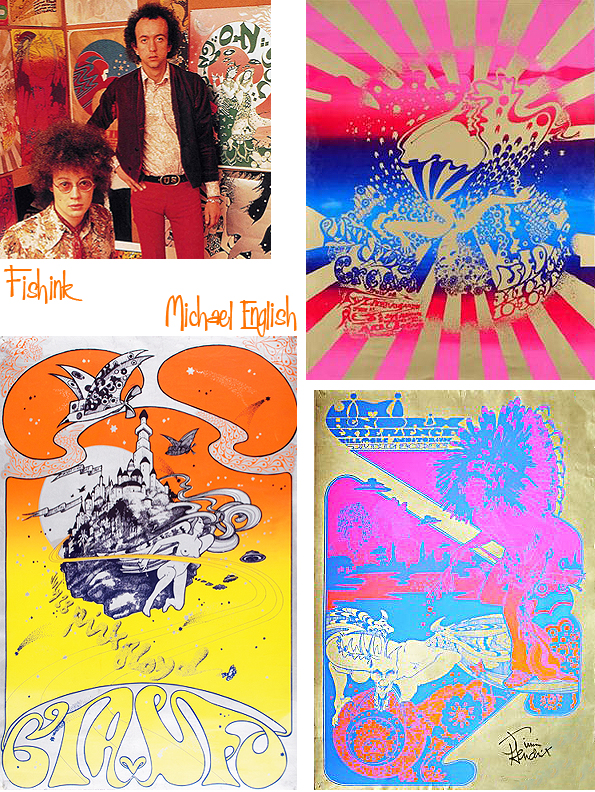
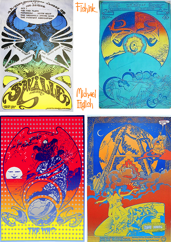
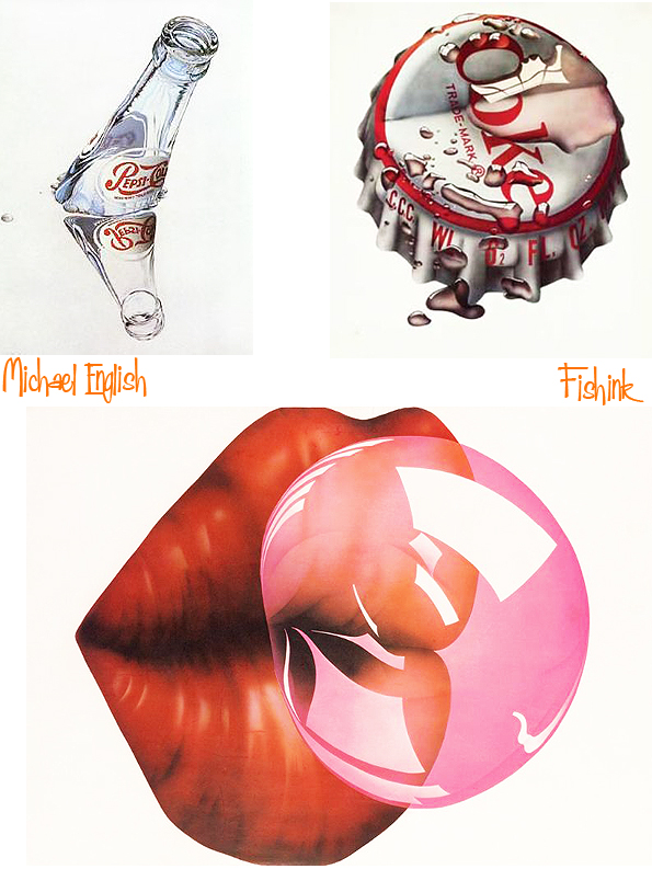
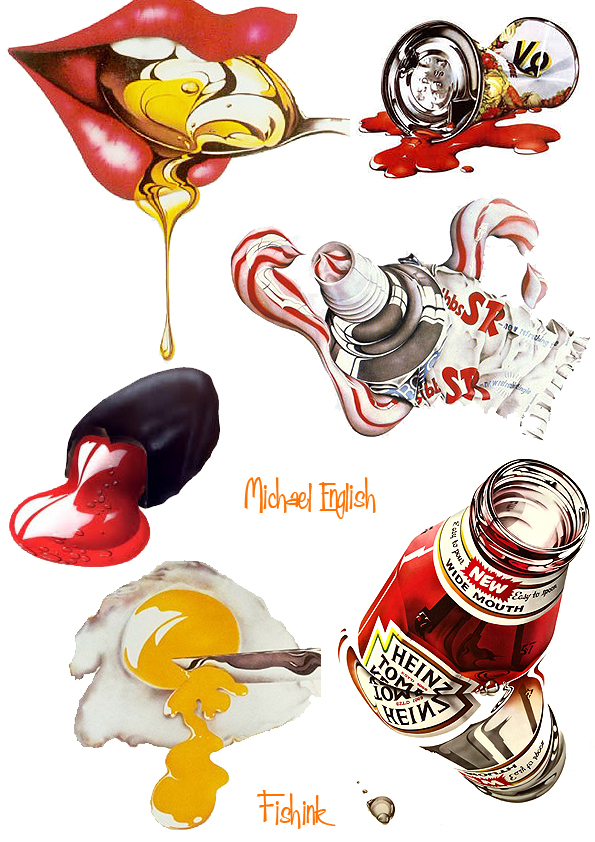
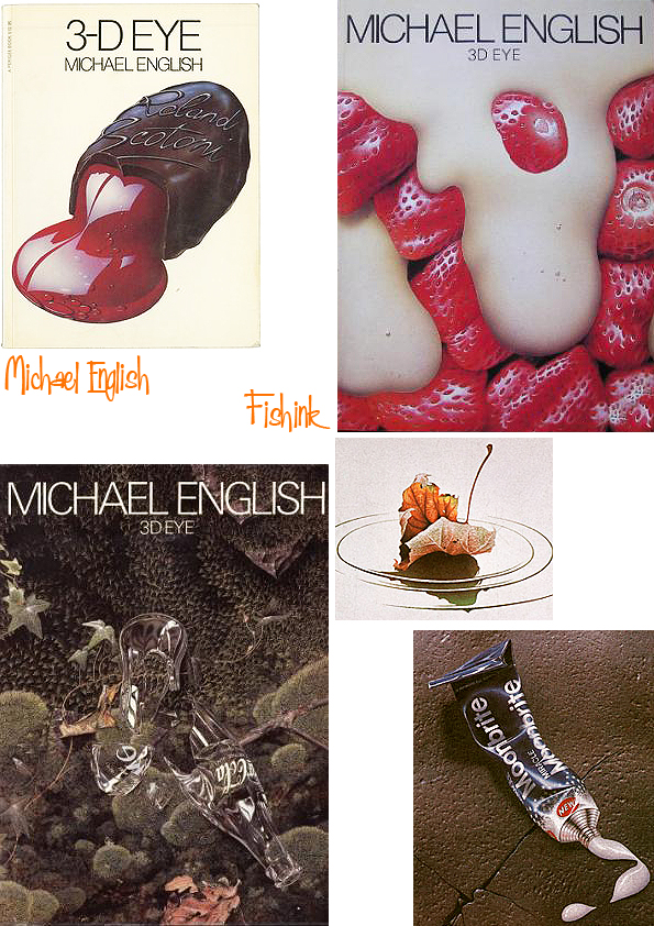
Michael English From Pop Art to Hyper Realism.

Michael Jeremy English was born at Bicester, Oxfordshire, on September 5 1941 and educated at boarding school before going on to Ealing School of Art, west London, where he studied under some of the leading British avant garde artists of the day.

Some of the posters were used to promote gigs by bands such as Pink Floyd, Jimi Hendrix and Soft Machine.
From the beginning they both understood what each other had to offer and, in sharing their talents, they were certain that they could produce a style that was both unique and exciting. English’s talent lay in his ability to balance an unrivalled attention to detail whilst creating the most fluid designs. Waymouth brought to the work a strong imagination bursting with romantic ideas and a facility for figurative drawing. Their very strong sense of colour was also important, given the cost limitations and the strictures of the silk-screen process. At a time when the prevailing fashion was for an indiscriminate use of rainbows and any clashing colour combination, they strived for maximum colour effect without sacrificing balance and harmony. To this end they introduced numerous innovations that have since become common practice. Expensive gold and silver inks had not been used much on street posters before but they made it a regular feature of their designs. English and Waymouth also pioneered the technique of grading one colour into another on a single separation. The effects were startling, bringing an explosive vitality to the fly posters on the London streets. Nothing like it had been seen before or since. Looking at a whole block of some twenty or thirty of a single Hapshash poster was a powerful visual shock. It was not long before people began to tear some of them down in order to decorate their own walls. It was eye candy to match any psychedelic experience.
In hindsight, they now realise that what they had done was to bridge a gap between Pop Art and tagged graffiti. The posters often contained subversive elements, including sexually explicit graphics, mystical symbols and dissenting messages. They regarded each poster, whatever it was promoting, not only as an aesthetically pleasing design but also as a pro-active concept. They got away with it because the posters were so charming to look at and the contents, including the words, required closer attention than people could give at first glance. Their immediate audience was the younger generation, sympathetic to the spirit of the times but they also wanted to brighten the lives of people going about their everyday business on the grey streets of London.
In 1967 English and Waymouth released an album, Hapshash and the Coloured Coat: Featuring the Human Host and the Heavy Metal Kids.
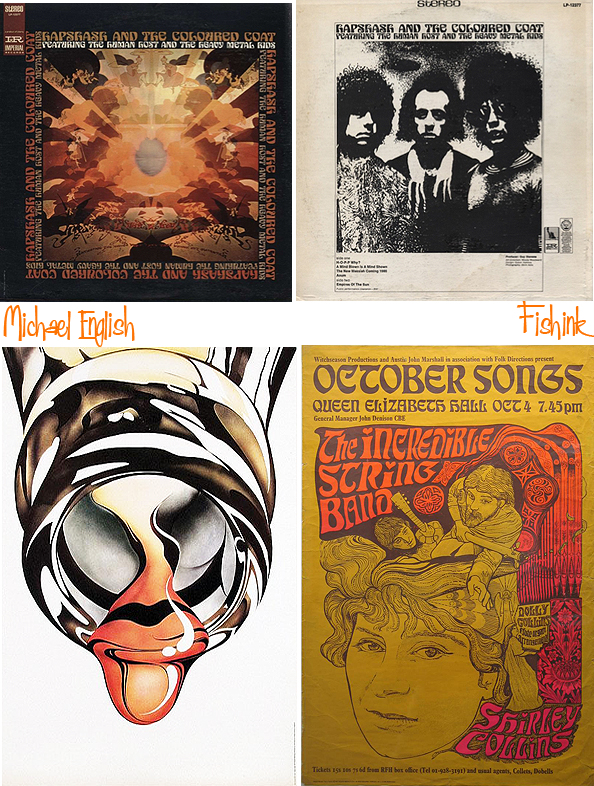
Artist and Designer John Coulthart says : – ” This was a bitter blow coming at a time when I’ve been working on something inspired in part by Hapshash and the Coloured Coat, the 1960s design duo comprised of Michael English and Nigel Waymouth. The two artists, together with associate Martin Sharp, are indelibly associated with the London psychedelic scene of the late Sixties. Whereas Sharp’s posters were often loose and dramatically bold explosions of shape and colour, the Hapshash posters were more carefully controlled in their curating of disparate elements borrowed from Art Nouveau—especially Mucha and Beardsely—comic strips, Op Art, Pop art and fantasy illustration. Their work perfectly complemented the very distinctive atmosphere of the capital’s psychedelic scene which, for a couple of hectic years, saw an explosion of new bands (or old bands in new guises) fervently engaged in a lysergic exploration of Victoriana, childhood memories and frequent silliness. UK psychedelia is generally more frivolous than its US equivalent which had the Vietnam War and civil disorder to deal with; English and Waymouth’s graphics captured the London mood.”

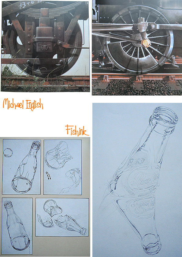
By the early 1970s the hippy movement was all but dead, and English ventured into other avenues. He produced limited edition prints for mass production, which sold incredibly well and in 1973 began to paint, abandoning the hyper-realism of the prints and concentrating on the dichotomy between man-made products and the natural world.

During this period he created minutely-detailed close-ups of machinery, as in Fanjet (1978); sometimes the man-made objects were treated as pollutants, as in his painting No Deposit, No Return (1979), in which a fractured Coke bottle litters a rich green background of vegetation and small stones.

In 1978 he created sets for the Ballet-Théâtre Contemporain at Sadler’s Wells.
In 1988 English made the first of several visits to the island of Praslin in the Seychelles, where the rainforests became a new inspiration for his painting. With his wife Jaki, he took photographs which were later worked up into acrylic paintings on canvas. By the end of his life he had completed about 20 of these pictures, which he viewed as the most important project of his later career.
To finance it he had produced dramatic and colourful advertising posters for some of the world’s leading companies, among them Swiss-Air, British Airways, Porsche, McDonalds and Bertolli. He also created two sets of stamps for the Royal Mail, one based on early buses and the other on old motorcycles; both sets proved highly popular with collectors.

In 1995 English was invited by the BBC to take on the role of artistic director for a projected serialisation of Mervyn Peake’s novel Gormenghast. For the first time he was working with digital imaging, and he scanned in concept paintings to build virtual sets and landscapes within which the actors would perform. The mounting costs of this complex process, however, forced the BBC to call a halt to the project.
Examples of English’s work are held by the Arts Council, the Victoria & Albert Museum, the Museum of Modern Art in New York, the British Council, and the Victoria and Albert Museum, which in 2000 mounted a retrospective exhibition of his work with Nigel Waymouth as Hapshash & the Coloured Coat.
He published a book about his work, 3-D Eye (1979), and The Anatomy of Illusion (1989), a short volume about airbrushing. English was still working until the last week of his life, busy with inkjet silk screen prints which feature a poem by the beat poet Allen Ginsberg.
Michael English is survived by his wife Jaki (née Abbott), whom he married in 1983.
Thanks to Bamalama Posters, the Telegraph and John Coulthart for their thoughts about Michael, that made this post possible.
Happy Chinese New Year
Wishing all my readers a healthy and wealthy New Year of the Pig.

George Maas
George Maas was a native of Kansas who worked as a Graphic designer & art director at Mercury Records in the 1950s & 60s. He created an impressive number of album covers as you can see below, but I can find little else about him. Apparently he also designed book jackets.

Quite bold and eye catching.
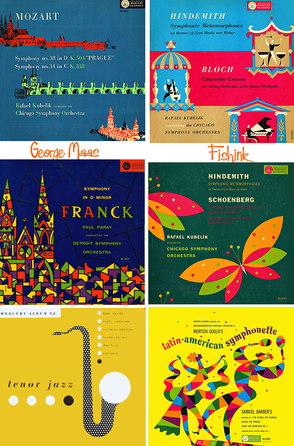
Coulour and texture being two of the attractions, alongside the music of course!

I’ve a feeling he could have turned his hand to textiles quite easily too, as he liked a bit of ornamentation in his work as well as different grades of line and blocks of colour.

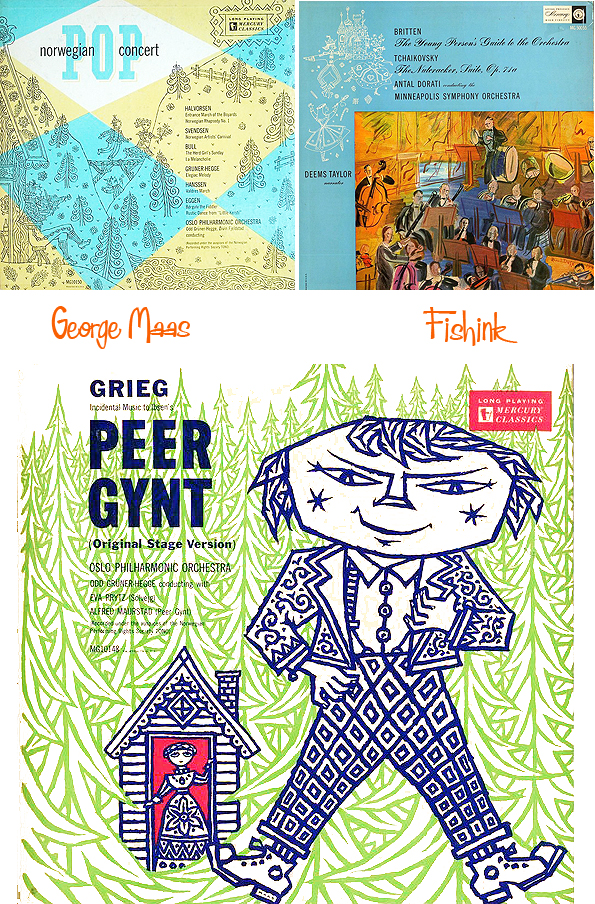
Some lovely work and I bet a fair few familiar covers here readers too ?
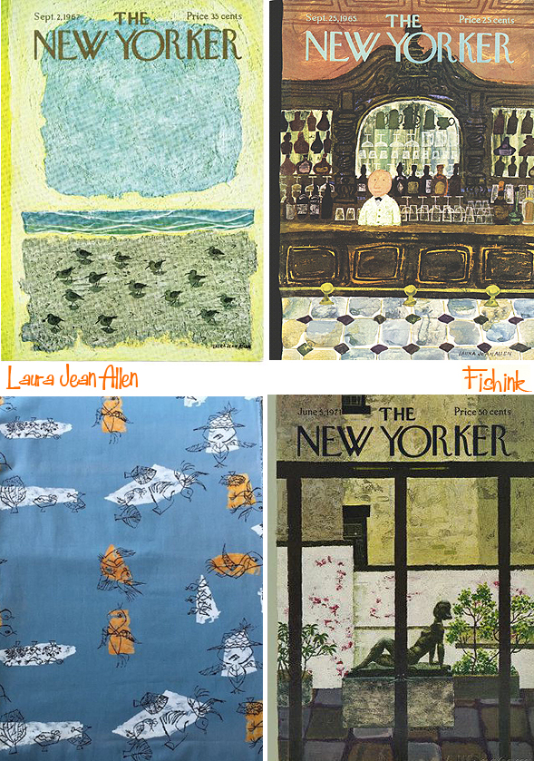
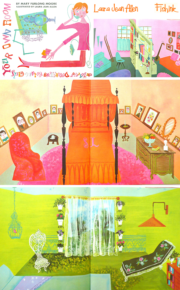
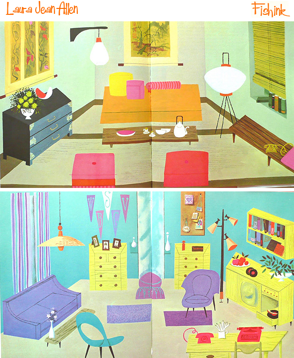
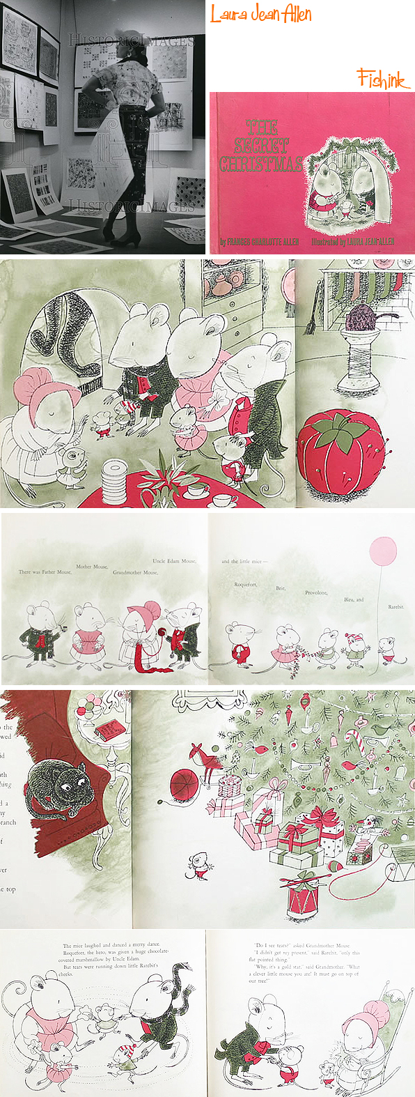
Laura Jean Allen Mid Century Fun
Laura Jean Allen (1916-2003) studied at the Pennsylvania Museum School in Philadelphia and graduated in 1939.
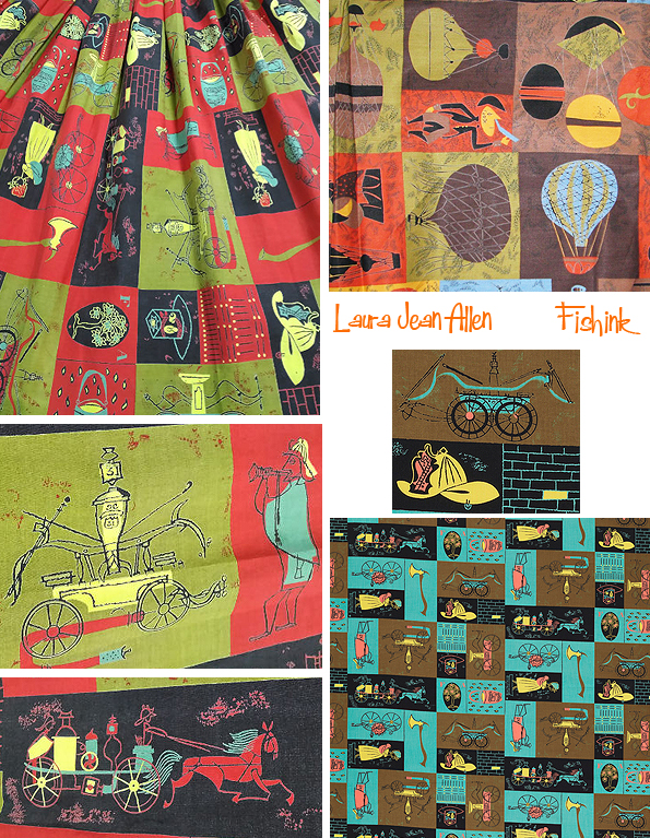
According to Art for Every Home: An Illustrated Index of Associated American Artists Prints, Ceramics, and Textile Designs (Mariana Kistler Beach Museum of Art, 2016), she was ‘one of the most prolific of the Associated American Artists ‘. Products featuring her art included Stonelain ceramics as well as textiles produced by Riverdale Fabrics and by M. Lowenstein & Sons for the Signature Fabrics series.
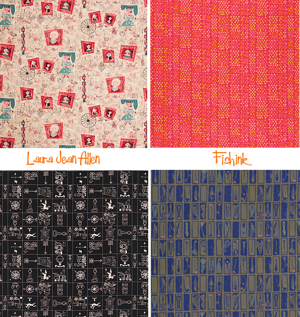
Her textile designs were featured widely from 1952-1956 in Vogue and Vogue Pattern Book, Simplicity Patterns, Women’s Wear Daily, Harper’s Bazaar, Mademoiselle, and Seventeen. Her designs are included in the collections of the Metropolitan Museum of Art, the Museum at the Fashion Institute of Technology, and the Helen Louise Allen Textile Collection of the University of Wisconsin, Madison.
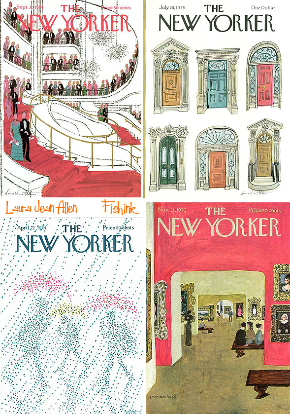
Laura’s artwork appeared on 16 covers of The New Yorker from the 1960s through the 1980s.
What a fabulous range of styles she has here.
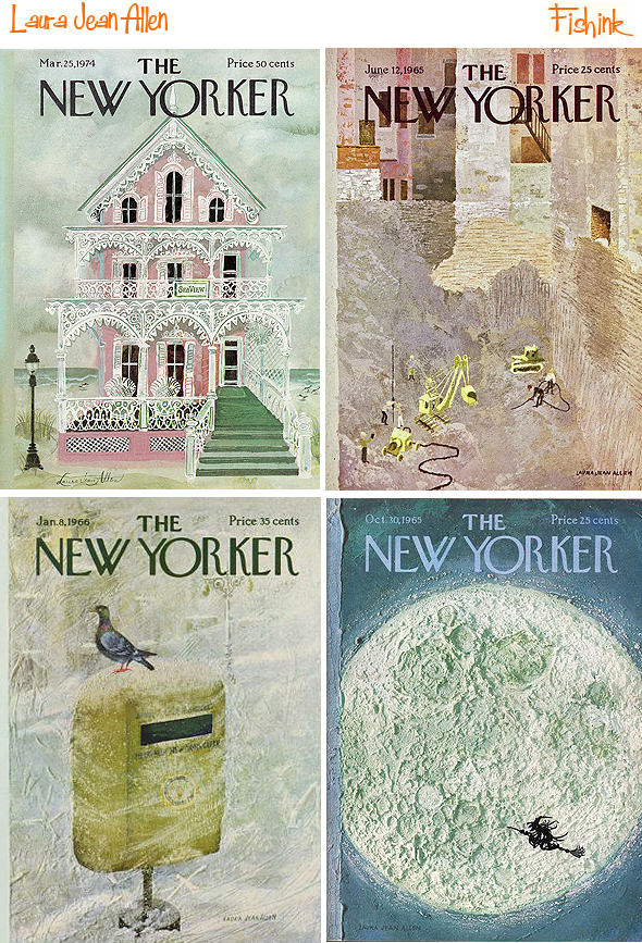
From textures and fine line work to paintings and collages.
She also wrote and illustrated several children’s books, including A Fresh Look at Flowers (Franklin Watts, Inc., 1963), Ottie and the Star (Harper & Row, 1979), Where is Freddy? (Harper & Row, 1986), and the Rollo and Tweedy books (HarperCollins).
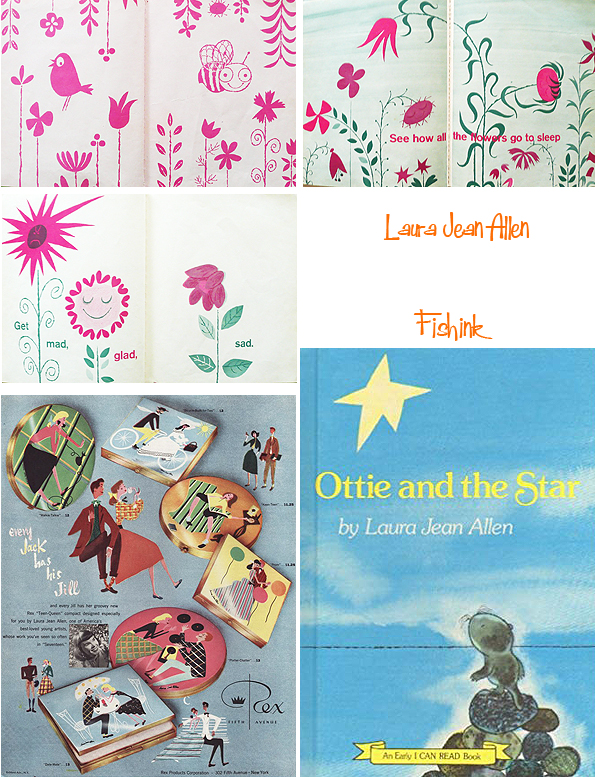
Her illustrations appear in Mary Furlong Moore’s Your Own Room: The Interior Decorating Guide for Girls (Grosset & Dunlap, 1960).
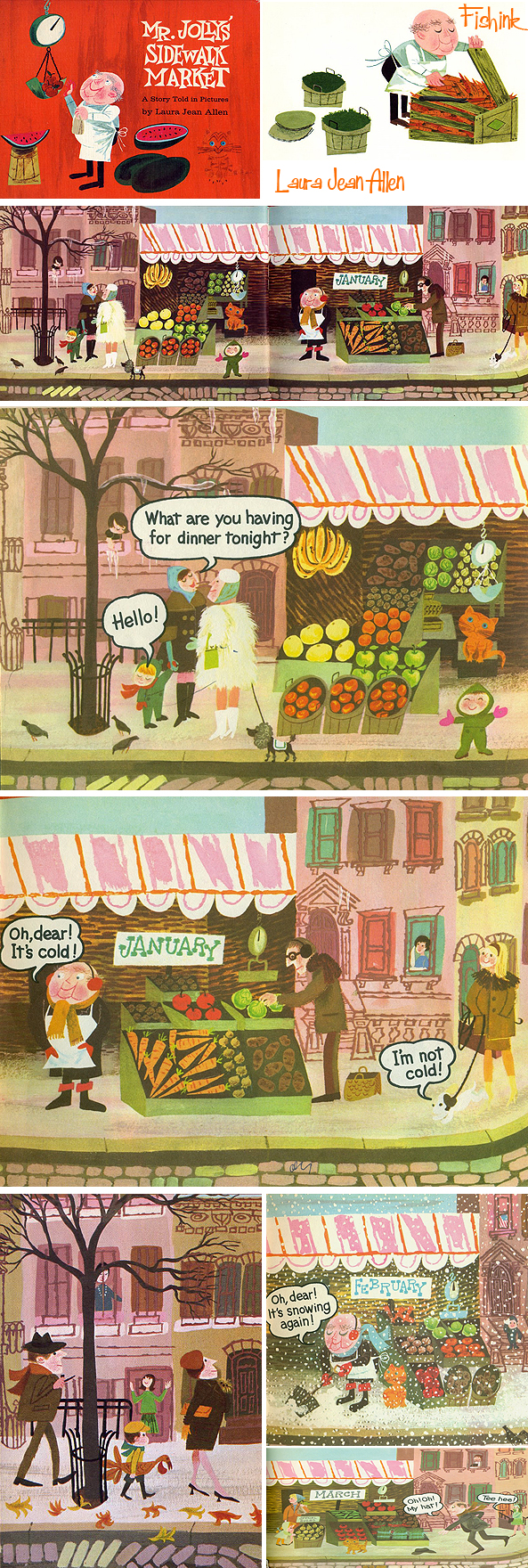
She also created Mr. Jolly’s Sidewalk Market (Holt, Rinehart and Winston, 1965). I think her style here is very similar to another favourite of mine Michel Sasek.
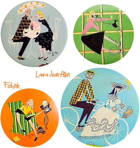
I came across some designs for pin badges or perhaps compact cases.
Here’s a rare image of Laura in the midst of sorting through her textile designs and another of her books The Secret Christmas.
Fine line illustrations for cookery books, cards and advertising.

This final one is a wonderful twist on She Stoops To Conquer… what an amazing cover for a cookbook!

Many thanks to Cooper Hewitt for the information on Laura used today and to Colin West for bringing Laura to my attention.
Scottish New Year Part 2
Welcome to part 2 of my travels around Scotland during New Year. We start at the artists town of Kirkcudbright (pronounced Kir-coo-bree).
This has been a thriving community of artists predominantly between 1850 and 1950, It is said that it was the quality of the light that brought painters to Kirkcudbright. However, there can be no doubt that a strong attraction would also have been being part of a close-knit colony of artists, all working together at the pursuit they all lived for. That’s also hinted at, from one of the pieces of prose I discovered on the door of these colourful sheds.

Even in the local knitwear shop, there’s a keen eye for colour, texture and display. The town has some fabulous buildings and views.


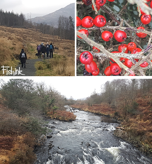
A second day we met up with more friends for a stroll around some beautiful countryside at Glentrool Visitor Centre near Newton Stewart.

I loved photographing all these woodland wonders.
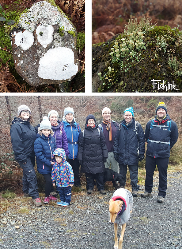
Not sure little Ruaridh at the front is that happy about Boo being too near lol.
A cold but beautiful setting, and I’d really recommend the food made by the friendly staff in the visitor centre, well worth a visit… even Boo agreed!

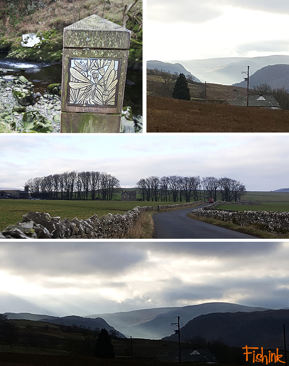
On the return journey we stopped off at Wigtown, which was officially designated as Scotland’s National Book Town in 1998 and is now home to a wide range of book-related businesses. Some bookshops weren’t yet open (it was just the 3rd January), but I had tempting glances of hidden away gems and at least 5 were open that I could wander around and be happy to loose myself in.

I loved the work of Astrid Jaekel as I bought a few of her postcards and then discovered how she had covered some of the shops in Wigtown for their Book Festival, click the link for some images.
On the way back to Manchester we side stepped the services for a visit to Shap and discovered this quirky and beautiful Greyhound Hotel.
Great welcome and tasty food will make it a firm favourite for future stop offs.

We also headed for a quick walk to find the remains of Shap Abbey and found this stunning bridge. Sorry no prizes in our ‘Spot the Boo’ competition.

A bit of a stormy grey day but still with atmosphere.

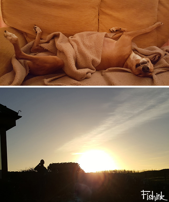
A great NY holiday break. Boo certainly enjoyed her long walks and lazy chilled out evenings, as did I. If this isn’t a contended dog photo then I don’t know what is. Hope you enjoyed coming along on my travels too. How did you spend your festive break ?
New year 2019
Hello to one and all and welcome back to Fishinkblog 2019. I hope you all had a great festive break and managed to switch off and recharge yourselves in preparation for a fresh beginning. Many thanks for all of your thoughts, comments and well wishing, much appreciated as ever. So what did you all get up to over the two week break ?
I had booked a cottage in southern Scotland and escaped there for New Year, with some friends who also have a dog. We spent lots of time walking, cooking and keeping away from the internet…. perfect !
I thought I’d share my Scottish travels with you for the next two posts and I hope you enjoy the images as much as I did creating them lol. First here’s a few images from local walks around Manchester, starting with a beautiful misty light.

These were mid December, we were so lucky with the weather in 2018, that long hot summer… wow. Feels long ago now.

A few frosty specimens, I love how the edges are all defined and white .


Even roses out in late December, surprised me.

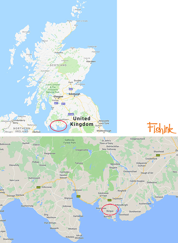
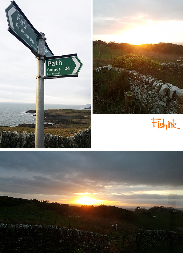
Ok so we’re off to Scotland and a little cottage near to Borgue, between Dumfries and Stranraer. For those of you who like to see a map or don’t know where in the British Isles I’m talking about here’s one lol.
Here’s the place, some local views and a snapshot of our huge neighbours !

One thing we all enjoyed were the excellent views from the cottage and it’s proximity (10 min walk) to the local beach. Wild, rugged with plenty to discover and captivate.
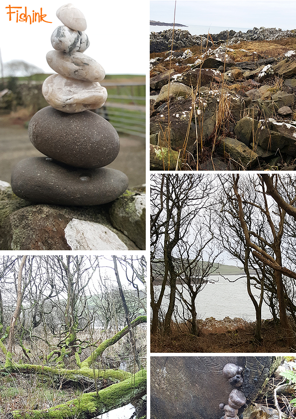
Petrified mushrooms (above right) and a wonderful impression of sand ripples (below right), fossilised into the rock over time and then shifted to a vertical position by ancient earth movements.
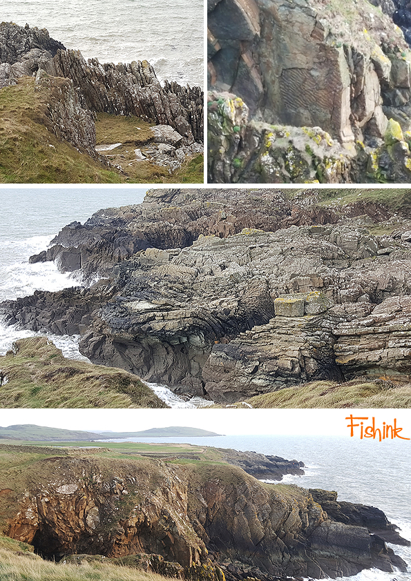
A wonderful coastline, and plenty to keep us busy on the beach too. Anyone out there who also likes rockpool hunting?

First time I’ve seen frozen sand and seaweed too.

These were short days as the sun disappeared around 4pm, oh but glorious sunsets.
Visiting Gatehouse of Fleet.

We came across this 15th century Cardoness Castle belonging to the McCullochs of Myreton.

Then a walk around the local area to this graveyard in Anwoth. Some wonderful carvings.

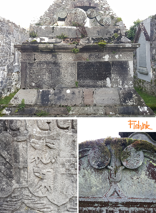
A joke sign and a local pictish carved rock up on Trusty’s Hill.

Great views and three monuments, including Rutherford’s Monument.

We were lucky with the weather again.

In the evenings we did some old fashioned things like reading books, doing jigsaws and playing board games. The dogs chased one another around the huge garden, played tug of war and did a lot of sleeping.. absolute bliss.
Part two next week.

2018 In Retrospect.
I decided to have a glance back over 2018 and pull together a range of images from the best / most enjoyable posts I’ve created over the twelve months. Which post is your favourite and how many do you remember ?
We start, back in January, with the four posts on John Minton, this being one of them. What a talented chap.

Great work by Scottish artist William Crosbie.

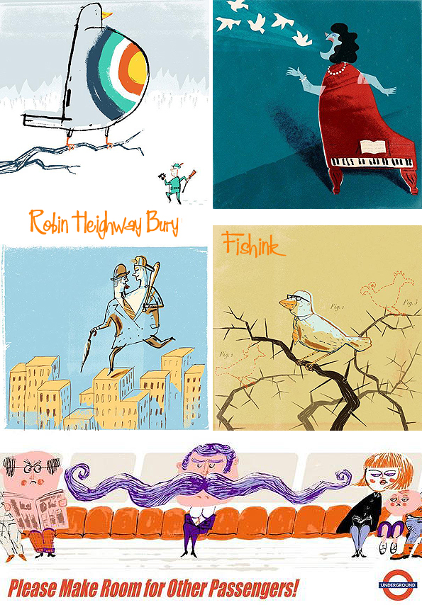
Slightly more contemporary work from Robin Heighway-Bury.
Beautifully crafted thoughts of the seashore from Kirsty Elson.

Forgotten artist in two parts, features the work of Roland Collins.

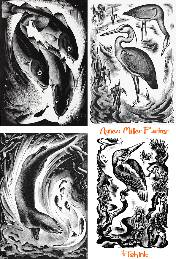
Wildlife woodcuts from Agnes Miller Parker.
Another female perspective of land and sea from Joan Eardley.

Textile and design repeats from Enid Marx.

Fun travel posters from Graphic Designer Abram Games.
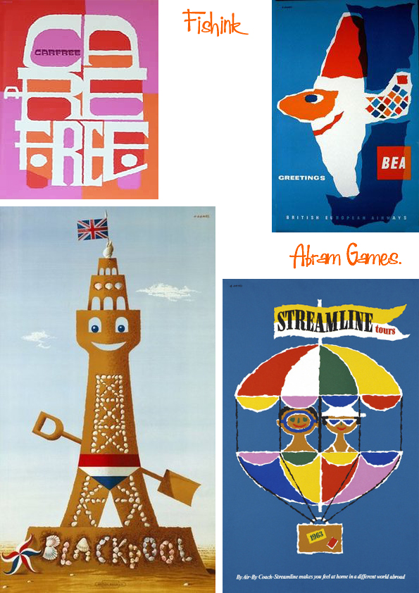
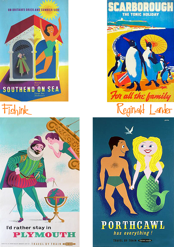
Two posts and more posters from Reginald Montague Lander.
.
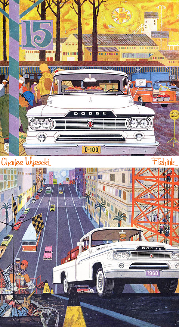
American sixties artist Charles Wysocki brought us Trucks and a glimpse of life in that era.
A little modern made nature from Mister Finch.

A glimpse of ceramic nature from Ann Wynn Reeves.

An inspirational trip back in time to Ryedale Folk Museum in Hutton Le Hole.

Also a splash of Vintage from Morecombe by the Sea.

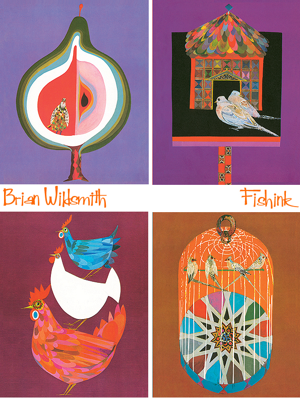
Three established artist treats in October from Brian Wildsmith,
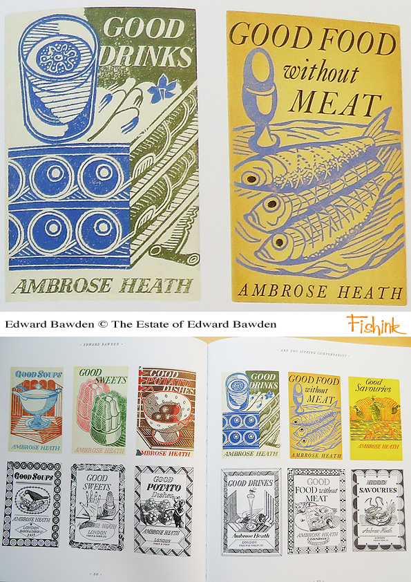
Edward Bawden and a fabulous book from the Mainstone Press.
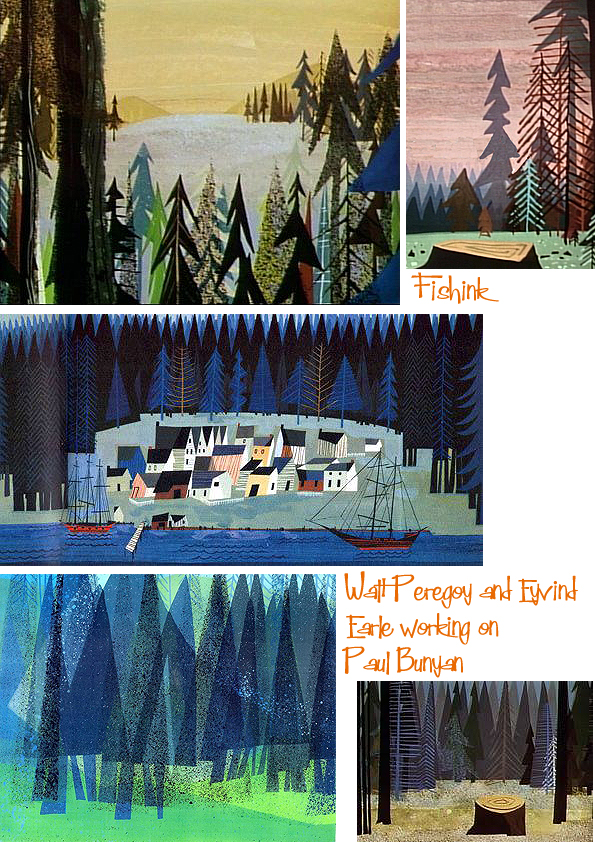
and lastly Disney background artist Walt Peregoy.
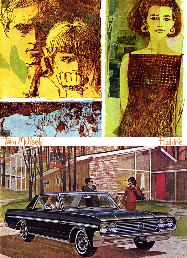
November Illustration from Tom McNeely.
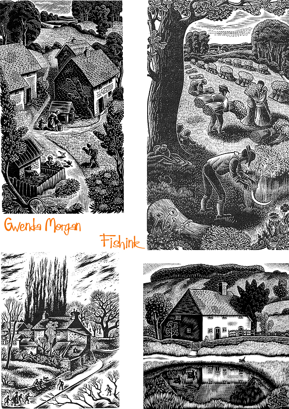
More recently some stunning woodcuts from Gwenda Morgan.
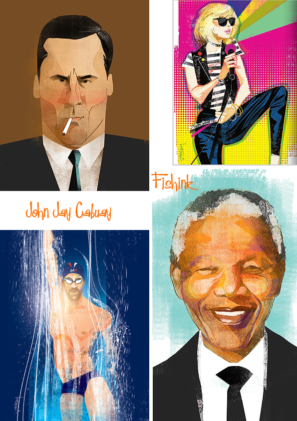
Contemporary work by John Jay Cabuay.
Timeless illustration from LeWitt and Him.

Ceramics from Lena Peters and finally…

A few pieces of my own, which will be available to purchase next year through Fishink on Etsy.

Which pieces do you like and why ? Anything you would like to see made in clay from my work ?

Thanks for following Fishinkblog this year.
This is the Eighth year it’s been running and even though I really love writing and curating the posts, it doesn’t get any easier to find the time to do it all. I do appreciate your feedback, likes and comments, it makes the whole experience much more fun to do, so thanks for leaving a word every now and then and if you have any thoughts on how Fishinkblog could be even better, then do let me know. Have a look through the posts you might have missed by clicking on the links above the images, and pass Fishink blog onto a new friend this year so we can grow into a bigger art community from across the globe. It’s great to have you with me.
Have a great 2019 and I’ll be back in a few weeks time.
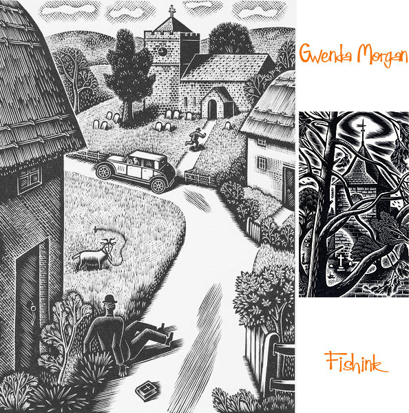
Gwenda Morgan Beautiful Woodcuts
Happy Christmas Eve to one and all from the UK. Strangely I’m still not feeling so Christmassy this year but I’m sure come tomorrow I will be enjoying some great food, company and feeling good about the year ahead. I wonder what kind of celebrations you, my readers will be having wherever you are reading this? Do let me know, and wherever you might be I hope this finds you well, healthy and in a peaceful time.
Thank you for following Fishink Blog this year and please keep the comments rolling in, it does make a difference and helps make me feel that all the hard work that goes into these posts isn’t falling on silent ears lol.
I wish you all a wonderful festive break and look forward to catching up again in a few weeks time in 2019. All the very best, Craig

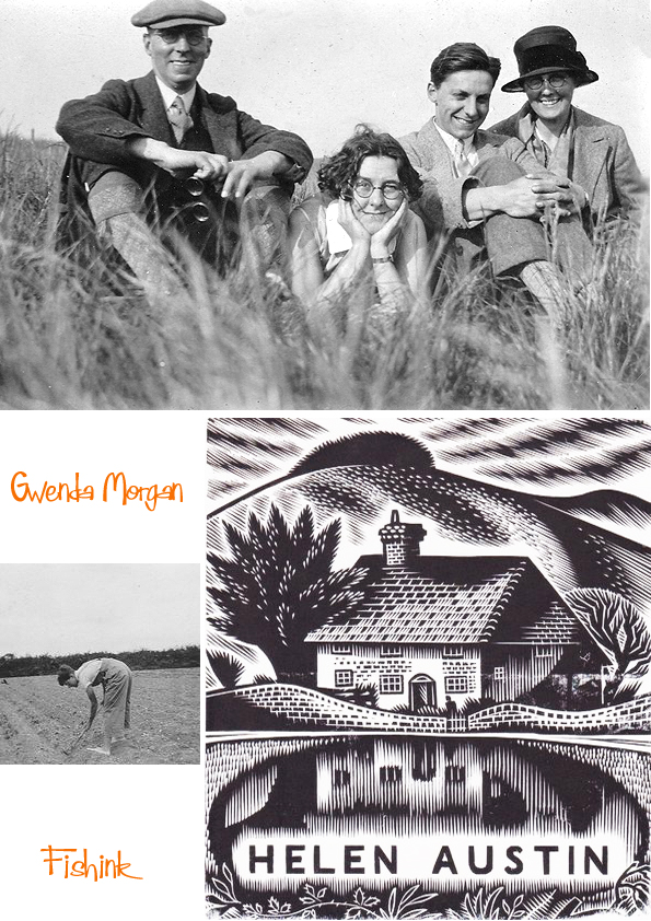
Gwenda Morgan (1908 – 1991) was born in Petworth, her father having moved there to work at the ironmongers Austens, of which he later became the proprietor. Following school in Petworth and at Brighton and Hove High School. From 1926, Gwenda studied at Goldsmiths’ College of Art in London.
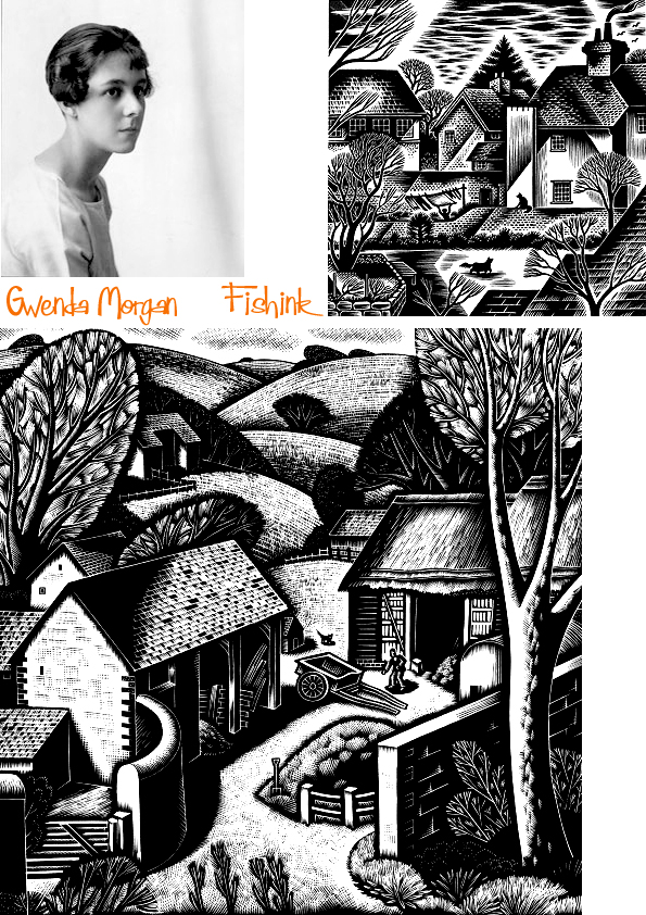
From 1930 she attended the Grosvenor School of Modern Art in Pimlico where she was taught and very strongly influenced by the principal, Iain Macnab. The Grosvenor School was a progressive art school, and the championing of wood engraving and linocuts fitted with its democratic approach to the arts.
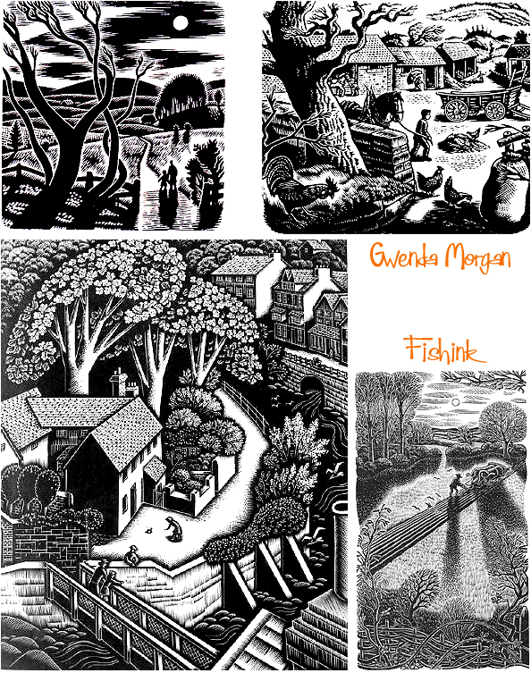
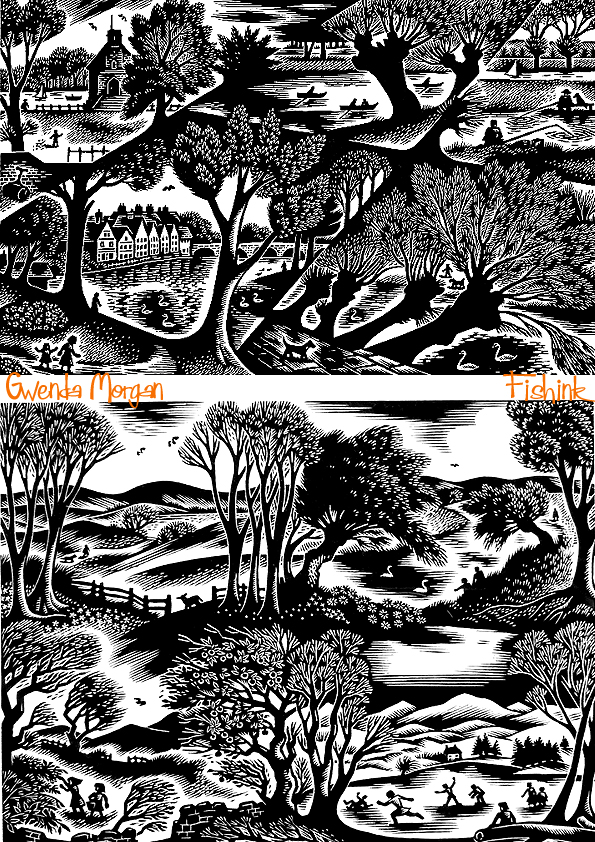
The main body of her work drew upon the landscape and buildings around Petworth and the neighbouring South Downs. Her work was inspired by that of Iain Macnab, Percy Douglas Bliss and the Sussex-bred Eric Ravilious.

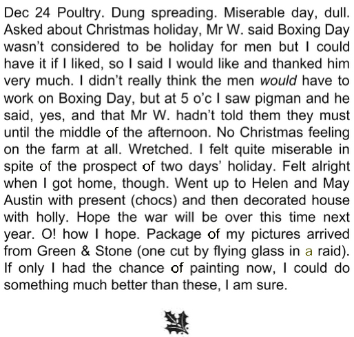
Throughout the Second World War she worked in the Women’s Land Army just outside Petworth. Her record of those years was published by the Whittington Press in 2002 as The Diary of a Land Girl, 1939-1945. It is a poignant record of the determination to carry on whatever the weather or wartime deprivations.
Here’s an excerpt from Christmas Eve.
She was a Fellow of the Royal Society of Painter-Etchers & Engravers, an Honorary Member of the Society of Wood Engravers, and a Member of the National Society of Painters, Sculptors and Engravers, and she showed work at their annual exhibitions. She also exhibited at the Royal Academy and at the Redfern Gallery.

Her prints are held in the collections of the Victoria and Albert Museum and the British Museum in London, the Ashmolean Museum in Oxford, and the Fitzwilliam Museum in Cambridge, among others.
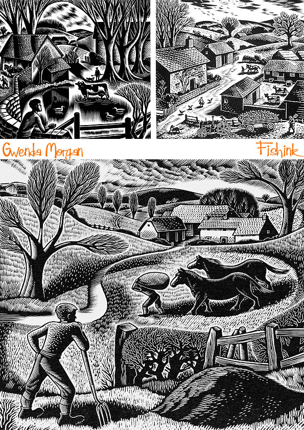
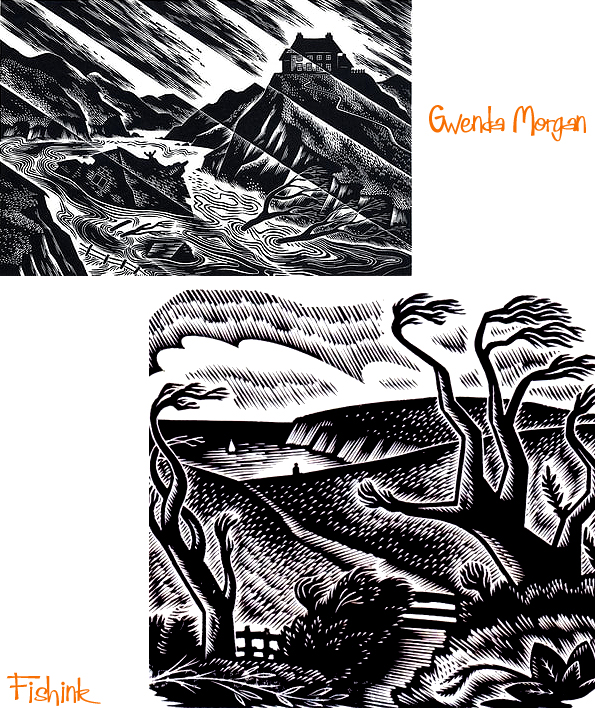
Some of her work has a wonderful sense of movement… even the still life woodcuts!
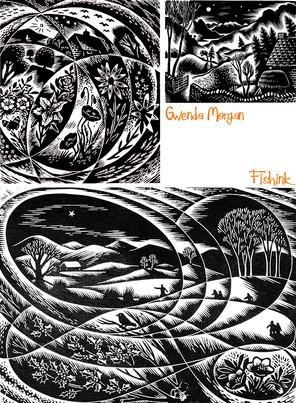
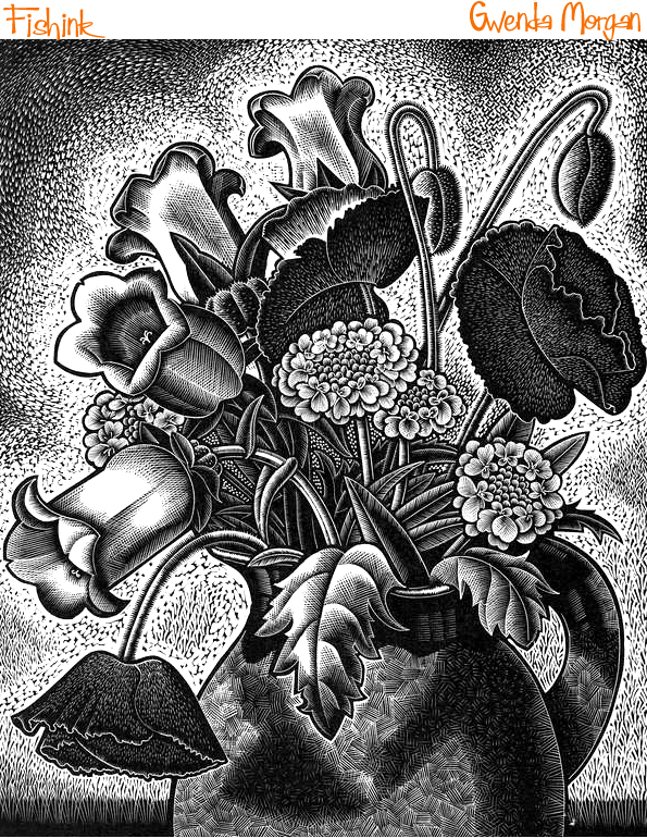

I feel that Gwenda’s work is somehow timeless, like this image above called ‘Winter Arrangement’, it feels like it could have been created last week and not over 60 years ago, as it was originally engraved in 1954!

Here’s a great shot of Gwenda with her family.
Lovely depictions of rural lifestyles at that time.

Happy Christmas.
Save


