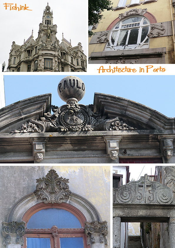
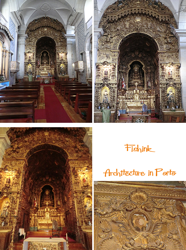
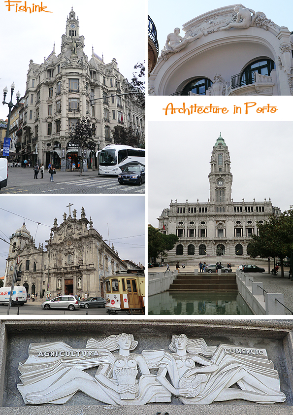
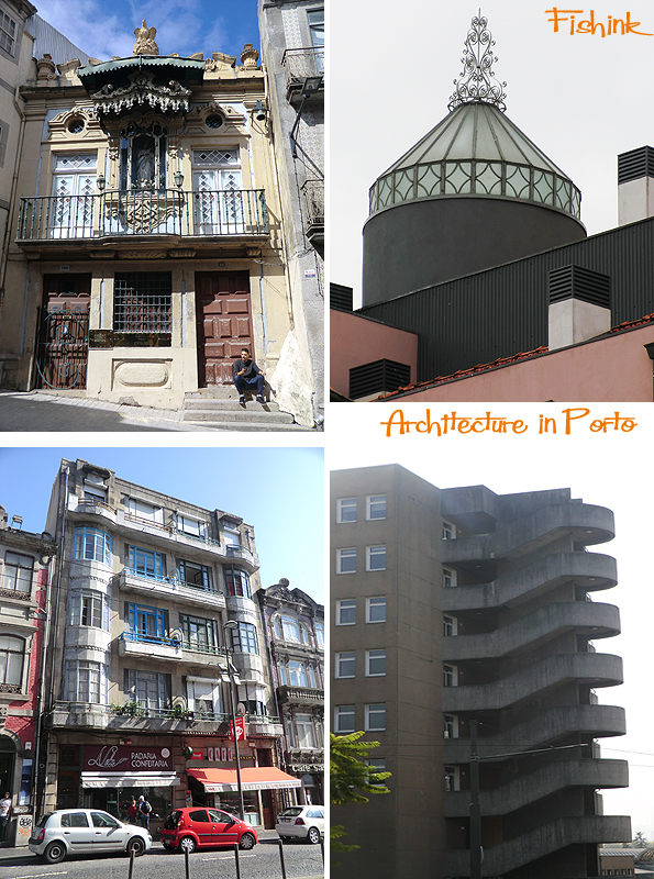
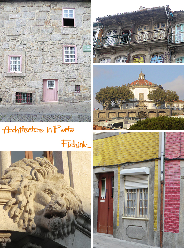
Architecture in Porto
Good morning everyone and welcome to another week. I hope you are still enjoying seeing as much of Porto as I did, just a few more posts to endure if you’ve had your fill already lol.
Just a ponder today on some of the beautiful architectural details I spotted a few weeks ago. Such a wild mix of styles, classical, deco, nouveau and at time a little bizarre !
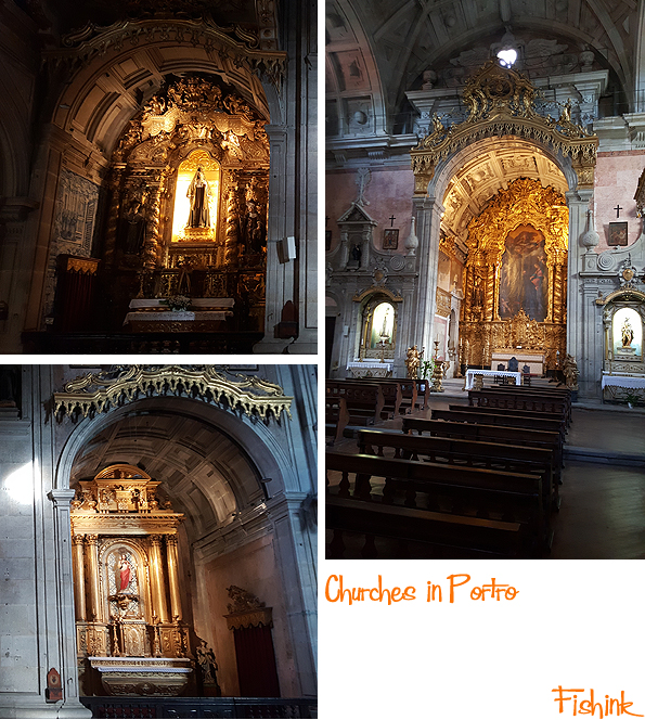
I found the rich layers of gold and guilt work in the churches, far too much for me. Classical and Baroque overkill as far as I’m concerned.
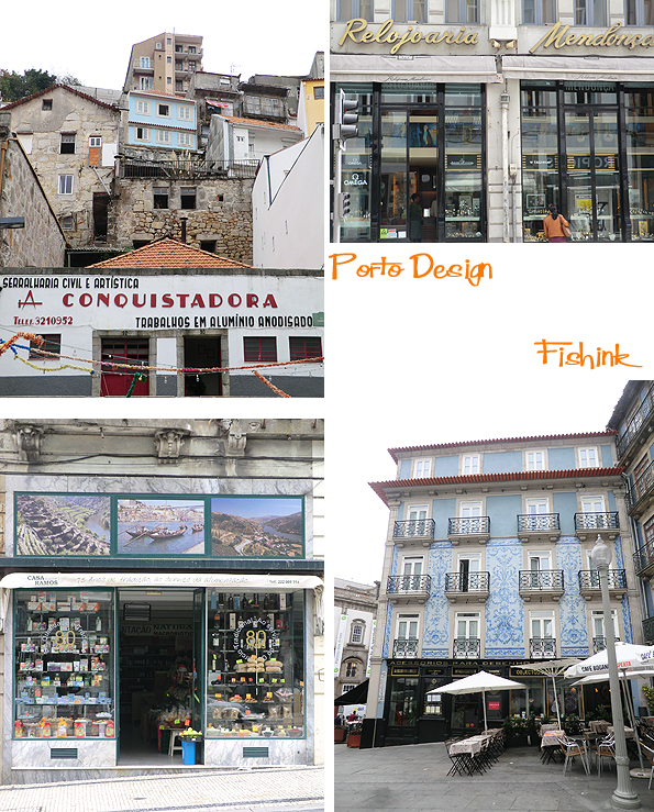
Some wonderful buildings as part of the main shopping streets.
This veranda caught my eye as did the strange little flourishes on the glass domes on numerous rooftops across the city, I can only think they might be used to allow extra light into stairwells etc.. anyone else know what these structures are for ?
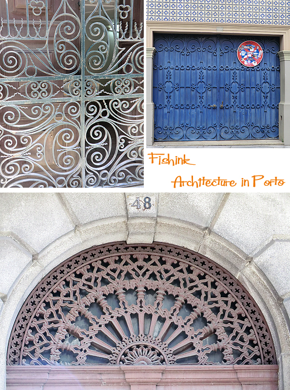
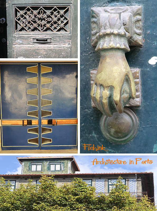
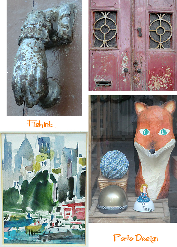
Some fab door details, scrolled ironwork and architecture.
A handy knocker !
This pink door can only be used by local pixies, as the top of it came up to my chest height !
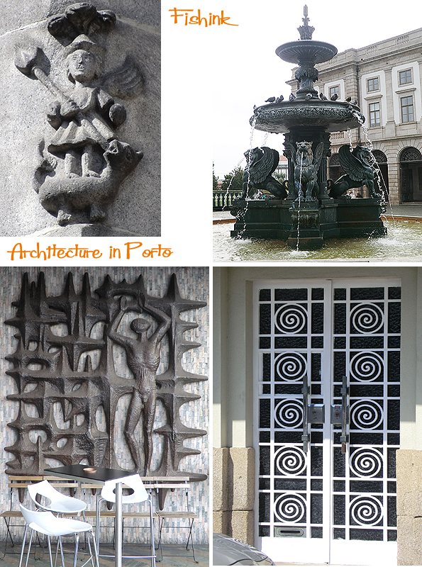
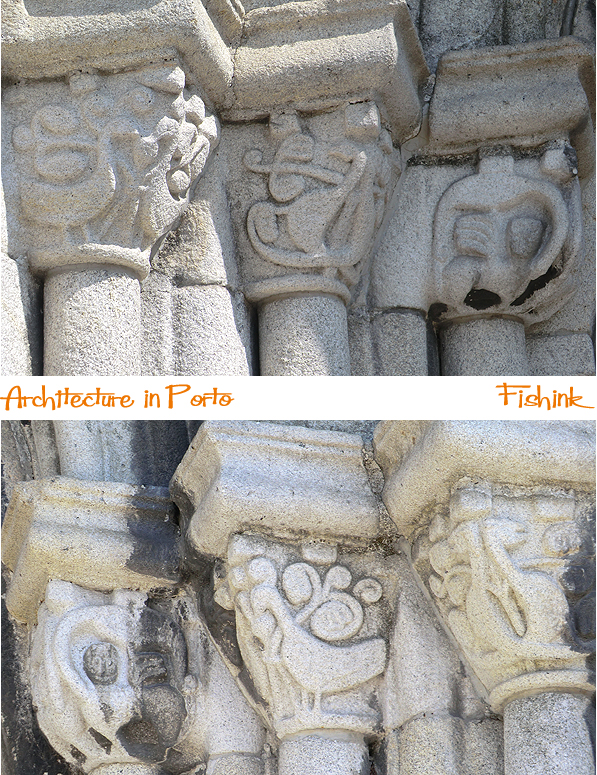
Lovely weather worn carvings in this church doorway.
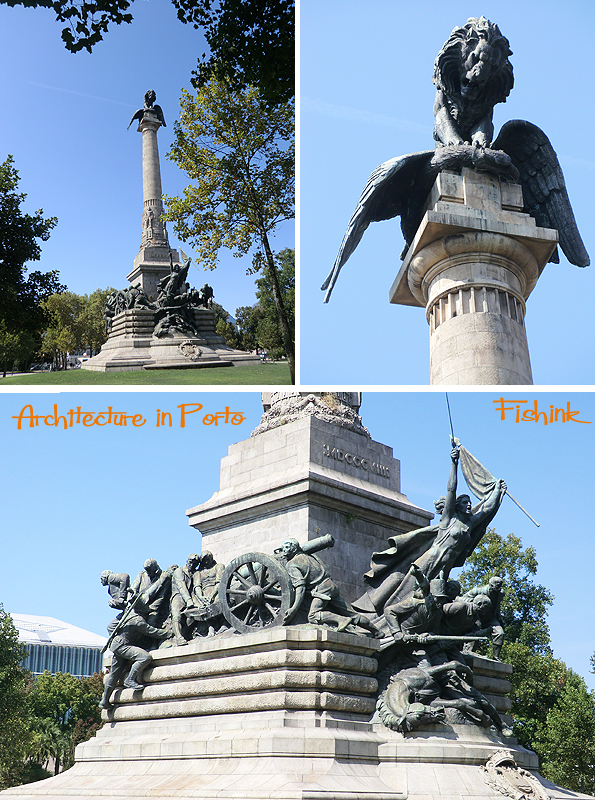
This impressive statue ” The Monument to the Heroes of the Peninsular War ” site in the middle of the large rotunda in the Boavista district of Porto. Despite being in the middle of a busy round-a-bout the monument is set in a peaceful tree-lined garden.
The statue celebrates the Portuguese and British victory against the French forces of Napoleon during the 1808-1814 Peninsular War. Set atop the impressive column is a lion, representing the Portuguese and British, dominating an eagle, representing the forces of Napoleon.
The figures at the base create a real sense of the tortures of war and the struggles during this period.
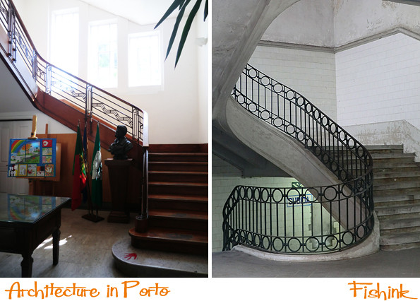
A few beautiful staircases spotted on my travels.
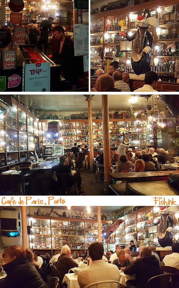
One of my favourite stop offs was in the Cafe de Paris. Filled to the brim with vintage memorabilia of old toys, cameras, lamps, soda streams and hundred of other bits and bobs. Great food, atmosphere and a free pianist thrown in with your glass of Port !
What’s not to like lol.
Design in Porto Part 2
Welcome back to my posts about Design in Porto, if you missed post 1 you’ll find it here !
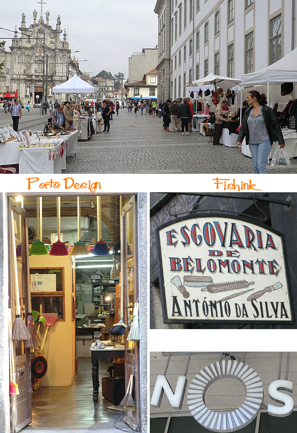
One place to head for if you are self catering and in need of some fruit and veg or simply enjoy markets, then head for the Mercado do Bolhao (Rua Formosa – more images here) A colourful and beautifully presented array of all kinds of produce, with cafes and souvenir shops on the ground floor.

There’s such a great mixture of the old and new in Porto. Speciality shops that have long since disappeared in the UK, like broom / brush shops or shops just selling parts for singer sewing machines ! It’s a great trip back in time.

A few of my own elevated views on design shapes and styles.

The old and the new go hand in hand. Marionette museums and quirky illustration boutique shops. I like the sign on the train welcoming prams and surfers alike !

You can still also discover an array of antique book shops that I wonder how on earth they know what is in each and every mountainous teetering pile surrounding their till or indeed how they sell enough volumes to just keep going.

From hip cafes to hip hats.

Shops that sell clothing brands ‘For Real Hunters’ and a gun to go with it!

More graphics from a forgotten era but great to still see today.

Mr cloaked Sandeman (a famous Port label) popping up here and there, looking more like zorro with a wine glass !

Wonderful art deco and still that intriguing mix of old and new.
These lovely tiled stones near to the main station.

Modern packaging for traditional sardines.
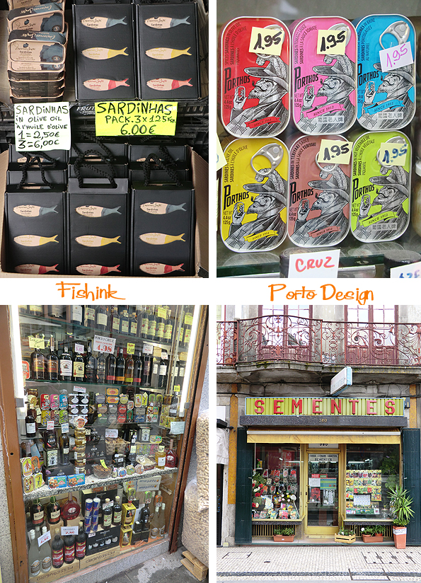
And finally a fish magnet shop… well it would be rude to go home without one !
More about the art and crafts around Porto to come soon.
Design in Porto Part 1
Welcome to my recent travels in Porto, Portugal. I’ve been showing the photographs I’ve taken of graffiti, illustration and will also be including ceramics, architecture and some of the art of the surrounding areas too. Stay tuned : )
We start today’s post off with a visit to a few stores who sell a great range of crafted or designer goods. In the Rua da Fábrica we find ‘Mario de Almeida L’, which hosts different makers all with their own table of wares. Some new work here alongside the typical array of cockerels, swallows and sardines that appear to be everywhere. Nicely displayed in a free to browse environment.
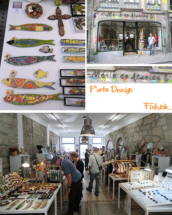
A few other local shops with upmarket product displays in a very natural, relaxed environment.
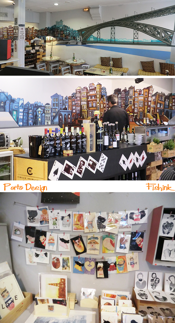
A wonderful mural in this wine / port / art bar.
A tuk tuk and tuk tuk delux lol

Any Mod or pearly king / queen would be proud to ride this Vespa. From craft markets to rustic old broom shops, it’s all in Porto.
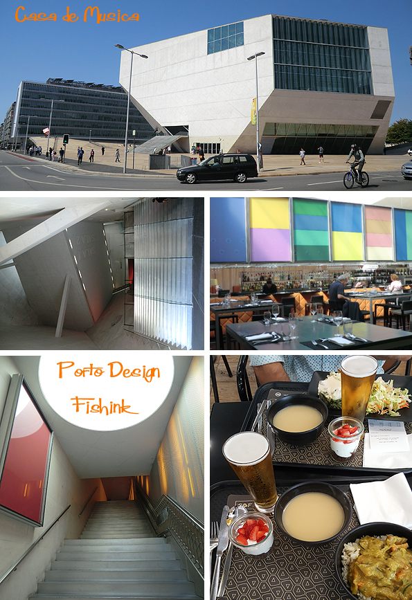
I wanted to take a walk around the Casa de Musica because I like to experience modern architectural spaces. I thought the cost of lunch here would be pretty high, but to my surprise and delight they had a great all in deal for a daily special of soup, curry and rice, desert and a beer for just 7 euros. Great food at a bargain price and a wonderful setting to eat in too.
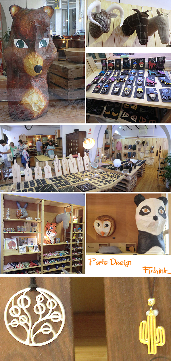
One of the studios on my list of ‘head to’ places was O! Galeria located in the Miguel Bombarda block, where the majority of small artistic businesses were.
It’s a stunning collection of local aspiring illustrators and a great place to discover some fresh work to adorn your walls.

Not far away was this beautiful hostel (the quality of which I rarely come across). It was also an art gallery and general haven to chill-out in the busy city. Known as Gallery Hostel Porto ( Rua de Miguel Bombarda, 222)

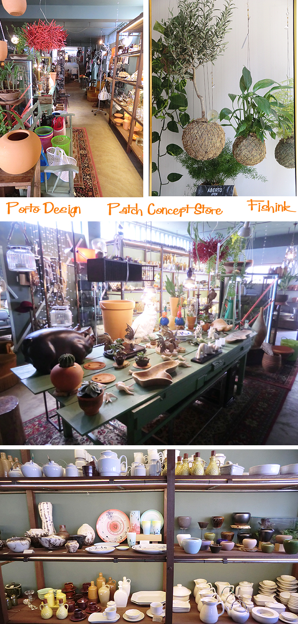
Patch concept store (Rua do Rosário 193) also got the thumbs up from me. Vintage clothing, new and retro ceramics and vintage toys and gifts from a bygone era. Trendy, re-loved we-love bric-a-brac if the term exists !
The best place to head to for a wonderful array of children’s books would be ‘Papa Livros’ (Rua de Miguel Bombarda. 523).
Such a great collection of illustrated volumes (a few in English too) with prices ranging between 10 – 15 Euros.

A retro gadget tea-shop.

And I love the mix of old and new businesses here, just look at these store fronts and graphic fonts.. wowsa!

How many art deco garages do you know of that are still in use and this clean ?

Some beautiful stores with products stocked to the ceiling.

More to come on the design in Porto front next week in post 2. See you all then and please keep those comments coming too.
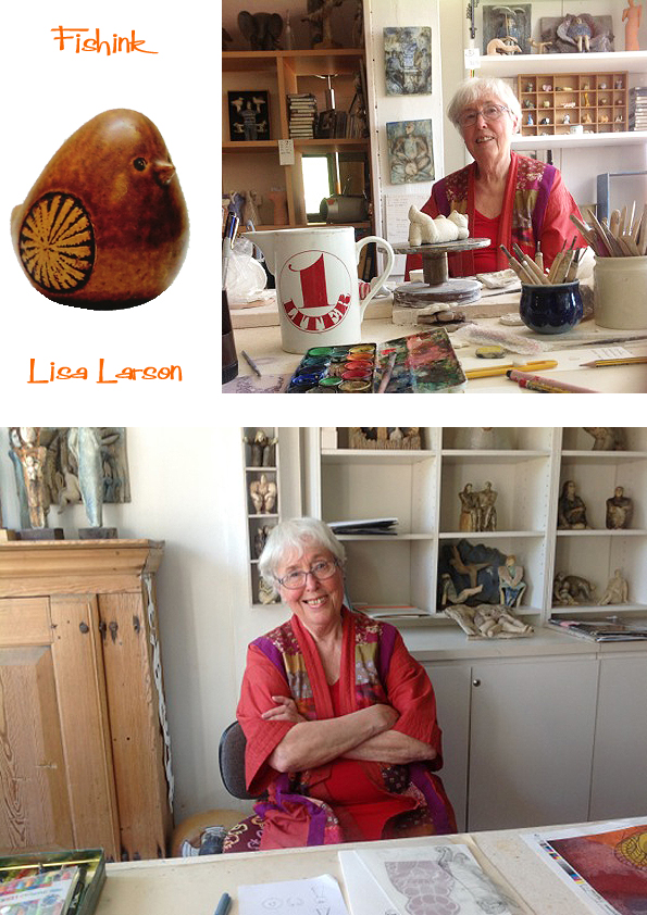
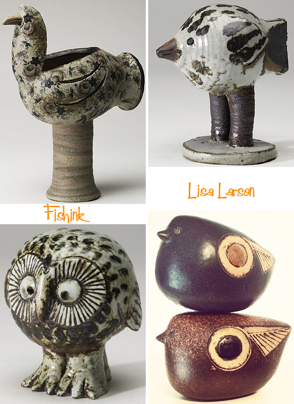
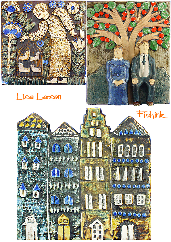
Lisa Larson World Exclusive Interview for Fishinkblog
Welcome to all of my visitors and whether you are a regular reader or a new visitor, I have a very exclusive treat for you today as I have managed to secure an interview with the wonderfully talented, Swedish Ceramist, Lisa Larson! I can hardly believe it happened myself and I’m still rather smiley as a result lol
Through a chance email, I received a reply from Lisa’s daughter Johanna. She just happened to be visiting her mum that week and very kindly offered to ask Lisa the questions I had mentally prepared (never thinking for a moment that I would actually get to ask them). The following post is a culmination of a few months work, ordering books and magazines and then the wonderful surprise of the interview itself… enjoy!
My first question went to Lisa’s daughter Johanna.
What was it like growing up with Lisa’s creativity around you.. I see that you have a graphics background yourself, do you think your mum’s encouragement has given you a love of the arts too ?
I grew up in a very creative home with two big artist studios connected to the house, and I also went along to the factory sometimes. I basically spent most of my time in a studio since I was a baby. I played with ceramic tools, or clay, or in the sandpit they used for casting. I was encouraged to draw and paint and knit and sew, my mum taught me how to throw clay. I went to art school but ended up specialising in Graphic Design and Illustration.
Here’s a fab selfie shot (below) of Lisa and Johanna.

Now my questions are directed to Lisa….
What are your first memories of art and drawing… were your parents creative and did they encourage your own creativity when you were younger ?
My father collected art and antiques and was a creative person. (My mother had died when I was two.) He encouraged me. He owned a sawmill and I could use the waste bits of wood to carve figures. I used to bicycle around and paint the farms around the area too, and sometimes sell the paintings to the owners, as was popular in rural Sweden. My father once gave me a load of blue clay and I made a life size portrait of the boy next door in our garden! Another neighbour (perhaps the boy’s father?) was an art teacher and was the person that advised me to apply to the art college in Gothenburg.
Was it unusual for a woman to be a designer in Sweden, some fifty years ago ?
My sister and I both wanted to be fashion designers and made all our own clothes. She did succeed (Titti Wrange, Annamodeller)…

and I ended up being placed in the ceramics department in art school, and loved the material from day one.
I saw a great video of a gentleman on the potter’s wheel and you reforming one of the pots he had thrown into a female figure, and later into a family pot etc. Growing up (and perhaps today) who helped in your own creative journey and who’s work do you admire who may or may not have been an influence on your work ?
The ceramicist and thrower in the video is Richard Manz who was my assistant at Gustavsberg. He was a very skilled technician. Else-Kulle Petersson and Kurt Ekholm were my teachers at Slöjdskolan in Gothenburg. I was also influenced by my husband Gunnar Larson and his artist classmates, teachers and colleagues. Stig Lindberg was my mentor at Gustavsberg. He had hired me and became a very good friend and colleague. (more about Stig here.)


What was it like working alongside Stig, (another hero of mine) and was it his free thinking style and humourous work, that allowed and perhaps encouraged your own style to develop and be appreciated ?
Yes, Stig had a lot of humour and we were all influenced by each other at the factory. He was very encouraging to us new students. We were free to experiment and he would visit the studio every week and discuss our work, and sometimes pick something for production, like the cat he thought was suitable. He asked me for more animals in the same style to make up a series. It became my first, Lilla Zoo.

I was frustrated for you when I read the story about you not getting paid very much for the work that you did that helped make Gustavsberg so famous. Was your transition to a freelance artist part influenced by that frustration yourself and are there any regrets about ever going it alone ?
No regrets. I had worked there for 26 years. Stig was gone, it was different times. Time to move on.
How did the collaboration with the Japanese company come about ?
I was originally contacted by a photo publishing company that wanted to do a photo project, and then they decided to produce some Lisa Larson merchandise instead (my photos probably weren’t that great!) and really wanted to launch the brand in Japan. My daughter was also enthusiastic about it and wanted to manage the brand internationally, and take care of all the new communications and new 2-D design tasks.

Below are part of the new Zodiac series due out in 2018, planned future orders are already sold out!

Being trained as a textile designer, I think your scope for design onto fabrics has a universal appeal, I know that the Japanese company you work with has made tee shirts and tee towels in their ranges, but have you ever thought about creating furnishing and fashion fabrics for children as part of your product range. I would love to put drawings into repeat for you if it would be helpful : )
Thank you but that is my daughter’s job! She has been inspired by my ceramic sketches and turned them into textiles, and she constructs the illustrations and the patterns for Uniqlo and other licenced clients. We have already worked with Ljungbergs Textiles and Boras Cotton in Sweden, and recently with Aswan curtains and rugs in Japan.


You can find more of the Japanese range of ceramics and kitchenware here.

Here’s one of the beautiful Japanese publications I discovered by Pie Books , great photographs.

Look at this cheeky chap awaiting some soup lol

Can you tell me a little more behind the story as to how your cat design came to be used by Baldelli and made into a moneybox ? I assume it was done with your permission ?
Not at all! It is total plagiarism! I first saw it in a shop window in San Francisco in 1966. When I asked what it was, I was told it came from a Danish importer. The shop owner said: “But, we do have a genuine Lisa Larson too”, and showed me into a back room!
Shocking to hear that blatent copying of designers work was happening mid sixties too. Some have the cheek to say it’s a compliment, but I disagree and if a company wants to compliment you on your skills and creative design, they should at least pay a royalty for using it !! Shame on you Baldelli and Bitossi.


I am delighted and also encouraged to hear that you are still designing and making now in your eighties… as an artist myself, I can’t imagine a time when I wouldn’t be still drawing and making new work. Do you have a list (perhaps even just in your head) of new pieces that you want to make and release to the world, as it were ?
Yes, my list is endless!
During my searching about Lisa’s work, I came across this fantastic company Scandinavian Retro who produce ‘Retro Klassiker’ magazine. Sadly it’s not available in the UK, but the very generous Editor in Chief sent me a complimentary copy and it is amazing….

132 pages just about Lisa Larson with photos of the majority of her ceramic work, what a delight. I just feel now that I need to learn Swedish or find a local Swedish friend to read all the text for me lol
The publication is excellent, concentrating on all the retro designs in textiles, fashion, ceramics, furniture etc from the mid century era. Sooo perfect for me.

I’ve read that the bulldog may be your most favourite piece that you have designed. Is that still the case and are there any designs that given the time you would perhaps do differently or work up again ?
I always try to make new and better things. I am never happy with my own work, until possibly much later on. Like when I said that the Bulldog was my favourite, was some 40 years after I made it!

Like you, I have a very quirky style of my own and often draw images of dogs and cats etc for use on fabrics and other textile surfaces. Do you think that your strong sense of humour has played a part in the style of ceramics that you produce ? Was that quirky style unusual in Sweden in the time that you were first making designs ?
Humour is important. We had a dog poster in the children’s room and I decided to interpret the funniest breeds.
I have always had my own style. I do not study other people’s style. (Other people copy me.)
I lastly want to say a vote of thanks for the joy that your work has given me. I’ve a family of three lions who sit in front of me on my desk that really make me smile daily, and for that alone, your work is truly priceless to me.
Thank you for your kind words!
If you are interested in buying Lisa’s ceramics I can recommend either using Lisa’s own online shop here or for retro and more obscure items, I’ve purchased using paypal before, from the wonderful team of Anna and Nicklas at Mother Sweden’s Lisa Larson store. Two very dedicated Swedes who also share a passion for Lisa’s (and other artists) vintage Swedish ceramics.
I want to say a huge THANK YOU to Lisa for answering my questions with such great consideration and honesty. Also to Johanna, without whom this interview wouldn’t have happened and for her lovely pictures. Lastly to Viveca Carlsson for generously sending me a copy of the wonderful Retro Klassiker.
I’ve a feeling there’s room for more of Lisa’s ceramics to come : ) Watch this space. Please share this post with your friends, leave a comment and sign up for regular Fishinkblog posts too. I hope you’ve enjoyed this interview as much as I have in making it.
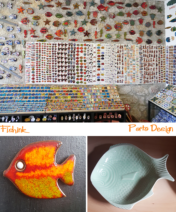
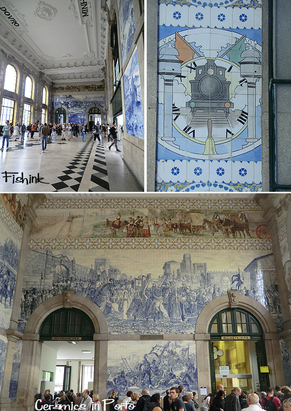
Ceramics in Porto
Welcome back to my travels in Porto, and today I’m revealing the wealth of ceramics than adorn and decorate the buildings around the city of Porto, Portugal. You may remember my ceramics post from Lisbon.. nearly 2 years ago ? if not it’s here for you to check out afresh.
I love spotting them on the outside of new and old buildings, from apartment blocks to ancient churches,

and the inside of São Bento railway station … what an impressive interior.
I often think what would we do without nature as inspiration for our surroundings ? Plants and flowers are everywhere.

And is it just me or is blue the most popular colour in the Portuguese ceramic world lol

Of course these retro ceramics from the sixties caught my attention straight away.

As did these geometric designs.

This beautiful frieze… designer unknown.
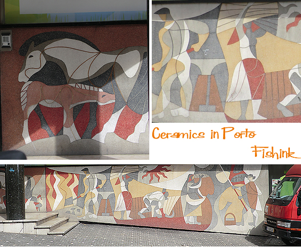
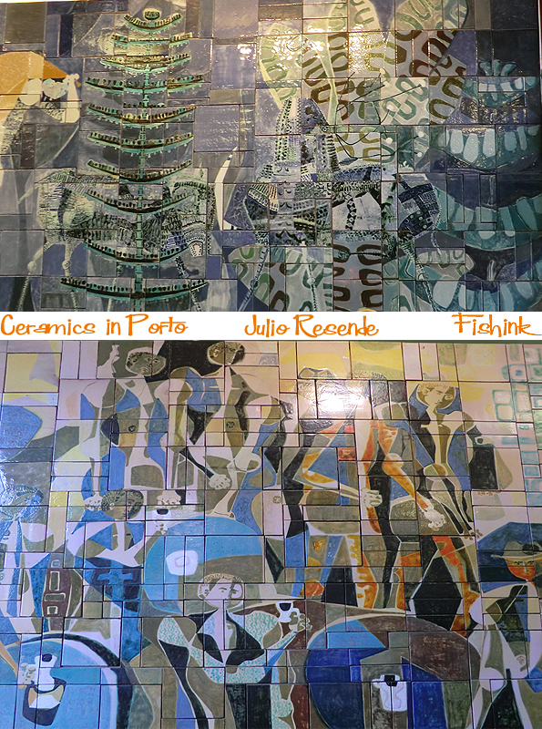
However my absolute favourite murals I spotted in Porto, at the Confeitaria Sical. Created from the work of artist Julio Resende in the 1960’s, who was born in Porto in 1917. They are right up my street.
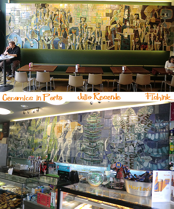
Lush colours and textures in a symphony of visual movement.
I stared at them (slightly mesmerized) whilst I enjoyed my lunch : )

Here’s a couple of Julio’s other artworks and a link to another huge tiled mural in Portugal that I didn’t get to see.

Which were your favourites ?
STOP PRESS… I’ve a real treat for you next week, a world exclusive interview with non other than Swedish Ceramist Lisa Larson. Given especially for the readers of Fishink Blog… how lucky are we ? Very exciting so don’t forget to tune in next Monday.
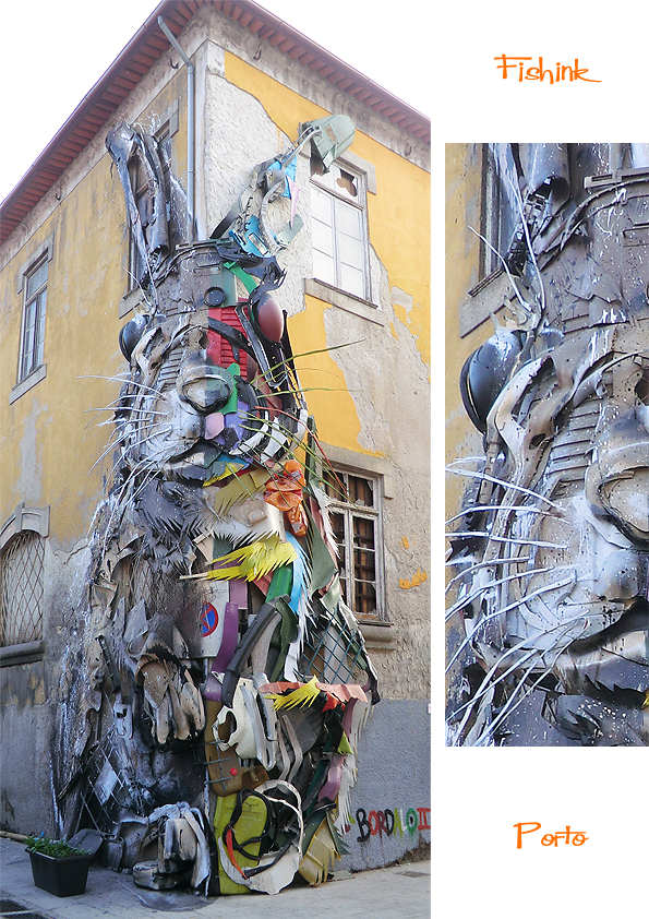
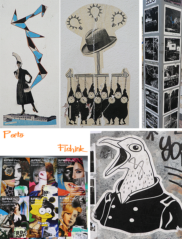
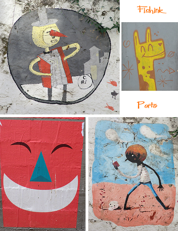
Illustration in Porto Part 2
In case you missed part 1 you can find it here. Porto was a wonderful place for spotting amazing illustrations around the city. They appear in many different formats. Some are painted directly onto the wall or door space, some are created onto paper and then glued on and some are collaged or sculptured.
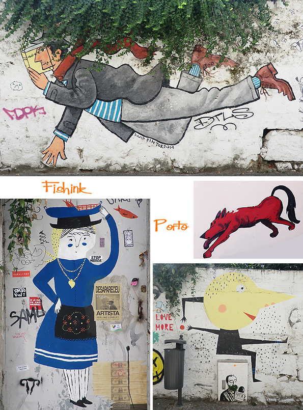
Obviously some of the work is commissioned to hide an ugly wall or to create drama and draw the attention to an area, like a restaurant or concert hall (as below).

Other pieces maybe purely decorative, political or have personal meanings to the artist themselves.

This 3-d sculpture was hidden in the back streets among the Port and Wine distilleries, across the river from Porto’s main town. Very commanding and I thought it’s half monotone /half colour idea worked very well using the corner of the house as a line to divide the two.
Another artist “Hazul” had work all over the city.

Again their distinctive style of swirling shapes and curvy lines caught my eye and made the work stand out as something different.

Some of the illustrations are glued on, using computer printouts or collage effects to create a ‘propoganda’ or retro quality to the work.
These were everywhere.
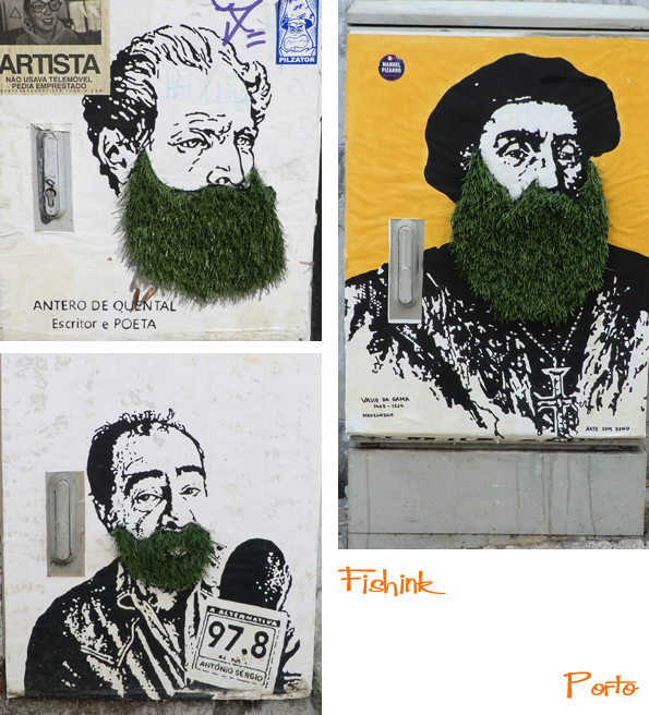
Amusing famous figures with grassy beards.
Whether it’s a painted train mural or a much more contemporary frozen food shop… illustration is key in telling a story and decorating a public space.
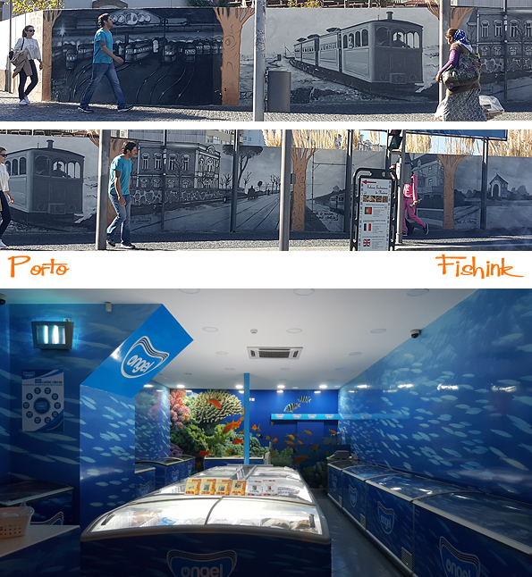
Illustration can even be set in stone ! Future posts to come about the design, ceramics and architecture in and around Porto.

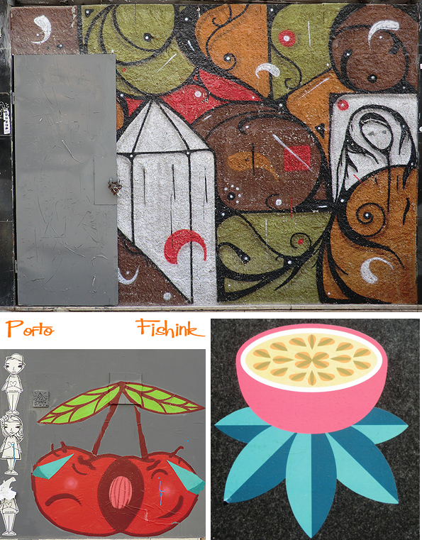
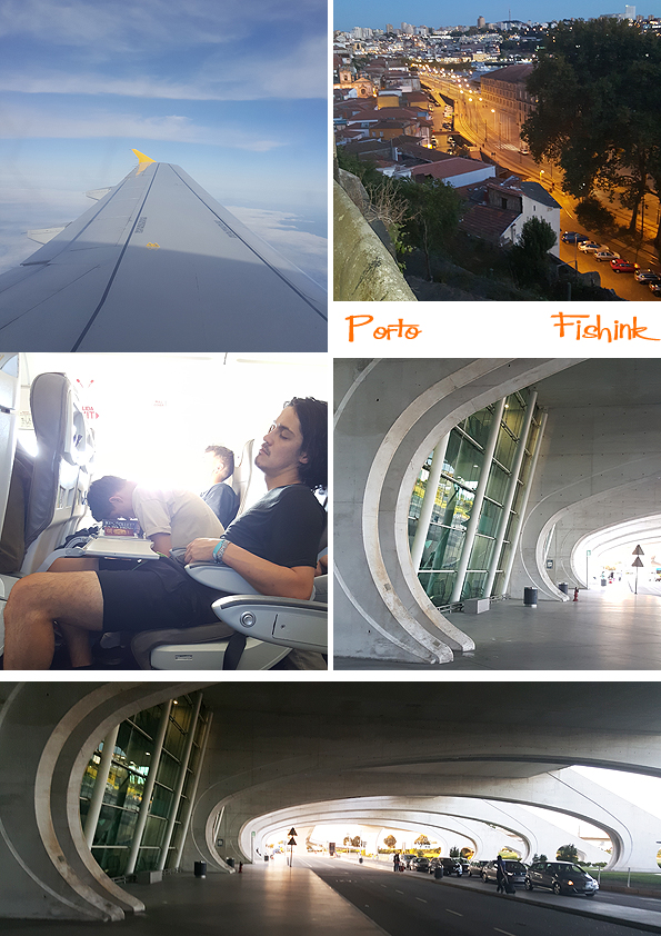
Illustration in Porto Part 1
Hello to you all and a welcome back to me, from a sunny time in Porto, Portugal… did you miss me ? Possibly not, especially as I was only away for 4 nights but I feel like it was a whole lot longer, and I took so many photos that I’m going to be revealing my travels for the next few weeks…. lucky you lol
Today I’d like to talk and show you a section of the illustrations (I struggle to call it graffiti when it was so beautiful) that I’ve captured on the Porto streets.
After visiting Lisbon last year, I’d say that Porto is it’s cultural little brother… not quite as developed but up and coming, give it five years and it will be booming in the tourist industry. Great to see it now when there’s soo much development going on and many buildings are still vacant or in the process of being refurbished.
The airport is extremely space age and retro at the same time… beautifully curvy, I loved it.
As I mentioned there’s so much illustration around of a high standard. This cat was a tremendous feat, since the alleyway was so narrow and tall, the artist must have planned their work meticulously beforehand.

Plenty of really exciting, large-scale work to feast your eyes on.
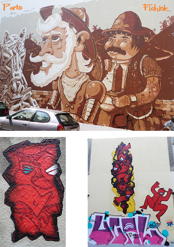
After a while of graffiti spotting, I started to recognise artists like “Costah” appearing all over the city. Their style becomes familiar and you feel like you’re treading in their footsteps.


Another artist “Chei” who is partial to a little giraffe graffiti, also gets around quite a bit.

Some really stunning pieces in the Art Block area (R de Miguel Bombarda) where the smaller independent art and craft shops can be found.
Wonderful to see how commissioned art can be decorative as well as creative, these flowers are amazing and covered the entire building.

Graffiti for a purpose or with a message too.

From maps to music and more in a few days too. Happy viewing

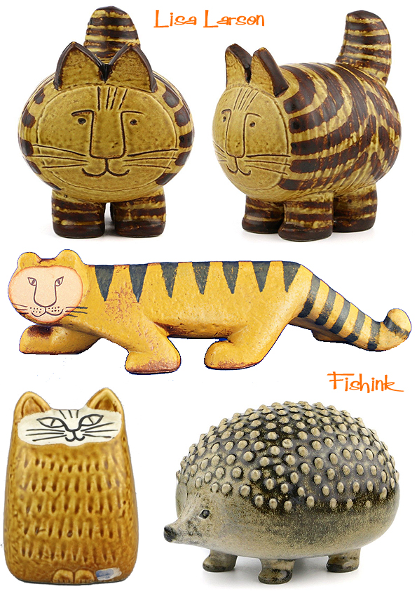
Lisa Larson Even more Ceramics
Lisa Larson has already appeared twice on Fishinkblog, here and here. I love the quirky ideas she creates in her work and the shapes she makes too.

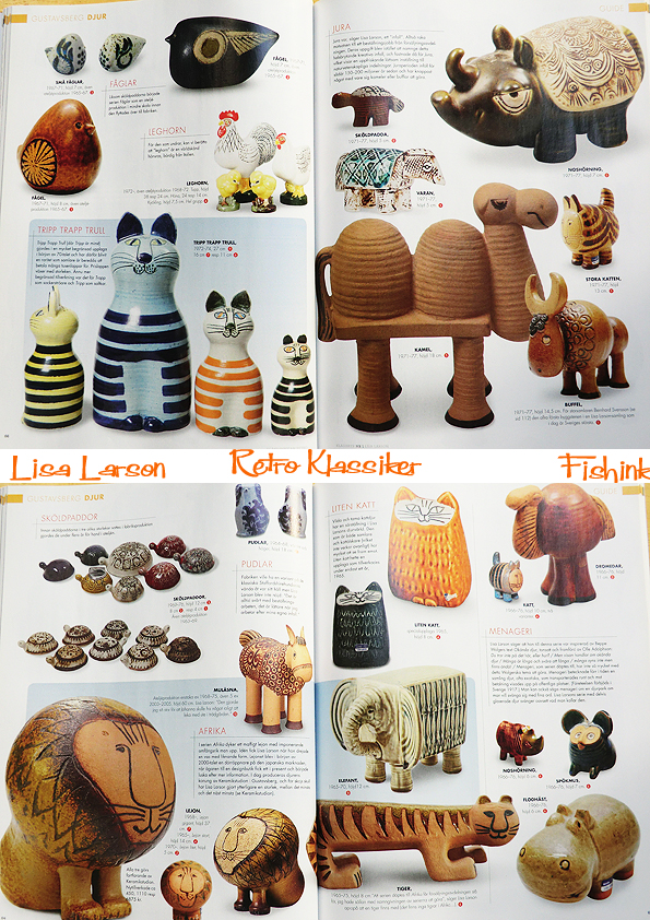
Lisa says “I’ve got such a curious nature! I’m constantly wondering how things will turn out. If I see a child on the bus who catches my attention, I want to rush immediately to my studio to see if I can capture the child’s character. If I can get it tight and remember the feeling.” According to Wikipedia, Lisa Larson (b. 1931) attended the school of the Society of Crafts and Design in Gothenburg and subsequently worked in the Gustavsberg factory. Scant information about a Swedish artist whose works are found in Swedish homes on a massive and more or less unparalleled scale. Chubby children, luscious women, angels, cocky pugs, kind lions, tough politicians, aloof cats and Pippi Longstocking.

Lisa Larson received a thorough education at the design school in Gothenburg. During the her five years there, discipline was tight and the message was clear: high artistic quality and no commercialism! During the last year, the rector of the school sent Larson’s diploma work (it would never have occurred to her!) to a competition between Nordic schools. One of the jurors was Stig Lindberg, then chief designer at Gustavsberg, and soon the Larsons received a letter in which Lindberg suggested that she come to work for him as designed for a trial year. “We said we would go and see. We stayed for 26 years.”

1954–1980 are golden years at Gustavsberg. Lisa Larson’s creativity never seems to wane, and sales successes follow one another. Although the management is happy enough, it does not show in her pay packet. The pay is low, lower than that of her male colleagues, and she does not get any royalties.

“I couldn’t afford to buy my own work. We had just enough to get factory seconds. Today, I own barely ten percent of all the items that went into production.” But the atmosphere was receptive and working spirit was high. Larson had assistants and unlimited technical resources. For her, the demand that products need to be durable and suitable for mass production was merely exciting and a challenge. One day she saw a jar thrown on a wheel by an assistant. She went to it and began twisting and turning the chubby piece of wet clay. Suddenly the image of a lion flashed in her mind, and she carved a lion’s face with a kind and tranquil expression on the jar. Another big seller was born. I’ve been a fan of Lisa’s work for so long that I’ve just invested in a family of these contented chaps !

More designs.

Another memorable story begins with a big meeting, a brainstorming session that in the democratic spirit of the 1970s involved all personnel in the company. The reason for the session was that Gustavsberg had just received a patent for a new durable material: melamine. The mood was listless, none of the shy staff had the temerity to take advantage of the opportunity to speak freely. Lisa Larson felt she had to break the silence. This was 1972, the oil crisis was looming, and Finance Minister Gunnar Sträng appeared often on television with his finger raised, warning against the pursuit of luxury and over-consumption. ”Why don’t we make a piggy bank in the shape of the Finance Minister?” Everybody fell silent, but Larson remembers the marketing people pepping up. And so it would be. Larson asked her children to give a shout whenever they saw the minister on TV, but every time she came running the minister had already turned his back. So she did it from memory. Larson would have preferred a piggy bank that does not open, but would have to be smashed first. The final product, however, which remains popular to this day, does have a hole in it. And a good thing too.

“I later found out that the minister was showered with these piggy banks as presents. One day I passed him on Kungsgatan, and realised how tall and impressive he was. And I had made him so fat! Perhaps it wasn’t really fun for him…” Another time she was commissioned to create a piece depicting Pippi Longstocking. What with so many things about the unruly child that had to be included in the piece, it was a tough assignment. The final result was a sculpted Pippi that shows her in a moment of reverie. Even Astrid Lindgren was delighted, and she said: “You will have to make another figure soon. I’m writing about a small boy living on a farm in Småland…”
Here are some more of her tranquil figures.

I love how her cats look a little disgruntled at being picked up.. how true to life lol


Other animals.

One part of Lisa Larson’s professional life was dedicated to the technical challenges of mass production. She had assistants who developed her sketches into products. The other part of her creative life was lived – and for the most part still is – in her studio. The possibility to alternate between the two is a luxury for Larson, and she does not set one above the other. In the studio, however, she comes has contact with clay, its weight, its ever shifting qualities and fragility. The studio gives greater latitude to her creativity. And the inspiration and the models are clear. “I am fascinated by folk art. From all over the world,” she says. “Particularly Africa, where they have no conflict between expression and decoration.”

Although Lisa Larson’s output is endlessly variable, her ceramic Noah’s ark nevertheless has an consistent feel, an emotional mood typical to her work. Everything radiates a kind of inner peace, a gentle satisfaction. The reason why people love Lisa Larson’s art is that it contains a generosity towards the world. It embraces everything that is alive and unpretentious, children and animals. The forms are organic and the textures inviting to touch.

Lisa Larson is immensely popular in Japan. Many Japanese tourists who come to Sweden ask where they can buy things designed by her. They cannot. “After the Kobe disaster, I got lots of letters from people who told me how much it had meant to them to find my figurines unharmed in their otherwise destroyed homes. How it had consoled them. It was so touching!”


Her grumpy cats, lions and tigers still remain a firm favourite with me.
Thanks to the auction site Bukowskis for the info used in this post. Long may Lisa’s work continue to delight and inspire not only myself, but millions of others. You can read a little more about the studio Lisa works at here.
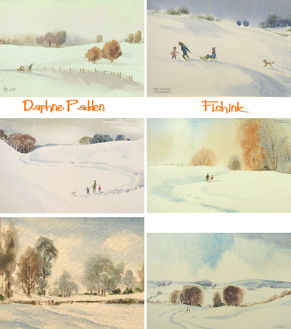
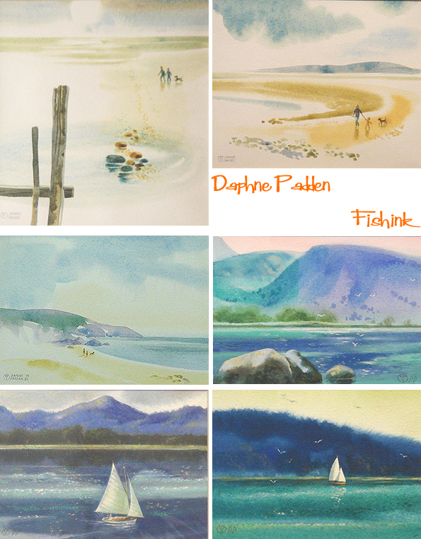
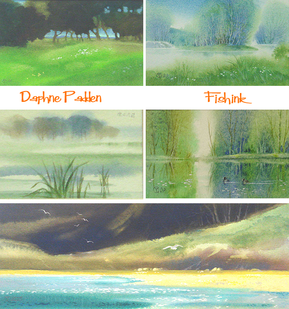
Daphne Padden Revisited

It was way back in 2010 that I first wrote about the advertising work of Daphne Padden. Through that post, Rosemary got in touch who has been organising an exhibition of Daphne’s fine art work. This is currently available to purchase through the Lincoln Joyce Gallery. She very kindly agreed to let me use the images and info on that site to share with you as an update on Daphne’s later work.
Daphne Padden was educated at Rosebery Grammar School in Epsom and attended the Epsom & Ewell School of Art. After college she became a freelance designer, producing posters and publicity material for the British Transport Commission, the Post Office Savings Bank, the British Diabetic Society, ROSPA, P&O, Trust House Forte and British European Airways. In 1976 she took up painting “for Art’s sake” working in watercolour where her delicate touch in both line and colour gave all her paintings a whimsical feel. Whether it is her studies of wildlife or landscape, the viewers’ eye is always drawn to the natural balance and extraordinary detail that Daphne achieves.

The Padden family originated in County Mayo in Ireland who in the mid 19th Century moved to Wolverhampton in the Midlands working in the iron industries. John Padden from County Mayo came to Wolverhampton where he had 7 children including James Padden , Daphne’s grandfather. James married a local girl Florence Crook from Wednesbury and they had two boys and a girl Percy, Sidney and Lilian Mary.
Daphne’s father was Percy Padden who studied at Wolverhampton College of Art and became an Art Master. He was discharged from the Army as unfit after enlisting in October 1917. Discharged on 27th December 1917 in London where he remained, trained at the Royal College of Art and he went on to become one of the foremost poster designers of the early 20th Century. Percy worked for the Post Office producing sumptuous works advertising cruises on Mail Boats.
In the First Wold War the family was subject to a scare when Percy’s cousin Thomas Bernard Padden who had joined up, was posted and formed part of the expeditionary force into France. Thomas was gassed and reported “missing” in April 1918. It was his wife Maud Padden (nee Browning) who wrote to the military to say he was alive as she had had a card from him to that effect. He survived the war but died shortly after in 1925 having had two children Gwendoline and Clifford.
A Padden marriage in 1917 caused a rift in the family due to religious differences, very prevalent in those days. This left part of their family estranged and isolated. It may have been unconnected or due to a clerical error but in late 1917 Percy listed his religion as Church of England in his Army papers, clearly an error as the family was Catholic. This was certainly not known to his cousin John Padden and his family who were isolated by the rest of the Padden family for his marriage to a Protestant, Leah Bradley. Percy married Marie Kate Bateman in Lambeth in 1924.
Daphne was born in Lambeth. She studied art and design under her father at Epsom and Ewell School of Art. Working for British Transport Commission, the Post Office Savings Bank, the British Diabetic Society, ROSPA, P&O, Trust House Forte and British European Airways.She was one of our gallery artists.

Daphne was always a very gracious lady, she undervalued her work and was always modest about her achievements which were considerable. She did not drive and always traveled distances by bus.

Little more is known about Daphne but she was elected a member of the Royal Society of Miniature Painters, Sculptors and Gravers in 1984. Her work is exhibited in galleries throughout the South East and London. I hope this helps in showing her and her work in their correct place in art history.
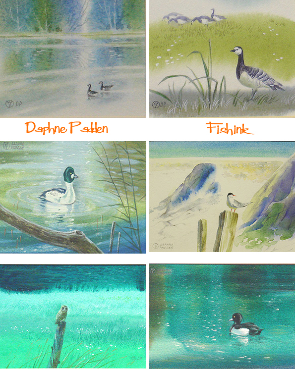
She has a wonderful sense of style and a great command of both watercolour techniques and landscapes. It’s wonderful to see such a change in style, from her work bold, blocked colour layouts for adverts in the fifties and sixties.

You might be surprised to discover that some of these pieces are miniatures, measuring just a couple of inches.
You can pick up an original here from as little as £80 ! Thanks again to Rosemary for letting us all appreciate Daphne’s stunning paintings, and for also fitting another piece into the jigsaw of her life and work.
More links to Daphne’s advertising work on Allison’s Flickr set here and over at Quad Royal here. Enjoy.
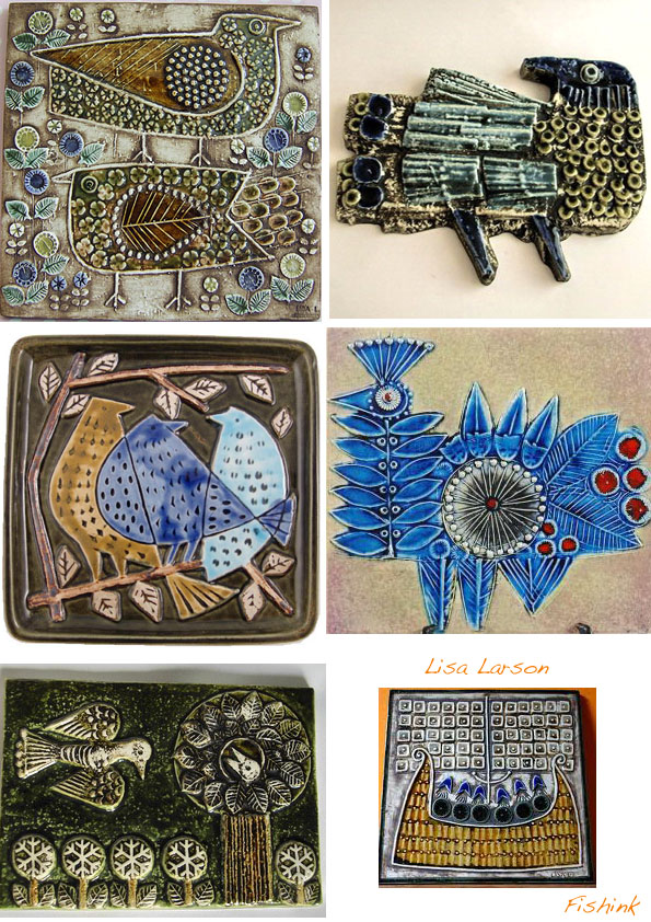
Ceramic Birds and Sunbirds
Happy Bank Holiday weekend to those of my readers in old Blighty and a great start to the week for everyone else.
At least three of my favourite ceramic designers included birds in their collections. To be honest their work still has a passion and delight for me, some fifty plus years after it was designed. Look at these colourful chaps created by Aldo Londi for Bitossi.


I equally admire the very stylised work of John Clappison for Hornsea Pottery. Imagine shaking these salt and pepper, rooster and hen pots, to add salt to your eggs in the morning !

A few beautifully textured and rounded pieces by Stig Lindberg.

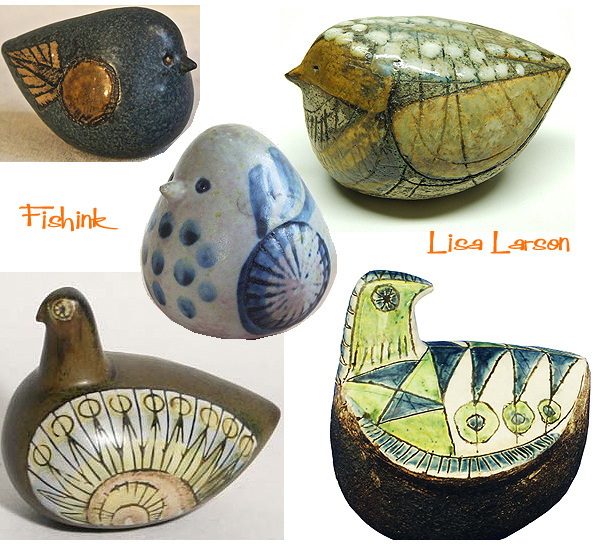
Some wonderfully contained and free-formed pieces from Robert Jefferson and Lisa Larson.
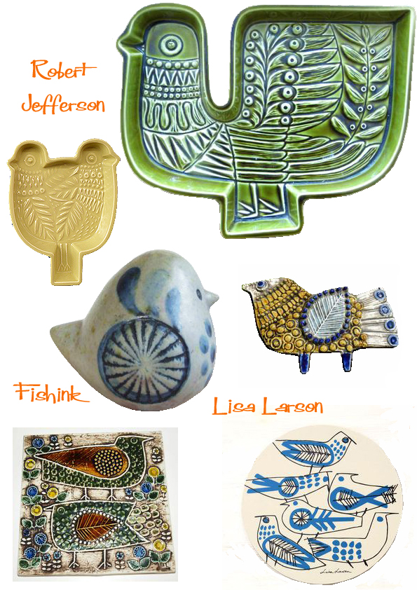
Or these slightly more up to date and simplistic beauties from Makoto Kagoshima.
![]()
Which ones are your favourites ? I’ve been inspired by the bird idea for quite some time now, so decided to get some ideas together and make some of my own. These are the very rough early drafts.

Based on a combination of my textures, suns and bird drawings. I’m calling these Sunbirds !

And I like the idea of making some tile / wall plaques too, using my pattern background as a a form of decoration.

Watch out for more as my ideas develop. All thoughts and comments appreciated as usual.


