Jacqueline Groag A life of Textiles
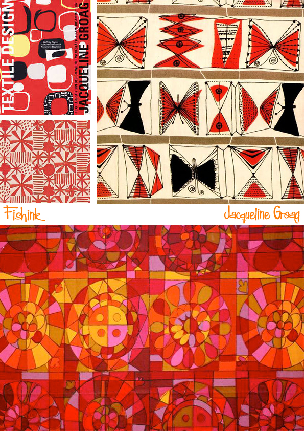
Born Hilde Pick in Prague in 1903 (she changed her name when she met her husband, a fellow Czech named Jacques Groag, at a Viennese masked ball in the 1930s), she grew up in an affluent Jewish family.

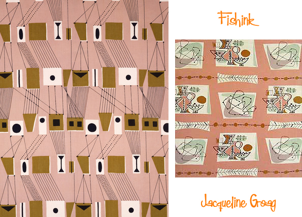
Her childhood was marred by ill-health and, as a result, she was largely home-schooled. She was also quite a solitary child who spent time alone drawing. Later in life, she said she had a theory that everyone has a particular age that they remain at inside, regardless of their real age; hers, she maintained, was eight. It gave her gave her a unique style that, while naïve and simple, was anything but childish.
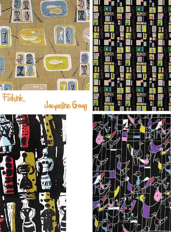
Groag studied in Vienna in the 1920s, focusing on textiles and pattern design. She studied textile design in Vienna and flowered under the tutelage of Franz Cizek who then recommended her to Joseph Hoffmann, Head of the Werkstätte and she became one of his students. By 1930 she was already designing textiles for couturiers such as Chanel, Worth and Schiaparelli. Following a first prize for a poster design for the Salzburg Festival in the 1920s Groag won an award for a lace design at the Paris Exposition Coloniale Internationale (1931), a gold medal at the 1933 Milan Trienniale and another gold medal for textiles at the 1937 Paris Expo. It was Cizek who suggested she concentrate on surface design and who encouraged his students to set aside the formal teaching they’d had in favour of a less-structured approach. Her work, which often used a grid, where squares were filled with drawings, figures and motifs, might have been dismissed by some as ‘decorative arts’ but she was unperturbed.


Groag began making designs for the Wiener Werkstatte collective of artist-designers, who came together with the aim of creating strong, credible design across the artistic disciplines. Working at a difficult but exciting time, she sold designs to the Werkstatte while still a student, as well as winning prizes for her work, including one design for a poster to promote the Salzburg Festival. These were prestigious accolades and distinguished her from her classmates and contemporaries. Like Hoffman, she did not agree with the values of the International Modernist movement, which eschewed decoration as frivolous and unnecessary.

She married the modernist architect Jacques Groag in 1939 but with the rising Nazi threat the couple had to leave Vienna. They moved to Britain and Jacqueline soon found work. Her playful designs with strong lines and vivid colours proved to be a welcome change from the stereotyped floral patterns current at the time.

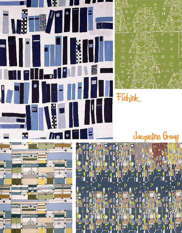
By 1955 Jacqueline was established as a designer for the British textile industry. Her client list is long and varied and ranges from British Rail to Associated American Artists. As well as for David Whitehead & Sons, Groag designed textiles for future RDIs Sir Misha Black at the Design Research Unit and Alistair Morton at Edinburgh Weavers. Her designs were applied to wallpapers, to carpets for Bond-Worth, to interiors for the airline BOAC, greetings cards for Hallmark, for Johnson Matthey ceramic dinnerware and for plastic laminates. A number of her designs were featured in the Britain Can Make It exhibition and her influence was evident at the Festival of Britain 1951, where her designs were also exhibited.

When she was appointed a Royal Designer for Industry (RDI) in 1984 the RDI Master Dr William Brown reported that they had been trying to arrange for Jacqueline to join the Faculty for many years ‘but illness and other circumstances had served to make her election elusive until now’. He added that throughout her long and busy career the quality of her work had never faltered.
Jacqueline Groag died at the age of 82 on 13 January 1986. Her work instills in me, a strong sense of calm, any thoughts readers ?
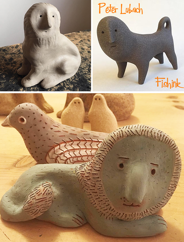
Peter Lubach Ceramics for contemplation
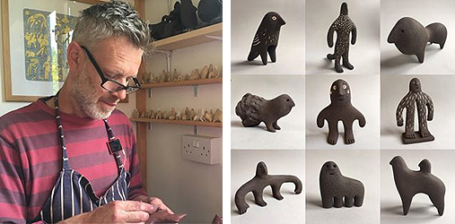
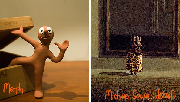
When I first discovered the wonderful ceramics of Peter Lubach through his Instagram account, they initially left me in a silent awe. Memories of Tony Hart’s ‘Morph’ Plasticine character and Michael Sowa came rushing to my mind, but they are much more spellbinding than that.
The more new figures you encounter, the more you want to explore and dip your toe into their world ! Peter has been a printmaker and Illustrator for the last 20 years…
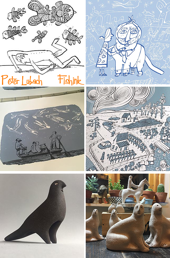 ,
, but it is his ceramics, I wish to explore here today.
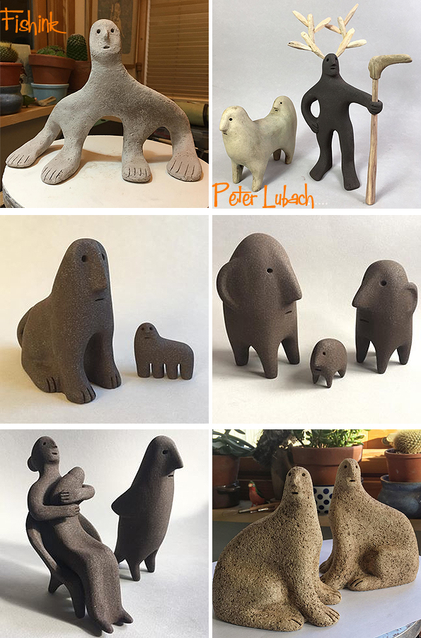
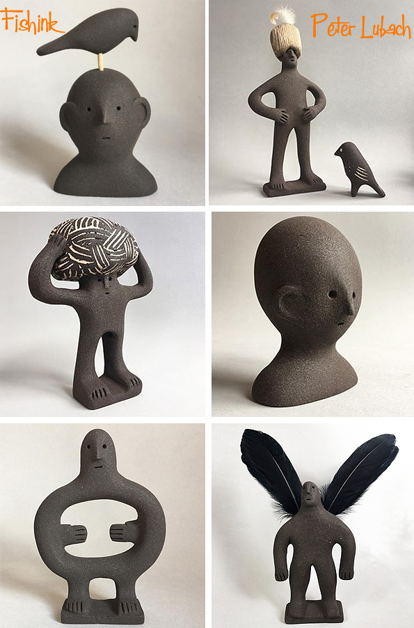
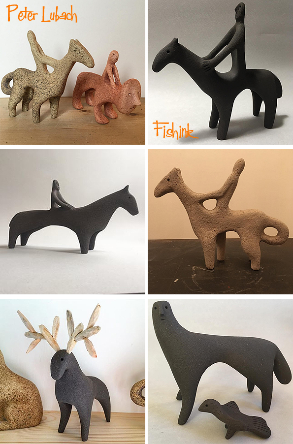
Leaving my most favourite of all until the end. This wonderful Lion, (bottom image) made me think back to 1960’s artists like Roger Duvoisin, I love the added detail on the mane and tail and it’s slightly inquisitive look. I would also love to have him sitting on my studio shelf too !
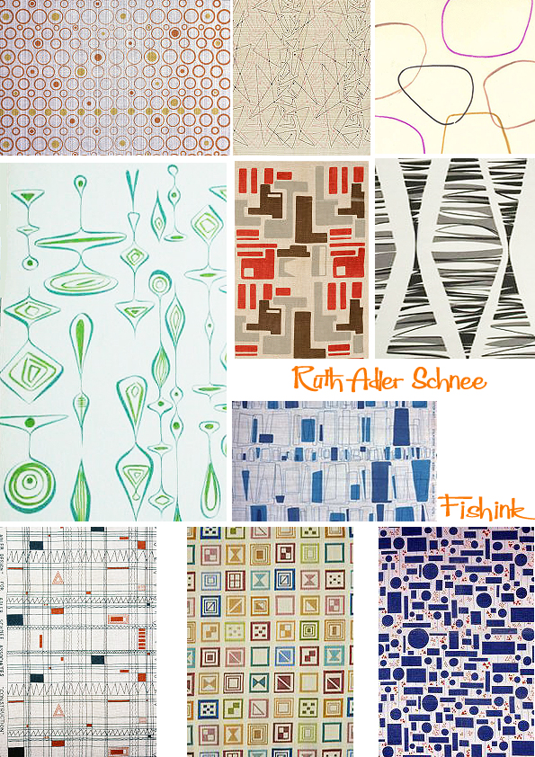
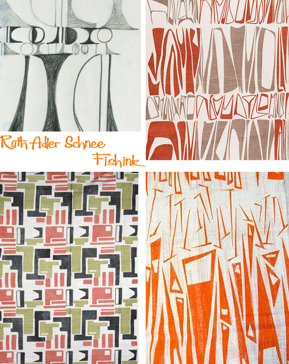
Ruth Adler Schnee Pioneering Textile Design
Born Ruth Adler in 1923, her passion for art started very early. Her parents loved art, music and design and instilled that same passion in her. As a child she played with mobiles on the floor of family friend artist Paul Klee’s studio and drew detailed interiors as a pastime in her childhood home in Düsseldorf, Germany.

In 1942, when Ruth left Detroit to attend RISD (Rhode Island School of Design), she took an overnight train on the New York-bound Wolverine line. On her train schedule, a warning alerted passengers to delays from trains carrying war materials or troops, which had the right of way. She understood those warnings more than most. Born in Germany, she and her family had fled the Nazi regime in 1938. She was not yet a naturalized American, nor was she a German: In 1935, Hitler had stripped all Jews of citizenship.
“I was a nobody,” Ruth told her daughter in a 2002 interview. They may have lost almost everything material, but the family held on to its love of art as they settled in Detroit. “We came to Detroit without a job or money, and before looking for a job my parents took us to the Detroit art institute,” she said.
That love of art became part of Ruth’s DNA and has been her career, passion and reward throughout her life. “It all began in Detroit with trips to the DIA (Detroit Institute of Arts Museum) and at Cass Technical High School. “I simply blossomed when I got to Cass,” she says, “because it was my love. … I just went wild.”
That love and talent won her a full four-year scholarship to the Rhode Island School of Design. After a stint in New York she returned to Michigan on a one-year fellowship to attend Cranbrook Academy of Art in Bloomfield Hills and became the first woman to earn a graduate degree in architecture.
“The competition was to design a house encompassing all the modern gadgets that were designed during the war but had just come on the market,” Schnee says. “My house was designed in glass and steel with large open spaces in the Mies van der Rohe style, but I could not find fabrics to fit the house. Everything on the market was French provincial. So I designed my own drapery fabric.”
She decided to go into business and opened a storefront on 12th Street in Detroit. There she displayed and sold a small selection of furniture and wares by such esteemed modernists as George Nelson, Warren Platner and Frank Lloyd Wright, all major architects and designers of mid-century modernism.
When she married Edward Schnee, a graduate of the Yale School of Economics, they moved to a larger space on Puritan Street and officially launched the Adler-Schnee store. It was one of the first stores in the United States to sell modern furniture, fabrics and home furnishings to the public – everything from cooking utensils to unique art objects. After a fire at the store, they moved the store to Livernois Avenue. It was not initially successful. People in those days preferred the mass market styles sold in department stores. “We just couldn’t earn a living in the early days,” she says, “but I was inspired by art and nature. It’s a simple thing, but true.” She was mixing in artistic circles, and as a young mother of three, her circle of friends and collaborators included Charles and Ray Eames, Frank Lloyd Wright, Buckminster Fuller and Minoru Yamasaki.

Slowly but surely things got better. The artistic objects sold at Adler-Schnee began to show up in kitchens and living rooms across metro Detroit and across the nation and her work became well known. From living rooms, fitting rooms and hospital rooms to museums, showrooms and skyscrapers, her textiles began to appear in the most intimate and the most iconic settings.
She worked on the General Motors Technical Center in Warren (1950-55), on the World Trade Center (1970-77), and on the update of Albert Kahn’s Ford Rotunda in Dearborn (1952-53).
Ruth’s work also included projects that reflected her experience as a woman in an almost exclusively male industry: While pregnant with one of her children, she designed interiors for the former Feld-Weisberg Clinic, a contemporary building named for her obstetrician at the time. “I had the idea of using whimsical figures on the ceiling, because I had to be lying on . . . those tables for the examinations, and I felt that one should have something fun to look at while one is being examined,” she says in her oral history.
The doctors vehemently opposed her idea, which called for wallpaper designs by illustrator Saul Steinberg. But Ruth insisted. “I was so convinced that that’s what I wanted [that] on our own, we paid for that Steinberg wallpaper. . . The reaction from the patients was unbelievable. I had calls morning, noon and night from women who had been examined thanking me for finally doing something wonderful to those rooms.”

“As an immigrant who launched an influential business in Detroit, as a woman who broke through barriers in a male-dominated field, as a Detroiter who helped shape an international sensibility, her story speaks to the value of inclusiveness, to the entrepreneurial spirit and to the profound role the arts play in nurturing our souls,” says Rip Rapson, Kresge president and chief executive officer. Two years ago, at 91, she was selected as the 2015 Kresge Eminent Artist.
Now at 93, she continues to work most of the year from her studio in Southfield. She still designs custom fabrics for Knoll Textiles, where she holds a 20-year contract, and with Anzea Textiles, an upholstery company. “I do the work because I love it,” she says. “And now to be recognized that my work has some quality to it, it’s very exciting to me. It’s incredible.”
She believes the best lesson to learn about creativity is being observant. “You have to look at things, see things,” she says. “Everything around us is a design that can be put on paper. As a design: the simpler, the better.”
Many thanks to the information from Marge Sorge over at The Detroit Hub, which has made this post possible.
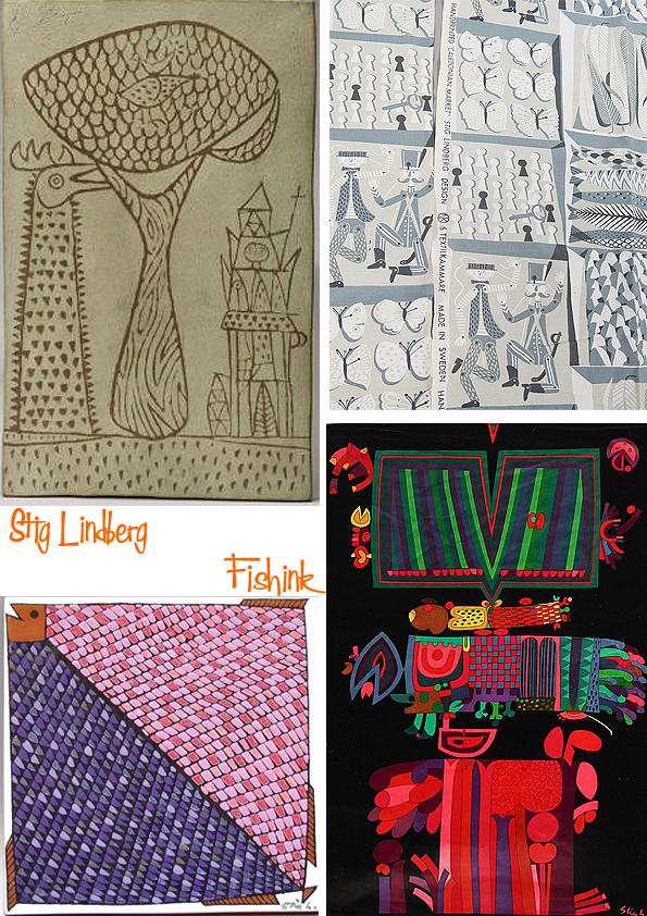
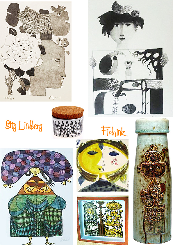
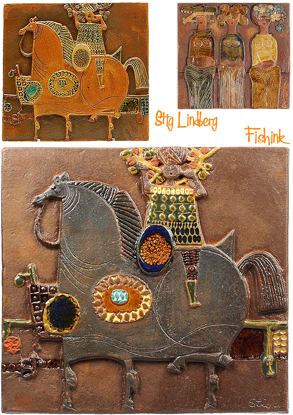
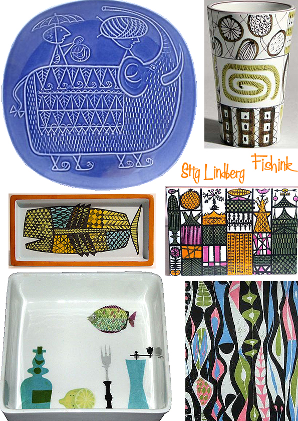
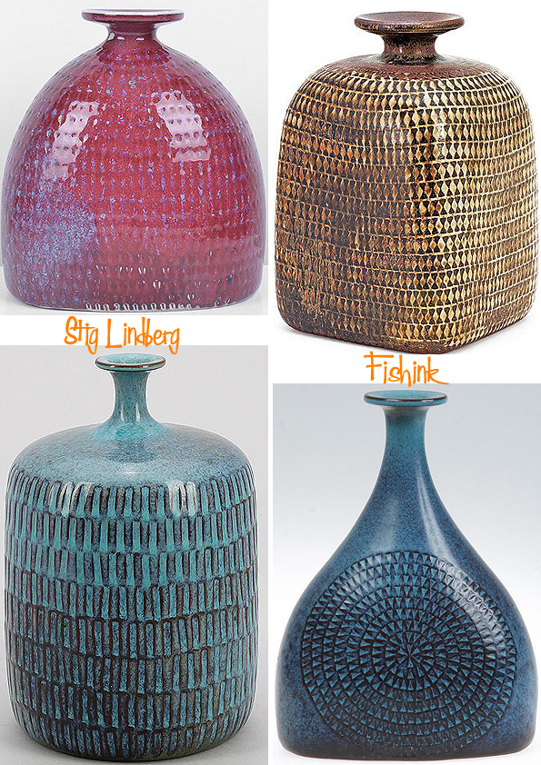
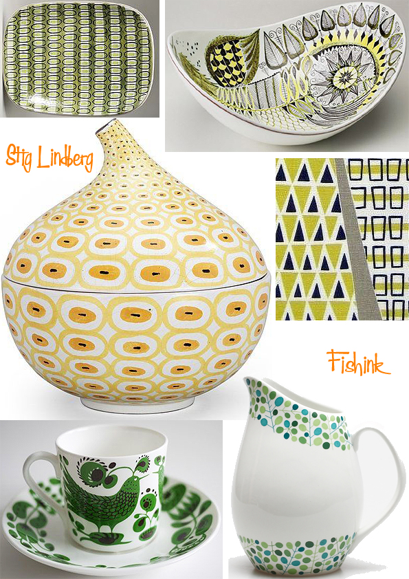
Stig Lindberg More ceramics
I have written before about the wealth of ceramics produced by the talented Stig Lindberg, and as I keep coming across more and more previously unseen pieces, I feel it is time to welcome Stig back into the Fishink blog fold once again!
I came across a fair few of Stig’s drawings. Some of them are quite clearly early ideas for ceramic pieces, which were developed later.
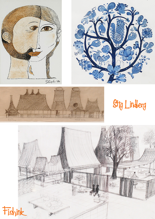
Themes appear again and again. Heraldry, horses, double heads, couples or siblings, mythology and make believe.
I wonder whether these were painted from dreams or just some crazy random thoughts.
Also interesting to see that the same plaque would be painted in different ways. Was this perhaps to make the ceramics feel more unique, to make the range look more varied or merely to keep the artists who painted them all day long, from getting bored lol
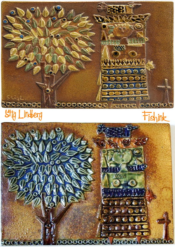
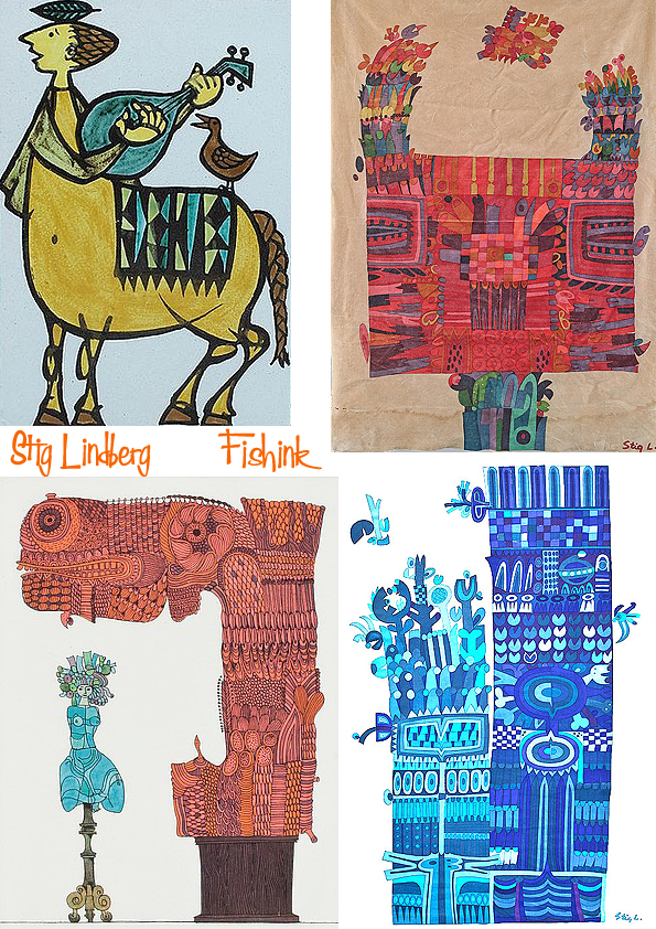
See below, how the knight on horseback develops from a drawing into ceramic tiles.
Again the rider appears, and in a variety of colours too.
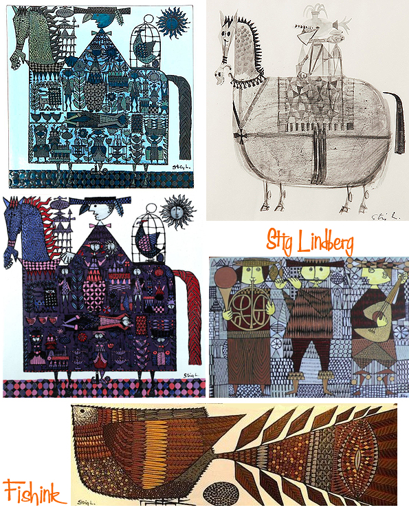
More double heads.
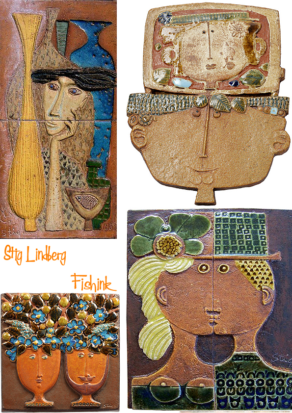
There is something peaceful and joyous about Stig’s work.
His work has gone on to influence so many.
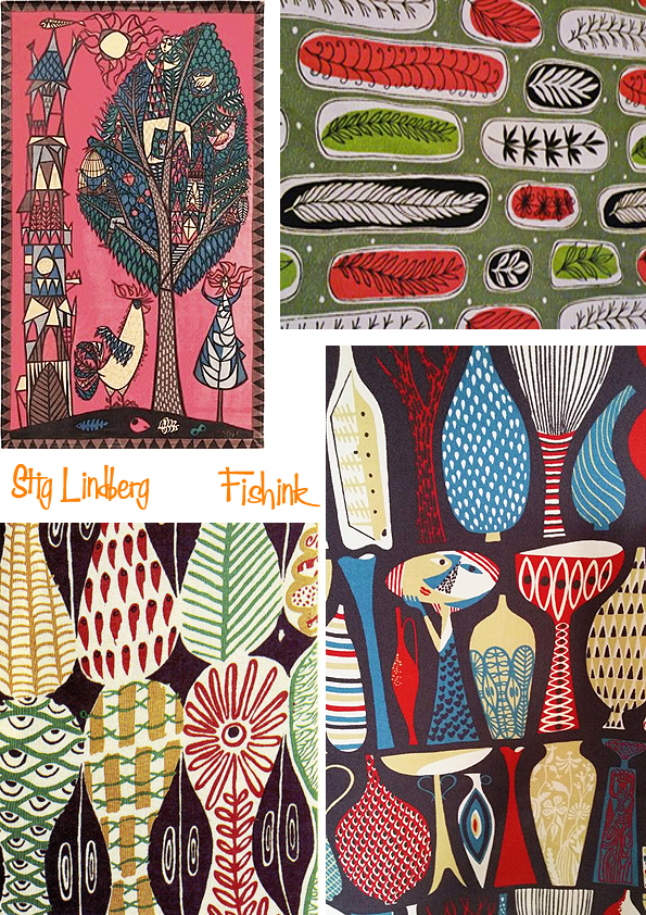
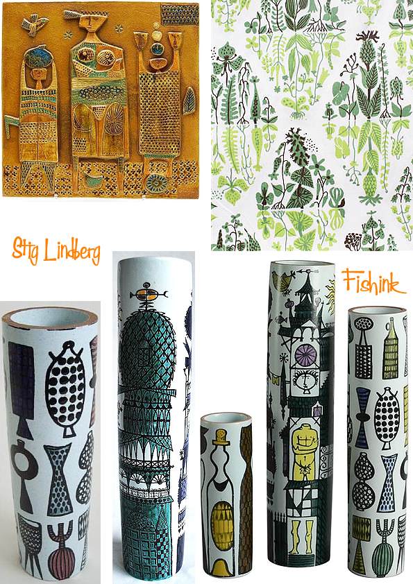
I love these shapes, the curvy elephant with the Ali-baba slippers lol
More visually pleasing shapes with textural repeat patterning.
Figurines I’d not previously seen. I love mister bluebird here…
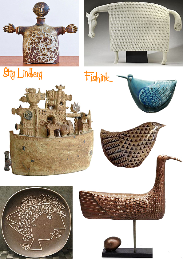
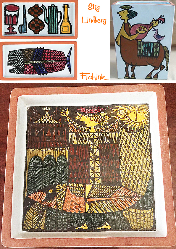
And of course some beautiful all over patterns. Such a talented guy.
What is your fav ? please share, comment and help spread the Fishink blog. Thank you
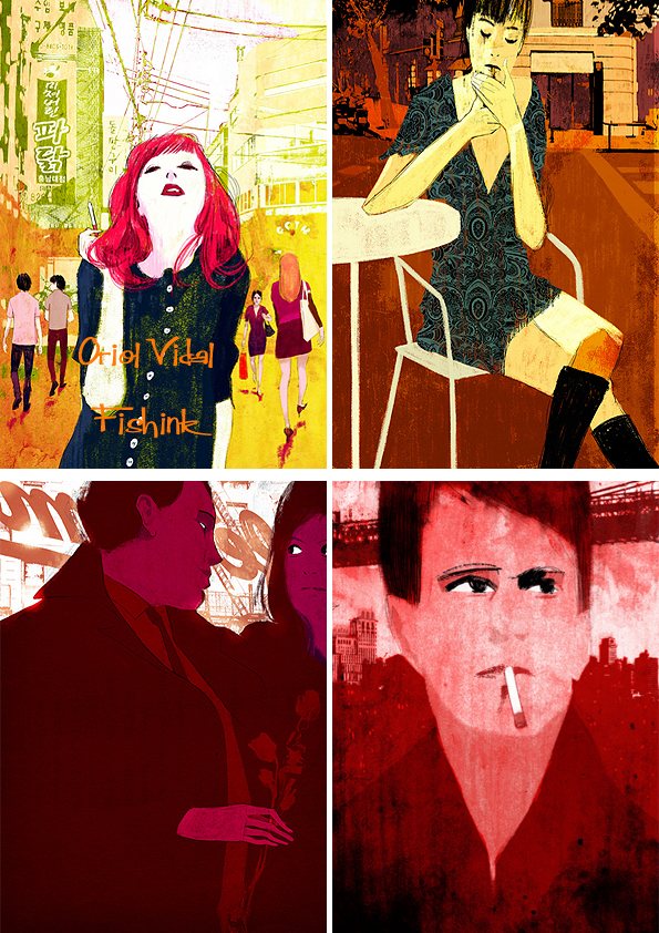
Oriol Vidal Illustration

Oriol Vidal is an illustrator/storyboard artist based in Barcelona. Like most successful artists these days, he has a few different styles to his work. One of his advertising styles works with a combination of photography, figures and dramatic lighting. A couple of these reminded me of Starsky and Hutch … perhaps it’s the car !
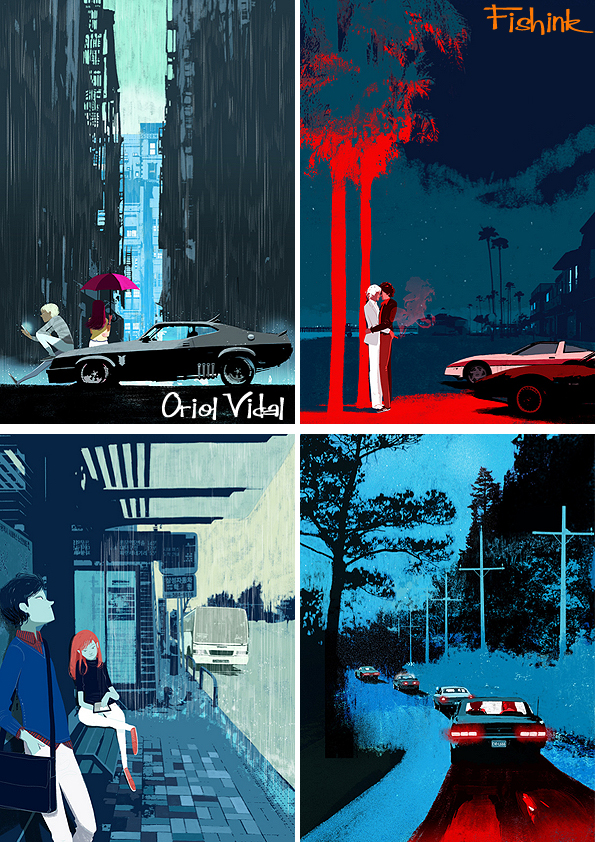
Speed and adventure.

There’s also plenty of beautiful textures in Oriol’s work, which help to bring them to life in such a magical way.

I think he likes pattern and plain too.
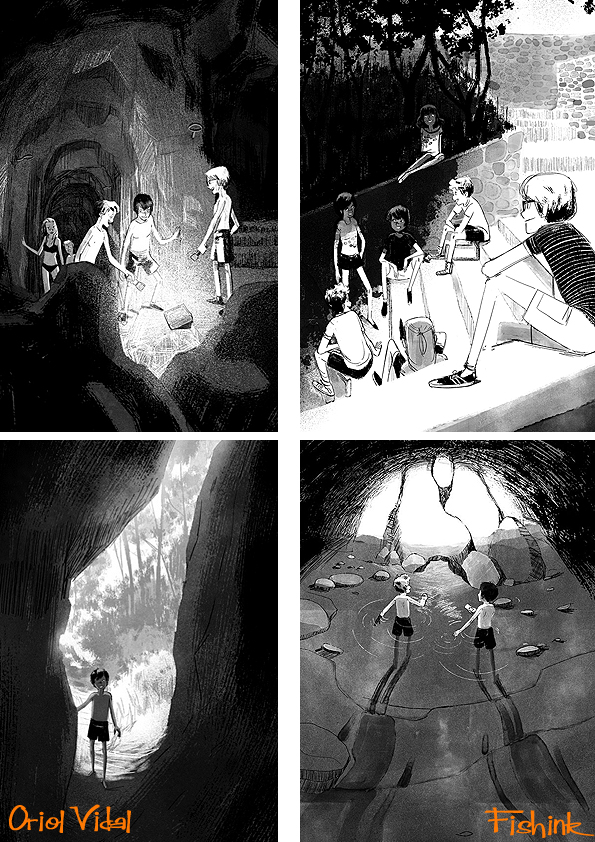
Then there’s his young adult style. Again teenager life, adventure and suspense are the main focuses. Those creatures in the wood are fabulously eerie.
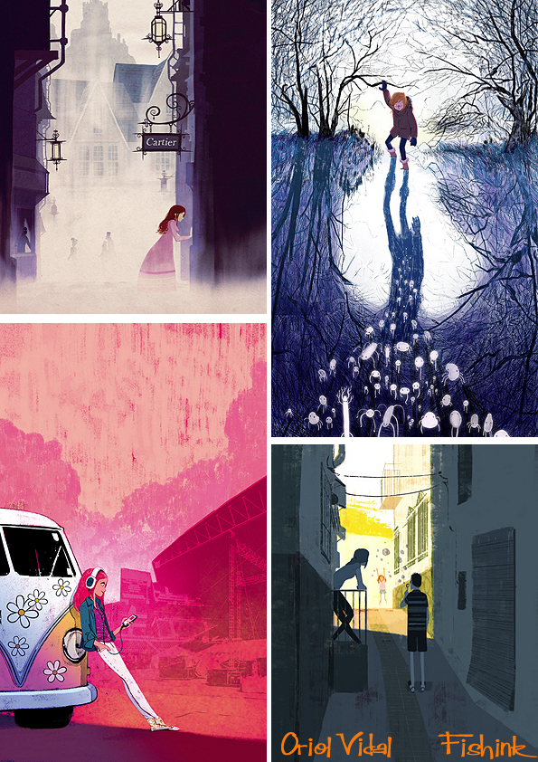
Great textures and lighting throughout.
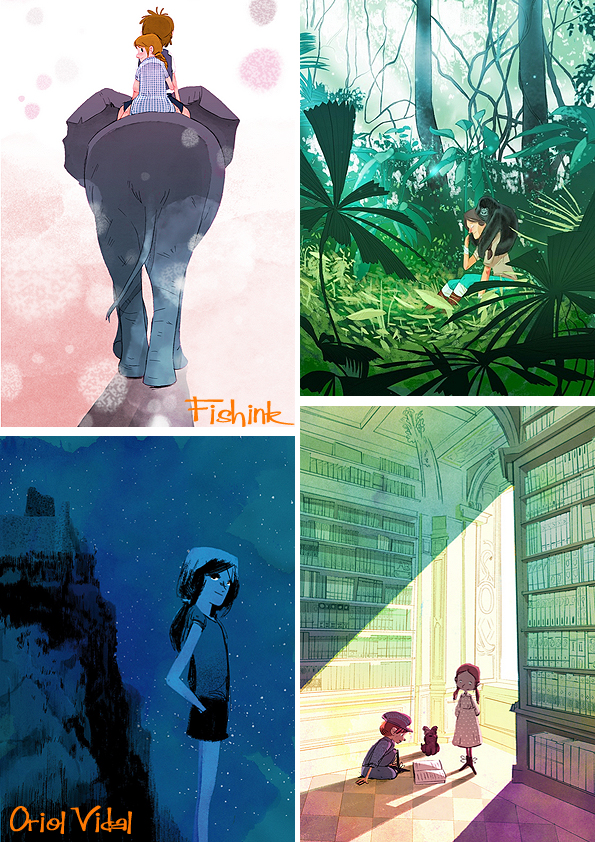
Even in an old famous five style, mystery adventure, these black and white illustrations offer superb snapshots into the narrative and tension of the story.
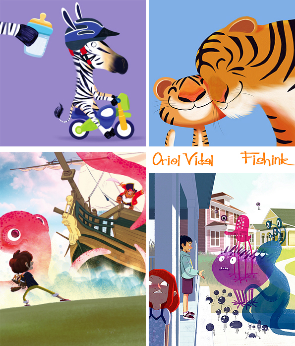
Finally there’s his fun for the under fives look. Cute, rounded with bright flat colours.

Such a talented and busy illustrator, you can check out a few answers to questions over at Creative Fluff Magazine.
And see more of his latest work by checking out his blog here. Keep the adventures coming Oriol!
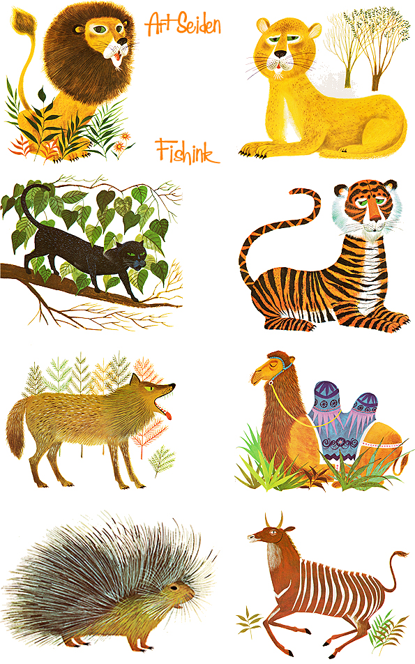
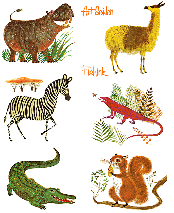
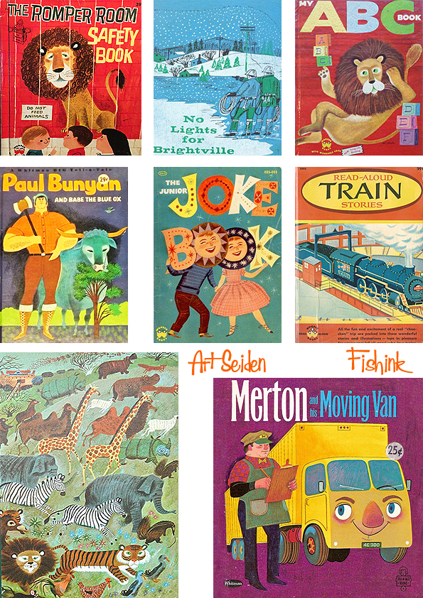
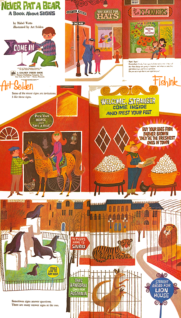
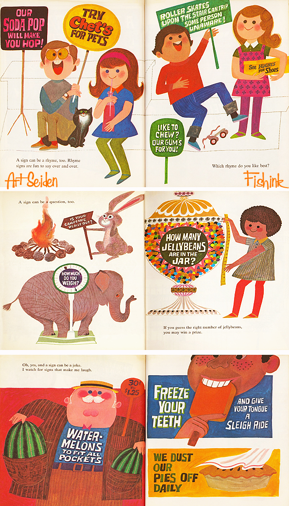
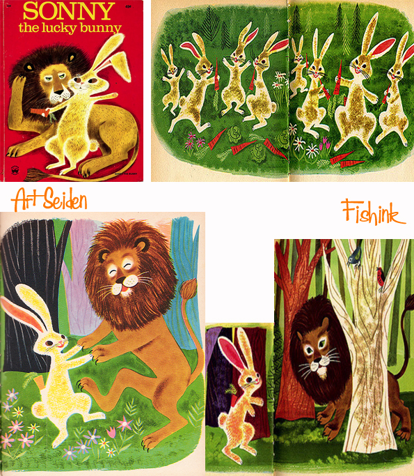
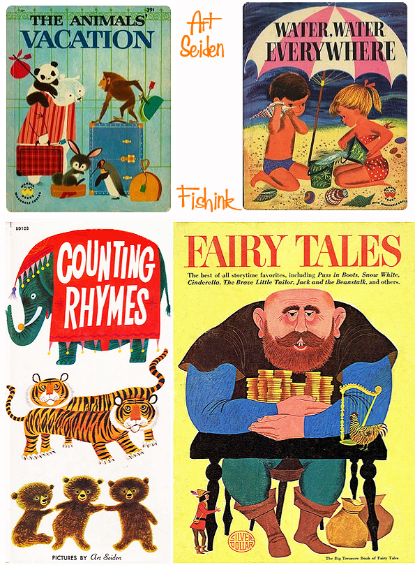
Art Seiden Mid century Illustrator of children’s books
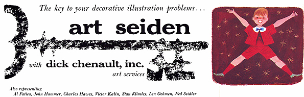
Art Seiden was a truly astounding artist who (again) very little information is available on the internet. He was born in Brooklyn, NY in 1918. He received a BA at Queens College and studied for eight years (!) at the Art Students League. See how full of character these animal illustrations are.
Upon entering the illustration field he did corporate and advertising work for some of the largest companies in America: Phillip Morris, Hoffmann-LaRoche, General Motors and Hearst Publications were some of his clients.

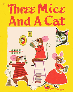
His distinctive style, best and longest association would have to be in the realm of children’s book illustration, where he ‘cut his teeth’ illustrating “Three Mice and a Rat” by Margaret Wise Brown and Jean H. Berg in 1950.

Somehow his work makes me feel calm and engaged at the same time.
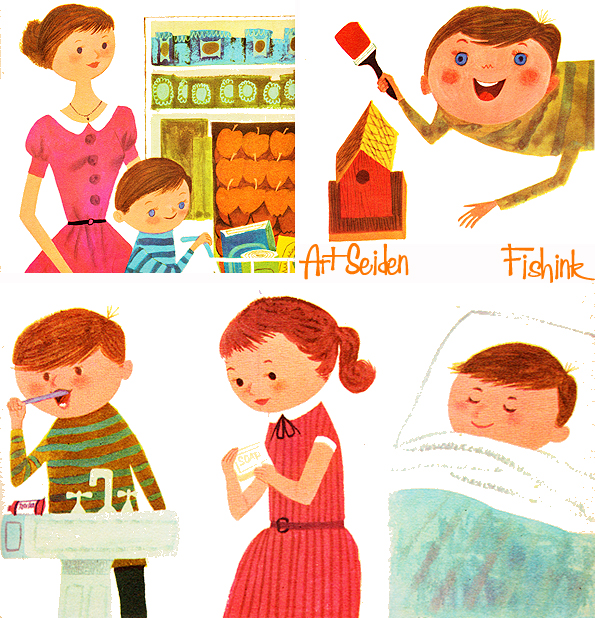
Seiden illustrated over 300 books and was both author and artist of at least 22 children’s books for virtually every major publisher in America, beginning rather appropriately with “My ABC Book” for Wonder Books in 1953.


Of course his illustrations touched many of the well known, favourite characters over the years too.


Seiden worked mainly in transparent watercolours and gouache and is a member of the American Watercolour Society and The Society of Illustrators, among others. His work is represented by the Kendra Krienke Gallery in New York City and he lived in Woodmere, NY.
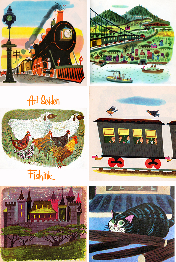

Great to come across these two paintings of his depicting female nudes and a sunny shuttered alleyway.

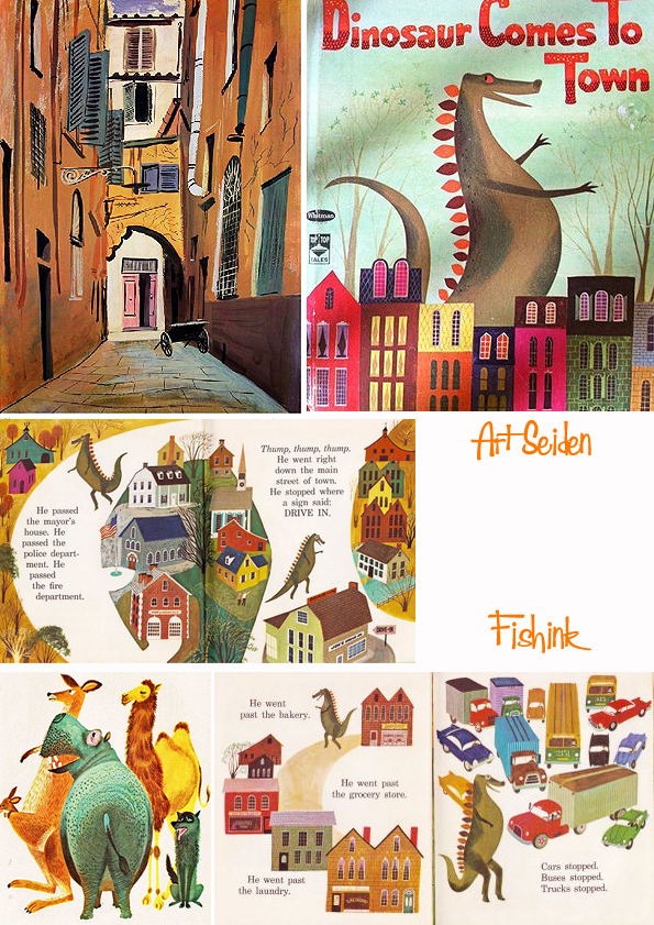
Just a small selection of the many, many books (around 300 remember!) that Art created illustrations for.
Seiden spent the following decades working with an alphabet of authors and coming back around to Margaret Wise Brown with one final book, “The Train to Timbuctoo” for Golden Books in 1999.

Many thanks to Leif Peng, over at the wonderful Today’s Inspiration, who tracked down this info back in 2005. Should anyone have any more knowledge about this artist, photographs, sketches etc, please feel free to get in touch and I will share it with pleasure. Thank you. If you enjoyed this post you may also like the work of Alain Gree.
Save
Marian Mahler Mid century textiles

Marian Mahler (1911-1983) Austrian born had trained at the Kuntgewerbeschule in Vienna (1929-32) and at the Royal State Academy, with some of her early designs being produced by the Wiener Werkstatte.

She arrived in Britain in 1937 as Marianne Mahler and worked as a free-lance designer, having supplied leading firms with her designs before the war.

During the early 1950’s she produced many designs for Allan Walton Textiles, Edinburgh Weavers, Donald Brothers Ltd. and Helios.

Her best client was David Whitehead’s in his ‘Contemporary Prints’ range. Whitehead’s were Britain’s most dynamic printed textile company, based in Rawtenstall, Lancashire. By 1948 the company was directed by architect Dr John Murray, whose ambition was to establish the Company in the forefront of contemporary design and to make good designs available on the mass market.

He wrote an article on his philosophy The cheap need not be cheap and nasty which was published in Design , Dec 1950. Twenty of their designs were chosen to be displayed at the Festival of Britain and on the SS Campania, the touring ship of the festival.
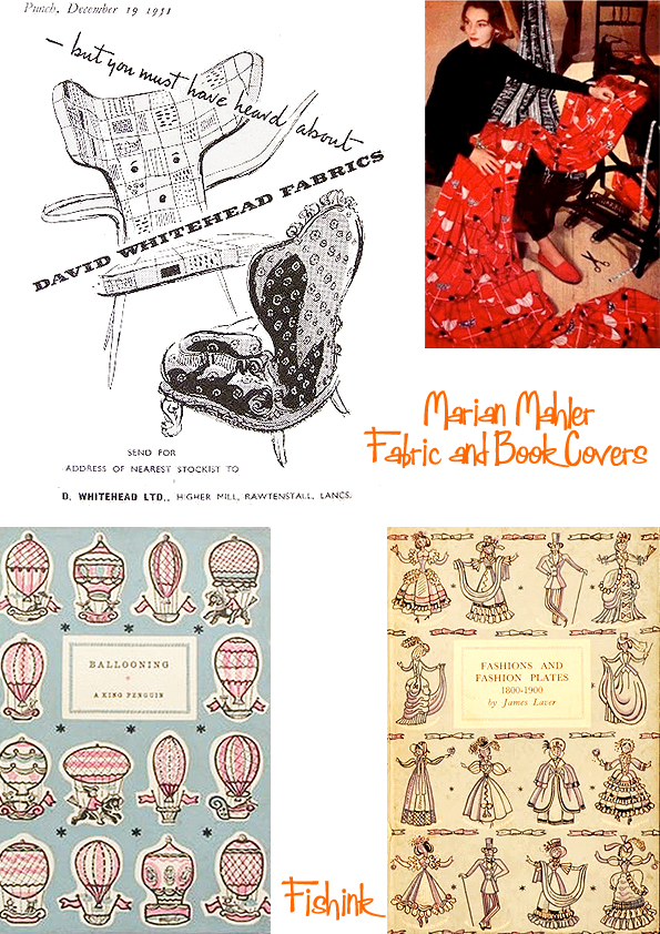
She also created a few book covers for Penguin books too.

Lovely work and a great influence on British fabrics during the 50’s and 60’s. If you liked this post you will also be interested in the one on Lucienne Day and Barbara Brown.
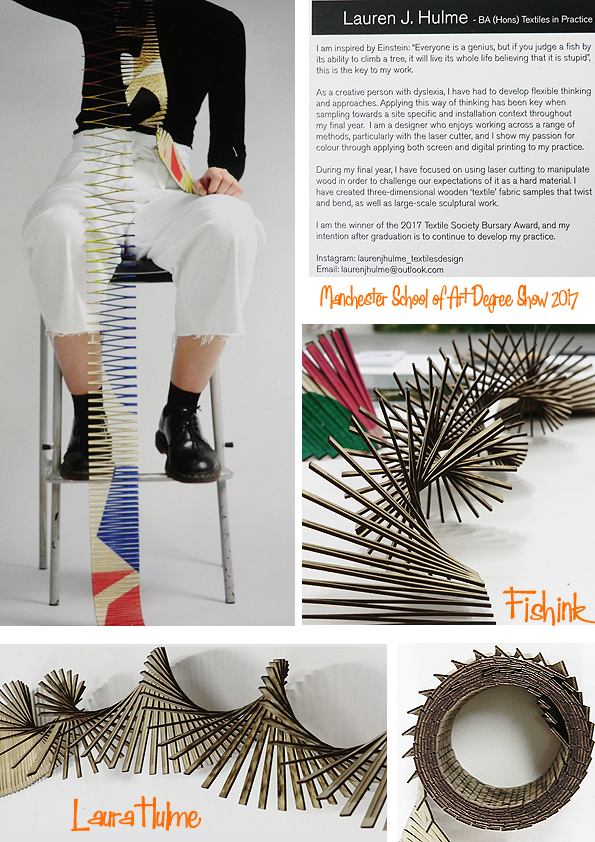
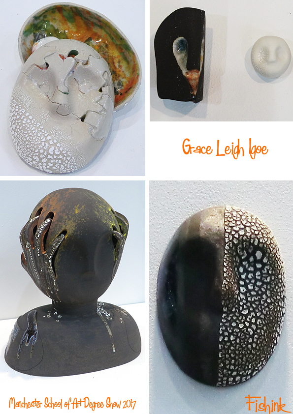
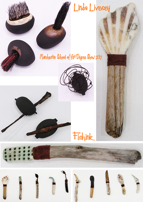
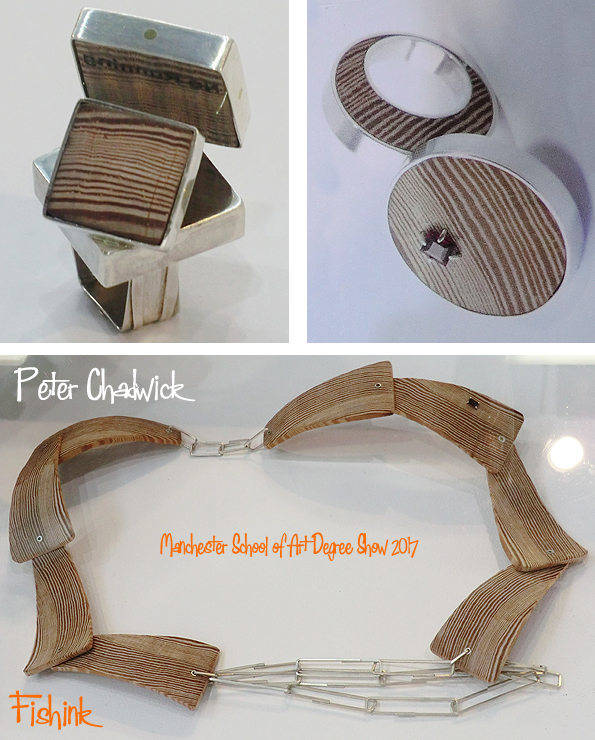
Manchester School of Art Degree show 2017 Part 2
Welcome to part 2 of my recent trip to the Manchester School of Art Degree show for 2017. Sadly the exhibition has finished now but should you wish to look up any details for any of the students then you can do so here.
Let’s begin with an escaped entry from my last post and some wooden textiles from Lauren J.Hulme. They remined me of a flic-flac my grandad used to make when we were children and of course the old Slinky !
Next up, a trip through the 3-D course and some ceramics from Grace Leigh Igoe, with an interesting use of crackle glazes.
Some wonderfully strange, created objects from found materials by Linda Livesey.
Peter Chadwick has made some solid male jewellery, using wood that’s over 200 years old, and from an old Victorian swimming pool changing room seating. He uses phrases like “No running” to give a hint of the woods original use.
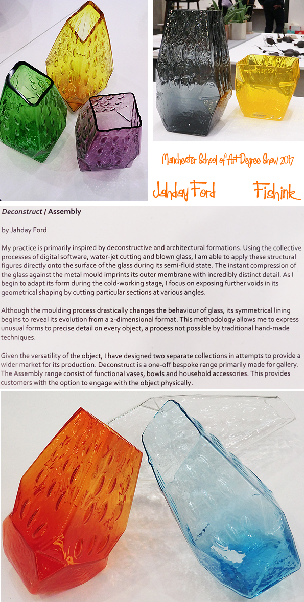
Lovely modern-retro pieces from Jahday Ford, they made me think of Geoffrey Baxters’s 1960’s ‘Bark’ and ‘ Drunken Bricklayers’ vases for Whitefriars. I liked their jaunty angled tops and bases.
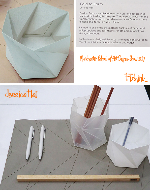
Some lovely forms from Jessica Hall.
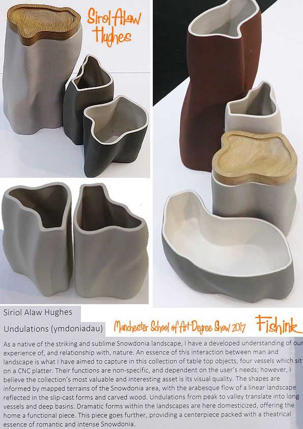
Again, great shapes from Sirol Alaw Hughes, with lids to match !
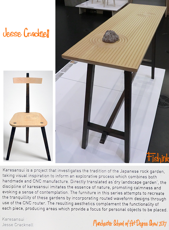
I’ve some friends who live in Cambridge with a Zen garden, I wonder what they would make of this table and chair by Jesse Cracknell.
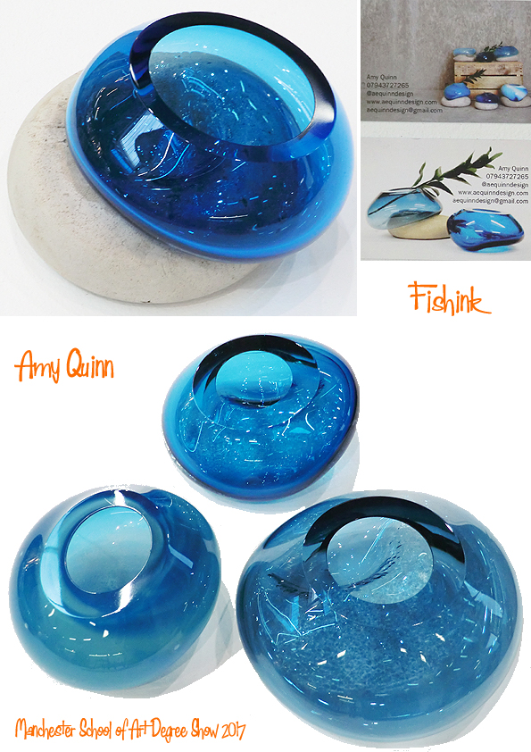
Finally for the 3-D section some beautifully relaxed glassware from Amy Quinn. Such deep blues, and you could almost loose yourself in their pool like qualities.
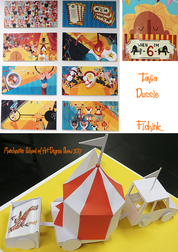
The we we’re off exploring the Animation with Illustration, that these days seems mostly to be about Illustration. Tayia Dussie, leads us nicely into the ring.
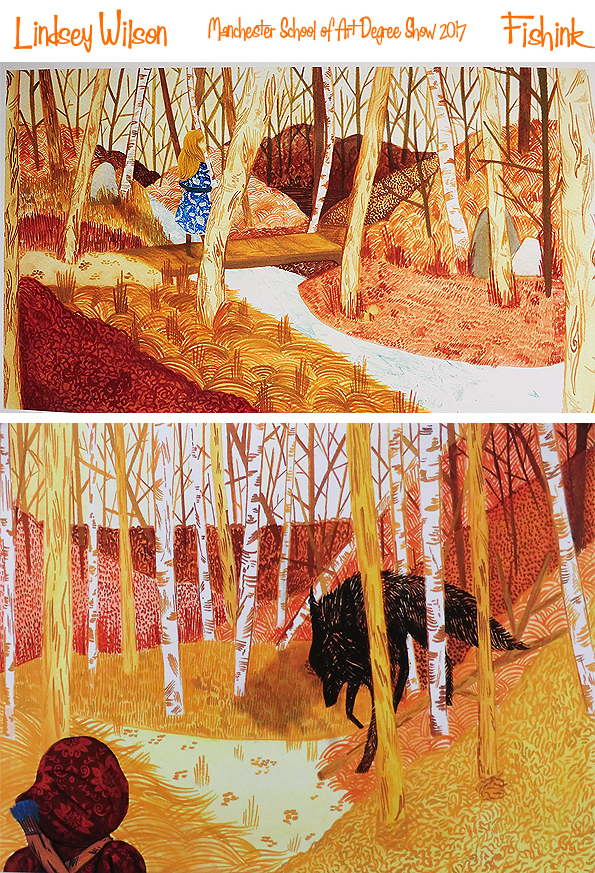
Some woodland walks with Lindsey Wilson.
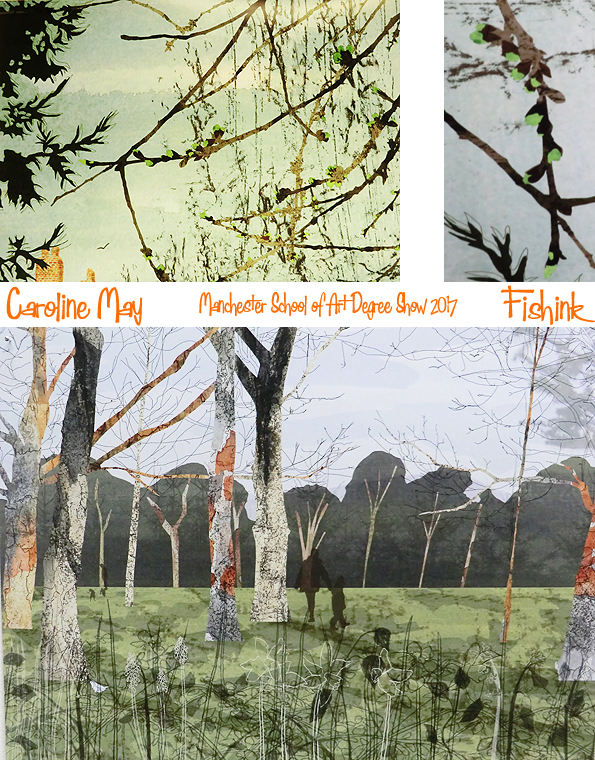
and Caroline May.
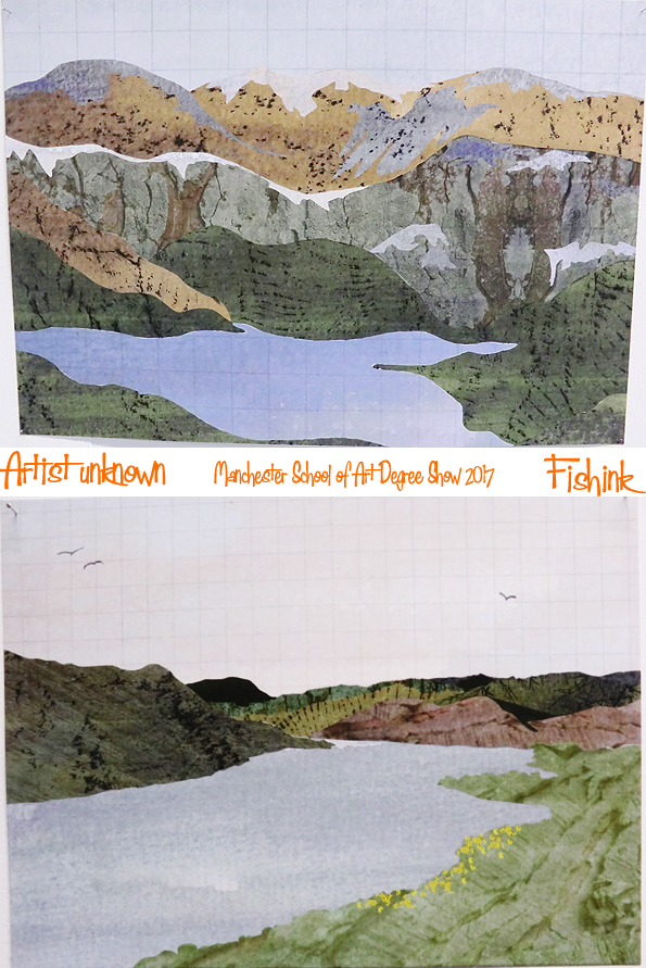
Before being transported to the hills by the only artist whose name escaped me.. sorry.
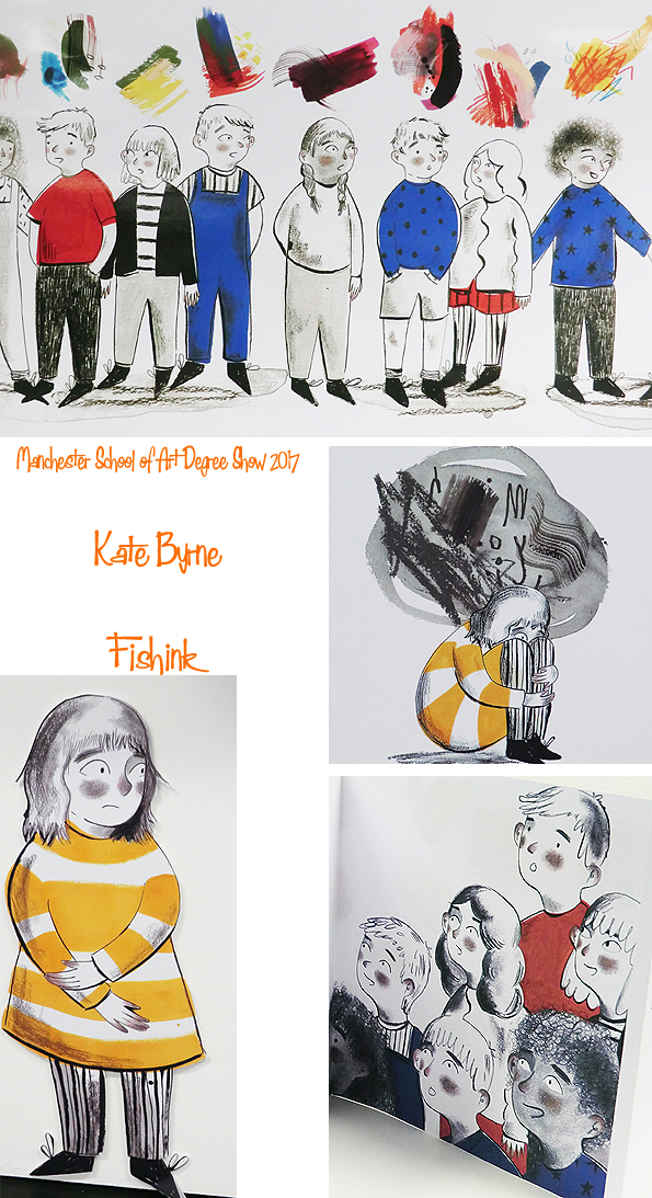
A few awkward looking teenagers here by Kate Byrne.
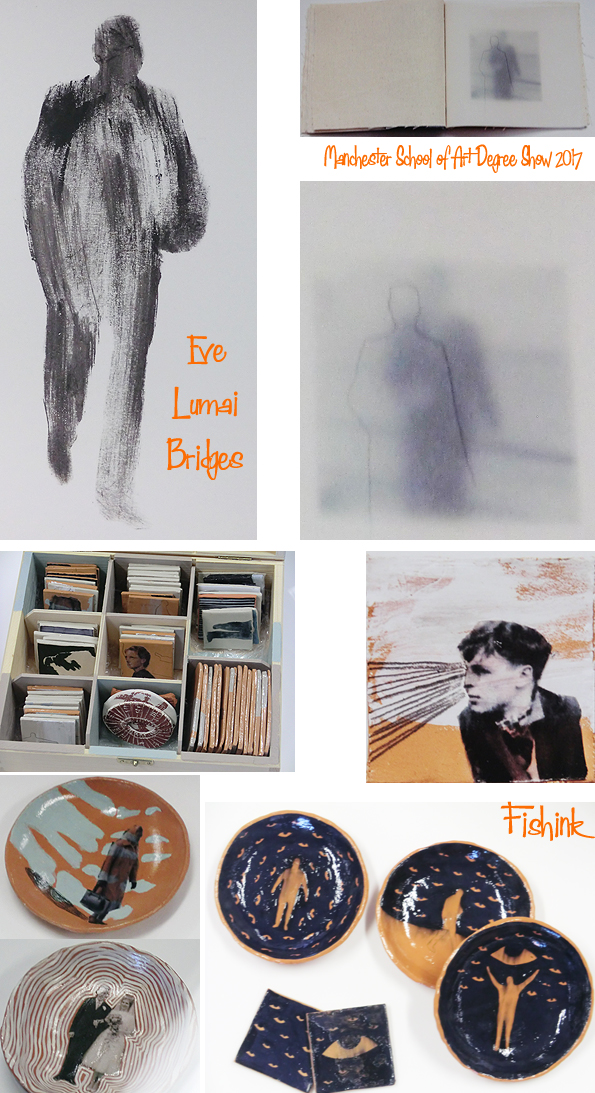
Then some interesting illustrations and ceramics linked to people’s fading images as memories disappear and we loose the pictures we once held in our minds. Eve Lumai Bridges has produced a fine body of work.
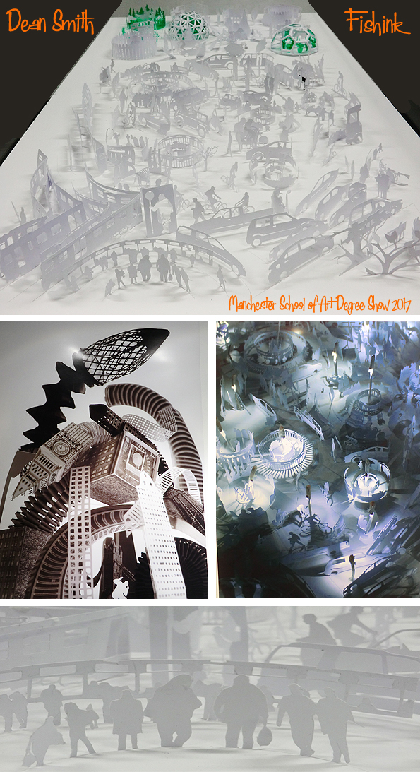
Dean Smith has been very busy hand cutting out all these people and objects, they made a great display.
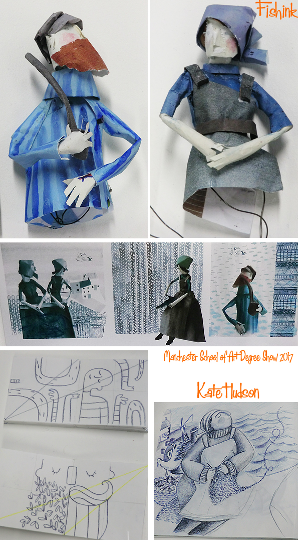
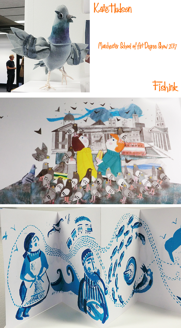
Kate Hudson had also been enjoying her final year producing some lovely figures and drawings of fisher folk and seagulls.
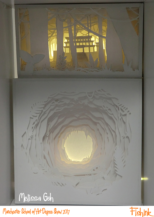
Finally one last paper cut stage by Melissa Goh to draw us into her wooded exhibits.
Many thanks to everyone who took part and allowed me to photograph their beautiful work this year. I hope you go on to produce a wealth of creative work on your journeys to your chosen career paths. I hope you all enjoyed viewing the degree show with me too. What was your favourite this year ?
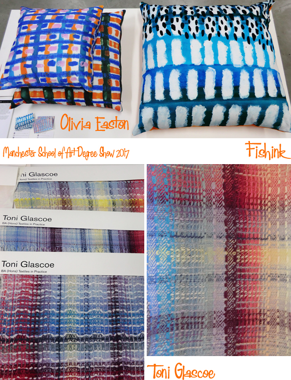
Manchester School of Art Degree Show 2017 Part 1
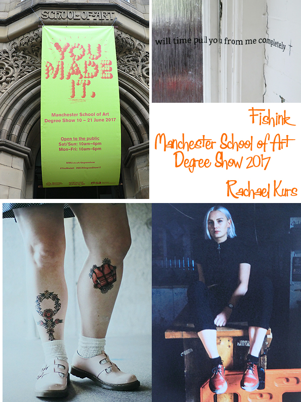
Welcome to this years review of the Manchester School of Art Degree Show. If you want to ‘make it’ too, then it’s on from the 10th – 21st of June, so you’ve just got time to pop along and see the latest crop of Manchester creatives before their work goes down to London for the next exhibition at New Designers in Islington.
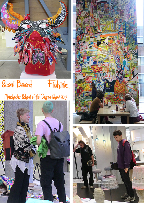
I had about two hours to scoot around the principal areas I wanted to view… Textiles, 3D and Illustration. If you want to know more about any pupil’s work, contact details etc you can check that out here under the course heading that they are on. I’ve taken a few images of each collection that has caught my eye, apologies to those people I’ve not included and I hope I’ve placed the correct names with the right designers work, there are so many it does get a little confusing !
Some strong Girl Power photography from Rachael Kurs (above) and these bright cushions by Olivia Easton are a great way to get us started, they made me think of Hockney for some reason.
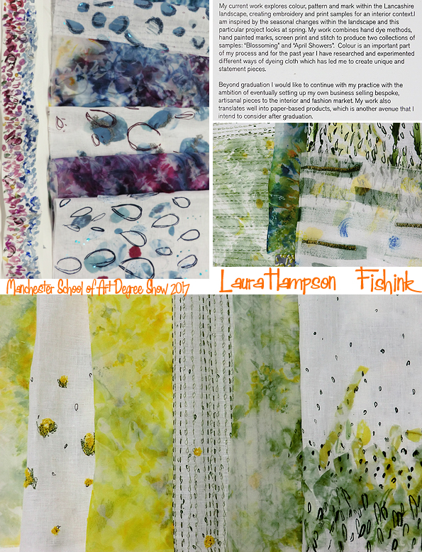
Some beautiful moody work from Laura Hampson. Raindrops, watercolours and old Flake adverts (let’s see who gets that reference!!)
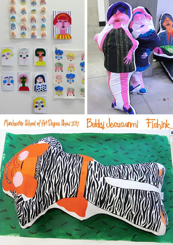
These ladies made by Bukky Jesusanmi really made me smile. Beryl Cook has indeed come to life lol
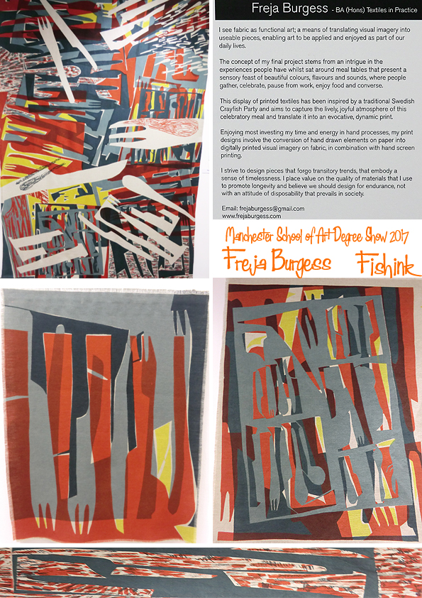
Looking deeper into Freja Burgess’s work, you start to see her cutlery jumping out at you.
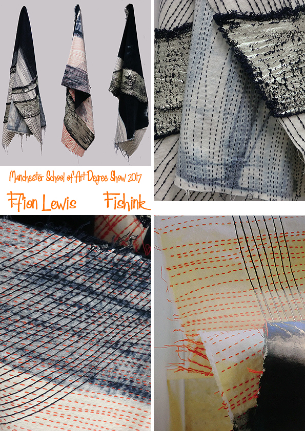
One of the show highlights for me, were these fabrics by Ffion Lewis. Ffion says that her work is inspired by her home, North Wales. ” Every mark, brushstroke and colour choice, within my work is drawn from the landscape. The way that the rocks lie on each other, the ripples of sea water as it steadily comes into land. This is where I find my Inspiration.”
There’s a lovely flow / movement in her textiles and I also like the brightly dashed sewn lines with it’s charging and changing sense of direction.
Colourful folk, in and out of the exhibition.
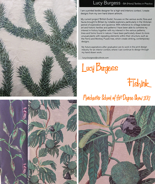
Some Victorian inspired botanical-florals by Lucy Burgess, with a great eye for detail and the natural world.
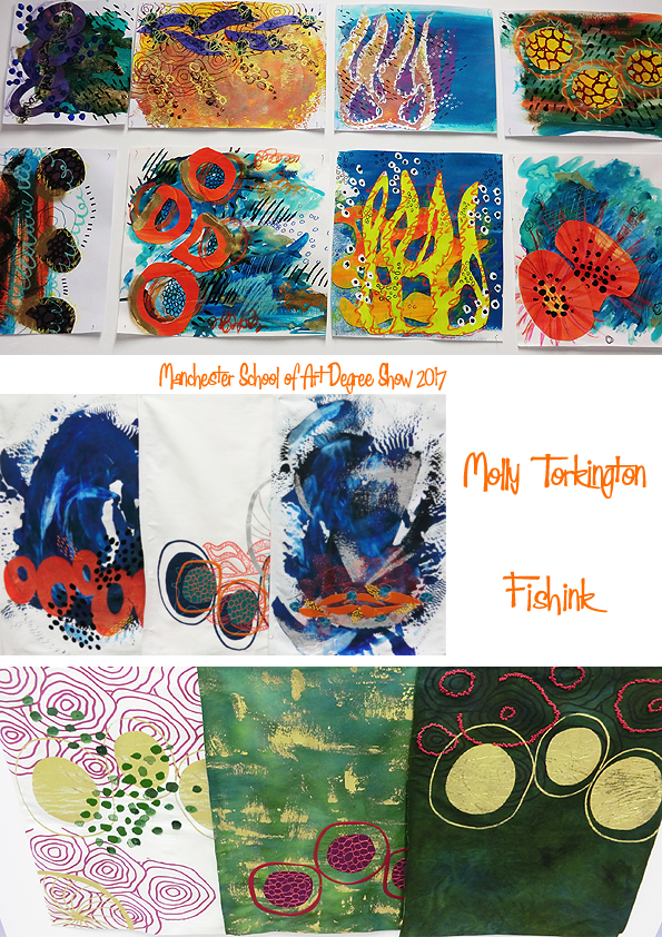
Great to see the inspirational paper drawings that Molly Torkington based her fabrics on, alongside the final cloth pieces. It could have been interesting to see how she may have taken her ideas into full repeats.
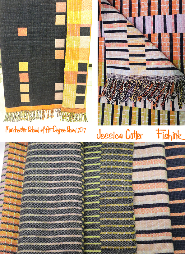
Jessica Cutler has a wonderful eye when it comes to putting colours together in her weaves. They felt a little sixties inspired and had a warm sense of calm to them.
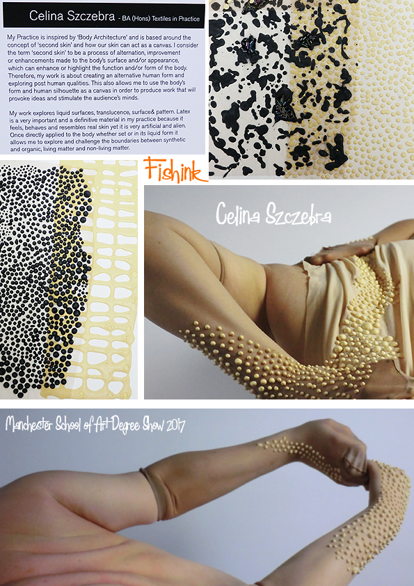
Celina Szczebra showed us a thing or two about her personal take on body architecture. The photographs compliment the work perfectly.
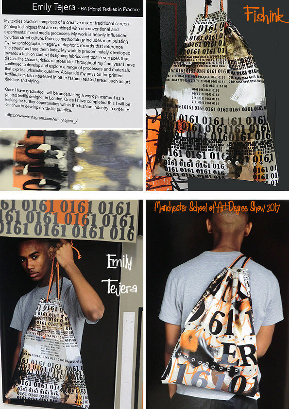
Bright, confident, urban street bags and designs from Emily Tejera. Memories for me of 80’s magazines The Face and I.D. jumped out when I saw these. Punchy, vibrant and local with it’s ‘0161’ telephone area code for Manchester.
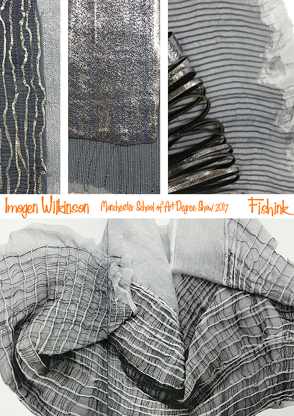
As a contrast, some cool, refined and detailed delicates from Imogen Wilkinson.
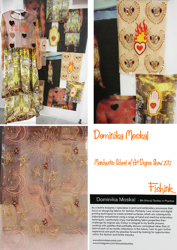
A little more exotic flavours from Dominika Moskals prints and embroideries. Blending cultural elements to create mysterious textural curiosities with detailed, layered complexity.
Part 2, will be appearing next monday after the work has been taken down. Don’t forget it’s on until Wednesday and do let me know your thoughts on the postings. Feeling inspired ?
Clare Youngs Designer / Maker
Clare is a designer/maker working with paper and fabric. She trained as a graphic designer and has worked in the industry, mainly in packaging design but has a life long interest in everything handmade and since childhood has enjoyed making beautiful handcrafted objects. I came across her beautifully fresh work and it made me smile.

Clare says: “When I can, I enjoy escaping to my studio to work on one off pieces. I have collected ephemera since I was a child and utilize vintage labels and paper in my pieces. When working with fabric I like to recycle and love to give a new lease of life to something old.”

Whether she is printing, cutting and folding paper, sewing or embroidering, she takes inspiration from all aspects of handicraft techniques, traditional and contemporary. Her desire to create has never been stronger than now.

She says “I love the whole process, the excitement of a new project, the thoughts and ideas that start as notes and sketches and the satisfaction of seeing my ideas develop into a finished piece. I think everyone can be creative and through my work and ideas I hope I can encourage more and more to get making and release the artist within!”

I love their spark, colour and sense of movement.

I think these would make great greeting cards, gift wrap, ceramics and repeat patterns for textiles, what do you think readers ?

Four years ago she turned to craft full time and has never looked back. It has been an incredibly busy time and she has just completed her 9th craft book. In-between writing she runs workshops and recently relocated from London to Broadstairs so has had the challenge of renovating her new home on the beautiful Kent coast.

You can see more of Clare’s work here. Pop over a treat yourself to a book today. Hopefully this is an inspiring start to your week !


