Fishink Walks around Tideswell Dale in the Peak District.
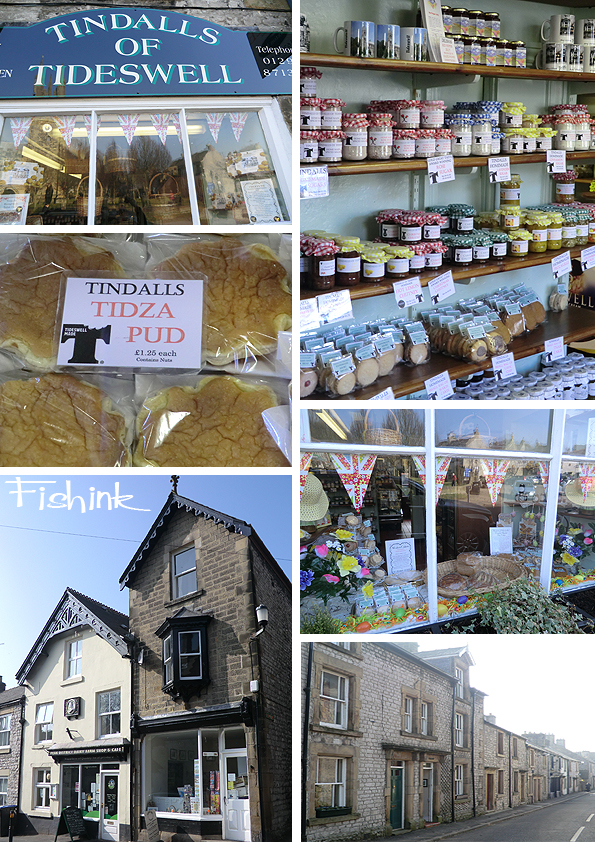
Tuesday last week was such a beautiful day. Sunny and warm (in parts), but with a hint of mist and a spring-like chill in the air in others. We made the most of the opportunity and escaped for a much needed walk into the Peak District. In the Middle Ages, Tideswell was a market town known for lead mining. The Tideswell lead miners were renowned for their strength and were much prized by the military authorities. Today this cake shop rules the town, fortunately for us !
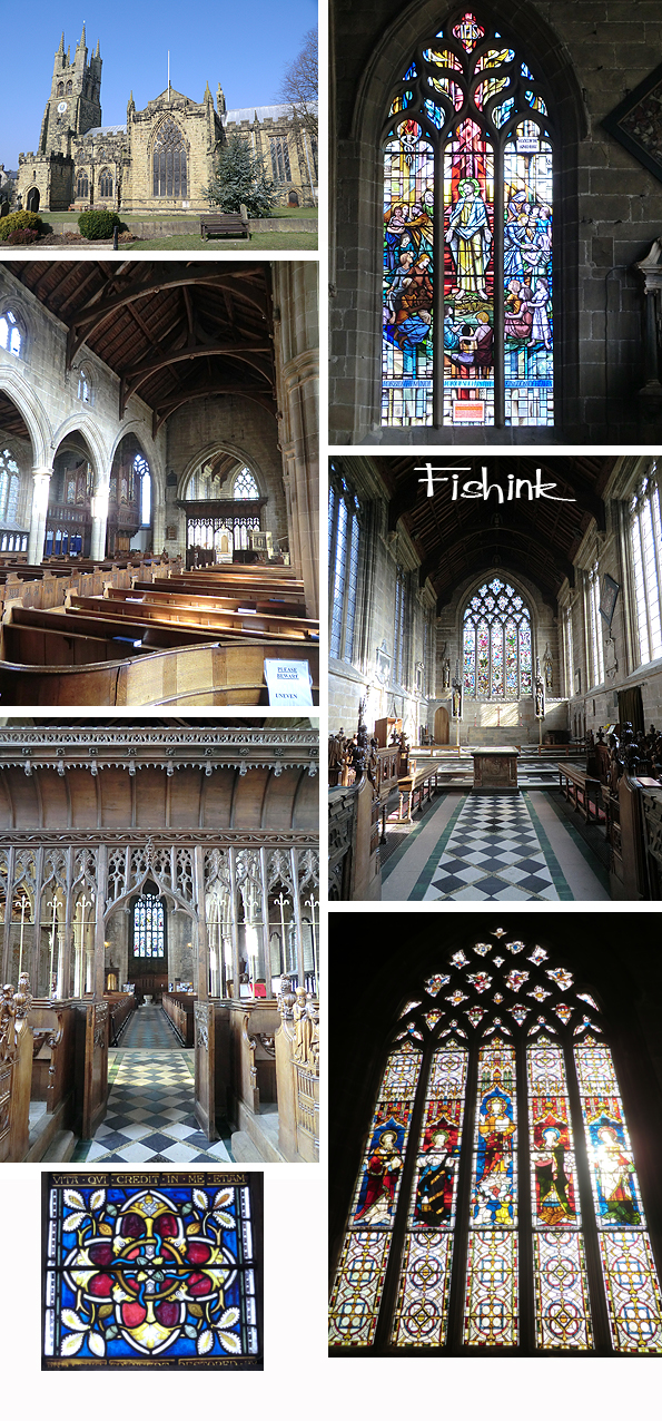
Tideswell is also best known for its 14th-century parish church, the Church of St John the Baptist, known as the “Cathedral of the Peak”, which contains three 15th-century misericords. A sundial lies in the churchyard; it is positioned on steps which local historian Neville T. Sharpe thinks likely to be those of the village’s market cross. A market and two-day fair were granted to the village in 1251. There are some colourful stained glass windows inside. All in all, a stunning Church, and even better to catch it today with the sunlight streaming in.
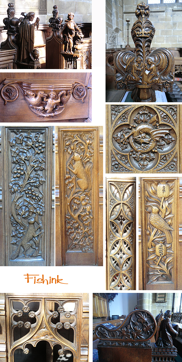
I was very impressed by the amazing figurative work on the benches and screens throughout the church. You can see the local love of the countryside depicted clearly in the carved panels. Such detail and skill.
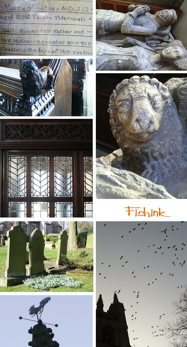
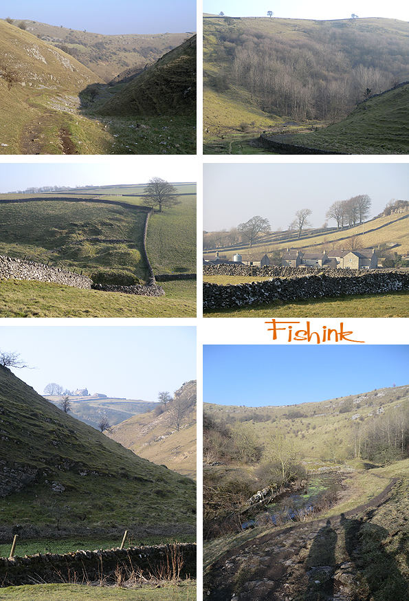
I wasn’t sure that the local crows and rooks were entirely friendly as they swarmed above us, so we quickly headed for the start of our 6 mile walk, not far from Tideswell itself. As you can see the countryside was looking particularly beautiful with it’s mist and sunshine and there was a wooden maiden and an oversized (I hope) Water-vole to guide us on our way.
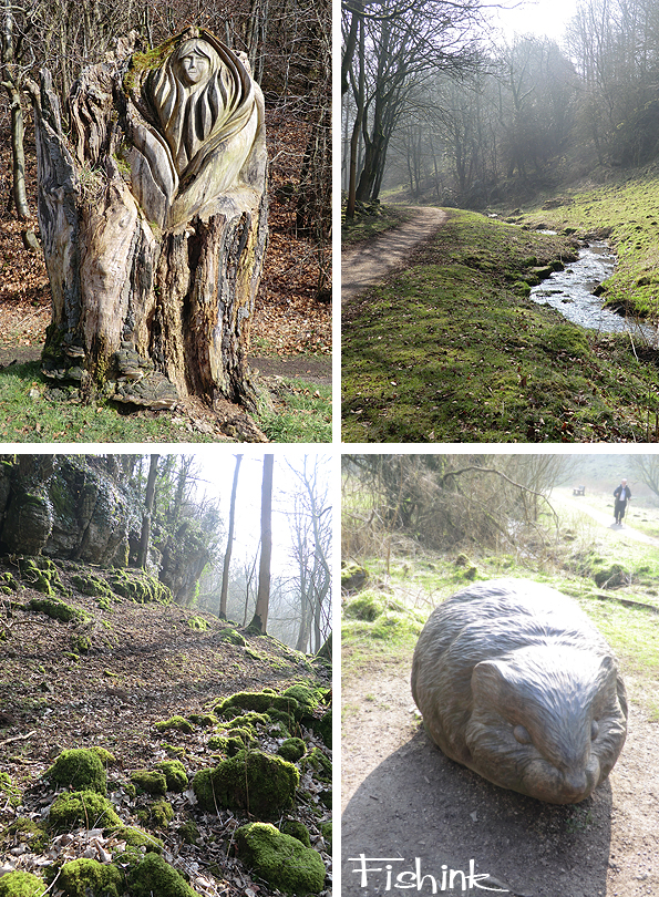
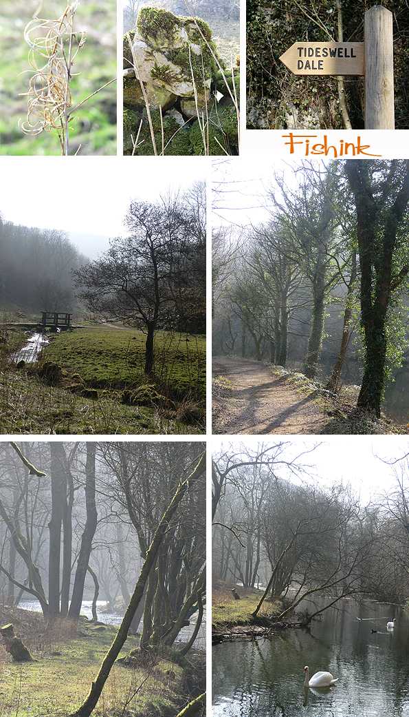
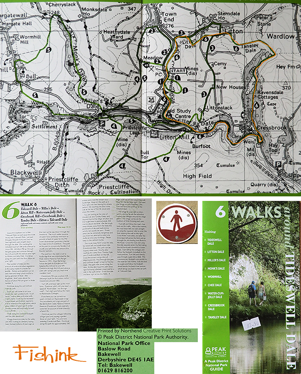
We picked up a map and walking route from the post office at Tideswell, it was a stunning trail, taking in sculptures and nature in abundance.
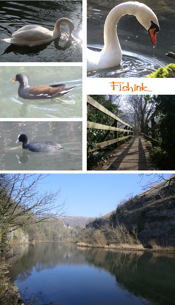
An hour into the walk we stopped to lunch alongside the swans, what a lovely spot. The light dripping off their necks and beaks caught the sunlight. A few Coots and Moorhens were around too.
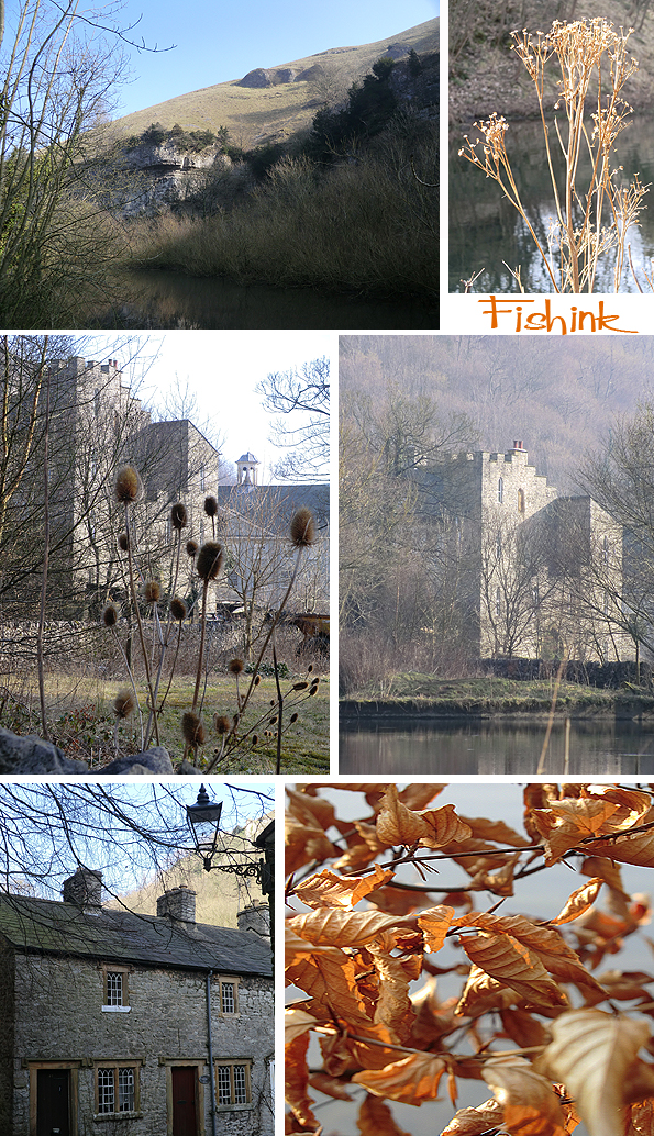
You can see clearly here why the area is known for it’s limestone. This castle folly made me feel like I was somewhere much further away lol.
A row of beautiful little cottages with wonderful detail in the windows, caught my eye. The damp trees and forests were carpeted with a glowing and growing green velvet moss along their boughs, again giving the area a slightly magical feeling to it.

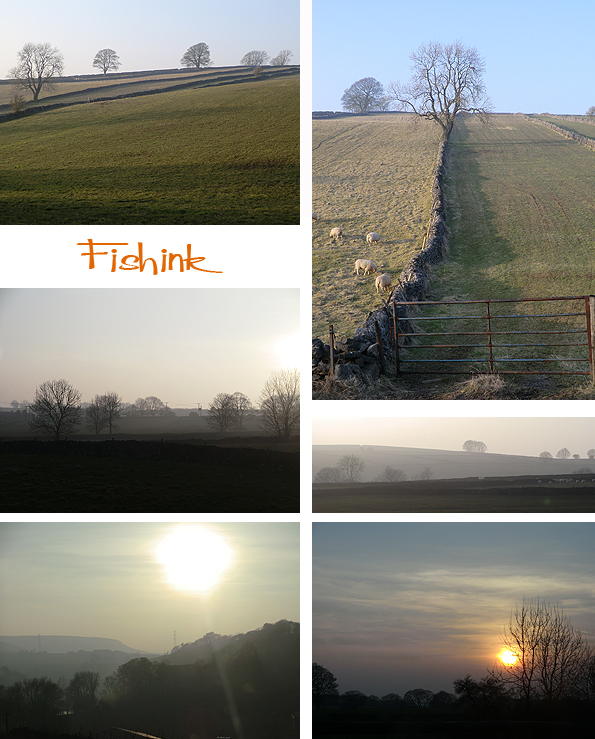
A little higher we climbed into the peaks and saw the valleys from above. An array of drystone walls lead the eye to the horizon and into the distance where small farms and cottages nestled.
On reaching the village of Litton a couple of hours later, we thought it time for a well earned cuppa at the cozy and rustic Red Lion pub. Well worth a warming stop off.

Then just another half hour walk back to the start of our journey. Pausing to take in the beauty of the countryside and the field boundaries once again.
For the map people amongst you here’s a little snippet of where we walked (in orange). You can do it in about 4 hours and it’s relatively flat so get out there and enjoy ! Do let me know if you get there, but don’t blame me if the pub’s shut : ) Have fun.
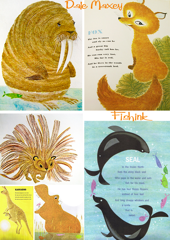
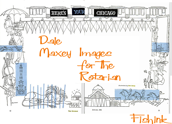
Dale Maxey Illustrator from the 1950’s
I can find very little info about today’s illustrator Dale Maxey, apart from the fact that he lived in Chicago, and worked as an illustrator for a magazine called The Rotarian during the 1950’s and 60’s. He also designed an amazing place called Casa Zorro (Maxey) during the 1970’s. It is a uniquely located house on the hill of La Mola on the island of Formentera. The house is unusual and unique, because unlike most houses on these islands, the ceilings are extremely high and the rooms very spacious. I think he may have painted a mural on the walls there too, looks like a great place to rent for the summer.
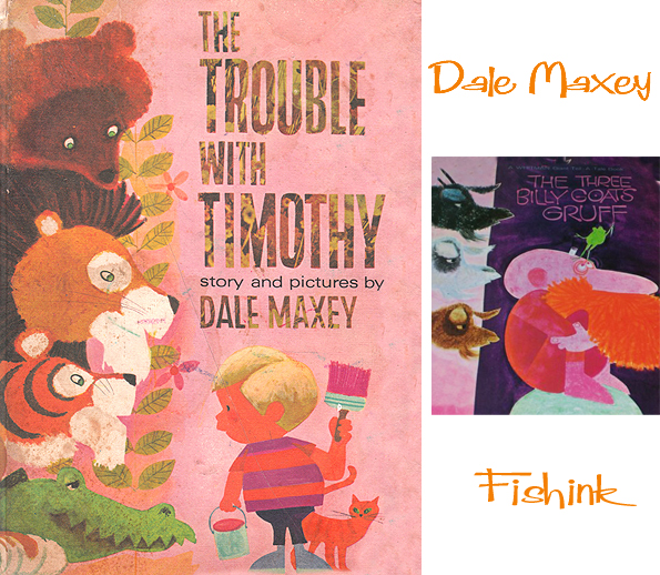
Here’s some of his book illustration work.


There’s a whole range of styles and differences in his artwork, some great expressions with his animals too. Look at the way his otters dip and undulate in the water and how the type also mimics and traces their swim patterns too.


A classic book Dale is known for is ‘Seeing London’. I love his 3-D maps, they remind me of another fav illustrator of mine, Miroslav Sasek.


If anyone has any more news about this artist that they can share with us, then I’ll gladly add it to this post.

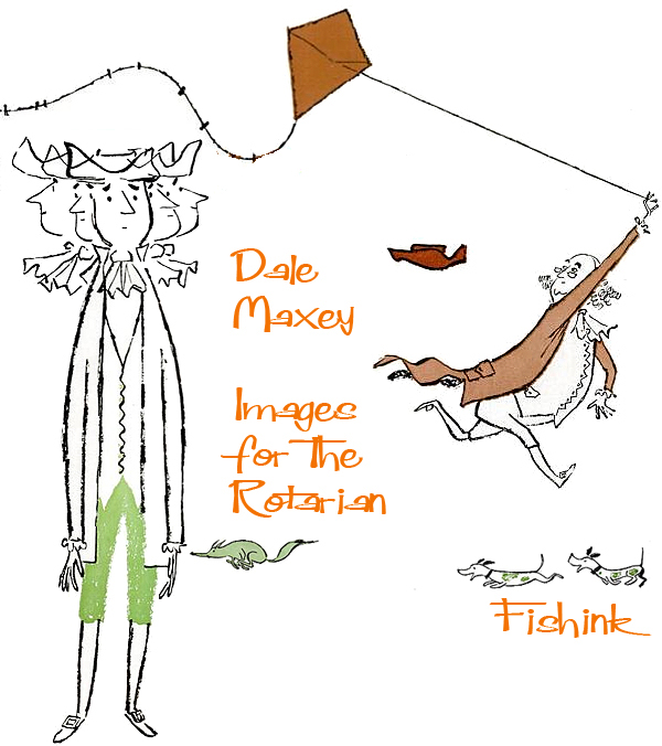
Finally a few images from Dale’s work for The Rotarian in the 1950’s and 60’s.


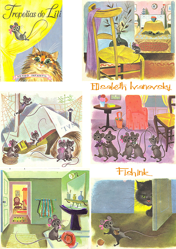
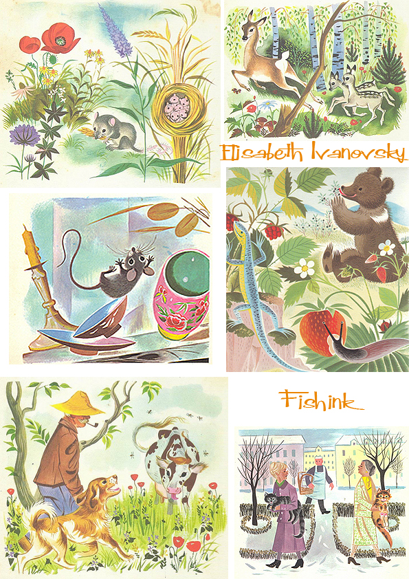
Elisabeth Ivanovsky Russian Children’s Illustrator
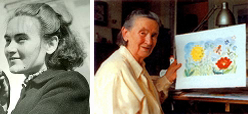
Elisabeth Ivanovsky was born in 1910 in Kisjinev (capital of Moldova).
In 1932 she leaves her country and she comes to Belgium where they are in the Institute of Decorative Arts (La Cambre) register. For three years following the lessons of Joris Minne (ventilation) and Herman Teirlinck (theatrical sets, costumes). The French novelist and poet Franz Hellens, a member of the jury in 1934, observes her extra-ordinary talent, set his house open for her, involve her in his work as a writer and asks her images to create in some of his books, to Bass Bassina Boulou. Thanks Elisabeth Ivanovsky Hellens comes into contact with the then Belgian literary world. She meets the Walloon poet René Meurant, whom she marries, and some members of the ‘Front de Gauche literary’.
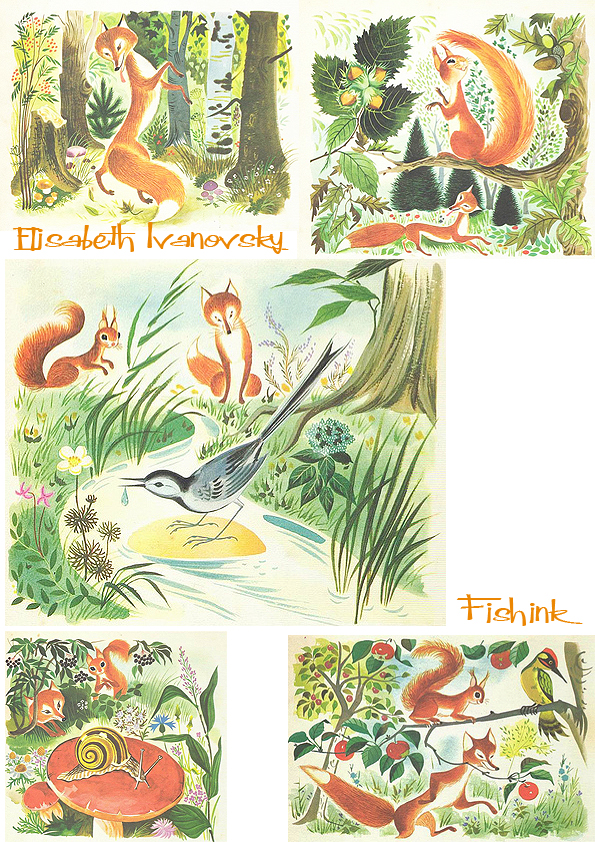

Several French writers call upon her, among them: Marcel Lecomte, Armand Bernier, Daniel Gillès, Geo Libbrecht. Also some Flemish writers like Stijn Streuvels and Ernest Claes, ask her to ventilate their books. For the Belgian “Editions des Artistes” she realized, between 1940 and 1950, a series of miniature books that extraordinary success know under the name “Pomme d’Api”.
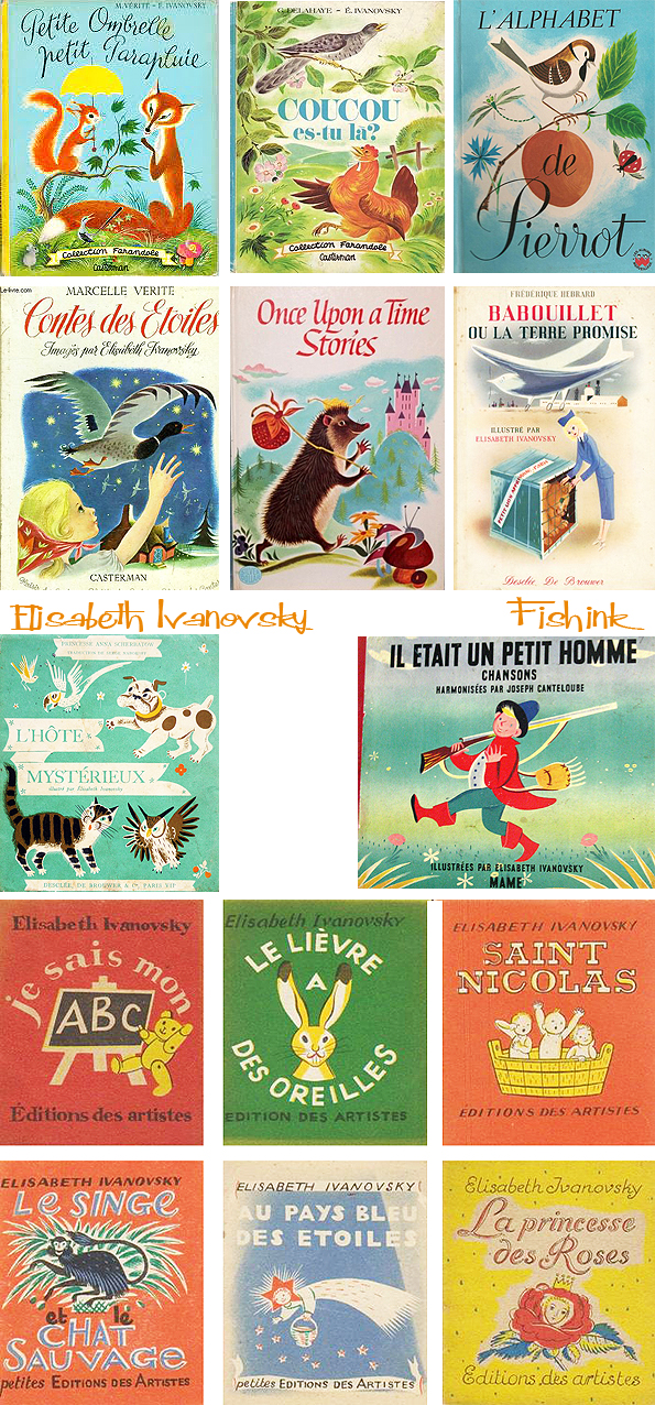
After the war and until today they mainly illustrates books for young people and particularly books for small children whom they daily global tender, lyrical and with sense of humor describes. Elisabeth Ivanovsky is today rightly considered the dean of book illumination in the French Community. Her universe deserves renewed attention of the public to be brought, especially in its relation to the literature. Therefore organizing the “Archives et Musée de la Littérature” this exhibition: thus tried the different facets of Ivanovsky’s artistic personality to highlight.
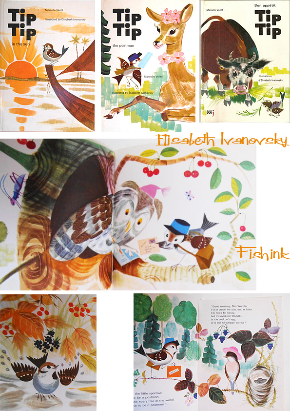

Sadly Elisabeth passed away in 2006 and in 2010, the Youth Literature Centre in Brussels held a conference and tribute in her honour, highlighting the major role she played in children’s literature post WWII.

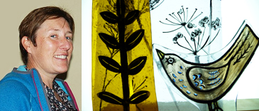
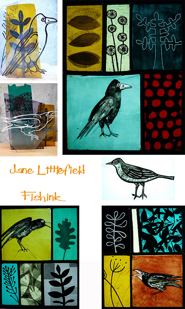
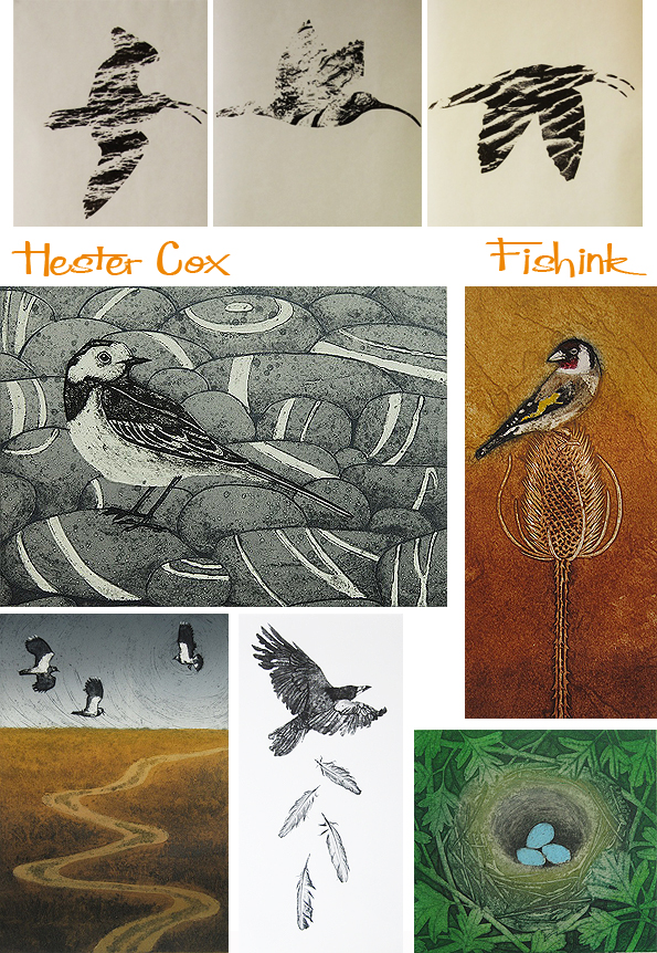
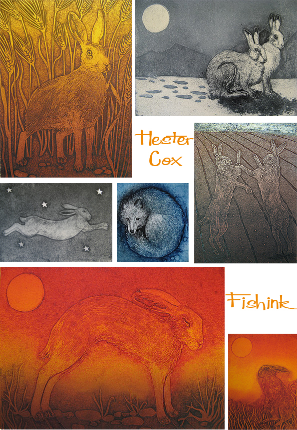
I wanted to mention the lovely work of stained glass artist Jane Littlefield. She has an exhibition coming up called ‘Telling Tails’, displaying her work alongside fellow artist Hester Cox who is a printmaker. Jane’s glass pieces are hand-painted using traditional stained glass paints and translucent enamels, often using many layers and textures, that are fired in the kiln.
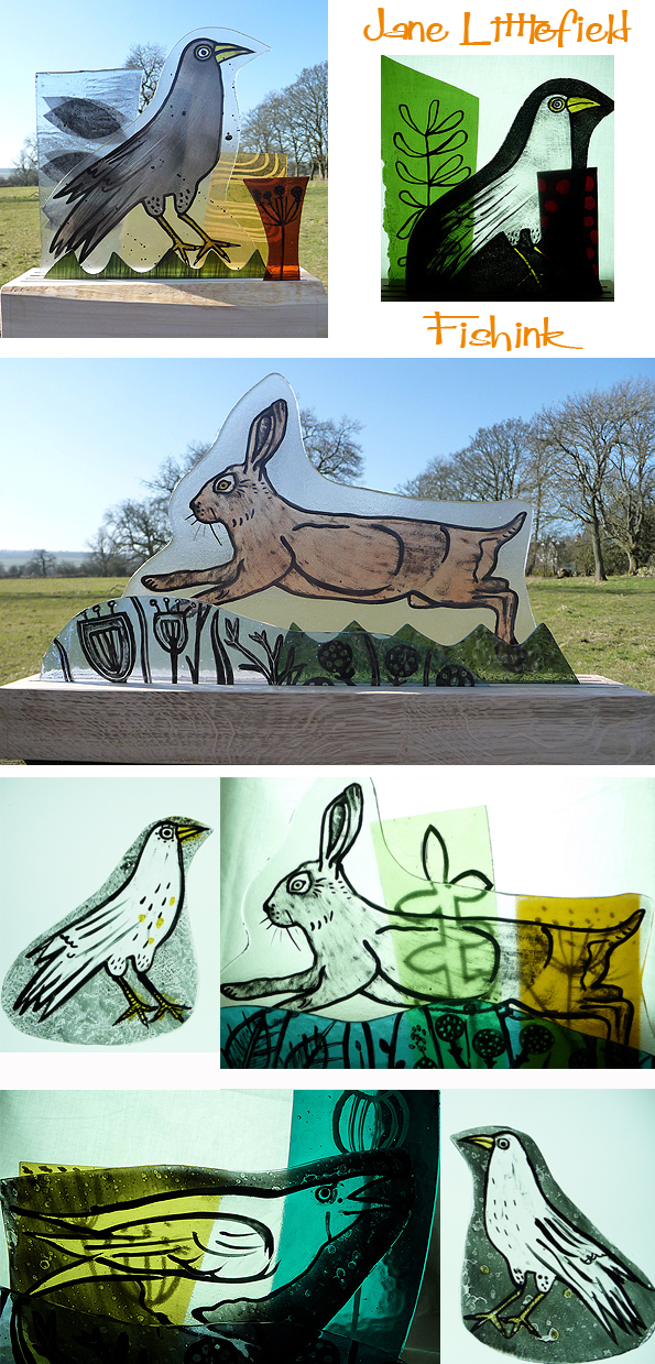
She has recently worked on projects with primary schools to design and produced windows for their buildings as well as taking on commissions for personal artpieces.
Her own work is inspired by the landscape and animals of the Peak District.
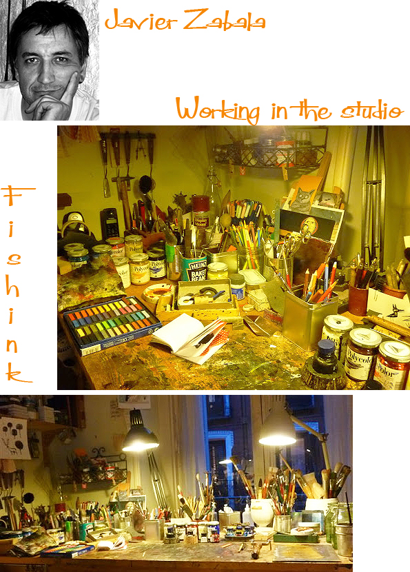
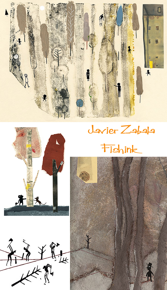
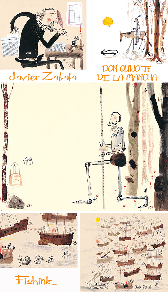
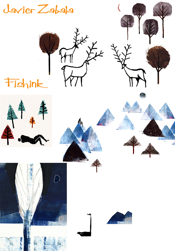
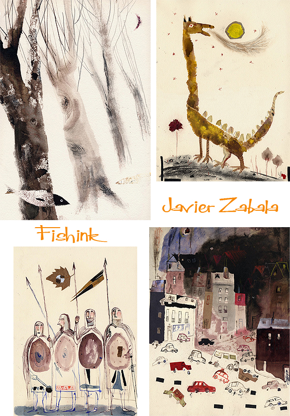
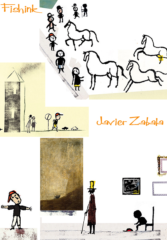
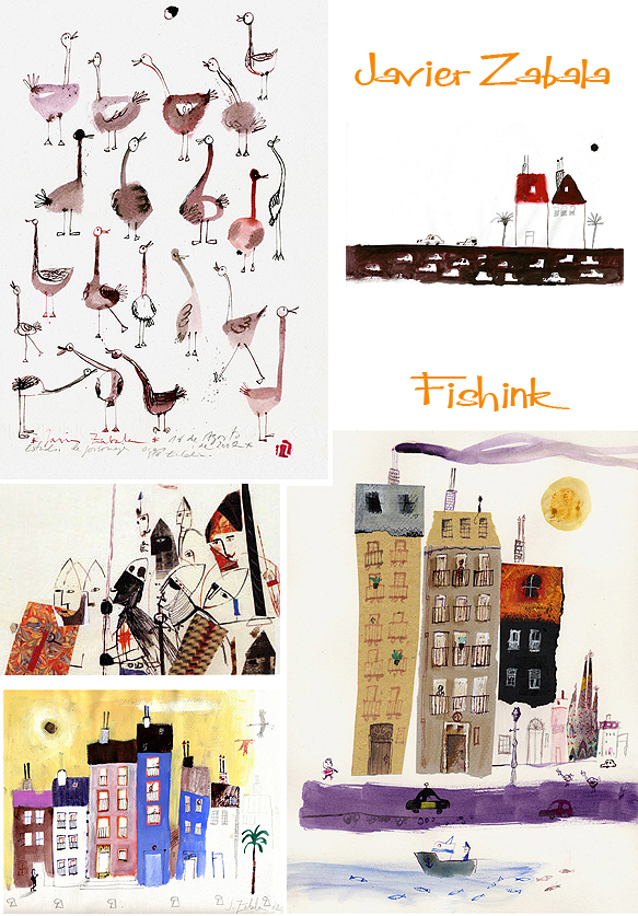
Javier Zabala Expressive Spanish Illustrator
Javier Zabala is a Spanish illustrator who creates work for many different end uses.
He studied Illustration and Graphic Design at Oviedo School of Arts and School of Arts of Madrid, where he moved in 1984. He started to work as an illustrator in various fields: magazines, advertising, cartoons…
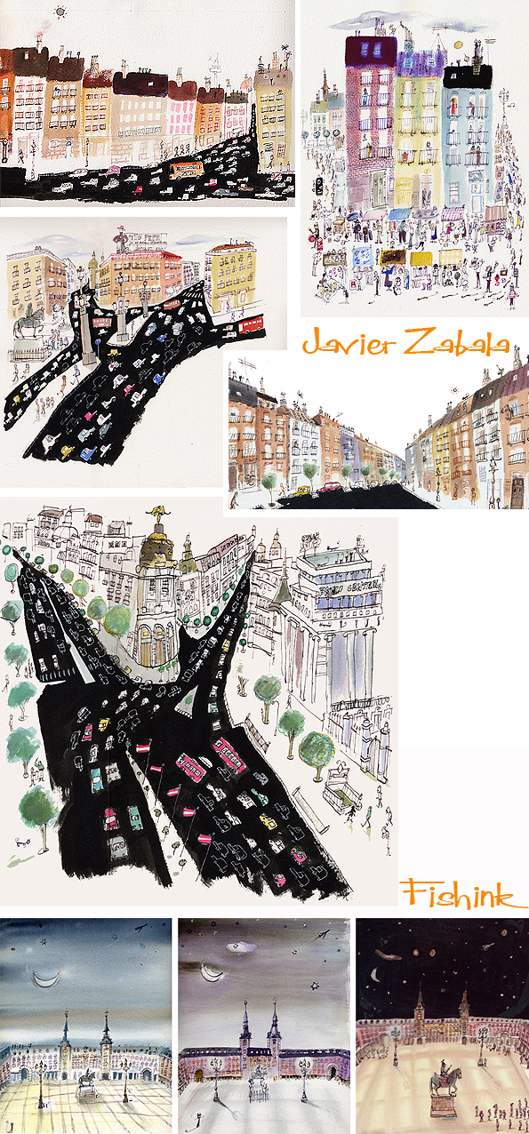
Since then, he works for the most important Spanish publishers and some of the most prestigious in Europe, Latin America and Asia. He has illustrated more than 70 books of poetry and fiction for children. some of them written by himself. His books have been translated into 15 languages. I really like his drawings for children, illustrating Barcelona and Madrid.
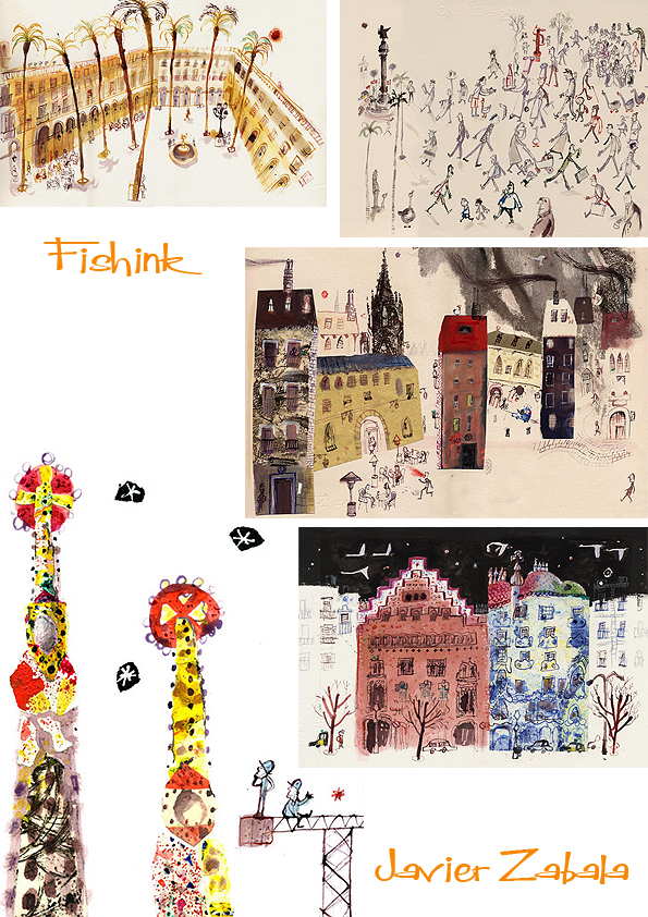
An important part of his current professional activities is his work as a teacher in illustration courses and lectures in Universities, Libraries and Schools of Arts in Spain and countries around the world such as Italy, Colombia, Ecuador, Mexico, Iran, Cuba. Javier has created some wonderful posters too.
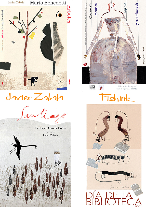
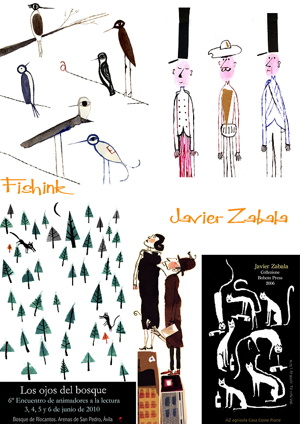
A few images from his children’s books.
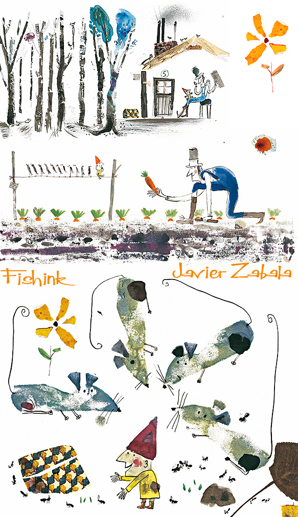
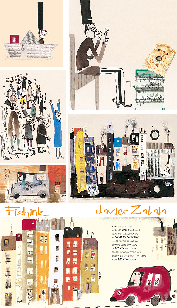
He has illustrated texts by Cervantes, Shakespeare, García Lorca, Rodari, Melville, Chejov.
Even illustrations for poetry !
And advertising.
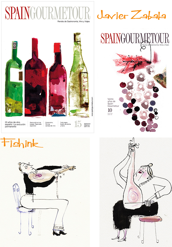
I see such creative, enthusiastic brush strokes and movement in his work. It really captures the eye and attention. Great work Javier.
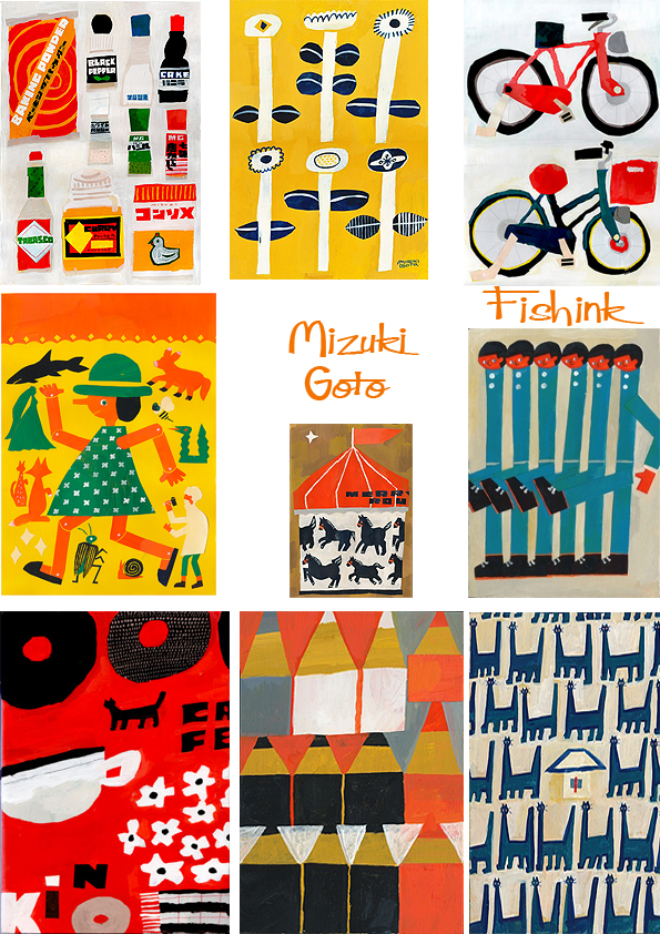
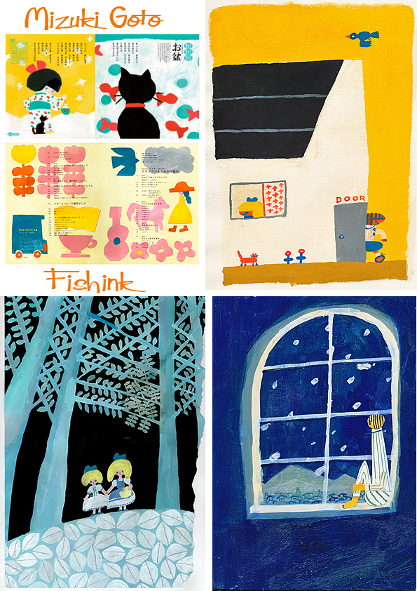
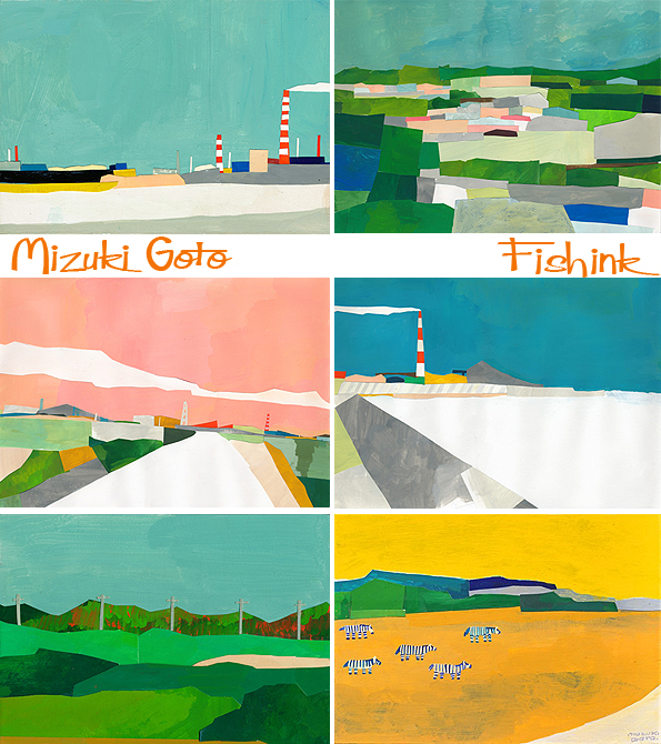
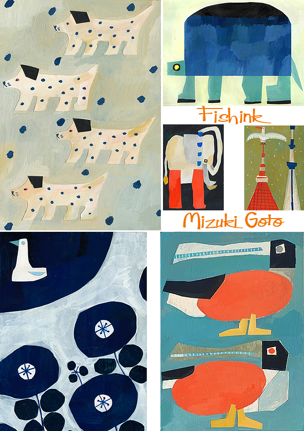
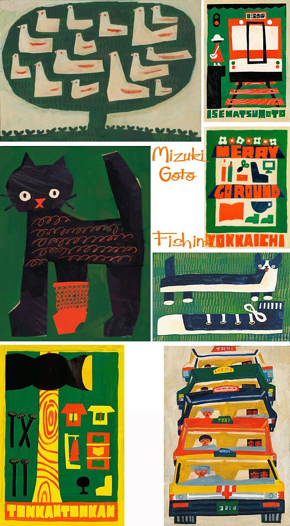
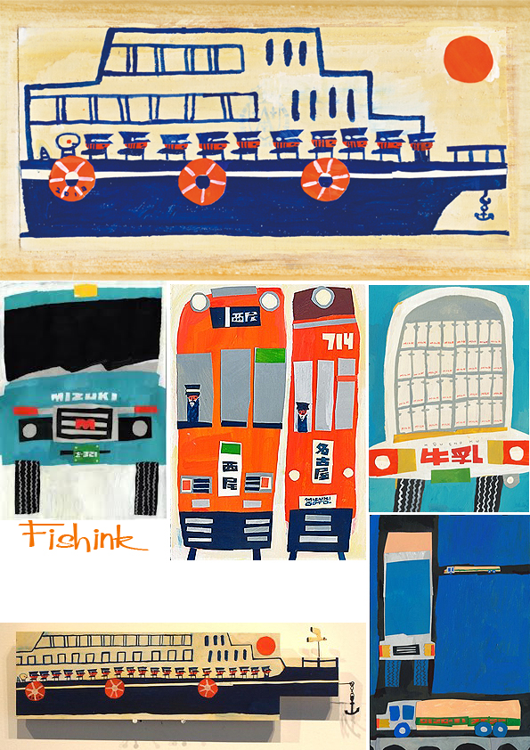
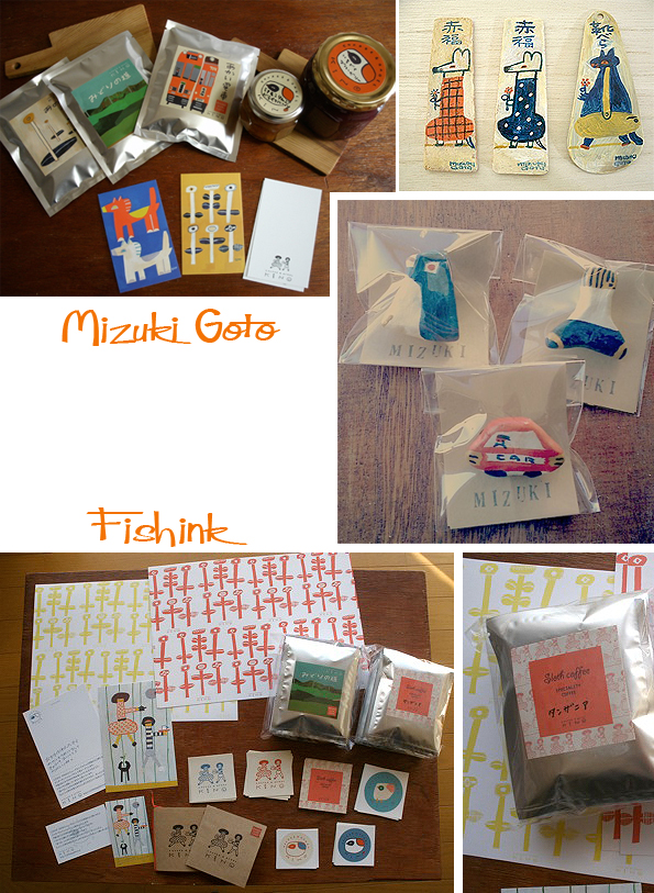
Mizuki Goto Japanese Collage Artist
Mizuki Goto has a way with torn paper that she can create such adorable images. Here are some lemons, Veg and sushi.
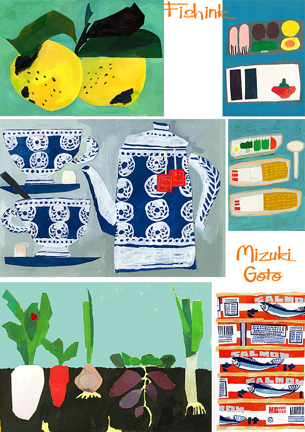
I also like her repeated motifs.
Ideas for posters, book covers and magazine articles.
Some creative paper landscapes.
Beautifully quirky animals.
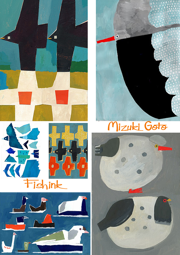
These little images on the left remind me of those great mid century matchbox covers that Maraid has on her flickr page.
These transport images are wonderful, I particularly like the red trains.
Mizuki creates some packaging and hand decorates objects but I’ve yet to discover how to purchase them. Great imagination.
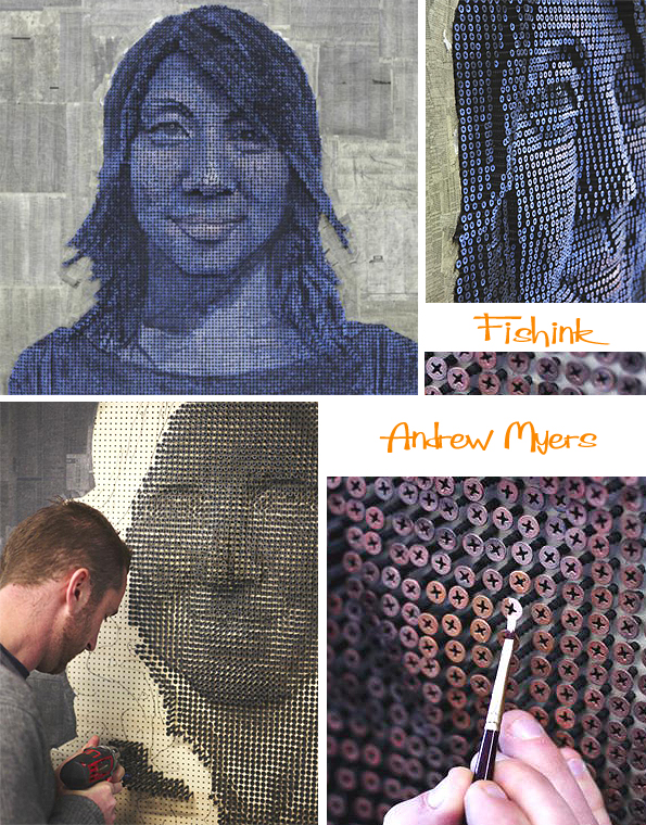
Andrew Myers and Michael Mapes Dismantling Art

Andrew Myers, must have incredible patience. Working from Laguna Beach, this California-based artist goes through a detailed process to create his unusual masterpieces.

Starting with a base, plywood panel, he then places pages of a phone book on top. (using pages from his subjects’ local area.) He then draws out a face and pre-drills 8,000 to 10,000 holes, by hand. He gauges the piece as he goes along and doesn’t reply on any computer software to guide his hand. “For me, I consider this a traditional sculpture and all my screws are at different depths,” he says. One of the most challenging parts is getting rid of the flat drawing underneath because he then has to paint over each of the screw heads, individually, so that in the end, the sculpture looks like an actual portrait.

Many thanks to Alice over at My Modern Met for this insight into Andrew’s work processes. She asked him these questions.
How does this type of sculpture differ from your usual work?
These pieces are definitely a departure from my normal artwork. For years I had been sculpting in bronze, doing figurative, narrative types of work. The screw art was born mostly because I was burnt out on the narrative work, but also because I’m always searching for a “better” sculpture. It has been hard for me to stick to one style of work as I always tend to find something more interesting. In fact, before I got the exposure on the screw art, I had considered taking a break from that to pursue something else.
What do you hope others will get out of these pieces?
When other people look at this work, I hope they can see the amount of thought and work that went into each piece. I feel I have used everything I’ve learned over the past decade, including sculpture, painting, construction etc, to create something that I had never seen before.
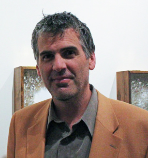
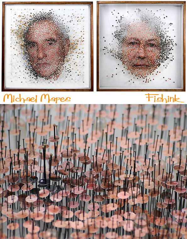
Another artist working in a ‘self-assembly’ style is Michael Mapes.
Picture thanks to JL Schnabel.
Again so much patience is involved in the meticulous process involved with each piece, which can be appreciated further, by Michael’s detail and close up shots.


Can you imagine putting these pieces together ? So much patience and concentration needed.

Thanks also to Chiara for showing me these amazing artists and their own preferred choice of media to work with.
If you enjoyed this work you may also like this piece about artist David Adey over at This is Colossal.
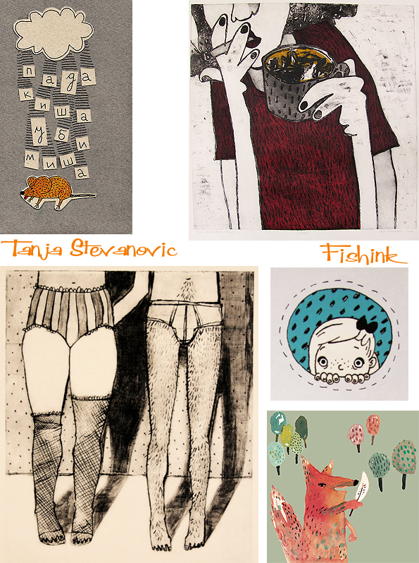
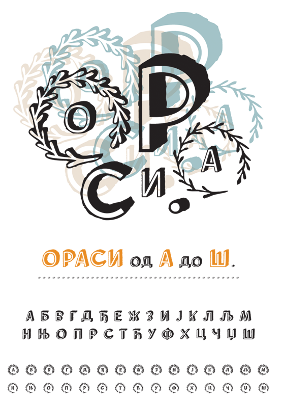
Tanja Stevanovic Illustrations from Serbia
Tanja Stevanovic has recently completed her studies at the Faculty of Applied Arts in Belgrade, Serbia, where she specialised in illustration and printmaking.

Creator of the decorative yrillic typeface Orasi that appeared in her book “Hedgehog’s House”.
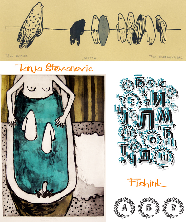
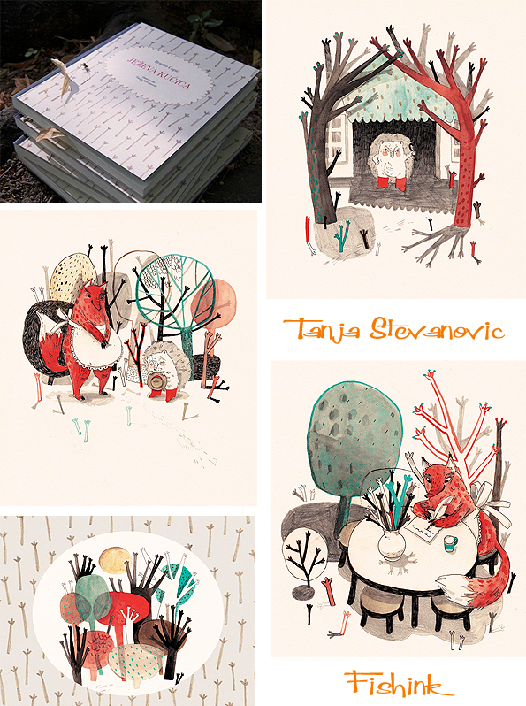
She is a playful illustrator, basing her ideas largely on natural themes such as animals and woodland, whilst also incorporating both scale and surprise in her imagery.


I look forward to seeing more illustration from Tanja next year.
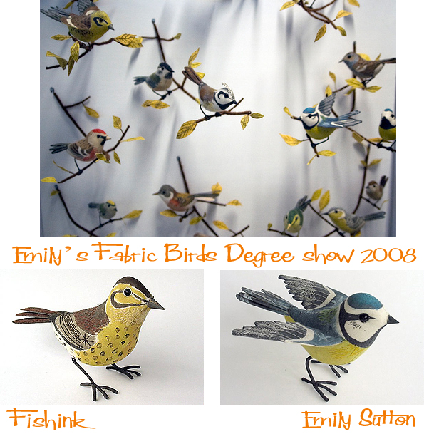
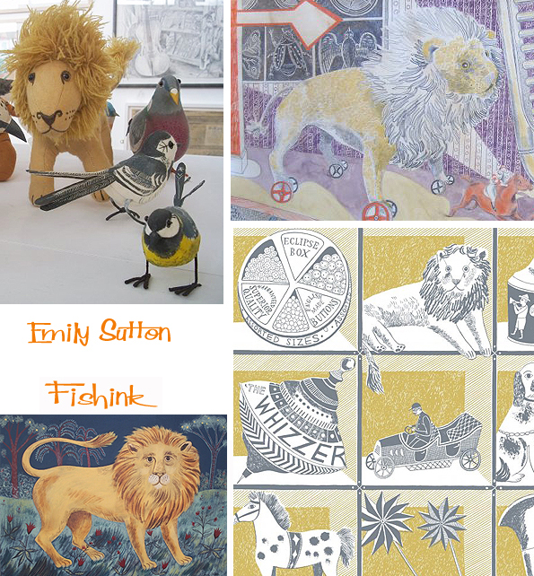
Emily Sutton Illustrator of the seasons and collector of the past
I’ve admired the work of Emily Sutton since 2008 when she graduated from studying Illustration at Edinburgh College of Art and her fabric sculptured birds made their first appearance.
I noticed how quickly her work has grown in popularity and style to become the rich, varied work that it is today. In an interview with UK Handmade, she tells us a little more about what influences and interests her.
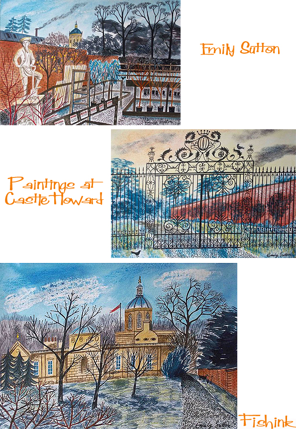
” My work is inspired by my love of old children’s book illustration (from the early to mid 20th century), in particular the picture puffin books, and the work of artists and designers also from that era including Edward Bawden, Eric Ravilous and Barbara Jones amongst others. I have always been very interested in detail and intricacy and this is carried through into my own image making. Another big source of inspiration is folk art- which I initially became aware of when I visited the Museum of American Folk Art in New York when I was a student. I found the colour, energy and playfulness of what I saw there really exciting and it definitely influenced how I approach making both images and my three dimensional work. I believe very strongly in hand-made, and I suppose that my work could be described as quite traditional in the sense that I would never consider using a computer to make an image (even if I knew how to!).” These beautiful pen and ink or watercolour illustrations below show us what a great eye for detail and colour she possesses.


Her work has an artistic nod towards her influential hero’s Bawden and Ravilious but essentially Emily has her own style, somewhat fresher and contemporary. This red House amongst the snowy landscape almost sings out with it’s wintery song and Christmassy colours.

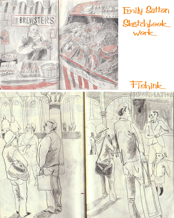
Her observational skills are also apparent in the work featured from her sketchbook. There’s a great feeling of being there in the space alongside her, as she shows us excerpts from her travels and observations from natural history museums.


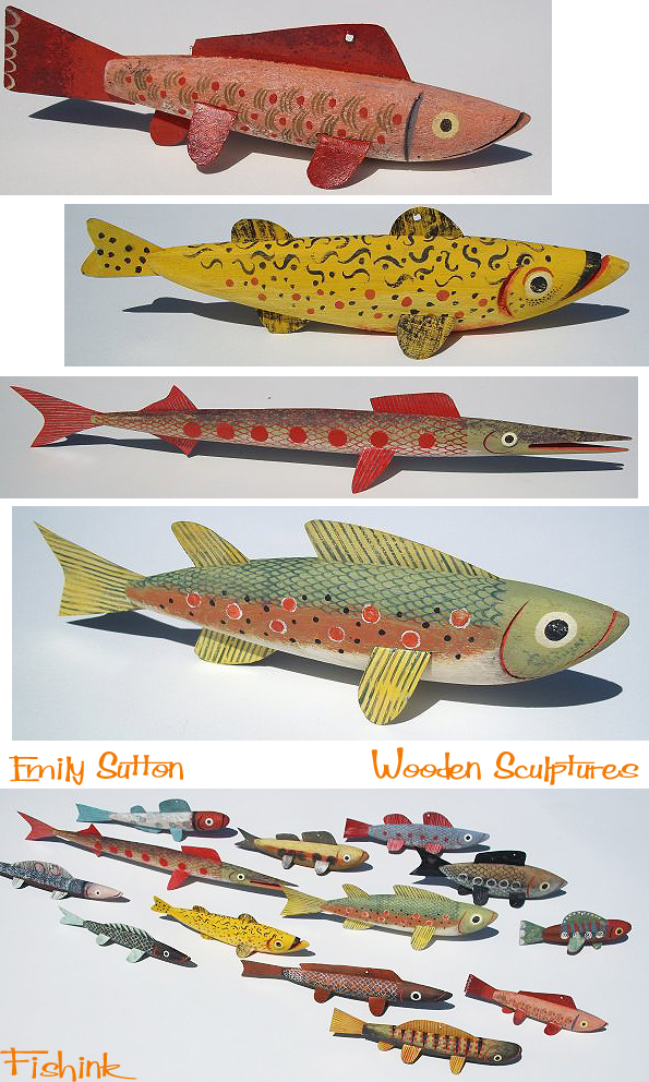
She hasn’t left her love of making things either, as we see a range of wooden fish with folk art colourations and expressions.
Her life seems forever surrounded with memorabilia and found objects from past times, which she carefully documents into her painterly collection.
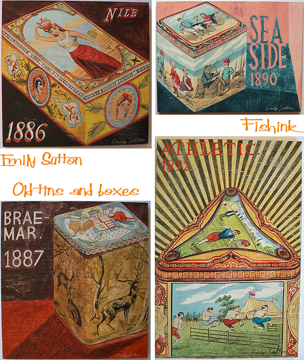
Some objects even reappear, perhaps they’re fond favourites.
Emily states ” I love that I am completely in charge of my own career. I can choose to a large extent what I want to do each day (depending on how many deadlines I have to meet at any given time) and I am lucky to have a variety of projects on the go so there’s no excuse for getting bored. Being an illustrator and designer, there’s a huge thrill in seeing your work applied to an object, whether it’s a book jacket, a textile or a piece of packaging. Another big plus point is the people that I come into contact with through work- I have met lots of really interesting and lovely people, many of whom have become friends. That’s what’s great about the art world in general- in my experience it’s quite a close-knit community and people look out for each other and are a great source of support. ”


Thanks Emily for continuing to inspire and delight us with your illustrations.
Ghost Monsters
I’ve been fortunate to spend some time with some friendly ghost monsters over the last six months.
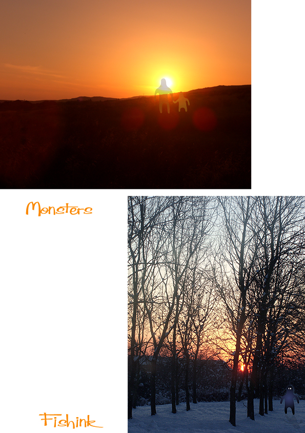
They’re quite shy so I had to take pictures when they weren’t looking but it’s kinda fun having them around.

They seem to lurk in shady places, just on the boundary of your vision, so when you turn your head to see what it was that you think you saw, they’re already gone.


