Modern Publicity 1959 – 60. Illustrated Mid century Art, Advertising and Graphics Part 3
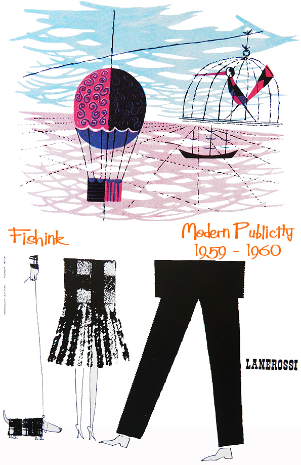
A little colour to start off part 3 of the collection of graphics from Modern Publicity’s annual for 1959 -60. I’m loving this tartan dog, made up of just that !
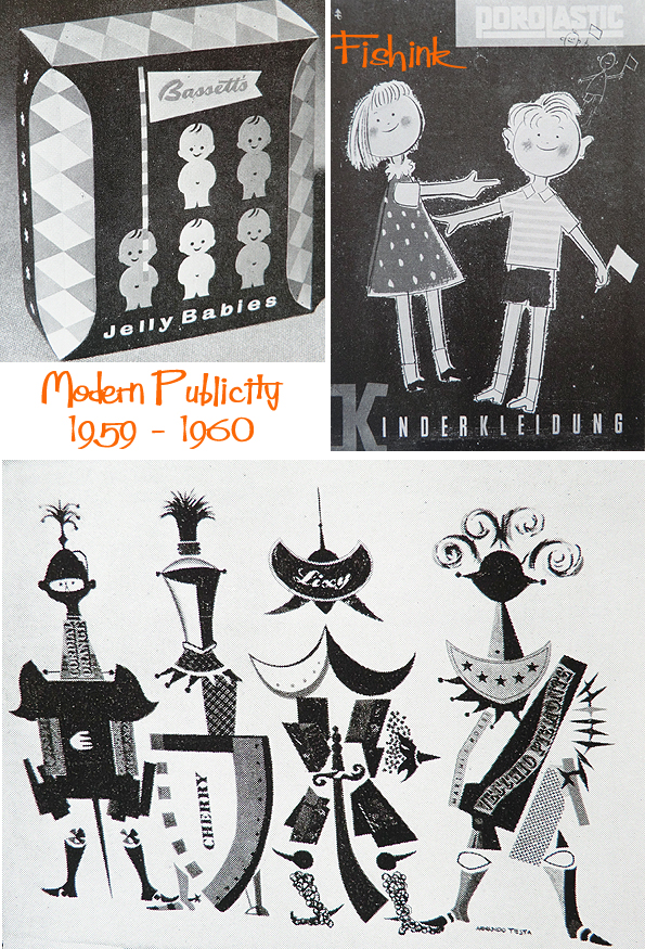
Perhaps I shouldn’t ask if anyone remembers the packaging for Jelly Babies looking like this ? (Don’t worry you’re age is safe with us)
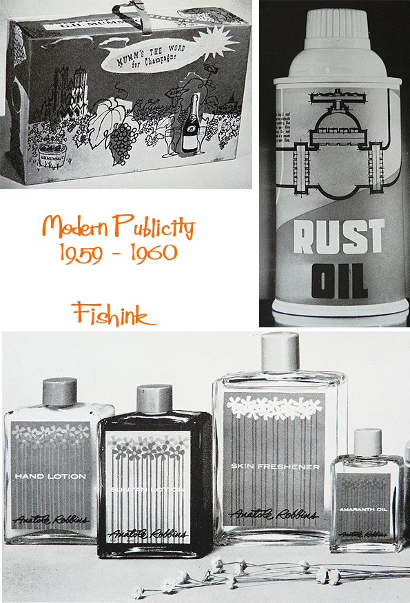
Who ever thought Rust Oil could look so appealing !
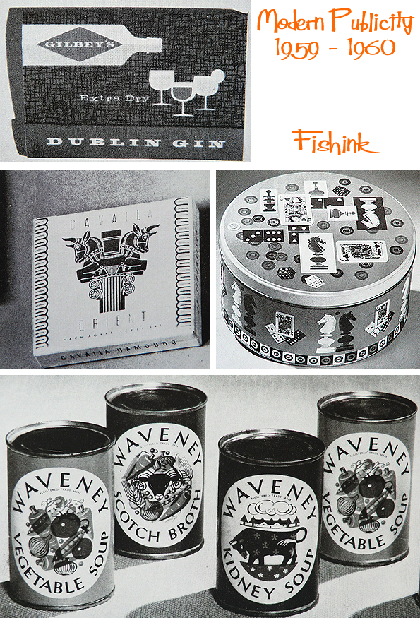
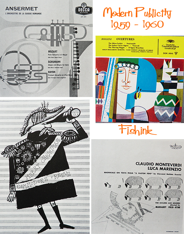
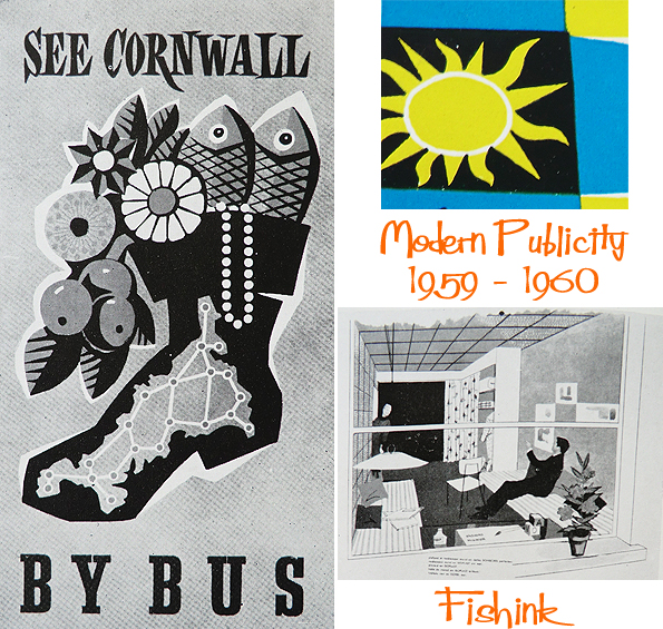
A few strong black and white company symbols, some classical record covers and travel posters to bring this post to a retro close.

You can find more posts and illustrations in this series by typing the words Modern Publicity into the search function on the right of this post. Don’t forget to share this, tell your friends about Fishink Blog and to vote for it here on the Blog Awards UK (when the site isn’t down !). I need every vote you can help me with : ) Many thanks.


Some of these are fab Craig! The birds about half way down are my favs, but I think the Cornwall advert is spot on! Kee ’em coming!
That tartan dog is killing me! He’s just the best! And ‘Kidney Soup’? No thank you. I like the simple flower design on the body care bottles, I think I remember something similar to these.
Kidney Soup does nothing for me either. Urg