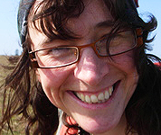
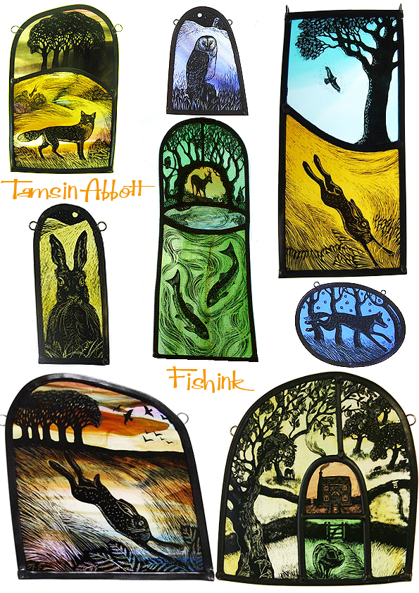
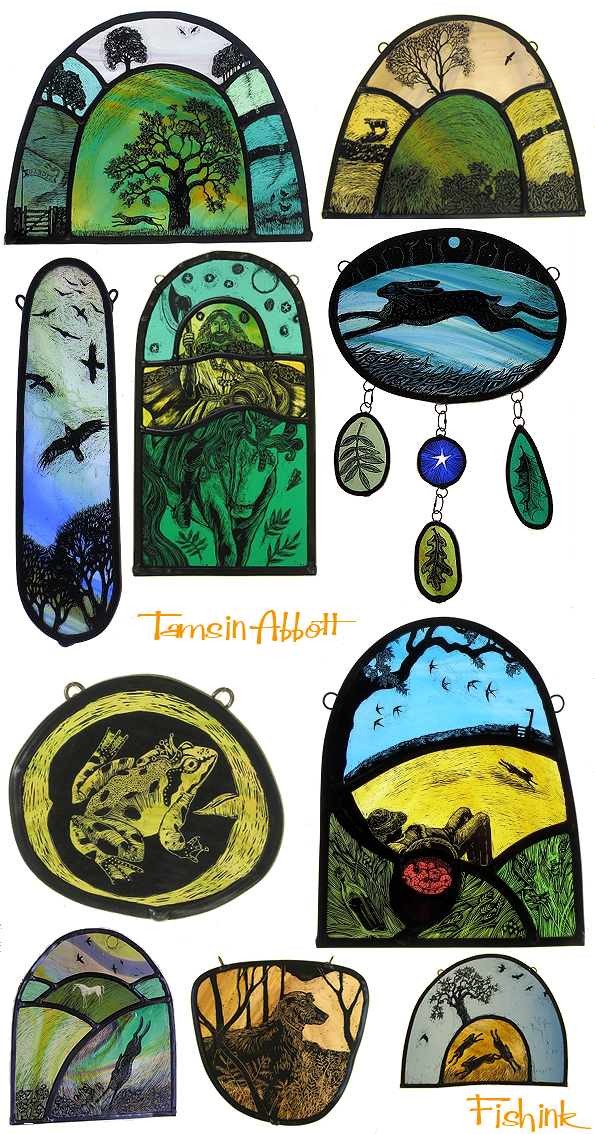
Tamsin Abbott . A vision of nature through glass
Tamsin Abbott completed a degree in English literature at Stirling University (1985 -1989) where she specialised in medieval literature. Her love of the language and stories of medieval literature was enhanced by the fact that much of the research material she was reading was illustrated with paintings and simple woodcuts of the period.
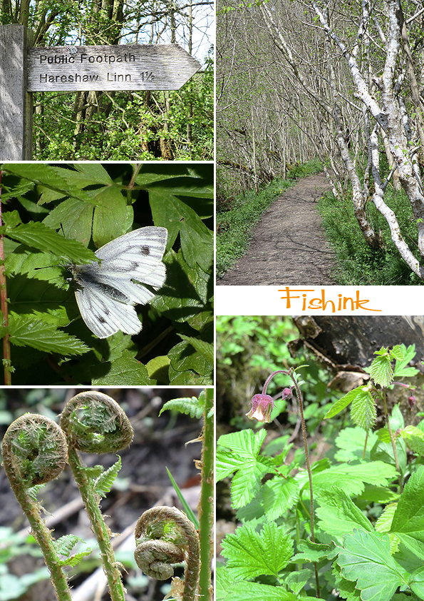
Fishink walks in Northumberland.
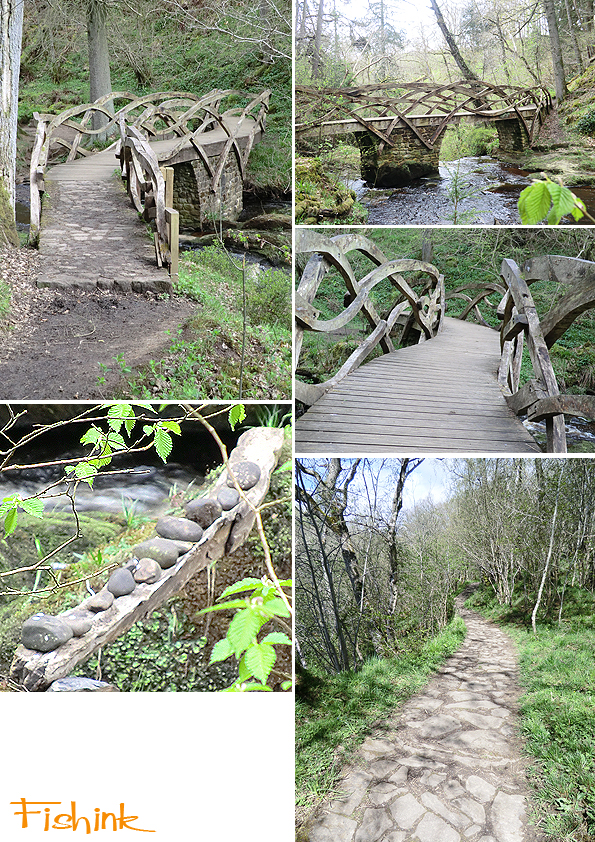
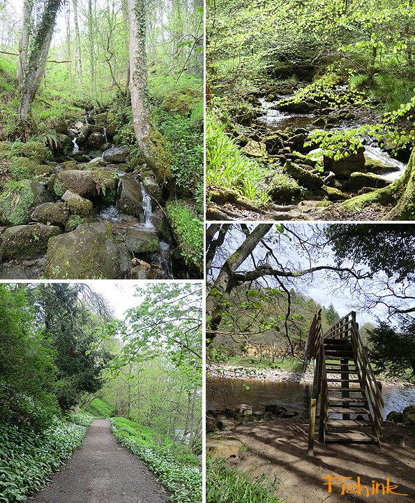
I was in Northumberland at the start of last week and managed a couple of beautiful walks. The first was around Hareshaw Linn, which was the old 1830’s site for two iron work blast furnaces.
There are a number of bridges spanning the river, before you reach the Waterfall at the end of the walk.
I liked the patterns on the water and the ferns on the boughs.
There is a rather stunning and slightly Tolkien-esque bridge on the way.
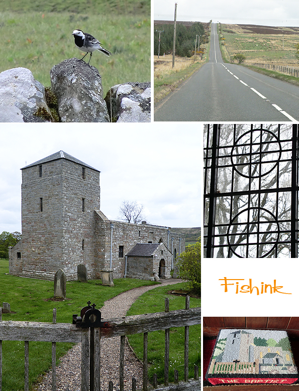
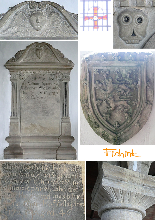
Whilst following one of the long and straight roman roads, I came across an 11th century church called St John the Baptist, in Edlingham. The remarkable tower is a 14th-century addition. There are some interesting carvings inside and spot the iron gate catch with a cross on top. Wonderful details.
Mr Wagtail showed me the way in.
A colourful stained glass window and some artistically styled floral displays.
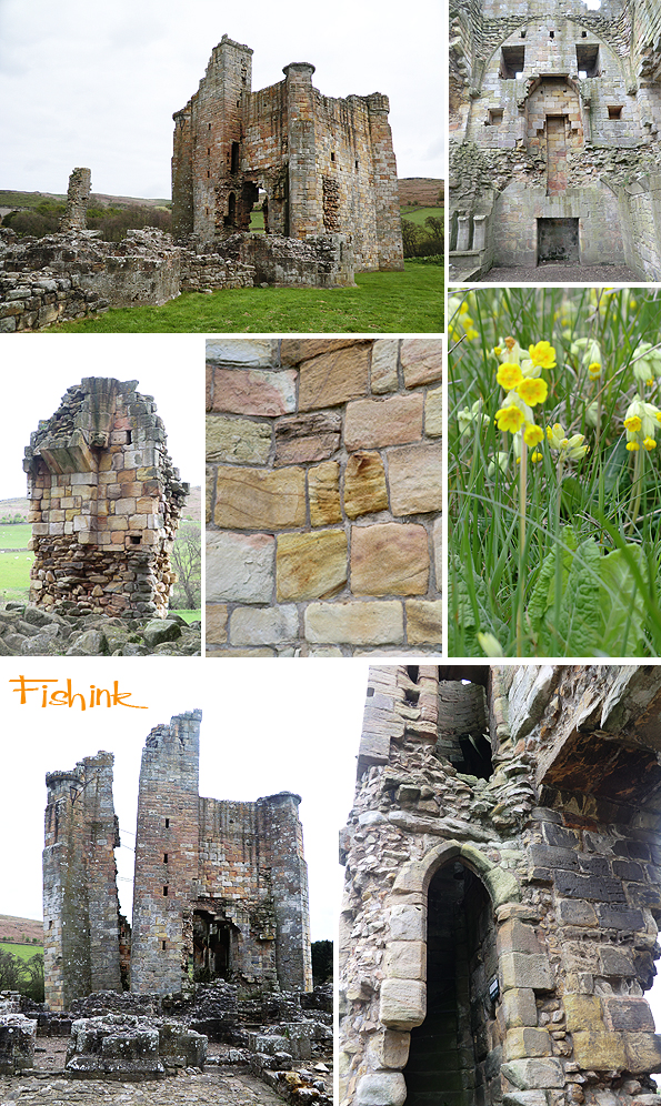
Only a few metres away from the church is Edlingham Castle, a 13th century building with 16th century battlements and defences.
More of the local wildlife was happy to pose for photographs too !
On the road between Alnwick and Otterburn, I came across a stunning waterfall by the roadside. It is hard to describe how amazing it was at the time, but the strong sunlight was streaming in through the oak trees new growth of yellow leaves. It created an almost Japanese grotto effect, which left me speechless for a few minutes. It is also mentioned in this tourism guide.
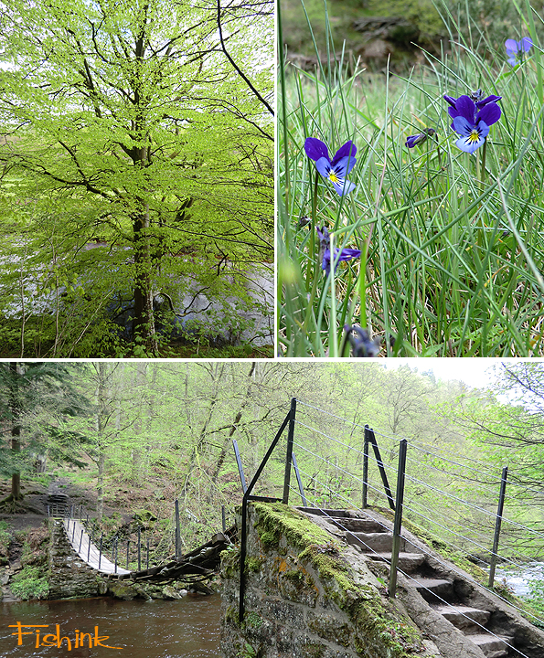
Another stunning walk I did was around Briarwood Banks.
This area is one of the best examples of rare, semi-natural woodland in Northumberland. Ash dominates, although oak and birch are common. Typical ancient woodland plants include ramsons, woodruff and dogs mercury. It was green for go everywhere !
These wild Pansies caught my eye. I was sad to leave Northumberland and it’s quiet rolling landscapes, hope to get back soon.
St. Judes in the City. An Exhibition of new work by Angie Lewin, Mark Hearld, Emily Sutton.
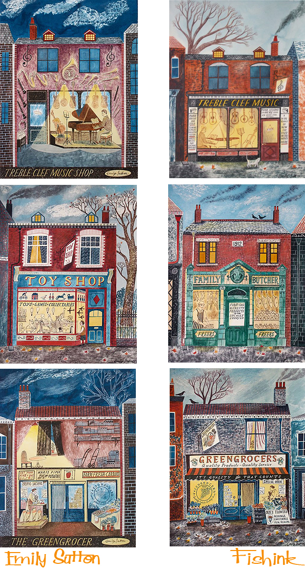
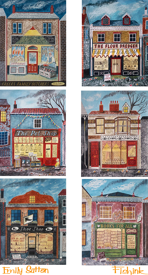
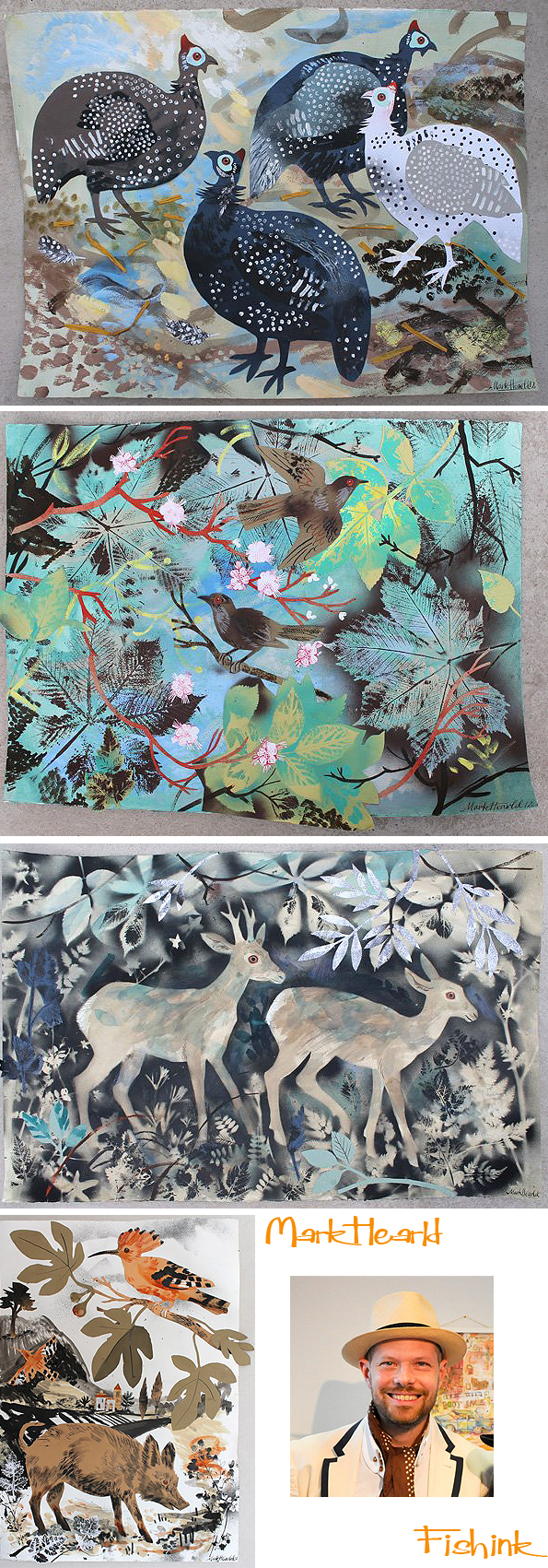
I’ve just heard that my favourite artists will be having a shin dig in London on the 26th May. Billed as an exhibition of prints, paintings and collages by Mark Hearld, Angie Lewin and Emily Sutton. Featuring some rare and unseen prints from Angie. You can follow the link to the event details here.
Some of Emily’s beautiful work, possibly inspired by Eric Ravillious’s series of prints called ‘High Street’.
And some new pieces from Mark too.
In addition to the framed and unframed work that each artist will exhibit, they will also be featuring the various fabrics and wallpapers that each have designed for St. Jude’s.
From 11am Thursday 24th May until 3pm Saturday 2nd June 2012 at 30 Tottenham Street London W1 (nearest Tube – Goodge Street).
Open daily from 11am until 6pm (but closed on Sunday 27th May).
Oh I wish I lived in London at this moment. Perhaps we should persuade St. Judes to do a Manchester Version of this city event ! lol
A City in Bloom.
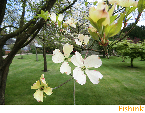
Is this really nearly Summer yet ? I keep getting hopeful of more summery climes and we do get the odd day of warmth, which is soo welcome, but then it all goes cold, grey and wet again. Ah well that’s what the last Bank Holiday Monday was all about here in the UK ! Apart from those grumbles, there has been a wealth of buds blooming and local colour in the trees. I’ve noticed.
Even the cats from next door have more than a ‘spring in their step’ when they appear on my second floor window sill !
A lovely note was attached to the head gardeners door in the botanical gardens in Fletcher Moss, Didsbury, which made me smile. Jessica seems to have spotted the little people.
Maybe Mother Nature thinks that Summer is coming ?
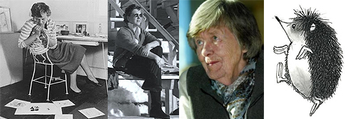
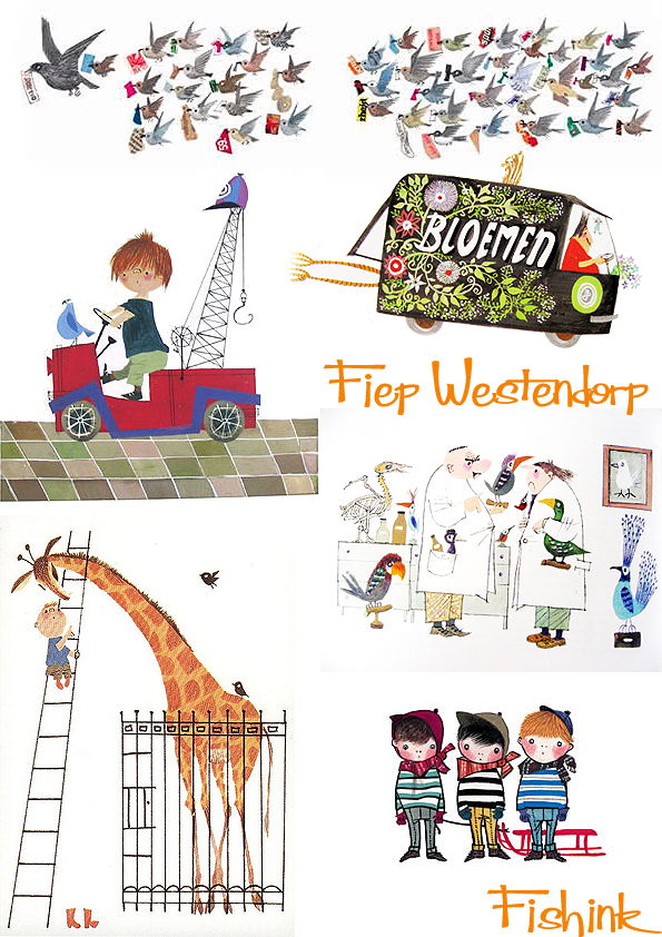
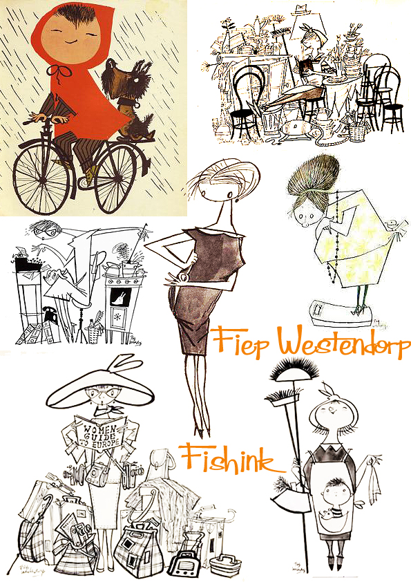
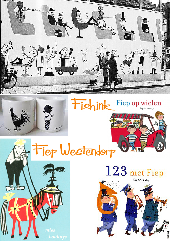
Fiep Westendorp (1916-2004) was a Dutch illustrator who became especially popular due to her long-term collaboration with writer Annie M.G. Schmidt.
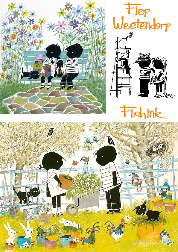
Dutch guys and gals have grown up with her illustrations over three generations. Her most well known characters are Jip and Janneke, two silhouetted kids who got up to all manner of things. It ran as a series of stories featured in the Dutch newspaper Het Parool from 1953 to 1957. Now, the Dutch department store HEMA has a huge selection of her illustrations on mugs, plates, stationery products etc.
I first became aware of her work when I purchased a couple of postcards in Amsterdam a couple of years ago. She has such a beautiful painterly style.
Two other firm favourites have been the tales of two cats Pim and Pom. Below are Fiep’s original creations alongside their modern day realisations.
She has illustrated numerous posters, billboards and books, some of which are featured here.
Since the regular Dutch awards for illustrations always eluded her, she was given a unique award for her entire career in 1997. At the end of 60 years of artistic creation, Fiep Westendorp received the Oeuvre Penseel, the highest possible Dutch award for an illustrator of children’s books. I should think so too lol.
This is the last part of the inspiring trip I took to Salts Mill, in Saltaire a couple of weeks ago.
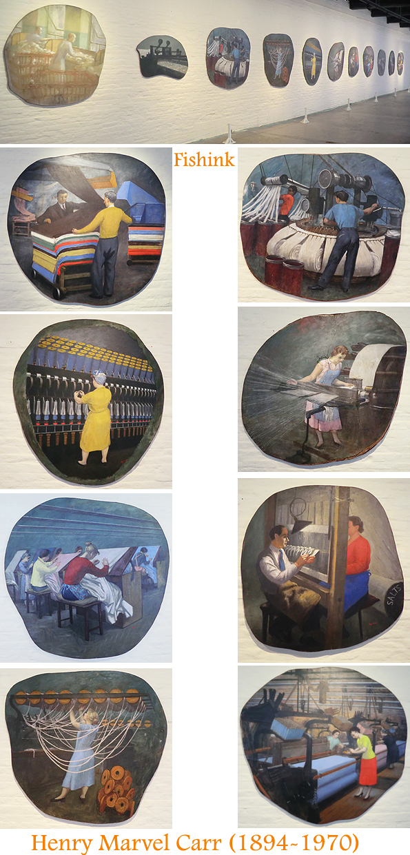
On one floor there was a long room displaying a series of works by Henry Marvell Carr, who was born in Leeds and later studied at the Royal College of Art, London. He was primarily a portrait painter and was successful both before and after the war. I presume he was commissioned to undertake a series of works depicting life in the factory. Interesting to see the skilled workers in their jobs and captured in this permanent way. Almost like ghosts from another life of the mill.
A more contemporary artist Nick Tankard, who has been a book seller in Salts Mill, grew up with a bedroom view of the Aire Valley. Inspired by the place that he worked and lived, he created a range of prints telling the story of Titus Salt’s journey from the Victorian Hell of Bradford to Elysian Saltaire– through a series of pen and ink images, using his distinctive cross hatching method. Copies of his dramatic cards and posters are available from the bookshop.
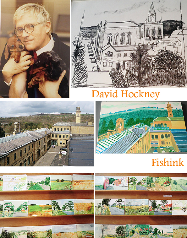
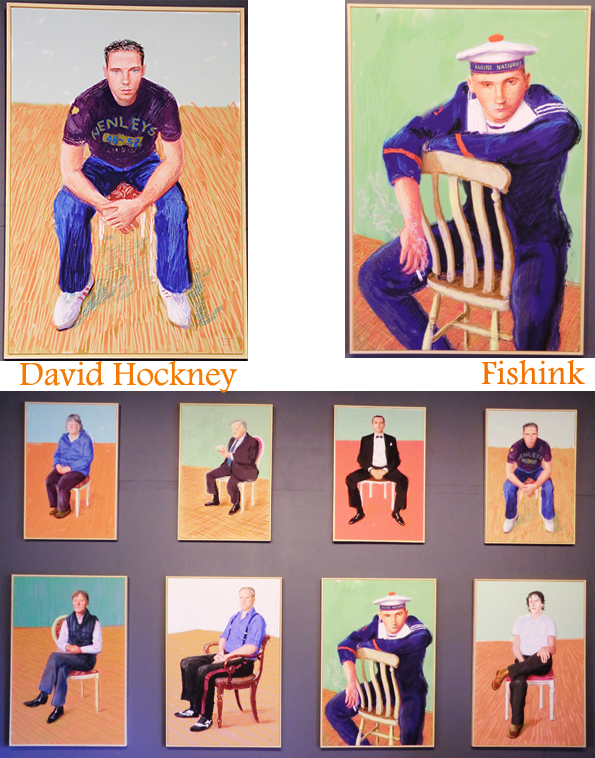
A more well known yet still local artist David Hockney has been associated with Salts Mill since its more recent refurbishment. A Bradford boy originally, David has always held his Yorkshire roots close to his heart. It wasn’t surprising that when Jonathan Silver approached David about displaying his work in the Mill, David agreed. The two had first met in the 60’s and had kept in touch, sporadically since then. The Galleries at Salts Mill are very proud of the large collection of David’s wonderful work on show and deeply grateful to him for his continued support and interest.
How lovely to stumble upon the same views that Hockey saw before turning them into his self styled works of art.
There’s even a nod to Hockney’s stage sets with the lovely Cafe in to the Opera on the same floor as his changing gallery exhibitions.
There was a projector of David’s images he’s created using a paint program called ‘Brushes’ on the iPad. I love the way that this 74 year old artist quickly embraces new technology and is keen to explore his art through so many different forms and mediums. How inspirational.
After his first major restrospective exhibition ‘David Hockney RA: A Bigger Picture’ which was housed at the Royal Academy of Arts from January 21 to April 9, he is still working on the Yorkshire landscapes that he loves and knows so well. There’s a great piece on David by Martin Gayford on The Telegraph site and that you can read here.
Martin says ” A long time ago, David Hockney met the granddaughter of the great Russian-Jewish artist, Marc Chagall. She told Hockney that all her grandfather – then in high old age – wanted to do was sit in his studio and paint. Hockney entirely understands why that was. “Well, of course, what else would you want to do when you’ve done this all of your life? When you are older, you realise that everything else is just nothing compared to painting and drawing.” How amazing to have found what it is you love to do the most in life and be able to do it for all your life too ! and to do it so well.
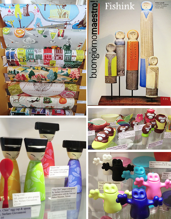
Finally there’s another wonderfully inspiring shop tucked behind the restaurant at Salts Mill, called simply ‘Home’. Jammed full of shiny, retro, contemporary and beautiful home interior items to tempt and entice even the most reluctant shopper. With a host of famous names like Alessi, Marimekko, Isak etc. There’s a superb design collection of ceramics throughout the ages along the back wall too, sadly I wasn’t allowed to take images but it is well worth seeing for yourself anyway.
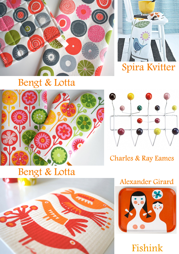
No surprises that I loved this series by Mini Moderns featuring the Festival of Britain. What quirky imagery. I also liked the ceramics from Lotta Odelius and their modern yet retro appeal, form and colours.
I found a few more companies and great items in the same vain online.
What an amazing place Salts Mill is, well worth a day’s trip to investigate more.
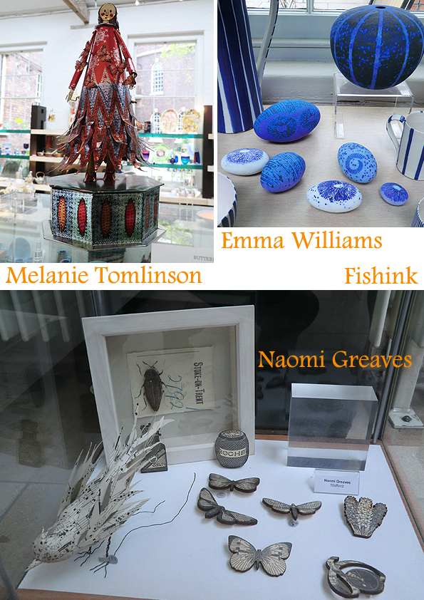
I had a fabulous art filled day in Liverpool. Starting off at the Bluecoat, collecting some work for a friend from the Gallery shop. As usual, I was pleased to find such a great array of stunning craft pieces. Tucked away at the back was a fantastic display of the papier-mache figures by Julie Arkell. This Exhibition is only on until May 12th so hurry!
 Photo from http://www.lovelytextiles.blogspot.co.uk
Julie says ” I’ve always been very attracted to the idea of a ‘really rural’ life without ever having lived in the countryside. At the end of last year I spent a few months in a village in Somerset. No shops, cafes, museums or libraries nearby, quite unlike what I’ve been used to all my life.
I love to walk, so each day I would venture down muddy tracks and across fields. The changing skies, animals, apple trees, bracken and berries were a constant source of enjoyment and comfort. I would bring back things from these outings that most pleased me, some more like treasure than others. An empty birds nest found lying on the ground was my most prized find. Now back in London, surrounded by buildings again, I walk on pavements and ‘dust the farmyard.”
Julie studied for a degree in Textiles at West Surrey College of Art and Design and then a diploma in Fashion Textiles at Central Saint Martin’s College of Art and Design. She combines stitch, knit, ephemera, vintage fabric and papier mache in her own distinctly personal way. Everything is produced by hand using knitted adornments, curious accessories, ribbons and found objects.
I love her idea of knitted shadows for the trees below.
She has exhibited across the UK in a number of galleries and has work included in the collection at the Arts and Heritage Centre in Rochdale. Ruthin Craft Centre’s bestselling book ‘Home’ featuring Julie’s work is now in it’s third reprint ! I noticed there we’re some left at the Bluecoat if you hurry. (Text taken from the Bluecoat exhibition)
If you like Julie’s work, you may also appreciate the creations of fellow papier mache artist Vanessa Cabban (as shown above). Here are some other pieces I liked at The Bluecoat Gallery Shop.
I love the small garden square. It’s an oasis, I remember escaping to, from the madness of the city centre. It still holds a calm feeling for me.
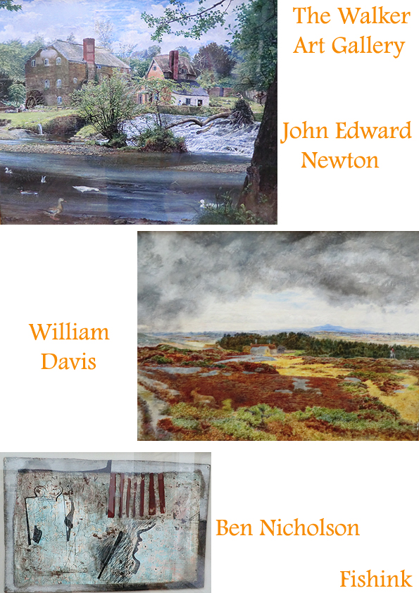
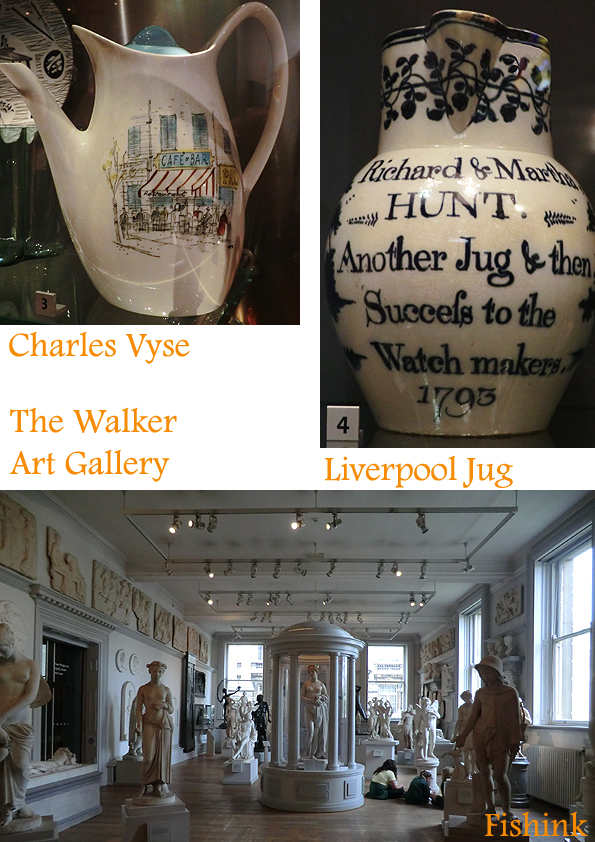
We then headed over to the Walker Art Gallery for a little more traditional art. Some of my favourites live there.
After recently visiting Eskdale I loved the above painting, which had been created there.
A little ceramics ..
A little humour …
And a final great cup of coffee and a home made cake from The Egg Cafe, mmm well worth a visit.
2001: A Space Odyssey / Oddity !
Last night was film night, a few beers and few friends, pizza and a classic dvd (… discuss lol)
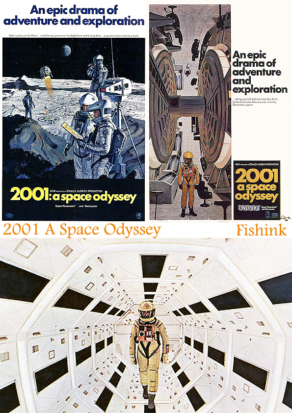
We watched a film that I’ve wanted to see for a while, Stanley Kubrick’s ‘ 2001: A Space Odyssey ‘. I’d not read much about it, as I wanted to form my own opinions and not be swayed by other people’s views. It came out in 1968, a year before the first moon landing, and there’s a lot written about the difficult and exhausting efforts that Arther.C.Clarke (author) and Kubrick encountered in the four years of its making (see here). Below are a couple of the original film advertising posters.
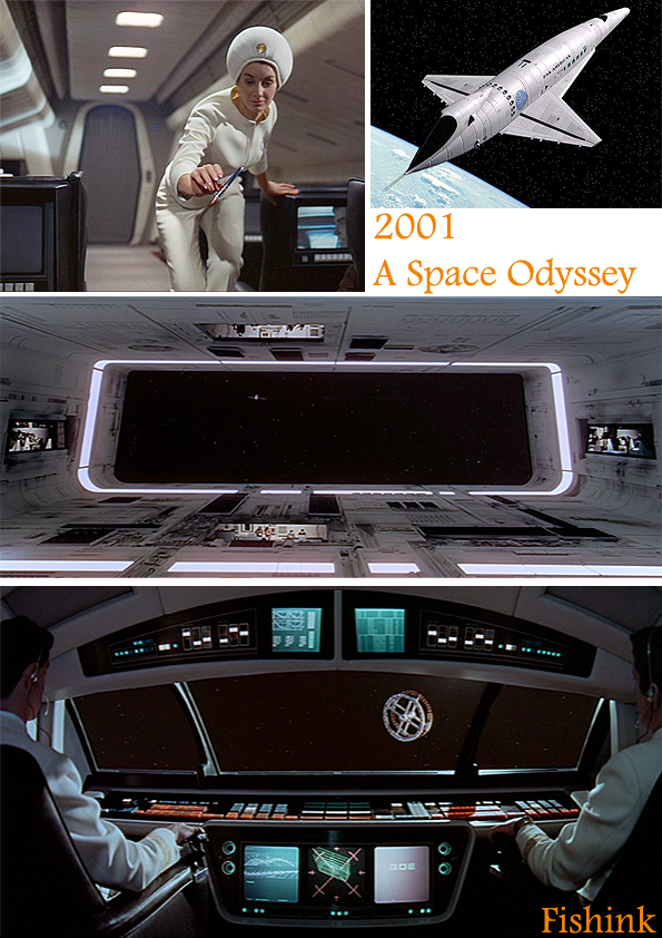
It begins with 2 minutes of a completely black screen and accompanying background music, proceeded by about 20 minutes of visual explanation of man’s beginnings, as apes, discovering how to use tools as weapons. This was ( I must say) my least favourite part of the whole film, but undeterred we watched on and we were rewarded by the visuals that followed. Researchers were convinced that Pan Am Airlines would have been the type of company who would eventually have taken their aircraft into space, so Kubrick helped them on their way by adding them to his film.
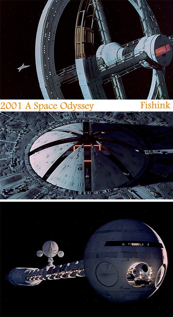
Spectacular effects and visuals. Considering this was made 9 years before George Lucas created ‘Star Wars’, I can only assume that Lucas must have been greatly influenced by the look of this film.
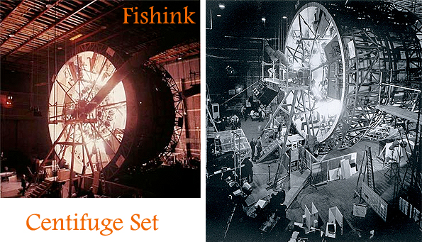
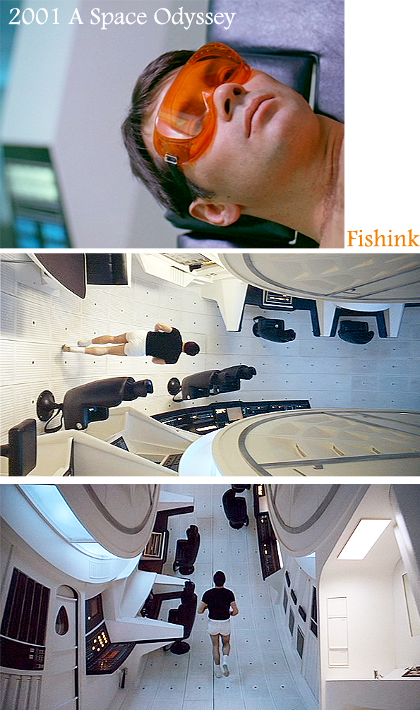
The creation of a huge revolving set in the MGM English studios, allowed for some amazing camera scenes of one of the astronauts exercising in his spacecraft.
Other revolving scenes, allow the actors to casually walk up walls and disappear through moving hatches. Kubrick cleverly angles the camera allowing us to believe that there really isn’t any gravity in his film. Elaborate costumes and dramatic sets all contribute to the films visual ability to draw the viewer in.
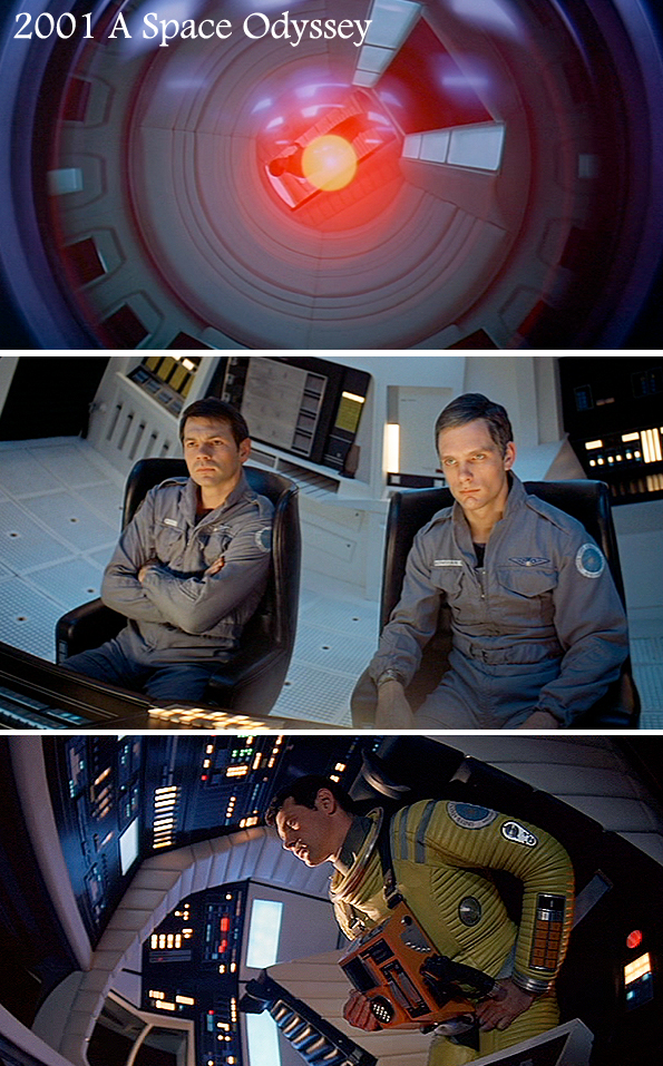
The Space-craft’s main computer is called Hal. It controls everything and observes everyone, appearing in the film in the form of a ‘ red eye ‘. Kubrick places a reflection over Hal’s red light, that shows the viewer what it’s looking at. Occasionally we even observe the astronauts from Hal’s perspective. This constant change of viewing perspective seems to be another way to leave the audience with a strange feeling of displacement. Sideways shots and filming scenes from high or low angles, also help to increase this dizzy perspective, making the viewer question who’s seeing what and whether they are in fact a viewer or more of a participant in the action. It’s a strange feeling.
I’d say that this definitely won’t be everyone’s favourite film, nor is it an easy film to watch. Minimum dialogue, long sequences of classical music accompany some of the space scenery. After saying all that and taking a step away from the analysis of what the film’s deeper significances could be.
The film is a visual feast.
It is one of the only films I can think of that principally uses silence to build up the viewers tension, rather than today’s typical usage of dramatic music to keep the audience gripped. The sequences when the astronauts are loudly breathing in their spacesuits, made me also feel breathless. The colours in the film are stunning and it’s possibly one of the earliest films to use product placement (Pan Am, Hilton Hotel etc) as a form of advertising that I’ve seen. It has also been a huge influence on films, interiors, advertising media and a whole host of space related products.
There are many sites on the internet like this one from Rob Ager, where people have done extensive research into the ideas behind the film itself and offer possible theories as to Kubrick’s hidden depth and meanings behind his space masterpiece. Apparently Kubrick has claimed that all the clues to unlock the films’ full explanation are there in the film, you just have to watch closely and decipher them ! I fear I may have missed a couple lol
Kubrick was so passionate about how his film was portrayed that according to the IMDB Trivia page the following proposal was made. “When Stanley Kubrick learned that his film would have an intermission in most cinemas (as this happened in most films that length) he not only ordered where the intermission took place, but had his film’s composer record specific music for the intermission, and requested that the theatre be plunged into darkness for a minute before the film restarted.”
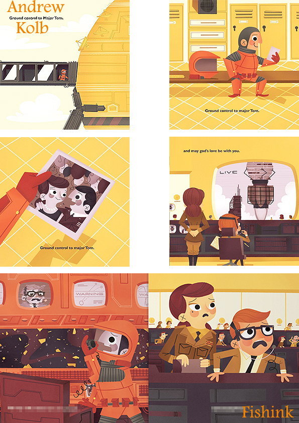
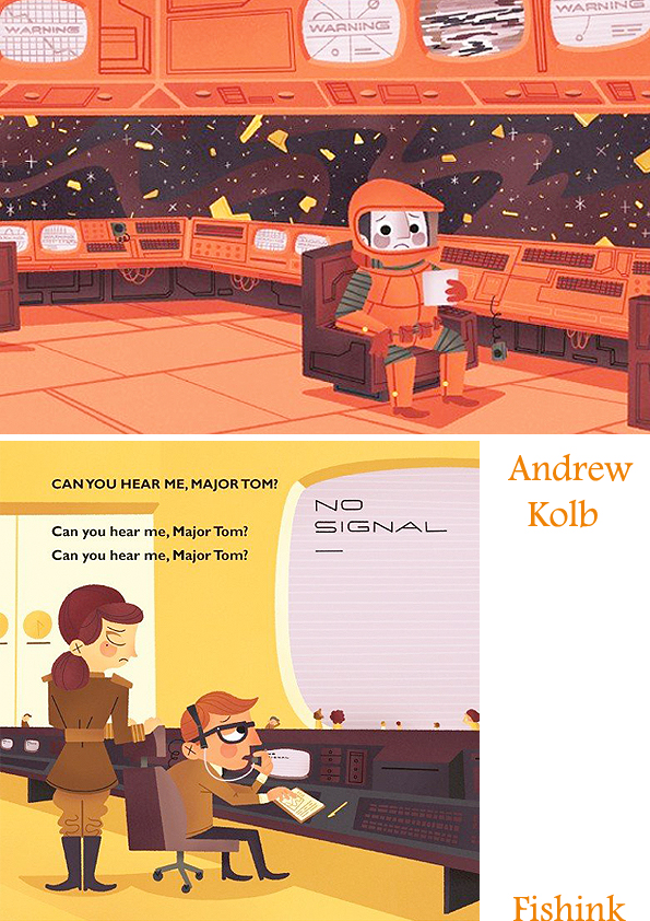
As a subtle link, David Bowie wrote his song ‘Space Oddity’ (Ground Control to Major Tom) in 1969. It was obviously a nod to Space Odyssey and came out in perfect time for the moon landing too. Andrew Kolb is a talented illustrator who decided to create a Children’s book from the lyrics of Bowie’s song. Sadly the Bowie camp who own the song, weren’t too happy that he’d used the lyrics on his site and made him break all links between the two. Advertising and illustration agencies were however very impressed on hearing the tale and seeing his work. He has since earned much work as a result of his creative space book talents.
You can see Andrew’s complete book with musical accompaniment here.
If anyone has watched ‘2001: A Space Odyssey’ and would care to share their views on it, I’d be interested to hear them.
I’d like to dedicate this post to Neil Armstrong, the first man on the moon who passed away today August 25th 2012 aged 82.
I’ve noticed a fair few bits and pieces slipping into my mailbox lately by some of my favourite Illustrators, so I just thought I’d mention them. ‘Deep Sea’ fabric by Emily Sutton, (as with most of the artists featured here ) available on the superb St. Judes site.
‘Harvest Hare’ Wallpaper by Mark Hearld and a beautiful new screen print ‘The Yellow Cup’ by Angie Lewin.
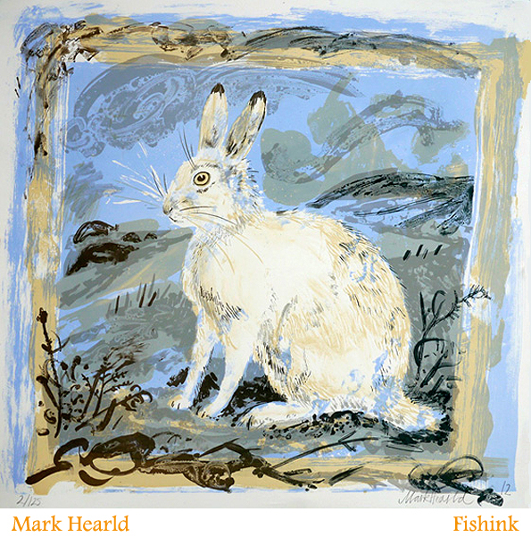
A new print by Mark called ‘Mountain Hare’.
and some new books too. One book, coming out in October, entitled ‘Mark Hearld’s Workbook’ with a teasing ‘heads up’ from Amazon.
‘ The artist Mark Hearld finds his inspiration in the flora and fauna of the British countryside: a blue-eyed jay perched on an oak branch; two hares enjoying the spoils of an allotment; a mute swan standing at the frozen water’s edge; and a sleek red fox prowling the fields. Hearld admires such twentieth-century artists as Edward Bawden, John Piper, Eric Ravilious and Enid Marx, and, like them, he chooses to work in a range of media paint, print, collage, textiles and ceramics. Workbook is the first collection of Hearld’s beguiling art. The works are grouped into nature-related themes introduced by Hearld, who narrates the story behind some of his creations and discusses his influences. He explains his particular love of collage, which he favours for its graphic quality and potential for strong composition. Art historian Simon Martin contributes an essay on Hearld’s place in the English popular-art tradition, and also meets Hearld in his museum-like home to explore the artist’s passion for collecting objects, his working methods and his startling ability to view the wonders of the natural world as if through a child’s eyes. ‘ Hmmm, one for the Christmas list I think !
