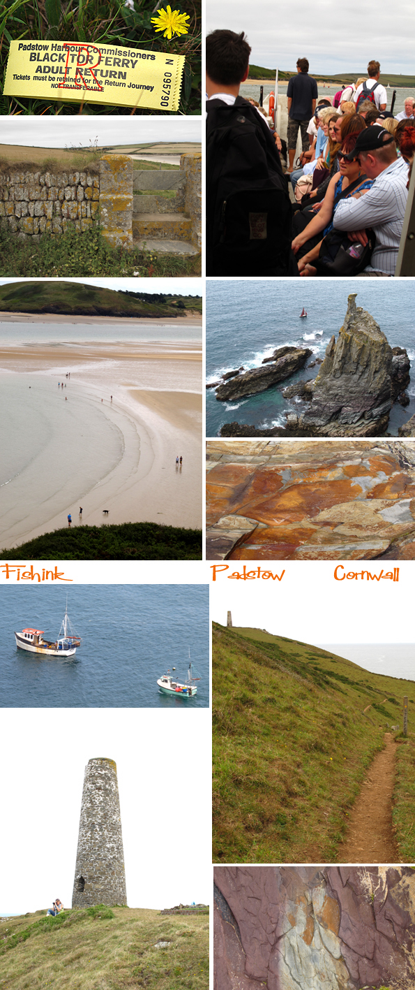
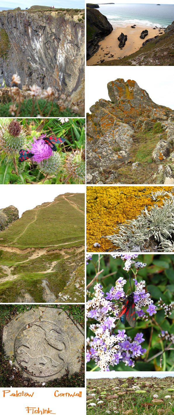
Fishink in Cornwall.
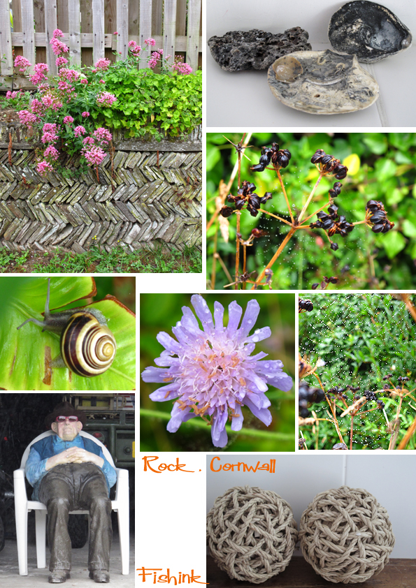
I’ve just spent a beautiful week in Cornwall with some friends in a little, rather posh area called Rock.
There were amazing beaches within a 10 minute walk and so much to see and wonder at that it was a
perfect place for the keen observer like myself. The houses were pretty impressive too, I like the way
the local architects were up for trying something fresh, well constructed but still with a coastal feel.
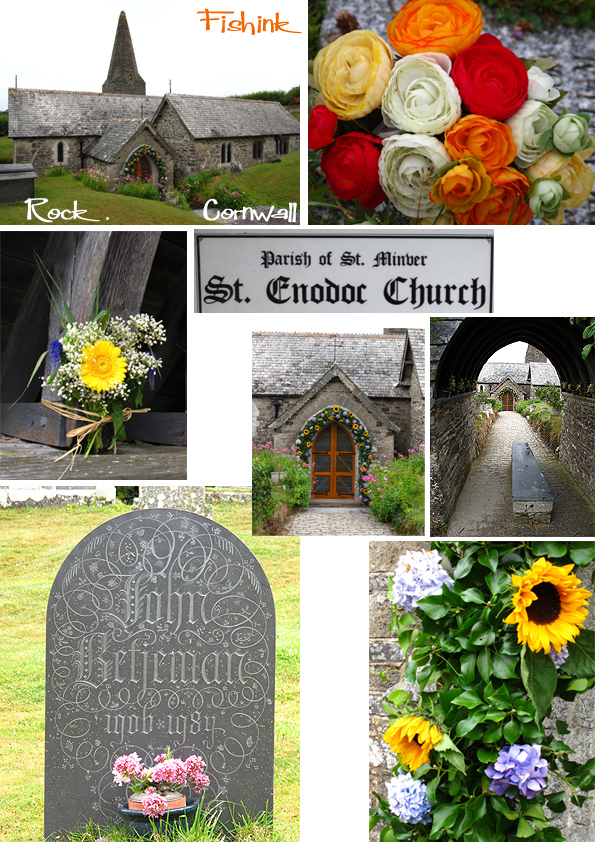
I wandered to St Enodocs Church where the poet John Betjeman has been laid to rest.
It’s a stunning location and beautiful little church and graveyard with some amazing finds there.
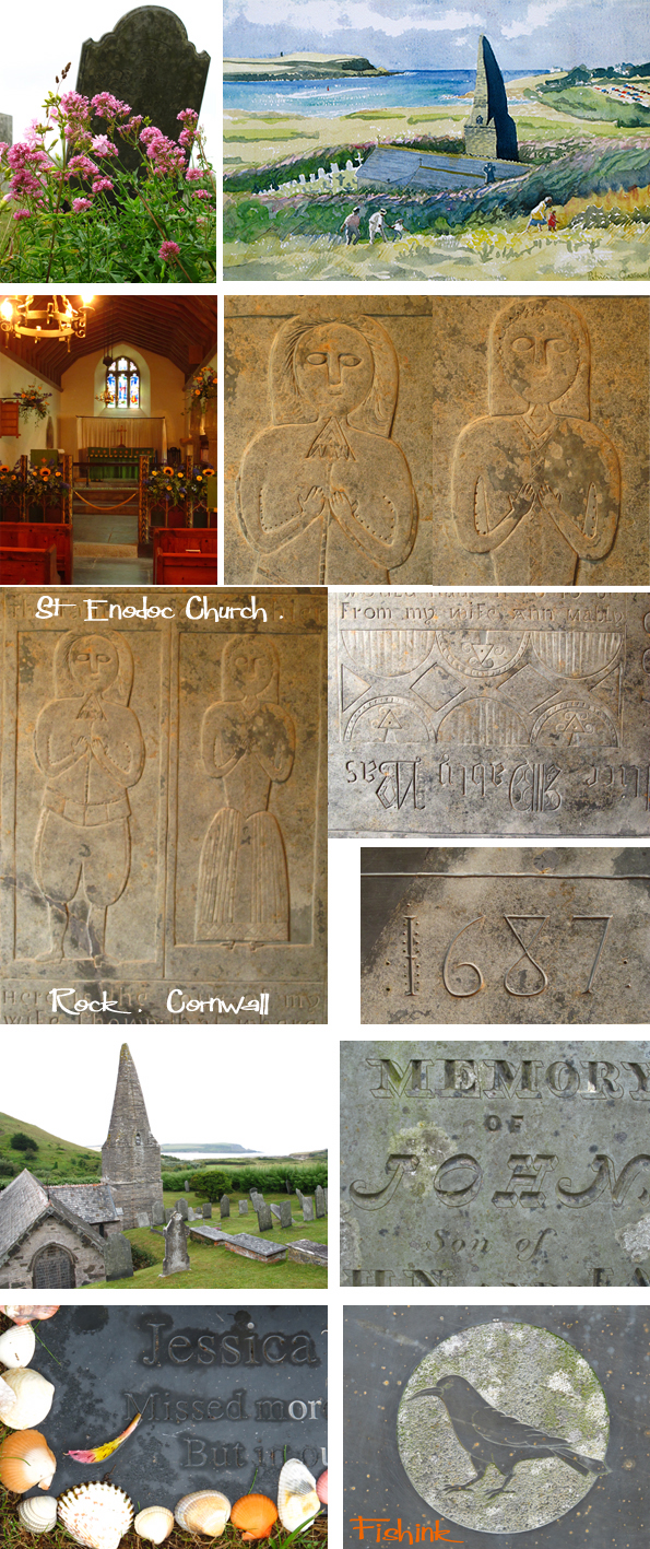
I was struck by the stone carvings inside the church that date back to 1687, just look at the detail in the
figures and in the 1800’s there were some great stone engravers and some stylish alphabets used too.
It’s easy to hop on a ferry boat and be in Padstow in a matter of minutes or better still do a fabulous
coastal walk along the twisty paths and take yourself off to many other beaches around the headland.
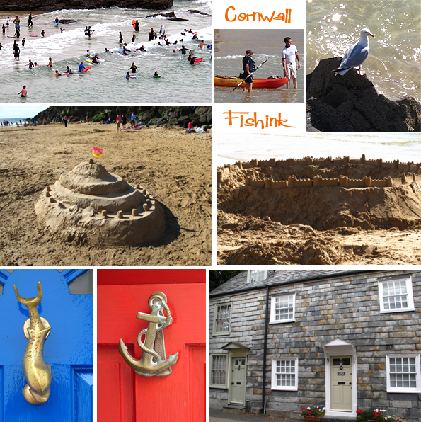
Sand castle competitions, surfing, sunbathing, or just spotting some sea side door furniture is what a
relaxing break is all about, don’t you find ? lol. Below are the sailing boats moored next to Rock.
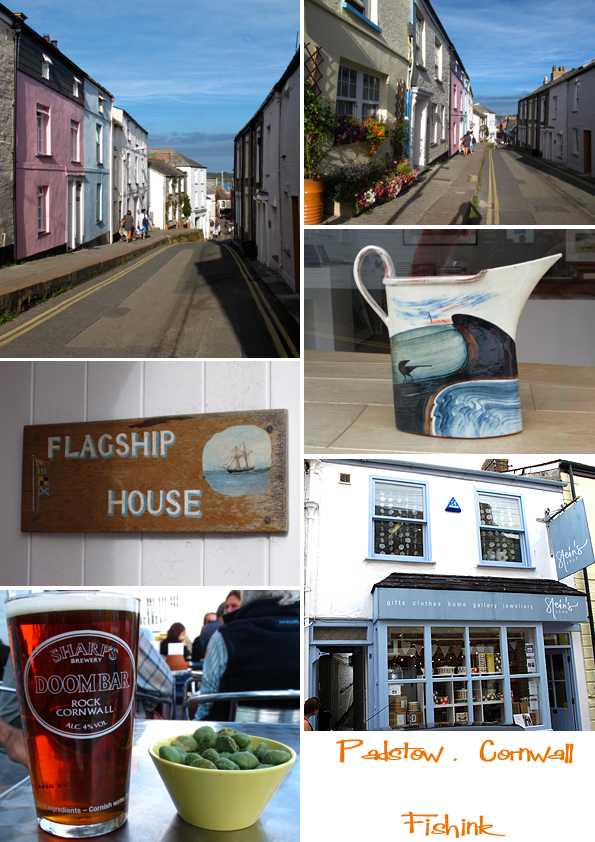
Of course it’s the law to try some of the local Doom Bar nectar, called after the strip of sand that runs
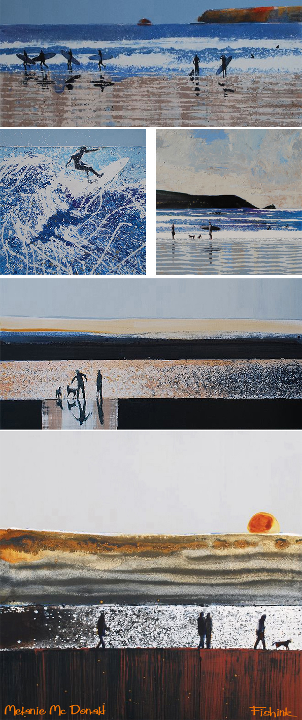
across the Camel Estuary. I saw some beautiful work by Melanie Mc Donald who originates from
Cornwall and is now living in France. I feel that her work captures some of that sparkle of the sunlight
on the water and the essence of the place perfectly. More Cornwall related items to follow.
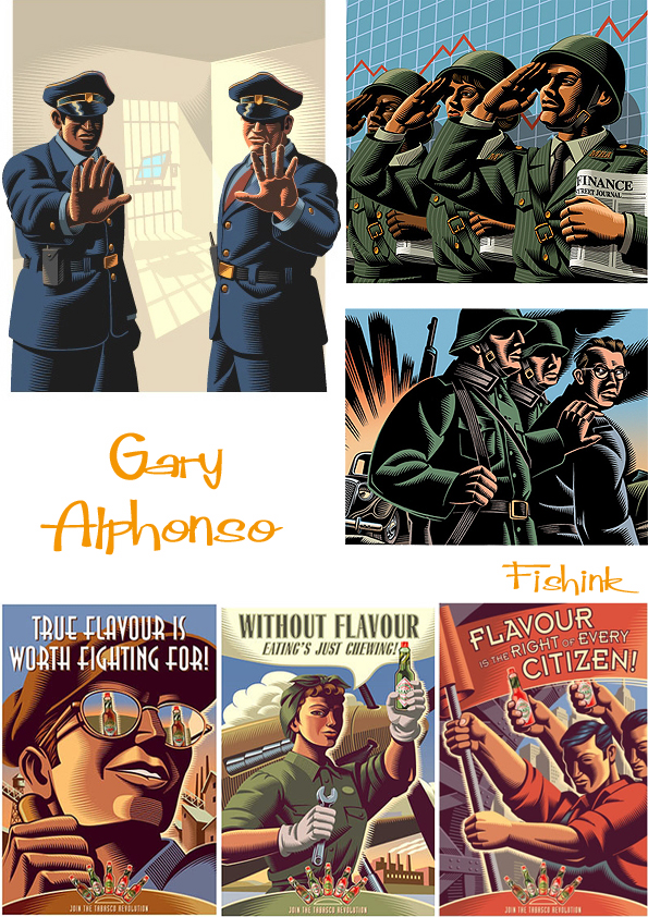
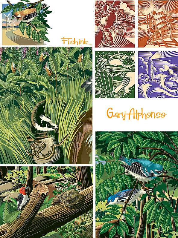
Gary Alphonso. Digital Scratchboard Illustrator.
Gary Alphonso is a freelance illustrator based in Toronto.
In 1982 he graduated from the Sheridan College illustration program and then continued
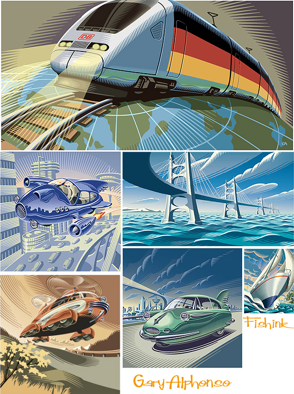
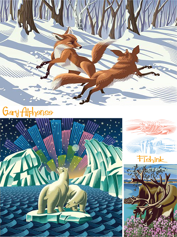
his studies at the Ontario College of Art and Design. His work comes across as very strongly defined,
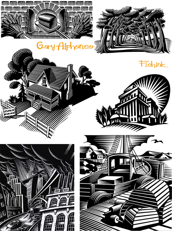
precise, masculine and even military. I like the way he creates shading with his use of lines.
Inspired by early 20th century wood engraving he chose scratchboard as a preferred media.
Gary has since taken his scratchboard style and adapted it to the digital realm which has greatly
broadened the restrictions of the traditional media.
His commissions have ranged from advertising to editorial and book publishing.He has also received
various awards from Applied Arts,Studio Magazine, CAPIC, 3 x 3 Magazine and Communication Arts.
I particularly like his work depicting nature and use of green spaces.
In particular the colouration and use of white to show light in the fox illustration, is beautifully done.
Angela Eata. Childrens’ illustrator
Angel Eata graduated from Wuhan University of Technology where she studied animation.
Angela quickly found acclaim working as a character designer before moving on to work as a
freelance illustrator in 2008. She has worked on a wide variety of exciting projects for children’s books,
publishing and editorial and is always evolving her style.
A lovely colourful and quirky style.
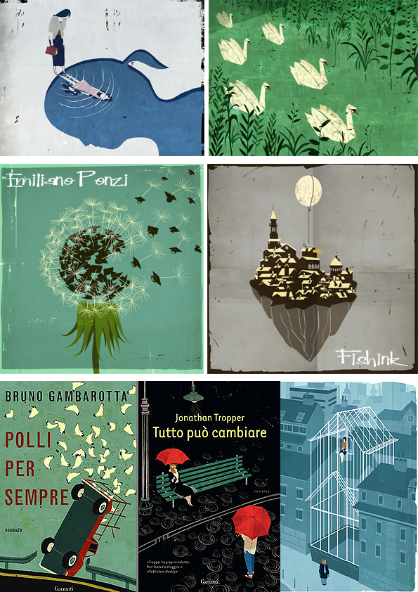
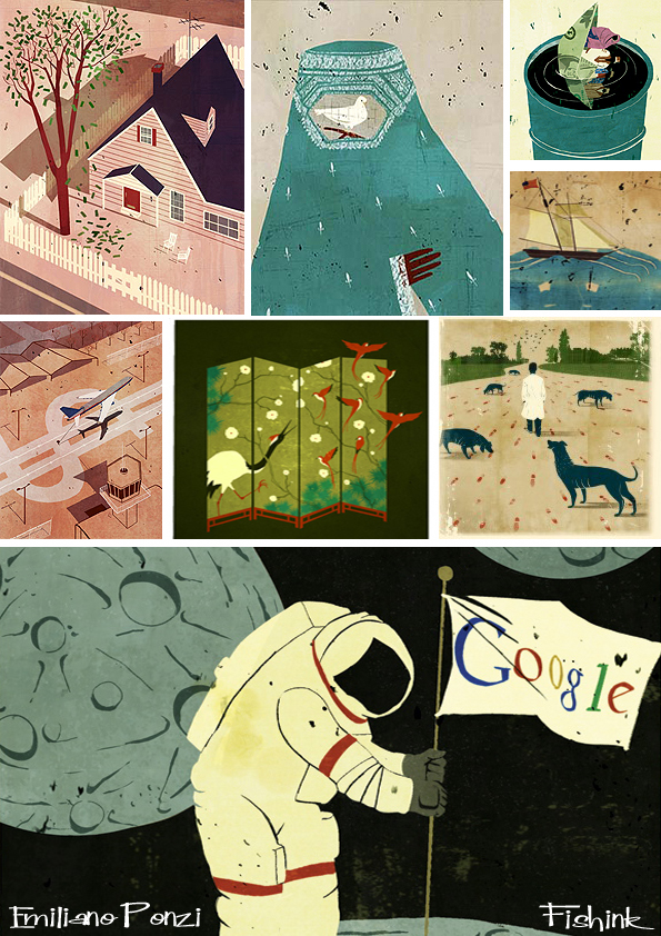
Emiliano Ponzi.
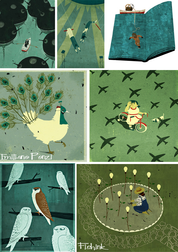
Based in Milan, Italy, Emiliano Ponzi‘s bold textured illustrations use repetition, a precision of line
and strong graphic compositions, to define and communicate the concept at hand.
His sophisticated illustrations have appeared in magazines, advertising, product, publishing, posters,
children’s books and newspapers.
Clients include The New York Times, United Airlines, Business Week, Newsweek, Le Monde, and
The Los Angeles Times. Emiliano has won a silver medal from the Society of Illustrators and a gold and
two silver medals in the 3×3 Magazine Pro Show Awards.
He has been honored by American Illustration, Communication Arts, Creative Quarterly and PRINT.
He has won numerous awards in both France and Italy including the Bologna Book Festival and an
Armando Testa Advertising packaging competition. Also interviewed on Italian TV and is a frequent
guest lecturer at illustration programs in Italy, he’s also spoken at the Savannah College of Art & Design.
Although he’s only in his early thirties, he’s already achieved so much.
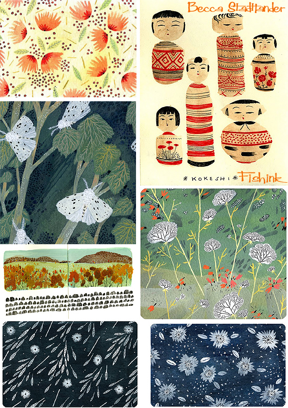
Becca Stadtlander Watercoloured Americana
There’s more to Becca Stadtlander than meets the eye. Firstly she claims to have spent her childhood
‘ rearranging the furniture, fascinated by ballpoint pens and cluttered antiques’.
Secondly she graduated in 2010 , just last year ! from the Maryland Institute College of Art
with a BFA in Illustration and when you see the wealth of illustration on her website and blog,
you’ll be amazed that she isn’t older than her years.
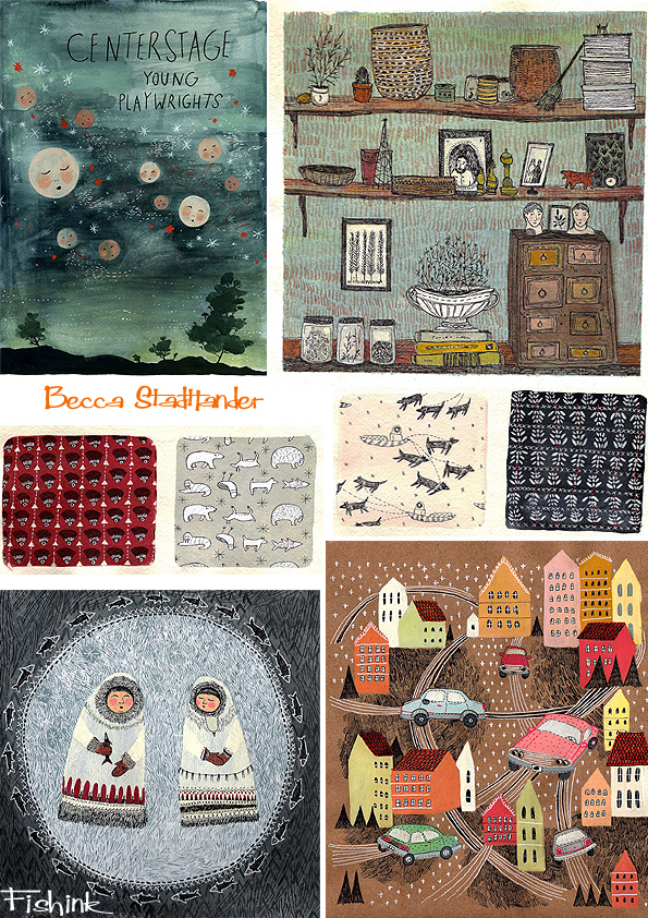
She has a beautiful style of painting on watercolour paper with a great eye for colour and detail.
With a slight fascination with houses, the lives of the Amish and everyday objects.
You can buy one of her lovely prints on her Etsy shop here or follow her blog here.
She is a great mark-maker with a talent for making the ordinary, well less ordinary !
I’m sure we’ll be watching her progress with avid interest, Keep up the lovely work Becca.
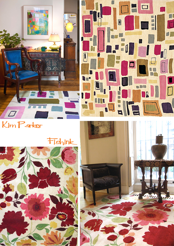
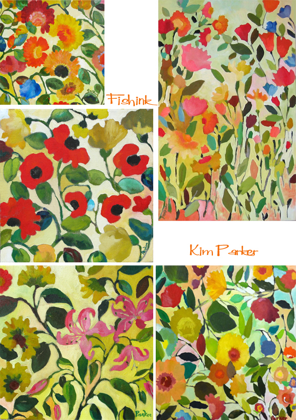
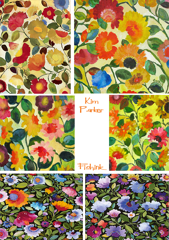
Kim Parker. From Flautist to Florals
I’m someone who is always drawn to hearing how people have managed to change their careers,
hence I found Kim Parkers’ story pretty fascinating. She is an internationally acclaimed artist,
textile designer and author. The British press have called her “the American queen of floral design,
and a pioneer of the new revolution in bold color and pattern design.”
Did you train as a designer?
” No, I trained as a flautist. It wasn’t until my late 20s that I started to think about a career in design.
I’d graduated with a BA in music in 1985, then in 1987 I took my first two painting classes – one in
colour theory and one in oil painting. After a brief time teaching and playing music in Belgium,
I switched to design. My first job was as a colourist in the fashion and textile industry.”
Where did you develop your talent for working with colour and prints?
” By the time I was four, I was producing literally hundreds of bookmarks with tiny floral and geometric
patterns on them. I don’t know where it came from, other than that my parents were talented artists and
musicians, and very early on they introduced me to painters such as Vuillard, Bonnard and Matisse.
I was in awe of these painters’ abilities to combine densely populated patterns on wallpapers, rugs and
upholstery in a room to the point where you couldn’t easily identify the figure.”
” I think my understanding of the interplay between colour and pattern comes from my familiarity
with paintings, fabric designs and even music, since music involves an understanding of rhythm
and dissonance.” (taken from an interview in the Guardian UK in 2005).
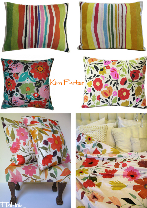
Kim produces a wide range of products including rugs, cushions, fabric, books alongside her paintings,
which she also sells on her site, what clever marketing.
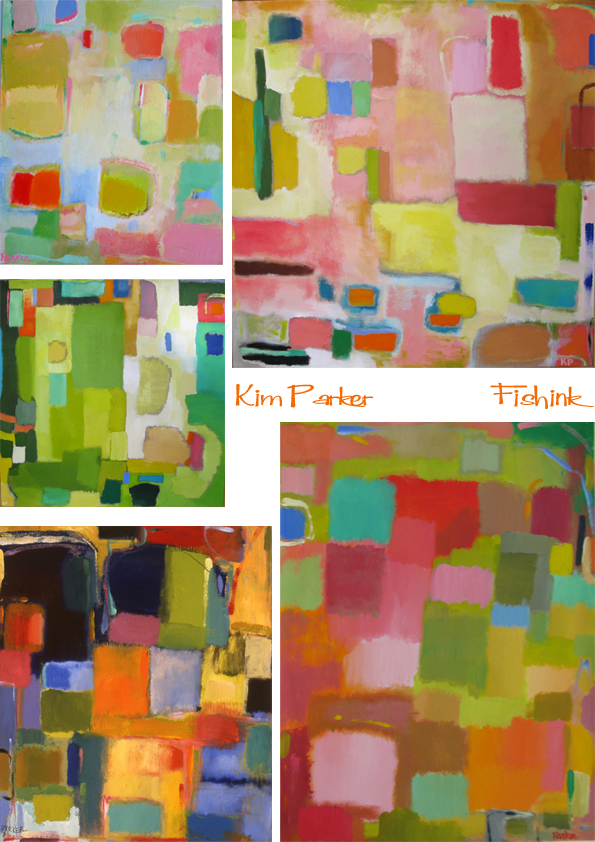
If you’re not so keen on florals, Kim also paints a line of abstracts too, and I bet the colours are even
richer than can be shown here. A great inspiration to us all !
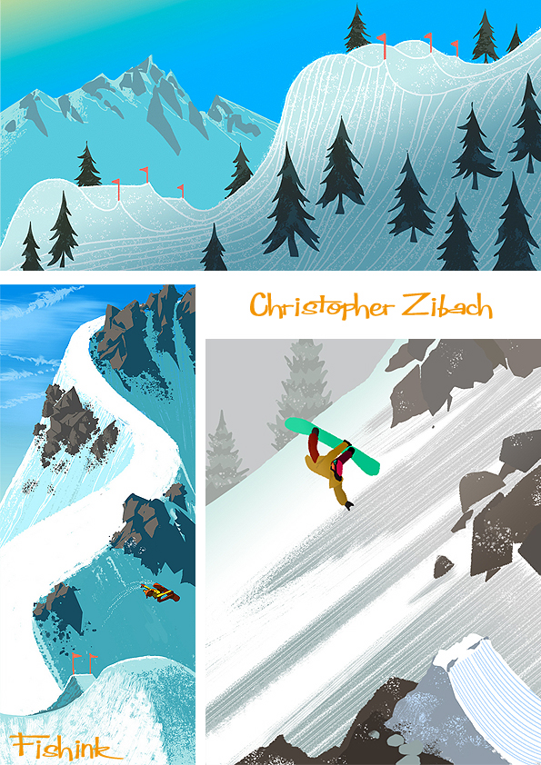
Chris Zibach Illustrator and Snowboarder
Chris Zibach graduated from Art Center College of Design, and is a keen sportsman.
He currently resides in Santa Clarita where he is only an hours drive from waves or snow,
where he can ride a wave or glide down slopes of the white stuff.
His work illustrates his passion for the latter so well.
From contacting and chatting to Chris, I learnt that he now works for Dreamworks alongside the likes
of talented artist Scott Wills whom I blogged about recently. Chris said ” I squeeze any hours for art
making when I’m not surfing, playing video games, day dreaming about snowboarding” You can really
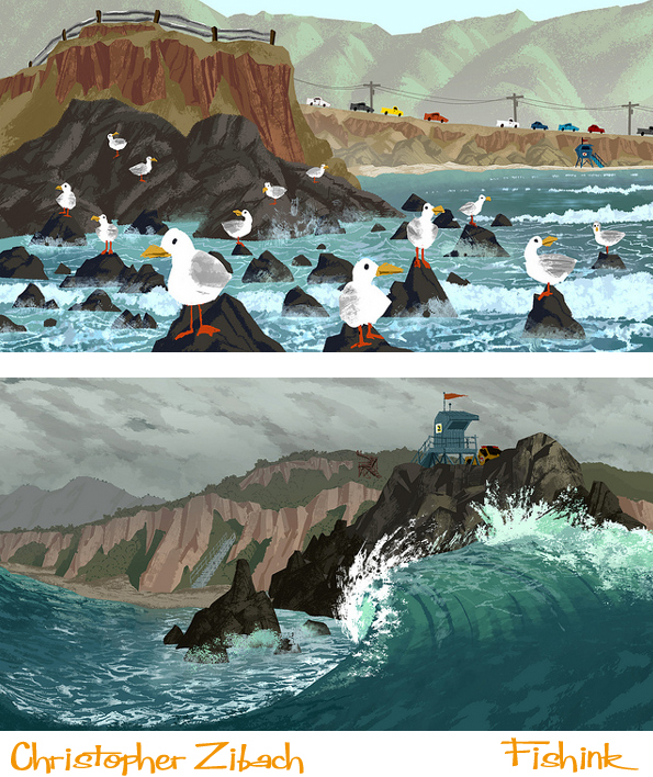
feel the rush of the ride and the cool of the landscape through these. I also like his seascapes below.
Last year Chris had the pleasure of working on Genndy Tartakovsky’s ‘Sym-bionic Titan’.
Chris says.. ” Working for Scott Wills was incredible, so much was learned and was undoubtedly my
most valuable experience to date “. Here’s some of the work from that time.
Great observation and variety in your work Chris, keep up the digital surf mister Z ! .
Brazilian Graffiti Otavio and Gustavo Pandolfo
Brazil is one of the places where graffiti still seems to be booming. Two brothers Otavio and Gustavo
work there under the name of ‘Os Gemeos’, which is Portuguese for ‘The Twins’. They share a
personal and creative bond, equalled only by the relentlessness that fills each brother and spills over
to impel the other further.
They began painting at four and over the last 26 years they have been painting and making their
illustrative marks on the streets and are still among the most prolific and visible of Sao Paulos’ Painters,
with a fearless approach to working in blatently illegal spots and sometimes with risky subject matter.
Their work ranges from lyrical and touching portraits of their beloved family to the gut-wrenching
images of the local homeless, crippled and forgotten. Their sardonic political images of looters,
terrorists, criminals and politicians contrast with those they create from Brazilian folk-tales, literature
and their own personal world of fantasy and self created yellow characters.
Their work continues to challenge, redefine and show what is truly possible with paint in the streets,
regardless of whether the product is called graffiti, street-art, murals or just plain art itself !
Now days they are hailed as celebrities of the graffiti world and invited to countries to decorate walls,
whole buildings and even trains.
You can find some links to their blog here and an interview here.
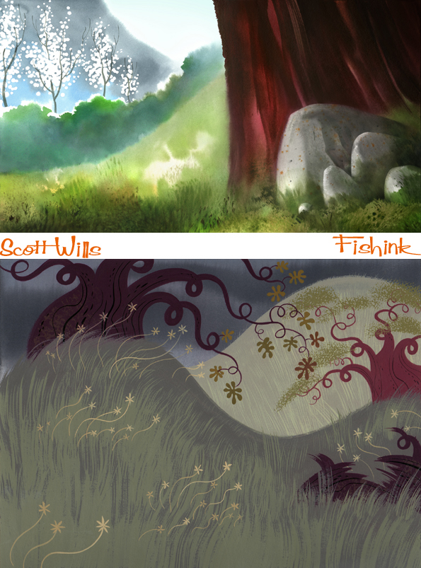
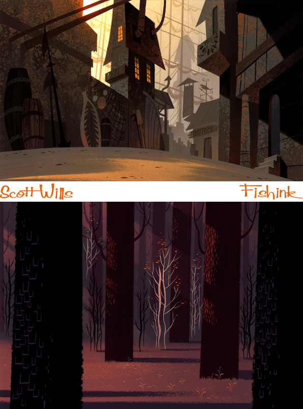
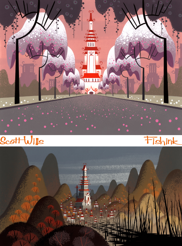
Scott Wills Animated Background Illustrator.
Scott Wills is an amazing artist who creates illustrated backgrounds for animations.
He has received much acclaim for his work on cartoons and films alike and he has painted for such
classics as Ren and Stimpy, Flushed Away, Viking, Clone Wars, Samurai Jack and Monsters V Aliens,
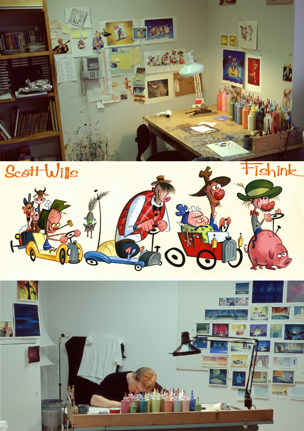
to name but a few. Here’s a glimpse of him at work in the studio, surrounded by his paint pots.
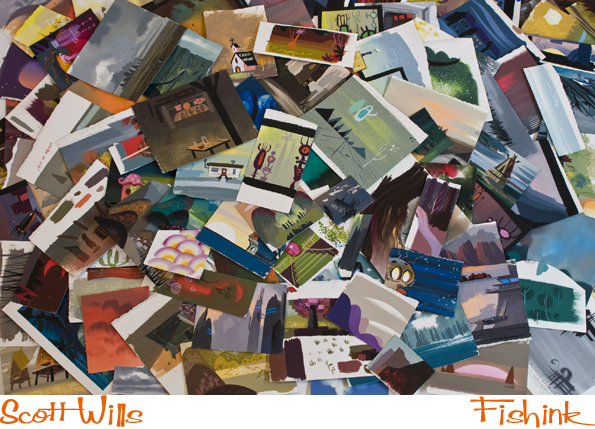
It’s fascinating to see how he meticulously creates thumbnail sketch paintings to work out the colours
he’s going to use, before concentrating on the techniques he wants to create during the final painting.
These images taken from Clone Wars and Sinbad show his command of the medium he works with.
He is also a very versatile contemporary artist and for me has a feel of those old classic painters and
artists I’ve mentioned previously like Mary Blair and Eyvind Earle.
He is as happy painting a forest scene as he is a Viking town or a more futuristic setting.
He has even worked for TV commercials like this one for Nicoderm.
I get the feeling from sites such as John K’s ‘ Stuff ‘ and Amid’s ‘ Cartoon Brew ‘ that Scott has many
admirers who are people connected to the industry in which he works. Amid gave me a great pointer
to a couple of painting technique films available on You Tube and created by Scott.
more demos are available here on You tube itself, watch and learn from the master !
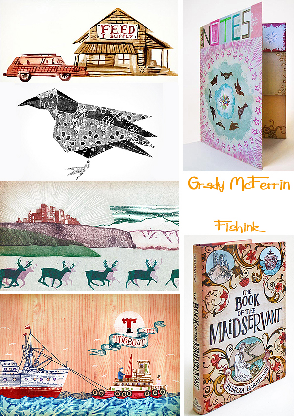
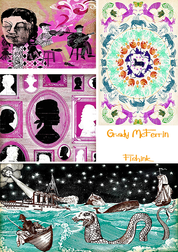
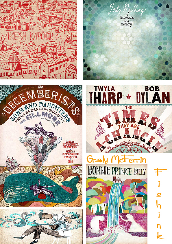
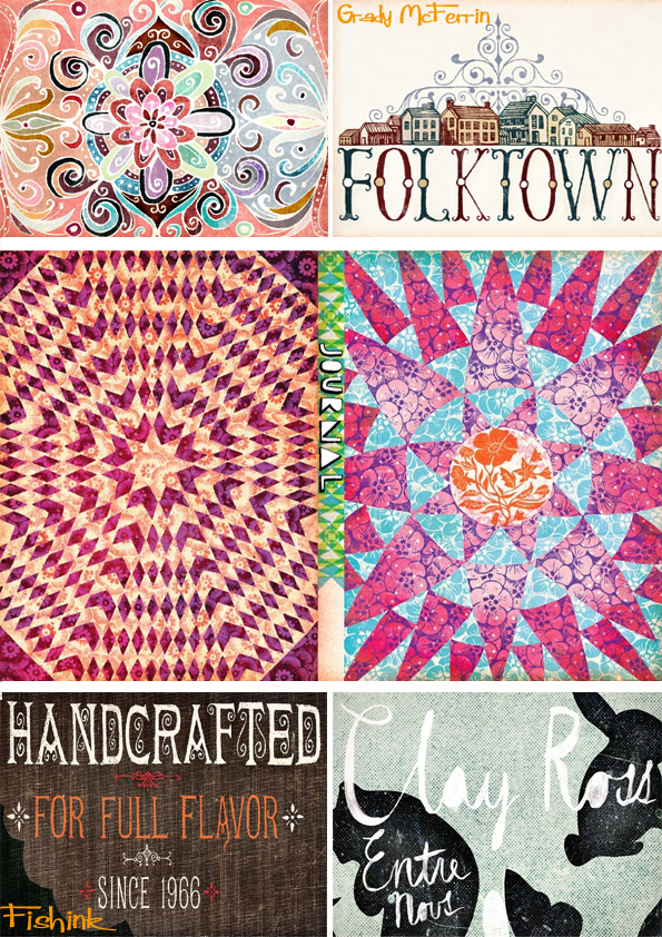
Grady McFerrin. The Brooklyn all rounder
Grady Mc Ferrin is an illustrator, designer and hand-letterer, who lives in Brooklyn, New York
with his wife and two kids. He studied art at Cal State University Long Beach, then moved
to San Francisco, where he learned how to use a letterpress and a computer (in that order),
and began designing numerous rock posters for the Fillmore Theatre.

You may have seen his Chronicle Books stationery line, or one of the many wine labels he’s designed
for Bonny Doon Vineyard ……………………. they make you want to buy the wine for the label alone ! .
His art has also appeared in an assortment of magazines, book covers, packaging, and ad campaigns.
He works on cd covers, band posters, books, stationery items and much more.
His work has been recognized by the AIGA, Communication Arts, The Society of Illustrators,
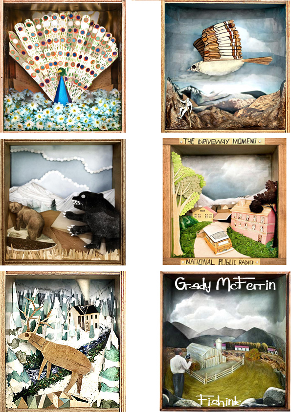
Print Magazine, and American Illustration. Here’s his collection of a little crazy dioramas.
Such a great all rounder and Gradys’ Blog can be found here.
