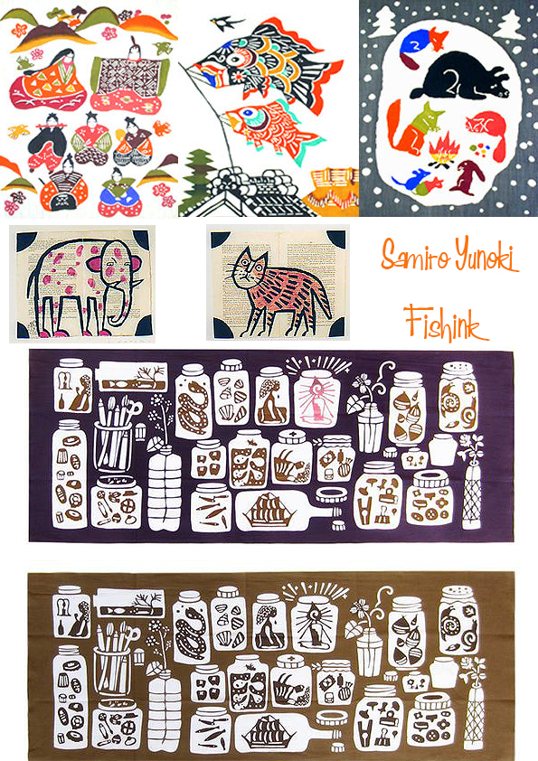
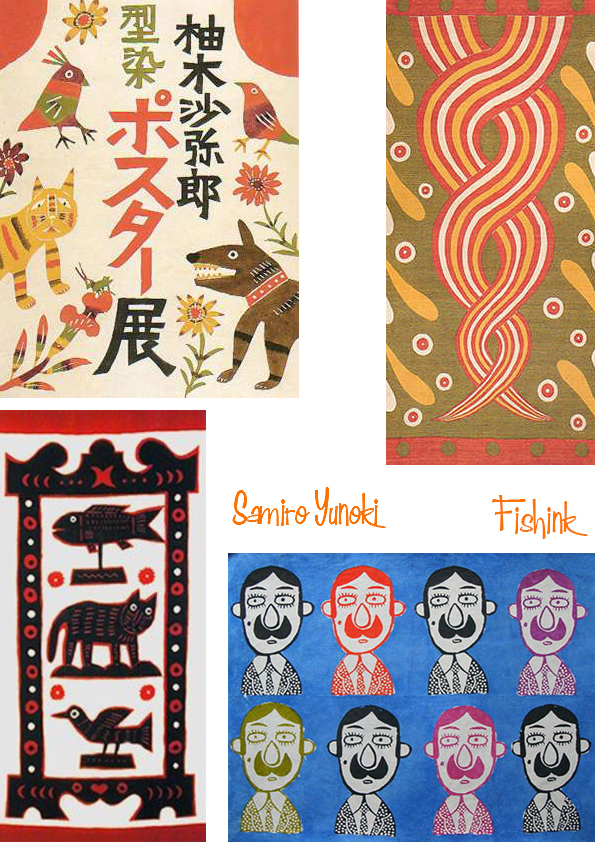
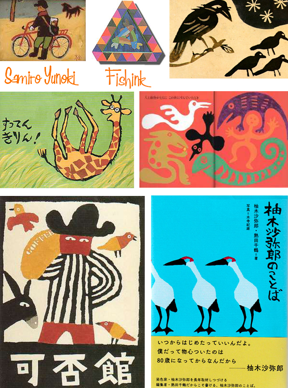
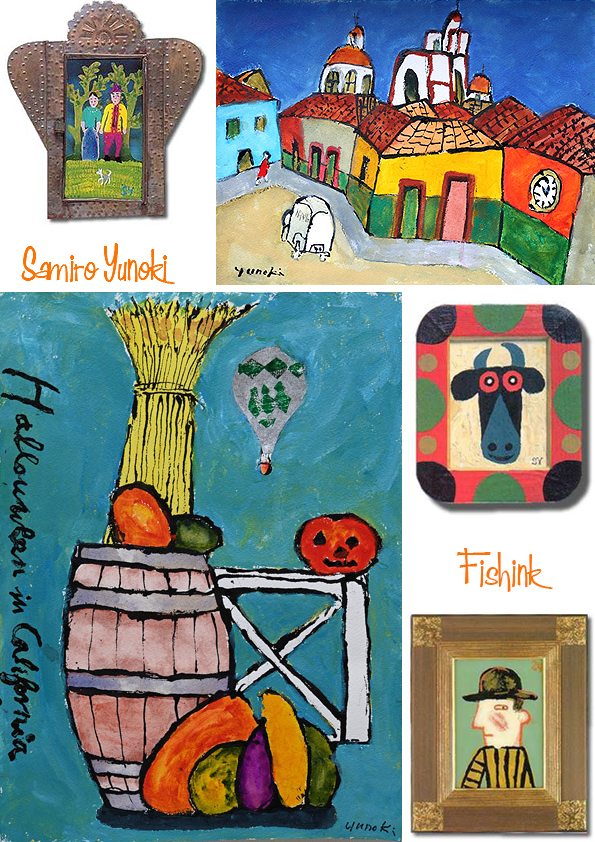
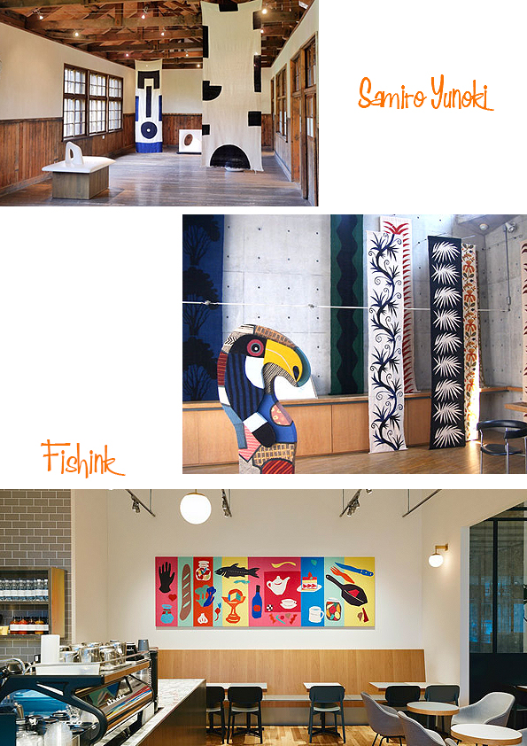
Samiro Yunoki 100 years young !
How wonderful to recently discover the work of Samiro Yunoki who turns 100 this year.
Samiro Yunoki started studying art history at Tokyo Imperial University. He is inspired by the “Folk Art Movement” promoted by Muneyoshi Yanagi.
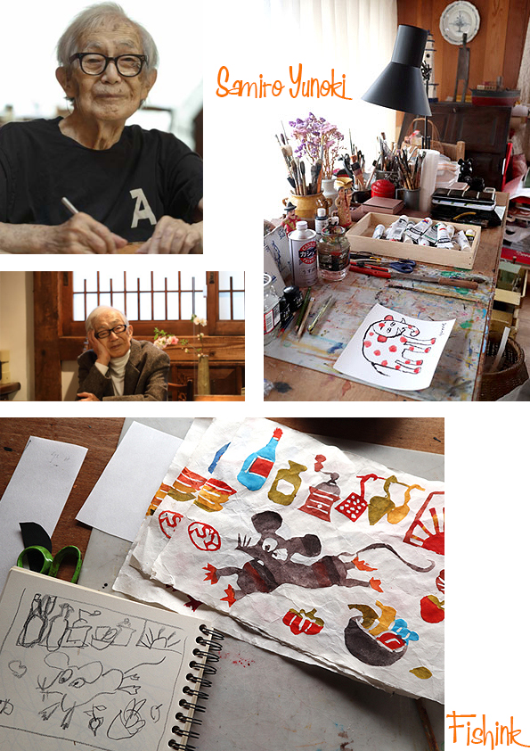
In 1947 Samiro began to work at the Ohara Museum of Art in Kurashiki in Okayama prefecture, a town with rich traditions and a centre of Japanese folk crafts (mingei). While at the museum Yunoki saw a calendar designed by Keisuke Serizawa, a master craftsman in the art of stencil-dyeing (katazome).
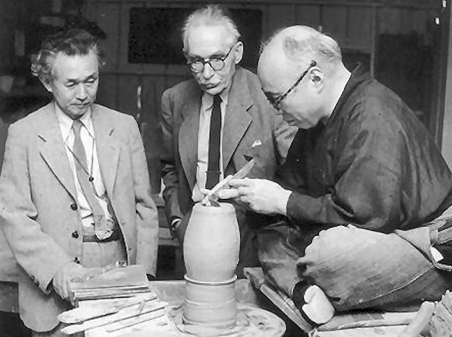
The calendar featured bold patterns printed on rich textured handmade paper. This inspired Yunoki to study the mingei traditions being revived under the guidance of Soetsu Yanagi in a group which included the potters Bernard Leach and Shoji Hamada.
Yunoki decided to devote himself to the study of katazome and armed himself with a letter of introduction from Yanagi when he traveled to Tokyo to meet Yui in Shizuoka prefecture, not far from Mount Fuji.
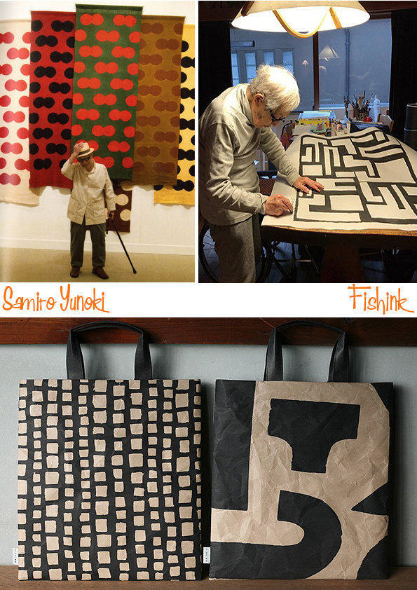
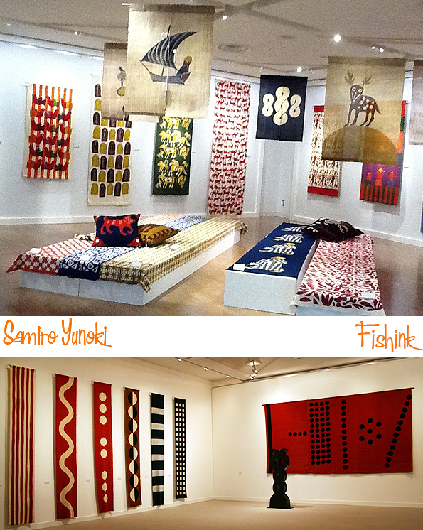
In 1949 Yunoki exhibited at the Kokugakai Tenrankai (a society exhibiting Japanese Arts and Crafts), and has continued to do so ever since eventually becoming its President. In 2003 he led the society in presenting the opening exhibition of the Baillie Scott house, Blackwell on the shores of Windermere following its refurbishment. Yunoki was elected President of the Women’s College of Fine Art in Tokyo, a position he held until his retirement in 1991. He has held two exhibitions in Paris in recent years and most recently exhibited at the Setagaya Art Museum in Tokyo in May 2013.
His characters have such joy and presence to them.

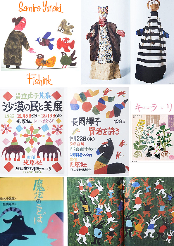
During his artistic lifespan he has been a painter, illustrator, textile designer, sculptor and all round creative genius.
A couple of his paintings.
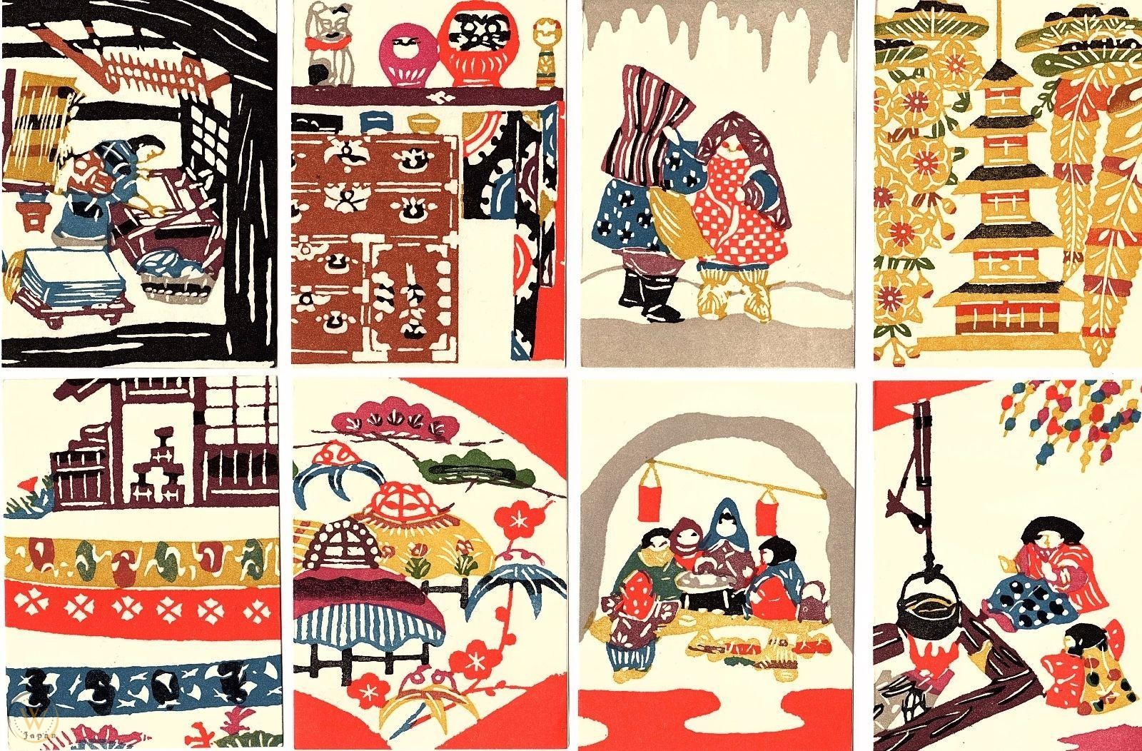
His creative activities, which have spanned over 70 years and continue to this day, include works in which he creates bold patterns on cloth using stencil dyeing. He also produces prints, paintings, sculptures, and picture books. In recent years, he has collaborated with the interior design shop Idée and Ace Hotel in Kyoto, attracting attention from multiple generations.
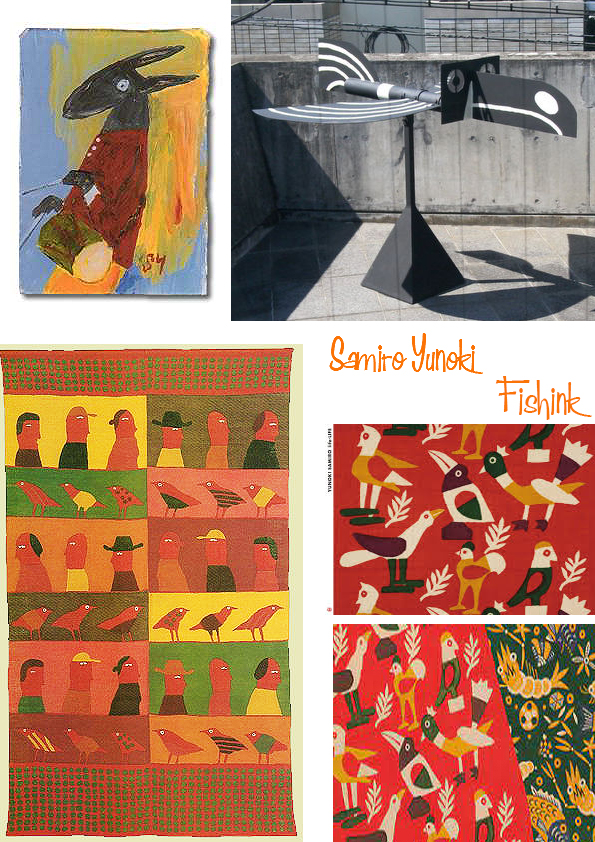
His textile designs will never grow old as they have such vibrancy and movement.
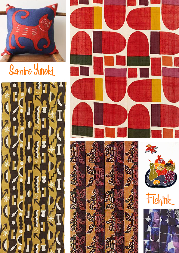
Even his simple shapes gain importance by their grand scale and colour ‘POP’.
His work has been exhibited and loved many times in numerous countries.
There are a couple of older interviews with Samiro here and here. A very Happy 100th Mr Yunoki : )
Fishink Ceramic Sale Feb 2022

Hi Everyone, I hope this finds you well.
Just a short Sunday post to tell you that my first Fishink Ceramic Sale starts today over on my Instagram account (@fishinkblog) at 2PM UKtime. You can find it here or simply go to http://www.instagram.com/fishinkblog or if you are on instagram just search for @fishinkblog and look through my stories (by clicking on the Fishink circle at the top of my feed). Here is a sneaky preview of what will be available.


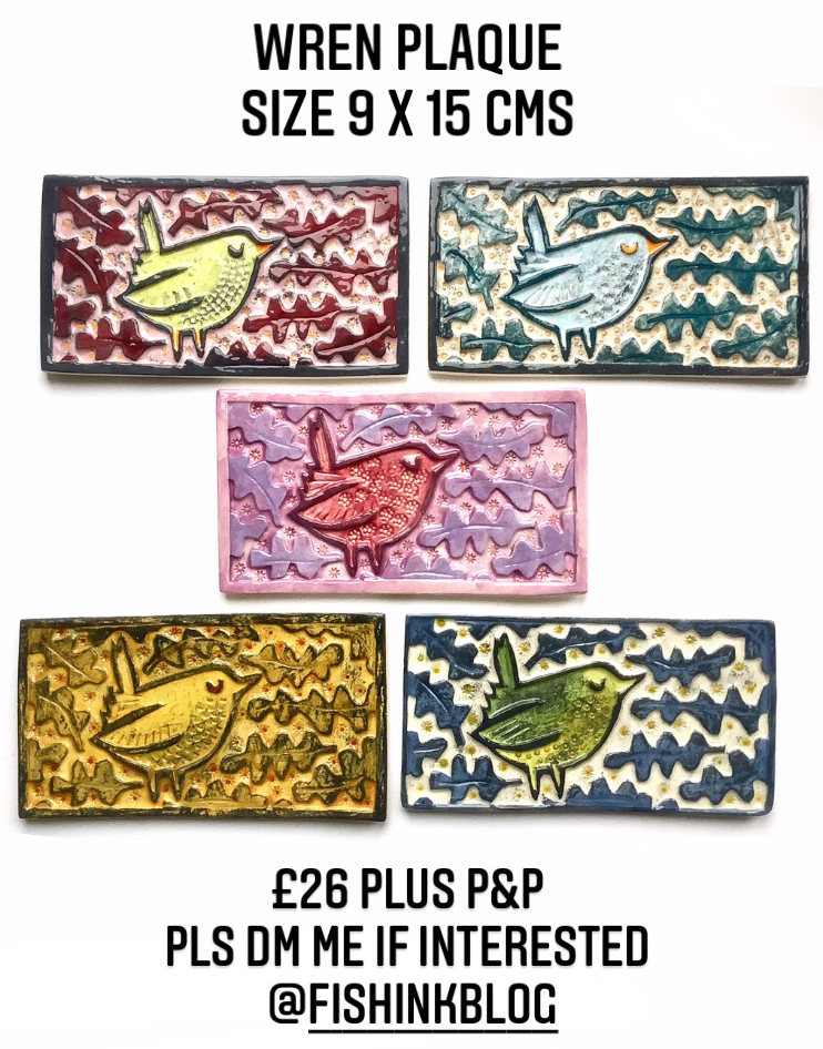

I am showing more than 50 brand new pieces and everything is hand-made and individual. All sales are carried out securely using Paypal (you don’t need a Paypal account to use this) and I ship worldwide. Please pop over at 2pm today and have a browse, pop a reminder on your phone so you don’t forget. If you can share this too, even better, many thanks Craig


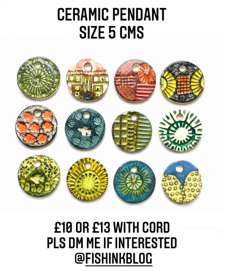
Anything catch your eye ? Don’t forget to follow me when you find me, for more Ceramic news.
See you later today : )
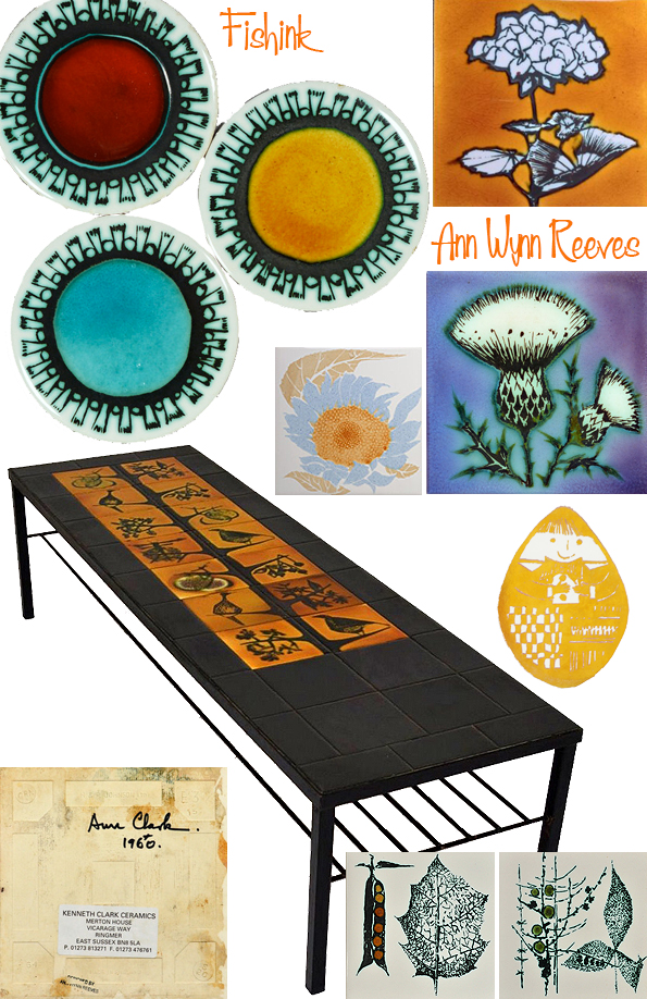
Ann Wynn Reeves An Update
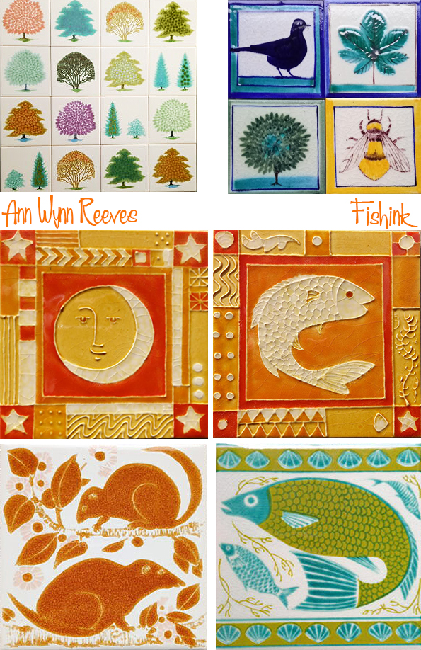
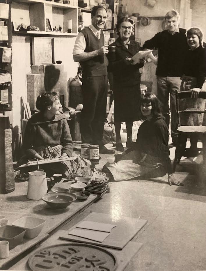
I last posted about the Ceramic Artist Ann Wynn Reeves back in 2018 with this post. Ann was the partner of Kenneth Clark and created motifs to decorate his household ranges of tiles.
Since then, I have been contacted by her neice Lil Tudor-Craig who has very kindly sent me some updated photos of some of Ann’s later work. She is also selling some of the tiles made by her aunt and uncle, Kenneth Clark, which you can view here.

Lil says ” Kenneth Clark Ceramics was set up by my aunt and uncle, Ann Clark (nee Wynn Reeves) and Kenneth Clark, in the early 1950’s. The business ran until the early 2000’s.
They were based in Covent Garden, London until 1980 when they moved the business to Southover Grange in Lewes, Sussex.
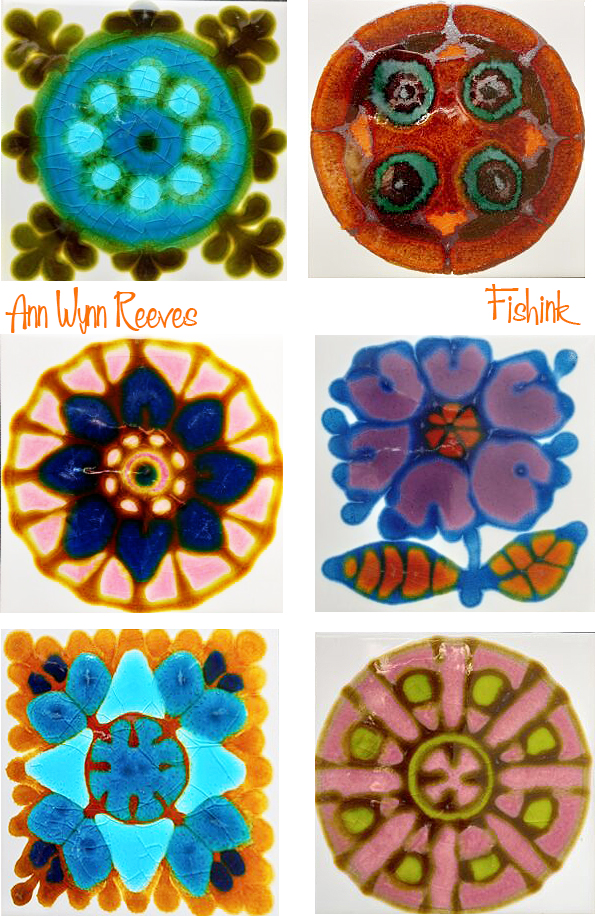

They specialised in hand decorated tiles, mostly designed by Ann, with Kenneth’s richly coloured glazes. Their highly inventive and original work received much acclaim and they were credited with reinventing the tile as an art form.

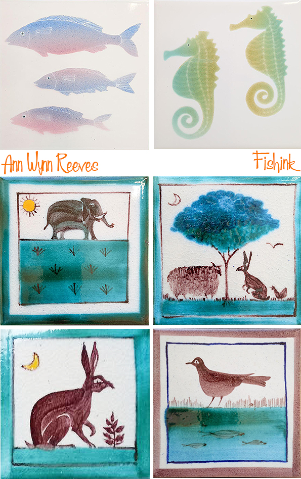
Kenneth developed very faithful reproductions of William Morris, William De Morgan and Philip Webb tiles, recognised as the finest reproduction tiles of these designers. Kenneth and Ann were the acknowledged leaders in the field of hand decorated tiles.
There are examples of their work in the V & A and numerous private collections.
Kenneth was awarded an MBE for his services to the Society of Designer Craftsmen.

Many thanks to Lil for geting in touch and providing me with a host of new images to show you today, including this wonderful image of Ann (far left) and Kenneth (central with mug) in their studio in 1961.
I really enjoyed being updated with your Aunt’s story.
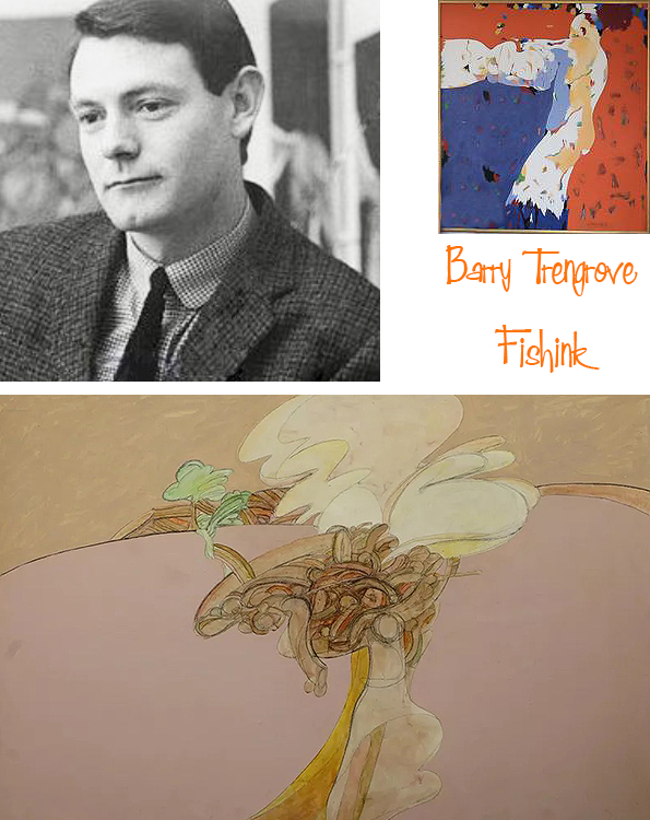
Barry Trengove Creative Artist

Don’t ask me why but I woke up the other morning after dreaming about this classic cover of ‘A Clockwork Orange’ and wondering who the illustrator was. My online investigations led me to a designer called David Pelham in 1972.
During the ‘falling down of yet another google rabbit hole’, I discovered that the original 1962 book cover was created by the artist Barry Trengove, much more to my mid century taste.
Sorry Barry I spelt your name wrongly aongst the illustrations, it’s Trengove not Trengrove!

Barry must have been very much in demand at that time, because a year later he was featured in the 1963 publication “17 Graphic Designers London”. This was an early attempt to present the work and effectiveness of a new breed of designer. The ‘graphic designer’ – at the time the term ‘commercial artist’ was still the general currency. The directory profiled the portfolios of 17 creative high flyers of the time – Dennis Bailey, Derek Birdsall, BDMW Associates; George Daulby, George Mayhew, Peter Wildbur, Ian Bradbery, David Collins, Bob Gill, Alan Fletcher, Colin Forbes, Sydney King, Jock Kinneir, Margaret Calvert, Romek Marber, John Sewell, Barry Trengove, Tom Wolsey.
Here are a couple of pages taken from that publication.

Around the same time Barry added a few other well known book covers to his portfolio including this one for Leonard Cohen’s novel ‘The Favourite Game’ published in ’63.

That’s where the trail on Barry’s work goes cold, apart from discovering that he went on to have a career as a painter and Art Director.
Finally I discovered this article from Alzheimer’s Australia New South Wales 2007 publication written by Kay Barnes, Barry’s partner. She talks about Barry’s diagnosis with Alzheimer’s Disease and how it affected his work.

If anyone else has any images of his book covers, illustration or paintings, please get in touch to help fill in some of the gaps in Barry’s creative life. Thank you
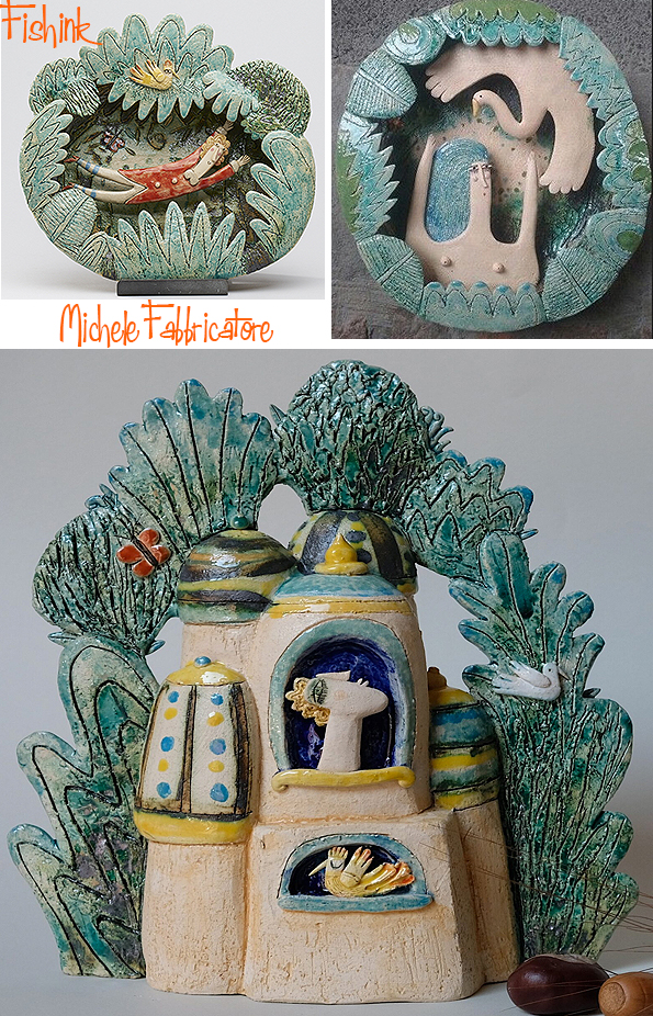
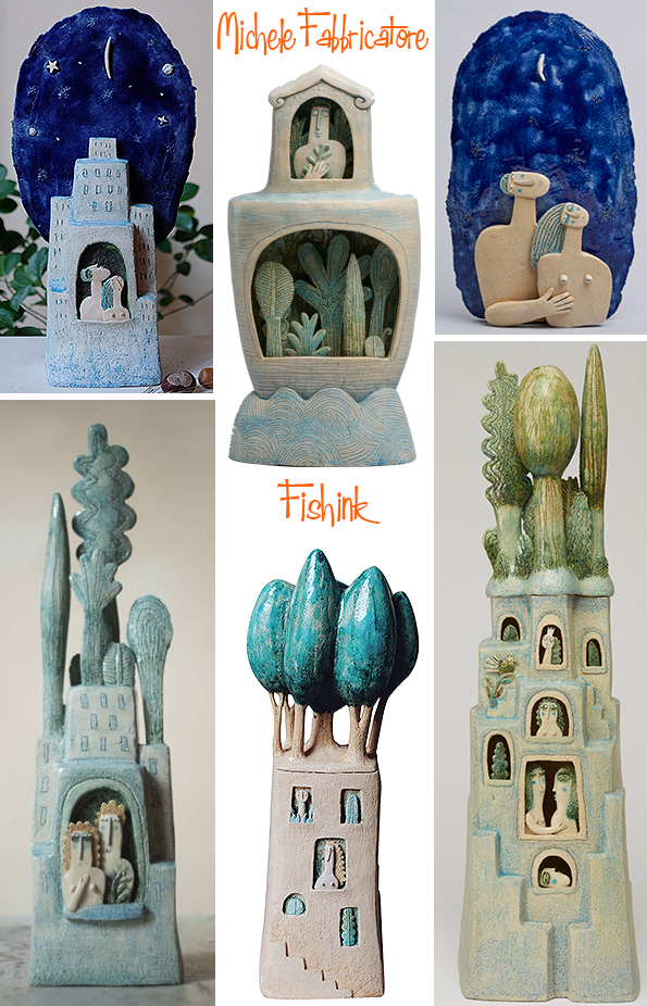
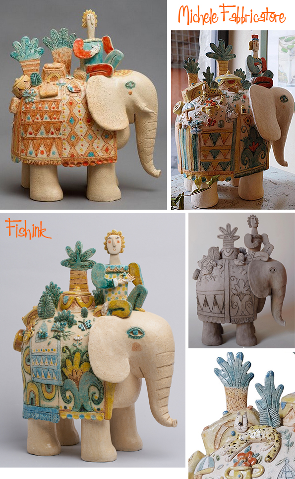
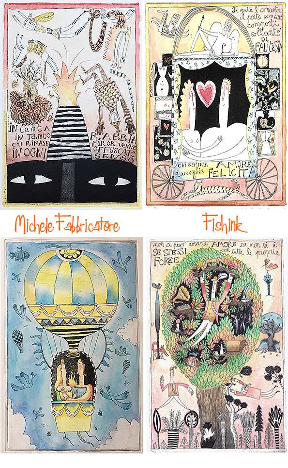
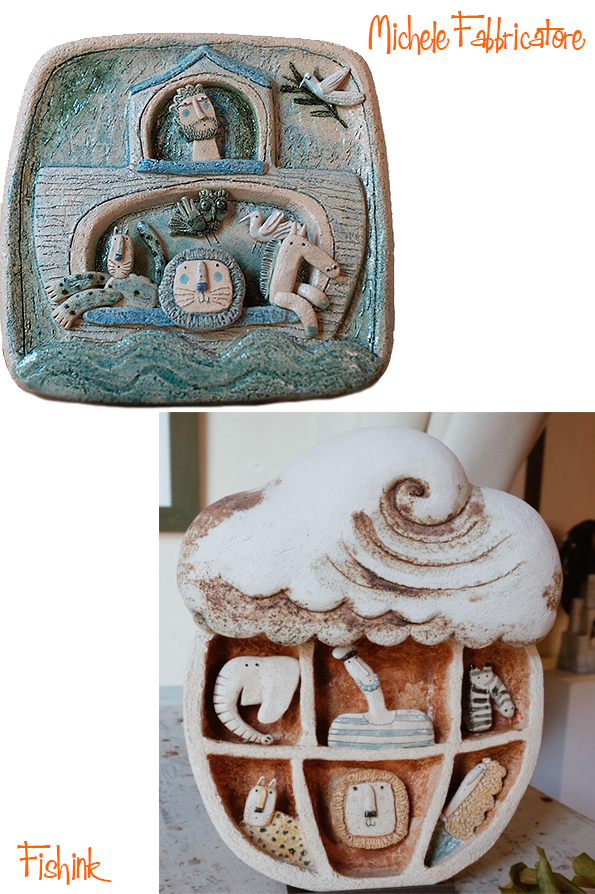
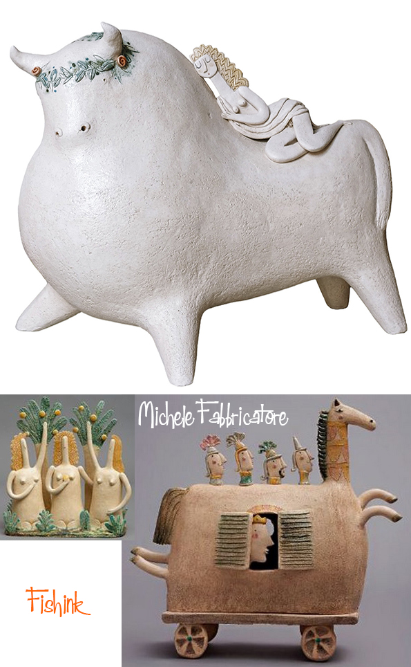
Michele Fabbricatore Ceramics of Myth & Fantasy

The humour and fabulous characterisation in the work of Ceramist Michele Fabbricatore, are just two factors that made me want to feature this artist here today. Michele creates narrative snapshots in clay which somehow capture mood, drama and illustrative conversation in every ceramic form.
Michele was born in Florence in 1972, he presently lives and works in Pistoia, a small and ancient Tuscan city. Since childhood he has been passionate about drawing and sculpture. He graduated from the Academy of Fine Arts in Florence in sculpture and subsequently attended courses in engraving and graphics at the international school “Il Bisonte” and the Armadillo Atelier in Florence. He also attended several workshops of the International School for Childhood Illustration in Sarmede (TV).
I contacted Michele to find out more.

How much does humour come into your work and why is it important to you ?
Irony is often found in my work for I find it is important to give happiness and lightness to people. I see art as a means to find resonance within “the best part of ourselves”


What are your earliest memories concerning drawing and working with clay ?
I come from a family where no one had ever put interest into art, I was the black sheep and started drawing and playing with pongo at the age of five. I had an inborn love for art and a natural predisposition for it. As I grew up I went through a family battle to be able to do the Arts Academy in Florence, which ended in them giving up in front of my determination. They later had to admit I was right.


Where did your idea to incorporate Fairy Tales and Folklore into your work originate ?
Myth and fables are often found in my work for they represent the archetypes, it is within them that man can see himself and his most intimate and deep aspirations reflected, together with his fears. It’s a way for him to look inside himself and get to know himself.

Where do you see your work going in the future ? Would you like to work in animation or create more books for example ?
In the future I would like to be able to create a school where I can transfer all my knowledge and love for this discipline. A place where one can regenerate and feel better than how he entered.

I see that you have always worked with illustration from an early age. Do you think that working with clay and creating your drawings in a 3D form, felt a very natural progression to make ?
Surely in my illustrated story books it is easy to recognize the characters of my ceramics and find my whole world. In respect to ceramics, drawing allows me to be more “abstract”, to be able to create new worlds and atmospheres which allow me at the same time to make new discoveries and regenerate.

What subject matter delights you to work with the most and which piece in particular has been your most fav to create and why ?
In this moment in time my favorite theme is the relationship between man, nature and the city. Maybe because it is tied to the contemporaneity and to what is happening. In fact, lately I have made an illustration which represents a little bit of the mirror of our society with its frenetic and unhealthy life, but, if searched for, one can find an intimate space to listen to oneself and create a place of interior peace.


You like to remake similar stories (like the prince and princess) multiple times. What drives you to retell those tales visually again and again and does the tale vary in your mind with each remake or retelling ?
Yes, some themes repeat themselves but my repetitions are not “to do the same thing” but the opportunity to better myself every time and find that perfection which has no end.
Watching this progression is my engine and gives my spirit the occasion to “keep searching” in art as in life. I hope it will never end!


Fabulouly inpirational work Michele, we hope your inspiration will never end too !
Thank you so much for joining my Fishink Blog contributors today. You can keep up to date with Michele’s work through his Instagram account here.
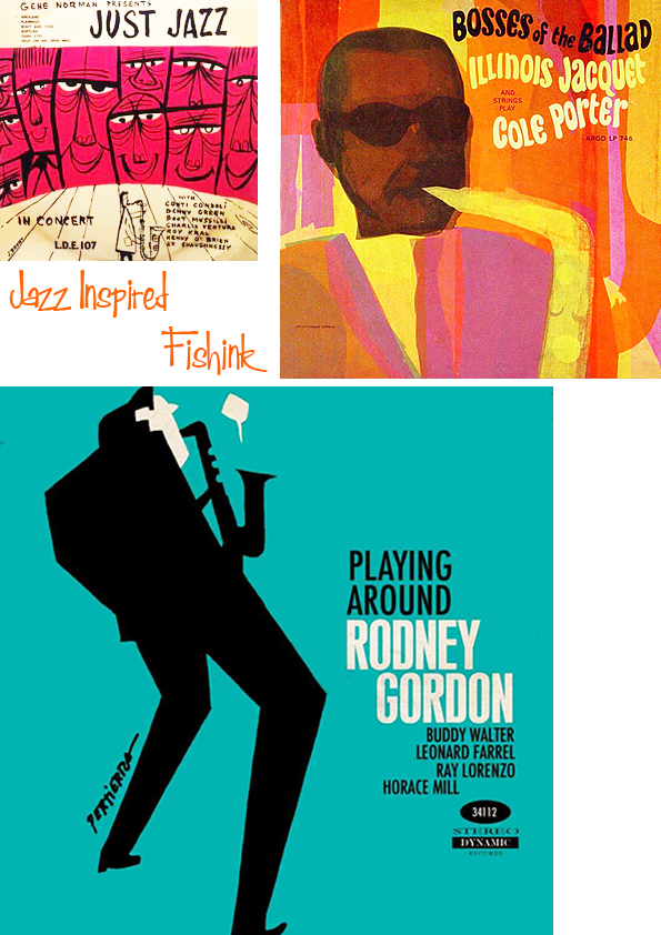
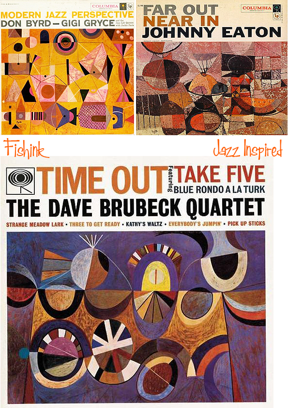
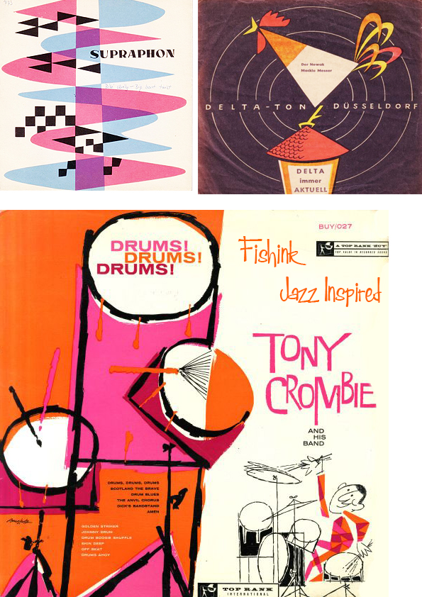
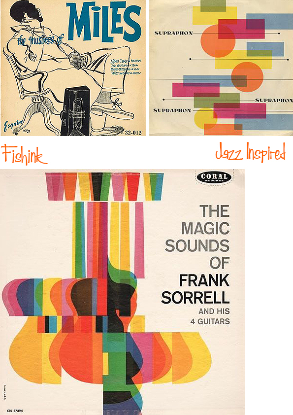
Jazz Inspired Posters and Record Covers

I’m sorry to say that I’ve never managed to get to grips with Jazz, that’s not to say that I don’t appreciate the laid back vibe behind it, but give me a fab Mid Century Record Sleeve that is Jazz inspired and I’m as giddy as the next Jazz aficionado !
Jazz is a music genre that originated in the African-American communities of New Orleans, Louisiana, United States, in the late 19th and early 20th centuries, with its roots in blues and ragtime. The origin of the word jazz has resulted in considerable research, and its history is well documented.

It is believed to be related to jasm, a slang term dating back to 1860 meaning “pep, energy”. The earliest written record of the word is in a 1912 article in the Los Angeles Times in which a minor league baseball pitcher described a pitch which he called a “jazz ball” “because it wobbles and you simply can’t do anything with it”.

Since the 1920s Jazz Age, it has been recognized as a major form of musical expression in traditional and popular music, linked by the common bonds of African-American and European-American musical parentage. Jazz is characterized by swing and blue notes, complex chords, call and response vocals, polyrhythms and improvisation. Jazz has roots in West African cultural and musical expression, and in African-American music traditions.

As jazz spread around the world, it drew on national, regional, and local musical cultures, which gave rise to different styles. New Orleans jazz began in the early 1910s, combining earlier brass-band marches, French quadrilles, biguine, ragtime and blues with collective polyphonic improvisation. In the 1930s, heavily arranged dance-oriented swing big bands, Kansas City jazz, a hard-swinging, bluesy, improvisational style and gypsy jazz (a style that emphasized musette waltzes) were the prominent styles.


Bebop emerged in the 1940s, shifting jazz from danceable popular music toward a more challenging “musician’s music” which was played at faster tempos and used more chord-based improvisation. Cool jazz developed near the end of the 1940s, introducing calmer, smoother sounds and long, linear melodic lines.


The mid-1950s saw the emergence of hard bop, which introduced influences from rhythm and blues, gospel, and blues, especially in the saxophone and piano playing. Modal jazz developed in the late 1950s, using the mode, or musical scale, as the basis of musical structure and improvisation, as did free jazz, which explored playing without regular meter, beat and formal structures.

Jazz-rock fusion appeared in the late 1960s and early 1970s, combining jazz improvisation with rock music’s rhythms, electric instruments, and highly amplified stage sound.

In the early 1980s, a commercial form of jazz fusion called smooth jazz became successful, garnering significant radio airplay. Other styles and genres abound in the 2000s, such as Latin and Afro-Cuban jazz.
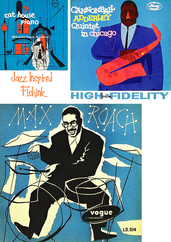
Many thanks to Wikipedia for the information used here today and if interested you can learn a little more specifically about Jazz Record Covers here.
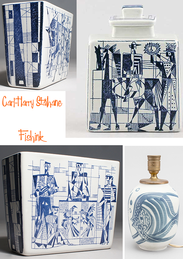
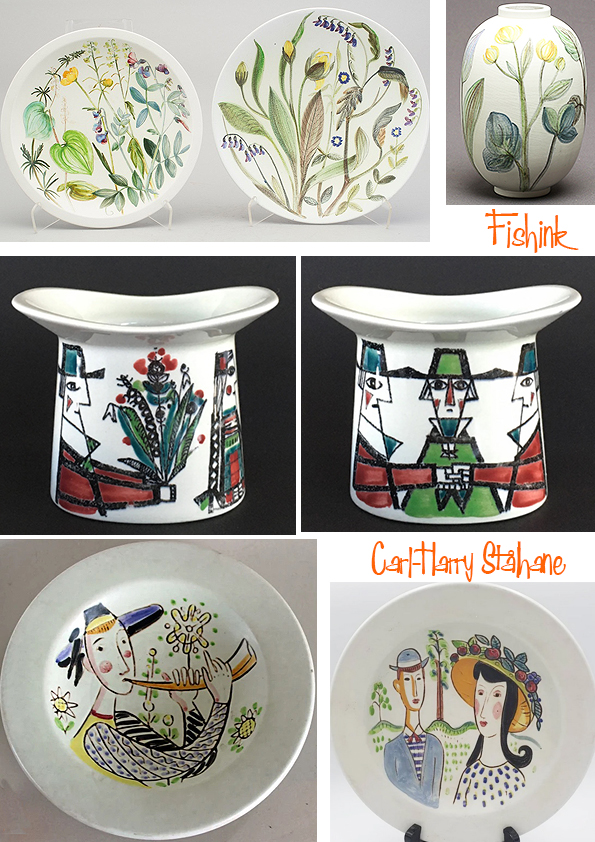
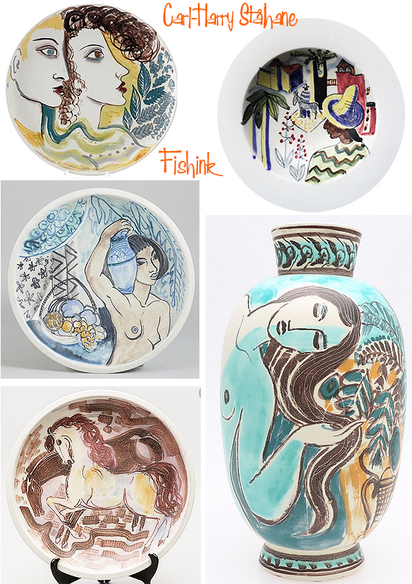
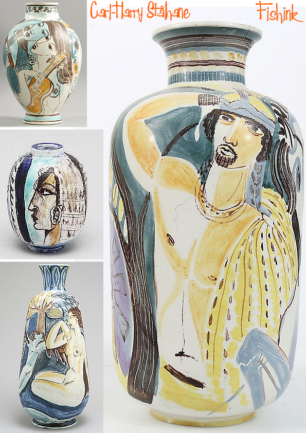
Carl-Harry Stålhane Swedish Midcentury Ceramist

Carl-Harry Stålhane (1920-1990) was born in the town of Mariestad, in the west of Sweden. As a child, he dreamed of being a successful painter. He started working for Rorstrand in neighboring Lidkoping at the age of 18. Initially, he decorated ceramic wares as assistant for the leading artist Gunnar Nylund. Carl-Harry decorated Rorstrand’s exclusive Flambé range as well as producing idyllic floral designs.

The managing director of Rorstrand soon became aware of the abilities of his young decorator. When the prominent Swedish artist Isaac Grünewald came to Rorstrand to prepare some work for an exhibition in 1943, Carl-Harry was made Grünewald’s assistant. Grünewald’s art and his strong personality were to act as a source of inspiration for the rest of Carl-Harry’s life.
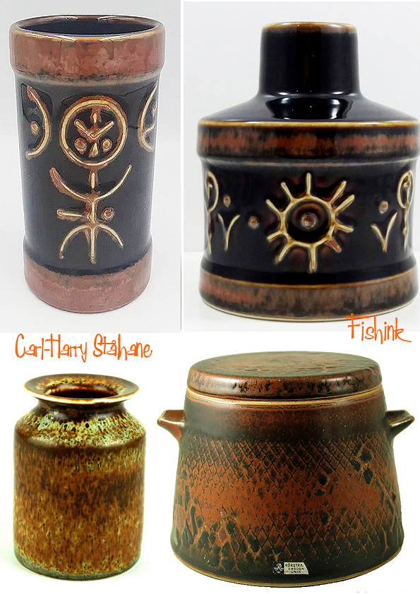
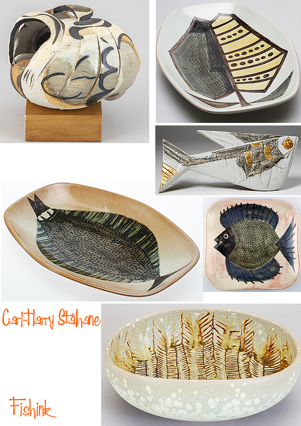
In the mid 1940s, Carl-Harry Stålhane began to develop his own stoneware. He had his first solo exhibition in 1948, impressing the public with an ability to work in most contemporary styles of stoneware. But after studying in Paris in the late 1940s, Carl-Harry found a style that was truly his own. Inspired by the hunger for new products to meet the post-war economic boom, he developed from being a gifted decorator to a first-rate ceramic artist.
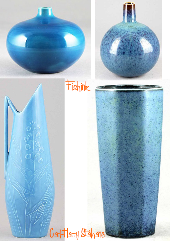

He was praised for his “column-like, slender-necked stoneware vases with their peach surfaces”, as one magazine put it. Spurred on by a deep love of the ceramic wares of the Far East, Carl-Harry liberated himself from the European tradition of ceramics, finding inspiration in foreign cultures, in Picasso and in constructivist art.
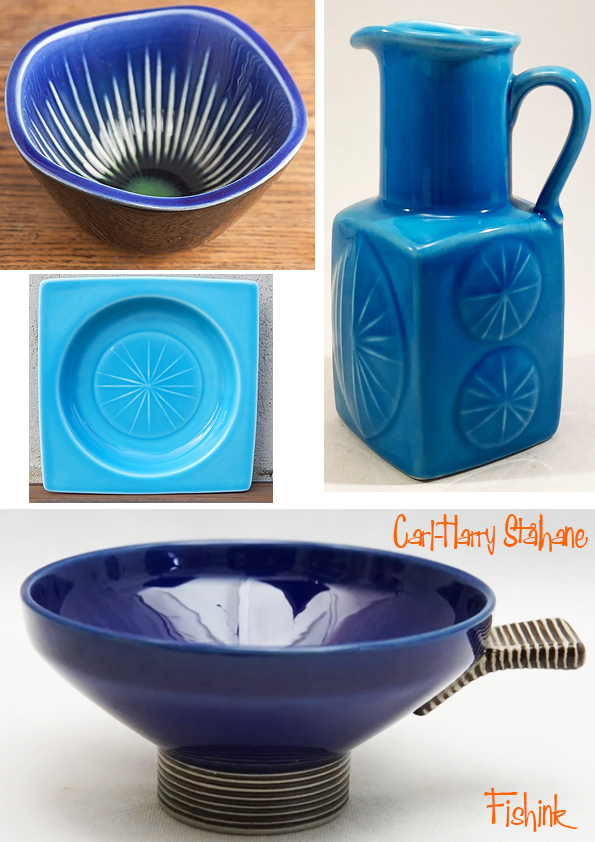

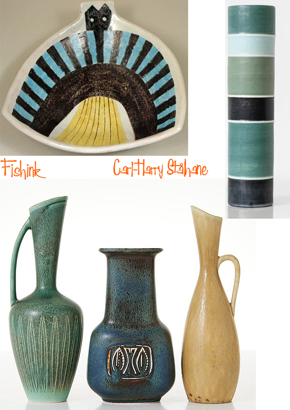
The 1950s brought major successes: a diploma and a gold medal at Milan Triennials as well as solo exhibitions in Sweden, the UK and the USA. Carl-Harry commenced his career as an industrial designer in 1954. His Blanca tableware — in elegant white porcelain — was much in demand and gained him international prizes. He designed almost everything from numerous table sets decorations to rustic ashtrays.
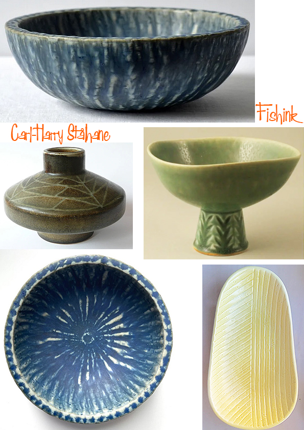
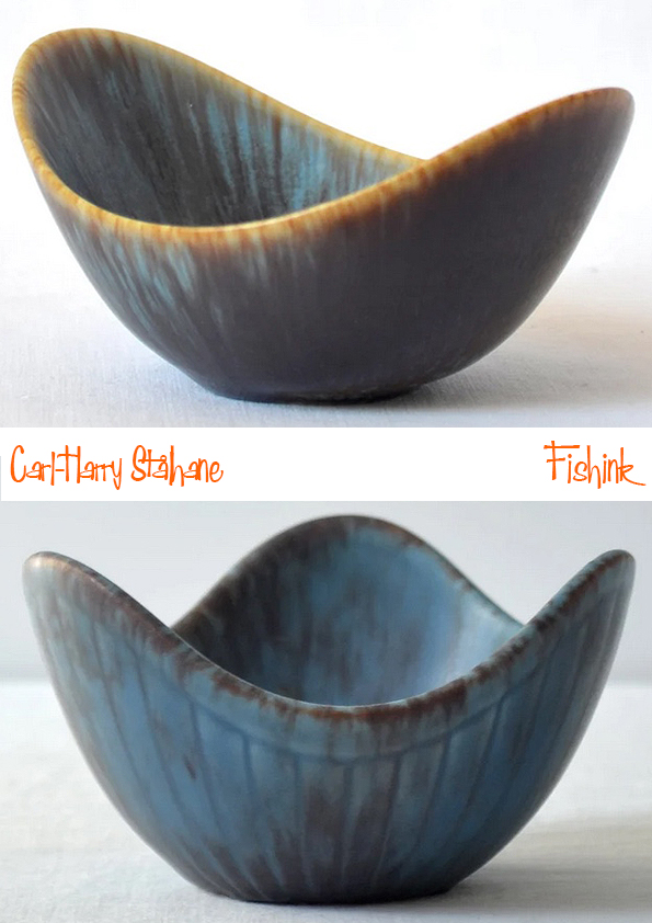
Carl-Harry Stålhane’s production of unique ceramic works of art increased notably in the late 1950s. In 1960 he reached something of a peak with an exhibition at Galerie Blanche in Stockholm. The exhibition showed robustly dark wares that were hailed as the new ceramics of the sixties, a “rebellion against perfectionism”. These massive stoneware pieces, using local clays, were to characterize Carl-Harry’s work in the sixties.
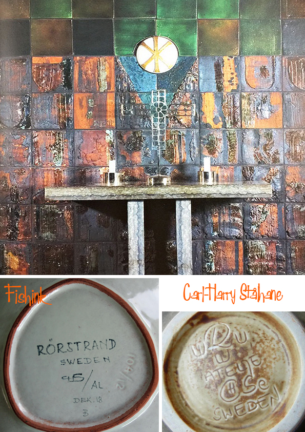
This is a detail from “Dynamik” (1963), a large stoneware wall sculpture at the SAAB Headquarters in Trollhättan, Sweden.


The 1960s also brought commissions for public works of art. He found ways of expressing his art on walls and in space with a magnificent hybrid of stoneware and architecture.

Carl-Harry and his assistants produced major commissions for companies ranging from automobile manufacturers to sports arenas. His largest wall decoration, covering some 54×54 meters, portrays a rocky landscape. It was created for the Commerce Tower in Kansas City in 1964.


Carl-Harry Stålhane left Rorstrand in 1973 since he felt that the company no longer valued the artists. With a couple of colleagues he started Designhuset which was a ceramics studio sited in a former waterworks outside Lidkoping.
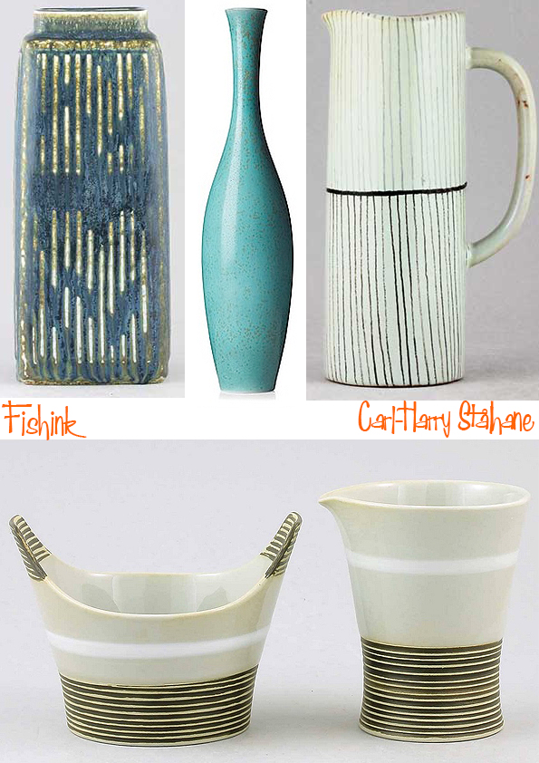
The new company rapidly produced a series of unique art ceramics as well as simpler wares for the home. Carl-Harry reached new heights as a ceramic artist with his spontaneous, calligraphic decor on porcelain and stoneware. During the early Designhuset years, Carl-Harry was still as vigorously professional as he had been at his debut almost forty years earlier “It is essential to be curious and adventurous in ones work”.

The last years of Carl-Harry’s life was marked by ill health and his youthful enthusiasm was less in evidence. He died in 1990 during his lunch break on a normal working day. Designhuset still lives on as a school where ceramists and model-makers are trained. Carl-Harry left a legend of high ceramic quality, magnificent creative design and brilliant craftsmanship.

Many thanks to Mother Sweden for the info on Carl-Harry, you can find a great selection of his work available to buy here on their site.
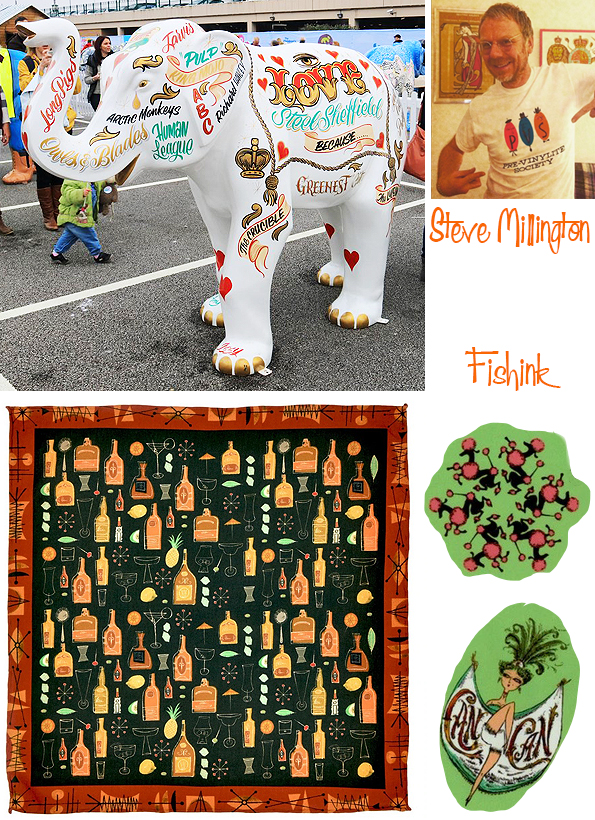
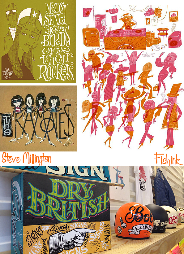
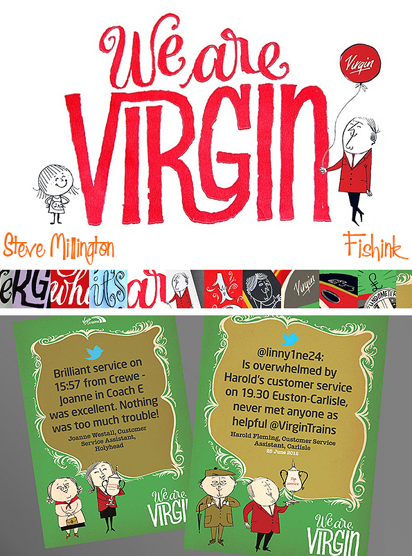
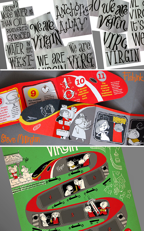
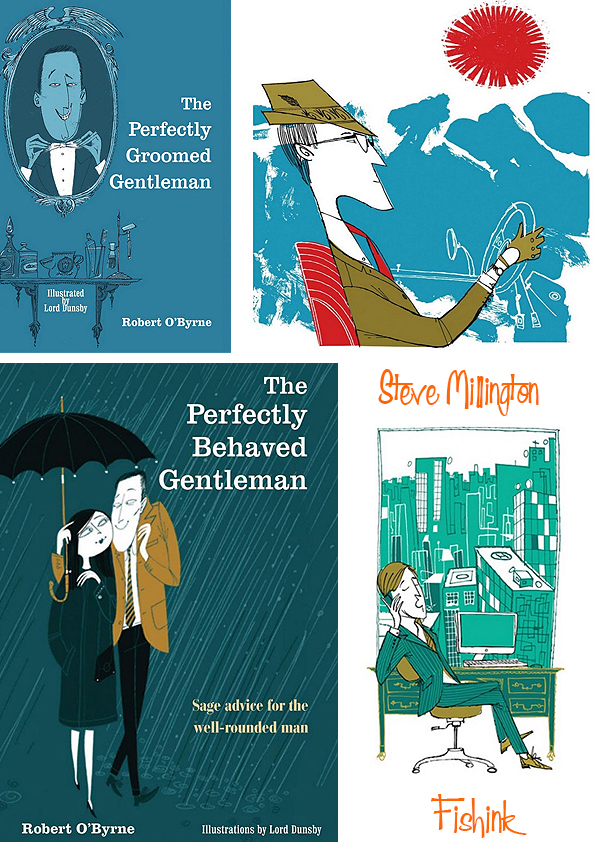
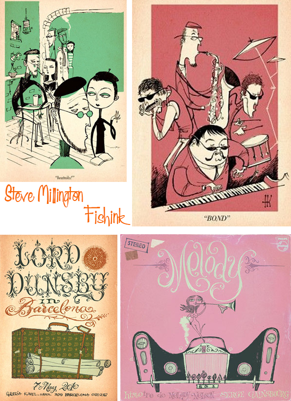
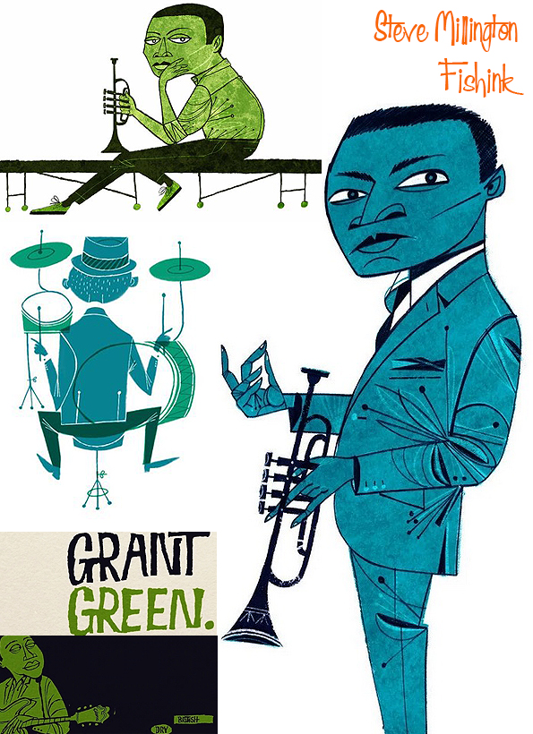
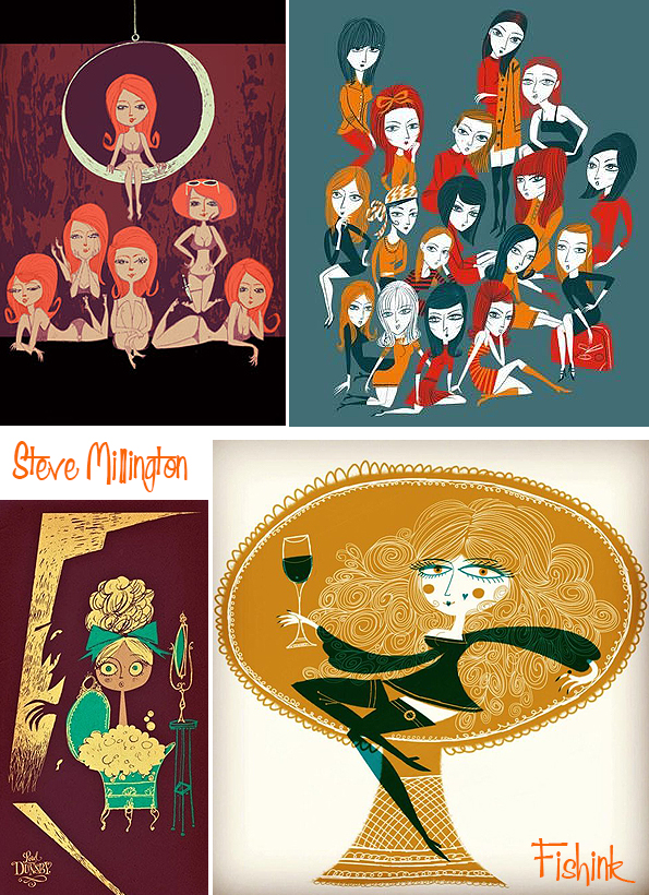
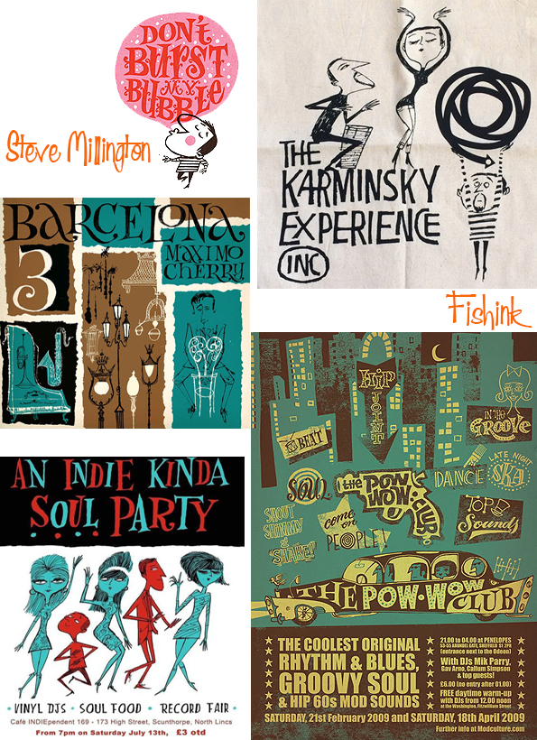
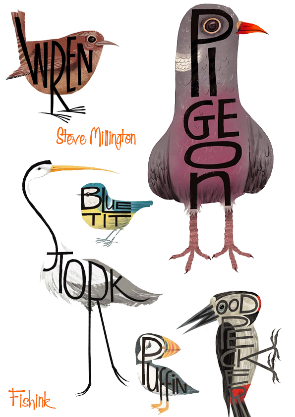
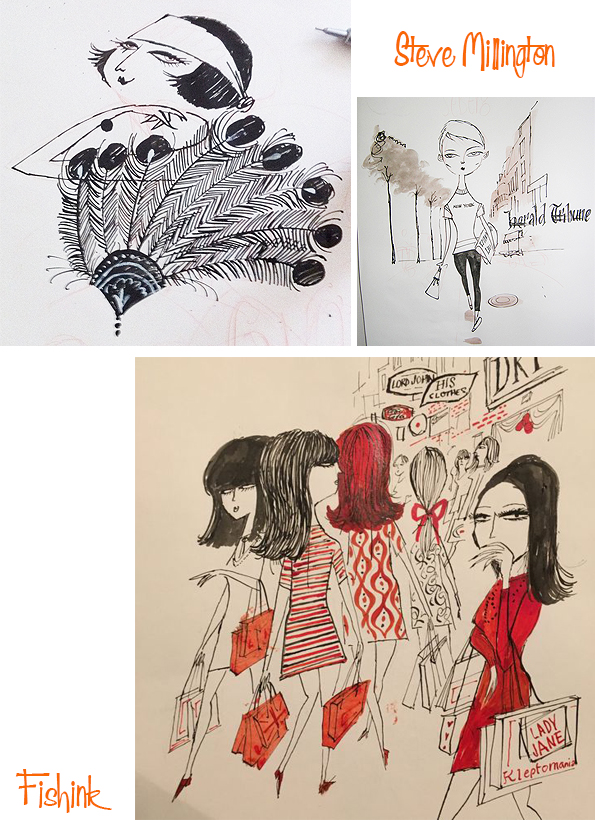
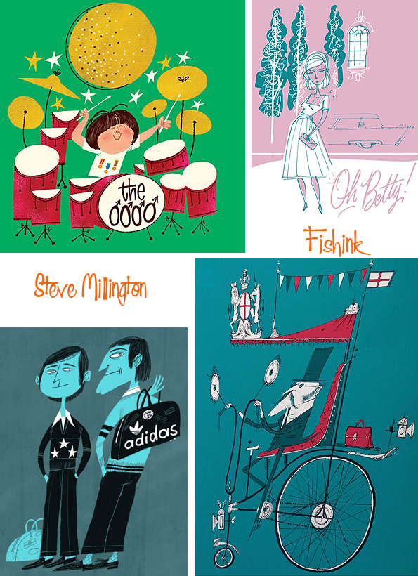
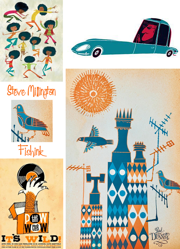
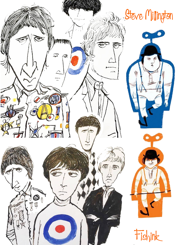
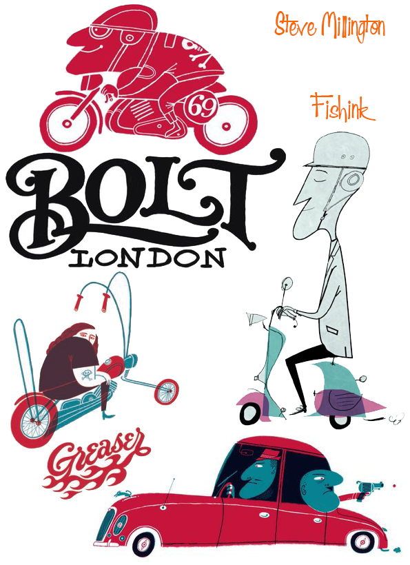
Steve Millington Contemporary-Retro Illustrator
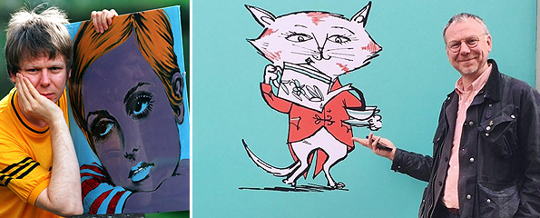
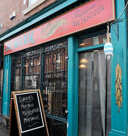
It was two years ago this month that we lost the talented Illustrator Steve Millington. Originally born in Horwich, Greater Manchester, he studied at Bolton College of Art in the late 1980s, then trained as a glass engraver and designer at Lancashire Crystal; before learning the craft of traditional sign painting. Here’s a Fishmongers shop front he painted.
Steve worked under the names Dry British, Lord Dunsby and Hisknibs, creating textile prints, book illustrations and T-shirt designs for a range of different clients.
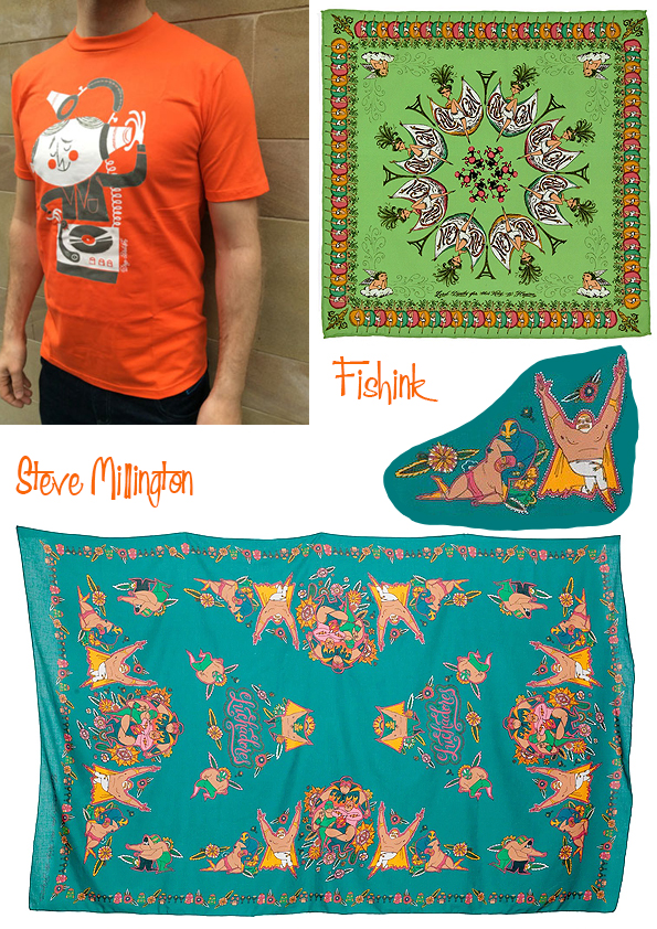
He created very sucessful campains for the likes of RAC, Virgin…
and Fortnum and Mason.
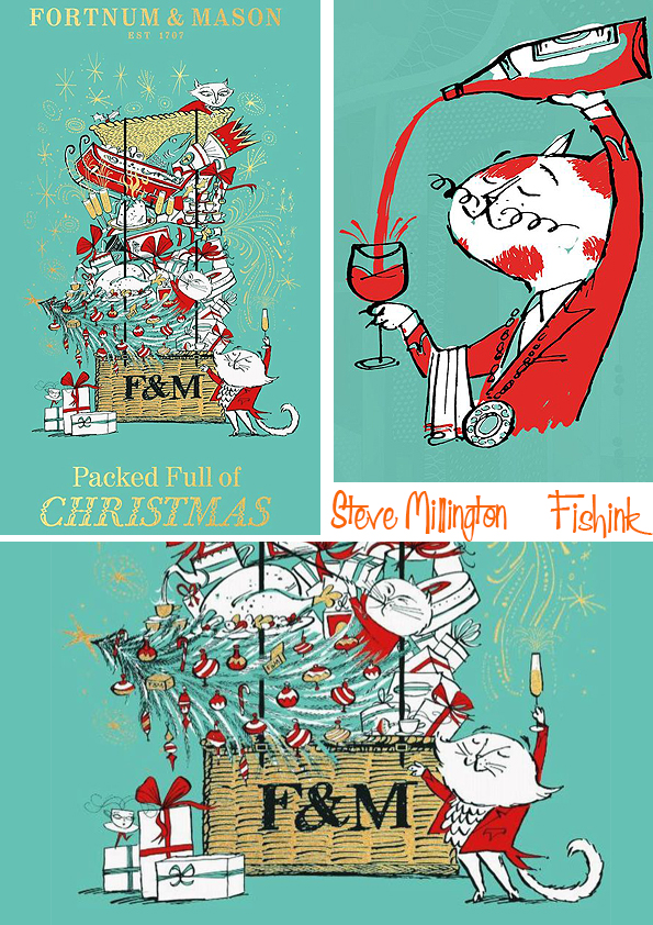
He was also as well renown for his work characterising the Beatnik era and Jazz Icons, as he is for his retro style cards and posters which he sold from his personal website.
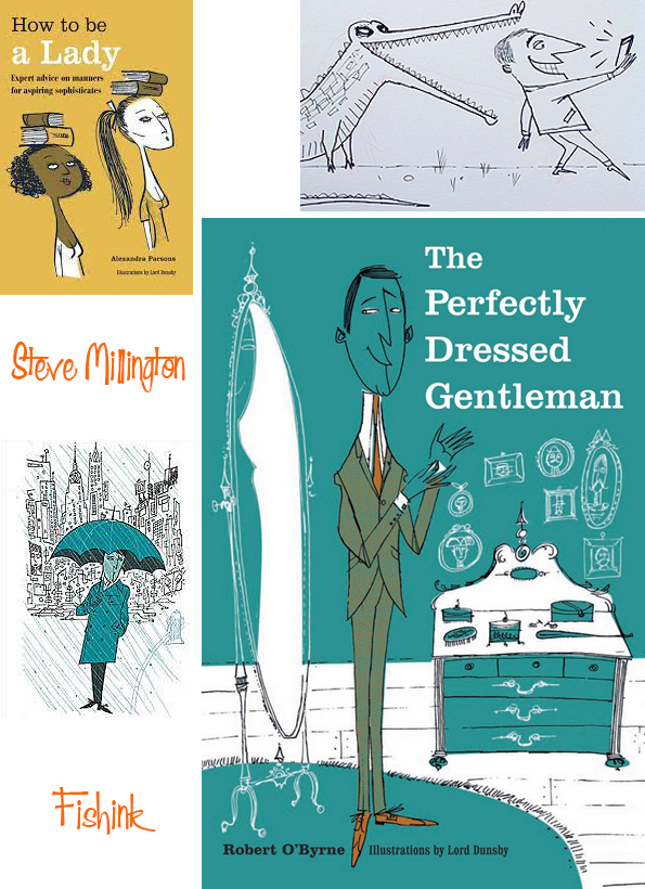
He also worked with Robert O’Byrne on a series of books about the well dressed Gentleman.
In his spare time he was also a keen cyclist.
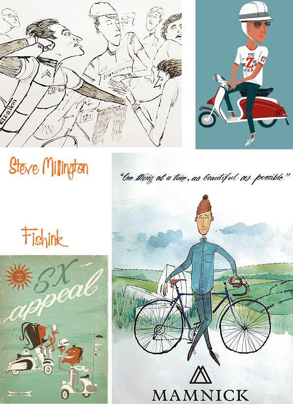
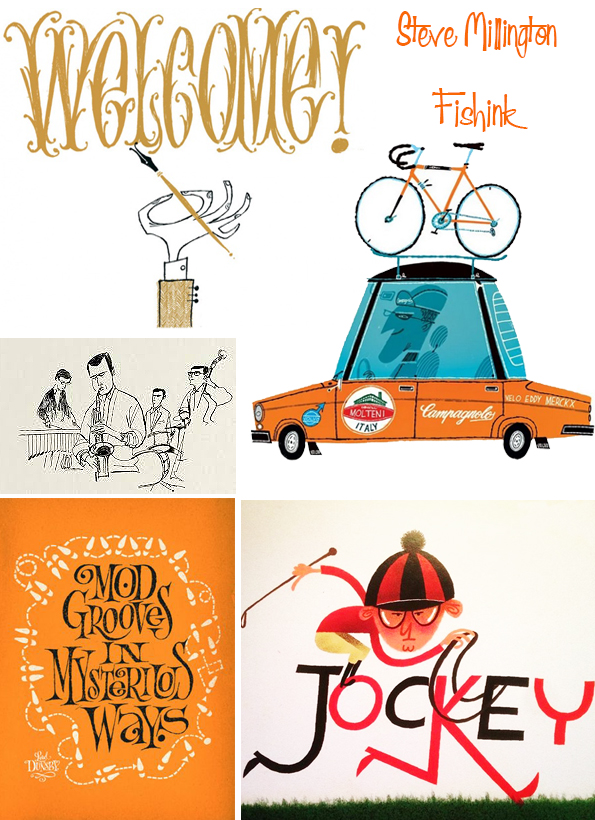
His influences were many and varied, from Peter Blake to Quentin Blake, Carnaby kitsch to the dadaists. His work managed to be both current and yet regain a sense of timelessness.
He even animated an informative video about the perils of Fracking !!
Such a loss to the world in general and specifically the world of illustration, long may his joyful work live on. If you liked Steve’s work you may also like these past posts about the work of Derek Yaniger and Cliff Roberts. Enjoy
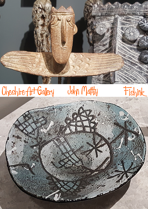
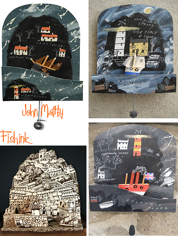
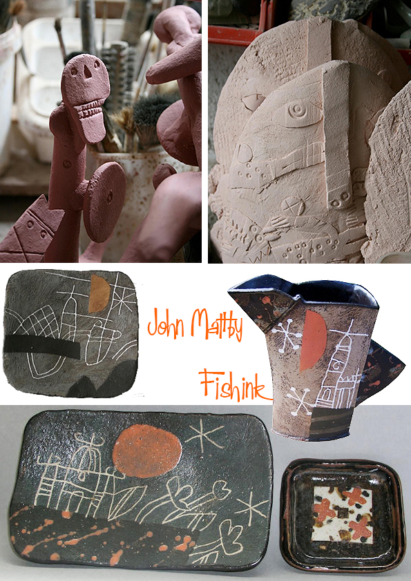
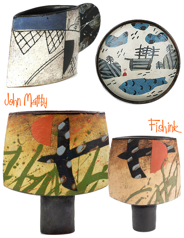
John Maltby Birds, Boats, Angels and Kings
What better way to end my blogging for the year by talking about one of my favourite Artists. Ceramist and Sculptor extroadinaire, John Maltby, who very sadly passed away in December 2020. I was very fortunate to notice that the Cheshire Art Gallery in Bramhall, had an exhibition of his work. Fifty pieces all in one space, obviously I had to go and was so pleased I made the effort. It was such a treat, they had examples of his very early work, right through to John’s last firing. Wonderful to see everything right before my eyes and not hidden away in glass cases in some museum-type display.

Born in Lincolnshire in 1936, John Maltby studied at Leicester College of Art and Goldsmith’s College in London. He joined David Leach at Lowerdown Pottery in Devon in 1962, starting his own pottery at Stoneshill in 1964, where he continued to live and work, up until 2020. You can see some of his different potters marks for both Maltby and SP (Stoneshill Pottery) here.

Born in the coastal town of Cleethorpes in Lincolnshire to John, a fish merchant, and his wife, Gladys (nee Kay), the young John developed a love of the sea, and sailed for many years. But he did not want to go into his father’s business. He was also a fan of the work of Alfred Wallis which I think is apparent in both his seascapes …

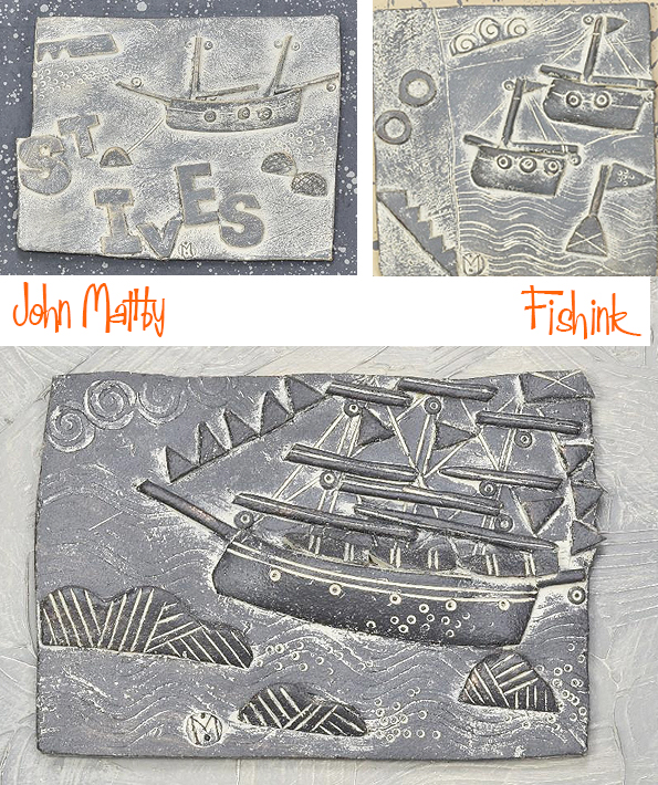
and his wooden sailing Automata.

Here’s a glimpse of life in his busy studio thanks to Gallery Top.

After attending Clee grammar school he took a degree in art at Leicester College of Art, specialising in sculpture, and then spent a year studying at Goldsmiths’ College in London. For a couple of years he was an art teacher at Caterham school in Surrey, and it was there that he met Heather Helmore, who was matron there, and importantly, as John liked to relate, drove a Frog Eyed Sprite. They married in 1961.
By chance at this time he read Bernard Leach’s A Potter’s Book, and when he and Heather toured the south west of England in the Sprite in 1962, he visited Leach in St Ives in Cornwall. Bernard in turn directed him to his son David, who had his own pottery at Bovey Tracey in Devon. John then decided to give up teaching and join David as his apprentice, spending two years there, after which, he said, “I could throw like an angel”.
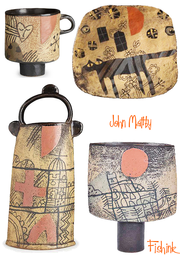
In 1964 John set up Stoneshill Pottery near Crediton in Devon and he remained working there until the end of his life. He started by making functional Leach-style pots, but quickly realised that making Anglo-Japanese wares was neither personally relevant nor fulfilling, and began to produce much more individual work.

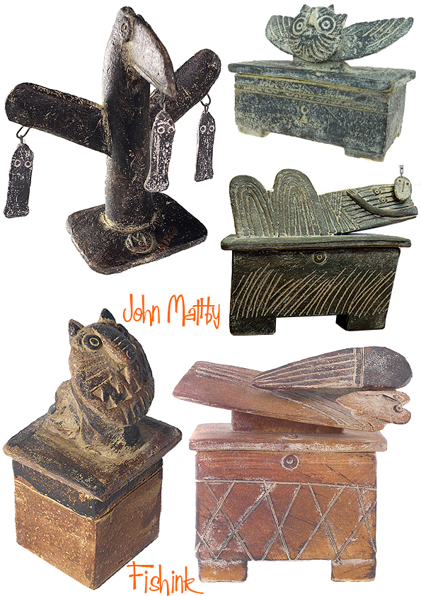


In 1996 John had a major heart operation that stopped him performing the heavy work of kneading clay and manipulating large pieces, leading him to make smaller sculptural work. Many of his earlier themes were still there, but at the same time he introduced a new cast of characters: birds, kings, queens, warriors and angels. This was the style that he worked with for the rest of his life.


John Maltby was one of the best known British ceramic artists, and most of his shows sold out on the opening day. He was advised by some gallery owners to severely limit his output and equally dramatically raise his prices, but that was not John’s way. He wanted his work to be affordable rather than exclusive.

I really love his attachment to folklore, the sea and a sense of being English. He created his own characters which inherited his world and the world’s of all the customers who were lucky to acquire his fabulous art.


I saw this lovely passage by Terry Brett owner of the Pyramid Gallery in York, talking about the effect John’s work had on his business back in 2016. It says so much about how John’s work touched the lives of so many.
“His work changed in the 1990’s from wheel thrown pottery to the current hand formed figurative sculptures. Pyramid Gallery has been representing John Maltby since 2012. Pyramid’s owner Terry Brett has been an admirer of John’s work for much longer than that ‘ It took fifteen years to get my first batch of work from John. I visited Stoneshill every now and then, asking for work, but he always said we were too close to another gallery that was in Harrogate. Eventually, that gallery closed and because I had got to know John over all those years, he graciously agreed to supply Pyramid. This has been a saviour for Pyramid Gallery, during the very worst part of the recession caused by the financial crisis that occurred in 2008, John Maltby’s work attracted new collectors. We have sold over 200 of his sculptures and many other items to collectors in those 4 years and owe our survival and current success very much to John Maltby. My hero.’ TERRY BRETT owner of Pyramid Gallery 2016″
You might find interest in this article from the Ceramic Review. Thank you to The Guardian for the info used in this post.
Wishing everyone who reads, comments and regularly visits Fishink Blog a wonderful festive holiday and a relaxing break, a chance to recharge and to catch up with ourselves and those we love. Enjoy.
See you all in 2022 ! : )
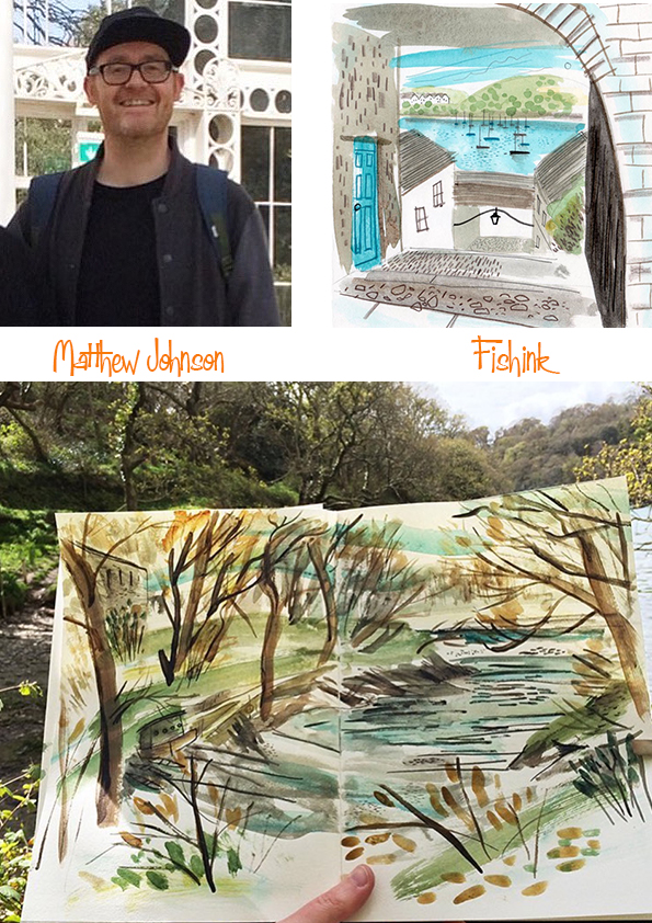
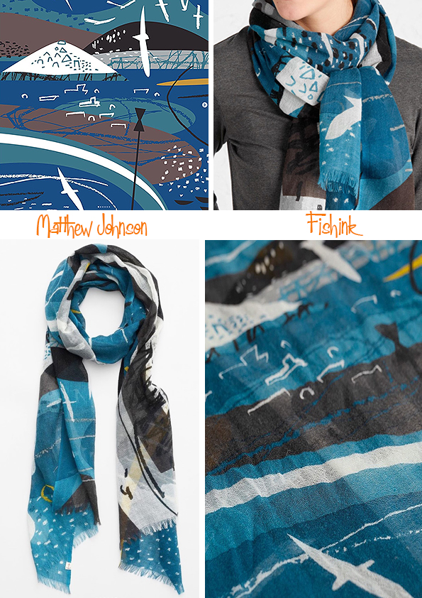
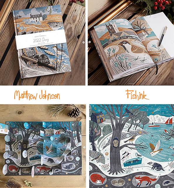
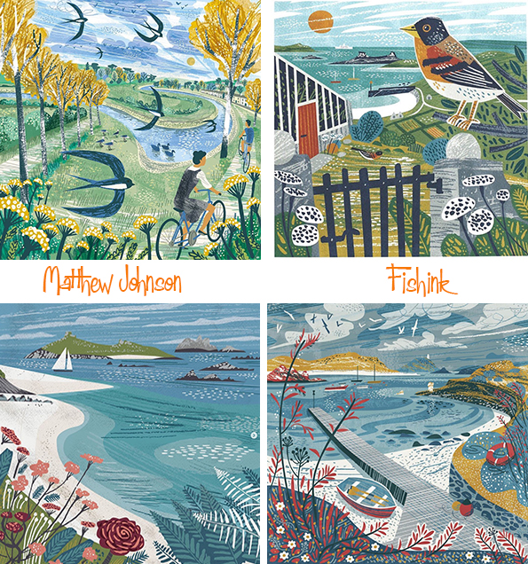
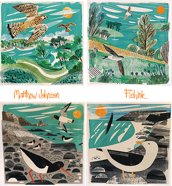
Matt Johnson Coastal Illustration
You can’t look at the clothing line called Seasalt without noticing the beautiful illustrations by their Senior Creative Designer Matt Johnson. Not surprisingly he is based in Falmouth, near the sea, where he derives much of his coastal inspiration.
What do you remember about your very early childhood days when it comes to art ?
One thing I remember (because I still have it now), is making a sequel book to The Tale of Jeremy Fisher by Beatrix Potter. I clearly had lots of help from my teachers and the plot is quite derivative (I was 9…) but the illustrations are action packed. It’s a pretty good early attempt!

How did you discover your present artistic style and the techniques you use today ?
I tried to emulate a lot of illustration and printmaking that I like, from the mid twentieth century. I felt that I could assemble things on the computer in a roughly similar way to the collage and printmaking techniques they used back then. That didn’t entirely work! But it resulted in my current style.
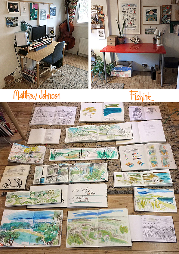
Here’s is a glance around Matt’s studio room at home where everything is created. Also you can see some of his fab sketchbooks.
You use a mix of digital and non-digital markmaking and drawing skills in your art, do you have a preference for either and if so why ?
They are both great and have their pros and cons… but I enjoy drawing on paper the best and I could happily live without the digital stuff. Drawing and painting is so immediate and tactile, and you don’t need any fancy gadgets to do it.


Congratulations to Seasalt who this year has been in operation for 40 yrs !! Matt has been working for the company for the last 14 years, I wondered how that might both enable and disenable him as a designer at the same time.
There’s a wonderful sense of freedom and movement in your work, what restraints when working for Seasalt, would you say hamper your creativity and also give you structure whilst working to a brief ?
I find limits and constraints a very good thing! For example, if I can only use three print colours it forces me to get creative with how I use them. I start stylising and abstracting the image to make it work, and things get more interesting. We get a lovely brief and colour scheme to work within each season and I find that great – it’s like a being given a beautiful area to play in.
Having said that, the same items, with the same restraints, reoccur over and over, so it’s brilliant to work with freelance clients and get some different constraints to grapple with.

It’s lovely for me as a textile designer, to see how Matt’s art naturally lends itself to work as scarves and fashion fabric.


Working for the same company for 14 years and with such defined subject matter, do you ever feel the need to draw and create for a different clientel or in an alternative way ?
I love working for Seasalt and I never get tired of making illustrations of Cornwall. But there is other subject matter I’d like to tackle more. Things like different landscapes, the wilder aspects of nature, cityscapes, music, and more illustrations of people. I recently did some designs for the RNLI and I’d love to work with some more charities or environmental groups too.

What would be your ideal design brief and what would be totally uncreative for you ?
I like it when the illustration is the product or part of the product, or part of an artistic work. Designing book or record covers for authors or musicians I really like is ideal. Illustrations that advertises or market something else are still creative, but I’m less keen on them I think.
During your time with Seasalt to date, what is your happiest design moment ?
Working on the Prussia Cove jute bag design for Judie Dench was a huge thrill. It also feels great when something I’ve designed sells out or gets a positive response from the customers.

Great to see you are developing posters and greeting cards for Seasalt and here under your own name. Where do you see your artwork leading you in the next 5 years ?
I’m so excited about where my artwork will go in the next few years. There will be lots more stuff under my own name. I will naturally keep exploring the landscape and wildlife in Cornwall – I have a constantly expanding list of views that I want to depict. I’m also just finishing my first illustrated book (first one that will be published anyway…) It’s about fishing in Cornwall and is very detailed and full of maps, cutaways, underwater scenes, and lots of things I liked when I was little (and still like). I would love to do some more books, and book covers in the next few years for sure.
Many thanks to Matt for taking time out of his busy week to be featured with Fishink Blog here today. I hope you enjoyed seeing his work and discovering more behind his creations for Seasalt too.


