Fishink Ceramic Sale **Tomorrow **
Hi everyone, I thought I would just mention that I have ne of my monthly Fishink Ceramic Sales over on my stories on my Instagram account Fishinkblog (www.instagram.com/fishinkblog)
As usual I have a wealth of brand new ceramic pieces for sale and can post worldwide so if you want to send something appropriate to your neice in Texas or your sister in Australia then I can organise that for you.
I open my ‘virtual sale doors’ at 10am Saturday 27th March UKtime and you can browse through my stories and feed posts to see what is available and I work through Paypal to make sure my customers payments are safe and secure.
Here’s a small sneak preview of a few items for sale tomorrow, please do drop in and even just say hi or leave a like and pass this info onto your friends and family for me, it all helps so much.
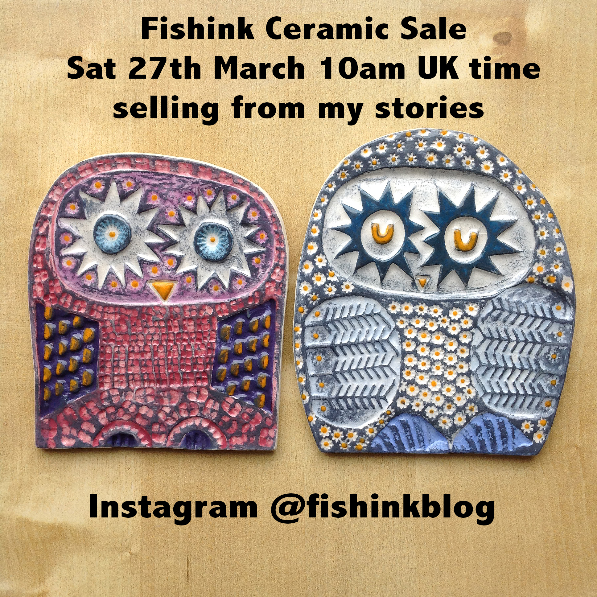
Look forward to seeing you all tomorrow !!
Aliki Children’s Book Illustrator
Aliki Brandenberg is now 91. She has well over 60 books to her name and illustrates in a number of different styles. I love her fun simple lines and her textural work most of all. Aliki says “I write fiction out of a need to express myself. I write nonfiction—out of curiosity and fascination. And I draw in order to breathe.”

Born in Wildwood Crest, New Jersey, Aliki’s parents, were originally from Greece, and they taught her to speak Greek as a first language. She started to draw at an early age, and her parents enrolled her in art classes.
After graduating from the Philadelphia Museum School of Art in 1951, she worked briefly at the J. C. Penney Company in New York, in their display department. She then moved back to Philadelphia and worked as a freelance artist, creating art for advertising and display purposes. She also taught classes in art, worked as a muralist, and started a greeting card company.


In 1956 Aliki decided to explore her Greek heritage, as well as many other parts of Europe. During her travels she met Franz Brandenberg, whom she married the following year. After moving to Franz’s native Switzerland, she wrote her first book The Story of William Tell, about the legendary Swiss archer. The book, published in 1960, was well received. Aliki and her husband moved to New York, where she began in earnest her long career as an illustrator and author of books for children.


She has written and illustrated many books and she has also illustrated books for other authors, including her husband Franz Brandenberg. Her career as an author and illustrator led her to explore many subjects of historic and scientific interest. Her nonfiction books, either written by herself or by others, touch upon matters as varied as dinosaurs, mammoths, book manufacturing, Shakespeare, evolution, and growing up. Aliki’s fictional works explore such themes as family and friendship. Aliki’s Greek heritage is also a recurring theme in her works, both fiction and nonfiction.
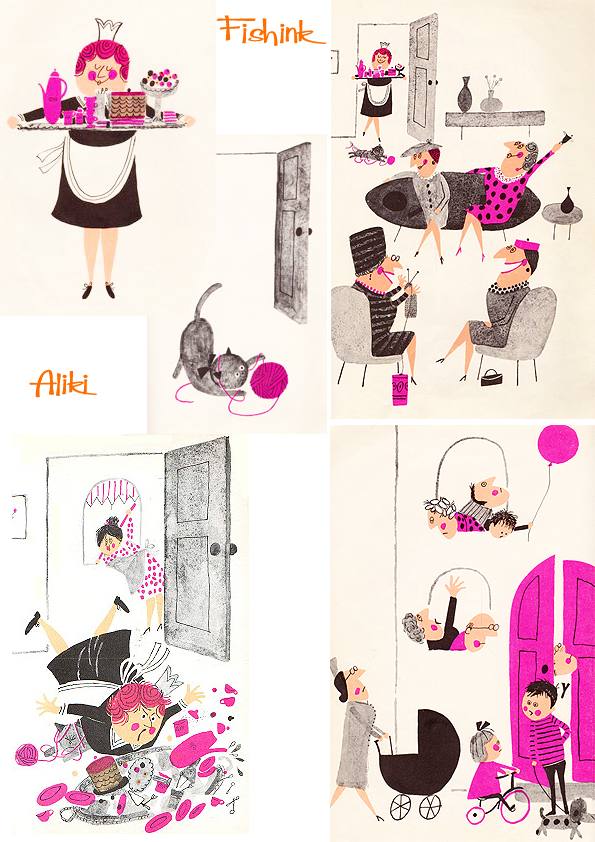
I have two of her books which display both of her styles that really appeal to me. The first is called ‘The Listening Walk’.

It’s all about the sounds we hear when going for a walk if you listen closely.

I love the simple use of two colours (sometimes overlapping to create a fall on third colour) with black line and textural elements. These cars below are wonderful, you can just feel the speed !
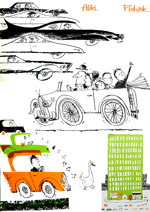
Lovely detail and observations.
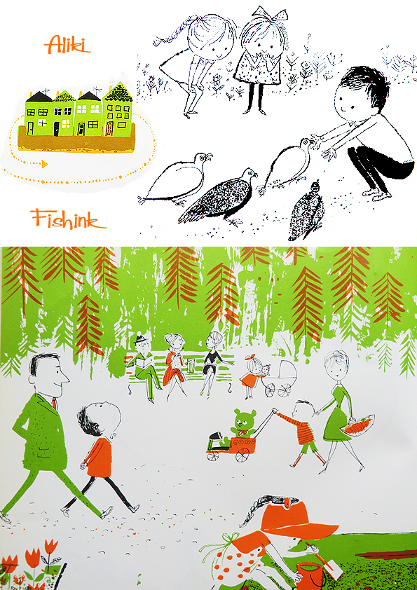
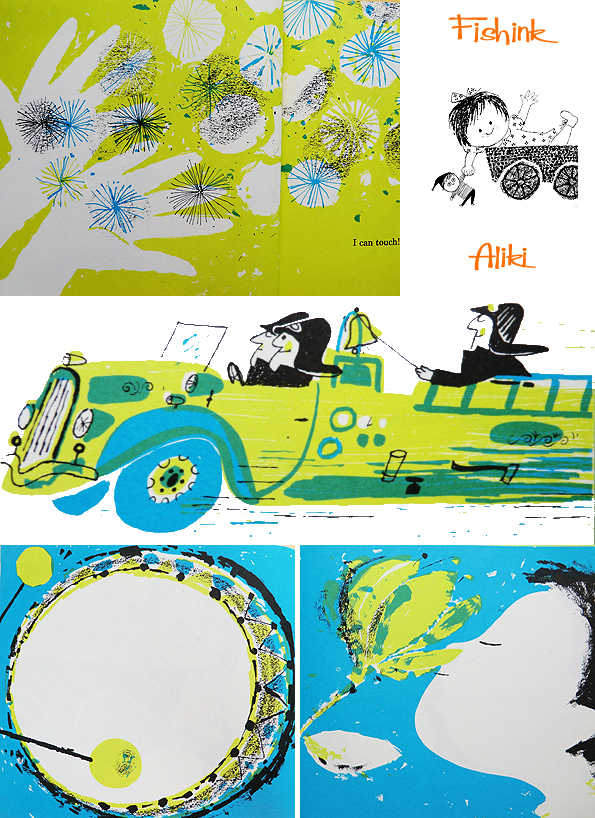
The second is called ‘My Five Senses’ and was part of the classic ‘Let’s read and find out Science book’ series.

Lots of textural rubbings, pattern and variation in line thicknesses and scale.

You can read more about her here.
She has been living and working in England since 1977, Aliki continues to produce new titles. “I’m one of those lucky people who love what they do,” she once commented. “I also love my garden, music, theatre, museums, and traveling. But I’m happiest when I’m in my studio on the top floor of our tall house in London, alone with the book I’m working on, and Mozart.”
If you like Aliki’s work, you may also like the work of Helen Borten and Abner Graboff, you can see many posts about these artists, by writing their names into the search function on my blog. Happy viewing.
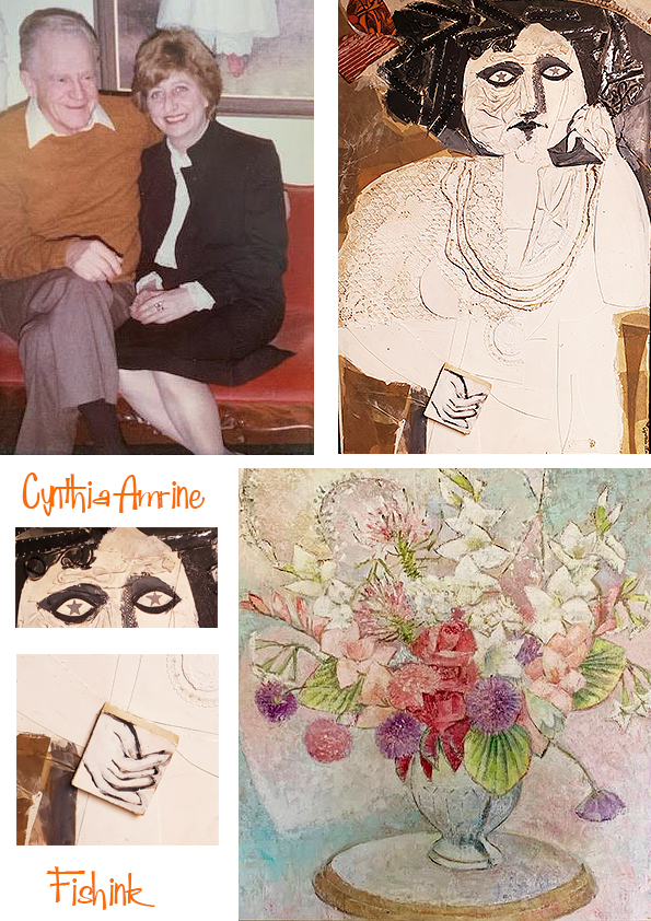
Cynthia Amrine Updated

I last spoke about the mid century illustrator Cynthia Amrine here back in 2019.
To set the scene… In 1965, Cynthia Amrine worked with librarian Mary Joan Egan to publish ‘Using Your Library: 32 Posters for Classroom and Library’, a lavishly illustrated book of tear-sheet posters for educators and librarians to promote library usage in primary and secondary schools. If you are aged 40 – 60 and have lived in the USA since childhood, you might remember her best for these kind of posters around your school.

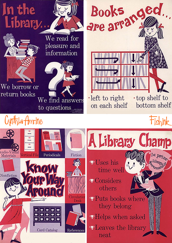
and some of the other informative sheets too.


Since my last post, members of her family (Peggy, John, Chuck, Keith and Susan) have been in touch to share some of their memories and images of her work that they have saved as treasured possessions. These are a collection of hand made cards, created for different occasions by Cynthia.


3-D gifts too !! All lovingly made by Cynthia’s hand.

Keith (Cynthia’s nephew) shared these descriptive thoughts with me.. ” As aunt Cyn’s passing was some time ago, the memories I have of her are a tad foggy, but there a few that have not withered over time and are still quite vivid. As many in the family may have already shared, Cynthia had a fondness for wrapping paper. Every Christmas eve or day we spent at our grandmother’s house, I remember distinctly the collage of shape, color, pattern, texture, and reflection of the lights on presents under the Christmas tree. Aunt Cyn wrapped her gifts with an eye that exhibited her attention to detail and an appreciation for the qualities inherent in art; the paper was always the highest of quality, folds and creases that made launderers jealous, and ribbons so elaborate that you wanted to take pictures before they were removed. We were always cautioned to be careful in the removing of the paper, because Cyn was the woman who kept every scrap, every ribbon, for the purpose of re-use, either in the next season or in some other art project. I even remember the candy dish on the coffee table that contained that old style ribbon candy, so vibrant in their colors, and how it always reminded me of the presents just a few feet away. ”
Indeed, as we can see below, Cynthia did paint that Ribbon Candy too.

Published illustrations in different journals.
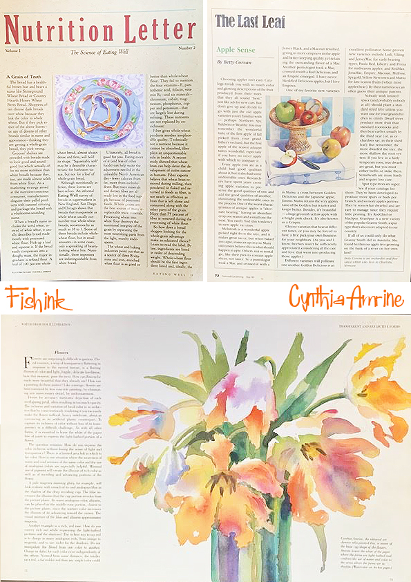

She was also an accomplished painter, setting up still life arrangements to incude in cookery books, magazines and paintings that she passed onto her family and friends.
Her brother John shares these memories.. ” I was fortunate enough to grow up in a great neighbourhood in a new home, lots of kids my age, a surrounding woods to explore, large yards to play in, and a loving family that gave me positive attitudes about my future. Unfortunately, my sister, being ten years older, was not part of my early childhood. It wasn’t until my teen years, that I could relate to her life and realize what unique talents she had. I do remember riding with my mom and dad to pick her up from the downtown campus of RIT where she got her first art degree and heard about the various awards she received for her paintings.”

“As a teenager, I was impressed with her ability to get her advanced degree from the Rhode Island School of Design and it immediately got her job with the Instructor Magazine in Dansville.
I remember the Holidays and when I came home from my six years of college and the birthday gatherings when I would receive clever hand made cards and over the top colorful decorated presents. After Sue and I got married we spent many happy family times with her and her long time love of her life, Bob. When Cyn got transferred to the downtown NYC for a job, she hosted us and friends for a long weekend with visits to Soho, Grand Central Park and other traditional tourist sites. During these years Sue and I received many examples of her paintings, her amazing Christmas ornaments and were entertained at her homes in Naples, NY. Her immortality is part our present life as we enjoy her artwork that surrounds us at our home and at the homes of friends and family. ”


Paintings from holidays and journeys made over the years.

Harbour scenes.
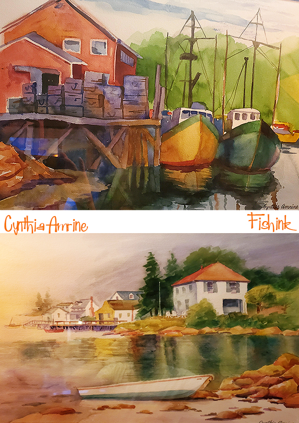

Many different styles and a clear mastery of a variety of art materials too.
John goes on to say… “Cynthia was also a good athlete. She played soccer at Charlotte High School where she had to walk to several miles to get there every day. She would practice with me and helped give me the skills that I used throughout college. Sue and I skied with her at Swain Ski Center a few miles from Danville. Her favorite color was turquoise and blue which she used all over her various apartments and homes.” Birthdate 2/6/31 to 10/26/03.
I want to sincerely thank the family for rallying round and photographing every keepsake and card they retained from Cynthia so we could enjoy seeing them today. I also thank them for sharing their thoughts and for recounting tales that show a warm love for a very talented lady who is very dearly missed. I hope this will help to keep her memory and work very much alive.
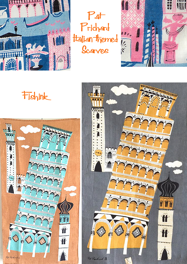
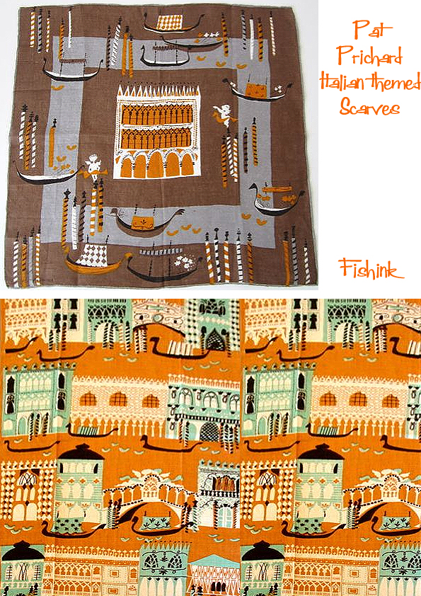
Pat Prichard Remembered. Scarves and Vintage Textiles

Happy International Women’s Day everyone.
I’m very excited to bring this post to you today, because it sheds a little light on another fabulous designer from the 1950’s.
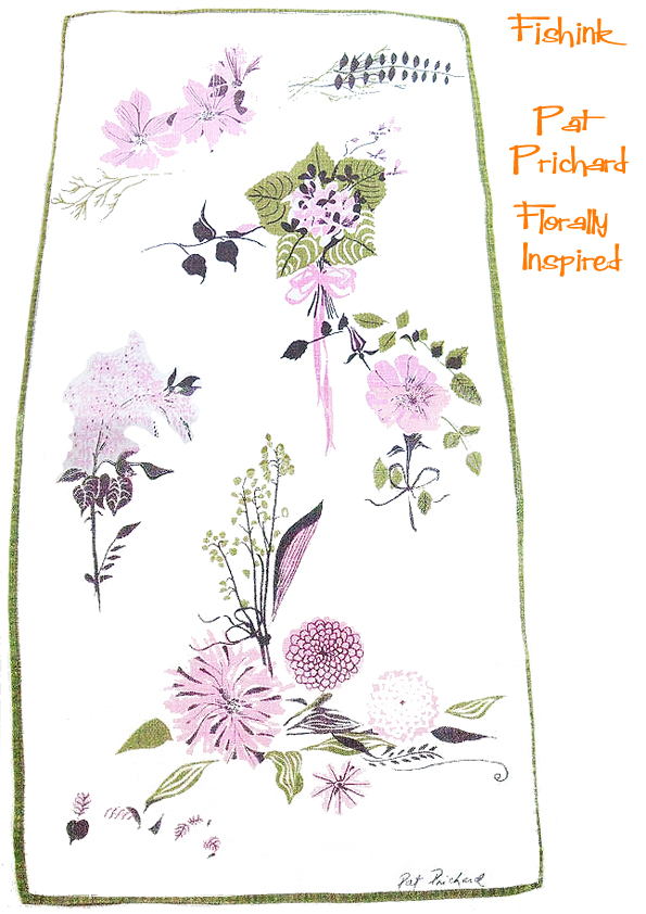
I have previously spoken here and here about the talented Pat Prichard, who designed hundreds of tea towels, scarves and linens during her lifetime. Sadly there is very little written online about Pat or her work, so I was delighted when a lovely gent, ‘Larry’ from the U.S.A contacted me, to say that his mum had been a good, close friend of Pat’s and would I like her to write down some memories and share them with us all on Fishink Blog! Well, you can imagine that it didn’t take me long to consider their kind offer and below are the fascinating recollections.
My story is from a long time ago. Pat and I met at the Parson’s School of Design sometime between 1947 and 1950. The class was then called ‘Advertising Design’ (‘Graphics’ may be a more appropriate subject title for today), Parson is now part of The New School in Manhattan.
Pat and I were the same age, well just a month difference, she was intelligent, well-read and culturally up to date. Occasionally working in a studio, Pat was creatively quite an original and did well when freelancing and producing work for different companies. During our friendship, I noticed how Pat’s style developed, her handwriting emerged and she experimented with a much freer look, which proved to be very fashionable.
I remember in the late 50’s taking a huge bouquet of hand-picked flowers, (from my mother who loved Pat), over to her place. Large Hydrangeas and many lesser sized, but equally lovely flowers, transported all the way from NJ to NYC (however did I do it ?.. I may even have walked the distance). The bouquet, however, became Pat’s inspiration, and the next time I visited, there, in the hallway, just waiting for me to view it was a stunning painting of my flowers.
Perhaps the bouquet could have inspired the design below ?
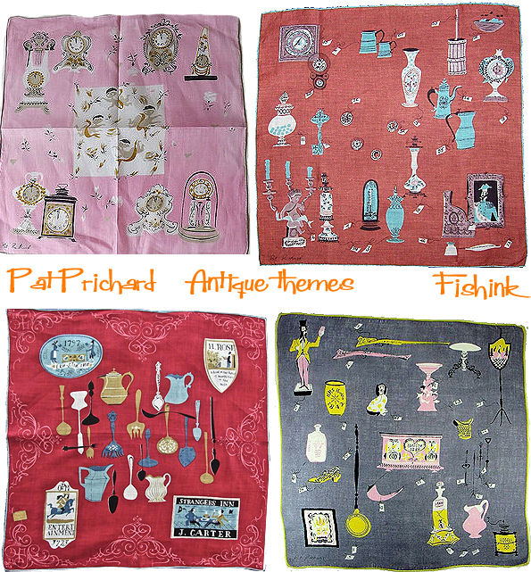
When our friendship began Pat and her mum were living in Queens, (her father had sadly passed away soon after she was born). As Pat became autonomous, she discovered and rented a unique two-story apartment made of stone over on the east side of Manhattan. I still lived with my parents, so I really admired her gumption and strength to achieve so much so early. Pat’s apartment was furnished generously with Victorian pieces collected through ‘antiquing’ a pastime she loved to do, and which soon became the subject matter for many of her designs.
I remember the stairs in her apartment were painted black (probably Pat’s choice) and built right into the wall. The landlord did a great job in making the changes and the place looked stunning. The living room was carpeted in deep lavender, a daring shade and at the same time,Victorian in feeling and the marble top tables fitted in splendidly well. Pat married and lived towards the end of her life in Pennsylvania, where she had many friends, who I imagine, have many of her paintings. I have two of her works, one was a gift and the other I purchased.
The first is of one of Pat’s trips to Italy. This is Venice, St Mark’s Square on a wet, but still crowded afternoon. How wonderfully she depicts the flight of the pigeons, the tourists with their dark sunglasses and the porticos on both sides pointing to the Cathedral in the distance.
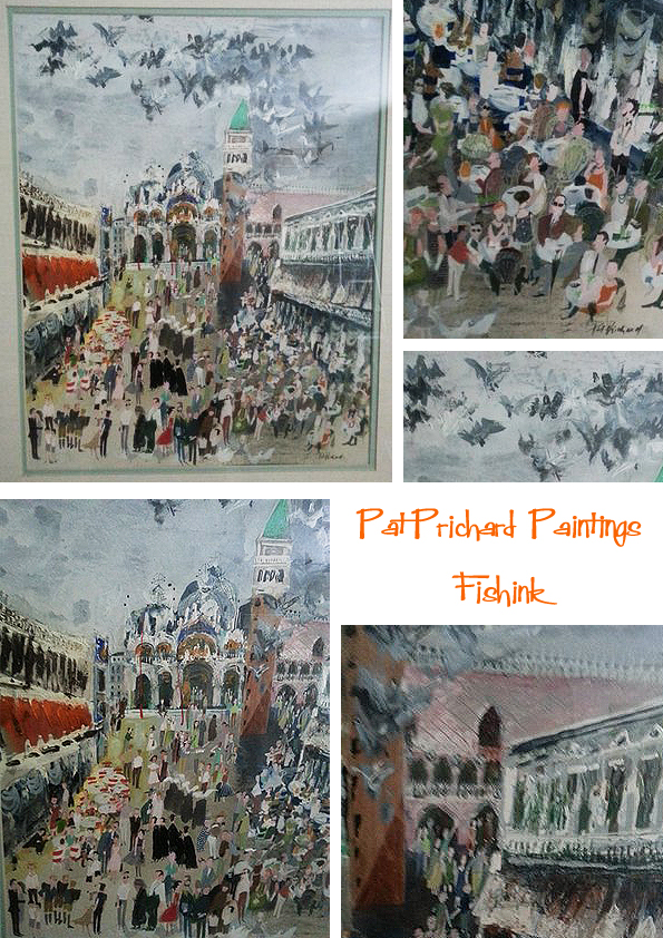
No prizes for guessing where Pat got the inspiration for these designs from!
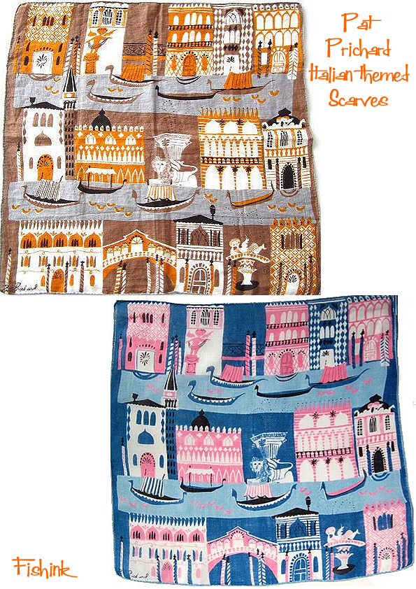
I love how she has simplified the decoration on the buildings but still manages to get enough detail into each design so that we can easily tell where it depicts. They must have been very popular judging by the number of colourway variations I’ve seen produced.
Such beautiful designs.
The second painting depicts the harbour of Cape Cod in Massachusetts. It’s similar in style to the Venice piece but a little more mysterious and slightly haunting too.
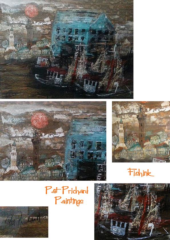
Sadly Pat passed away when she was in her early sixties. I had many of her handkerchiefs and cards that she had painted for me over the years but with downsizing, only one scarf now remains with me. It’s tattered and torn, faded and sports a hole but, like my memories, doesn’t take up too much room !
I want to send out a huge vote of thanks to both Larry and his mum for making this post possible. For taking the photos, typing two pages of the warmest, fondest, memories I’ve read for a long time (gosh I hope some of my friends remember me with such warmth : ) ) and for keeping me up to date with everything as we got the story together. How fascinating to share a glimpse into Pat’s world through the eyes of a good friend.
I’m certain there will be many of you who will enjoy reading these recollections, please leave a comment if you do.
If anyone else knows someone I may have covered in one of my posts and would like to share their thoughts and images, then please do get in touch. You can reach me here Craig at fishink.co.uk
Issey Miyake

Another creative’s work I admired from my college days, was that of the Japanese fashion/textile designer Issey Miyake.
Along with other strong oriental designers like Rei Kawakubo working for Comme Des Garcons and Yohji Yamamoto also designing in the Eighties, Issey’s beautiful sense of line and form, grace and design struck a real chord with me.
I even entered a textile competition designing a collection of fabrics with him as the inspiration !

Issey Miyake was born on April 22, 1938 in Hiroshima, Japan. (Happy Birthday for yesterday !)
He studied graphic design at the Tama Art University in Tokyo, graduating in 1964. After graduation, he worked in Paris and New York City. Returning to Tokyo in 1970, he founded the Miyake Design Studio, a high-end producer of women’s fashion.
From the outset, Miyake’s creative process has been based upon the concept of “one piece of cloth.” His process explores the fundamental relationship between the body, the cloth that covers it, and the space and room that is created between these elements, divesting itself of the labels of “East” or “West”

The outlandish model and singer Grace Jones made an excellent collaborative choice, to show off Miyake’s amazing creations to the fashion world.

He’s the master if creating unusual shapes on the body.

After the ISSEY MIYAKE A-ŪN exhibition in 1988, Miyake began to experiment further with pleats, in the hopes of expanding the possibilities of the medium. When William Forsythe came to Miyake asking him to create clothing for his new production The Loss of Small Detail for the Frankfurt Ballet (first performed in 1991) Miyake was inspired and attempted to create pleated clothing that would move, using a new lightweight knitted material and introducing a new technique called “garment pleating.” Traditional pleated clothing is made by pleating fabric, then cutting and sewing the individual garments. Here, an oversized piece of cloth was cut and sewn in the shape of the desired garment and then sandwiched between two layers of washi paper and fed into a heat-press. Unlike its predecessors, these pleats remained permanently in the fabric’s “memory” and never had to be returned for re-pleating.

This experiment lead to further changes and adjustments and in 1993, the line PLEATS PLEASE ISSEY MIYAKE was born. The label offered clothing as a product that was easy to to wear, care for and to travel with; PLEATS PLEASE ISSEY MIYAKE was the perfect, elegant, yet practical and affordable solution for the needs of a modern woman, translating effortlessly from work to play to suit her diverse needs.

It is impossible to tell the story of Miyake’s work without mentioning the unique collaboration with photographer Irving Penn that lasted for over 10 years, beginning in 1986. Penn’s photographs, which number around 250 and were styled by Midori Kitamura (current president of Miyake Design Studio), burst with energy and surprise, and were compiled into 7 books. This body of work represents not only an archive documenting a unique artistic collaboration but also of the spiritual connection between two creators, separated by two continents but which resonate and transcend the realm of fashion photography.

In 1998, Miyake began to develop A-POC (A Piece Of Cloth) with Dai Fujiwara. A-POC was not only able to create clothing with a high degree of variation, but was also able to control the amount created through the process of casting, where each thread receives computerized instructions. A-POC was revolutionary in that it began with a single thread and resulted in fabric, texture and a fully finished set of clothing in a single process. It led the way, along with the concept of engineering design, to a new methodology of clothing design.

More recently he has worked with brands like Adidas to create backpacks and sport bags.


Recently, Miyake was working on the next phase and new projects. He and longtime Issey Miyake Collection production chiefs Sachiko Yamamoto and Manabu Kikuchi had assembled a select team of experienced and young staff members from within the Studio known as the “Reality Lab”. The Reality Lab ‘s focus is on new designs that are intimately connected to society. Many of these projects come out of the extensive research undertaken in preparation for the XXIst – Century Man, an exhibition directed by Miyake at 21_21 DESIGN SIGHT in 2008. The work at the Reality Lab includes a focus upon the development of environmentally-friendly materials that recycle and recreate new and better things from pre-existing ones. Sadly Miyake passed away in summer of last year.

Such a creative mind and spirit.
Thanks to Wikipedia and the Issey Miyake official site for the written information used in this post.
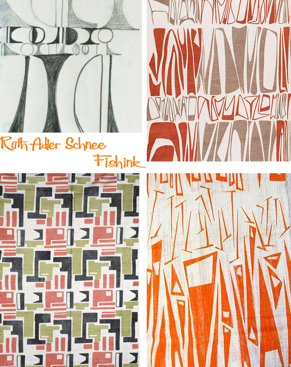
Ruth Adler Schnee Pioneering Textile Design
Born Ruth Adler in 1923, her passion for art started very early. Her parents loved art, music and design and instilled that same passion in her. As a child she played with mobiles on the floor of family friend artist Paul Klee’s studio and drew detailed interiors as a pastime in her childhood home in Düsseldorf, Germany.

In 1942, when Ruth left Detroit to attend RISD (Rhode Island School of Design), she took an overnight train on the New York-bound Wolverine line. On her train schedule, a warning alerted passengers to delays from trains carrying war materials or troops, which had the right of way. She understood those warnings more than most. Born in Germany, she and her family had fled the Nazi regime in 1938. She was not yet a naturalized American, nor was she a German: In 1935, Hitler had stripped all Jews of citizenship.
“I was a nobody,” Ruth told her daughter in a 2002 interview. They may have lost almost everything material, but the family held on to its love of art as they settled in Detroit. “We came to Detroit without a job or money, and before looking for a job my parents took us to the Detroit art institute,” she said.
That love of art became part of Ruth’s DNA and has been her career, passion and reward throughout her life. “It all began in Detroit with trips to the DIA (Detroit Institute of Arts Museum) and at Cass Technical High School. “I simply blossomed when I got to Cass,” she says, “because it was my love. … I just went wild.”
That love and talent won her a full four-year scholarship to the Rhode Island School of Design. After a stint in New York she returned to Michigan on a one-year fellowship to attend Cranbrook Academy of Art in Bloomfield Hills and became the first woman to earn a graduate degree in architecture.
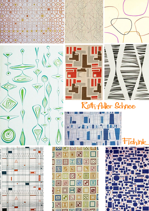
“The competition was to design a house encompassing all the modern gadgets that were designed during the war but had just come on the market,” Schnee says. “My house was designed in glass and steel with large open spaces in the Mies van der Rohe style, but I could not find fabrics to fit the house. Everything on the market was French provincial. So I designed my own drapery fabric.”
She decided to go into business and opened a storefront on 12th Street in Detroit. There she displayed and sold a small selection of furniture and wares by such esteemed modernists as George Nelson, Warren Platner and Frank Lloyd Wright, all major architects and designers of mid-century modernism.
When she married Edward Schnee, a graduate of the Yale School of Economics, they moved to a larger space on Puritan Street and officially launched the Adler-Schnee store. It was one of the first stores in the United States to sell modern furniture, fabrics and home furnishings to the public – everything from cooking utensils to unique art objects. After a fire at the store, they moved the store to Livernois Avenue. It was not initially successful. People in those days preferred the mass market styles sold in department stores. “We just couldn’t earn a living in the early days,” she says, “but I was inspired by art and nature. It’s a simple thing, but true.” She was mixing in artistic circles, and as a young mother of three, her circle of friends and collaborators included Charles and Ray Eames, Frank Lloyd Wright, Buckminster Fuller and Minoru Yamasaki.

Slowly but surely things got better. The artistic objects sold at Adler-Schnee began to show up in kitchens and living rooms across metro Detroit and across the nation and her work became well known. From living rooms, fitting rooms and hospital rooms to museums, showrooms and skyscrapers, her textiles began to appear in the most intimate and the most iconic settings.
She worked on the General Motors Technical Center in Warren (1950-55), on the World Trade Center (1970-77), and on the update of Albert Kahn’s Ford Rotunda in Dearborn (1952-53).
Ruth’s work also included projects that reflected her experience as a woman in an almost exclusively male industry: While pregnant with one of her children, she designed interiors for the former Feld-Weisberg Clinic, a contemporary building named for her obstetrician at the time. “I had the idea of using whimsical figures on the ceiling, because I had to be lying on . . . those tables for the examinations, and I felt that one should have something fun to look at while one is being examined,” she says in her oral history.
The doctors vehemently opposed her idea, which called for wallpaper designs by illustrator Saul Steinberg. But Ruth insisted. “I was so convinced that that’s what I wanted [that] on our own, we paid for that Steinberg wallpaper. . . The reaction from the patients was unbelievable. I had calls morning, noon and night from women who had been examined thanking me for finally doing something wonderful to those rooms.”

“As an immigrant who launched an influential business in Detroit, as a woman who broke through barriers in a male-dominated field, as a Detroiter who helped shape an international sensibility, her story speaks to the value of inclusiveness, to the entrepreneurial spirit and to the profound role the arts play in nurturing our souls,” says Rip Rapson, Kresge president and chief executive officer. Two years ago, at 91, she was selected as the 2015 Kresge Eminent Artist.
Now at 93, she continues to work most of the year from her studio in Southfield. She still designs custom fabrics for Knoll Textiles, where she holds a 20-year contract, and with Anzea Textiles, an upholstery company. “I do the work because I love it,” she says. “And now to be recognized that my work has some quality to it, it’s very exciting to me. It’s incredible.”
She believes the best lesson to learn about creativity is being observant. “You have to look at things, see things,” she says. “Everything around us is a design that can be put on paper. As a design: the simpler, the better.”
Many thanks to the information from Marge Sorge over at The Detroit Hub, which has made this post possible.
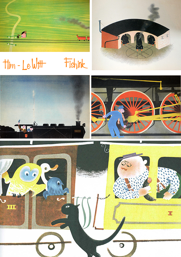
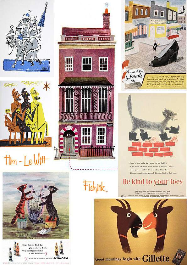
Le Witt and Him

Having met in a Warsaw café in 1933, two Polish-born artists Jan Le Witt and George Him, built upon a friendship to become the highly successful collaborative design partnership Lewitt-Him. It’s so difficult to accurately say which partner created what, so I’ve created this post for both artists, working together.
George Him was born Jerzy Himmelfarb in 1900 to a Polish-Jewish family in Lodz, Poland. After schooling and further education in Warsaw Him studied Roman Law in Moscow but left in 1917 when the Russian Revolution forced the closure of the university he was attending. He moved to Bonn and by 1924 had completed a PhD at the University of Bonn on the comparative history of religions before deciding to study graphic art in Leipzig. George studied at the Leipzig Academy of Graphic Art but even before he graduated in 1928, he was already undertaking commercial commissions. He returned to Poland where, in 1933, he changed his name and also established a design partnership with Jan Le Witt. Working as Lewitt-Him, the two established a distinctive design style which combined cubist and surrealist elements, often in a humorous context. Their most notable work in Poland were illustrations for an experimental poetry group known as Skamander.
The first work that brought the team success was the 1934 graphic presentation of three poems by Julian Tuwim: “Locomotives”, “Rzepka” and “Bird radio”. This book was reprinted several times and also appeared in translation to French and English.
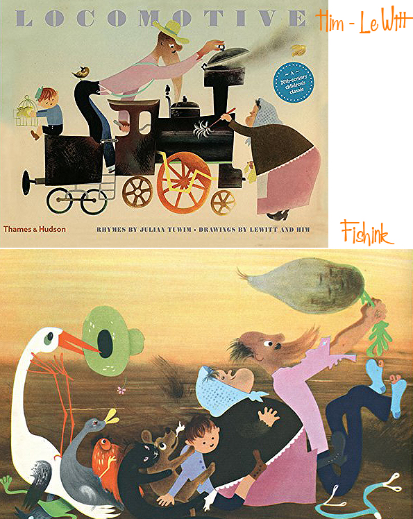
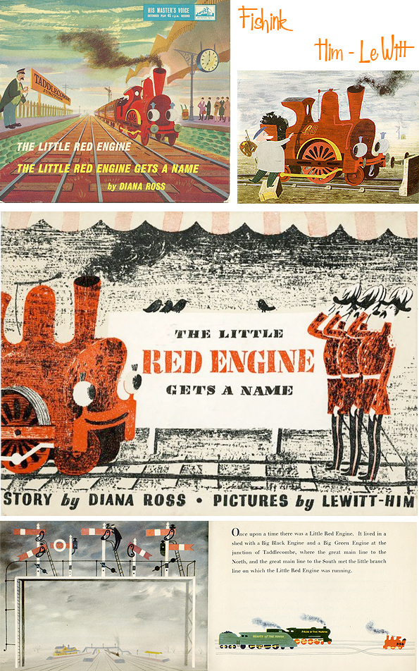
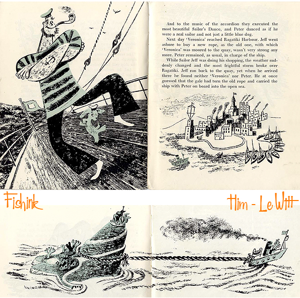
Him and Le Witt worked together in Poland for several years before, in 1937, they relocated the Lewitt-Him design business to London, following an exhibition of their work there by the publishers Lund Humphries. The pair quickly gained commercial contracts with London Transport and Imperial Airways as well as illustrating children’s books, such as The Little Red Engine Gets a Name (1942) by Diana Ross.
They settled here and soon found that they were among a growing number of talented artistic emigres.

George continued his practice as freelance designer and design consultant, active in all fields of graphic design, publicity, exhibitions, corporate identity, book design etc.


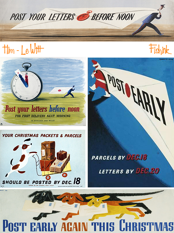
In London during World War II the partnership received notable commissions for information and public safety posters from, among others, the General Post Office, the Royal Society for the Prevention of Accidents and the Ministry of Information.


George was naturalized as a British citizen in 1948 and the Lewitt-Him partnership enjoyed great success.

Notable commissions included designing the giant umbrella tree for the Wet Weather section of the 1946 Britain Can Make It exhibition…

… and the Guinness Clock Tower for Battersea Park Pleasure Gardens and murals for the Education Pavilion of the 1951 Festival of Britain. (More info on the clock here)

The Lewitt-Him partnership was dissolved in 1954, when Jan decided to focus on developing his abstract paintings and artworks. George continued to work as a commercial designer.

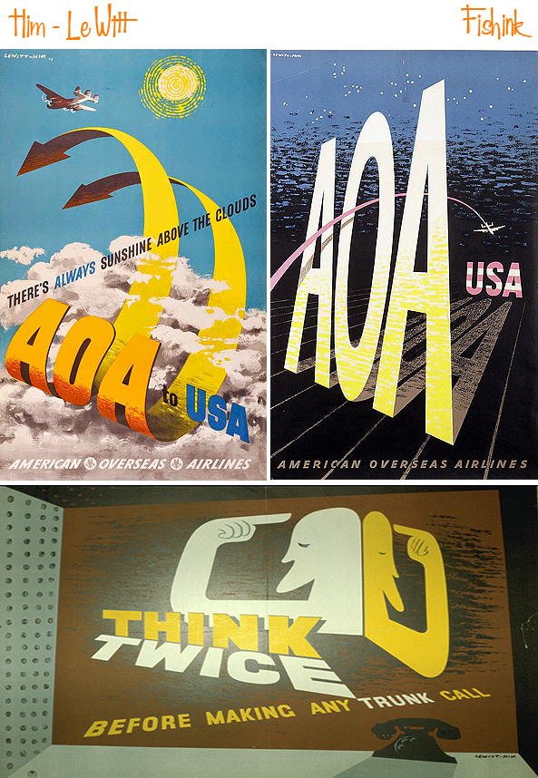
Among the advertising campaigns he illustrated was the 1950’s Schweppeshire campaign for the Schweppes drinks company. He also designed the point of sale merchandise to be used in the shops.

His other clients numbered several airlines, including Pan-American Airways, El Al and American Overseas Airlines plus the publishers of Punch and Penguin Books. He continued to illustrate books but also designed exhibition stands, such as the Australia stand at the 1960 Ideal Home Exhibition and large window displays, notably for the De Bijenkorf store in Rotterdam and the 1961 Christmas windows for the Design Centre in London.


From 1969 until 1977, Him taught graphic design at Leicester Polytechnic. Him was an active artist up until the very end of his life. Two retrospective exhibitions of his work have been held, one in 1976 at the London College of Printing and another in 1978 at the Ben Uri Gallery in London. In 1977 Him was awarded the Francis Williams Book Illustration Award and in 1978 became a Royal Designer for Industry.
Jan Le Witt (1907–1991) was a Polish-born British abstract artist, graphic designer and illustrator. He had a long professional partnership with George Him.

As a design company, Lewitt-Him brought an innovative use of colour, abstraction and symbolism to commercial design. They established a reputation for fine poster work during World War Two and for exhibition displays.
After the partnership Jan, who had become a British citizen in 1947, abandoned graphic design to work with Sadler’s Wells Ballet, creating sets and costumes for their performances.
A wonderful collaboration that lasted over 20 years. What do you think readers ?
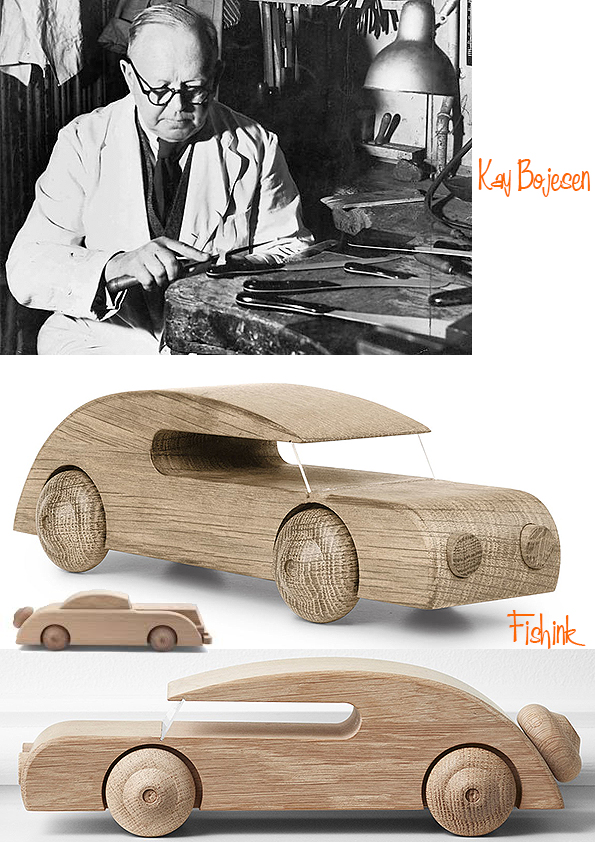
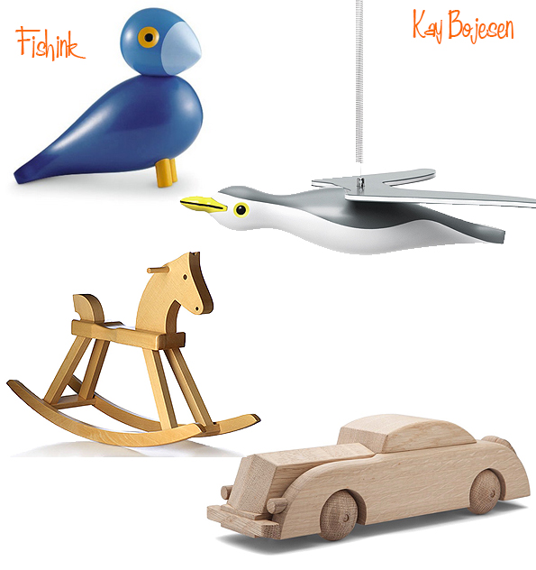
Kay Bojesen Wooden Classic Toys
Good morning.
Before we start with today’s post, I would just like to mention that I will be having my next ceramic selling event on 20th and 21st February via my stories at Fishinkblog.(www.instagram.com/fishinkblog). I am joining Curated Makers for their #postablepopup over in my stories and on their feed on Instagram starting at 9am UK time.
I will have a range of new ceramics to show and sell.

So to our featured artist for today… Kay Bojesen (15 August 1886 – 28 August 1958) was a Danish silversmith and designer.
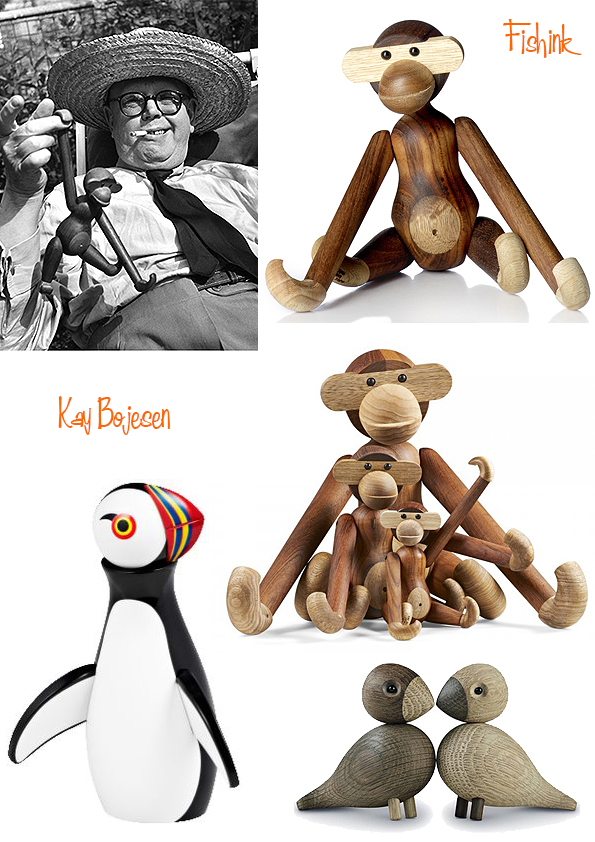
He is best known for creating wooden animals, especially his wooden monkey (above) which was exhibited at the Victoria and Albert museum in London in the 1950’s, and which today is considered a design classic.

Born on 15 August 1886 in Copenhagen, Denmark, Kay first trained to be a grocer, but in 1906 began working for Danish silversmith Georg Jensen. The Danish Museum of Art & Design describes his early work as being in an Art Nouveau style, likely due to Jensen’s influence.

In 1922, Kay began designing wooden toys, typically about six to ten inches tall, with moveable limbs. These included a teak and limba monkey (1951), an oak elephant, a bear made of oak and maple, a rocking horse of beech, a parrot, a dachshund, and toy soldiers of the Danish Royal Guard including a drummer, a private with rifle and a standard-bearer. In 1990, Danish design house Rosendahl bought the rights to the toys.

In 1931, he was one of the key founders of the design exhibition gallery and shop called “Den Permanente” (The Permanent), a collective which aimed to exhibit the best of Danish design. Kay also designed furniture for children, jewellery and housewares. A set of stainless steel cutlery he designed in 1938 won the Grand Prix at the Milan Triennial IX of 1951, after which he named the set “Grand Prix.” Today, the Grand Prix cutlery has been relaunched and is being manufactured by Kay Bojesen’s granddaughter, Susanne Bojesen Rosenqvist. The Grand Prix is known as the national cutlery of Denmark and is to be found in every Danish Embassy worldwide.
Kay Bojesen died August 28, 1958, at the age of 72. His shop in Copenhagen, which he founded in 1932, operated until the nineteen-eighties. Following his death it was continued by his widow Erna Bojesen until her death in 1986.

He was an honorary member of the National Association of Danish Arts and Crafts, and was recognized for his toys by the Danish National Committee of the OEMP (World Organisation for Early Childhood Education). I bet they feel great to play with, anyone have or had one of these growing up ?
Andy Lovell Etching our Landscapes
Hello everyone, I hope you had a great weekend.
I first spoke about the work of Andy Lovell back in 2010. His work pops up in my searches every now and again and I remember what fab illustrations he creates.

He is an artist, illustrator and printmaker who has become known for his abstract etchings, mono-prints and Cyanotype art.

Having originally studied at the Liverpool School of Art and Design, his work is well recognised and his individuality produces striking artwork.

Andy takes inspiration from life which is then revisited through the medium of print.

He is a master of line, colour and mark making.

Taking original sketches and paintings, Andy is able to capture a real sense of mood and place from the places he visits to sketch.
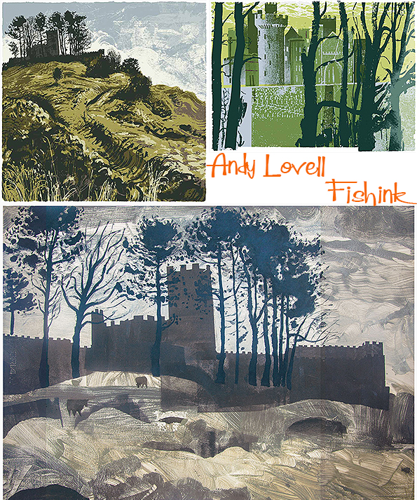
He knows how to add drama and interest to a landscape.

His landscapes speak of earth and furrowed fields. Forest and wildplants throw splashes of colour and shape, adding to the richness of each illustration.


I love these wild moor and lofty hill prints. The clever dragged lines of ink and paint not only help to suggest the landscape but also give a visual direction to each scene.

You can almost feel like you’re standing looking down these valleys.

The hills eventually lead us to the sea.

White cliffs and wild waters.

Tepid tones, swirling skies and seas.
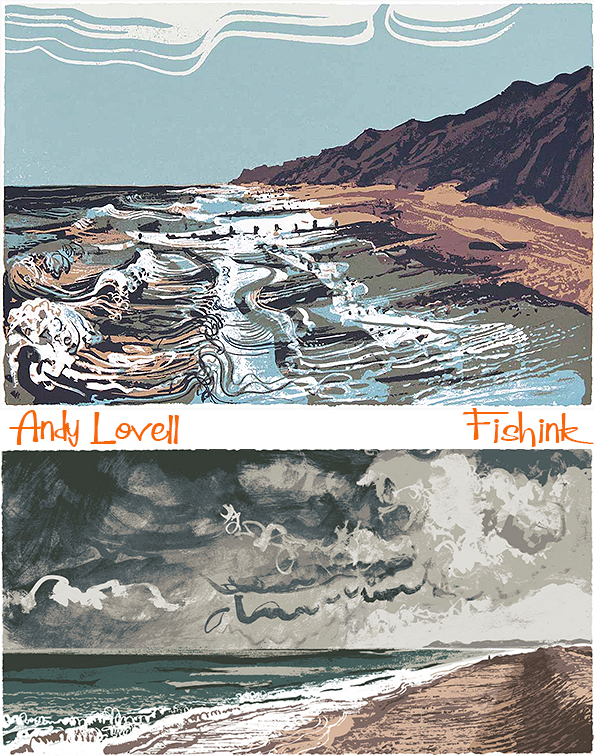

These textured black and whites are wonderful, with a slight sixties retro edge to them.


Breathtaking textures.

You can discover more of his prints for sale here on his website.
Gwenda Morgan Beautiful Woodcuts
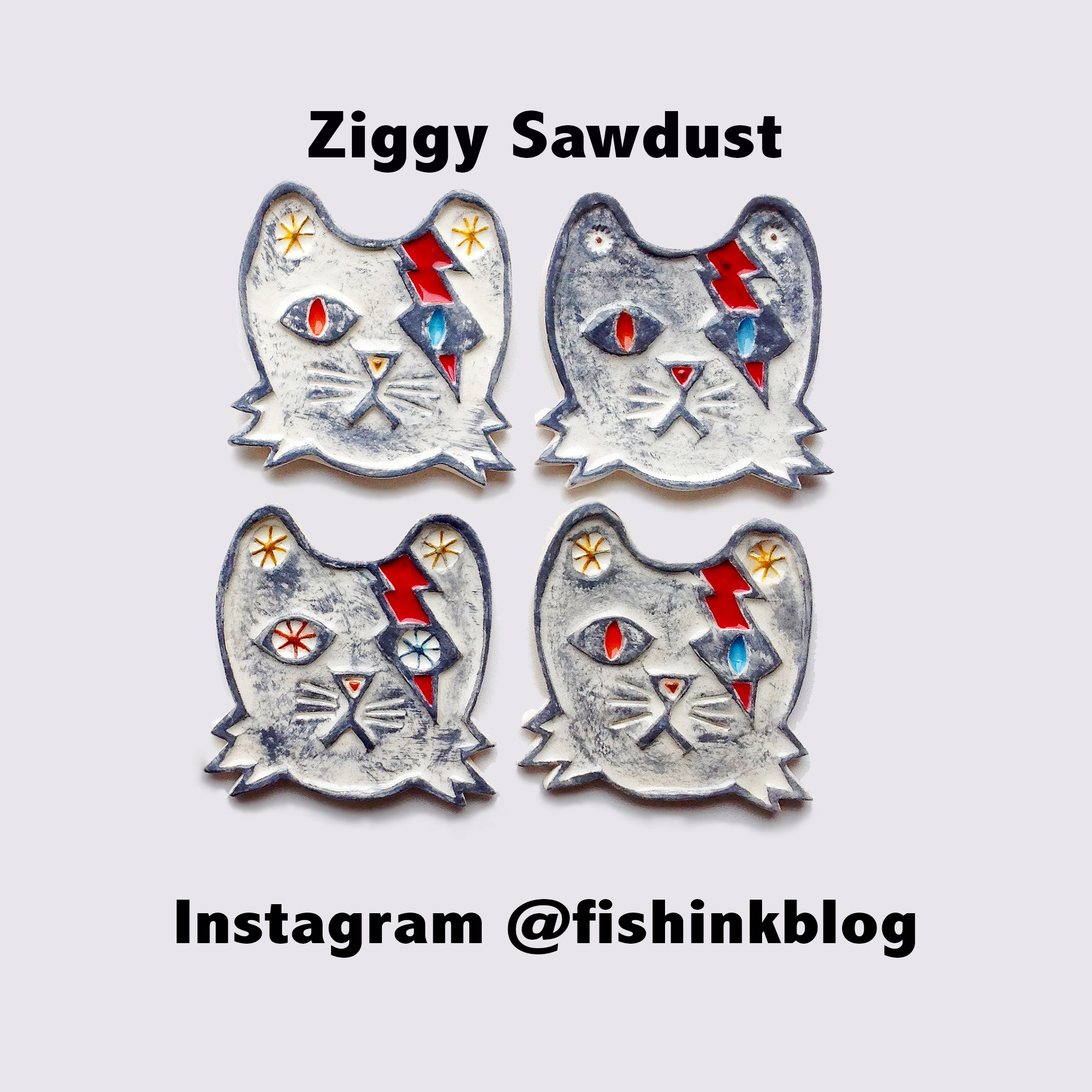
Hello one and all. I shall start by thanking everyone who came and bought from my ‘shop’ @fishinkblog on Instagram over the weekend. If you missed it don’t worry there are still many wonderful ceramics for you to browse through, but it was a great sucess and my work is now on it’s way to the USA and Australia which is fab.
I thought as it’s been particually snowy here in the UK of late that this artists’ work may be just the tonic, enjoy !

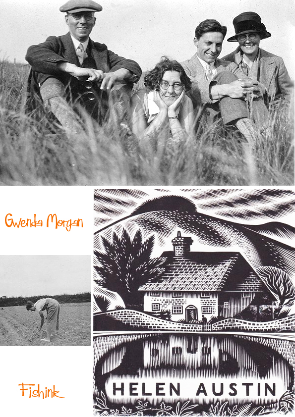
Gwenda Morgan (1908 – 1991) was born in Petworth, her father having moved there to work at the ironmongers Austens, of which he later became the proprietor. Following school in Petworth and at Brighton and Hove High School. From 1926, Gwenda studied at Goldsmiths’ College of Art in London.
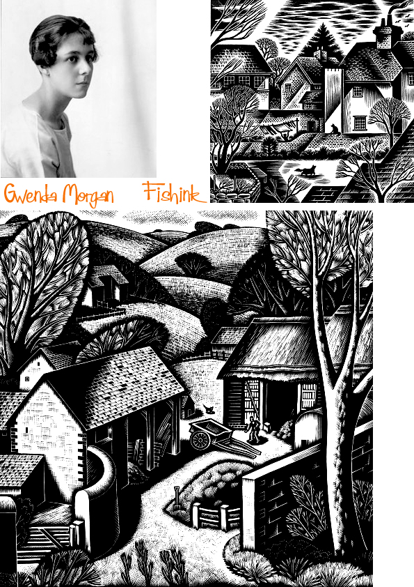
From 1930 she attended the Grosvenor School of Modern Art in Pimlico where she was taught and very strongly influenced by the principal, Iain Macnab. The Grosvenor School was a progressive art school, and the championing of wood engraving and linocuts fitted with its democratic approach to the arts.
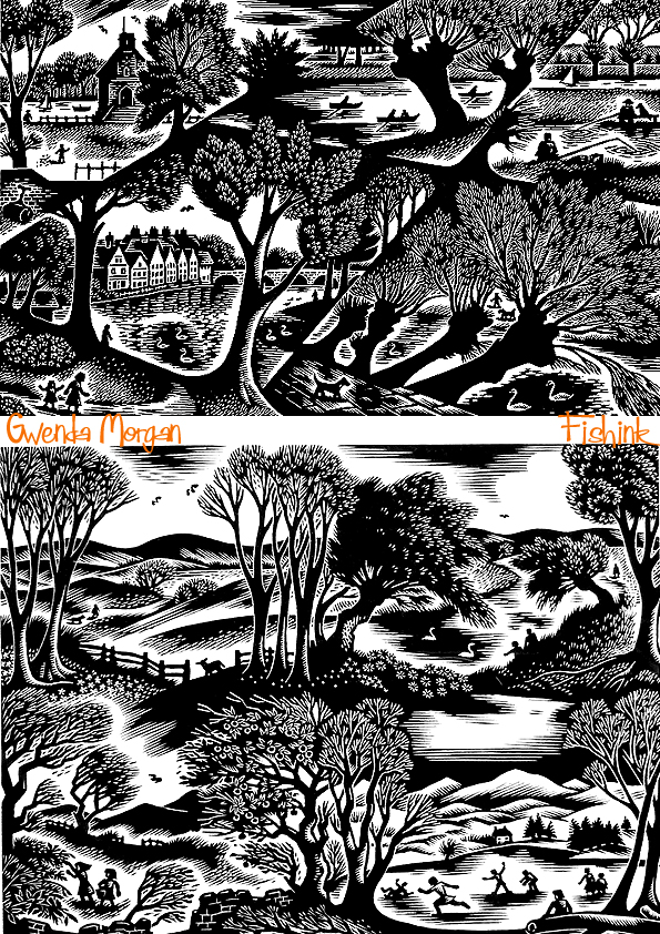
The main body of her work drew upon the landscape and buildings around Petworth and the neighbouring South Downs. Her work was inspired by that of Iain Macnab, Percy Douglas Bliss and the Sussex-bred Eric Ravilious.

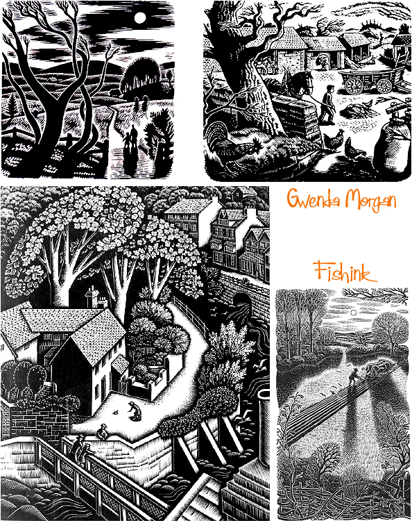
Throughout the Second World War she worked in the Women’s Land Army just outside Petworth. Her record of those years was published by the Whittington Press in 2002 as The Diary of a Land Girl, 1939-1945. It is a poignant record of the determination to carry on whatever the weather or wartime deprivations.
Here’s an excerpt from Christmas Eve.
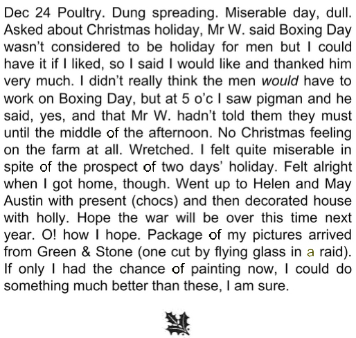
She was a Fellow of the Royal Society of Painter-Etchers & Engravers, an Honorary Member of the Society of Wood Engravers, and a Member of the National Society of Painters, Sculptors and Engravers, and she showed work at their annual exhibitions. She also exhibited at the Royal Academy and at the Redfern Gallery.

Her prints are held in the collections of the Victoria and Albert Museum and the British Museum in London, the Ashmolean Museum in Oxford, and the Fitzwilliam Museum in Cambridge, among others.
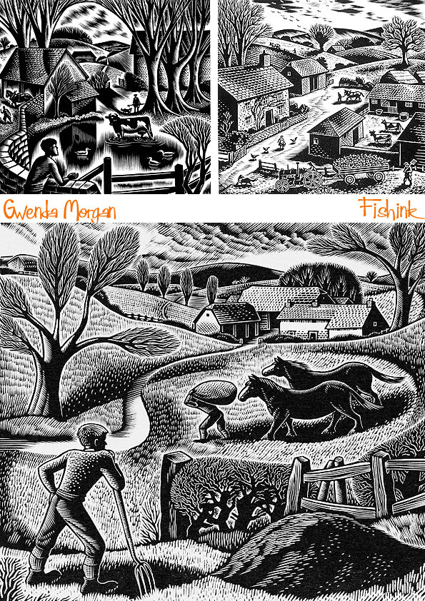
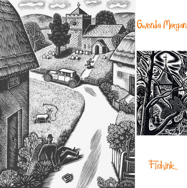
Some of her work has a wonderful sense of movement… even the still life woodcuts!
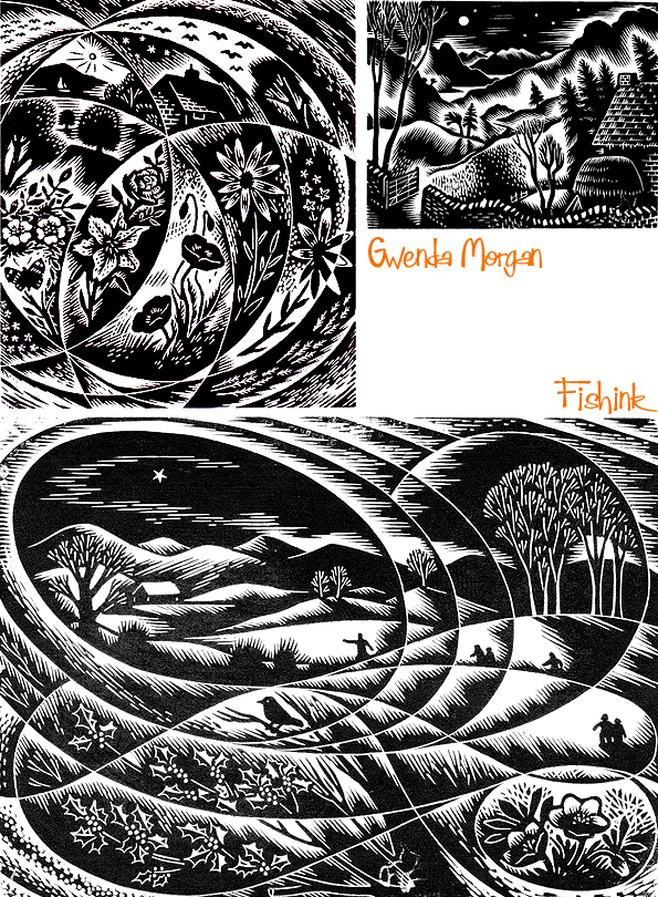
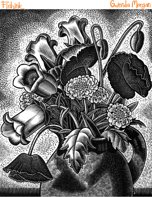

I feel that Gwenda’s work is somehow timeless, like this image above called ‘Winter Arrangement’, it feels like it could have been created last week and not over 60 years ago, as it was originally engraved in 1954!

Here’s a great shot of Gwenda with her family.
Lovely depictions of rural lifestyles at that time.

Save


