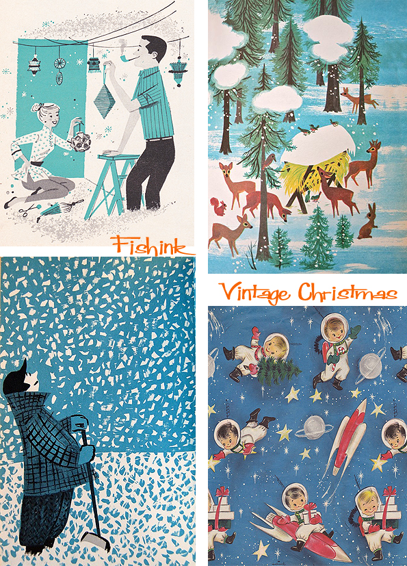
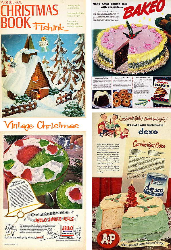
Fishink Christmas 2019
Hello everyone, and welcome. You’ve found me at the final Fishink post for the year : ( but don’t be glum, because there’s plenty to see : )
I’ve used some of these images before but to be honest when I was assembling ideas for the christmas blog, I couldn’t find much that rivalled what I already had. So I just added more to it to make a soooper bumper post !
I have enjoyed us travelling together throughout the year and thank you for keeping me company with your thoughts and comments. It’s been a particularly gloomy year politically here in the UK and even though I try not to bring politics into my art life it does drip, drip, drip into my conscious and subconscious thoughts. Let’s hope we can find a better direction, sometime soon.
I’d like to also say a big H E L L O to all the people who have ‘schnook-in the Fishink Blog backdoor’ and are now fully signed up, (albeit silent), members of the online community. Yes, that means YOU and that lady at the back with the big hair and fifties spectacles ! lol. Welcome one and all, and did you know this blog now has over 1000 email followers who receive my posts every time they are unleashed into the creative ether ! Keep spreading the word to your friends and followers and together we can turn Fishink Blog into a worldwide creative community.
Have a fab, safe and restful holiday and I look forward to catching up with you all again in early 2020.
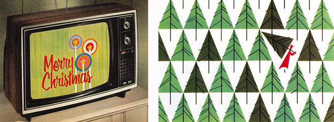
We start off with a few illustrations with Santa Claus. Did you know that he used to be depicted in green clothing and viewed more as a pagan figure ? and it’s influences like Coca Cola from the 1920’s and 30’s that helped turn his clothes red as we know them today.

I’m loving the Beatle Bauble ! Yeah yeah yeah !

Santa on a moped and in a flying bus, I wonder if J.K Rowling had seen these books before Harry Potter ?

A lovely vintage Radio Times cover here.


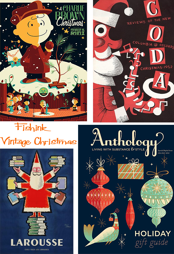
A few snowy themed book covers too.


Then thinking about christmas stamps.

A couple of sixties artists I discovered recently.


Baubles and decorations.


Swish and stylish reindeers.

Christmas trees and wrapping papers.


A few gifts I’m sure you ladies wouldn’t ‘die for’.
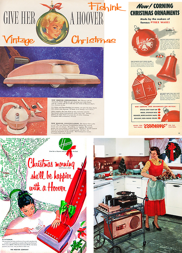
The same for you guys.

Christmas advertising.

Some rather dodgy looking christmas treats for your table from Jello, Bakeo and Dexo… Oh No !
A little snow from the oriental shores.

And to bring us to a final more restful place. Martin and Alice Provensen and their beautiful version of the Twelve Days Of Christmas.

Happy times to one and all and I’ll look forward to catching up in a few weeks. Thanks for all your regular comments and additions, they are REALLY appreciated and help to make Fishink Blog into more of a community too. Please do let me know your thoughts on the posts, the blog and if you have any ideas for featured artists, or work you’d like to share with us (that you feel would fit the Fishink criteria) then do drop me a line … craig at fishink.co.uk.
If you’re missing Fishink Blog over the holidays do take a look through the back posts, I’m sure you’ll have missed one or two.
Which ones were you favourites of the year ? Have a lovely restful break, be kind to your family and neighbours, and of course a ‘Merry Fishmas’ to everyone, see you in 2020. So it’s goodbye from me and it’s goodbye from Boo too : )

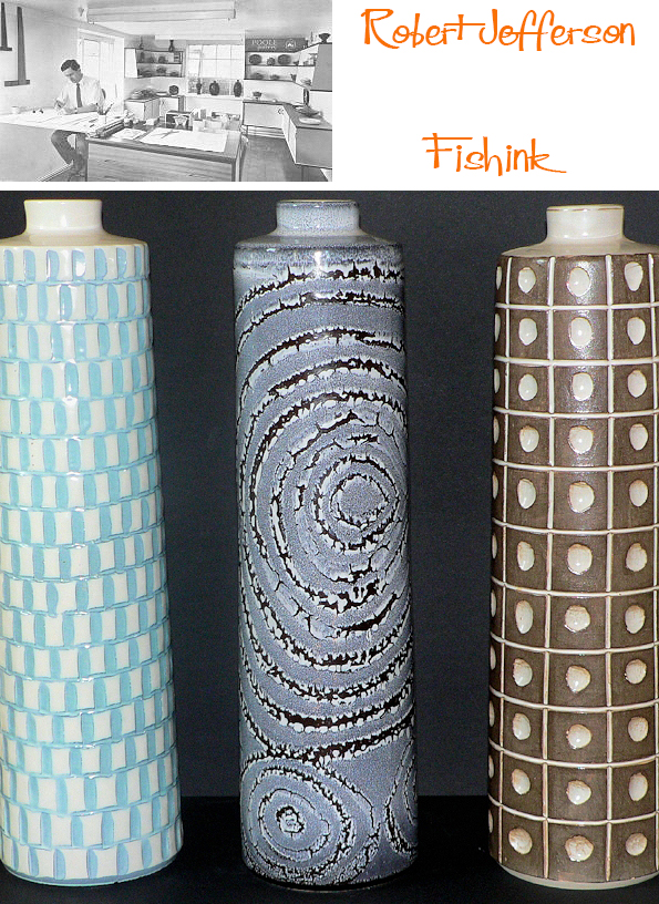
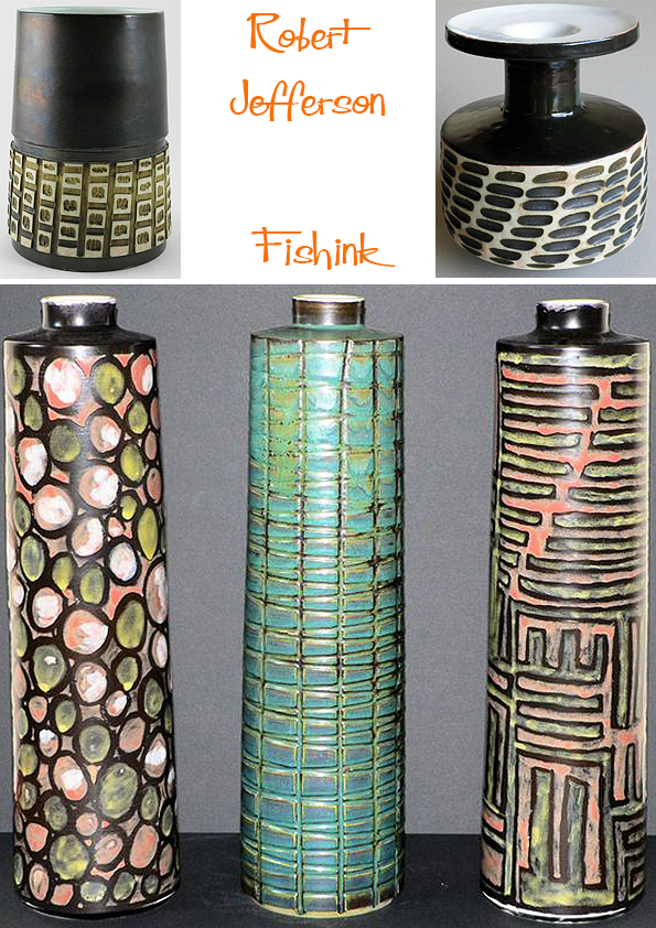
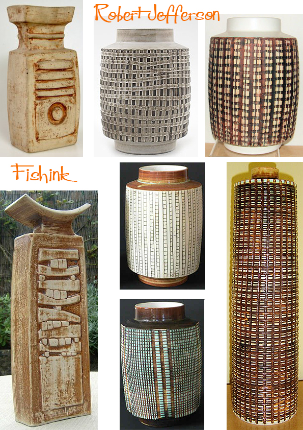
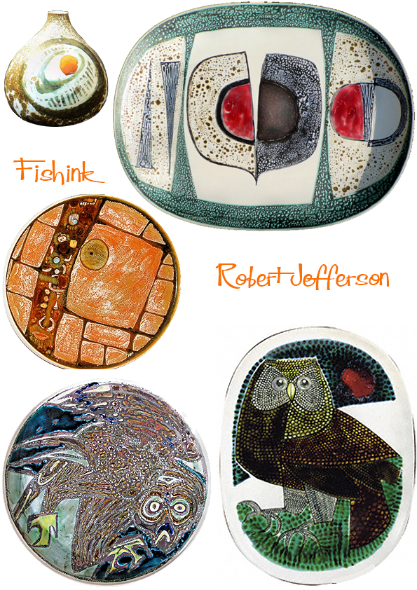
Robert Jefferson Ceramic Designer Part 2
Welcome back to Part 2 of my post about the work of Robert Jefferson. You can find Part 1 here.

Robert had a great eye for nature and incorprated it into his work whenever he could.
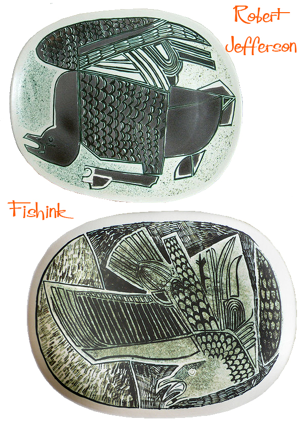
I love the marks that create this seagull above. They add to the drama of the whole piece.

Wonderfully textured ‘Helios’ table lamps and sumptuously curvaceous tea and coffee pots.
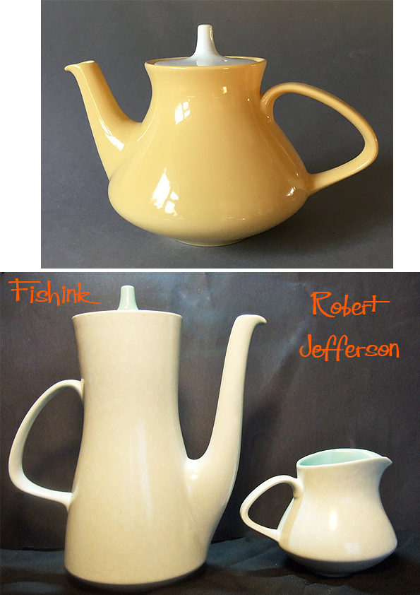
His decorative eye was both clever and precise. Like much Poole tableware these dishes are surprisingly thin bodied and lightweight. The high biscuit firing temperature used (1150c), produced a semi-vitrified body which meant these pots could withstand domestic ovens. Although, they were sold with a warning to avoid thermal shock. This “Oven to Tableware”, proved to be very popular.

As a textile designer, these mark-made vegetables and birds really caught my eye.


The shrimp are practically dancing on these dishes !

Robert was a great innovator: Introducing new technology to the factory and reinvigorating the Poole catalogue with new shapes and styles in keeping with a new decade. As well as the pots below, he also designed the “Contour” tableware range and “Black Pebble” pattern shown in the Twintone Gallery, together with Helios table lamps and other wares. He left Poole Pottery in 1966, after he had reputedly “designed himself out of a job”. He went on to continue his painting career, giving exhibitions of his work and showing his extensive love of detail and nature.

I wonder if this was his decorative world merging with the real one ?
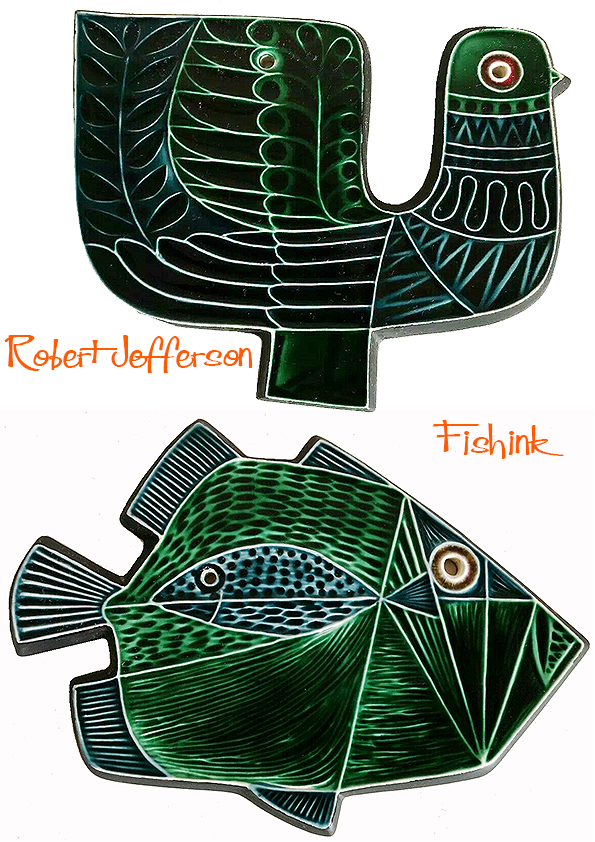
Below are some of the first wall plaques that Robert designed, these were hand decorated in the available studio glazes. The designs were ‘transferred to the production departments when greater output was required. These remain my favourite pieces of his work.

Launched as the 1964 ‘Spring Collection’ the plaques were then produced in the (much more common) standard colours of blue and green that you see below.
Other designs of plaques and dishes soon followed. See more about Poole Pottery and it’s production here.

My favourites are still the birds and I’d love to find a few for myself. I hope you’ve enjoyed this visit into Robert’s creative world.

Many thanks again to The Virtual Museum of Poole Pottery and Rob’s Poole Pottery for helping to make this post possible. Do let me know if you’ve found this post exciting, uplifting or have anything to add. I always enjoy hearing from you. My last post for 2019 will appear on Christmas Eve. Enjoy everyone.
Robert Jefferson Ceramic Designer Part 1
Robert Jefferson was a former lecturer in Ceramics at Stoke-on-Trent College of Art. He joined Poole Pottery in 1958 as full-time resident designer (rather than a thrower) working on domestic ranges and oven-to-table ware alogside potter Guy Sydenham.
When Poole Pottery was launched in 1921, Poole, Dorset, it was decided to make pottery, which was useful and ornamental, in a style both contemporary and also in the best traditions of potting. It was a very successful experiment.
Launched in October 1963, the so-called ‘Delphis Collection’ reproduced 75 or so vases designed by Robert Jefferson as a standard repeatable range. This allowed trade customers to place orders with a degree of certainty as to size, shape and price. Popular lines could be re-ordered from a catalogue. Although shapes were (to some degree) standardised, the colour, decoration, glazing and carving of each piece was unique.
The early Studio pieces were thrown by Guy Sydenham and decorated by both Tony Morris and Robert Jefferson.

After 1963 new patterns were added and there was a crossover of paintresses from other departments.

It must have been exciting times as there was much room for experimentation, mark making techniques and ideas were flowing.


Quite a variety of shapes and styles, in order to see which would catch the public’s eye and become popular.
There were few other potteries at the time producing studio pottery within a modern industrial environment in this way. (Rye and Denby too).
Robert later also worked for other compaies (like Purbeck) after he left Poole in 1966.

The use of the latest glazes and experimental techniques (such as wax-resist, see below) aided the development of new products and helped to preserve the unique identity of the Pottery. No doubt there was also perceived to be a niche market for highly individual works of art (the retail cost of one plate would be more than a weeks wages for the artist).
It’s Robert’s later work that I first encountered and that I was initially drawn to. Join me for Part 2 next week when I’ll show you more.
Many thanks to The Virtual Museum of Poole Pottery and Rob’s Poole Pottery for helping to make this post possible.
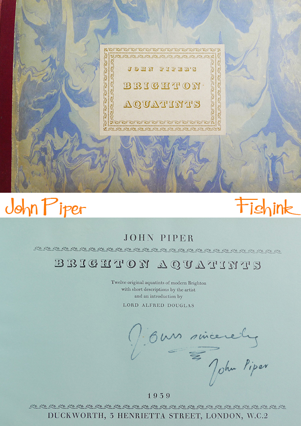
John Piper’s Brighton Aquatints and The Mainstone Press
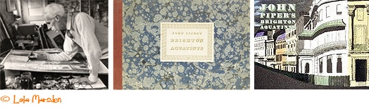
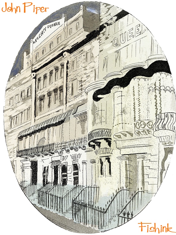
John Piper was one of the leading artists of the 20th century Modern British Art Movement. He worked in the abstract, romantic and classical traditions as a painter, ceramicist, writer, designer and printmaker. Piper’s 1939 illustrations for the book ‘Brighton Aquatints’, have been credited with the revival of the aquatint as a 20th century print medium in Britain.
The book consists of twelve aquatints of Brighton.

Two hundred standard copies were printed and a further fifty-five copies were hand-coloured by the artist.

The prints were not signed, although Piper did sign and dedicate some copies of the book. Modern auction house sales have reached between £2000 and £8000 for rare or signed editions.


The illustrations were printed by the two Alexander brothers who had a basement workshop in Henrietta Street, Covent Garden, London.
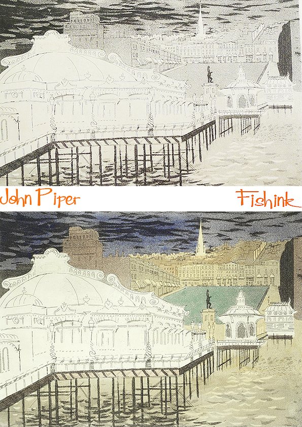
The process of creating an aquatint involves exposing a plate, usually of copper or zinc, to acid through an applied layer of granulated, melted resin. The acid incises the plate between the granules creating areas of evenly pitted surface. This can be varied by applying additional resin, scraping and burnishing. Different strengths of acids are also employed. When the grains are removed and the plate is printed it results in variations of tone. The effect often resembles watercolours and wash drawings, hence the name Aquatint.

This YouTube video tells us more.
Issued in the first months of the Second World War, Brighton Aquatints with it’s luxurious limited edition of 250 copies, was both strangely inappropriate and perfectly on cue for its time.
To celebrate the 80th anniversary of the book, Norfolk publisher, The Mainstone Press, has released a new, updated edition with an extended Introduction by Alan Powers – the noted historian of graphic arts of the mid-century – to dig deeper into the story behind the book.

It’s a lovely volume, with over 100 pages detailing each of the prints and additional insights into the spirit of the late 1930’s as a remarkable period of transition.

If you would like to purchase this fabulous book you can do so here at The Mainstone Press. Another fascinating piece of history now available to own.
Winter days and Sale Arts Trail 2019

The nights are certainly drawing here in the UK and it’s dark by 4pm.
We had our first really frosty weekend recently and the local countryside where we walk, looked stunning.

I loved how the sun made jewels out of the drops of water on this seedhead. Even pieces of frozen puddle take on their own kind of beauty.
The day before I was at the Sale Arts Trail’s Christmas Bazaar in St Paul’s Church in Sale. We had a great day and I met a few new faces to add to my list of designer buddies.
Here’s the talented Katie Shepherd and her collection of original paintings. It was her first fair and I must say from the number of red dots on her work, that she had a great day too.


From landscapes and people portraits to those of our furry friends, by local artist Inari at Ambiguous Brush.
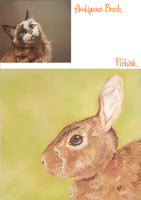
Her very reasonable rates mean that you could have a pastel A4 rendition of your pet for as little as £130, and when you see the quality of her work, that sounds like a bargain to me.

Beuatiful Japanese ceramics from my friend Yuki at Goro Goro Arts Studio. Check out more of her work on her Instagram account (follow the link).
Another designer I chatted to was Furniture Upholsterer Fola Agbalaya from (https://squaretwofurniture.co.uk). I didn’t have any photos of Fola’s work so here are a couple from her website. She has an eye for retro and a love for getting the details right too.

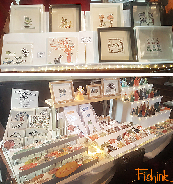
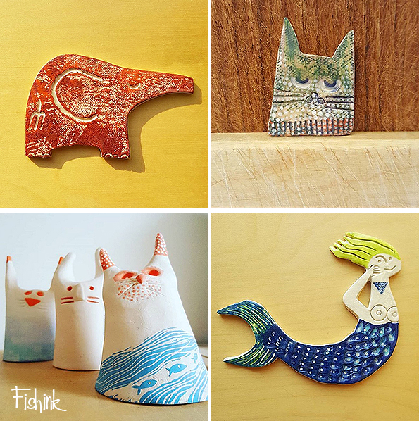
Finally some of my Fishink Ceramics
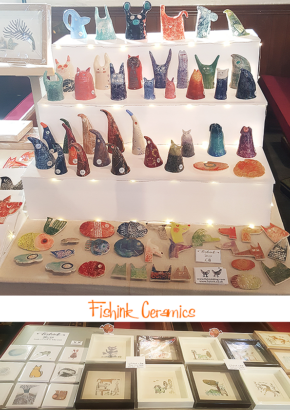
The most popular items of the day were my framed ceramic pieces ( a few of which you can just see in the full table display below, on top of the shelf). Needless to say I’ve only two left, so thank you to everyone who made a purchase, a comment, or just even a smile, believe me, it all helps make the event a really positive experience. Big thanks to Jo and Sophie as ever for making the show run so smoothly.
Although non of my ceramics are presently on my old Fishink Site, you can find some recent images on my Fishinkblog Instagram and there are some prices in the description too.

They are all made with a hook on the reverse to hang them on the wall and are £16 each plus P&P, the fish are £10 each plus P&P and the dogs at the start of this post are badges and are £8 plus P&P. Some pieces may have already gone.

Email me for more info if interested in any of the above pieces. Many thanks Craig
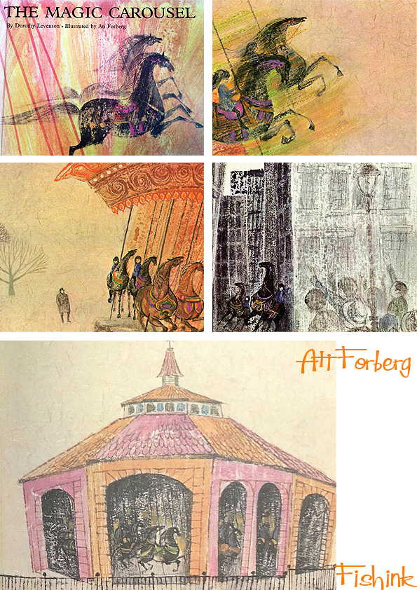
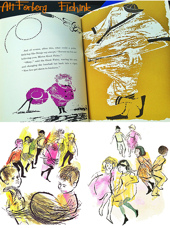
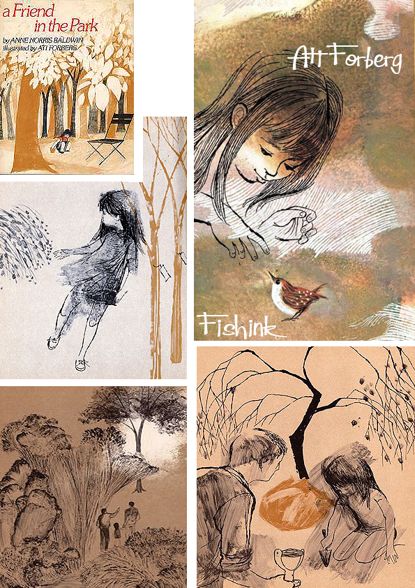
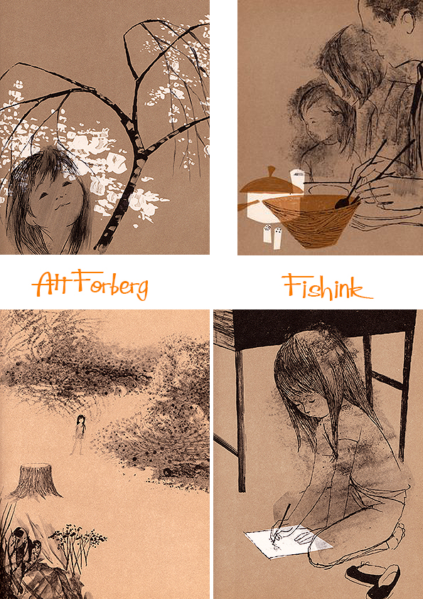
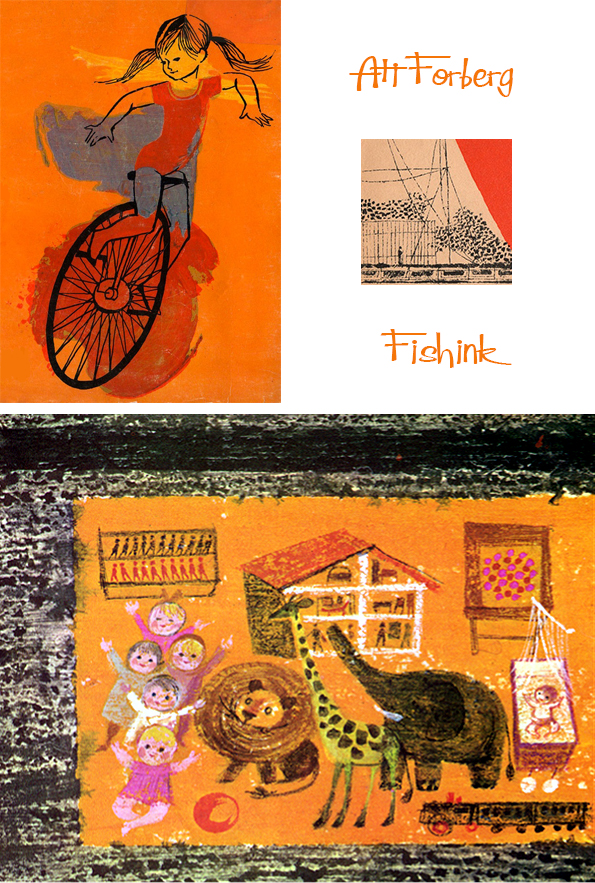
Ati Forberg Mid century Children’s Book Illustrator Part 2
Ati Forberg was a children’s book illustrator, working predominantly in the mid sixties and seventies. She sadly passed away in 2014 at the age of 88. If you missed part 1 of this post you can find it here. As you scroll through her work today, just bear in mind that this is all the work of one illustrator. How many different styles can you spot ?
We start with some delicate pencil drawings.

Add a little watercolour paint, coloured pencil and wax crayons.


Printmaking techniques, combined with bolder inks and gouache paints.
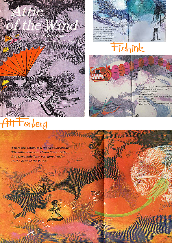


Pencil and watercolour.

A very different departure, and a very stylised character in Benjy. Splodgy and fun mark making techniques.

Inks and watercolours, layers and fine shading.
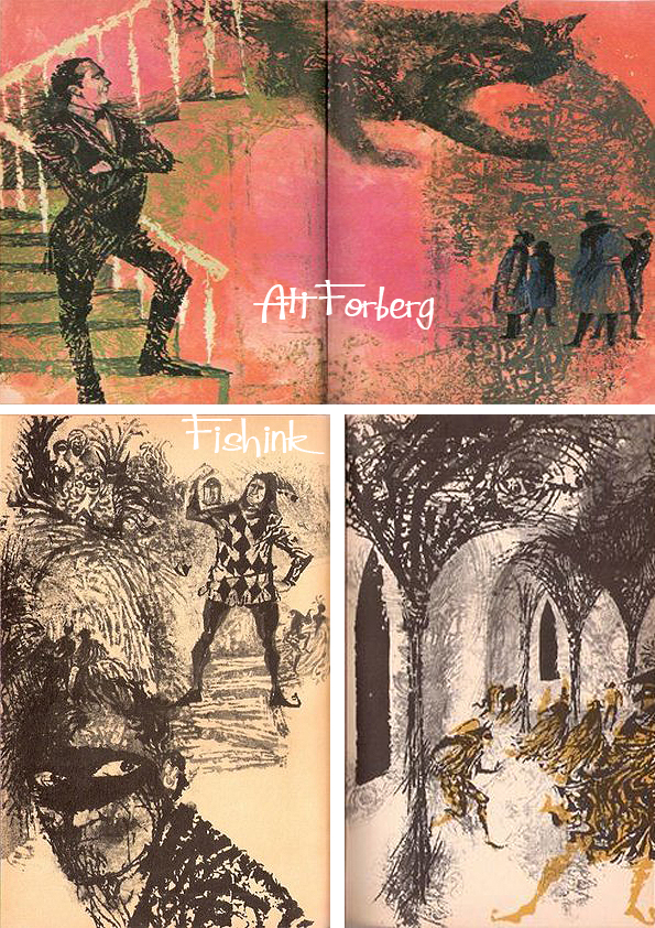

And finally an almost Japanese style. Black and white line work with added watercolours and chalks.
A former children’s book illustrator who taught students from Cape Cod to Germany about modern design and the movement her father helped launch, Mrs. Johansen died of complications from a brain tumor Sept. 7 in her Wellfleet home. She was 88 and had led workshops in Wellfleet as recently as the previous year.
“She found herself in teaching,” said her daughter, Erika Pfammatter of Waltham. “Not that she was lost before, but she was a born teacher and a warm teacher — a smart, caring, succinct teacher.” Here’s a flavour of this remarkable lady.
Her daughter says…” she was just as creative with ordinary moments.” When her daughter was young and the family lived in a Brooklyn brownstone, Mrs. Johansen would drive her an hour north on chilly winter evenings to a frozen lake in Tarrytown, N.Y. There she set out votive candles to illuminate the ice and her daughter skated while the strains of “The Blue Danube” drifted from a portable cassette player. “That was the essence of her,” Erika said. “She was full of fabulous, beautiful, magical ideas.”
I, for one, would love to have been taught by her. If you know anymore about Ati and specifically her illustration, or if you are a relative and have any great memories to share, please do get in touch.
Ati Forberg Mid century Children’s Book Illustrator Part 1
Ati Gropius Johansen (1926 – September 7, 2014) was an artist, graphic designer and teacher. Originally born in Wiesbaden, Germany, Ati Gropius Johansen’s given name was Beate, pronounced as if it was the first part of Beatrice. Her nickname, Ati, which she used all her life, sprung from the way she tried to say Beate as a child, when she couldn’t manage the pronunciation. Her mother was the sister of Ise Gropius, the second wife of Walter Gropius. At about 9, Ati was adopted by her aunt and uncle when her mother died. Her new parents offered an exit in the early 1930s from the rise of Nazism in Germany. She lived in England for about three years until Walter Gropius accepted a teaching position at the Harvard Graduate School of Design, and she joined her adoptive parents in the United States.

She was instrumental in continuing the legacy of her father through her teaching.
At 21, after finishing at Black Mountain, she married architect and designer Charles Forberg, who with Edward Larrabee Barnes created the logo for Pan American World Airways. The couple lived in Boston, Rome, Colorado, and Chicago before settling in New York City.
Her marriage to Forberg ended in divorce and she later married John M. Johansen, who was the last surviving member of the Harvard Five architects — a group that had been influenced by her father — when he died in 2012. They lived for many years in Stanfordville, north of New York City, where he designed his famous Plastic Tent House. They spent summers in the Wellfleet home they purchased in the mid-1970s, and Mrs. Johansen moved there year-round several years ago.
“She fell deeply in love with Wellfleet,” her Ati’s daughter said. “She loved nature and loved light. She was so sensitive to light. She would always say to me in August, ‘Don’t you see how different the light is?’ She saw all of that.”

Here’s a small example of the diverse range of books she illustrated.

In many different styles and using a whole variety of media and techniques.

There’s a beautiful sense of tranquility mixed with solitude about her work.

New books to old classics.

From workshops she taught in
Wellfleet to classes she led at the Museum of Modern Art in New York City and the Walter Gropius School in Erfurt, Germany, Ati had a wide geographic reach as a teacher.
Whatever the theme, Ati’s work takes you to the essence of the action.

Great inky lines, give a feeling of strength and movement.
More of Ati’s work to come next week. Tune in next monday.

And for those of you who are local to Manchester, don’t forget to pop along to the Sale Arts Trail this coming Saturday where myself and 35 other designer/makers will be exhibiting their hand-made crafts. I’ll have some new ceramics with me and there will be a fine array of Illustration, painting, jewellery, textiles and much more. Do say hello.


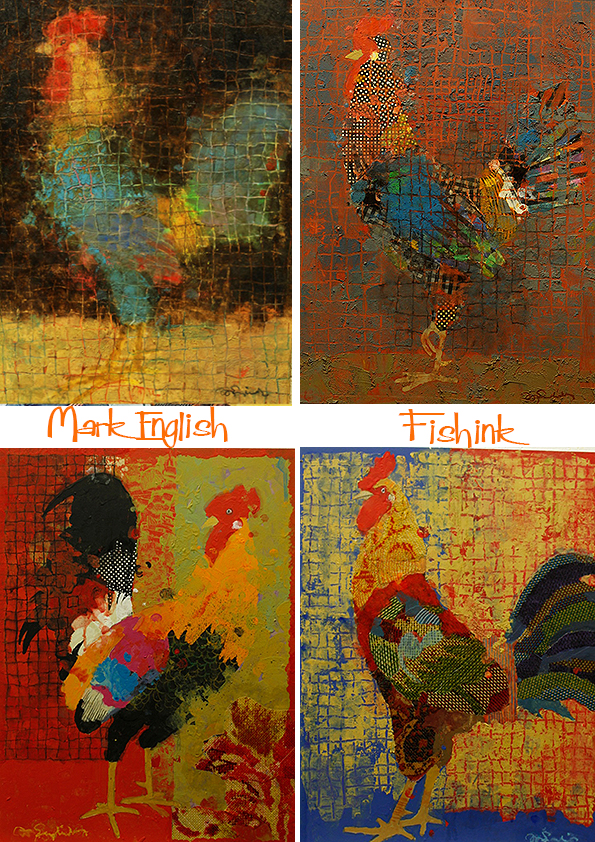
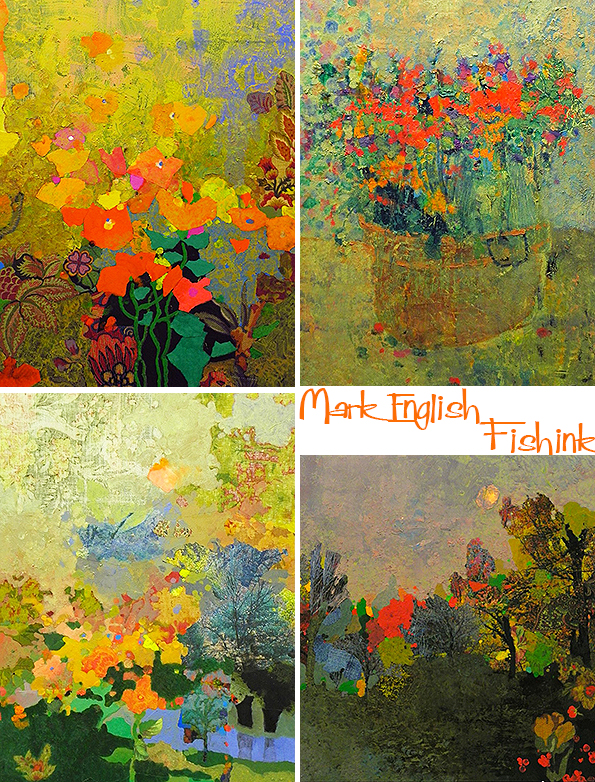
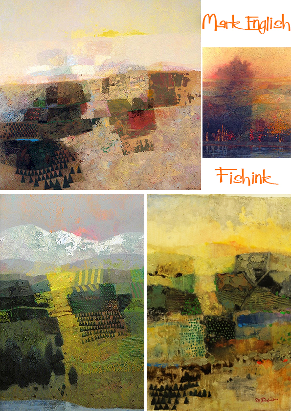
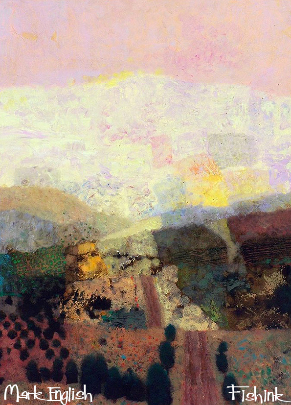
Mark English

Mark English‘s work has been a staple of the Illustration industry for decades. The Society of Illustrators inducted him into their Hall of Fame in 1983, and he continued to work in, and influence the market for years after that. Sadly, this giant of illustration passed away a couple of months ago. I thought I would showcase some of his work here today.
Mark was born in 1933 in Hubbard, Texas. He attended the Hubbard High School and graduated in 1951, after which he enrolled into the University of Texas and was then drafted into the military during the Korean War.
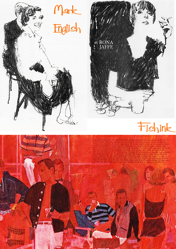
In 1954, Mark married his first wife, Peggy Ann Littlejohn. In 1960, Mark graduated with honours from The Art Center College of Design in Pasadena, California, with a BFA in Advertising Design.

After gaining work experience in advertising agencies for the automobile industry, Mark and his family moved to Connecticut in 1964.

He began an illustrious career, working with publications such as TIME Magazine and Sports Illustrated among others in the corporate, pharmaceutical, music and postage industry.
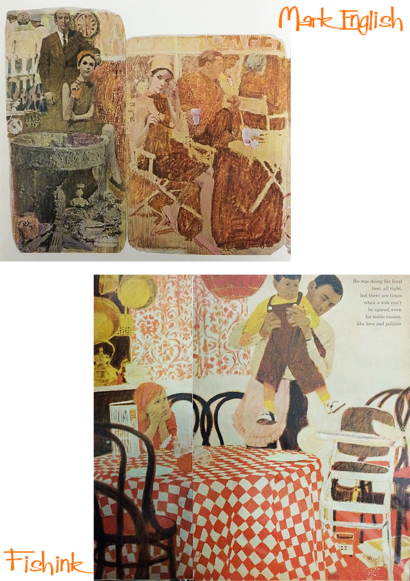
In 1977, Hallmark Cards offered Mark an Artist-in-Residency to teach classes to its creative staff in Kansas City. It was there that he met his second wife, Wendy Buskey, and they married in 1983.

In 1995, Mark retired from illustrations and began to paint for galleries in earnest.

He had quite an usual departure from his previous illustrative and quite photographic style.

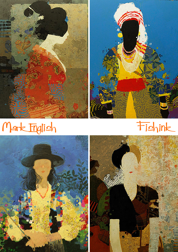
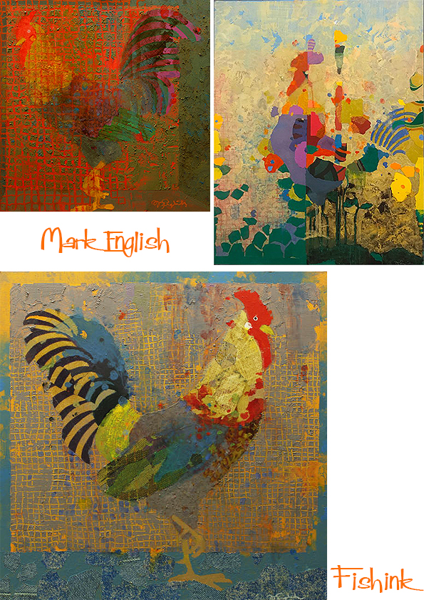
Combining elements of cloth, paper and motifs to help construct his decorative collages. Using a variety of subject matter such as people…
… bird life…
… flowers…
…cities…

… and horses.

Wonderful compositions and subtle dashes of texture and colour to help identify both the subject and the flow of movement. Look at the colours in this beautiful work.

Often Mark makes the viewer search for the animal in the work.

Stunning paintings and harmonious colourations.

However his most prolific work concentrated around landscapes. Playing with geometric shapes, layering colours and texturing throughout.
In 1995, he and his son John co-founded the Illustration Academy, an art and design workshop catering to students and professionals.

From 1999 onwards, Mark’s work and paintings were exhibited in galleries across the United States and in London.


Beautifully serene landscapes.

Mark’s last exhibition was in 2019, in the Sager Braudis Gallery, in Columbia. He has had a tremendous influence on multiple generations of artists and hopefully his work will continue to delight, inspire and shine out from blogs like mine well into the future. How many of you readers knew of his work already ?
If you liked Mark’s early work you may also admire the work of Mac Conner.
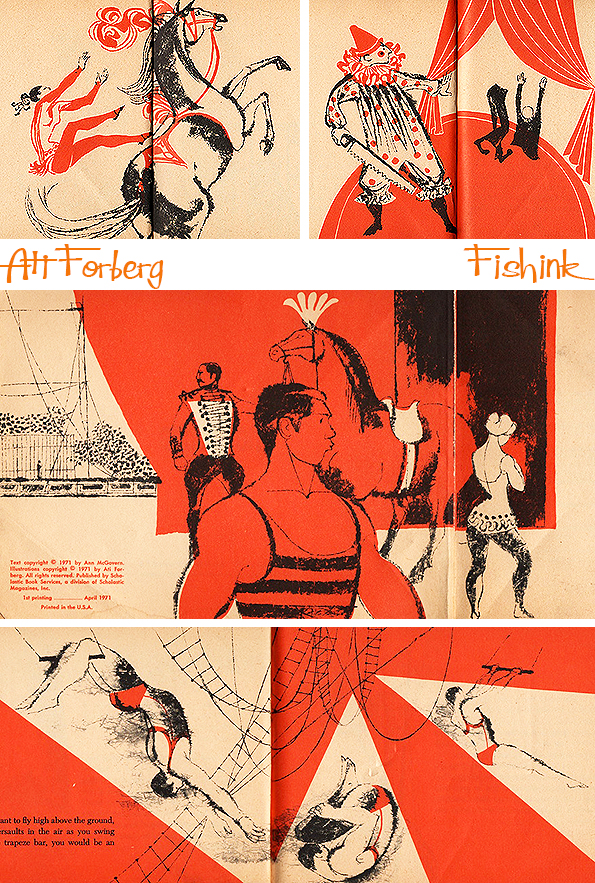
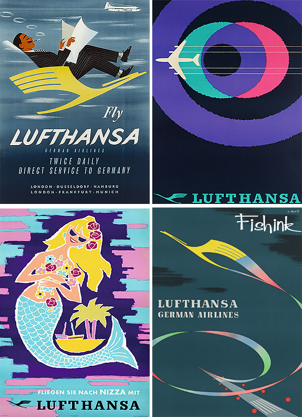
Mid Century Airline Posters Part 2
Welcome back to part 2 of my blog on Mid Century Airline Posters. If you missed part 1, you can find it here.

These posters (below) were designed by the artist Jean Carlu. I like his crayon-like lines.
Relax in style, retro-style with Lufthansa.
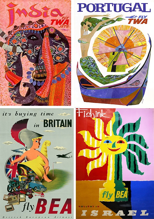
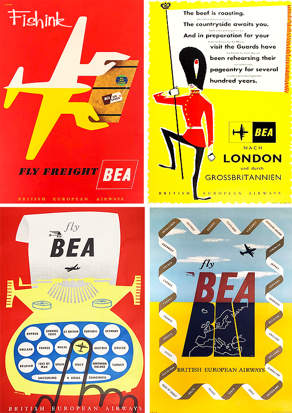
A few more from BEA.

The Spanish poster above was created by John Minton.

From BEA to BOAC and a graphic style and some quirky animals.

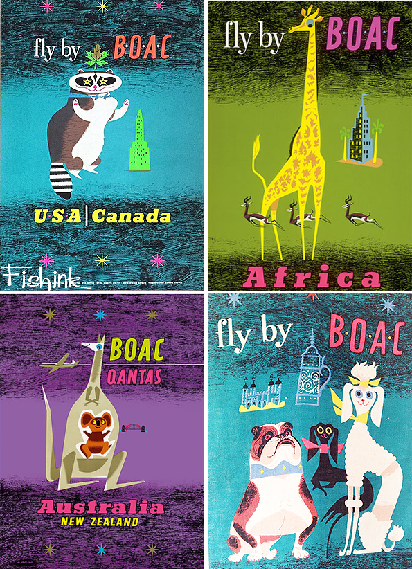
The amusing animals continue into these great Quantas posters.
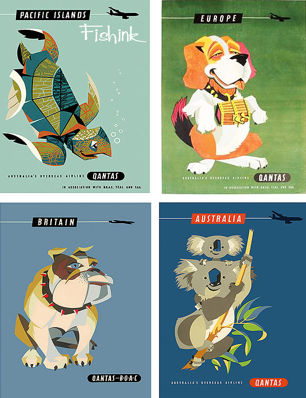
Simple yet inspirational !

Finally we come to the Golden Gate Bridge and a splashdown at Niagra Falls with American Airlines.
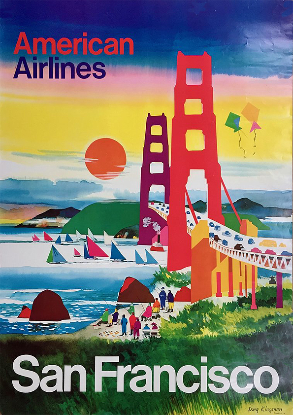
More from Dong Kingman (above) in a future post.

If you enjoyed my posts then do check out these similar ones about Pan Am, B.O.A.C Part 1 and B.O.A.C Part 2 and Braniff.
Also please leave me a comment with your thoughts and most of all…. Have a fun start to your week !
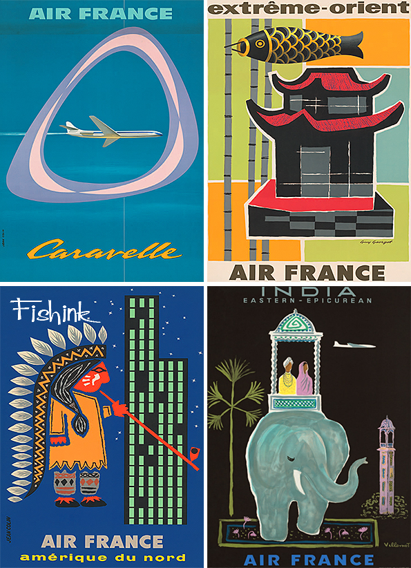
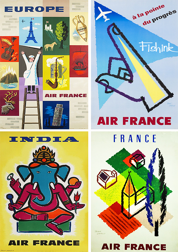
Mid Century Airline Posters Part 1
I’ve covered many different Airline Posters on Fishink blog in the past. There’s Pan Am, B.O.A.C Part 1 and B.O.A.C Part 2 and Braniff to name a few.
Here’s a great collection that I came across and haven’t seen many of before. I make no apologies if they have appeared on here previously however as they are all rather special!
Let’s begin by flying TWA.
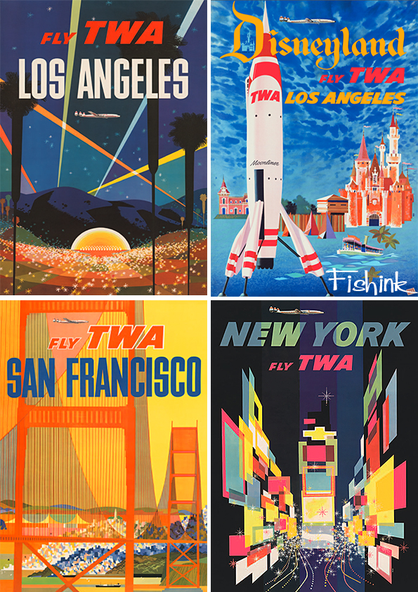
Some wonderful posters, which make me want to hop on a plane right now.

Great use of colour, space and design. They are visually captivating.
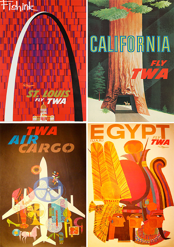
Many of these wonderful posters were designed by David Klein. Such a talented artist.
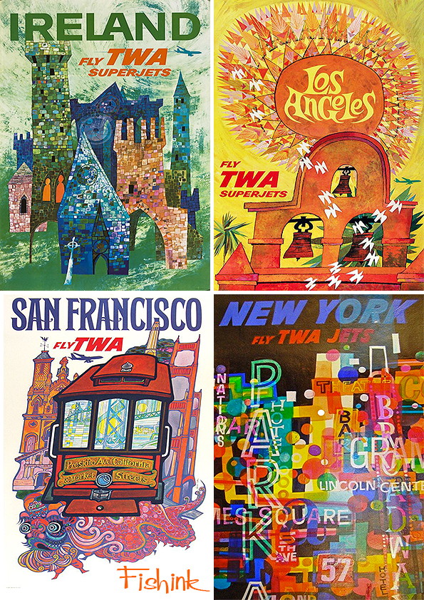
From TWA to BEA.
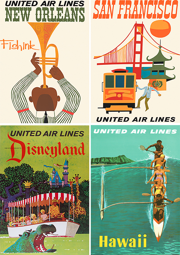
Followed by some fresher United Air Lines posters.

That Miami Sun is fabulous don’t you think.
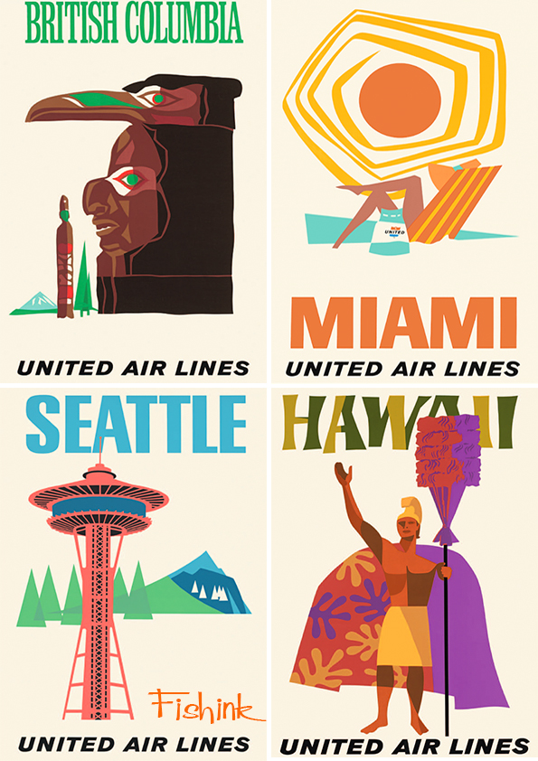
The San Franciso poster below, makes me think of Miroslav Sasek. Or perhaps they’ve just picked the same elements.

A little more structure from American Airlines.


From Braniff to Japan Air Lines.

A few Pam Am specials to finish for today. Is that Cilla ?

More Mid Century poster madness next week.


