Sheffield Fishink travels
It’s about a 40 minute train ride from Manchester to Sheffield, I’ve never actually visited, always just passing through during my student days, taking coaches between Nottingham and Liverpool. So, a few weeks ago, I decided to remedy this and go and see what the city had to offer. It was a bit of a grey January start.
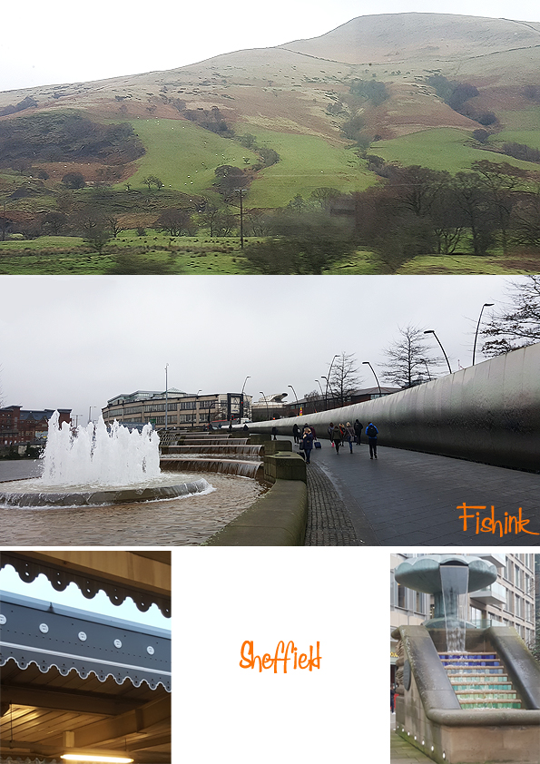
Sheffield is a city and metropolitan borough in South Yorkshire, England. Historically part of the West Riding of Yorkshire, its name derives from the River Sheaf, which runs through it. The city is in the eastern foothills of the Pennines, 61% of Sheffield’s entire area is green space, and a third of the city lies within the Peak District national park. There are more than 250 parks, woodlands and gardens in the city, and Sheffield is estimated to contain over two million trees. (Wikipedia)
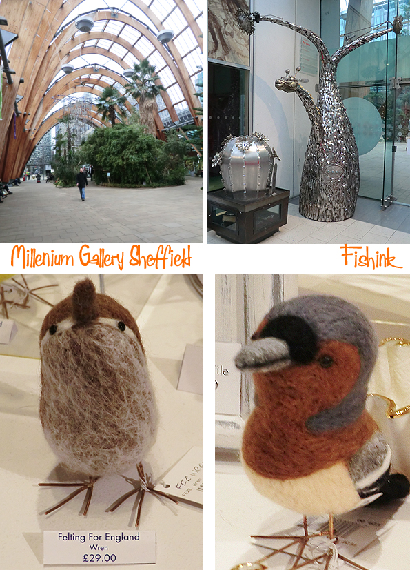
I had hoped to be in time for the Ravilious and Co exhibition at the Millennium Gallery, which came from the Towner Art Gallery to Sheffield and is moving onto Compton Verney Art Gallery in March this year. Sadly I was too late and it had finished, which for a free exhibition, I was feeling crazy to have missed, especially as the entrance fee for a non member at Compton Verney will be £25! There was however, a great gallery shop with a range of Ravilious products, I treated myself to this book and look forward to dipping into it when I get the chance. Opposite is a lovely scarf designed by Tirzah Ravilious (nee Garwood).

I was impressed by the Winter Gardens, attached to the Gallery and housing botanical plants and sculptures. It’s a lovely airy space.

There was a room selling a range of designer/makers work. These cheeky birds caught my eye from Felting for England.
A collection of ceramic scenes by Sarah Moss.

And a delightful mix of scenes and birds from Frances Noon.
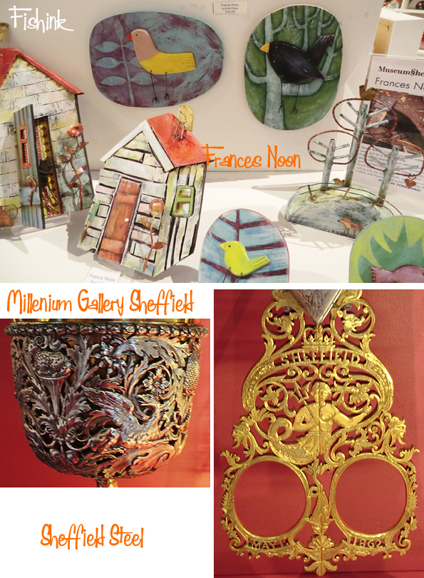
In the 19th century, Sheffield gained an international reputation for steel production. Known as the Steel City, many innovations were developed locally, including crucible and stainless steel, fuelling an almost tenfold increase in the population in the Industrial Revolution. Sheffield received its municipal charter in 1843, becoming the City of Sheffield in 1893. International competition in iron and steel caused a decline in these industries in the 1970s and 1980s, coinciding with the collapse of coal mining in the area.
There’s a whole host of steel and silver artifacts on permanent exhibition at the gallery, I was drawn to the pieces with animals in them.

Beautiful, intricate work.
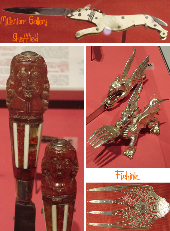
Forks, serving spoons, walking stick ends, door handles… the list goes on and on.

Does anyone know what this (above right) was used for ? Answer at the end of the post.

Some of the pieces were dated as early as the 16th century !
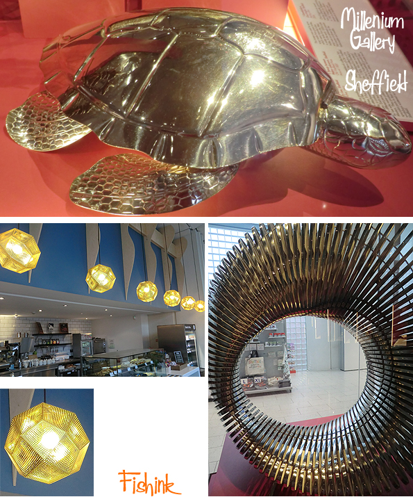
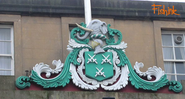
Outside I spotted this elephant, high above the Cutlers Hall.
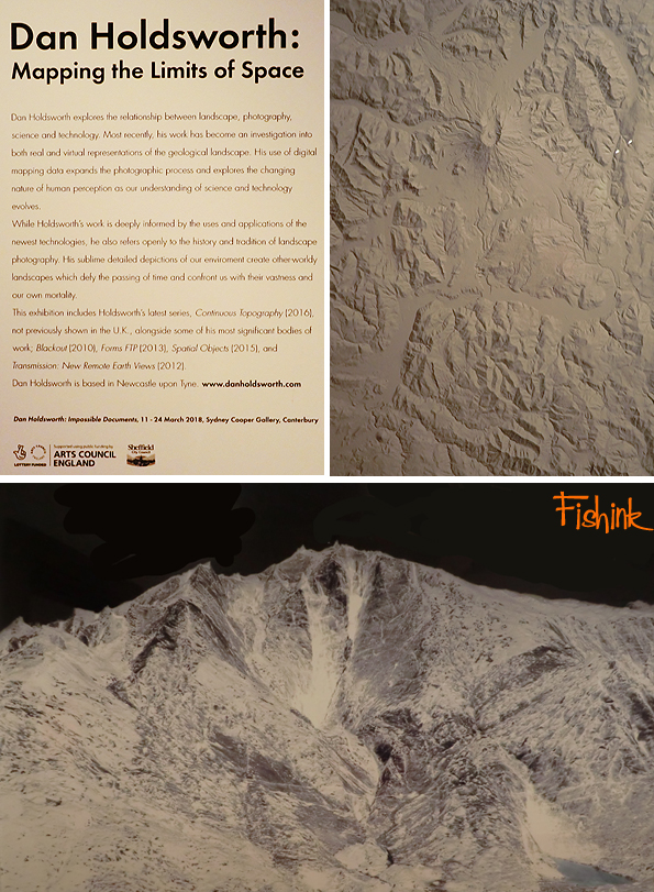
Just around the corner from the Millenium Gallery is the Library and the Graves Gallery, where this exhibition of British photographer Dan Holdsworth was taking place.
The rest of the art gallery had a great collection of mid century paintings.

Quite a few familiar names but also a few new ones to investigate further.
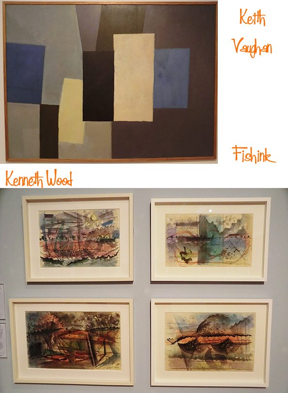
Hard to appreciate the true splendour of some of these pieces, as they are behind glass with light shining on them too.

Beautiful landscapes from Paul Nash and Harry Epworth Allen.

All in all a great day out and a fab introduction to Sheffield with it’s not one but two Art Galleries. I will return, but probably not until it’s warmer ! Well done to those of you who correctly spotted that I’d forgotten to tell you what the mystery object was above … doh.. It’s a device to take the top off your soft boiled egg !
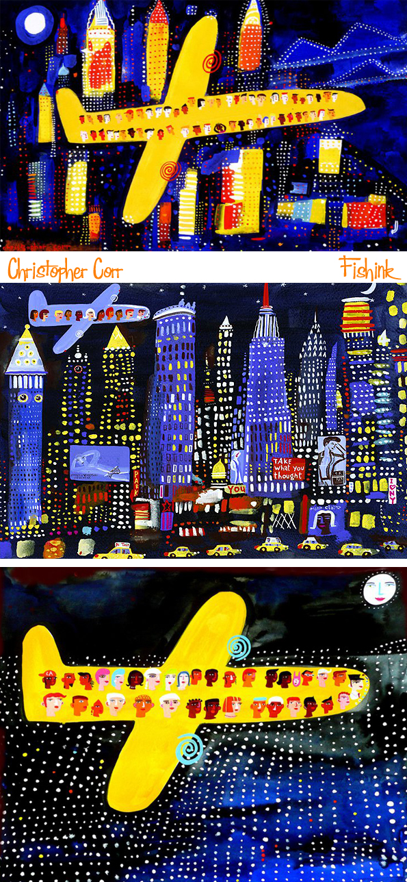
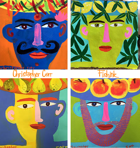
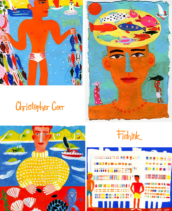
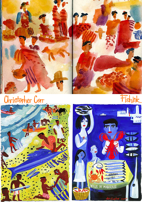
Christopher Corr The bold and the beautiful
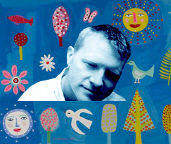
Christopher Corr was born in 1955 in London. He says that his work is all about joy, colour and a love of life and I would very much tend to agree. I’ve admired Chris’s bold style for many years now and was excited when I got in touch with him to discover that he not only liked Fishinkblog but was happy to be featured on my site. The rest (as they say) is history …
Hi Chris, what was your first memory of art / drawing for yourself ? Were your parents artistic and if so was painting positively encouraged during your childhood ?
I have always drawn and painted and I have early memories of scribbling with crayons and playing with paints. My mum really encouraged me to develop my arty skills and I can remember us drawing together. I was given lots of drawing materials to play with. Reading was important too and I joined the local library when I was about 5 and made weekly visits to get new books and return the old ones. I still follow these principals.
Have you any plans for more children’s books ? Textiles designs etc as I think your work would lend itself to these areas very well.
I like children’s books and I have worked on quite a few…..
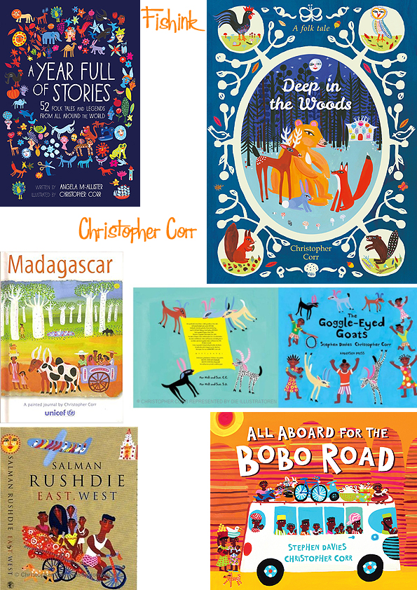
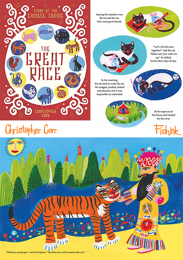
It’s a tricky & a difficult area but I’ve enjoyed most of the projects I’ve been involved in. My latest book is called ‘The Great Race’ and it’s a retelling of the Chinese Zodiac story. It’s full of animals in a very Chinese hilly landscape. The world has lost track of time and so the Emperor organises a competition for all the animals to compete in. They have to swim across a big river and the first 12 will be the guardians for each year in the cycle of time. It’s quite cosmic.
The previous book was a big anthology of stories from around the world, 52 in total. I love folk art and folk stories and it’s a great way to see the world.
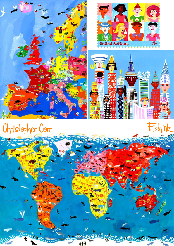
I’ve been working a big textile project which will be launched in the Autumn of 2018 and I can’t say much about it except it has a world theme too. I enjoyed the process a lot and I’d like to do more. Josef Frank is a huge inspiration. I like his playful approach to textile design and his love of colour and natural forms. His NYC map textiles are stunning.

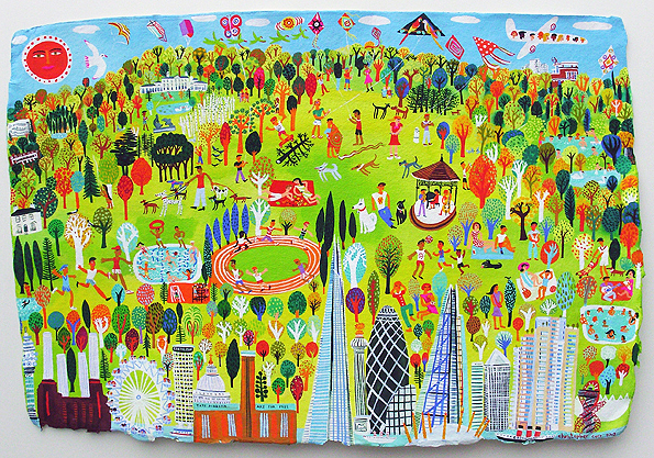
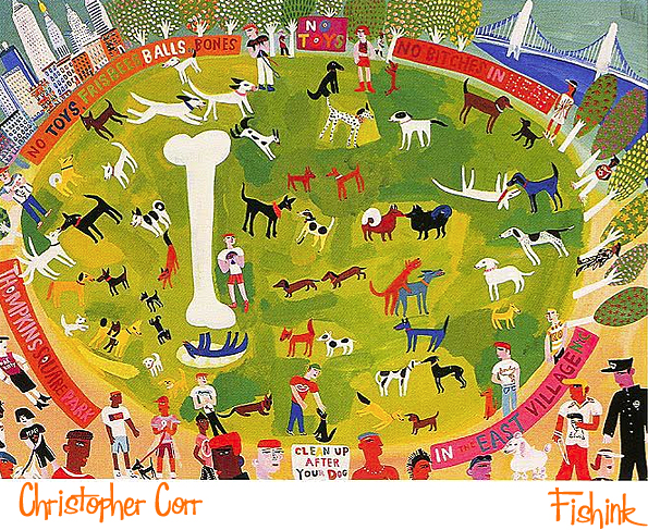
He loves taking on rather large scale commissions too, the one above is of Wartburg, NY and the two below are painted from Parliament Hill in London and Thompkins Square Park in East Village, NY.
I’ve read that you studied Graphic Design in Manchester before you went to the RCA. At what point did your style and palette start to mould itself into the portfolio I see today and when did illustration and painting become important to you as a career ?
I studied art for 7 years, first at Manchester, a Foundation Course, a 3 year BA in Graphics followed by 3 more years MA Illustration at the RCA. I wanted to draw and experiment during my studies. It sounds like a long time but the time flew by. I started to travel and draw as a student, applying for scholarships and competitions to help pay my way. I realised that getting away to new places opened my eyes to new ways to see & draw. There is always so much to see and learn. In my 2nd year at the RCA, I went to the USA for 5 months to travel and draw and see what was happening over there. I drew every day, street scenes, city-scapes, lots of architecture, everything was new and so exciting. I’d seen Paul Hogarth’s urban American drawings and they certainly inspired me, Hopper too and Ben Shahn. There is nothing like traveling and seeing with your own eyes to open your mind.
Where do the colours in your palette derive from as they often look a little Mexican, Jamaican or Trinidadian ( somewhere warmer than the UK anyway lol) ? How often do you paint from life or do you prefer to sketch ideas from life, photographs etc and paint later once your plans for a painting are more established ?
I went to India in 1986 and I discovered colour. It was a truly wonderful and significant moment. A true revelation. Here was pure and rich beautiful colour! I had never seen such pure and intense colours before and it changed me profoundly. It was like arriving on a new planet and one where I didn’t know the rules. Everything was more vivid, more colourful, more crowded, more noisy and stranger than everything I had seen before. And how to draw it ?
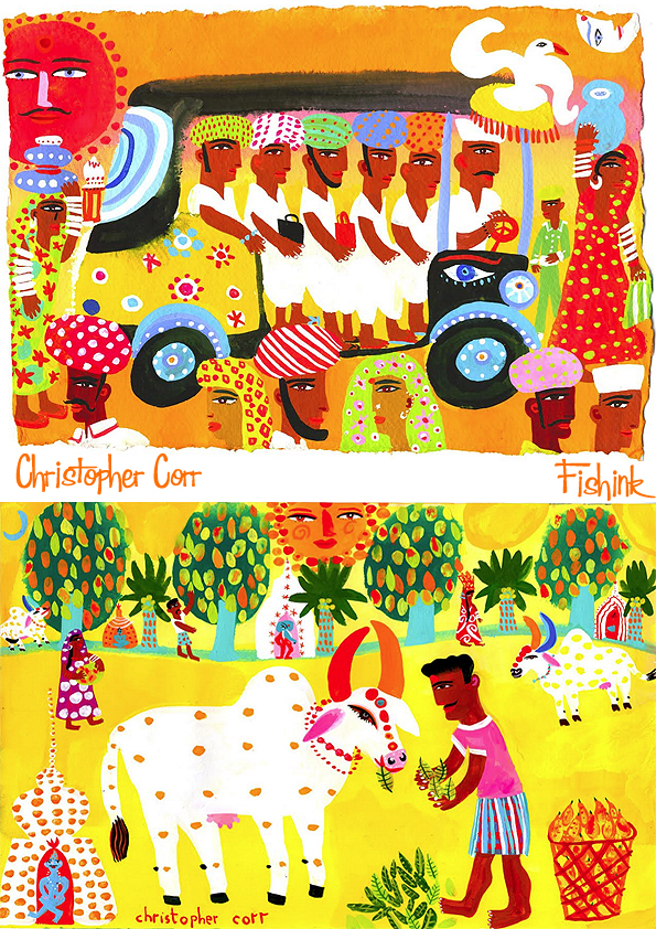
I quickly realised that if I sat in an Indian street and started to draw I became a crowd magnet and drawing became impossible. So I started drawing super fast, on foot as I walked, in small note books, in buses, rickshaws, trains but never for too long. It was a good lesson: look hard, draw fast, don’t get comfortable. I tried to record everything I saw in my little sketch books and it changed everything for the better. Sometimes I found a good location to paint from, usually a rooftop or a balcony view where I could work in colour.
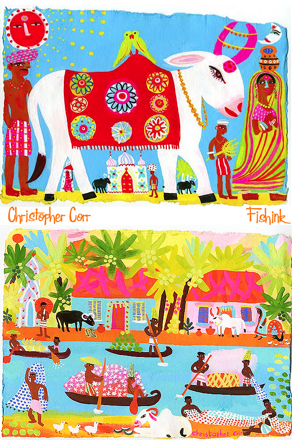
It ’s still a way I like to work and nowhere is harder than India to draw on location. It’s sketch book boot camp !
India taught me to love and value colour and to draw fast. I’ve traveled in Mexico and Guatemala, Brazil and Bolivia and Peru, in other parts of Asia and Australia and in Africa too, but nowhere has the intensity and vibrancy of India.
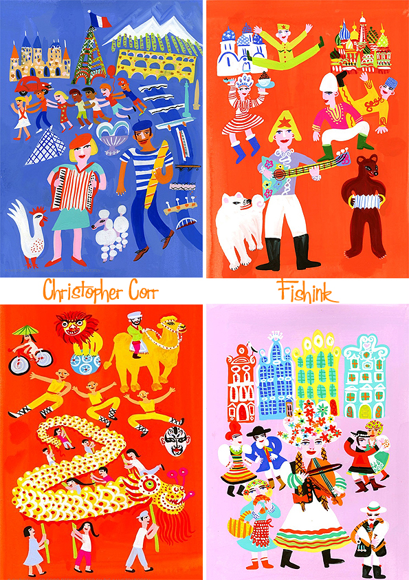
America is all about capturing the upward spaces as well as the ones on eye level.
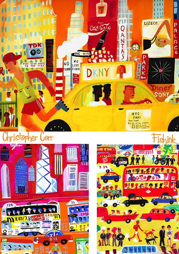
And why not do that from the air !
What subject matter delights you most to paint ?
Cities are fascinating ! I think cities give me most inspiration. I like exploring and drawing new city-scapes. It’s all the ghosts and new energy, all the lives and all their stories that fascinate me. I want to be a world citizen.
When I was very small I had some of Sasek’s books about world cities. NY and London were my favourites.
Christopher certainly knows how to travel. I wonder how long he’s actually in the UK with all these world experiences lol.
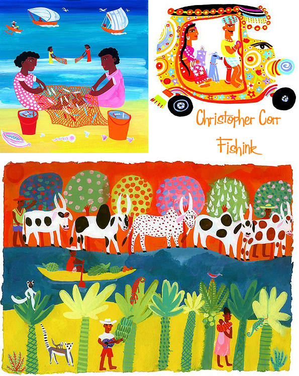
Of course people play a large part in his work. This gardener looks very content in his floral surroundings and I like the texture that all the flowers add to the painting.
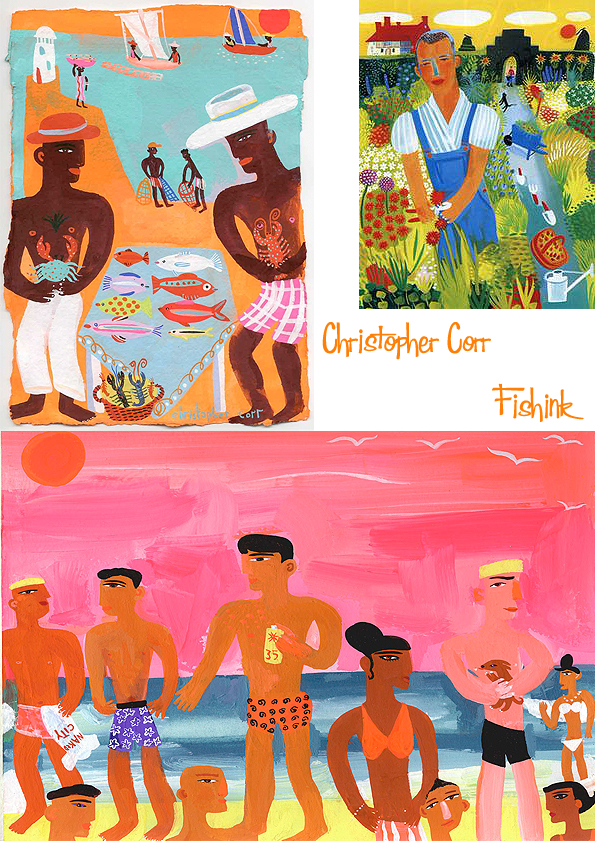
Faces, people, busy, busy, busy.
Where would we be without animals too.
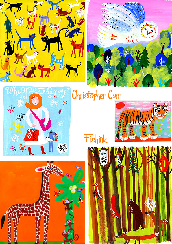
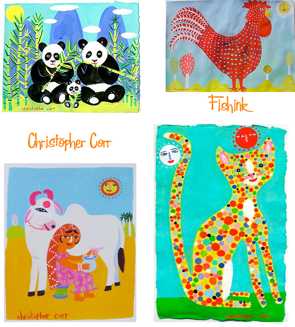
Aren’t these big cats fab !

All captured in Chris’s wonderful sketchbooks too. You can just feel the speed at which he has to work to get the information before him down.
These figures are lovely.

Many thanks to Christopher for his time in answering my questions and for sending me some images to use. I’ve very much enjoyed learning more about the artist behind the art too. You can find works by Christopher to purchase at the Rowley Gallery site. What do you find inspiring about the illustrations in today’s post ?
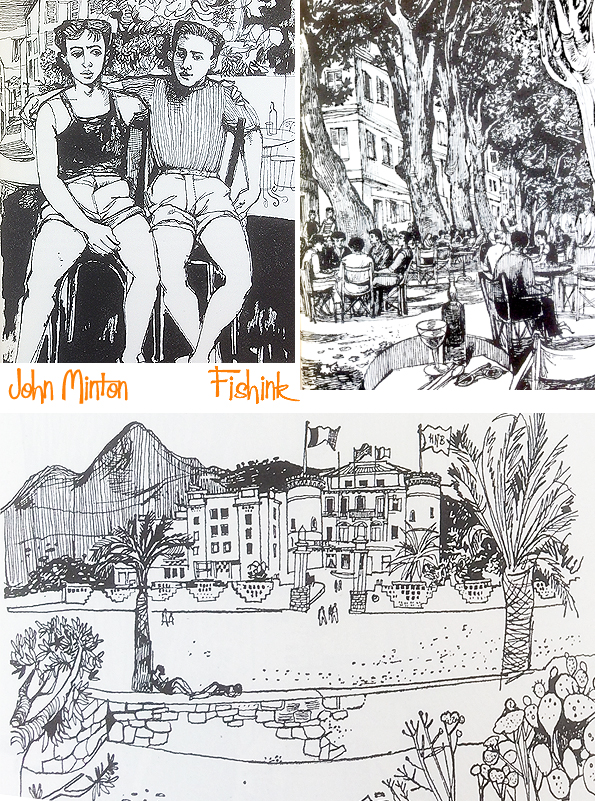
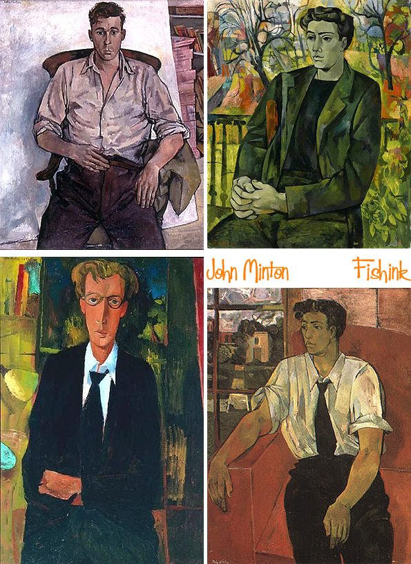
John Minton A productive short life part 4
 John Minton Illustration by Fishink
Welcome to the fourth and final post about the work of John Minton. I hope you have been enjoying exploring his work as much as I have by telling his story.
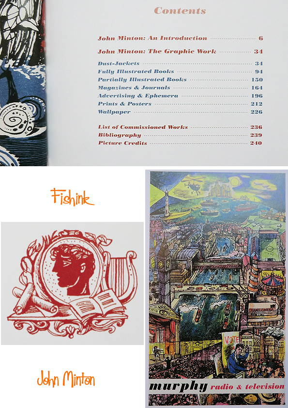
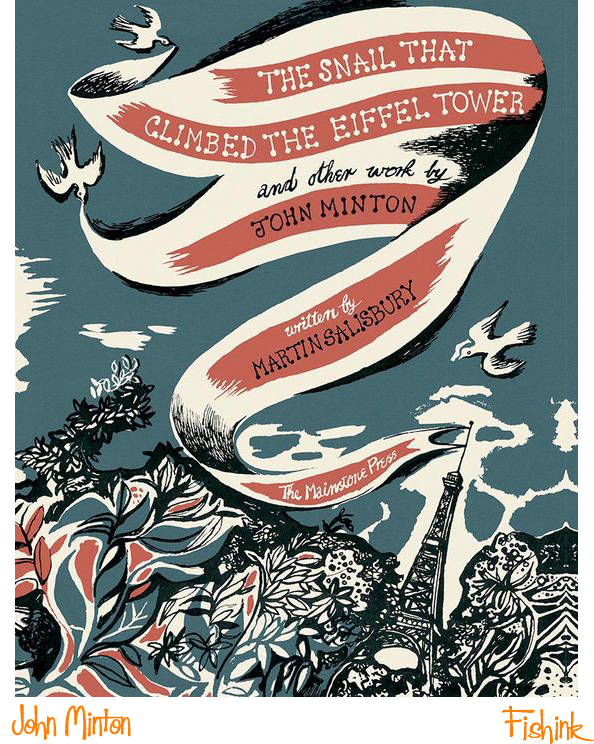
I was extremely fortunate to obtain this copy of a new book (published last year) by The Mainstone Press and written by Martin Salisbury, called ” The Snail That Climbed The Eiffel Tower and Other Work by John Minton ” It’s a beautiful volume, with 350 examples of John Minton’s painting, illustration and editorial work, featured over 240 stunningly weighty pages. This book concentrates on John’s more illustrative pieces, covering book jackets, advertising, stamps, film posters, leaflets, magazine articles and even wallpapers.

Taken from the book… ” JOHN MINTON (1917—1957) may be best known today as a gifted post-war painter of the nee-romantic movement, but he produced some of his most inspired work as a commercial illustrator. Remarkably, even as interest in mid-twentieth-century art and design has grown considerably in recent years, Minton’s prolific output as a graphic artist — achieved during a working life of little more than a decade, has not gained the recognition it greatly deserves. One hundred years after his birth, this book gathers together for the first time Minton’s commercial graphic work, including many rare and previously unseen pieces, to celebrate a major force in the distinguished history of British illustration. ”
You can see from the contents page alone what a wealth of subjects are covered in this book.
I still struggle to appreciate just how much work, and such varied work at that, that John managed to produce during his short lifetime. It’s only recently that his portfolio is being both recognised, acknowledged and indeed triumphed.

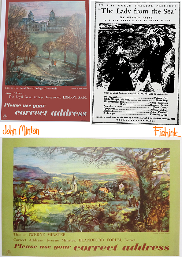
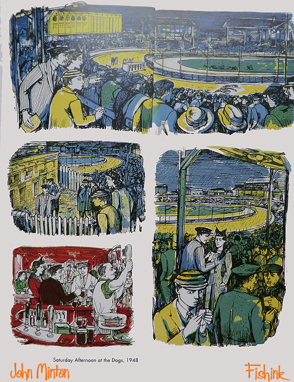
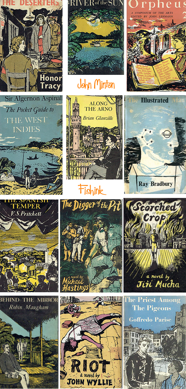
Here’s a few poster campaigns that would have appeared in journals in the 1950’s.
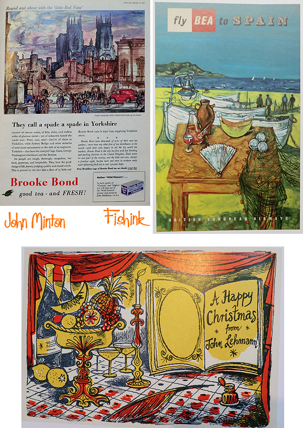
The BBC, GPO, British Rail and numerous book publishers all sought out John’s work for their advertising campaigns and book covers.
A couple of film posters from the 40’s and 50’s created for Ealing Studios in London.
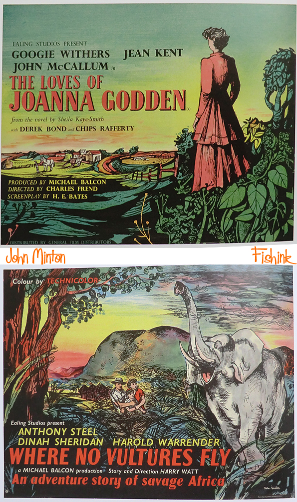
John had a very naturalistic, yet descriptive ability to portray a place or setting to a reader.
You can easily get a sense of what’s happening in these illustrations without even the need for an accompanying written explanation.

Even the post office wanted John to illustrate for their stamps.
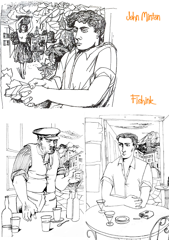
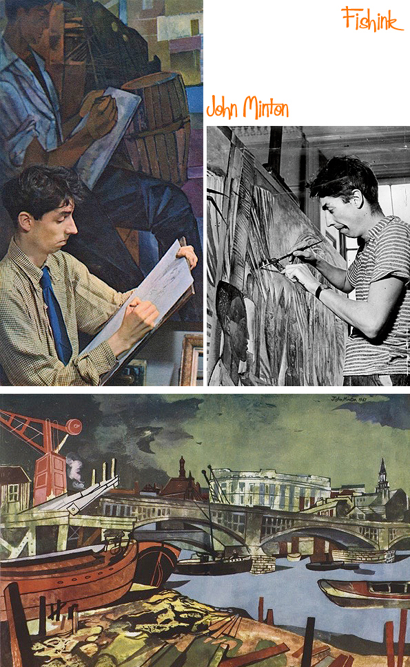
He was said to be a hard-working perfectionist. Perhaps the comical study below portraying the young artist, reveals so much about John as an illustrator and determined creative.
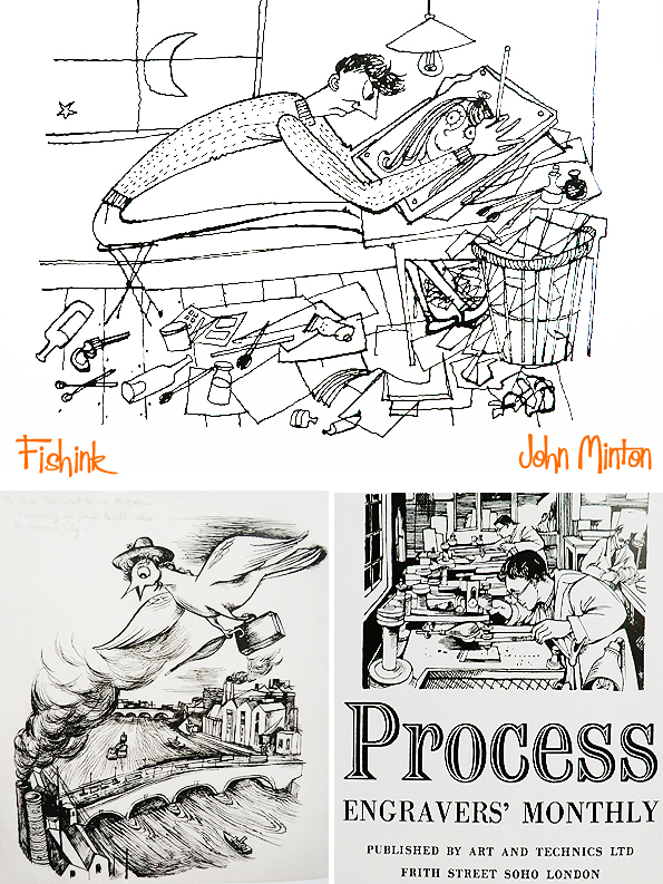
I love this colourful piece for the Engravers monthly magazine ‘Process’.

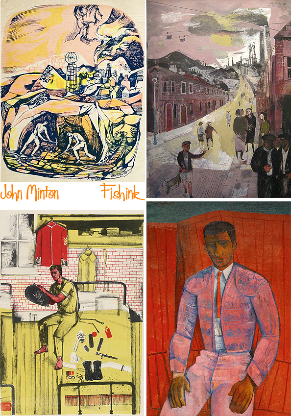
In particular, this wonderful study of industrial Britain in the 1950’s. Such amazing colours and textures.

If you’ve enjoyed the images in today’s post especially then it’s well worth grabbing yourself a copy of the book, which you can order through the Mainstone Press here.
Now that you’ve seen an extensive collection of John’s work this week, what appeals to you the most and why ? Do leave me a comment, I’d be interested to hear your thoughts on John’s work.
John Minton A productive short life Part 3

Welcome to part 3 of my posts about the artist John Minton.
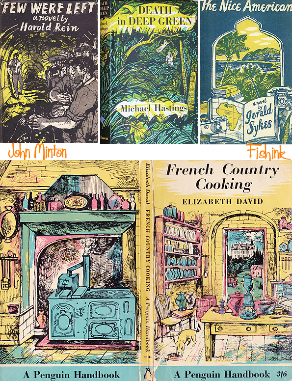
Minton’s posthumous fame is principally as an illustrator. Many of his commissions for illustrations came from the publisher John Lehmann. Both men were gay, and were so much in one another’s company that some people supposed that they were partners, though the biographer Artemis Cooper thinks it was unlikely. For Lehmann, Minton illustrated A Book of Mediterranean Food and French Country Cooking (the first two books by the food writer Elizabeth David), travel books such as Time was Away – A Notebook in Corsica, by Alan Ross (which appeared in Part 2 of my John Minton posts) and fiction, including Treasure Island by Robert Louis Stevenson (see below). He also produced dust wrappers for many other publishers including Michael Joseph, Secker and Warburg and Rupert Hart-Davis. Here’s a small selection of his work for book jackets.

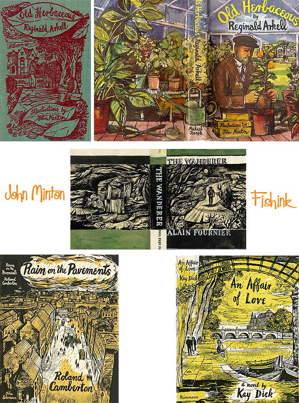
All that practice of drawing fishermen should have come in handy for this book lol

John’s obvious love and understanding for the countryside and nature made him a perfect artist for this novel by H.E. Bates

and the outdoor work he sketched by eye.

You can see how his observational sketches were useful for future paintings, artworks, cards, textile and even wallpaper designs.
He produced posters for London Transport and Ealing Studios. He painted scenes of Britain, from rural beauty to urban decay, and traveled overseas, producing scenes of the West Indies, Spain and Morocco. The Times wrote, “Even when they were ostensibly of Spain and Jamaica, John’s landscapes looked back to Samuel Palmer for their mood. They were densely patterned and luxuriantly coloured, and it was always the fullness and richness of the scene which attracted his eye and which he painted with such evident enjoyment.”

Here he uses the sunflower motif from earlier work (above) to create wallpaper patterns.


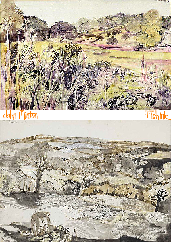
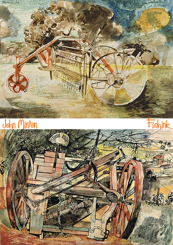
Finally here we see some of John’s landscapes, beautifully detailed and rich in their visual and descriptive elements.
Pieces of farm machinery found on the landscape.
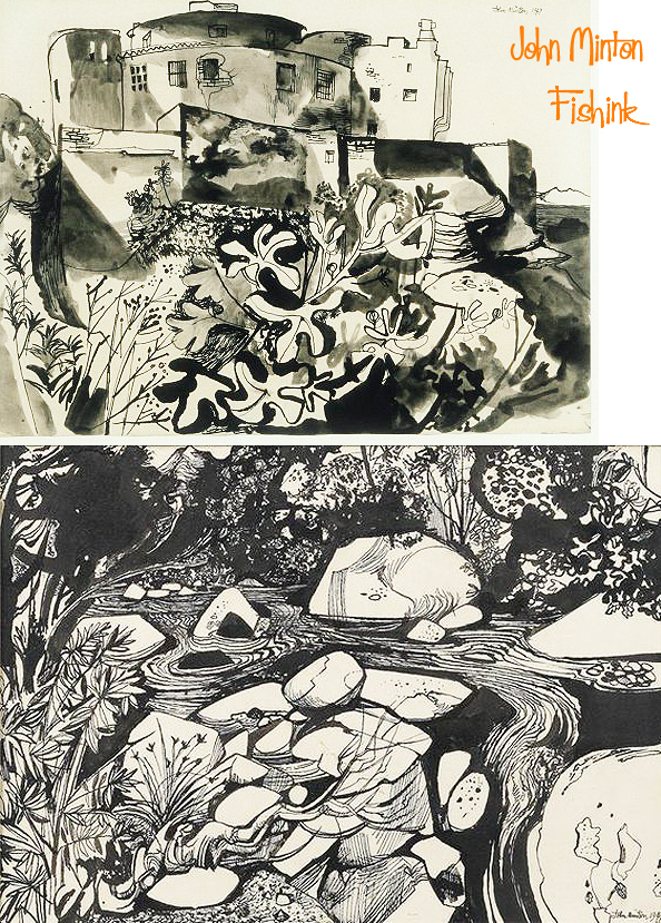
Lovely scenes like this brook (above) and the fruit pickers (below), again illustrate what a prolific, versatile and talented artist John Minton really was.
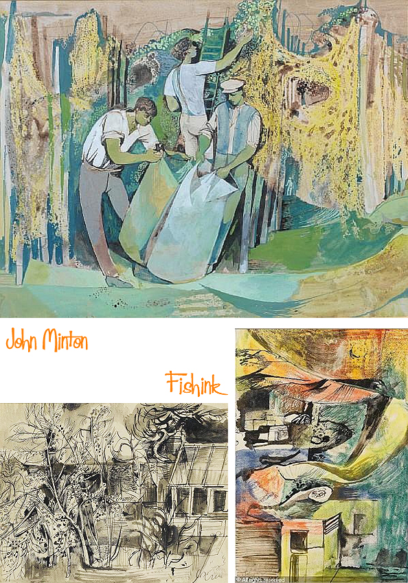
Don’t you feel that these scenes just shout out… traditional English summertime lol !

One final post still to come about John Minton to conclude this series of blog posts. I hope, like me, that you are also enjoying his journey.

John Minton A productive short life Part 2

Welcome to part 2 of my homage to artist and illustrator John Minton.
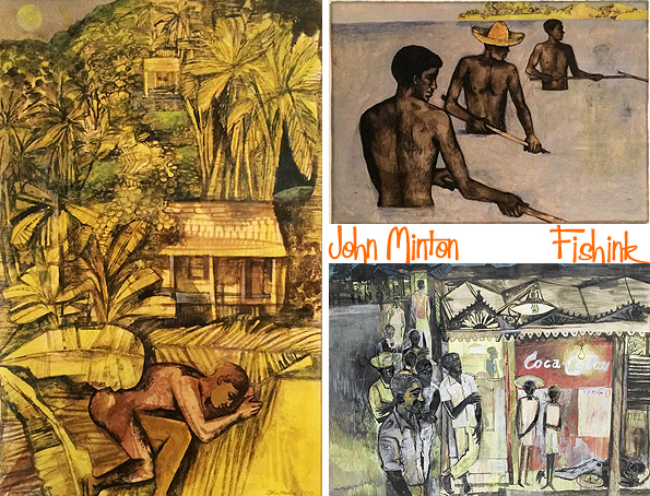
In the early 1950’s Minton traveled to the West Indies.
This study (above right) and painting (below) shows drinkers outside a ramshackle nocturnal bar, aiming to evoke, as Minto put it himself, “a sense of watchfulness, of waiting… a disquiet that is potent and nameless.”

Scenes of rural life and local vegetation all add colour, depth and variety to John’s work.
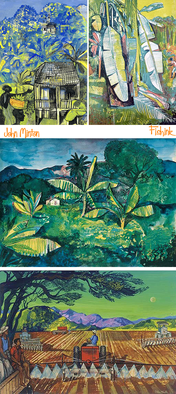
Workers on the land and sea, both observed and captured in paint.

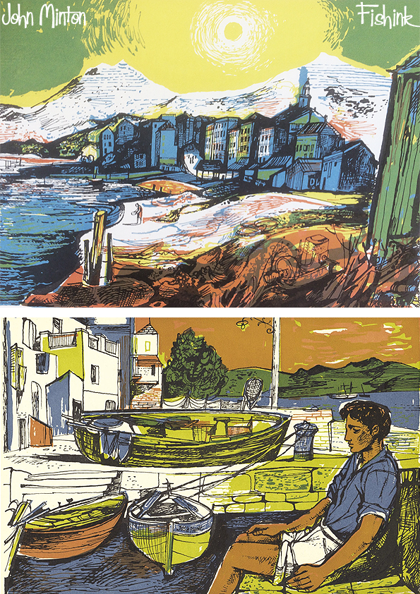
Earlier in the mid 1940’s John spent some time in Corsica preparing sketches for ” Time Was Away “, accompanying text by Alan Ross with his illustrations. I really like this style of his work.
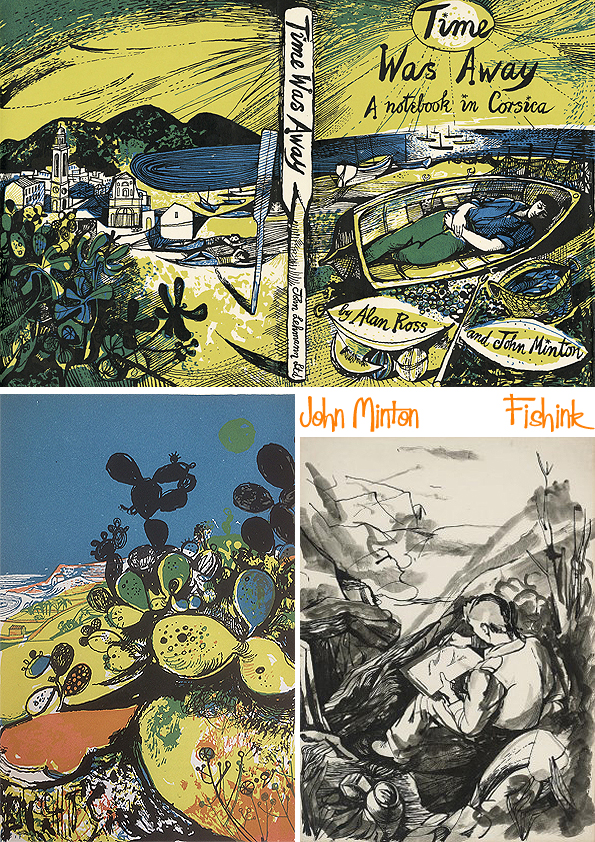
Some beautiful illustrations here, reminding me of the work of Rena Gardiner, who was also creating prints around this time.

Wonderful use of colours.

Some detailed b/w studies also.


John did figure studies of some of the locals too.
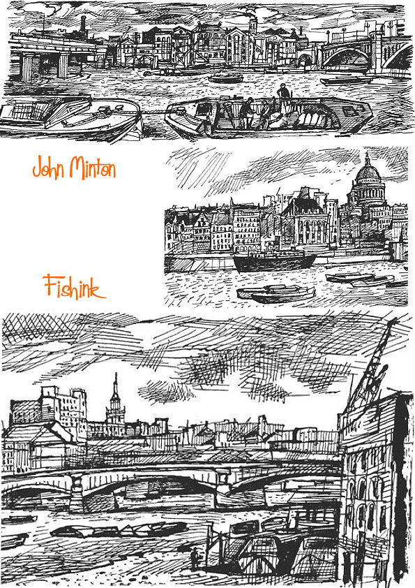
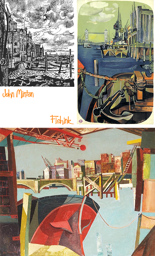
He was also quite mesmerised by observing the Fishermen and drawing them at work.

Some at the docklands near where he lived and others in Cornwall and other parts of the UK coastline.
The many hours that Minton spent haunting the riverside allowed him not only to draw but to enjoy the company of sailors and dockers. Time and again, his pictures feature solitary male figures or distant pairs, huddled together, walking at low tide or working on boats, dwarfed by the surrounding buildings and brooding clouds.

Again using quite a variety of styles, techniques and painting or illustrating materials.

Sometimes it’s hard to imagine that this is all one person’s work !

Such a prolific artist who worked so diligently, in such a short space of time.

More about John in part 3 on thursday.
John Minton A productive short life Part 1
Recently I came across the amazing work of John Minton and decided to look further into his background and extensive portfolio of painting and illustration. The more I discovered, the more I wanted to learn, and this researching turned into a four post feature spread out over this week, that delves into the history of this talented yet tormented artist. I hope you’ll join me to see where the journey of John Minton’s work takes us.
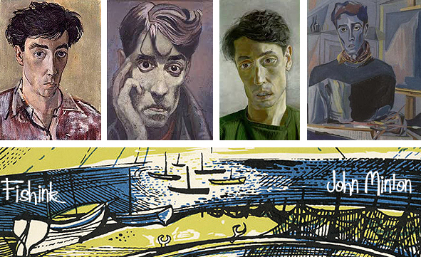
Francis John Minton (25 December 1917 – 20 January 1957) was an English painter, illustrator, stage designer and teacher. In the mid-1950s, Minton found himself out of sympathy with the abstract trend that was then becoming fashionable, and felt increasingly sidelined. He suffered psychological problems, worried about his sexuality, self-medicated with alcohol, and in 1957 committed suicide, he was just 39 !
2017 marked 60 years since his death and with this in mind, there was a retrospective exhibition at the Pallant House Gallery and in late October the release of a book called “The Snail that Climbed the Eiffel Tower and other work by John Minton” by The Mainstone Press and written by Martin Salisbury. More about this publication to come in Part 4 of John’s story.
I set out to discover more about this fascinating character and uncover more of his art and illustration for myself.
Born in Great Shelford, Cambridgeshire, John was the second of three sons of Francis Minton, a solicitor, and his wife, Kate. From 1925 to 1932, he was educated at Northcliff House, Bognor Regis, Sussex, and then from 1932 to 1935 at Reading School. He studied art at St John’s Wood School of Art from 1935 to 1938, and was greatly influenced by his fellow student Michael Ayrton, who enthused him with the work of French neo-romantic painters. He spent eight months studying in France, frequently accompanied by Ayrton, and returned from Paris when the Second World War began.
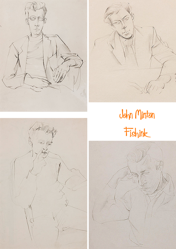
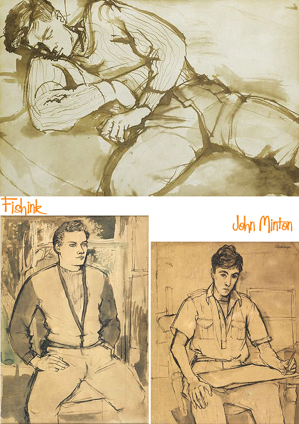
His figurative work shows a deep understanding of the human form and his talent shines in being able to capture their characters and personalities through these drawings/paintings too.
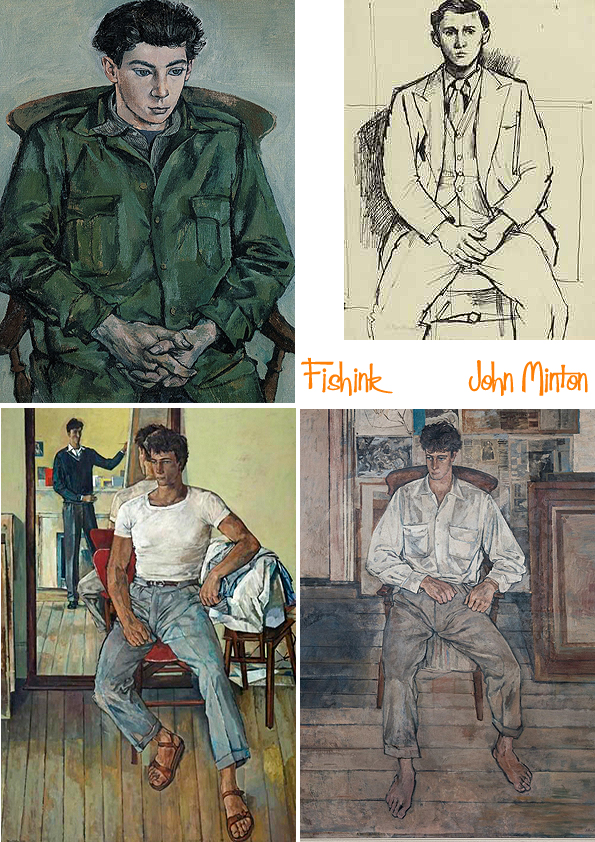
He uses a few different styles of painting to work on his subjects, some more realistic, some hints of cubism in there too.
In October 1939 Minton registered as a conscientious objector, but in 1941 changed his views and joined the Pioneer Corps. He was commissioned in 1943, but was discharged on medical grounds in the same year. While in the army, Minton, with Ayrton, designed the costumes and scenery for John Gielgud’s 1942 production of Macbeth. The settings moved the piece from the 11th century to “the age of illuminated missals”; The Manchester Guardian wrote that they “should be long remembered”. In the same year he and Ayrton held a joint exhibition at the Leicester Galleries in London. The Times wrote, “Mr. Minton is seen to have an overcast, gloomy realism, and much intensity of feeling, which he expresses in dark colour schemes, both in a curious and effective self-portrait and in paintings of streets and bombed buildings.”
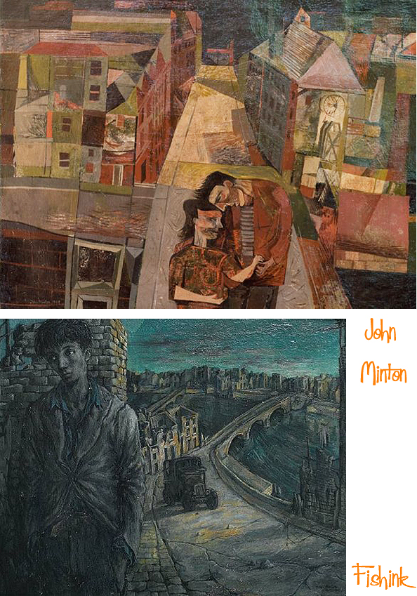
London, where he lived, was definitely his stage, to be observed and captured.
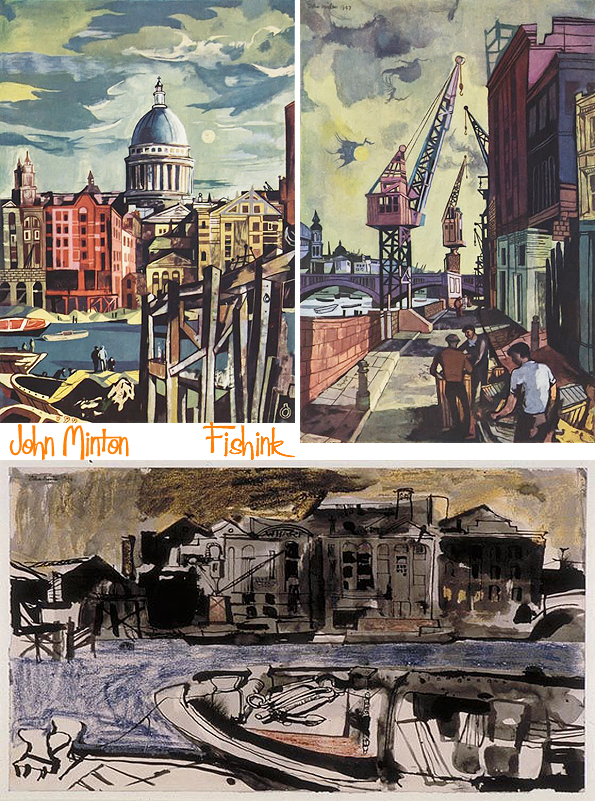
” The flattened perspective in these type of pictures embraces barges in the foreground and the jumble of warehouses on the far bank in the background. Typically, this image includes a pair of male figures. Minton’s sexuality was central to his work and these dockland images embody the frustration he felt as a gay man at a time when sex between men was illegal.
John Minton’s only commission for London Transport came from publicity officer, Harold F. Hutchison in the form of a ‘pair poster’ titled London’s River. This concept involved posters designed in adjoining pairs, with one side featuring a striking pictorial image and the other containing text. The familiar dockland images are reworked here in gouache, in similar manner to the series of paintings commissioned for Lilliput in July 1947, London River. ” (Martin Salisbury)
John Minton was one of the artists who regularly attended Wheeler’s restaurant and the Colony room during the 1950s. As well as being a figurative painter he also turned his hand to book illustration, poster designs and theatrical costumes. In 1950, he asked Bacon to fill in for him as tutor at the Royal College of Art for a single term. Bacon accepted on the understanding that he would not have to give formal lessons (he had never taken any himself) and that he would have the use of a studio. Perhaps because of his non-didactic approach, he attracted a significant following among students. In contrast to Bacon’s increasing painterly confidence, Minton became less certain of his artistic gifts. His last years were overshadowed by heavy drinking and depression, and in 1957 he took his own life by taking an overdose of sleeping tablets.
I’d like to share more of his work with you over the next few posts, I hope by the end of this week, you’ll also appreciate what a highly productive and talented artist he really was. See you here tomorrow !
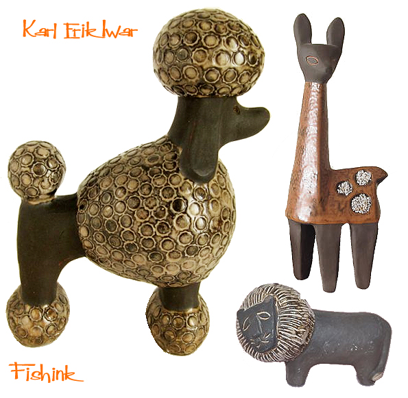
Karl Erik Iwar Mid century Ceramics
Karl Erik Iwar (1920-2006) studied at Upsala Ekeby and then in the early 1950’s he opened his own workshop. He then worked for the company between 1936 and 1946. Karl Erik is today most known for his pottery animals from his workshop in Farsta and Åkersberga in 1953–1987. They are made of dark brown earthenware, with modernistic shape, and gently humorous expression. The figurines are partly glazed in earthy tones.
Here’s a selection of his animal based figures which caught my eye. Sadly I couldn’t discover any more about him or his work. His ceramics have such humour.

His giraffe is a firm favourite for me. I love the proportions.

Funky poodles and friendly lions in the mix too, he also made people, but I like his animals the best : )

Does anyone have any further info on Karl ?
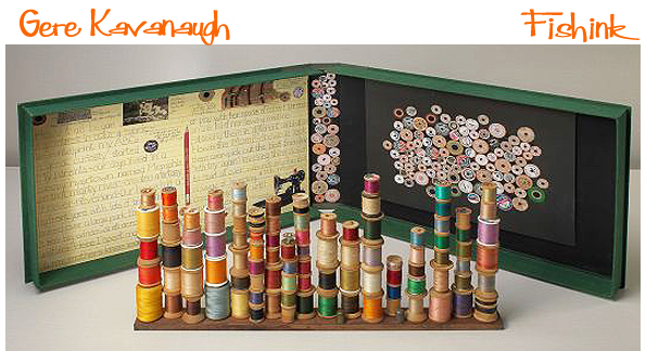
Gere Kavanaugh

Gere Kavanaugh’s varied output has dubbed her a designer of textiles, furniture, interiors, exhibitions, products, and graphics, as well as an artist and a colour consultant. She’s also channeled a love of letter forms into type design, creating custom typefaces for the Nixon Presidential Library and Museum and Arklow Pottery in Ireland. “I love too many things. I’ll design anything I can get my hands on—just ask me,” says Gere, an active designer at 87 years old, who’s itching for a commission to design a destination tea room or redo the interiors of an airline. “They’re just so boring!” she remarks with her usual affable candor.
Gere’s prodigious and polymathic approach to design began in school. After studying fine arts at the Memphis College of Art, she went to Michigan to pursue a master’s degree at Cranbrook Academy of Art. There, she thrived in the tightly knit studio system, living and creating with fellow students working in ceramics, painting, textiles, graphics, and architecture. At the time, both the classroom and the workplace were male-dominated, but Gere was not to be impeded by this fact. She was one of the first women to go through Cranbrook’s design program, along with mid-20th-century legends Ray Eames, Florence Knoll, and Ruth Adler Schnee. Cranbrook’s staff included strong male and female teachers, and Gere was encouraged by designers such as Finnish ceramicist Maija Grotell, architect/industrial designer Ted Luderowski, and textile designer Marianne Strengell.

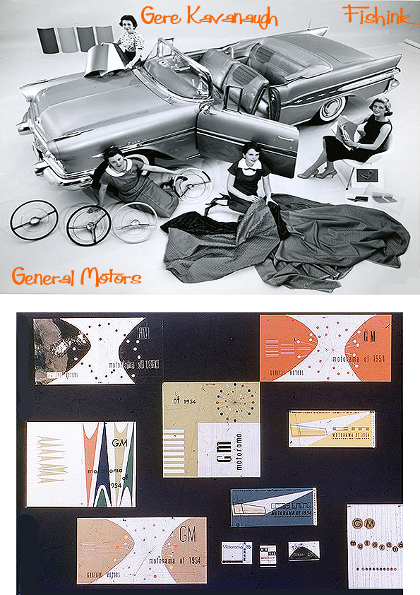
After Cranbrook, she was immediately hired at General Motors. Buoyed by a wave of postwar optimism, Gere remembers this time as heady and exciting for designers, especially those working in Detroit. In addition to GM, design-forward companies such as Ford, Chrysler, Herman Miller, Eero Saarinen, and Minoru Yamasaki were all located in Detroit, then the center of design in America. “There was a milieu—an atmosphere—[where you felt] that by creating better products, you were creating a better world,” she recalls.
Gere worked at GM’s styling studio, equivalent to a company’s in-house design department today. She designed displays, created model kitchens, and would even, at times, work on the interior design of private homes of GM’s top executives. But as part of the design architecture group, Gere’s main focus was designing exhibitions to showcase GM’s automobiles. For one memorable springtime show, she rented 90 canaries and housed them in a trio of 30-foot, floor-to-ceiling columns made of Swiss cotton netting, which hung like transparent birdcages beneath the dome of the Eero Saarinen-designed GM Technical Center. “There were also lights underneath and when you turned them on, the birds would sing.” Gere likes to incorporate animals in many of her concepts, drawing from memories of living across from the Memphis Zoo as a child.
Gere was part of GM’s “Damsels of Design,” the first group of women to work as professional designers in a U.S. corporation, a move championed by GM’s legendary design director Harley Earl. The “damsel” moniker concocted by the company’s public relations department didn’t always sit well with her, and she wasn’t interested in fueling the raging narrative about sexism and feminism. Her mindset is that of a humanist.
In 1960, after four years at GM, Gere accepted a design position at Victor Gruen’s—known as the father of the shopping mall—architecture firm, first in Detroit, then in Los Angeles. She flourished in Southern California’s creative climate and enjoyed great freedom in her new role, working on interiors of retail stores and shopping centers across the country. Following Gruen’s vision of recreating the atmosphere of European town centers in suburban America, also designing the first town clocks at shopping malls as public meeting places.
She also forged a lifelong friendship with her colleague Frank Gehry, a relationship that led her to venture out on her own. Gehry and his design partner, Greg Walsh, invited her to split the $76 per month rent for a bungalow in Santa Monica that was so small they used the bathtub as storage for their drawings. After moving to a bigger space years later, the Frank-Gere-Greg trifecta was joined by Deborah Sussman and Don Chadwick, best known as the co-creator of the iconic Herman Miller Aeron chair.
With the support of her colleagues and champions, the “unique, multi-dimensional design firm” Gere’s designs excelled. Her client roster has grown to include Pepsi, Hallmark, Neutrogena, Max Factor, and Isabel Scott Fabrics, who hired her to help set up an ikat silk weaving factory in South Korea.
Working with the patio furniture company Terra in the 1970s, she invented the now ubiquitous market umbrella, at times referred to as the “California umbrella,” a design she was unable to patent because it had “no unique patentable parts,” she explains. Frustrating dalliances with patents and copyrights throughout her career have informed her efforts to help Cranbrook establish an alumni product archive, a place for alums to donate a design or artwork that companies can reproduce and pay royalties directly to the school.

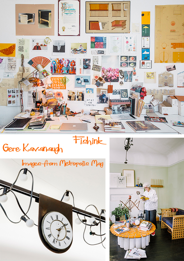
Reflecting on how design students have changed since she was in school, she observes, “We’re living in the most exciting age that we can ever live in and have more disciplines to draw upon to produce our work. But you have to be smart enough to figure out the best tool to produce what you’re thinking. And this the students are not doing today.” She’s talking about using one’s hands for more than clicking around a computer’s track pad.

For Gere, her hands are still the best creative tools she owns—as they’ve been since she started doodling as a child. “Working with your hands teaches you about your inside person,” she says, and at 87 she must know a little more than most of us.
Many thanks to Anne Quito for her biography on Gere, and the information used in today’s post.
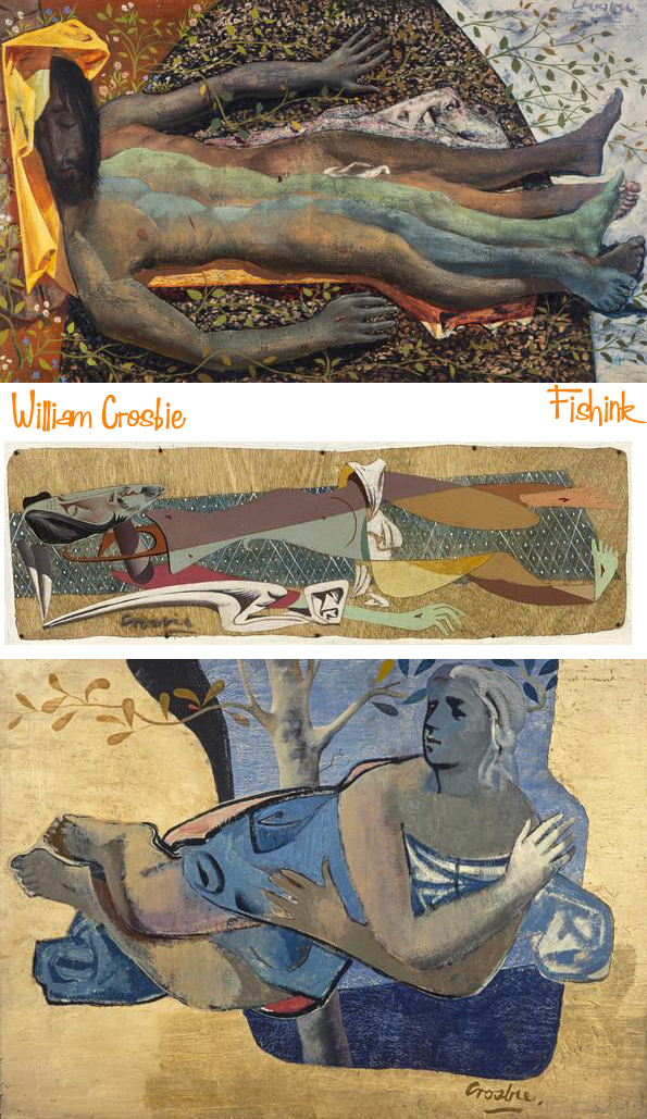
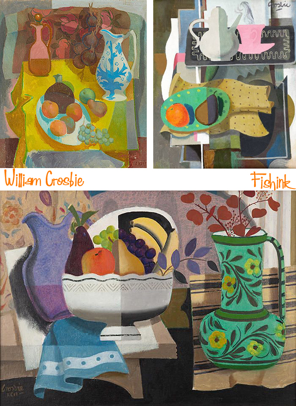
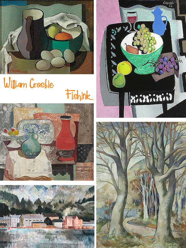
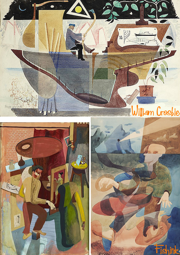
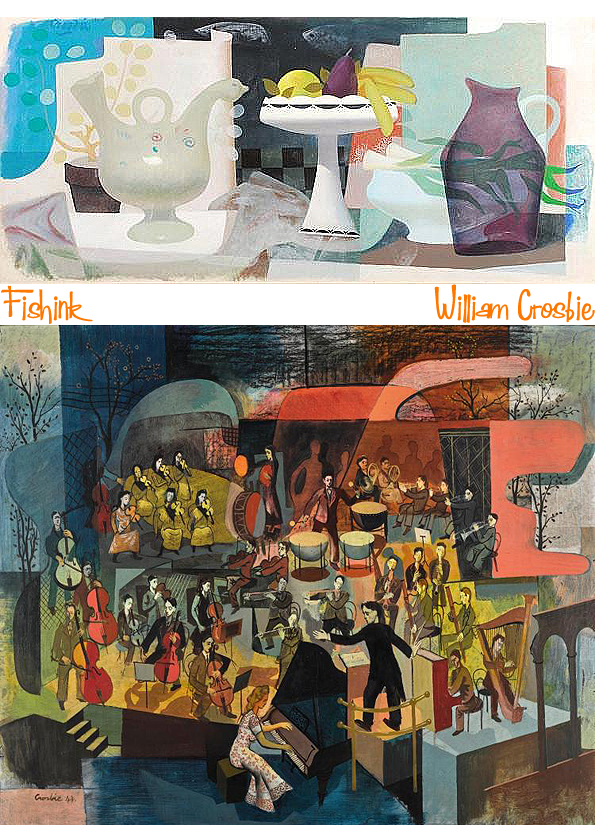
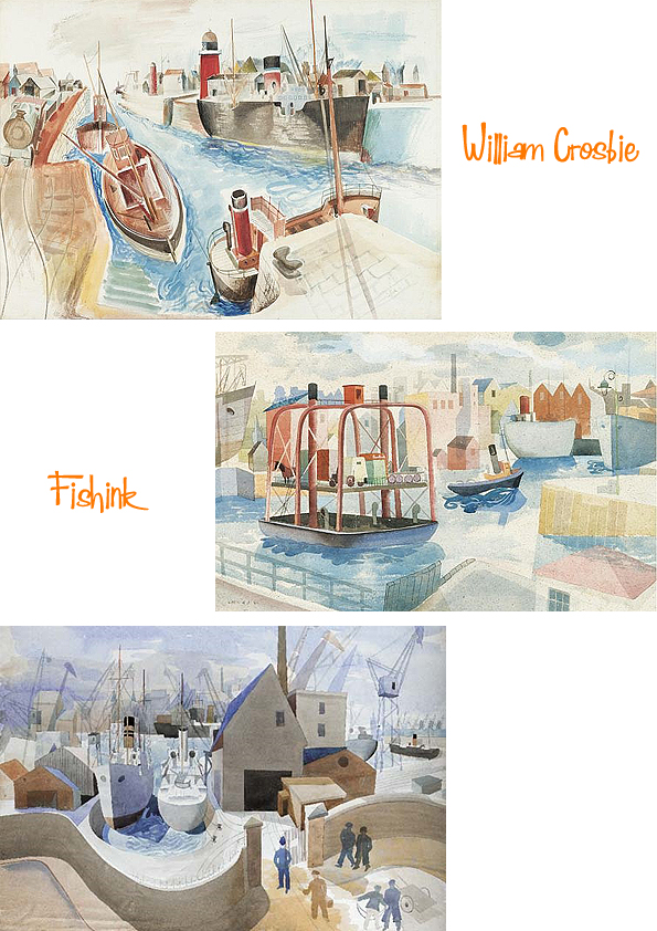
William Crosbie, Scottish Artist
Welcome to 2018 and a year ahead of new art and artists work to discover. So how was your new year ?
Sadly I’ve been out of sorts over the last 4 days with something far worse than ‘manflu’ and have been acting like someone twice my age with little to no energy, zero appetite and bouts of falling asleep throughout the day. Which really isn’t like me at all.
Hopefully, the fact that my rough, raspy, bellow of a cough is turning into a bunged up nose, means that its slowly working it’s way out of my system.. hurrah, let’s hope so. I think it’s fairly typical that when we stop working (like we do for Christmas), that’s when we are often struck down with some lurgy or other.. hey ho. or should I say ho ho ho !
Anyway enough about that and let’s get onto cheerier issues and more importantly, the first of this year’s posts and the wonderful work of William Crosbie.
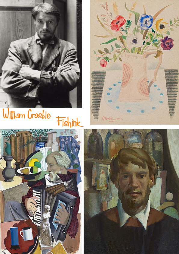
William was born in Hankow, China, in 1915, of Scottish parents. The family returned to Glasgow in 1926, where Bill attended Glasgow Academy and, in 1932, entered Glasgow School of Art. On graduating in 1935, he was awarded the Haldane Traveling Scholarship and set off for Paris, where he gained admission to the studio of Fernand Leger and was able to study under the master; he described his time there as ”one of my proudest experiences”. When his scholarship ended Bill was offered a job with the Archaeological Institute’s expedition to the newly excavated Temple of the Bulls and Temple of Sakhara in Egypt, where he copied the friezes on the temple walls.
In 1939, Bill returned to Glasgow where he set up his studio at 12 Ruskin Lane, a studio originally designed for Sir David Cameron. During the war he served in the Merchant Navy, though he continued to produce paintings through these years. He was also at the centre of what he once described as ”a little local Renaissance”, which included luminaries such as Hugh MacDiarmid, J D Fergusson, James Bridie, T J Honeyman, and Basil Spence. Other ”regulars” at his studio were the refugee artists Jankel Adler and Josef Herman, as well as Duncan Macrae (whose portrait by Crosbie is now hanging in the People’s Palace).
After the war Bill made his London debut at the Reid and Lefevre gallery in 1946 in a joint exhibition with the English surrealist painter John Armstrong.
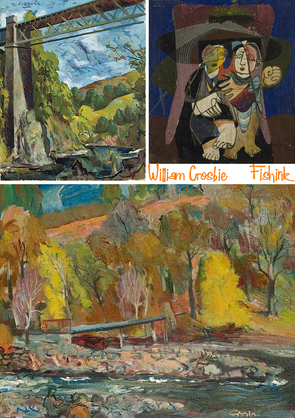
An important part of Crosbie’s work after the war were his mural paintings, largely commissioned through his association with architects like Basil Spence and Jack Coia. These included works for the ”Britain Can Make It Exhibition” in 1946 and the ”Festival of Britain” in 1951; there were also many murals and altarpieces for churches of all denominations. He was involved in book illustrations for the publisher William MacLellan and even designed the set of a ballet for George Chisholm.
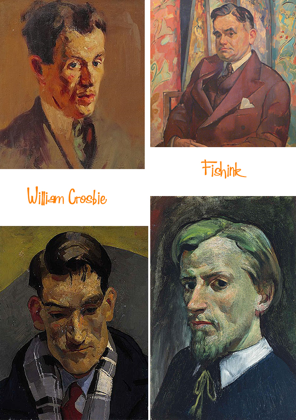
He exhibited on a regular basis with the Annan Gallery in Glasgow from the war until the 1970s and in Edinburgh with Aitken Dott’s. From the 1980s he showed with Ewan Mundy in Glasgow. Academic recognition came in 1953 with his election as an associate of the Royal Scottish Academy and subsequently as an academician. In Glasgow he was a proud member of, and annual exhibitor at, the Royal Glasgow Institute, and he was also a former president and long-time member of the Glasgow Art Club.
There were major retrospective exhibitions of Crosbie’s work at Aitken Dott’s in 1980, Ewan Mundy’s, 1990, and Perth Museum and Art Gallery, 1990.
His paintings hang in all the major museums and galleries in Scotland as well as the Royal Collection and the British Museum in London, and in private collections throughout the United Kingdom and abroad.
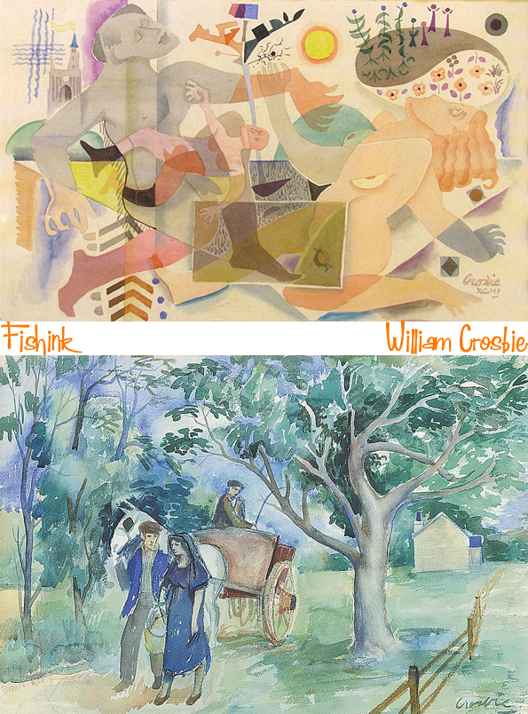
Some of his work has a flavour of Ravilious about them, like these watercolours below.
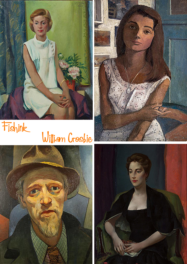
William’s own words are perhaps his best epitaph: ”Devotion to the muse and the life it has led me has meant I have enjoyed a richness of texture not readily to hand to the majority of my fellow citizens.” He was one of the finest and most singular Scottish painters of the twentieth century. He passed away in 1999 at the age of 84.
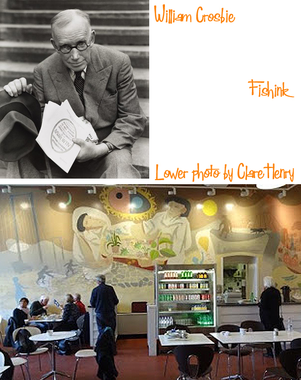
If you are ever in Edinburgh, take a trip to the City Art Gallery’s Cafe to view their beautiful commissioned mural, painted by William. Thanks to Clare Henry for the photo.
If you have any suggestions for blog-posts for an artist who’s work you consider would fit with the style I tend to show on Fishink Blog (1950’s 60’s), then please let me know. I won’t guarantee to use them but It’s always interesting to see who gets nominated : )
Christmas, New Year and Spiritcloth
Welcome to that period of calm between Christmas and New Year. I hope you’ve all had a good rest and a chance to recharge those physical batteries!
I’ve just spent a few days in Cobham, Surrey with my partner’s mum who is German. Traditionally she celebrates Christmas on Christmas eve (i.e 24th) so we had a big roast and gave our presents then. The next day (i.e. Christmas day) we drove back home and I must say, it felt a little odd to have a ‘not so Christmassy’ day on what would be my usual day for celebrating Christmas. After recently re-watching the film’ Groundhog Day’ I was convinced I’d woken up with Sonny and Cher singing “I Got You Babe” all over again lol
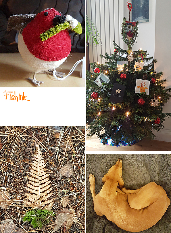
I also hadn’t bought a Christmas tree this year, partially because I don’t really agree with the idea of growing trees just for the season and then throwing them out straight after and also because I knew that we would be away anyway. So on returning home, imagine my delight to discover that someone with a gardening business had left two beautiful trees on our road, obviously unsold and now surplus to their requirements. I didn’t hesitate to carry one indoors and decorate it… she’s a real beauty. I thought that fate had found a way to bring a Christmas sparkle to my 25th of December after all : )
Cobham was lovely and as Surrey is the county which has the most trees in the country, we made a real effort to see as many as we could.

We went out for numerous walks around Ockham Common, where we saw this Semaphore Tower. Which was once part of a chain of towers used to pass messages (using Semaphore flags from their flagpoles on the roof) between the Admiralty in Whitehall and the Royal Naval Dockyard in Portsmouth. Built in 1822, it is now the only restored surviving tower in a line of signalling stations that stretched from London to Portsmouth.
We also did some walking around Esher and Wisley Commons too.

Boo loved the mix of paths and ferny undergrowth to rummage about in and generally disguise herself with.
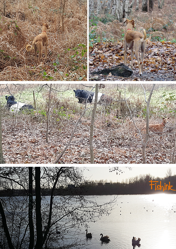
Always on potential squirrel alert… that is, when she’s not posing for photographs !

Plenty of beautiful silver birch trees, making the paths quite magical and almost mystical too.

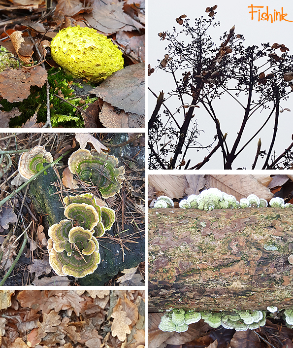
Interesting range of fungi.
A rare shot of Boo in the car, not her favourite place or mode of transport.

Bows and stone engraved, leafy flourishes. Truly wonderful woods.

Going forward into 2018, means that my blog will be 8 years old, wow where does the time go ?
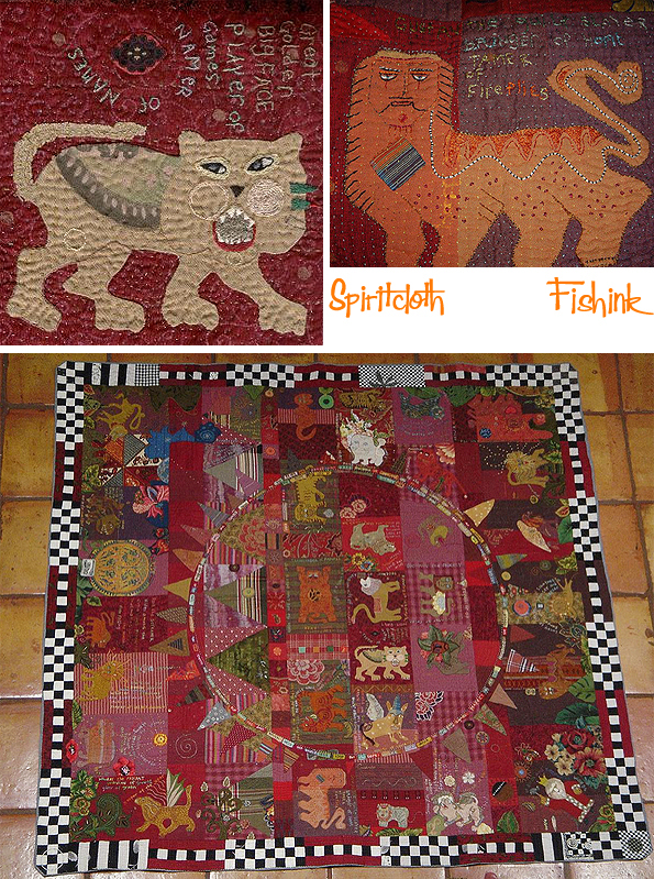
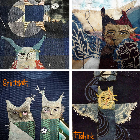
I thought it would be good to start with a retro look back to a lady from a post I did in 2010. Jude Hill is a wonderful, embroiderer who writes a blog called Spiritcloth, where she explains her thought processes with such detail and delicacy that you feel you are accompanying Jude on her personal textile journey. Her work is a real labour of love.
I had read her blog for some years prior to me starting my own and was inspired by her calm, serene manner and her strength and determination to explore her topics for embroidery (i.e. moons, cats, feathers, leaves etc). Here are a few images of her work, cats are a firm favourite.
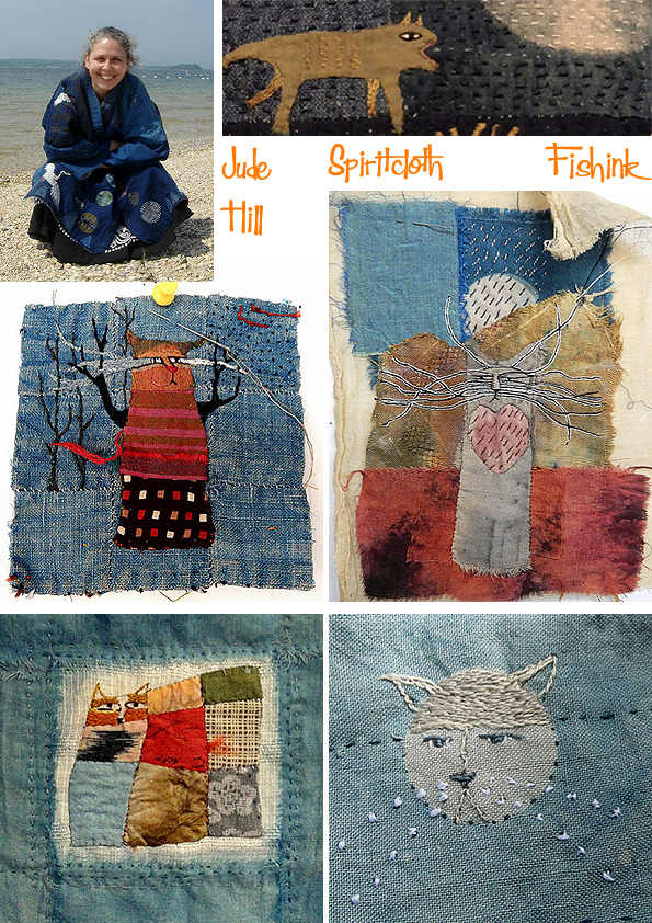
Apart from explaining her techniques and reasons that her work heads off in certain directions, (things that some artist’s choose not to share with the online world), Jude also takes wonderful images of the world and changing seasons around her. Reading Spiritcloth, you are very much a part of her life and world and feel privileged to be allowed to linger there too.

Playing with the idea of moons, houses and tie-dye textures and shades.
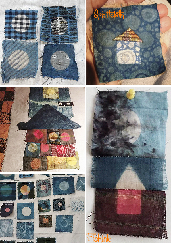
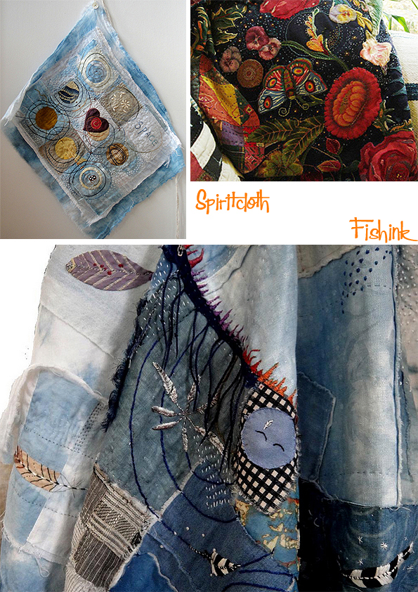
Her ideas and tapestries grow and flourish.

Some are small scale and others are bed cover size !
Beautiful, dreamy and at times almost hypnotic.

I always find Jude’s work rich, engaging and intriguing.
Happy New Year to Jude and everyone that you find inspirational and who will accompany you on your artistic journey this year.
You can find more of Jude’s images on Flickr and Instagram and I’ll be back in early January.


