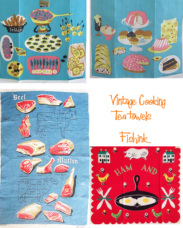
Vintage Housekeeping and Cooking Tea Towels
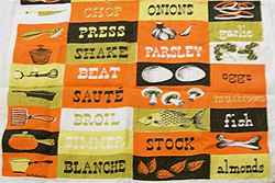
For decades designers have thought that it would be a great idea to inspire the cooking housewife in the home, by putting recipes onto tea towels and linens. Imagine the scenario… you completely run out of ideas as to what to make for the family dinner, well worry no more, dust off the tea towel and there’s your answer, ingredients and all ! Of course that doesn’t help you out the next day when you have the same problem all over again, unless that is, you have a drawer full of these beauties lol

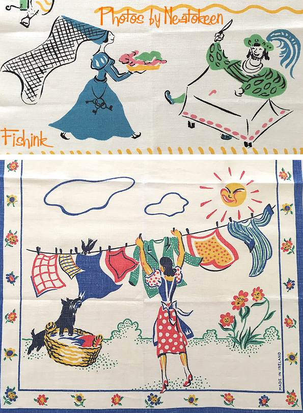
Cooking and washing up go hand in hand, whatever country you happen to be in. You can even be inspired to go global and make a Goulash or Curry as a complete change to the British meat and two vegetables ensemble!

Such was the popularity of the idea, that there were hundreds of variations made.

Over many different time periods.
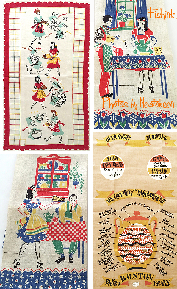
And in many different countries. I’m sure you ladies will all be flocking to get a copy of the Housewife’s Arms below.. with the inspirational motto ” Labour without ceasing”. I am hoping if that was meant to be tongue-in-cheek ?
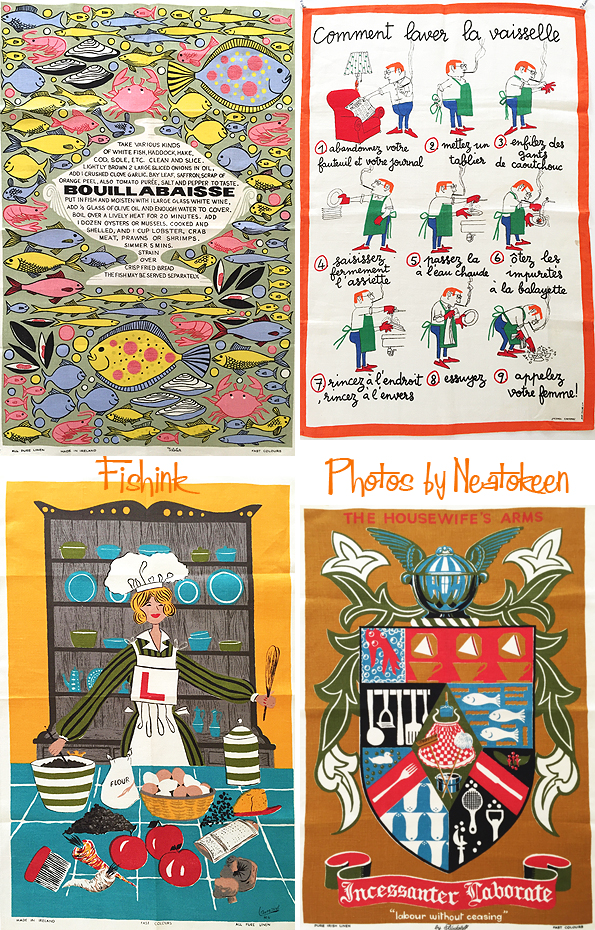

It appears (from the design above) that Sunday is the only day of rest for the working housewife, and perhaps the saying ‘ a woman’s work is never done’ would be somewhere nearer the truth.

I do find the quotes on these towels rather amusing.
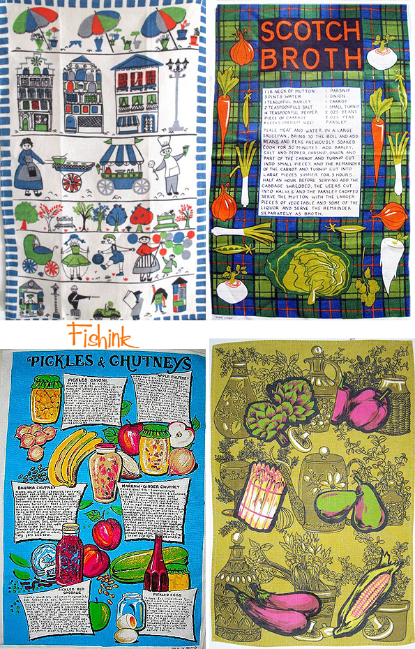
Great designs and educational too.
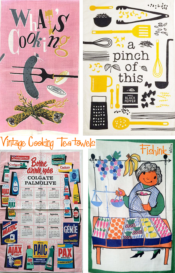
I bet this Happy New Year 1968 tea towel just bursting with advertisements for Colgate & Palmolive, went down an absolute storm ! But seriously, who wants to be reminded about cleaning products all year round ? Really !
However, I do think some of these much more modern illustrations (below) would make some fetching new tea towel designs.

Many thanks to Cindy over at NeatoKeen for selecting most of the images used in this post, from her vast collection of vintage linens. Also for coming up with the idea for this blog in the first place. May our collaborations long continue : )
![]()
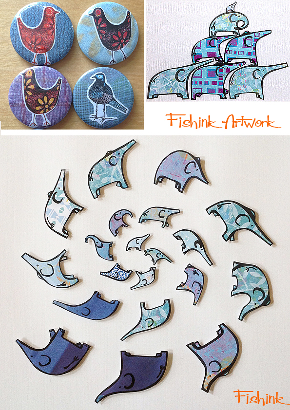
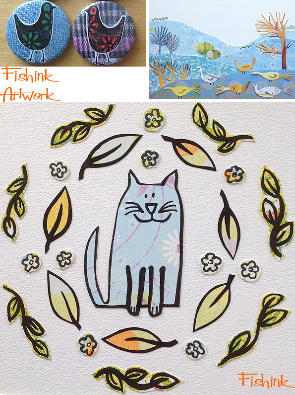
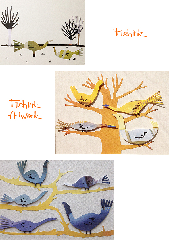
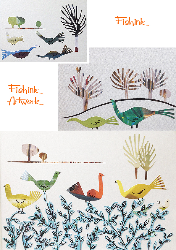
Fishink Artwork
Happy Monday everyone. I’m still working hard on building up some new artwork for next month’s Sale Arts Trail, Sale, Manchester. I did a quick question session for them here …
https://saleartstrail.com/2016/06/15/qa-fishink/
A good friend lent me their badge making machine…. oh what fun. I swear it’s such an integral part of artistic folk’s second nature to produce products and I for one had a great time creating 80 hand-made badges for the Sale show. I nearly didn’t want to give it back lol
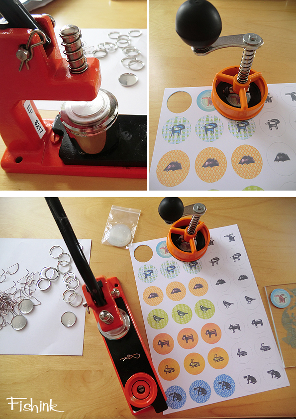
Some designs I re-coloured especially for the badges and others are collages pieced together beneath the plastic coating.
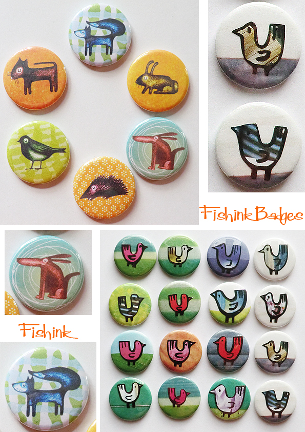
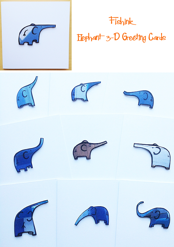
It is quite addictive. Something new… elephant illustrations.
Happy Cat.
And more stripey birds.
I’m enjoying making these. Don’t forget to come along to Sale on the 9th and 10th July for the Sale ArtsTrail and drop in to say hello. I’ll be displaying a large range of work in Minikin Emporium, which is Venue C on the Sale Arts Trail Map. There will be 50+ other designers exhibiting over 24 different venues, so it should be an exciting weekend.
Look forward to seeing you all there. More work available here on my website.
MMU Degree show 2016 Part 3
Welcome to the final part of my visit to the MMU degree show for this year. A couple of graduates firstly from the Architecture department, with wonderful architectural illustrations from both Alexandru Trofin and Hannah Bellerby.
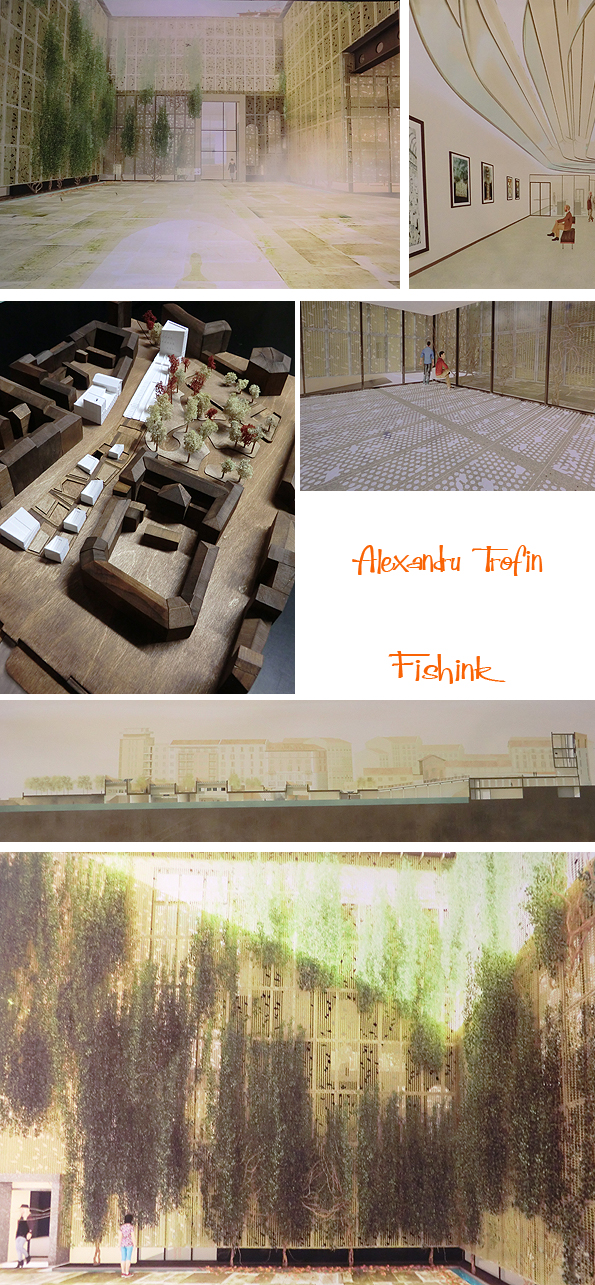
These visuals are amazing, they make their creative, structural interpretations feel so real.
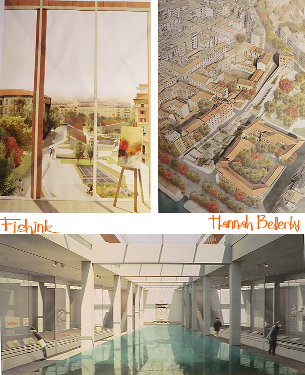
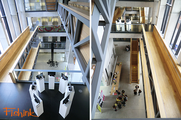
Of course, the MMU building is pretty amazing too.
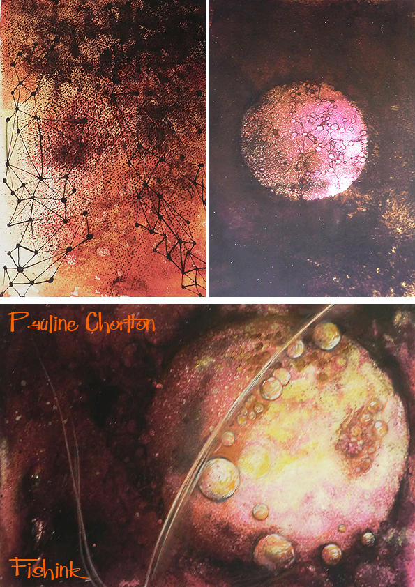
Pauline Chorlton from the Creative Practice course is interested in the nature and the dynamics of the universe. I love her planetary paintings.
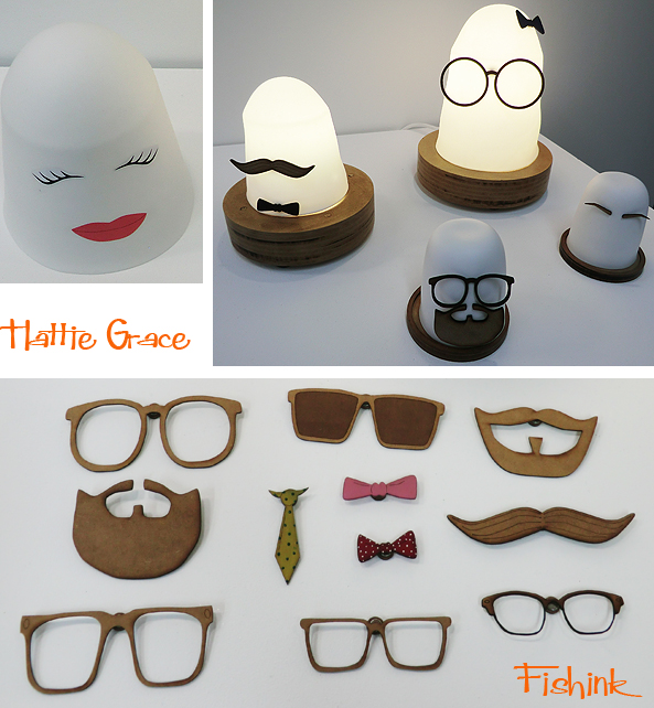
Some quirky lighting with accessories from Hattie Grace.
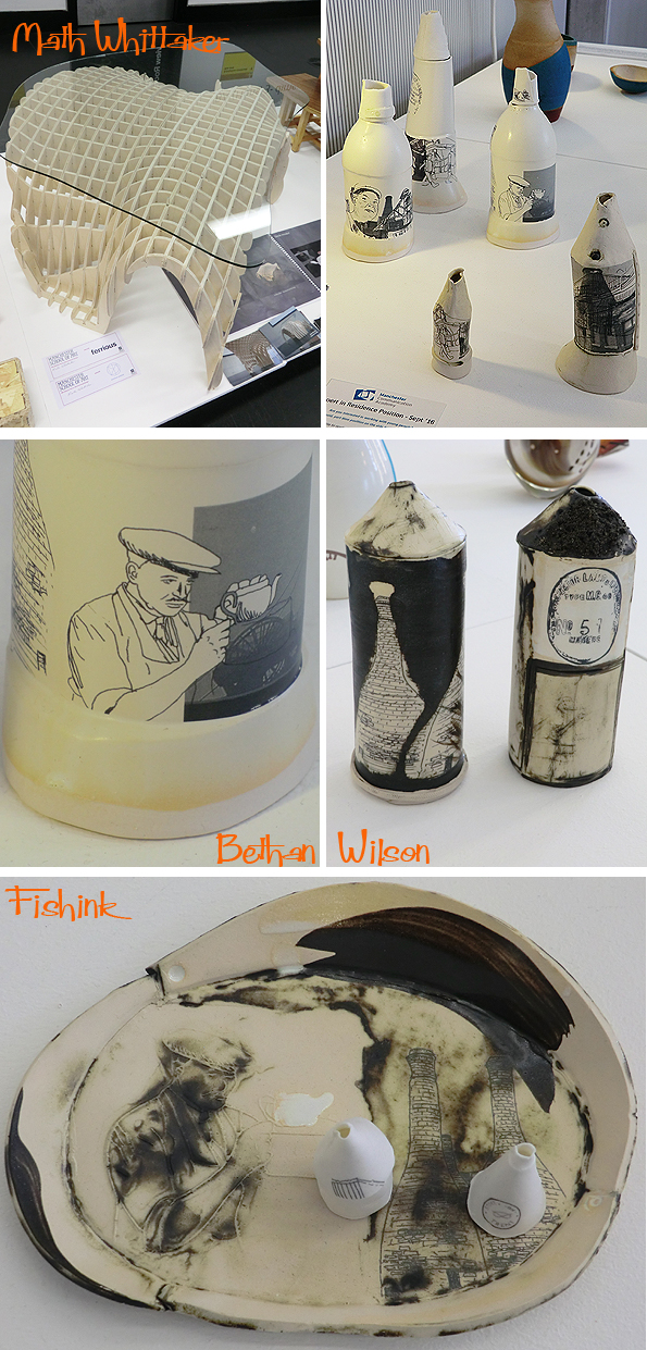
Math Whittaker and Bethan Wilson show us some great uses of form and function, mixed with a little decoration.
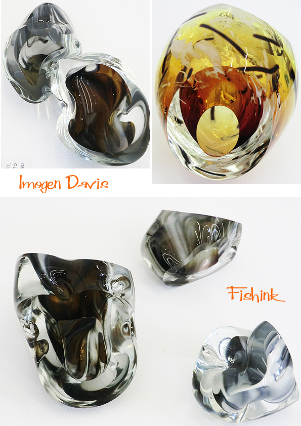
Curvaceous glass work from Imogen Davis.
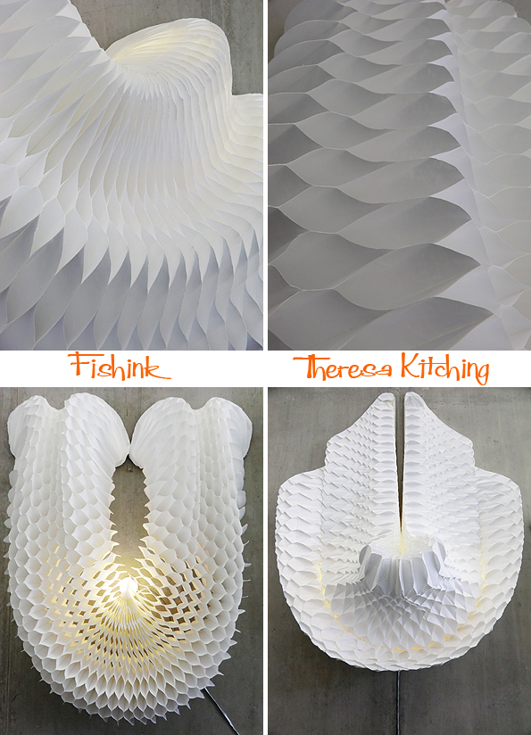
Perfectly made, pleated, fungi-inspired-forms from Theresa Kitching.
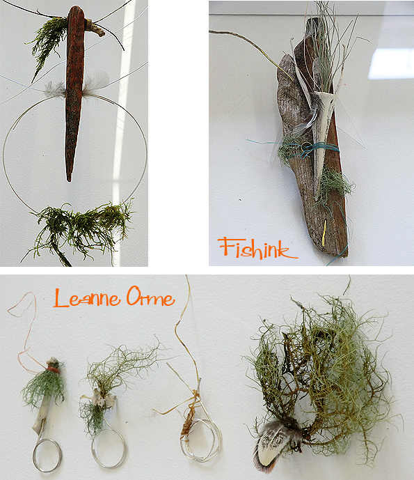
Leanne Orme presents us with jewellery made from foraged materials.
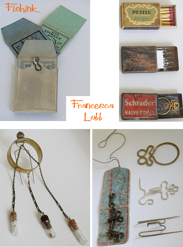
And Francesca Lobb explores the ideas behind body adornment and how objects evoke personal comforts for their owner.
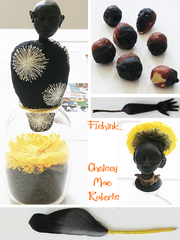
Chelsey Mae Roberts is using fetility and IVF as inspiration for her final project. The use of ritualistic artifacts for fertility historically and today and our current relationship with modern and traditional fertility treatments, are all ideas trailing through Chelsey’s work.
Well that’s all for this year, wow and to think I saw all this within an hour ! Plenty more to view and I’m sorry I didn’t get to see more. Good luck to everyone who’s graduating this year, do let me know what you think of the work and which pieces in particular you find inspirational.
Save
MMU Degree show 2016 Part 2
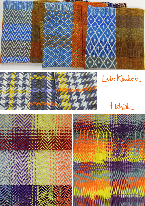
Today is the final day to get along to Manchester Metropolitan University and take in this year’s degree show. Following on from Monday’s post, textile designer Lois Ruddock starts us off with a few wonderfully coloured weaves.
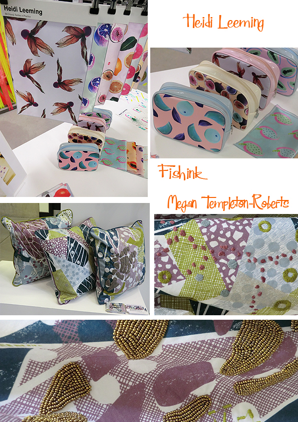
Heidi Leeming specialises in Women’s wear and fashion accessories for both the commercial and high end markets. Megan Templeton Roberts says that her work ” is strongly influenced by the structure and the organic marks seen within insect wings. By abstracting forms and textures from them, I digitally printed surfaces, which I then hand embroidered and beaded to express the texture and delicacy of the wings”
Taking a sturdier approach on materials, Mella Moylan uses the laser cutter to engrave images of draped fabric onto wooden geometric pieces. Her ‘wooden textiles’ could be used in many different ways to mold and form new shapes into our interiors.
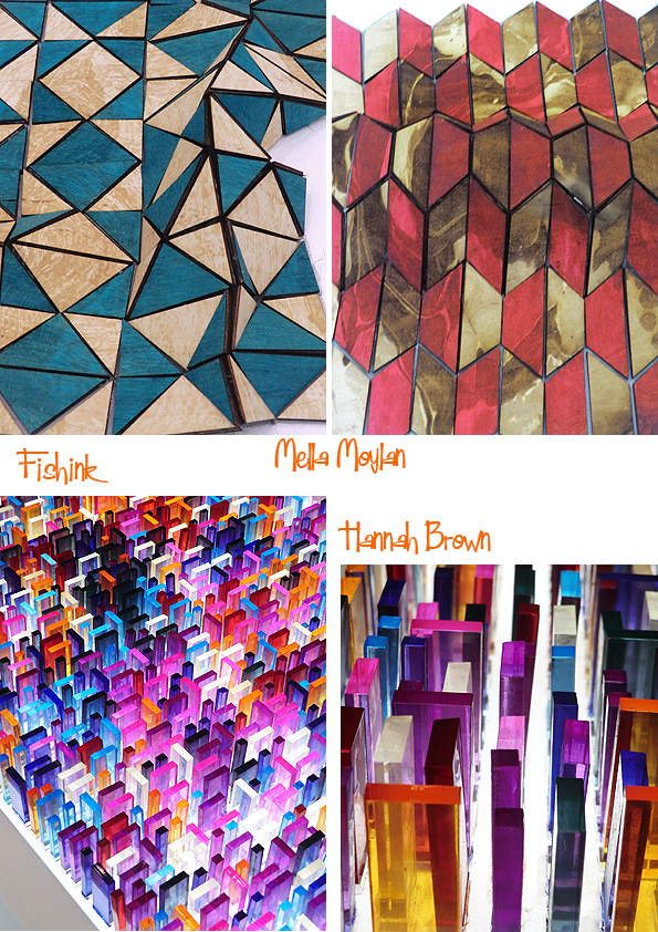
Hannah Brown says her work ” has a strong relationship to light and I incorporate the use of transparent or reflective materials in conjunction with other tactile surfaces. I enjoy manipulating materials through a variety of different processes, such as embossing, laser cutting, printing, dying and hand craft techniques ” Very effective they are too.
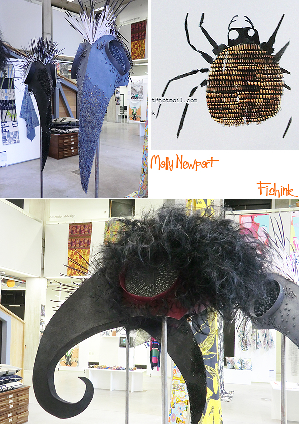
Molly Newport says ” Using the language of embroidery and particularly embellishment, I have developed a practice that is primarily aimed at an illustrative context. I am an avid drawer, and use my textile skills to realise the translation of two dimensional mark on paper into both three-dimensional and two-dimensional works that give the drawn mark and form a physical and tactile quality” I can see these working well in a theatre or children’s drama.
Mollie Milnthorpe has been inspired by botany and the natural world. Her ideas are developed through hand drawing and digital processes, combining and contrasting elements which has been an over riding concept throughout her work, creating unexpected but beautiful combinations.
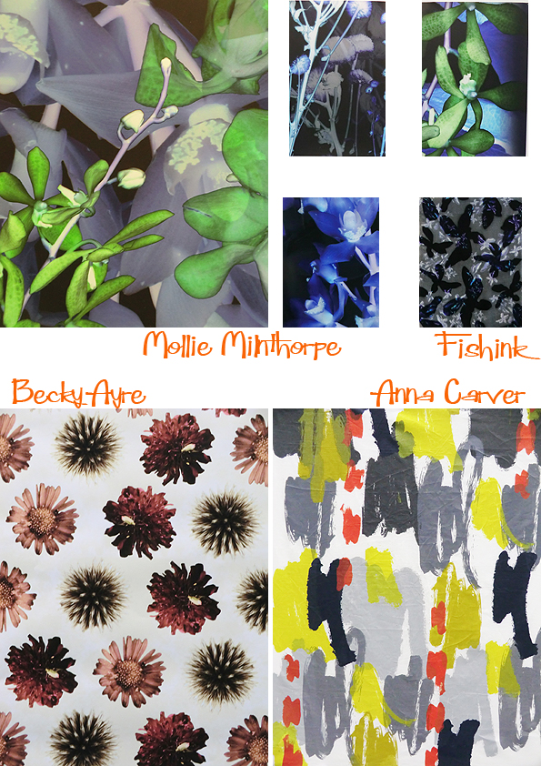
More botanical work from Becky Ayre and a freestyle, fifties-feeling print from Anna Carver.
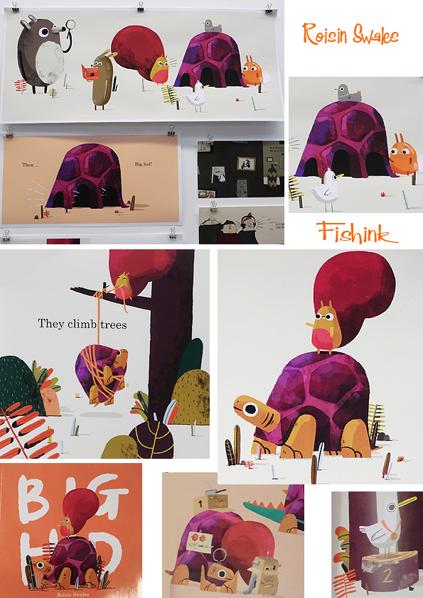
From there we move onto the Illustration with Animation course graduates. A beautiful collection by Roisin Swales. I will eagerly look forward to seeing more from Roisin, as her own style emerges and develops as she certainly has the talent to engage and inspire the reader.
One of my favourite illustrators work this year was that of Katie Williams. Her sea-focused dramatic work were full of life and vigor.
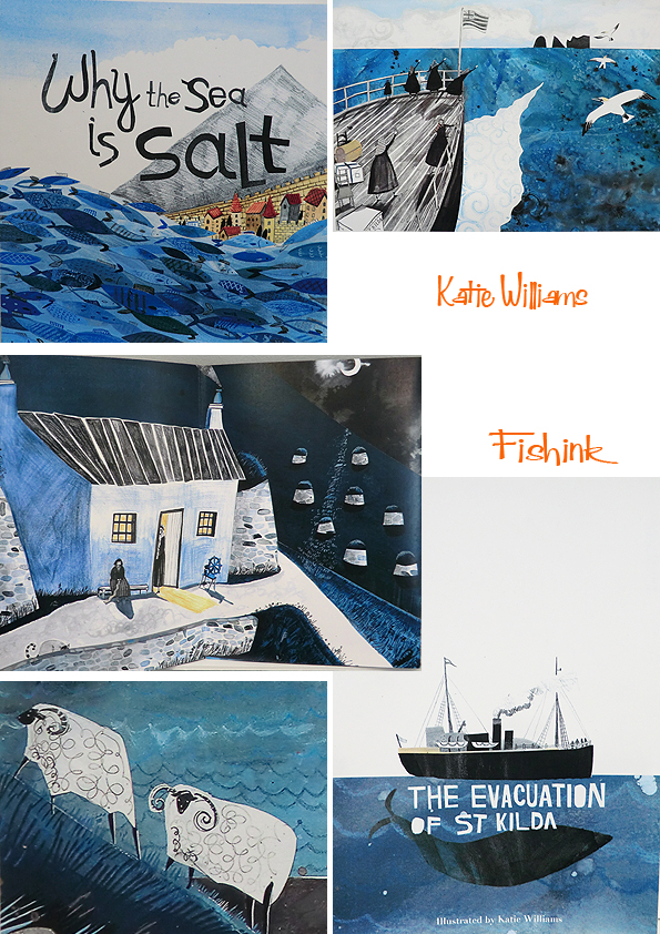
With a strong mix of collage and paint/pencil mixed media techniques. Katie’s work was a joy to look at.

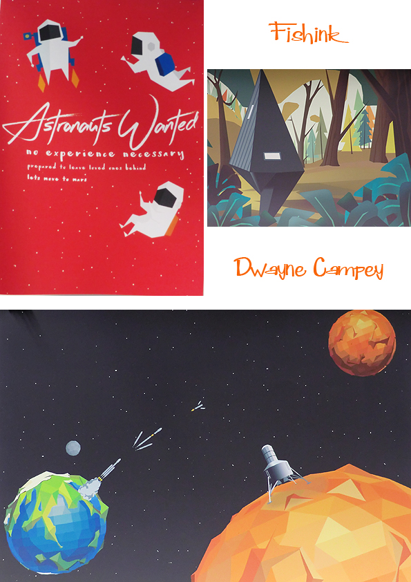
Some wonderfully ‘out of this world’ pieces by Dwayne Campey.
Keeping on a planetary connection with Cara Davies.
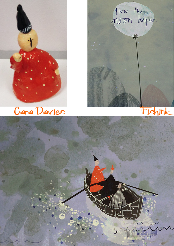
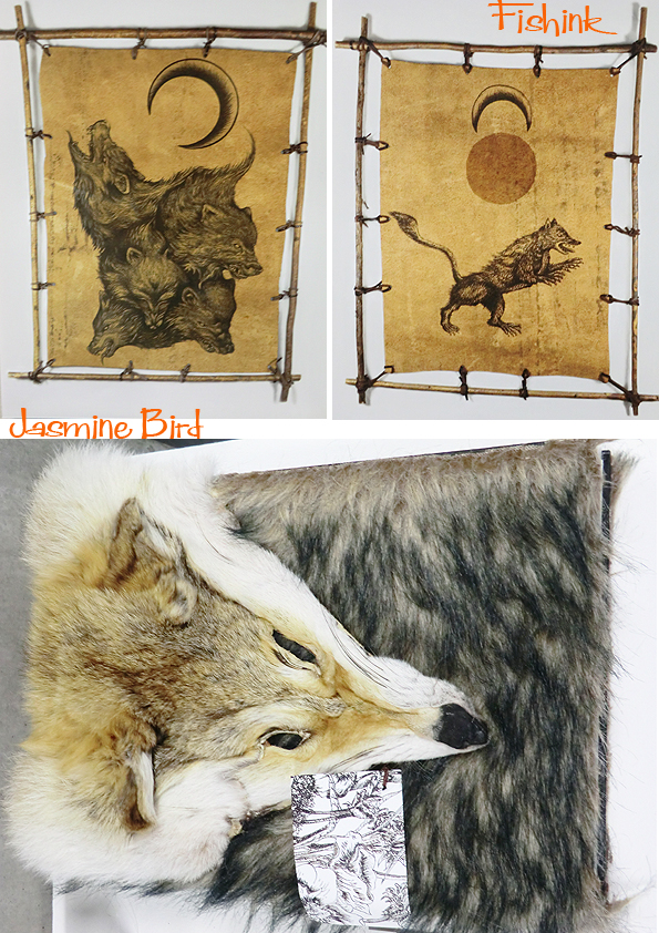
Moons and wolves by Jasmine Bird.
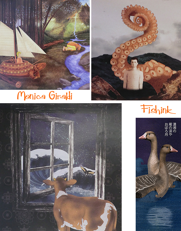
Unusual and intriguing images from Monica Giraldi.
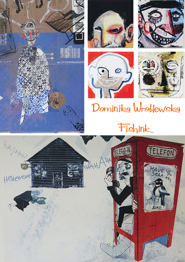
More graphic and sketchy work from Dominika Wroblewska and Antony Cross.

Beautiful colours and tranquil settings from nature by Emily Dayson.

A wonderfully dramatic journey into the animal kingdom by Rachel Fitchett. Great colour and expression in her work.

More to come on friday with the last post on the show. Do pop in to see the work at MMU today and let me know your thoughts on what you’ve seen here too.
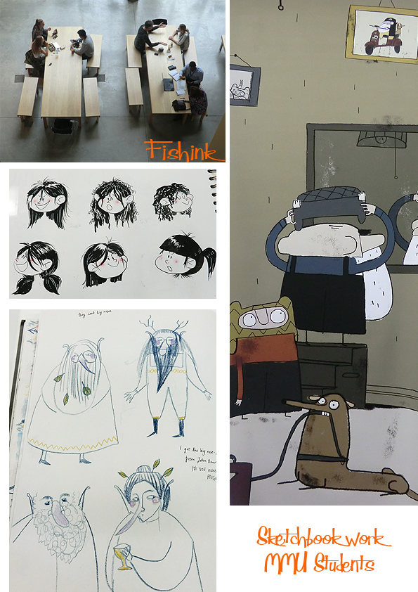
MMU Degree Show 2016 Part 1

I went into town last week to catch up on the Manchester Met Degree Shows 2016, sadly I didn’t have as much time as I’d have liked, but still managed to see quite a bit and was impressed with what I did view. In the textile rooms there were some great weaves. Look at these lovely colours by Avril Anne Melling. I hope she won’t be offended but they do make me think of luxury travel seating : )

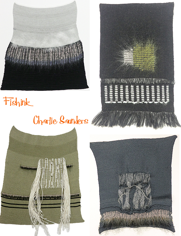
Wonderful, intricate details from ladies wear designer Charlie Saunders.
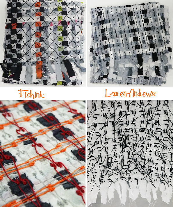
Or these softly comforting, grey-scale embroideries with a hint of colour from Lauren Andrews.
Animalistic embroidery from Kelly Quinzel, the large faces were great.

Some spicy hot, summery, Indian vibes from Jazmine Darson.

3-D textiles from Alexandra Jordan, who was inspired by lichens, fungi, bark, crystals, reptile skin and moss. Alexandra has used beading, embellishment, puff binder and tufting to help create her raised, textural surfaces.

Hannah Sharratt’s concern for the planet has focused her on recycling, using natural plant fibers/dyes and hand processes. She has created these nest-like pots in a world that needs a more sustainable consumer culture.
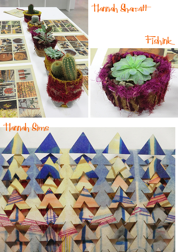
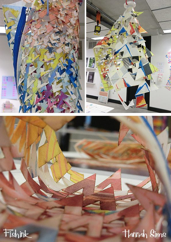
Hannah Sims used Manchester’s city centre as her inspiration for some graphical and colourful geometric lighting structures. Personally they’re a little too busy and random for my personal taste, but I think they’d make superb children’s climbing frame wigwams, amongst a scaled up playground ! What do you think ?
Finally for today, some interior based embroidered patterns by Elen Lowri Hughes. A simplistic colour palette makes them, ‘POP’ right out at you. Great Amoeba-circuitry Elen : )

More to come this week (as a treat for you) and the shows are on until the 22nd, so do pop in and have a look around for yourselves.
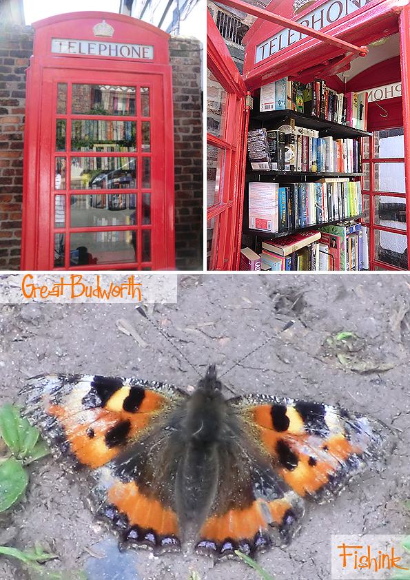
It’s summertime and the last 2 weeks have been glorious (yes, before the rain came), sunshine every day and lots of great walking in the local area. With a billing of the most picturesque village in Cheshire.. and that’s a high bar to set!.. Great Budworth, is a must to call in at, should you be in the area.
I’ve been before on
and there’s more on the history of the place here. I do like their converted phonebox / book-swop shop. What a fab idea.
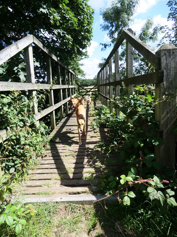
We set off for a walk around some of the local countryside to explore the area again.
Always spotting butterflies but it’s hard to take a decent shot of them, they’re either too quick, or perhaps just a little camera shy : )

The scenery and fields are beautiful, even these hot hounds thought so.

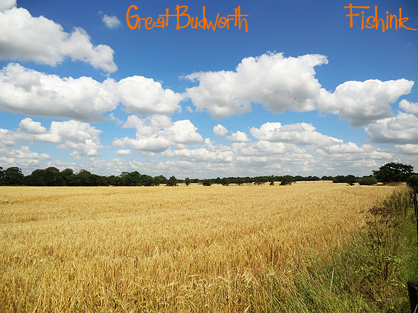
This just sums up how perfect the day was (sighs). The British countryside at it’s best.
Other snippets include seeing this Comma butterfly. (I had to look it up) here. When I first saw it with it’s wings closed, I thought it was a moth, but then it sun bathed and I knew it wasn’t.

Another recent walk was to Quarry Bank in Styal, Cheshire. The village is very typically ‘rural English’. Quaint, pretty and likely to end up featured on the set of some BBC period drama, if it hasn’t been already !

They were working on re-thatching the roofs of some of the cottages. Great to see these traditions are still maintained, yet alone that you can find the skilled labour to do the job well too. Look at this beautiful meadow full of buttercups, a real sign of summertime.

Before the mill was built, Styal village was a small collection of barns and cottages whose inhabitants worked on the surrounding land. In 1784, the valley of the river Bollin was chosen by Samuel Greg as the site for Quarry Bank Mill. As the mill expanded, many of the original farm buildings were converted into houses with purpose-built Oak Cottages added in the 1820s. This early industrial community included a school, shop, bakery, two churches and many of the villages even had their own allotments.
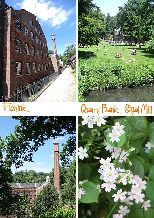
in 1939, Alexander Greg gave the estate to the National Trust to be cared for and for future generations to enjoy. The textile mill is one of the best preserved of the Industrial Revolution and is now a museum showing how the cotton industry worked.
I kept getting glimpses of old technology, lovely bridges and tall, tall trees.
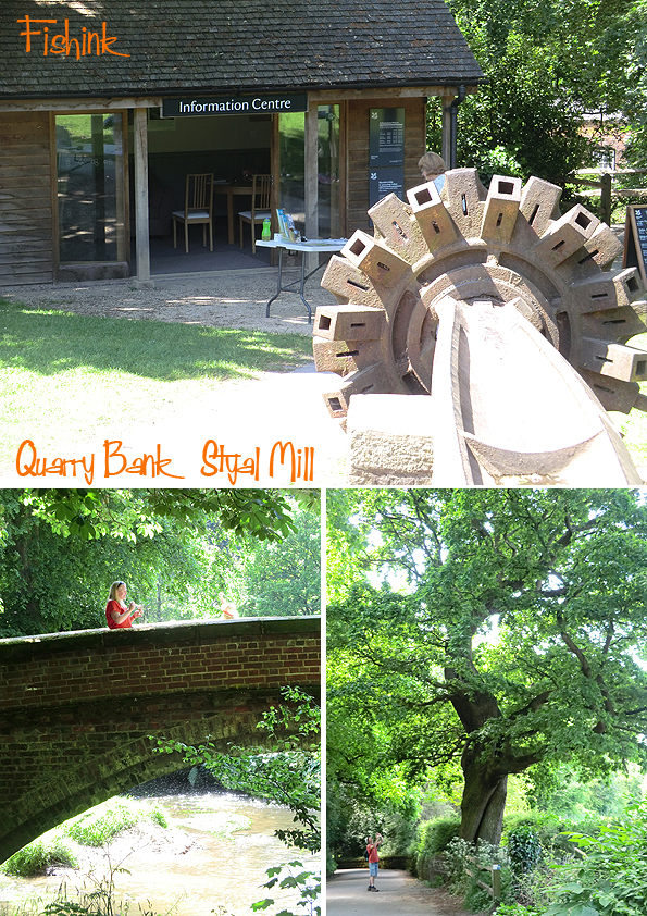
Boo had to cool off a few times with a river paddle, just as well she didn’t bring her bike!

The walking route towards the airport, I feel, is the most beautiful, in terms of views, environment and the different experiences you get being surrounded by nature.
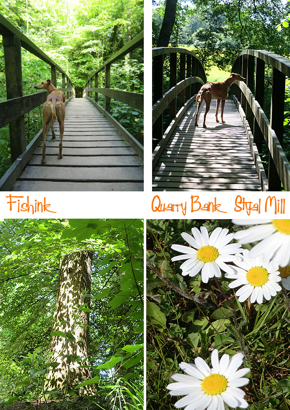
Always so much to see as you wander along.
Even the cows were too hot.

With Quarry Bank being so near to Manchester Airport, and as a treat for all you plane spotters out there, you can go and watch plane after plane take off and land to your heart’s content : )

Something for everyone, hope you liked our recent travels. Where have you been to lately that you’ve really enjoyed ?
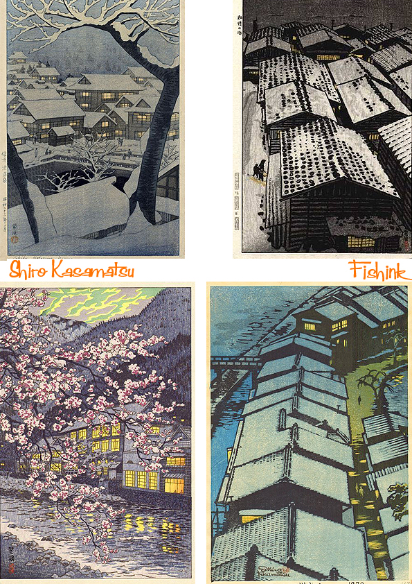
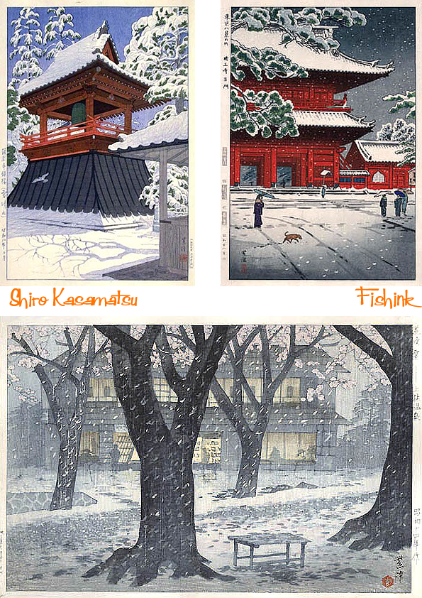
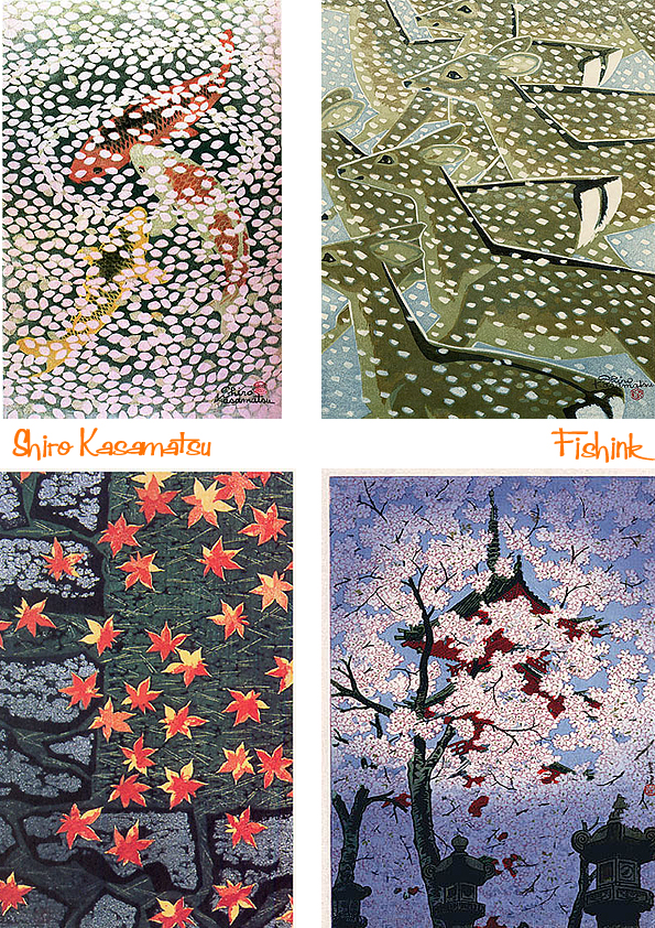
Shiro Kasamatsu Japanese Woodblock Painting
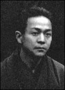
Born in the Asakusa section of Tokyo to a middle class family, Shiro Kasamatsu started his art studies at a young age. In 1911 (at the age of just 13) he became a student of Kaburagi Kiyokata, a master of the bijin-ga genre. Shiro studied Japanese style painting (Nihonga) but unlike his teacher, he concentrated on landscapes.
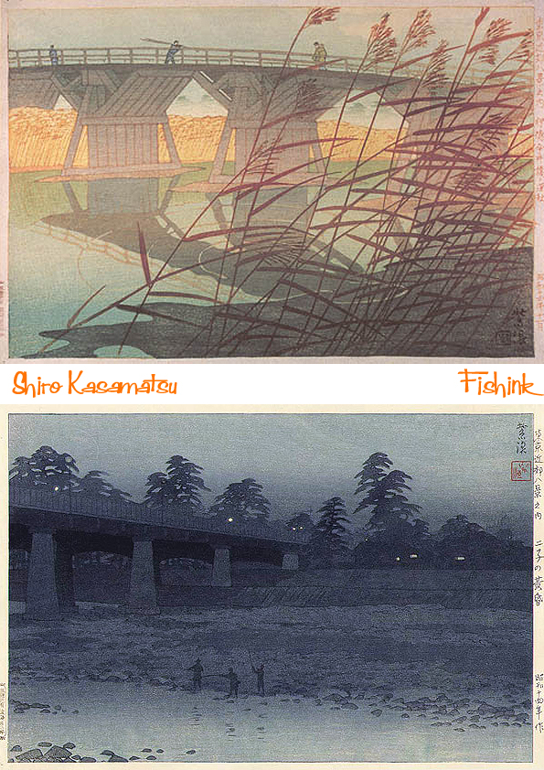
Shiro’s paintings were shown at several prestigious exhibitions including the government sponsored Bunten, where they caught the eye of Watanabe Shozaburo, a Tokyo publisher. In 1919, Watanabe approached Shiro about designing woodblock prints. No doubt Kiyokata facilitated this introduction as he had done for several other students. Shiro’s first print, ‘A Windy Day in Early Summer’, (seen below top left) was published in that same year. He designed several landscape prints over the next few years, but the blocks for these were lost in the 1923 Kanto earthquake and as a result, they are now quite rare.
Shiro resumed his work with Watanabe in the 1930’s. His designs were mainly of landscapes, but also included bijin-ga, interiors. Western collectors were especially attracted to his romantic landscapes depicting traditional Japanese life and landmarks. ‘Shinobazu Pond’, (above, bottom right) published in 1932, was so popular that it was continually reprinted throughout the 1930’s and 1940’s. It was published in several different color combinations, including this aizuri-e (blue) version. In this print and many others, Shiro used foreground elements like branches to draw in the viewer and give the image depth. This was a design technique first originated by the ukiyo-e artist Hiroshige.
In 1939, Shiro designed the series Eight Views of Tokyo, but only four prints were completed. His relationship with Watanabe was nearing a close, probably because Watanabe did not give him the creative control that he desired. Shiro was intrigued by the independence of sosaku hanga printmakers who carved and printed their own designs. After World War II, he stopped working with Watanabe. However, it would be nearly a decade before Shiro began producing his own prints.
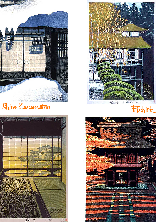
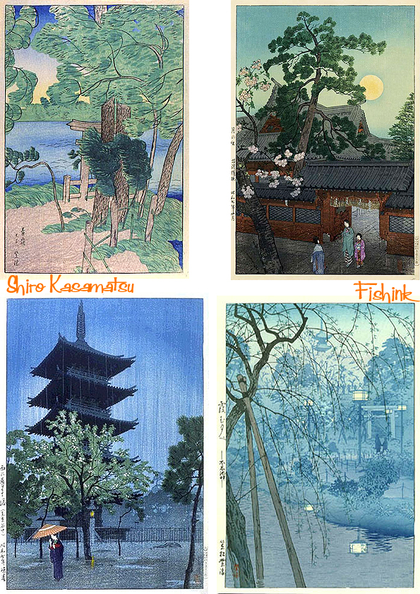
These prints taken from scenes around the traditional Japanese home, are beautifully simplistic and yet soothing as a result. As with many things Japanese, I find that they instill a sense of calm when you look at them.
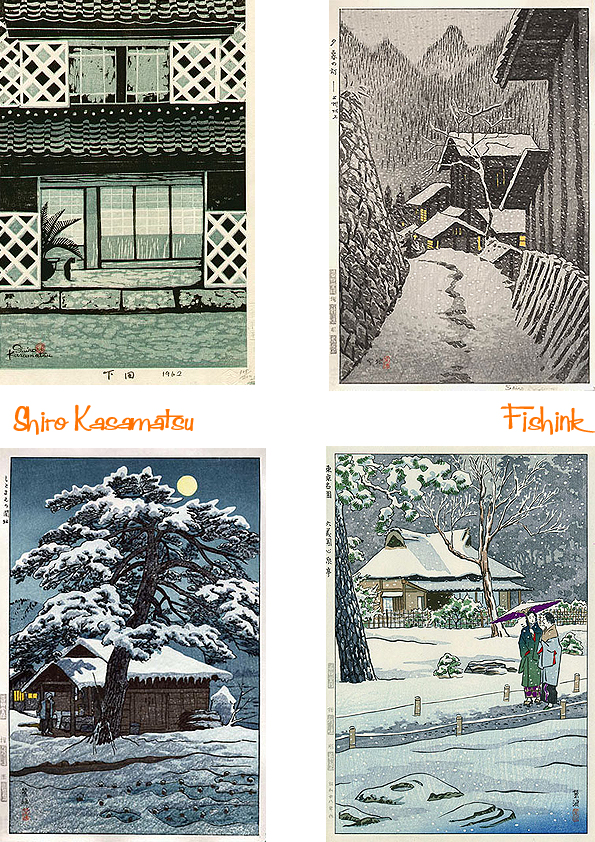
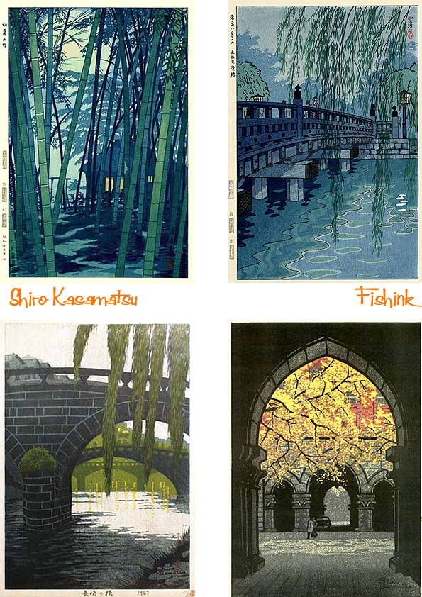
In the meantime, he established a short collaboration with Unsodo, a publisher in Kyoto, designing landscape and animal prints. Many of the prints published by Unsodo are quite striking and compare favorably with the Watanabe-published prints. By the late 1950’s, Shiro was ready to break out on his own. He began carving and printing his own designs in limited, numbered editions. He signed these prints himself in English. Some of his Watanabe-published prints also bear English signatures; however, these signatures were applied by Watanabe’s employees, not by the artist himself.
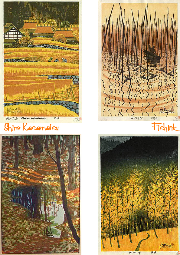
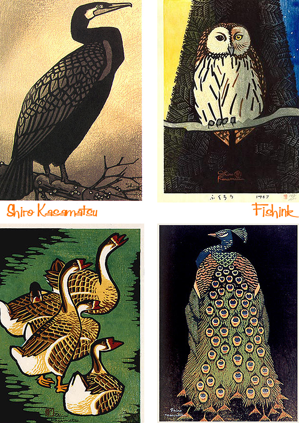
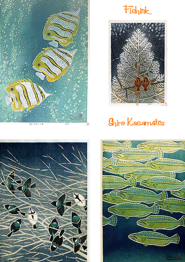
Scenes of nature or seasonal themes are conjured up and depicted so beautifully here.
Although Shiro’s self-made prints lack the refined carving of his shin hanga designs, they have a simplicity and expressiveness that is very appealing.
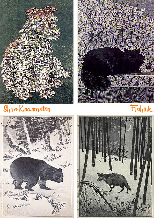
Shiro’s animal prints either reveal creatures in their natural habitats, or more dramatically they are strongly depicted, with little, or no, background detail or distraction.
Shiro continued to create prints for several decades, but never promoted them through exhibitions or gallery affiliations. As a result, his self-carved prints were more a labor of love than a commercial success. I do wonder if Shiro had designed Textiles or Wallpaper what they might have been like ?
Many thanks to the Hanga Gallery for it’s information and illustrations, without whom, this post wouldn’t have been possible.
I’m very excited to bring this post to you today, because it sheds a little light on another fabulous designer from the 1950’s.
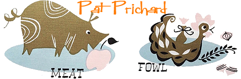
I have previously spoken here and here about the talented Pat Prichard, who designed hundreds of tea towels, scarves and linens during her lifetime. Sadly there is very little written online about Pat or her work, so I was delighted when a lovely gent, ‘Larry’ from the U.S.A contacted me, to say that his mum had been a good, close friend of Pat’s and would I like her to write down some memories and share them with us all on Fishink Blog! Well, you can imagine that it didn’t take me long to consider their kind offer and below are the fascinating recollections.
My story is from a long time ago. Pat and I met at the Parson’s School of Design sometime between 1947 and 1950. The class was then called ‘Advertising Design’ (‘Graphics’ may be a more appropriate subject title for today), Parson is now part of The New School in Manhattan.
Pat and I were the same age, well just a month difference, she was intelligent, well-read and culturally up to date. Occasionally working in a studio, Pat was creatively quite an original and did well when freelancing and producing work for different companies. During our friendship, I noticed how Pat’s style developed, her handwriting emerged and she experimented with a much freer look, which proved to be very fashionable.
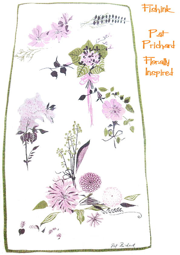
I remember in the late 50’s taking a huge bouquet of hand-picked flowers, (from my mother who loved Pat), over to her place. Large Hydrangeas and many lesser sized, but equally lovely flowers, transported all the way from NJ to NYC (however did I do it ?.. I may even have walked the distance). The bouquet, however, became Pat’s inspiration, and the next time I visited, there, in the hallway, just waiting for me to view it was a stunning painting of my flowers.
Perhaps the bouquet could have inspired the design below ?
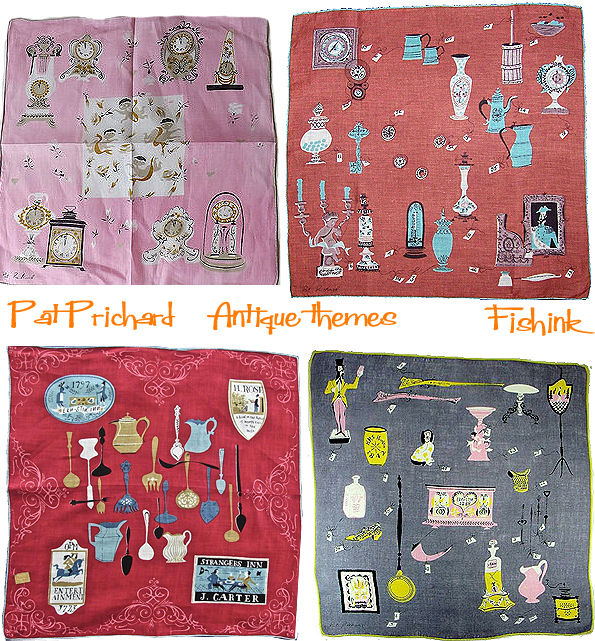
When our friendship began Pat and her mum were living in Queens, (her father had sadly passed away soon after she was born). As Pat became autonomous, she discovered and rented a unique two-story apartment made of stone over on the east side of Manhattan. I still lived with my parents, so I really admired her gumption and strength to achieve so much so early. Pat’s apartment was furnished generously with Victorian pieces collected through ‘antiquing’ a pastime she loved to do, and which soon became the subject matter for many of her designs.
I remember the stairs in her apartment were painted black (probably Pat’s choice) and built right into the wall. The landlord did a great job in making the changes and the place looked stunning. The living room was carpeted in deep lavender, a daring shade and at the same time,Victorian in feeling and the marble top tables fitted in splendidly well. Pat married and lived towards the end of her life in Pennsylvania, where she had many friends, who I imagine, have many of her paintings. I have two of her works, one was a gift and the other I purchased.
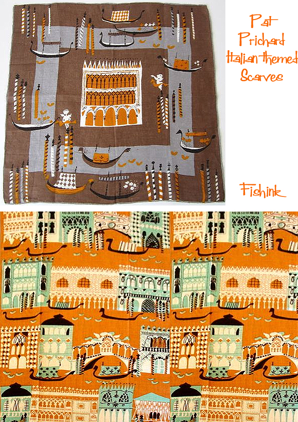
The first is of one of Pat’s trips to Italy. This is Venice, St Mark’s Square on a wet, but still crowded afternoon. How wonderfully she depicts the flight of the pigeons, the tourists with their dark sunglasses and the porticos on both sides pointing to the Cathedral in the distance.
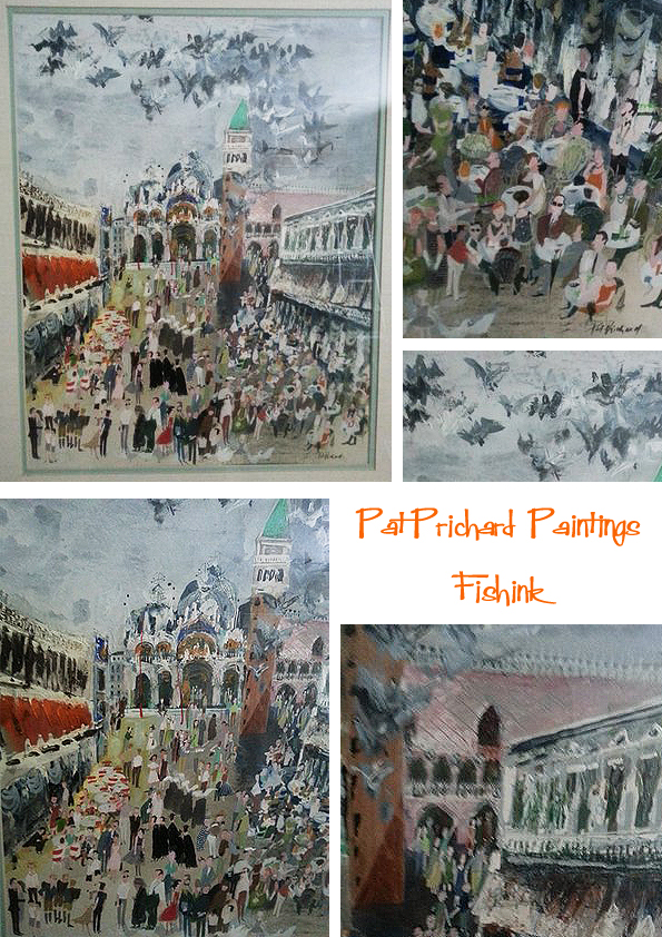
No prizes for guessing where Pat got the inspiration for these designs from!
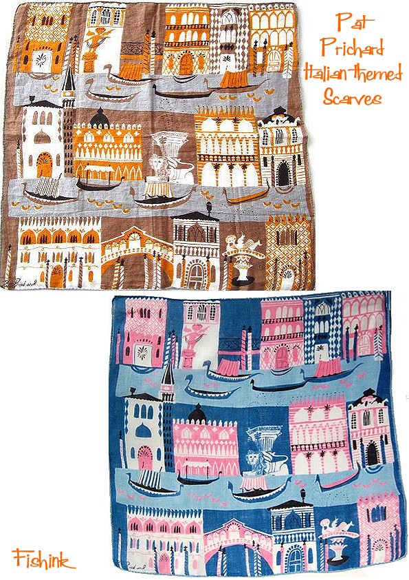
I love how she has simplified the decoration on the buildings but still manages to get enough detail into each design so that we can easily tell where it depicts. They must have been very popular judging by the number of colourway variations I’ve seen produced.
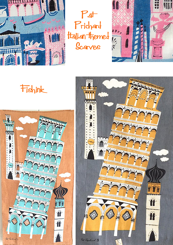
Such beautiful designs.
The second painting depicts the harbour of Cape Cod in Massachusetts. It’s similar in style to the Venice piece but a little more mysterious and slightly haunting too.
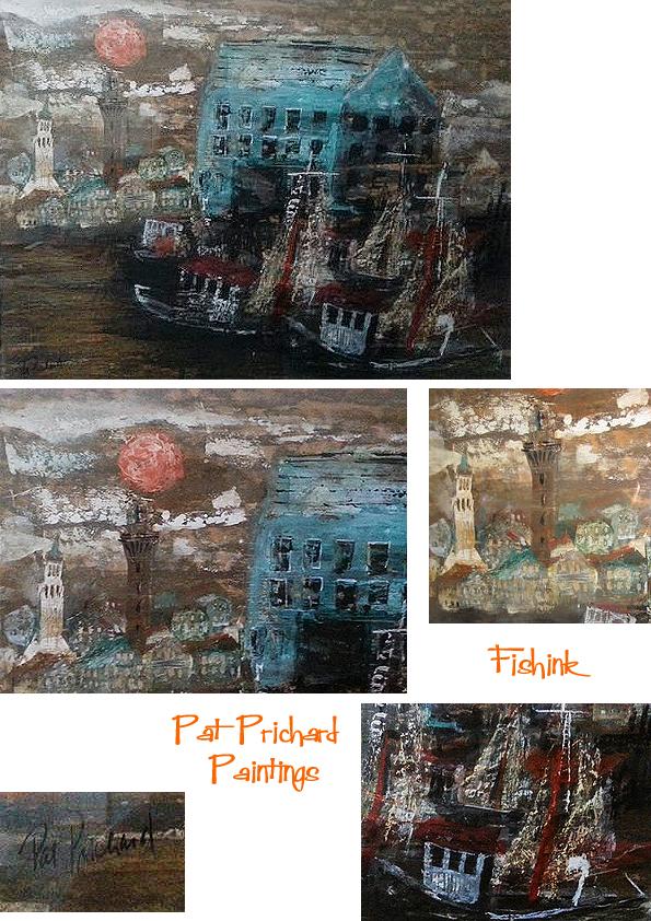
Sadly Pat passed away when she was in her early sixties. I had many of her handkerchiefs and cards that she had painted for me over the years but with downsizing, only one scarf now remains with me. It’s tattered and torn, faded and sports a hole but, like my memories, doesn’t take up too much room !
I want to send out a huge vote of thanks to both Larry and his mum for making this post possible. For taking the photos, typing two pages of the warmest, fondest, memories I’ve read for a long time (gosh I hope some of my friends remember me with such warmth : ) ) and for keeping me up to date with everything as we got the story together. How fascinating to share a glimpse into Pat’s world through the eyes of a good friend.
I’m certain there will be many of you who will enjoy reading these recollections, please leave a comment if you do.
If anyone else knows someone I may have covered in one of my posts and would like to share their thoughts and images, then please do get in touch. You can reach me here Craig at fishink.co.uk
A very happy Bank Holiday to all in the UK too.
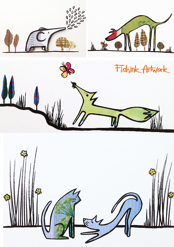
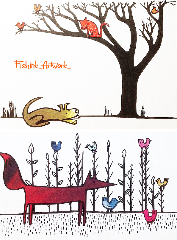
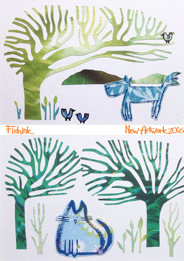
Fishink Artwork for the Sale Arts Trail 2016
I’ve been busy preparing for this year’s Sale Arts Trail which will be taking place on Sat 9th / Sun 10th July in and around Sale, Manchester. Last year we had a wonderful weekend of weather and the art lovers were out in their hundreds. My display looked like this…

and here’s some of the work from 2015 …
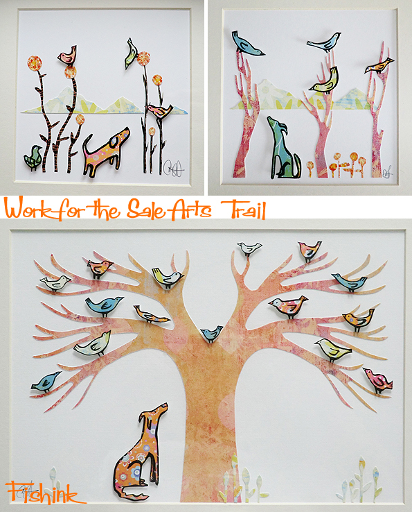

This year there will be more dogs (of course!) and more cats, some foxes and even the elephants are making an appearance too !
Whoop : )
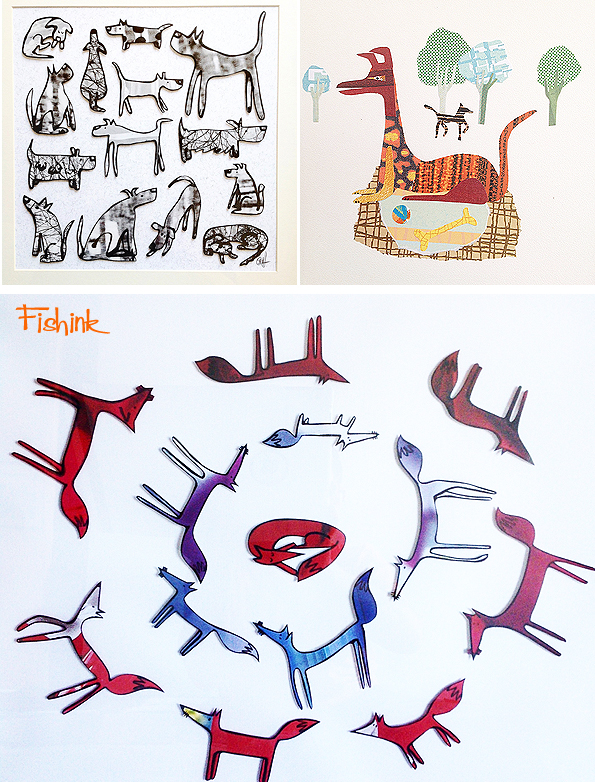
Prices range between £25 for a small card original (7 x 5 inches), and £150 for a much larger framed piece with various price points in between. Hopefully something for everyone’s pocket.
Sometimes the textures and patterns creep in too !


A few more elaborate trees have started growing too !
Last year I showed my work at the wonderful Minikin Emporium in Sale.


New hand made greeting cards with cats, dogs and elephants too. £3 each or four for £10.
More news to come as the date draws nearer, do keep that weekend free to come over and say hello. There’s usually over 50 different designer’s work on show at about 30+ venues. Anyone wishing to have a commission made, specific to their dog, cat etc can contact me for more information here craig@fishink.co.uk. More stamps, stationery and notebooks on my website too here.
Here’s one I did for a birthday gift for a customer last year, who’s squirrel-chasing whippet looked just like this : ) What would your choice be ?

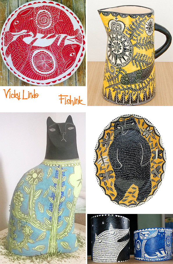
Vicky Lindo Ceramics that got the cream
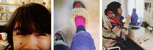
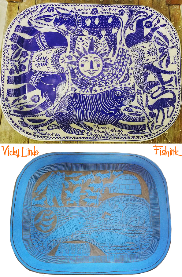
Vicky Lindo has been on my ‘posts to relist’ for quite sometime now. Based down in Bideford in Devon, she used to work for a number of years in the Burton Art Gallery. Until, both influenced and fascinated by an exhibition of the R J Lloyd slip-ware collection, made in the middle ages by farmers and country folk, (more here), she decided to start up her own workshop and make her personal range of slip-ware. Below are a sample of the ceramics Vicky was inspired by… and I can see why !

Although it’s far more contemporary and with a slant towards the purr-fect feline, Vicky’s work certainly has a bit more colour and definitely makes me smile, her partner Bill Brookes is also her business partner and together they produce these beautiful ceramics.
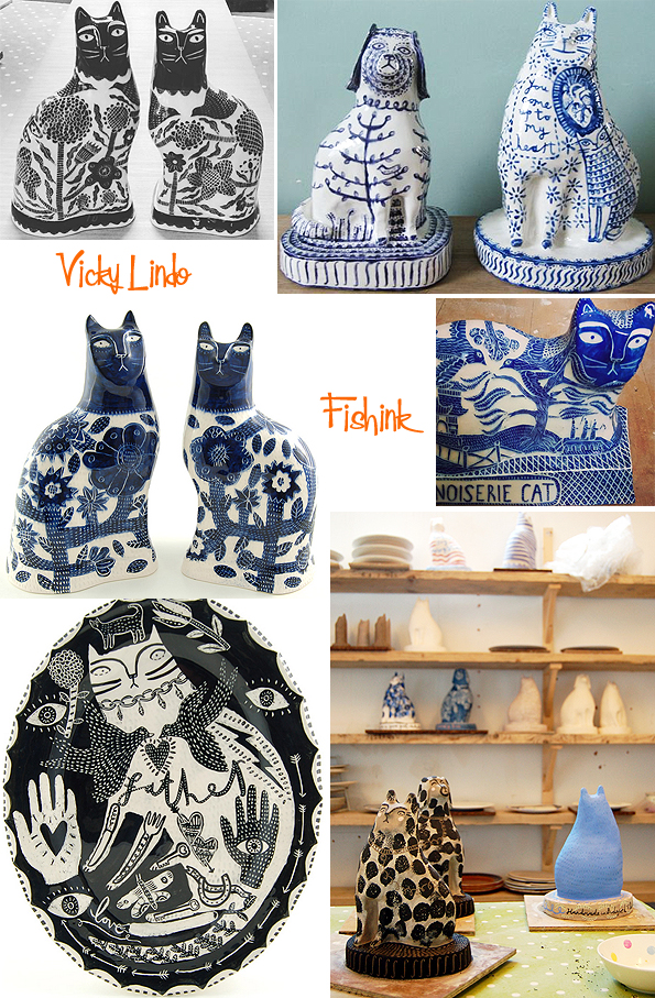
The ideas often originate in a sketch or painting. It helps to determine where shapes and pattern will be, sometimes this will be altered slightly for the final piece. The hardened clay object to be decorated is then coated with a layer of different coloured slip (watered down clay) and once that’s dried, the design can be drawn and cut into (sometimes called Sgraffito). You have to be clever at thinking in monotone and good with shapes and pattern, it’s not as easy as you may think.

Finally after the second firing, the piece is finished
Sometimes Vicky hand decorates directly onto a pre-fired piece. Having cats around the home and studio must help when using your imagination to conjure up these whimsical pieces. Of course the cats help out too… when then can!

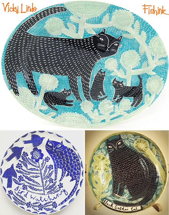
It’s great to capture the ‘aloofness’ of cats so well and I like the way the garden creeps up onto their coats sometimes too.

It’s not all about cats.

Some pieces are commissioned too.

More variation of themes and colours.
When she has a few minutes to spare (which I imagine these days doesn’t happen often), Vicky likes to relax and do some hand embroidery.

Fabulously quirky ideas.


But in the kingdom of the ceramic world… Vicky’s cat is still King of the jungle.. or at least her back garden ! Beautiful work Vicky, keep inspired and long may they prosper and continue to amuse us all.


