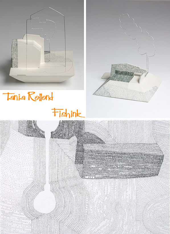
Tania Rollond Nature, geometry and ceramics

Tania Rollond was born 1973, Esperance, Western Australia. She completed a Bachelor of Arts in Design at Curtin University before discovering her passion for working with clay.

She moved to Sydney to study Ceramics at the National Art School from 1997 to 2000, and then established her studio in the Southern Highlands of NSW, where she has been living and making work for solo and group exhibitions in Australia and overseas for the last decade. In 2011, Tania completed her Master of Fine Art (by Research) in Drawing at UNSW.

In addition to her studio practice, she has been teaching since 2001. Her experience includes the University of NSW, TAFE and Sturt Craft Centre. She is currently a part-time Lecturer in Ceramics at the National Art School, Sydney, where she has worked since 2004

Lovely to see her slip trailed vases and bowls, pictured here in their pre and post glazed stages.

Considering the line and form is obviously a large part of Tania’s work.

Nature plays another fundamental role.
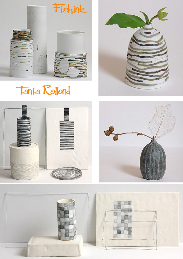
Fascinating to see how Tania’s drawings and paintings reflect her finished ceramics. Some forms (below) even appear to be midway between the drawing and painted stages of completion. Wonderful sense of line and movement.

Elements of repeat pattern, nature and geometry are reiterated in different ways on a variety of shapes and ceramic forms.

Beautiful work…. any thoughts readers ? Which piece would you like to own and why ?
Fishink New work for the Sale Arts Trail
For those of you missing the Mid Week Mix, fear not, they will be returning soon. It’s just that I’ve got so much news to tell you lately, that they’ve been pushed further down the ‘post pile’, whilst the more recent news comes first !

I’ve been selected to exhibit my work in this year’s Sale Arts Trail and have started preparing new work to show. There will be a collection of 50+ local artists, across a range of different disciplines such as jewellery, ceramics, painting and illustration. The work is displayed in the Waterside Arts Centre as well as participating shops, cafes and businesses around Sale itself.
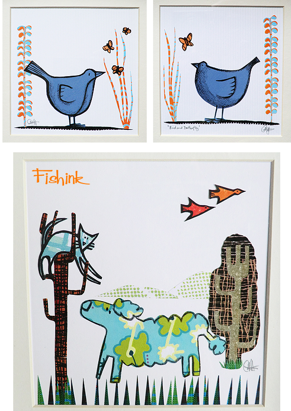
I thought it would be fun to create some more simplistic pieces that allow the cut of the card to depict the shape of the animals, instead of using a surrounding line to do the same. I quite like the softer look… any thoughts ?
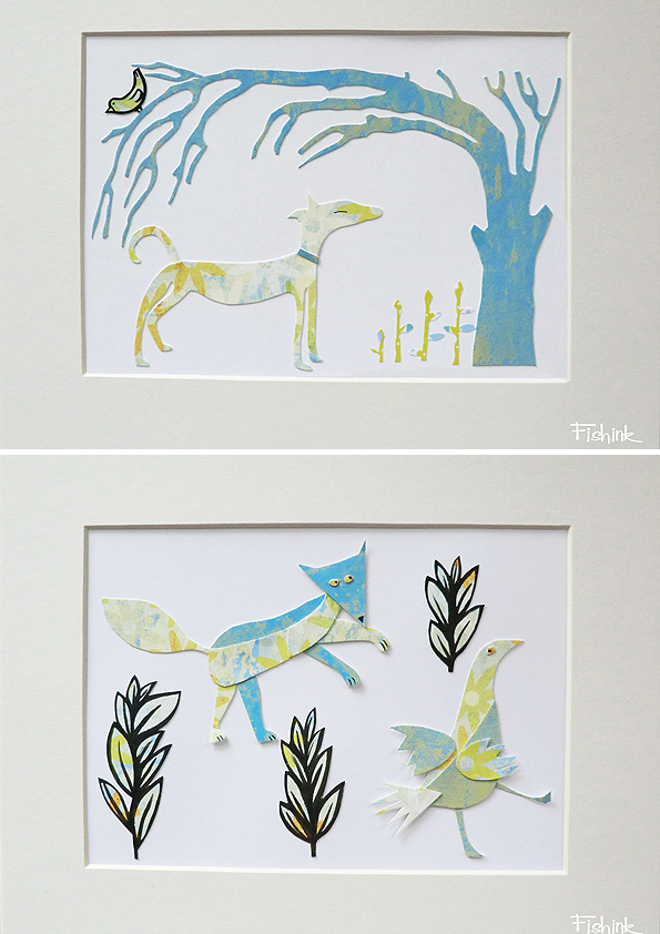
This is my largest piece to date, approx 40 x 50 cms and is painted straight onto torn, collaged pieces of card, which allow splashes of texture and colour to peep through.

Other work takes from the theme of pinned/ mounted butterflies, but in this case, rabbits and birds. The animals stand proud of the ground which gives depth and casts shadows within the illustrations too.
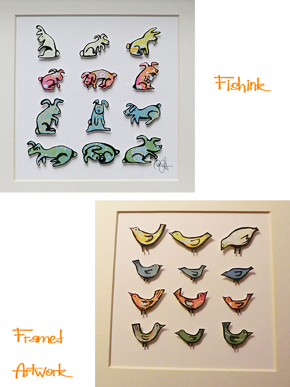
I’m hoping to have a good range of hand made cards too, like the ones below

More work available here. I’m available for commissions, so if you like my style and want something more personal creating, do get in touch. Be sure to put the 10th – 12th July in your diaries and come along to take part in the trail. It should be a great weekend.


Here’s a couple of inspired repeats taken from the collages.
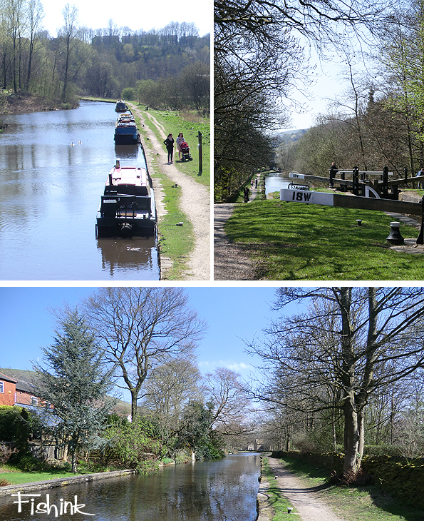
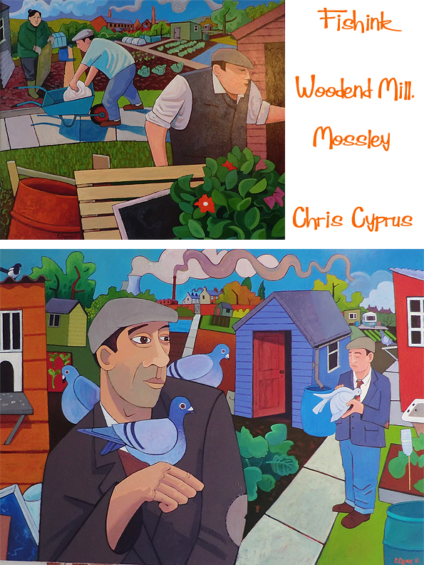
Chris Cyprus at Woodend Mill, Mossley.
A couple of weeks ago now, we got out of the house and explored a part of the outskirts of Manchester that we had not been to previously. Meeting up with a friend who’s recently moved to Greenfields, we ambled along the canal side to Mossley. As you can see, it was a beautiful sunny day.
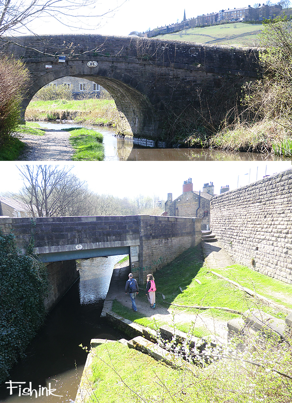
I liked the two different arches here, the bridge and the land, one resting upon the other.
Fortunately you can walk for miles along the canal side, whilst you admire the slowly changing scenery.
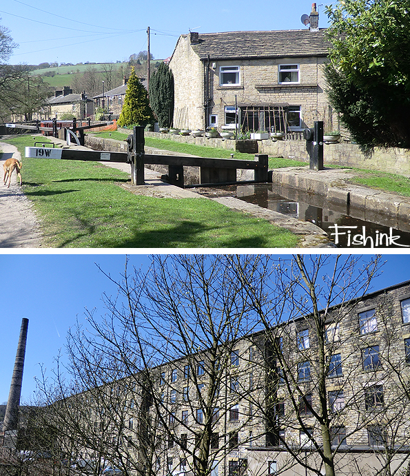
At Woodend Mill, there was an open day, where a lot of the artists who work there, open their studio’s up to the public. Some are tucked away up in the rafters ! The mill has about 5 floors so it’s a pretty big place to walk around, although sadly not all of the studios were open.
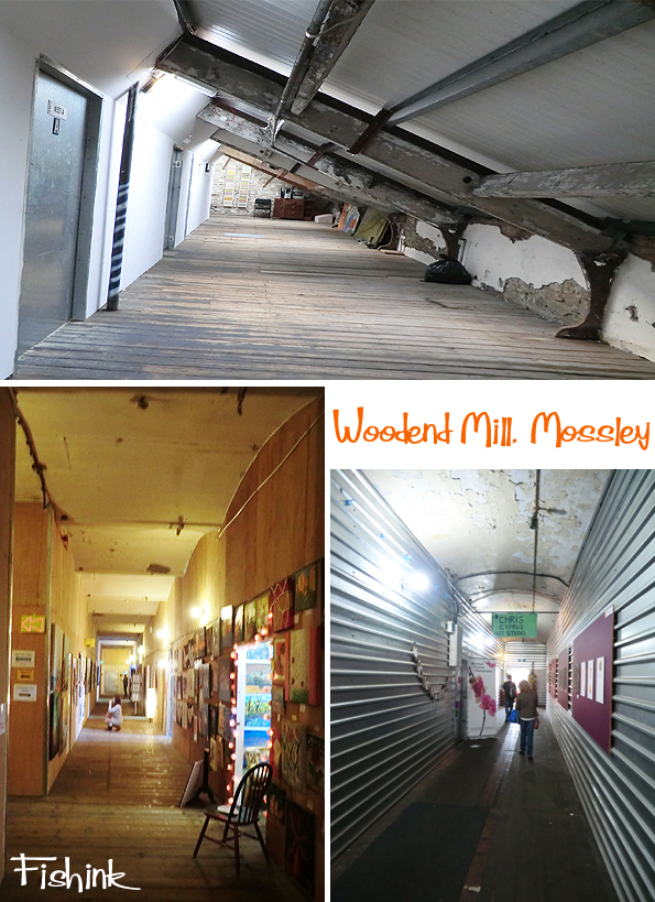
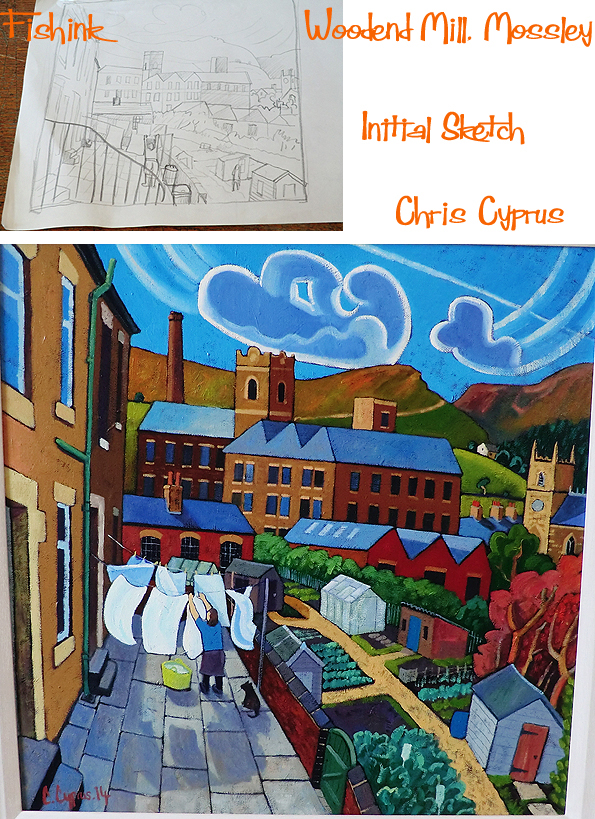
My favourite artist, who has a large studio space is Chris Cyprus.
Born in Gorton, Manchester in 1971, Chris then spent his early years growing up in Stockport. When he returned to his roots as an aspiring musician in his twenties to play at Bakers Vaults, Chris’s memories of being a young lad resurfaced: like “…being pushed along the cobbled streets while staring up in wonder at gigantic mill buildings.”
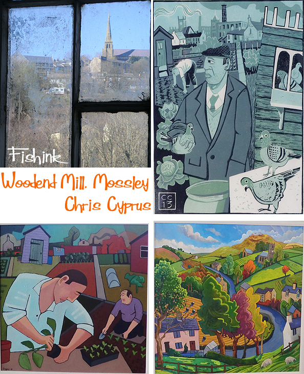
Chris says “I now live in Mossley, Lancashire, at the foothills of the Pennines. While it feels completely different to the place of my childhood, it is the enduring community ties blended with my memories that inspire how I depict Northern Life.”
A few years ago, Chris sought out his own allotment, when he saw in it, a different way of life. “It’s that sense of community you get in the Pennines, in the little surrounding villages. It’s that sense of belonging. The chit-chat in the chip shop and the passing conversation on the street market.”
To a large extent, all of Chris’s work is inspired by his view of northern life, though it is wider than that. It’s about capturing the way things were, when people looked out for each other, when everyday life brought people together.
For me there is also a Beryl Cook side to Chris’s paintings. A humour in the work and that feeling of capturing a fleeting snapshot of the life that’s going on around us, or in some cases, that is sometimes passing us by.
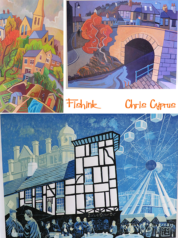
There are still elements of the big city amongst Chris’s work, like this one above from 2014 depicting Sinclair’s Oyster Bar in Manchester’s Shambles Square. From the city to the mills, there’s always that sense of community and life happening around you.
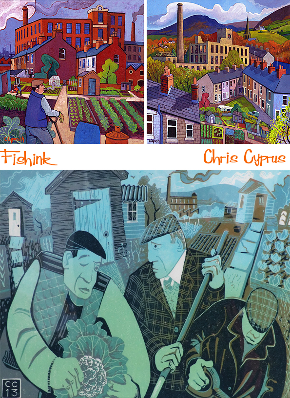
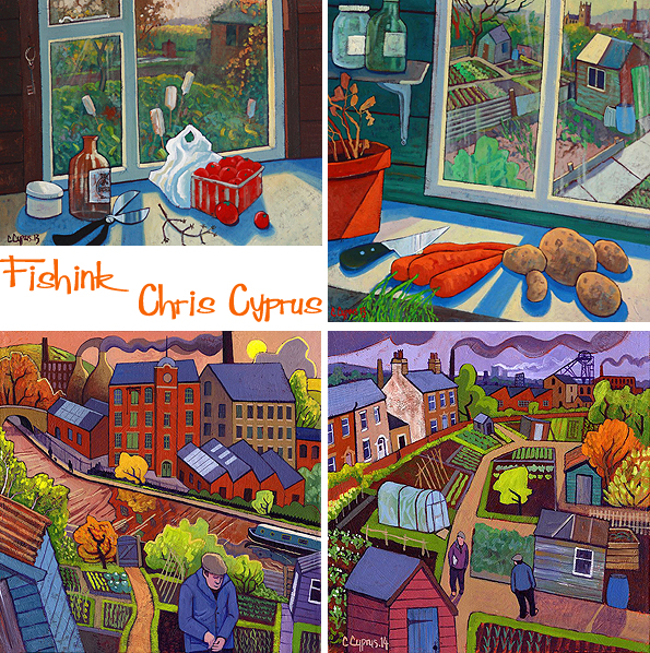
I like these still life paintings depicting both inside and outside of the potting shed. His hazy sunlight and long shadows suggest the end to a hard day’s work on the allotment, or in Chris’s case at the easel !
More about Chris in this video and on his site. Many thanks to Chris for sharing his words and work with us today.
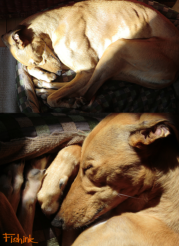
Phew, a grand day out Gromit ! With all that walking, even the dog had to find a sunny spot and have a lie down afterwards !!
Alas as all good things come to an end, so we’ve reached the final post on my London trip. Be sure to nip back and read them, especially those on the Eric Ravilious, Sonia Delaunay and Mac Conner exhibitions, all well worth a visit.
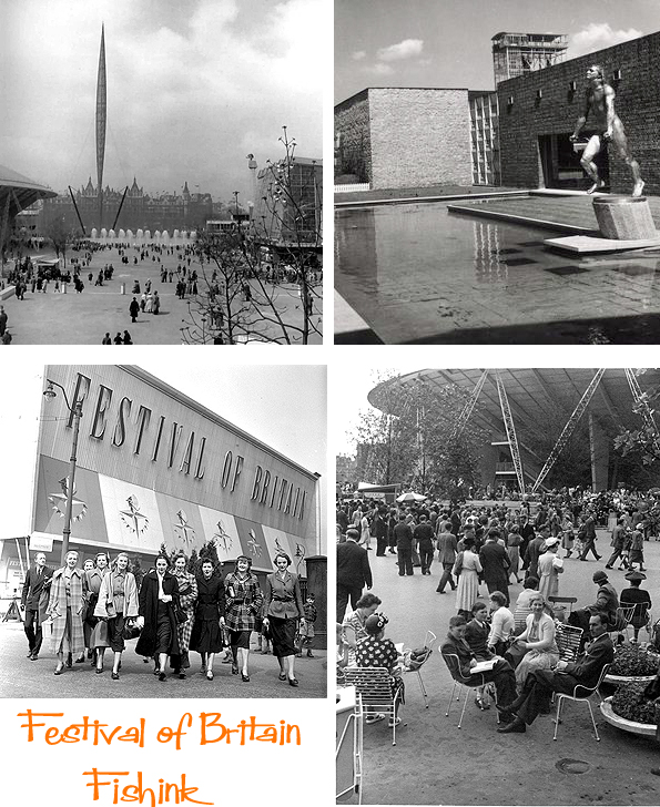
I was wandering alongside the Thames river and decided to pop into the Royal Festival Hall which is the heart of the Southbank Centre.

Many of you who know me, will also know about my passion for the 1950’s era, so with a foyer display featuring information, advertising and models of The Festival of Britain, I was again, a happy soul !
The Festival was a national exhibition held throughout the United Kingdom in the summer of 1951. It was organised by the government to give the British a feeling of recovery in the aftermath of war and to promote the British contribution to science, technology, industrial design, architecture and the arts. The Festival’s centrepiece was in London on the South Bank of the Thames.

The first idea for an exhibition in 1951 came from the Royal Society of Arts in 1943, which considered that an international exhibition should be held to commemorate the centenary of the 1851 Great Exhibition. In 1945, the government appointed a committee under Lord Ramsden to consider how exhibitions and fairs could promote exports. When the committee reported a year later, it was decided not to continue with the idea of an international exhibition because of its cost at a time when reconstruction was a high priority. The government decided instead to hold a series of displays about the arts, architecture, science, technology and industrial design, under the title “Festival of Britain 1951”.
At that time, shortly after the end of World War II, much of London was still in ruins and redevelopment was badly needed. The Festival was an attempt to give Britons a feeling of recovery and progress and to promote better-quality design in the rebuilding of British towns and cities. The Festival of Britain described itself as “one united act of national reassessment, and one corporate reaffirmation of faith in the nation’s future.” Gerald Barry, the Festival Director, described it as “a tonic to the nation”
Here’s a model of the site.


It’s hard to imagine how exciting the site must have been for a society who survived World War 2, just six years before.

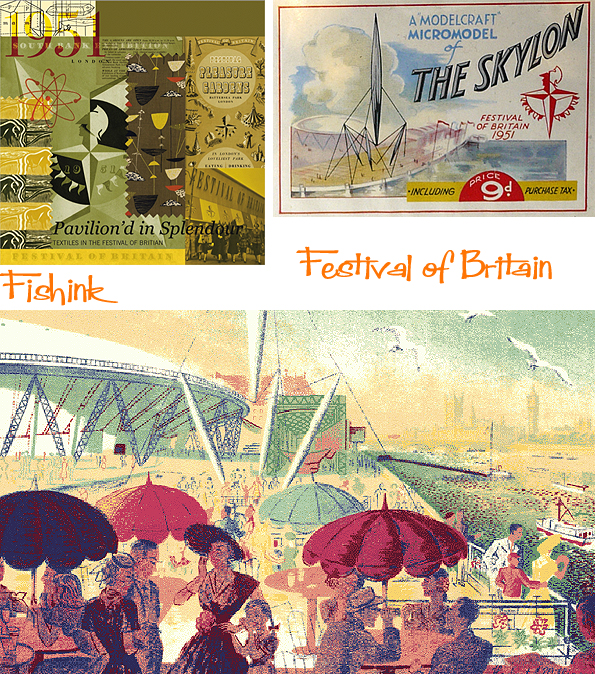
Of course colour was everywhere and souvenirs appeared in all shapes and forms imaginable. Here’s a few head scarves.

These coloured shots give a hint at how wonderful it must have looked. Disneyland in Britain !
I would have loved to have gone. I also remembered the Festival of Britain inspired ceramics and wallpaper by Mini Moderns that I’ve mentioned in a previous post.

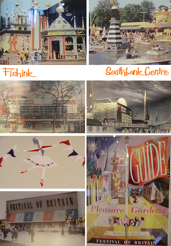
More modern day items in the shop and a great display of goodies by Sukie.

The Royal Festival Hall is a beautiful building. Full of natural wood, light and curves.
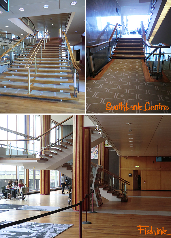
I really enjoyed the experience of just being in the building. The views, the dinner jazz, the slow pace and unhurried business of it’s inhabitants and the sun streaming in and bringing it all to life.

From the Royal Festival Hall, I wandered over Hungerford Bridge and into London. Some beautiful flowers in the local park, even businessmen letting their hair down in the lunchtime sunshine with a spot of table tennis.

These store fronts caught my eye.

The Cath Kidston version of Shaun the Sheep for charity.
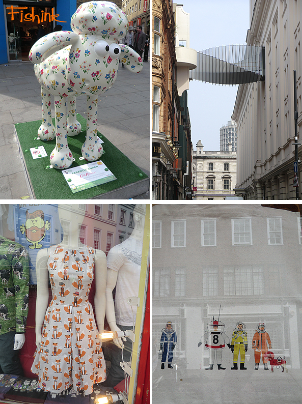
I really liked this wonderful shop called simply ’52 Greek Street’ which was both it’s location and trading name. I was very tempted by the fox shirts I can tell you !

It’s the brain child of two friends, one in Israel (I think ?) who designs the tee shirt prints and the other in London who’s the salesman. A winning combination I feel.
I spotted a natty robot shirt too, Men’s shirting starting at £69.

The rather sad remains of the old FOYLES store turned into a tacky ladies clothing store O NO ! Fortunately the new Foyles store, which has taken over the old Central St Martin’s site, was tremendous, with a children’s book department to outdo all others !

The friends I was staying with were looking for a fireplace for their new home, so we also popped into Blue Mantle on the Old Kent Road to see what tiles and surrounds they had. I always love seeing the statues and wrought iron work that sit lying about the place. On the site of an old fire station, there was plenty to rummage through.


So here marks the end of my London travels for now, I hope you’ve enjoyed my journey as much as I enjoyed making it. Do let me know, all comments welcome. What shows have you recently seen that you’ve enjoyed ?

Just to let you know that Fishinkblog is now even easier to share with your friends, as we’ve dropped the wordpress bit to become just http://www.fishinkblog.com.
Please tell the world : ) Happy Weekend ahead.
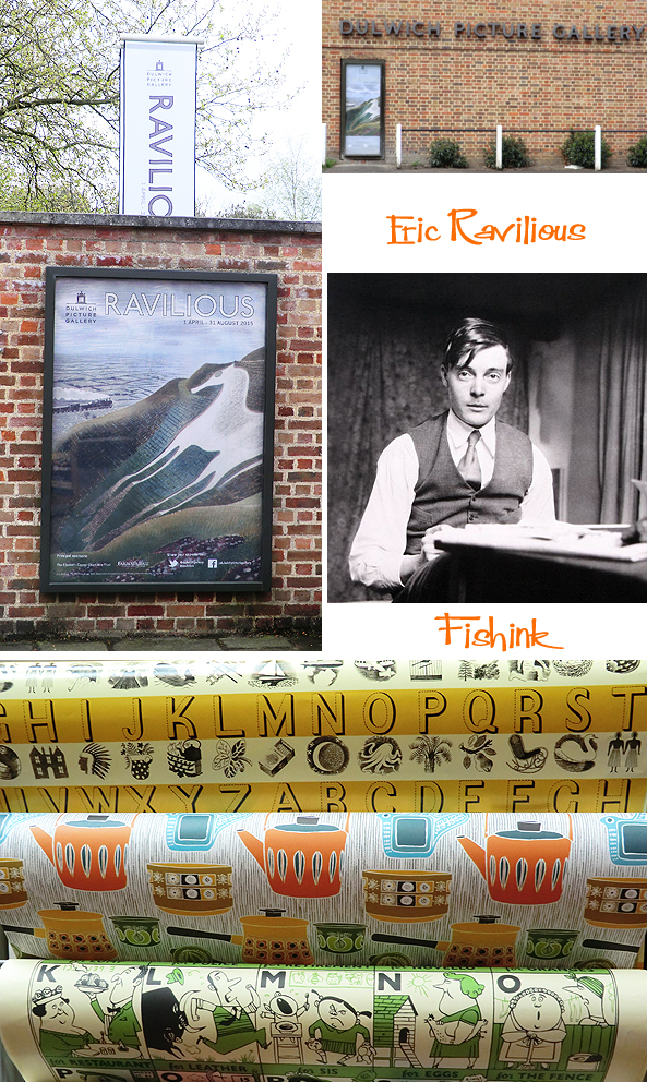
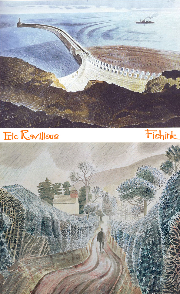
Fishink in London Part 4. Eric Ravilious
Ok it’s confession time readers… my sole reason for going to London last week was … to get the rare opportunity to see the work of one of my ‘personal gods’, Mr Eric Ravilious. The amazing exhibition was brought about by a fellow Ravilious fan James Russell, who was asked by the Dulwich Picture Gallery to put this whole show together and thankfully he not only did that, but he did it spectacularly well.
Eric Ravilious was born on 22 July 1903 in Churchfield Road, Acton, London, the son of Frank Ravilious and his wife Emma (née Ford). While he was still a small child the family moved to Eastbourne in Sussex, where his parents ran an antique shop. He was educated at Eastbourne Grammar School. In 1919 he won a scholarship to Eastbourne School of Art and in 1922 another to study at the Design School at the Royal College of Art. There he became close friends with Edward Bawden (his 1930 painting of Bawden at work is in the collection of the College) and, from 1924, studied under Paul Nash.
Nash, an enthusiast for wood engraving, encouraged him in the technique, and was impressed enough by his work to propose him for membership of the Society of Wood Engravers in 1925, and helped him to get commissions. In 1925 he received a travelling scholarship to Italy and visited Florence, Siena, and the hill towns of Tuscany. Following this he began teaching part-time at the Eastbourne School of Art, and from 1930 taught (also part-time) at the Royal College of Art.
In the same year he married Eileen Lucy “Tirzah” Garwood, also an artist and engraver. They would have three children together: John Ravilious; the photographer James Ravilious; and Anne Ullmann, editor of books on her parents and their work. In 1928 Ravilious and Bawden painted a mural at Morley College in South London on which they worked for a whole year. Their work was described by J. M. Richards as “sharp in detail, clean in colour, with an odd humour in their marionette-like figures” and “a striking departure from the conventions of mural painting at that time”. It was destroyed by bombing in 1941.
Between 1930 and 1932 Ravilious and Garwood lived in Hammersmith, London, where there is a blue plaque on the wall of their house at the corner of Upper Mall and Weltje Road. When Ravilious and Bawden graduated from the RCA they began exploring the Essex countryside in search of rural subjects to paint. Bawden rented Brick House in Great Bardfield as a base and when he married Charlotte Epton, his father bought it for him as a wedding present. Ravilious and Garwood lodged in Brick House with the Bawdens until 1934 when they purchased Bank House at Castle Hedingham, which is now also marked by a blue plaque. In 1933 Ravilious and his wife painted murals at the Midland Hotel in Morecambe. In November 1933, Ravilious held his first solo exhibition at the Zwemmer Gallery in London and 20 of the 37 works displayed were sold.
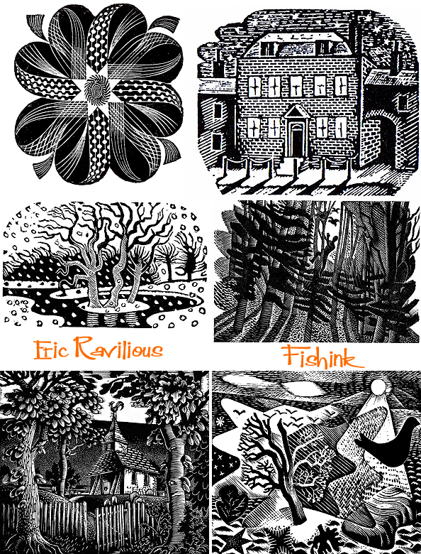
Ravilious was accepted as a full-time salaried artist by the War Artists’ Advisory Committee in December 1939. He was given the rank of Honorary Captain in the Royal Marines and assigned to the Admiralty. In February 1940, he reported to the Royal Naval barracks at Chatham Dockyard. While based there he painted ships at the dockside, barrage balloons at Sheerness and other coastal defences. Dangerous Work at Low Tide, 1940 depicts bomb disposal experts approaching a German magnetic mine on Whitstable Sands.Two members of the team Ravilious painted were later awarded the Distinguished Service Cross.
On 24 May 1940 Ravilious sailed to Norway aboard HMS Highlander which was escorting HMS Glorious and the force being sent to recapture Narvik. Highlander returned to Scapa Flow before departing for Norway a second time on 31 May, 1940. From the deck of Highlander, Ravilious painted scenes of both HMS Ark Royal and HMS Glorious in action. HMS Glorious in the Arctic depicts Hawker Hurricanes and Gloster Gladiators landing on the deck of Glorious as part of the evacuation of forces from Norway on the night of 7/8 June. The following night Glorious was sunk, with great loss of life.
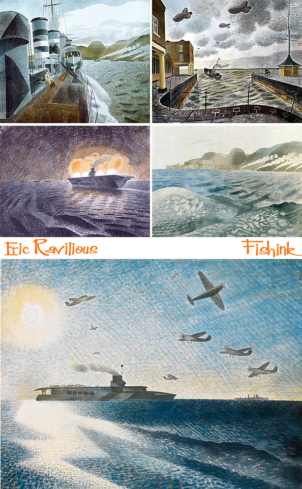
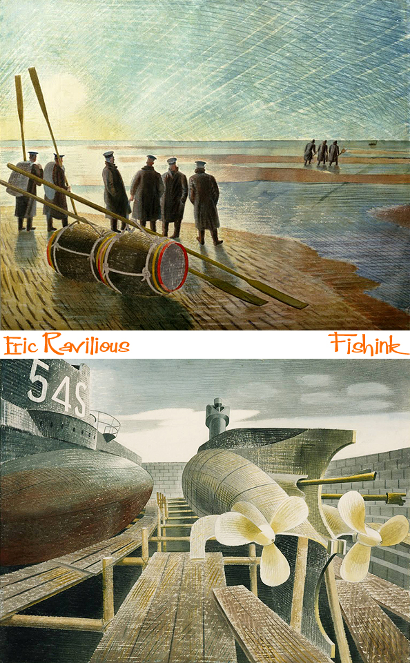
On returning from Norway, Ravilious was posted to Portsmouth from where he painted submarine interiors at Gosport and coastal defences at Newhaven. He remarked on how hot and difficult it was painting in these confined spaces underwater.
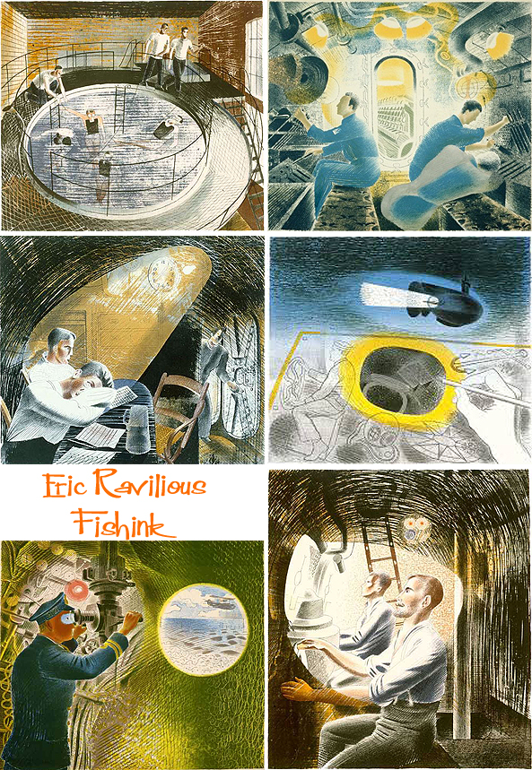
After Ravilious’s third child was born in April 1941, the family moved out of Bank House to Ironbridge Farm near Shalford, Essex. The rent on this property was paid partly in cash and partly in paintings, which are among the few private works Ravilious completed during the war. In October 1941 Ravilious transferred to Scotland, having spent six months based at Dover. In Scotland, Ravilious first stayed with John Nash and his wife at their cottage on the Firth of Forth and painted convoy subjects from the signal station on the Isle of May.
At the Royal Naval Air Station in Dundee, Ravilious drew, and sometimes flew in, the Supermarine Walrus seaplanes based there. In early 1942, Ravilious was posted to York but shortly afterwards was allowed to return home to Shalford when his wife was taken ill. There he worked on his York paintings and requested a posting to a nearby RAF base while Garwood recovered. He spent a short time at RAF Debden before moving to RAF Sawbridgeworth in Hertfordshire. At Sawbridgeworth he began flying regularly in the de Havilland Tiger Moths based at the flying school there and would sketch other planes in flight from the rear cockpit of the plane.
On 28 August 1942 Ravilious flew to Reykjavík and then travelled on to RAF Kaldadarnes. The day he arrived there, 1 September, a Lockheed Hudson aircraft had failed to return from a patrol. The next morning three planes were despatched at dawn to search for the missing plane and Ravilious opted to join one of the crews. The plane he was on also failed to return and after four days of further searching, the RAF declared Ravilious and the four-man crew lost in action. His body was not recovered and he is commemorated on the Chatham Naval Memorial. What a great loss.

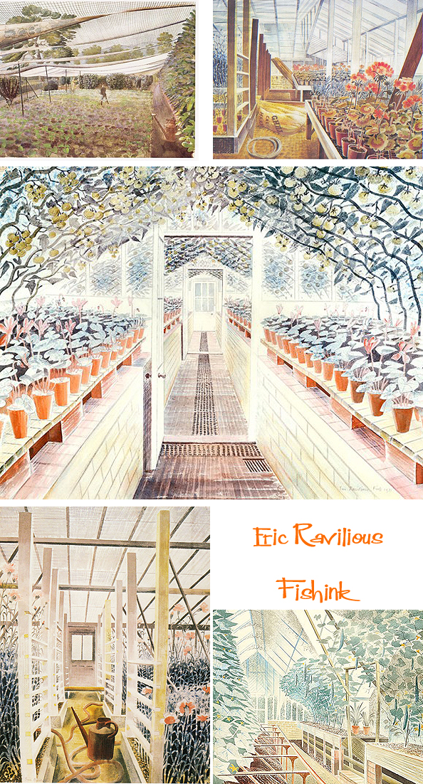
For me some of my favourite illustrations, are those of the interiors of greenhouses and of the countryside. According to information provided by John Nash (letter of 24 February 1959), this watercolour (below top right) and another of a vine covered with grapes were painted in the nursery garden of an old man at Firle. At that time Ravilious and his wife were staying with Peggy Angus at The Furlongs, Beddingham, the next village under the Downs to Firle. In a letter (8 March 1959) Peggy Angus states: ‘We used to get fresh vegetables from the Market Garden at Firle. It was part of Firle Place, Lord Gage’s country Seat and in the garden the first greengage was grown.’
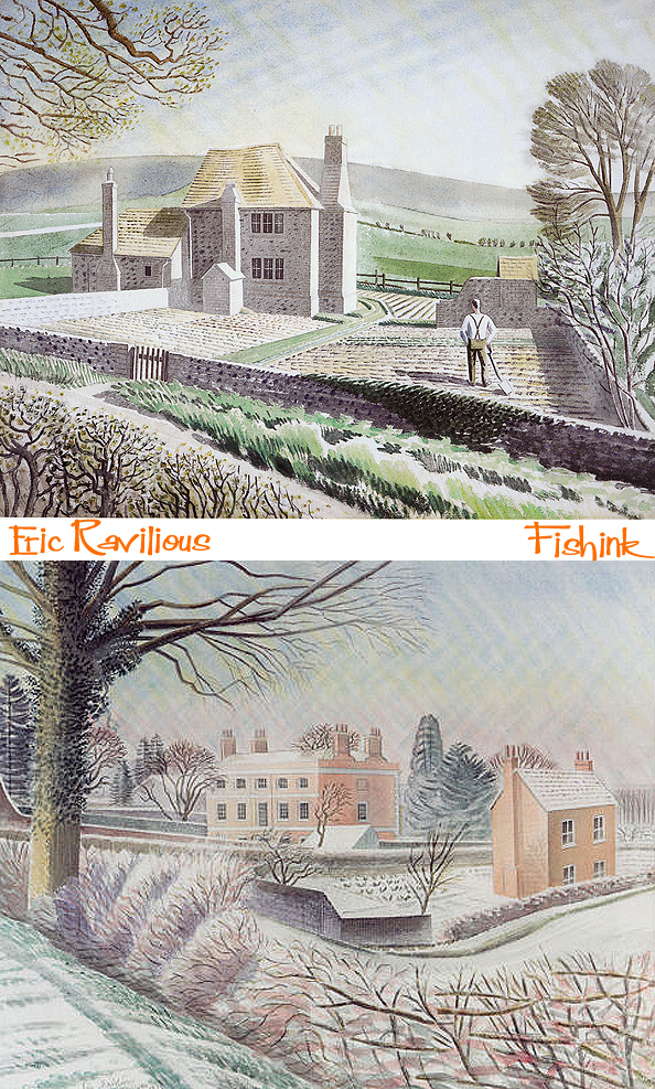
Apart from a brief experimentation with oils in 1930 – inspired by the works of Johan Zoffany – Ravilious painted almost entirely in watercolour. He was especially inspired by the landscape of the South Downs around Beddingham. He frequently returned to Furlongs, the cottage of Peggy Angus. He considered that his time at Furlongs “…altered my whole outlook and way of painting, I think because the colour of the landscape was so lovely and the design so beautifully obvious … that I simply had to abandon my tinted drawings”. Some of his works, such as Tea at Furlongs, (the watercolour below with the parasol) were painted there.
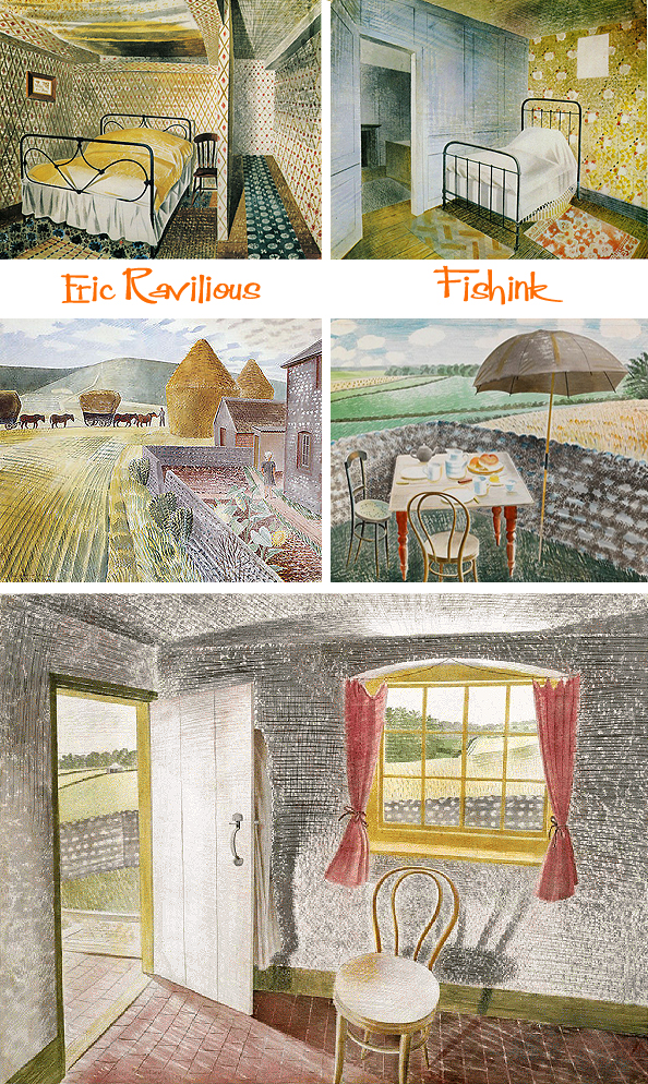
These beautiful works of the rolling, chalky hills and footpaths are for me amongst his best work. I can relax into them and be visually led to walk those hills and feel the sun on my back as I do so.
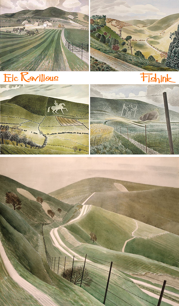
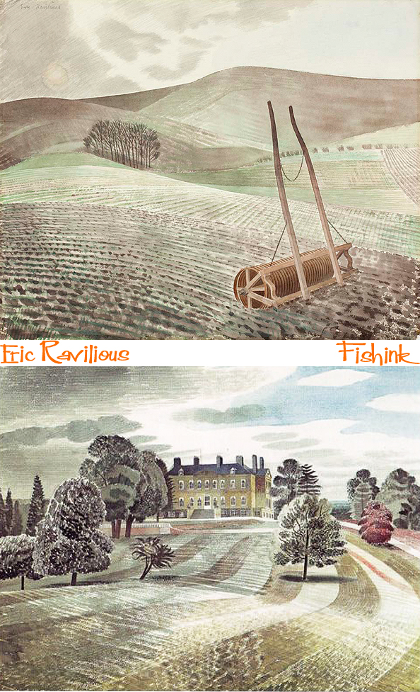
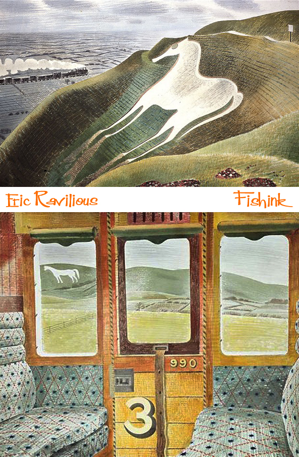
My absolute favourite two watercolours are The Westbury Horse and Train Landscape (below). The Westbury Horse features in both watercolours. One is of the horse with a train in the background and Train Landscape where the chalk figure is glimpsed thought the carriage window. Interestingly this piece had originally featured the Wilmington Giant, but Ravilious was unhappy with the composition and added the new image over the top. I didn’t realise until I saw Train Landscape close up, that the carriage seating has actually been carefully cut out and collaged into the watercolour. Also that some of the lines in the sky (as with many of his other works) aren’t watercolour paint as I’d previously thought when looking in books, but instead are actually deep scores, made to mark the watercolour paper and add depth, direction and movement to the piece. It is amazing how much more you can reveal by seeing the actual watercolours, just a few centimetres from your eyes.
(Update) I now have it on good authority (from a Ravilious family member, no less !) that it was Tirzah who saved cut pieces from Train Landscape as Eric was initially unhappy with it. I’m so pleased she helped him see a way of making it work.
I do recall those individual train carriages from days as a child, which would sit about 6 people and the texture of the seating (that fuzzy velour fabric) and the smell of the wood as the sun heated the compartment. It was always fun to push the window half way down, stick your head out ( a little way for fear of it being knocked off lol) and enjoy the exhilaration of the journey.
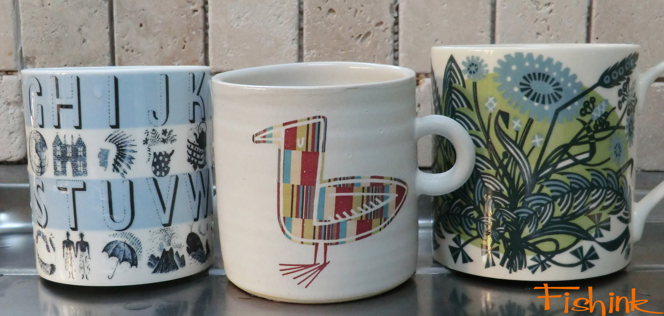
In February 1936, Ravilious held his second exhibition at the Zwemmer Gallery and again it was a success with twenty-eight out of thirty-six paintings being purchased. This exhibition also led to a commission from Wedgwood to for ceramic designs. His work for them included a commemorative mug to mark the coronation of Edward VIII, which was revised for the coronation of George VI. Other popular Ravilious designs included the Alphabet mug of 1937, and the china sets, Afternoon Tea (1938), Travel (1938), and Garden Implements (1939) plus the Boat Race Day cup in 1938. Production of Ravilious’ designs continued into the 1950s, with the coronation mug design being posthumously reworked for the coronation of Elizabeth II in 1953.
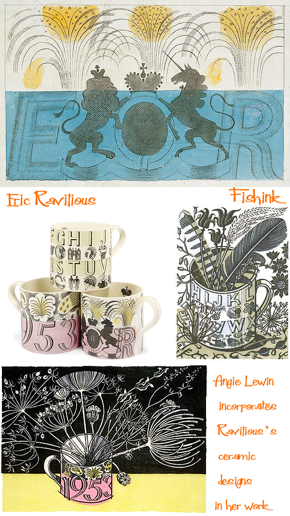
Modern day illustrator Angie Lewin isn’t the only artist to reference and pay homage to Eric’s ceramics constantly in her own. This is Eric, mine and Angie’s work in a line, all together they make for a refreshing break lol !
The Eric Ravilious exhibition is on until the 31st August, and for just £12.50 a ticket … I’d say miss it at your own peril ! Many thanks to Wikipedia for some of the factual information in this post.
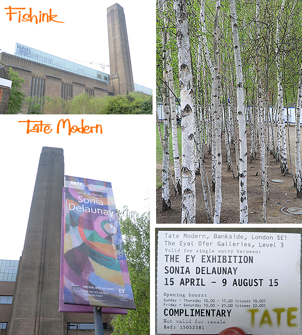
Happy Bank Holiday everyone and welcome back to my London travels. Although it’s over a week ago now, the memories are wonderfully refreshed as I put these posts together to share with you. I arrived at the Tate in full sunshine and loved these lines of silver birch trees outside. I think they’re possibly my most favourite tree with their ghostly, papery bark and a sense of strength and delicacy all in one.
I always enjoy those first few moments when entering the Tate, when you’re transformed from a person into a small ant in a giant anthill of art ! (well kind of ). The bold lines, the silver metallic sweeping escalators and the beautifully textured wooden stairs, all add to my enjoyment of the space.
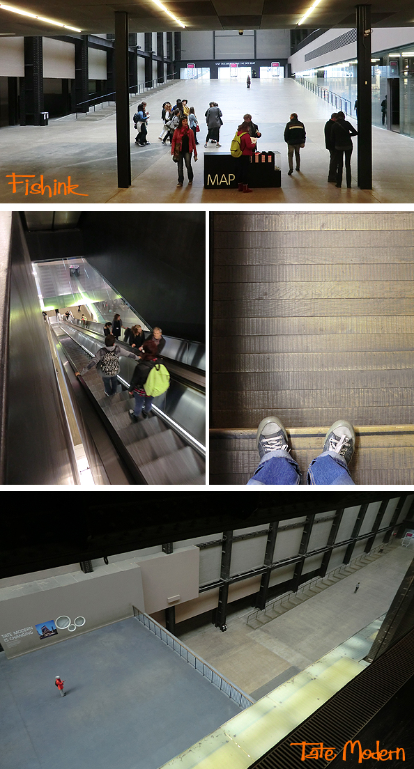
I watched as very excited children, queued behind their friends, to get an opportunity to draw or write a coloured message on the huge art wall. It was fascinating to see technology so well used in an art gallery environment.
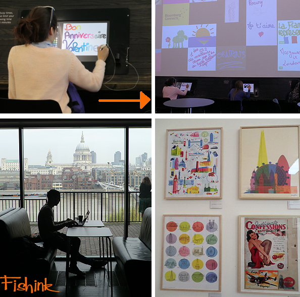
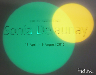
I took my ticket and headed up to the Sonia Delaunay exhibtion. Not quite knowing what to expect.
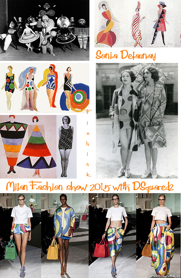
Sonia Delaunay, was born in modern-day Ukraine (1185–1979), a Jewish-French artist of the Art Deco period. She was famous for her colourful geometric textile designs, although her work extended to painting and stage set design too.
It was in 1911 that Delaunay’s distinctive style was born – along with the arrival of her son Charles. She spontaneously created a quilt for his crib, and said of it: “About 1911 I had the idea of making for my son, who had just been born, a blanket composed of bits of fabric like those I had seen in the houses of Russian peasants. When it was finished, the arrangement of the pieces of material seemed to me to evoke cubist conceptions and we then tried to apply the same process to other objects and paintings.”
Sonia Delaunay, Coat made for Gloria Swanson, 1923-24.

Delaunay met Sergei Diaghilev in 1917 and went on to design costumes for his production of Cleopatra and Aida. On their return to Paris from Madrid, she began to make clothes privately, and in 1923 her textile business was founded. Commissioned by a manufacturer from Lyon, Delaunay created 50 fabric designs in her distinctive style, using geometrical shapes and vivid colours. Soon after she began to work for herself and simultané became her registered trademark. Even in Milan this year, her work is seen to be emulated by designers who are also inspired by her style.
She created many beautiful and decorative textile designs and there was a huge room dedicated to showing her garments and colourful patterns.
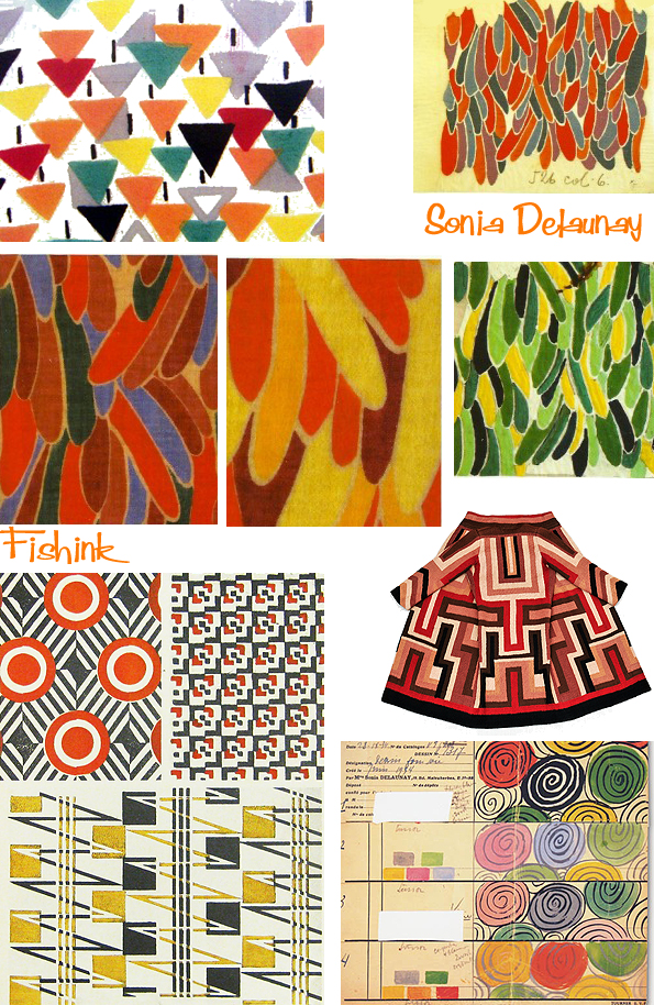
She and her husband Robert were inspired by the wild colours used by the Fauvists, and by Cubism too. Experimenting with colour and design in a style they called simultanéisme, the Delaunays explored the way in which colours and shapes interacted and affected one another, employing a theory similar to Pointilism, in which the eye mixes closely-placed dots of primary colours.
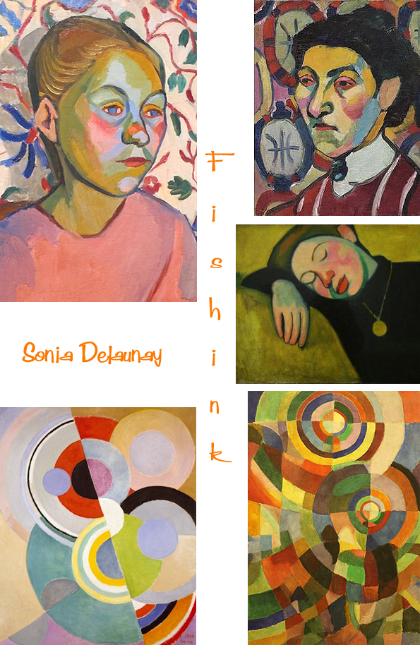
Sonia’s Electric Prisms series was inspired by the introduction of electric street-lights on the Boulevard Saint-Michel in 1913. These produced haloes of reflected light that she transcribed as intersecting coloured discs, radiating energy like artificial suns. Their division into four quadrants suggests the separation of white light into the prismatic spectrum of colours.

After the second world war, Sonia was a board member of the Salon des Réalités Nouvelles for several years. Sonia and her son Charles in 1964 donated 114 works by Sonia and Robert to the Musée National d’Art Moderne. Alberto Magnelli told her “she and Braque were the only living painters to have been shown at the Louvre”. In 1966 she published Rythmes-Couleurs (colour-rhythms), with 11 of her gouaches reproduced as pochoirs and texts by Jacques Damase, and in 1969 Robes poèmes (poem-dresses), also with texts by Jacques Damase containing 27 pochoirs.
In 1975 Sonia was named an officer of the French Legion of Honor. From 1976 she developed a range of textiles, tableware and jewellery with French company Artcurial, inspired by her work from the 1920s. Her autobiography, Nous irons jusqu’au soleil (We shall go up to the sun) was published in 1978. Sonia Delaunay died December 5, 1979, in Paris, aged 94. She was buried in Gambais, next to Robert Delaunay’s grave.
Her work in modern design included the use of geometric abstraction and the integration of furniture, fabrics, wall coverings and clothing.
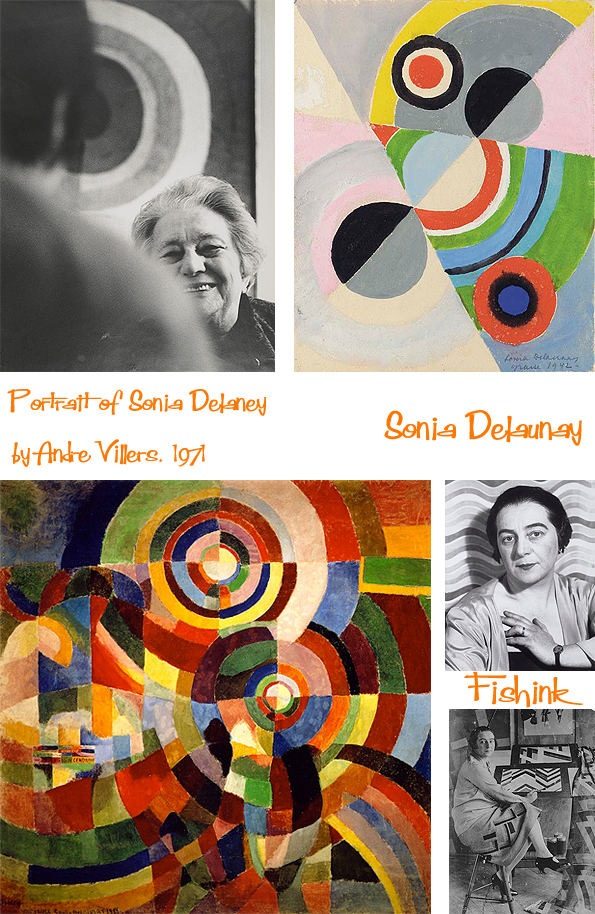
The exhibition is spaced out over 9 rooms and was a very well-organised, visual textile designers treat ! Catch it between 15 April and 9 August 2015 at the Tate Modern.
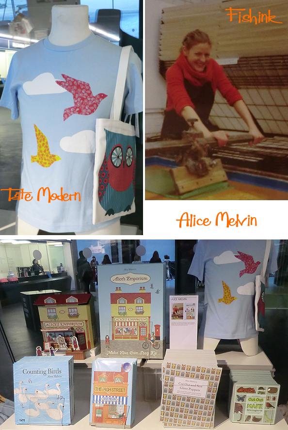
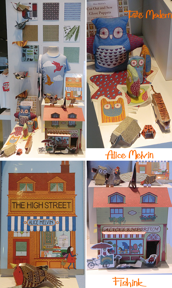
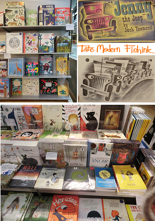
The two shops at the Tate always are a delight for their array of books, magazine publications and other sumptuous artefacts. From a previous Fishink post, I spotted the work of fellow illustrator Alice Melvin, who’s work seems to be a firm favourite with the Tate Shop as there was so much on display. Which is fine by me as it is rather splendid after all : )
Great to see work from Alex Barrow , who’s London Bus Tee-Shirts I originally mistook for an illustration by Miroslav Sasek !
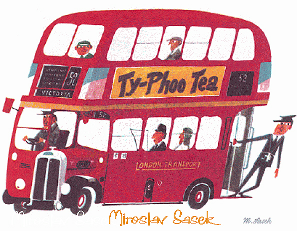
Of course Alex’s bus is much more modern : ) You can purchase his items here.
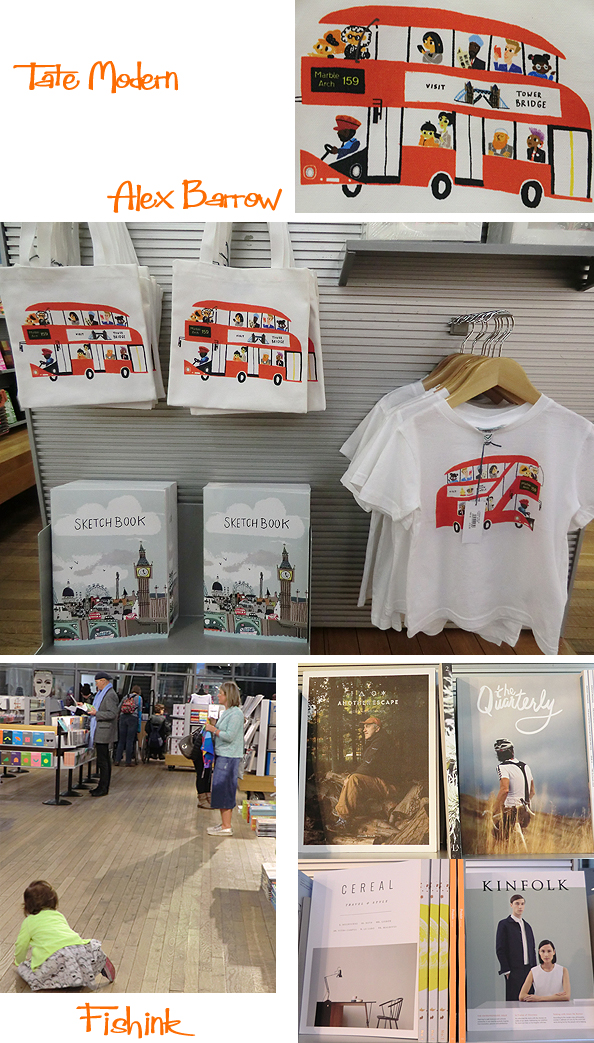
Something for everyone, young/old, arty/techie and even a huge array or Uber-cool magazines for the hipsters. Who are fanatical about their off-road bikes, mountain trekking, office furniture, tool sheds or sleek line clothing. All in a totally “I’m not really that interested, but I am going to buy an expensive magazine about the fanatical and slightly offbeat subject, that I’m not really interested in anyway ” lol ! If that makes sense.
The children’s book section is huge, a familiar haunt and always makes me drool. Lovely to see some editions in the mix from the likes of Oliver Jeffers, Chris Haughton, Beatrice Alemagna, Ruth Green and Jon Klassen who I’ve either met in person, featured before on my blog.. or both !

A culturally fascinating trip for both old and new subjects all under one roof. Must do this again soon ! Part 4 of my London trip posts, featuring the work of Eric Ravilious, will arrive on Wednesday, see you here then. Hope you’re enjoying my journey too, please feel free to share Fishink with your friends : ) Enjoy your holiday.
Fishink In London Part 2
Welcome back to my Fishink travels in London. Right next door to the House of Illustration building, is the Central St Martins site. There was an exhibition of students work from the MA Fashion course, featuring some rather weird and wonderful outfits.


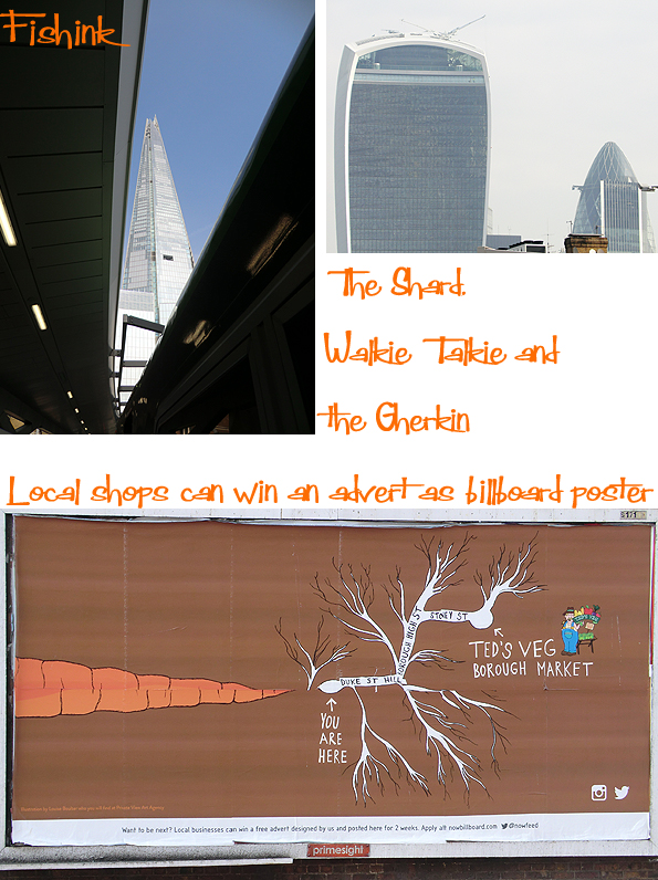
My first glimpse of the Shard was from the platform at London Bridge, you can also see the other array of famous buildings like the Walkie Talkie and the Gherkin.

I followed the Thames and discovered the colourful Borough Market which is currently celebrating 1000 years of trading in Southwark !
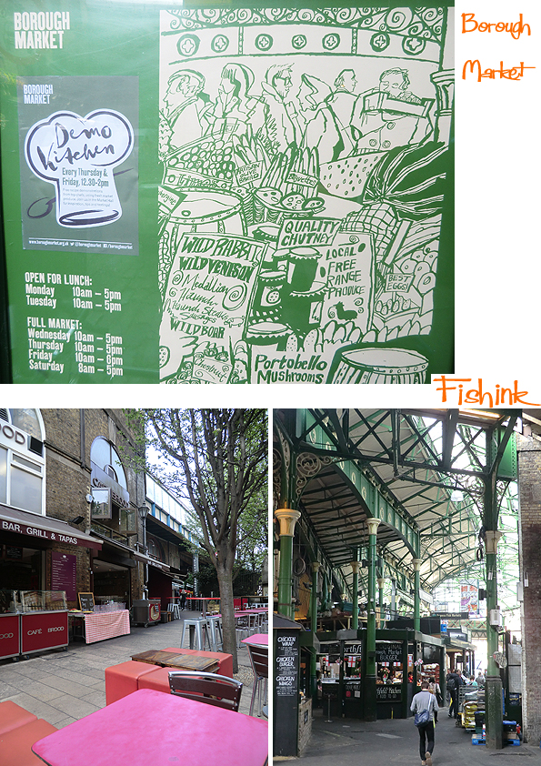
I had a lovely outdoor breakfast at this pink and red cafe, and found the food stalls in the market to be very impressive.

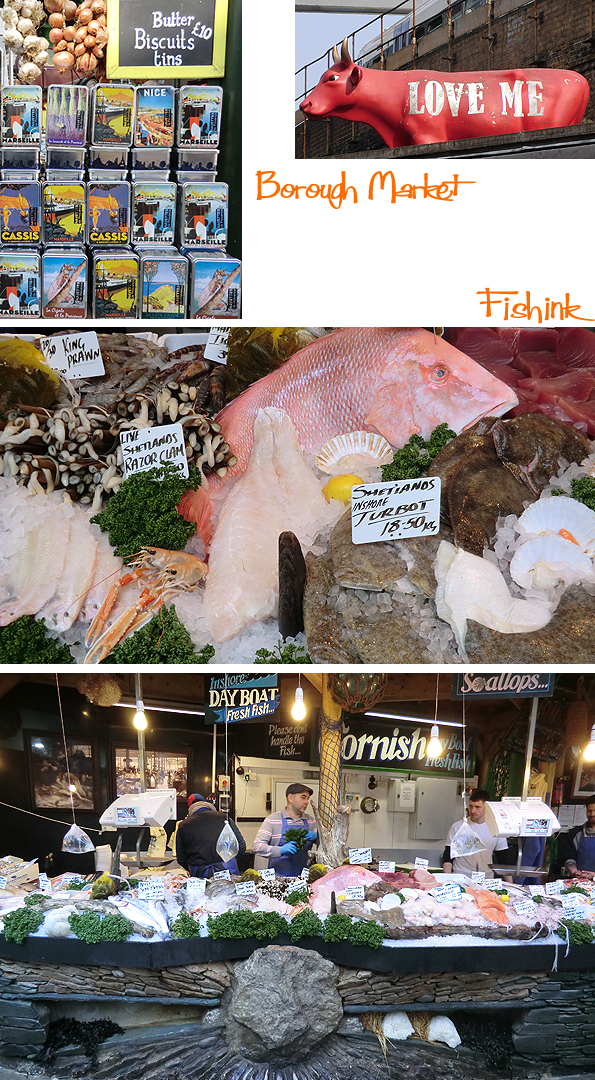
This Fish stall (above) and restaurant (below, top left) called simply ‘Fish’ also caught my eye.

I wandered a little and discovered the spookily narrow and darkened, Clink Street and the notorious Clink Prison Museum. It’s dated back to 1144 and the name ‘Clink’ seems to have been attached to the prison in the 14th century. One of the most commonly argued derivatives is that of the sound of the blacksmith’s hammer closing the irons around the wrists or ankles of the prisoners, although the Flemish word ‘klink’ meaning ‘latch’ (perhaps referring to the latch on the gaol door) could also have influenced its attachment. Whatever the etymology, the prison subsequently bequeathed this name to all others, resulting in the development of the expression, “to be thrown in The Clink.”
Such a fabulously warm and sunny day for wandering along the bank of the Thames, bridge spotting and sight seeing.

I next came across The Globe Theatre , a reconstruction of the first Globe Theatre in which Shakespeare worked. They were unable to build on the original site which is partially covered by listed Georgian buildings and Southwark Bridge Road. You can however see the original site which is about 200 metres from today’s Globe, and is marked by a plaque and information panels.
The gates hosted an array of weird and wonderful beasts and symbols presumably mentioned in Shakespeare’s plays.
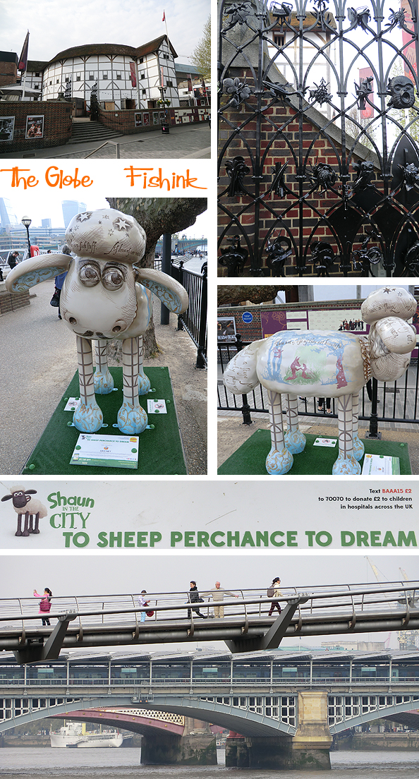
And a fundraising Shawn the sheep, who presumably wasn’t !!
A little further on I went to the Tate Modern, (which I’ll talk about in my next post) and saw these lovely David Weidman cards.

The Bankside Gallery , next door to the Tate, had a great exhibition of watercolour paintings by well known artists like Mark Raggett, Richard Bawden and (a new name to me) David Brayne.

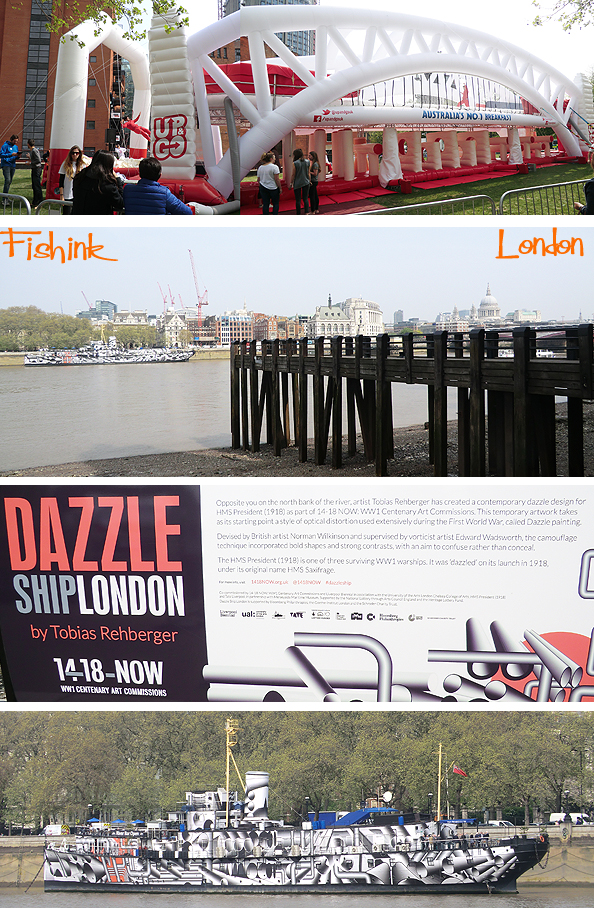
Further along the Thames, there was a huge inflatable to promote (of all things) an Australian liquid breakfast drink called ‘Up and Go’. People were scrambling through the obstacles underneath, then climbing on top and running back to the end where they’d hurl themselves off, into a pit of squishy, inflated blocks to cushion their fall.
Across the water sat the Dazzle Ship and some info about the newly ‘dazzled’ HMS President (1918) and the history of World War I naval camouflage, and its connection to avant-garde art.
Another fortunate encounter came in the form of Gabriel’s Wharf, described as ‘ an arty enclave offering design-led shopping, from jewellery and ceramics, to fair-trade furnishings and affordable artwork’.

In particular, I fell for the Norwegian delights of Nordic Nicnac and the charming owner Karine Gulliksen, who not only opened her dream shop in January this year but who also sews the children’s clothing and knits the woollen hats too !

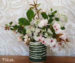
I was particularly taken by the design and layout of the shop, having that eye for quality and style that has become synonymous with the Scandinavian countries. The beautiful purchase I made there (of the vase below) was made by Isabella Lepri, an Italian ceramist who works from her own studio in north London. It compliments the heavy blossom that is abundant at the moment, just perfectly.

More about my London travels on Monday.
I’m back from London and had such a wonderful time there. I’ll be talking you through what I saw over the next few posts, and in place of the regular Mid Week Mix, I’m going to talk about my trip instead as I have so much to share with you, that I don’t want the news to become outdated.
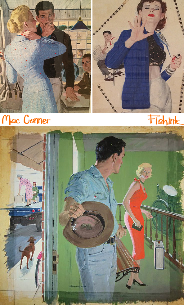
My first exhibition had to be the 50’s/60’s artist McCauley Conner or ‘Mac’ Conner. His art is straight out of the original Mad Men era and with the show being exhibited at the relatively new House of Illustration, it had my name all over it !

At the grand age of 101, Mac Conner has seen it all. In 1943 he came to New York to illustrate training manuals for the Navy and found himself caught up in a post-war New York City, pulsing with life and the ambition of young men wanting to make life happen in the Big Apple. Mac began his career as a sign painter. He studied at the Pennsylvania Museum and School of Industrial Art, developing his illustration skills in the Navy during World War II. After the war, he moved to New York and studied under Harvey Dunn at New York’s Grand Central School of Art.
Postwar marriages were booming, sexual relationships were changing and the consumer industries were exploding after the confines of wartime rationing. In 1952 Conner set up the studio Neeley Associates with salesman Bill Neeley and artist Wilson Scruggs and his career as an illustrator really took off. The Saturday Evening Post became a steady client, and other magazines soon followed.
The creation of an illustration for a story was a highly collaborative process. Editors selected manuscripts for publication and art directors managed how they looked in print; matching stories with illustrators, laying out copy to determine the space a picture would fill and guiding the process from inception to production. Conner, like other illustrators, began by discussing the story with art directors, then prepared dramatic ideas and sketches for review. Photography was used to draw scenes from. Conner used pastels on vellum to create colour ‘comps’ (short for ‘design comprehensives’).
When satisfied with the strength of an idea, the art director gave approval to proceed to ‘finish art’. In most cases, this work was executed in gouache; an opaque flat watercolour paint whose quick-drying nature made it particularly effective for fast-paced work. The magazine then photographed the finished gouache for reproduction.
Different fates befell illustrators’ originals; some were retained by art directors and others were returned, though many were thrown away. The work survived because Conner’s agent Bill Neeley was adamant about having his artists’ boards returned.

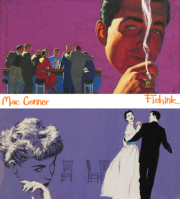
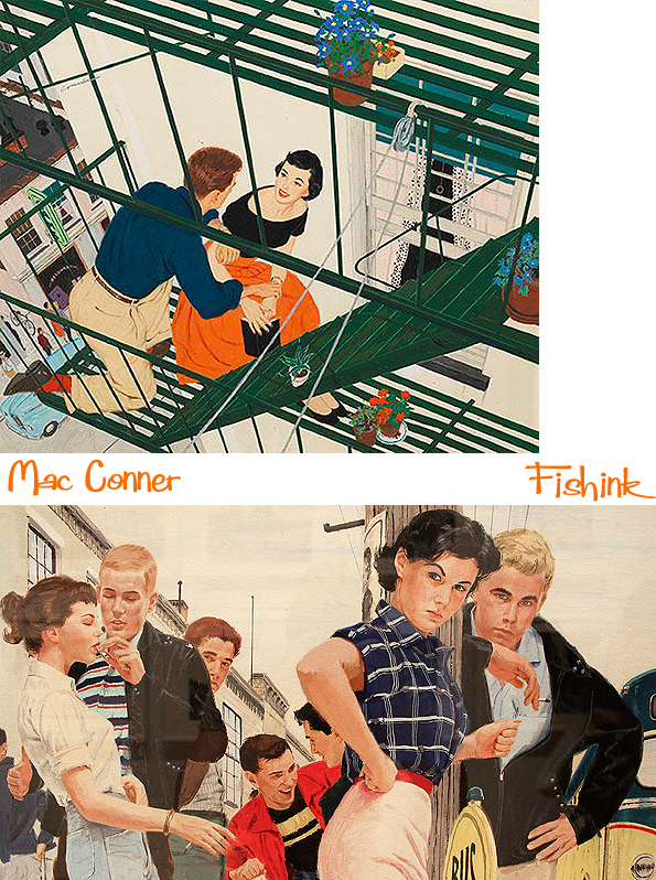
Much of Conner’s work was for the booming field of women’s magazines. They published a range of features, but none were more popular than romantic short stories and serialised novels. Illustrators gave form to the texts in lavish spreads, which appeared at the front of magazines as ‘teasers’ for the rest of the tale.
The stories reflected the social norms of the era. In America, the austerity of the 1930’s and WW2 were giving way to new beginnings. Returning veterans reunited with their former sweethearts, or courted new ones. Women, who had entered the workforce during wartime, were encouraged to surrender their employment and independence. Fiction editors appealed to them with stories that captured a longing for romance and adventure, believably packaged in recognisable, though idealised, female characters.

Fiction about the romantic intrigues of men and women was known in the publishing industry as ‘Boy/Girl’. Mac Conner’s Boy/Girl illustrations ably addressed and intrinsic difficulty: they conveyed intimacy without directly addressing sexuality, which was off-limits in mainstream magazines. Viewed together, the pictures suggest the bigger story of the time: a mass pairing-off was underway.

The women in Conner’s fiction illustrations project a sense of confidence and stylish supremacy. These smart, lively figures embody an ‘everyday’ glamour: Conner’s female protagonists are never without red lipstick and are always perfectly manicured and accessorised. They demonstrated an informal elegance plausibly within readers’ reach. Through their carefully constructed outfits, they celebrate a heightened, yet self-possessed femininity.
Mac paid close attention to the fashion of the day, including the wasp-waisted full skirts that celebrated the end of fabric rationing after WW2. The ubiquitous garments emphasised the figure when worn with restrictive corsetry. Conner credits Jessie Neeley, his agent’s wife, with adding “polish” to his depictions of women by helping him to stay aware of trends in necklines, hairstyles and glove lengths. He also consulted the collections of emhemera and photographs at the NY Public Library, as did many of his peers.
These fictional women exist in a gender-defined world, in which a “feminine mystique” suggests their satisfaction with restricted female roles. However, Conner’s keen eye and creative sympathy place his heroines at the centre of their own stories.

Men are often mere ‘props’ in Mac’s illustrations, which were aimed at a predominantly female audience. When men appear as central figures, they embody the norms of the 1950’s American manhood; sometimes suggesting the rugged integrity of manual labour, at others capturing the alienation that characterised office work in a new age of large corporate businesses . Often obsessed with work, they pose emotional challenges for the wives, girlfriends around whom most stories revolve.
Perhaps because women formed the primary audience for magazine fiction, male characters tended to lack nuance. They were either standard ‘good guys’ or brooding curmudgeons. Men dominated plots steeped in dark emotions like jealousy and revenge. Most often they stay in the background, emerging to provide a practical obstacle or reassuring attendant to women. Unsurprisingly, they are uniformly masculine, conventionally attractive and completely self-assured.


On the ad side, Mac’s illustrations playfully teased out the pleasure and benefits of ownership, from cars to appliances. In a 1953 ad for Blue Bell coveralls (“It’s autumn time, it’s Blue Bell time!”), a pre-teen clad in the client’s tough denim gleefully hangs upside down by his legs from a tree limb while his sister below rakes leaves. This type of film-still perspective is what set Mr. Conner apart from many of his peers.
In the early 1960s, magazines changed. Advances in print technology and the proliferation of photo agencies made photography more affordable and prevalent, reducing the need for realism in illustrations. Magazine art and ad styles also began to relax, featuring humour, abstraction and line drawings—all of which seem to have been outside of Conner’s stylistic approach. Here’s a couple of advertisements and book covers.

The magazine industry had relied on illustrators for most of the century, but by 1960 the ‘Boy/Girl’ approach began to seem less persuasive. A new critique of women’s roles began to emerge, particularly in the writing of feminist Betty Friedan, who criticised the magazines as perpetrators of stultification. The Civil Rights struggle made the all-white world look increasingly dated and irrelevant.
The economic context was also changing. Magazines relied on income from selling space to advertisers and had already lost some of their clients to radio. It was television that diminished their influence after 1950. ‘Colliers’ and ‘Women’s Home Companion’ ceased publication in 1957 and by 1960, ‘The Saturday Evening Post’ was also out of business. Magazine illustration was never again created at the scale it had been at the height of Mac Conner and his colleagues careers.
In Conner’s case , the effects of these changes were compounded by personal tragedy. His agent and business partner Bill Neeley was killed in a household accident just as the market was evolving. Beginning in his 50’s, Conner found other work in educational publishing and romance novel covers. He continued to draw and paint for his own purposes for the next half a century.
Many thanks to the Wallstreet Journal and exhibition itself for the background information in this post. A fabulous show and is running at the House of Illustration 2 Granary Square, King’s Cross, London, N1C 4BH, from now until June 28th.
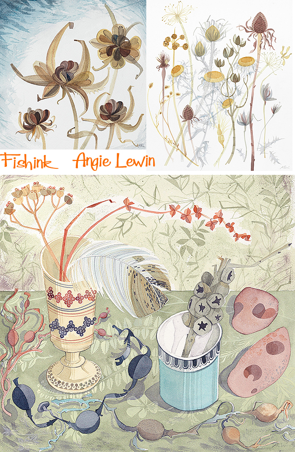
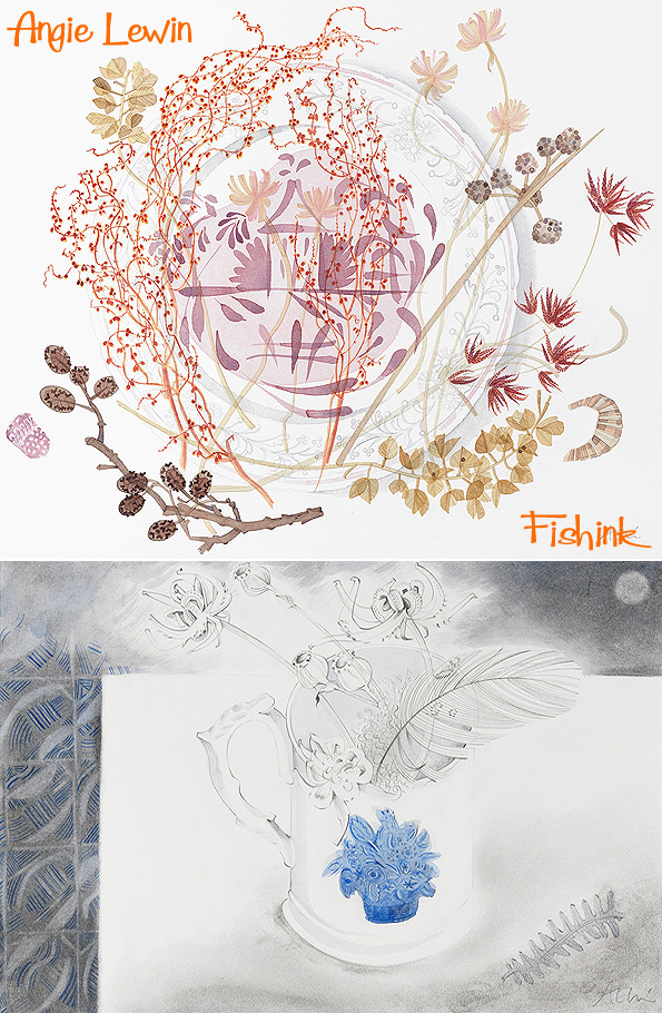
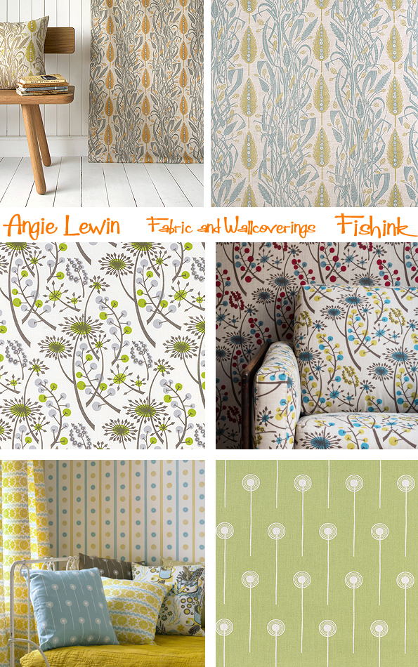
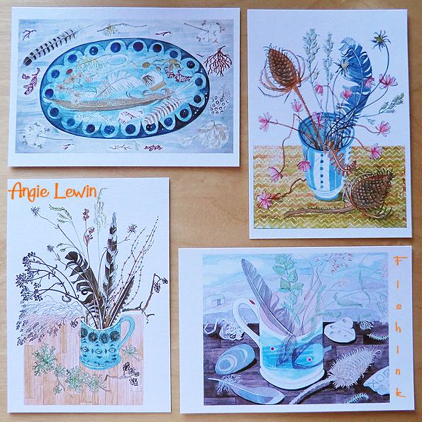
Angie Lewin Watercolours at the Scottish Gallery Edinburgh
Hello everyone, I’m back from a wonderfully refreshing 4 days in London (did you miss me ? lol)
I’ll be telling you more about the excellent three exhibitions I went to see later this week, in the meantime here’s something that’s about to open this week in Scotland.
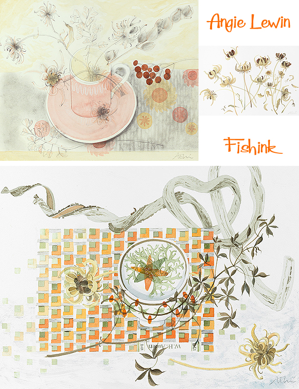
Angie Lewin has been busy creating a series of 18 new watercolours especially for her first solo exhibition at The Scottish Gallery. Director of the gallery, Christina Jansen explains:
“We are delighted to present Angie Lewin’s first solo exhibition with The Scottish Gallery. She is best known as a designer and printmaker whose sensitive patterns and motifs are inspired by the English Arts and Crafts movement and the work of Bawden and Ravilious. She divides her life between homes in Edinburgh and Speyside and this geographic diversity is reflected in her plant observations and interweaving of the natural and domestic worlds.
She walks, looks and draws; she collects and assembles and her studio is full of reference material, beautiful in itself witnessing a life lived in art and nature. Her chosen medium for this exhibition is watercolour, that most sensitive and difficult medium and her virtuosity is complete but should be no surprise in the context of her rigorous apprenticeship. The playful title for this show hints at her obsessive observing, refined through the artist’s editorial eye to make order out of chaos.”
All of the watercolours are available to purchase prior to the exhibition opening. Please contact The Scottish Gallery for further details.
The exhibition, called ‘A Natural Selection’, runs from 1st to 30th May 2015 at The Scottish Gallery, 16 Dundas Street, Edinburgh EH3 6HZ. For everyone who sadly won’t be able to make it, here’s a taste of what will be on show.
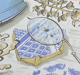
Lovely to still see hints of Ravilious’s china creeping into Angie’s work.
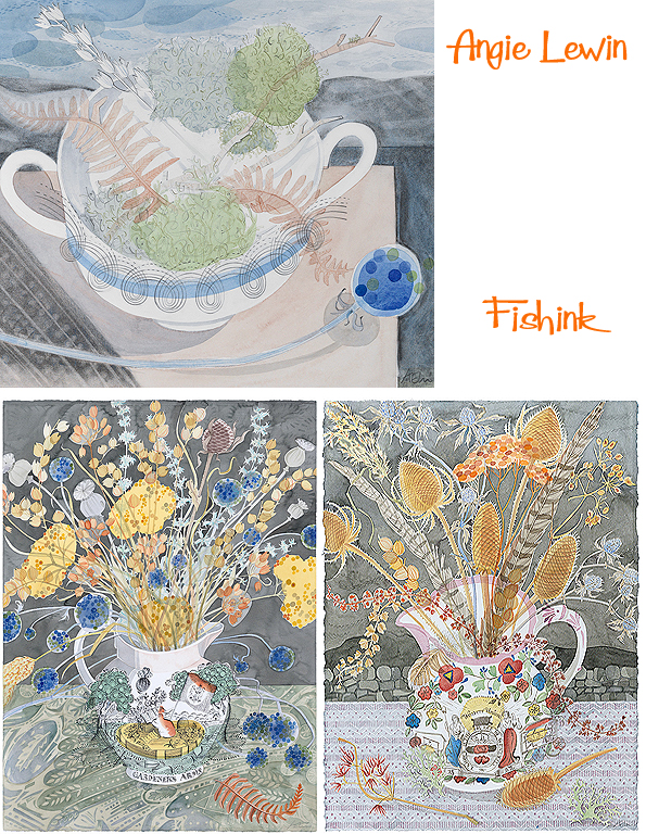
Here Angie explores the delicate, subtle wisps of nature and captures them in watercolour, a most appropriate medium to portray finery and fragility.
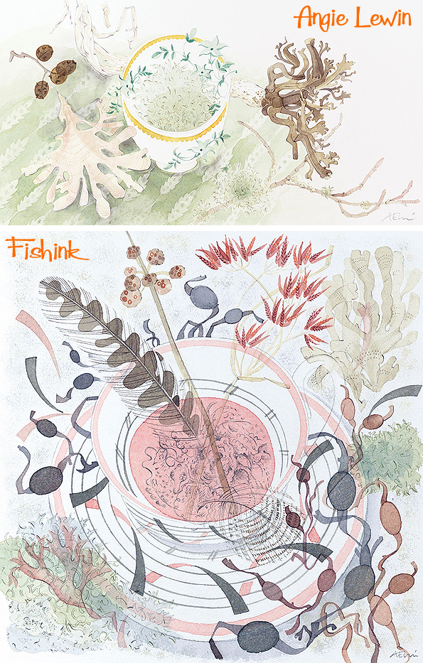
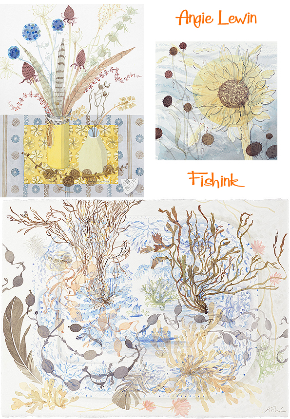
Picking out a row of selected stems to paint, almost creates a landscape in itself.

Perhaps my favourite below, entitled ‘Pink Lustre Plate With Sheep’s Sorrel’ which has already sold, before the exhibition has even opened ! Check out more details on Angie’s site.
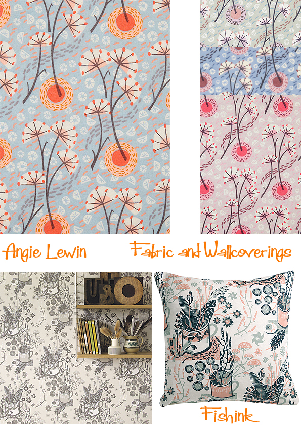
More about Angie’s new fabrics and wallpapers can be discovered over on the St Judes website.
Whilst in London, I bought myself a box of Angie’s postcards to send to friends. 12 cards for just £6.99 and with a sturdy brown envelope with each card, what’s not to like : )
Stay tuned for more news and photos about my London trip this week.
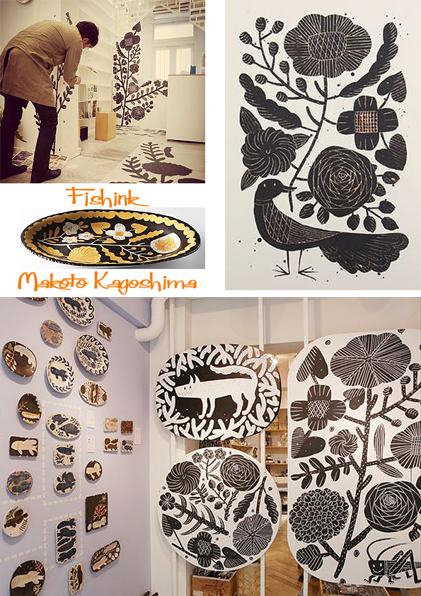
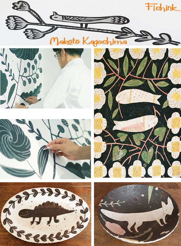
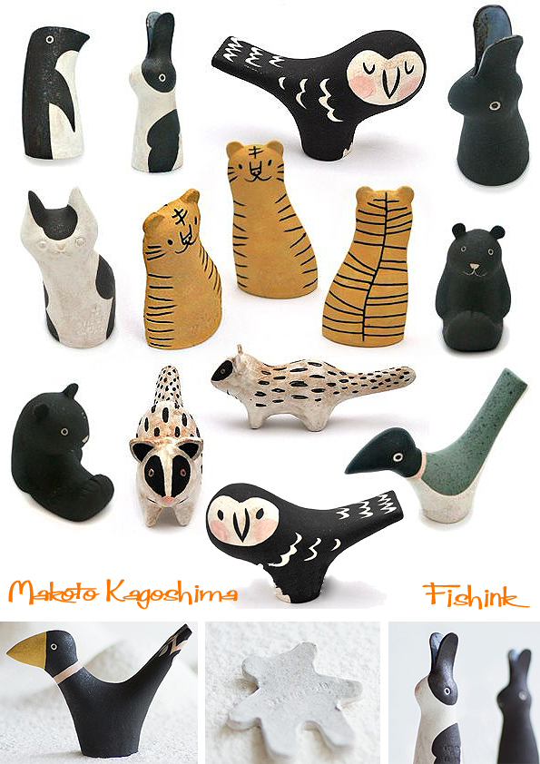
Makoto Kagoshima Japanese Animal Ceramics

Makoto Kagoshima was born in Fukuoka, Japan 1967.

After graduating from the art college, he worked in the Conran Shop in Fukuoka and didn’t become a full time potter until the age of 35.


Nowadays, Makoto Kagoshima has been creating his art works, pottery, fabric and prints at his shop, Atelier de La Paix, in Fukuoka. He has a wonderfully quirky and bold style.

His characters all speak of mirth and mayhem, as they frolic amidst his stylised gardens and undersea worlds.

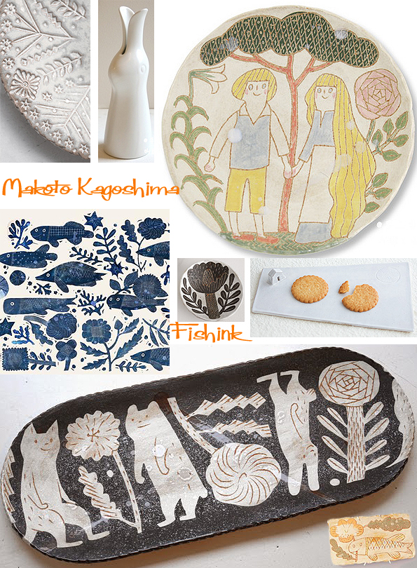
His work is all hand produced and every bowl is decorated by Makoto too.
He shows us step by step how he creates a squirrel. Kneading and rolling the clay, using a template to cut out the sides and base. Softening edges, stamping the form, using different sized lightbulbs to mould and shape the form on the back. He then paints slip onto the edges, places both sides together and waits for this to harden before carving and making the join smooth and seamless. He lastly puts on the base, fires and glazes the piece… et Voila ! A squirrel is born : )


For me his work is fresh, fun and a joy to look at.
I’m really liking these little chaps too.
Recently he had private exhibitions also in LA, Taipei and London. Makoto Kagoshima has already many fans all over the world. You can find more to see on the Doinel site. What do you think readers ? If you enjoyed this you may also like the work of Makiko Hastings , Lisa Larson and Jonathan Adler.


