Home, Home on the Range !
If you’ve ever had that feeling that you would like to live somewhere a little more isolated, or perhaps wish to escape the consumer culture and plan a life on your own.
Here’s a few interesting options to consider.

The Katshi pillar is a natural monolith located near the village of Katskhi in western Georgia. The pillar its approximately 40 metres high and overlooks a small river. The rock has a small medieval hermitage on its top which has been dated between the 9th and 12th century and was used by Stylites, Christians who lived on top of pillars to avoid worldly temptation until the 15th century when the practice wsa stopped following the Ottoman Invasion of Georgia. While the pillar had remained unclimbed until 1944 religious activities started again in the nineties and now a monk lives there full time and takes 20 minutes of vertical stairs just to get down from the pillar.
The 59-year-old monk Maxime Qavtaradze is the only inhabitant of the pillar. His only visitors are priests and a group of troubled young men who are seeking solace in the monastry at the foot of the pillar. A photographer called Amos Chapple paid a visit to the Stylite monk Maxime but was not at first allowed up onto the pillar. Instead he had to spend four days taking part in seven hours of daily prayers including a four hour stint from 2am until sunrise. When he finally was granted permission to scale the ‘dicey’ ladder to the top, he was worried that it might be too dark to get back down. After making it to the top, Maxime told Amos that he became a monk after a stretch in prison and decided he wanted to make a change. The monk slept in a fridge when he first moved to the top of the pillar, but now has a bed inside a cottage.

Ellidaey is an island in the Vestmann Islands, south of Iceland, on this Island there is one lonely house. The story of this secluded house is fascinating.
“Three hundred years ago, Elliðaey was inhabited by five families. They lived there in huts and survived by fishing and raising cattle on the island’s grassy pasture — and by hunting puffins. Over the next two centuries, sustaining a community on Ellidaey became increasingly impractical and unappealing (to say nothing of inbred). People started to leave; sometime in the 1930s, the last permanent residents of Elliðaey moved away.
The island’s former residents found that Iceland had many places more economical than Ellidaey from which to fish and raise cattle. But, as it turned out, there weren’t too many better places for hunting puffins. So, in the early 1953, the Ellidaey Hunting Association built a lodge on the island for its members to use during their commando puffin missions.

Hidden between the mountains in northern Portugal near the city of Fafe and a large wind field is the “Casa do Penedo”. (Top Image) The house was built starting from four giant rocks that were already on site and it was inspired by the American cartoon “the Flinstones”.
The house was built in 1974 by a local family and was supposed to be their vacation house. However, over the past years the house started to attract attention from tourists, architecture enthusiasts and others fascinated by its complete integration with the surrounding nature.
The Irony of this story is that as the interest for the house grow the owner Vitor Rodriguez, had to move elsewhere to find the peace he was looking for.
Because of its popularity the house has been increasingly targeted by thieves and robber who believe it must contain something valuable. So, the house now has bullet proof windows and a full metal door. Nonetheless, the interior remains comfortable and rural with stone and wood furniture.

The Crystal Mill (Old Mill) or historically known as the Sheep Mountain Mill, is one of the most beautiful, picturesque and reputed to be the most photographed area in Colorado state. It’s located above the Crystal River in Crystal, Colorado, between the towns of Glenwood Springs and Aspen on Highway 82, seven miles southeast of Marble.
The Crystal Mill is reachable only in the summer and fall months; it is accessed by a road that requires a four-wheel-drive vehicle, a sturdy pair of boots, a mountain bike or a horse. Operation shut down in 1917, but the site has been preserved with the help of the Gunnison and Aspen historical societies. The Crystal Mill is a wooden powerhouse built in 1892, added to the National Register of Historic Places in 1985. Astonishing is that Crystal never had nor does it have now, electricity.

Taktsang Palphug Monastery is more well known as Paro Taktsang and is a Buddhist temple complex which clings to a cliff, 3120 metres above the sea level on the side of the upper Paro valley, Bhutan. Mountainous Paro valley is the heart of Bhutan; here the only international airport of the country is located.The Taktsang Palphug Monastery is one of the most famous touristic destinations of the country and the cultural icon of Bhutan. Visiting the Paro Taktsang Monastery is an unforgettable experience thanks to its unique location and the views of surrounding majestic mountains and emerald green valleys.
The remote location of the monastery makes it amazingly beautiful and unique, but also creates technical difficulties. When on April 19, 1998 a fire started in the Monastery it was burned down completely: the temple was hard to access and the emergency assistance was impossible.
No wonder, that when you are looking at the Taktsang Palphug monastery from Paro valley or from the bottom of the cliff, it seems almost impossible to reach the Monastery. In fact, there are three paths leading to the holy place. The first path is a trail passing through the pine forest and decorated with bright, prayer bannerettes symbolizing protection from evil forces, positive energy, vitality and good luck. he other two paths are passing through the plateau, called “a hundred thousand fairies’ plateau.”
The refined architectural appearance of the Monastery is shaped in the best traditions of Buddhist. The complex has white buildings with golden roofs. Paro Taktsang Monastery consists of the 4 main temples and several dwellings. All buildings are interconnected by staircases with steps carved into the rock. Almost every single buildings of the monastery complex has a balcony with a breathtaking view of the surrounding area. The main shrine of the monastery -the prayer wheel is located in the courtyard of the temple. Every morning at 4 a.m. it is being rotated by monks to mark the beginning of a new day.
The interior design of the temple impresses with its luxurious beauty: gold-plated dome and flickering lights that are illuminating golden idols. In the hall of Thousand Buddhas, which is carved into the rock, a large statue of a tiger is located. The tiger is respected as the symbol of Paro Taktsang because of the legend, according to which the location of the Monastery was chosen by a tigress. The tigress brought here on her back the founder of Bhutan’s Buddhism guru Padmasmabhava.
There are eight caves in the monastery; four of them are comparatively easy to access. The cave where Padmasmabhava is believed to have entered first, on the back of the tiger, is known as “Tholu Phuk” cave and the one where he meditates is known as the “Pel Phuk”. Monks of the monastery are supposed to live and meditate in these caves for 3 years. They rarely visit the adjacent Paro valley.

Located at the Canadian-US border on the St. Lawrence River east of Ontario, Just Room Enough Island was named by the Sizeland family who purchased it as a vacation lodge in the 1950s. What the Sizelands didn’t expect was that Just Room Enough Island would quickly become a popular tourist attraction because of its oddity.
Just Room Enough Island is part of the Thousand Islands in the St. Lawrence River. It is the smallest of the 1,864 islands in the famous archipelago shared by the cities of Ontario and New York. The Island counts as a legitimate part of the Thousand Islands because it satisfies these state-given criteria: 1) Above water level year round; 2) Have an area greater than 1 square foot (0.093 m2); and 3) Support at least one living tree.
And if that doesn’t float your boat (groan) or your home, then be careful what you wish for : )
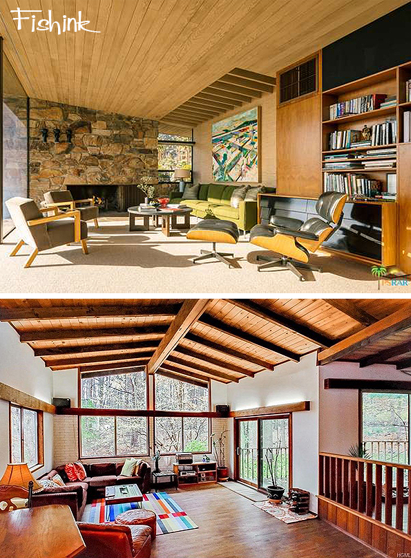
Interior-wise If I had a choice, I’d choose to live in the buildings below. Stocked with sixties retro furniture… naturally!

So if you live in one of these type of homes, please feel free to ask me over to stay for a few days lol
Even for a short break, I’d find this environment inspirational and creative for drawing.

Alternatively you can borrow from Sculptor Offentlig Konst and take your home with you… on legs!

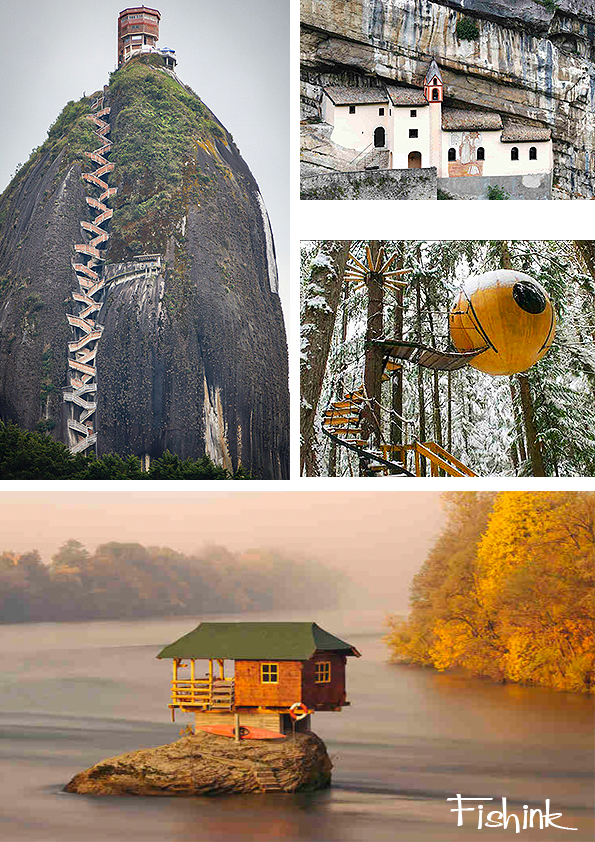
Finally here’s a couple of other tucked away home environments.
Which one is your favourite ?
FISHINK CERAMIC SALE
Hi Everyone , just a quick mention that I have a Sale starting tomorrow morning at 9 am UK time on my stories over at http://www.instagram.com/fishinkblog or @fishinkblog .
You can browse over 50 items of my new collection of ceramics and just message me should you see anything you might like.
These will be available tomorrow too


Please pop over to my Instagram space over the weekend it is open for business 9 til 5 both days. I look forward to seeing you there, thank you Craig
Ladislav Sutnar Graphic Input
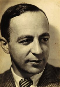
Ladislav Sutnar was born in 1897 in Plezn, Czechoslovakia. A Renaissance man, like many in his era, his activities were multidisciplinary and he studied painting at the School of Applied Arts in Prague, architecture at Charles University, and mathematics at the Czech Technical University concurrently.

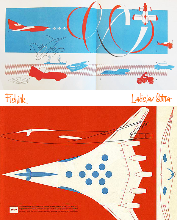
This silkscreen print was published as a promotional kit for the Build the Town building block set Sutnar designed between 1940 and 1943 while living in the U.S. This print is 1 of only 2 promotional materials Ladislav produced for the modern toy design market.

Starting in 1924, Ladislav designed toys consisting of simple geometric structures of animals and puppets.

He attempted to introduce modern aesthetics into children’s toys by developing a building kit that consisted of sawtooth roofs, cones, and pieces in the colors of red, blue, and white (this remained a prototype).

The 1960s proved to be a difficult time for the designer as he turned to publishing Strip Street (1963). It was an album of 12 erotic silk-screen prints. He organized two New York gallery exhibitions of his nudes, In Pursuit of Venus (1966) and Venus: Joy-Art (1969). These works outside of his norm still included his hierarchical design approach as a father of modern information design. The term “posters without words” refers to Ladislav’s distinct poster-like design that characterizes the individual prints of this series.

His racy Strip Street compilation has relatively been forgotten. He wrote an essay to accompany these works. “In these disturbed times of cool and alienated society,” he wrote, “if the paintings can inject the feeling, the mission is accomplished.” An influence of Pop is notable despite Sutnar’s dislike of Pop and Pop Art. His paintings are reproduced today in a 392-page monograph.

Ladislav Sutnar is most notably a pioneer in the field of information design. He worked with many media including print, painting, products and interior design.
He went to school to learn how to make utensils, pots and other ceramic works. In 1923, he became the professor of design at the State School of Graphic Arts in Prague, and was later made its director. At the same time he worked as a designer at other firms too. Ladislav also did much work in exhibition design for a number of World Fairs, including the one in 1939 located in New York where he was to design the Czech pavilion. The exhibition ended up being cancelled due to the Nazi invasion of Czechoslovakia. Still, his work brought him to America, where he began a new chapter in his life.
Ladislav transitioned from industrial designer to graphic designer during his time in the States. He responded to the chaotic nature that he saw in American graphic design, starting his influence in information design. His work brought simplicity to the complex. His personal philosophy on visual design was that it should not “sink down” to the level of public taste, but rather inspire the general public to improvement and progress. He believed designers are called to perform to their fullest capacity and should “think first, work later.”
He placed a heavy emphasis on precision and clarity in information display, and on simplifying the complex.

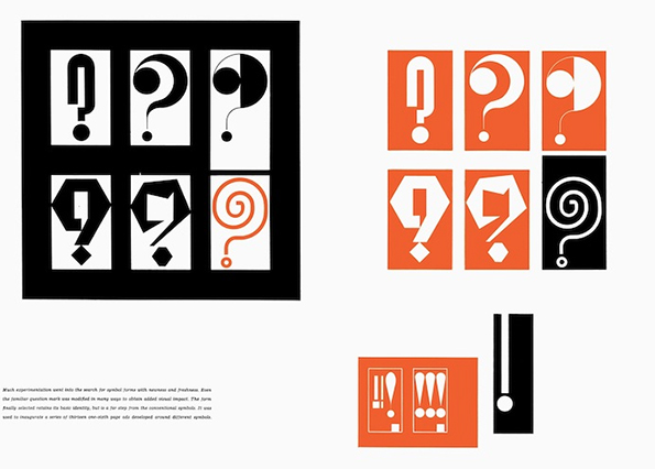
His style reflected this philosophy in many ways, using grids and a strict layout, as well as a limited color palette and choice of typeface. He often used geometric form to guide layout, and also asymmetrical compositions to draw visual interest. Ladislav was also greatly inspired by movements such as Modernism, Bauhaus, and De Stijl. He used vivid colors, especially with his penchant for orange. A distinguishing feature of his work is the use of punctuation symbols to organize information.
After settling in America, Ladislav became the art director at F.W. Dodge’s Sweet’s Catalog Service in 1941 until 1960. His contributions here are seen in use even today. To replace the messy design that originally characterized Sweet’s pages, he created business-friendly templates and layouts for clarity of vast amounts of information and easy consumption by the general viewer. He contributed graphic systems to several companies and manufactured items. Also among his innovations was the use of double page spreads as opposed to only single pages. He was also the one to put parentheses around the area code in the American telephone numbering system.
Ladislav’s contributions to the practice of information design are still applied to graphic design today. The components of web design and navigation today can be accredited to his methodical Modern-style graphics, which are widely borrowed and applied. His designs transformed the face of business data, organizing massive amounts of information into not only comprehendible but visually interesting displays.
Though far from a household name, Ladislav Sutnar is a giant in the history of design. A Czech American who had a prolific career in his native Czechoslovakia in the 1920s and ‘30s and subsequently in the United States. He was an innovator in graphics, product design, exhibition design, and information design—a forerunner of web design. He is particularly known for his work in typography, including the innovation of adding parentheses around area codes in phone numbers, a seemingly small change that makes long strings of digits easier to read and remember.
Studio Tabularasa Storytelling Ceramics
Reiko Miyagi‘s decision to be a potter came while she attended college in Tokyo.
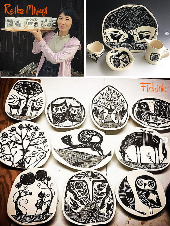

She says:- “I studied, contemporary art and museum curation. It wasn’t pottery related so after I graduated, I went to a ceramic school called Bunka-Gakuin, where there were great teachers who had studied under National Treasure-level potters. I was able to study a variety of outstanding styles and skills there. I also learned functional pottery making skills for two years and then took an apprenticeship in the pottery town of Mashiko. Mashiko had a very open and diverse atmosphere compared to other traditional pottery towns in Japan, probably a result of the folk-art movement there in the 1920’s lead by Shoji Hamada. I enjoyed interacting with many excellent artists who lived independent life styles in Mashiko, including quite a few people from overseas who came to learn pottery making. ”

Reiko works using white stoneware with free hand-painted black slip and sgraffito decoration. Sgraffito is the technique where a layer or numerous layers of glaze are painted onto the hardened clay, before being scratched away in a design or pattern to reveal the surface of the clay beneath. It can create quite crisp imagery. You can see this technique in progress below. Reiko says:- ” I use all kinds of scratch tools, mostly made from metal, such as a needle tool, scratch board tools and an exacto knife. It really takes them all to make my work but since I’m also a metalsmith I like to modify my tools. For example, I like my loop tool because I was able to customise the shape for my needs by forging and filing.

There ia an ancient Japanese belief that all beings and objects have a spirit and divinity within. Being born and raised in Japan, Reiko’s aesthetic sensibility was largely influenced by the traditional art and crafted items that reflected this philosophy. Using black slip on white stoneware, Reiko creates her own sense of inner spirit and with the moments of bliss she receives whlst working with the clay, she expresses her belief in idea that all beings are connected and the appreciation for our surroundings, make us what we are.
I love the folk art element to her work.

Her studio name “Tabula Rasa” comes from the latin expression meaning to start with a clean slate. ” I was first exposed to this expression when I bought the music CD, “Tabula Rasa” by Arvo Pärt thirty years ago. I chose it for my new studio name when I moved to the US because I was making a completely new start. I have interpreted the words in my own way which is, “every moment is unique and a chance for a fresh start,” just like in Zen philosophy. We are easily distracted by thoughts of the past or future rather than being fully present in the moment but when I make my art and am having a good flow, I truly enjoy the feeling of this moment of “bliss.”

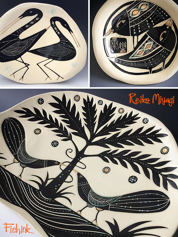
“I draw a lot of animals, trees and flowers. My culture has an animistic philosophy that all beings and objects have a spirit or godess within them. Animals and flowers have complete beauty and it’s like having a universe within so I never get tired of drawing these “millions of gods.” I also draw a lot of musicians, too”
“The pieces below are some of my “Tree of Life” plates. It’s an image in use for a long, long time in many places. I’m very interested in the patterns and imagery that you can see in different areas of the world and throughout a variety of time periods. Some images have literally travelled through time, whilst some are very similar but it cannot be explained why they have this similarity without any communication between them. Perhaps it comes from something humans are born with. Either way, I love looking at images and patterns that appear in historic and tribal work that play with my imagination and make me question what the artists went through to express these images”

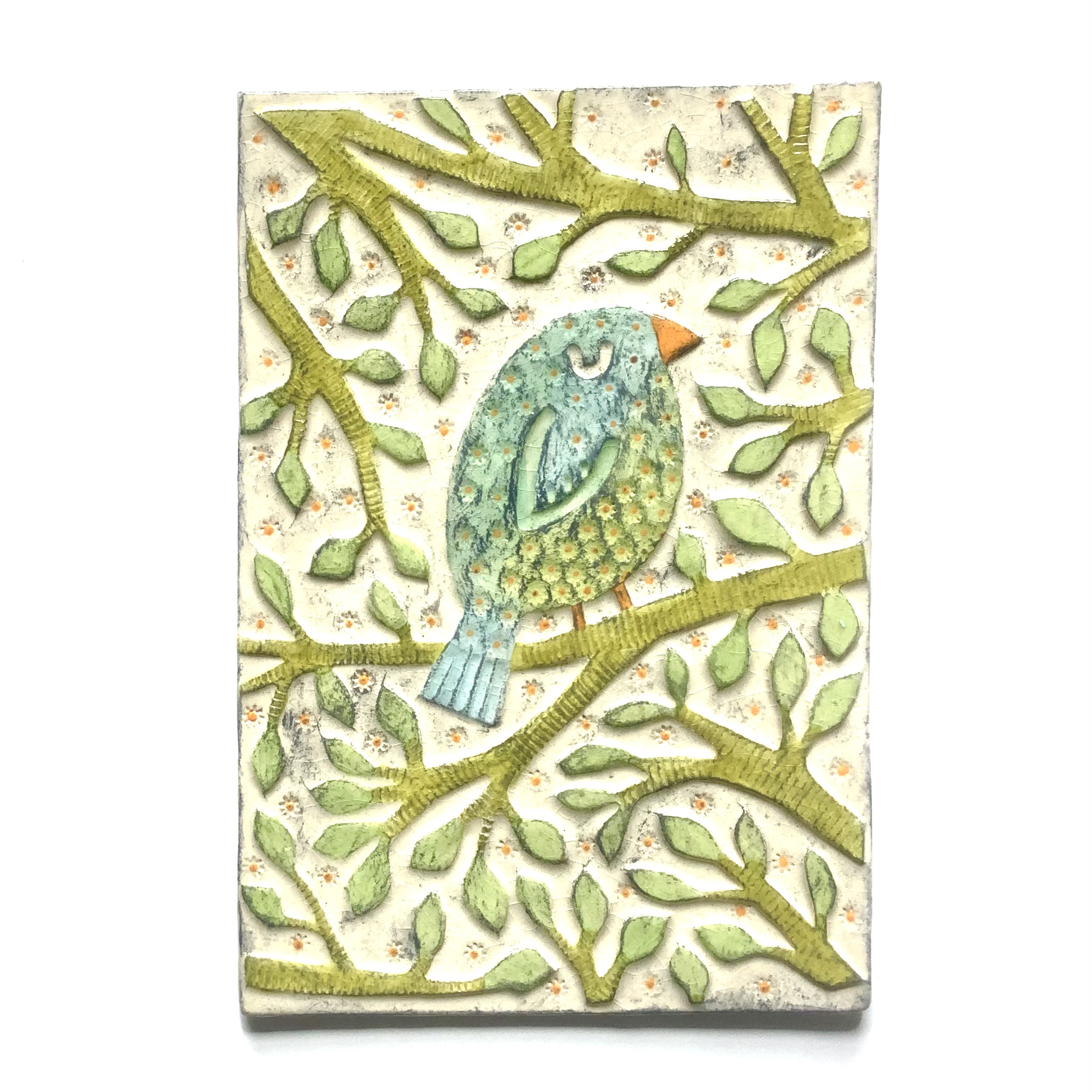
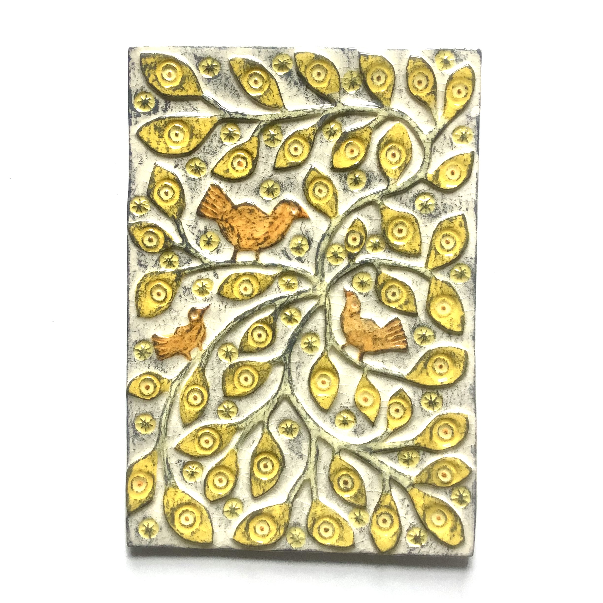
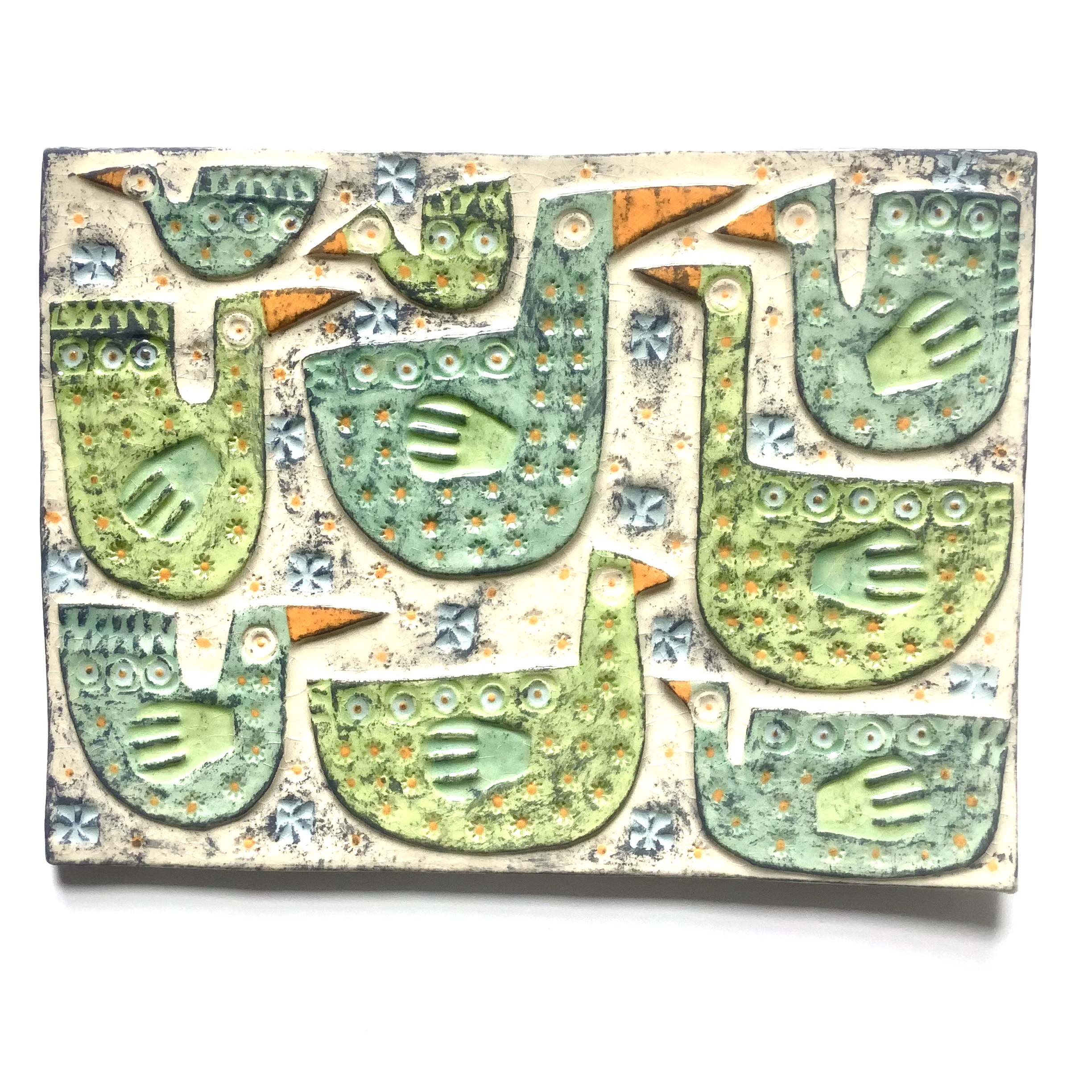
Birds are a common theme and stem from mythology, stories and folk imagery.

Beautiful shapes and couplings.
I love these little Owls, they definitely feel like pottery discovered from Greek mythology.

Cups and vases with great little feet.
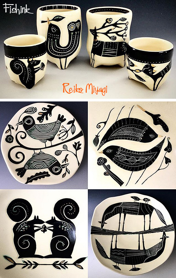
Her whimsical character-driven ceramics, almost suggest stories and create strong emotive responces to their narratives.

Nowdays Reiko is living in North Carolina with her partner and you can follow her work on her Instagram account over @studiotabularasa.
Happy Holidays.
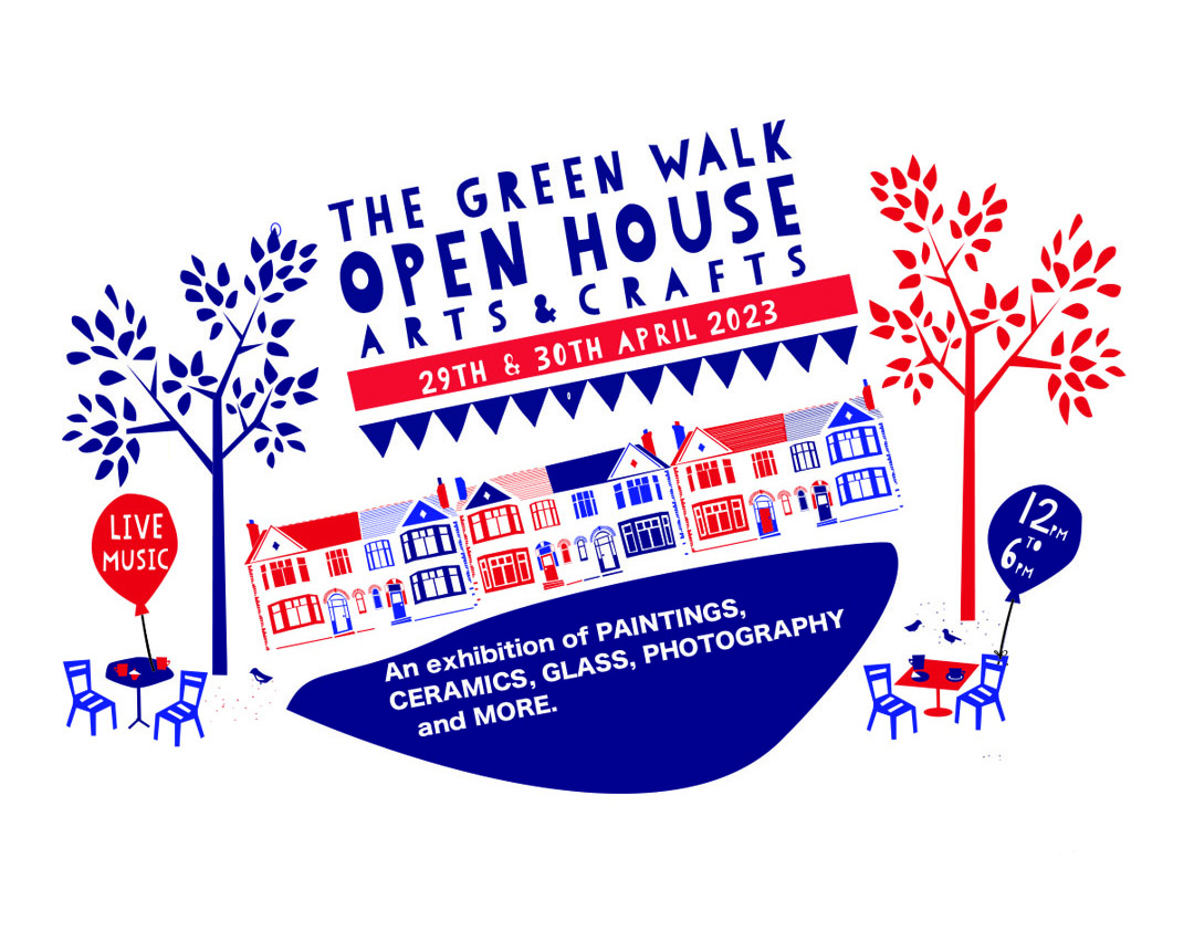
Green Walk 2023
This weekend, one of the friendliest and well managed events of the year is on. The Green Walk Open House Arts & Crafts 2023 or on ig @greenwalkopenhouse.
Now in it’s 14th year and always a joy to be a part of and visit. Set in beautiful surroundings in a small cul-de-sac off Upper Chorlton Road. Manchester.. be sure to add this to your list or literally miss out !
Music, food, tea and cakes and plenty of beautiful creatives with their work.
12 til 6pm Sat and Sun. See you there, please share. Green Walk, Manchester, UK, M16 9RF


Andy Lovell Etching our Landscapes
I first spoke about the work of Andy Lovell back in 2010. His work pops up in my searches every now and again and I remember what fab illustrations he creates.

He is an artist, illustrator and printmaker who has become known for his abstract etchings, mono-prints and Cyanotype art.

Having originally studied at the Liverpool School of Art and Design, his work is well recognised and his individuality produces striking artwork.

Andy takes inspiration from life which is then revisited through the medium of print.

He is a master of line, colour and mark making.

Taking original sketches and paintings, Andy is able to capture a real sense of mood and place from the places he visits to sketch.
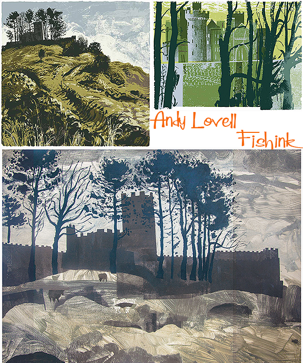
He knows how to add drama and interest to a landscape.

His landscapes speak of earth and furrowed fields. Forest and wildplants throw splashes of colour and shape, adding to the richness of each illustration.


I love these wild moor and lofty hill prints. The clever dragged lines of ink and paint not only help to suggest the landscape but also give a visual direction to each scene.

You can almost feel like you’re standing looking down these valleys.

The hills eventually lead us to the sea.

White cliffs and wild waters.

Tepid tones, swirling skies and seas.
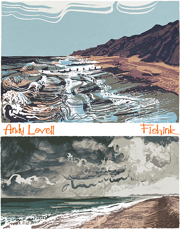

These textured black and whites are wonderful, with a slight sixties retro edge to them.


Breathtaking textures.

You can discover more of his prints for sale here on his website.
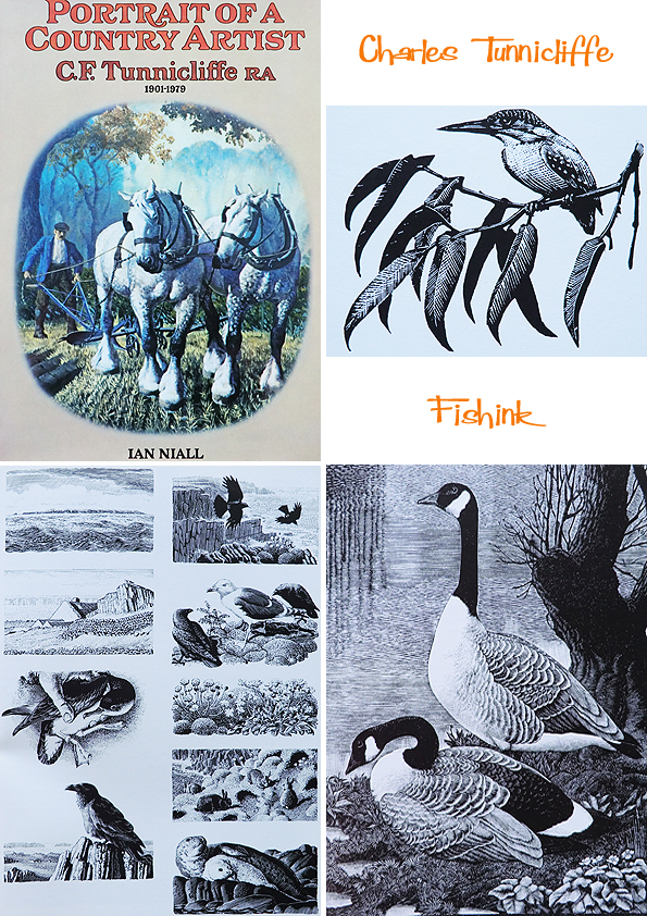
Ladybird Books and Charles Tunnicliffe
Hello to Monday.

Like thousands of other children, I grew up with Ladybird books around me. I didn’t collect them, however, like many others I knew (and boy did kids like to collect things when I was growing up !) but I do remember going into ‘Bookland’ (my local book shop) and being confronted with a wall of Ladybird titles. It was quite literally (and visually) overwhelming !
So recently, I happened across a couple of cheap, possible first edition copies, of two familiar titles I remember owning as a child. Part of the ‘What to look for in… (Autumn, Winter, Spring, Summer)’ series. Looking through them as an adult, I remember how beautifully the painted pages were, and I quickly re-associated with these familiar scenes from nature and my youth. What I failed to realise, until I started putting this post together, was that the artist Charles Tunnicliffe, was a name I already had on my bookshelf. These are some of his illustrations for Ladybird books.

Charles Tunnicliffe was born in 1901 in Langley, Macclesfield, England. He spent his early years living on the farm at Sutton, where he saw much wildlife. In 1916 he began to study at the Macclesfield School of Art, and later went on to win a scholarship to the Royal College of Art in London.
He married in 1929 at the Methodist Church, Whalley Range, Manchester, to Winifred Wonnacott, a fellow art student. In 1947 he moved from Manchester to a house called “Shorelands” at Malltraeth, on the estuary of the Afon Cefni on Anglesey, where he lived until his death in 1979.
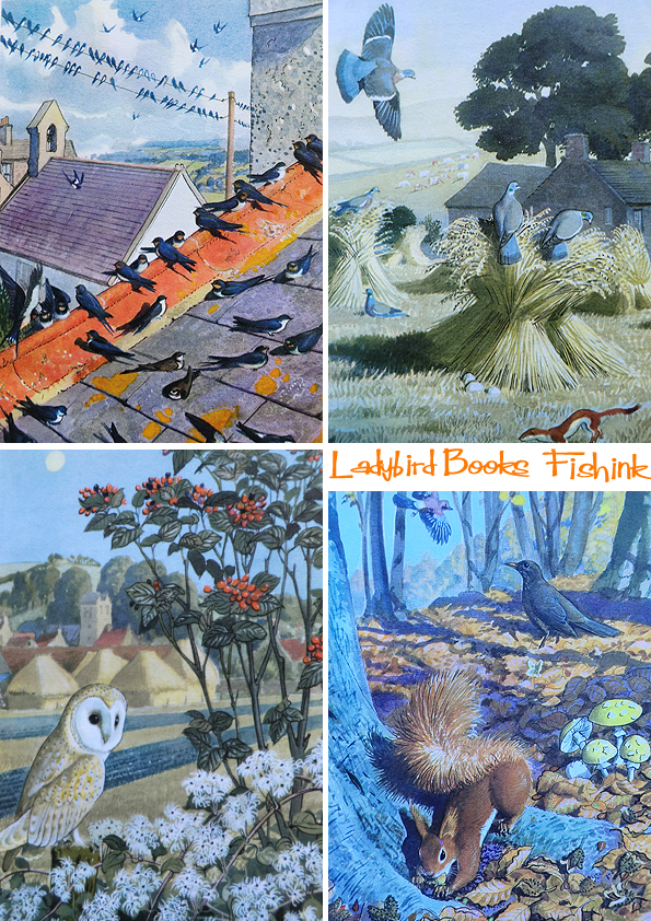
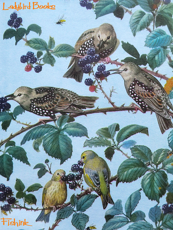
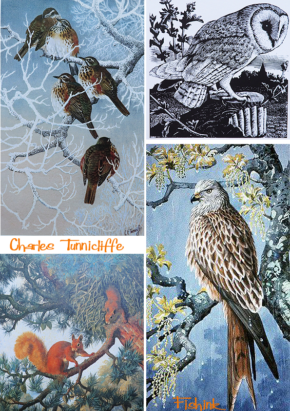
He worked in several media, including watercolor painting, etching and aquatint, wood engraving, woodcut, scraperboard (sometimes called scratchboard), and oil painting. Much of his work depicted birds in their natural settings and other naturalistic scenes. His work was also used to illustrate Brooke Bond tea cards and as a result was seen by millions of young people in the United Kingdom during the 1950’s and 1960’s. Charles’s work was characterised by its precision and accuracy, but also by the way in which he was able to portray birds as they were seen in nature rather than as stiff scientific studies.
From March 1953, he painted many of the cover illustrations for the Royal Society for the Protection of Birds’s (RSPB) magazine Bird Notes, and several for the later Birds magazines. At his death, much of his personal collection of work was bequeathed to Anglesey council on the condition that it was housed together and made available for public viewing. This body of work can now be seen at Oriel Ynys Môn (The Anglesey Gallery) near Llangefni.

His work shows such care and attention to detail, that you can’t help but be drawn into each scene, noticing more and more information as the eye works it’s way around the painting.
Charles also created the wood engravings too.

Here’s the other two covers in the series (below) and the only other ladybird book I owned (above).

And this was the book I had on my shelf already, without realising it was the same artist. Such amazing detailed and dedicated work.
Charles also received much recognition for his work on Henry Williamson’s children’s book ‘ Tarka the Otter’ in 1932.

He created many studies for Tarka, the main character.

Beautifully observed watery scenes.
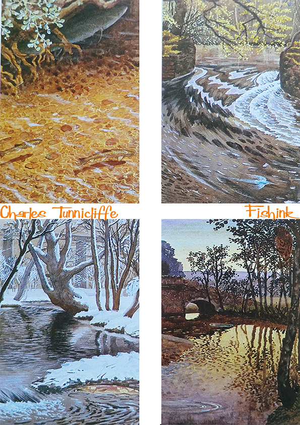
He spent days just observing and creating observational paintings, which were often life-size studies !

Can’t you just feel the frost on this branch below. At least 250 books used Charles’s illustrations on the cover and inside.

Ladybird books had their beginnings in 1915, although the company traces its origins to 1867, when Henry Wills opened a bookshop in Loughborough, Leicestershire. Within a decade he progressed to printing and publishing guidebooks and street directories. He was joined by William Hepworth in 1904, and the company traded as Wills & Hepworth.
By August 1915, Wills & Hepworth had published their first children’s books, under the Ladybird imprint. From the start, the company was identified by a ladybird logo, at first with open wings, but eventually changed to the more familiar closed-wing ladybird in the late 1950’s. The ladybird logo has since undergone several redesigns, the latest of which was launched in 2006.
Wills & Hepworth began trading as Ladybird Books in 1971 as a direct result of the brand recognition that their imprint had achieved in Britain. In the 1960’s and 1970’s the company’s Key Words Reading Scheme (launched in 1964) was heavily used by British primary schools, using a reduced vocabulary to help children learn to read. This series of 36 small-format hardback books presented stereotyped models of British family life – the innocence of Peter and Jane at play, Mum the housewife, and Dad the breadwinner. Many of the illustrations in this series were by Harry Wingfield and Martin Aitchison.
The 1950s to the 1970s are widely considered to be Ladybird’s ‘golden age’. This period saw the post-war baby boomers come of age, creating a mass of new consumers who were open, confident and unrestrained. Ladybird books reflected this optimism with its forward-looking design and illustrations, which depicted a utopian vision of modern Britain.
In the 1960s, Ladybird produced the Learnabout series of non-fiction (informational) books, some of which were used by adults as well as children.
An independent company for much of its life, Ladybird Books became part of the Pearson Group in 1972. However, falling demand in the late 1990s led Pearson to fully merge Ladybird into its Penguin Books subsidiary in 1998, joining other household names in British children’s books such as Puffin Books, Dorling Kindersley, and Frederick Warne. The Ladybird offices and printing factory in Loughborough closed the same year, and much of the company’s archive of historic artwork was transferred to public collections.
Nowadays you can pick up a lovely retro print of a Ladybird book illustration from the company King & MCGAW.

I’ve been told that over 20,000 of the images from the books have been preserved in the world’s first permanent gallery devoted to Ladybird books at Museum of English Rural Life (MERL). The gallery has scores of titles shelved chronologically from 1961’s ‘Learning to read Numbers’ to current titles such as ‘Climate Change’ by the Prince of Wales. His book is one of the new range of “expert” titles for which the first new artwork in over 40 years was commissioned. A proof sheet shows how little the books changed once a standard was established to cope with wartime shortages, a single large sheet of paper printed on both sides gave 56 pages or text, illustrations, plus a cover.
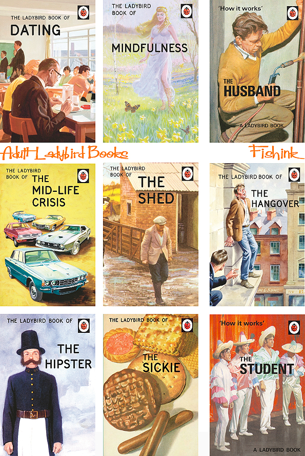
In case you have had your head in the sand for the last year and haven’t noticed, there has been a range of Ladybird books for grown-ups, which use original Ladybird illustrations with up to date, dry humoured and witty, written commentary.
They have been runaway best sellers, earning an estimated £30m for Penguin.

The key illustrators of Ladybird books from that vintage period were: – Martin Aitchison, Robert Ayton, John Berry, John Kenney, B.H Robinson, Charles Tunnicliffe and H Wingfield, (some images of the illustrators exist here).
It is impossible to say exactly how many titles Ladybird Books has published over the past century as records before 1940 no longer exist. We do know that, between 1940 and 1980, Ladybird published a total of 63 different series, collectively containing 646 titles. By 1990, the annual Ladybird catalogue listed over 600 titles still in print, with new titles being published at an average rate of 100 per year. Today, Ladybird continues to publish around 70 new titles every year.
Finally, and before you start asking me what your ladybird books are worth these days lol, I happened across a site that deals in rare and unusual Ladybird publications called The Wee Web. They claim that the rarest book of them all to be ‘The Computer – How it Works’ (1971) – this is not the standard issue but rather a private publication that was especially produced for the Ministry of Defence in 1972. The M.O.D specifically asked for the book to be published in plain covers and without copyright information as not to embarrass their training staff !
Which titles do you remember and possibly still own ?
Many thanks to Wikipedia, Penguin Books and The Guardian for the information in this post. Please share this post with your friends and spread the word about Fishink Blog online, thank you for being a reader.
Save
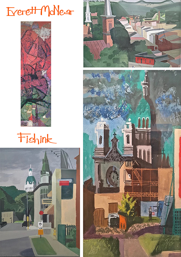
Everett McNear American Mid Century Artist
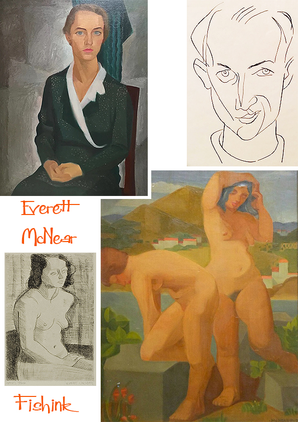
After a year of study at the University of Minnesota, Everett found that the drawing and painting classes at the Minneapolis School of Art were more immediate to his needs than liberal arts courses. In 1924, he made his first contact with Cameron Booth. Prior to his arrival at the Minneapolis School of Art in 1921, Booth had been thoroughly exposed to the key exponents of French painting. His style was firmly rooted in the Cubist and Impressionist traditions. Booth’s influence on McNear was significant.

“Cameron Booth taught me to love the smell of turpentine and the feel of a bristle brush in oil paint. He opened the doors for me. Beyond them I found the rich linear organization of Veronese, the color harmonies of Titian, and the poetic, freely moving space-forms of El Greco and Tintoretto. I began to see that these abstract qualities and relationships were the things that gave a painting a life of its own.” Under the influence of Booth, Edmund Kinzinger, and his fellow students at the Minneapolis School of Art, McNear abandoned the curvilinear forms of his early drawings in favor of a more disciplined aesthetic.
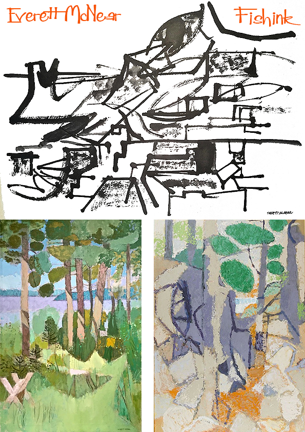
In 1932, McNear made his first of many trips to Europe. Hungry for personal and artistic growth, he scheduled an exhaustive program that would guide him through much of Western Europe, including time spent at the Academie Moderne studying etching with Marcoussis. His travels are particularly important to an understanding of the artist and his work. In his book Young Eye Seeing, his collected letters document this first trip, express his motivations, and chart his goals. French engravings made around Notre Dame and along the Seine.
You can see below first the sketch and then the realisation.
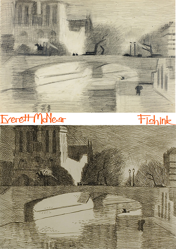
More work in the vacinity. Lovely use of light and shade.


His return to the US in 1933 saw the artist turning to work as an illustrator, and in Chicago, he worked for many years as a graphic designer. McNear also became heavily involved in the art scene in Chicago. He became a member of the Arts Club and won numerous prizes for artworks he exhibited at the Art Institute of Chicago, the Art Directors Club, the Illinois State Museum and the Art Guild. He was a prominent artist, designer, and collector in Chicago and also put together exhibitions at the Art Institute, the Arts Club, and later at the Sears Tower.

Some illustrative work for Childcraft volumes, a young child’s encyclopedia started in the 1930’s.

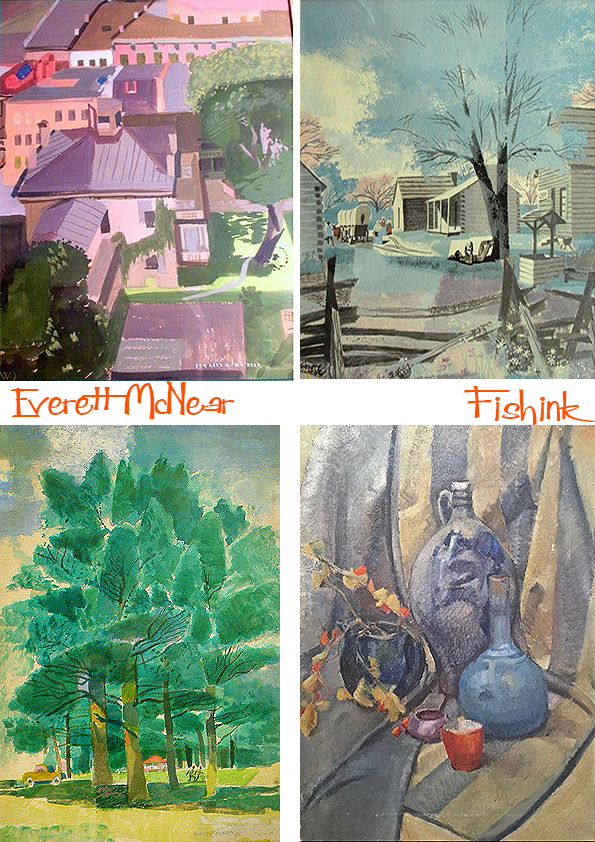
A few watercolours from around the 1950’s.
Others which remind me a little of Rennie Mackintosh’s work.
Painting using different mediums.
Everett and his wife, Ann, were benefactors of what was the Notre Dame Art Gallery (now the Snite Art Museum); they served on the advisory panel and he did the initial gallery installation design. He donated hundreds of his own works to the Snite, plus pieces from his collection including works by Alexander Archipenko, Cameron Booth and Edmund Kinzinger, in addition to African sculptures; Flemish, Spanish, and Italian manuscript pages; Persian paintings and Peruvian textiles.
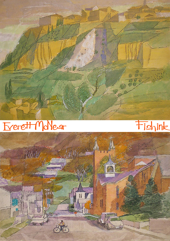
His sixties landscapes show a wonderful transition from Cubist marks to a style of his own.
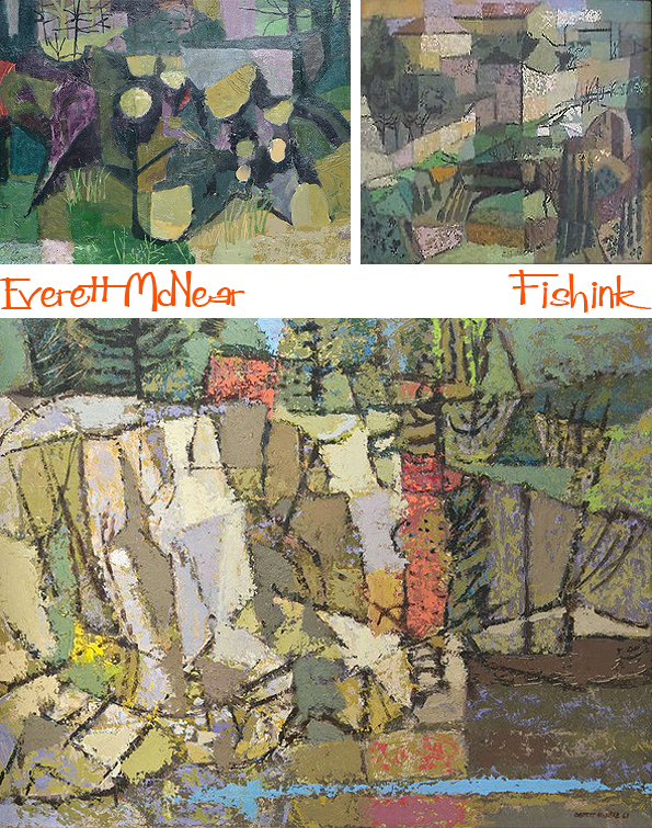
They feel so fresh and summery


A couple of more abstract paintings.

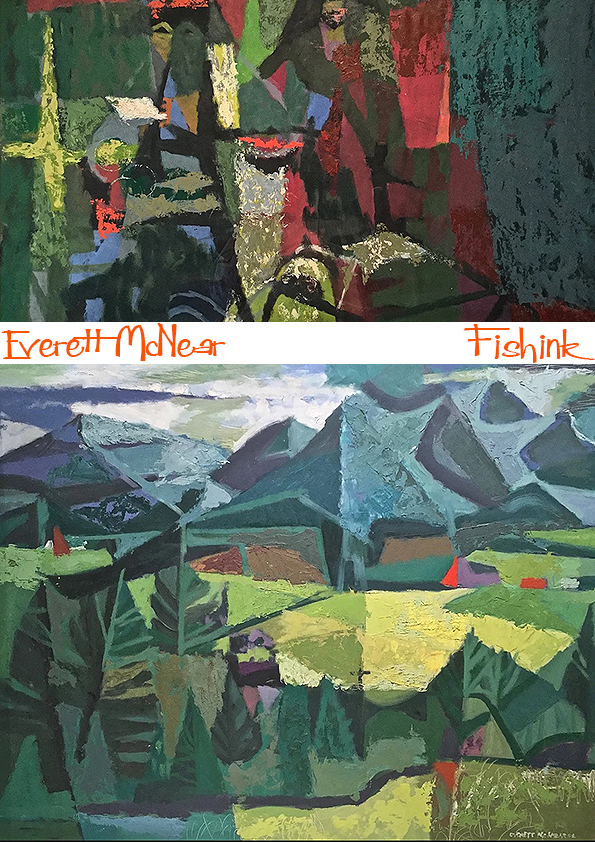
Before his wonderful land and sea scapes. Breathtaking.

Everett McNear was a happy painter … “There is a genuine pleasure in the transferring of ideas from nature to the canvas, and in the handling of paint.”
A dozen one-man shows in galleries and museums from San Francisco to New York rewarded him for his dedication to the smell of turpentine and the drag of the loaded brush.
Many thanks to Gallery 5004 for the information about this talented Artist.
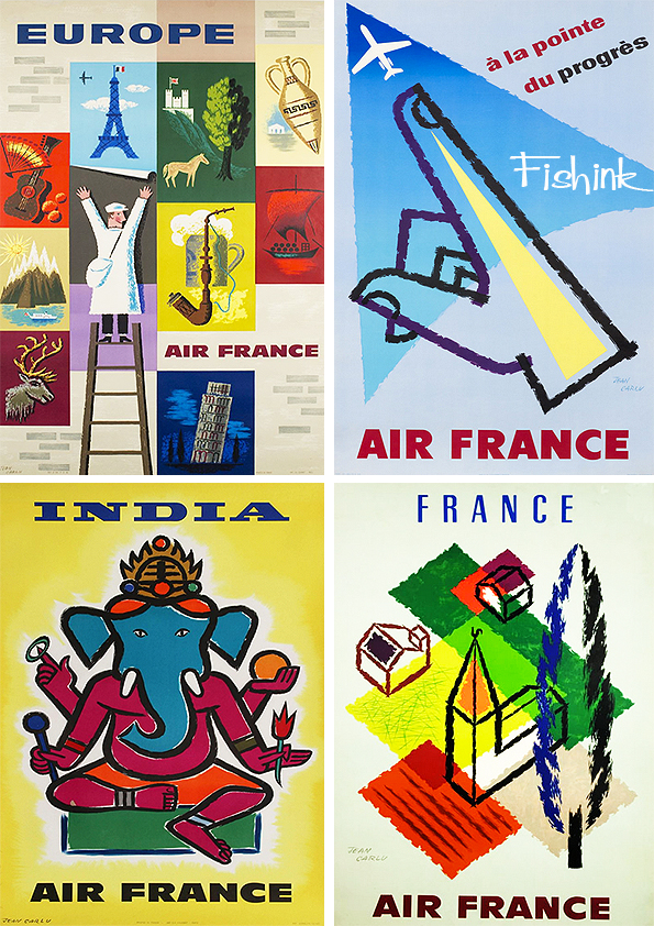
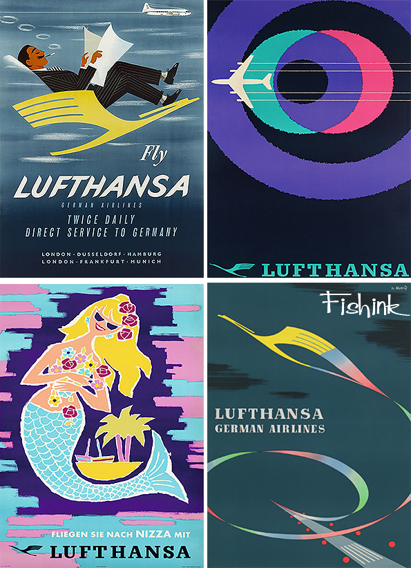
Mid Century Airline Posters Part 2
Welcome back to part 2 of my blog on Mid Century Airline Posters. If you missed part 1, you can find it here.

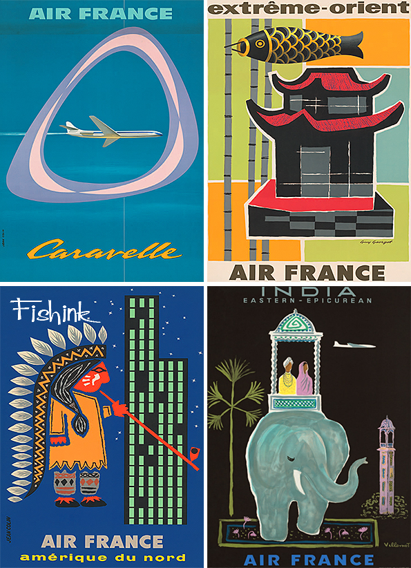
These posters (below) were designed by the artist Jean Carlu. I like his crayon-like lines.
Relax in style, retro-style with Lufthansa.
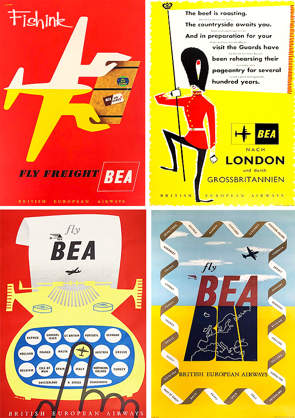
A few more from BEA.

The Spanish poster above was created by John Minton.

From BEA to BOAC and a graphic style and some quirky animals.

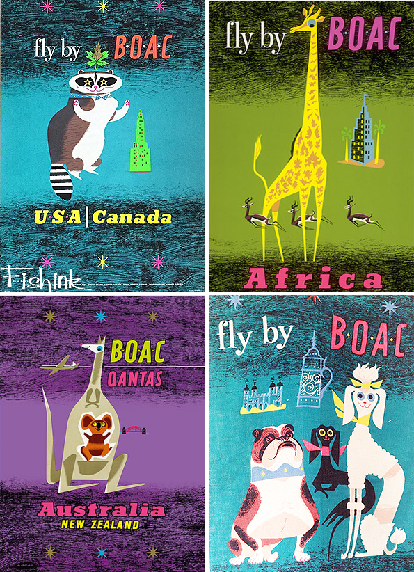
The amusing animals continue into these great Quantas posters.
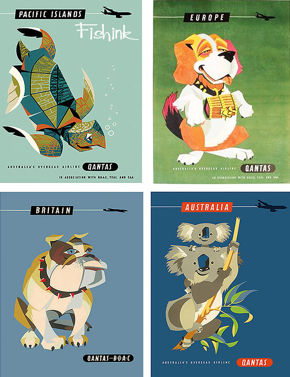
Simple yet inspirational !

Finally we come to the Golden Gate Bridge and a splashdown at Niagra Falls with American Airlines.
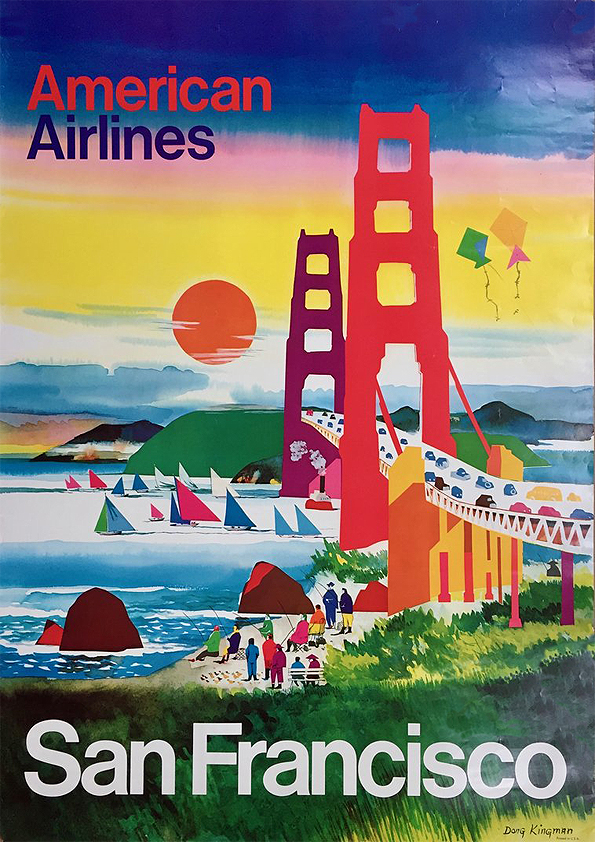
More from Dong Kingman (above) in another post.

If you enjoyed my posts then do check out these similar ones about Pan Am, B.O.A.C Part 1 and B.O.A.C Part 2 and Braniff.
Also please leave me a comment with your thoughts and most of all…. Have a fun start to your week !
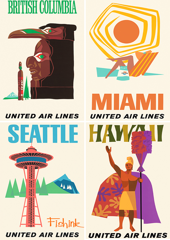
Mid Century Airline Posters Part 1
I’ve covered many different Airline Posters on Fishink blog in the past. There’s Pan Am, B.O.A.C Part 1 and B.O.A.C Part 2 and Braniff to name a few.
Here’s a great collection that I came across and haven’t seen many of before. I make no apologies if they have appeared on here previously however as they are all rather special!
Let’s begin by flying TWA.
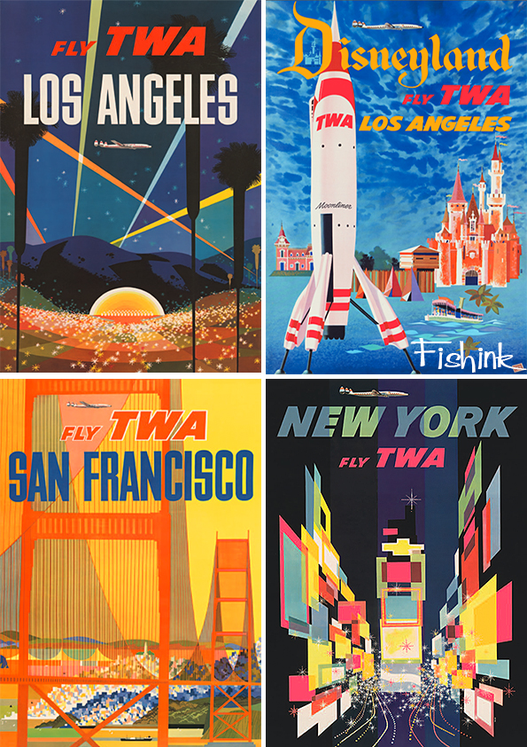
Some wonderful posters, which make me want to hop on a plane right now.

Great use of colour, space and design. They are visually captivating.
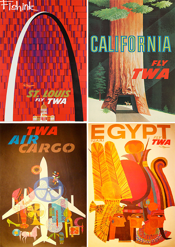
Many of these wonderful posters were designed by David Klein. Such a talented artist.
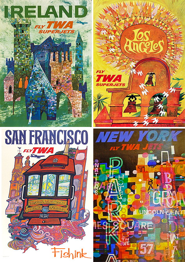
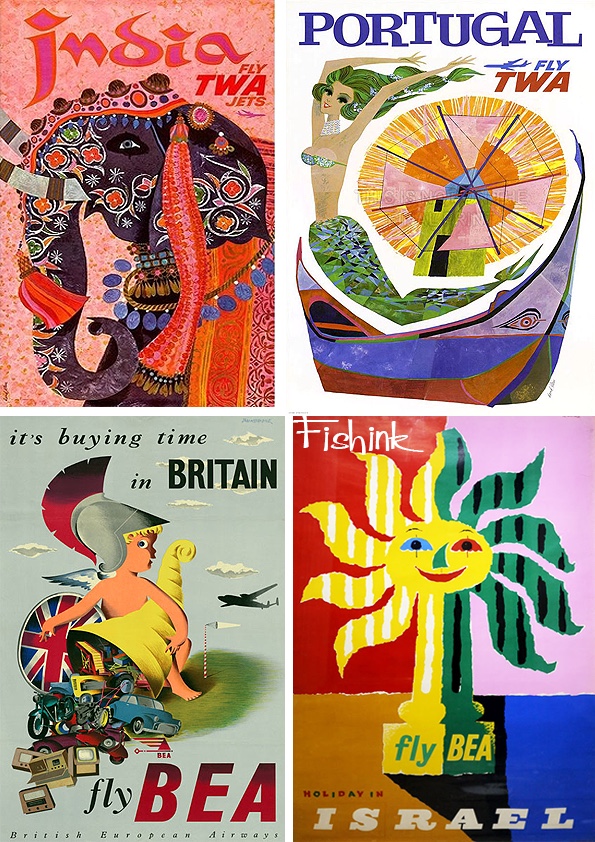
From TWA to BEA.
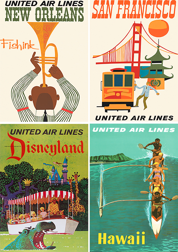
Followed by some fresher United Air Lines posters.

That Miami Sun is fabulous don’t you think.
The San Franciso poster below, makes me think of Miroslav Sasek. Or perhaps they’ve just picked the same elements.

A little more structure from American Airlines.


From Braniff to Japan Air Lines.

A few Pam Am specials to finish for today. Is that Cilla ?

More Mid Century poster madness next week.


