Print and Pattern Geometric

Marie Perkins (Bowie Style) of Print and Pattern fame, has just released her fourth book in the series of beautifully collated and collected print designs. This time it’s all about Geometrics. It’s released by those fab folk over at Laurence King Publishing and holds over 300 pages of pure colour pattern.
I grabbed myself a copy and these are just a small selection of my favourite entries, to whet your appetite !

There are entries from some well known illustrators like Sanna Annukka and Nancy Wolff, (more about Nancy in the next two weeks).


Stunning colours (above) from Melanie Mekecz and shapes (below) by inaluxe, Hemmingway Design and Jackie Shapiro.
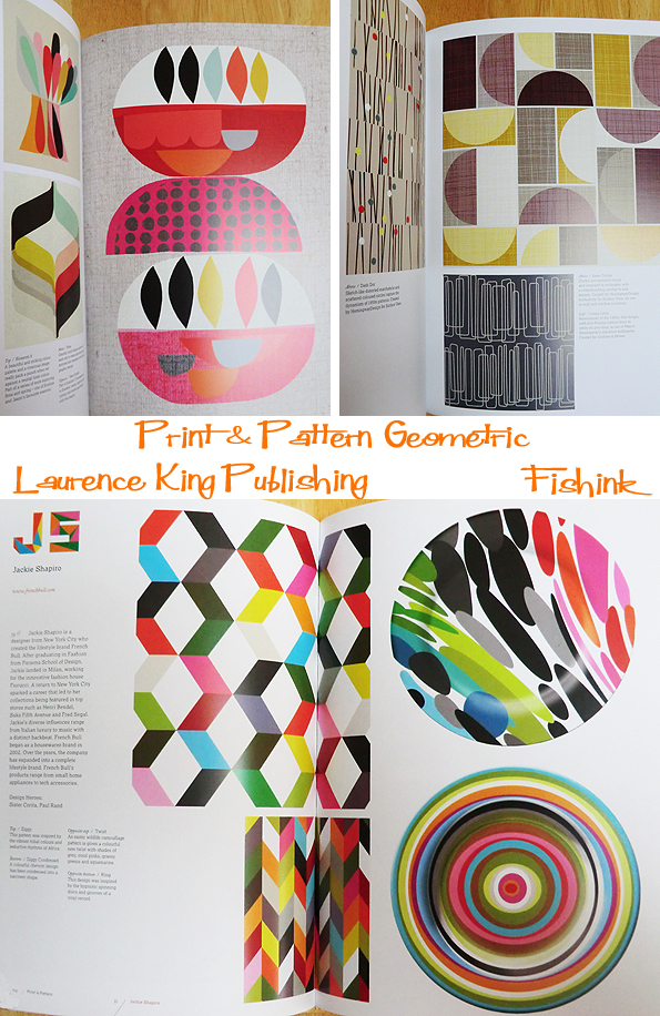
A final touch of delicacy from Anne Waters. There’s over 100 illustrators in this edition alone !

Released this month and with 460 colourful illustrations, this volume is an invaluable source of reference and inspiration for surface designers, designer-makers and craftspeople, graphic/textile designers and illustrators alike.
Marie’s other titles are still available too and they certainly make a superb modern-day collection.
Get your Geometric copy here today.

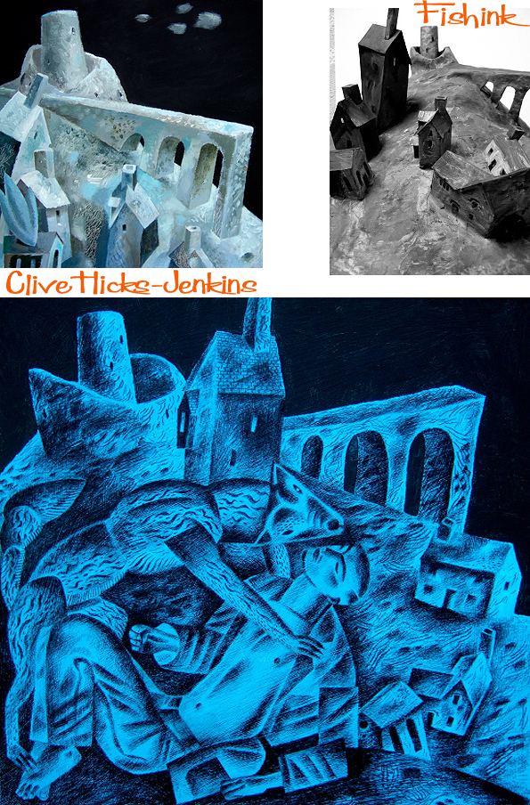
Clive Hicks-Jenkins Painting Man and Beast
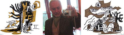
Clive Hicks-Jenkins was born in 1951 in Newport, South Wales. From his early twenties until his mid thirties, he was an actor, choreographer, director and stage designer, creating productions with leading companies. He moved back to Wales permanently in the late 1980’s to concentrate on his work as an artist. You can read more about Clive’s early days here. I have been dipping in and out of his truly amazing Art Blog on and off for the last couple of years, and finally got around to contacting Clive recently to more fully discover, the man behind the art.
What is your favourite medium to work with and why ?
I came to painting very late. I was past forty when I picked up brushes. I dabbled with oil, but while I enjoyed the feel of it, the drying times drove me crazy. I was and still am a man in a hurry. I began with acrylic inks, because I thought the available colours were interesting and the bottles were portable to carry for field-work. The inks were formulated for airbrush work… though I used them with brushes… and are difficult to handle in all sorts of ways. The colours vary from transparent to dense via various degrees of opacity. The pigments separate from the medium in a silt-like manner, and there is a lamentable tendency for them to pool and dry in sticky patches. But by gosh the damned things taught me how to paint, and once mastered, I turned out some terrific work. Most of it small to medium. (Those inks are not easy to handle on a large scale.)
My day to day paint of choice is a heavy-bodied acrylic brand called Golden. The pigments are excellent. There’s first-class technical support from the manufacturers, and moreover continuing research in the improvement of the product. These people don’t rest on their laurels. When I had problems with supply I wrote to the managing director in the US, and got a personal reply and the help I needed.

Who (if anyone) would you count amongst the artists who’s work has inspired you ?
I have a soft spot for the artists I was looking at when I was growing up. Keith Vaughan, Winifred Nicholson, Christopher Wood, Barbara Jones, Ravilious and Nash. My work had a Neo-Romantic feel when I began, and though there are vestiges of it still occasionally present, ultimately that was a blind alley for me. Of course I am mad for modernism, with Klee, Braque and Calder ever-present inspirations. German Expressionism does it for me. That appeals to my dark and bleak side. Historically my passion is for the early Renaissance. Not a great deal interests me after that until we get to the twentieth century, the exceptions being Turner, Samuel Palmer and Stubbs. Stubbs is a god !!!!

Can you briefly explain where the inspiration for some of your subject matter has derived. Saints and their Beasts etc. Do these images begin life as researched areas of interest for you or maybe start through commissions ?
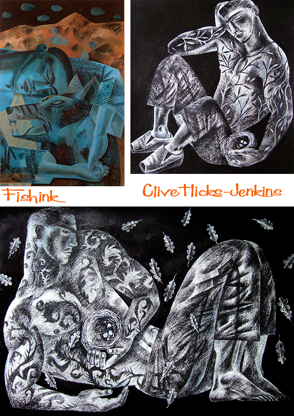
I’m interested in the interface of animals and humans, and particularly in the stories about so-called miraculous interventions. I came to Saint Kevin and the Blackbird through the poem of that title by Seamus Heaney. (Poetry is a crucial source of inspiration for me, and I work with poets a lot.) I have no religious faith at all, and so my focus is the relationship between animals and humans, though of course I love the stories which are my sources. Hervé and the Wolf for instance. The stories imply that God in some way changed the nature of the wolf so that it transformed from a ravening beast to the saint’s companion. But for me there is nothing miraculous in the relationship between a wild animal and a man or woman. No crackling bolt of lightning from God’s finger to the beast’s heart. An interspecies relationship may be unlikely, or confounding or startling, but we all know they happen. What are they built on? Love? Dependency? Emotional succour? I don’t know, but when I paint, I feel that I move toward understanding.
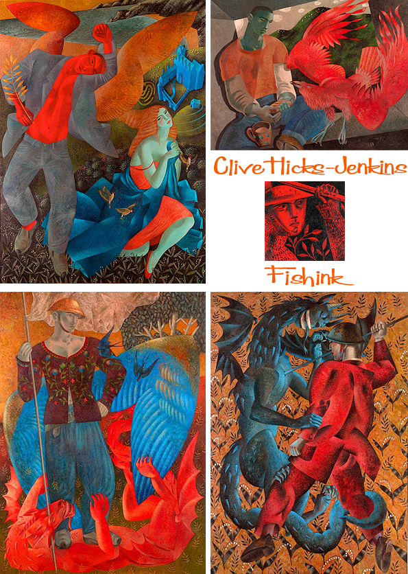
I love the detail in your work, especially the floral repeats behind your subjects (as in ‘Battle Ground’ and ‘Leap’). I sense that his has almost become a trademark in your work and wondered if it derives from earlier paintings that you’ve observed (William Morris or Burne Jones perhaps) or is a style that you’ve developed over a longer period and is now purely just the way that you create ?
Definitely not the Pre-Raphaelites, for whom I have no liking. It’s the early Renaissance for me, all those flower-diapered meadows and Tuscan landscapes with hillsides like twists of meringue, make my pulse race. That’s the source from me, the spring from which I drink.

How important is the sketchbook to your work and the way that you formulate ideas ?
Drawing is everything. EVERYTHING!
I draw obsessively. For me the work is not done until I have observed and drawn the subject until it is imprinted on my brain and I can draw it from the heart, with no other reference. Like an actor learning lines. Until I learn the lines, I can’t play the role.
Here’s some of Clive’s private sketchbook work.

Some more pencil and ink sketches.


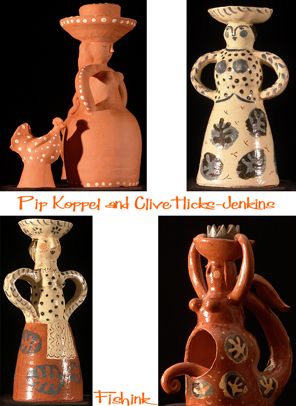
Clive told me ” I have worked with ceramics. I spent time with the ceramist Pip Koppel, who’s a close friend. She threw and I decorated. It was just a bit of fun, and we made mostly stuff for the kitchen of the house my partner and I were about to move into. Lots of slip-trailed ware. I made a ‘foliate-head’ dinner-service, and lots of decorated bowls and jugs. Simple little figurines of animals too. All quite primitive and lively.
I love this selection of still life paintings, obviously taken from artefacts around Clive’s home.
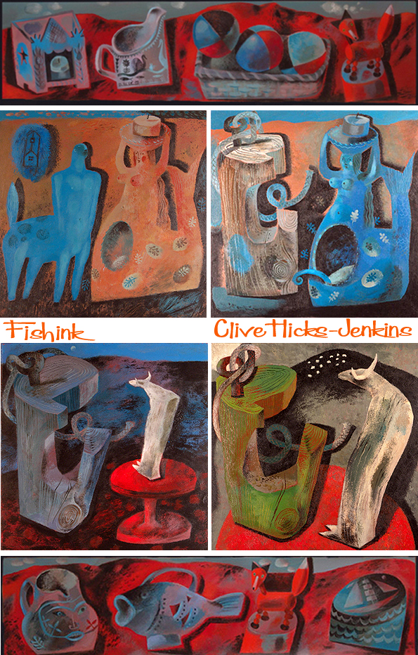

I was bowled over by the painting (below) called “The Catch” with the fisherman supporting a nautilus shell tattoo. The starting point for which was a Penparc Cottage mug from Gwili Pottery, the same cup can also be seen in one of the still life paintings (above). Here’s a photo of the original, I don’t know why, but I really like it when objects and designs are reused in an artist’s work, perhaps it gives me a weird feeling of reassurance, if that makes sense !


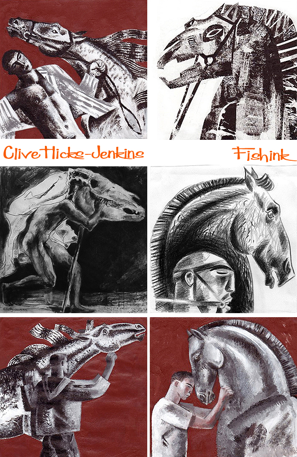
Clive has a love of folk lore, the written word, novels, plays and poetry. All of which often inspire his work. Clive says ” My exploration of the roots of my father’s fear of the Welsh hobby-horse tradition known as the Mari Lwyd, and the persistence of that fear throughout his long life right up to his death, made a startling debut exhibition for me. The venue was an appropriate one, as I was born in Newport and my father lived there all his life.”
Below Clive also considers ‘The Mare’s Tale’ and ‘Equus’ as inspirational starting points.
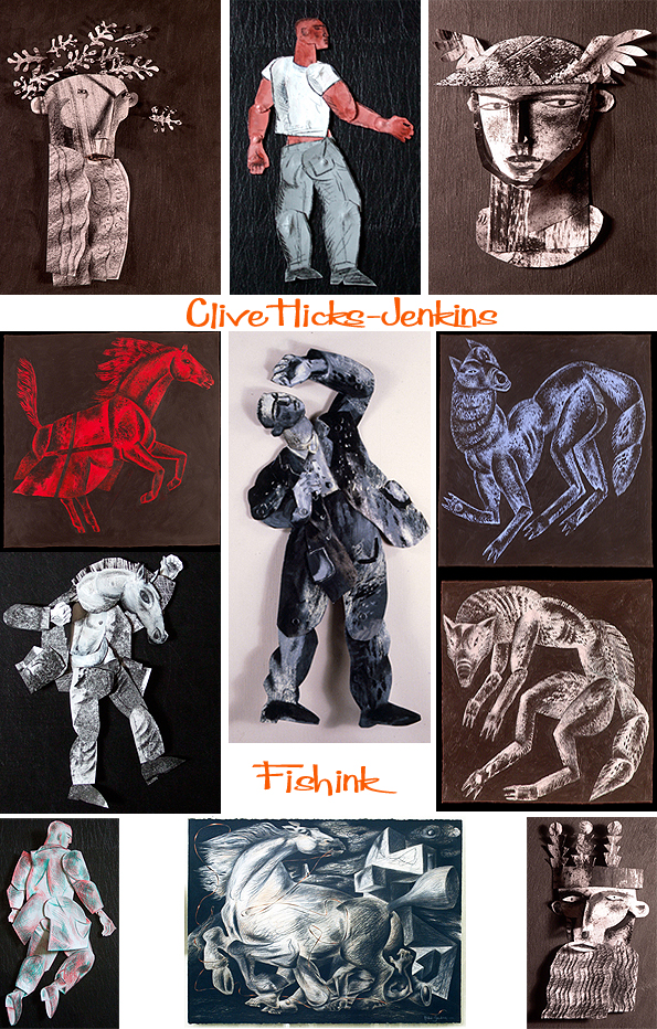
Some of Clive’s work also translates into puppetry and you can find instances on his blog where he shows theatrical stage sets which possibly hark back to his early beginnings as an actor.
Have you ever considered making a film, documenting the way that you work, or films of your puppets coming to life ?
Pete Telfer of Culture Colony has made a couple of documentaries about my work with maquettes. You can find some of Clive’s here
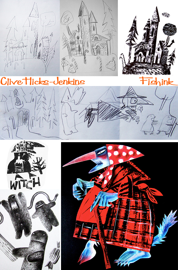
I read that you are in the process of creating a book with Simon Lewin of St. Judes about Hansel and Gretel. Are there other fairy stories that you would like to explore ? ( I see that you’ve touched on Alice in Wonderland and possibly others already)
Well first let me say that I adore the European illustrative tradition, and I’m a sucker for the Polish and Czech traditions of book design. (I won’t make a cover for a book these days unless I can make the lettering too!) Although I get asked to make book covers and chapter headings by the writers who I work with regularly, and recently I’ve had enquiries from further afield, I don’t think of myself as being an illustrator, but as an artist who occasionally gets asked to make pictures for books! The Hansel & Gretel project came from left of field, and it’s a wonderful opportunity to get very dark indeed, because it’s not a children’s picture book, but a book for people interested in art. Perfect.
Below is Alice with a crab. I feel that the simple, flat colours, work so well contrasted with the dark pencil markings, to help create both depth and form.

If you could illustrate any book at the moment, what would it be ?
I have long harboured a desire to make an illustrated edition of the Ramuz libretto for Stravinsky’s L’histoire du soldat.
Clive has also recently been inspired by the theme of Stravinsky’s The Soldier’s Tale, in which Joseph the soldier unwittingly makes a pact he’ll come to regret. Last year Clive Hicks-Jenkins was commissioned to make an animated-film to accompany a performance of The Soldier’s Tale at the Hay Festival, and his new paintings further exploring the story were at the heart of this, his first solo exhibition at Oriel Tegfryn.

Looking through (just a small part) of Clive’s rich and varied body of work, I still find myself being drawn to the work that ties together Man and Beast. For animals play such a huge part in so many artists (and non artists) lives, that seeing their portrayal with ourselves on canvass, somehow helps to make that bond draw closer still.
Inspired by a Seamus Heaney poem, Clive has created these beautifully observed and formulated paintings. I love both their colouration, texture and dare I say it, small nod to the likes of Nash and Ravilious too.


Any other new plans and projects that you can tell us about ?
I’m working on a tattoo project. Eight ‘collaborators’ are discussing their ‘dream’ tattoos with me, and I will make bespoke designs that they’ll then have inked. The exhibition, which will be at the Martin Tinney Gallery in Cardiff in 2016, will consist of the original designs, photographs of the collaborators being inked, and portraits I plan on painting of them with their tattoos done. It’s called Skin/Skôra, reflecting the fact that the first three collaborators to commit to the project were Polish.
The other project that’s in the pipeline, is Beastly Passions. I’m making paintings of ‘imagined’ Staffordshire pottery groups that initially look quite traditional, but when you look closely are contemporary tabloid stories reinterpreted in the picturesque Staffordshire style. Murders and mayhem aplenty. My collaborator is the American poet Jeffrey Beam, whose creating verses to go with the paintings. I’ve long wanted to work with him.
Clive’s work has been selected for several prestigious institutions, including the Royal Academy. Clive was winner of the Gulbenkian Welsh Art Prize in 1999, runner-up as Welsh Artist of the Year in April 2000, and in 2002 received a Creative Wales Award from the Arts Council of Wales. His solo exhibitions have been reviewed in Modern Painters, Art Review, Galleries, Planet and the BBC Wales series Double Yellow.
I want to say how much I have enjoyed assembling this post and admiring Clive’s work. Many thanks to him for his well considered replies to my questions and for giving so generously of his time. Please do take a moment to look back over his Art Blog, I can’t praise it enough for it’s detail and descriptive/ visual delights. I’m sure you’ll find something of interest for each and every one of you.
On the following day to the release of this post, I got a fab surprise through my letterbox .. Many thanks Clive, what a very generous gift !

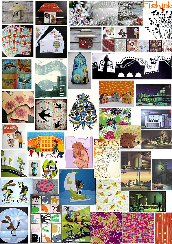
Mid Week Mix 2
Welcome to week two of a new feature that I’ve decided to regularly add on a Wednesday. I’ve called it….. the ‘mid week mix’.
Since about 2008, I’ve been collecting images from the internet that have caught my eye. Way back then, I wasn’t so diligent in keeping records as to where images came from, or who had painted, photographed, illustrated or indeed created the artwork in the image. So I apologise in advance for their lack of referencing, but to be honest, it was purely about seeing groups of imagery together, that for whatever reason, I enjoyed.
As I have managed to amass quite a few of these ‘collaged sheets’, I thought I would share them with you, in the hope that they may also provide some inspiration to you the readers, from their shape, colour, texture or out and out randomness : )
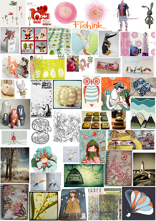


Do let me know your thoughts and which images catch your eye for whatever reason. Enjoy !
The Whitaker Museum and Art Gallery

I was fortunate to find myself in the Rossendale area last week and popped into The Whitaker, as I’d passed before but never previously had the time to stop and visit and was so glad that I did.
The Whitaker Museum and Art Gallery was built in 1840, called Oak House, it was the private residence of Mr George Hardman. The estate was originally over 28 acres, having cottages and farms within it. George, earnt his living in the woollen trade, becoming a partner in Hoyle Ashworth & Co’s Newhallhey Mill. In 1849 that company was dissolved and became George Hardman & Son. When George died in 1852, it was taken over by his three sons. The business had connections to the Hardman family up to the 1950′s, but Oak House and estate was sold in 1896 to the Whitaker family.

What a welcome from these decorative tiles and ornamental glass engraving ! Views of the local mills and something for all ages.
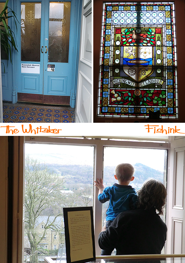
Mr Richard Whitaker came from Rawtenstall, at work from the age of six, he even spent some time at George Hardman’s mill. Moving on, he rose through the ranks to managerial level. However, he never forgot his origins, and his sole aim on purchasing the Oak House estate was to establish parks and playgrounds for the people and children of Rossendale. The 28 acres were then laid to park at Mr Whitaker expense, at a cost of over £4000.00. A number of playgrounds, ornamental gardens and paths were put in, including the fountain that still stands in front of the museum.
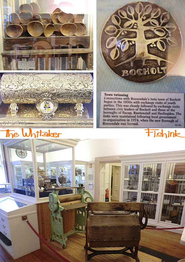
These drinking jugs and cordial jars came to life with their either whimsical or stern characters.

The museum collections were acquired from a number of local sources, to create a museum of general interest. The first curator, also the local librarian, was a Mr Hargreaves Wilkinson, under his auspices the museum and its collection slowly started to develop. Initially on the first floor and in two rooms downstairs, display space was always at a premium. In the 1930′s the displays did expand, and the collections were slowly added to.

I couldn’t help but notice this gem entitled David Whitehead Ltd, Lower Mill, Rawtenstall by non other than John Piper ! There’s an impressive room housing an array of stuffed animals, including a small elephant, a tiger grappling with a python and a huge collection of birds.
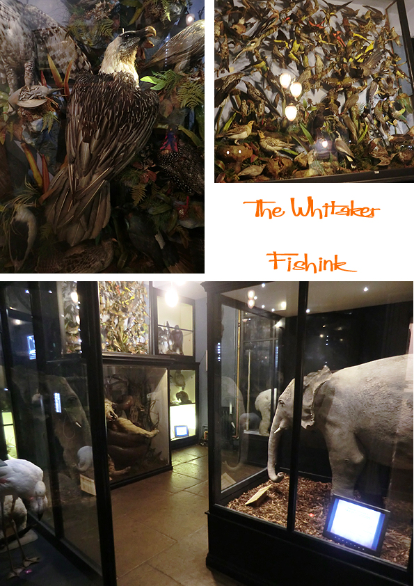
The museum collection now encompasses fine art, decorative art and furniture, ceramics, glassware, archeology, geology, natural history, numismatics, costumes and textiles, local social history, arms and weapons, handling and learning collection.
In 2013 The county council decided it could no longer fund the museum and so The Whitaker Group stepped in to ensure the museum stayed open for the people of Rossendale. The museum aims to remain true to its original 1902 declaration to educate and enlighten the people of Rossendale, providing a focus for learning and cultural activity into the 21st Century. How fabulous that this museum is still going strong and if you’re in the area, I’d also recommend sampling the best coffee and orange and chocolate marble cake for miles around ! I did and buzzed all the way home lol

You can find the Whitaker at Whitaker Park, Haslingden Road, Rossendale, Lancashire, BB4 6RE, Rawtenstall. Opening times on their site here.
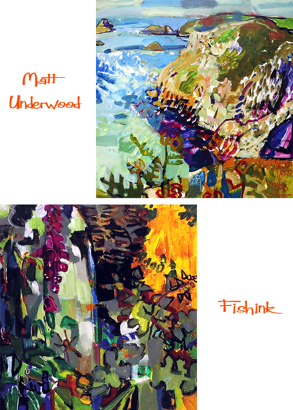
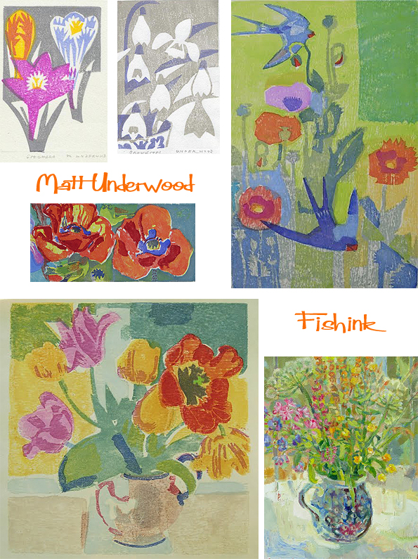
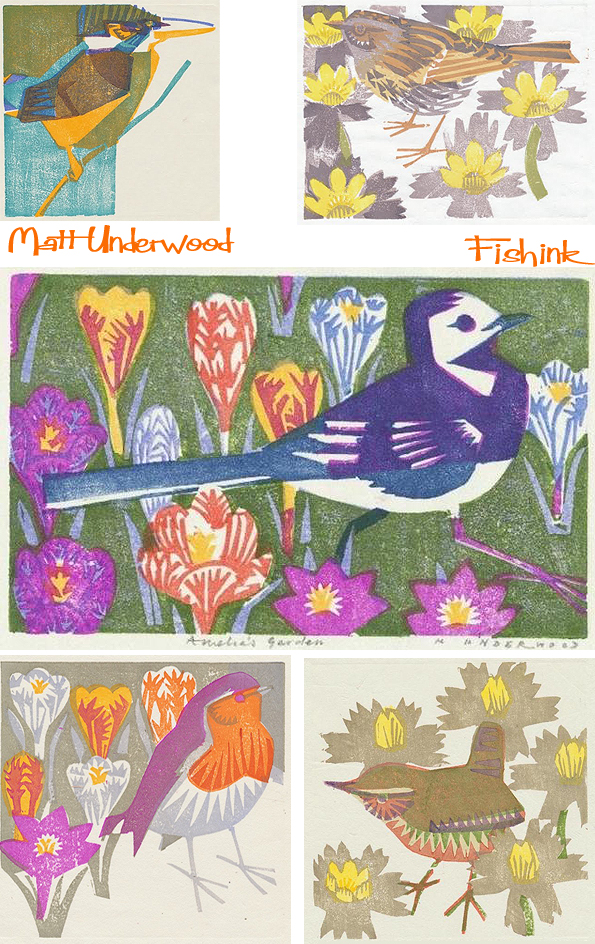
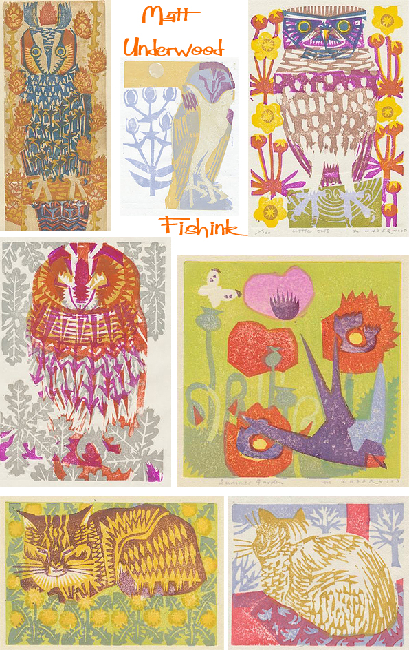
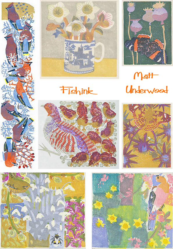
Matt Underwood Nature’s Artist
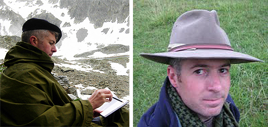
I’m guessing that Matt Underwood is a man who spends a lot of his time amongst nature. Born in 1971, Matt’s curiosity about natural history lead to him drawing and keeping sketchbooks from an early age. He went on to study art and art history at Salisbury College of Art and then to Carmarthenshire College of Art to study wildlife illustration, completing his HND in illustration with a distinction. He creates beautiful artwork in a few different mediums. Paintings …
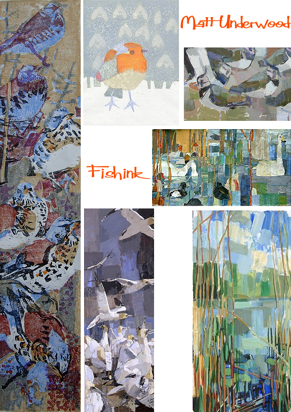
Which often come from his observational sketching and watercolours.

He is involved with The Artists for Nature Foundation (ANF) which is a unique non-profit organisation that aims to combine art, nature conservation and education through the work of some of the world’s finest contemporary wildlife and landscape artists.
Matt is also well known for his love of painted miniatures, he paints within a 10 by 10 cm border and even makes the gilded frames himself. Realising that his long name takes up a lot of room on such a small space, he signs them simply with an ‘M’.
He says ” I’m very fond of Dutch still life paintings and like the way that butterflies, wasps, snails and bees seem to wander into them. It’s something I like to do too, so I often include small creatures that visit me while I paint. Landscape painting has always fascinated me. I like to get a feel for the place before I begin to paint, many of my landscape paintings are of places that I know well or are places that I’ve enjoyed exploring. My miniature paintings are widely collected and I’ve had successful exhibitions in Amsterdam. I’ve also exhibited at The Medici Gallery, The Llewellyn Alexander Gallery, and The Royal Academy Summer Exhibition. Here’s a selection, and you can view more here.

For me his purest work is captured in his softly multicoloured wood block prints. I love the textures and woody graininess that appears amongst his flowers and birds.
This wren reminds me of some of the Polish matchbox covers I’ve seen in the past. Great colours.
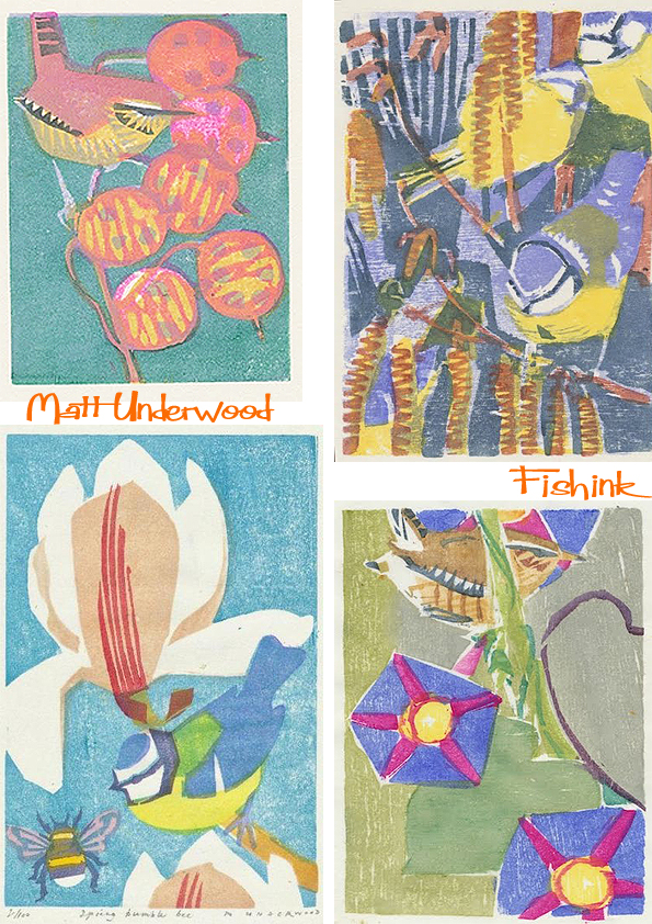
Misses Dunnock, the Robin, young Wren and the Owls, I’ve too many favourites !
I caught up with Matt to ask him a few questions.

How much of your time do you spend outdoors, sketching and painting ?
Many thanks Matt for answering my questions and agreeing to show your work on Fishink Blog.
You can find some of Matt’s fabulous prints over on his Folksy Site.
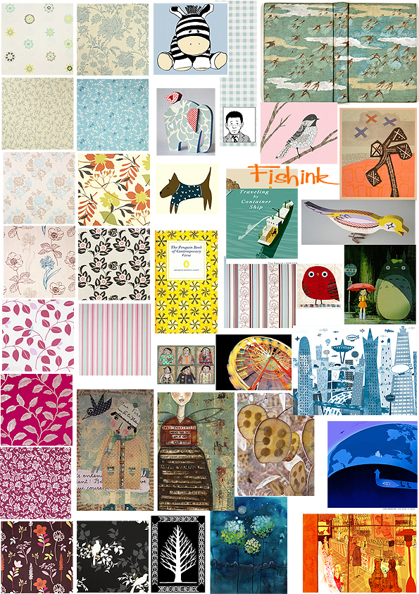
Mid week mix
Welcome to a new feature that I’ve decided to regularly add on a Wednesday. I’ve called it….. the ‘mid week mix’.
Since about 2008, I’ve been collecting images from the internet that have caught my eye. Way back then, I wasn’t so diligent in keeping records as to where images came from, or who had painted, photographed, illustrated or indeed created the artwork in the image. So I apologise in advance for their lack of referencing, but to be honest, it was purely about seeing groups of imagery together, that for whatever reason, I enjoyed.
As I have managed to amass quite a few of these ‘collaged sheets’, I thought I would share them with you, in the hope that they may also provide some inspiration to you the readers, from their shape, colour, texture or out and out randomness : )
Vespa Visions

Happy Monday everyone.
After recently watching half of the final series (7) of Madmen, and whilst eagerly awaiting the next 7 episodes, I’ve been missing my hit of the 1950’s/1960’s retro vision. So I decided to buy the series ‘Pan Am’ to see if it matched up to Madmen. Sadly, whilst it has been enjoyable viewing for it’s nostalgic look at the era, it doesn’t quite compete with Madmen’s complex characterisation and amazing sets. Also I couldn’t believe that the series has been compiled rather badly and that the episodes have to be watched in this sequence (1, 4, 3, 2, 5 ..to.. 14) in order for the story to make sense (erm yeah, scratches head). However, I’m so glad I discovered that fact before I started watching them ! Anyone interested in the background to the Pan Am series should look here.
I came across this illustration of a stewardess riding her Vespa to work and thought I’d check out a little about this ‘uber cool’ vehicle and see how it’s been depicted through old adverts. I discovered some great illustrations.

I love the ‘wind in your hair’ feel of this first Pirelli for the scooter ad.

This family going for a holiday jaunt also made me smile.
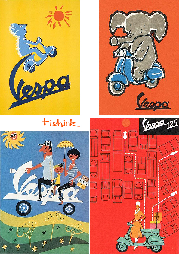
Vespa’s are so easy to park and even come in shades of red, orange and ‘invisible’ : )

Also featured in the movies, the Vespa has iconically been used as a cool way to get around. From the absolute classic ‘Roman Holiday’ to ‘Quadrophenia’, ‘Ratatouille’, ‘ The Curious Case of Benjamin Button’ and ‘Amilie’, amongst others.

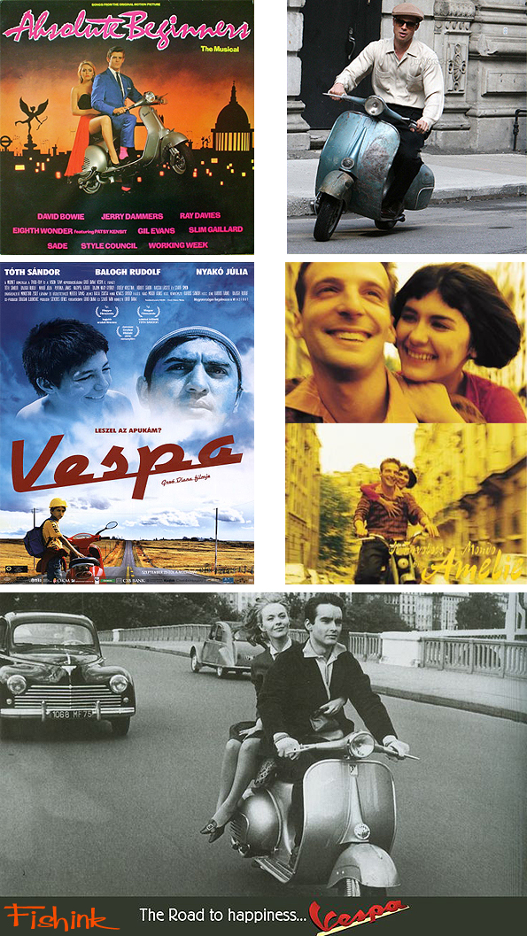
More about Vespa on their official site and more the airline Pan Am here. Does anyone out there own a Vespa ?
or perhaps have any other (‘ Madmen quality ‘) retro recommendations for a tv series to watch ? : )
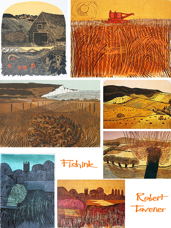
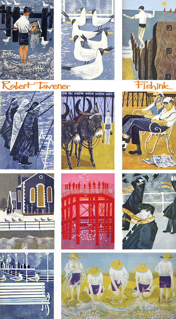
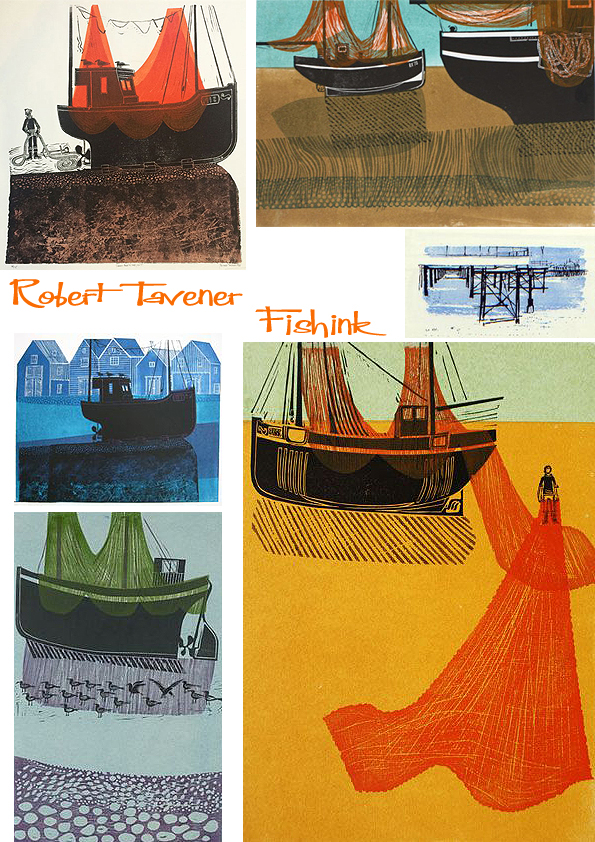
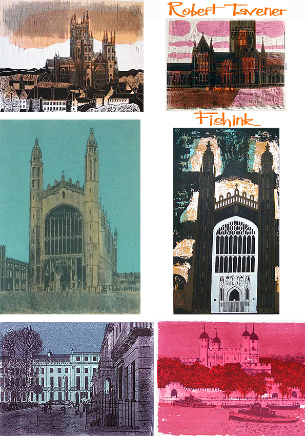
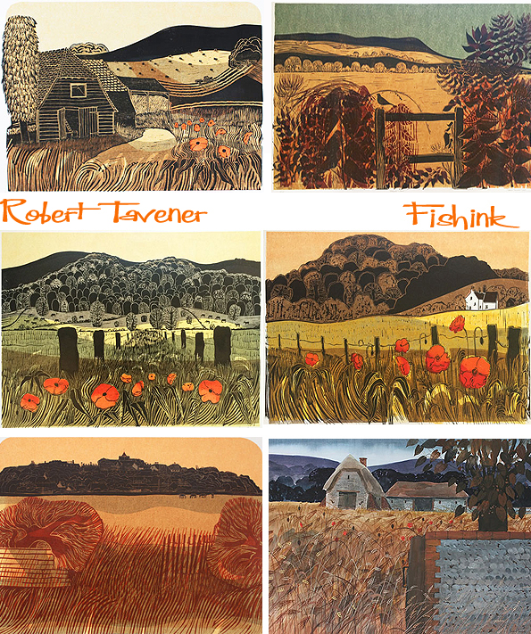
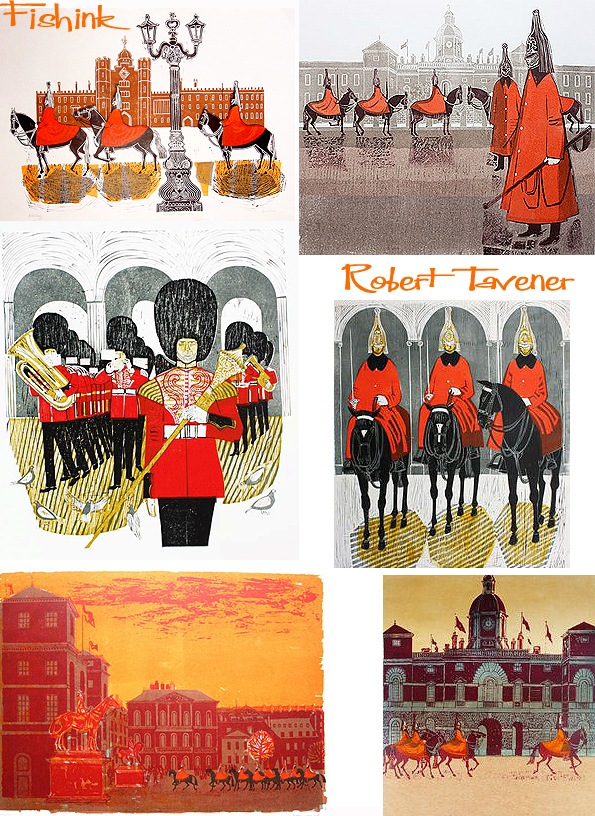
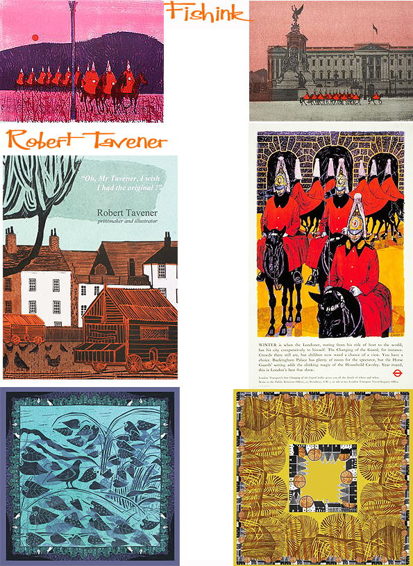
More Robert Tavener

I first featured the work of the talented artist, printmaker and water-colourist Robert Tavener back in 2010. Since then I’ve been surprised how many of my searches over the years seem to uncover an illustration by him, that I decided to cover more of his beautiful work.
Born and brought up in Hampstead, north London, Robert Tavener had always enjoyed art. As a boy he sat for hours making chalk drawings on the pavements. After school he took an office job for a short time before being called up into the army in 1940. He served in the Royal Artillery for six years and in the Second World War took part in the D Day landings at Arromanches, France. It was at the end of the war, whilst still a soldier, that he had the opportunity to pursue his love of art. For eight months, he studied drawing and painting at the College of the Rhine Army. This experience confirmed his wish to study art. On his return to London in 1946 he enrolled at Hornsey College of Art. Here, Robert took a National Diploma in Design, specialising in lithography; he also gained an Art teachers Diploma.

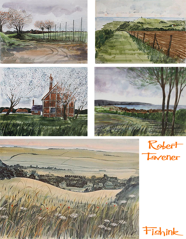
After college, Richard began his career as an art teacher, teaching for a few years in Kent. In 1953, now married, he was delighted to get a job teaching printmaking at Eastbourne College of Art and Design. He and his wife Jane, and later a daughter Mary, set up home in Eastbourne, the place he was to spend the rest of his life. These seashore illustrations are beautiful, really captures the atmosphere.
Robert soon set up a highly regarded printmaking department at Eastbourne College of Art. His success and reputation grew and he was invited to teach printmaking at St Martins School of Art in London for a day a week, which he did for several years. During this time he also worked as a freelance illustrator and received commissions from important clients such London Transport, Shell, the BBC and ICI.
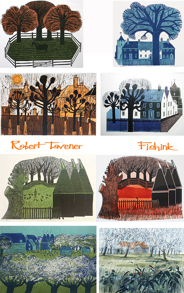
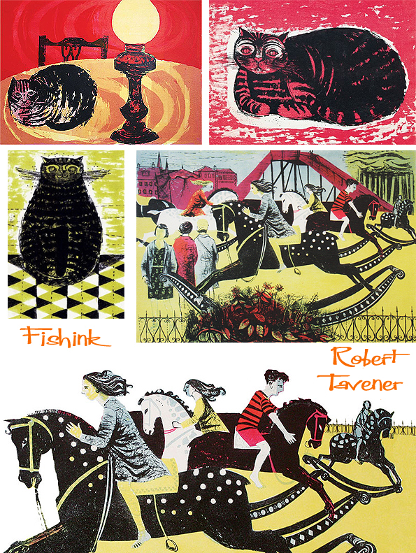
He became a well known illustrator designing front covers for Homes and Gardens magazines, the Listener, and Liliput as well as hundreds of illustrations for childrens books by publishers such as Longman, Penguin, and Methuen images people often remember seeing if they were at school in the 1960s. His output in printmaking was prodigious. He produced most of the prints, mainly linocuts and lithographs, on an old Albion Press cast in 1882.
Making each print himself by hand, printing them in small limited editions. He described his work as: English countryside and English architecture. Shape, pattern, colour, texture, design. “In other words, my subject matter is a personal interpretation of the richness, variety, beauty, and the underlying relationship with the past, of our landscape and building.” He particularly loved the Sussex landscape and it influences much of his work. His images of the Downs, the farmland, the Sussex villages and the Sussex seaside were very important to him.
His poster designs for London Transport in the 1960s are striking examples of his work. The poster of the Horse Guards from 1967 invites people to visit London and see the changing of the guards, the clinking magic of the household cavalry. He then produced a series of linocuts and lithographs of the horse guards some of his most bold and colourful prints. A number were purchased a couple of years ago for the permanent collection of the Palace of Westminster Collection.
In the Emma Mason Gallery you can find some wonderful prints, silk scarves and even a colouful book on Robert’s work.
Robert went on to became Vice-Principal at Eastbourne College of Art where he worked until he retired in 1980. He continued making prints until the late 1980s when the printing press became too heavy for him to use. Then he started to paint in watercolour. His prints have become highly collected and his work is held in more than 25 public collections including the Government Art Collection and the Victoria and Albert Museum. He held over 35 solo exhibitions during his career and exhibited at the Royal Academy Summer Exhibition every year for 34 years. A few years before he died he left a collection of his work to the Towner Art Gallery in Eastbourne.
Robert Tavener died in July 2004 after suffering a fall at his home. Since then his world wide audience of admirers has continued to grow, myself included.
Many thanks to Emma Mason, for her biography (above), her dedication to Robert’s work and for showing us his amazing illustrations in the first place.
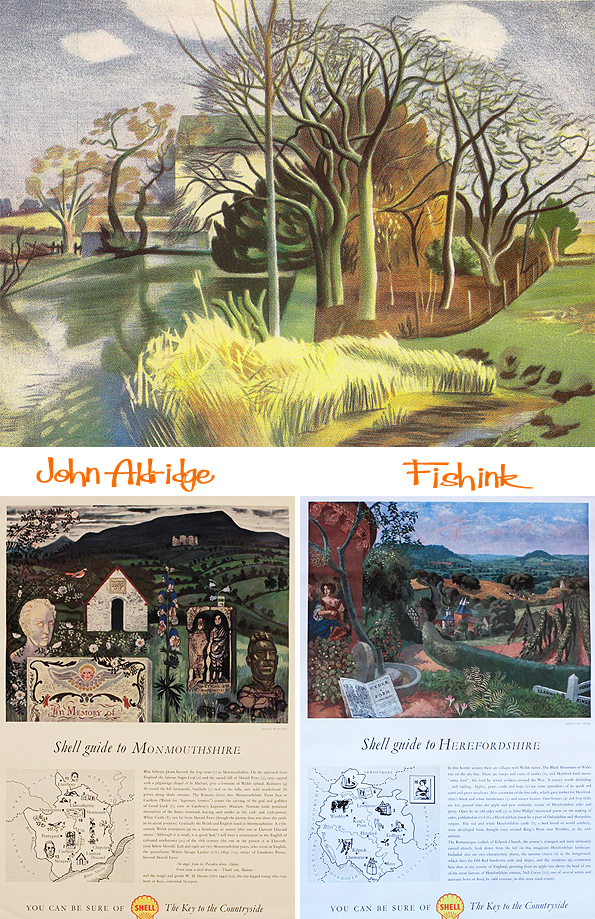
Photos by Geoffrey Ireland/ Edward Morgan
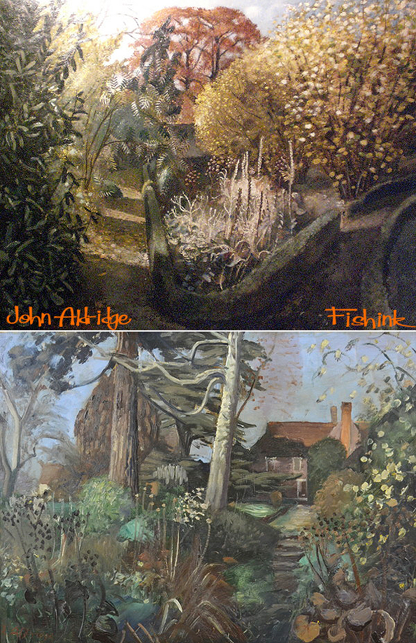
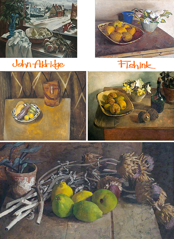
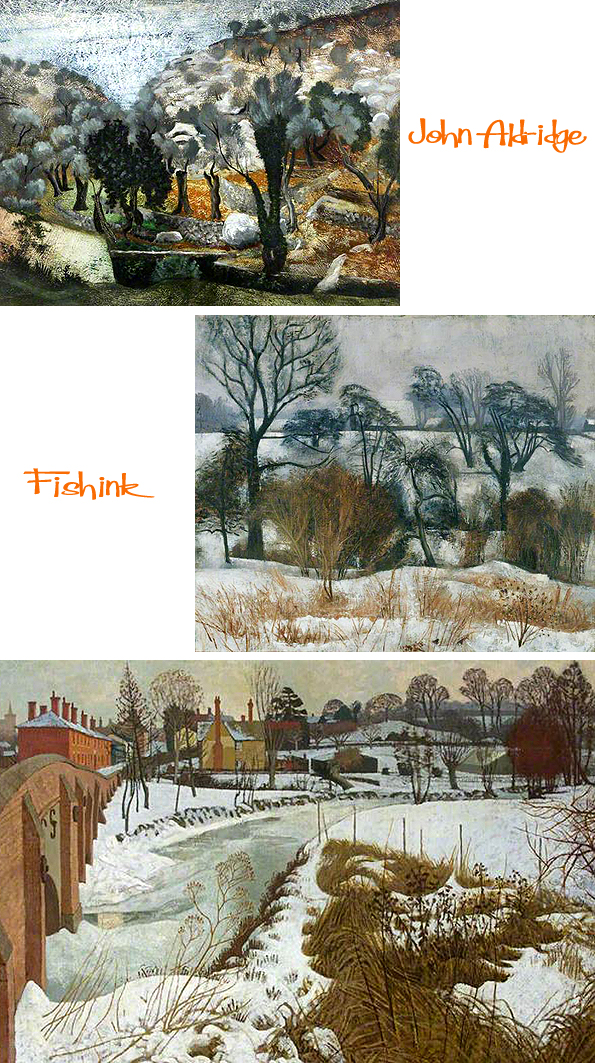
John Aldridge was born in 1905 in Woolwich, England, and grew up in a comparatively wealthy military family. After attending Uppingham School in Rutland, he studied ‘Greats’ at Corpus Christi College at Oxford University and graduated in 1928 with a Bachelor of Arts degree. After finishing university, John settled in London, taught himself to paint and held his first mixed exhibition in 1931.
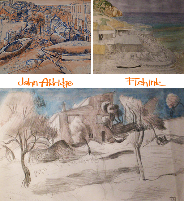
Aldridge exhibited with the ‘Seven and Five Society’ at the Leicester Galleries from 1931 to 1933. In 1933, he presented his first one man-show at the Leicester Galleries in London and in 1934 he exhibited at the Venice Biennale art exhibition in Italy. During this period and for the rest of his life, Aldridge associated with the British poet Robert Graves and the poets and artists centred on him in the village of Deià, Mallorca. In 1933, at age 28, Aldridge, and his cats, moved to Great Bardfield in the Essex countryside and acquired ‘Place House’.
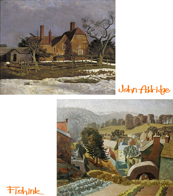

He quickly became a friend of his neighbour, Edward Bawden, himself a painter. Bawden who, with his friend Eric Ravilious, discovered Bardfield a year before the arrival of Aldridge and dominated the scene there for almost four decades. Bawden and Aldridge collaborated in designing ‘Bardfield’ wallpapers during the later 1930s, which were distributed by Cole & Sons, a British wallpaper company, (some examples below discovered on the V&A Collection site).

In 1941, Aldridge joined the British Intelligence Corps as an officer interpreting aerial photographs. After leaving the army in 1945, Aldridge returned to landscape painting.
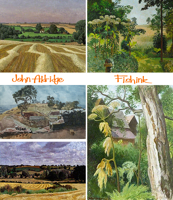
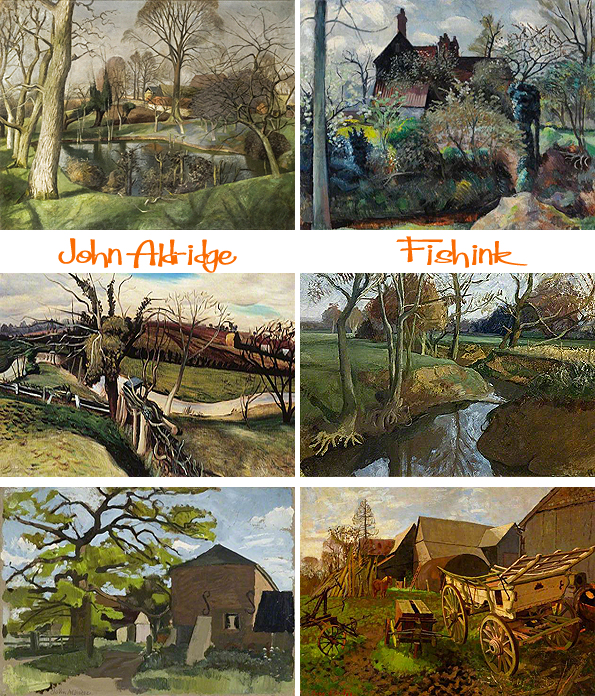

Although he was a skilled ‘plein air’ painter, many works were produced in his studio at his home; his subjects were the Essex countryside, scenes from his many visits to Italy and to Mallorca, and his much-loved garden at Place House.
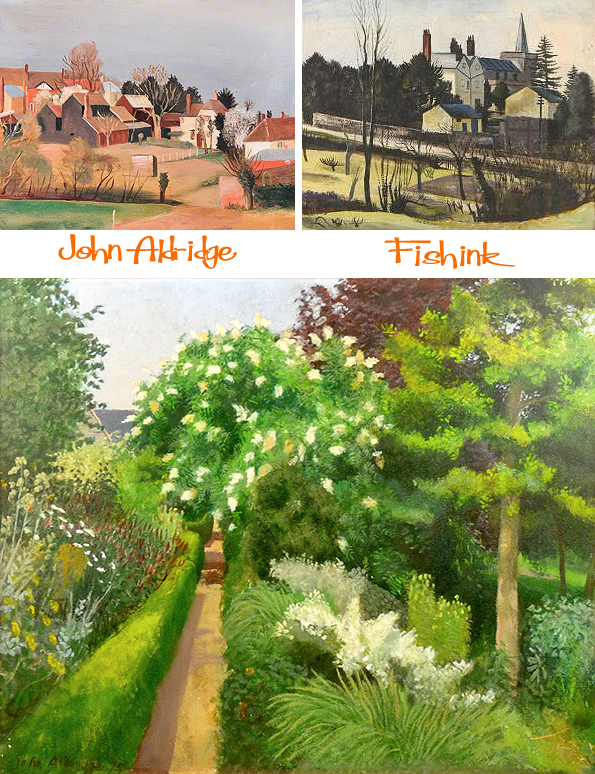
Starting in 1949, Aldridge taught at the Slade School for Fine Arts of University College London, under the realist painter Sir William Coldstream. At the same time, other artists started moving to Great Bardfield, making the village a dynamic centre for the visual arts. Aldridge and his wife Lucie Aldridge (née Brown) frequently opened Place House for summer exhibitions in the village. These well-organised shows attracted thousands of art lovers. In 1955, Aldridge told an London Observer reporter that “people seem to prefer this domestic informality to galleries”. At these summer exhibitions, Aldridge exhibited his oils while Lucy exhibited her hand-knitted rugs. Although Aldridge’s work was well-received, it seemed the most conservative of the Great Bardfield Artists as it possibly reflected the art scene of the 1920s and 1930s in Britain.
The early 1960s saw the Bardfield art community fragment but Aldridge would remain in Place House until his death. After his 1970 divorce, Aldridge married Gretl Cameron, the widow of his poet friend Norman Cameron.
In 1980, on Aldridge’s 75th birthday, London’s New Grafton Gallery held a retrospective on his work. He died in 1983, his wife Gretl having deceased a few months earlier.
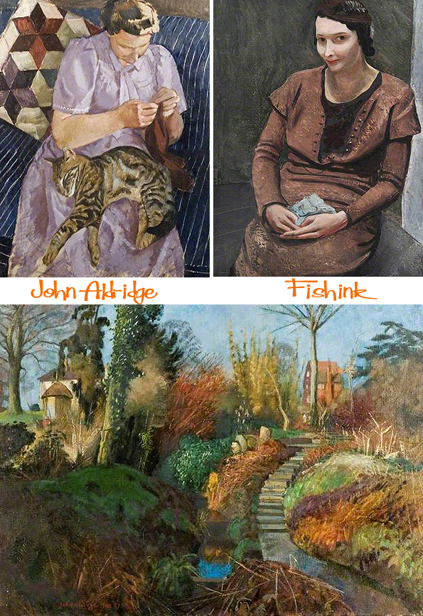
What a talented artist. What do you like about his work ?
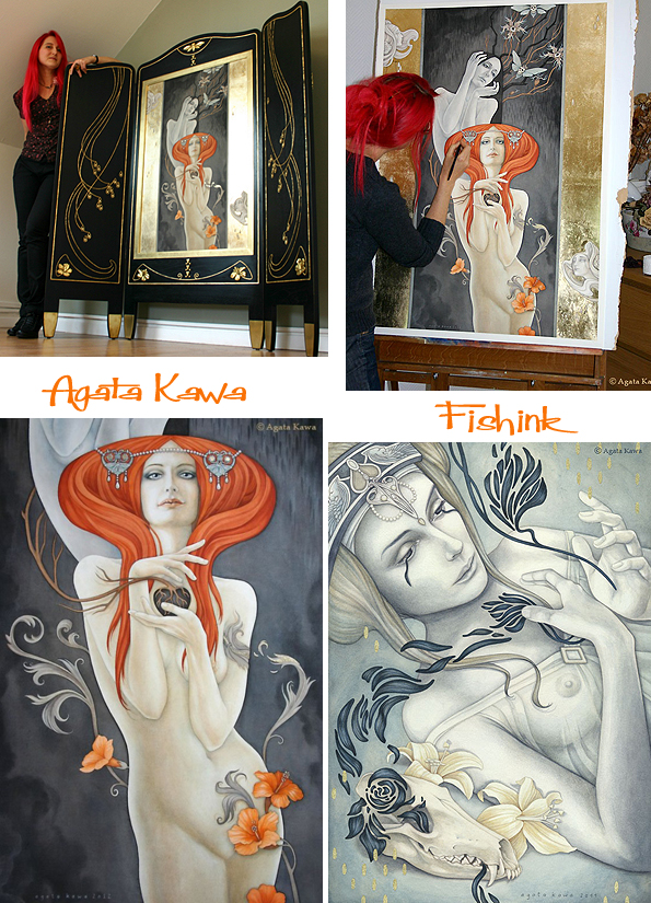
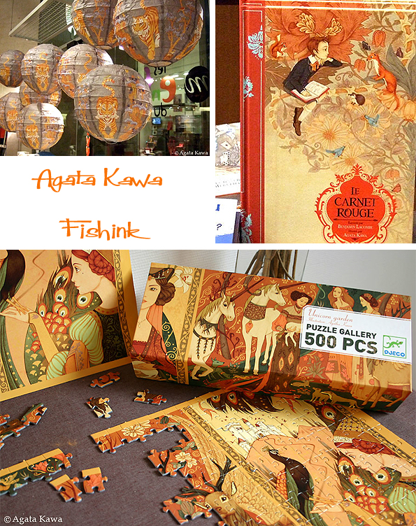
Agata Kawa Reviving the Arts and Crafts
Good morning / evening everyone (depending where you might be reading this ! ) and a big welcome to 2015 on Fishink Blog.
I hope you have had a fab festive break and are now ready to embrace the new year. Thank you for finding your way back to me, do please continue to comment and spread the word about my blog because without you things just wouldn’t be the same. I do appreciate your comments and thoughts, ideas and suggestions so keep them coming too.
Ok that said I’ll introduce our first post this year… enjoy : )
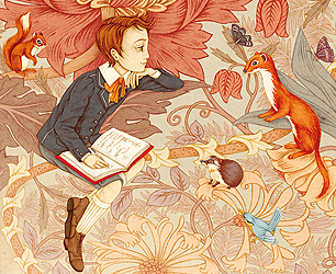
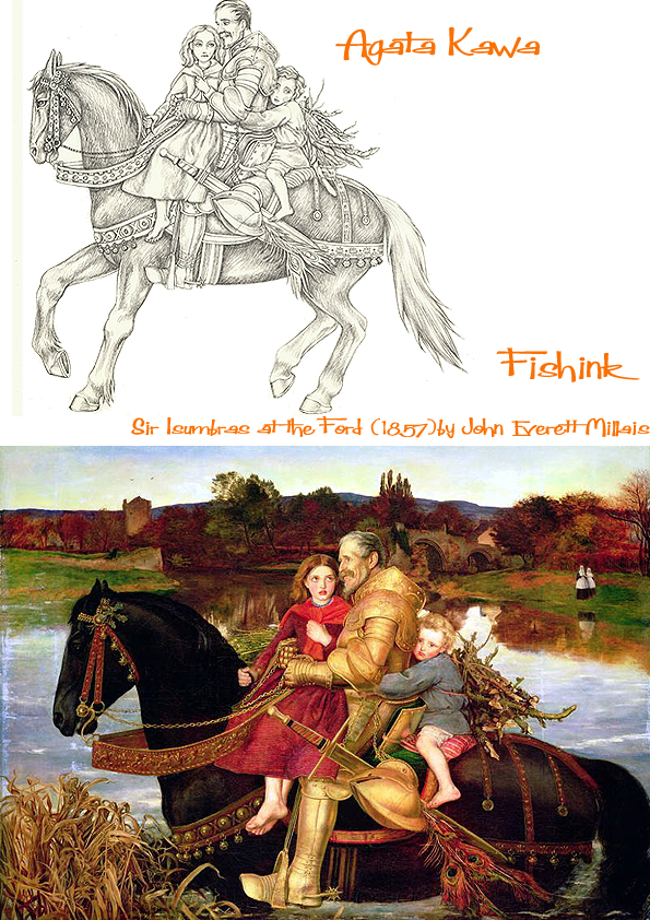
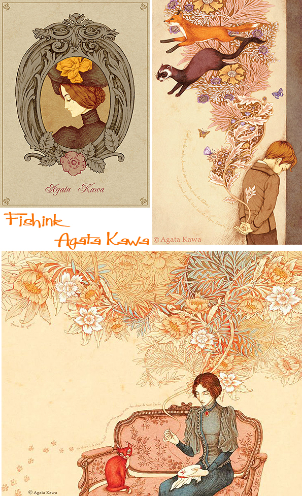
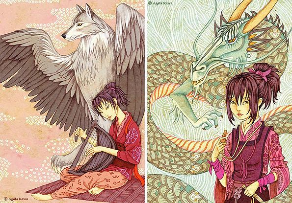
Agata Kawa is a painter and contemporary artist. She is something of an enigma and occasionally completely changes her illustration style from the one I’ve concentrated on in this post. Her art and work in Décorative Arts places itself in the continuation of the 19th century Symbolists and Arts & Crafts movements. She even takes elements from their paintings. Below you can see Agata’s drawing , influenced by John Everett Millais.
I like the fact that she has absorbed elements from the likes of Morris and the Pre Raphaelites, (amongst others), but in turn, has also made her illustrations feel new and more up to date. In a way she helps to keep their work alive. Beautiful drawings here.
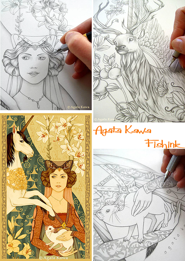
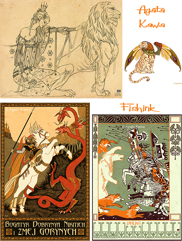
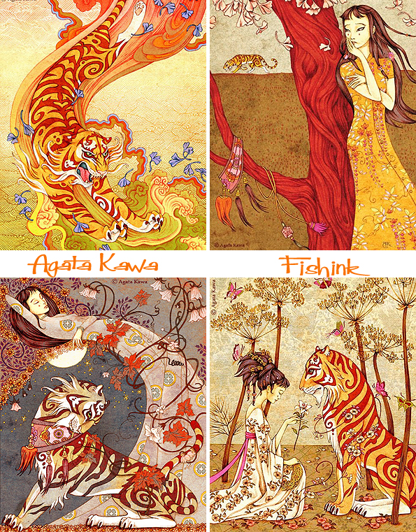
These pieces remind me strongly of the work of Aubrey Beardsley but again with Agata’s twist of part tiger – part winged beast etc.
There’s great strength in her drawings.
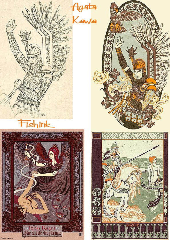
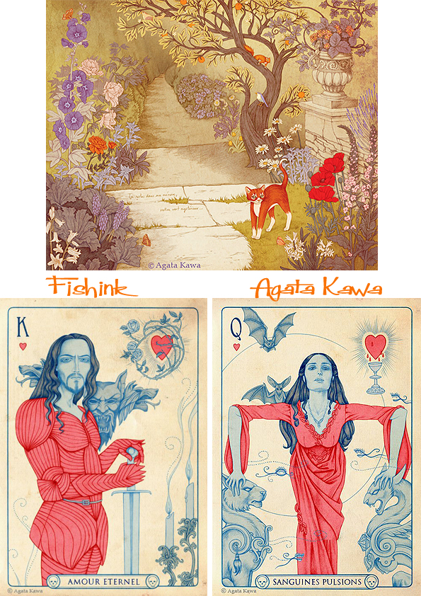
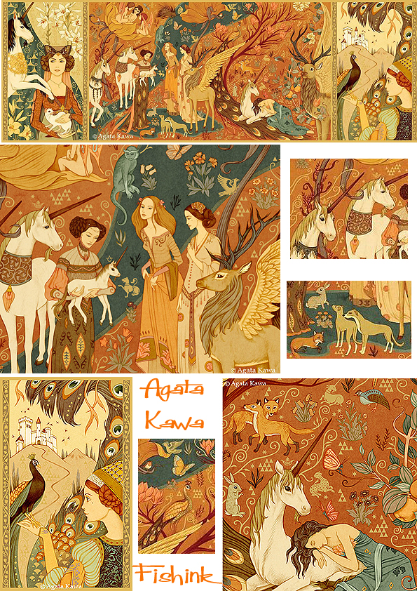
I particularly like these Morris inspired pieces with animals and people escaping from his floral swathes.
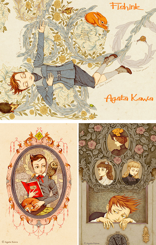
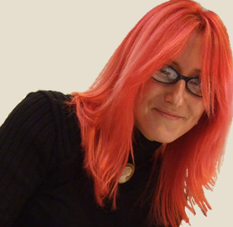
Along the years, Agata Kawa has been a Graphic Designer, an Art Director for animated movies, a drawing, painting and sculpture teacher in ateliers. As a freelancer she is now a Painter, an Arts & Crafts designer, an Illustrator (notably children books), and lives near Paris. With her red hair she could almost be a modern day Pre-Raphaelite model herself lol
Here are some illustrations from her book “Dedicated to the Tiger”, I love that it’s stripes have become swirls. I find Agata’s work beautifully ornate and decorative with sumptuous yet harmonious colours.
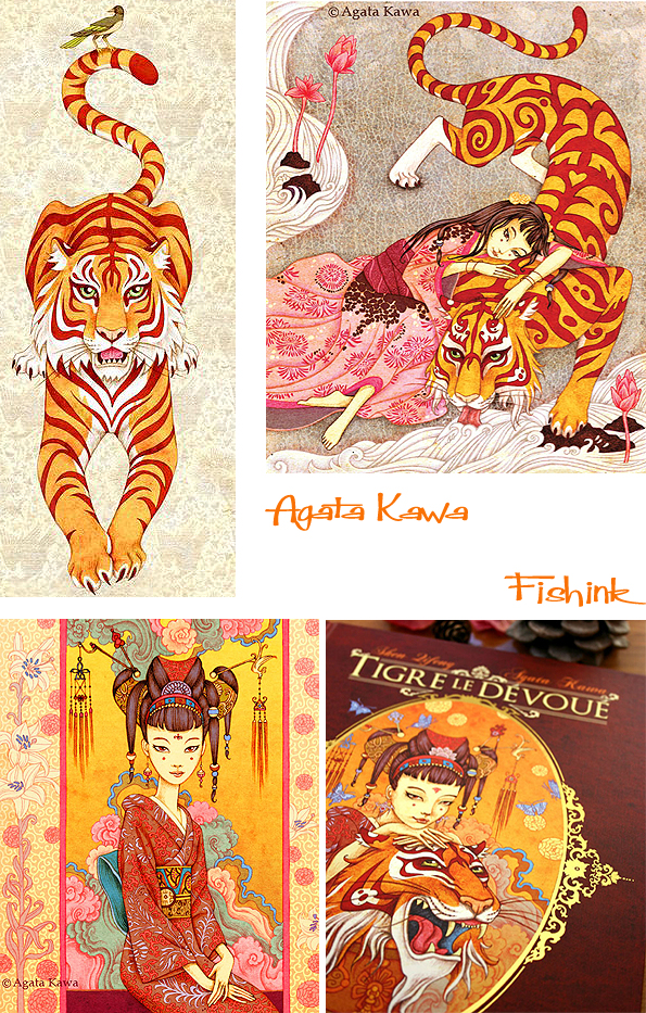
Apart from her beautifully illustrated books, Agata’s work has been used on lampshades, jigsaws and many other items.
Fabulous work. What do you think readers ?


