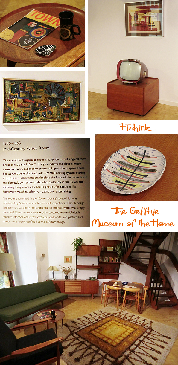
The Geffrye Museum of the Home

The Geffrye Museum is is devoted to the history of the home, showing how homes and gardens reflect changes in society, behaviour, style and taste over the past 400 years. Founded in 1914, this is a museum specialising in the history of the English domestic interior. Named after Sir Robert Geffrye, former Lord Mayor of London and Master of the Ironmongers’ Company, it is located on Kingsland Road in London. The main body of the museum is housed in the Grade I-listed almshouses of the Ironmongers’ Company, built in 1714 at the bequest of Geffrye.
Last weekend I took a visit to see what there was on offer. The exterior is really quite breathtaking.
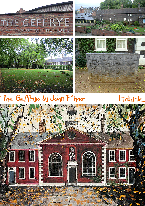
I really liked this beautiful View of the Geffrye Museum in autumn, signed John Piper in 1984. It was a similar kind of windy autumnal day when I was there too.
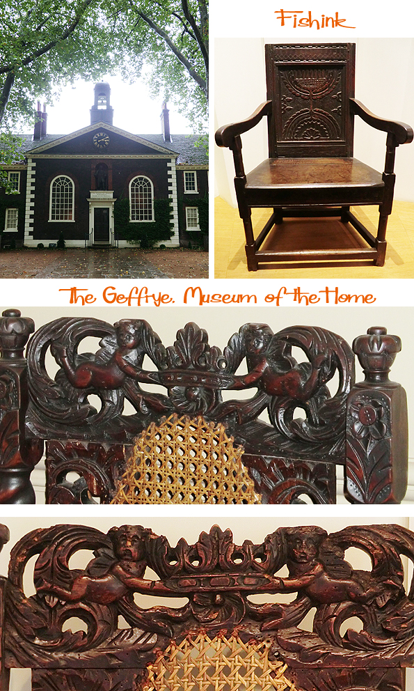
Some characterful details on the chair backs caught my eye.

This painting of the ‘ rather scary large headed children ‘ was actually painted by William Holman Hunt around 1846. I can’t help but wonder if he was asked to exaggerate the size of the infants heads to suggest that they come from a clever family ? In most of his other work, I believe he painted people with their heads in proportion to their bodies lol.
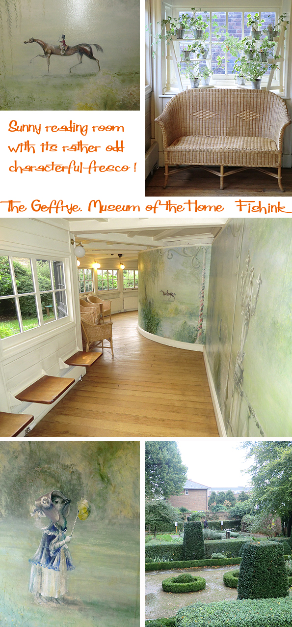
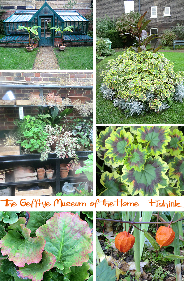
In the sunny reading room, the passage looks onto the herb gardens at the rear of the buildings and there’s a slightly bizarre mural on the wall with quirky characters. Perhaps the ducks with parasols were added to offer some painted sunshine to the lives of the elderly folk who lived there.
Some great paintings on display. It’s interesting how the lines of the tiles on the floor in this watercolour, lead you into the image and off into the dining room beyond. Here’s a selection of some of the rooms you can view too.

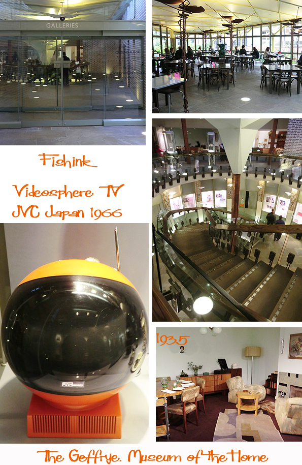
There’s a very smart cafe-restaurant and gift shop.
No prizes for guessing which was my favourite time period in terms of decoration and furniture, I could live here lol
Outside there is a wonderfully stocked herb garden, it’s so fragrant we spent 20 minutes just rubbing the leaves between our fingers and saying “Ooo have you smelt this one ! ” : ) You can see the outside of the reading room here too.

Even on a cold autumnal day there was still colour in the leaves of this lovely garden.
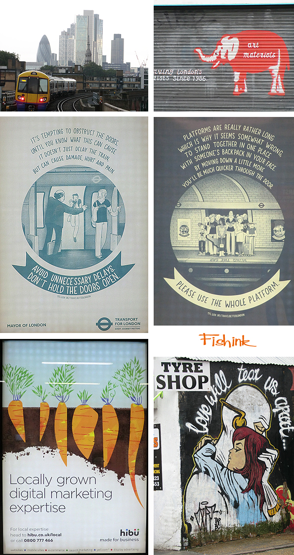
More local graffiti and eye catching posters.
Open Tuesday-Sunday 10am-5pm. Closed on Monday. Free entry.
Well worth a look if you’re in London with a half day to spare.
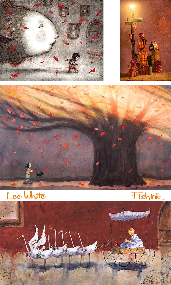
Lee White Children’s Illustrator

Lee White is a children’s book illustrator and concept artist living in Portland Oregon.
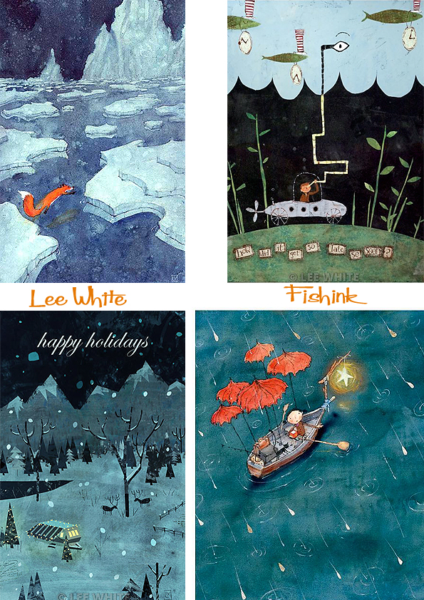
He has illustrated over 10 children’s books to date including this one by Jacqueline Davies.
He has some wild ideas, just imagine taking your floating giant fish for a walk, or being chariot led by a flock of white geese, how wonderful !
Recently partnered with noted artist agent Paul Rodeen, Lee is writing as well as illustrating his next three book titles. His client list includes Simon & Schuster, Laika, Scholastic Publishing, Verizon, Disney, Viking, National Geographic, Apple, and many more.

Lee also enjoys teaching illustration and concept design and works as a faculty professor for the Art Institute of Portland.
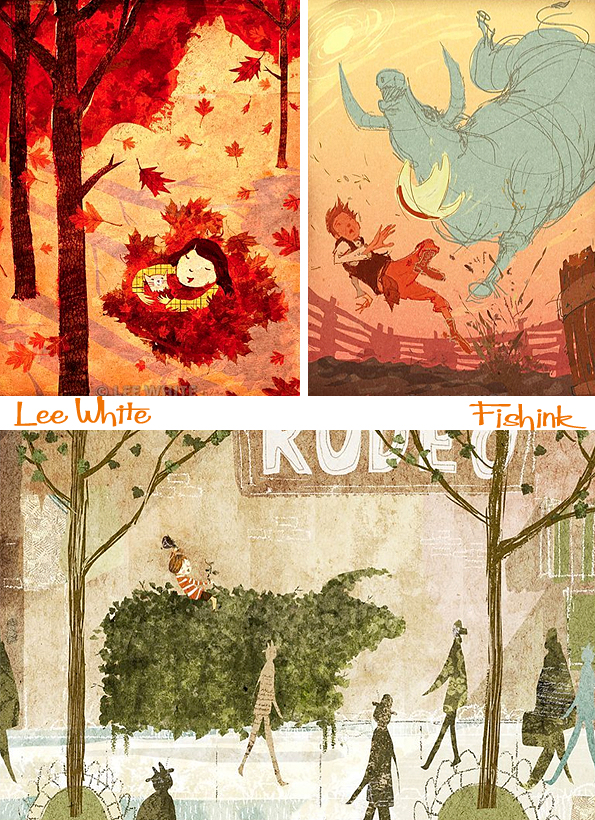
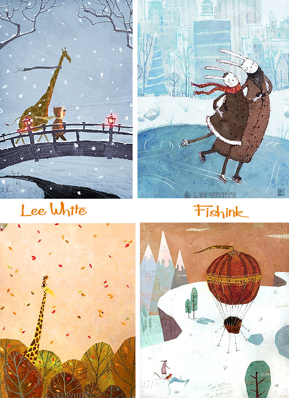
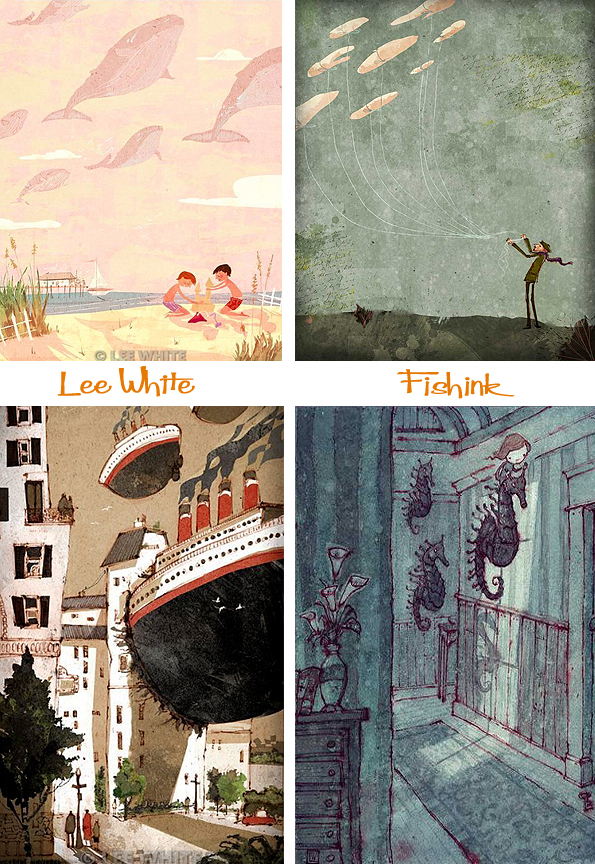
He is slightly taken by large floating objects in his work, as you can see here. Perhaps he dreams of these things a lot.
When he’s not working Lee enjoys going on long bike rides with his wife and son. I got in touch to ask a few questions.
I was wondering where your ideas for your illustrations derive from and also if you’re a little excited by the idea of large floating objects as they seem to reoccur quite a bit lol ?
Most of my ideas come from stories or poems. I really like thinking about how a story evolves and how I can show that in the images. I do love large floating objects as well ! : ) Some of my stories come from little things I notice throughout my day. I just like making new work and getting it down on paper.
Could you also talk us through how you construct the work. i.e. drawing, painted, digital etc
Most of my images are traditional watercolor although I do work digitally as well. I always start with small clumsy little sketches and work it up from there. The finished illustration can take anywhere from an hour to three days depending on the complexity. I favor M.Graham watercolor paints and Arches cold press paper. Most of my brushes are cheap bristle brushes that cost $.39 from Micheals or Home Depot. Real sable brushes work for some things, but I think the line is too neat and tidy. I like a little bit of chaos and energy in the brush strokes. Once the paint is down, I may add pastel, gesso, colored pencil, and ink as well.
Who do you find inspirational ? artist or otherwise.
I find so many artists inspirational it would be hard to list them all. Shaun Tan and Lisbeth Zwerger are two of my absolute favorites though. I love working to music and I think there is a lot of great music out right now. I have been listening to classical music lately, but before that it was punk rock.
Beautiful work Lee and thanks for giving us a little more insight into your thoughts and your work.

If you enjoyed this post you will also like the work of Tadahiro Uesugi and Pascal Campion too.
The Great Northern Contemporary Craft Fair 2013 Part 2. Caroline Rees, Robert Ingham, Anya Keeley, Stuart Jenkins, Katharina Klug and Juliette Hamilton.

Welcome back to part two of my last friday visit to the GNCCF 2013 event in Spinningfields, Manchester. First of the work to be revealed is that of Caroline Rees. Caroline originally trained as a textile designer and then worked with glass and now also cut paper. Her work is bold and yet decorative and simple yet humorous. She even created some paper cuts inspired by L.S.Lowry because she was coming to Manchester, what a great idea. You can see more of her beautiful work with glass on her site.

From paper to wood and beautifully inlaid too. Robert trained at Loughborough College, and at Leeds College of Art, followed by a degree at Leeds University. After several years teaching, he set up a workshop designing and making furniture in partnership with his younger brother George, who had arrived at this point through the more design orientated route of the Royal College of Art. In conjunction with his teaching, Robert has his own business, Robert Ingham Designs, and wearing this hat he makes one-off pieces to commission and for exhibition both in this country and abroad. Several of his pieces have been awarded Guild Marks. I get the impression that he is quite a perfectionist, who must also have the patience and creative eye of a very skilled man.

For a little more ‘wacky’ creativity, I smiled at the fun sculptures by Anya Keeley. She has long been a collector of edwardian and victorian ephemera and with a joy of making objects and bringing things to life… her combined interests turned into a business. I thought her Billy Milton sculpture reminded me of the Monty Python collaged animations.

Stuart Jenkins has followed a creative path in both the fine and decorative arts. His designs are have a bold and masculine flavour to them. They are form and function, ornate and decorative and sometimes even combined with ceramics to become whole new objects altogether. There’s an air of mystery about his work, the past blending nicely with the future and they often set off questions in the mind as to their purpose and meaning. Exciting and textural pieces.

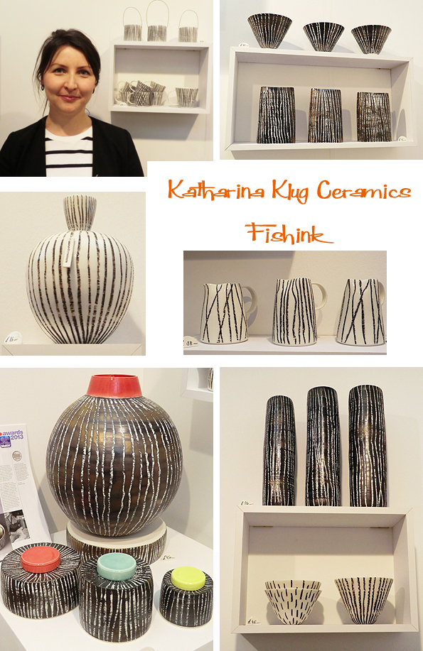
I was strangely drawn to the ceramics made by Katharina Klug as her delicate shapes reminded me of the work of Lucie Rie whom I had written about for my A level Ceramics examination. When I mentioned this to Katharina, she confessed that not only were her and Lucie both originally from Austria, but that she actually uses one of lucie’s glaze recipes on her work today and also admires her ceramics too ! How funny. Katharina was great to chat with, warm, engaging, and very knowledgeable about her discipline. Coming from a family of ceramists, I imagine it’s practically in her blood !
Again I smiled warmly when I turned the corner and came across the woodland menagerie, skilfully woven by Juliette Hamilton. Another artist who began as a textile designer, specialising in weave. It’s clear from this that woven structures in one form or another we’re the way to go and after a few ‘diversions’ in her career path, weave has won her heart again. Happy to undertake commissions like ‘Joey‘ a War Horse for Tameside Council and special garden pieces which are mentioned on Juliette’s Blog, you can also enrol on a course and learn how to make your own wicker bird for just £50 for the day…. great Manchester value. More details here. Beautiful work Juliette.

There were many other talented craft makers and skilled designers at the GNCCF but sadly I couldn’t get around to see them all. I’d like to give a quick mention to Sarah Malone, Linda Miller, Fir and Wren at holn, Tessuti, David Ashby and Kate Kelly who’s faces I passed on the evening. A big thank you to everyone who kindly gave of their time to answer my questions and let me photograph their work to show to you all. Much appreciated.
I shall be taking part in the GNCCF’s little sisters’ event in Altrincham Grammar School for Boys on December 8th so put it in your diaries now and I’ll look forward to seeing more of these crafty folk then. I hope you enjoyed this years show, do pass it onto your friends and family.

Hello everyone, just back from a few days break in London. Hands up who missed their monday helping of Fishink Blog yesterday ? Lol.
Here’s the first of two reports featuring the work of ‘new-to-me’ designers who were exhibiting at the GNCCF (Great Northern Contemporary Craft Fair) last friday til sunday in Manchester. I’ll start off with some familiar favourites. Andrea from &made, a joint stand from the MCDC and embroidered works from textile artist Dionne Swift.

I was lucky to also catch up with talented designer Hannah Nunn, who had her beautiful new range of wallpaper designs on show. Apparently her best seller in the lamp range, is still the cow parsley design, and with the intricate and delicate shapes, it’s easy to see why that is.

The first of the ‘new to me’ designers was the very smiley Geraldine Murphy, who had travelled over from Dublin, especially for the event. She is a clever lady, with qualifications in Sociology, Business Communication and Computer Animation… is there anything she cannot do I wondered. She can also create wonderful wall art and jewellery with silver and enamels. Inspired by the pets around her she sketches and photographs the animals and then turns them into her own creations under her business name of ‘Saba’. Stunning.

Next up was Ceramist Rachel Wood, who had travelled from Worksop, near Nottingham. We had a great chat about how Rachel really likes to bond with and personalise her work, hence the finger marks on her work which have become a recognisable feature. She is a keen walker and lover of the outdoors and again the landscape and it’s colours appear often in her work. I love their textures and said to Rachel that they have an ‘unearthed’ quality to them and hoped that she wouldn’t mind me saying that. She told me that a lot of people think the same thing and it’s almost complimentary, as it means that people make that link from her work to the land for themselves.

Another ceramist who identifies very closely with the outdoors was keen surfer Alison Graham. Again we had a lovely talk about Alison’s passion for surfing, which she tries to do most days before her ceramic work even begins. This early riser lives for the surf and brings back to her studio such amazing colours of the ‘sun-rise-skies’ that translate into her work. Beautiful oranges, and pinks sail across her porcelain wares and come alive even more when a tea light is popped inside. Just look at these.

Amanda Anderson from Wigwam Arts has a keen eye for an illustrative animal. Her quirky birds and creatures would add pleasure and smiles to any home. Her colours and decoration are beautiful, I wanted to own a whole menagerie as soon as I saw them, sadly the house is too small for a mosaic zoo right now, perhaps the odd, small armadillo could be introduced and house-trained sometime in the future ! : )

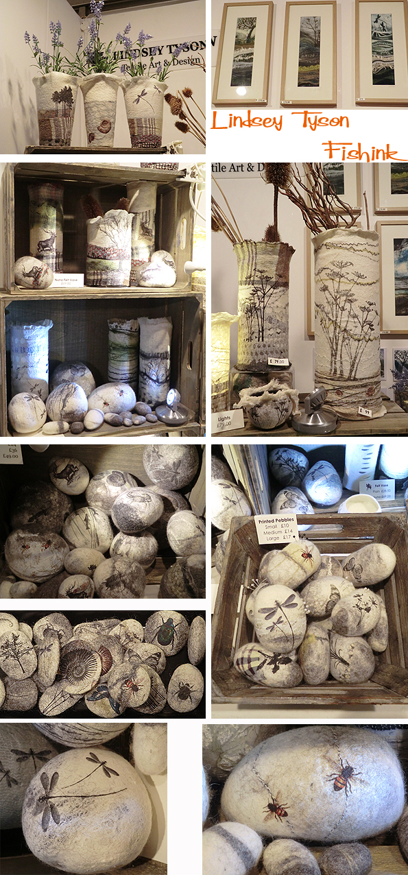
Finally for part one of this two part review, we have the work of Textile Designer Lindsey Tyson. Lindsey specialised in jacquard weaving during her early studies. After a lifetime of making and creating, Lindsey has finally set up her own business to create wonderful pieces of art and textiles, as well as teaching others how to express themselves through art and design. She works in felt creating brooches, vessels, bowls, vases, felt ‘pebbles’, and pictures. I thought her dragonfly and bee pebbles looked very cosy, nestled in their boxes and baskets.
Catch up with a few more talented folk on friday for part two of this review. Thanks to everyone who I chatted with who happily let me photograph their work and themselves. It was a great event and thrilling to see such vibrant and fresh work.
New Fishink exhibition at Manchester Craft and Design Centre
Following on from my helping out at Wall Of Art in (MCDC) or Manchester’s Craft and Design Centre, the owners, Kitty and Tom, very kindly offered to give my work some gallery space in their shop during the month of October. I’ve been busy working on a new range of framed pieces to go on display. Here’s a pair of very colourful elephants to start us off.

Cats of all sizes !

A slightly bemused looking little pup and some rather extreme dog avoidance tactics !

There will also be a small range of mount framed collage illustrations and prints inside the shop too.

If you’re heading into Manchester do call in and have a look, and let me know what you think. For those of you who don’t live locally you can find other illustrations available on my pinterest site here. Also some new prints available too.

Please pass this onto your friends who you think may like these, or you can acquire your own original print or illustration here. Many thanks.
Here’s a couple of images of the work now in situ. Wow I’ve even had the golden frame treatment ! Very honoured and it looks great.

Also tonight is the preview of the exhibition I’m showing work in at the Platform Gallery in Clitheroe. It runs from October 12th until early Jan 2014, so do try and get along to see it. More info here.

Also don’t forget today marked the start of three days of exhibiting for designers at the Great Northern Contemporary Craft Fair. I snook along to the preview evening yesterday and will give you a full report on the who’s new early next week. I’m away until tuesday so will see you all then. Happy weekend. Here’s a sneeky peek at what to expect from the Great Northern exhibitors … watch this space !

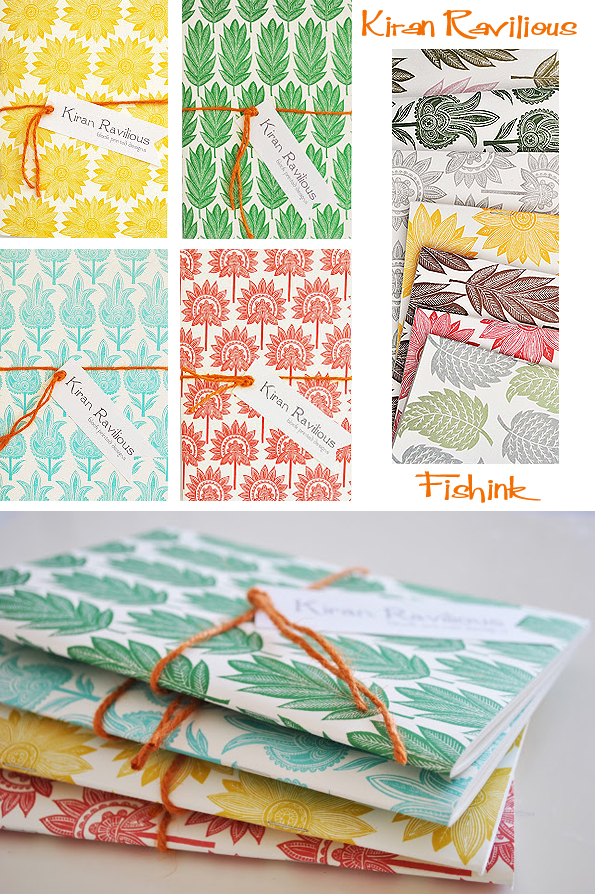
Kiran Ravilious Natural artist and Block Printer

Kiran Ravilious trained in the Visual arts and worked as a graphic artist, hailing originally from Singapore, she moved to England at the age of 21. Soon after her move she met her future husband Ben, that was 10 years and two small girls ago. In case you’re wondering (as it is an amazing surname), Ben is the grandson of Eric Ravilious. Kiran tells on her blog how Ben inspired her to draw and paint coming from a family of talented artists and eventually a business developed which has been successfully running for three years now.
Not wanting to sit in front of a computer for a career Kiran says ” I picked up some lino one day and began carving and experimenting printing on fabrics after reading some books. It wasn’t as easy as I thought it would be at first but it’s been four years and my style and printing methods have evolved. I’ve always loved printmaking and drawing patterns ”

It’s a short walk to her lovely studio, just beside the apple and ash trees in her garden. Who wouldn’t be inspired to work here ! What a lovely space.


Here Kiran spends her days creating intricate and beautiful linocuts which then get translated into designs for a whole multitude of products like stationery, cushions, lampshades, and other household items. Kiran calls them her ‘naïve botanical plants’, and gains inspiration from simple weeds to more complex and tropical forms from her days in Singapore. She recalls taking many photographs around the botanical gardens there in the blazing sun. Having the place to herself was an added bonus. Then when she came to the UK she noticed the change in plant forms and through her ‘Tropical Forest’ collection of prints, aims to gradually interweave the two. Here’s a little taster.

Apparently Kiran’s favourite colour is green (apart from lime green) and the best part of her job is being able to express herself through her designs and keeping everything made in England. Her favourite part of the printing process is working with the lino.
” It has to be the carving ” She explains. ” It requires concentration but I’m also at my most creative when I’m carving. My designs are quite large for block printing which is normally small and delicate. The blocks themselves, to me, are lovely ”
And I think we all agree.

I managed to catch up with Kiran and ask a couple of questions.
Do you have any plans for the future in terms of where you’d like to see your work going or places you’d like to sell to?
I’d really like to work on my wallpapers and fabrics and aim to target the interiors market with them and also design the next collection.
Who are your influences and inspirational people around you ?
I married into an artistic family and although some might find it daunting, for me, it’s been great ! They play a big part in inspiring and more importantly, supporting me and giving me their honest thoughts and opinions. I’m inspired by the colours Eric Ravilious used, the handmade nature of Tirzah Ravilious and Peggy Angus’s works and outside the family, I’m love Rousseau’s jungles.
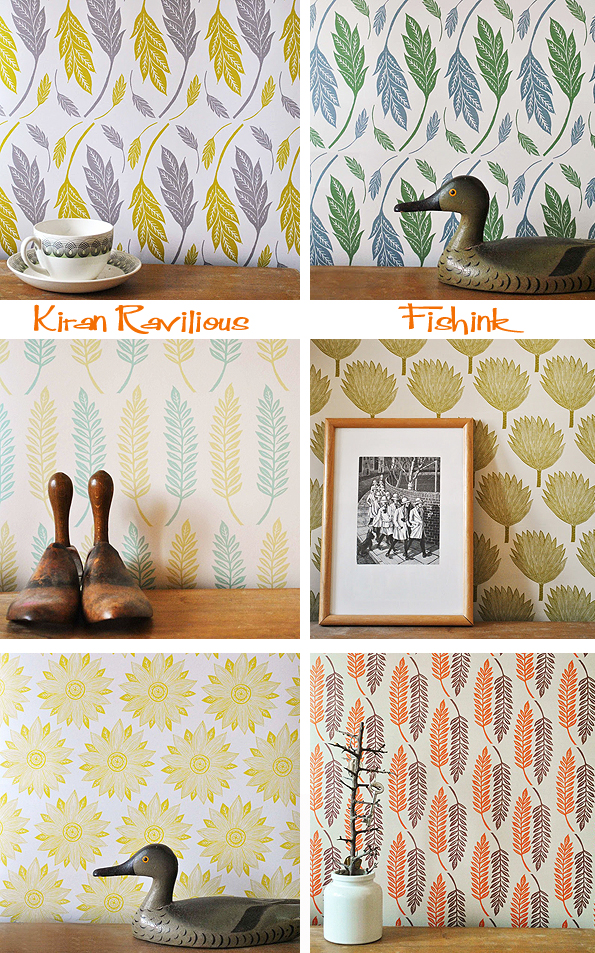
Kiran also has a growing range of wallpapers and fabric designs, all derived from her nature inspired designs.

I feel there’s a calm, classical beauty to her work and through reading Kiran’s blog you really feel that you get to know her and her ideas, more intimately. In this beautiful passage she remembers and shares a fond memory about her late father.
” As a child, it was my dad who used to sit and draw with me. We used to have to make these art folios when I was at primary school and I would wait for my dad to come home from work (he was an officer in the Singapore Navy), so he could draw Bugs Bunny on my folio. I would colour it in and no doubt was the proudest kid at school the next day. That continued all the way till I was at my second year of art collage. He bought me my first Apple Macintosh when I was in my second year, doing Graphic design. For some reason, I decided to buy a little couch for my room and would often find him sitting on it reading his book whilst I was working on the computer. I loved having him there, just for company ”
Her business maybe relatively new but she already has an impressive list of stockists on her website and sells her products in London, Holland and France. Definitely a name to keep an eye on. Keep up the great work Kiran, it shines with style !
If you want to see more of Kiran’s work close up then she’s next exhibiting at Made London from the 25th – 27th October. All photographs are from Kiran’s site and some information was taken from Katie Treggiden’s wonderful confessions of a design geek‘s site from 2012, many thanks for permission to use both.
Ray Morimura Japanese woodcut artist

Ray Morimura was born 1948 Tokyo and studied at the Tokyo Gakugei University.

He began his career as a painter using abstract, geometric forms. Later he turned to woodblock printing. The use of geometric forms can still be found in the artist’s print designs.

Ray’s work concentrates predominantly on the landscape which allows more structural freedom in the composition. He chooses not to sketch from nature because he is not aiming to reproduce the landscape as it is, instead he concentrates on pattern, form, colour, shape and texture as his guides.

A typical edition size for Ray Morimura prints is 60. I like the way in which he shows detail and the repetition of pattern in his work, gives it a signature style.

Ray Morimura currently works as an art teacher at Tokyo Zokei University and Nihon Kogakuin school. Looking through these I’m reminded of 1920’s and 1930’s textiles, Art Deco and even similar dramatic elements like the work of Eyvind Earle. It would be rude to leave without a little cherry blossom, lol, amazing woodcuts.

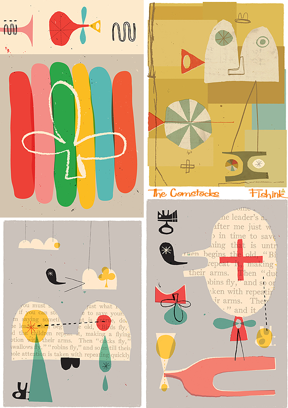
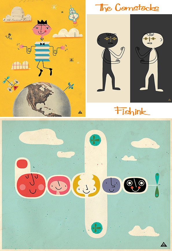
The Comstocks 1950’s illustration … today

Apologies to those of you who might have gotten a sneak preview of this post yesterday, by mistake lol this is the fully updated version ( with Q&A session ).
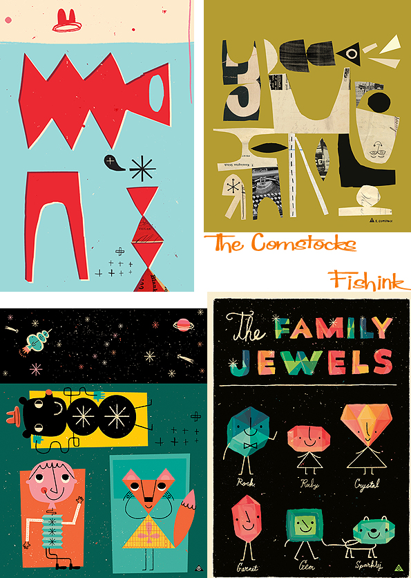
I’m crazy about The Comstocks illustration, Julie and Eric certainly know how to have fun when it comes to colour and design, just look at these retro repeats. I got in touch with them and they kindly answered some questions for me.
So you guys met about 17 years ago through work. How did your present business come about and do you both do this full time or as a side line ?
We’ve actually been married for 20+ years. We met in school and fell in love almost instantly. We both worked as Art Directors after graduation, but then Julie quit to stay home with our soon to be born baby. 10 years later, I joined her and began working with her in product design and illustration. We work full time from home, right next to each other… unless a child or two stands between us.


You’re both clearly not children of the 50’s so where did your interest for this era stem from ? any memories or artefacts you’d like to share ?
Maybe it was influenced by our Professor Jon Anderson. He was in love with that era and felt that the late 50’s to 60’s had the best design ever created. We were exposed to it on a continual basis throughout our schooling.
They know their way around designing a catchy poster too.


Who are your influences and ‘ wanna be’s ‘, anyone you’d like to be friends with who may not be around anymore ?
Eric would like to be friends with Thelonious Monk and Richard Diebenkorn. Julie would like to be friends with Don Quixote and Sancho Panza.
How do you go about creating new work, I’ve seen your sketches, but where do these ideas come from, do you play an equal role in the creation and illustration of the artwork ?
As far as where our ideas come from, if we knew that, we’d live there. Eric is definitely a better illustrator than Julie (Julie is typing this, she’s a better typer). He does most of the illustration work. He is also stronger in typography and graphic design. However, Julie (still typing) is very conceptually creative and throws lots of great ideas at Eric for illustration. She also does most of the pattern design.
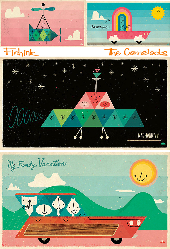
I always appreciate seeing artist’s drawings or proposals for their finished illustration and love their idea of futuristic travel, alongside travels from the past.

You have such a lovely fun and quirky style and colour palette, is there a place where the feel of this derived from or has it progressed slowly over the years ?
It’s been developing over years, but Eric has loved pink since his embarrassing childhood (he had older sisters that liked dress-up).


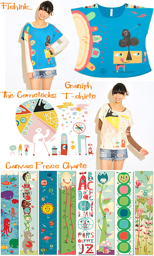
Wonderful T-shirts created using Eric’s work by Graniph and growth charts from Canvas Press , to name but two of the many companies they
have worked with.
Where do you see your business going ? Any plans to move into books or animations in the future ?
We are hoping to have some books under our names soon. We have lots of ideas, but it’s a long process. We’ll let you know when something happens.
Many thanks to Eric and Julie for their honest answers and insight into their fifties world. You can keep up to date with The Comstocks by following their blog. There are more images on Eric’s site or in their Facebook photo album. Smile and enjoy !
Maiko Takeda. Future Jewellery

Maiko Takeda grew up in a post boom Tokyo where she quickly was faced with the challenge of wanting to create products of individual and timeless quality in a country slowly coming to a grinding halt. This meant that she more and more looked to areas outside of fashion and pop culture for impulses, exploring the city by foot, finding inspiration in the smallest and most random of things. This is early work from 2008.

Within the pieces, there is the juxtaposition of various elements. Environmental influences such as shadow, wind and gravity, create an experience of wonder and bewilderment for the adorned. The form of her work itself can never be its sole feature as the extra element is always seeking to transcend the expectations of the wearer as part of the work. Clever ideas developed here, love the fox stole.

After having moved to London she studied Jewellery Design BA (Hons) at Central Saint Martins College of Art and Design and is currently doing a Masters in Millinery at the Royal College of Art. Her work experience includes Issey Miyake, Stephen Jones, Philip Treacy and Erickson Beamon. This is part of Maiko’s RCA 2013 show. Stunning !


If you enjoyed this post, you may also like the work of Nora Fok.
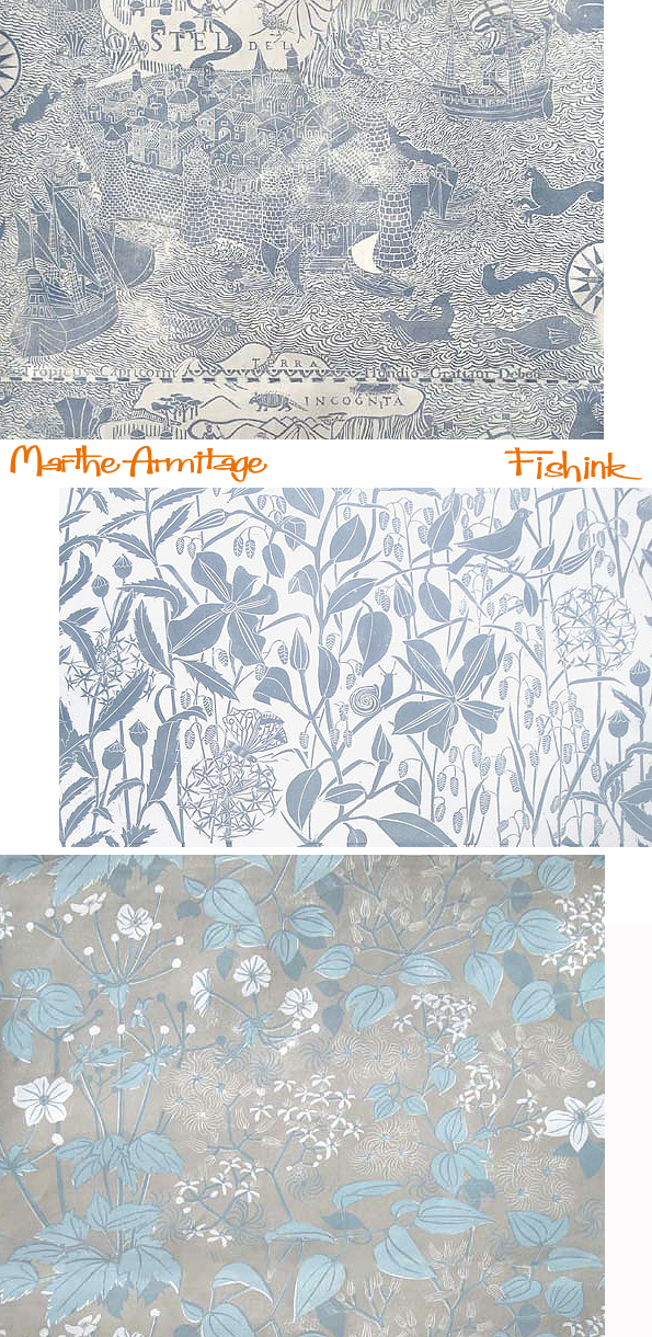
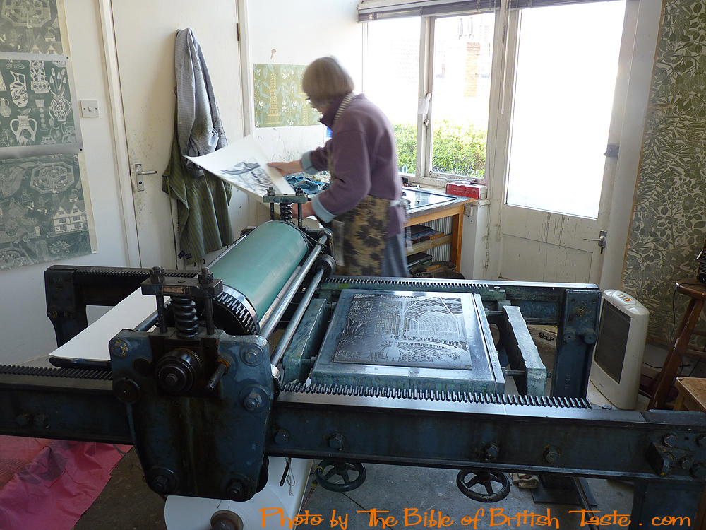
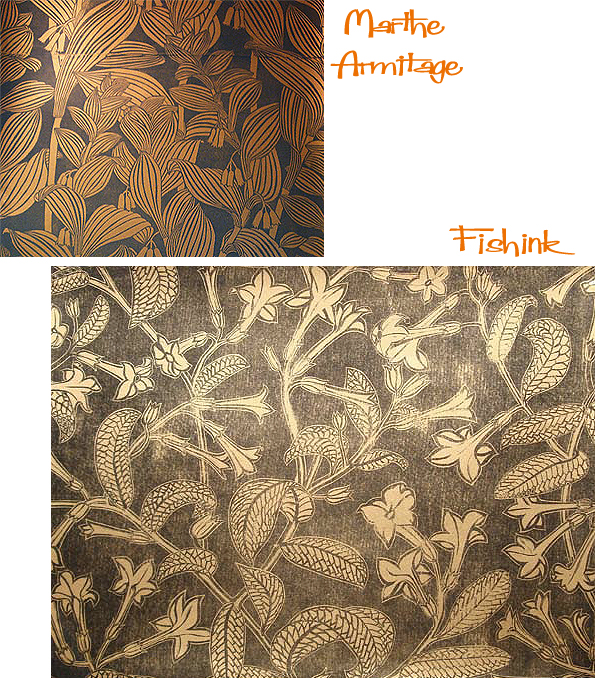
Marthe Armitage . English Wallpaper at it’s finest.
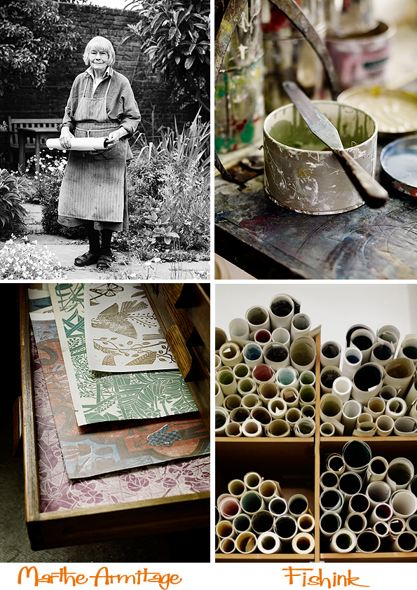
Marthe Armitage is a British designer, who graduated from Chelsea School of Art just after the second world war, and after marriage and kids, started designing lino-cut wallpaper in the 60’s. ‘I’d done a bit of lino cutting at school’ she remembers. ‘ It struck me you could make wallpaper that way.’ Her first design ‘Angelica’ was based on this vigorous cow parsley-like plant which grew all along the river bank at Chiswick where she pushed a pram.

These blocks ‘last for ever,’ and she is still printing from them today. A hundred year old lithographic proofing press made things easier and the garage at the bottom of the garden became her studio.
Even so, in the eighties and nineties she found herself thinking ‘but nobody wants them.’ Her wallpaper was a fairly exclusive secret. People saw it on other people’s walls, at a neighbour’s or at dinner with the Warden of All Souls College Oxford, and sent her a line. It was only when the design company Hamilton Weston asked to represent her in 2004 that she looked back over her archive and thought (with astonishing modesty), ‘well perhaps they are … something.’


Her wallpapers are still available to buy through Hamilton Weston and there’s a fine range to choose from.

Many thanks to The Bible of British Taste for some of their comments and photos from their lovely site (well worth a look).
There’s a great a short film about Marthe below too.
As a final point of interest designer Hannah Nunn has recently added a beautiful range of wallpapers to the products available on her website, and in her shop Radiance based in Hebden Bridge. These are two of the new wallpapers, called ‘Beech Leaves’ and ‘Paper Meadow’.
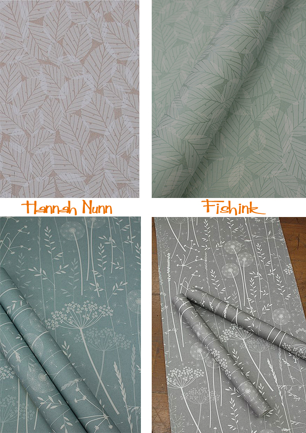
With future plans to release this ‘In The Tall Grass’ sometime in early October. WOW Lovely work Hannah, I need a few more walls in my home now !

If you’re quick you may be able to watch the BBC’s programme about the history of Wallpaper in their ‘ Fabric of Britain ‘ series here, available until October 9th.


