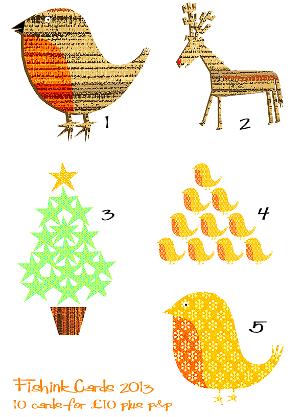
Fishink Christmas Cards and ideas 2013
I know it isn’t quite the season of goodwill and all that but I am afraid it is the time to start thinking about buying your christmas cards and christmas gifts. This year there are 5 designs to choose from. The illustrations are printed and cut out and assembled onto the cards, I’m using recycled thinner envelopes this year too and all at £10 for 10 cards plus £3 p&p if in the UK, or £5 worldwide. I’m taking orders now so please contact me at craig@fishink.co.uk with Christmas Cards as a subject if you’re interested.

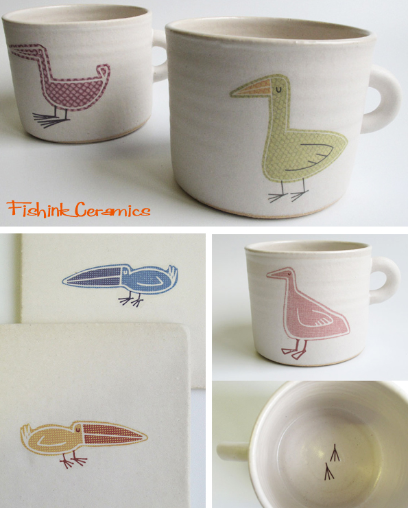
If you’re looking for some lovely original artwork as a christmas gift, then have a look through my illustrations on Pinterest for some ideas , I’m also hoping to have the remaining ceramics available in my Etsy Shop next week.
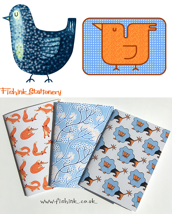
or as usual Fishink Stationery products, (stamps, stickers, notebooks, greeting cards etc) are available here.

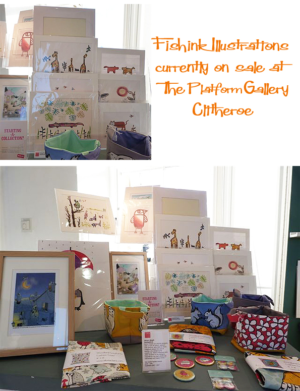
I have also had some encouraging feedback from the organisers of the Platform Gallery in Clitheroe, which currently has an exhibition with some of my collage illustrations in it. They were kind enough to send me some photos of the work in situ, and I think it looks great. It runs from October 12th until early Jan 2014. More details in an older post here.
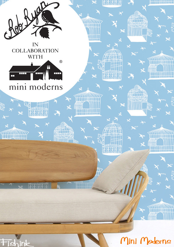
Mini Moderns . Contemporary style with a touch of the past.
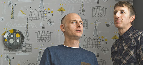
Mini Moderns is the creation of Keith Stephenson and Mark Hampshire. It is an interiors brand specialising in applied pattern across a range of products including wallpapers, fabrics, cushions, rugs and ceramics. The initial collection (below) was inspired by the 1951 Festival of Britain and was quickly snapped up by Heal’s.

Before Mini Moderns was formed, Keith had worked as a textile print and graphic designer for various fashion companies ranging from jeanswear to cult fashion brand Red or Dead, whilst Mark had worked in television and had also created his own interior designer-maker business selling his collections through Heal’s. They met at a branding agency in the mid-nineties, and were always put together as a team for projects, they soon realised that they worked well together and had a similar aesthetic, approach and most importantly a similar sense of humour when it came to working on projects.
“We work with pattern in way that creates a mood or a story. We don’t create pattern for pattern’s sake – we won’t for example do a design because other pattern makers are doing it and it may be commercial – it has to mean something to us. For us pattern is and should be a personal thing. We love to hear how people respond to our designs and the memories or images they evokes for them.” Their wallpapers, fabrics, cushions, rugs and ceramics all evolve as emerge as well considered and concluded ranges.
Inspiration-wise, they always say that nothing is beyond inspiring them, design influences range from mid-century British textiles to vintage toys, from literature to childhood memories. Travel also influences their work, and much of the inspiration comes from holidays and field trips, both at home and abroad. One design can transform into another whilst working on it.
When asked how they overcome any creative blocks, Keith replied…
“Our biggest problem is that we have too many prints per season rather than having creative block – financial block is usually our problem! As a small business we can only afford to produce the amount that we do per season and we have become pretty good at self-editing. Obviously it is disappointing when we have spent time developing something that doesn’t go ahead, and by the following collection we have moved on. But they all go into our design bank for a time when they may come into their own or influence another design.”

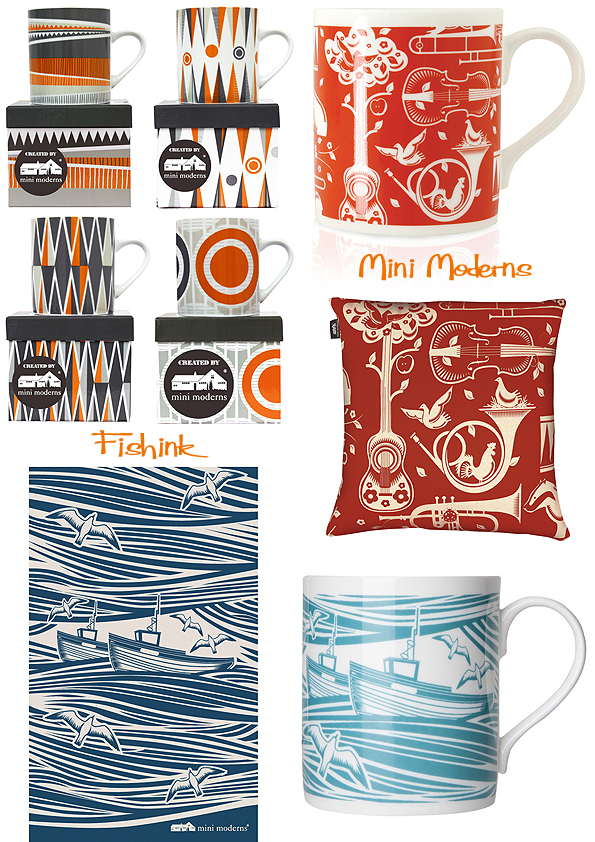
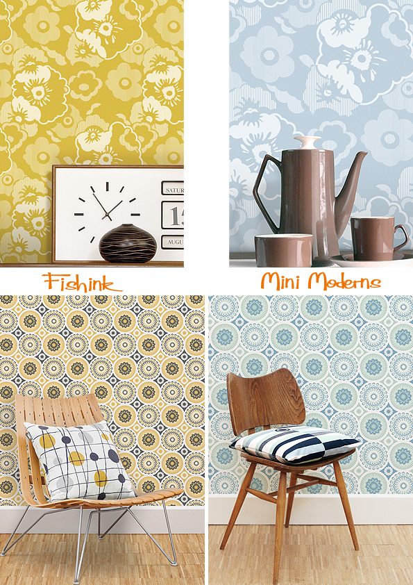
“Our favourite product is always wallpaper. Everything else comes from this – the patterns are adapted for accessories and the colours are used in our paint collection. The wallpaper is the starting point and is the thing that establishes who we are as a brand and what our collections are about. We always start our wallpaper collections with a concept for the theme – sometimes this can be fairly loose – like ‘Daytripper’ – or very specific like ‘Buddha of Suburbia.’ We immerse ourselves in the theme first, pulling images from our own memories or things we collect and pictures from our library of design books. Then we start designing. We always work on the wallpaper first. This how we feel comfortable and we can work within a square and repeat this. At this stage we work out whether the flow of the design is better as a drop repeat or a straight match. Some designs conceptually feel more structured and seem to want to be straight matches – others need more movement. Sometimes designs take quite a long time to feel spontaneous. The Festival print was planned out very roughly and then drawn on screen very accurately and then printed out and traced by hand and then scanned and redrawn with all its hand drawn quirks. Whitby (with the seagulls) was a particularly difficult print – but the overall effect is one of simplicity. Which we like – the hard work should never seem evident in the final design.”
Their suppliers are so important to their company that the guys get to know them personally, it made perfect sense for them to manufacture their products in the UK with ‘nice people’ (as it says on their label), producing goods at prices they agreed that their customers could afford.
Their wallpaper with Rob Ryan just happened by being in the right place at the right time. Keith explains…
“Rob works with Clothkits, who we have worked with in the past and we have some friends in common, although we had never met. We asked around to see if anyone knew if he was interested in producing wallpaper. At first it was just to introduce him to our manufacturers. However, when we did meet he was more interested in collaboration where he created a piece of art, that we made into a repeat pattern and helped to produce with our manufacturers. We all got on immediately and he is really wonderful and inspiring to work with. He is always very, very busy but he always finds time for everyone.”
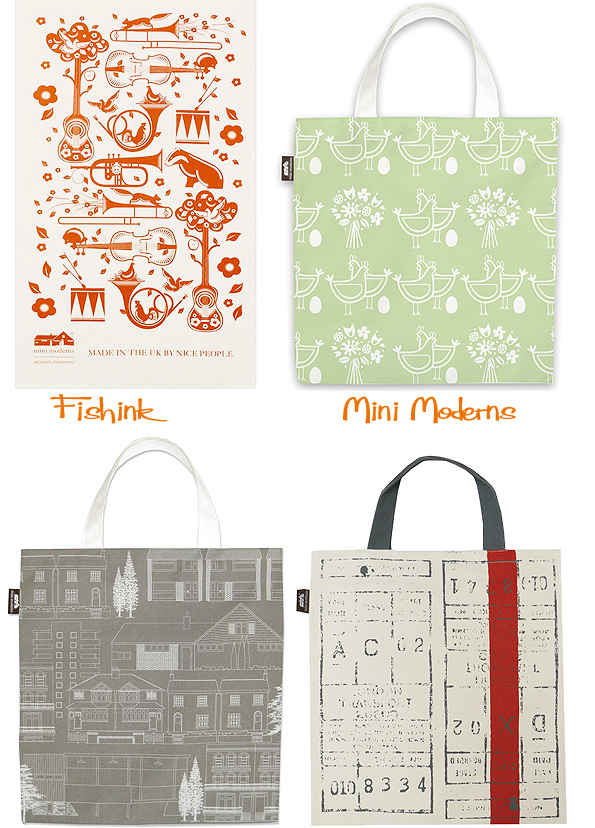
It’s great to see how varied the inspiration is in their work. From calligraphy, backgammon, paisley, travel tickets and their own memories from growing up (like c-60 cassettes), it all appears and works well as a rich collection. Some amazing design work, check them all out on their site here.


Thanks again to Katie Treggiden over at Confessions of a Design Geek for asking all the right questions and allowing me to quote her replies.
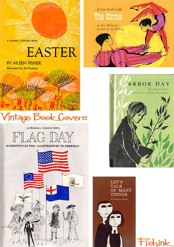
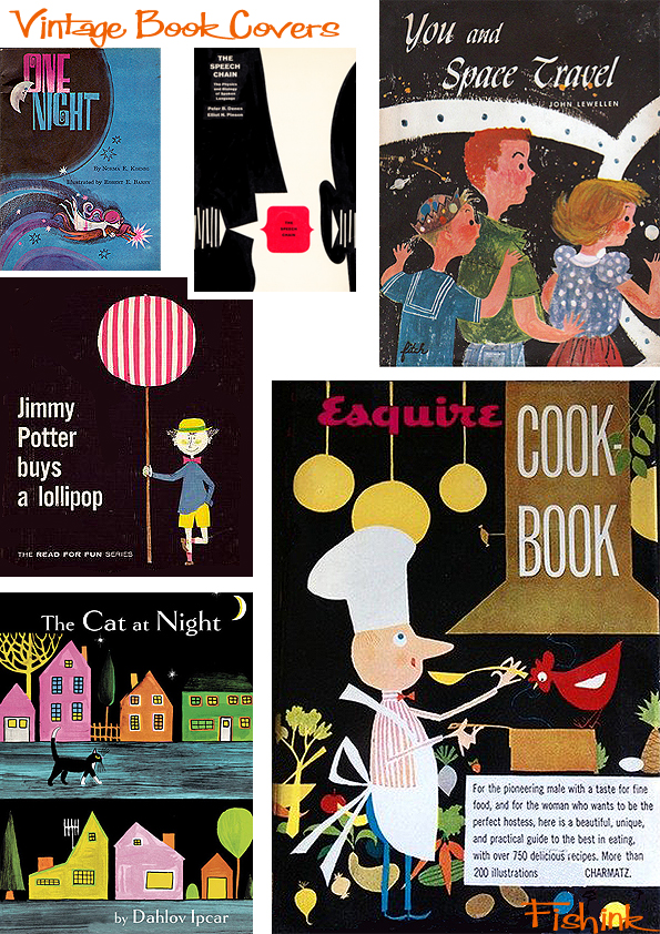
Vintage Book Covers
Everyone seems to love a spot of vintage when it comes to book covers from the past. This little collection I’ve been gathering for a while now. Inspired by the last Helen Borten post featuring her Halloween book, I’m now awaiting a copy of this Easter book illustrated by Ati Forberg to drop through my door. Let’s hope it’s as promising as the cover suggests.
A small splurge on the black covers.
A few textured covers thanks to the likes of Ed Emberley.
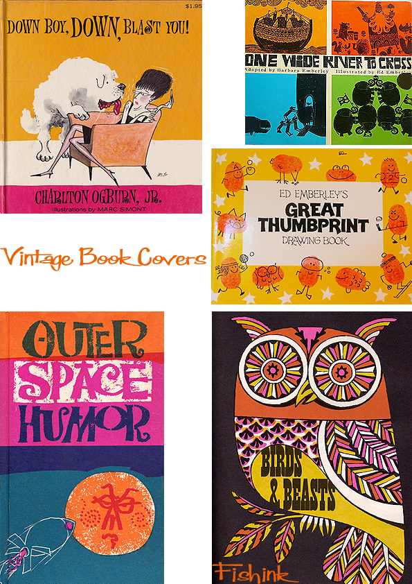
Circles seem to be popular.
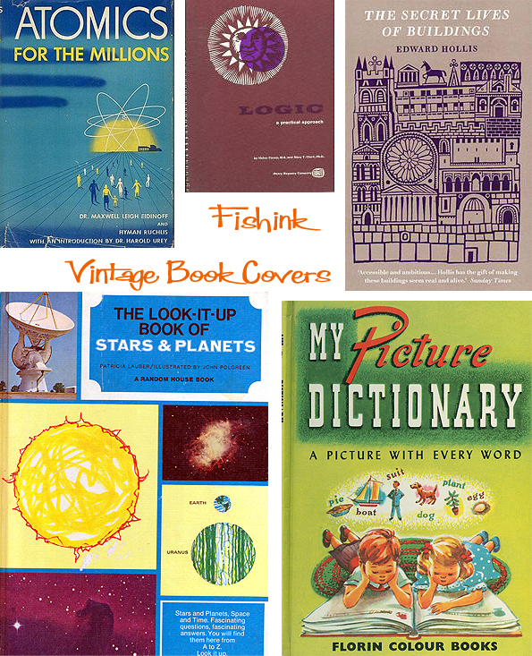
Animals always create a second look when gracing a good cover.
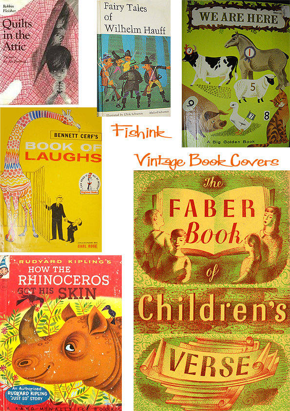
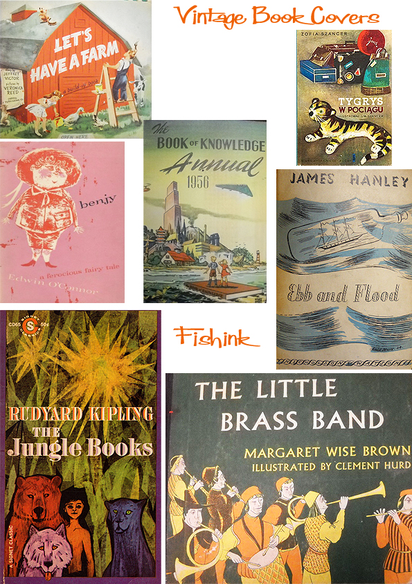
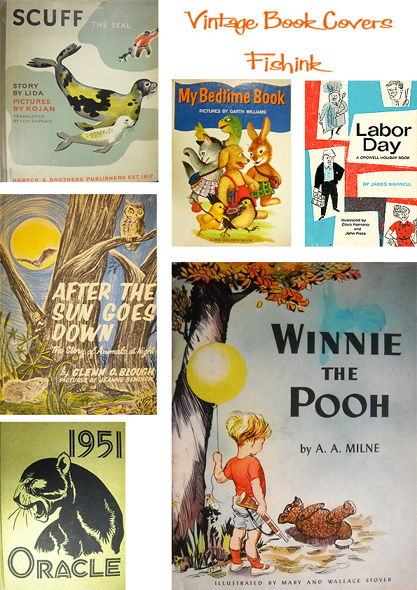
A few snippets I couldn’t resist putting in here too from G. Porter, anyone know anymore about this artist ? and the wonderful John Burningham, thought it maybe nice to end on a few of his wonderful illustrations.
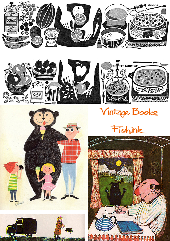
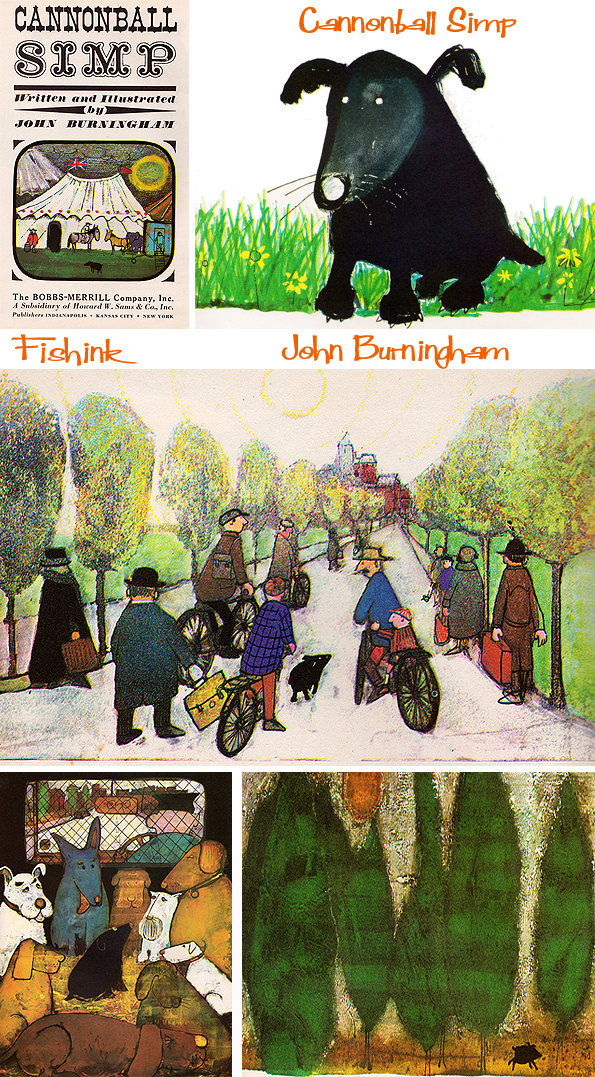
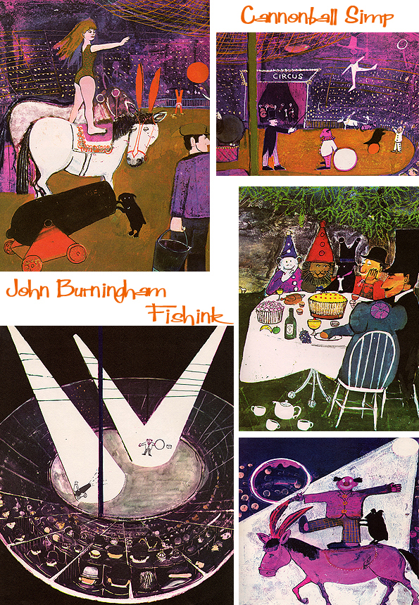
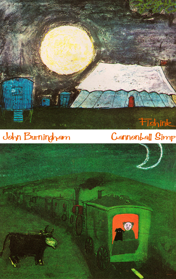
Hasn’t he just got a beautiful style. More Vintage fun to come in the week. Enjoy.
Tom Eckersley The Father of all Poster Illustrators
Tom Eckersley was born in Lowton, Lancashire in 1914. He spent much of his childhood drawing, and at 16 he enrolled at Salford School of Art. Here he was awarded the Heywood medal for his dedicated approach to his work. Eckersley was greatly inspired by the work of commercial artists such as A.M. Cassandre and Edward McKnight Kauffer. He had seen their work at an exhibition of avant-garde posters, which turned his attention to graphic design and began to shape his stylistic attitude. It was at this time that Eckersley met Eric Lombers, a fellow student who shared his passion for progressive poster art.
 After leaving college in 1934, Eckersley and Lombers went to London to embark on a career together as freelance poster designers. In May 1935 their Principal at Salford, Harold Rhodes, recommended them to Frank Pick, then vice chairman of London Transport. Pick had played an active role in securing high-quality poster art since the first pictorial poster was commissioned in 1908. By the 1930s, London Transport was one of the country’s most significant patrons of graphic design. The company commissioned dozens of pictorial publicity posters every year, which were exhibited to a much wider audience than was possible in a gallery or publication. ‘Eckersley Lombers’ submitted some samples of its work to Christian Barman, Pick’s publicity officer. This led to the partners’ first commission, for a small Underground car panel poster advertising the London Zoo. The team went on to secure commissions from other commercial patrons such as the General Post Office, the B.B.C, Austin Reed, and Shell, all of whom shared L.T’s enthusiasm for innovative developments in style and technique.
 Eckersley described this period in design as: ‘that stimulating time when certain artists, supported by enlightened clients, saw opportunities to use their art and their vision to solve communication problems. They began to realise the many exciting visual possibilities that could be derived from the major art movements taking place in Europe between the wars’.
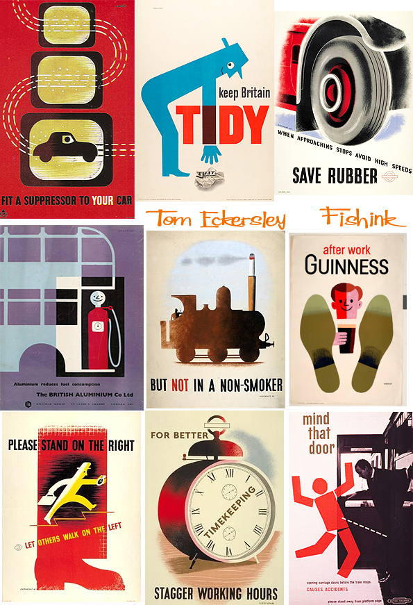 By 1939, Eckersley Lombers was well established and both artists lectured in graphic design at Westminster School of Art. However, at the outbreak of war their working partnership was ended when Eckersley joined the R.A.F. and Lombers joined the army. During the war, Eckersley worked as a cartographer. He also produced a number of striking ‘war effort’ posters for the Ministry of Information and National Service, the G.P.O. and the Royal Society for the Prevention of Accidents. After the war he returned to teaching, and continued freelance commercial design. His contribution to British poster design was formally recognised in 1948, with the award of an O.B.E. In 1957 he became head of graphic design at the London College of Printing, where he spent 20 years inspiring new generations of progressive designers.


 While teaching, Eckersley continued to design posters for a range of clients. He was appointed a Royal Designer for Industry (R.D.I) in 1963, and became a Fellow of the Society of Typographic Designers and the Society of Artists and Designers, and an honorary Fellow of Manchester College of Art and Design and the Royal College of Art. His poster designs retained a striking and immediate impact. Their bold simplicity and flawless clarity of purpose was the key to prolonged international success. He showed great variety of technique and development without losing his individuality.
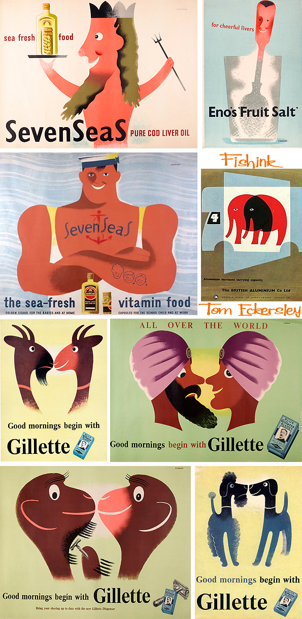
In his book, Poster Design, Eckersley wrote ‘The good poster, that is one which does its job successfully, is one above fashion …. Really fine work never dates: it is only the posters which depend solely on the particular techniques of their period which today appear dull and dated’. 
Images are taken from the University of the Arts site (VADS) here, the London Transport Museum site here and information is from 20th century London site. Many thanks for their use. What an inventive and creative mind.
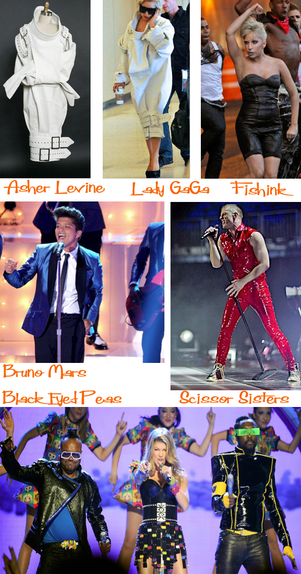
Asher Levine Fashion designer of the future
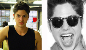
Asher Levine, a boy out of Port Charlotte, FL arrived in New York (a few years ago) to complete a degree in Managerial Entrepreneurship at Pace University, understanding that fashion, just like any other industry, is fundamentally a business.
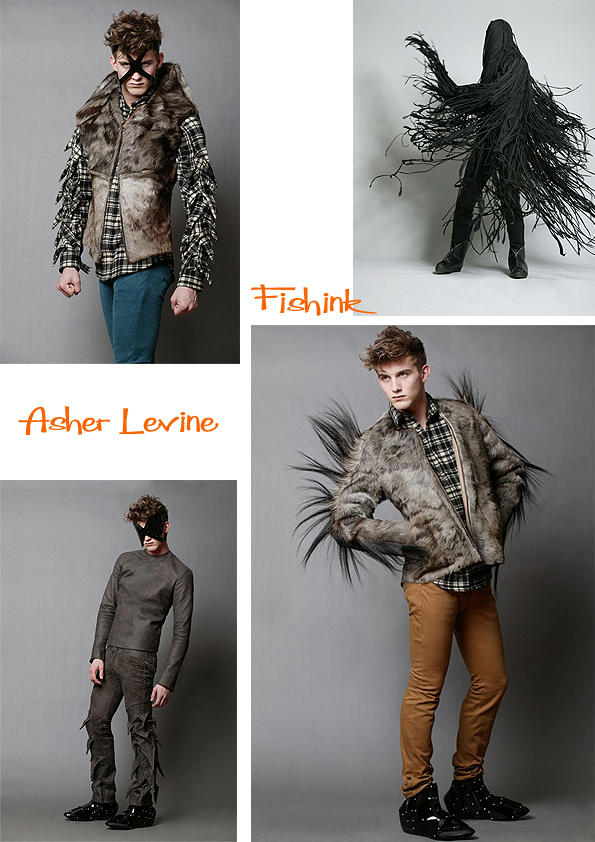
” I began making clothes when I was 10 years old, designing was the only future I could think of. I moved to New York in 2006 to get a business degree, and while in school I made clothes in my basement in the West Village. After graduating, I launched my first collection. ” Asher explores ideas about accentuating the male form through his clothing. There’s a mystic often dark side to what appears. His 2012 Collection looking more like a cross between Marvel Comic Heros and Dr Who Monsters rampage the high street lol.
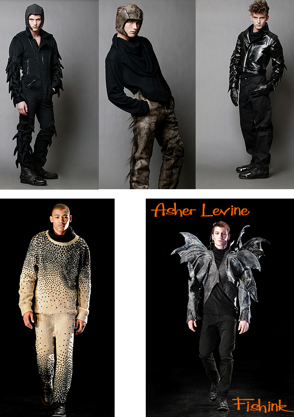


Brought up on bread, cutting and sewing, the Discovery Channel and science fiction, for Asher it is perfectly natural to embroider his every creation with details taken from the biological and scientific universe. It is even more spontaneous for him to interlace these inputs with dark visions of the future. An example is that of his biker shoes for Alpinestars, which manage to mix opposing concepts such as the underground communities of the New York nightlife and a high-tech clothing label for the hard-core motorcyclists who indulge in extreme sports.

He has also collaborated with companies such as Dr. Martens, Converse and many more. We have to remember that Asher is someone who makes clothing for the stars of today and the likes of Lady Gaga, Scissor Sisters, Bruno Mars and Black Eyed Peas are all amongst his clients.
Even though I don’t imagine many of us will be walking down the high street wearing Lavine clothing, I do admire anyone who can challenge people’s perceptions of how clothing should look and create stylish, cutting edge and fashionable clothing with a difference. The fact that he’s creating new textiles and fabrics as well as ways to wear clothing is fascinating. The next Galliano perhaps ? definitely one to watch.
There’s another interesting video to watch here on a fashion site called The Cut.
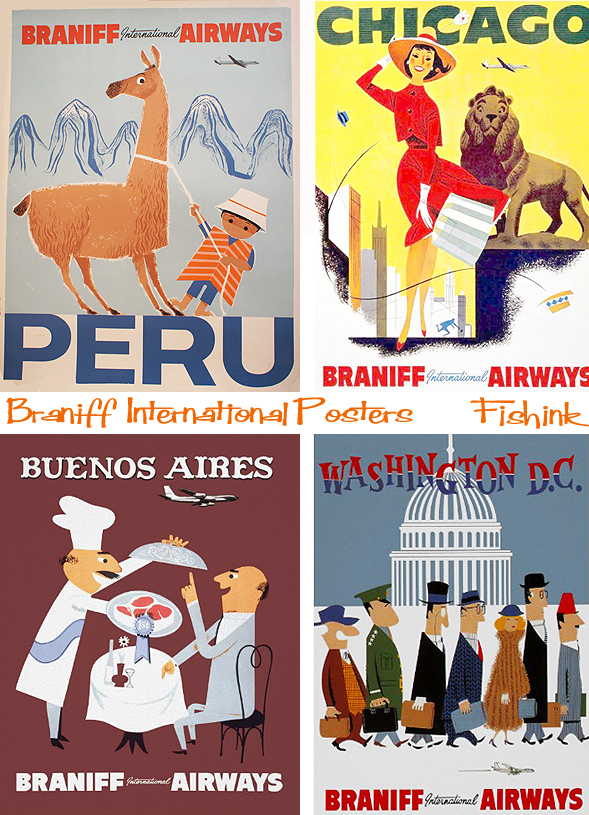
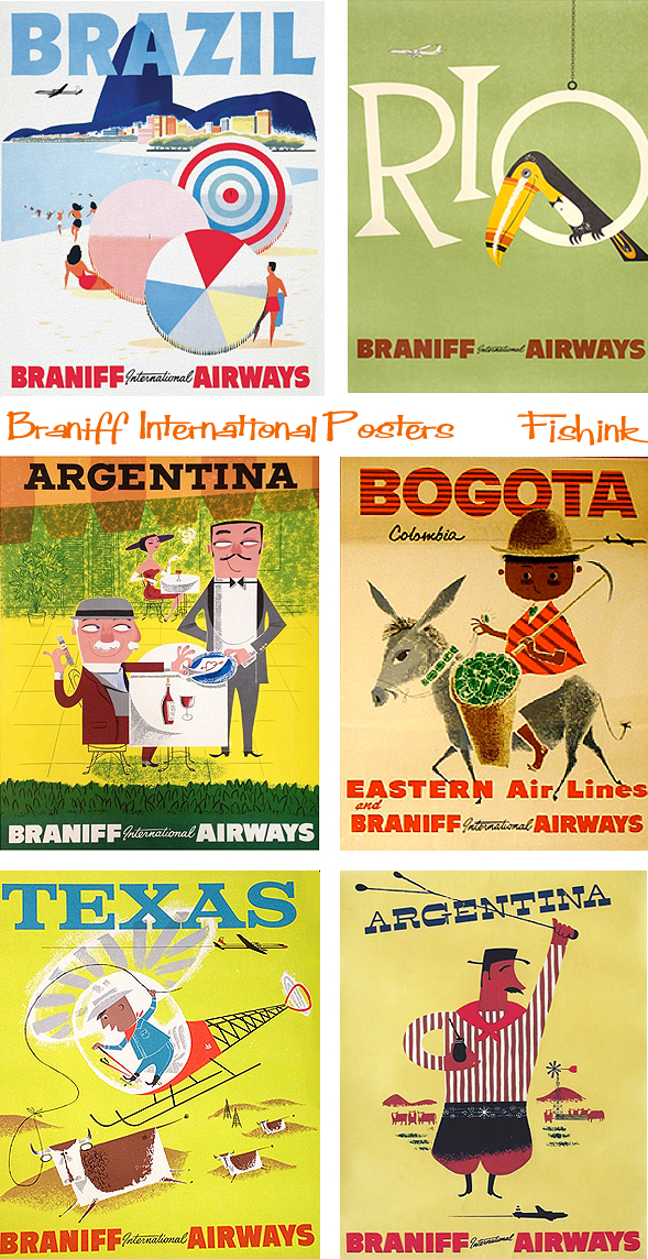
Braniff International Airlines. Vintage Mid century Posters

The Braniff brothers started a new airline in 1930, named Braniff Airways, Inc. Braniff Airways began service between Oklahoma City and Tulsa and Wichita Falls, Texas, with Lockheed Vega aircraft. Braniff’s long-term survival was assured when Paul Braniff, then general manager, flew to Washington, D.C. to petition for the Chicago-Dallas airmail route. The United States Post Office granted Braniff its first airmail route in the wake of the 1934 Air Mail scandal. In 1935 Braniff became the first airline to fly from Chicago, to the U.S.-Mexico border.
In 1968, Braniff opened the amazing “TERMINAL OF THE FUTURE” at Dallas Love Field.

The terminal had a rotunda concourse and a mono-rail system (opened in 1970) to transport passengers from their cars to the Braniff concourse. It was named the “JETRAIL” system. However, the mono-rail was only used 4 years because of the move to D/FW Airport in 1974. Waco, Texas briefly considered using the “Jet-Rail” for tourism, but that plan was eventually scrapped. The “Terminal of the Future” was designed by Jack Corgan (who had designed the rest of Love Field) and was decorated by Harper and George using Alexander Girard, Herman Miller and Ray and Charles Eames designs.

Braniff transformed its jets with pastel coloured paint jobs. Orange, beige and baby blue were ‘in’. Designer Emilio Pucci unveiled new ‘stewardess’ uniforms that looked like something the Jetsons would wear. There was no one uniform look. Cabin crew were given a capsule wardrobe of symmetrical outfits and multiple outfit changes were standard on flights –so the crew would sport a different look at boarding, meal times and on night and day flights.


And it wasn’t just the uniforms that were colourful.

Sadly Braniff expanded too quickly and suffered from rising fuel prices and the Airline Deregulation Act in 1978, which opened the door to aggressive airline competition. 31 years ago, the airline sadly flew in the direction of many carriers today – into bankruptcy. Fortunately there’s still plenty of fab ‘n’ groovy artefacts available for us to marvel at.

Best of all were the range of wonderfully designed posters. Seeing these sparked my interest in the company and then through my research. the whole colourful story unfolded.


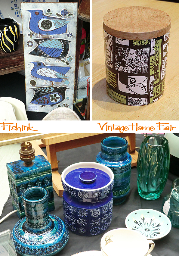
Vintage Home Fair in Victoria Baths, Manchester

Before the stormy winds come and strip the trees of their colourful ‘plumage’, I managed to get a picture of this beautiful tree that grows opposite my studio window, which is currently producing leaves of red, yellow and green all at once.
Victoria Baths is on Hathersage Road which is a couple of miles south of Mancheser City Centre in an area called Chorlton-on-Medlock.
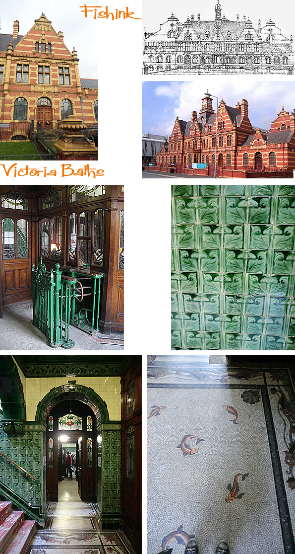
In 1902 Mr Henry Price was appointed as the first City Architect of Manchester and became responsible for the Victoria Baths building project. Building commenced in 1903 and a commemorative terracotta coat of arms was installed in the Males 1st Class / Gala pool.
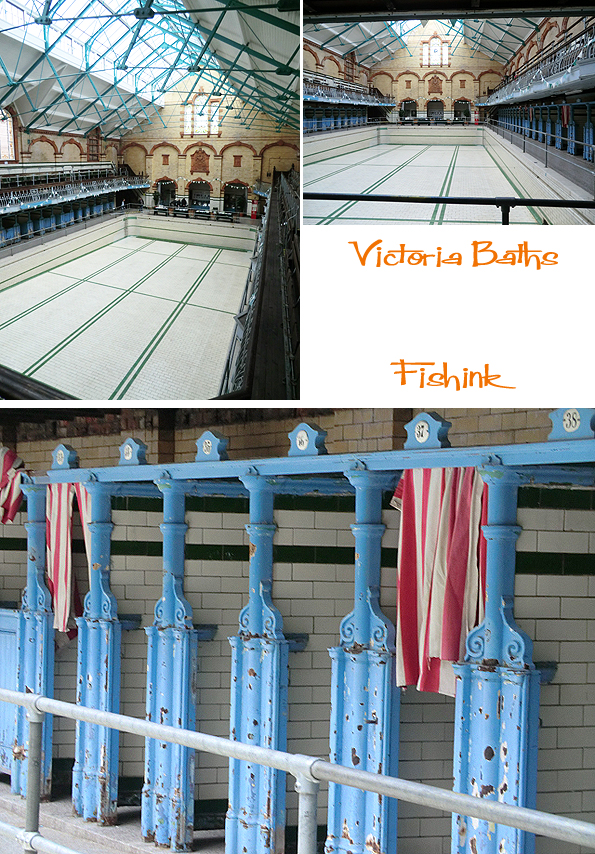
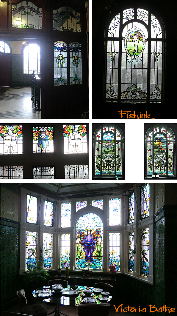

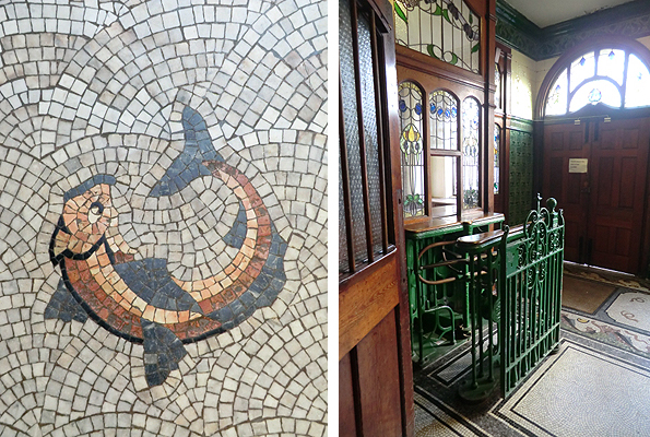
It’s been described as “the most splendid municipal bathing institution in the country” and “a water palace of which every citizen of Manchester can be proud.” Not only did the building provide spacious and extensive facilities for swimming, bathing and leisure, it was built of the highest quality materials with many period decorative features:- stained glass, terracotta, tiles and mosaic floors.
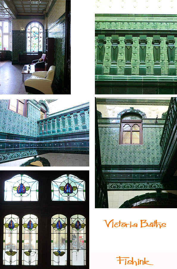
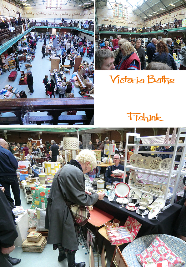
It closed as a public swimming pool in 1993 and is currently part of a massive renovation project, in 2003 more than £5m was spent restoring the frontage of the building, stained glass windows and the roof of the gala pool itself. I was lucky to spot a Vintage Fair taking place there last weekend and so jumped at the chance to have a wander around this splendid building and get my fill of some 50’s and 60’s memorabilia too ! It was quite a busy event.
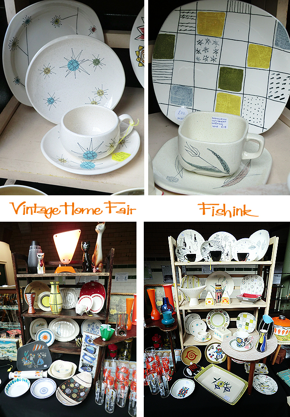
Lots of beautiful ceramics and patterns, love the colours and shapes on these dishes.
Amazing old retro illustration posters, even old movie posters taken from cinemas in the 1970’s. Glass, fabrics, furniture in abundance.

Even some of the stall holders live and breathe the retro life, this lady looked amazing with her grey suit and stole. I saw this Blue and cream Fidelity Radio Stereo player, exactly the same as one I had as a kid, it brought back some fine memories.
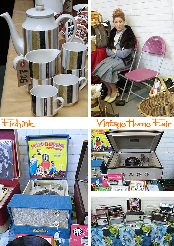
Love this Portmerion ‘totem’ range, and the wooden letter blocks on one stall.

My one regret was not buying this bird plaque which I had in my hand and thought that £36 was a little pricey (what was I thinking !) but I did treat myself to this 1960’s or possibly 1970’s green and black ceramic pot for £5 and was very happy with it, so all ended well. A great day out and do watch out for more news about further events advertised through the Vintage Home Show.
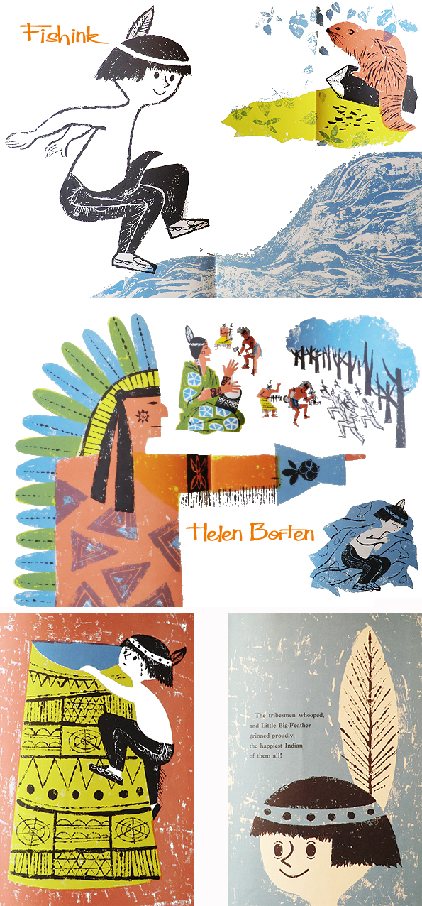
Helen Borten Illustration Heaven Part 4 Halloween Special
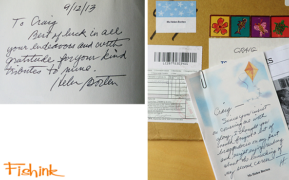
Exciting news for everyone who appreciates the beautiful work of artist Helen Borten. Very kindly Helen sent me two of her published books that I didn’t already have, so now I can share them with you too. She even signed them with a thoughtful, personalised message. I was rather humbled and excited at their arrival, as you can imagine lol
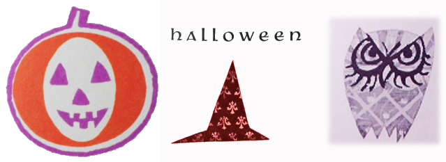
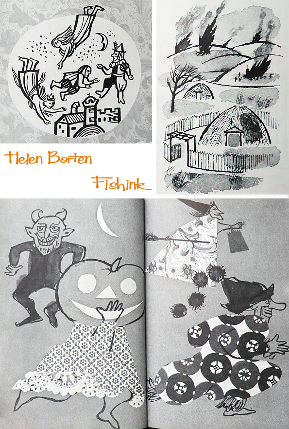
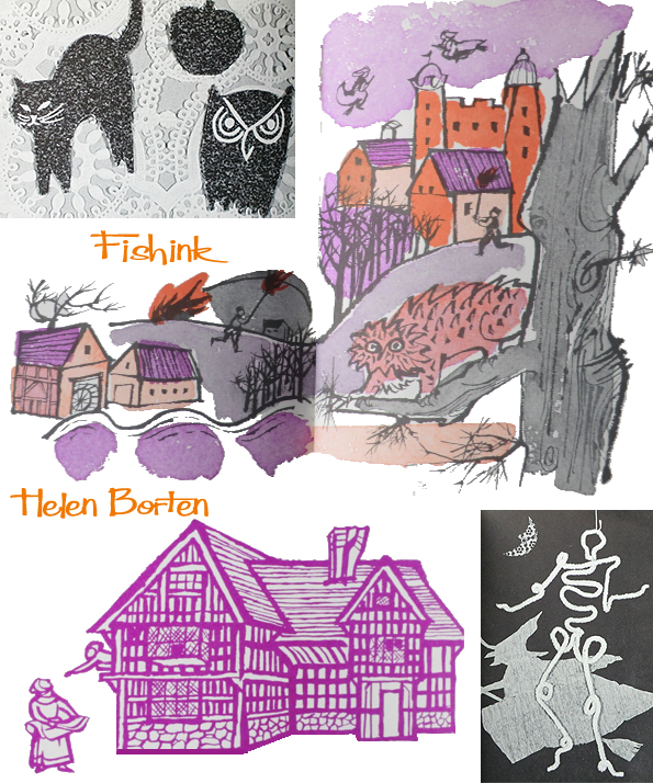
Firstly, as it’s Halloween tomorrow, I thought it rather appropriate to feature this 1965 publication that I already owned but hadn’t yet shared, with Helen’s artwork. There was a whole series of Crowell Holiday books all featuring different holidays in the American calendar. Other artists featured were Aliki, Paul Showers, Ed Emberley and Ati Forberg. As usual with Helen’s work I love the range and diversity captured in her illustrations.

Pagan festivals and evil demons, they’re all here and I love the purple witch with her broom-riding sidekick !
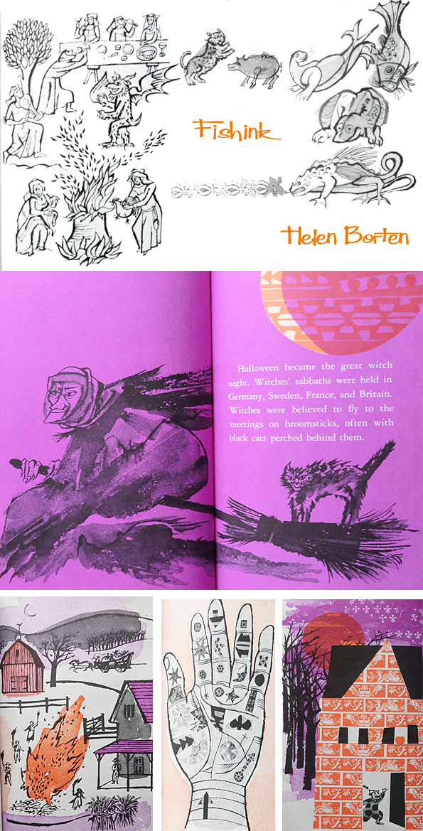
The use of a variety of grounds, patterns, papers and materials to construct these collages, somehow makes work from this period stand out.
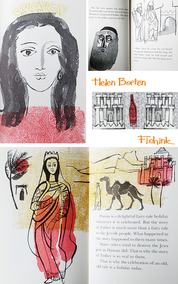
Here’s the first or Helen’s kind donations. ‘Purim’ another book in the Crowell Holiday Series. I’d never heard of this before, apparently it is a Jewish holiday that commemorates the deliverance of the Jewish people in the ancient Persian Empire from a plot to destroy them. The story is recorded in the Biblical Book of Esther.

Purim is celebrated by giving reciprocal gifts of food and drink, giving charity to the poor, a celebratory meal, and public recitation of the Scroll of Esther, additions to the prayers and the grace after meals. Other customs include drinking wine, wearing of masks and costumes, and public celebration. I love the way that Helen uses collage to create these outfits below. Such a lovely array of watercolour and pen and ink techniques.

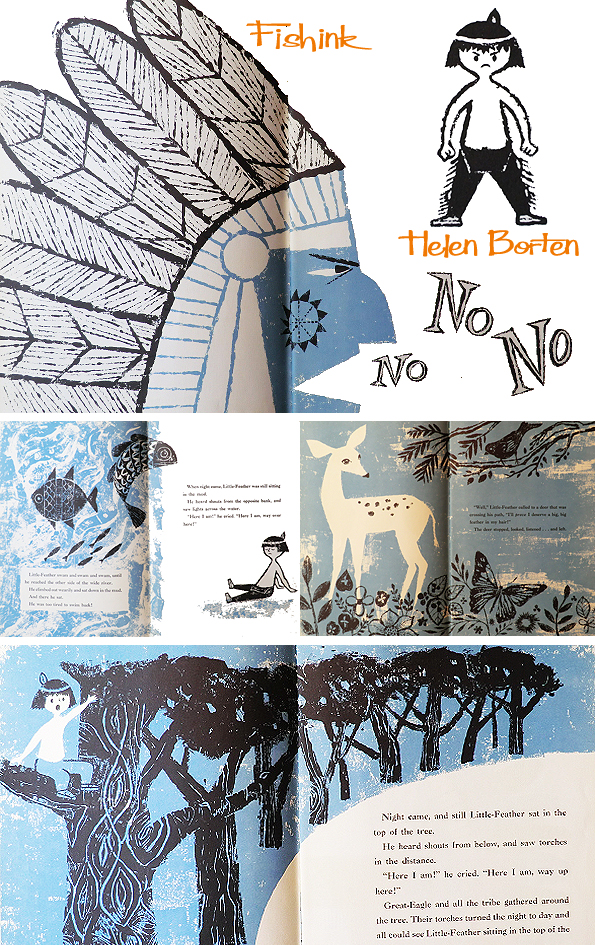
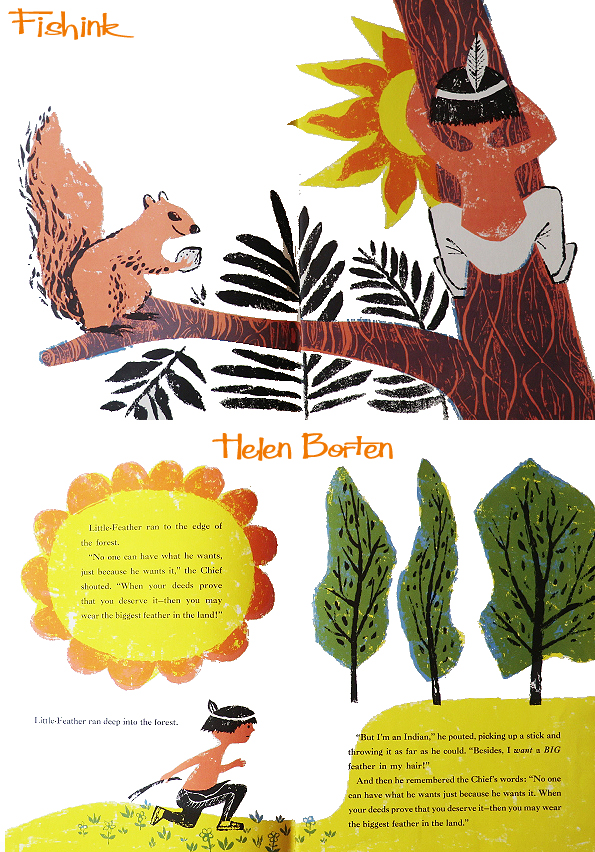
The last book I’m going to feature today was ( I believe) one of Helen’s first to Illustrate, ‘Little Big Feather’ from 1956 (more info here). Helen’s donated copy no longer has it’s cover but it would have looked like this. This book was featured in the New York Times Ten Best-Illustrated Children’s Books of 1956 and it was this fact that gave Helen’s career a great boost.

Helen’s beautiful free and easy style shines through right from her first book.
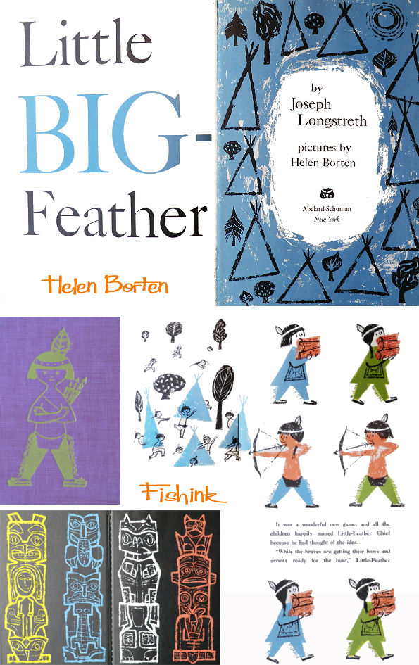
Aren’t the colours and sketches so creatively put together, I find them very inspirational.
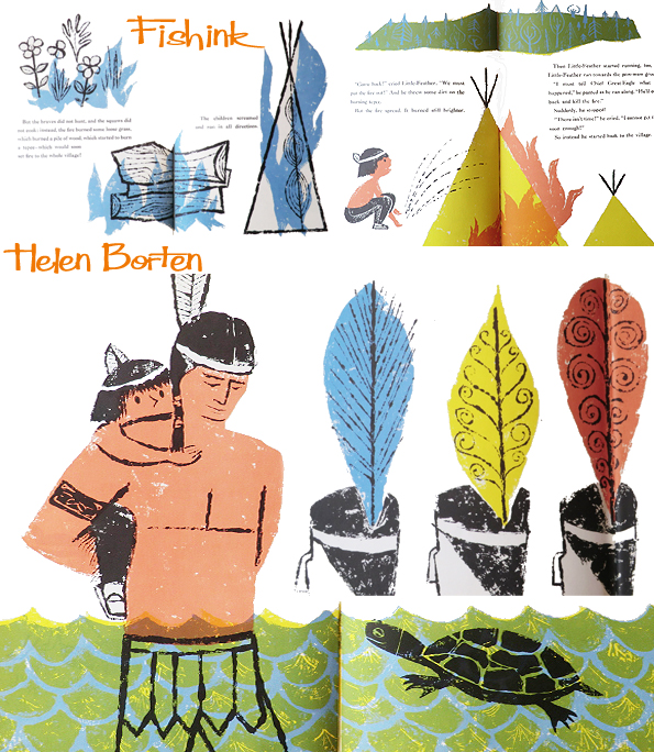
I can only imagine how much fun it must have been to assemble all the different drawings, watercolours, prints and collages to make each book the illustrative joy that it is. Look at this wonderful beak nosed Red Indian saying ” No. No, No ” ! It’s a style that modern illustrators are copying today, but Helen was one of the first artists to create and introduce it.
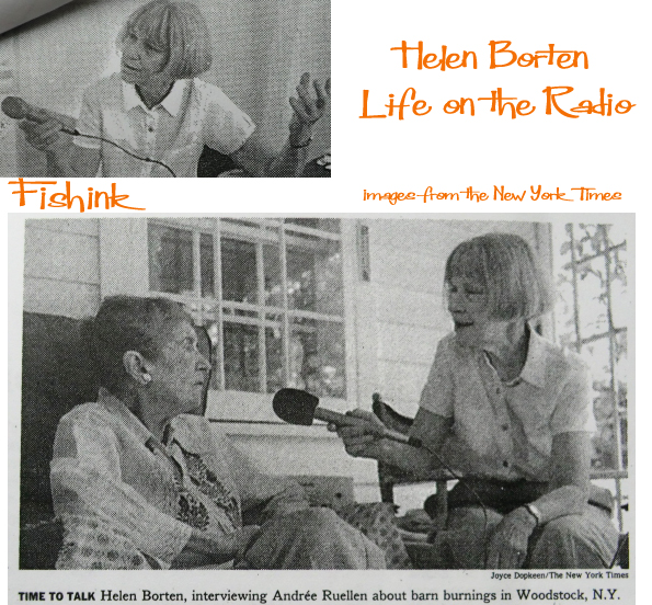
Helen still works but these days it’s more in the radio industry. Here’s a couple of images from a 1997 article published in the New York Times, which writes..
“She works alone recording her interviews on a portable Marantz cassette recorder and, without a transcript, editing on dual Otari machines in her west side apartment in Manhattan. ” She has the ability to see the story behind the story ” said Leonard Lopate, a colleague and host of the National Public Radio Program. ‘New York and Company ‘ who unabashedly calls Ms. Borten a genius ”
Helen said ” People say, ‘How do you get your interviewees to say those things ?’ I just talk to people, sooner or later they forget the mike. ”
She has won awards for her work as a producer of a series of programmes called ” A Sense of Place”. Remarkably with a little internet searching I came across one of Helen’s broadcasts here. How lovely to hear her voice and words. Helen has covered such topics as Mohawk Ironworkers who walk up skyscrapers, barn burnings in Woodstock NY, Circus life and Fisherman rivalries in the shrimp industry. It appears her productions are as cleverly intricate, beautifully drawn out and multilayered as her illustrations. More about Helen’s achievements on the radio here.
What a talented lady. Thanks again Helen for your kindness and wonderful work, it’s been a joy looking through your work and communicating with you. Happy Birthday to your son, who I believe was also born on Halloween. Hope he wasn’t such a little monster when he was little lol !
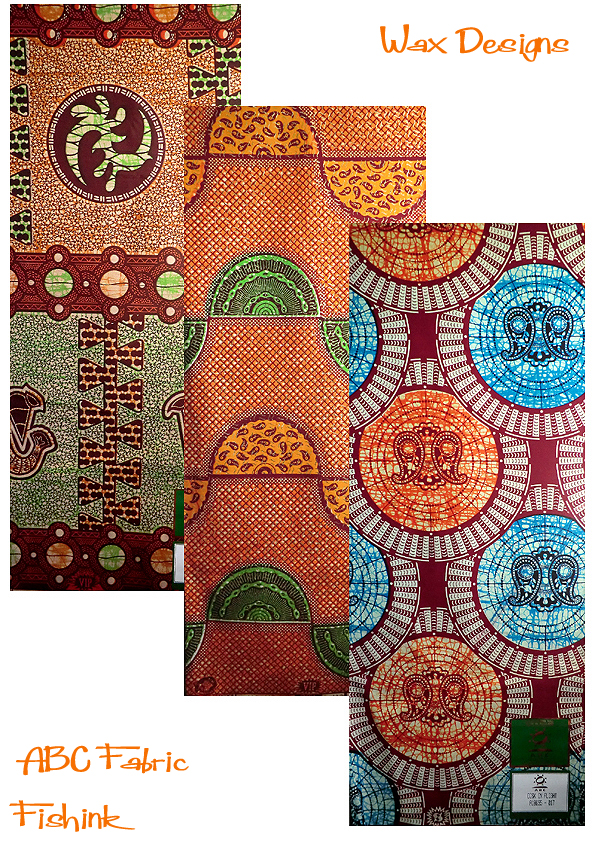
Fishink from African Wax to Aduna Products

Creative people that I encounter and readers of my blog often ask me the question ” What did you do before Fishink ? ” so in a small attempt in answering this question, I’ve decided to share a little of the creative journey that has led me to where I am today.
Three years ago I was made redundant from a company who designed wax printed fabric for the African marketplace. I had been working there for about 12 years, and during that time, sadly the larger group who owned the company overseas had imploded, leaving behind, in the UK company a small studio of about 6 designers from a company who, in this country alone, had once employed about 500 workers.
Here’s an article from the Manchester Evening News from last year which explains a little more and here are some of my own designs that I created over the 12 years whilst working there.
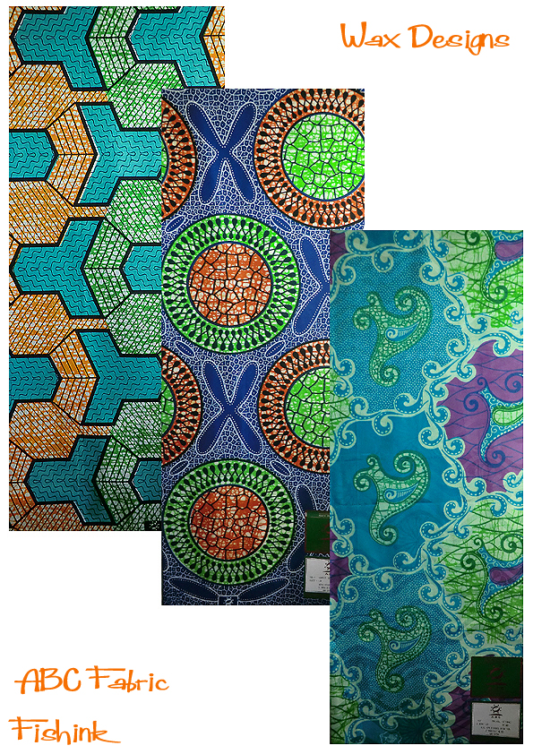
The company created fabric which sold in London, USA, Holland, Ghana, Nigeria, Ivory Coast, Benin, and Togo to name but a few places. It was an amazing process to watch a design be printed. Firstly the fabric would be printed with the wax, using engraved metal rollers (with the designs that I created) that scooped up hot molten wax from a trough and placed it onto the fabric in all the areas (on the designs below for example) where the dark linear artwork didn’t appear, i.e. where the coloured areas are. The fabric would then travel through a number of indigo dye baths until the correct depth of shade was reached. The wax was used as a resist, because it literally resisted the indigo dye from reaching the original white cloth surface.

The fabric would then travel through various machinery and get twisted and scrunched in all manner of ways in order to crack the wax and release areas of previously unexposed fabric. These areas would next be printed with the first and second colours. The remaining wax would then be washed off and the last plain colour could then be printed with no wax effects showing in these areas. Walking around the factory when the machines were in full service was both exciting and deafening at the same time. The factory felt like a cross between Heath Robinson and Willy Wonka, with a myriad of pipes running all over the place and with fizzing steam, thick gloopy dye and hot dripping fabric sitting in huge plastic containers on wheels, momentarily paused on it’s way from one process machine to the next.
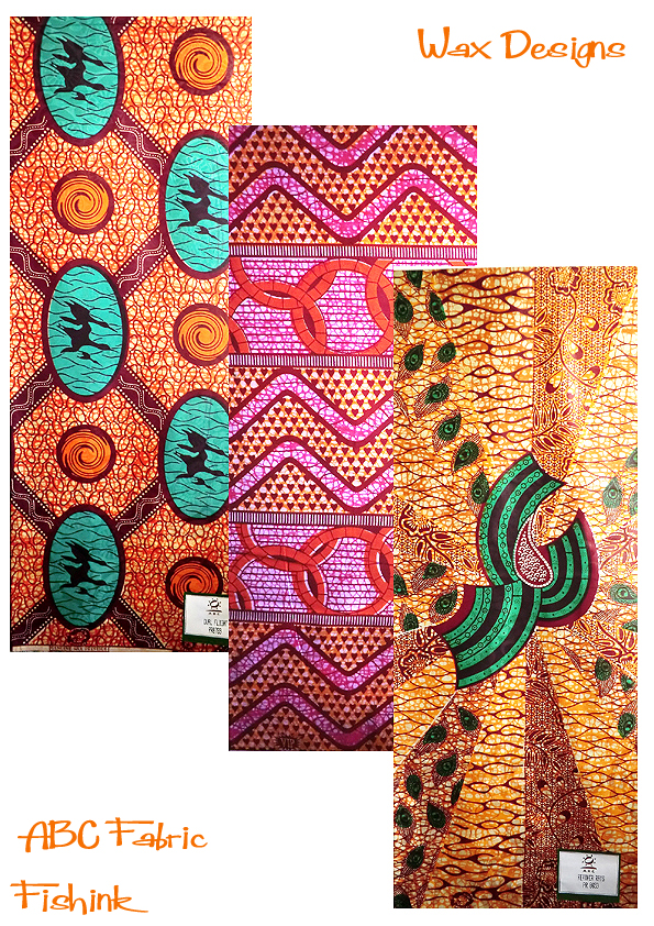
Some of the more expensive fabric collections would then have coloured foil design adhered to the cloth, by first printing glue and then using a heat process to fix the foil onto the glue and therefore onto the surface of the cloth. The excess foil would then be peeled off and the surface of the fabric had an amazing shimmer and would catch the light. I can see why the product worked so well under the hot African sunshine.

It was really sad to see the demise of an industry happening around us. We had spent time out in Ghana, Nigeria, and Benin working with the designers who were based there and we were part of a huge global company that had once been a king amongst it’s countrymen. A familiar story with so much of the textile industry today and although six designers still work there, the original site has now been cleared for a new industry to take it’s place.
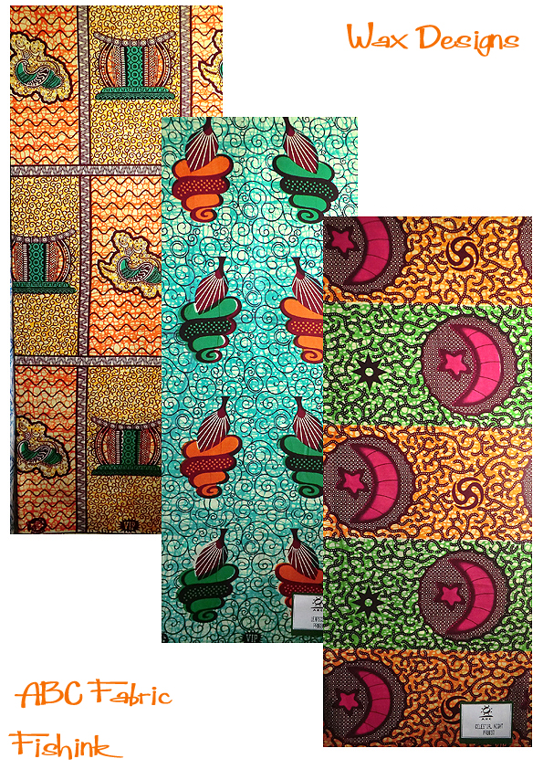
A lot of the products I worked with were specifically for the Ghanian marketplace. They have a huge wealth of historical symbols and meanings that are part of their heritage and would appear in old and traditional designs that their grand parents might have worn. Familiarity and recognition of shapes, colours and symbols would sometimes determine how well a design might sell in the marketplace. My work was to create new designs that looked traditional, I hoped I managed it.
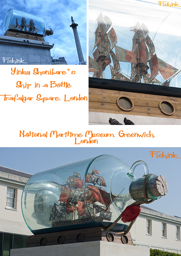
During my time with this company and since, the designer Yinka Shonibare, who has recently had a huge exhibition at the Yorkshire Sculpture Park, used the fabrics we created to adorn his mannequins and one of my designs took flight on the sails of his Ship in a Bottle, now on one of the plinths in Trafalgar Square, London.
I was fortunate to be approached by a London based company Aduna who were in the process of creating a health and beauty brand using natural African products. They were looking to work with a designer who had had experience with the African textile market, we met, exchanged a few skype calls, emails and drawings and the eventually first of the designs for their Baobab range was born. That was 12 months ago and I’m now working on the next.


I was really happy with the end design and the company owners are selling it in the likes of Harrods and are in talks with other high end distributors.
Another customer wanted me to design a range of wax inspired cards, which sadly didn’t materialise, due to lack of funds. Perhaps I’ll create a range and sell them at some point in the future.

It’s nice to think that little areas of wax related products are still in demand and being seen in the UK and abroad. Next time you see some, think about where it may have originated.
Helen Borten Illustration Heaven Part 3
This is the third post concerning Illustrator Helen Borten that I’ve been able to assemble recently. I’ve been a fan of her 1960 and 70’s illustrated books for some time. By chance I came across Helen’s contact details and we have been emailing one another for a while now. She kindly agreed to send me some images of her own artwork that she has framed in her home. Also graciously allowing me to post it here so that we can all appreciate her beautiful sense of line and colour. Here’s a few of her early sketches.
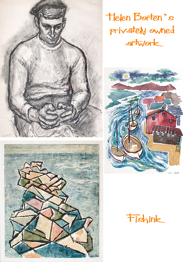
She recalls ” The charcoal figure was done from a model in art school– I was 18 years old and afire with the idea of becoming a fine (as opposed to commercial) artist. Then life intervened… ” I love these two birds, you can gather all the information necessary to explain what is happening from such fine and stylish linework .

A couple that were made in 1968 from Helen’s book ‘The Jungle’.

Finally a couple of Oils. Such vibrant movement in this bird and beautiful colour in the fruit-bowl still life.

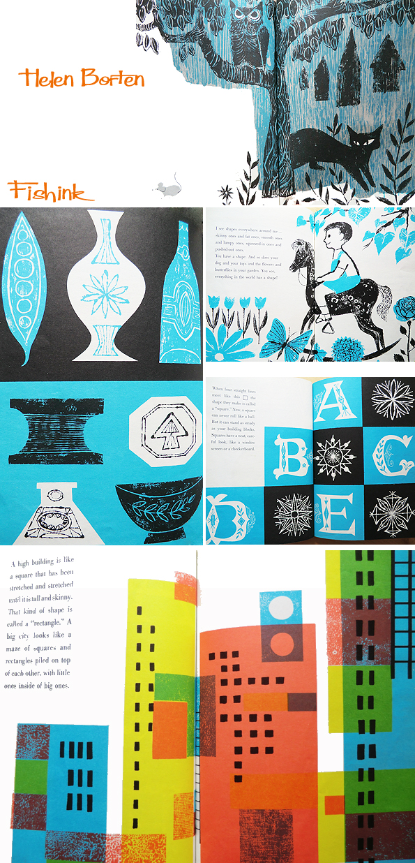
I’ve some further images from two more of Helen’s books. Firstly ‘Do You See What I See ?’
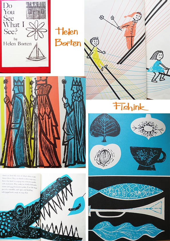
Such a variety of mark-making , textures and use of minimal colour here.

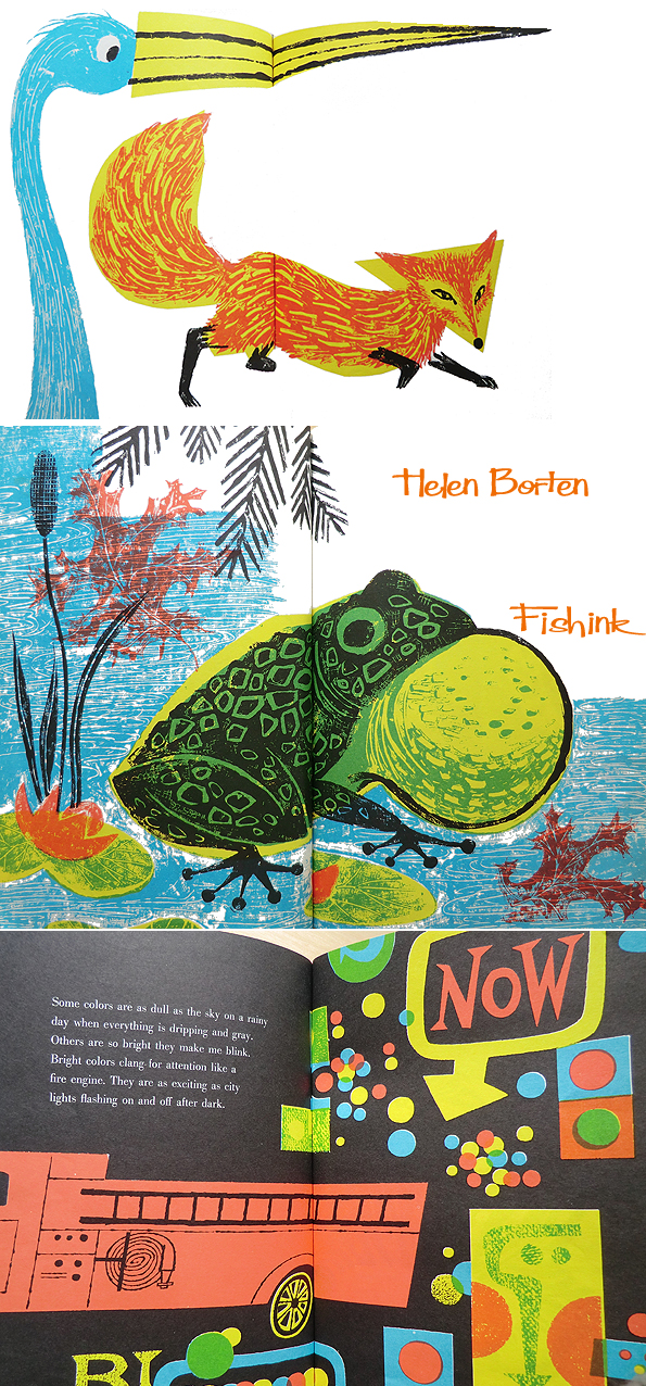
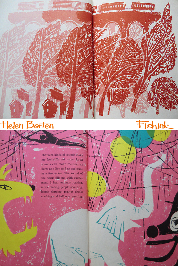
Another book ‘ Do You Hear What I Hear ? ‘
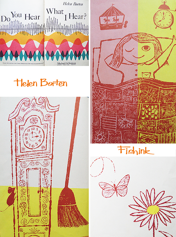
You can feel the speed of the train and the wind in the trees here.


Helen and I were discussing various books of hers and I said that I hadn’t seen her ‘Tales of America’ … she had an interesting memory of it.

” It was my first book illustration job and its author was quite famous at the time. Does the name Burl Ives mean anything to you? He was our foremost folk singer and became an actor too, his best-known role being Big Daddy in Tennessee Williams’ “Cat on a Hot Tin Roof”. I was a kid less than 3 years out of art school and showed my portfolio to the art director at World Publishing (now defunct, I believe). My professional samples were book jackets and record album covers at that time. He offered me the Ives book at a ridiculous sum and, novice that I was, I countered that it wasn’t enough for the work required! He was so taken aback he looked at me as if I’d suddenly grown horns. So there we were, arguing over price, this little nobody (a female yet !) and the big-time art director. I seem to remember I asked for double the amount but I can’t be sure. Amazingly, he accepted my terms — but with a very bad grace. In other words, he was sore as hell. Then, when I handed in the job, he was so pleased with the results that he apologized for the former tiff! Actually admitted he was wrong to offer such a pittance! There ‘s an interesting twist to that tale that happened after the book came out — how much later I don’t remember. My husband and I were on holiday at a seaside resort and I spotted Burl Ives sitting in a boat tied up to the dock. We walked up and I introduced myself as the illustrator of “Tales of America”. He invited us on board and we spent a couple of delightful hours chatting with the famous man as the sun went down — he even strummed the guitar and sang a folk tune for us ! ”
There are other past blogs about Helen’s work which you can discover by typing her name into the search box on the right of my postings. More about Helen to come as a Halloween treat. Watch this space. If you enjoyed this post, please pass it on or share the site with your friends. Thank you.


