Bengt & Lotta Stylish Contemporary Design

Do you ever have one of those days when one thing seems to draw you to another as if it’s a secret to be discovered ? Today was one of those days for me. I came across some fabric that my friend’s German mother had given to him. It strongly reminded me of something that I had seen a while ago on the internet.
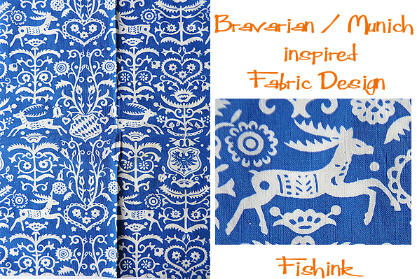
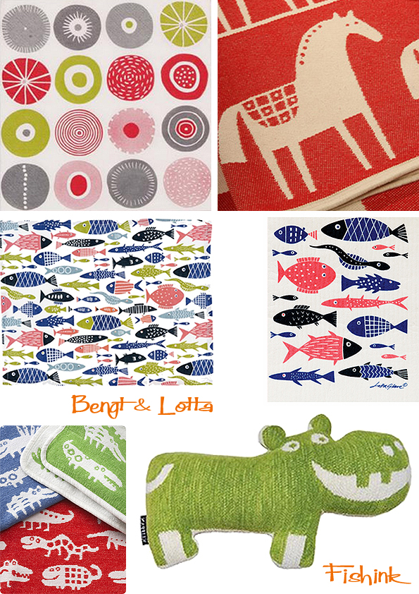
And I soon discovered, it was this lovely tea towel by illustrator Lotta Glava, but it wasn’t German or even Austrian but Swedish. I then looked into the work of Lotta and her partner Bengt and discovered a whole new world of beautiful and stylish Swedish design.

Bengt Lindberg and Lotta Glave were a couple already at university, studying graphic art and illustration.
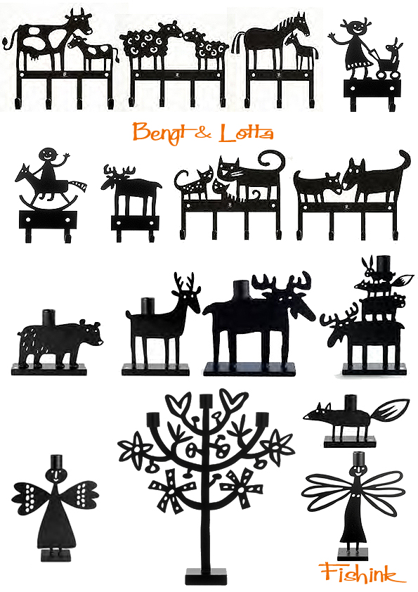
After graduating, Lotta got a job at one of Sweden’s main newspapers, Dagens Nyheter and Bengt at an ad agency that turned out to be a pretty boring job. Neither of them could resist the flow of creative ideas that kept coming. For Bengt, it all started with a cow, which became a cast iron candleholder. The cow was soon accompanied by a sheep, a horse and an elk, all produced in Småland, Bengt’s home county. Bengt made sure to launch them in all the right stores and as for the elk, it coincided with the enormous interest in elks from German tourists who would even steal the road signs of elks when visiting Sweden! The four classics are still in production and have spread all over the globe, from Sweden and Germany to the US and Japan. But it didn’t stop there; the animals soon also populated printed fabrics, blankets and notebooks. Here’s just a taster.

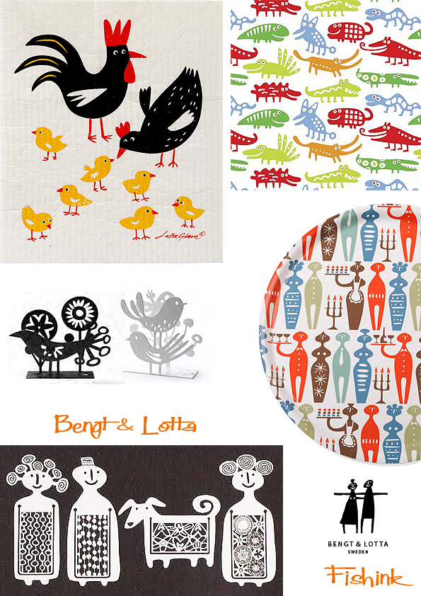
Bengt was born in Värnamo, in Sweden but his grandparents had a farm in Skåne, filled with objects of art, handicrafts and nick-nacks. I have always loved old things, says Bengt, especially the slightly naïve, clumsy folk art stuff. When things are too perfect they also get to be boring. The ironwork on their company site is fun and quirky.
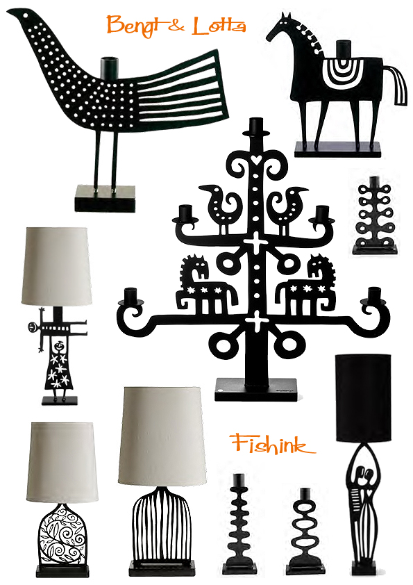
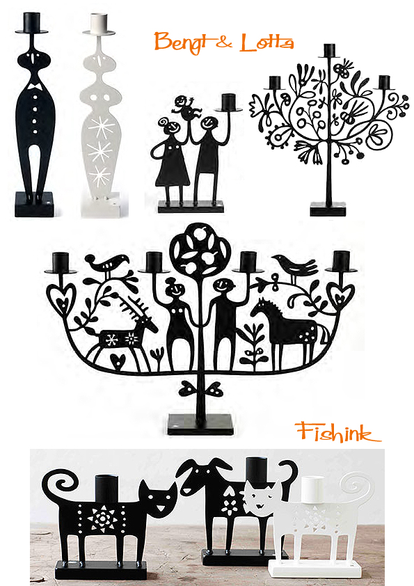
Lotta Glave, who stems from Malmö believes a lot of her inspiration comes from her Austrian grandmother who worked as an illustrator and bookbinder. Their home was always filled with fun, homemade creations like fantastic doll’s houses made out of lacquered paper! I love stuff that is fun, different and makes you happy, says Lotta who got drawn into the family business when Bengt asked her to draw an angel. Like Bengt’s animals, Lotta’s angel has spread from candleholders and Christmas tree decorations to necklaces and fabrics. Nowadays, Lotta designs most of the patterns; designs that are appreciated all over the world, not least in Japan and the U.K.
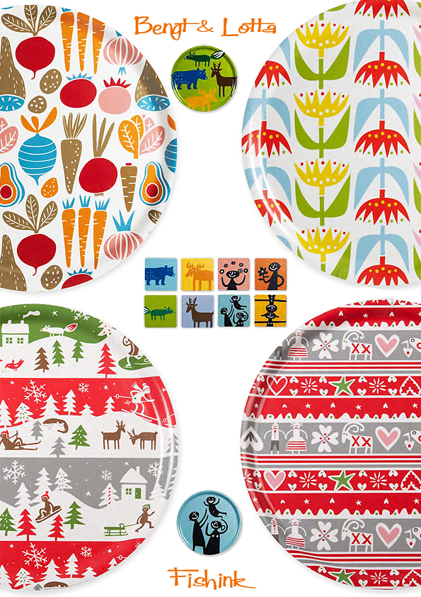
Today, the couples creations are represented at Nordiska Muséet in Stockholm, Kulturen in Lund and at Växjö Glass Museum. And if you visit their little store in Stockholm you will find them surrounded by hundreds of other items; trays, lamps, furniture, porcelain, serviettes, as well as thousands of ideas that haven’t
materialised yet. Here’s a couple of christmassy images of their shop…. this alone makes me want to go !
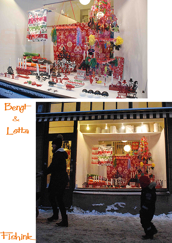
Many thanks for the info and images from Bengt & Lotta and Scandinavian design site Fjorn also well worth a look.
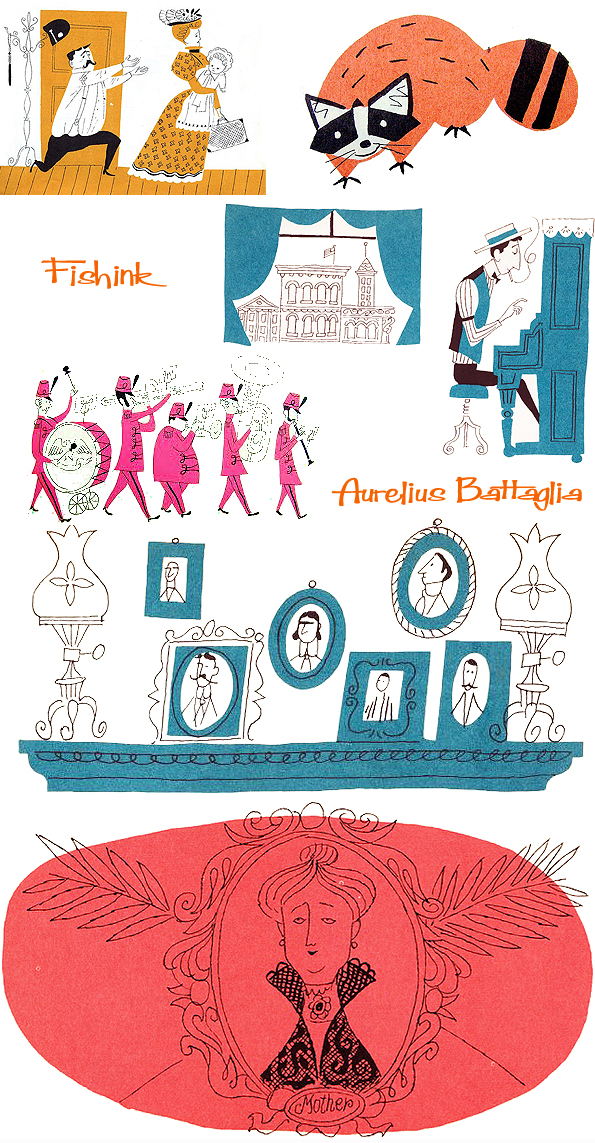
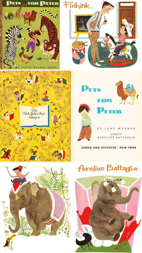
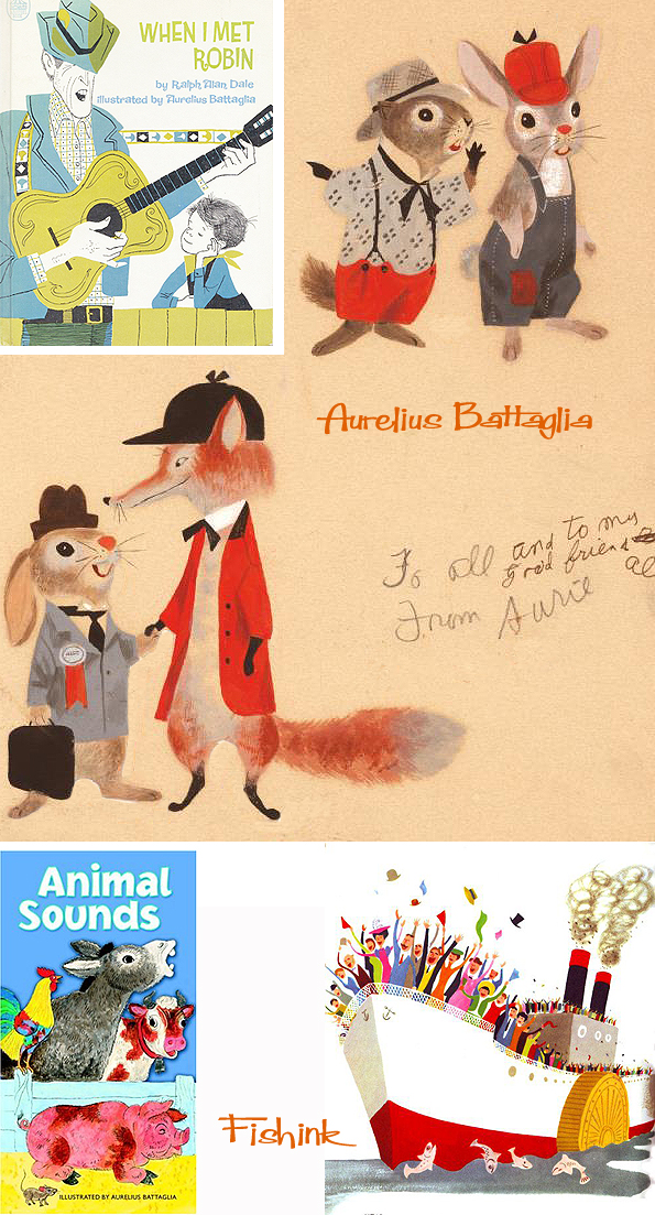
Aurelius Battaglia Disney Illustrator creating midcentury artwork.
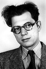
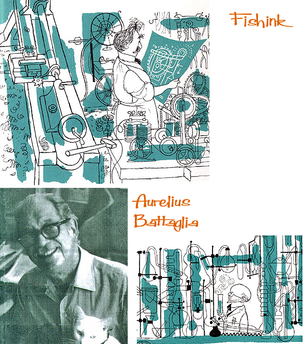
Aurelius Battaglia was an American illustrator, muralist, writer, and director. It looks like he’s sporting a very early pair of Mickey M ears in this photograph, well after all, he’s not alone in liking that Disney mouse lol !
Born in Washington, D.C., in 1910 the son of Giuseppe and Concetta Battaglia, who had emigrated from Cefalù, Italy. Aurelius went on to attend the Corcoran School of Art. Graduating as one of the Corcoran’s most promising students and winning $50 in a Corcoran-sponsored art contest.
 \
\
Aurelius migrated west in the late 1930s and worked for the Walt Disney Studios from 1937 to 1941. He contributed most notably to Dumbo, Fantasia, and Pinocchio and is credited as one of the writers of the latter. In the mid-1950s, joining United Productions of America, a studio staffed by some of the industry’s most accomplished, forward-thinking animation artists. Perhaps his most outstanding UPA contribution was the short film The Invisible Moustache of Raoul Dufy. Battaglia directed the film, which was nominated for a BAFTA award. You can watch it here.
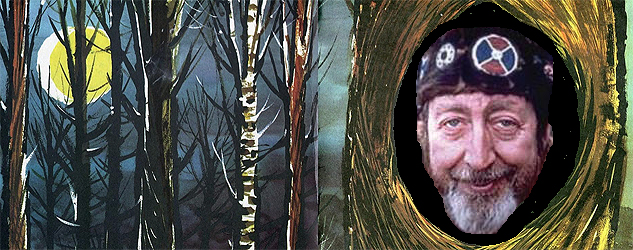
In the 1930s, he worked in a flowing, deco-influenced, organic style informed by classic European illustration. In 1934, the Works Progress Administration commissioned Aurelius to paint murals in the children’s section of the library in the Mount Pleasant neighborhood of Washington where he resided. The result was a stunning, whimsical panorama of anthropomorphic animals at play “Animal Circus”. It still hangs in the alcoves of the building’s second floor. The Mount Pleasant Library is located at 3160 16th Street, NW Washington, DC 20010.
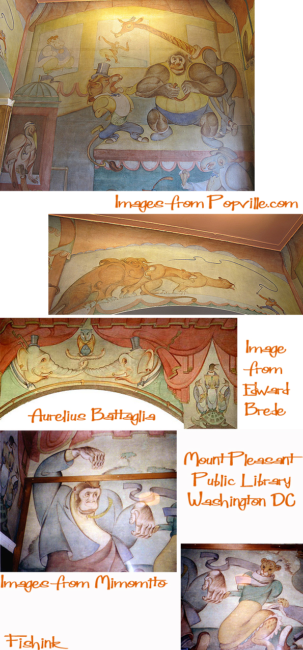
From 1937 to 1941, he worked for Walt Disney studios. In 1940, he drew Mickey Mouse, he was part of the illustration and writing team that created ‘Pinocchio’ (1940), and just the illustration side on ‘Dumbo’ (1941) and ‘Fantasia’ where he worked on the elephants’ dance sequence….which I think is this one.
His later children’s book and animation work was emblematic of the radical, more abstract stylization prevalent in the 1950s and ‘60s, a trend he helped to establish.
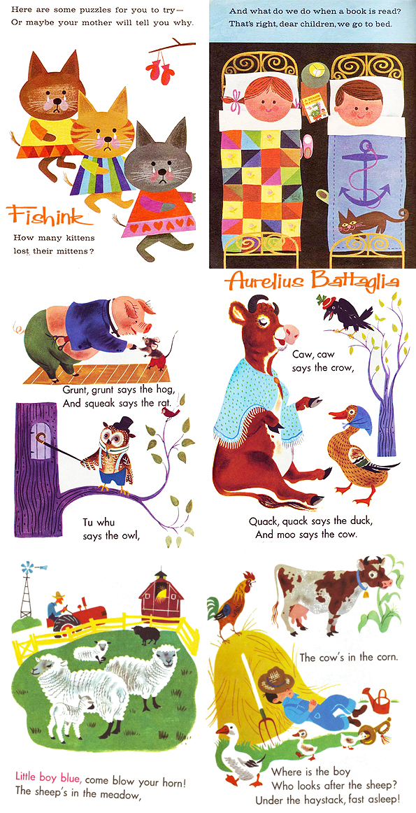
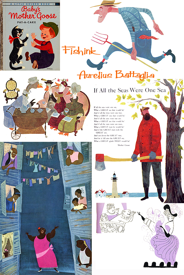
He created some amazing children’s Illustration.
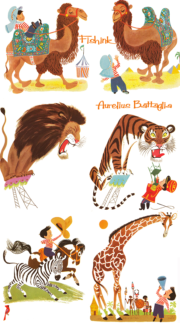
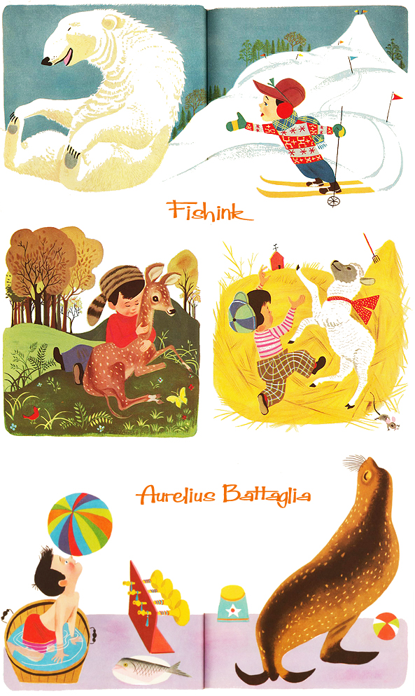
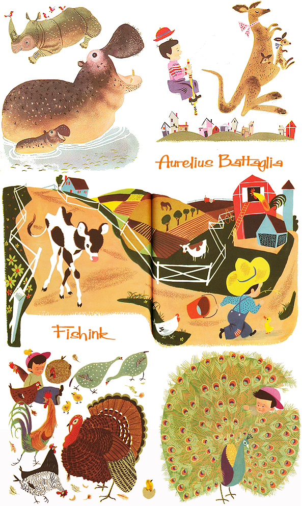
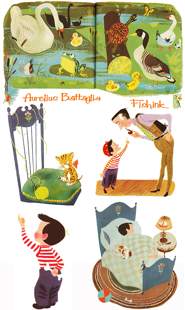
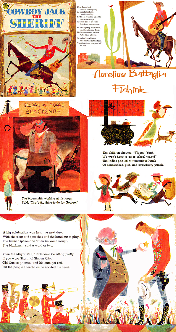
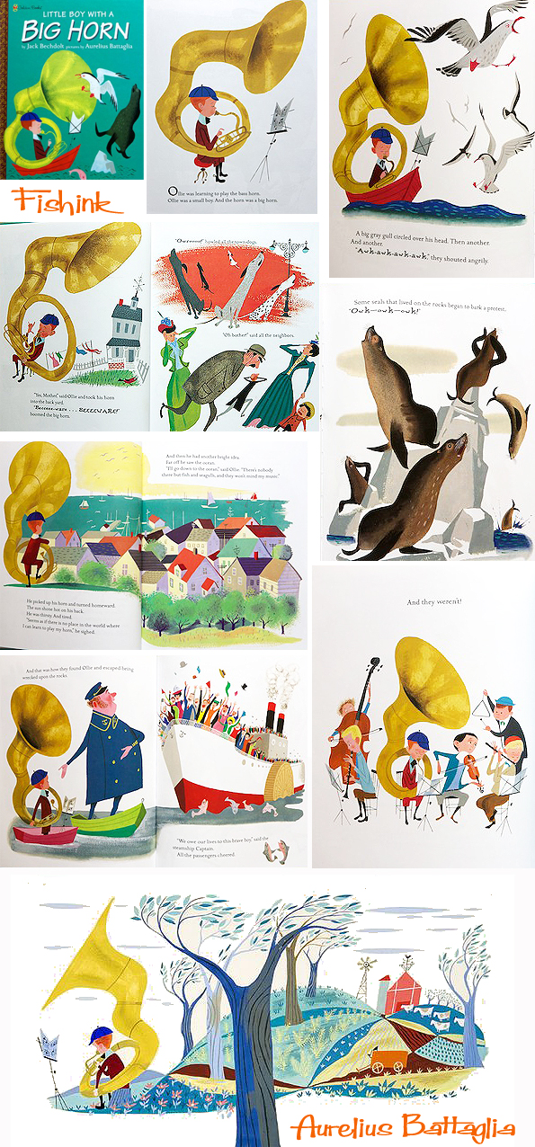
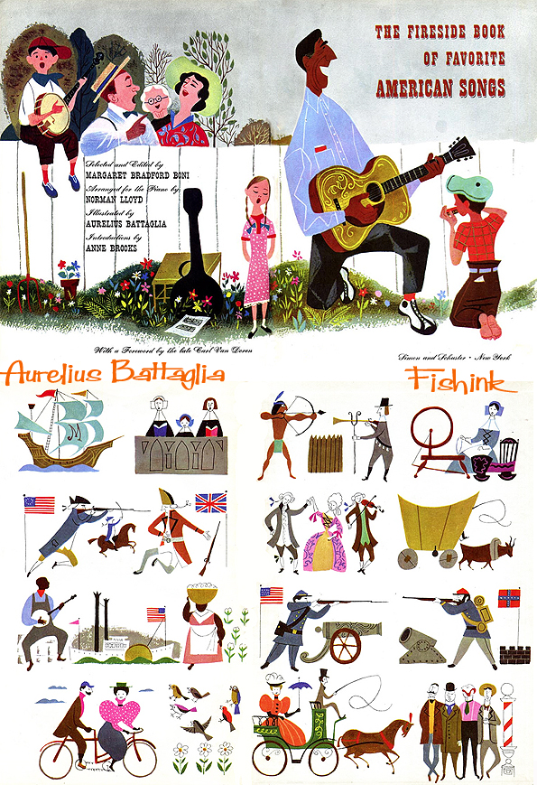
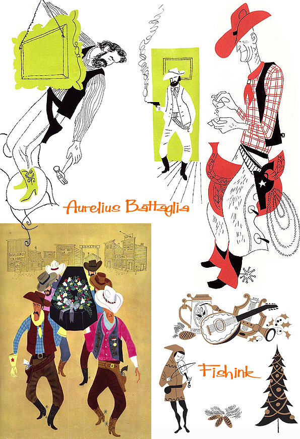
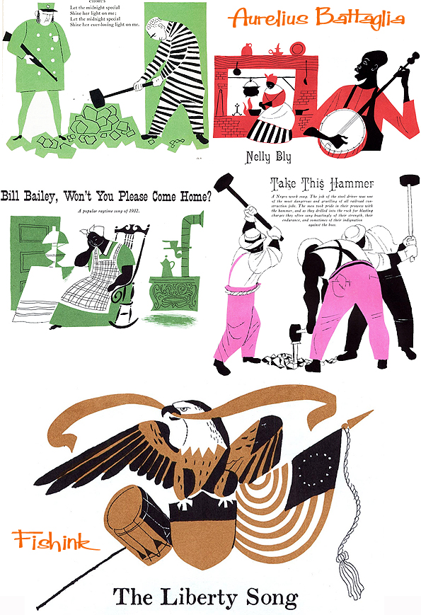
His picture book work in the 1950s and 1960s differs significantly from the deco-inspired circus animals of his depression-era murals. They feature bold, solid colours and striking, stylized pen and brush work indicative of the looser, more abstract mid-century cartooning style that he helped pioneer.
Notable examples include “Cowboy Jack, the Sheriff”,
“When I Met Robin”, “Captain Kangaroo’s Read-Aloud Book”, “The Fire Engine Book”, “Little Boy With a Big Horn”
and “The Fireside Book of American Folk Songs”.
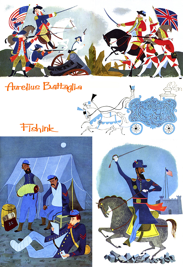
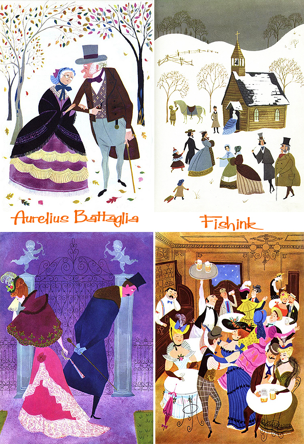
He spent the second half of his life in Provincetown (MA), a town of fishermen that in that period was full of artist who was coming from all over the States. He moved there, buying a house after he had visited the town in the 1930’s as a student and after he had spent a winter there in the 1947. He was a member of the Beachcomber club of Provincetown, where, every Saturday night, artists of the city met to drink, eat and talk in the harbour area. What an amazing artist with a fascinating life-story.
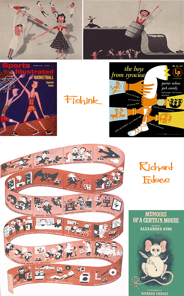
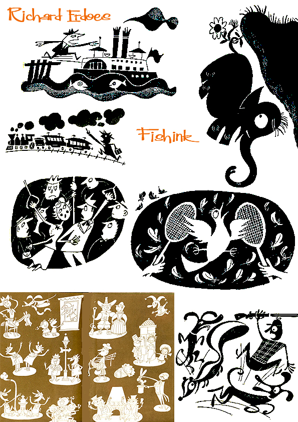
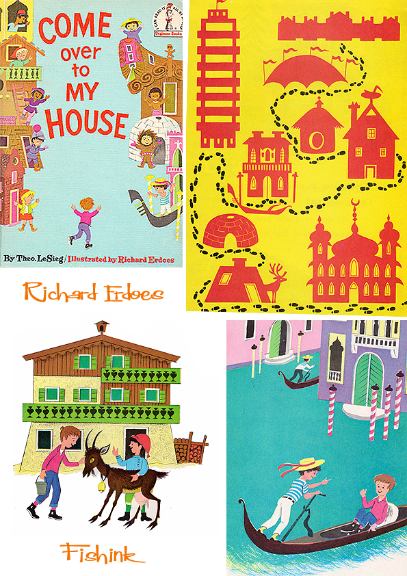
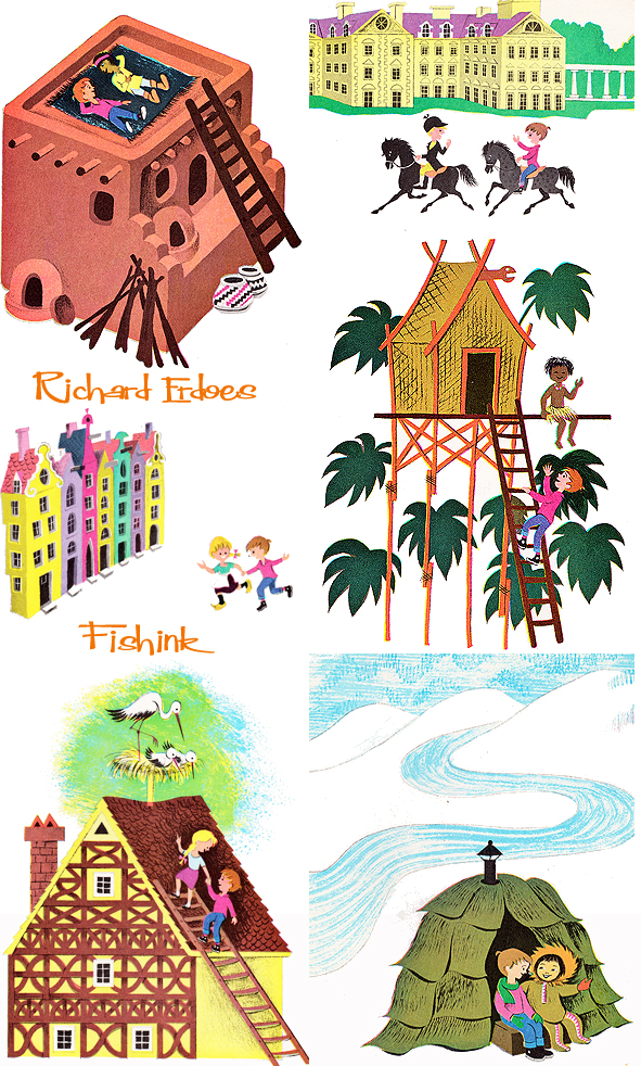
Richard Erdoes Illustrating his way around the world.
As this post is an extra, extra long one, I’ll post again towards the end of this busy week, enjoy Richard’s work.
Richard Erdoes was born in Vienna, Austria in 1912. His father, Richárd Erdős Sr, was a Jewish Hungarian opera singer who had died a few weeks earlier in Frankfurt. After his birth, his mother lived with her sister, the Viennese actress Leopoldine (“Poldi”) Sangora and Erdoes grew up traveling with them from one engagement to another in Germany and Austria. He was involved in a small underground paper where he published anti-Hitler political cartoons which attracted the attention of the Nazi Regime. He fled Germany with a price on his head. He fled to Paris and London, eventually ending up in the United States where he continued his early illustration career contributing to Life magazine, and creating three Joke books in the early 1950’s.


He got a taste for travelling a expressing his findings in an early book. ‘Come over to My House’ is a 1966 children’s book, illustrated by Richard Erdoes. The name “Theo. LeSieg” was a pen name of Theodor Geisel, who is more commonly known by another more familiar pen name, Dr. Seuss. The illustrations portray the various styles of homes that kids from around the world live in along with Seuss’s recognizable prose. Throughout the book they also cover what kids eat, how they sleep (Japanese wooden pillows), play (sledding on pine needles), and even clean-up afterwards (Polynesian hot spring).
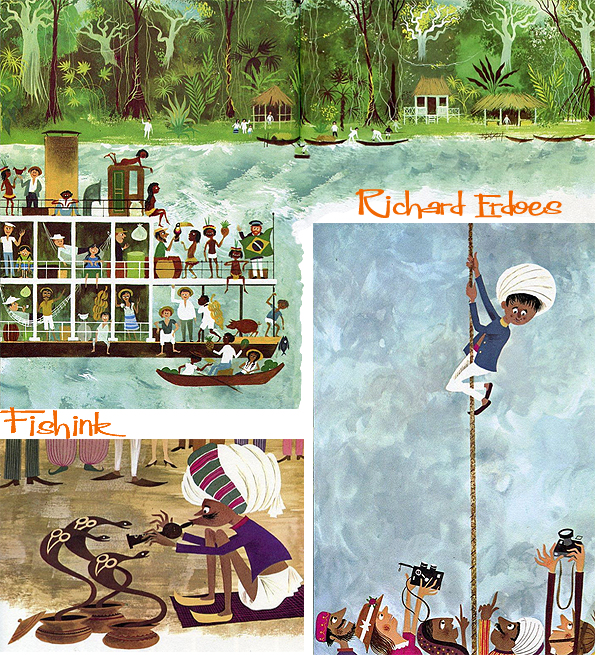
An assignment for Life Magazine in 1967 took Erdoes to the Pine Ridge Indian Reservation for the first time, and marked the beginning of the work for which he would be best known. Erdoes was fascinated by Native American culture, outraged at the conditions on the reservation and deeply moved by the struggle for civil rights that was raging at the time. He wrote histories, collections of Native American stories and myths, and developed profound editor/collaborator creative partnerships with such voices of the Native American Renaissance as Leonard and Mary Crow Dog and John Fire Lame Deer.
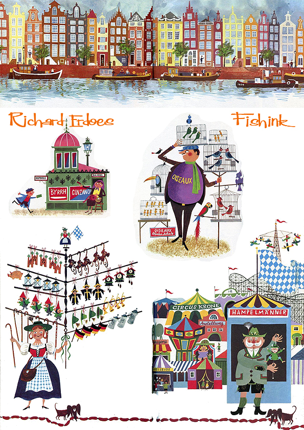
However, between 1967 and 1971, Richard had completed three amazing books concentrating on Policemen, Peddlers and Vendors and finally Musicians from around the world. It is these illustrations (with a very similar flair to those of another fav illustrator of mine Miroslav Sasek) that I wish to show you. First come the Policemen.
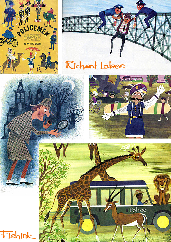

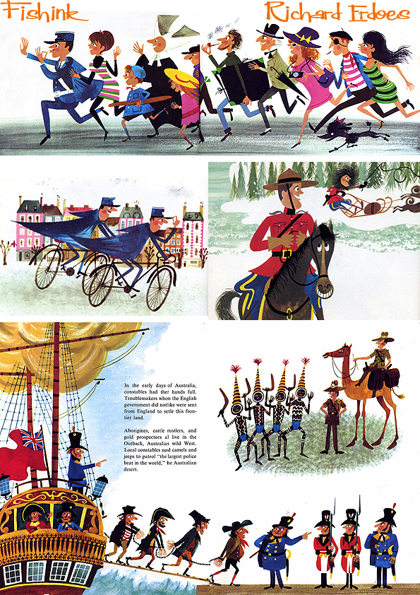

This NY street scene is fabulous, such hustle and bustle ! Next it’s the turn of the Peddlers and Vendors.


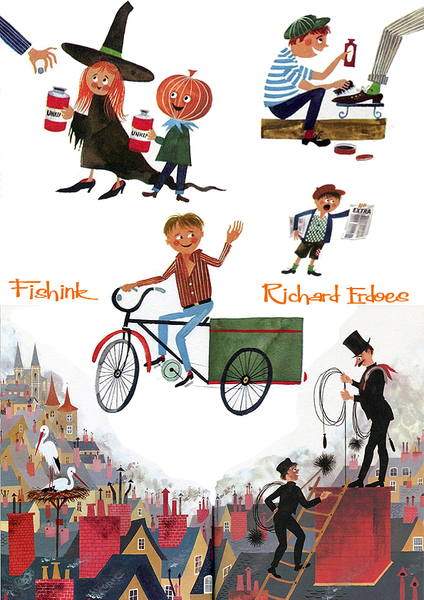

And finally the Musicians.


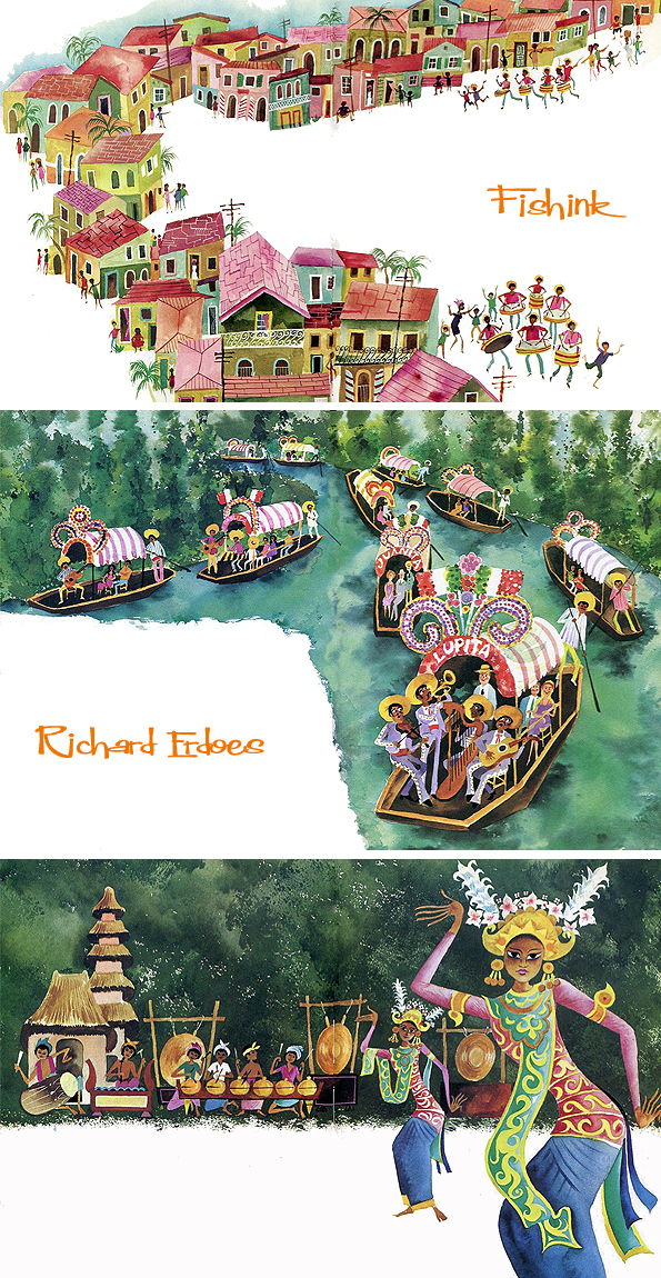
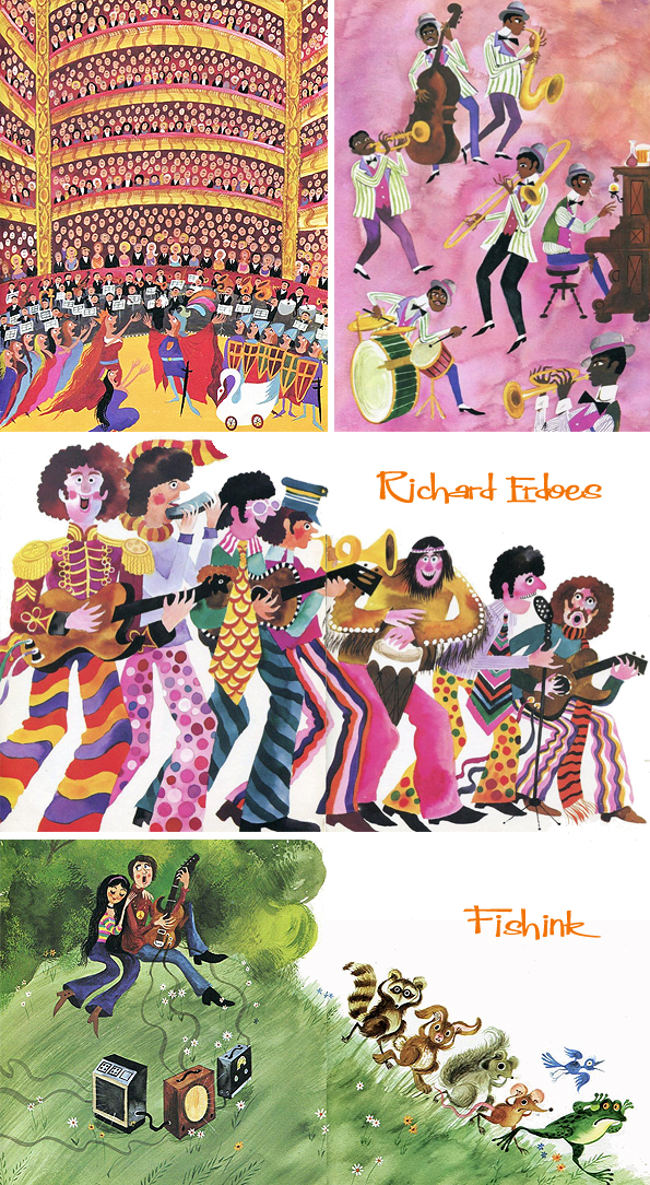
I love how he manages to characterise each countries appearance, customs and idiosyncrasies so perfectly.
As well as being a photographer, illustrating books for children, Erdoes was known for a long list of books about Native Americans including, Lame Deer: Seeker of Visions, American Indian Trickster Tales, Lakota Woman and more. Richard remarked that his father first came to Pine Ridge in 1967 for a sun dance. He said, “He always had an interest in other cultures. As a young man, before having to flee the Nazis in Europe, he traveled on foot to Yugoslavia. He was interested in how other people lived. He loved to travel on western trips and visited Pueblos and Indian reservations.” It seems that Richard was highly influenced by his father’s beliefs even though he never met him.
Richard died at his home in Santa Fe, NM in 2008 aged 96. A huge vote of thanks to the tireless work by Ariel S. Winter who’s flickr sets always inspire and inform us all.
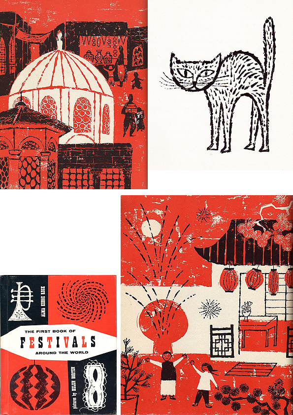
Helen Borten Illustration Heaven Part 1
I really like the illustrations of Helen Borten, and anyone who follows this blog will know that I’ve featured her work a few times in the past, and no doubt will continue to do so, as new or previously uncovered illustrations come to light.
‘Do You See What I See ?’ the first images from a great series of books.
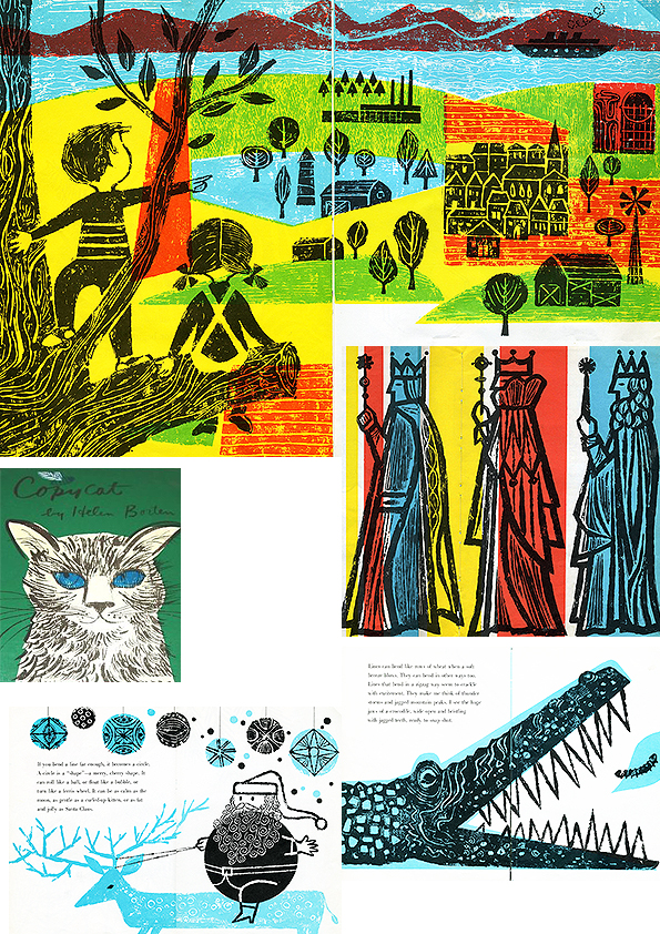
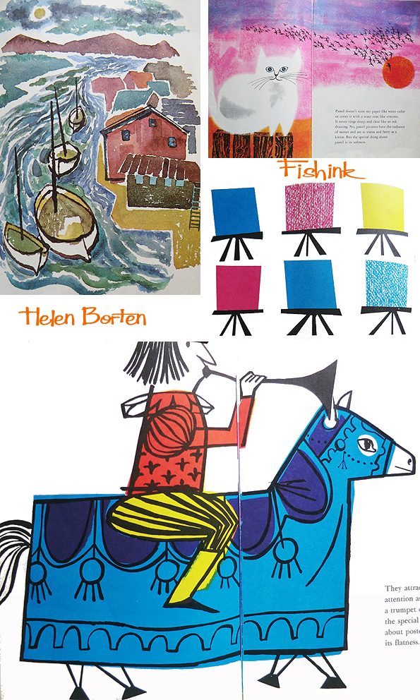
These images (below) are from ‘The First Book of Festivals around the World’. They have a great vibrancy about them and yet are amazingly simplistic in their colouration.
I’ve been lucky enough to find a copy of ‘ A Picture Has A Special Look’ and have been totally amazed at the versatility of Helen’s work. Her line-work, watercolour, ink-work, collage etc are wonderful, it looks like the work of ten artists, not just one !
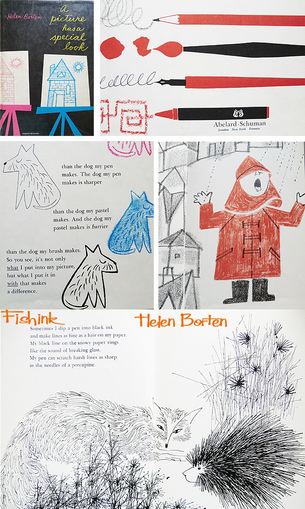
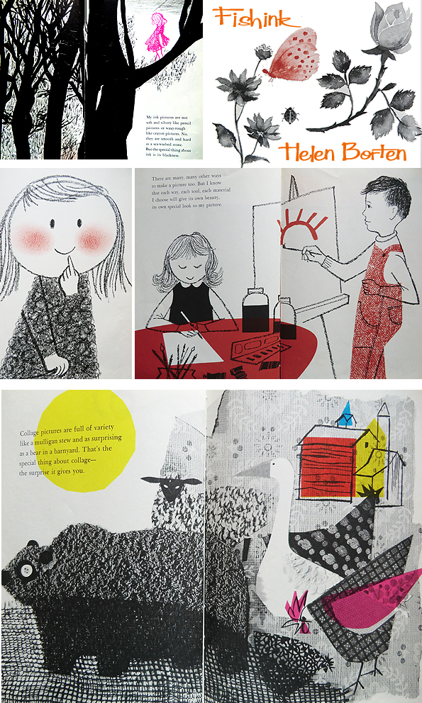
These are all different styles from the same illustrator, and the same book !
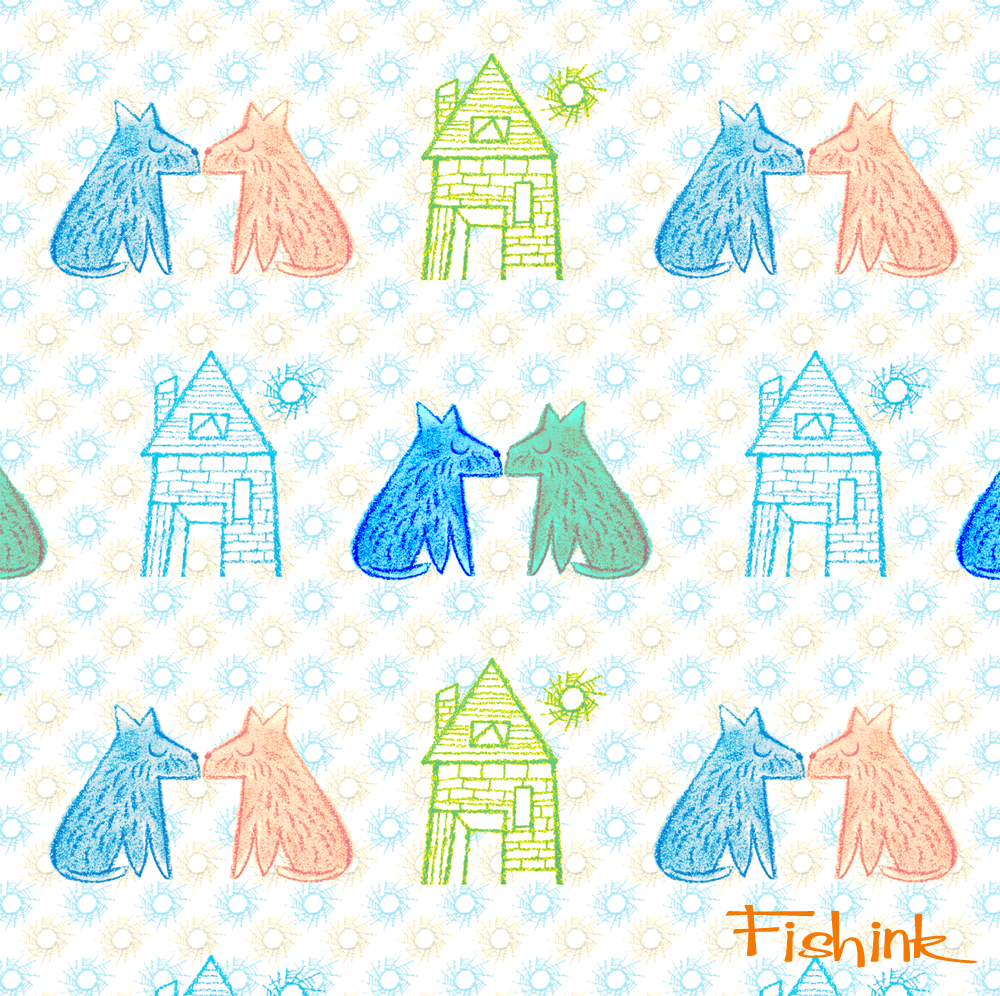
A couple of design repeats I’ve created from Helen’s work … just for fun.
More from Helen to come.
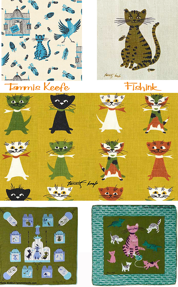
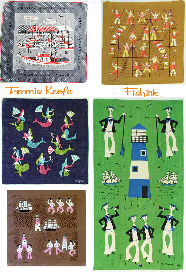
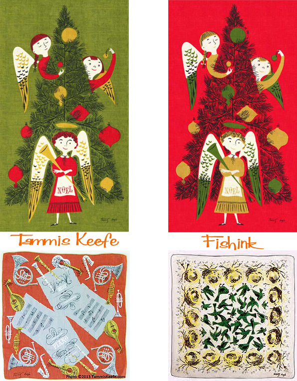
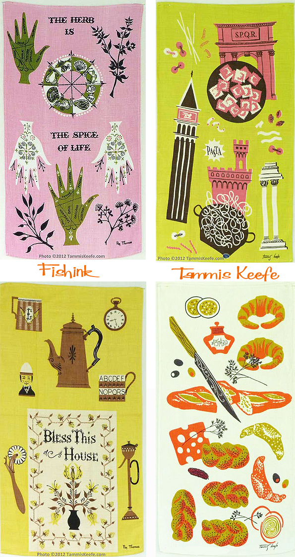
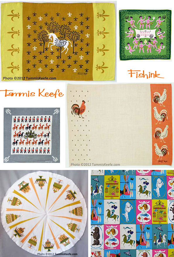
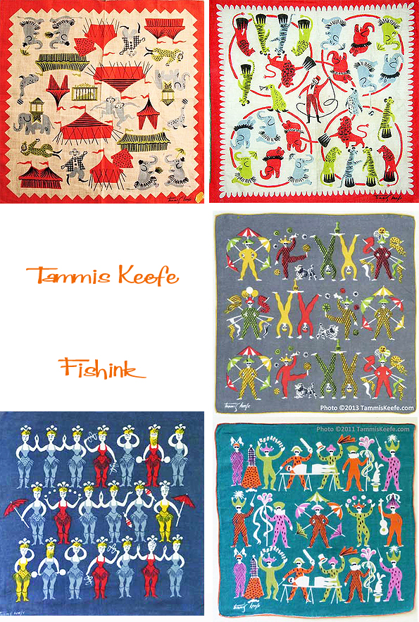
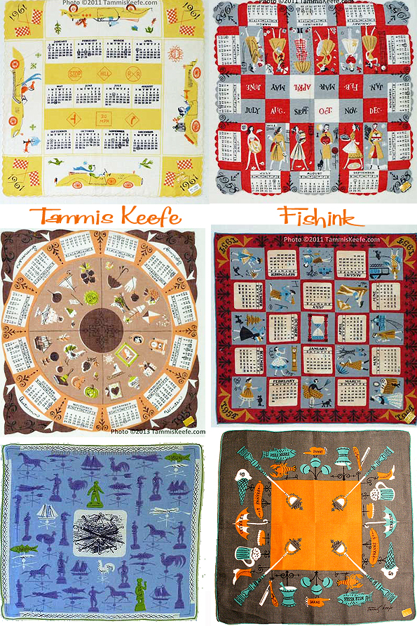
Tammis Keefe Mid-century Textile Designer
Born Margaret Thomas Keefe, and called Peg by her family (which is Gaelic for Thomas), Tammis Keefe is one of the great names of hankie and textile design collecting.
She was born in 1913, and in the 1940s worked as a textile print designer, designing prints for home furnishing textiles.
She began designing handkerchiefs for Kimball scarves in the late 1940s or early 1950s. Her designs are typically 1950s – full of whimsy with those great 1950s colors: pink, turquoise, gold and black.
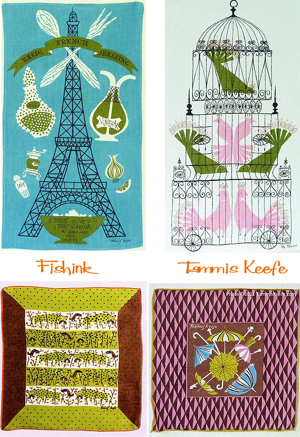
Keefe’s designs were often inspired by her travels. One can find Oriental, Arabian nights, and European castle themed hankies. She also did hankies featuring American cities and attractions. Many of these hankies were like little travel guides, showing the highlights of a city that were not to be missed.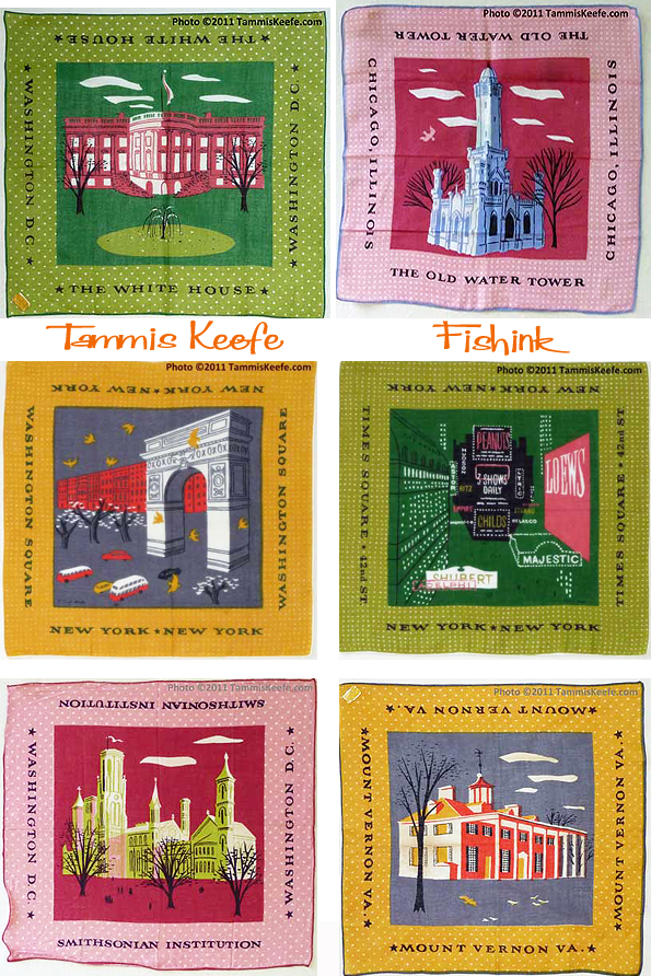
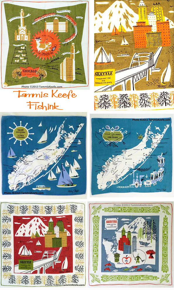
Townscapes locally, and as a contrast, places and themes from further away.
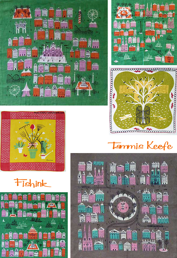
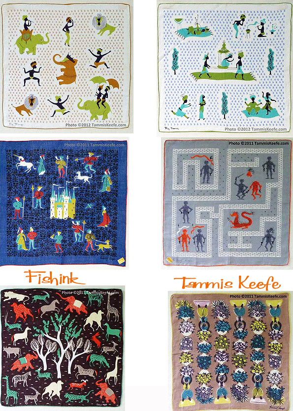
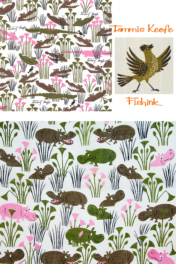
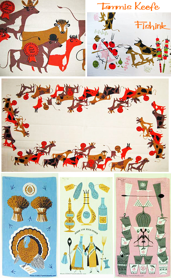
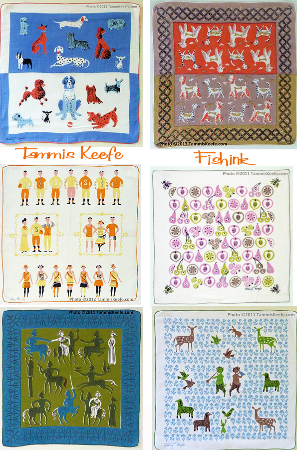
Keefe’s work also shows a love of nature and animals. Her dog and cat hankies are true 1950s classics.
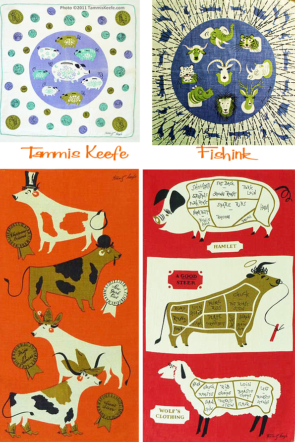
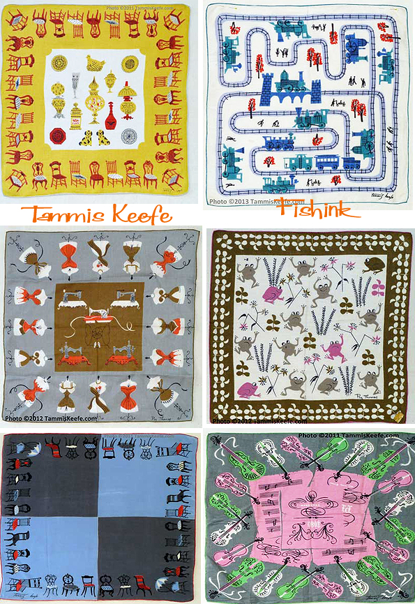
Other designs to look for are her antique furniture and motifs,
or holidays including Christmas and Easter.
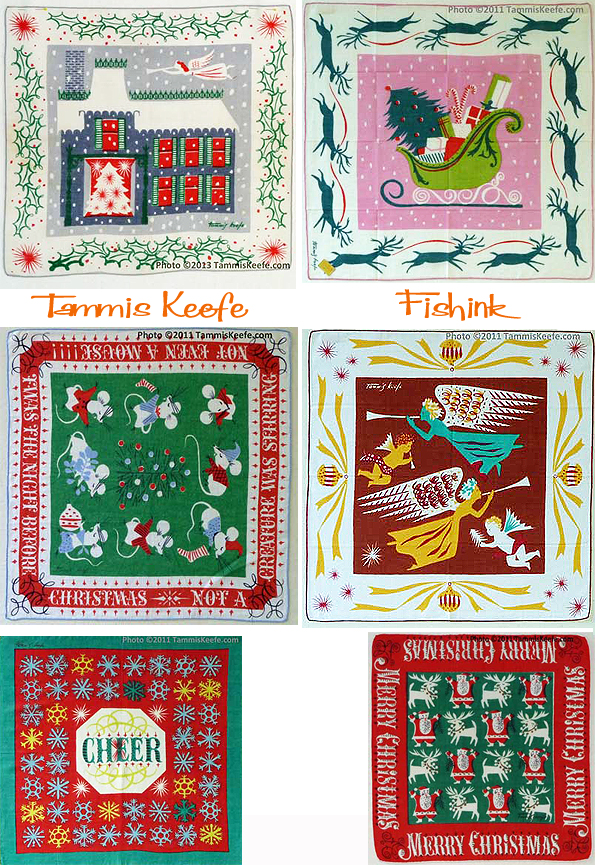

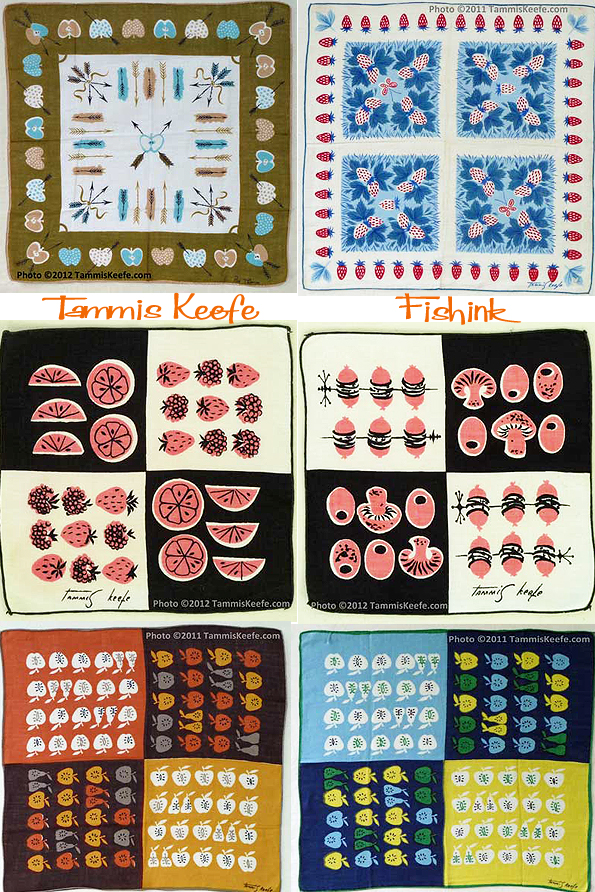
Some lovely nature and scrolling inspired designs.
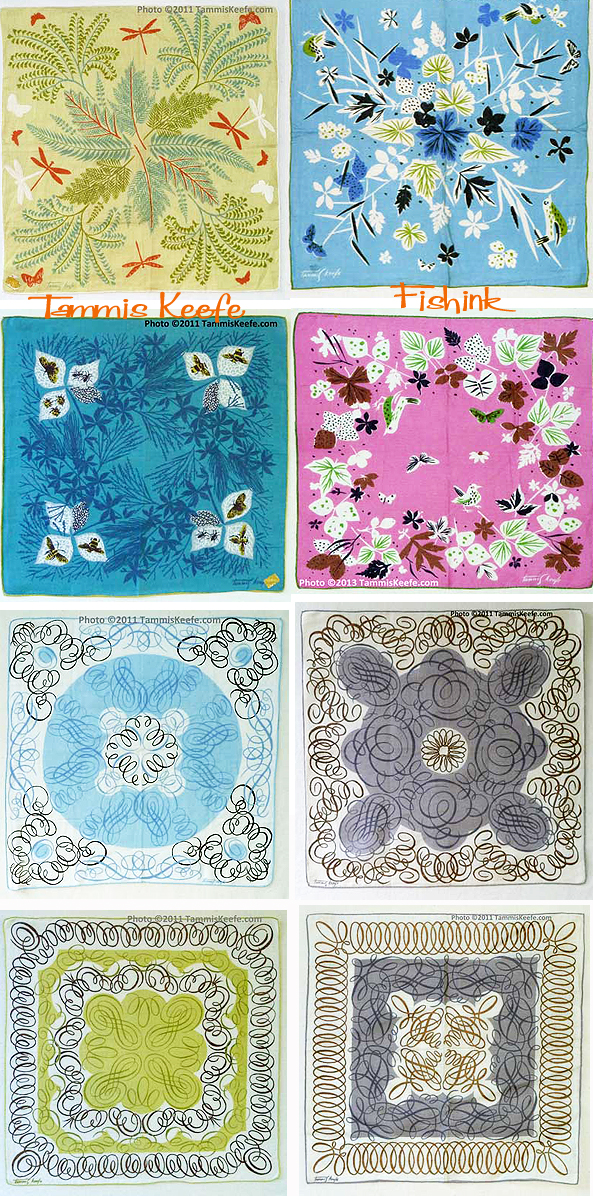
Keefe’s hankies are most prized, but look also for linens and fabrics with her signature. Her designs for the kitchen are just as clever and fresh as her hankies. Silk scarves with the Tammis Keefe signature are rarer, but do surface from time to time.

Even rarer are clothing items she designed for the Marlboro Shirt Company. Also, hankies signed Peg Thomas are Tammis Keefe designs. There are hundreds of Keefe designs to choose from, as she was quite prolific, especially considering that she died in 1960 and had a relatively short career.
In 2000, Tammis Keefe’s work was featured at a show at FIT – A Woman’s Hand. Designing Textiles in America 1945 – 1969.
A HUGE vote of thanks to Ellen over at her amazing Tammis Keefe site and some other updates here.. Ellen has dedicated years documenting the designs of Tammis and kindly photographing each and everyone for us to enjoy, and it’s most appreciated too. More background information on Tammis and even more of her wonderful designs can be found there and on Making It Fun too. There was ‘talk’ about some of her designs being reproduced about 2 years ago but after looking online I could only find 1 design remaining. I’m sure there would be a market for her work. What do you think readers ?
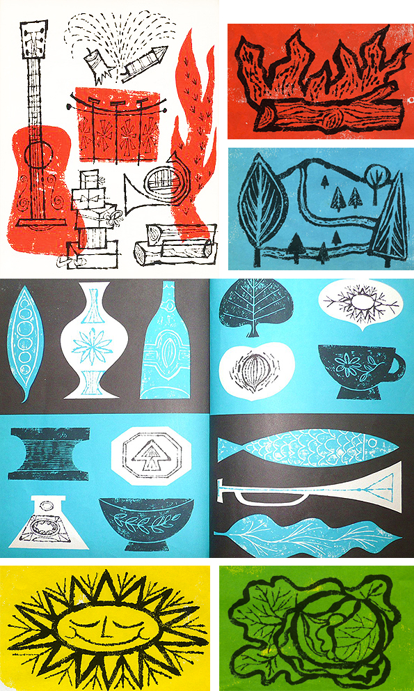
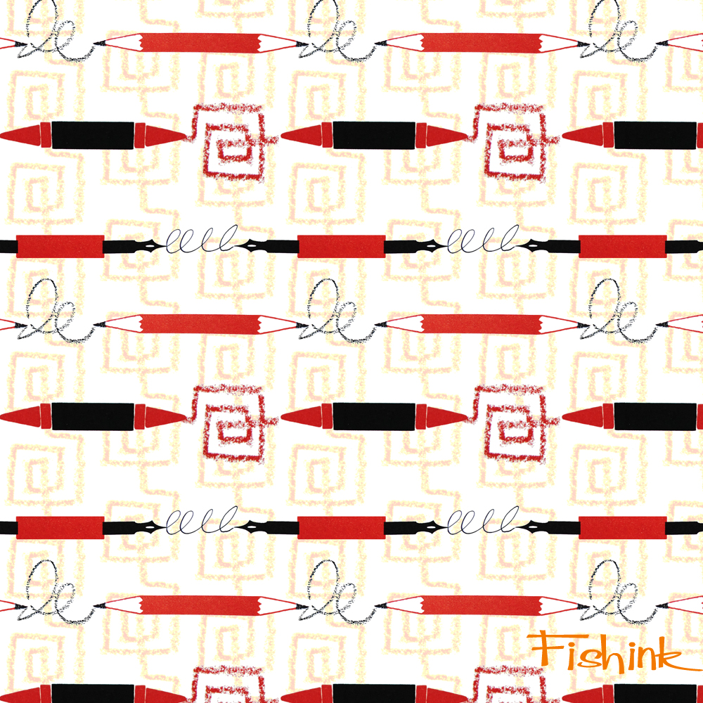
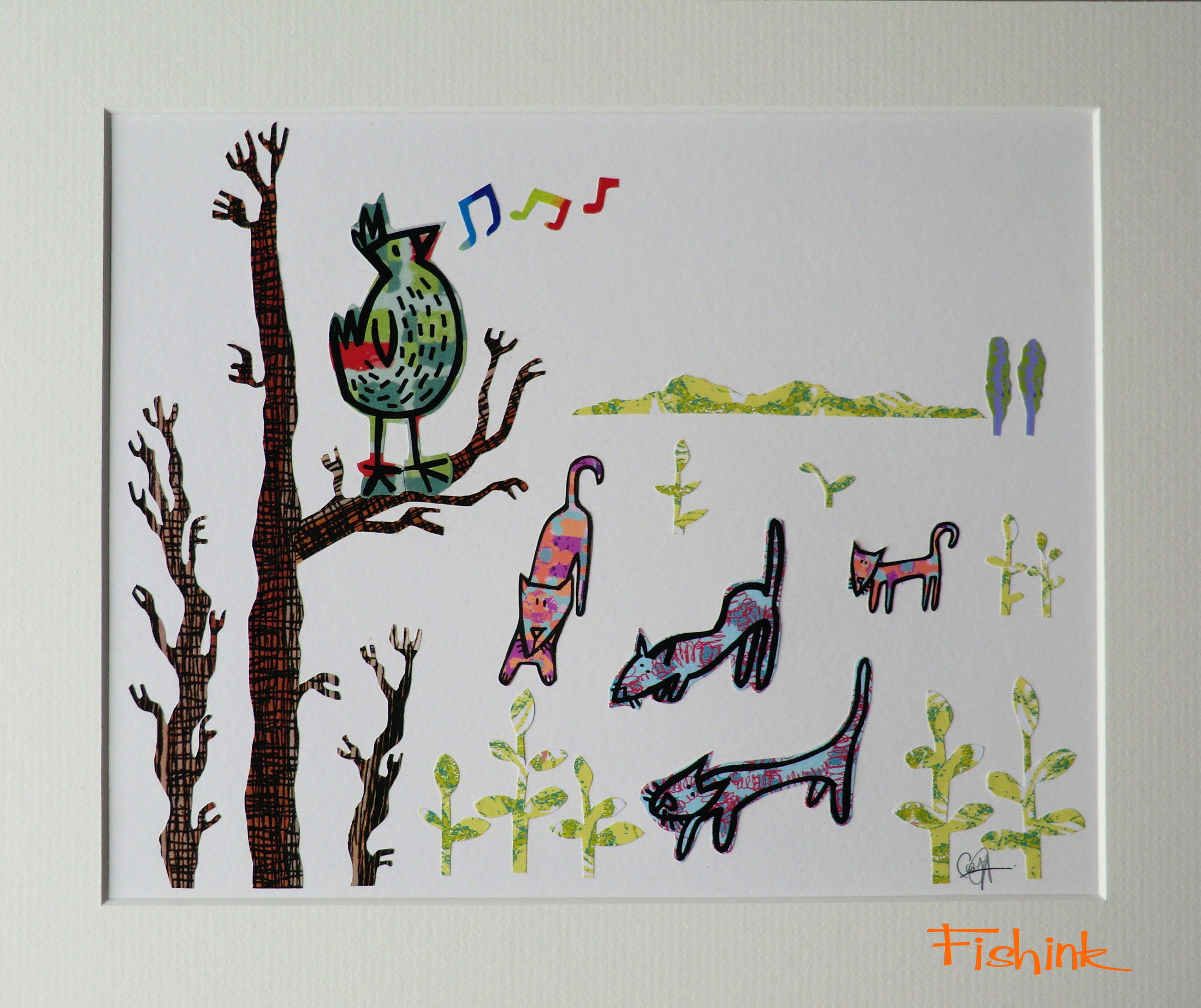
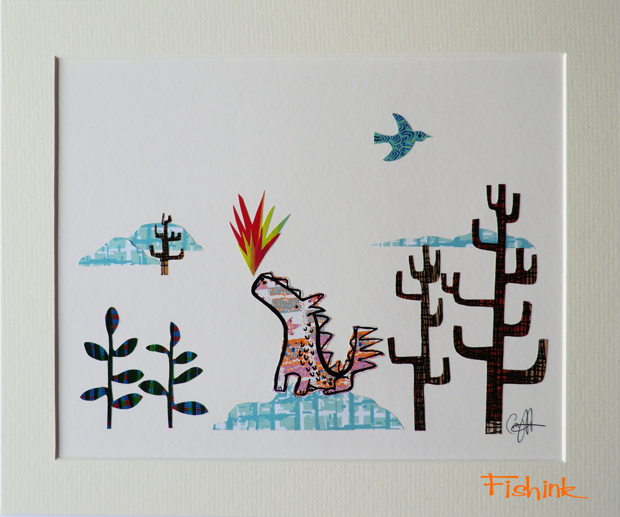
Fishink New Artwork
Hi everyone, I hope those of you who are having a long weekend are enjoying themselves, and those of you who have just had their weekend are having a great monday. I’m back with some new artwork, some of which I’m planning on exhibiting in a gallery exhibition later in the year. At the moment these are for sale on my Pinterest site.
Starting off with the Lions and the Butterflies.

The dawn chorus, attracting a little attention.
Baby Dragon.
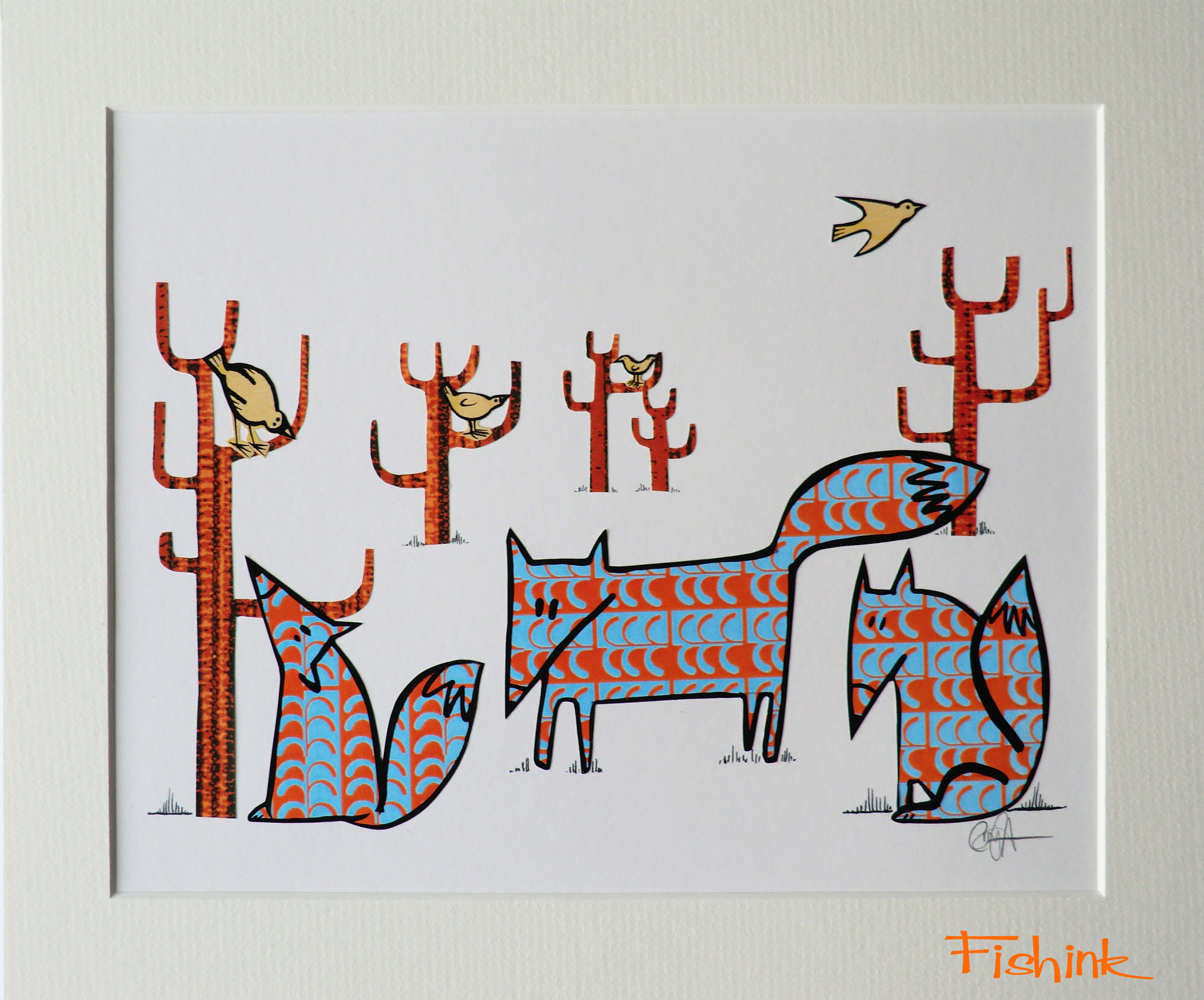
Stylish fox in the woods.

Foxes and birds in the woods.
Robot Love.

And finally some crazy sheep.

These are all hand-made, one off, original artworks. Check out Pinterest for more information and a wide variety of images and sizes. All feedback most welcome.
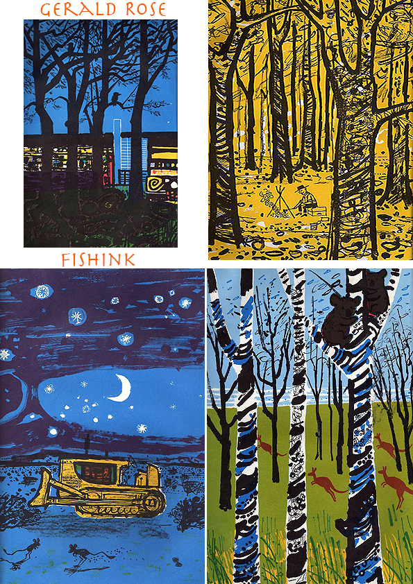
Gerald H Rose Children’s book Illustrator from the 1960’s

Gerald Rose was born in Hong Kong.
When the Second World War started, his father became a prisoner of war, and Gerald and his mother were interned in a civilian camp, which was where he saw his first live tiger.
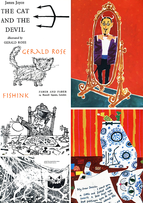
He has illustrated quite a few books with his quirky, humorous drawings. Thanks to Brain Pickings for posting these amazing images accompanying a James Joyce novel.
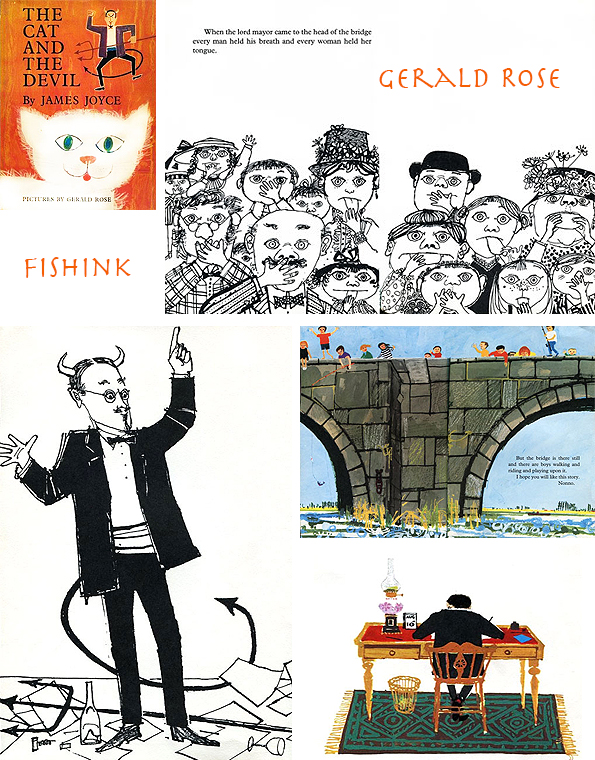
and also to The Art of Childrens Picture Books for these.
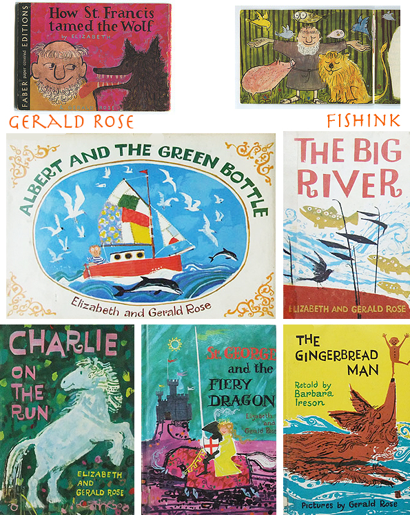

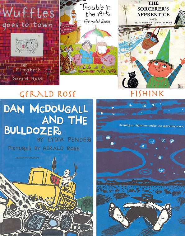
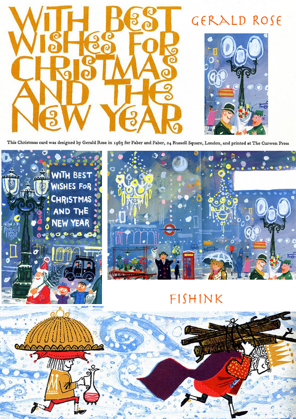
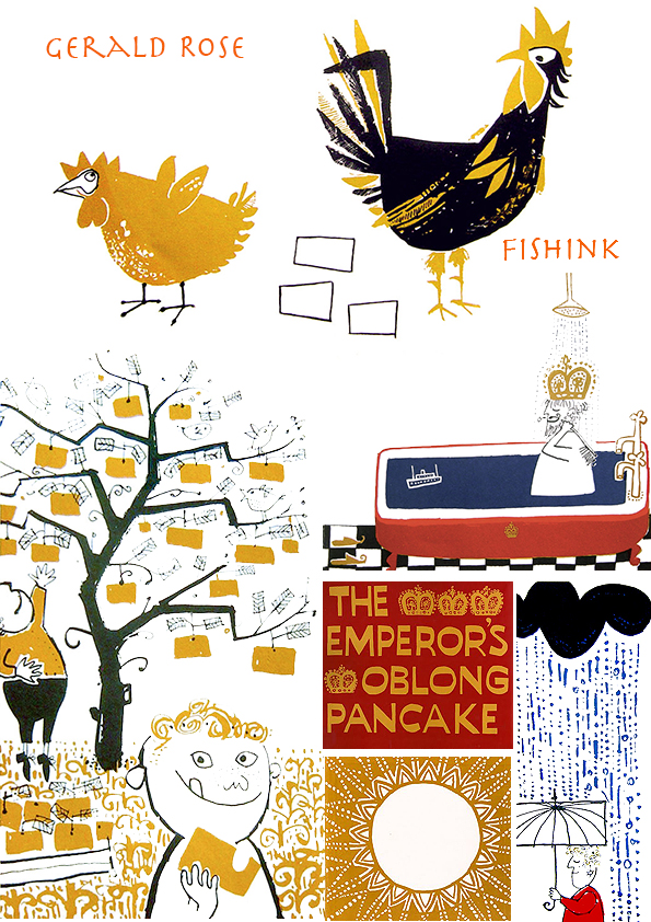
Gerald studied at Lowestoft School of Art and the RA schools. Frustrated by the dearth of good illustrated books for children, his wife, Elizabeth, helped him to write and illustrate a number of books. Gerald won the Premio Critici in 1979 in Erba, Italy for ‘Ahhh! Said Stork’ and won the Kate Greenaway Medal in 1960 for ‘Old Winkle and the Seagulls’. These are amazing they really make me smile.


Gerald now lives in Hove, East Sussex. Look at this funny Ted Hughes story about Nessie the Mannerless Monster !

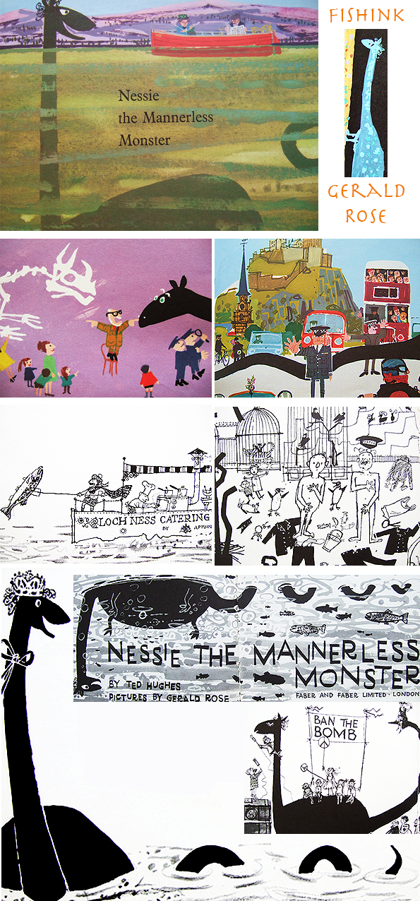
Or ‘ Albert and the Green Bottle ‘.

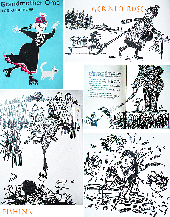
Grandmother Oma and her inventive uses of her umbrella.
Or these beautifully observed illustrations of Cormorants and the Chinese lifestyle.

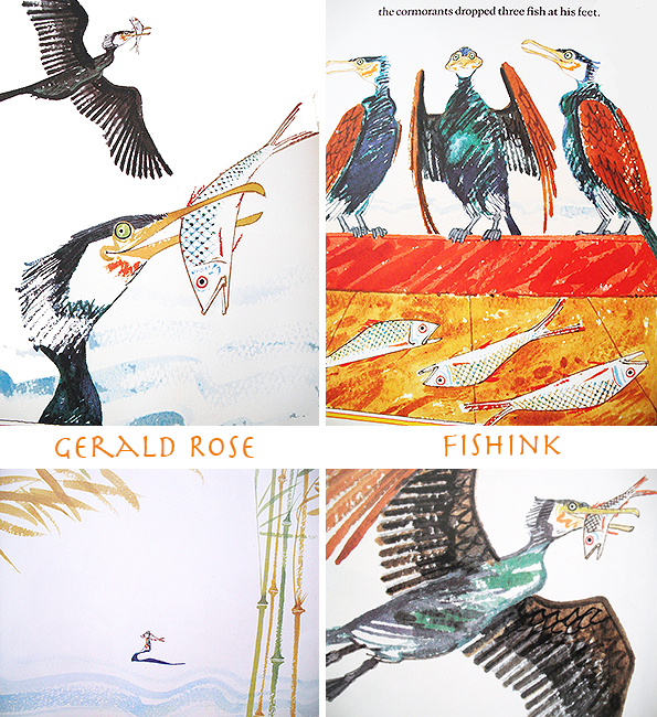
Gerald has such a wonderful variety of styles, all with a great sense of humour. His characters are so rich in emotion.

Many thanks to Hazel Terry and many more for posting images of Gerald’s fascinating work.
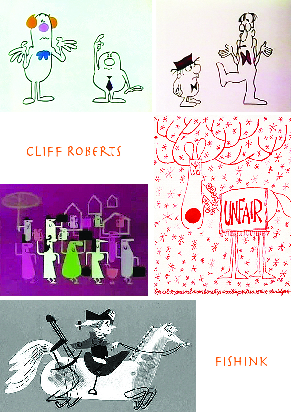
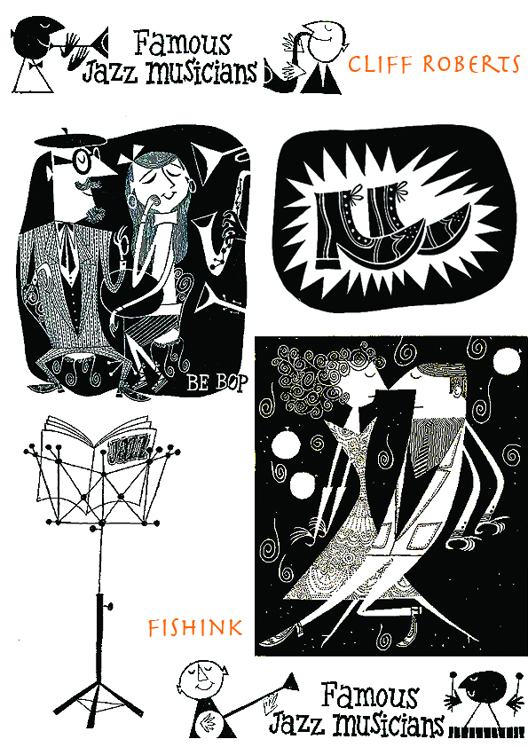
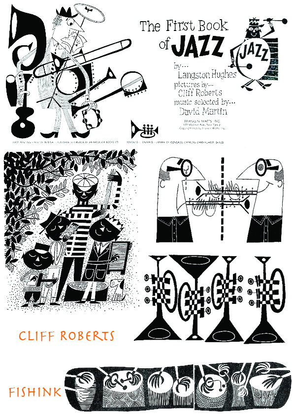
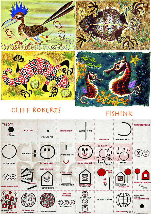
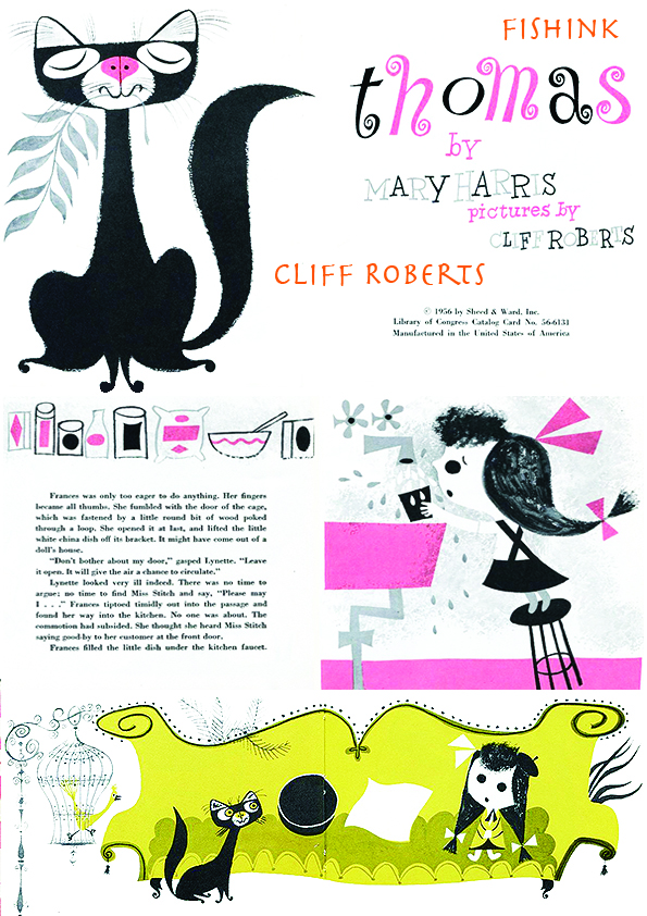
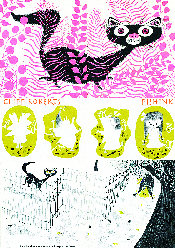
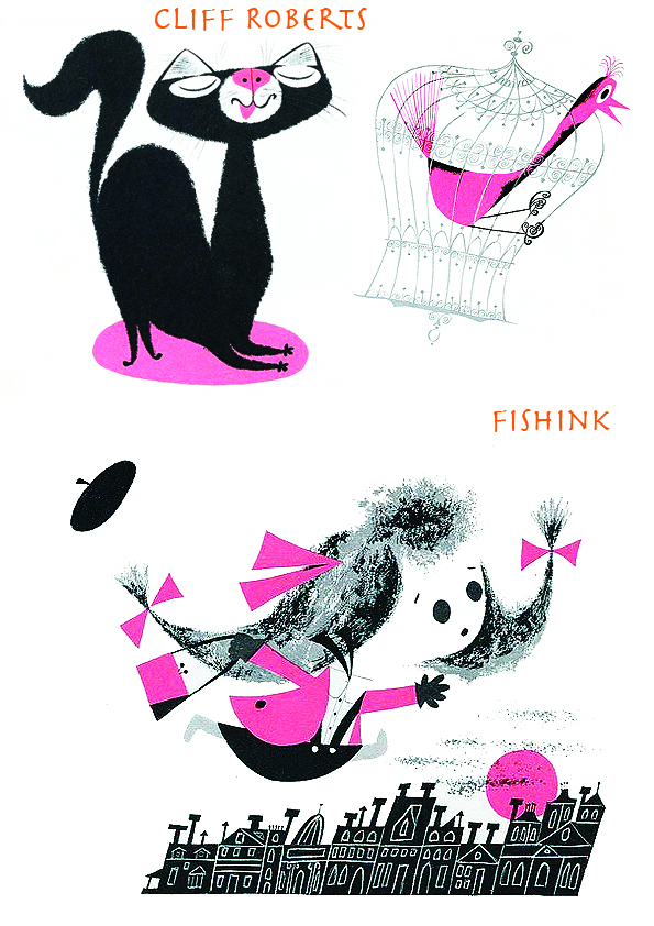
Cliff Roberts Mid century Illustrator of Jazz and Muppets
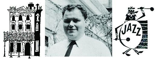
Cliff Roberts (1929-1999) was a cartoonist and animator. His cartoons appeared in magazines such as The New Yorker and Playboy. He worked on inserts for Sesame Street as well as the spin-off comic strip and Sesame Street Magazine. Roberts spent much of his early career in New York City as a freelance commercial artist and director. For Sesame Street, Roberts created Jasper and Julius, two characters who would engage in debates over body parts, as well as Christopher Clumsy. These characters were brought over to Roberts’ Sesame Street strip, alongside Big Bird, Oscar the Grouch and Cookie Monster.
Thanks to the flickr site of Ariel S Winter for these great B/W images of Langston Hughes ‘The First Book of Jazz’.
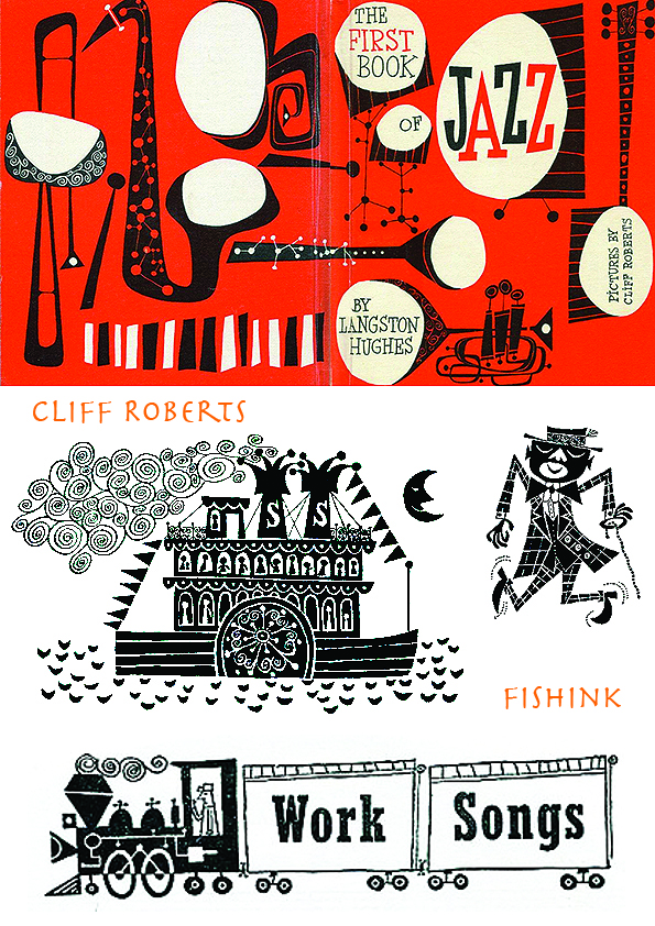
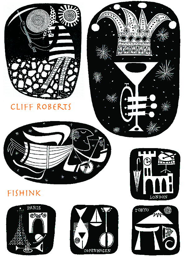
How stunning are these ? Such simple lines but beautifully drawn and wonderfully expressive.
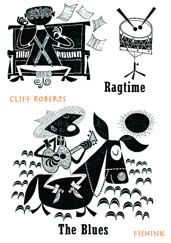
There’s such energy in his work.
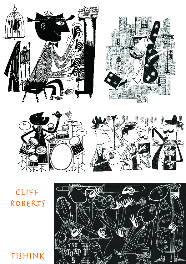
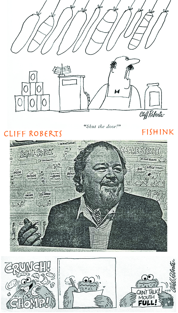
He also worked as a photographer, with work displayed at the 1964 World’s Fair, and contributed cartoons to Playboy and The New Yorker. He soon became a popular designer for animation, creating character model sheets for Terrytoons and UPA projects. Roberts’ style, reflecting his commercial illustration background, involved flat but appealing forms and a minimal color palate; most of his characters were white blobs with occasional splashes of color. Roberts later worked on the Saturday morning cartoons The Smurfs, Scooby-Doo, and The Pink Panther.
‘Depth Study’, is a 1957 sales film for CBS Television which shows Cliff at the peak of his career. Thanks to Amid Amidi over at Cartoon Brew for this.
Thanks to Eric Sturdevant over at Fun All Around Blogspot for posting these illustrations which were some early work done by Cliff Roberts for FORD TIMES magazine in the late forties. He was in his late teens when he drew these ! Roberts cites illustrator Jan Balet as an influence of his from this period.
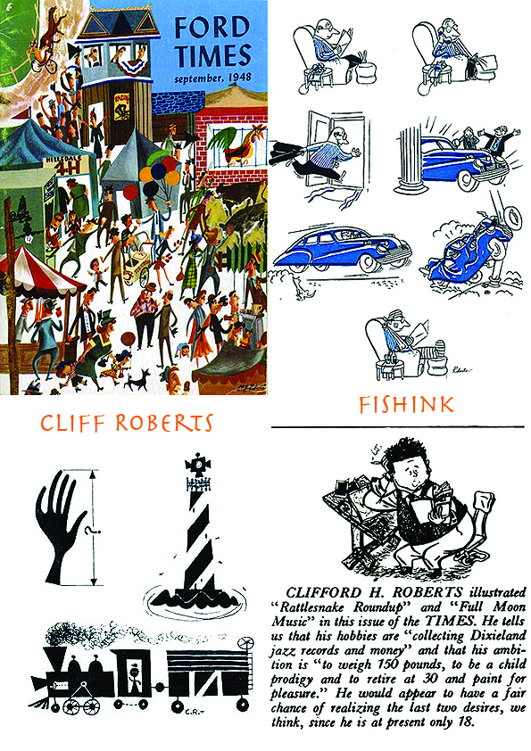
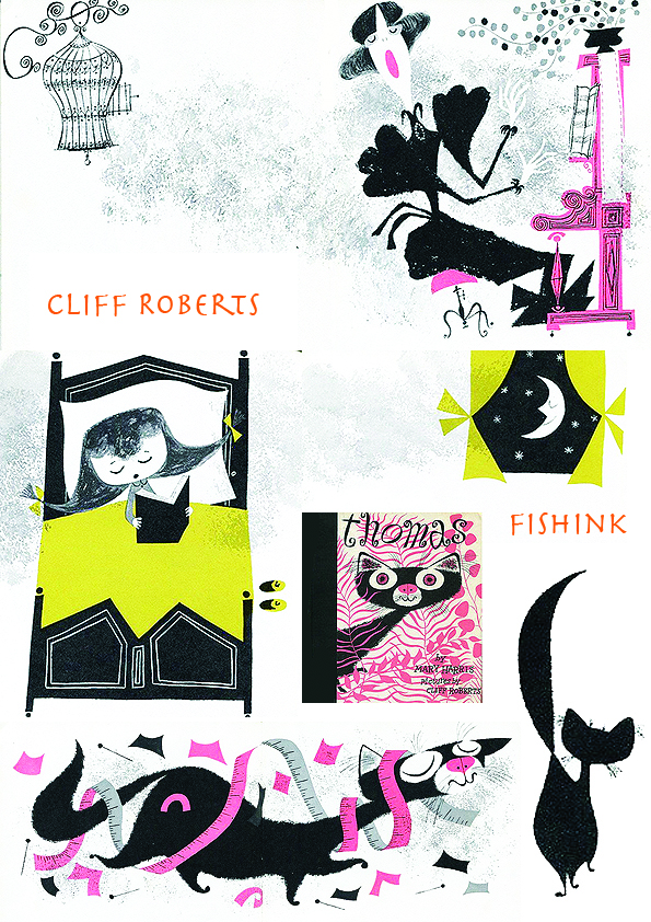
More full colour illustrations from the Ford Times again and one of Cliff’s books called ‘The Dot’ (c.1960)
I do prefer his work in the book ‘Thomas’ (1956) where his ornate, whimsical style really has a chance to shine out, or should that be Purrrrr !
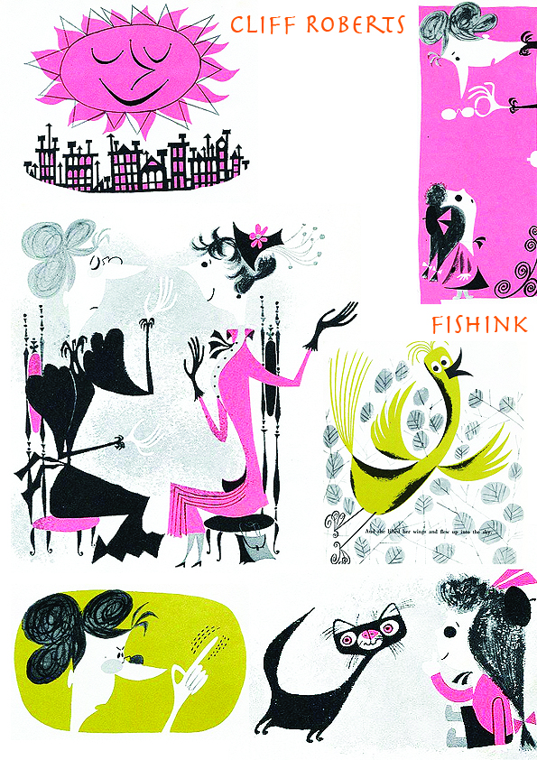
More stills from Cliff working on animations for Sesame Street over on Muppet Wiki and a great article by Leif Peng over on Todays Inspiration Blogsopt too. He retired in 1993 and sadly passed away 6 years later at the age of 70. Such a talented guy. I sense from looking through his work, that he was a larger than life figure, who liked jazz, enjoyed his work and had a great sense of humour. What do you think ?

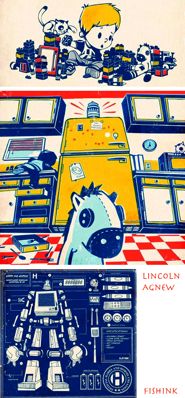
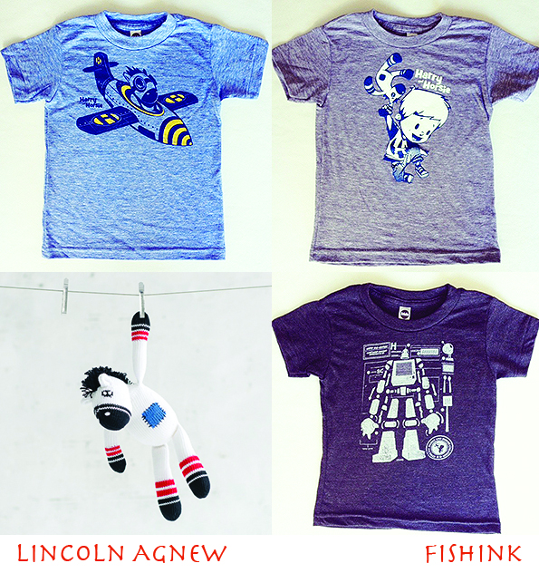
I recently came across the beautifully illustrated childrens books by Lincoln Agnew and writer Katie Van Camp, called ” Harry and Horsie “ for which he won the 2009 Society of Illustrators “The Original Art” Founder’s Award as well as the Marion Vannett Ridgway Award.

What caught my eye in particular is the 50’s inspired feel to the books, using styles that I’d played around with myself a little when I was creating my first book “In Space No One Can Hear You Bark ! “. Playing around with dots and shading and creating that retro happy accident when two colours slightly don’t match up when printed and cause a third tone to emerge. It’s all good fun lol.
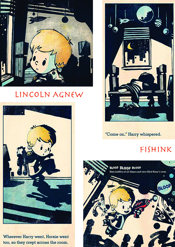
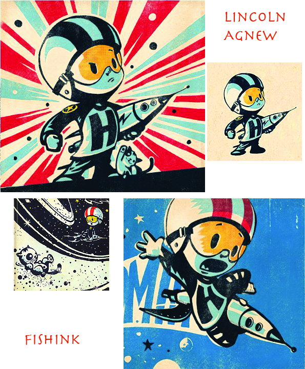
Lincoln Agnew once tried to build his own robot out of a plastic bucket, a broken microwave, and “technology,” but sadly its abilities were limited to catching fire. Years later, after giving up on world domination, he attended the Alberta College of Art and Design, where he obtained degrees in both illustration and photography. He is currently rebuilding that robot in the form of his second book ” Cookiebot “.
There’s a great Q & A session from 2009 over on The Casual Optimist site and a more recent one here by Jan Markley, where you can learn a little more about Lincoln. Heck you can even pick up a classy children’s Tee shirt here too !
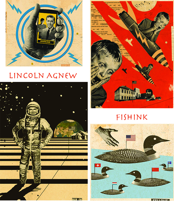
There’s a different side to Lincoln’s work explored on Marlena Agency site, as you can see here.
If you like this you may also like to look through Space Alphabet with illustrations by Peter P Plasencia, more about his artist here. (thanks again to mister Jenkins for posting).
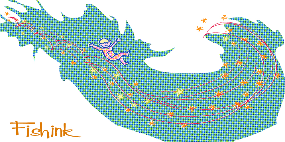
I think I may have to invest in a copy of Harry and Horsie for myself. This also reminds me of some illustrations I was working on about a year ago about a boy in space, here’s one of the ideas. Any thoughts readers ?
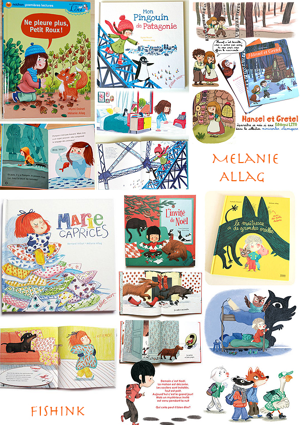
Melanie Allag Children’s Book Illustrator
Melanie Allag is a children’s picture book illustrator.
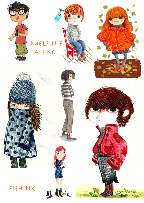
On leaving the Ecole des Beaux-Arts d’Angoulême, Melanie made her first steps in youth publishing working with Bayard Press.
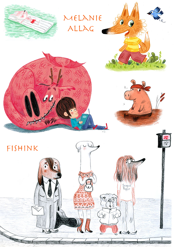
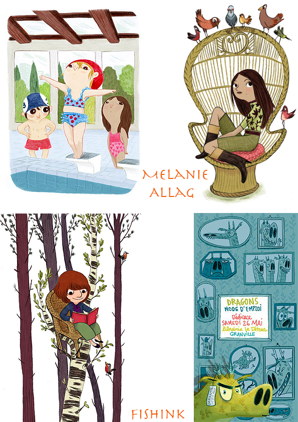
Illustrating imposed themes or designing pages games for youth magazines created varied projects and through this Melanie gained the experience to offer more personal responses to graphic commissions, and illustrations for comics.
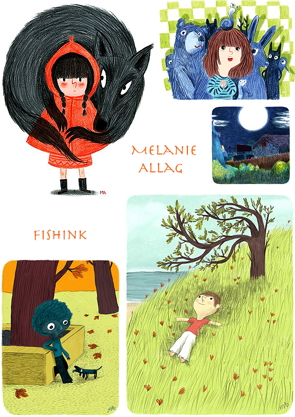
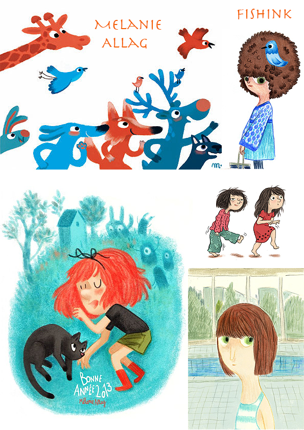
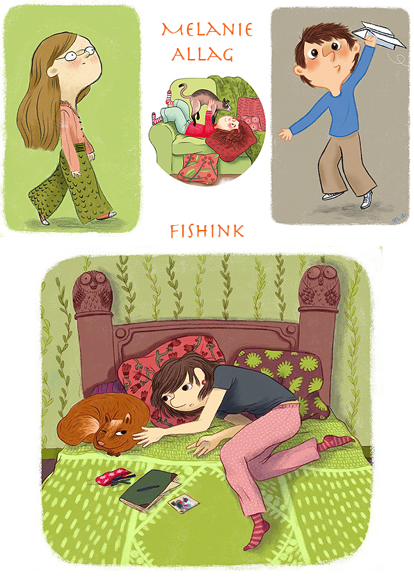
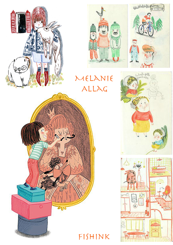
Coloured pencils are her favorite tools.
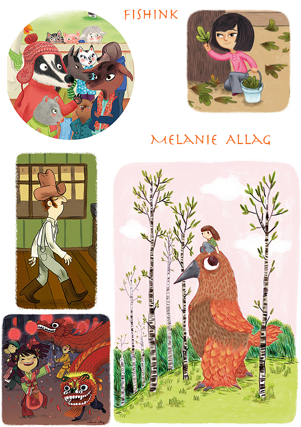
She lives and works in Nantes and has illustrated many books, here are a few.
If you like Melanie’s work then you’ll also like that of Meg Hunt who’s style I feel is similar. Beautiful drawings with a fun, fresh feel to it all.


