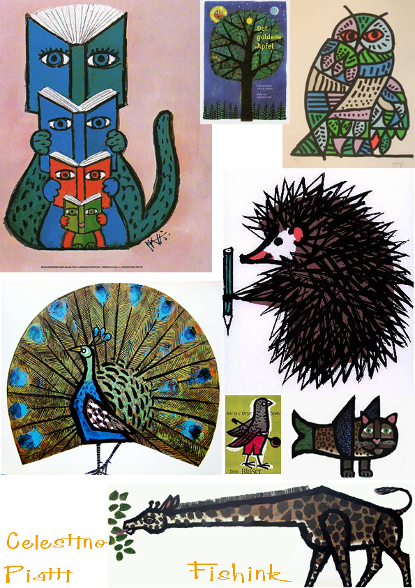
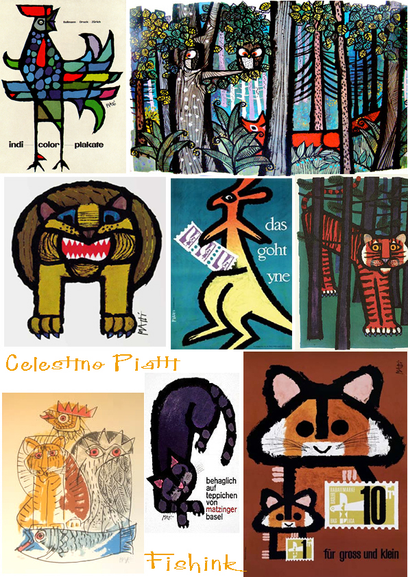
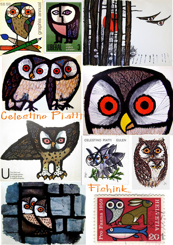
Celestino Piatti. Swiss Artist, Painter and Designer.
Celestino Piatti (1922-2007) was a Swiss graphic artist, painter and book designer.
He is popular for his illustration work for children’s books, though he also achieved international
success as a designer for Deutscher Taschenbuch Verlag (DTV), whose books, from 1961 until
the mid-1990s, were designed almost exclusively by Piatti, a total of over 6,300 titles !
In addition to the cover design, he was responsible for typography, Signet, letterheads,
advertisements and posters, providing a uniform identity to the DTV catalog.
A motif that runs through his entire work, is the owl, as a messenger of good luck or misfortune, or as
a symbol of wisdom. 1992 Piatti said in a magazine: “You can draw a thousand times the owl,
but never get its secret”.
I love his fresh strong lines and scratchy details. No wonder kids and adults liked him so much.
There is an interesting interview with Celestino taking about Poster art here.
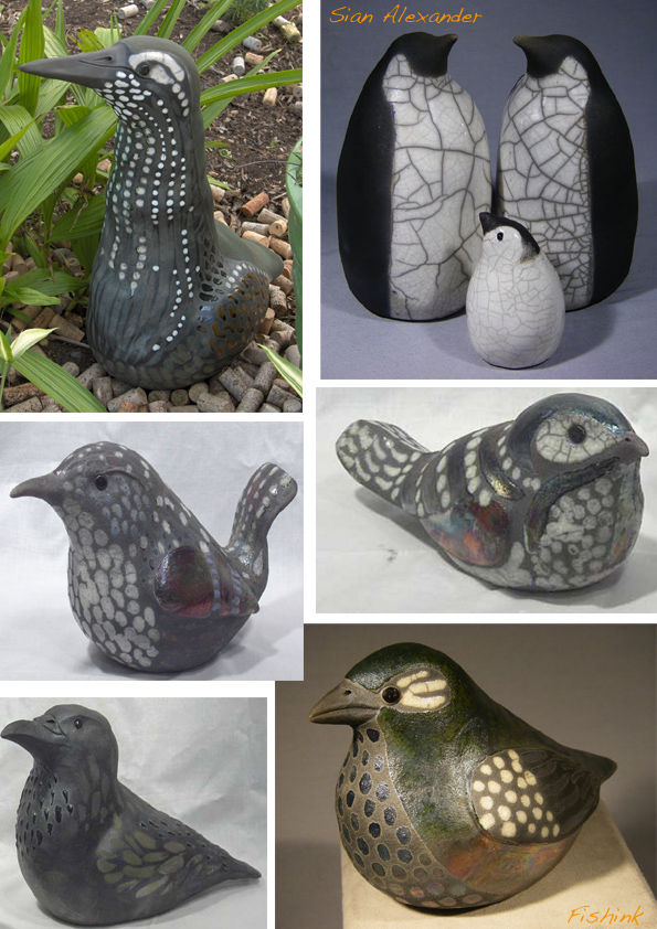
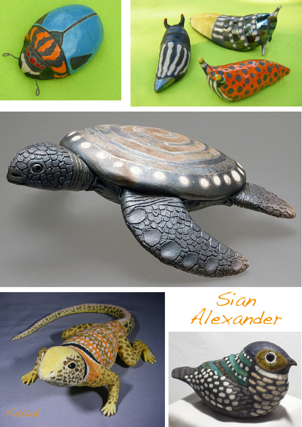
Sian Alexander. Birds, beasts and ceramic wonders.
Sian Alexander lives in Portland, Oregon and has a close affinity with our feathered friends.
She likes to create birds and other creatures in ceramic form and often fires using a Raku process
with glazes and colours to add to the range of effects that style of firing offers.
You can see more examples on her blog or buy something from her shop on Etsy.
January Walks and New Year Confessions.
On the last two days I’ve started, just started to see a glimpse of a warmer time. I’ve missed the sunshine
soooo much that the walk along the coast on the Wirral on sunday couldn’t have come at a better time.
Sunshine, beach and blue skies all in one, how lovely.
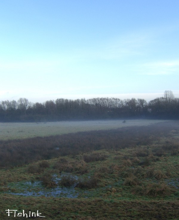
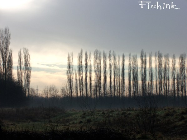
And a local walk yesterday with sun and mist was really quite special too.
I also have a confession to make and I may be struck down by the folk who believe that by twelfth night
all traces of Christmas should be banished and never again seen till later in the year… but…
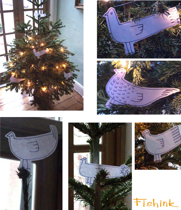
I loved my Christmas tree soo much this year that I was loathed to throw it out and so turned it into a
paper bird aviary for this month… just to have it around a bit longer. Please don’t judge me too harshly !
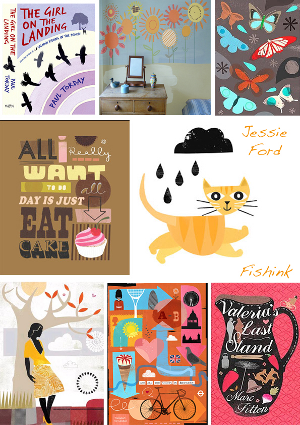
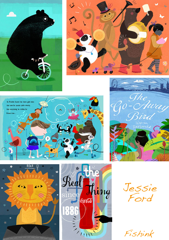
Jessie Ford. Simple Illustration.
Jessie Ford is a freelance illustrator who is based in Brighton. She has recently exhibited
with the AOI in the annual ‘Images’ Exhibition and is featured in their book ‘Images 31’,
as well as in the Artbook 2007.
Jessie has also just finished a collaboration with Mothercare and the Early Learning Centre,
in conjunction with NB Studio. Her window display characters can be seen throughout stores
nationwide this Autumn.’
I think there’s a refreshing simplicity to her work, that gets the message across without too much fuss.
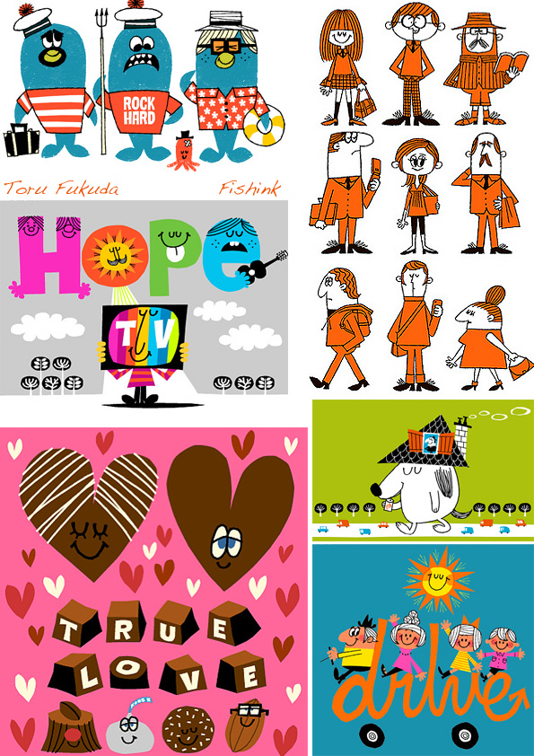
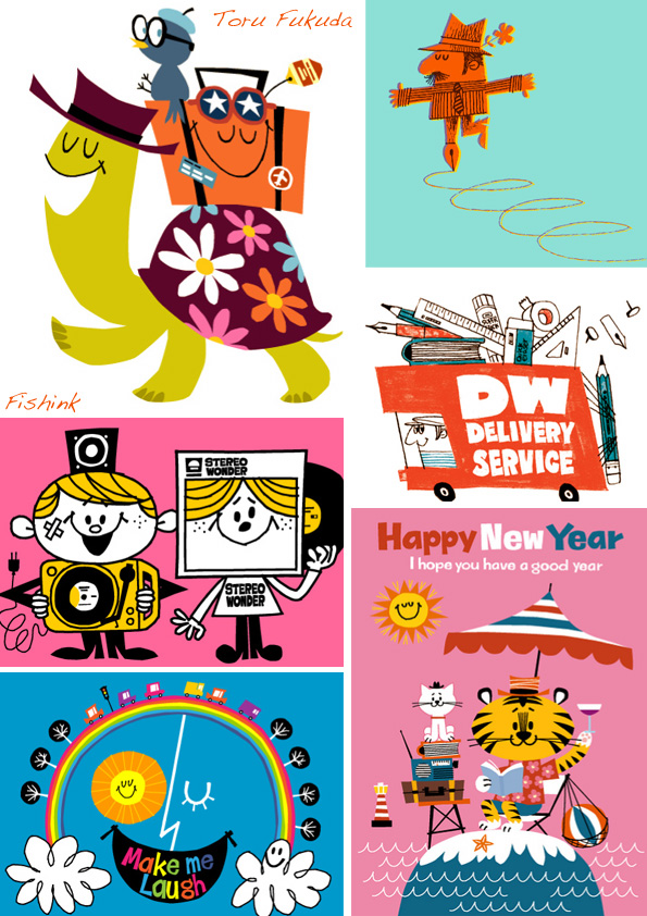
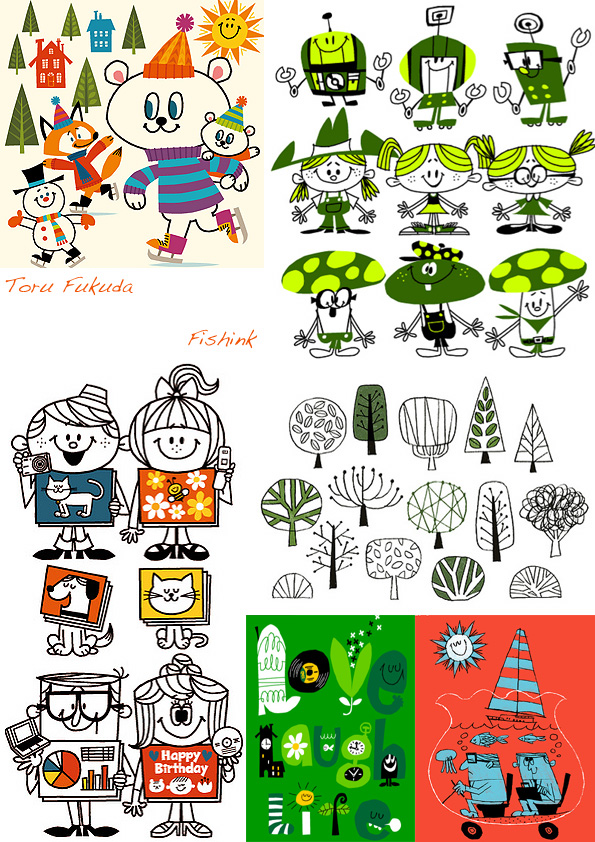
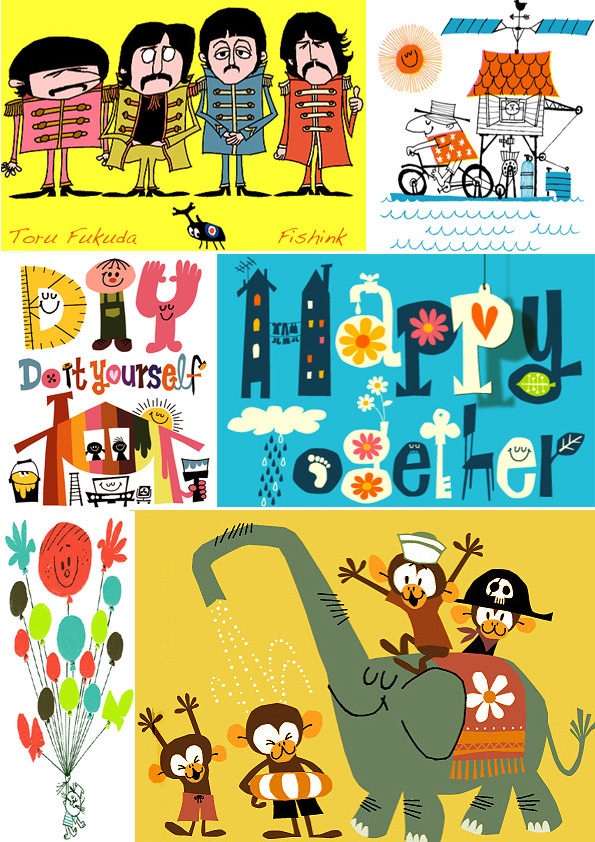
Toru Fukuda. Japanese Illustrations that bring a smile
Toru Fukuda is another modern day artist who works in a retro style. His work is always
bright, fun and guarantees a ray of sunshine on even the darkest of January mornings !
He runs a Japanese site called Drawing Wonder and I hope his real life is even half as full
of ……. Z Z Z Z Z Z ZING as his artwork !!
You get the award for making me smile today Toru, anyone else smiling out there ?
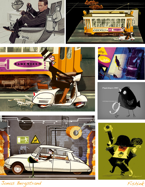
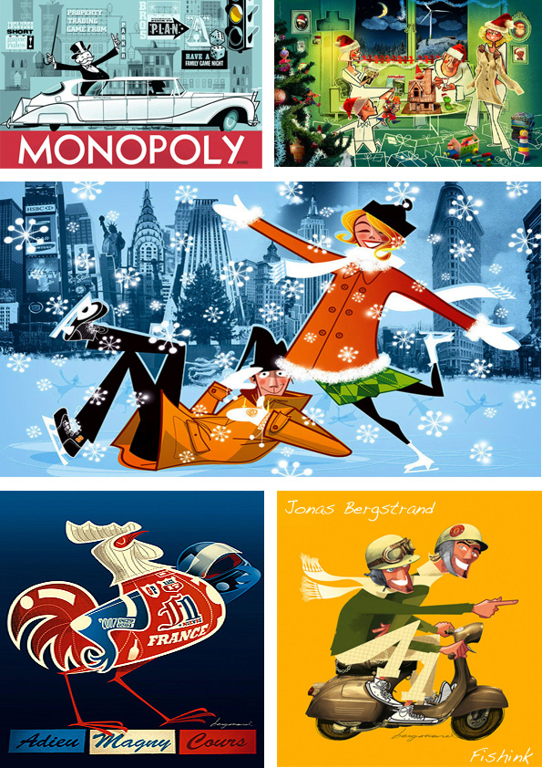
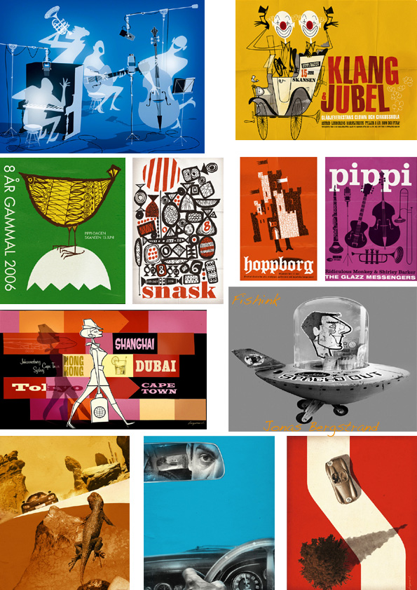
Jonas Bergstrand. Modern Day, Retro Illustrator
Jonas Bergstrand was definitely born in the wrong era. His illustrations are a beautiful homage
to the work of the 1950s and 1960s. He says ” I think illustration is much more than just decoration.
A good illustration/illustrator provides illumination. And this doesn’t happen by chance—
it’s not a byproduct to style. Illustration may not be a science but it certainly communicates in a
precise way. He creates the initial drawing in Illustrator and then ‘fills in’ the detail using Photoshop.
What amazing stylish work and all from a guy who’s not even 40!
… absolutely no envy factor happening here at all !! Lol
Also there’s a great interview with Jonas by Layers Magazine, available here.
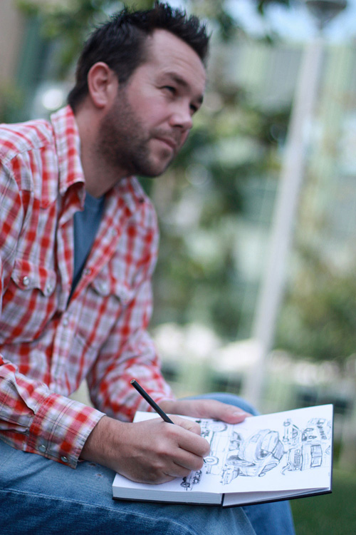
Stéphane Kardos U.K. to L.A. Disney Illustrator
Stéphane Kardos was born in France before working in the UK as an Illustrator for 6 years before
moving to Los Angeles to work for the Walt Disney Company as an Art Director.
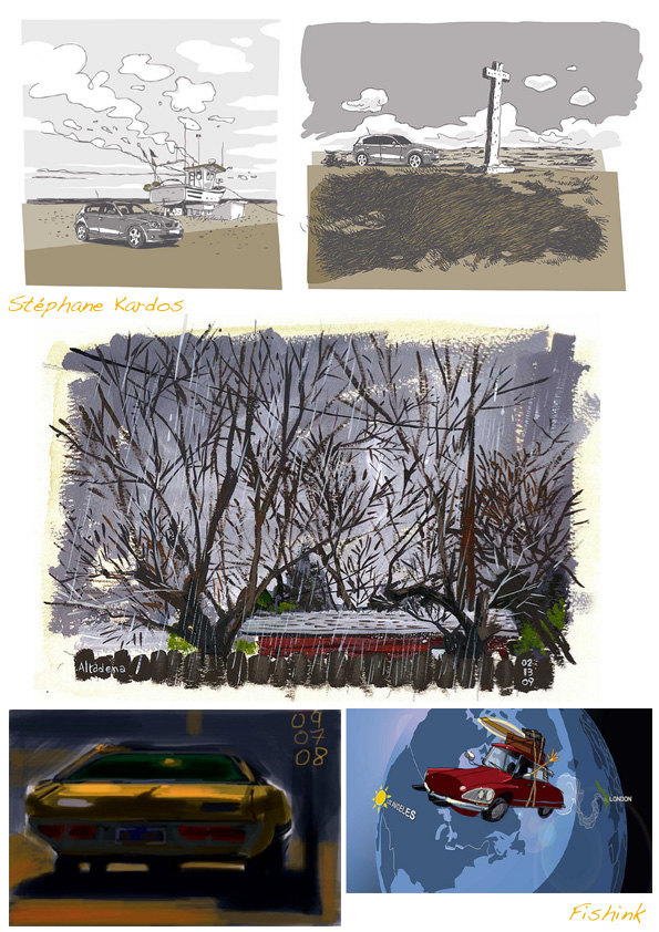
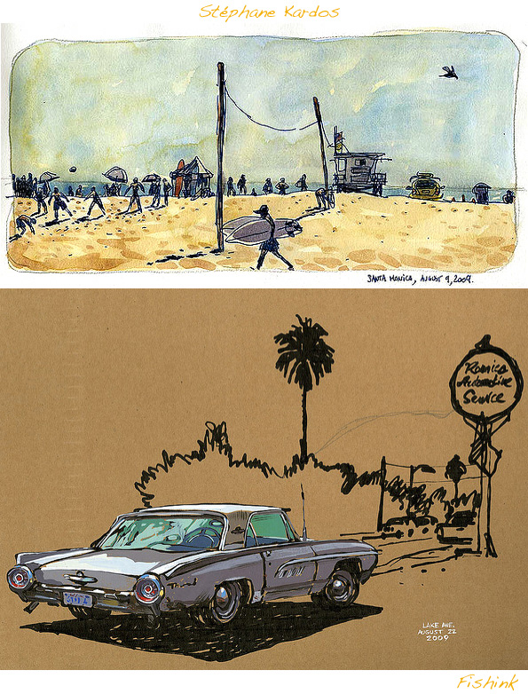
He has an amazing variety of styles and is as comfortable working a sketched line as he is with a
paint brush or a wacom tablet on a computer. There are a few favourites you’ll be sure to recognise here.
Lovely to see rough sketches and before and after images for some of these, I like it when artists are
brave enough to show these too.
More images on Stefs’ Flickr site here and info about Stef on the Urban Sketchers site here..
Soap…. not the TV variety!
I recently watched an episode of a series about people trying to live and work in the
Victorian age and run a farm (see here). The main woman in the programme made
soap using animal fats and it made think about what that would smell like and how
it might be packaged, of course it would later be perfumed to make it more desirable !
Until the early 1900’s, much of the soap used was made at home. Fats from cooking and butchering were
saved until there was enough to make a batch of soap. This all changed in 1916 when a shortage of fats
(a main ingredient in soap) occurred during World War I. As an alternative was needed, enterprising
companies developed the first synthetic soaps called detergents.
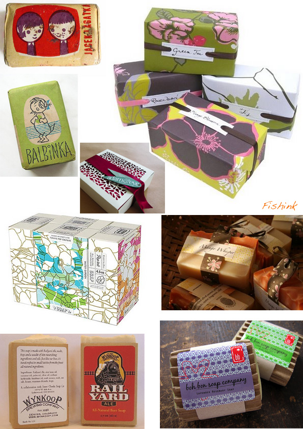
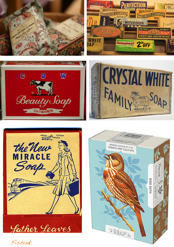
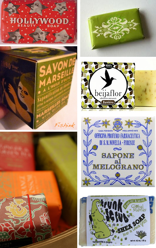
I did a little browsing on the net about vintage and modern soap packaging and came up with these.
Some lovely designs and fun packaging for getting clean.
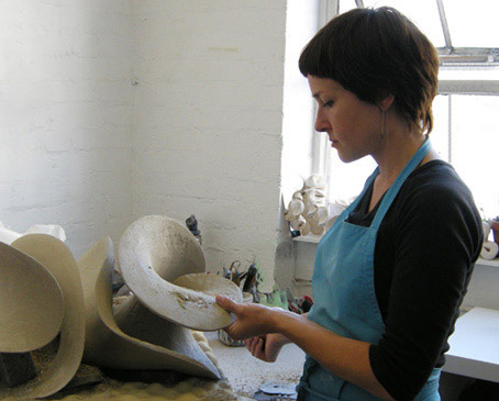
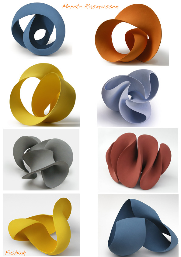
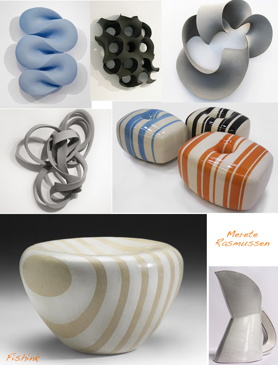
Merete Rasmussen. Danish 3-D SculptorEva Hild
Merete Rasmussen works with abstract sculptural form. She is interested in the idea
of one continuous surface, with one connected edge or line running through the whole form.
Clear, clean shapes; soft smooth curves in contrast to sharp edges; concave and convex surfaces;
the discovery and strength of an inner/negative space – are all form expressions that appeal to her
and results in her continuous exploration and expression in many different variations.
Below are some of her wall sculptures and some earlier forms and perhaps ‘sweet inspired’ pieces.
She was born in Denmark but grew up in Sweden. Returning to Denmark to study at Design School
Kolding in 2000, and moved to London in 2005 after graduating. Beautiful movement.
If you like Meretes work, you’ll also like the similar work of Eva Hild.
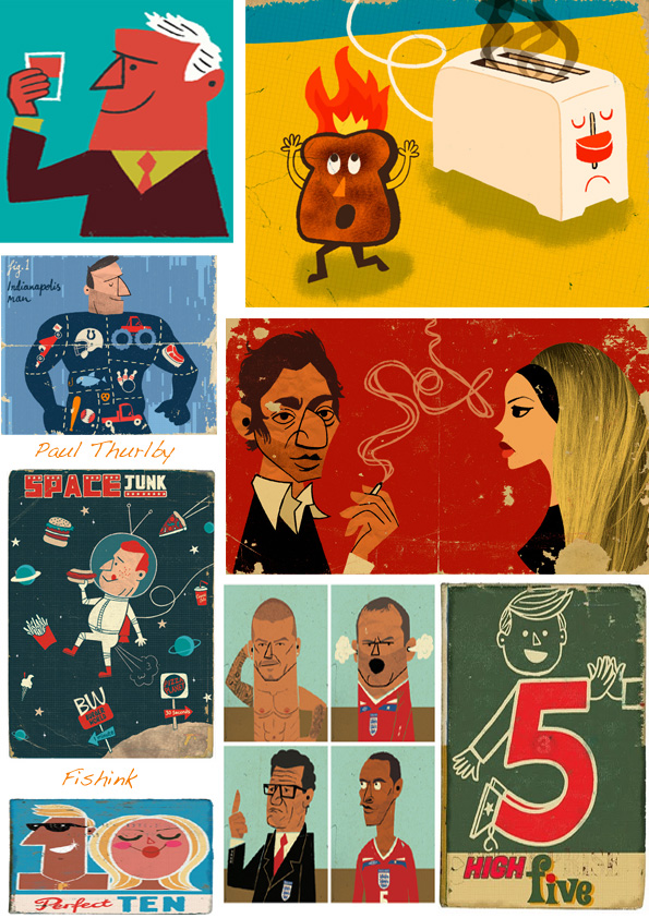
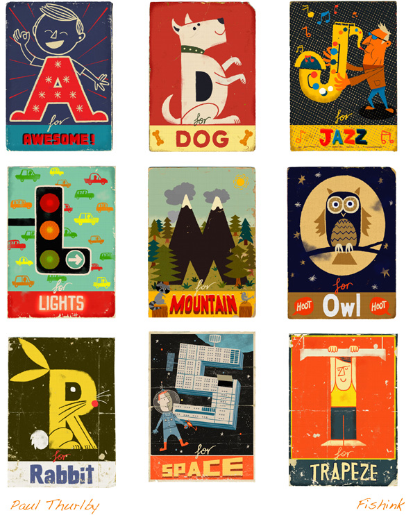
Paul Thurlby Illustrator
Originally from Nottingham, London based Paul Thurlby has been a full-time illustrator since
September 2006 after graduating from University in Buckinghamshire. Paul holds his
pen in a funny way, but it works just fine for him. He has built up an impressive list of
commissions including regular contributions to The Guardian since May 2007.
He also has a great set of greeting cards based on the alphabet, see more on his blog and site here.


