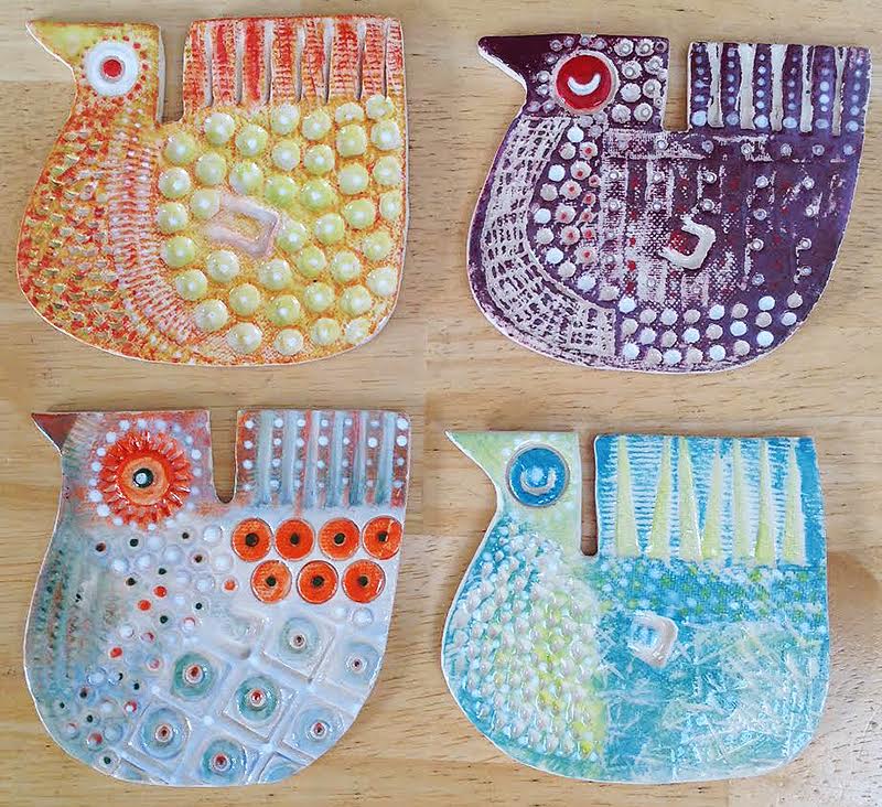
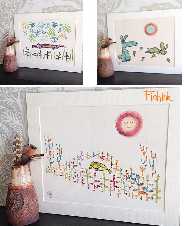
Fishink Ceramics Sale this week.
Hi everyone, just a quick post to let you know that im having a Ceramics Sale tomorrow, Saturday and Sunday, so that’s the 3rd, 4th and 5th of July.
I will be ‘open for business’ 10am til 4pm UK time on those three days and showcasing a whole host of new and previously unseen work.
Here’s a little taster of my retro fish plaque… more fun to come lol
Please check them out on Instagram @fishinkblog and leave a message, like or perhaps a little treat for yourself or a gift for a friend, I ship worldwide.

Happy Day Craig.
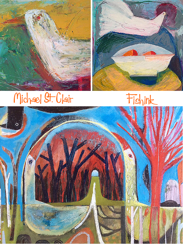
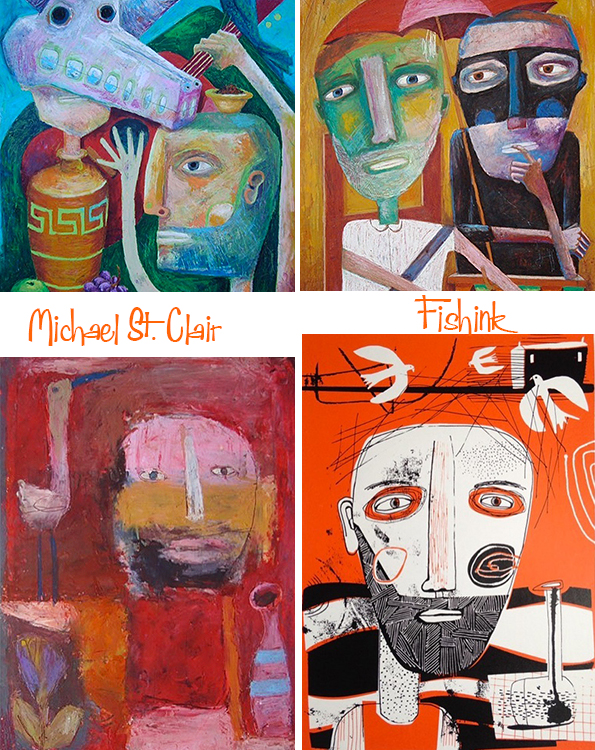
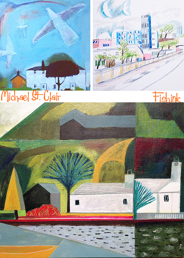
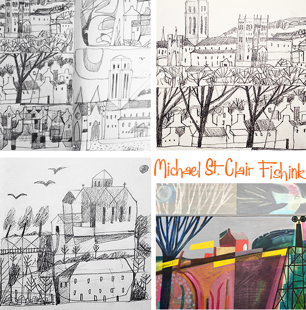
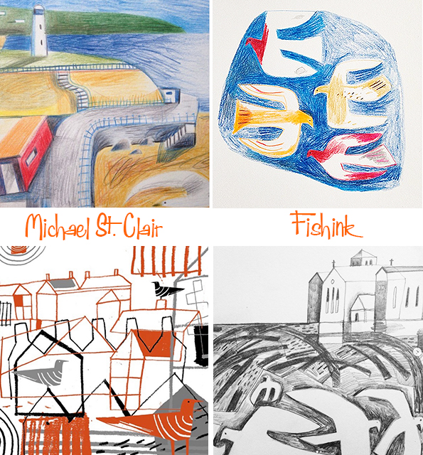
Michael St. Clair Considered Landscapes
I recently came across the art of Michael St. Clair and love his wonderful connections to the land sea and sky.
Michael studied Fine Art Printmaking at the University of Humberside and worked for several years in graphic design before retraining as an art psychotherapist in 2010. As well as helping others express themselves through art making, he is keen to pursue a career as an artist himself creating images which are partly metaphorical and partly autobiographical. I caught up with him to find out a little more about his processes and ideas.


Finding places to show and sell work is a bit tricky. It seems to make sense to show in the north east and north west as these are the areas I’m generally painting about but I don’t have anywhere particular in mind. I’m always open to offers!
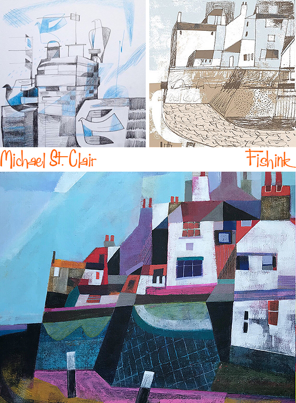
Here’s a couple of Michael’s digital illustrations.

This is his latest work and amongst my favourites. I love the interweaving of the birds into the landscape, the colours, the perspectives and the slight flattening of the views.

Always taken in and transported by that slight aerial perspective too !

They make me sigh and feel calm at the same time, how wonderful.

Thank you Michael for appearing on my blog today, I look forward to seeing what comes next for your work. You can see more of Michael’s work over on Instagram here. Please leave a comment to share your thoughts and feelings about Michael’s work.
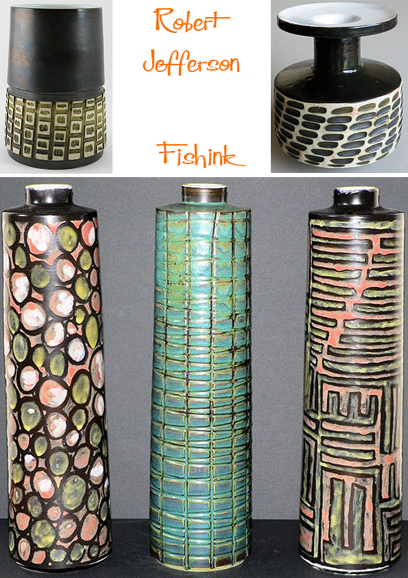
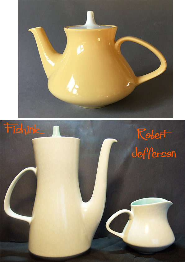
Robert Jefferson Ceramic Designer Parts 1 and 2
Morning everyone, I’m so busy with my ceramics at the moment that I haven’t had a spare second to prepare a post, how naughty of me lol so instead here’s not one but two posts sandwiched together about the ceramic work of someone that I admire very much, Robert Jefferson. I hope you enjoy it as much as I did assembling it in the first place.
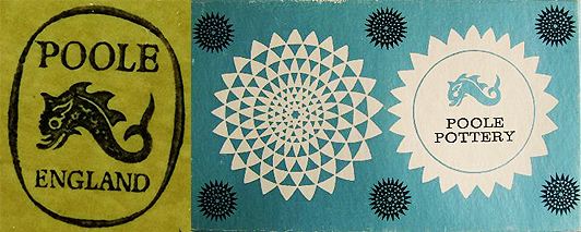
Robert Jefferson was a former lecturer in Ceramics at Stoke-on-Trent College of Art. He joined Poole Pottery in 1958 as full-time resident designer (rather than a thrower) working on domestic ranges and oven-to-table ware alogside potter Guy Sydenham.
When Poole Pottery was launched in 1921, Poole, Dorset, it was decided to make pottery, which was useful and ornamental, in a style both contemporary and also in the best traditions of potting. It was a very successful experiment.
Launched in October 1963, the so-called ‘Delphis Collection’ reproduced 75 or so vases designed by Robert Jefferson as a standard repeatable range. This allowed trade customers to place orders with a degree of certainty as to size, shape and price. Popular lines could be re-ordered from a catalogue. Although shapes were (to some degree) standardised, the colour, decoration, glazing and carving of each piece was unique.
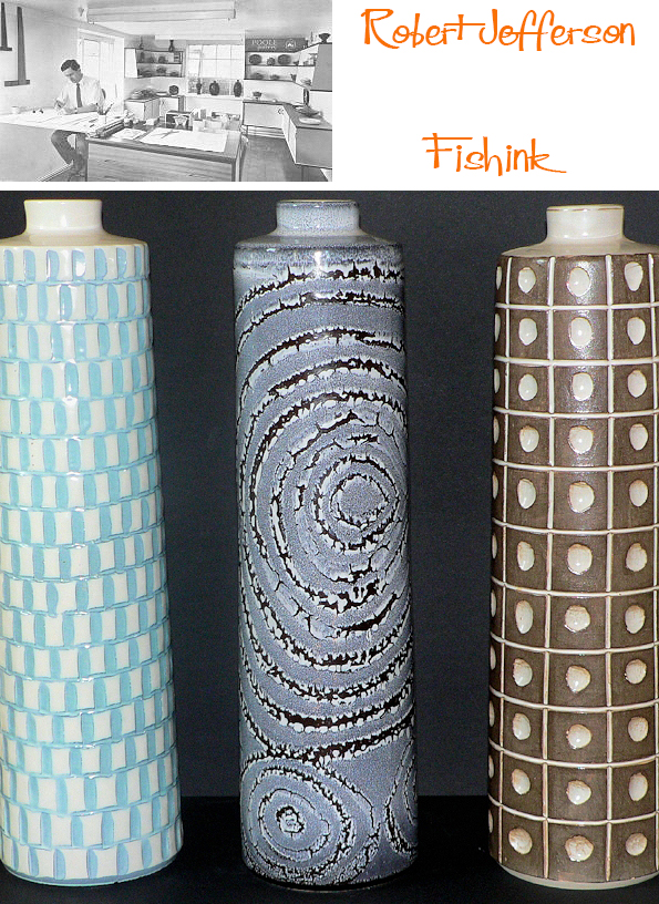
The early Studio pieces were thrown by Guy Sydenham and decorated by both Tony Morris and Robert Jefferson.

After 1963 new patterns were added and there was a crossover of paintresses from other departments.

It must have been exciting times as there was much room for experimentation, mark making techniques and ideas were flowing.


Quite a variety of shapes and styles, in order to see which would catch the public’s eye and become popular.
There were few other potteries at the time producing studio pottery within a modern industrial environment in this way. (Rye and Denby too).
Robert later also worked for other compaies (like Purbeck) after he left Poole in 1966.

The use of the latest glazes and experimental techniques (such as wax-resist, see below) aided the development of new products and helped to preserve the unique identity of the Pottery. No doubt there was also perceived to be a niche market for highly individual works of art (the retail cost of one plate would be more than a weeks wages for the artist).
It’s Robert’s later work that I first encountered and that I was initially drawn to.
Welcome back to Part 2 of my post about the work of Robert Jefferson.

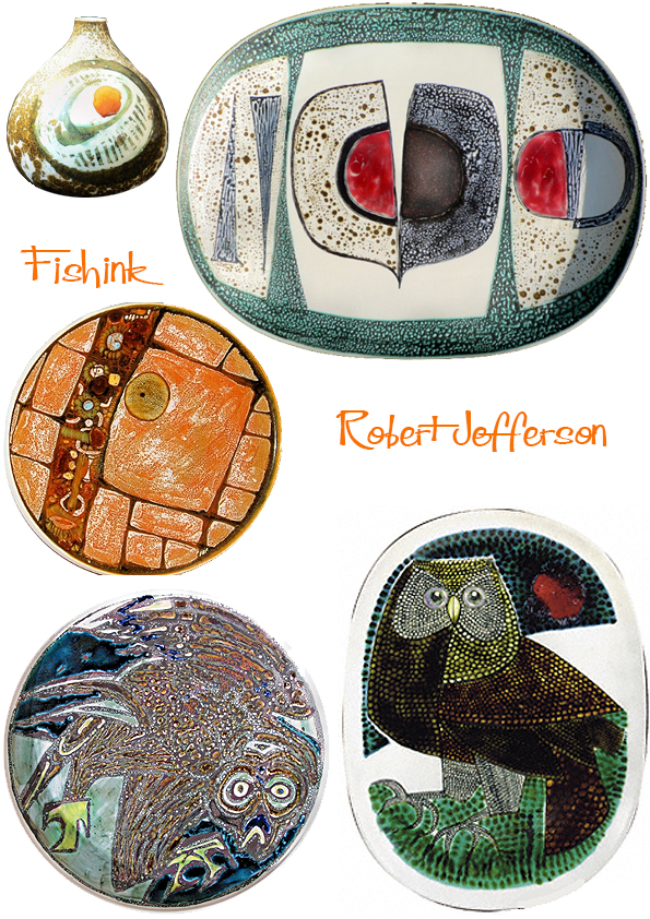
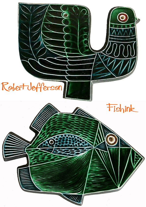
Robert had a great eye for nature and incorprated it into his work whenever he could.
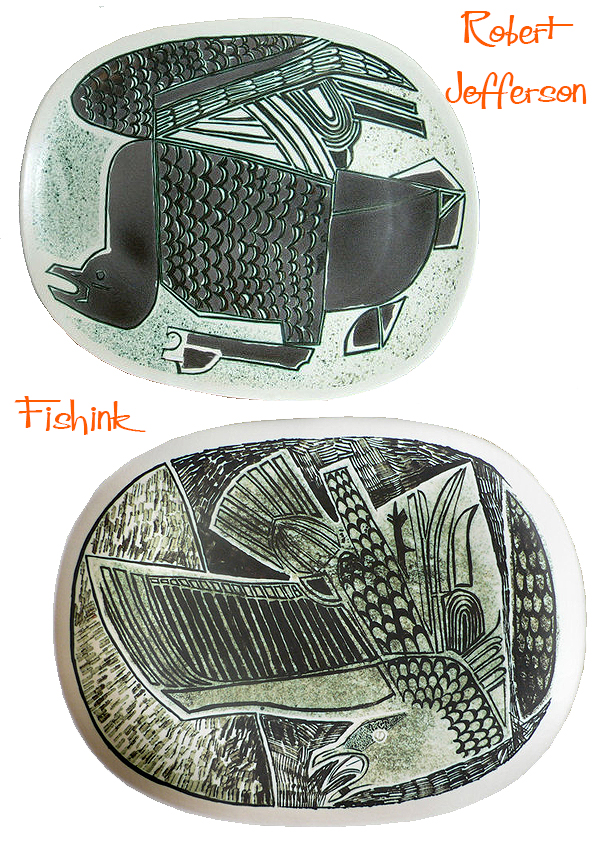
I love the marks that create this seagull above. They add to the drama of the whole piece.

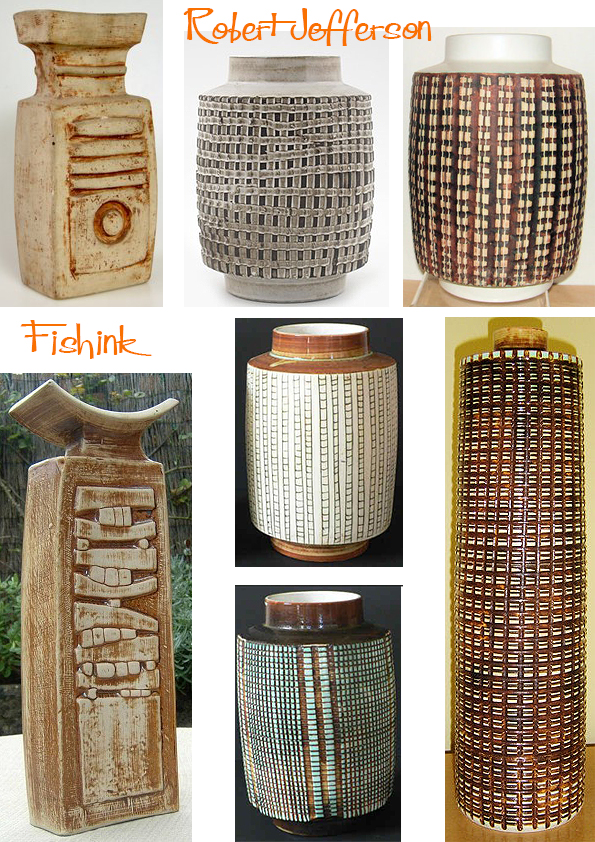
Wonderfully textured ‘Helios’ table lamps and sumptuously curvaceous tea and coffee pots.
His decorative eye was both clever and precise. Like much Poole tableware these dishes are surprisingly thin bodied and lightweight. The high biscuit firing temperature used (1150c), produced a semi-vitrified body which meant these pots could withstand domestic ovens. Although, they were sold with a warning to avoid thermal shock. This “Oven to Tableware”, proved to be very popular.

As a textile designer, these mark-made vegetables and birds really caught my eye.


The shrimp are practically dancing on these dishes !

Robert was a great innovator: Introducing new technology to the factory and reinvigorating the Poole catalogue with new shapes and styles in keeping with a new decade. As well as the pots below, he also designed the “Contour” tableware range and “Black Pebble” pattern shown in the Twintone Gallery, together with Helios table lamps and other wares. He left Poole Pottery in 1966, after he had reputedly “designed himself out of a job”. He went on to continue his painting career, giving exhibitions of his work and showing his extensive love of detail and nature.

I wonder if this was his decorative world merging with the real one ?
Below are some of the first wall plaques that Robert designed, these were hand decorated in the available studio glazes. The designs were ‘transferred to the production departments when greater output was required. These remain my favourite pieces of his work.

Launched as the 1964 ‘Spring Collection’ the plaques were then produced in the (much more common) standard colours of blue and green that you see below.
Other designs of plaques and dishes soon followed. See more about Poole Pottery and it’s production here.

My favourites are still the birds and I’d love to find a few for myself. I hope you’ve enjoyed this visit into Robert’s creative world.

Many thanks again to The Virtual Museum of Poole Pottery and Rob’s Poole Pottery for helping to make this post possible. Do let me know if you’ve found this post exciting, uplifting or have anything to add. I always enjoy hearing from you.
Gillian Martin Contemporary – Retro Illustrator

Good Morning everyone, (or evening depending where you are!)
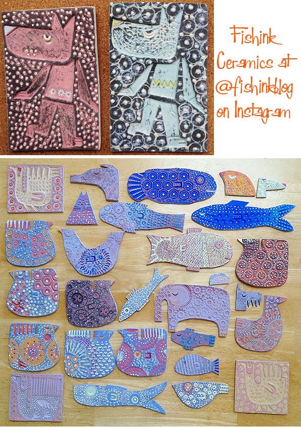
I just wanted to say a huge vote of thanks to those Fishink readers who popped over and bought something from me at @fishinkblog on Instagram at the weekend. The Sale of my ceramic work and Illustrations went well and I’m very grateful for their support, I still have pieces to sell so if you fancy a new treat for yourself or a present for a friend’s birthday etc then pop over and have a browse. (www.instagram.com/fishinkblog).
So onto today’s wonderful offering of smile making illustrations.

I came across the retro / contemporary work of Illustrator Gillian Martin on her IG account here, and through our messaging and likes of each others work. She also purchased a brooch from my @fishinkblog account… I think it will become clear why she selected this one : )
When did you first start to get interested in Art ?
I can’t remember ever not being interested in art, it has always been central to my life. My parents were both very creative and my brothers and I grew up drawing painting, and making
stuff! My pocket money was usually spent on a new sketch book, still one of life’s greatest pleasures! At school I was that kid who hid in the art room at play time! I always planned to be an artist, once I discovered I could be an illustrator I had a plan!

You can buy a Print from King and McGaw and she has a quirky humorous style for magazine and journalistic work.

What training did you have to prepare you for the work you are doing now, did you always want to be an artist ?
I did an illustration course at Maidstone College of Art (as was), Gerald Rose was the course leader. It was the only purely illustration degree in the country at the time. After that I moved up to London. In those pre internet years, I used to drag my A1 port folio around to meetings with actual magazines editors and publishers. It was very exciting to see my illustrations in various magazines, and eventually hundreds of books (mostly educational publishing), and products. I spent a lot of time at the Tate Gallery and the National, among others, also The British Museum
and V&A were great places to spend a day drawing. Having a part time job at the Tate gave me the opportunity to study the collection at close quarters. I lived in London for about 20 years before relocating to Scarborough. We moved over to Canada in 2009, but I’m back in Scarborough now.
Here’s a range of tins Gillian decorated for Mr English Breakfast with Elite Tins (@elietgiftboxes)


You have a very distinct style to your work, does this come from a love of all things 50’s and 60’s like myself, or just an interest in contemporary styles ( as the retro look is everywhere right now) ?
Deciding at that point, to make a fresh start, I decided to take some online courses (mostly with Lilla Rogers) and started licensing some designs, joining Yellowhouse Art Licencing Agency a few years ago. I’m glad you think I have a distinctive style! I would say there has always been a bit of a Mid Century vibe to my work-it’s sort of in my DNA, absorbed since childhood, and the illustrated books I used to pore over, and the things my parents had around the house.
They both had similar taste, and liked ceramics and certain colour schemes. I remember black jugs with yellow insides, black spotty vases (I still have a few things) Hornsea Pottery and slab pots! My Grandad also encouraged me a lot, and made me feel like a ‘proper’ artist. He was an amateur painter and we used to work together in his attic studio. I can still smell the oil paint and turpentine! We lived in Hull, so used to go to The Ferens Art Gallery at weekends. Over the years I have become more passionate about Mid Century Art and design in general, I just
love it! In my teens I was introduced to the wonderful John and Myfanwy Piper ( at a school event ) I was a bit star struck, but they were so kind and encouraging, the encounter had quite an impact on my awareness of style.

Which artists would you say have an influence on your work and who’s work do you currently admire ?
There are SO many artists that have influenced me, and whom I absolutely love! It’s hard to pick just a few, but here goes… Apart from John Piper, Picasso, Barbara Hepworth, Bawden, Ravillious, Lucien Day and John Minton … There are also lots of others – John Maltby, Ben Nicholson, the Provensens, Edward Ardizzone, Joan Eardley, Stig Lindberg, Ben Shahn, Le Corbusier, Roger Hilton, Peter Lanyon – to name but a few. Rosemary Vanns as I mentioned earlier, really has that midcentury feel going on, and has recently
been doing some experimental work, also Melvyn Evans, Simon Laurie, Elaine Pamphilon, and lots of others.

Does your use of imagery come from living near to the coast ? Birds, fishing ports etc ?
I’m not sure why I enjoy drawing birds so much! I think I found a way of representing them that felt unique to me, and worked with where I wanted to go in terms of style. They are endlessly fascinating aren’t they in their various shapes and colours, but mostly it’s about the lines I think. I have always been drawn to the sea, which has I think had an impact on subject matter.
Boats, seagulls, beach huts, the shapes and textures of the landscape. The geology of this area is fascinating too, and I love to collect fossils, and interesting rocks and
pebbles. One of my prized possessions is a large piece of Whitby jet which I found a couple of years ago I do feel very lucky to live here-there are some great walks, in all weathers!


How do you start the process of creating new work, does it evolve naturally or is it a case of assembling parts to make up the whole ?
A new image usually starts as a pencil sketch which I then scan into Photoshop, where I can play around with different colour ways, and create some texture for that ‘printed’ look. I like to collage samples either sourced or created on paper and build up layers. Recently though, during this lockdown period we have all been going through, I’ve been
experimenting with actual printing techniques! So far I’ve done some mono printing and Lino, and plan to try screen printing next.
I’m interested to see where this takes me.
I’m quite obsessed with Instagram, and love to discover new artists and see what people are working on. Pinterest is also a very useful tool for reference gathering, and visual inspiration.
I recently bought a print from Rosemary Vanns, one of my favourite contemporary artists, which combines screen, mono, and linoprint all in one image, I love it! The last exhibitions I saw were Picasso and Paper at the RA, and Ivon Hitchens at Lakeside Arts in Nottingham. Both are among my favourite artists. I also visited the Henry Moore rooms at the AGO Toronto last year, he is always a great source of inspiration for me.

Where do you see your work heading in the next 5 years… ?
I intend to print and paint more, see where that takes me, and perhaps explore other markets. Maybe collaborate on a range of household wares, ceramics, bedding, throws, wall art etc… It would be nice to have some of my work in museum and gallery shops. I have been meaning to open an online shop for ages now, that is something I intend to do in the very near future.

I love these fresh bouquets and still life ensembles.

If you couldn’t be an artist right now what else would you like to do ?
If I couldn’t be an artist, perhaps I could be an Art History lecturer, or an art and book conservator!


Gillian kindly put together some sketches and revealed how she works them through to final illustrations. Fascinating to see the process.

Birds and Fish everywhere and I love them all.

You can even license a design through her agent Sue Bateman at Yellow House Art Licensing. Thanks again Gillian for all your contributions to this post, it’s been lovely catching up with you, I hope one day after all this crazy time we get to meet up in person, I’m sure we would get along well.
Fishink Ceramics on Instagram Today !!
Hi Everyone, Just a quick message to say that today I will be selling my Ceramics on my Instagram account
@fishinkblog
It’s my first solo online sale so please drop by between 10am and 4pm UK time and say hello, leave me a like and have a browse through my work.
If you are looking for a gift for a brithday, a friend or even a treat for yourself, I have many different pieces, framed ceramic artworks, original illustrations etc and can send items anywhere worldwide for you.
I look forward to catching up very soon. I’ll see the usual faces on Monday for my blogpost. Happy Weekend !!
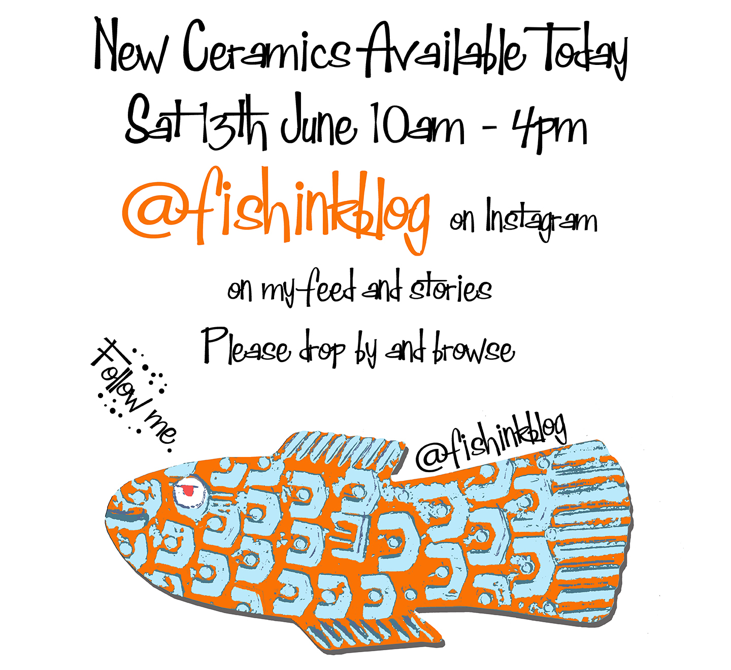
Margery Gill Mid Century Book Illustrator

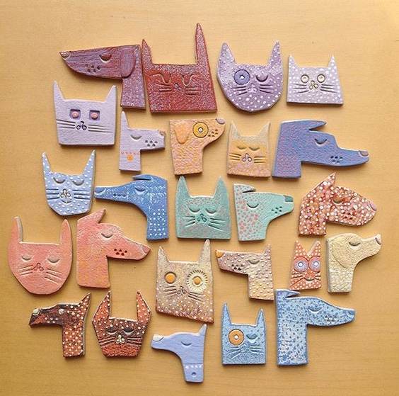
Happy Start to the week everyone and I hope this finds you well. Before I show today’s guest illustrator, I would like to tell you about an exciting event that is happening this coming Saturday 13th June. Ok apart from the Queen’s official Birthday (lol). I am hosting my first sale of Fishink Ceramics on my Instagram account @fishinkblog between 10am and 4pm GMT, in my stories and on my feed. As long as my final firing goes to plan today (crosses flippers) there will be a host of Ceramic Retro Birds, Fish, funky bird shapes and new Cat / Dog plaques suitable to hang on your wall.

It would be fab if you could drop by, say hello, leave a like or perhaps make a purchase for yourself or a present for a friend, it all helps so much and also allows me continue to work, live and run this blog.
Look forward to seeing you there and please follow me on instagram and tell your friends who may like my work, to do the same, many thanks Craig.
Ok on with the post today and I’m talking about an illustrator who many Enid Blyton fans may remember.
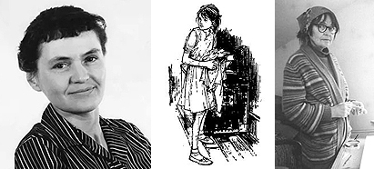
Margery Jean Gill (5 April 1925 – 31 October 2008) was a British illustrator of children’s books.
Born in Coatbridge, North Lanarkshire, Scotland, on 5 April 1925, she was brought up in Hatch End, London after her father Oscar moved there to take a job at the Post Office Research Station developing the speaking clock.

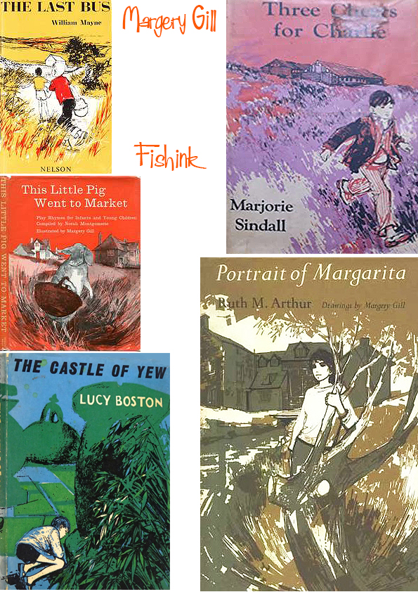
She left school at 14 and took a place at Harrow School of Art. In 1946 she began studying etching and engraving at the Royal College of Art, married actor Patrick Jordan, and illustrated her first book, Robert Louis Stevenson’s A Child’s Garden of Verses, for the Oxford University Press.

After a series of commissions for the Oxford University Press, Gill began an association with The Bodley Head, for whom she illustrated over thirty books between 1957 and 1982, including Margaret Kornitzer’s 1960 novel about adoption, Mr Fairweather and his Family, and books by Anita Hewett, Roger Lancelyn Green and others. John Ryder, the publisher’s design and art director, said her early work was “interfered with, rather than aided” by her background in etching and engraving, but as her drawings became bolder her work became more in demand, her serious, unsentimental view of childhood suiting the kitchen sink realism prevalent in children’s books at the time. She remarked “that is often how children are — taking their own lives seriously”.
Eleanor Graham, the founding editor of Puffin Books, also sought her out to illustrate books including A Little Princess by Frances Hodgson Burnett. Gill’s lack of recognition was cruelly underlined, when a 1961 edition of this book was reissued as a Puffin Classic. Margery’s 24 pen-and-ink illustrations for the book were among her best work, but on the title page her surname was mistakenly printed as Hill.

She worked for numerous other publishers, including Jonathan Cape, for whom she illustrated Susan Cooper’s Over Sea, Under Stone in 1965, and Chatto & Windus, for whom she illustrated Cooper’s Dawn of Fear in 1972, drawing on her own memories of living in London during the Second World War.
I love her interpretations (below) for Susan Cooper’s classic first book in ‘The Dark is Rising’ series of books, “Over Sea Under Stone’.
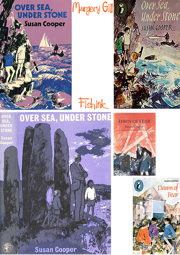
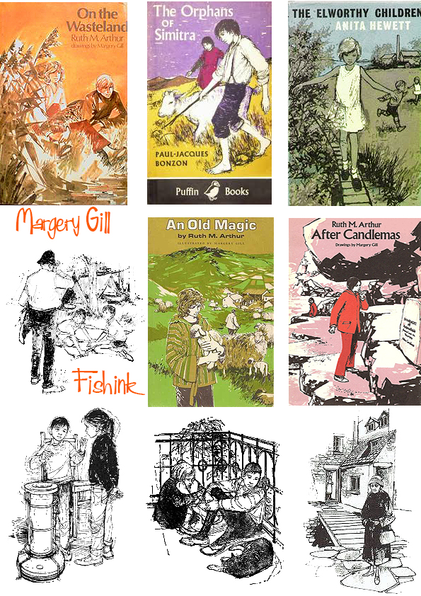
Cooper said of her work on Dawn of Fear, “She caught the image of the kids I was writing about perfectly, with no communication. That does huge things for the confidence of a writer.” She illustrated A Candle in Her Room for Gollancz in 1966. She would often travel to capture the landscape and setting of books she illustrated, particularly those by Ruth Arthur and William Mayne, and for this reason a German publisher commissioned her to illustrate a German translation of Arthur Ransome’s Swallows and Amazons.

During the 1960s Gill was working in colour and had become one of Bodley Head’s prized possessions – she was hugely sought-after as publishers began to explore working class lives in children’s literature. In his obituary written in 2008, Matthew Weaver made this astute observation: “Her sometimes solemn drawings of children underlined a new attitude to the young. Children were no longer to be talked down to, but taken seriously. Margery’s drawings, which presented a lively and unsanitised view of childhood, were in vogue. But always modest, she shunned the opportunity to exhibit her work “
Gill didn’t always find the creative process easy and would often go through periods of despair when she would threaten to destroy all her work. But ultimately she was prolific and clearly she saw her drawing as fundamentally important to her: ” Every drawing is a fight which I really enjoy. I enjoy, too, the failures, and starting again ”
But by the early 1970s the prevailing fashions in book illustration were beginning to change and there was a declining demand for Gill’s social realism. Her output declined significantly and ill health – breast cancer and arthritis – meant her last book was illustrated in 1985.

She combined freelance work as an illustrator with motherhood – she had two daughters – and a teaching job at Maidstone College of Art. From 1969 she and her husband lived in Alpheton in Suffolk. As the 1970s went on her work fell out of fashion as publishers preferred cartoonier illustrations for children’s books, and her output was slowed by arthritis in her hands, and in her later years, cataracts. The last book she illustrated was Anne Thwaite’s Pennies for the Dog in 1985. She did voluntary work in her retirement, including charity collections and Meals on Wheels. She died on 31 October 2008, survived by her husband, the older of their two daughter, (their younger daughter died in 1996), four grandchildren and six great-grandchildren.
She was admired by fellow illustrator Shirley Hughes, who said “I thought her work was terrific. It made me look to my laurels. It was modern – the children she depicted were less sweet. Margery used solid black line with tremendous fluidity and ease: the way her children stood and moved was very distinctive”.
Many thanks to Wikipedia for the information used in this post.
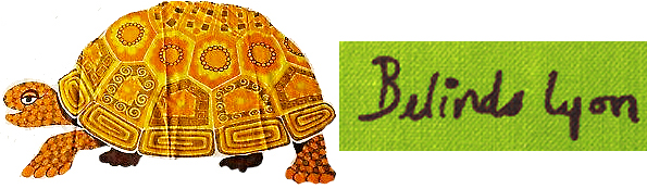
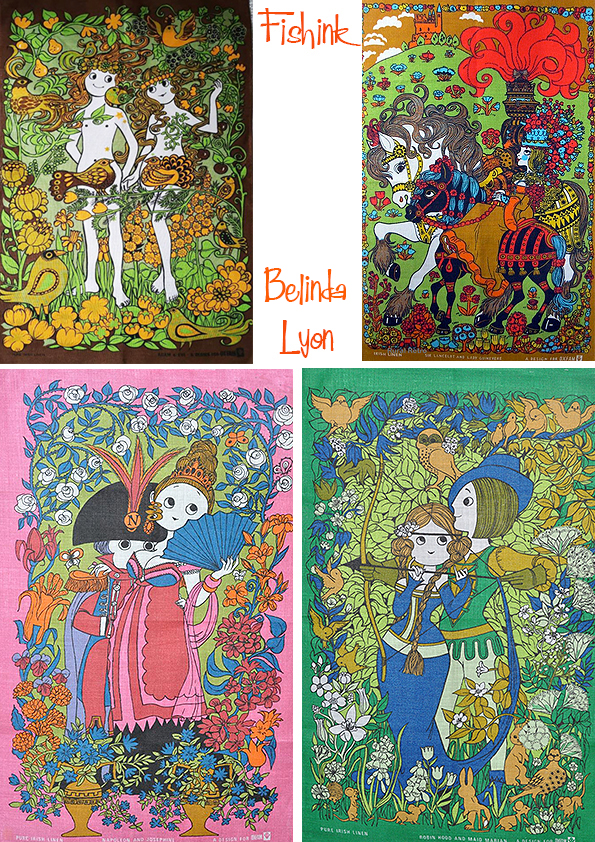
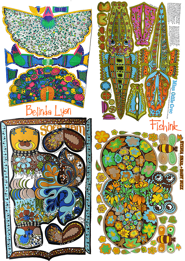
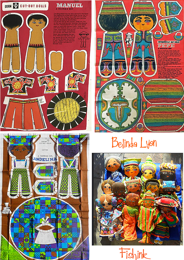
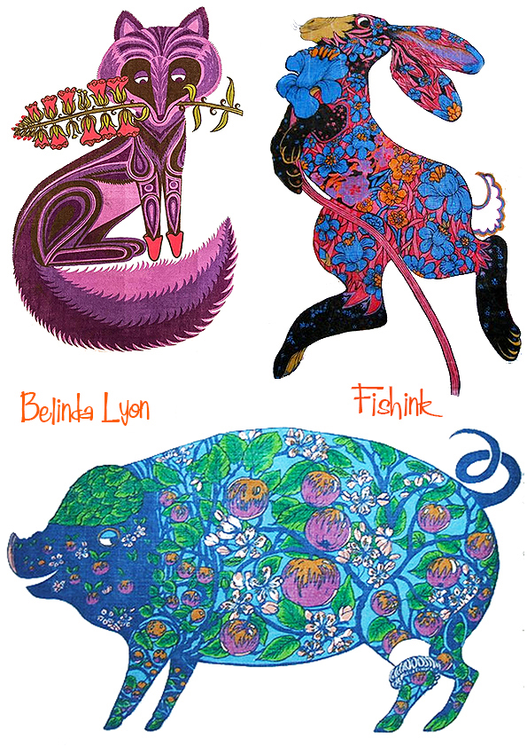
Belinda Lyon Animal Vintage Tea Towels
There is an interesting story behind today’s post. I came across the work of Illustrator Belinda Lyon a while ago and set about trying to find out something about her past.. typically with a lot of people who worked between the 5o’s and the 80’s there is often ‘nothing’ to ‘very little’ anywhere. Apart that is from one other post from 2016 by an artist, stylist, maker and collector of vintage items called Jacs Collins, who’s site Rural Retro is a treat in itself !
Belinda Lyon trained at a London art school and started her commercial career in advertising. Illustrators were in strong demand during the late 1950’s and early 1960’s and advertising was where many young graduates of the era started their careers.

Iconic illustrated adverts and posters the early 1960’s are now highly collected and many talented and now sadly anonymous illustrators started out in advertising before television and photography took over during the later “swinging 60’s”.

She started her commercial freelance career around 1965 with illustrations for short stories and books. Almost from the start of her career, her commissions were for books aimed at children and teenagers, featuring advice for young people, crafts, sewing and fashion. Some of the books and cut out dolls she illustrated in the first few years of her career are fantastic retro time capsules some 40+ years on.

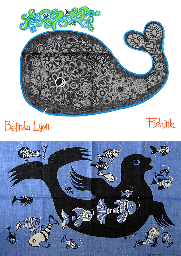
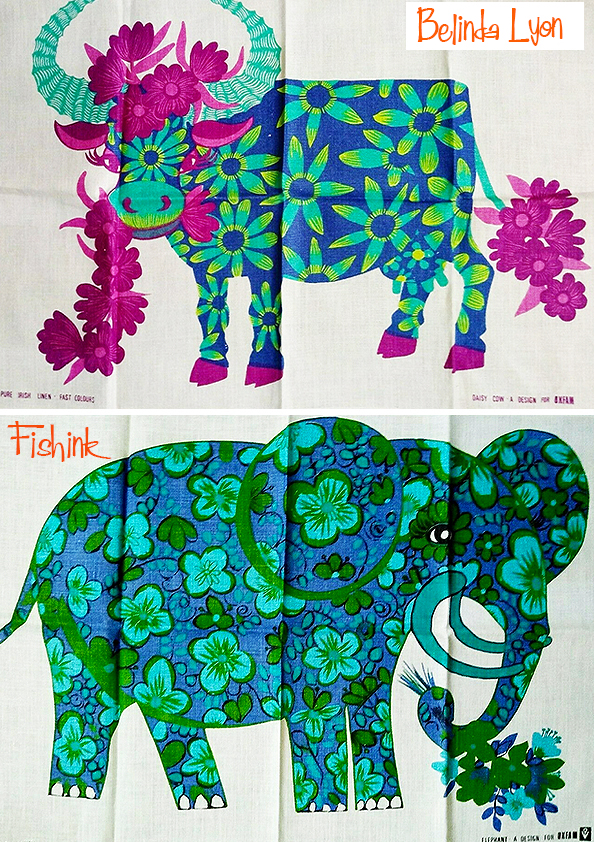
Belinda is more well known to 1970’s retro fans for her lovely tea towel and fabric cut out designs which became part of the massive Oxfam retail success story. Belinda’s first design for Oxfam was a colourful Christmas card illustration in 1966. In 1967 Oxfam introduced their first “own brand” products consisting of the first two tea towels. The elephant and giraffe were initially produced in three colours and were selected for the London Design Centre – at this time still known as the Council for Industrial Design, prior to the opening of the Design Centre shop in 1971 which had people flocking in to buy the latest trend setting products. The first 2 Oxfam tea towels were produced in 3 different base colours.

The elephant and giraffe tea towels were an instant hit and new designs were added to the range each year with 20 different animals available in the series by 1979, most of which came in two different colours. Oxfam were the very first UK charity to introduce a retail commercial model to their shops and as the number of shops grew so did their gift range. Belinda produced very popular designs for Oxfams successful retail gift range throughout the 1970’s and her work very much reflected the colours, trends and themes popular with children at the time.

Belinda produced over 60 designs for Christmas cards, tea towels etc…
… which continued to be sold in Oxfams shops into the 1980’s.

Other designs for Oxfam included cut out cushions, toys, and pillow cases.

The designs were printed onto a Tea Towel that could then be cut out, stuffed and hey presto, you had a children’s toy and a rather stylish cushion in one !


Belinda Lyon’s designs also appeared on tea towels sold by a few other companies during the 1970’s.
As a published children’s book illustrator, it seems a natural progression that Belinda Lyon went on to become a successful comic illustrator. Most of her later career during the 80’s and 90’s was spent illustrating for Twinkle comic, and lots of grown up girls will remember with fondness one of her most well known Twinkle comic characters – Jenny Wren.

Sadly, weekly comics started to decline during the 1990’s and Twinkle stopped production in 1999.

One of Belinda’s last commissions before she retired from commercial work was for a lovely children’s book by Nicola Baxter, which contains many of her highly detailed humorous illustrations. Belinda Lyon, like many other talented illustrators from her generation, has been mainly unknown for the last 20 years until the growing retro interest in the 1970’s and the current sewing craft revival has brought her designs and illustrations “back on trend” and her designs are a reference source for several of today’s retro inspired designers. Like the work of contemporary artist Sarah Young.

Belinda had a wonderful eye for colour, pattern and texture, I can imagine these strong designs working well in kitchens even today. What do you think readers, should Oxfam revive these designs for today’s market ?
Many thanks to Jacs and her sister over at Rural Retro, for allowing me to use the written information to accompany my images and make this post possible. Much appreciated.
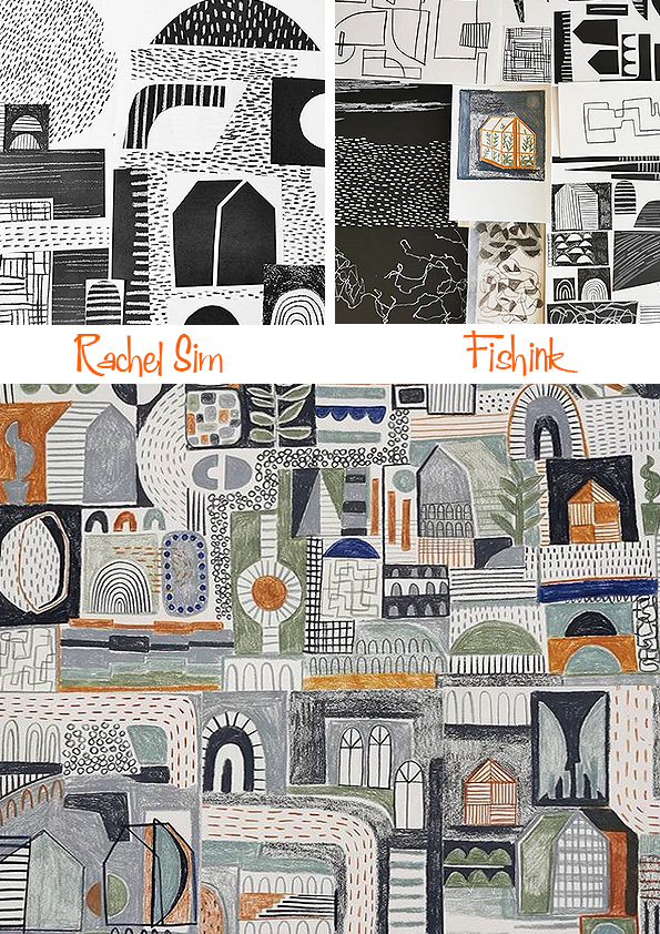
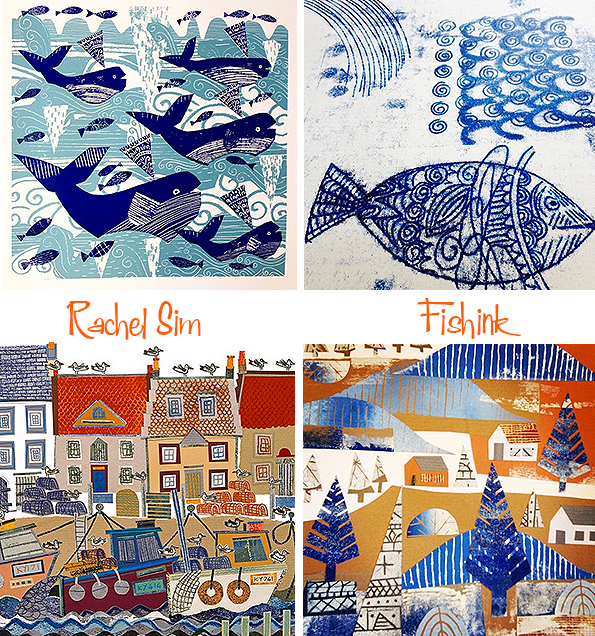
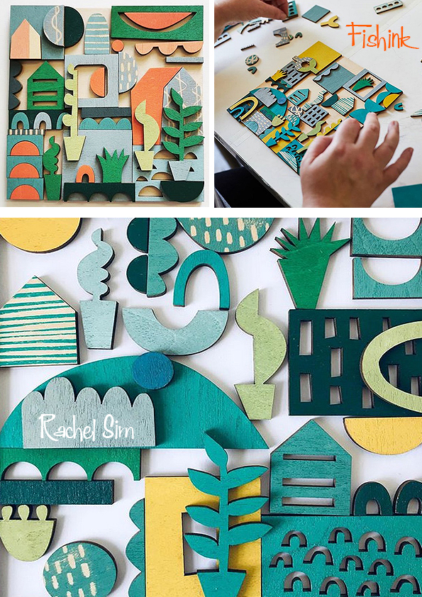
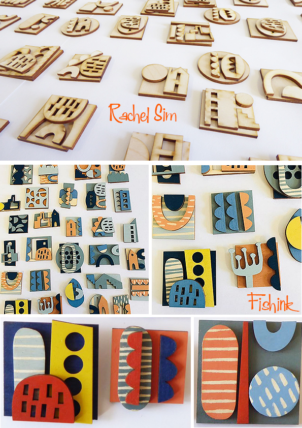
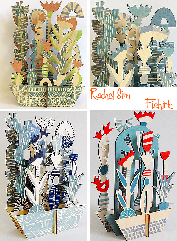
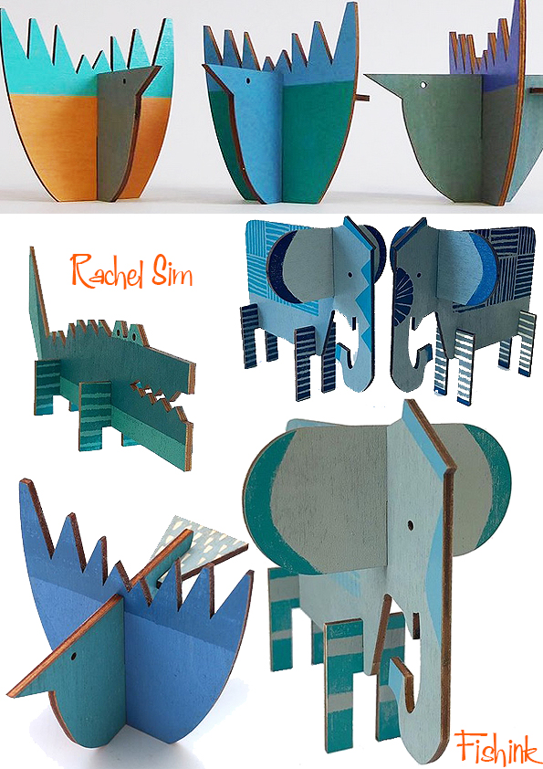
Rachel Sim Pattern Pleasure

I was delighted to discover the work of Rachel Sim which brims over with wonderful busy patterns and graphic shapes. I got in touch during lockdown to find out a little more about her style and ideas.
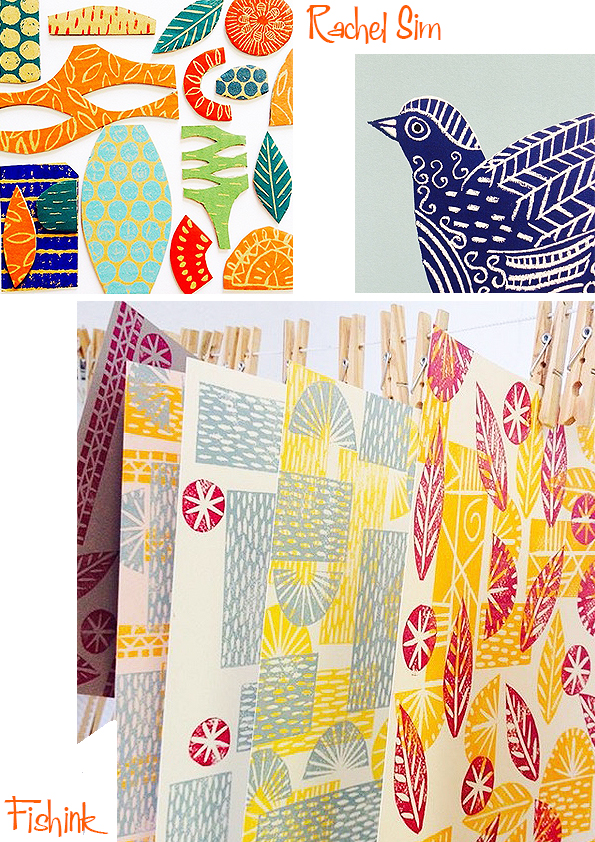
Look at these fab prints and colour combinations. Below Rachel’s sketches around the theme of the Greenhouse.

Some great seaside senarios.

These textural animals are beautiful.
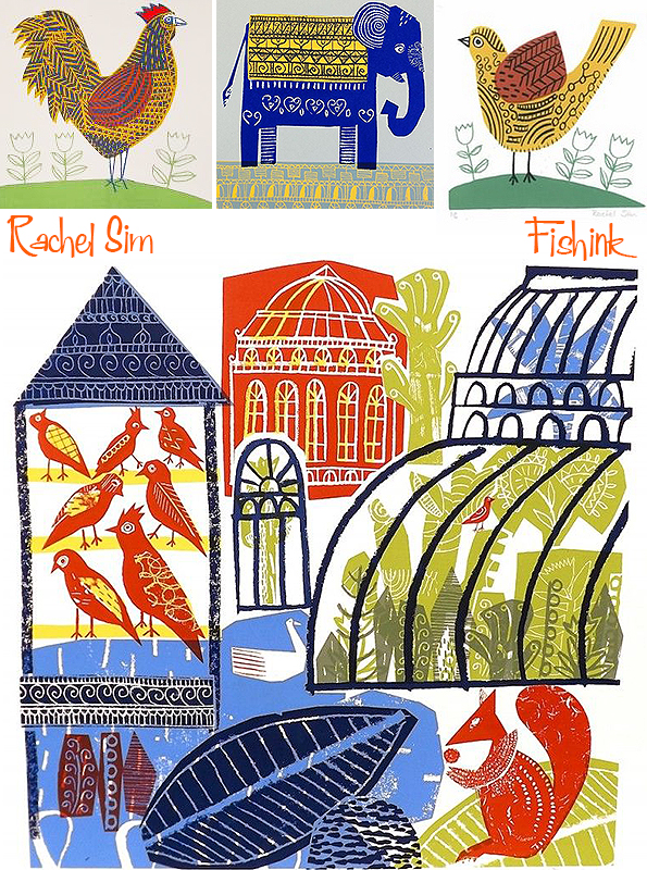
I rarely have an exact plan for my work, I try to always follow my inspiration and curiosities and see what processes and ideas are bringing me joy.
I don’t know about you readers, but Rachel’s panels bring me so much joy !
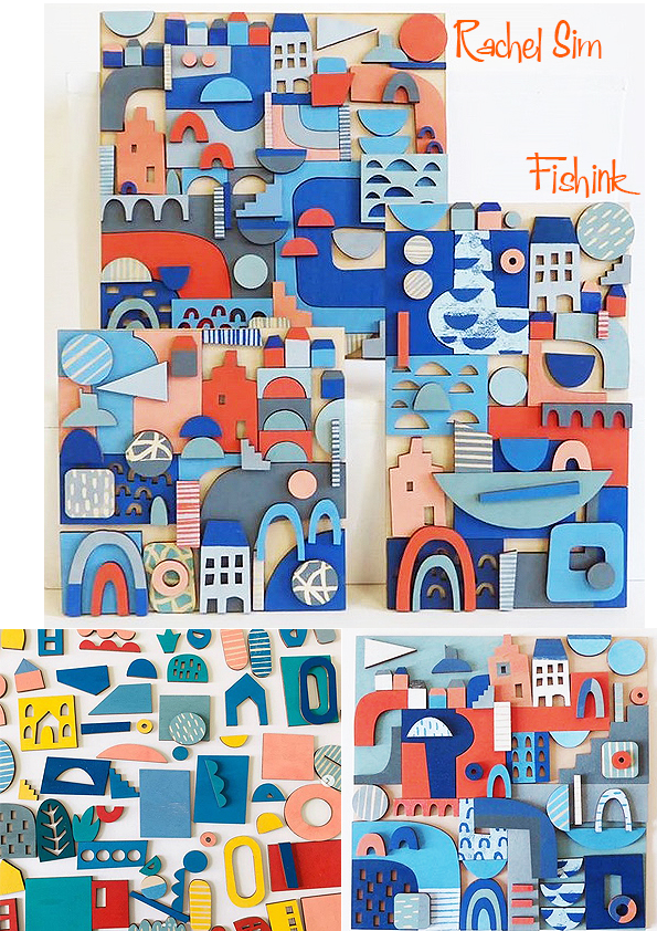
Naturally I am always drawn to blues and greys, I grew up beside the sea and I am sure that has played a part in inspiring my colour palette. I love colour and I spend a lot of time taking photos of all sorts of colour combinations as well as collecting different shades of paper that I can use for reference when making new work. I recently watched a short bbc programme on the designer Paul Smith where he discusses how he chooses and selects colour combinations that I found really inspiring.
Look at these plants, how wonderful, you can have your own permanent indoor garden !
Thats a difficult one! I have a couple of print trays that I have had for many years. I am always collecting little objects or finding stones, shells and natural bits and bobs to add to these. I am constantly curating these little collections and changing bits. It’s a lovely ongoing process.
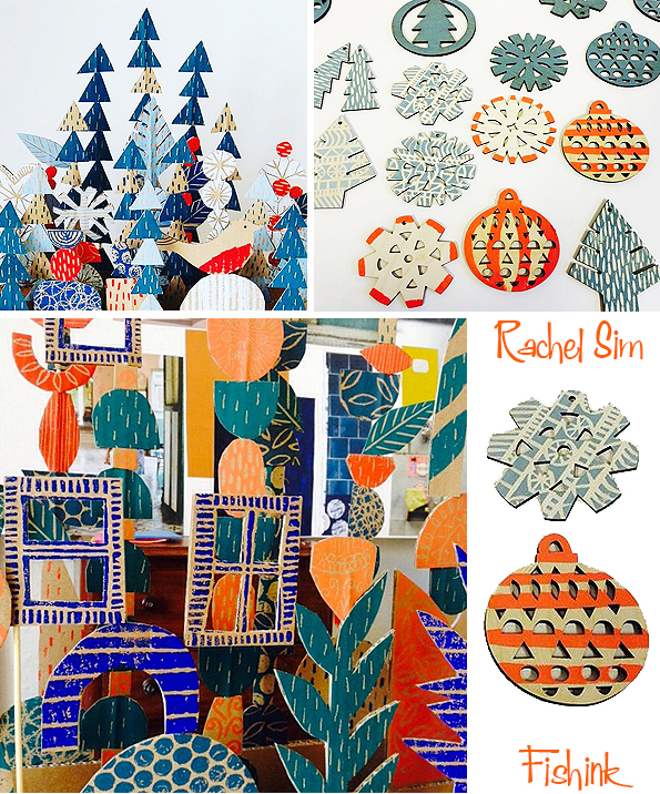
Yes I have been working on a little collection of harbour and garden linocuts recently and I hope to turn some of these into a range of cards, I just need to design a few more prints first !
How about that for a cheery start to your week everyone ?
Thanks again Rachel for taking part and telling us more about your background and how you work.
More fab images on Rachel’s Instagram here.
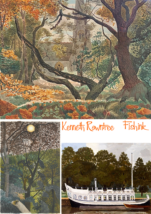
Kenneth Rowntree
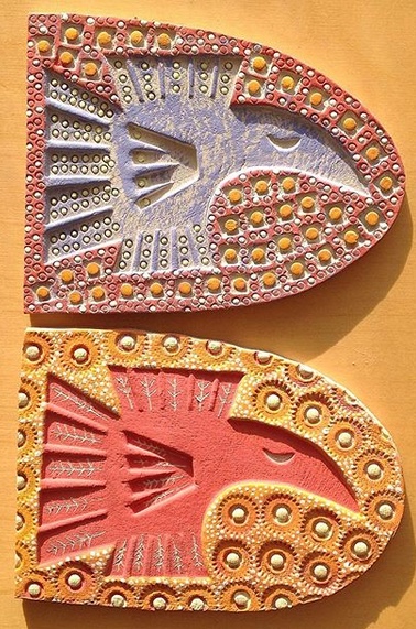
Hello to one and all, I hope this finds you well. I want to start by thanking everyone who dropped into my first Pop Up Shop experience at the weekend over on instagram. It happened under the hashtag #postablepopup and was created by Megan who runs @curatedmakers. I was there as @fishinkblog and it was a successful event. Giving me the opportunity to not only showcase some of my latest ceramics, but also to virtually ‘chat’ to the customers, discover who they were, what they liked about my work and where they planned on being, hung, placed and admired. A great experience. If you missed it, I still have more Fishink Ceramics here and will be adding more in the weeks to come, so do drop back or feel free to direct message me with your requests. I’m also taking part in the @greenwalkopenhouse , another event that had been cancelled due to COVID-19 this coming Saturday between 12 and 4pm GMT, so please drop by.
Ok onto today’s wonderful artist, the legendary Kenneth Rowntree.
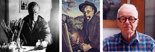
He was an artist, designer and teacher who worked in Britain from the 1930s through to the 1990s. Born the son of Howard Doncaster Rowntree, and educated at Bootham School, York. Kenneth was part of the extended, and famous, Quaker Rowntree (confectionery) family. His immediate branch of the family were shopkeepers and business leasers in the Yorkshire seaside resort of Scarborough – where they owned the town’s department store. There’s some interesting background family history here…
He studied at the Ruskin School of Art, Oxford and went on to the Slade School of Fine Art. At the Slade he met Eric Ravilious and Edward Bawden, moving to north Essex to work more closely with them. They became known – with others – as the Great Bardfield Artists. Here’s one of Bawden’s painting from around the village.

In 1939, Kenneth married architect Diana Rowntree (née Buckley) with whom he had two children.

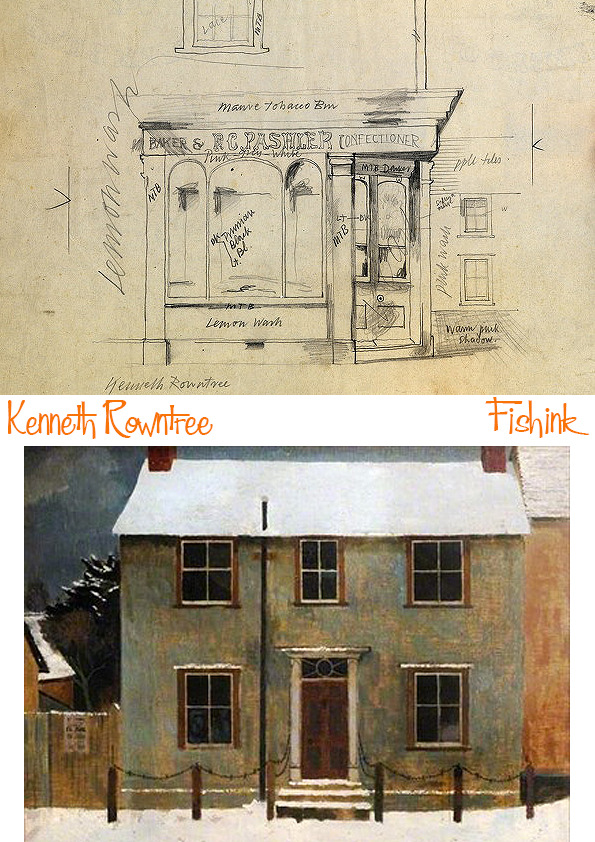
He painted beautifully tranquil depictions of life around him.
During the Second World War, he worked for the War Artists’ Advisory Committee. He was one of more than 60 artists commissioned by the Government and financed by the Pilgrim Trust to record the face of England and Wales before development or wartime destruction changed it.

Amazing to have these scenes catalogued in such a way.

Capturing scenes of devastation and celebration both.

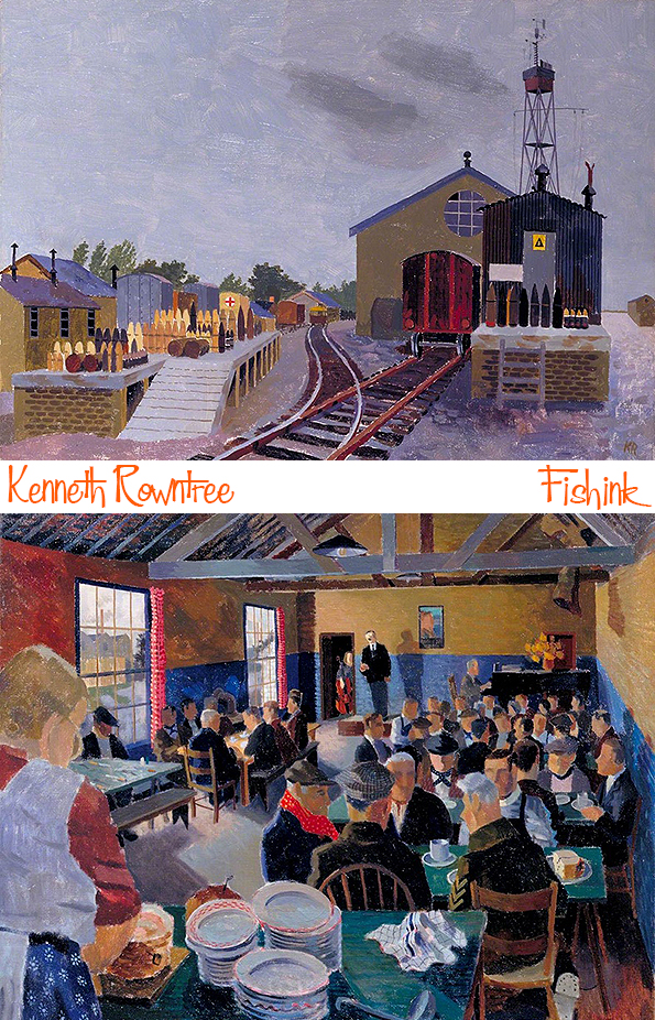
Recording Britain, as this project came to be known, covered a total of 36 counties. Kenneth Rowntree concentrated on capturing the essential character of old buildings and interiors in Bedfordshire, Essex, Yorkshire, Derbyshire and Wales.


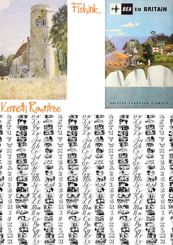
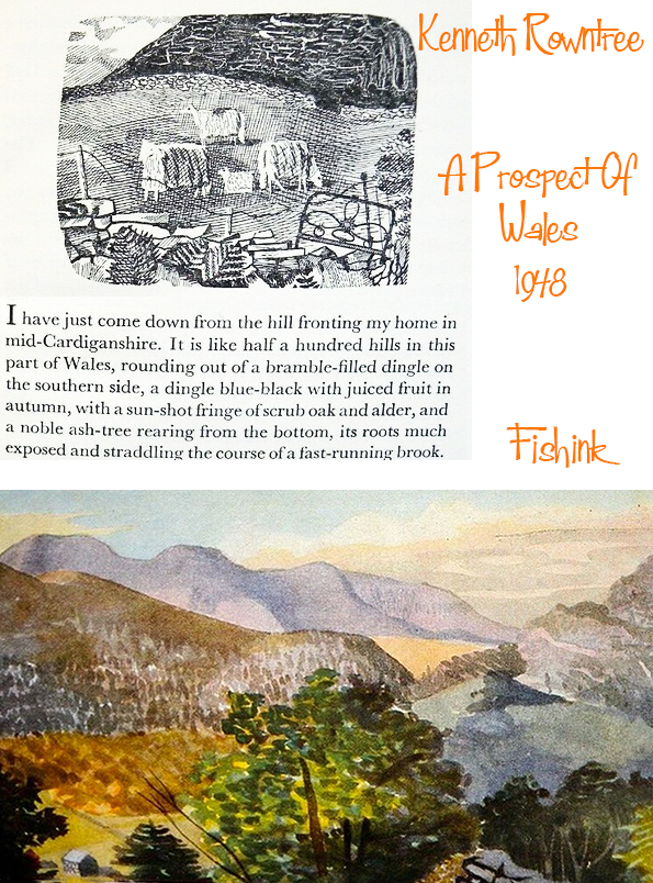
After the war he joined the Royal College of Art as head of its mural painting studios. He designed book covers, such as that for King Penguin and created “A Prospect of Wales”.

Kenneth contributed 20 watercolours to the book, covering the landscape and buildings that inhabit it. The painter Clive Hicks-Jenkins has this to say about it.

In 1951 he completed a major mural, Freedom, for the Festival of Britain and two years later painted scenes along the processional route of the Coronation, with the Queen later acquiring some of his works.

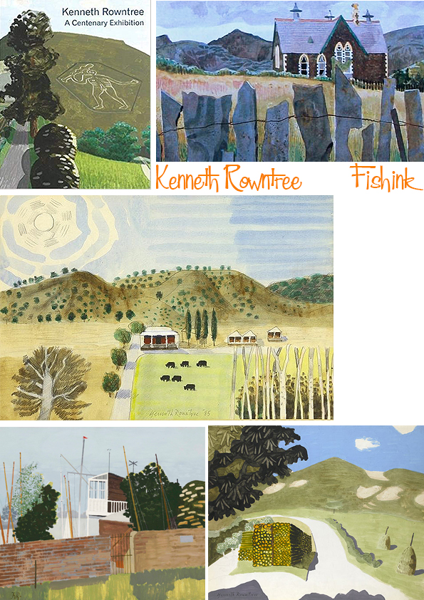
In 1953, he painted scenes along the processional route of the Coronation, with the Queen later acquiring some of his works. In 1959, he was appointed to succeed Lawrence Gowing as Professor of Fine Art at Newcastle University; it was one of the most progressive art schools in Britain, where the teaching staff included Victor Pasmore and Richard Hamilton. He held this post until his retirement in 1980.
It was at Newcastle that he became receptive to various modernist idioms, such as assemblage and constructivist forms, and incorporated them in his own work. He repainted the scene of an outdoor table and dishes, over and over again, everytime slightly changing it’s location and use.


I can’t help but wonder if he had been inspired by Ravilious’s earlier Tea at Furlongs painting from 1939 ?

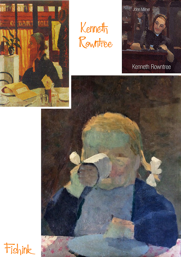
Amongst many other achievements, Kenneth Rowntree worked with the architect Ernő Goldfinger to produce coloured glass panels in Goldfinger’s Alexander Fleming House (now Metro Central Heights) in the Elephant and Castle. He also created many portraits.
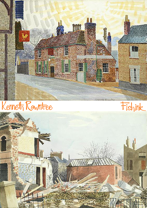
But he’s possibly best remembered for his country scenes.

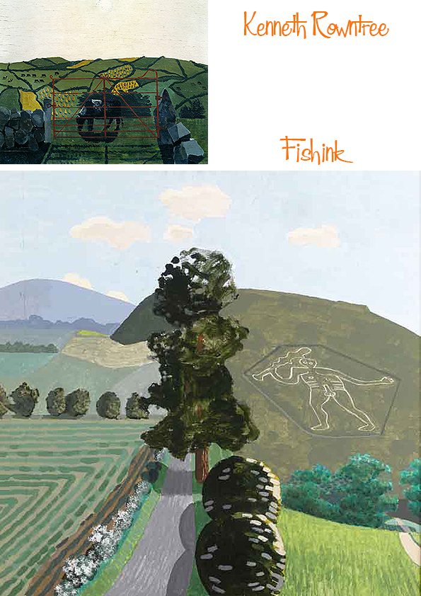
I particularly like this scene set in the woods of a church. You really feel the crisp autumnal leaves and slightly cool breezes.
In the 1960s Rowntree was elected Professor of Fine Art at University of Newcastle, where he remained until his death in 1997.
Fishink Pop Up
Hey everyone, just popped on here quickly to say that I’m taking part in an online pop up on Instagram this weekend. If you follow the link #postablepopup or look for @curatedmakers
or myself @fishinkblog then you can view some beautiful and amazing work by a whole host of designer makers from across the UK.
Brooches / badges £8 each plus P&P
Ceramics £20 plus P&P

Smaill original illustrations £10 with greeting card plus P&P
Larger Illustration £50 plus P&P

Dog figures £22 plus P&P
Look forward to seeing you there, please like and follow me @fishinkblog if you can, it all helps enormously. I’ll be around this weekend if you want to say hi, or available for sales from Monday onwards. Thank you, Craig


