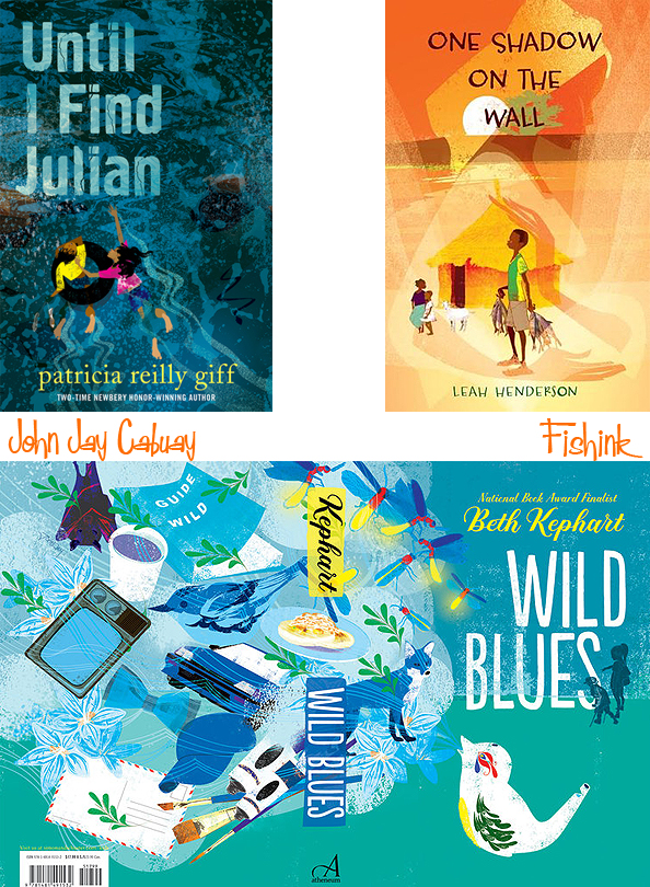
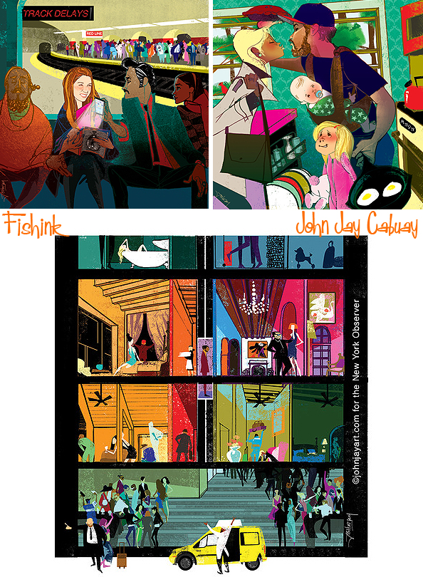
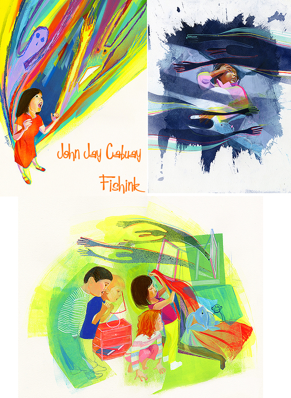
John Jay Cabuay Illustrating a sixties world today
Hi everyone, wow what a busy week this is turning out to be, so much so that I completely missed my chance to post out on the last two mornings so here we have a Wednesday post instead. I hope you’re all well and enjoying the pre-holiday rush!
John Jay Cabuay is a New York City illustrator. He has a beautiful sixties feel to his work, but with a contemporary twist.
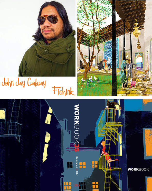
His illustrations have graced the covers of newspapers, magazines, and book jackets worldwide.

A graduate of the Fashion Institute of Technology,

He says : – “ Learning how to draw from the model has helped me to grow in different directions and, it has given me opportunities to feature my skills in different markets and different continents from Japan and across oceans to South Africa. ”

His work also encompasses illustration for children.


He was featured in a book by Taschen called “100 illustrators” a book about the 100 important illustrators around the globe.
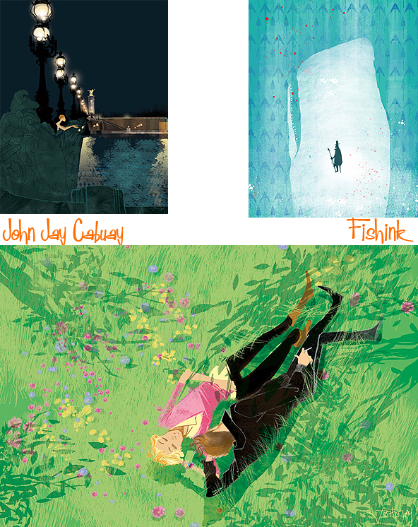
Stunning work, what do you think readers ?
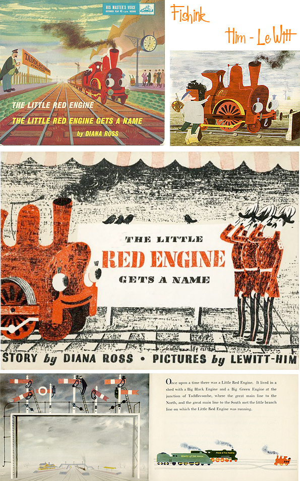
Le Witt and Him

Having met in a Warsaw café in 1933, two Polish-born artists Jan Le Witt and George Him, built upon a friendship to become the highly successful collaborative design partnership Lewitt-Him. It’s so difficult to accurately say which partner created what, so I’ve created this post for both artists, working together.
George Him was born Jerzy Himmelfarb in 1900 to a Polish-Jewish family in Lodz, Poland. After schooling and further education in Warsaw Him studied Roman Law in Moscow but left in 1917 when the Russian Revolution forced the closure of the university he was attending. He moved to Bonn and by 1924 had completed a PhD at the University of Bonn on the comparative history of religions before deciding to study graphic art in Leipzig. George studied at the Leipzig Academy of Graphic Art but even before he graduated in 1928, he was already undertaking commercial commissions. He returned to Poland where, in 1933, he changed his name and also established a design partnership with Jan Le Witt. Working as Lewitt-Him, the two established a distinctive design style which combined cubist and surrealist elements, often in a humorous context. Their most notable work in Poland were illustrations for an experimental poetry group known as Skamander.
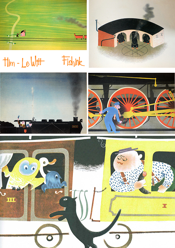
The first work that brought the team success was the 1934 graphic presentation of three poems by Julian Tuwim: “Locomotives”, “Rzepka” and “Bird radio”. This book was reprinted several times and also appeared in translation to French and English.
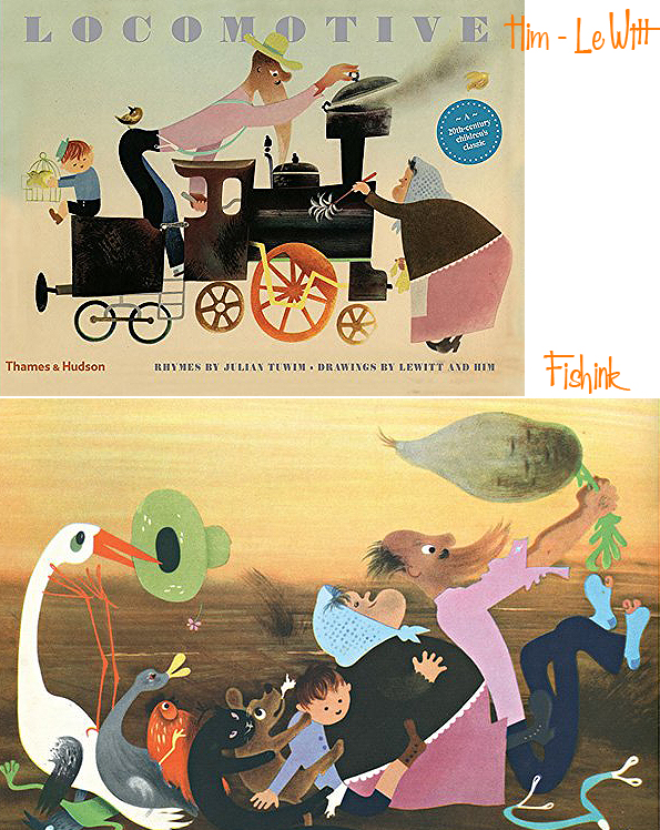
Him and Le Witt worked together in Poland for several years before, in 1937, they relocated the Lewitt-Him design business to London, following an exhibition of their work there by the publishers Lund Humphries. The pair quickly gained commercial contracts with London Transport and Imperial Airways as well as illustrating children’s books, such as The Little Red Engine Gets a Name (1942) by Diana Ross.
They settled here and soon found that they were among a growing number of talented artistic emigres.

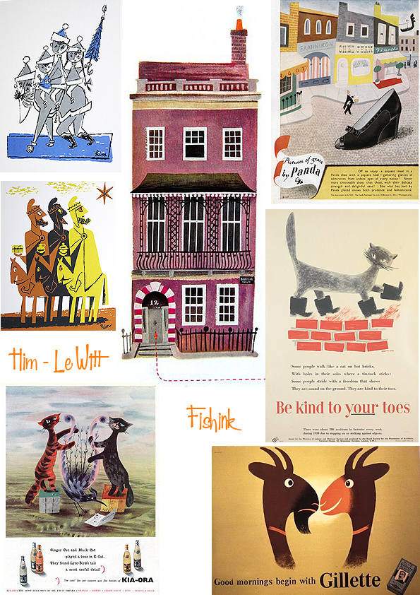
George continued his practice as freelance designer and design consultant, active in all fields of graphic design, publicity, exhibitions, corporate identity, book design etc.

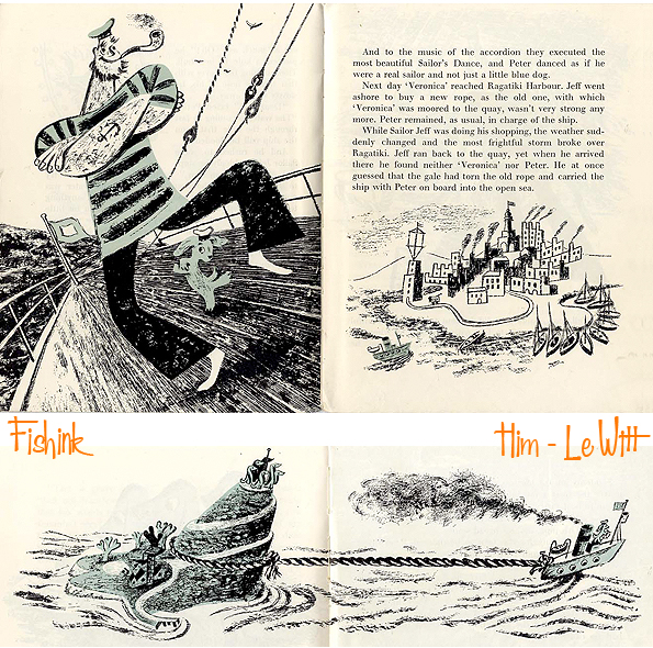

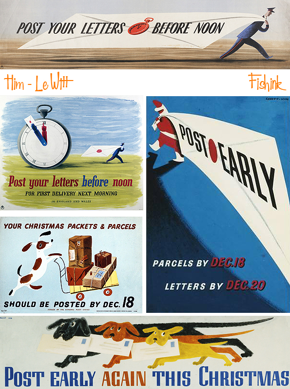
In London during World War II the partnership received notable commissions for information and public safety posters from, among others, the General Post Office, the Royal Society for the Prevention of Accidents and the Ministry of Information.


George was naturalized as a British citizen in 1948 and the Lewitt-Him partnership enjoyed great success.

Notable commissions included designing the giant umbrella tree for the Wet Weather section of the 1946 Britain Can Make It exhibition…

… and the Guinness Clock Tower for Battersea Park Pleasure Gardens and murals for the Education Pavilion of the 1951 Festival of Britain. (More info on the clock here)

The Lewitt-Him partnership was dissolved in 1954, when Jan decided to focus on developing his abstract paintings and artworks. George continued to work as a commercial designer.

Among the advertising campaigns he illustrated was the 1950’s Schweppeshire campaign for the Schweppes drinks company. He also designed the point of sale merchandise to be used in the shops.

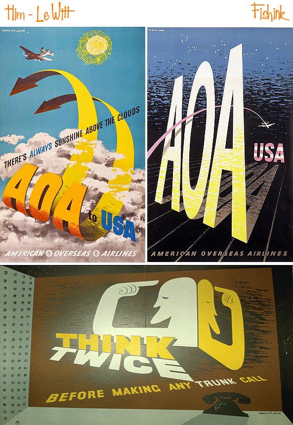
His other clients numbered several airlines, including Pan-American Airways, El Al and American Overseas Airlines plus the publishers of Punch and Penguin Books. He continued to illustrate books but also designed exhibition stands, such as the Australia stand at the 1960 Ideal Home Exhibition and large window displays, notably for the De Bijenkorf store in Rotterdam and the 1961 Christmas windows for the Design Centre in London.


From 1969 until 1977, Him taught graphic design at Leicester Polytechnic. Him was an active artist up until the very end of his life. Two retrospective exhibitions of his work have been held, one in 1976 at the London College of Printing and another in 1978 at the Ben Uri Gallery in London. In 1977 Him was awarded the Francis Williams Book Illustration Award and in 1978 became a Royal Designer for Industry.
Jan Le Witt (1907–1991) was a Polish-born British abstract artist, graphic designer and illustrator. He had a long professional partnership with George Him.

As a design company, Lewitt-Him brought an innovative use of colour, abstraction and symbolism to commercial design. They established a reputation for fine poster work during World War Two and for exhibition displays.
After the partnership Jan, who had become a British citizen in 1947, abandoned graphic design to work with Sadler’s Wells Ballet, creating sets and costumes for their performances.
A wonderful collaboration that lasted over 20 years. What do you think readers ?
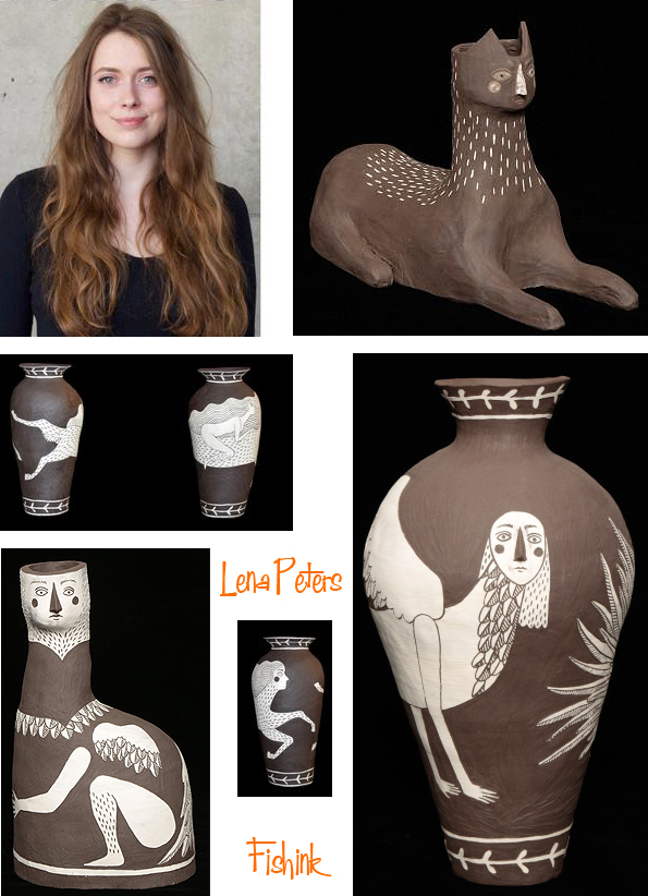
Lena Peters Ceramics and Storytelling
Last years UK Young Artist of the Year Award winner Lena Peters, has combined her love of ceramics with storytelling. She cleverly interweaves her passion for history and nature. These elements merge with her interest in folklore and mythology making her work dance between the real and the unreal, creating illustrative objects which work to embody a narrative.
There’s a wonderful interview over on Melody Vaughn’s site and it’s well worth a read

Lena’s has a fascination with the British Museum and grew up near Sheffield in the Peak District, surrounded by tales of magic and woodland sprites. You can see where her interest in creating her ceramic creatures has come from.
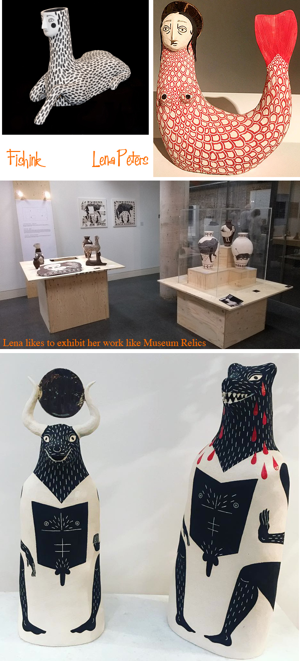
I love the coiled pots and bold imagery that has been formed by scraping away one layer of coloured slip to reveal the colour beneath.

There’s an exhibition on of Lena’s work called ‘Saints and Spirits’ between 21st November – 21st December 2018 at the David Gill Gallery, 2-4 King Street, London, SW1Y 6QP. Drop in and enjoy.
More about Mary Blair

In a blog concerned with mid century art, the artist Mary Blair is bound to crop up a fair few times. I recently came across another book about her by John Canemaker. Entitled ‘Magic Color Flair. The World of Mary Blair.
It was created for the Walt Disney Family Museum 2014 Mary Blair exhibit, of the same name, and is an authoritative collection of Blair’s life and work including the precocious paintings she made as a student at the renowned Chouinard Art Institute; the enchanting concept drawings she created for numerous Disney films; her lovely illustrated Golden Books, which are still treasured today; and the rarely seen but delightful advertisements, clothing designs, and large-scale installations that she devised later in life.
Curated by Academy Award winning animator John Canemaker and annotated with fascinating information about her artistic process, ‘Magic Color Flair’ is a bold, lively look into the work of an equally bold and lively creative, whose invaluable influence and keen eye helped shape some of the world favorite Disney experiences.
As I’ve already got the ‘Art and Flair of Mary Blair’, I may have to place this one under ‘future investments’.

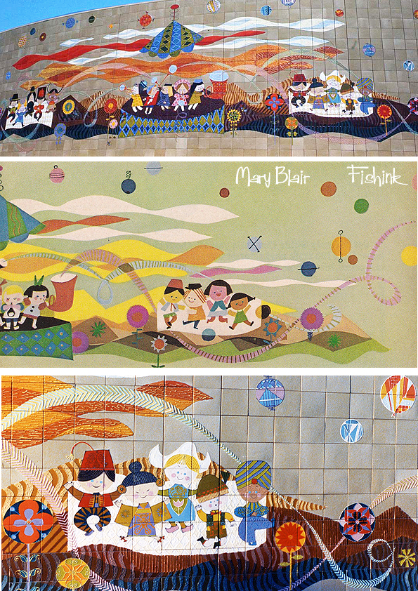
After a little research I stumbled across this piece below which was sold at auction originally from Mary’s estate and dated 1966. It is said to be an early study for Mary’s tiled murals called ‘Tomorrowland’.

Here’s what the murals turned out to look like.

Such a wonderful array of colour, movement, style and well plain joy to be honest !
She had a great talent for bringing design and illustration to a large marketplace, in a friendly and creative way.

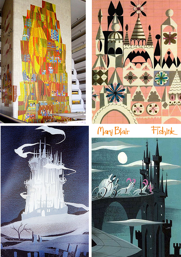
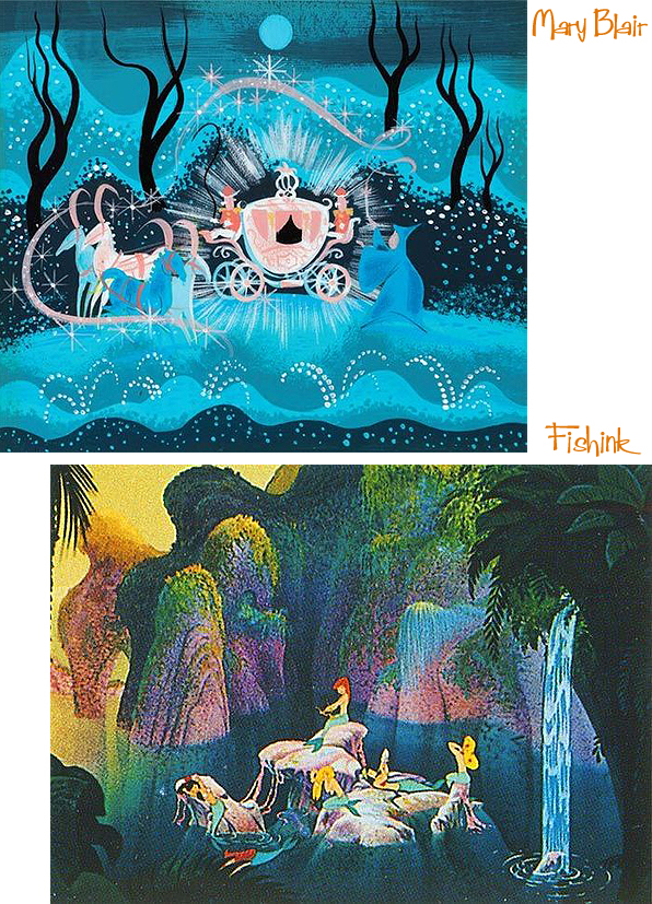
A few more snippets of Mary’s work I’d not seen for a while.

Some old favourites for Alice in Wonderland,
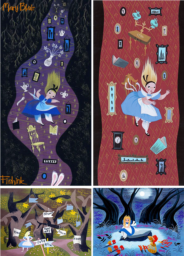
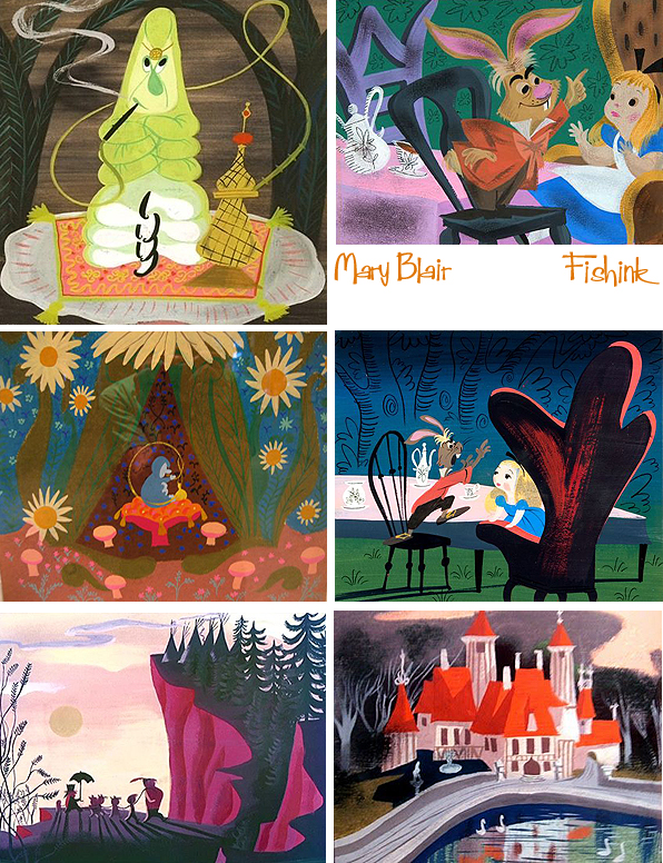

Peter Pan and Cinderella.

The classic rags to riches story.

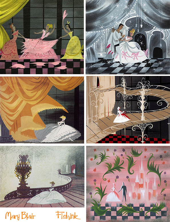
I love Mary’s great sense of colour, style and application of paint.

Some mid fifties advertising and an early sketch for some Indian and African inspired designs.
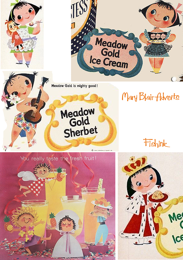

You can also see a short sixties film about the making of the tiled murals for Mary’s designs here. I’ve also created more posts about Mary which you can see by clicking on the links under Mid Century Artists on the right side of my blog. Thank you.
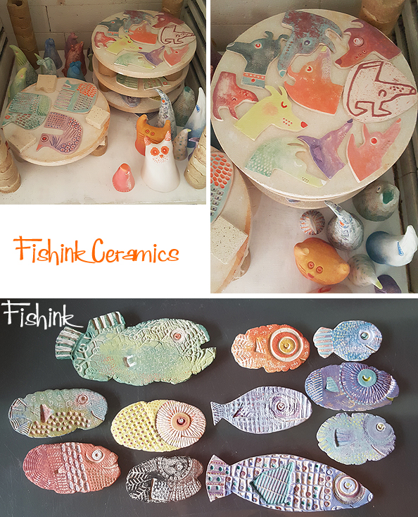
Fishink Ceramics at the Sale Arts Trail ‘Yule Do’
Hello everyone and apologies for the late posting this week. It’s been a very busy few days with getting everything ready for the designer fair I did last Saturday. I must say the church (St Pauls in Sale) looked great and there was so much amazing work from a wide variety of artists.
I was kept pretty busy throughout the day, so much so that I only grabbed a few minutes to scoot around and take a few images.
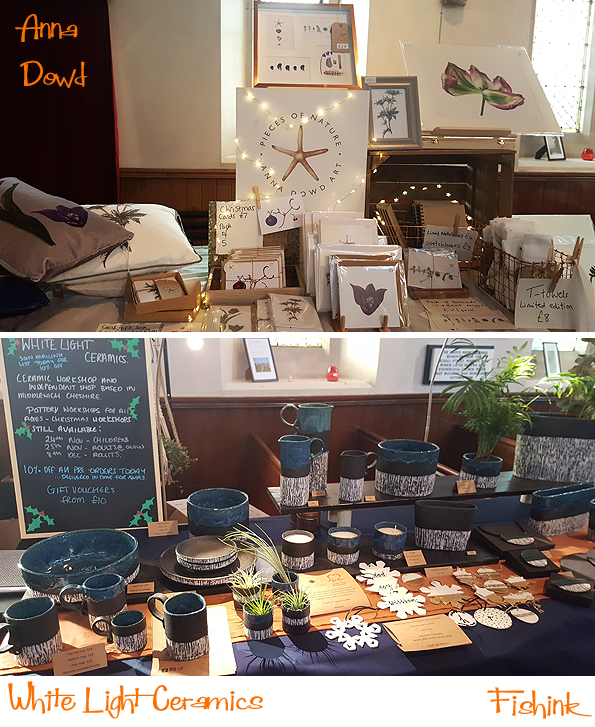
Very creative layouts from the makers who were selling from table tops laid out across the upright pews.

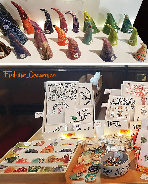
This was my stand, and I was pretty pleased with how it looked in the end.
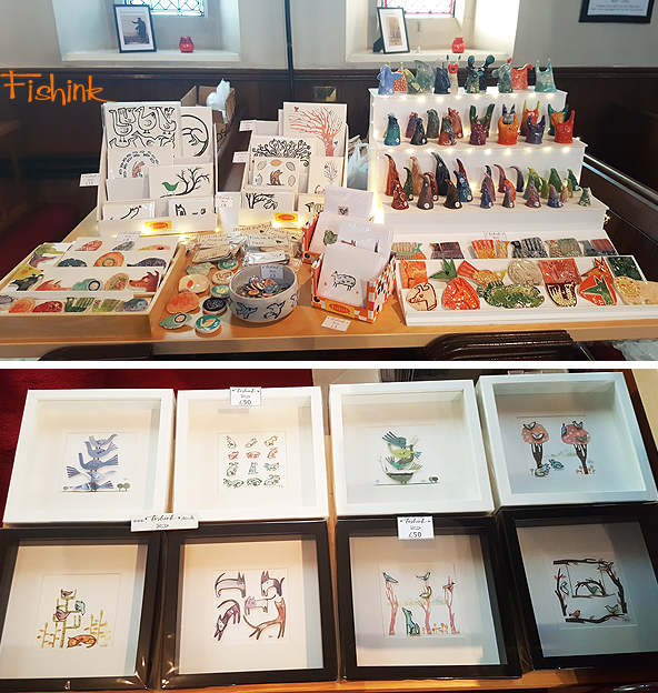
The wall hanging, flat ceramics sold well, so much so that when a couple of stall holders popped around near the end of the fair to buy a piece they’d had their eye on, the items had gone! I’ll be making some more and hope to be back at Sale Arts Trail in summer 2019.

In the meantime, you can head over to my shop on Fishink Shop on Etsy (which I’ll be adding to very soon) or contact me directly (craig@fishink.co.uk) if there’s anything you wanted to purchase for yourself and I can send you a photo and sell securely through Paypal.
Thanks again to the organisers Jo, Sophie and Catherine for another great event, and to everyone who came along, purchased something and helped keep us designers in business. It really does make a difference #justacard.
For a full list of the exhibitors see
https://saleartstrail.com/yule-do-2018/

Walks, the Whitworth and Sale Arts Fair’s “Yule Do”

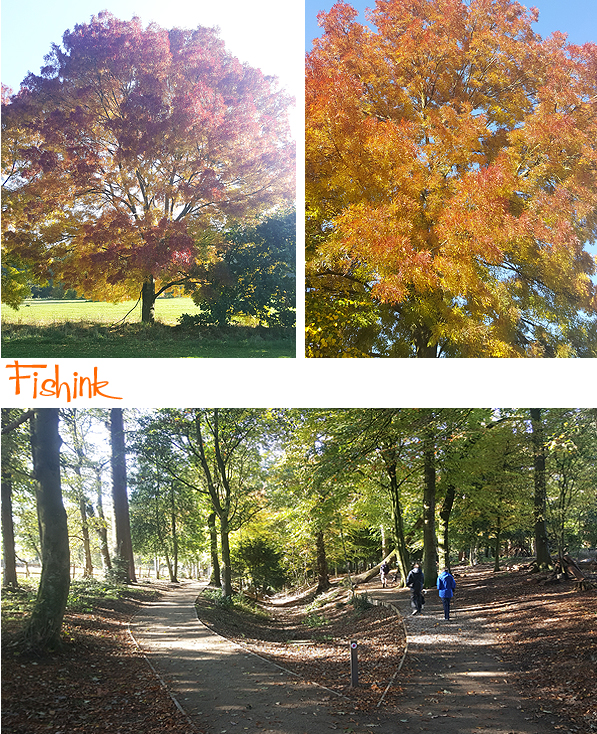
Hello there, welcome to the autumnal section of the year. I’ve been looking back over the past months photos I’ve taken and thought I’d share a few as they are full of colour, nature and things that seem to make me sigh a lot with happiness.

I’ve been lucky to capture some beautiful days and that great changing seasonal colouration that you lucky readers in New England get every year around this time.

Some of the trees have been ablaze with colour.
My dog Boo has loved getting out and about too, although she does become a little difficult to spot when the leaves and her coat are the same shade.

Yes some time for relaxing, it is a dogs life after all !

Vernon Park in Stockport and Style Woods have been fab spots for a crunchy leaf walks lately.


Boo needs her superdog cape every now and then, mostly when she flies in her sleep : )

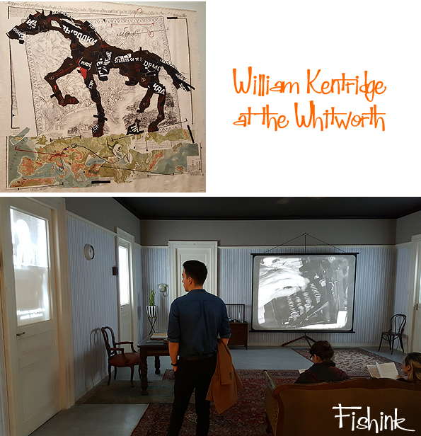
I also made it to the recent exhibition by William Kentridge at the Whitworth Art Gallery in Manchester. William is renowned for his animated drawings and films that have been exhibited throughout the world since the 1980s. I last saw his work back in 2013 at the Tate in London.
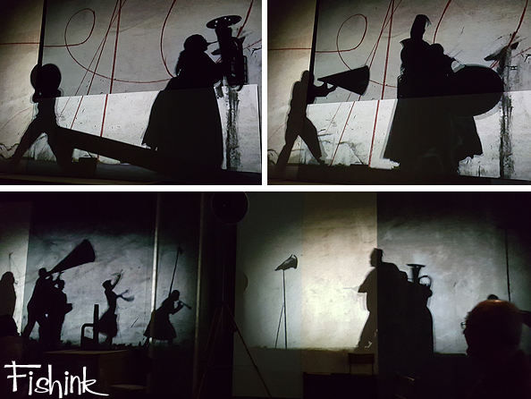
Combining drawing, tapestry, music and film projection as well as sculpture, this major touring exhibition draws on sources as broad as early cinema, China’s Cultural Revolution, opera, scientific theories of time and space and the generative qualities of nature and creativity.
My favourite exhibition today was that of the work of Alice Kettle.
Entitled ”Thread Bearing Witness‘ is a major new series of large textiles, and other works, to be shown at the Whitworth, that considers cultural heritage, refugee displacement and movement, while engaging with individual migrants and their creativity within the wider context of the global refugee crisis.
Alice Kettle is a highly regarded contemporary artist focused upon stitched textiles, a powerful medium through which to explore these themes. Thread Bearing Witness represents displacement though the migration of stitches, using the three strands of artistic representation, participation and creative resilience, testing ways of belonging within a cultural space, and using textile as a medium of integration, collective expression and resilience to displacement.
The scale alone was breathtaking.
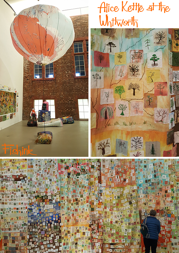

Great to see such swathes of rich colours too.

And the smaller details didn’t go unnoticed. Well worth a visit.

This Saturday 17th, I’ll be exhibiting my new range of ceramic pieces in St Paul’s Church, Sale between 10 and 5pm, alongside about 25 other designer-makers. It’s free to get in, so please come along, say hello and pick up a beautiful early Christmas present for yourself or a friend.
For those of you who can’t attend, (due to being on the other side of the globe), I’ll be putting some more pieces onto my site on Etsy very soon, please check it out and treat yourself.


I had a Blue Peter moment this week and made myself a display stand out of foam board. I was quite pleased with the results, although my accurate scalpel cutting and glue gun control need more practice.

Some new pin badges, wall hanging ceramics and creatures going into the kiln for their first firing.
Before clear glazing everything (below) for it’s second firing.
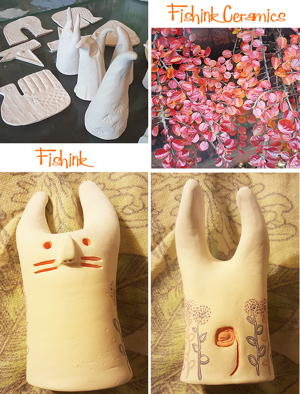
A few pieces I’ll work back into with additional artwork, like this floral decoration above.

Looking forward to seeing some of you on Saturday, do spread the word if you are local to Manchester and Sale and if not have a look at my Etsy site for inspiration in a weeks time.
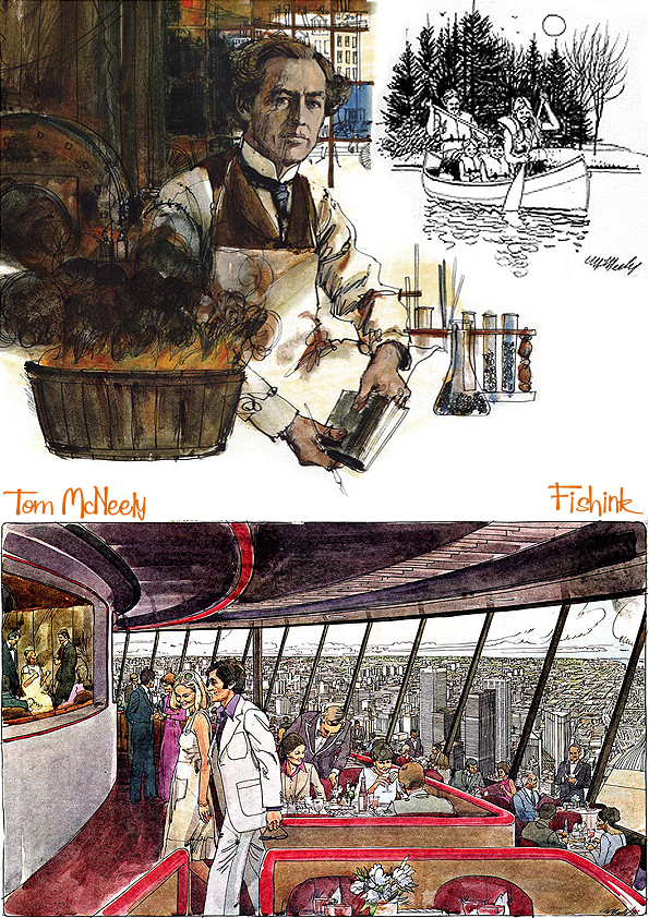
Tom McNeely Mid century Illustrator
Born in Toronto in 1935, Tom McNeely studied with two prominent Canadian artists before setting off on his own highly successful career.
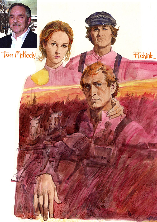
He was a prominent artist of his time and was commissioned to work in all manner of subjects.
Illustrating books, magazines, posters, adverts and even stamps.
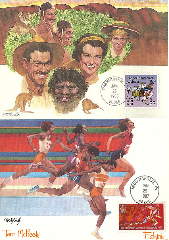
He had a real talent for both laying out a scene and for drawing you into one.
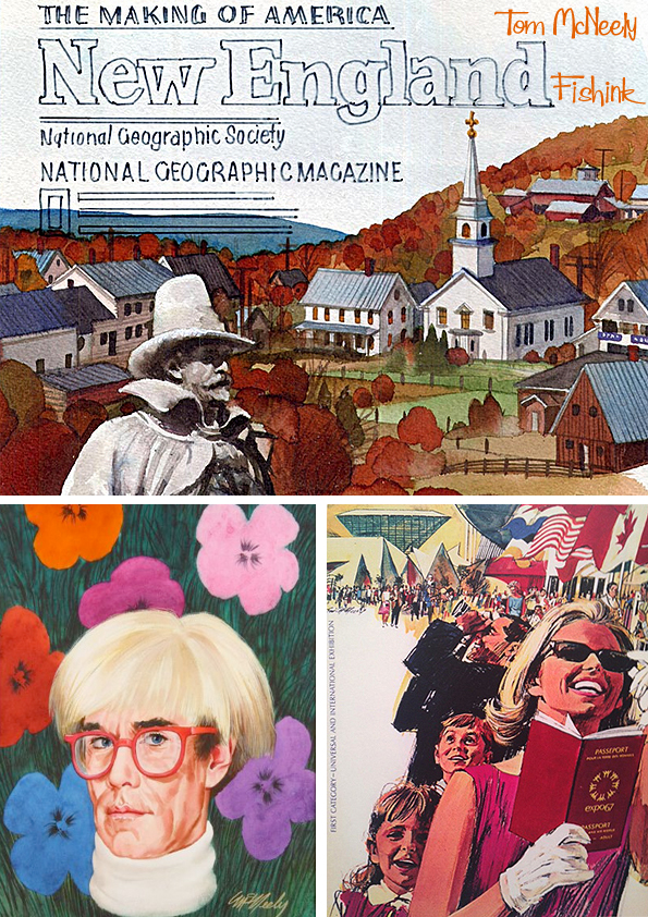
His paintings for Canada’s Expo ’67 and the 1976 Olympics brought him worldwide fame and his distinctively-styled portraits of some of the world’s most famous personalities have been featured in numerous museums.
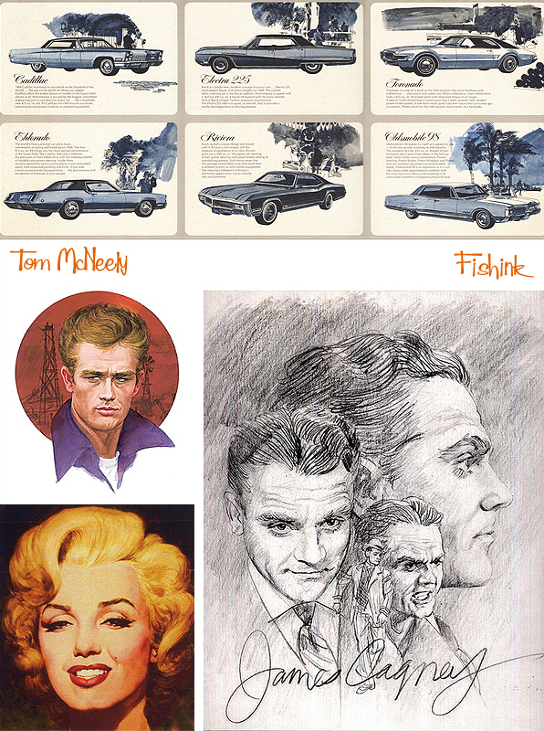
He also illustrated history books and modern fictional book covers.

As well as Cars and couples.

He loved experimenting with a wide variety of styles and media.
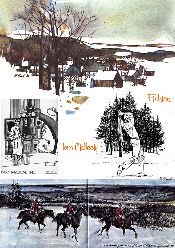
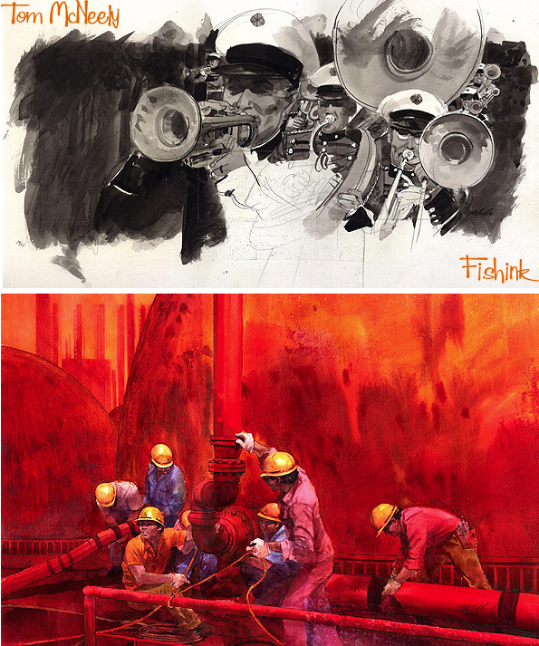
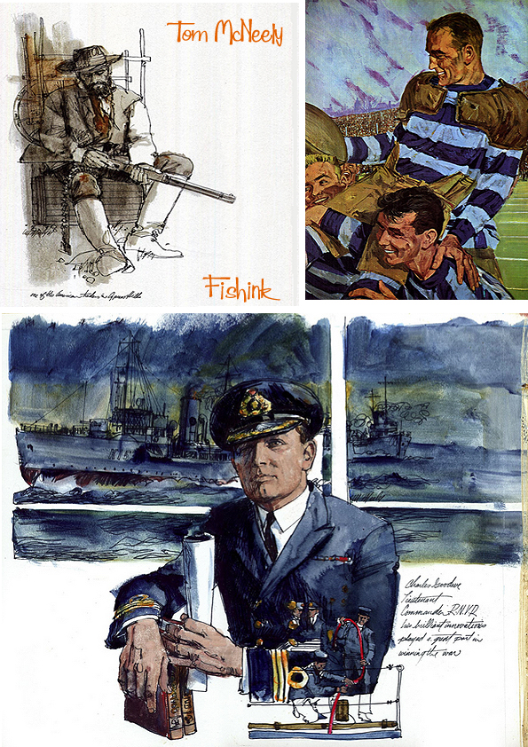
Here’s a small selection of Tom’s artwork from magazines of the sixties.
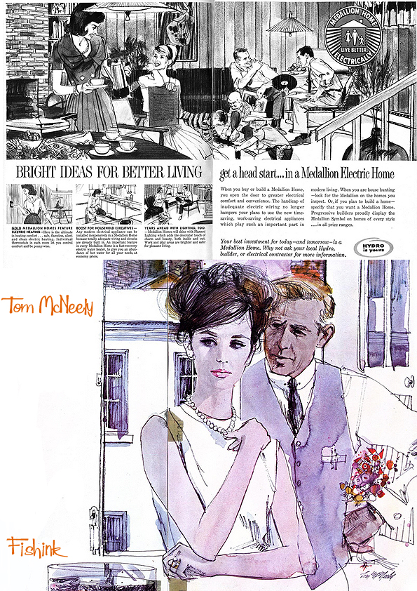
There is sometimes tension, passion and always that certain something that keeps you intrigued.

“Before I begin to paint, I immerse myself in my subject. I learn all I can about the person and the age when he lived. Only then, when I feel completely familiar with the subject — almost as if I can see him firsthand — do I begin a work of art.”

Space, monsters and everyday family life all featured in his vast portfolio of work.
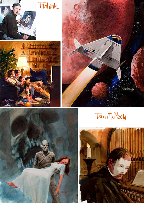
You can find more information on Tom over at Today’s Inspiration and there’s five other posts featured at the end of this one. Thanks again to Leif Peng for some of the illustrations used in today’s post.
Brian Wildsmith Christmas Treats

Hello everyone, and welcome to the second of my book themed blog posts this month.
I have some very exciting news about the artist Brian Wildsmith. I’ve recently been in contact with Brian’s children and have heard that they are in the process of totally updating their father’s website. This is wonderful news. As an incredibly successful artist working here in the fifties and sixties for children’s publications, I’ve always felt that his artwork should be more highly praised in the UK since it is innovative, inspirational and already loved the world over.
As fate would have it, I was also contacted by the Oxford University Press who asked if I would like to feature two of their newly re-published books, when they said they were by Brian Wildsmith, I just smiled and said ” Yes of course”
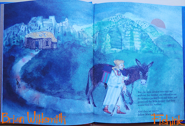
The first book is called ‘A Christmas Story’ and it reveals Brian’s tender scenes and stunning landscapes that draw you into his sensitive re-telling of the Nativity tale. Readers are invited to travel to the stable with a little girl called Rebecca and the donkey, whose mother has left to carry Mary and Joseph to Bethlehem.

The beautiful water-coloured, snowy scenes are almost dreamy in both feeling and mood. I also learned from Brian’s children a little extra detail that made the book even more personal to him and his family.
Clare (Brian’s daughter) says:- “A little story my sister Rebecca told me last night regarding ‘A Christmas Story’. Rebecca’s daughter Ornella, (Brian’s 2nd grandchild) was born just before the original book was sent to print in 1989. Brian just had time to ask the Oxford University Press to call the little girl in the story Rebecca, and dedicate the book ‘For Little Ornella’. What a lovely story.
The book was re-edited in ’92 with a different cover, again in 2007 (paperback edition) and in 2013 it came with a nativity set. It’s 2018 version is available to purchase here. There are some fab angel themed cards for sale by Brian at the Royal Academy of Arts online shop here.
The second book is the wonderful ‘Twelve Days of Christmas’.

These amazing baubles and patch-worked colours still feel unique almost fifty years after the book was first published!
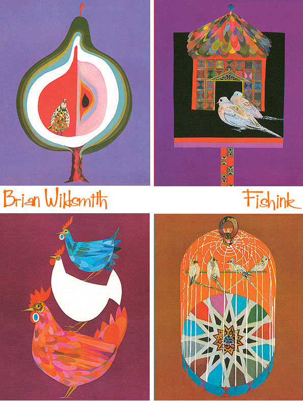
Here’s a few images that Brian’s son Simon sent to me, from the original edition, first published in 1972.

That version showed all of the Christmas gifts brought together on the final page with the Twelve Lords A-Leaping.
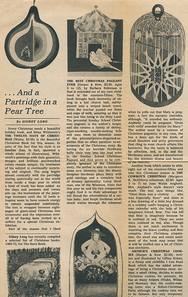
Below is the original artwork Brian sent to the publishers. Wonderful to see these all assembled together alongside Brian’s instructions in pencil for the OUP’s layout artists.

Also a newspaper article from 1972 taken from the New York Times.
Thanks to the Oxford University Press for the beautiful new copies of Brian’s books, well worth considering for a Christmas additional stocking filler.

A big vote of thanks to Clare and Simon Wildsmith who have been so helpful already in donating some of the information for this post.
I look forward to sharing with you, in a later blogpost, their answers to my questions about what it was like growing up with a famous Artist for a farther. I hope to release it to coincide with the new Brian Wildsmith website launch, later this year or early 2019.
Watch this space !!! and please feel free to leave comments below, I’m sure Brian’s family would love to hear your stories and memories about their father’s books.
Are You Sitting Comfortably ? Edward Bawden
Good Morning readers, just look what’s landed on my doormat today, a fabulous new hardback bound in pink Rachford’s cloth, just begging to be browsed at my leisure…. and it’s not even Christmas!
The latest publication from The Mainstone Press with over 350 illustrations, 176 pages and a guaranteed smile a minute. Celebrating the beautifully illustrated book jackets of Edward Bawden, featuring a range of work dating between the 1920’s and the 1980’s.
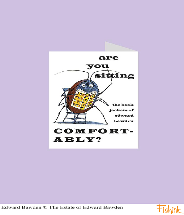
For copyright reasons I’m only allowed to show you a sneak preview of how wonderful this volume is. Hopefully you can see for yourselves, what a pleasure it is to browse through the pages, explore the amazing illustrations that Edward Bawden is well known for and read the entertaining insights from Peyton Skipwith and James Russell into his artistic development and his working methods.

Peyton Skipwith traces Bawden’s remarkable career from his designs for the students’ magazine of the Royal College of Art in the 1920’s to his final commissions from the Folio Society in the 1980’s. Exploring his working methods, including drawing in pen and ink, line-engraving and his favourite medium of linocut.
Look at these great illustrations below for Ambrose Heath’s Good Food series, rarely seen from the 1930’s and beautifully simplistic, with Bawden’s characteristic use of shading and half tones to create both depth and form.

‘Are You Sitting Comfortably? The Book Jackets of Edward Bawden’ with captions by James Russell available for £35 from The Mainstone Press.
Pop it on your Christmas list and grab a copy today!
GNCCF Manchester 2018 Part 2

Welcome back to this weeks second post, featuring some of the exhibitors from this year’s Great Northern Contemporary Craft Fair. See my previous post here for more of the designers who attended.
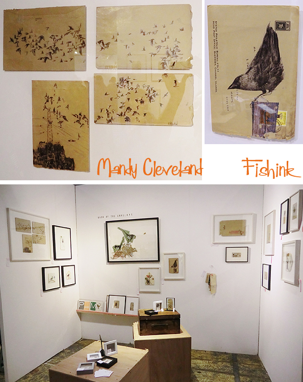
Mandy Cleveland starts us off today with some beautifully illustrated, framed and re-purposed envelope art.
I hadn’t come across the great print designs from Posner and Posner. Makers of hand-printed, contemporary textiles, their designs and illustrations focus on line, repeat pattern and colour contrasts. With distinctive fabric which is screen printed in their studio and used for homewares, clothing and accessories. The collection sits together colour-wise very well and the patterns feel fresh and vibrant.

When I first saw the floral sculptures from Linda Southwell I thought they were made from felt, as their surface suggested the same texture. On closer inspection I discovered they are in fact ceramic and made from either a groggy clay or a fine porcelain. Inspired by a variety of plant forms, Linda’s sculptures bring the outside in and give a permanence to natural forms. Great patience Linda, they look amazing.

I loved the art pieces from Rachel Cooke. She makes multi-textured, wall-hung and wearable art using her own handmade ceramics, salvaged materials and vintage tiles. Rachel enjoys working intuitively, experimenting with different texture and colour combinations to make each piece unique.
For me, Rachel’s work has a timeless retro feel to her art forms. Beautiful ceramic/mosiac, suggested landscapes with a splash of other media to add variety, texture and shape to each artwork. She also runs classes so you can make your own art, check out the details on her site.

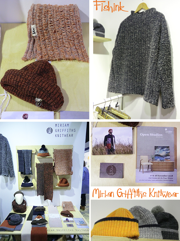
Miriam Griffiths is one of two companies showing wonderful knitwear that caught my eye. Based in Sheffield, all the pieces are lovingly made from high quality, locally sourced fibres with a focus on using natural materials. Great to see some Menswear pieces too.
The second knitwear company was Heather Chamberlain. Luscious greens and linear shapes defined Heather’s collection. Autumnal scarves, wonderfully soft to the touch with a naturally rolled edge. I wanted a jumper made out of them.

Some familiar and striking work from The Courtyard Pottery’s David Ashby.
David’s work is a familiar ‘face’ on my blog. He lives and has a workshop in Grassington in the Yorkshire Dales. His work is wheel thrown and slip decorated, with a mixture of wax resist, inlaid colours and scraffito. He’s inspired by the paintings and intuitive mark making of painters like Antoni Tapies, Robert Rauschenberg and Jean -Michel Basquiat. Bold, busy and distinctive.

Next to David was G R Hawes with some beautifully coloured and shaped glass pieces. ” My work encompasses small batch production for galleries and retail outlets through to large scale lighting and bespoke commissions for individuals, hotels around the world and well respected lighting and chandelier companies. My work includes the use of many traditional glassblowing techniques combined with a very contemporary edge. ” I really admired the shape within a shape, colour within a colour idea.

Hiro Takahashi had an intriguing stand with a collection of small containers on the top of each sat a small creature, these were her ‘Soul Houses‘. Hiro’s ceramic work focuses on intricate textures, forms and architectural pieces. Her distinctive narrative approach can be seen in other works: Message box and Tree of life. They all depict a reflection of her life in past & present.

I also admired Hiro’s mosiac or fragmented animals. Each beautifully textured and looking like its been unearthed from some ancient architectural site. Fascinating work.

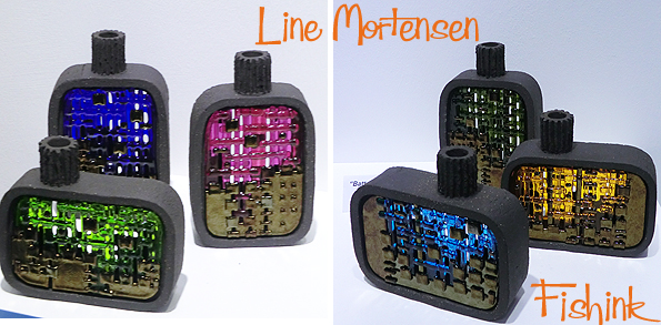
I wonder why these retro looking shapes caught my attention ! Great work from Line Mortensen, who is a Danish contemporary mosaic artist based in Scotland. Her Scandinavian heritage and architectural background shines through in her sculptural objects which are imaginative, detailed, textured and abstract.
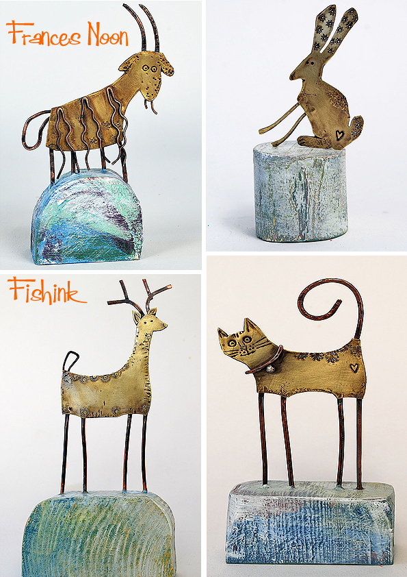
Finally, my favourite artist from 2018’s show is Frances Noon. Based in Slaithwaite, West Yorkshire, Frances makes small, humorous sculptures of animals and birds. She uses jewellery techniques to shape and solder base metals, these are combined with a coloured wooden element to form woodland scenes, boats and sheds where an incongruous scale is predominant and humour prevails.

There’s so much love and joy that shines out of her work, it made me smile as soon as I saw it. Spending more time browsing her pieces, just made me like it all the more. It’s definitely the stories that each piece conjures up in the viewers mind (or perhaps it’s just my imagination that works overtime) that makes each artform both precious and absorbing.

A cool collection of sheds above and some quirky creatures below.
Some great wall plaques too. Pop over to her site here and see more for yourself.

Many thanks to everyone who kindly allowed me to photograph their beautiful work and took the time to talk a little about how they make, mould, form and fabricate the great array of crafts I’ve seen again this year at the GNCCF. Do pop over to their sites, buy something direct from the makers, share my posts so that more people can get to see what fantastic talent we have in this country. As ever, your comments are very much appreciated too.


