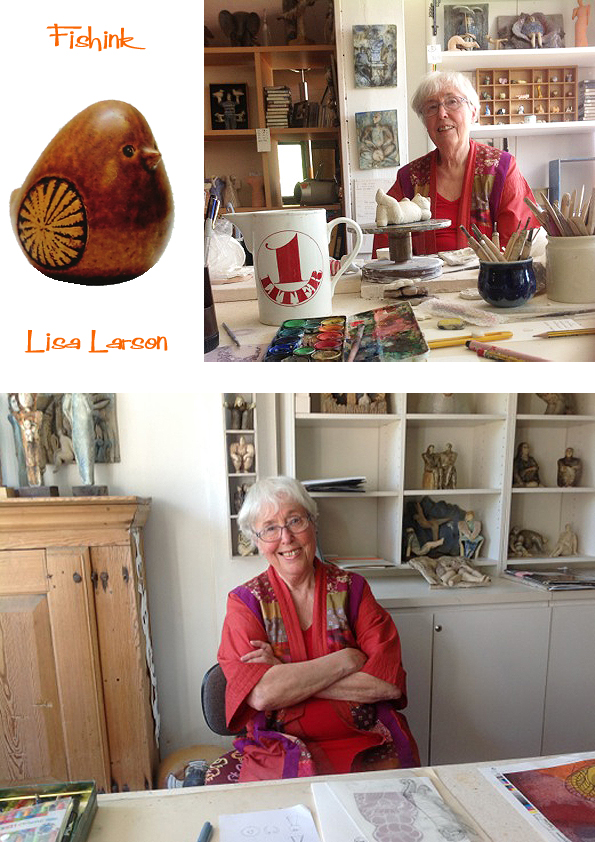
Lisa Larson World Exclusive Interview for Fishinkblog
Hello Everyone, it is with a very heavy heart that I heard of the passing of my icon and muse Lisa Larson yesterday. She worked up until her death at the age of 92 and inspired and gave joy to myself and so many other millions of folk worldwide with her quirky ceramic characters. I was very fortunate to get to ask Lisa some questions in 2017, so decided to repost this in her memory.
Welcome to all of my visitors and whether you are a regular reader or a new visitor, I have a very exclusive treat for you today as I have managed to secure an interview with the wonderfully talented, Swedish Ceramist, Lisa Larson! I can hardly believe it happened myself and I’m still rather smiley as a result lol
Through a chance email, I received a reply from Lisa’s daughter Johanna. She just happened to be visiting her mum that week and very kindly offered to ask Lisa the questions I had mentally prepared (never thinking for a moment that I would actually get to ask them). The following post is a culmination of a few months work, ordering books and magazines and then the wonderful surprise of the interview itself… enjoy!
My first question went to Lisa’s daughter Johanna.
What was it like growing up with Lisa’s creativity around you.. I see that you have a graphics background yourself, do you think your mum’s encouragement has given you a love of the arts too ?
I grew up in a very creative home with two big artist studios connected to the house, and I also went along to the factory sometimes. I basically spent most of my time in a studio since I was a baby. I played with ceramic tools, or clay, or in the sandpit they used for casting. I was encouraged to draw and paint and knit and sew, my mum taught me how to throw clay. I went to art school but ended up specialising in Graphic Design and Illustration.
Here’s a fab selfie shot (below) of Lisa and Johanna.

Now my questions are directed to Lisa….
What are your first memories of art and drawing… were your parents creative and did they encourage your own creativity when you were younger ?
My father collected art and antiques and was a creative person. (My mother had died when I was two.) He encouraged me. He owned a sawmill and I could use the waste bits of wood to carve figures. I used to bicycle around and paint the farms around the area too, and sometimes sell the paintings to the owners, as was popular in rural Sweden. My father once gave me a load of blue clay and I made a life size portrait of the boy next door in our garden! Another neighbour (perhaps the boy’s father?) was an art teacher and was the person that advised me to apply to the art college in Gothenburg.
Was it unusual for a woman to be a designer in Sweden, some fifty years ago ?
My sister and I both wanted to be fashion designers and made all our own clothes. She did succeed (Titti Wrange, Annamodeller)…

and I ended up being placed in the ceramics department in art school, and loved the material from day one.
I saw a great video of a gentleman on the potter’s wheel and you reforming one of the pots he had thrown into a female figure, and later into a family pot etc. Growing up (and perhaps today) who helped in your own creative journey and who’s work do you admire who may or may not have been an influence on your work ?
The ceramicist and thrower in the video is Richard Manz who was my assistant at Gustavsberg. He was a very skilled technician. Else-Kulle Petersson and Kurt Ekholm were my teachers at Slöjdskolan in Gothenburg. I was also influenced by my husband Gunnar Larson and his artist classmates, teachers and colleagues. Stig Lindberg was my mentor at Gustavsberg. He had hired me and became a very good friend and colleague. (more about Stig here.)


What was it like working alongside Stig, (another hero of mine) and was it his free thinking style and humourous work, that allowed and perhaps encouraged your own style to develop and be appreciated ?
Yes, Stig had a lot of humour and we were all influenced by each other at the factory. He was very encouraging to us new students. We were free to experiment and he would visit the studio every week and discuss our work, and sometimes pick something for production, like the cat he thought was suitable. He asked me for more animals in the same style to make up a series. It became my first, Lilla Zoo.

I was frustrated for you when I read the story about you not getting paid very much for the work that you did that helped make Gustavsberg so famous. Was your transition to a freelance artist part influenced by that frustration yourself and are there any regrets about ever going it alone ?
No regrets. I had worked there for 26 years. Stig was gone, it was different times. Time to move on.
How did the collaboration with the Japanese company come about ?
I was originally contacted by a photo publishing company that wanted to do a photo project, and then they decided to produce some Lisa Larson merchandise instead (my photos probably weren’t that great!) and really wanted to launch the brand in Japan. My daughter was also enthusiastic about it and wanted to manage the brand internationally, and take care of all the new communications and new 2-D design tasks.

Below are part of the new Zodiac series due out in 2018, planned future orders are already sold out!

Being trained as a textile designer, I think your scope for design onto fabrics has a universal appeal, I know that the Japanese company you work with has made tee shirts and tee towels in their ranges, but have you ever thought about creating furnishing and fashion fabrics for children as part of your product range. I would love to put drawings into repeat for you if it would be helpful : )
Thank you but that is my daughter’s job! She has been inspired by my ceramic sketches and turned them into textiles, and she constructs the illustrations and the patterns for Uniqlo and other licenced clients. We have already worked with Ljungbergs Textiles and Boras Cotton in Sweden, and recently with Aswan curtains and rugs in Japan.


You can find more of the Japanese range of ceramics and kitchenware here.

Here’s one of the beautiful Japanese publications I discovered by Pie Books , great photographs.

Look at this cheeky chap awaiting some soup lol

Can you tell me a little more behind the story as to how your cat design came to be used by Baldelli and made into a moneybox ? I assume it was done with your permission ?
Not at all! It is total plagiarism! I first saw it in a shop window in San Francisco in 1966. When I asked what it was, I was told it came from a Danish importer. The shop owner said: “But, we do have a genuine Lisa Larson too”, and showed me into a back room!
Shocking to hear that blatent copying of designers work was happening mid sixties too. Some have the cheek to say it’s a compliment, but I disagree and if a company wants to compliment you on your skills and creative design, they should at least pay a royalty for using it !! Shame on you Baldelli and Bitossi.


I am delighted and also encouraged to hear that you are still designing and making now in your eighties (she is now 91 in 2022)… as an artist myself, I can’t imagine a time when I wouldn’t be still drawing and making new work. Do you have a list (perhaps even just in your head) of new pieces that you want to make and release to the world, as it were ?
Yes, my list is endless!
During my searching about Lisa’s work, I came across this fantastic company Scandinavian Retro who produce ‘Retro Klassiker’ magazine. Sadly it’s not available in the UK, but the very generous Editor in Chief sent me a complimentary copy and it is amazing….

132 pages just about Lisa Larson with photos of the majority of her ceramic work, what a delight. I just feel now that I need to learn Swedish or find a local Swedish friend to read all the text for me lol
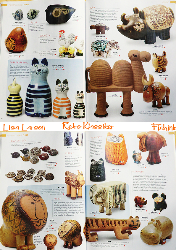
The publication is excellent, concentrating on all the retro designs in textiles, fashion, ceramics, furniture etc from the mid century era. Sooo perfect for me.

I’ve read that the bulldog may be your most favourite piece that you have designed. Is that still the case and are there any designs that given the time you would perhaps do differently or work up again ?
I always try to make new and better things. I am never happy with my own work, until possibly much later on. Like when I said that the Bulldog was my favourite, was some 40 years after I made it!

Like you, I have a very quirky style of my own and often draw images of dogs and cats etc for use on fabrics and other textile surfaces. Do you think that your strong sense of humour has played a part in the style of ceramics that you produce ? Was that quirky style unusual in Sweden in the time that you were first making designs ?
Humour is important. We had a dog poster in the children’s room and I decided to interpret the funniest breeds.
I have always had my own style. I do not study other people’s style. (Other people copy me.)
I lastly want to say a vote of thanks for the joy that your work has given me. I’ve a family of three lions who sit in front of me on my desk that really make me smile daily, and for that alone, your work is truly priceless to me.
Thank you for your kind words
I want to say a huge THANK YOU to Lisa for answering my questions with such great consideration and honesty. Also to Johanna, without whom this interview wouldn’t have happened and for her lovely pictures. Lastly to Viveca Carlsson for generously sending me a copy of the wonderful Retro Klassiker.
I’ve a feeling there’s room for more of Lisa’s ceramics to come : ) Watch this space. Please share this post with your friends, leave a comment and sign up for regular Fishinkblog posts too. I hope you’ve enjoyed this interview as much as I have in making it.


Lisa Larson (9th September 1931 – 11th March 2024) R.I.P.
Ladislav Sutnar Graphic Input
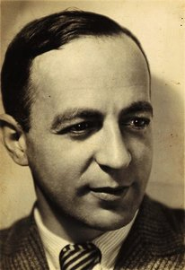
Ladislav Sutnar was born in 1897 in Plezn, Czechoslovakia. A Renaissance man, like many in his era, his activities were multidisciplinary and he studied painting at the School of Applied Arts in Prague, architecture at Charles University, and mathematics at the Czech Technical University concurrently.

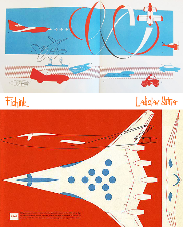
This silkscreen print was published as a promotional kit for the Build the Town building block set Sutnar designed between 1940 and 1943 while living in the U.S. This print is 1 of only 2 promotional materials Ladislav produced for the modern toy design market.

Starting in 1924, Ladislav designed toys consisting of simple geometric structures of animals and puppets.

He attempted to introduce modern aesthetics into children’s toys by developing a building kit that consisted of sawtooth roofs, cones, and pieces in the colors of red, blue, and white (this remained a prototype).

The 1960s proved to be a difficult time for the designer as he turned to publishing Strip Street (1963). It was an album of 12 erotic silk-screen prints. He organized two New York gallery exhibitions of his nudes, In Pursuit of Venus (1966) and Venus: Joy-Art (1969). These works outside of his norm still included his hierarchical design approach as a father of modern information design. The term “posters without words” refers to Ladislav’s distinct poster-like design that characterizes the individual prints of this series.

His racy Strip Street compilation has relatively been forgotten. He wrote an essay to accompany these works. “In these disturbed times of cool and alienated society,” he wrote, “if the paintings can inject the feeling, the mission is accomplished.” An influence of Pop is notable despite Sutnar’s dislike of Pop and Pop Art. His paintings are reproduced today in a 392-page monograph.

Ladislav Sutnar is most notably a pioneer in the field of information design. He worked with many media including print, painting, products and interior design.
He went to school to learn how to make utensils, pots and other ceramic works. In 1923, he became the professor of design at the State School of Graphic Arts in Prague, and was later made its director. At the same time he worked as a designer at other firms too. Ladislav also did much work in exhibition design for a number of World Fairs, including the one in 1939 located in New York where he was to design the Czech pavilion. The exhibition ended up being cancelled due to the Nazi invasion of Czechoslovakia. Still, his work brought him to America, where he began a new chapter in his life.
Ladislav transitioned from industrial designer to graphic designer during his time in the States. He responded to the chaotic nature that he saw in American graphic design, starting his influence in information design. His work brought simplicity to the complex. His personal philosophy on visual design was that it should not “sink down” to the level of public taste, but rather inspire the general public to improvement and progress. He believed designers are called to perform to their fullest capacity and should “think first, work later.”
He placed a heavy emphasis on precision and clarity in information display, and on simplifying the complex.

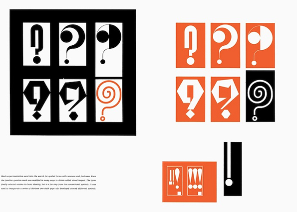
His style reflected this philosophy in many ways, using grids and a strict layout, as well as a limited color palette and choice of typeface. He often used geometric form to guide layout, and also asymmetrical compositions to draw visual interest. Ladislav was also greatly inspired by movements such as Modernism, Bauhaus, and De Stijl. He used vivid colors, especially with his penchant for orange. A distinguishing feature of his work is the use of punctuation symbols to organize information.
After settling in America, Ladislav became the art director at F.W. Dodge’s Sweet’s Catalog Service in 1941 until 1960. His contributions here are seen in use even today. To replace the messy design that originally characterized Sweet’s pages, he created business-friendly templates and layouts for clarity of vast amounts of information and easy consumption by the general viewer. He contributed graphic systems to several companies and manufactured items. Also among his innovations was the use of double page spreads as opposed to only single pages. He was also the one to put parentheses around the area code in the American telephone numbering system.
Ladislav’s contributions to the practice of information design are still applied to graphic design today. The components of web design and navigation today can be accredited to his methodical Modern-style graphics, which are widely borrowed and applied. His designs transformed the face of business data, organizing massive amounts of information into not only comprehendible but visually interesting displays.
Though far from a household name, Ladislav Sutnar is a giant in the history of design. A Czech American who had a prolific career in his native Czechoslovakia in the 1920s and ‘30s and subsequently in the United States. He was an innovator in graphics, product design, exhibition design, and information design—a forerunner of web design. He is particularly known for his work in typography, including the innovation of adding parentheses around area codes in phone numbers, a seemingly small change that makes long strings of digits easier to read and remember.
Roger Duvoisin No introductions necessary
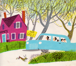
Roger Duvoisin makes quite a number of regular appearances on Fishink Blog. You can see more of my posts about him, by typing his name into the search box on the right hand side of my blog. He was such a prolific artist, that every time I seem to think about him, there’s more illustrations to view online, that I’d not seen previously. Here’s a few more book covers…

His animals have such a friendly nature to them.

His books have been translated into many, many languages and they work because his illustrations are easy to understand, wherever you may live.
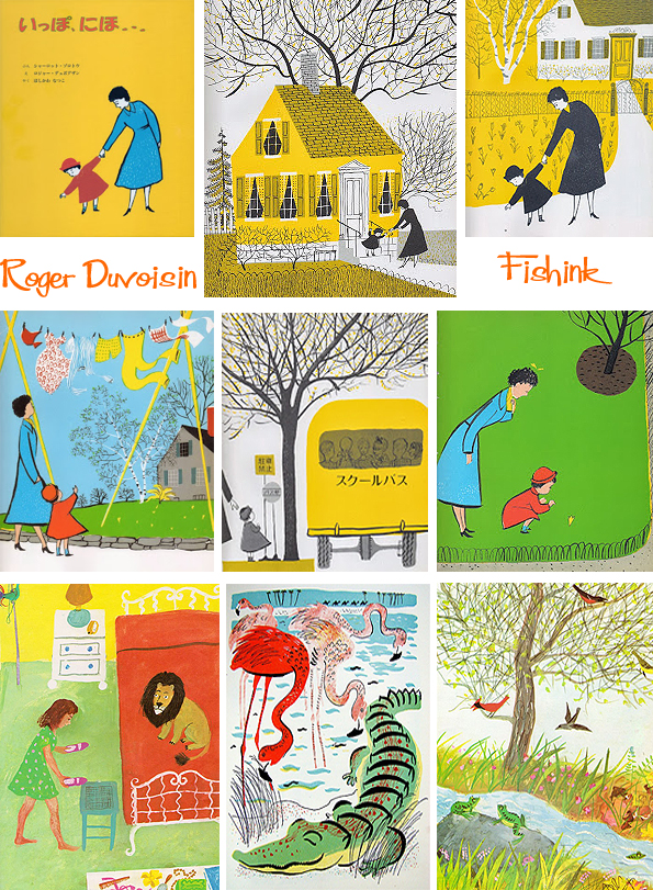
Great colour schemes.
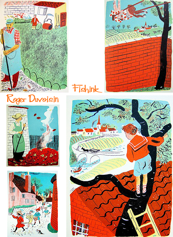
In case you’ve ever wondered what Daddies do all day…. I hope there was a Mummies book too !

Here’s the man himself hard at work, he must have had a busy and hopefully fulfilling career.

Always a breath of fresh air to see Roger’s work. To me they will never feel 60+ years old !
Fishink Ceramic Sale
Hello everyone, just a quick message for those of you who maybe interested to say that I will be having a sale of my latest ceramics over on my stories on Instagram this evening starting at 8pm GMT (Sunday 11thFeb) . Please pop a reminder on your phone and message me if you see anything you would like to buy. All the very best Craig x
You can find my work here http://www.instagram.com/fishinkblog


Fiep Westendorp (1916-2004) was a Dutch illustrator who became especially popular due to her long-term collaboration with writer Annie M.G. Schmidt.


Dutch guys and gals have grown up with her illustrations over three generations. Her most well known characters are Jip and Janneke, two silhouetted kids who got up to all manner of things. It ran as a series of stories featured in the Dutch newspaper Het Parool from 1953 to 1957. Now, the Dutch department store HEMA has a huge selection of her illustrations on mugs, plates, stationery products etc.


I first became aware of her work when I purchased a couple of postcards in Amsterdam a couple of years ago. She has such a beautiful painterly style.

Two other firm favourites have been the tales of two cats Pim and Pom. Below are Fiep’s original creations alongside their modern day realisations.

She has illustrated numerous posters, billboards and books, some of which are featured here.


Since the regular Dutch awards for illustrations always eluded her, she was given a unique award for her entire career in 1997. At the end of 60 years of artistic creation, Fiep Westendorp received the Oeuvre Penseel, the highest possible Dutch award for an illustrator of children’s books. I should think so too lol.

Vintage Book Covers
It’s been a while since I shared some classic book covers. I can’t tell you why but they always make me feel warm inside, I hope they have the same effect for you : )
Here’s a little science to get the visual party started.

A little food to go on the side table.

Throw in a little mystery and intrigue.
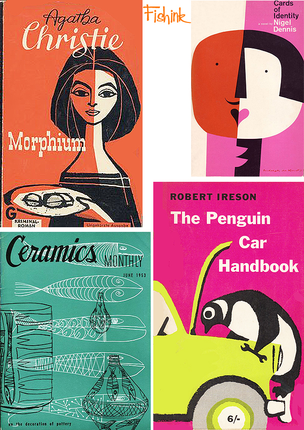
Making sure it’s well packaged.

Remember there’s a lot to learn out there.

Even if it’s from our children.

Before alas and all too soon… the party’s over.
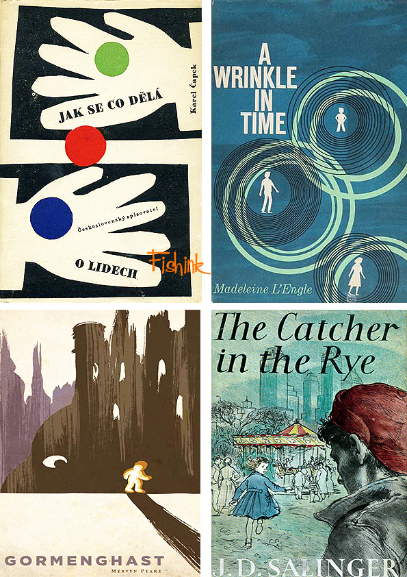
Do any of these covers prompt a memory for anyone ? Hope you enjoyed today’s visual feast !
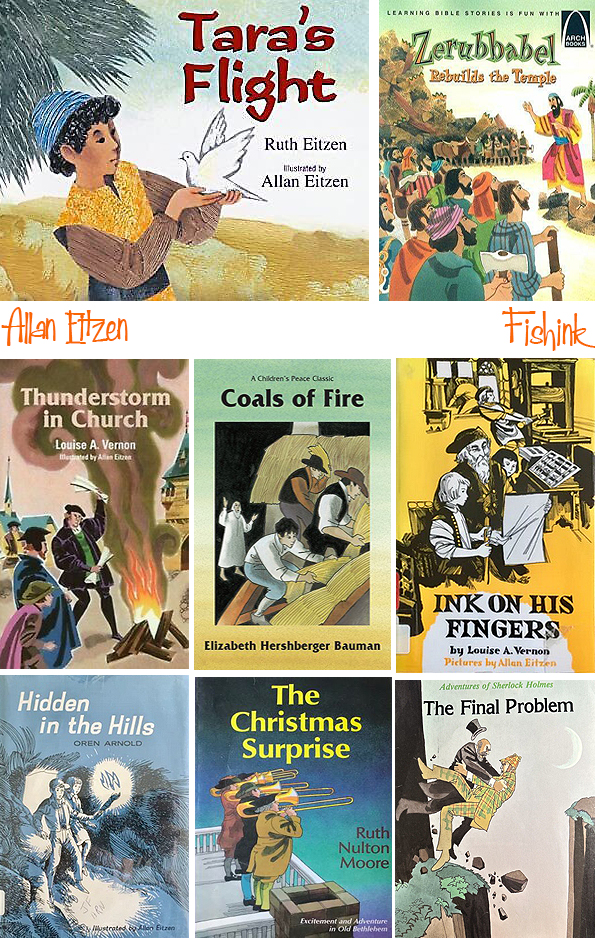
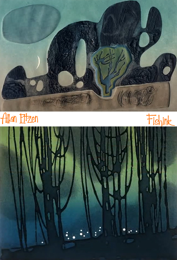
Allan Eitzen
Happy Festive season to one and all, this is my last post of 2023 and I hope it finds you well, cup of tea, coffee or your preferred beverage in hand and nicely chilling out awaiting the holidays to come.
It’s been a tricky year for many reasons, which I won’t go into right now, but thank you for staying with me on this journey of exploration of different artists who tend to catch my eye. I have one last one for you,,, but it’s a good one. Enjoy : )
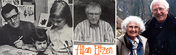
Allan George Eitzen was born on the 25 May 1928 in Minnesota. He received an education in art from local Gustavus Adolphus College before moving to Scottdale, Pennsylvania, where he worked as an illustrator for Herald Press.

It was there that he met his future wife, Ruth Carper, who was developing educational materials for the same Newspaper. After a month’s acquaintance, Ruth moved to Europe for a four-year term with Mennonite Central Committee. During that time, she and Allan remained in contact and, after her return to the United States, they married on 12 July 1954. In the meantime, he had earned a degree in illustration at Philadelphia College of Art (now University of the Arts).


They moved to a country home in Barto, Pennsylvania, and had five children.
He supported the family as a freelance illustrator of children’s books, magazines, and textbooks, often inspired by their idyllic country setting and his flock of sheep, his children were often the models in his book illustrations. 8 year old Dirk was the model for the book ‘Pick a Whistle’.


When the children left home, he had more time to devote to his artistic medium of choice, printmaking, while Ruth continued her education at Temple University, where she earned a master’s degree in creative writing.


Together, Allan and Ruth wrote and illustrated three books: The White Feather (Scottdale, PA: Herald Press, 1987); Ti Jacques: a Story of Haiti (New York: Thomas Y. Crowell Company, 1972); and Tara’s Flight (Honesdale, PA: Boyd’s Mill Press, 2008), which was released ten months after Ruth’s death on 11 April 2007.


Allan continued working professionally as an illustrator until 2007, and as a printmaker almost to the time of his death. In a 2008 interview, Allan described his style as “stylized realism. . . simplification or slight abstraction . . . a little exaggeration here or there to give it a personal touch.” Here are a few of his later artworks that I came across in a You Tube tribute.


Sadly Allan died of cancer on 31 August 2008 at the age of 80. Such a talented individual with a varied and technically acclaimed eye for illustration and art. I contacted two of his children Laura and John, who have sent me many images of their father’s work which I intend to put into a follow up post in 2024. In the meantime I managed to buy this beautiful book of his work from 1963 called ‘Birds in Wintertime’. It is a book without words and I think from the illustrations alone, it really doesn’t appear to be lacking in any way for not having any.


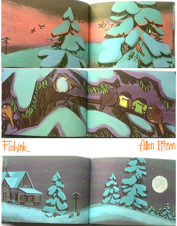
Aren’t these illustrations just stunning ! This is my festive gift to you all.
Happy Holidays wherever you are and I look forward to sharing next year with you too.
All the very best fishes, Craig x
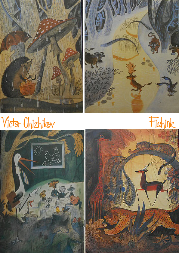
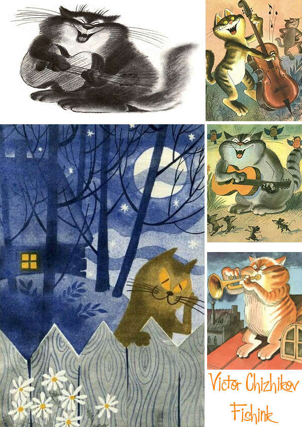
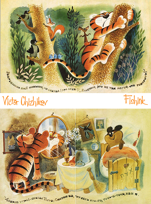
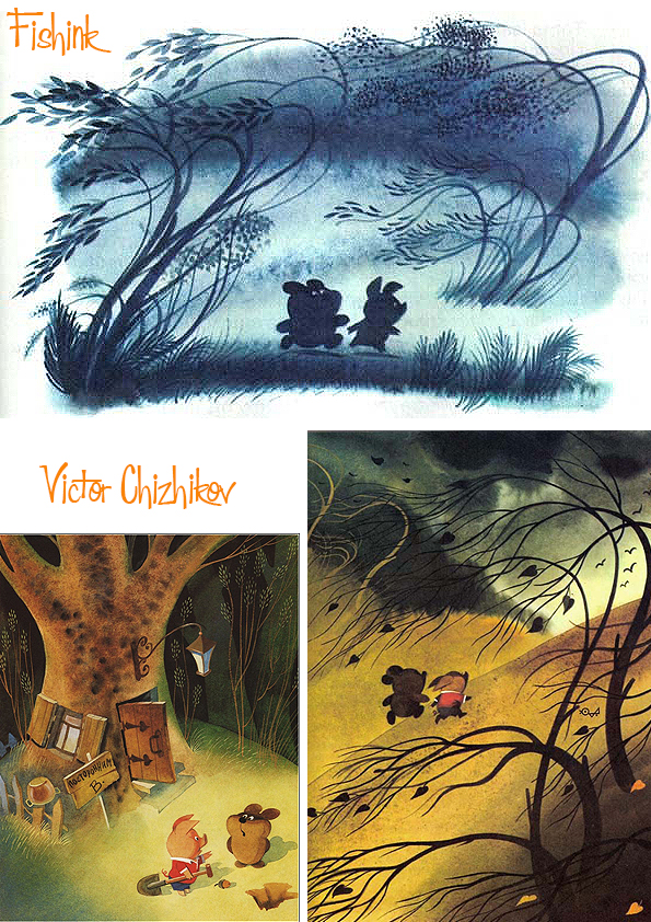
Victor Chizhikov

Victor Aleksandrovich Chizhikov was born on September, 26th, 1935 into a family of office workers in Moscow. He started to publish drawings when he was still a schoolboy, in the newspaper ‘Housing Worker’ in 1952. After finishing school he entered the Art and Design Branch of the Publishing Faculty of the Moscow Polygraphic Institute (nowadays – the Moscow State University of Press), where he graduated in 1958.

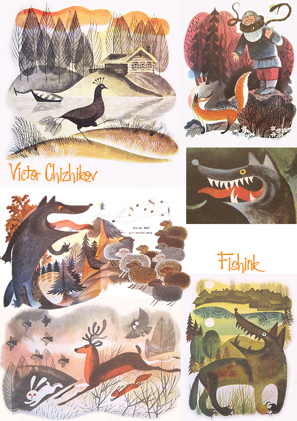
How lovely are these trees !

From 1955 Victor Chizhikov worked as an illustrator in the comic journal ‘Crocodile’, from 1956 – in children’s magazine ‘Vesyolie Kartinki’, from 1958 – in ‘Murzilka’ (from 1965 – the associate editor), and from 1959 – in the travel magazine ‘Vokrug Sveta’ (Around the World).

In 1960 the young artist who was frequently published in the periodical press was admitted to the Union of Journalists. He also worked in other popular periodicals. Though Victor Chizhikov started his career as a caricaturist, from the early 1960s he was mainly engaged in illustrating children’s books, and co-operated with major Russian publishing houses. He was a versatile artist and worked in many different styles.


In 1968 Victor Chizhikov became a member of the Union of Artists of the Russian Federation. His illustrations embellished books by almost all classics of the Soviet children’s literature – Agnia Barto, Sergey Mikhalkov, Boris Zakhoder, Samuil Marshak, Nikolay Nosov, Edward Uspensky and many other domestic and foreign authors.
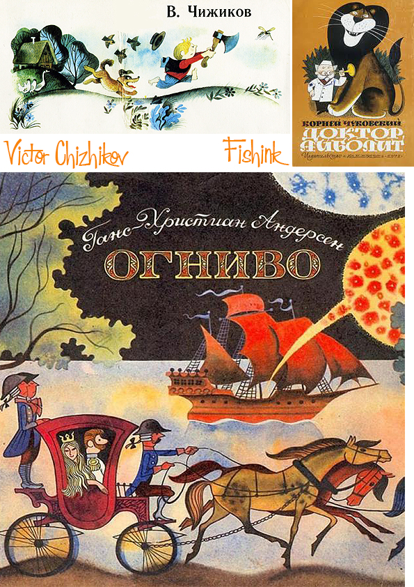
Easily recognizable, full of kind humour and warm-heartedness, Chizhikov’s drawings became known to millions of readers of all ages. In 1980 he created the famous bear cub Misha – this emerged as the best out of 40,000 submissions for a contest to select the mascot for the 1980 Moscow Olympics. At once it became one of the most popular Russian cartoon characters. The same year, he was awarded the order of the Sign of Honour, and a year later gained the title of the Most Deserved Artist of the Russian Federation.

The mascot born out of the Communist bloc’s greatest power, the Soviet Union, ironically became the first to be a globally commercial success. Sadly, Victor said that he was promised the copyright but didn’t get it, and thus never saw any royalties from the stuffed toys, t-shirts and television programs related to Misha the Bear. “I hate to talk about mascots,” he told The Wall Street Journal but “This is like a thorn in my heel.”
Starting from 1966, for over more than thirty years, he repeatedly won the “Art of Book” competition, participated in exhibitions both in Russia and abroad, and got numerous professional awards, including the Diploma of Academy of Arts of the USSR (1980), Andersen Honourable Diploma (1980), and Diploma of Council on Children’s Books of Russia (1997). He also gained the award for the highest achievements in the genre of satire and humour – “Gold Ostap” (1997).
Victor Chizhikov also showed himself as the author of children’s fairy tales, such as “Petja and Potap”, “Petja Rescues Potap”, “Sharik and Vaska are Against”.
In the mid-1990s the publishing house Samovar started to issue the series “At Victor Chizhikov’s”, which included twenty books by different children’s writers, and two books written by the artist himself. Each of the books in this series was accompanied with Chizhikov’s illustrations and a preface.
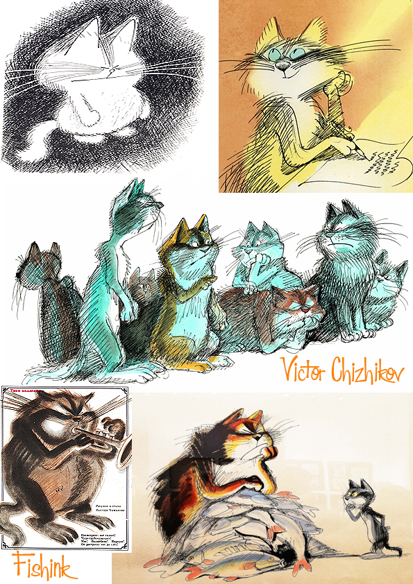
Among his most significant works of recent years is the book 333 cats (2005), which was created jointly with the poet and writer Andrey Usachyov. During his life, Victor illustrated over 100 books, he sadly passed away in 2020 at the age of 84.

Great Northern Contemporary Craft Fair 2023
Hi everyone, I hope this finds you well.
It has been a while since I’ve pulled together a long post detailing one of my trips out, and now (after three hours of photo editing and sorting contact details etc), I know why I don’t get to do it as often as I used to lol. I am spending some time looking after my parents and working hard on promoting and selling my ceramics, which has become the work I enjoy the most … long may it continue !
However here is a nod back to my degree show from the late 80’s, a silk scarf design I created and printed. At the time interior company Timney Fowler was an influence on my thinking and I chose to give this nautilus shell idea a more modern slant, by recreating modern sayings like “People in glass houses shouldn’t throw fish” and ‘Many fish make light work”.. you get the idea.
It is from illustrating Fish on my Textile degree course that the name Fishink was finally born!

So introduction over, I wanted to show you my small offerings from the 2023 Great Northern Contemporary Craft Fair from last weekend. To give you a feel for the size of the event, there were over 100 exhibitors taking part. The first today is from Nell at Hem Handwoven.
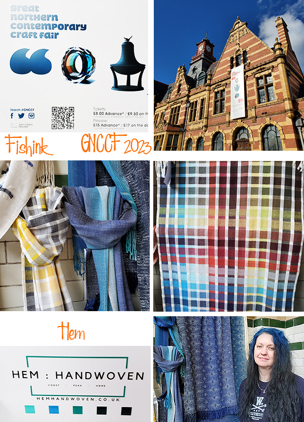
Looking like a beautifully crafted pantone chart, Nell takes hundreds of photographs of an small town (such as Whitby) and then creates a colour selection of no more than 10 colours from the photographs. She then weaves up a range of scarves that are directly connected in tone and hue to that area.

Nell says “I always made things- I was brought up in a household of makers, and as an only child, I spent lots of time following my imagination and making. I’m fascinated with fabric- I import fabrics from Japan and Sweden. Trying to find the perfect fabric led me back to wanting to learn to weave- I remember making little cardboard looms when I was a child. Weaving is old. There are hundreds of thousands of drafts, offering infinite combinations of pattern, colour and texture. I think this bottomless quality is what appeals.” Beautiful fabrics Nell.
Next I spoke to the Ceramist Annie Tortora. Her stunningly realistic small birds, felt like they had literally risen from my children’s Observer Book of Birds and morphed into 3-D ! Annie says “I have been connected with clay professionally for many years now, principally as a ceramics tutor in A&F education and in an Arts for Health service based in the NHS. I truly believe in the therapeutic power of Creativity & Art. I’m proud to have worked in this capacity for over 30 years. Alongside this, I’ve practiced ceramics for pleasure, for my own creative development and sustenance and I’ve enjoyed working on commissions and exhibiting at intervals along the way.”
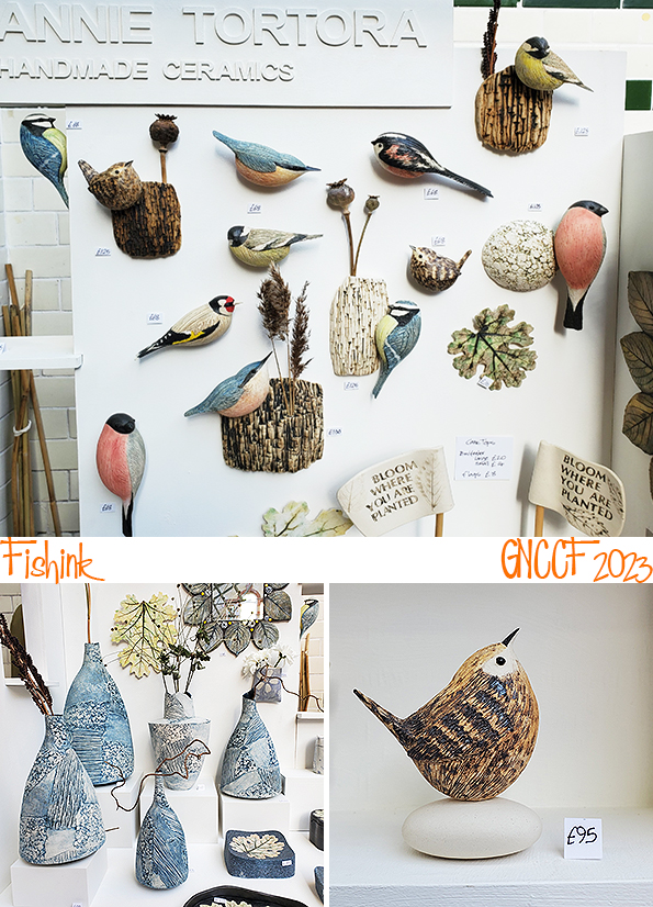

Her partner had made such a beautiful stand too which all cleverly came apart and broke down into easy to carry (and storeable) parts, a truly alented team.
Some more bird inspired work, but this time stained glasswork from Debbie Copley.

Creative and quality leatherwork from colourful designer Gosia Weber which were definitely too cool for school !

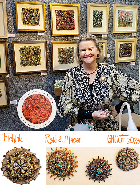
Intricately detailed beadwork from coding guru Cressida at Reid and Mason. She told me “my passion for textiles, pattern and colour inspire my work. Semi-precious stone and glass beads combine imaginatively with a variety of miniature treasures to create hand embroidered bespoke artwork. The addition of Morse Code allows me to transcribe text into a series of dots and dashes which once strung can be incorporated into my pieces creating secret hidden messages. Favourite poems, lyrics, prayers or a declaration of love can all be immortalised in the beadwork producing artwork that really can speak to you.”
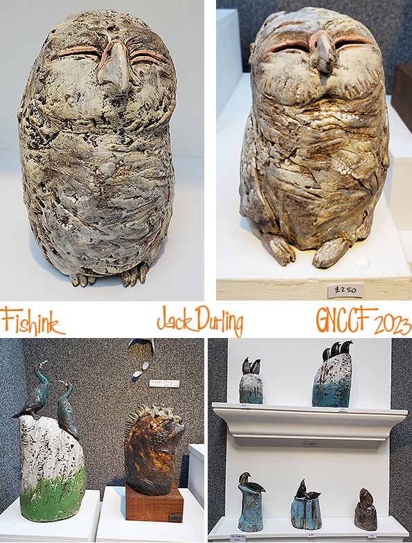
Back to the birds, (and other animals) by talented ceramist Jack Durling. Jack is a Brighton based artist who is inspired by the natural world and creates bespoke ceramic sculptures that are celebratory of animal species. Focusing on natural behaviour and animal congregation, his work is notable for decorative embellishment and I would also say.. the viewers quirky enjoyment.
I loved the calm illustrations by printmaker and embroider Gail Kelly. She works using linocut, woodcut and lithography, inspired closely by the countryside where she lives, along with gorgeous gardens and beautiful landscapes she sees on her travels in Ireland and Britain.

Vibrant, leafy screenprints by Kathy Hutton. It turns out from our chat, that Kathy not only is related to one of my best friends but also went to the same school as me when I was a youngster. Small world hey!

When chatting to ceramist Nehal Aamir, she told me that her work was inspired by Pakistani truck art which also enabled Nehal to illustrate her own heritage. She explained how personal the illustrations painted on the decorated trucks were to the drivers. The images have meaning to their families, communities and offer glimpses into their beliefs and sometimes even depict the gods who watch over their safety as they spend long hours on India’s dusty roads. I thought it wonderful how Nehal had captured a part of her heritage and transformed it into a decorative tile for people’s interiors.

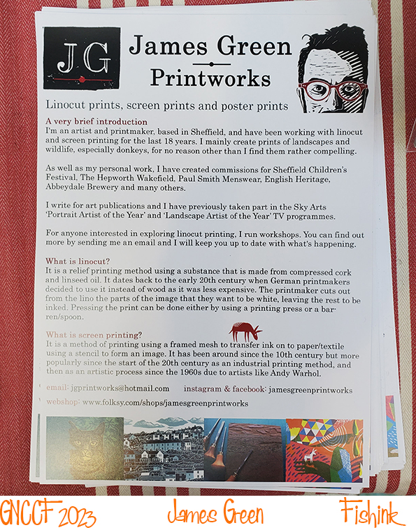
I had bumped into illistrator James Green a couple of time before at other events. I feel we have a similar sense of creating characters who inhabit our minds, or in Jame’s words ‘alternative universes’. In his case it’s his clever little donkeys who strutt around and often steal the show.. or at least the print !

In the style of most good adventures, I was saving the best til last and for me this time, it was definitely the quiet little 20 minute chat I had with the lovely ceramist Lucy Baxendale. Her work is delightful, charismatic, offbeat and downwright enchanting. I had feelings of meeting a clay form of Maurice Sendak’s ‘and ‘Where the Wild Things are’, merged along with mischievous sprites, carefree creatures and whimsical folk of the forest. All creations from Lucy’s wonderful head.

We had a great chat about where we both feel our influences had come from and how her parents were so great at encouraging her and her sister to think as creatively wild as possible. No idea was ever considered too much, too crazy or simply silly. Her father created his own apps to switch lights on and off in his home whilst he was away and many other helpful devices for around the house. It sounds like a great childhood and a wonderful way to nurture an enquiring and creative mind. I can see where he work comes from. Beatutiful work Lucy and thanks so much for the inspirational chat.

Needless to say, apart from a quick hello to my friend Tone Von Krogh (who’s stand always looks amazing), my two small purcases today were from James and Lucy. How lovely to take a little part of their worlds home with me.

Do visit the weblinks to the artists I have mentioned today and if you like their work too, please tell them you saw them here and perhaps buy a little something along the way too.
For some of my work you can find me over on instagram at Fishinkblog. Thank you GNCCF for a wonderfully exciting day out.

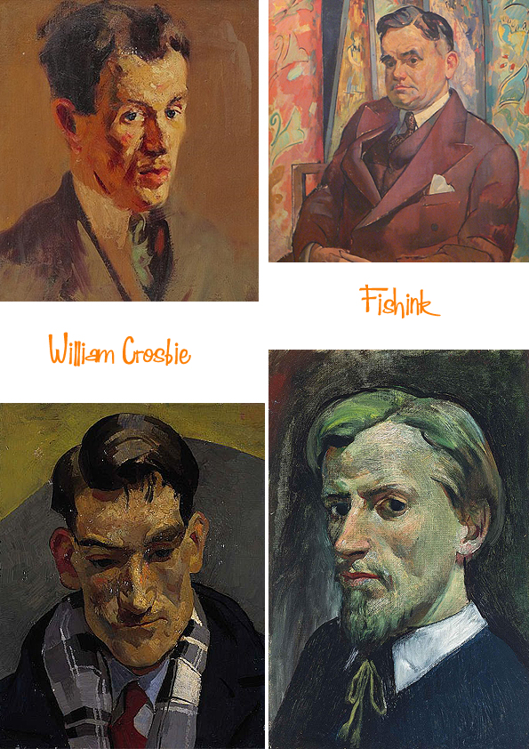
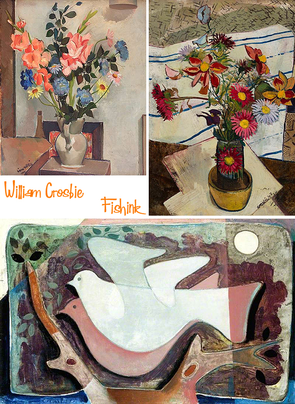
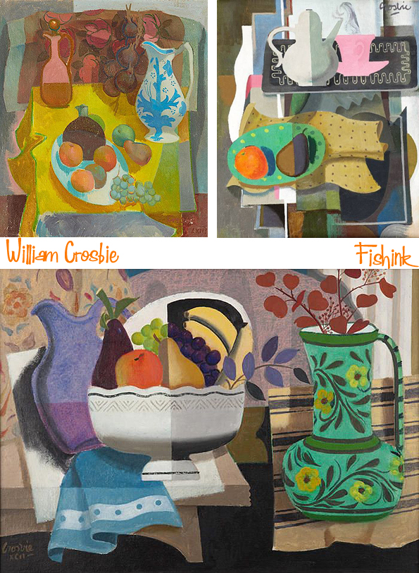
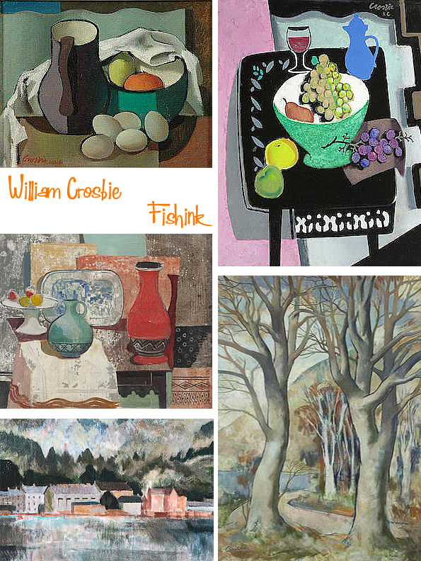
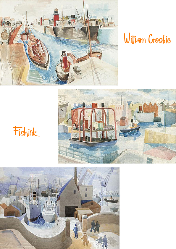
William Crosbie, Scottish Artist
Welcome to the wonderful work of William Crosbie.
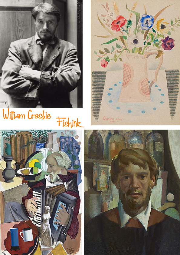
William was born in Hankow, China, in 1915, of Scottish parents. The family returned to Glasgow in 1926, where Bill attended Glasgow Academy and, in 1932, entered Glasgow School of Art. On graduating in 1935, he was awarded the Haldane Traveling Scholarship and set off for Paris, where he gained admission to the studio of Fernand Leger and was able to study under the master; he described his time there as ”one of my proudest experiences”. When his scholarship ended Bill was offered a job with the Archaeological Institute’s expedition to the newly excavated Temple of the Bulls and Temple of Sakhara in Egypt, where he copied the friezes on the temple walls.
In 1939, Bill returned to Glasgow where he set up his studio at 12 Ruskin Lane, a studio originally designed for Sir David Cameron. During the war he served in the Merchant Navy, though he continued to produce paintings through these years. He was also at the centre of what he once described as ”a little local Renaissance”, which included luminaries such as Hugh MacDiarmid, J D Fergusson, James Bridie, T J Honeyman, and Basil Spence. Other ”regulars” at his studio were the refugee artists Jankel Adler and Josef Herman, as well as Duncan Macrae (whose portrait by Crosbie is now hanging in the People’s Palace).
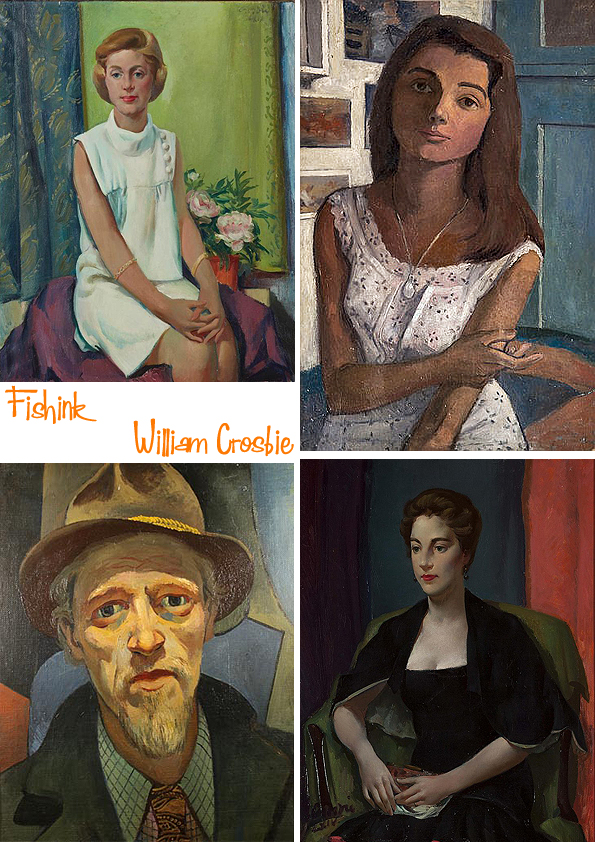
After the war Bill made his London debut at the Reid and Lefevre gallery in 1946 in a joint exhibition with the English surrealist painter John Armstrong.
An important part of Crosbie’s work after the war were his mural paintings, largely commissioned through his association with architects like Basil Spence and Jack Coia. These included works for the ”Britain Can Make It Exhibition” in 1946 and the ”Festival of Britain” in 1951; there were also many murals and altarpieces for churches of all denominations. He was involved in book illustrations for the publisher William MacLellan and even designed the set of a ballet for George Chisholm.
He exhibited on a regular basis with the Annan Gallery in Glasgow from the war until the 1970s and in Edinburgh with Aitken Dott’s. From the 1980s he showed with Ewan Mundy in Glasgow. Academic recognition came in 1953 with his election as an associate of the Royal Scottish Academy and subsequently as an academician. In Glasgow he was a proud member of, and annual exhibitor at, the Royal Glasgow Institute, and he was also a former president and long-time member of the Glasgow Art Club.
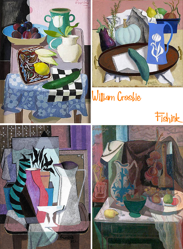
There were major retrospective exhibitions of Crosbie’s work at Aitken Dott’s in 1980, Ewan Mundy’s, 1990, and Perth Museum and Art Gallery, 1990.
His paintings hang in all the major museums and galleries in Scotland as well as the Royal Collection and the British Museum in London, and in private collections throughout the United Kingdom and abroad.
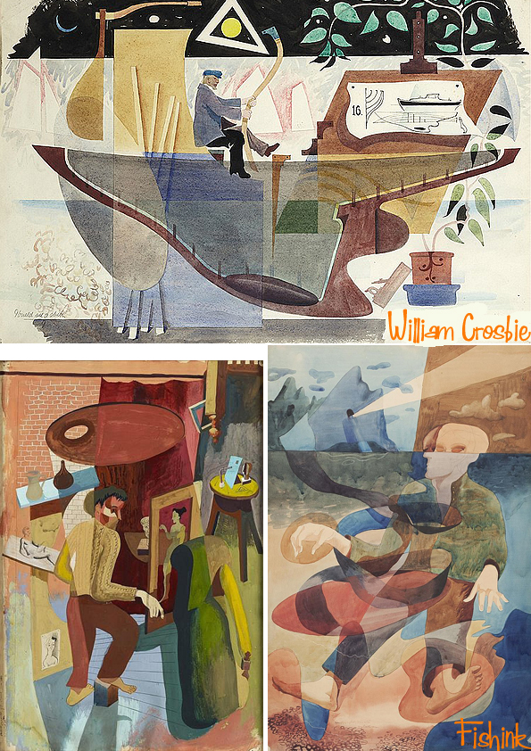
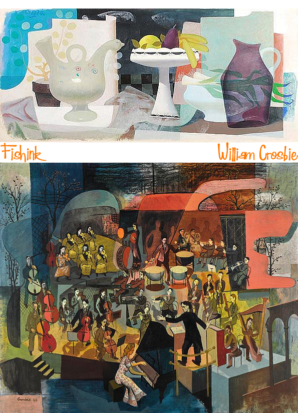
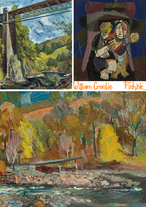
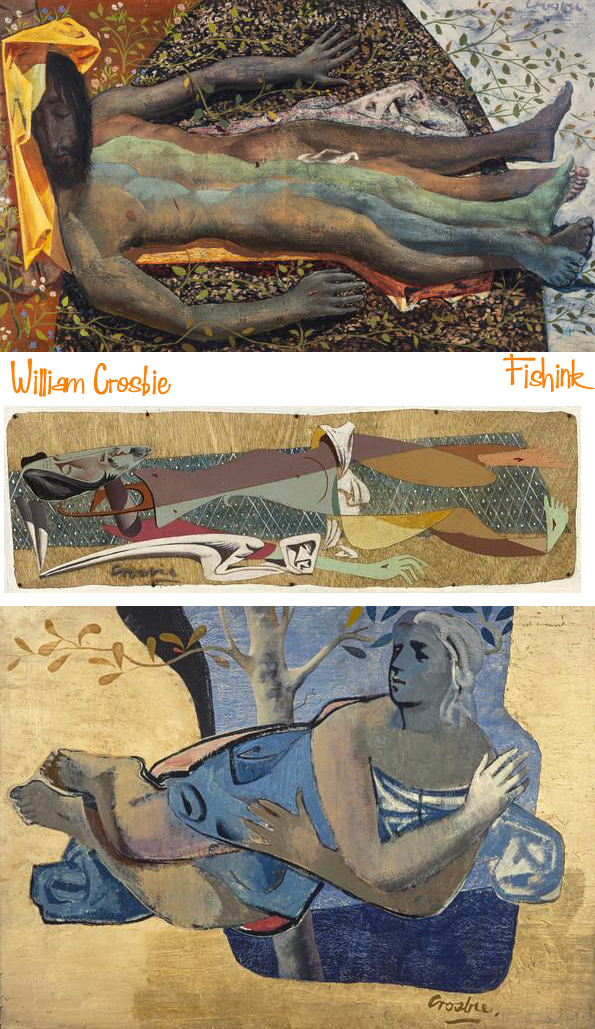
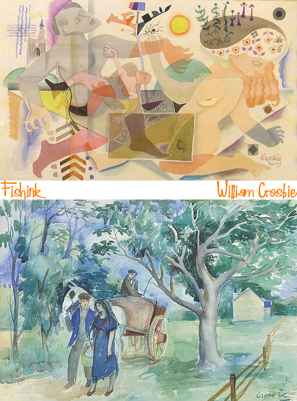
Some of his work has a flavour of Ravilious about them, like these watercolours below.
William’s own words are perhaps his best epitaph: ”Devotion to the muse and the life it has led me has meant I have enjoyed a richness of texture not readily to hand to the majority of my fellow citizens.” He was one of the finest and most singular Scottish painters of the twentieth century. He passed away in 1999 at the age of 84.
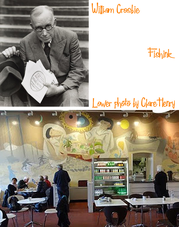
The City Art Gallery’s Cafe used to be covered with a stunning mural by William which started to fade and peel and has consequently been covered up, this is a photo of part of it , in it’s heyday. Thanks to Clare Henry for the photo.
If you have any suggestions for blog-posts for an artist who’s work you consider would fit with the style I tend to show on Fishink Blog (1950’s 60’s), then please let me know. I won’t guarantee to use them but It’s always interesting to see who gets nominated : )


