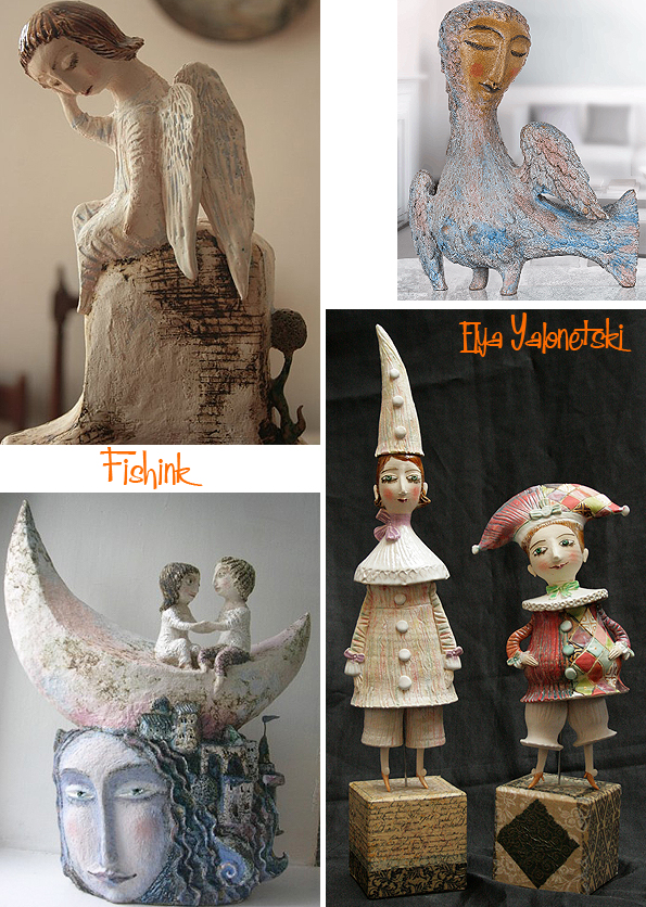
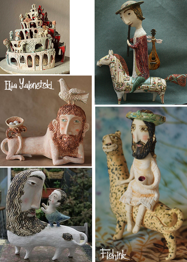
Elya Yalonetski Ceramics from another age.

Elya Yalonetski is an award winning Berlin-based artist. Her work appears to stem from another period in time, yet not one that you can easily put your finger on.

A mixture of Greek mythologies, Chagall dreamscapes with a nod to the worlds of folk myths and fantastical wonder.

I smiled as soon as I came across it. I also love how she creates such large pieces carefully balanced on such tiny points. For me this also gives her work a sense of wonder and fascination.
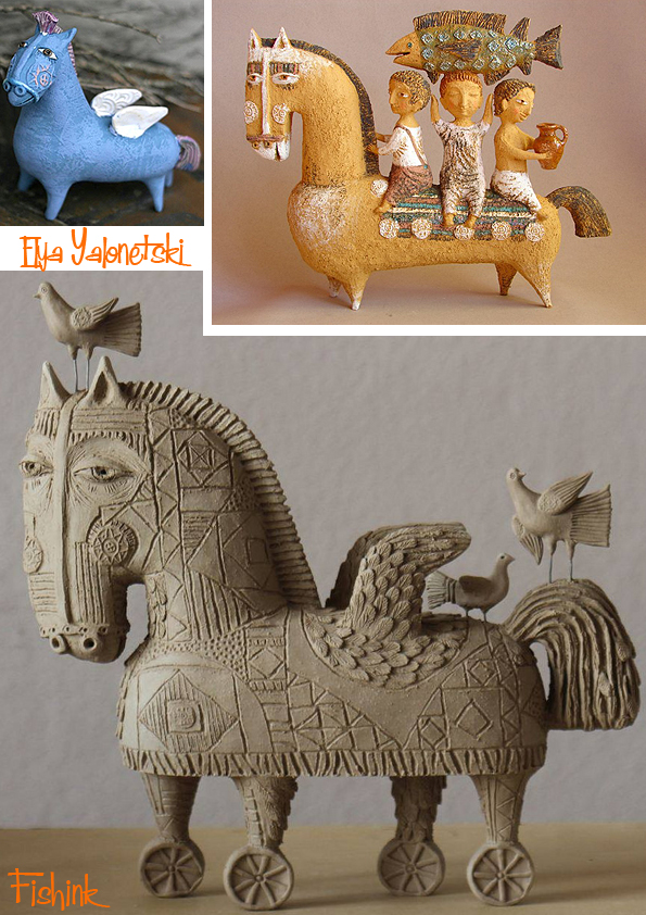
I can’t imagine how long each piece must take to create, such detail and fine line work, I’ve a feeling Elya must be quite a steady handed, patient ceramist.

Her photographs also are like mini stage sets, they show her work off quite beautifully.

This wonderful Edwardian couple and their tiny tattoos.

Her tower of Babel must have taken weeks with all those characters. Amazing work, don’t you agree.
Elya says:- ” I have been working with ceramics for the last 20 years, successfully combining my initial traditional education from the Abramtsevo Art school in Russia with the Baroque and Renaissance elements in my sculptures and figurines. For me ceramic is a very mystical art medium. Being very fragile it can still survive over ages and epochs. Having mostly unknown authors each ceramic piece keeps the personal aura of its creator and whole cultures are named after certain ceramic styles. With over 1000 objects sold to the collectors around the world, I hope that some thousands years later someone will be able to “read” the feelings from my artworks like I can feel them admiring the work of ancient craftsmen in some archaeological museum.”
You can see more from Elya on Facebook and purchase some of her wonderful work here.
Brian Wildsmith New Book & Exhibition News for 2024
Hello everyone, I hope this finds you all well and enjoying the last of the summery days as the season here in the UK turns to a more chilly Autumnal one.
I am back with some very exciting news regarding one of my favourite children’s illustrators Brian Wildsmith. If you remember back in 2020, I had an interview with Simon Wildsmith, who alongside his sisters, Clare and Rebecca, set up a wonderful website dedicated to sharing more of Brian’s amazing work and personal life with us all.
On September 7th, there was a fabulous release of a new collabrative book called “paws claws tails & roars” which is very special to Simon in particular because it has been assembled using three of his father’s books on Birds, Fishes and Wild Animals. Books that had been dedicated to him alone. It is a beautifully crafted publication, larger than your usual A4 book layout and printed on heavyweight paper with gold foil on the edging !
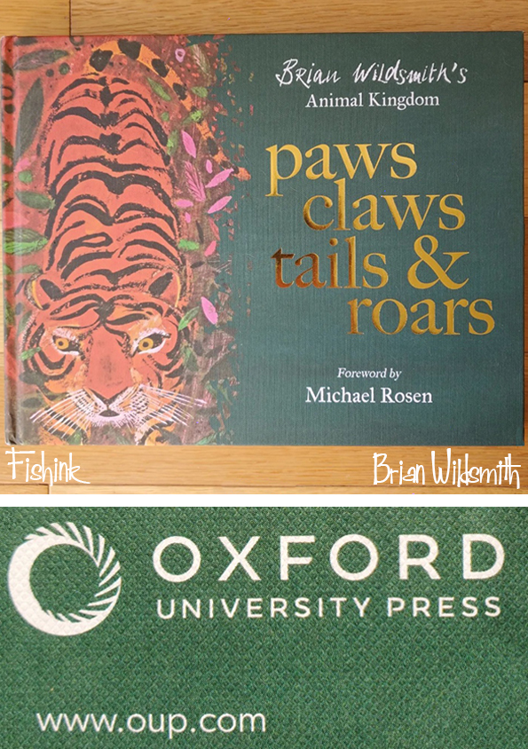
A special volume published by the @oxunipress to honour the work of Brian Wildsmith, who remains one of my personal llustrator favorites. At just £20 it is a definite must for any bookshelf and I think suitable for children and big children (myself included) alike ! Here are a few selected highlights.
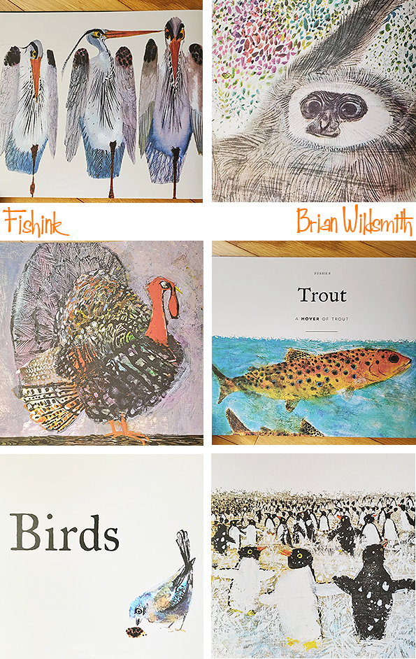
Further to this, mid September I finally got the go ahead from Simon that I could share a burning secret I had known about for a while.. namely that there is a major exhibtion planned in Brian’s original home of Yorkshire.
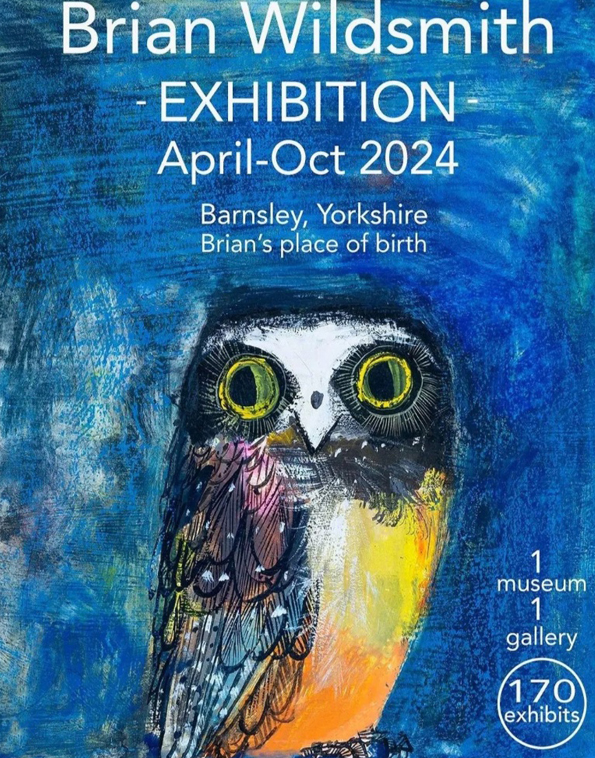
The Exhibition will run from 20th April 2024 til the 21st September 2024 in both Experience Barnsley Museum and the Cooper Gallery and as it says above, will feature 170 exhibits across the two venues So exciting that this collaboration is not only being housed in Yorkshire but is also curated by Brian’s family too. I look forward to giving you any updates I receive as they appear. Watch this space !!
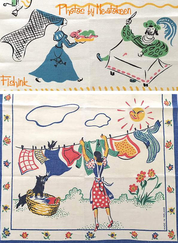
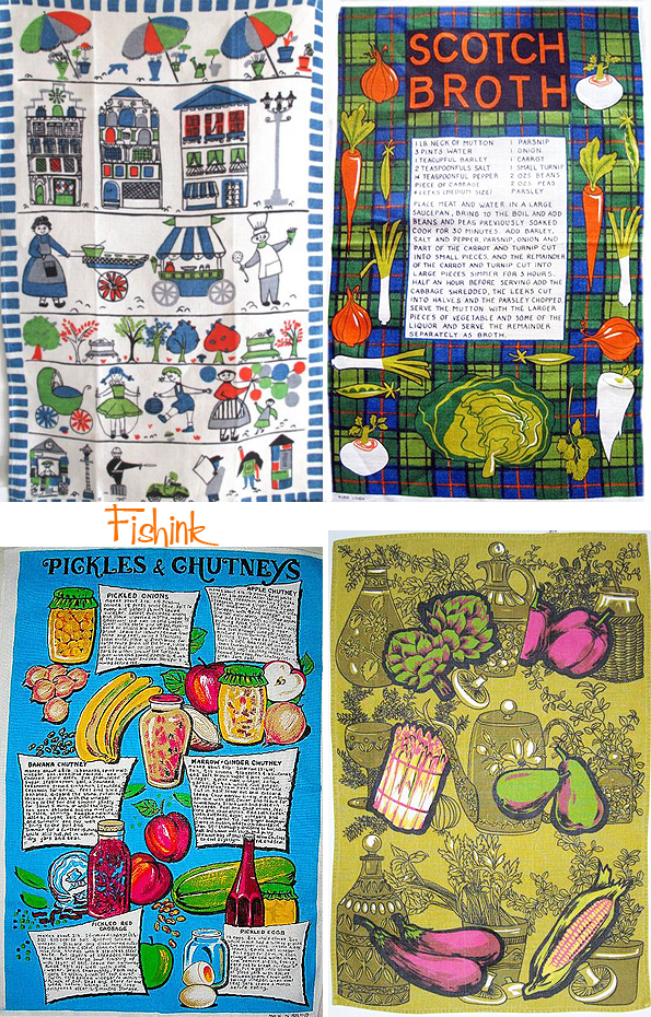
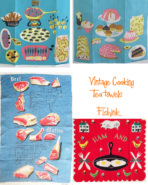
Vintage Housekeeping and Cooking Tea Towels
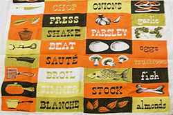
For decades designers have thought that it would be a great idea to inspire the cooking housewife in the home, by putting recipes onto tea towels and linens. Imagine the scenario… you completely run out of ideas as to what to make for the family dinner, well worry no more, dust off the tea towel and there’s your answer, ingredients and all ! Of course that doesn’t help you out the next day when you have the same problem all over again, unless that is, you have a drawer full of these beauties lol

Cooking and washing up go hand in hand, whatever country you happen to be in. You can even be inspired to go global and make a Goulash or Curry as a complete change to the British meat and two vegetables ensemble!

Such was the popularity of the idea, that there were hundreds of variations made.

Over many different time periods.
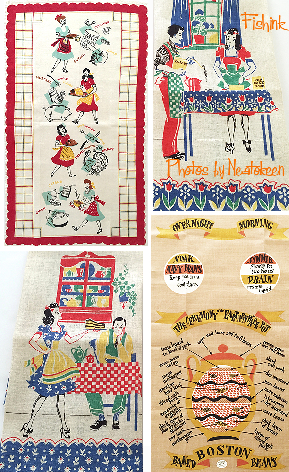
And in many different countries. I’m sure you ladies will all be flocking to get a copy of the Housewife’s Arms below.. with the inspirational motto ” Labour without ceasing”. I am hoping if that was meant to be tongue-in-cheek ?
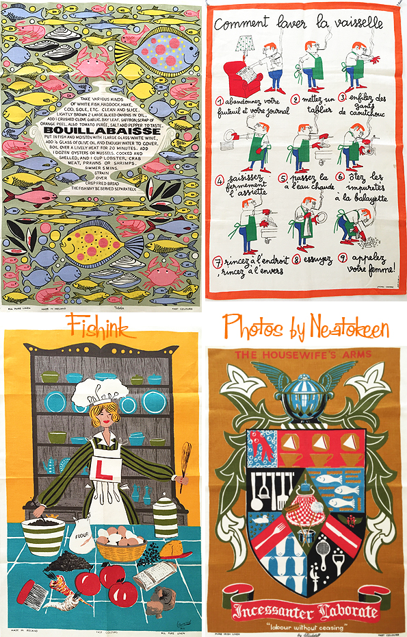

It appears (from the design above) that Sunday is the only day of rest for the working housewife, and perhaps the saying ‘ a woman’s work is never done’ would be somewhere nearer the truth.

I do find the quotes on these towels rather amusing.
Great designs and educational too.
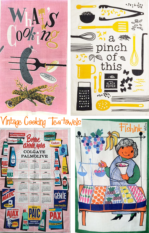
I bet this Happy New Year 1968 tea towel just bursting with advertisements for Colgate & Palmolive, went down an absolute storm ! But seriously, who wants to be reminded about cleaning products all year round ? Really !
However, I do think some of these much more modern illustrations (below) would make some fetching new tea towel designs.

Many thanks to Cindy over at NeatoKeen for selecting most of the images used in this post, from her vast collection of vintage linens. Also for coming up with the idea for this blog in the first place. May our collaborations long continue : )
![]()
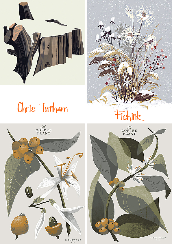
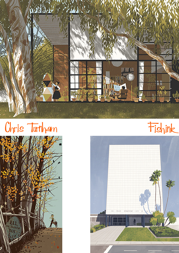
Chris Turnham Illustration
 Photo by Dan Cole.
Chris Turnham lives and works in Los Angeles. He has worked in both feature and television animation and has contributed illustrations to publications and children’s books.

Of course his style appeals very much to my eye and love of the mid century life.

This could be fresh out of a book from 50+ years ago…. fabulous.

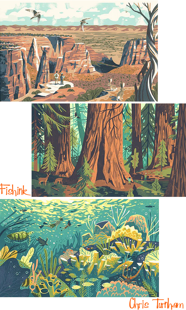
Interesting to see some floral and botanical studies too.
Illustrations of intrepid explorers….

and places Chris has also explored.

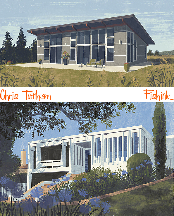
But my absolute favourites are his his beautiful architectural pieces… was this the bridge used in the film Grease, I wonder ?


Many of these illustrations are commissions.
Or just plain jaw-droppingly wonderful ! Lol

I love Chris’s use of the sun in these sleepy suburban dwellings.
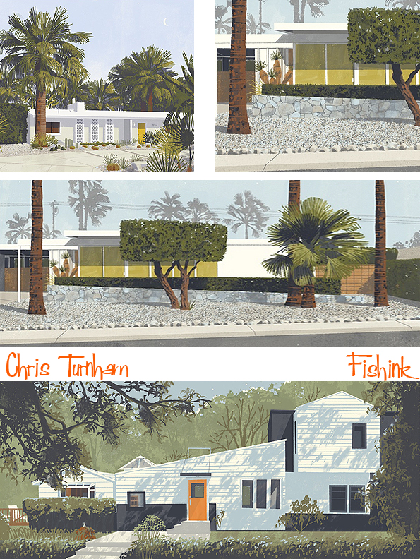
He has even covered the Eames House, below. Stunning work Chris.
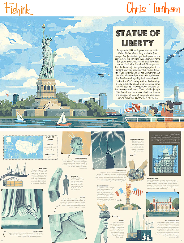
I just wanted to add a quick update to this post. Chris has been busy working on two wonderful books which are right up my street.
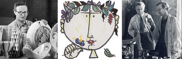
National Monuments and National Parks of the USA.

Just look at these mouthwateringly retro illustrations.

You can even grab a print from Chris’s website here
Lovely work Chris, with a nod to the classic Miroslav Šašek too, get your copies today.
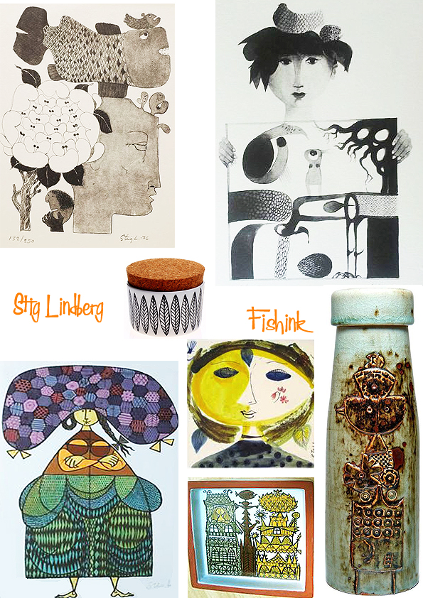
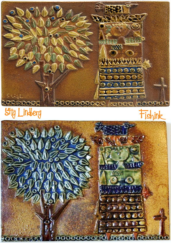
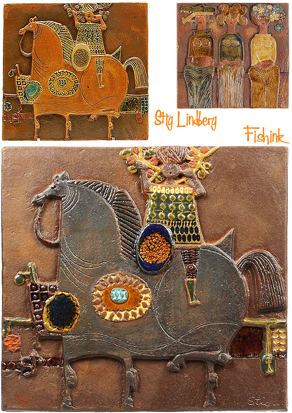
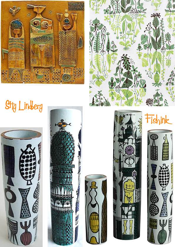
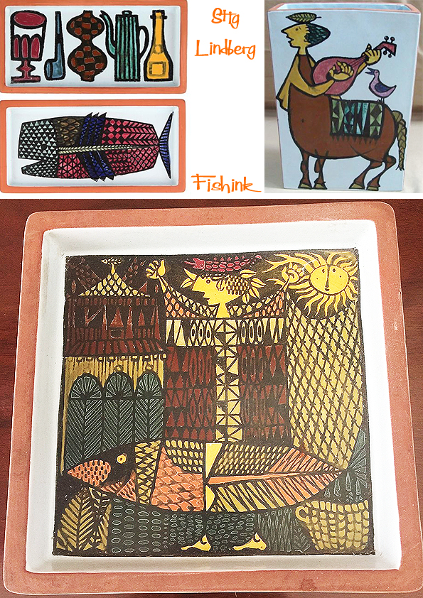
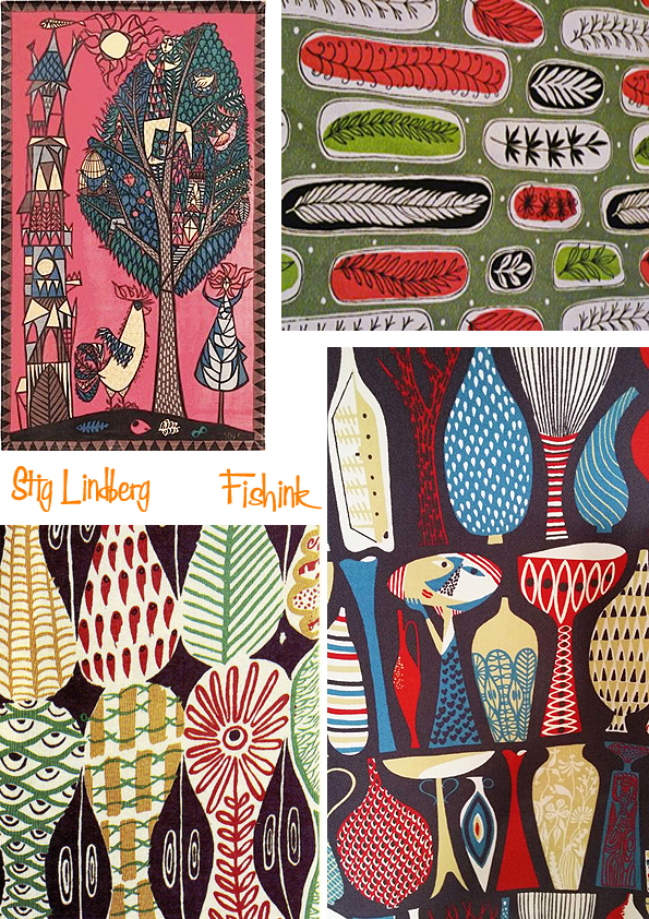
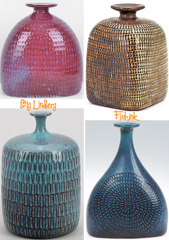
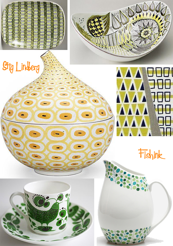
Stig Lindberg More ceramics
I have written before about the wealth of ceramics produced by the talented Stig Lindberg, and as I keep coming across more and more previously unseen pieces, I feel it is time to welcome Stig back into the Fishink blog fold once again!
I came across a fair few of Stig’s drawings. Some of them are quite clearly early ideas for ceramic pieces, which were developed later.
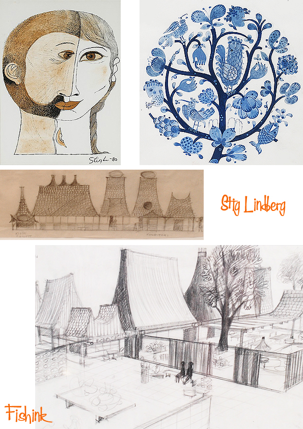
Themes appear again and again. Heraldry, horses, double heads, couples or siblings, mythology and make believe.
I wonder whether these were painted from dreams or just some crazy random thoughts.
Also interesting to see that the same plaque would be painted in different ways. Was this perhaps to make the ceramics feel more unique, to make the range look more varied or merely to keep the artists who painted them all day long, from getting bored lol
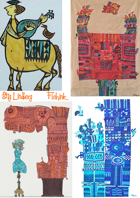
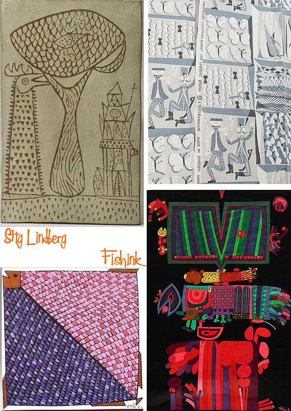
See below, how the knight on horseback develops from a drawing into ceramic tiles.
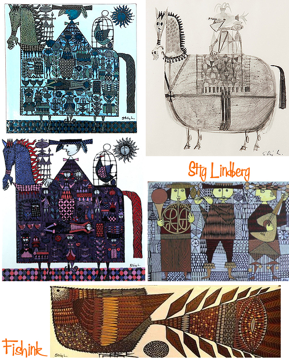
Again the rider appears, and in a variety of colours too.
More double heads.
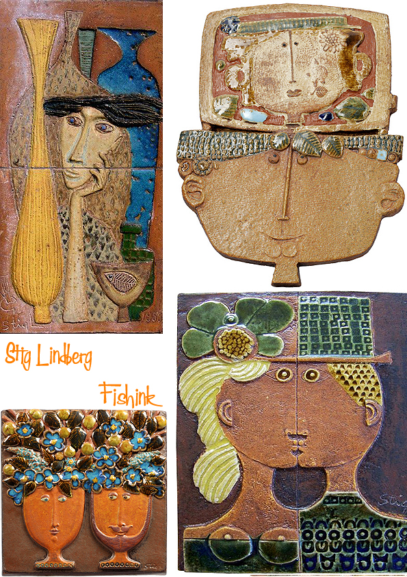
There is something peaceful and joyous about Stig’s work.
His work has gone on to influence so many.
I love these shapes, the curvy elephant with the Ali-baba slippers lol
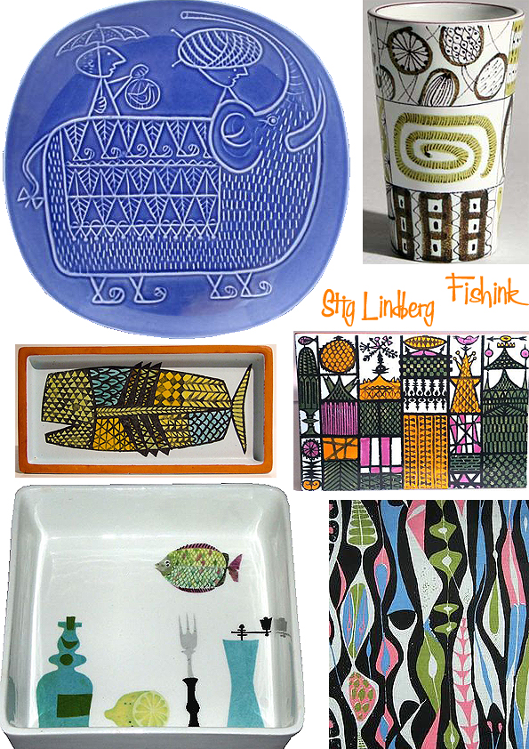
More visually pleasing shapes with textural repeat patterning.
Figurines I’d not previously seen. I love mister bluebird here…
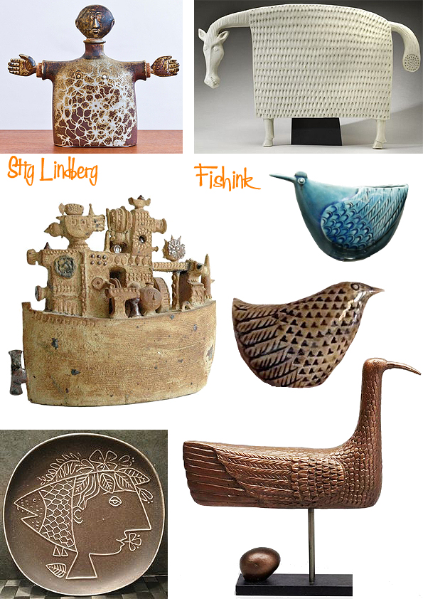
And of course some beautiful all over patterns. Such a talented guy.
What is your fav ? please share, comment and help spread the Fishink blog. Thank you
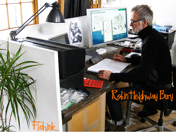
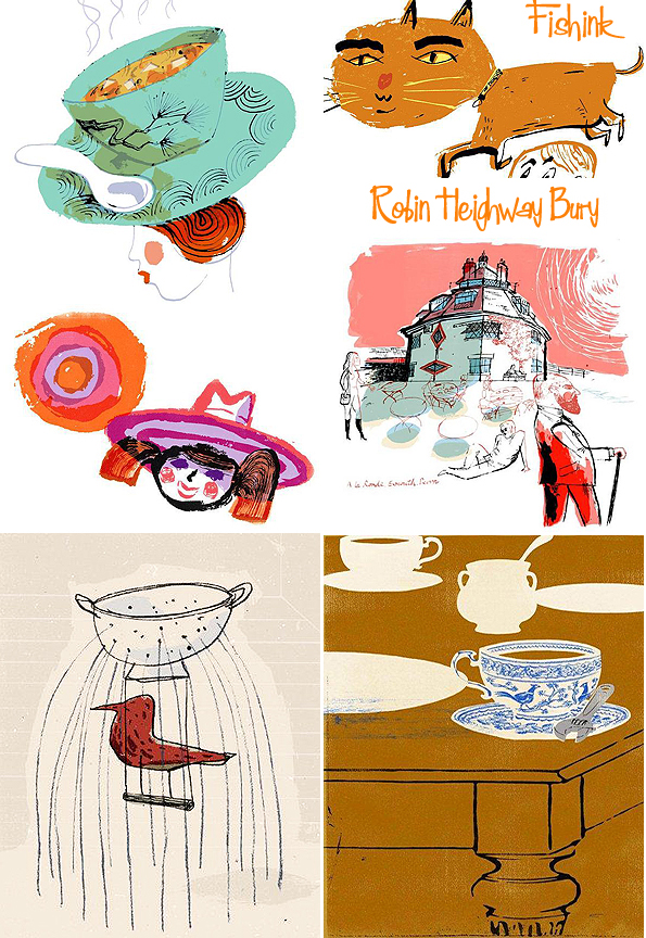
Robin Heighway-Bury
I last posted this in 2018, I think it’s well worth a reminder.
You may well be familiar with the graphic work of Robin Heighway-Bury if you lived in the UK between 1991 to 1994, because he produced ALL of the advertising – poster, press and animated TV ads for Heinz during that time. Which, when you think about a company the size of Heinz, is quite an achievement in itself !
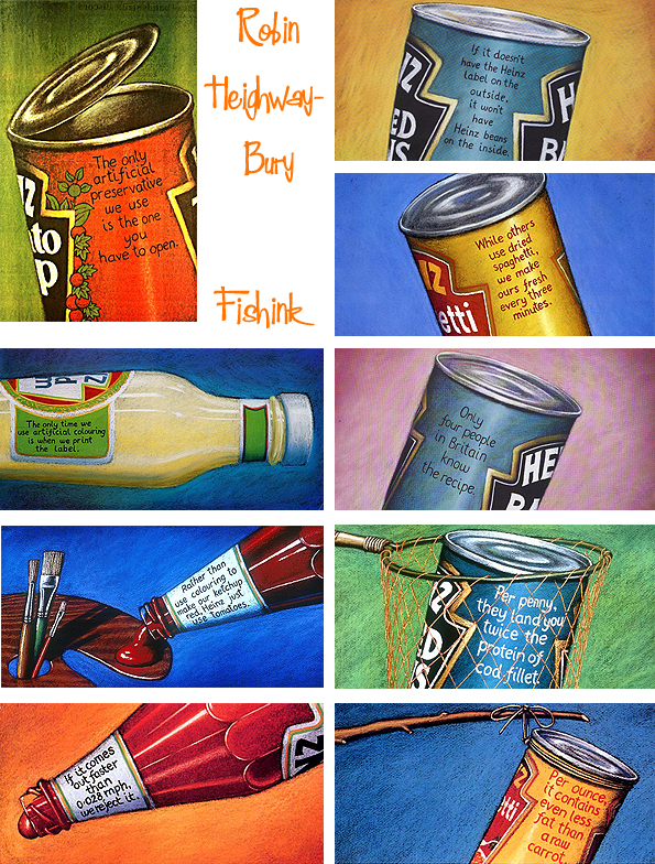
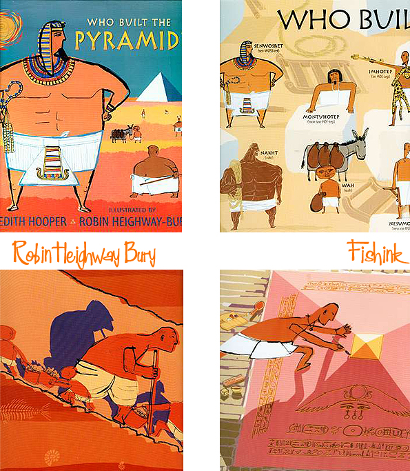
I actually came across more of Robin’s wonderful work by spotting a new book cover (below) he had created for a republished book about the life of the Hare by George Ewart Evans and David Thomson. I contacted Robin to discover more about the man behind the work. He explained that he has produced two more covers in this series that ‘The Leaping Hare’ is from, but they won’t be published until April, so sadly he can’t jump the gun by showing us those just yet.

Hi Robin, your black and white work for The Family, Derailed and in the Eric Newby book (see below), reminds me of a 1950-60 style of working I’ve come across, also used by Graham Byfield (see here https://fishinkblog.com/2010/08/14/picture-this-the-artist-as-illustrator/ ) and Terence Greer ( https://fishinkblog.com/2014/10/31/terence-greer-mid-century-illustrator/ .) Can I ask, when did you create your work and were you influenced or even asked to work using this style at all ? I’m curious if there was London Illustration ‘look’ that was popular at the time, as I guess the retro 60’s resurgence seems to be used a lot now ?

” I’ve been illustrating since 1985 (after brief stints as a lab assistant and electricians mate -that’s a job title, not a social status – and then a few years as an engineering draughtsman. So not a contemporary of the great Terence Greer, or Heinz Edelman, they were prolific when I was a very young boy. My contemporaries were starting out after college around ’85 but I somehow sidestepped that route and got a portfolio together after realising that a more creative application of my drawing skills may be more enjoyable as a career.
Those ’50s and ’60s influences that are evident in my work have appeared more in the last ten years, I’d say. Though I did see Yellow Submarine when it came out at the age of six, so maybe Heinz Edelman influenced me in my career choice early on after all ? ”

” I would say that the majority of my illustration over the years has been editorial, followed by book publishing (covers and one children’s book – Who Built The Pyramid, Walker Books) but I think I’ve covered most areas over the last 30 years or so. ”

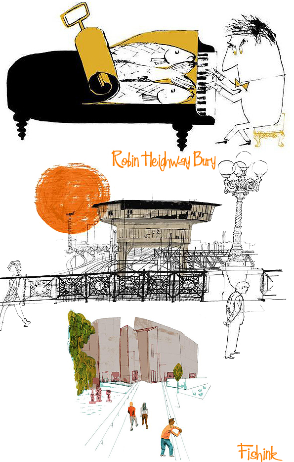
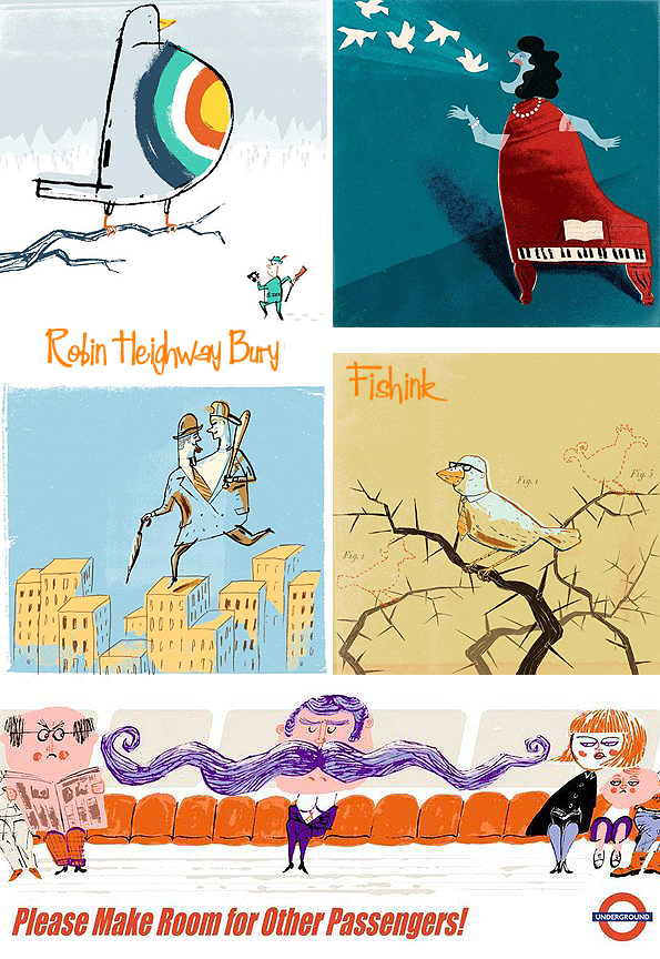
Here’s a special glimpse into his sketchbooks. I’m always fascinated by other artists ways of working.


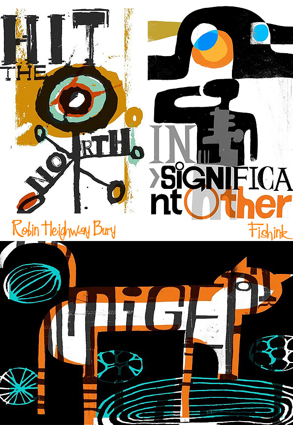


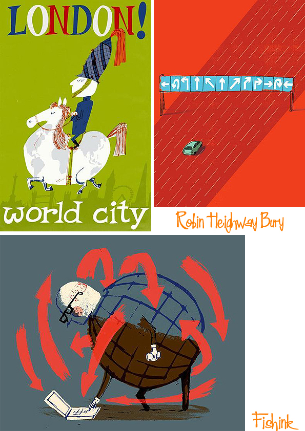
There’s a fab sense of retro that surfaces in Robin’s work.
What has caught your eye today ? Many thanks to the man himself for becoming a part of the Fishink Blog artists. Keep up the great work Robin.
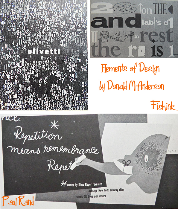
Elements of Design
I came across this book in a charity shop a while ago by Donald M Anderson.

He was born 1915 in Bridgewater, South Dakota, and became an influential artist and designer, publishing such textbooks as this one (‘ The Elements of Design ‘) in 1961 and ‘ The Art of Written Forms ‘ in 1969, whil’st he taught art at the University of Wisconsin, Madison. He also contributed some of his illustrations (above) to the book. He lived to be 80, and passed away in 1995.

There’s quite a fascinating mix of imagery from around the world, it’s interesting to dip into. I’ve pulled out the best to show you today.
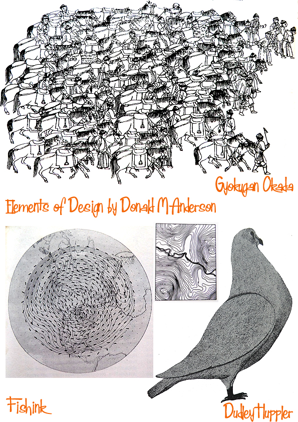
Wind Patterns, designs from nature, repeat elements, etc are all discussed and featured.

Of course with it being a book from the early sixties, there are also some fab cartoon and advertising illustrations.

Olivetti appears a couple of times.

Some intricate designs and details.

More sixties, textural images.

Lovely shapes and scratchy, painterly work here.

Santa is looking very type-festive !
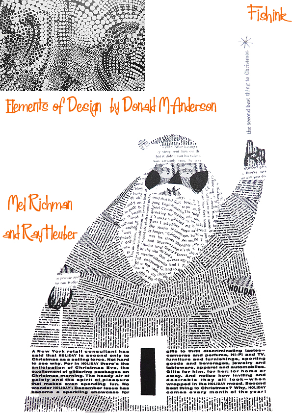
A very enjoyable mark-making ride I’d say : )

What do you think ? Does anyone have any similar books on their shelves they wold like to share with everyone ?
Heatons Arts Trail
Hi Everyone, this weekend (1st and 2nd July) is the most welcome return of the HEATONS ARTS TRAIL.
35 Artists display their work over 8 different venues, for details please visit http://www.heatonsartstrail.com. As Fishink Ceramics, I will be showing work at Venue 4 which is St Paul’s Church Hall, St Paul’s Rd, SK44RY, Manchester.
All venues are open 11am until 5pm both days, free entry. Please drop in for a browse or tell your friends who live locally. See you soon , cheers Craig


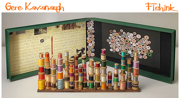
Gere Kavanaugh

This is a post from 2018, today Gere is a fabulous 94 yrs young, enjoy her work and words.
Gere Kavanaugh’s varied output has dubbed her a designer of textiles, furniture, interiors, exhibitions, products, and graphics, as well as an artist and a colour consultant. She’s also channeled a love of letter forms into type design, creating custom typefaces for the Nixon Presidential Library and Museum and Arklow Pottery in Ireland. “I love too many things. I’ll design anything I can get my hands on—just ask me,” says Gere, an active designer at 87 years old, who’s itching for a commission to design a destination tea room or redo the interiors of an airline. “They’re just so boring!” she remarks with her usual affable candor.
Gere’s prodigious and polymathic approach to design began in school. After studying fine arts at the Memphis College of Art, she went to Michigan to pursue a master’s degree at Cranbrook Academy of Art. There, she thrived in the tightly knit studio system, living and creating with fellow students working in ceramics, painting, textiles, graphics, and architecture. At the time, both the classroom and the workplace were male-dominated, but Gere was not to be impeded by this fact. She was one of the first women to go through Cranbrook’s design program, along with mid-20th-century legends Ray Eames, Florence Knoll, and Ruth Adler Schnee. Cranbrook’s staff included strong male and female teachers, and Gere was encouraged by designers such as Finnish ceramicist Maija Grotell, architect/industrial designer Ted Luderowski, and textile designer Marianne Strengell.

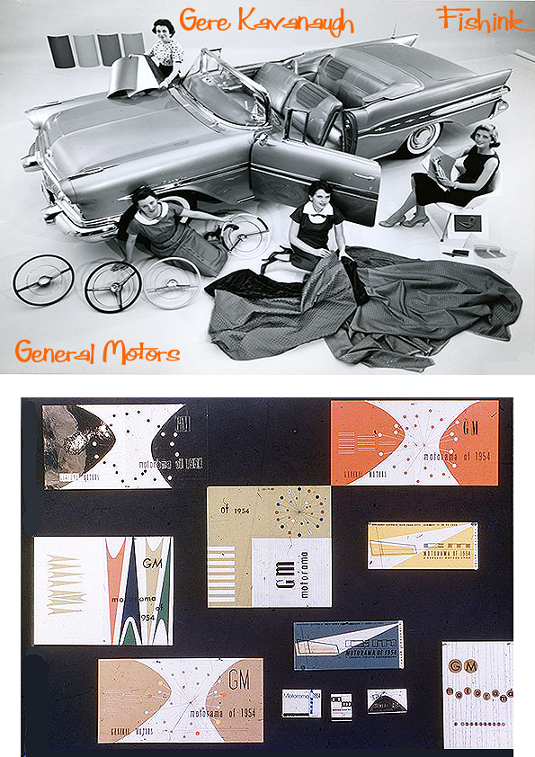
After Cranbrook, she was immediately hired at General Motors. Buoyed by a wave of postwar optimism, Gere remembers this time as heady and exciting for designers, especially those working in Detroit. In addition to GM, design-forward companies such as Ford, Chrysler, Herman Miller, Eero Saarinen, and Minoru Yamasaki were all located in Detroit, then the center of design in America. “There was a milieu—an atmosphere—[where you felt] that by creating better products, you were creating a better world,” she recalls.
Gere worked at GM’s styling studio, equivalent to a company’s in-house design department today. She designed displays, created model kitchens, and would even, at times, work on the interior design of private homes of GM’s top executives. But as part of the design architecture group, Gere’s main focus was designing exhibitions to showcase GM’s automobiles. For one memorable springtime show, she rented 90 canaries and housed them in a trio of 30-foot, floor-to-ceiling columns made of Swiss cotton netting, which hung like transparent birdcages beneath the dome of the Eero Saarinen-designed GM Technical Center. “There were also lights underneath and when you turned them on, the birds would sing.” Gere likes to incorporate animals in many of her concepts, drawing from memories of living across from the Memphis Zoo as a child.
Gere was part of GM’s “Damsels of Design,” the first group of women to work as professional designers in a U.S. corporation, a move championed by GM’s legendary design director Harley Earl. The “damsel” moniker concocted by the company’s public relations department didn’t always sit well with her, and she wasn’t interested in fueling the raging narrative about sexism and feminism. Her mindset is that of a humanist.
In 1960, after four years at GM, Gere accepted a design position at Victor Gruen’s—known as the father of the shopping mall—architecture firm, first in Detroit, then in Los Angeles. She flourished in Southern California’s creative climate and enjoyed great freedom in her new role, working on interiors of retail stores and shopping centers across the country. Following Gruen’s vision of recreating the atmosphere of European town centers in suburban America, also designing the first town clocks at shopping malls as public meeting places.
She also forged a lifelong friendship with her colleague Frank Gehry, a relationship that led her to venture out on her own. Gehry and his design partner, Greg Walsh, invited her to split the $76 per month rent for a bungalow in Santa Monica that was so small they used the bathtub as storage for their drawings. After moving to a bigger space years later, the Frank-Gere-Greg trifecta was joined by Deborah Sussman and Don Chadwick, best known as the co-creator of the iconic Herman Miller Aeron chair.
With the support of her colleagues and champions, the “unique, multi-dimensional design firm” Gere’s designs excelled. Her client roster has grown to include Pepsi, Hallmark, Neutrogena, Max Factor, and Isabel Scott Fabrics, who hired her to help set up an ikat silk weaving factory in South Korea.
Working with the patio furniture company Terra in the 1970s, she invented the now ubiquitous market umbrella, at times referred to as the “California umbrella,” a design she was unable to patent because it had “no unique patentable parts,” she explains. Frustrating dalliances with patents and copyrights throughout her career have informed her efforts to help Cranbrook establish an alumni product archive, a place for alums to donate a design or artwork that companies can reproduce and pay royalties directly to the school.

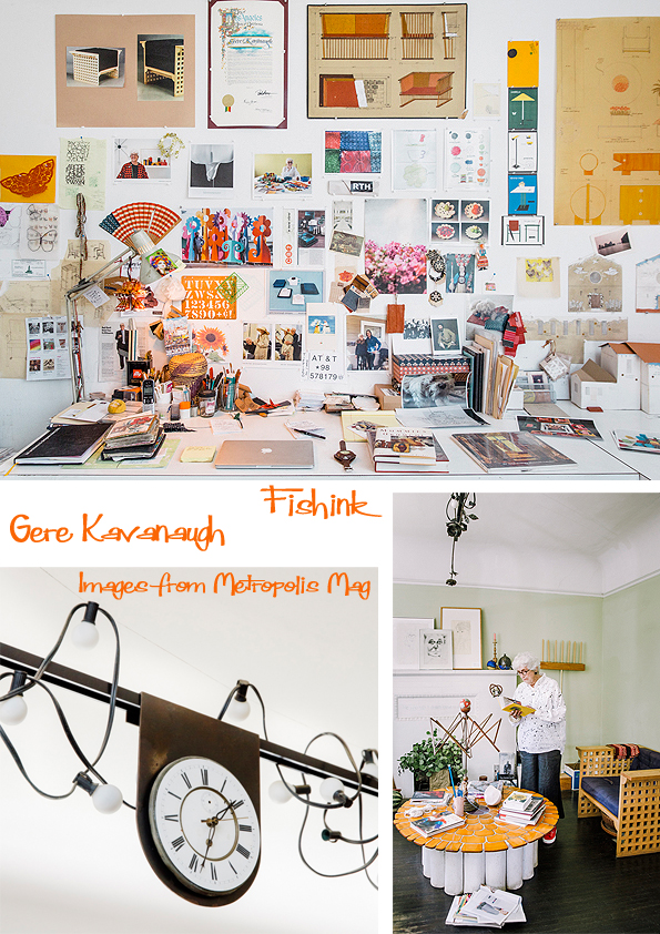
Reflecting on how design students have changed since she was in school, she observes, “We’re living in the most exciting age that we can ever live in and have more disciplines to draw upon to produce our work. But you have to be smart enough to figure out the best tool to produce what you’re thinking. And this the students are not doing today.” She’s talking about using one’s hands for more than clicking around a computer’s track pad.

For Gere, her hands are still the best creative tools she owns—as they’ve been since she started doodling as a child. “Working with your hands teaches you about your inside person,” she says, and at 87 she must know a little more than most of us.
Many thanks to Anne Quito for her biography on Gere, and the information used in today’s post.
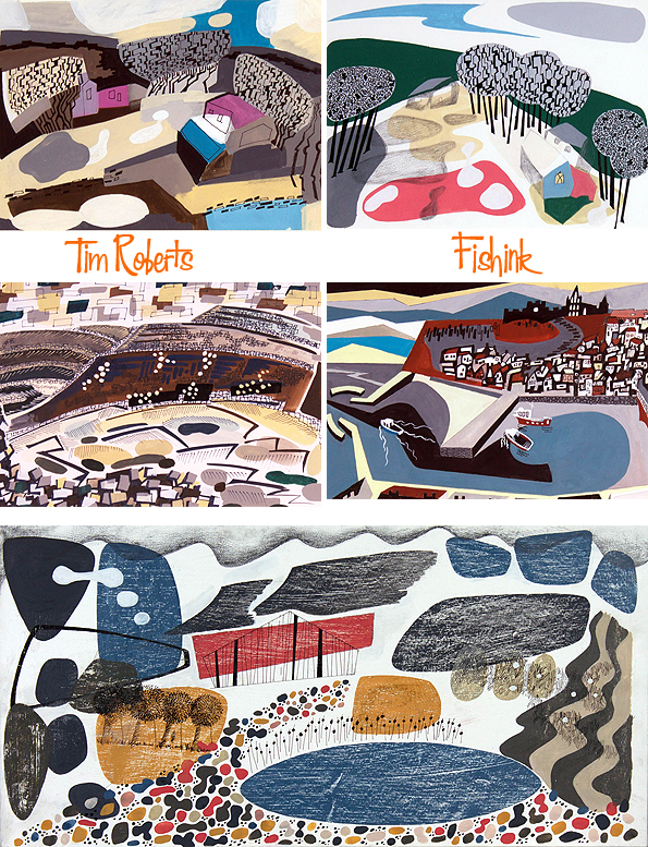
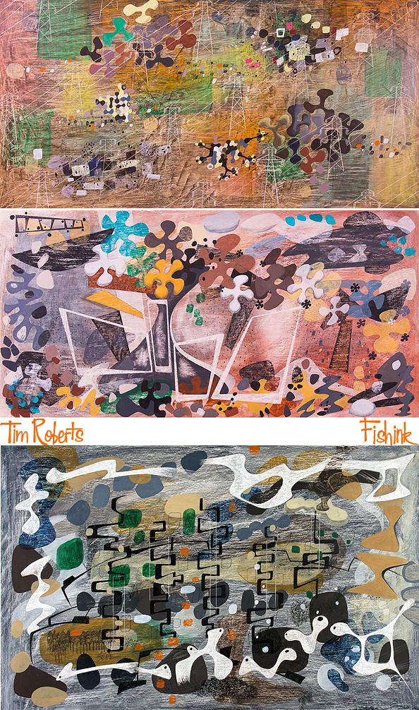
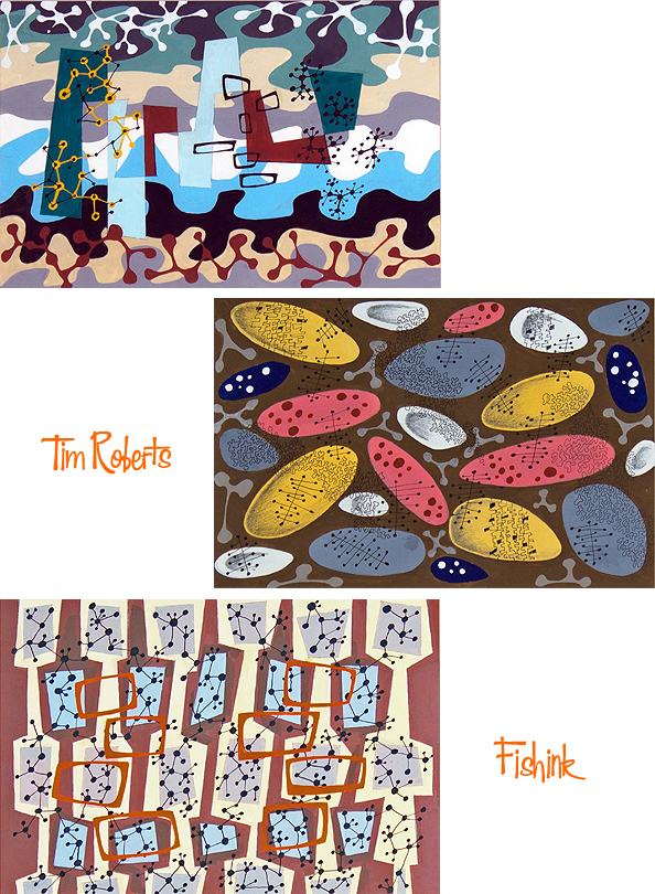
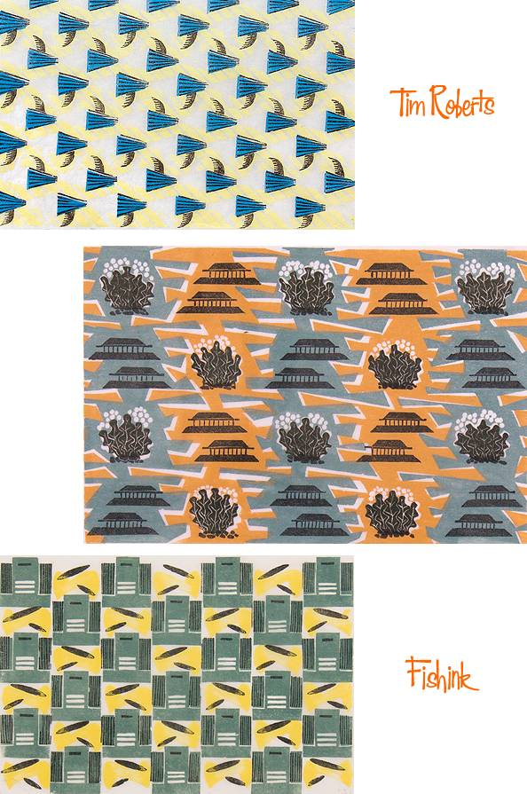
Tim Roberts Contemporary Retro
Tim Roberts studied fine art at the Sir John Cass School of Art and then at Chelsea School of Art back in the late seventies before taking a thirty-year career break, returning to full-time painting about six years ago. Describing himself as a continuing Modernist, his work for me conjures up motifs and an artistic ambiance of creatives like Paul Nash, Eric Ravilious, Barbara Hepworth, Enid Marx etc, but with his own personalised twist.
A new way to look at what’s gone before. I contacted Tim to discover more about the meaning behind his work.
When did you first get interested in art ?
Difficult to say when I first got interested – the stock response is to say I’ve always been interested. I do remember always making things; models, lead soldiers, wood and paper gliders, powered model aircraft etc – so maybe that making thing just got focused into painting. I remember doing art at (Catholic, boys only, grammar) school off my own bat – in addition to the general curriculum – as it wasn’t considered a ‘serious’ subject. Going to uni and meeting a lot of people who were interested in art and had a lot to say about it opened my eyes a bit. I probably spent more time drawing and painting at uni than studying my chosen degree subject (Eng. Lit and philosophy.)


How would you describe your style of paintings ?
I suppose I would tend to describe myself as a Modernist even though for most of my formal art education (John Cass and Chelsea) this was an invisible and almost unknown strand of British art. At the time we were far more concerned with current (seventies) US and European practices – Minimalism, structuralism, post structuralism, post pop – a lot of post-stuff. Say what you like about the YBAs, they did wrest the control and direction of art praxis in the UK back to a more domestic agenda, For good or ill.

How did your interest with fifties and sixties motifs develop ?
I became interested in British Modernism later on after discovering the astonishing 1920s generation of Slade school artists – Nash, Wyndham Lewis, Spencer, Wadsworth, Bomberg, Piper, Nevinson et al. This rather undermined the accepted art establishment view that in general and with few exceptions – Turner, Blake, Gainsborough – the Brits rather punched under their weight. Certainly there was a prevailing feeling that in terms of what was going on, British Art was, at best, a sideshow. For me, the cut-off point was the Pop generation of the sixties who started to look towards the US for their subject matter and to Europe (Situationism, Fluxus, COBRA) for their modus operandi. I wanted to – not return to- but pick up from where the Modernist movement left off. I was particularly concerned with an aspect of British art that had almost completely disappeared: the ability and facility of artists to segue from one discipline to another and not be trapped in their own pigeon-hole.. It seemed the norm for painters of the pre-war period to try their hand at illustration, book, theatre typographical, fabric, theatre design as well as a host of other related disciplines. I think that this holistic approach to artistic enterprise produced a body of work that has yet to be generally recognised as one of the crowning achievements of any national art movement.
Not quite the answer to your question, but I was trying to distill the motifs and the ethos of that period and use them to produce work that stands on its own – without the crutch of a borrowed and pre-validated aesthetic. It’s for you and others to decide if that works.

When you are creating a new piece of artwork, do you work from drawings, photographs, a feel of a place or are the paintings more abstract. I feel some are almost dreamlike !
I can see developments in your work when I look at them all together..( i.e. more use of identifiable objects in your later work than around 2009.) Was this a conscious way of working, or is it more a development of your style and perhaps emulating work that you’ve created that has pleased you in the past ?
I think all painters plagiarise their own work to a greater or lesser extent. I am fortunate in not having commercial or social pressure to produce a large volume of work although some days it would be great to go into the studio and just get on with making. Having the time to worry about every piece of work you make, means that you do. I would love to be able to roll out the same painting over and over again (with minor tweaks, of course) but I find I am not temperamentally suited to that. I suppose I believed naively, that it would get easier as the years progressed, but it doesn’t.
You have a number of handwriting styles, loose paintings, tight and controlled printwork and a keen eye for detail. Would you say that the different areas of work you create allow you to use a variety of skills and interests ? Which in turn helps to keep your work fresh ?
I think of painting as an area of experimentation, of play and improvisation. I quickly get bored with a canvas if I am reproducing something or working by rote. There has to be an element of risk – of skin in the game – a feeling that the next mark could bring the whole thing crashing down. It often does, so it is equally important that the painting provides a commentary on its own history – a palimpsest where marks are made and destroyed or incorporated but leave their own shadow. Unlike other media – film, theatre, music, literature etc – painting is not time-based, you get the whole thing in one go. It is my hope that the layers of marks and paintwork reintroduce a time-based element to the work. If painting is an area of play, printmaking is almost its polar opposite requiring every component of the piece to be conceived and constructed at the outset. The very different techniques and approaches required by these disciplines do complement each other.
Which artist would you say influence your work today.. if any ? Who’s work do you most admire ?
Who do I admire? If you mean in general I would say it’s the generation listed above with Paul Nash being the key stand-out figure for me. Not particularly for his painting – the recent disappointing retrospective showed him to be rather limited if you ignore his outstanding wartime work. Again that show didn’t do justice to his graphic work, book designs, illustrations, end papers, fabrics etc nor did it bring out his fantastic work in mentoring a generation of artisan/artists that are only really now finding an appreciative audience: Ravilious, Bawden, Freedman, Marx Angus et al. Of contemporary artists, I was encouraged by the aforementioned Rose Wylie as much for her attitude as her actual work.


What part of the painting process do you most enjoy ?
The most enjoyable part of the process is pulling a painting out of the rack six months down the line and thinking that actually some bits aren’t as bad as I thought. I don’t tend to finish paintings as much as give up on them. Usually by that stage they have diverged so much from my original intention that I can find no way back, Time to start a new one. It usually takes a while to forget what I thought my original intention was, by which time the work has established a life its own independent of me. Some of course are irredeemable stinkers and stay in the pile!


