Pat Prichard Part 2

Welcome back to part 2 of this feature about 1950’s illustrator Pat Prichard. She is best known for her handkerchief designs. She also designed a wide range of household linens. As with many handkerchief designers from this period there appears to be so many subjects to select from when coming up with new design ideas.

The kitchen, cooking, condiments, dressmaking and even keep fit !

Statues, clocks and angels, even angels in the kitchen !


Jars of sweets and goodies, as well as spices and adult beverages.
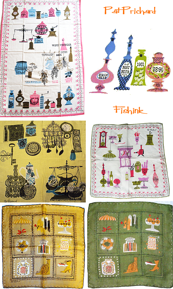
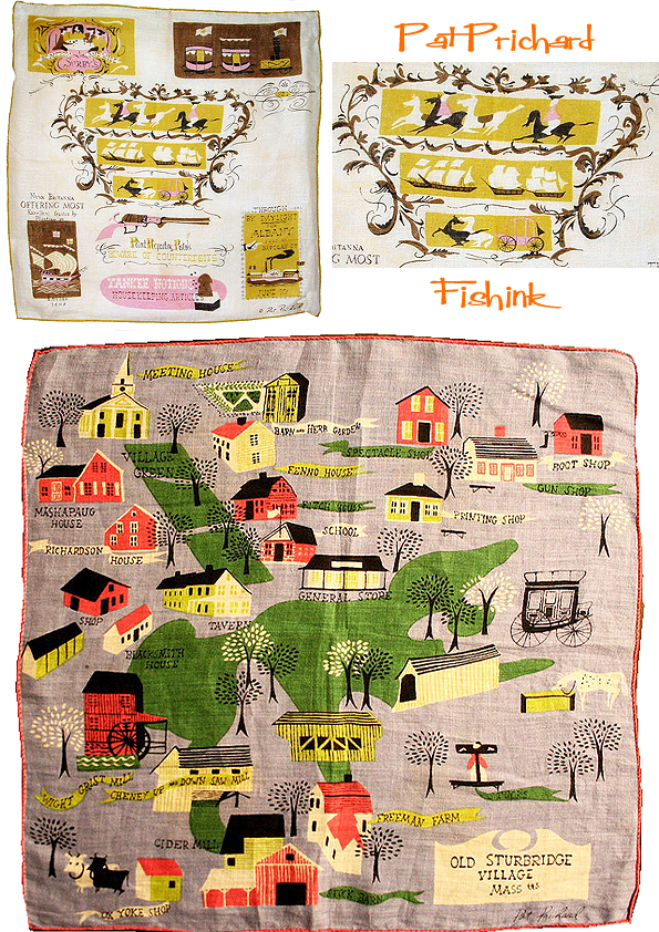
Maps, modes of transport, local and foreign travel. I love the plan of Old Sturbridge Village and her depiction of Venice and Pisa.
Lovely colours.

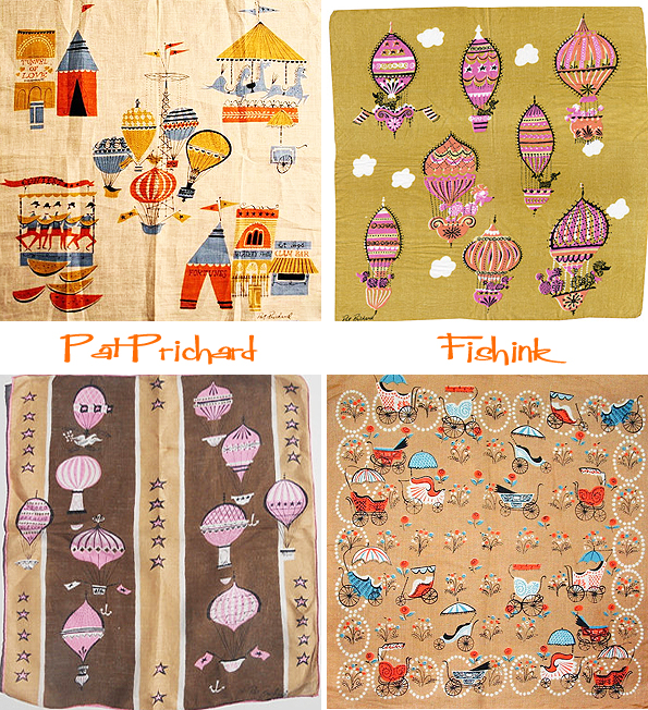
I do find some of the subjects quite unusual for a handkerchief, like these amusing hot air balloons. It makes me wonder whether these were decorated as talking pieces or just to have some patterning on them. I also would have loved to know which were the best sellers and which didn’t do so well : )
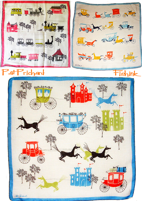
I wonder if ‘Cinderella’ influenced some of these more elaborate carriages ?
In addition, Pat designed dinnerware for Salem China Dinnerware and provided illustrations for print advertisements for companies such as Italian Lines.
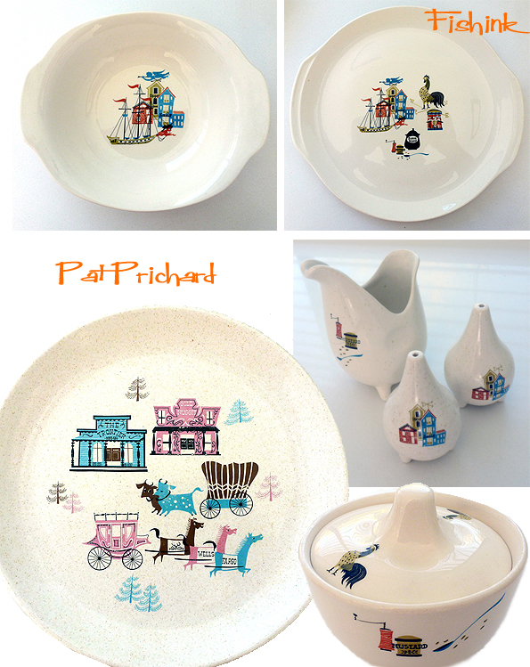
Such a talented designer with a great eye for colours, composition and contemporary fashions. Wonderful work. If anyone has more information about Pat, please drop me a line.
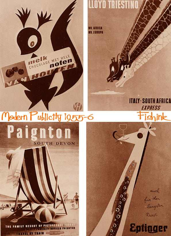
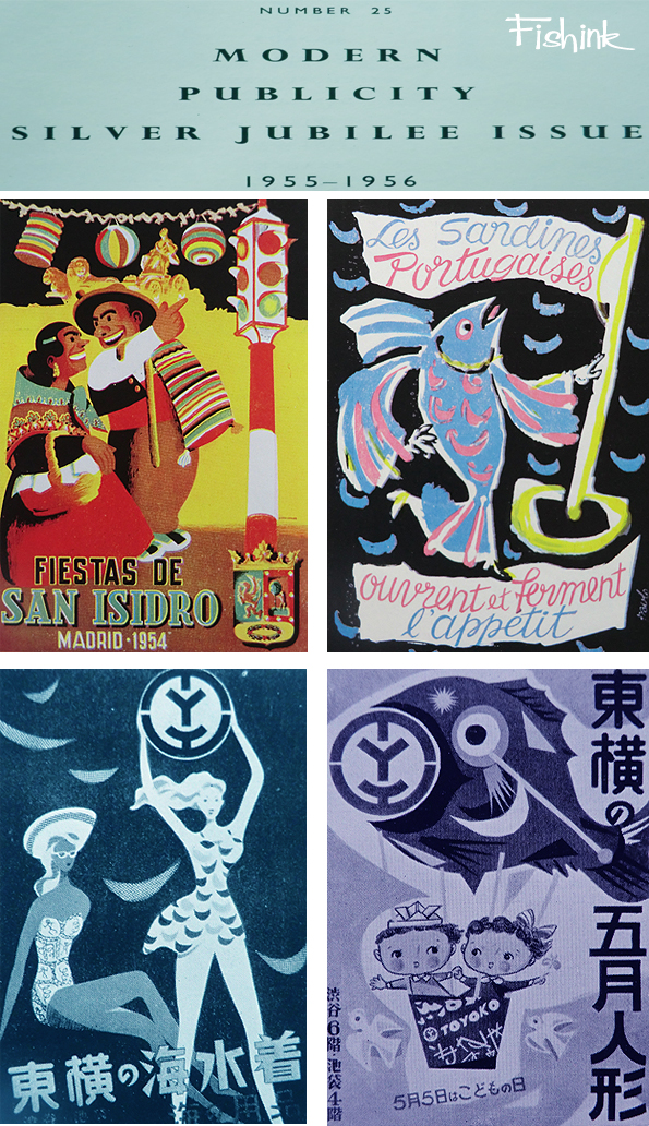
Modern Publicity 1955-56 Part 3

This is the third post taken from the annual Modern Publicity publication. These are from the 1955-56 collection. I’ve coloured some of the black and white images to lift them a little. Many depict figures or animals or sometimes both.
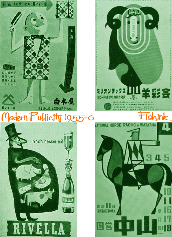
Wonderful use and consideration for shape here.

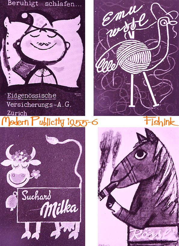
Happy animals to inspire you to buy chocolate or visit Africa : )
These wolves are amazing and the cat with the roller coaster tail is very close to home for me.
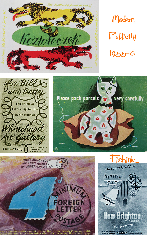
Adverts to make you smile for certain, although not sure about the smoking horse !
I was memory jogged (above) by the series of Posters that Tom Eckersley designed for the Post Office to instruct people to package fragile items properly when sending them through the post. Judging by the number of variations, they had a lot of breakages back then ! More about this on the fab Quad Royal site.

More from this Modern Publicity publication to come too… watch this space !
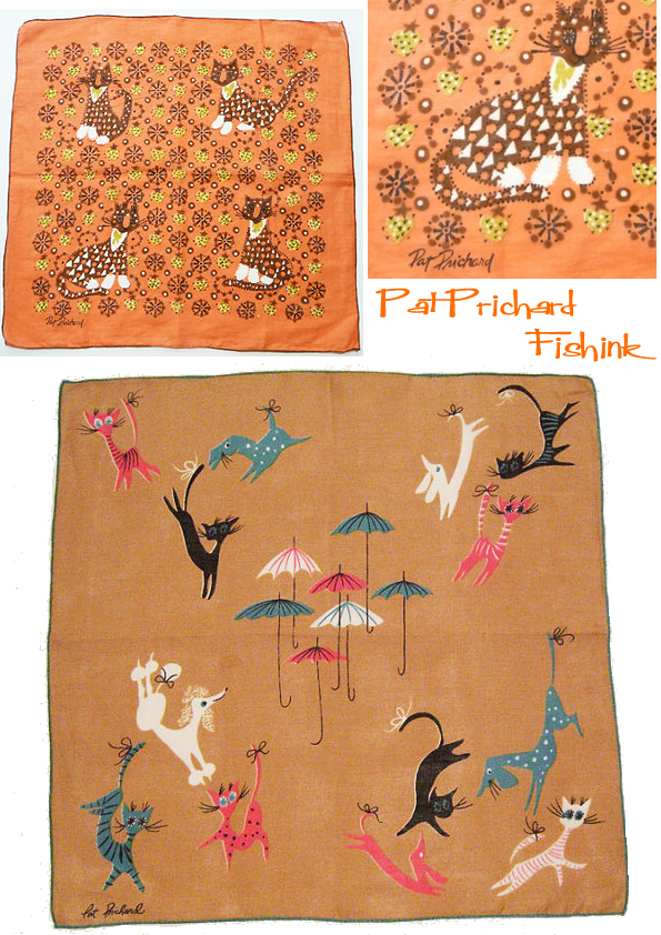
Pat Prichard Part 1
Welcome to part 1 of my feature about 50’s and 60’s textile illustrator Pat Prichard. Sadly there isn’t very much written on the internet about this inspirational lady, who like Tammis Keefe and Lois Long produced many (hundreds ?) of designs during her time as a creative.
I find her bird and animal designs amongst some of my favourites.

As with Tammis’s designs, Pat’s hankies were produced and marketed by J.H. Kimball & Co. Some of her hankie designs were repeated in scarves also bearing her signature. She also designed handkerchiefs for Franshaw.

I did a little research and discovered a great article in the Corsicana Daily Sun Newspaper, Texas in 1956. Here Pat is quoted as saying : –
“A hankie in the springtime is for show, not to blow. Which means you should pick handkerchiefs by colour to complete your spring outfit”, says Textile designer Pat Prichard. Miss Prichard doesn’t believe In using spring handkerchiefs on your nose at all. She advocates starching them lightly and wearing them as colour accents on belt or bolero. The young, blonde designer has created some handkerchiefs specially to contrast with spring suit, colours of navy and beige. Miss Prichard’s 15-by-15 inch handkerchiefs (for J. H. Kimball) feature mint green, beige and lemon yellow. In monochromatic patterns or against white backgrounds. She advises mint green hankies peeping out of jacket pockets or tucked in the belt of beige and navy suits, and beige or lemon yellow for navy outfits. So what happens to the ensemble if you suddenly have to blow your nose? “Nothing,” says Miss Prichard, “For that. you use tissues !” So now you know ; )


There’s a great article about Tammis Keefe over on the Making it Fun site, which gives more of an insight as to how these designer like Tammis worked during the mid century years. Don’t miss part 2 of Pat Prichard’s work here on friday.
Sale Arts Trail 2015 Day Two
I’m really enjoying taking part in the Sale Arts Trail this year, one day down and one to go today. I must say there’s a lovely ‘buzz’ about the people coming to view the work and from the other artists taking part. It’s friendly, people are interested, they ask questions and are walking around with a myriad of brown paper bags containing all manner of artistic goodies : )
My neighbours Nell Smith and Jo Lavelle, are selling screen printed illustrations and jewellery in a lovely cafe called Coasters on Northenden Road. My fellow artist in Minikin Emporium is Scott Millar, who has a lovely selection of (sadly extinct), mounted bird- heads. Pun not intended but they’ve been so popular that Scott experienced a ‘rush’ of sales yesterday which has made his birds extinct once again ! I think he’ll be taking commission orders today.

Scott, who can be contacted through his Etsy site here, has a new arrival which premièred yesterday… the Dodo !
I must say he’s been very well received.

Finally a brief look at my work, yesterday pre sales. I have a few gaps to fill today to make it look presentable again : )

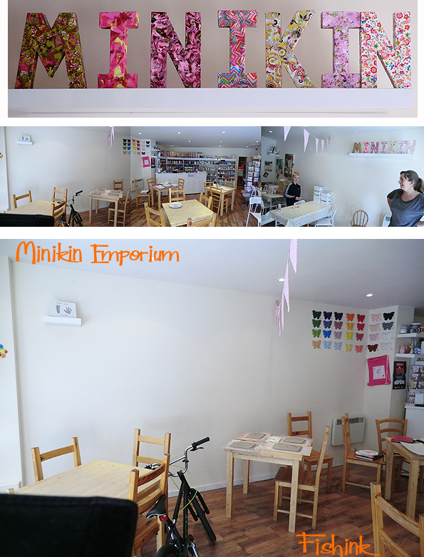
Pop into Minikin Emporium, paint your own mug or pot, have a browse or just say hello … we’re a friendly bunch. Open 10 til 5 today or check out the exhibition at the Waterside Arts Centre until August 9th.
Sale Arts Trail.. All set up
Wow, it’s surprising how long setting up even a small exhibition takes. Two hours later and we’re good to go with thirteen illustrations on the wall.
I’m taking part in the Sale Arts Trail which is on (tomorrow) sat 11th July from 10- 5pm & sun 12th July from 11-4pm.
I’ll be in ‘Minikin Emporium’ on Northenden road (venue D check out the Map ) and discover the work of 50+ artists all taking place in shops, cafes and homes across Sale, Manchester.

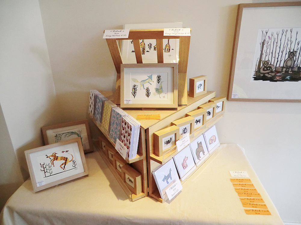
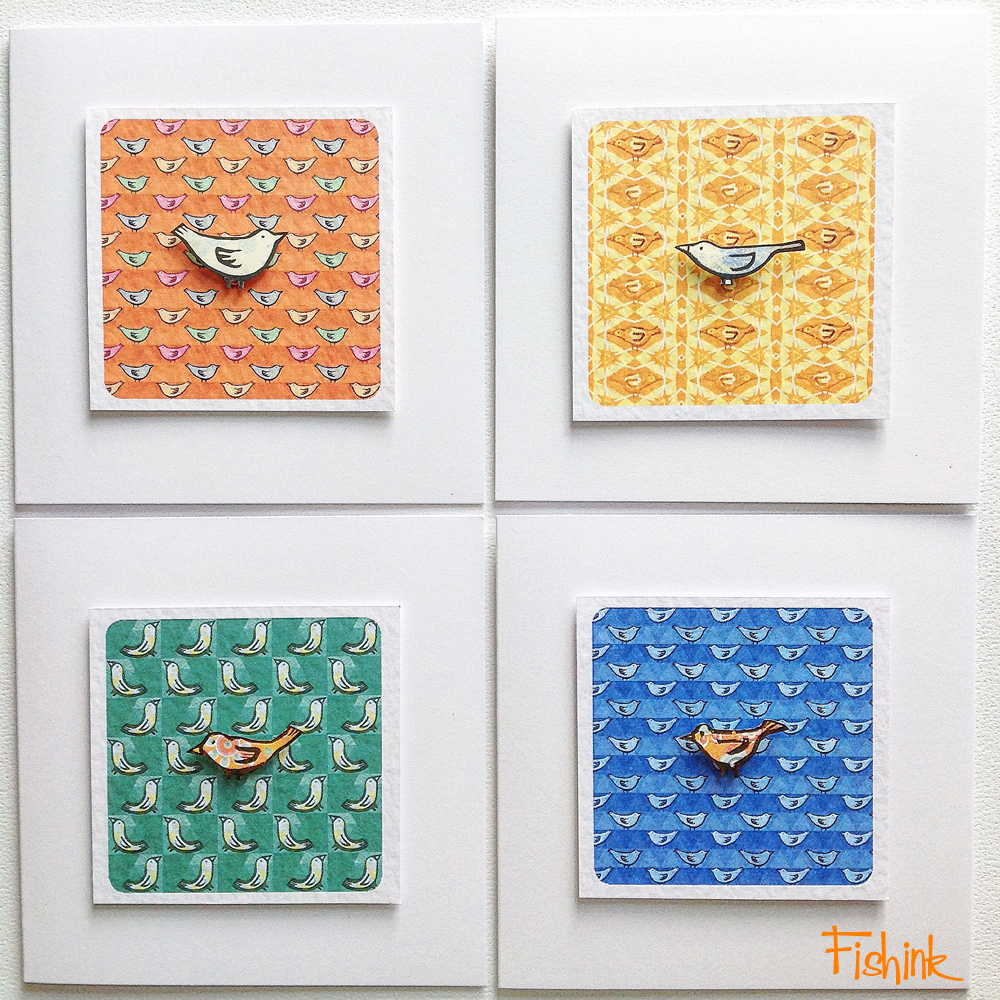
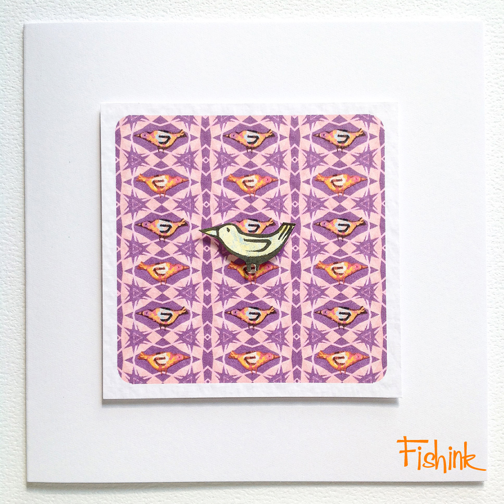
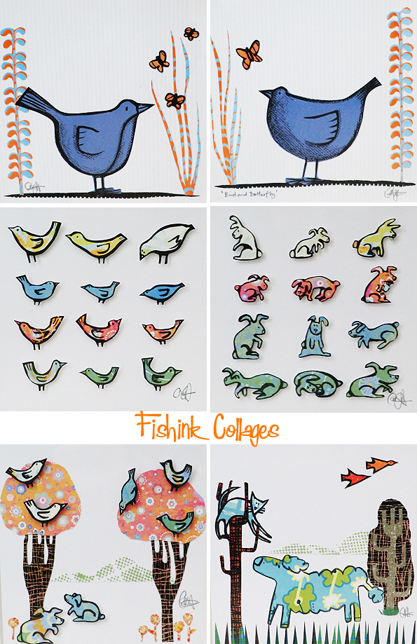
I’ll also be showing a very small collection of new cards, all hand-made with layered collages, mounted over my own textile designs.
Please pop in, like, RT, share and spread the news. Look forward to meeting some new faces over the weekend too.
 It’s the Sale Arts Trail this weekend Woo Hoo !
The shop that I’m displaying work in, will be open 10am – 5pm Saturday and 11am – 4pm Sunday. I’m at Minikin Emporium, 11 Northenden Road, Sale, M332DH on both days with a selection of work on this blank wall below..on the left… assuming all goes to plan today, whilst I’m putting the work up ! (flippers crossed).
Here’s a few more framed prints that I’ll be taking along with me.

I’ll have a full range of items such as hand-made cards for £2.50, notebooks at £4 and framed original artwork from £12 – £100, so something for everyone’s pocket.

Please spread the word, come and view over 50 artists work alongside my own, in venues around Sale for the weekend and a combined exhibition of everyone’s work, at the Waterside Arts Centre until August the 9th.

Here is a little Q&A session I did earlier for the Sale Arts Trail, giving a little more information about my work.
Last weekend, I looked at other people’s work….

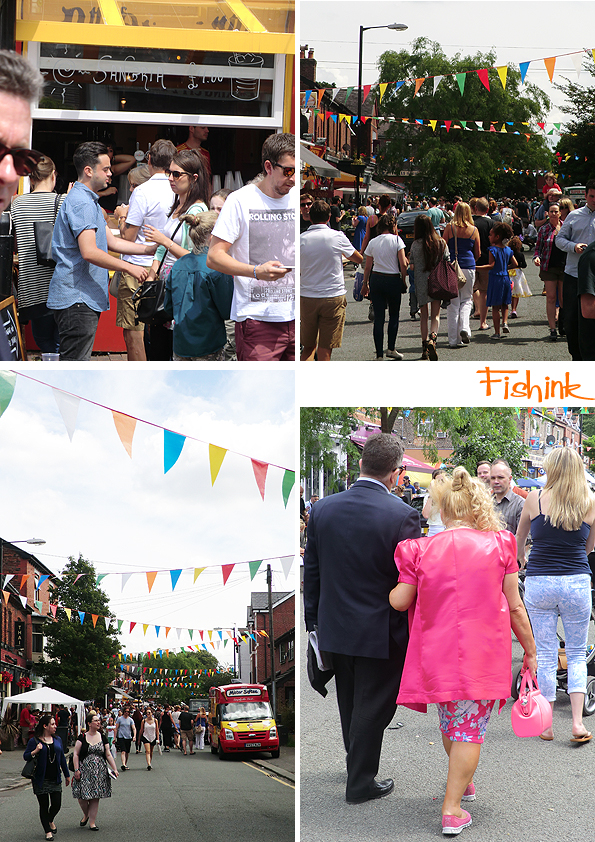
Just around the corner from our house is a lovely buzzy little place called Beech Road.
Where you can find, a selection of wholesome restaurants, quirky bars, gift shops deli’s etc. Once a year they shut off the street and hold a Festival. This year it was on Sunday, a day of half baking sunshine, t-shirt and shorts kind of weather, and the other half of cold torrential (soak you through to the skin) downpours. Luckily we picked the sunny half to explore the festival!
Lots of colourful characters, a great selection of food and drinks to sample …
even the next potential boy band !
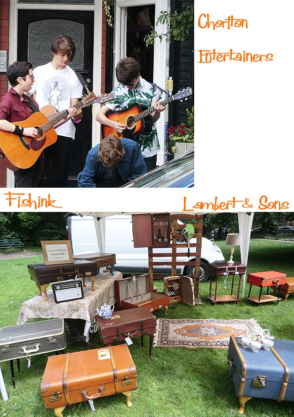
Lambert & Sons have the skills to re-purpose furniture or more specifically suitcases and create very individual tables, hampers and bathroom cabinets.

Laura Nathan had a beautiful collection of paper stitched art and printed cards. I couldn’t resist one of her Hares, and a photo of these wild Elvis shoes from another stall. The blue suede ones must have all sold out !

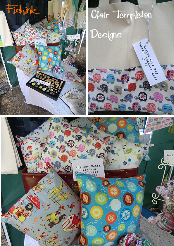
More eye-catching goodies on Clair Templeton‘s stall. Cushions, cards, tote-bags and even doggie-bandannas. (No I resisted )

Lastly you can see my exciting bargain-finds of the day below. The Whitefriars glass vase has a tiny, tiny (I mean you can’t really notice it) chip and the Staffordshire Cat bookends are crackle glazed, but in top condition. Would you believe that all of them set me back just £6 ! Unbelievable, I was a happy soul. I hope everyone didn’t get too wet during the afternoon and had a successful day, thanks again for letting me take photos of your fabulous stalls.

Look forward to seeing you all at Minikin Emporium (Venue D on the Map) in Sale this Saturday and Sunday along with Scott Millar’s lovely Birds, do call in and say hello.

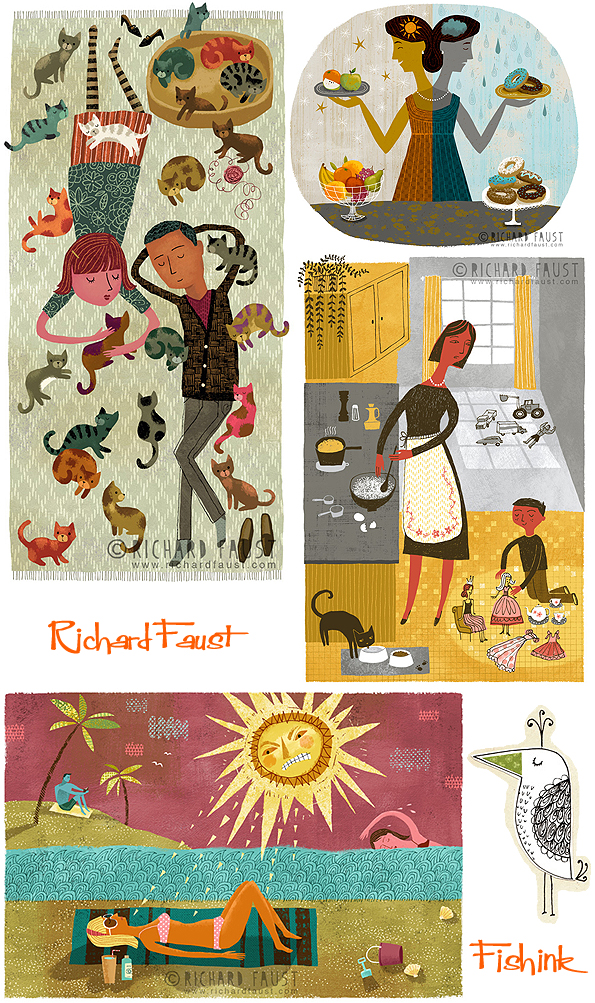
Richard Faust Fun Flights of Illustration
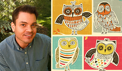
Many of the finished illustrations by Richard Faust begin as doodles from his journal.
His quirky style is influenced by hours spent at vintage shops and flea markets hunting for mid-century oddities. “ I like to get ideas from weird and wonderful junk because it reminds me not to take my work too seriously ”. To stay loose and inspired, he also paints large abstract paintings using acrylic paint with collage for the gallery market. He likes to create illustrated ‘Zines’ (self-published street magazines), and he‘s pretty awesome at singing karaoke.
After completing his BFA at The Columbus College of Art and Design, he spent twelve gratifying years illustrating in the American Greetings Design Studio. These days, when he’s not doodling in a local coffee-shop, he works in his cozy home-studio that overlooks Lake Erie in Cleveland, Ohio. What a lovely sunny room.

I emailed Richard to find out a little more detail behind the fab illustrations.
What are your earliest memories of drawing and what do you most like about illustrating for a career ?
As a kid, I would draw what I was most interested in. If I saw a movie I liked, I would draw the characters over and over again. I’d obsessively doodle and make things from whatever I could find around the house. There was never a time when I didn’t know I would be an artist. It became so woven into my identity that it stuck with me, even during the years I struggled to make a career out of it.
Now that I’m more established, my goal is to connect my personal work with the work I do professionally. I’ve learned that if it’s important to me – if I have a strong point-of-view about a subject – then it will resonate with people. That’s what I like about doing this as a career. I get to put my whole self into my work.

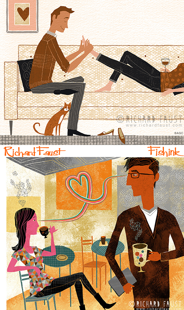
Your work has many different styles, decorative, graphic, floral, real and imaginary, animalistic lol. Which ways of illustrating appeals to you the most and why ?
It was a challenge to figure out what kind of illustrator I want to be. It took years and I’m still figuring it out. I think clients need to be reasonably certain of the kind of illustration they’ll get when they trust you with a project. So, I had to learn to be true to my core aesthetic even as I branched out into different areas. It helps to constantly ask myself “Does this look like me?” before I send off a finished job or add a piece to my portfolio. With that in mind, I try everything when it comes to subject matter for my illustrations. I focus on what’s right for the job – what tells the story – but always try to put my stamp on it.
Are there ever commissions that come along that you feel don’t quite sit with the work you would like to do ?
When I get a job that’s not exactly glamorous or particularly interesting, I try to find something to like about it and build from there. Sometimes, if the client is flexible, I offer suggestions for a new approach. Chances are, if it feels wrong-headed or pointless, there’s a better solution out there. I think it’s important to improve the final result and give the client more than they expected.
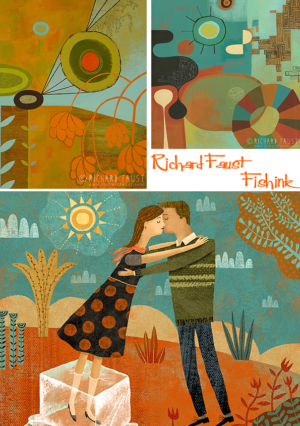
I really like the textile / decorative /ornate elements in your work. Do you see pattern as an essential part of the work you produce ? How did you come to develop this way of working ?
I create dozens of hand-drawn and digital patterns, then print them out so I have plenty of collage materials. This way, I get the patterns I like and don’t have to worry about copyright. Then I’m free to paste scraps in my journal, in paintings, or utilize the patterns digitally as I’m working in Photoshop.

I can see your designs interpreting well into textiles and surface pattern areas and of course onto fabrics, have you ever thought along those lines ?
I’ve been working with a licensing agent for the past couple of years to help me find opportunities in those areas. I occasionally create ensembles that can be used on merchandise or wall art. It can be a slow and complicated process to license artwork, but possible deals are always in the works. I try to focus on creating my best work and leave the rest to the experts!
Where would you most like to see your work and in what markets ? (children’s books, cookery, giftwrap/stationery etc ?)
It’s hard to predict or control what unique projects might come along. I never know if it’s going to be a beer can design, or a mural, or a re-useable grocery bag. I would eventually love to illustrate a book cover for one of my favorite authors. And while I’m dreaming, a New Yorker cover wouldn’t be bad either. I honestly take pride in even the smallest spot illustration though. It’s always a thrill to see my work when I go to Target or browse a magazine rack. That never gets old!

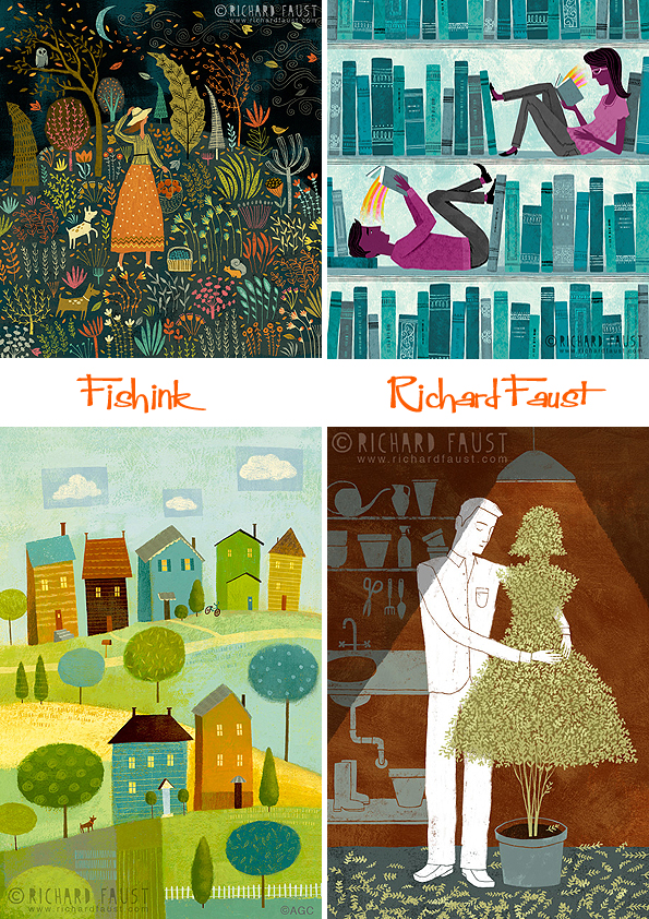
Lovely soft muted palettes here.

I see that you use sketchbooks a lot and like to do a doodle or three when you have the time. How important for you is working in this way ?
My journals have been a critical part of my daily routine and process for many years. It gets me out of my home-studio and gives me an excuse to overspend on good coffee. It’s a no-judgement zone where I’m free to write about my life, sketch ideas, make messes, and tell the truth. I think it’s important to have a place to put the questions, the bad ideas, the awful drawings, and the experiments. It’s a good way to shut off my impulse to pre-judge my work or talk myself out of trying something new.
Do you have a preference when choosing whether to work digitally or to produce work by hand ?
I need a balance of both. I have a computer desk on one side of my studio and a drafting table on the other. For my editorial illustrations, it makes the most sense to work digitally, but I usually scan a drawing or painted background to get started. Some days, I like to get my hands (and entire studio) dirty by working on large paintings or mixed-media collages. By working traditionally, I discover happy accidents that I can use later when I’m in front of the computer. I also try to give my computer-generated illustrations enough imperfections to keep people guessing.
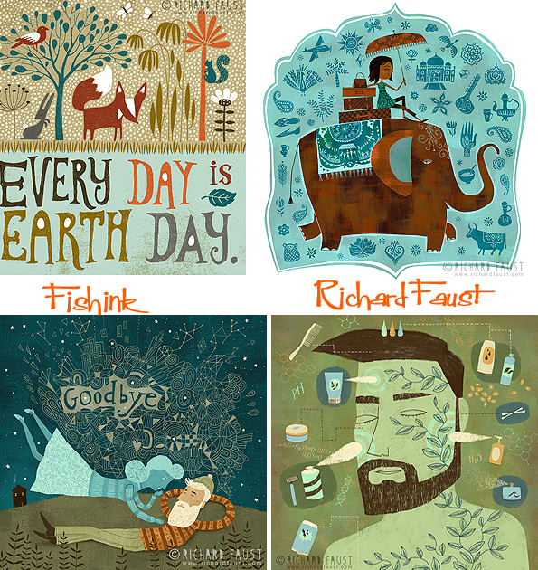
I particularly enjoy these repeat pattern designs. I could see these being used on so many different products and there’s a wonderful sense of fun and light-heartedness about them, that just makes me smile.


Many thanks to Richard for taking time out of his busy day to answer my questions. Do pop over to his Etsy shop here and his blog to see what’s new.

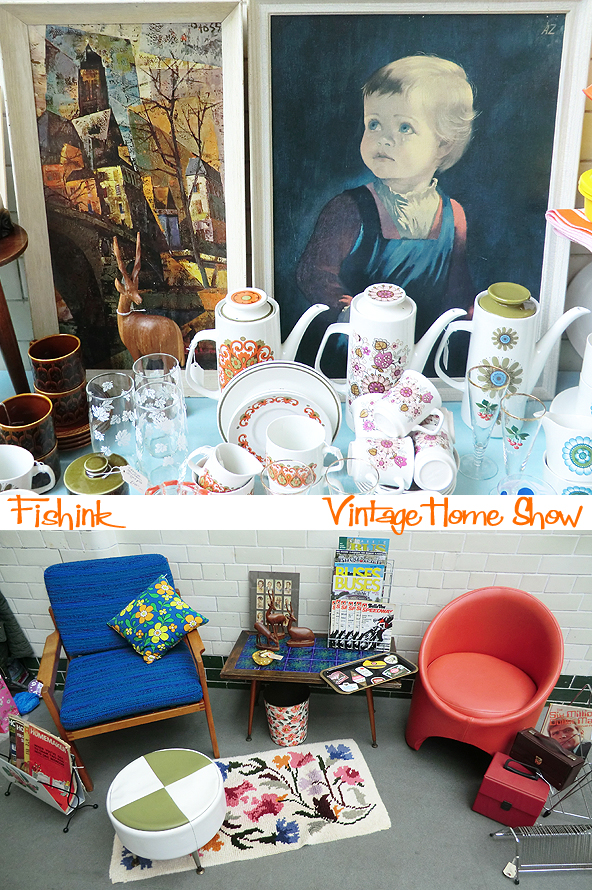
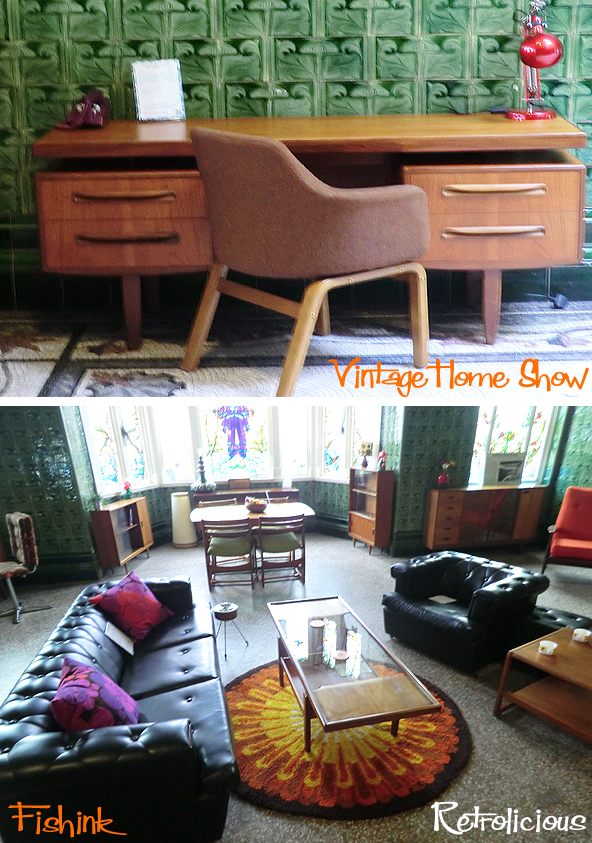
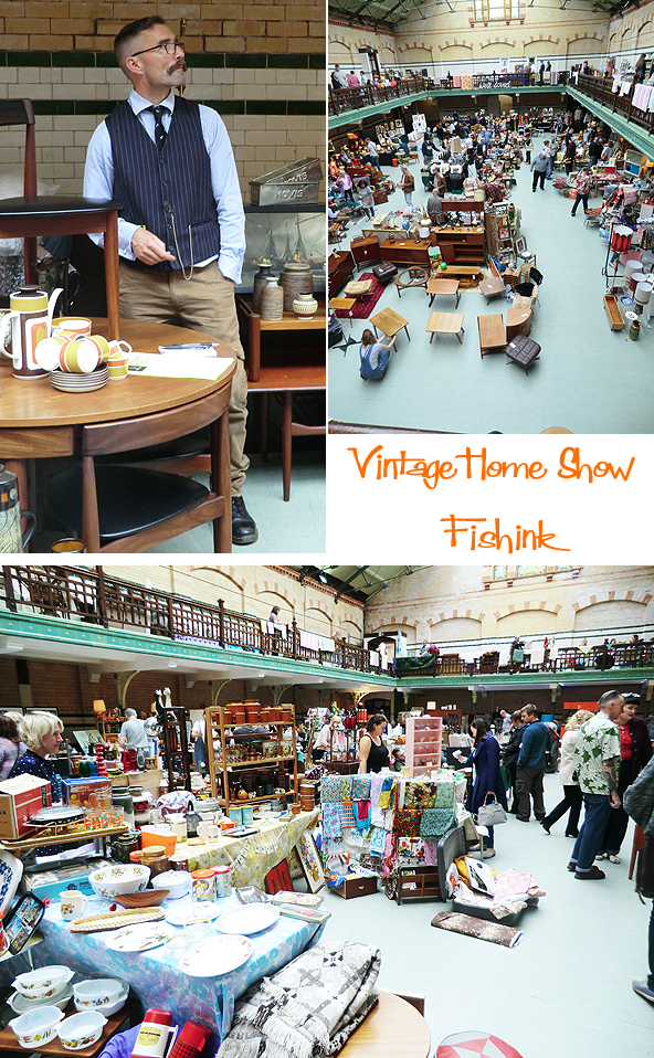
It’s hard to believe that it will be two years in November since I last blogged about the Vintage Home Show at Victoria Baths in Manchester. Always a great event with plenty to see and goodies that will implore you to not leave without them. The show has been established by Keeley Harris, who has penned her own retro book called ‘Style Me Vintage’ (Home).
Let’s start with some lovely blue and brown illustrated Portmeirion Pottery. Does anyone else think of Disneyland and Mary Blair when they see this ? lol.
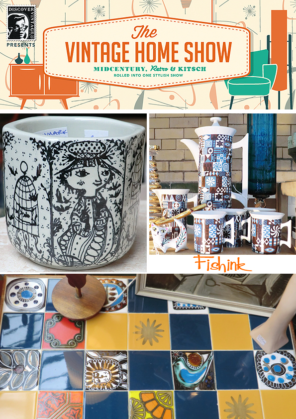
Some fabulous items and even more welcoming stall holders, who were happy for me to photograph their wares to show to you today. Rachel from Funky Vera.com (website not working at present), not only knows her textile designers but can tell you about their work and life in the 1950’s. How wonderful to get a background story with your retro cushion!

From this blue bowl by Flavia to illustrated ware by Figgjo Fajance.
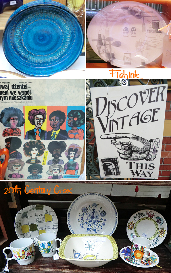
Jennifer from 20th Century Crox sells everything from deco to psychedelic.
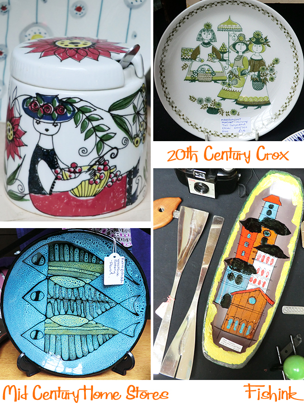
Gill from Mid Century Homestores based in Todmorden, had a beautiful mix of designer retro pieces. My friend bought the fish plate above and I was tempted by sgraffito horse bowl and the John Clappison hippo beaker below. The Beaker is fetching prices around the £30-40 mark now.
More fab ‘n’ funky selections from Jenny at Wowie Zowie Online

Jill Coulson displayed a nicely stacked array of matching Hornsea Pottery. In the latter part of the ‘sixties, it was a big hit with the public. The ‘Heirloom pattern’, (seen third shelf down), was introduced in 1968. In spite of its traditional appearance, Heirloom actually used a very modern technique called glaze resist. This allowed alternate shapes in the pattern to be glazed and unglazed.

More common prints with crying children were available too!
I loved this poster and there must be easier ways to remove tattoos !

Some beautiful curvaceous furniture for the dinning room , the office and the living room from Salford Quays’ Retrolicious.
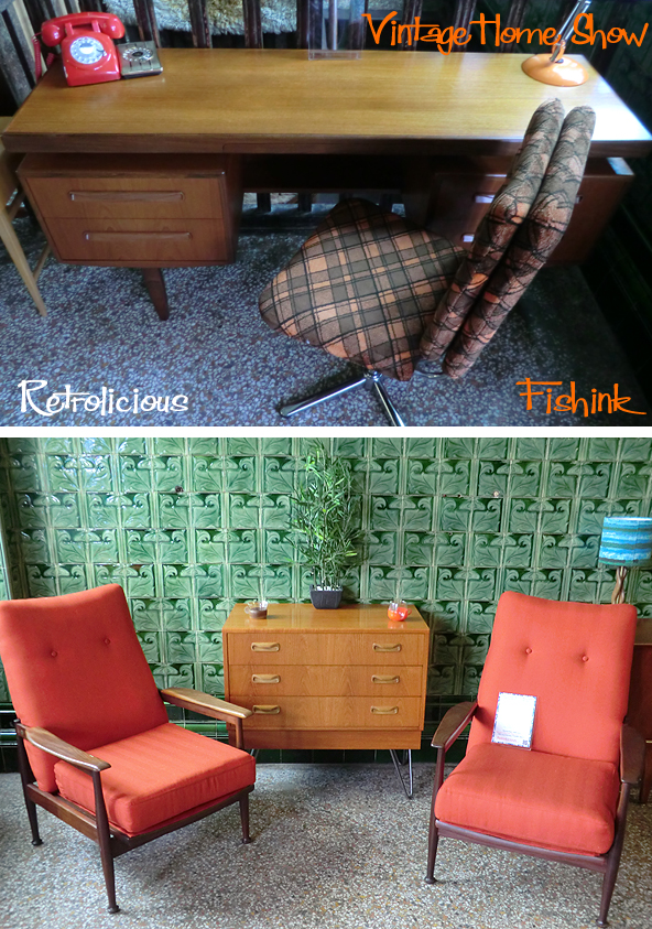
Looking pretty wonderful in this tiled setting too.
This was my modest purchase for the day, two Tams-ware mugs, from Jill Coulson, although I was tempted by much, much more.

A great venue and day out, fab to see that many people looked the part too. Very dapper chap. Thanks to everyone for letting me snap their stalls. The next one here is Sunday 25th October, a date for your diaries and I look forward to seeing you there !
Modern Publicity 1955-6 Part 2
Continuing the theme of my Retro week, this is the second post from the Modern Publicity annual for 1955-56. I’ve coloured some of the black and white adverts, just to add a little zing to them.

Great play on the word ‘guard’ here, helping to reinforce safety measures around the workplace.

Travel, holidays and festivities.

In my mind, there’s a little nod to the Pilsbury Doughboy adverts here. Perhaps that chirpy chappy (below) was inspired by these even earlier adverts (above) ?

Poke me 9,000 times and I’ll explode !!
If you liked this post you can find more, by simply typing the words Modern Publicity into the search function on my blog. Happy findings.
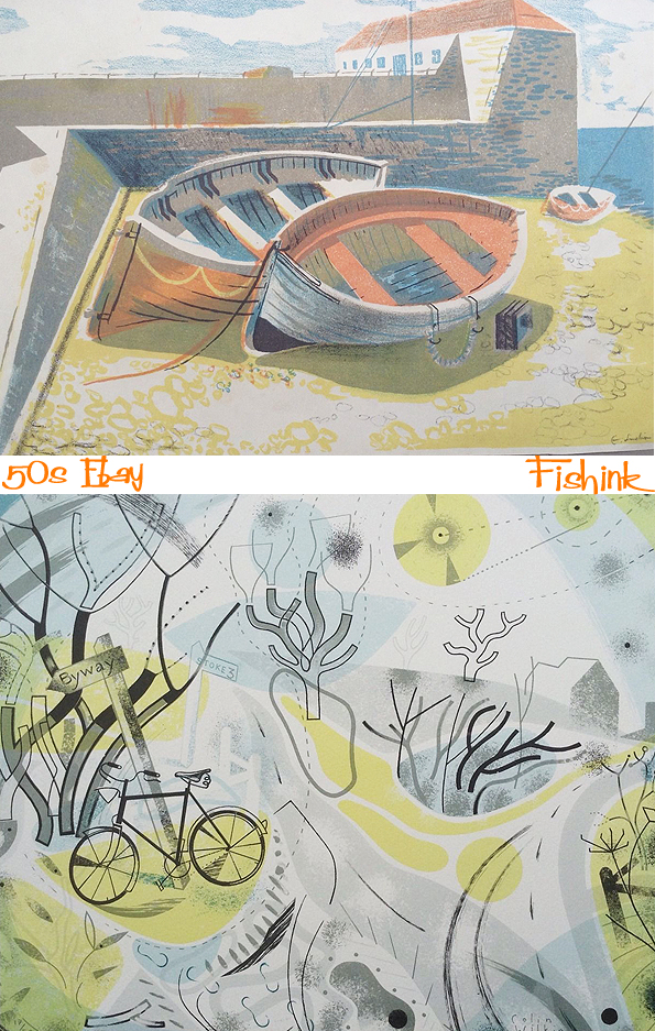
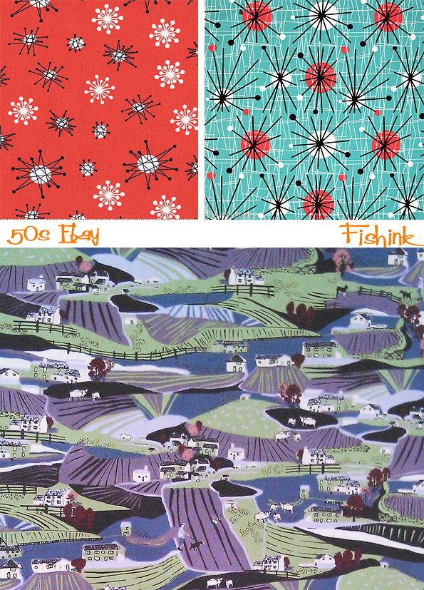
Ebay browsing in the 1950’s
Occasionally, but much more rarely these days, I would spend a half hour perusing Ebay, rooting through it’s 1950’s and 60’s ‘online treasures’ and sometimes finding a poster, book cover or piece of ceramic that catches my eye. Here’s a few I thought you might enjoy too.

Old adverts for children’s sweets, I know the names but the packaging had changed when I last saw them in a sweet shop.

Product advertising posters.

These lovely couple of prints, the top one had a rush of bids at the last minute and went for over £60, lovely work.
A few book and card illustrations from different parts and climates.

More typical 1950’s work.

Some paintings, wallpaper and textile designs.


Possibly a couple of modern designs (below) inspired by the Festival of Britain.
It’s great what you can discover that’s been living in someone’s cupboard all these years : ) Do you have any interesting 1950’s mementos ?


