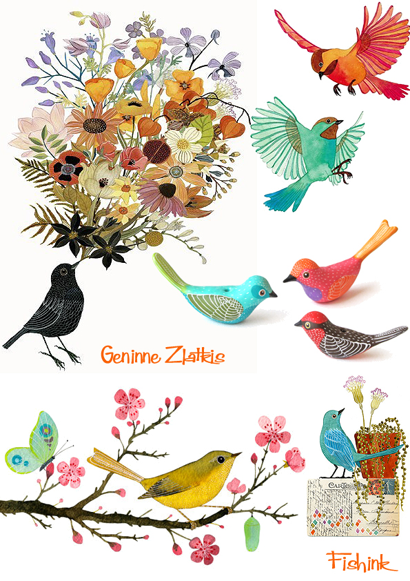
Geninne Zlatkis Mexican Watercolours
Geninne Zlatkis is an artist, illustrator, and graphic designer, living in Mexico, married to an architect and designer, and mother of two home-schooled, artistic boys. I came across her site on Etsy where she sells a range of her beautiful prints. I think most artists would find it impossible to not be inspired with such an amazing space to work in.

From her art blog, Geninne takes some wonderful photographs of her work and the array of collected items that adorn her studio too.

Earlier this year she partnered with Magenta to create a stunning range of stamps that can be used to decorate envelopes, stickers, books etc. It’s great the way that they complement her artwork so perfectly, and don’t they just ‘sing out’ on brown paper ! You can even buy a copy of her book about making stamps here.

Below is a selection of her colourful and detailed watercolours. Again, for me, the fine painterly lines and intricate decorative qualities make these such a joy to look at.

If you fancy something a little more individual, then visit Geninne’s Big Cartel site where she sells her original work.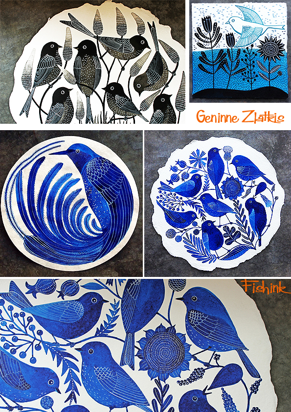
More of her Etsy site prints, beautiful colours.
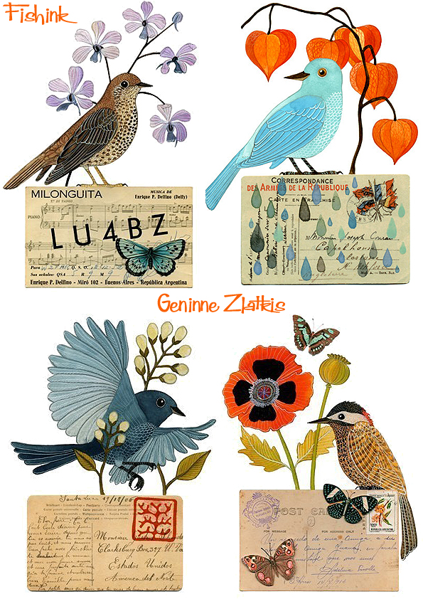

There’s such a calm, yet fresh, air to her colour palette.
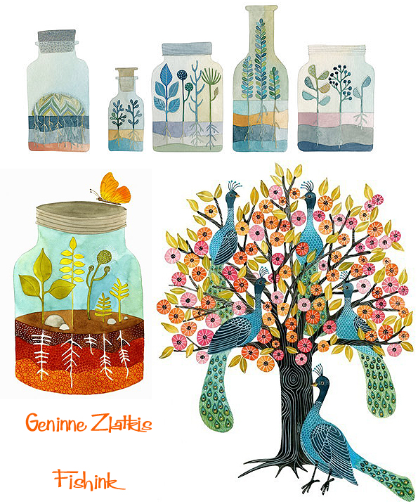
It seems whatever she turns her hand to, whether it’s painting, embroidery, engraving or ceramics, the end products are stunning.


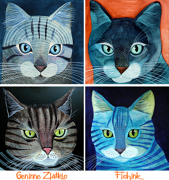
A few watchful cats to keep the birds awake.
With such an amazing home, recently featured in the current Anniversary Issue of Casas Magazine, a home decor publication from Chile, more stationery notebooks and a ceramics studio on the way, it seems there is no stopping Geninne from her creating. Thankfully for us that that is the case : ) There’s an interview from Taproot Magazine here from earlier this year.
Keep up the beautiful inspiring work Geninne, I look forward to seeing much, much more.

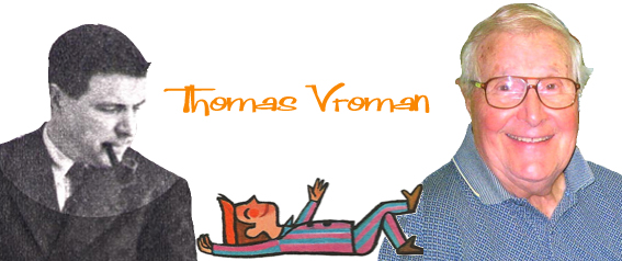
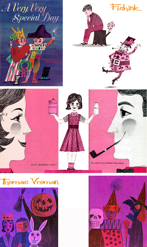
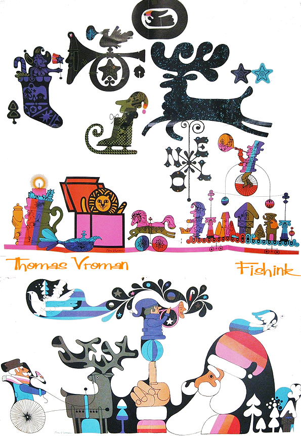
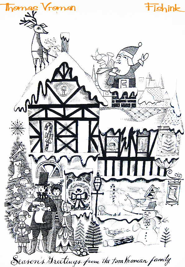
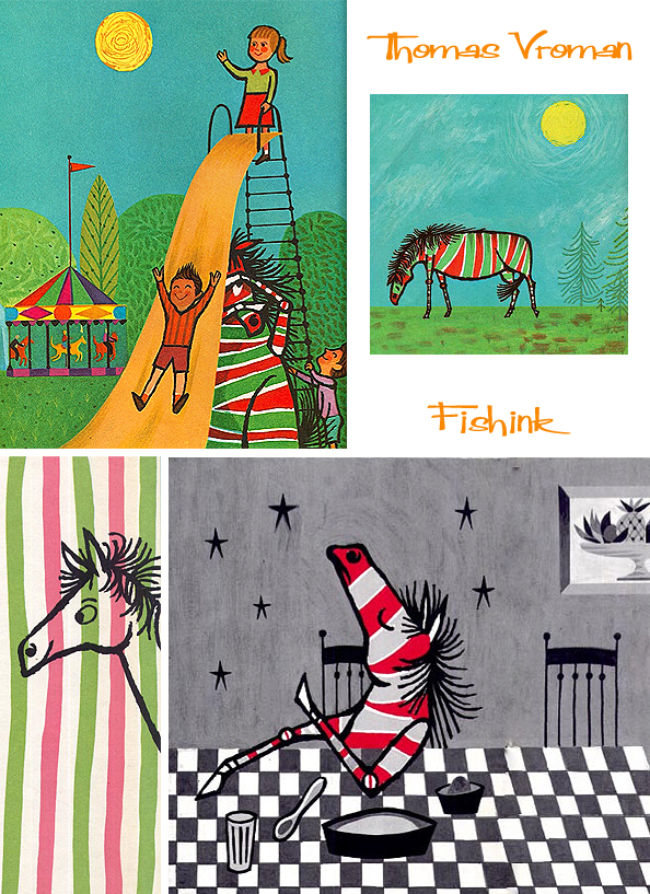
Thomas Vroman Mid century Illustrator
Born in Olean, New York, Thomas Vroman went on to attend the Beaux Art School in Paris, graduated from the University of the Arts in Philadelphia, Pennsylvania and began a career of painting, which has won him numerous awards from art organizations around the world. In 1974, along with Norman Rockwell, he was chosen as one of the thirteen leading contemporary artists in the United States. Here’s some illustrations he did for Colliers Magazine in 1956.
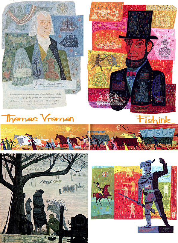
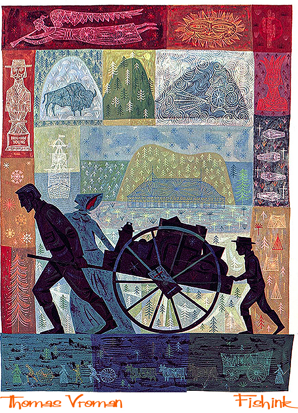
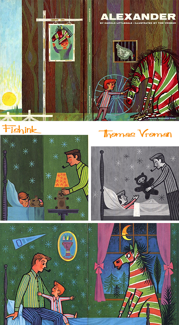
During World War II, Tom applied his artistic talents to highly unique projects needed to fulfill the direct requirements of General Eisenhower, General Bradley, General John Lee and others. He was a member of an elite team assigned to the Intelligence Unit of the European Theatre Headquarters. Tom’s paintings have been selected by the U.S. Information Agency State Department to tour Russia in exhibitions, and his work has been exhibited in France, Denmark, Germany and Switzerland. He has taught at the University of the Arts and Temple University. Here are a few of his children’s book covers.
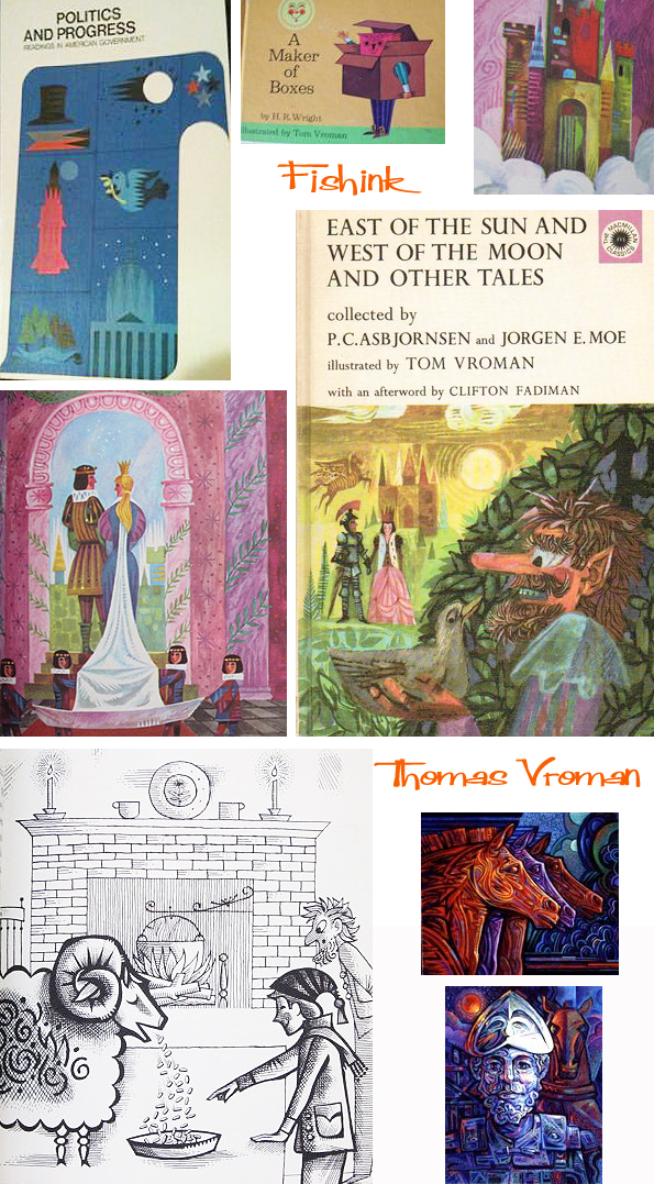
One of his best known books is ‘A Very, Very Special Day’ from 1963.
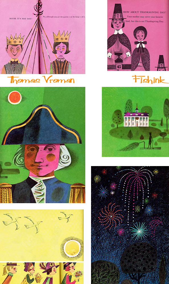
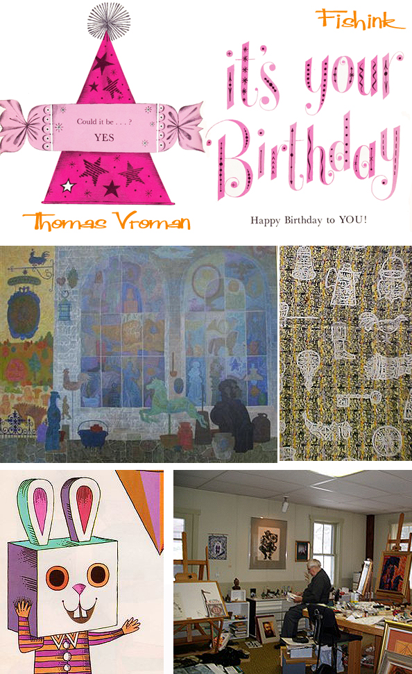
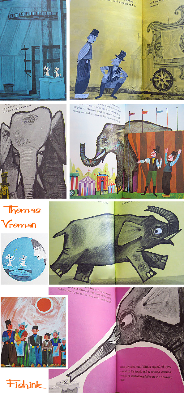
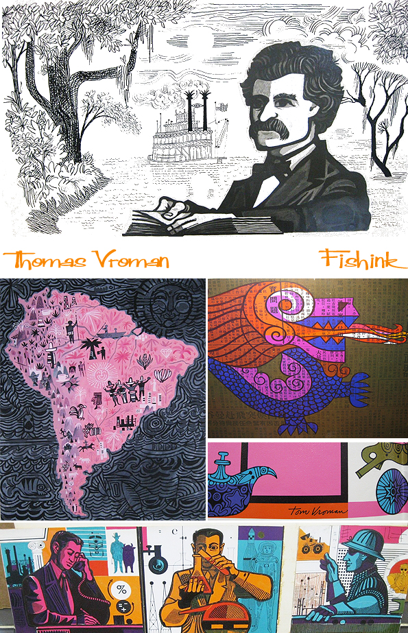
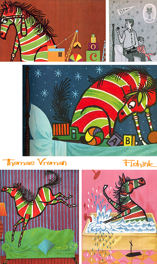
Here’s a taste of some more of Tom’s original work, found selling as a job lot on ebay !
These christmas themed ones have a feel of Heinz Edelmann‘s ‘blue-meanies’ for the Yellow Submarine cartoon for The Beatles.
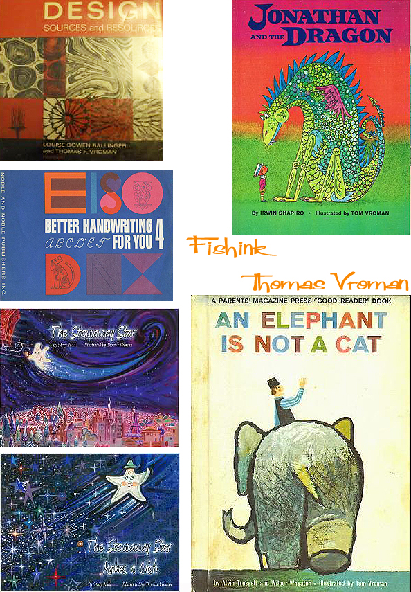
Five daughters have inspired Tom’s illustrations and the texts for delightful children’s books, and his intricately detailed paintings have appeared in The Saturday Evening Post, Holiday, McCall’s, Cosmopolitan, Good Housekeeping, Venture and many others. He has co-authored a book entitled Design Sources and Resources. He has had many feature articles published in graphic art publications and he continues to work for leading industries. By far his most well loved book has to be that of ‘Alexander’ the naughty, imaginary horse that arrives to teach a lesson.
As an artist, designer and businessman, Tom worked in New York City for many years early in his career. He founded Thomas Vroman Associates as a Design and Marketing Communications firm. Striving to find a unique creative environment, Tom relocated the business to the bucolic setting of Gaines, PA. He housed the firm in a quaint barn-like building, updating it with the latest equipment and technology. He fulfilled his vision of being able to offer clients high quality design and communication support on a cost effective basis. Using sophisticated technology, Tom eliminated the barriers of distance and time to support the needs of clients, regardless of their locations.
Here’s an interesting article from the Olean Times Herald from back in 2009, and many thanks to The Stowaway Star site for their info on Thomas.
Giving thanks … colour is all around us
I spent a couple of hours over the weekend, taking images of things around the house and garden that have recently made me internally smile. I’m sooo grateful for the beautiful Septembery sunlight days that we’ve been experiencing and the colourful signs of autumn approaching too. Somehow it makes the slow winter creep, seem less daunting.
Often we are in too much of a rush to get somewhere or to get something done quickly, that we walk by and ignore beauty on our doorstep. I’ve been patiently waiting for my Orchid to produce an shoot that turned green and travelled skyward. Once this had happened, the flowers are now just beginning to open. How amazing is nature !
Even the apples in my breakfast bowl have been rosy on the insides lately : )

I’ve noticed how other fruit are super colourful too, and outside the leaves in a neighbour’s garden are flickering with reds, oranges and fiery hues.

A few of the trees have just begun to discard leaves and turn them flame-like on the floor.

This orange squeaky toy is a real fav of my dog Boo. Yes noisy it’s true, but everytime she plays with it I have to smile at her excitement. These less colourful birds were drawn on remnants of Mark Hearld’s wallpaper.. how else do you use up small pieces too precious to throw away lol ?

Boo likes to keep an eye out on who’s passing by from time to time. Thankfully her obsession for doing this has lessened. Is that a cat.. or a snake in the grass !
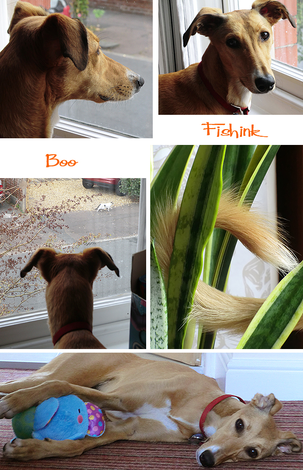
Sometimes the excitement is all too much !
Seed pods are everywhere at the moment… spikey, protected and encased, with their inner, shiny and jewelled rewards !

A new studio rug has been an all round hit. Boo can now fly free from her carpety prison bars.

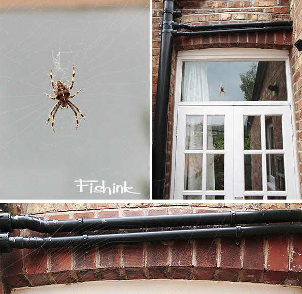
To be honest one of the things which hasn’t made me smile this weekend was discovering this huge spider and seeing what a massive web it’s been busy assembling. The web (not the spider) is the width of these double doors and about a metre in height ! and excuse me but when did spiders in the UK get to be so big ? (Urg).
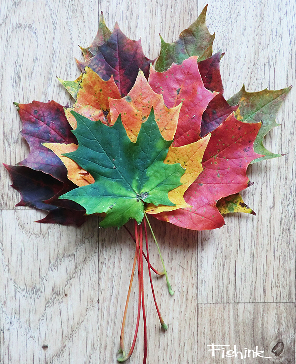
Fortunately this was the exception and to celebrate here’s a leafy bouquet I gathered to herald the start of the Autumn.
I finally like the fact that my blog has now over 200 daily email followers and I got a little notice to say it has received over 1000 likes, 2,500 comments and over 450,000 views since it began !
A big THANK YOU to everyone and please keep telling your friends about my blog and commenting on the posts too. This blue glass star is mine, one I brought back from Africa and recently rediscovered.

Try and take a moment out of your busy schedule to see what is around you that might make you smile, and do let me know what you’ve found as a result of reading this.
A happy week of colour to everyone !
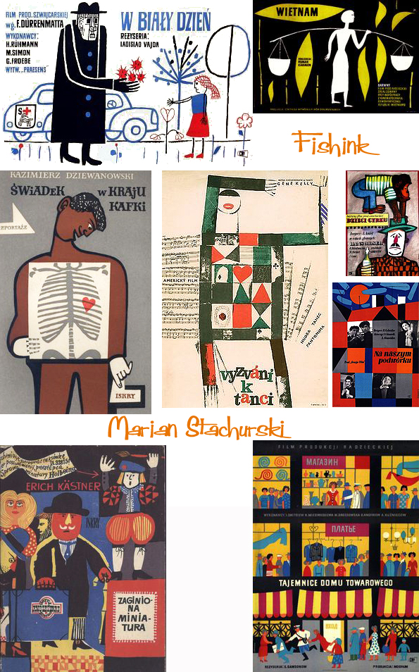
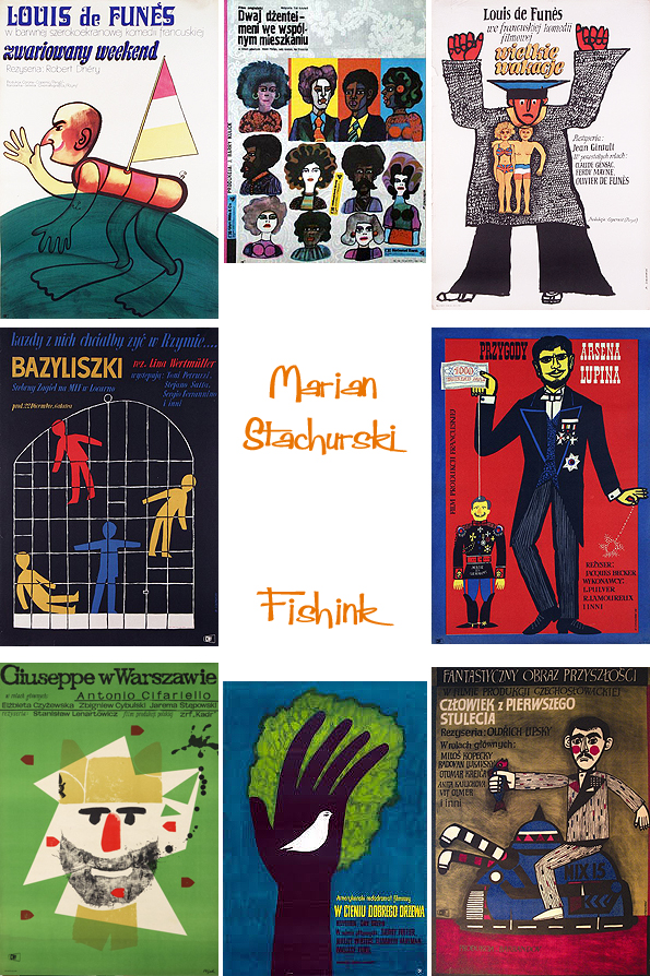
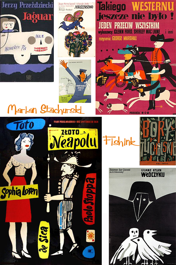
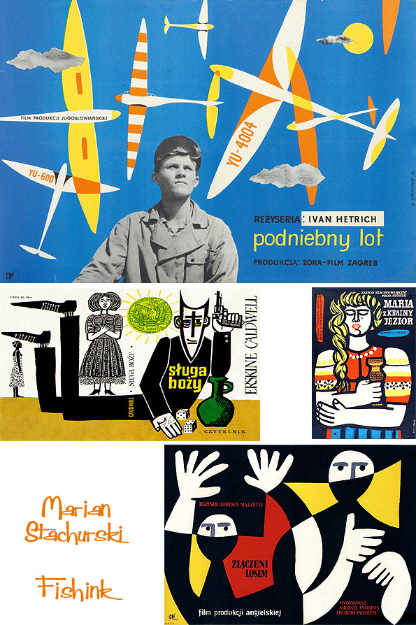
Marian Stachurski Mid-century Polish Poster Designer
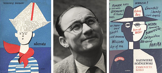
Born in Lazy 1931, Marian Stachurski studied at the Warsaw Academy of Fine Arts under Henryk Tomaszewski, an influential illustrator who taught many of the most successful poster designers in Poland.
Stachurski created film posters from the late-1950s through the mid-70s, for both domestic and international films. He worked in quite a comical cartoon-style manner.
This ice skating smiley criminal and bendy policeman are great !

As with many designers, he employed a range of styles and approaches, but his work is generally characterized by its simplified forms, playful colour schemes, and mix of film stills with painted elements.
There are some lovely textural lines in the posters below.
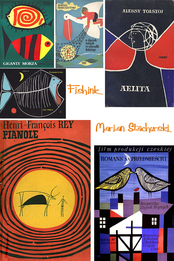
He was influenced by Polish folk art, as seen in the almost naive approach to figure drawing; their bold outlines and blocky shapes recall the aesthetic of paper cut-out crafts popular in the surrounding region.
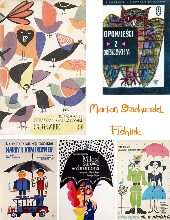
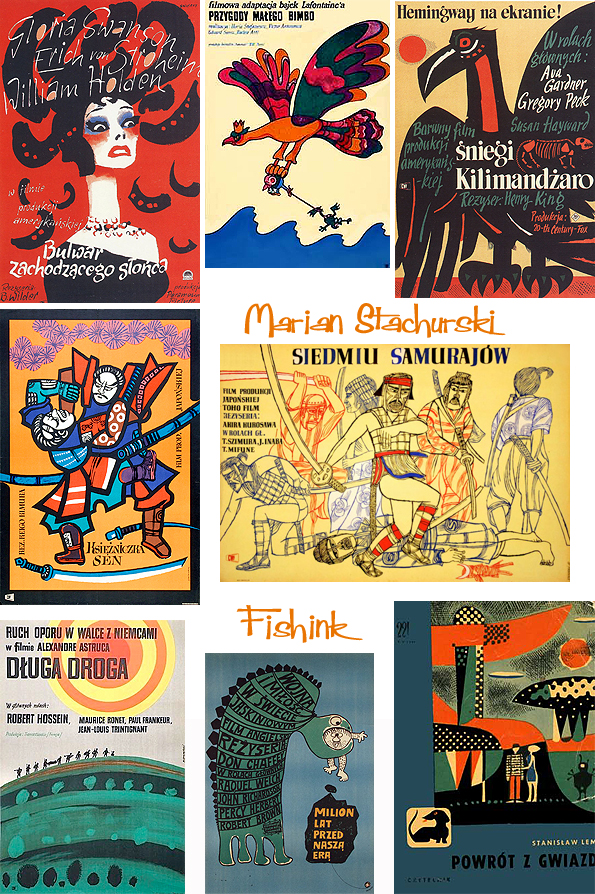
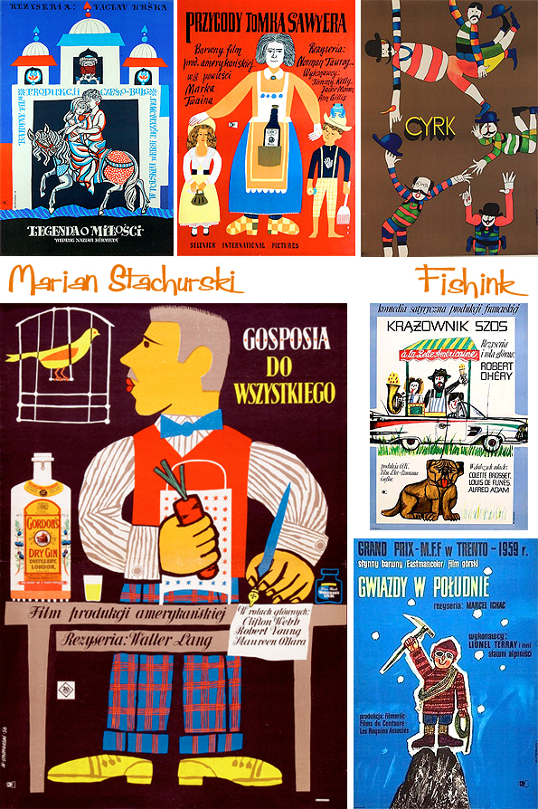
His subjects tended to reference the films directly, but with the addition of fanciful or abstract elements. I like this little ‘travel themed selection’ I discovered.
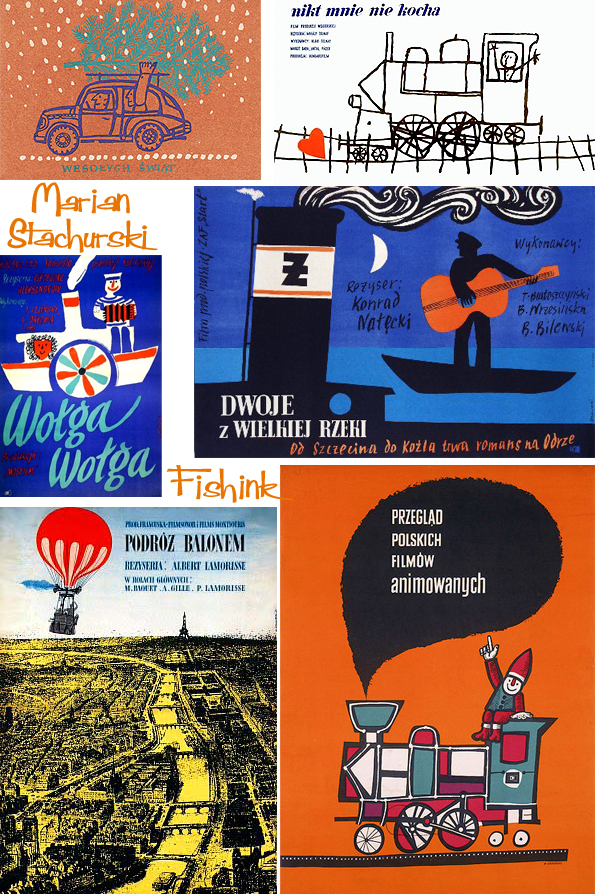
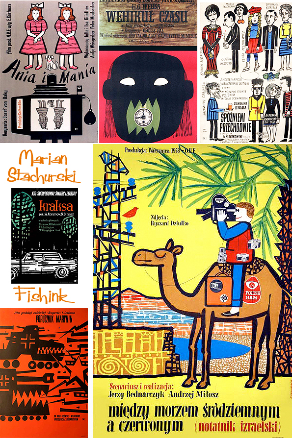
Here are some more examples of his Cinema Posters. Hope these have cheered up your friday, don’t forget to share them : )
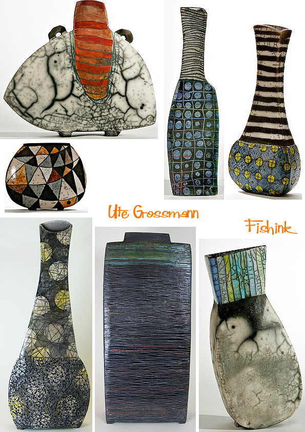
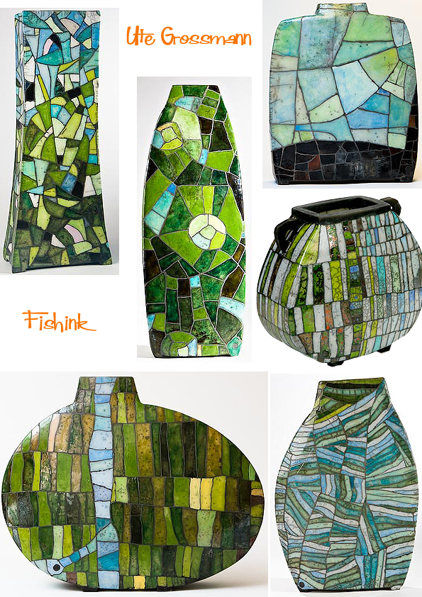
Ute Grossman Stylish decorated ceramics

Ute Grossmann was born in Dresden, Germany in 1960. Having originally studied Chemical Engineering, she gravitated towards the arts with studies in painting and graphics at the Academy of Fine Arts, Dresden in 1998/1999. On discovering her ceramics, I was not only amazed at the vast body of her work but also the variety of textures, colours and surfaces that she creates. A real textile designers dream in ceramic form : )
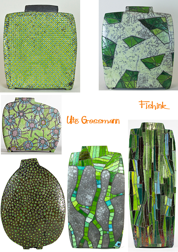
Beautiful ranges of pond greens, Ute’s patterns here make me think of frogspawn, underwater plants, cell structures, Klimt, Hundertwasser and Pre-Raphelite masterpieces.
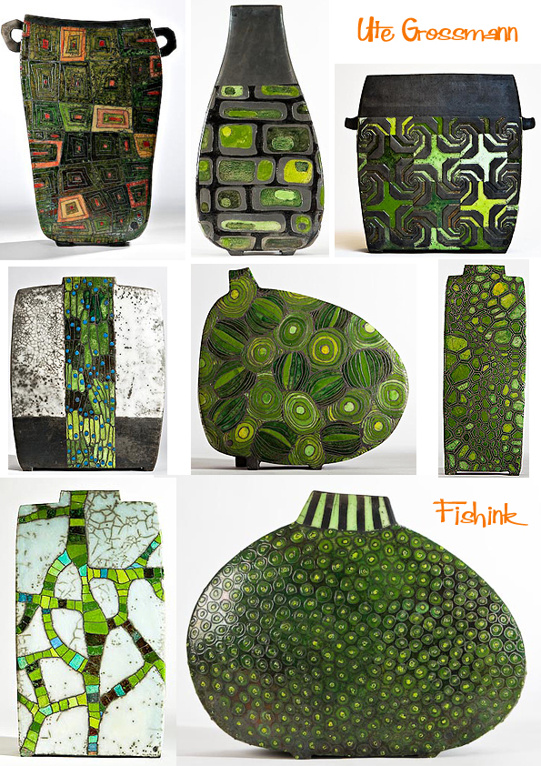
These are definitely inspired by plant structures, sycamore seeds and spiky interlocking thorns.
More non-symmetrical forms with little legs.

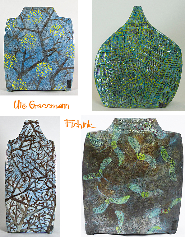
In 2003, Ute became a member of the Association of Artists as a freelance ceramicist and her early work also involves using mosaic sculptures in public places. All her ceramic art still displays mosaic aspects, but are now also mixed with raku, which has become a more prominent feature over the last three years. Here’s some more monochrome yet still highly textured forms.

Raku glazes add additional crackles and root structure shapes, with dashes of colour in specific sections of each ceramic.

Mosaic ceramics and Paul Klee style surfaces make me think of Tiffany Lamps and stained glass windows.
These are almost painterly.
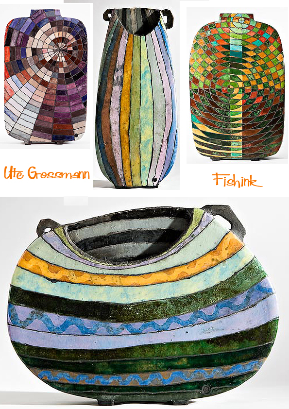
This highly decorated pot below was based on Italian floor tiles.
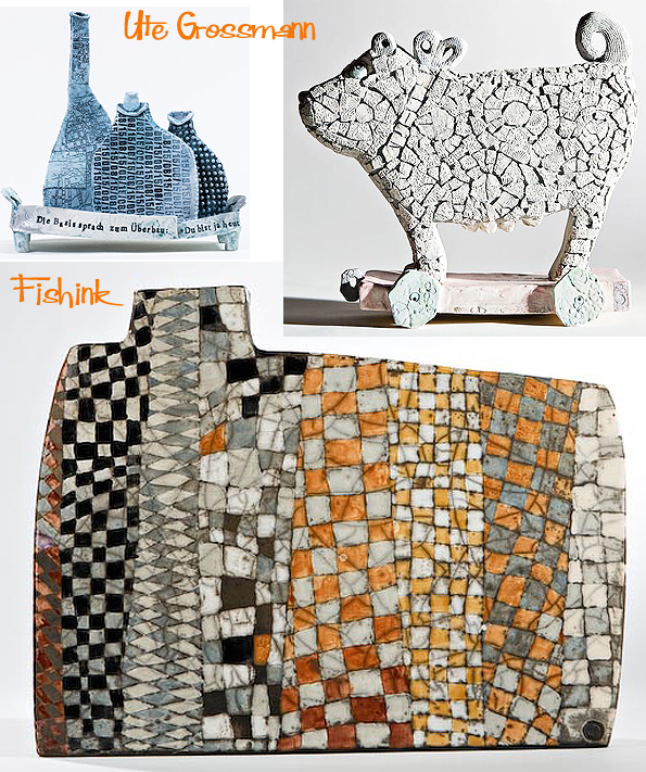
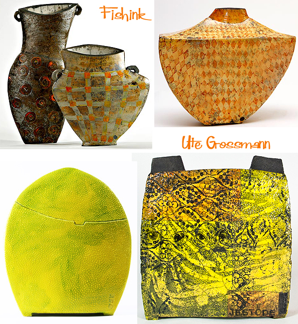
Ute has also created her own fantastical ceramic menagerie, sometimes with people too ! What a great imagination she has.


I love these lazy leaf decorated toads and wordy chameleons.
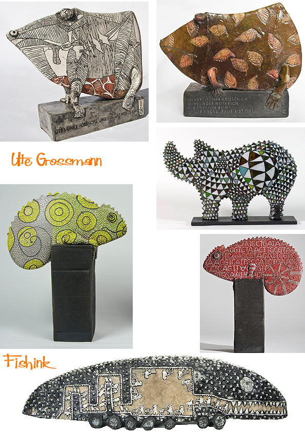
Highly decorated, quirky and often smile inducing, there’s never a dull moment with Ute’s work around you. What says you Fishink readers ?
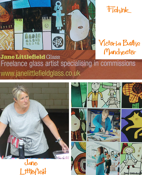
Victoria Baths Glass Exhibition
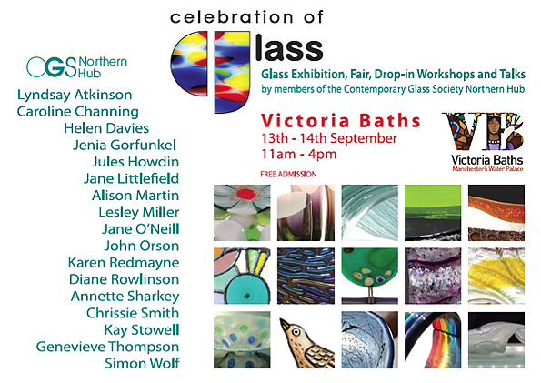
On saturday I popped along to this glass exhibition at Victoria Baths in Manchester and on arrival, I was greeted by a choir singing in one of the pool rooms, it was quite a stirring sound experience. The pool has temporarily had a stage built into it for the version of Romeo and Juliet which is performing there until October 4th. What a great setting for such a play.

Around the edge of the pool some of the changing rooms had been taken over as exhibition spaces to allow the glass artists to showcase their work.

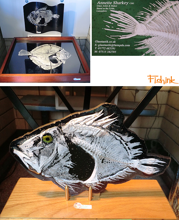
I was fascinated by the work of Annette Sharkey who uses real fish and encapsulates them into her glass sculptures. I’m not sure just how happy I’d be having this wee chap watching me around the home. Annette’s got the perfect surname for her style of work don’t you think ! lol
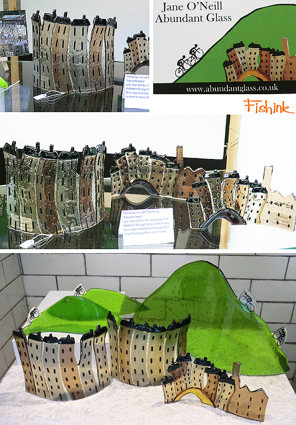
One glass artist from the Pennines Jane O Neill, makes more humorous sculptures depicting the long thin houses of Hebden Bridge and the Yorkshire contribution to the Tour De France from earlier this year.
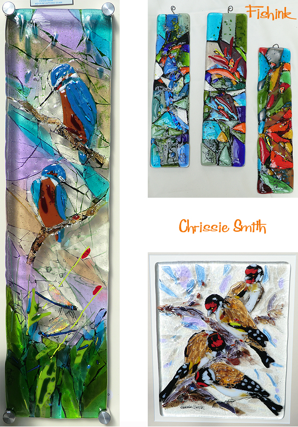
One ex Biochemist and Primary School Teacher who’s now a glass artist, was Chrissie Smith. I thought she captured the colours and feel of birds very well in these hangings.
Lyndsay Atkinson also manages to balance her love of glass and nature with being a Physiotherapist. I guess when she’s not manipulating glass she’s busy being ‘hands on’ with her patients. In both professions I would guess that she has great control in her work.

Sea-struck Nicola Thompson takes most of her glass inspiration from the the waves and surf. Some beautiful frothy, foamy, pieces can also be seen on her website.

Finally the wonderful work of Jane Littlefield with some of her cyclists and (a few frames higher) swimmers which fit perfectly within the victorian swimming pool setting. Jane was busy keeping the children occupied making some glass mosaic coasters. She takes on commissions for private homes, churches and schools. Drop her a line here Jane@JaneLittlefieldGlass.co.uk if you’re interested. She also helped me make my stained glass piece from last year.

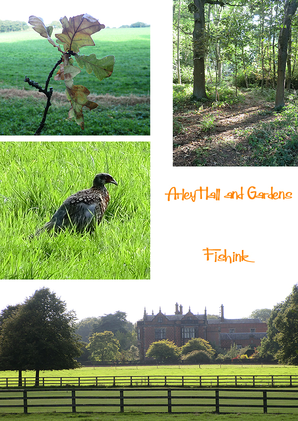
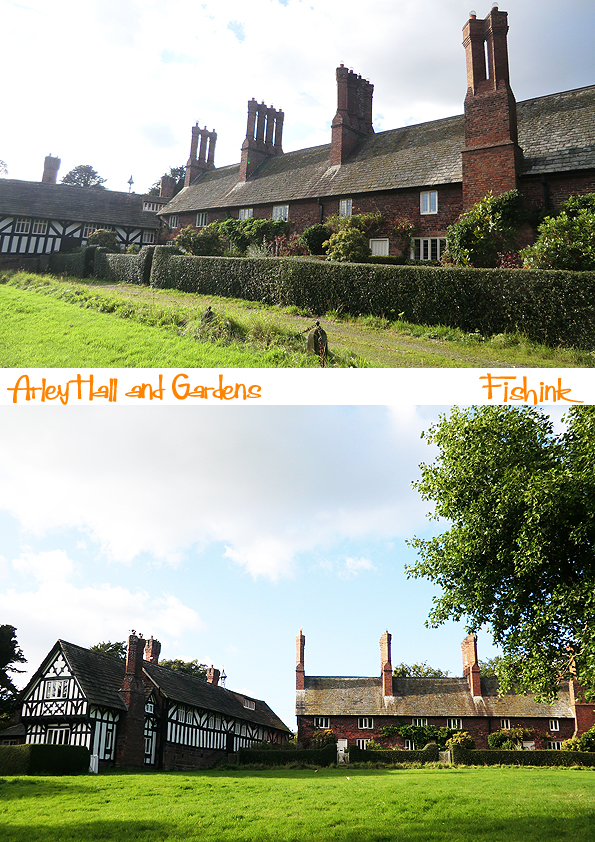
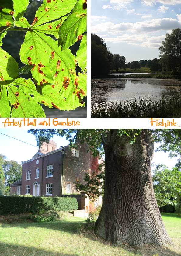
Arley Hall and new Fishink Collages

We took a day off this week, whilst the sun was shinning and headed over to Arley Hall and Gardens in Cheshire. There’s a little more about it’s history here and here. It’s a pretty big estate, with plenty of space to wander around without bumping into people all the time.
Some very pretty architecture, the cottages look like a film set for Larkrise to Candleford lol
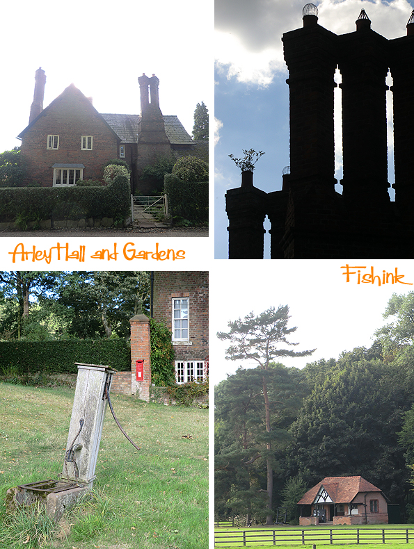
With a good book and cup of tea in hand this was my view of the world for an hour.
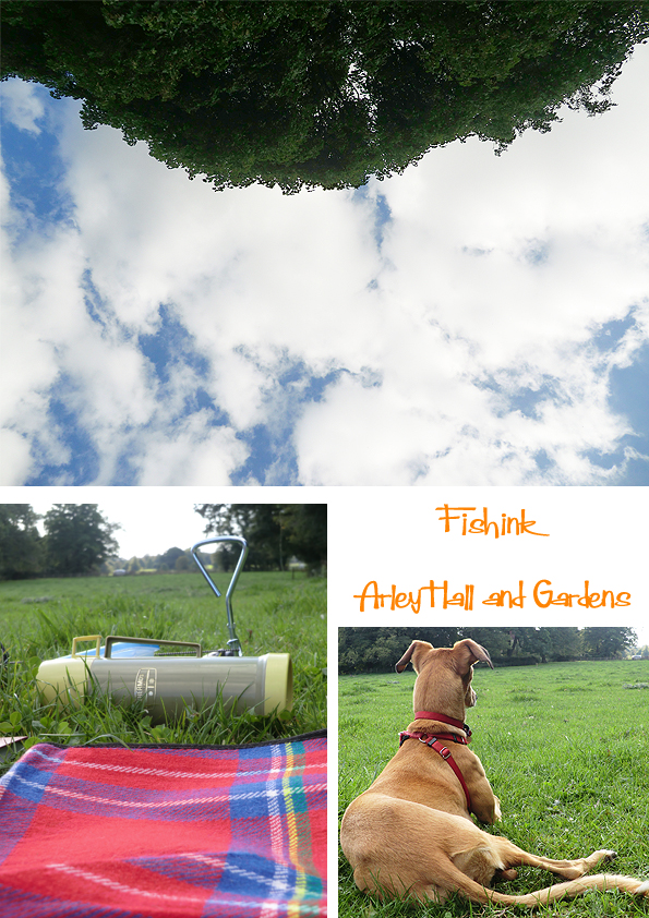
Always keeping one eye on this character, who was busy watching out for anything that scampered or hopped ! Yes you Boo !! All in all a great escape for everyone involved.

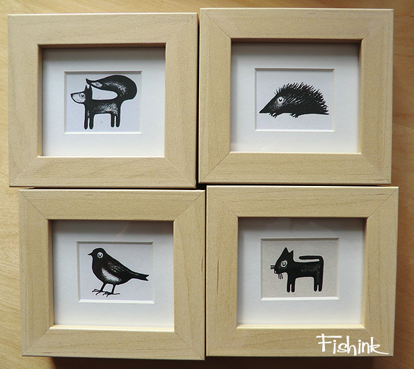
When we got back, I completed framing some new pieces to drop off at Wall Of Art, who exhibit and sell my work in Manchester’s Craft and Design Centre.
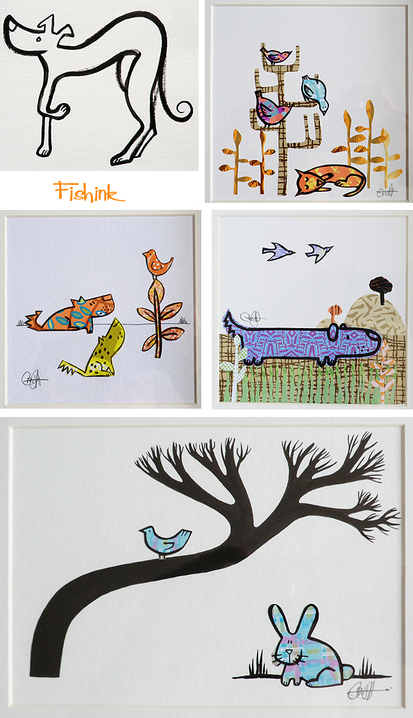
Always good to get some new work in progress. Do drop in and see what’s exhibiting, there is always a great range of work on show.
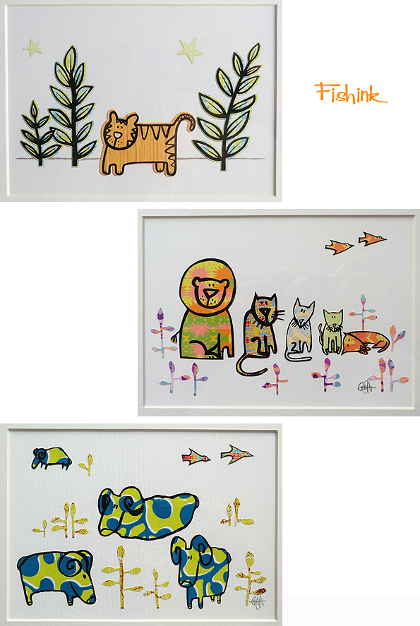
These mini frames are something I’m newly introducing too. All comments most welcome. More original artwork on sale on my website here.
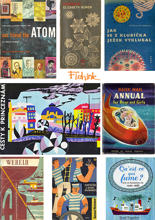
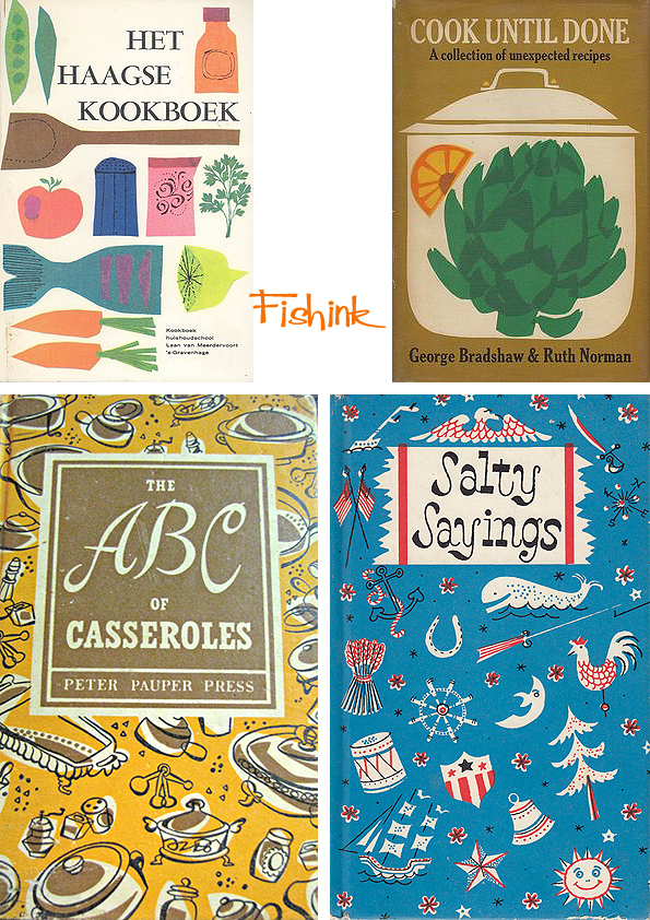
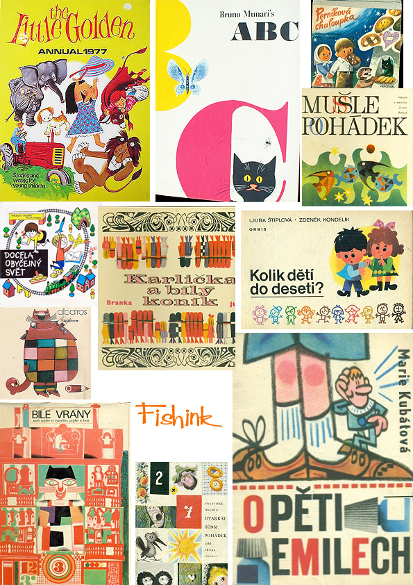
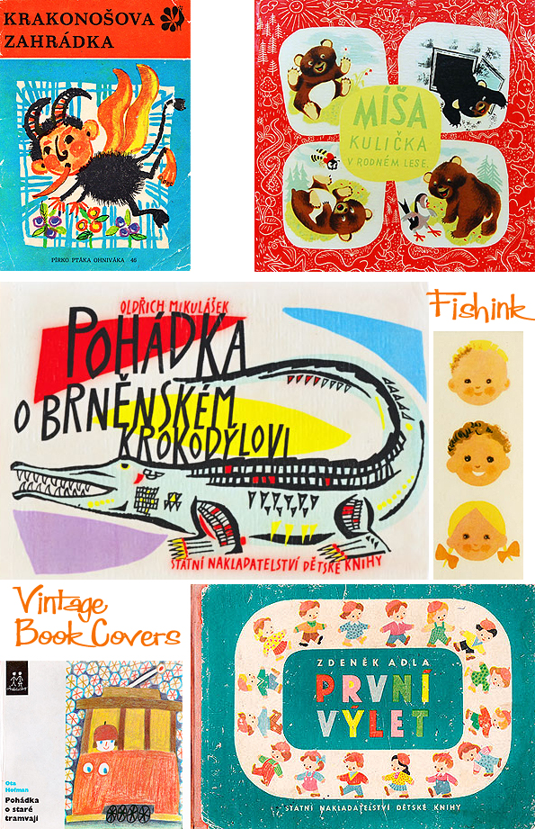
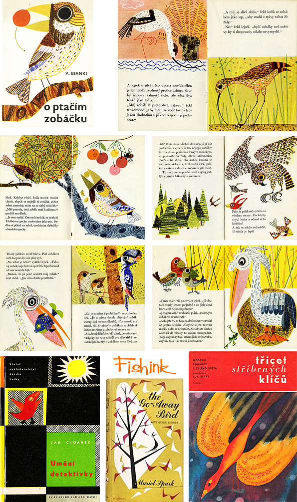
Vintage Book Covers
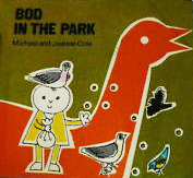
It seems that you can never have too much of my Vintage Book Cover posts, people appear to really like them, which is great to hear. So let’s start off with a little midweek sunshine.
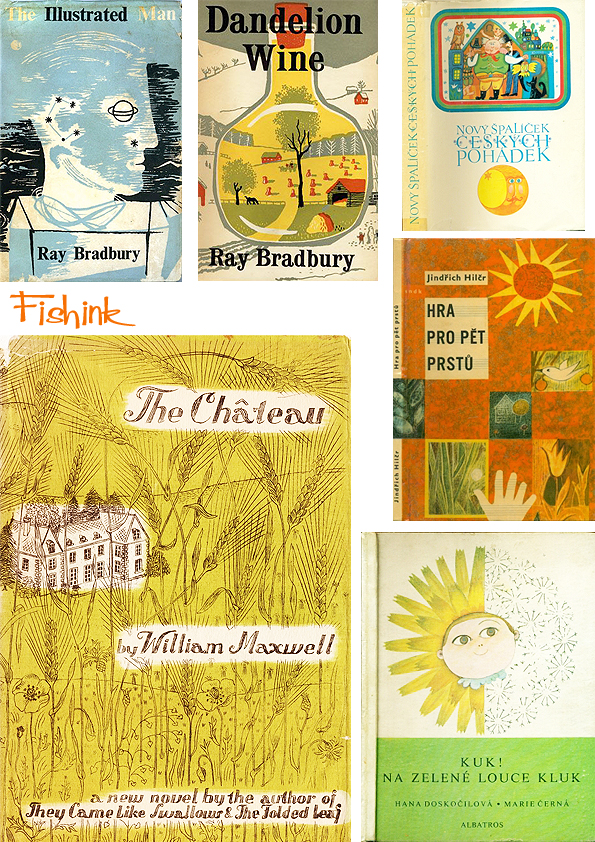
There’s some lovely movement, symbols and shapes in these.
A taste of nature.
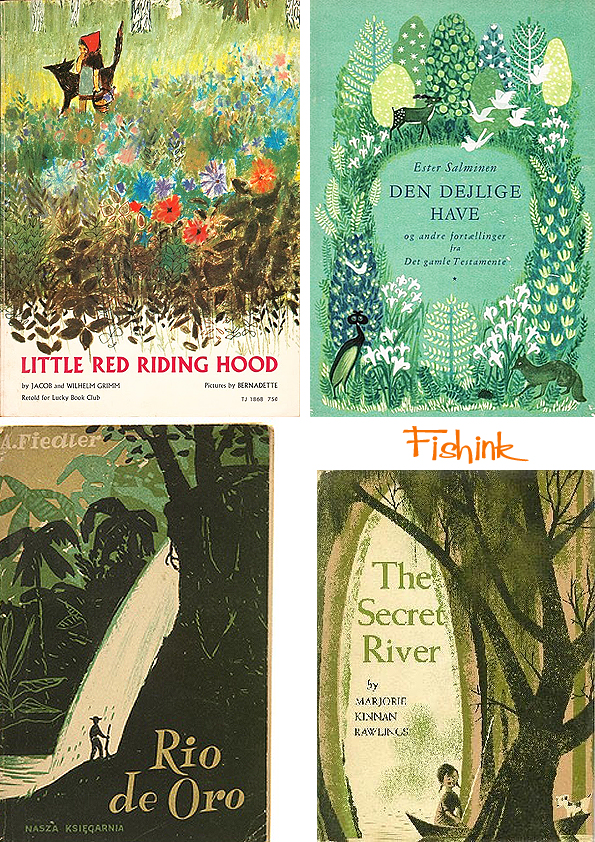
A taste of food.
Something for the little people.
Transportation and travel.
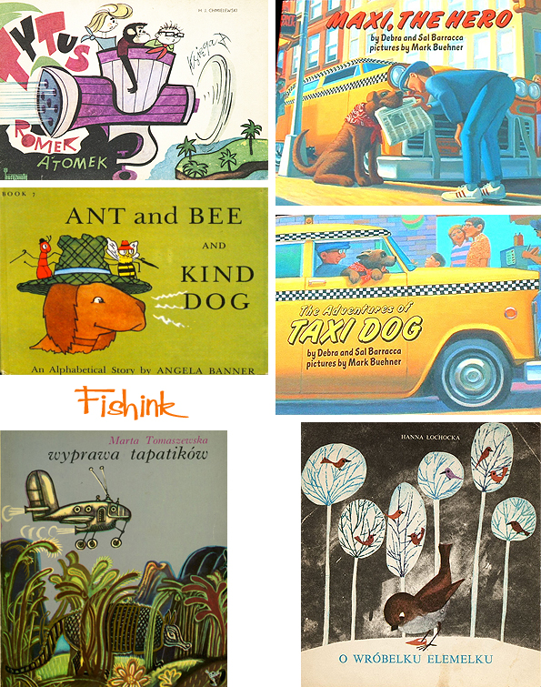
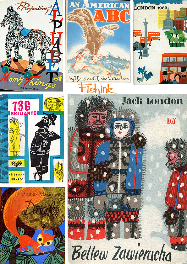
Birds everywhere.
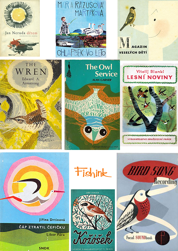
And finally for today some beautiful illustrations by Polish artist Věra Faltová from way back in 1964.
Please don’t forget to leave some comments and thoughts on your favourites. Happy Wednesday everyone. Many more superb polish covers over at SNDK, be sure to check them out too.
Adam Kilian Scenery Designer, Graphic Artist, Illustrator
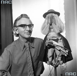
photo: Edward Hartwig / Narodowe Archiwum Cyfrowe
Born in 1923 in Lviv, Ukraine. Adam worked with puppets and prints, one field inspiring work for the other. He studied architecture at the College of Arts and Crafts in Nottingham, U.K. Then returned to Poland and from 1948 to 1951 was the managing director and stage designer of the Niebieskie Migdały (Idle Dreams Theatre), a puppet troupe his mother, Janina Kilian-Stanisławska, had founded in 1944 in Samarkand.

Some enchanting shapes and friendly characters here.


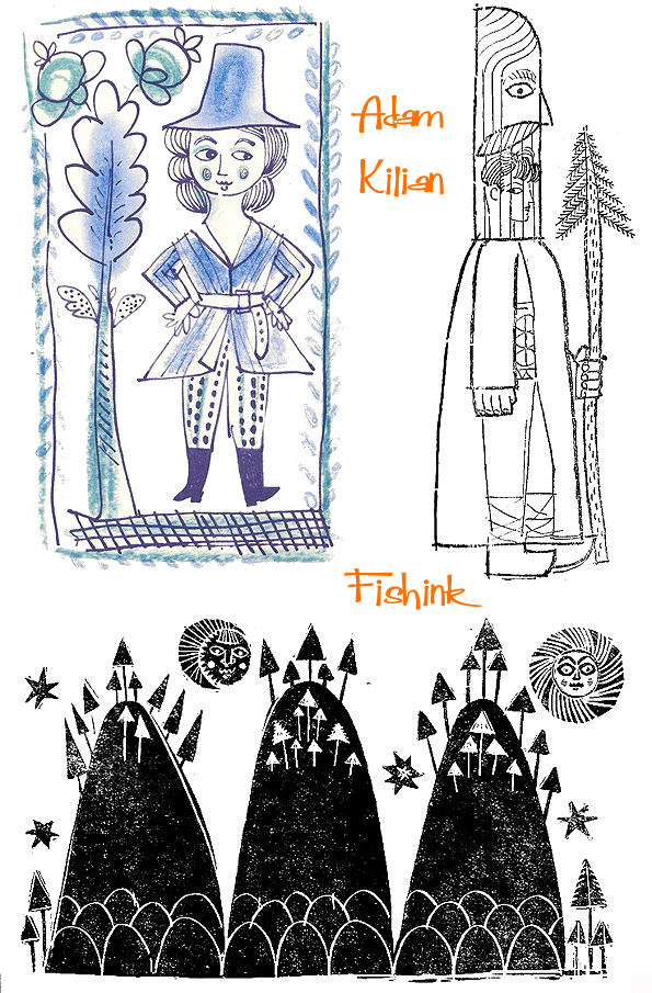
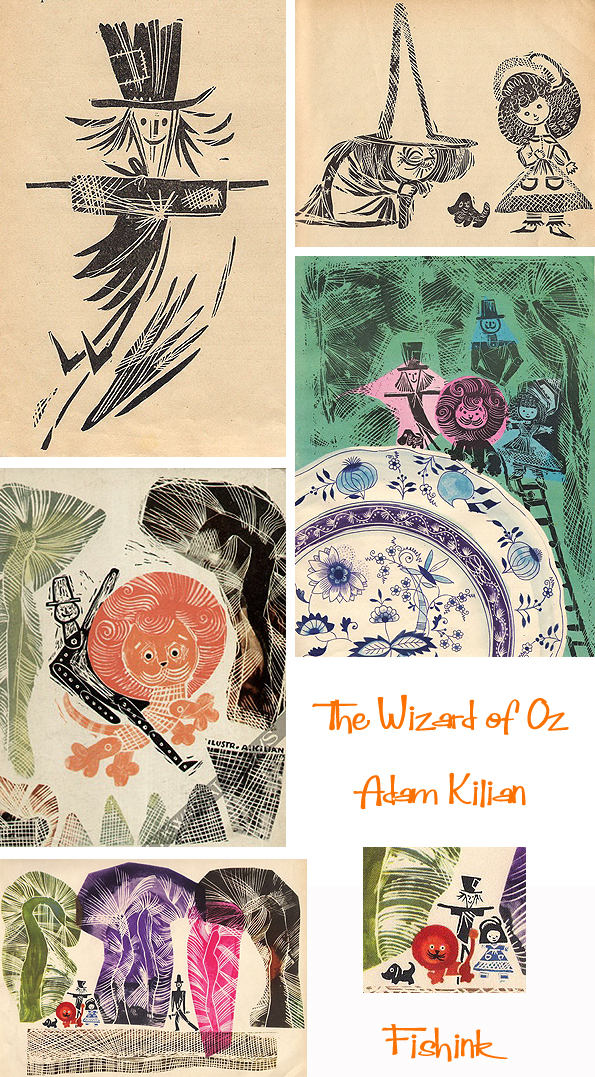
In 1951 the institution was renamed the Teatr Lalka (Puppet Theatre), and Kilian has been associated with this Warsaw stage for over half a century. He continued to design scenery there and became the theatre’s visual director in 1951. Since 1988 he has been a visual consultant. In addition, Kilian has worked with numerous other puppet and dramatic theatres, as well as opera houses. He also illustrated for numerous books including ‘The Wizard Of Oz’ in 1962. Great scratchy marks here.
Since the 1990s Adam Kilian has focused on designing scenery for productions directed by his son Jarosław. Kilian has also produced scenery for television shows, as well as poster and postcard designs. He devised the visual concepts of a number of drawn- and puppet-animated films.

I love the expression in his characters.


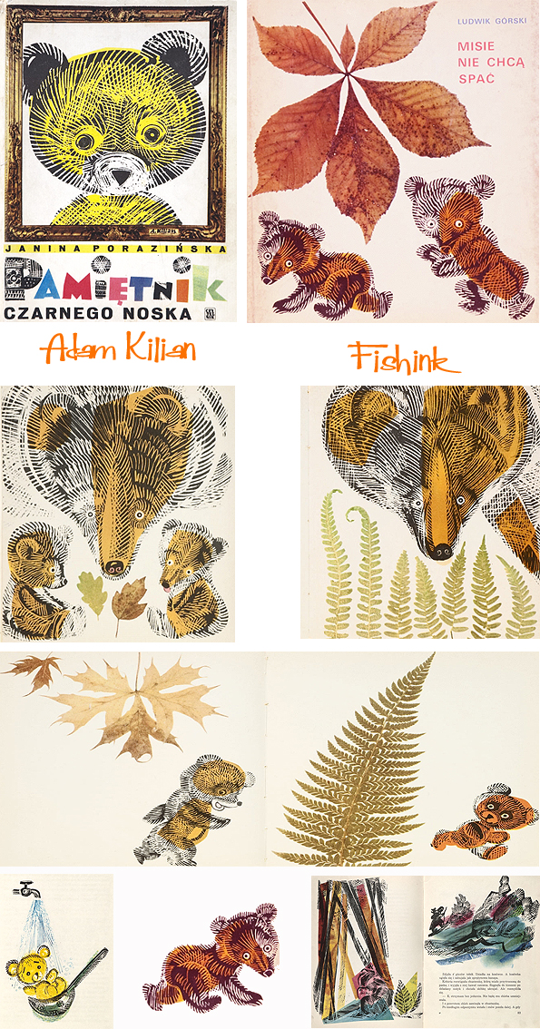
A beautifully illustrated book about bears in autumn.
A few of his puppets.
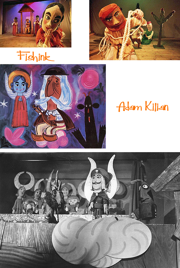
This mustacheoed figure looks right out of one of Oliver Sachs animations like Noggin the Nog or Ivor The Engine !
There’s a great post with more info about the life of Adam Kilian over at Culture Pl.
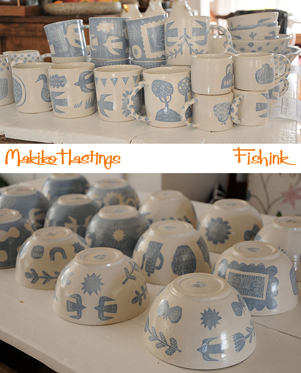
Makiko Hastings Beautiful Ceramics

For some time now I’ve been looking at (and lusting after) the work of Makiko Hastings. I first came across her ceramics at the YSP Shop. She makes a whole host of different ranges and styles. Firstly there is a range that is pierced so that once it has been baked and glazed it allows the light to show through.

More decorative work (based on the idea of lily pads) using decorative and delicate floral transfers.

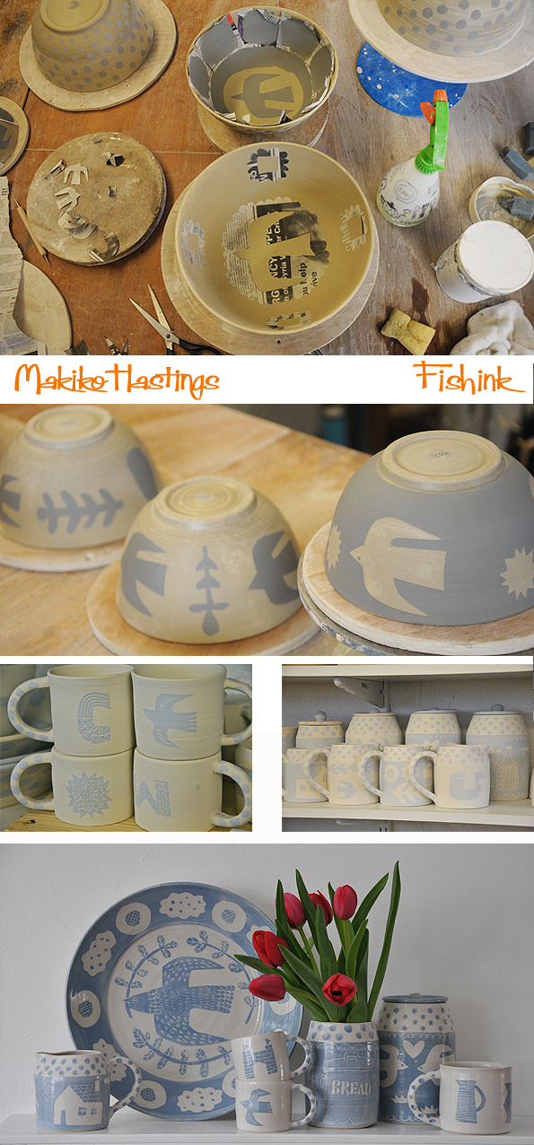
Makiko explained a little to me about her other styles of work.
“Below is the Mazekoze range. The word means ‘mixing up’ in Japanese and this collection is more focused on the form. The bowls are all hand thrown then altered into flower shape. To highlight the shape, I only use one colour of glaze. The plates are actually hand built then I add a surface pattern. I mix the glaze by a traditional method without using a ready made colorant. I tested and experimented for quite a long time in order to get what I wanted. I know I can buy any colours from the supplier today, but I still believe my own philosophy of handmade – i.e. in doing it yourself ! I wanted nice colour combinations of two colours, but not like green and brown which is too traditional. So when yellow ochre and grey came out successfully… I was really chuffed. I am planning to add purple and olive in the future. ”

Makiko first makes the bowls to the exact size she wants, she keeps a guide to tell her how deep and how far across each size of bowl should be. Then she forms the wet bowl into the shape she desires, and continues to do this for every larger size of bowl so that, when they’re fired and dry and shrink, they all do so at the same rate and therefore the bowls will sit beautifully within one another with equal space around them. It’s a real skill to be able to do this consistently.


Makiko likes the idea of people mixing up her range with shapes and colours.

My personal favourite range is her Rakugaki ware (this means ‘doodling’ in Japanese). Makiko takes up the story…”When I first started this range, I wanted to express something unplanned, spontaneous like the doodling you do on a piece of paper whilst you are on the phone etc. I wanted to make something casual and fun. I used line drawling like you do with a pen rather than painting with brush. So I chose a ceramic crayon to draw on bisque ware. I suppose it can be screen transferred or something if you wanted a clear and precise line drawing like a normal pen can do, but to me that was too sharp and too modern. I wanted it to be more random and imperfect, so the rough line from the ceramic crayon was just perfect. I used to draw items such as chairs and lamp, houses, clouds, ladders and spiders. The range was successful and sold well. You can see in the photos below, my rakugaki ware displayed within the stand at my college show. The crayon was black so when I glazed with white, the line became blue. Hence the blue and white range came to life. ”

” Later on I started to find that crayon drawing was limited and when I wanted a bold blue somewhere in the drawing I had to fill the whole space with crayon. So I’ve changed the application and now use slip (coloured liquid clay) instead. Slip is applied on the unfired surface, then I scratch over the area to make a negative white over blue, or visa versa. I used a brush to apply the slip at first, but I didn’t like that the fact that edge can be blurry and not sharp enough. So I used newspaper and cut out shapes prior to applying the slip. Sort of like stencilling. Now I am very pleased with the result, as my blue and white doodling has much more crisp edges but still has the sense of fun. I rarely use sketchbooks. In particular for rakugaki, I don’t plan so much, I just start cutting out newspaper and make design up as I go. But I tend to ‘draw’ what I like, such as birds, nature, kitchen items etc.”
I think this range has reached a wonderful final stage where each cup, bowl etc is unique and with it’s simplistic colouring, you can easily mix and match any designs. Beautiful work Makiko.
You can see some of the process work here.
I must track down Makiko’s work somewhere nearby and grab myself one of these lovely mugs.


Makiko has her first solo exhibition on at the Ropewalk Gallery in North Lincolnshire from October 4th to November 2nd, featuring a collection of her ‘mazekoze’ work. If you’re in the area do drop by and buy something. Failing that here’s a list of other stockists and do keep an eye on her blog for more images and information. Thanks to Makiko for answering questions about her work and sending such great images to illustrate this post.
If you enjoyed this post you may also like the work of RAMP Ceramics and Katrin Moye, I’ve featured previously.


