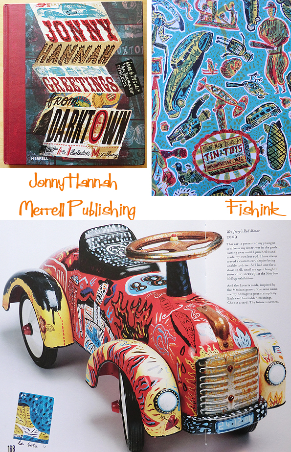
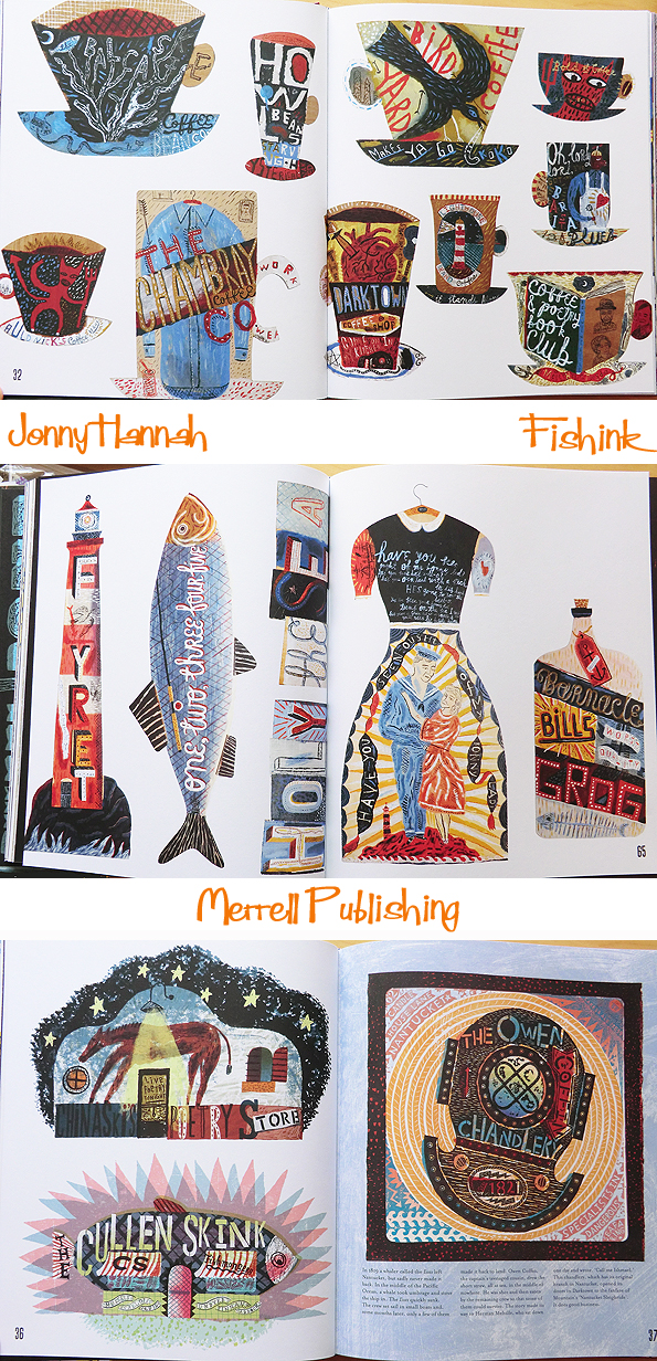
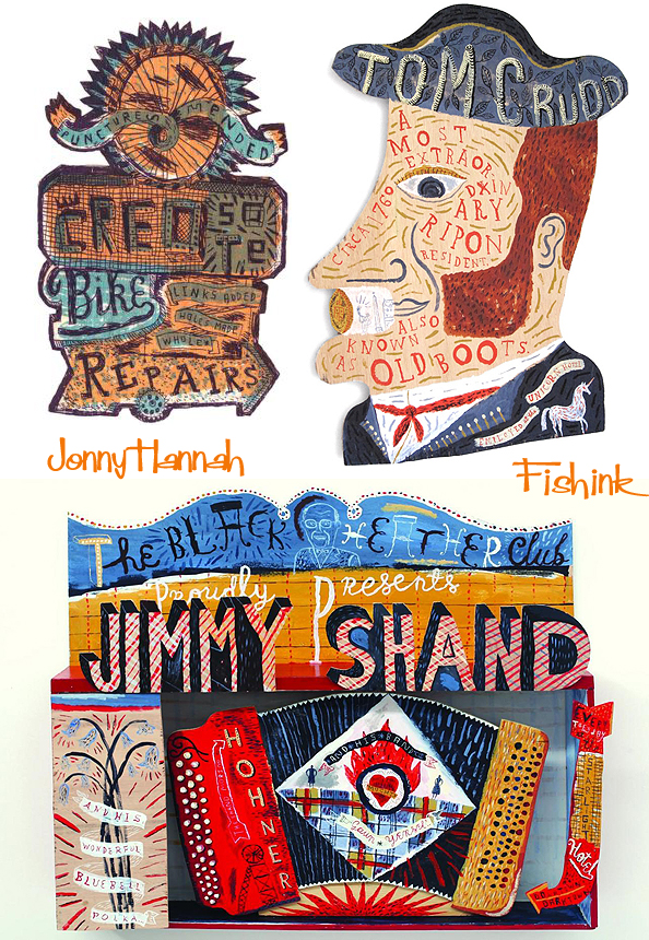
Jonny Hannah Merrell Publishers Illustrated Greetings From Darktown
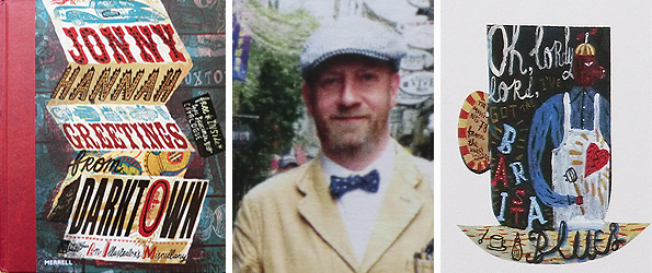
A huge vote of thanks to those fab people over at Merrell for sending me a copy of their latest book, on artist Jonny Hannah. He works with Heart Agency and also St Judes to illustrate his wonderfully eerie worlds of mayhem and mischief. The book is a real treat for lovers of typography, colour and nostalgic nods to a bygone and often rather downtrodden era. It’s lavishly produced and with over 170 pages, it reveals the many sides of the man behind the work and is a wonderful collection and exploration of the artist’s work to date.
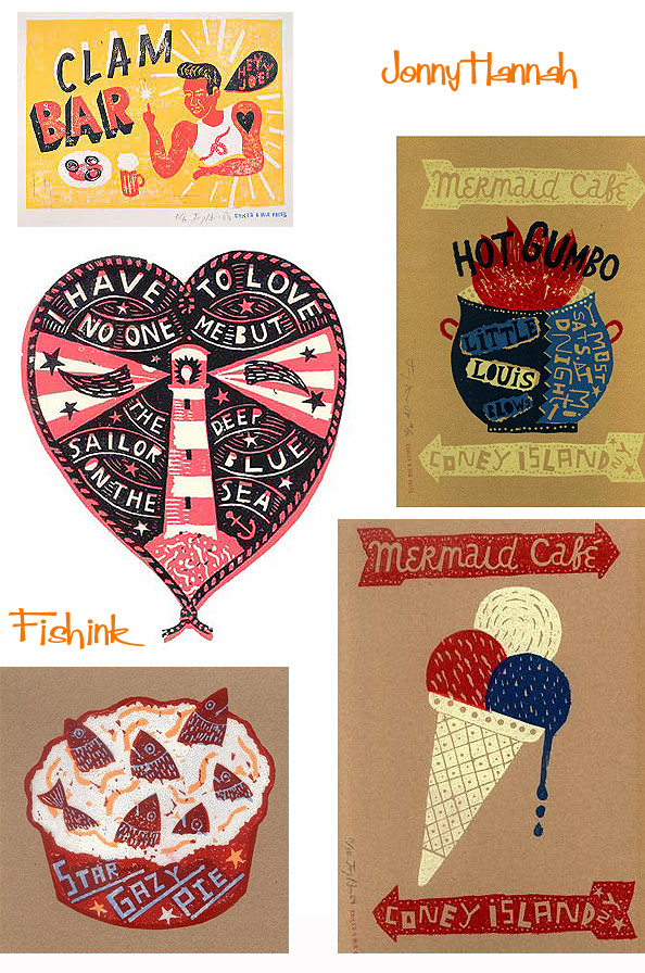
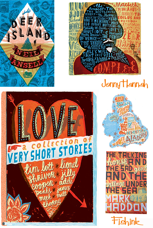
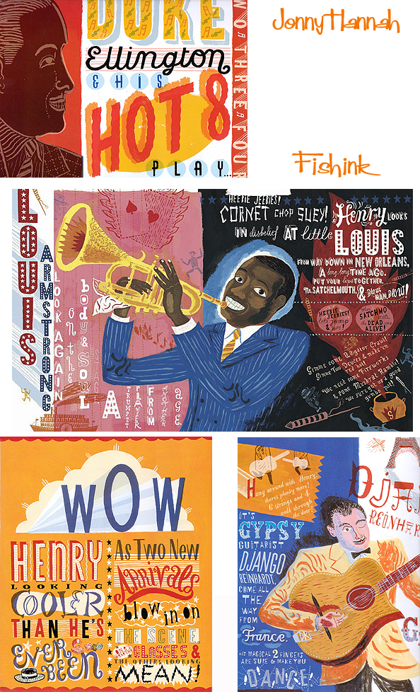
Jonny loves to drift into a bizarre and sometimes darkened world inside his imagination. From there he creates illustrations based on the sea, bowler-hatted skeletons, sea monsters, tattooed sailors, sailing vessels etc. Darktown is his imaginary collection of run down establishments inhabited by Jazz Artistes, the Action Hero Rocket Man, shady characters and people you probably wouldn’t want to bump into at two in the morning in a remote seaside resort in wintertime. Thoughts of a Morrissey song pops into my head as I peruse the book, with lines like,
…Everyday is like Sunday
Everyday is silent and grey
Hide on the promenade
Etch a postcard :
“How I Dearly Wish I Was Not Here”
In the seaside town
That they forgot to bomb
Come, come, come – nuclear bomb…
Also Rickie Lee Jones’s song ‘We Belong together ‘
…But a sailor just takes a broad down to the dark end of the fair
To turn her into a tattoo
That will whisper
Into the back of Johnny’s black hair
And now Johnny the King walks these streets without her in the rain
Lookin’ for a leather jacket
And a girl who wrote her name forever…
However Jonny Hannah’s work is anything but silent and grey, it’s vibrant, lively and full of pattern, surface texture and ornate typography.
Born in Dumfermline, Jonny studied illustration at the Cowdenbeath College of Knowledge, Liverpool Art School & then the Royal College of Art.
For the last twelve years he has been a freelance illustrator. His many clients include The Sunday Telegraph, The New York Times & The St. Kilda Courier.
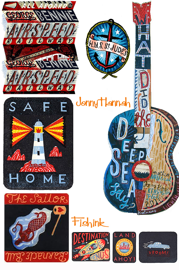
Any spare minute is spent working on news projects for his own Cakes & Ale Press, busily creating books, posters, prints & occasionally t-shirts.
Benji Davies arrival from On Sudden Hill !

Very excitedly I received this huge parcel saturday morning containing my ‘fresh-off-the-press’ copy of ‘ On Sudden Hill ‘ which I mentioned here by the very talented Benji Davies and Linda Sarah. Apart from the lovely dedication, Benji had very kindly donated a paperback copy of this beautiful book which I shall be putting into a competition on my blog soon, so keep an eye out for that !
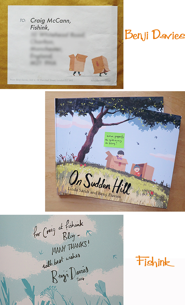
The hardback is truly a beautiful book and for a short period if you buy it through Benji’s site, you get a limited edition artists print too !
Love the illustrations and feel of this story…. get your copy here today.
With all this patchy, sometimes, drizzly weather at the moment, what could be better than to curl up with a good book : )

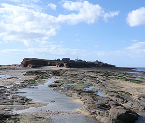
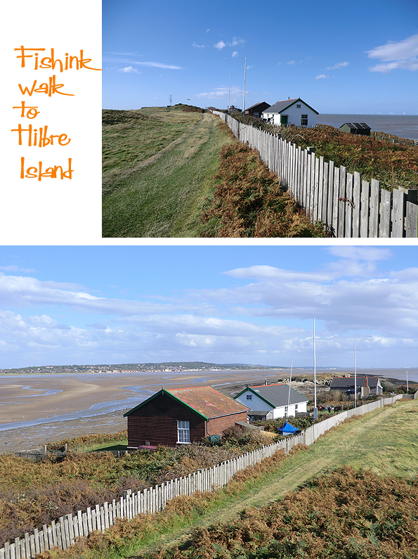
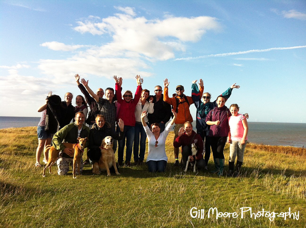
Fishink on Hilbre Island

‘ Good morning ‘ says Boo ‘ I know we’re going in the car today, so if it’s alright with you, I’ll just hide here ‘ !
It was a pure stroke of genius that one of my school friends organised a walk to Hilbre Island on thursday, saying that the weather was going to be good. We left Manchester during a huge downpour and with a little trepidation, partly due to the weather and partly due to my dog’s car sickness, made our way over to West Kirby on the Wirral where we were meeting.
We were met with a much bigger group than I’d anticipated as more and more of my old friends had heard that we were going on this walk and had taken the day off work to join in. So with a big smile the group of sixteen of us (and three dogs) set off on the forty minute walk over the sands to Middle Eye which leads you onto Hilbre Island.

We were certainly in luck, as the dogs ran ever increasingly larger circles around us and the sun shone all the way. There’s a little camera trickery going on in the first picture below as the view from of Hilbre comes into focus.
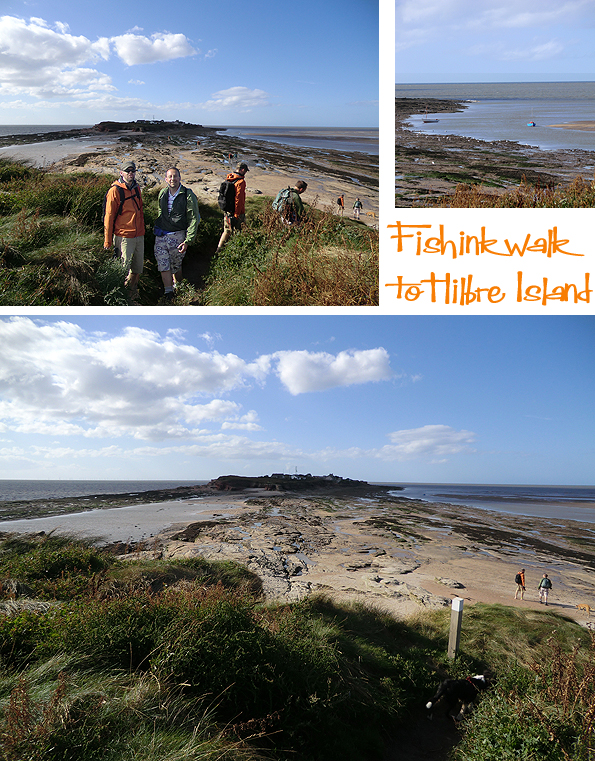
Hilbre Island is approximately 11.5 acres in area, and lies about 1 mile (1.6 km) from Red Rocks, the nearest part of the mainland of the Wirral Peninsula. The island’s name derives from the dedication of the medieval chapel which was built on the island to St. Hildeburgh, an Anglo-Saxon holy woman, after which it became known as Hildeburgheye or Hildeburgh’s Island.

It is believed that the island has been occupied on and off since the Stone Age, several finds of Stone and Bronze Age items and Roman pottery items were discovered in 1926. There are a few privately owned houses on the Island, an old telegraph station and what remains of an old lifeboat station.
We spent a lovely sunny hour sitting in the long grass, having chilled conversation and watching the dogs play.


We discovered one of the local inhabitants, luckily just before the dogs rolled all over it .

The islands were bought in 1856 by the Trustees of the Liverpool Docks, which later became known as the Mersey Docks and Harbour Board. Hilbre Island Lighthouse was constructed here in 1927. The islands were sold to Hoylake Council in 1945 for £2,500, passing to Wirral Borough Council on its formation in 1974.

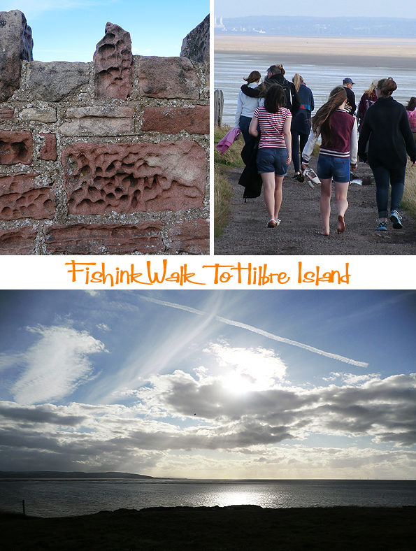
Such a beautiful tranquil bunch of people and a grand place to relax in the sunshine.

Thanks to Boo, for not being sick in the car (first time) and to everyone for their organisation and contributions towards good conversation, dog watching etc . Finally to my good friend Gill Moore who took this happy picture of us all. What a great memory.
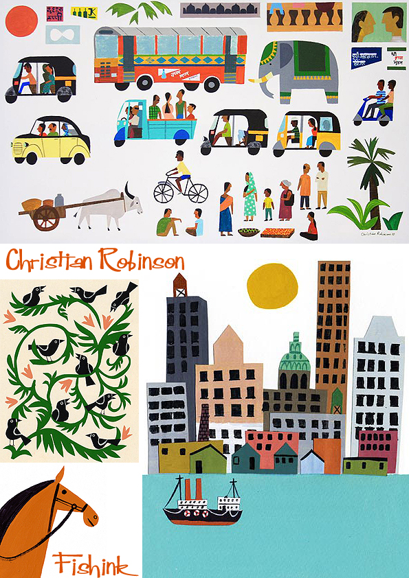
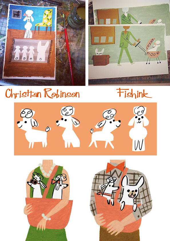
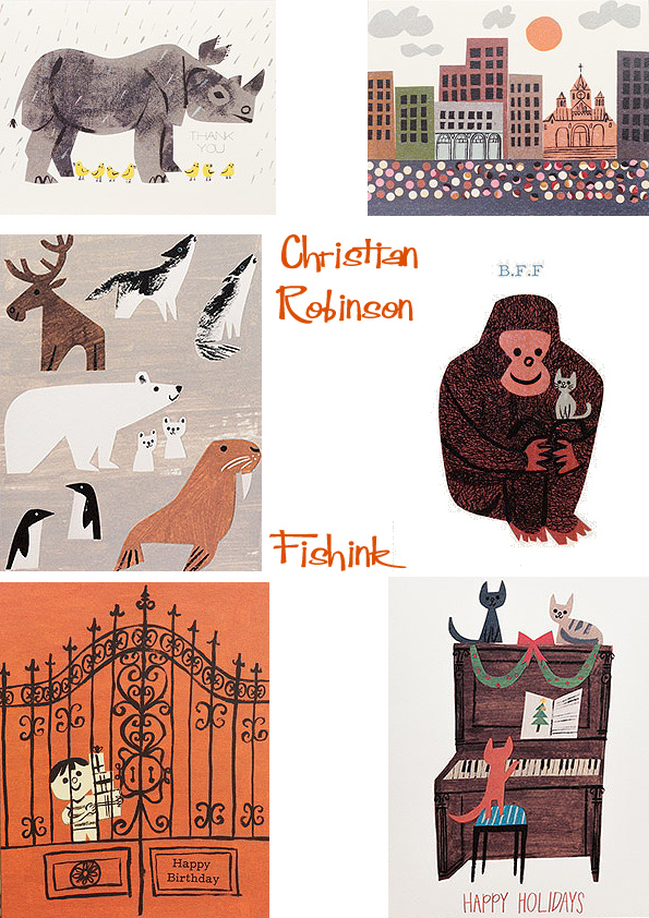
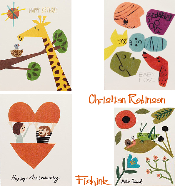
Christian Robinson and his Illustrated Art of Fun !
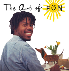
Christian Robinson is a talented illustrator of picture books, presently living and working in San Francisco. In 2008 he earned a BFA in Character Animation at the California Institute of the Arts. He has since worked with Pixar Animation Studios and the Sesame Street Workshop, to name but two amazing companies. I caught up with him to ask him more about his work and website ‘ The Art of Fun’.
Hi Christian, can you tell me a little about how you became an illustrator and some of your earliest memories of drawing ?
Hi Craig, Thanks for asking these questions! I take your or anyone’s interest as a great compliment. Long story short: I’d say I got to a place where I could make a living as an illustrator by being very very lucky ! Of course I subscribe to the definition of luck being when preparation meets opportunity. It feels as if I’ve been preparing my whole life, by always creating and by sharing my work. It was a blog I kept that caught Steven Malk’s eye, who is now my agent and set me on this course as an illustrator of picture books.
Some of my earliest memories of drawing are connected to the films and animations I watched growing up. I remember seeing a movie like Jurassic Park, Beetlejuice or The Lion King and immediately after racing to my sketch book to document and retell the story in my own drawings. Basically I think I did what most kids do, make little comics and design super heroes and monsters, oh and dinosaurs! I was… am obsessed with dinosaurs.
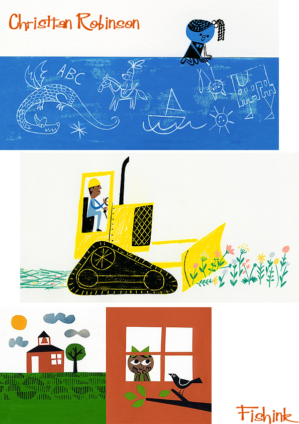
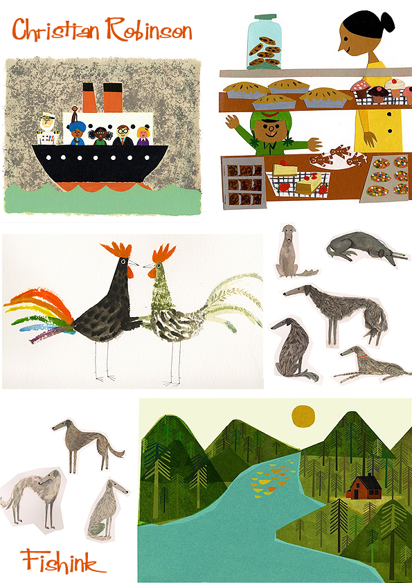
Your style of artwork feels so fresh and joyful with a mix of paper cut outs from time to time. How did you develop your personal style and were you influenced by any other artists work on the way to finding your own personal way of working ? (you must end up smiling a lot whilst at work) : )
Wow! Thanks! Quentin Blake the amazing illustrator of so many books for children like Matilda, Charlie and the Chocolate Factory, The BFG (Roald Dahl classics) said that an illustrator’s style is almost like their handwriting. Meaning that it should be something that flows naturally, one doesn’t have to think too hard on how they developed their own penmanship. I subscribe to that thought, but also admit that I’m a bit of a sponge and my work is influenced and inspired by so many illustrators and painters that I love. Illustrators like Ezra jack Keats and Abner Graboff inspire me to play with collage and cut outs. Designers like Paul Rand and Bruno Munari inspire me to keep things simple and have fun. Artist like Picasso and Mattise push me to explore color and shapes. I could keep going on and on.
I notice that you have worked for some amazing places in your career already like Pixar Animation Studios and the Sesame Street Workshop. Can you tell me a little about what it felt like to work within these famous environments, and what were the highlights for you ?
It felt incredible ! I think most creative people have the fear of creating something no one will like or worse, no one will care about. Having a commercially successful team of artists accept your work is validating and can feel amazing. Highlights would be the people I met along the way. During my internship at Pixar I had an incredible mentor Ben Butcher, who encouraged me to trust in my own creative voice. Ben also shared his love of picture books with me and turned me on to the possibility of becoming a picture book illustrator.
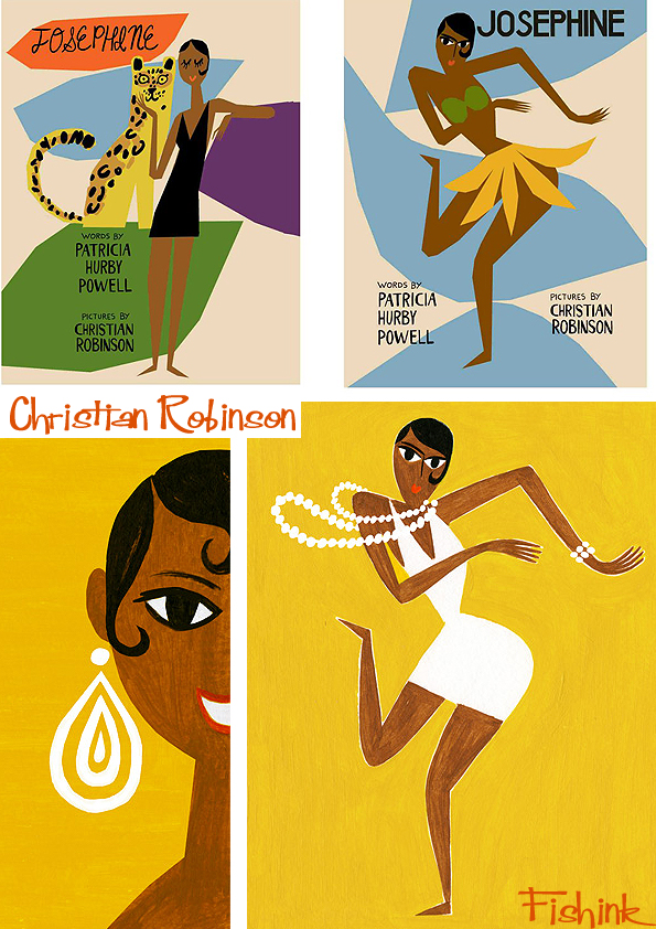
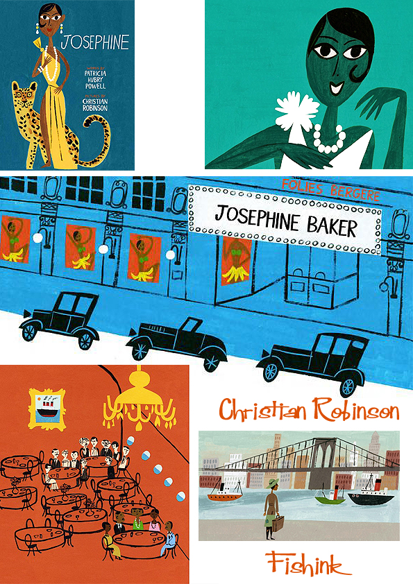
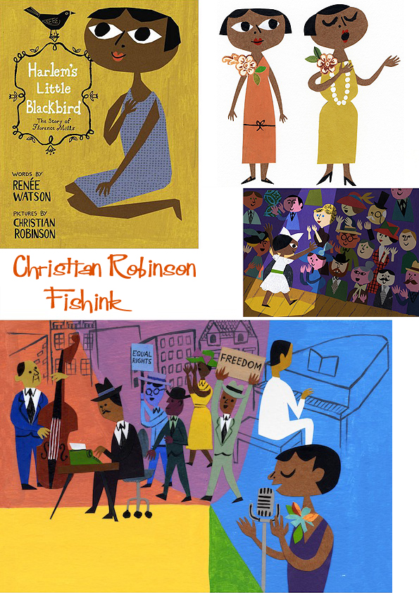
I notice from your beautiful books on Josephine Baker / Florence Mills and your posters and pamphlets for Precious and the LGBT Teens and bullying campaigns, that you have become, (in a small way), an illustrator who covers Black rights and minority group issues. I wondered how these wonderful opportunities came your way, and whether you are now getting a name for yourself for creating a greater awareness around Black and minority culture concerns ?
Well I’m very fortunate in that I have a certain amount of freedom to choose what sort of projects I work on. Naturally I gravitate toward sharing stories that I’m passionate about and resonate. It’s my hope that whatever I create it has a positive effect. I don’t really know how to get into how each project came along in a brief way 🙂
I sadly haven’t had the chance to read any of your books but from the look of these I want to thank you for the great work you’re doing to highlight these issues. There aren’t many illustrators doing this and I feel it’s a fab way to work and be able to educate people at the same time.
Thank you! Honestly I still pinch myself from time to time just to make sure I’m not dreaming. I love being able to do the work I do. It’s unfortunate that my work might stand out because it features a certain amount of diversity and tackles uneasy topics. Wouldn’t it be wonderful to imagine a day when there isn’t a diversity gap in books for children, to see more kids of different colors on the covers of bestselling books.
I quite agree Christian, let’s hope the work you’re doing here will help to speed that transition along.
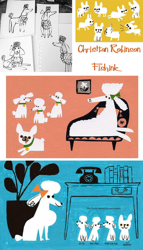
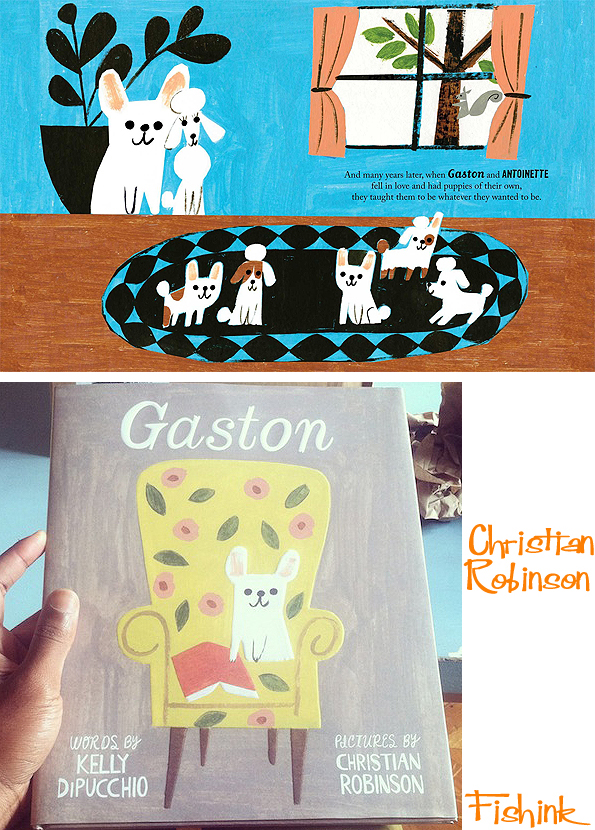
I particularly love the Gaston book and they way that you’ve included sketches on your blog.. it’s great to see a behind-the-scenes view, of how different artists like yourself, go about creating their books. Can you tell me a little about how you prepared for this book, in terms of where do you start sketching and gaining ideas ? Do you sketch from real life, photos or your imagination ? Does the authors story create the pictures for you when you first read through it ?
I like to do my research. I’d describe the start as cultivating curiosity for the characters and setting in the story. I go to the library and absorb all the visuals and facts that will influence and inspire the work. Then I start sketching, sometimes rough concepts; other times, more polished work. I basically work on creating enough art to share my vision with the art director and editor. Then layout sketches — I like to use Post-it [notes]. These are great, because I can easily switch out sketches that aren’t working. Then, once approved by the editor and art director, I create images in Photoshop, tying down shapes and colors. Then, final art collage and acrylic.

Which of your books to date have you most / least enjoyed creating and why ?
For some reason I almost want to reject this question 🙂 I think it’s like asking a parent what child is their favorite and why. I will say it takes a team to make a book, and often the experience is more enjoyable based on how well you get along with the art director and editor. Sometimes there is a shared vision, and other times it takes a bit of push and a pull to either have your point of view come through or to compromise with theirs. Either way the goal is the same, to make the best book as possible.

I love the range of cards you have created for Red Cap Cards and wondered whether you have any other new products in the pipeline, or things that you’d like to do for yourself that may provide further challenges to yourself ?
Well it’s a goal to author and illustrate a book of my own, sometime in the future. I think a part of me is ok taking my time though and waiting to share a story that I really believe in. Also just as it’s taken me a while to gain confidence in my voice as a visual storyteller, I think it might also take some time when using words to tell a story too.
We will look forward to that day Christian !
Here’s another great interview about Christian from 2012 from Seven Impossible Things Before Breakfast.

If you’re on instagram, I would suggest checking out Christian’s profile where he shares a lot of his most recent work, under the profile name of washing_dishes !
Fabulously colourful and exciting work Christian, keep it up and it will guarantee to keep us smiling too. Many thanks for your contributions, do please keep us posted re your new books and future illustrations.
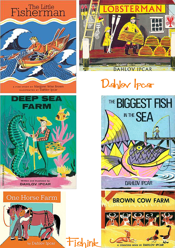
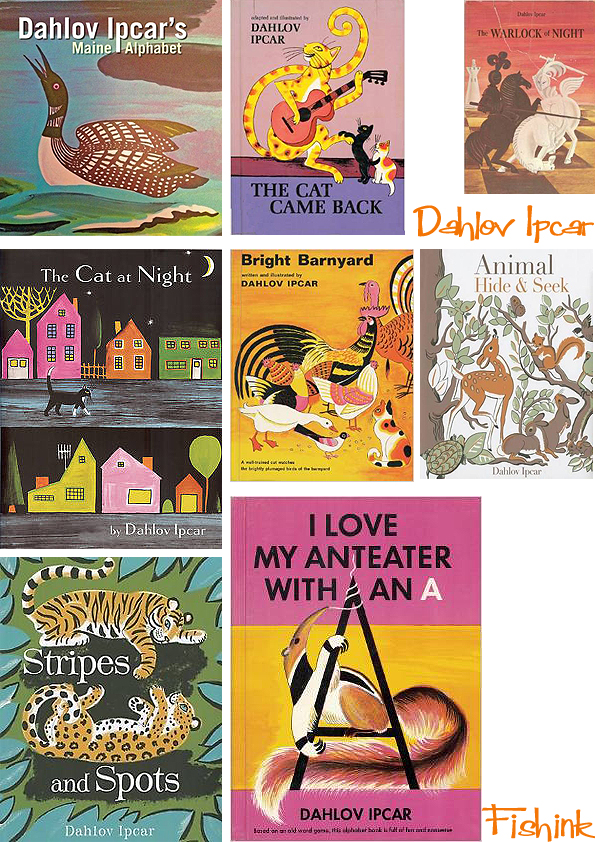
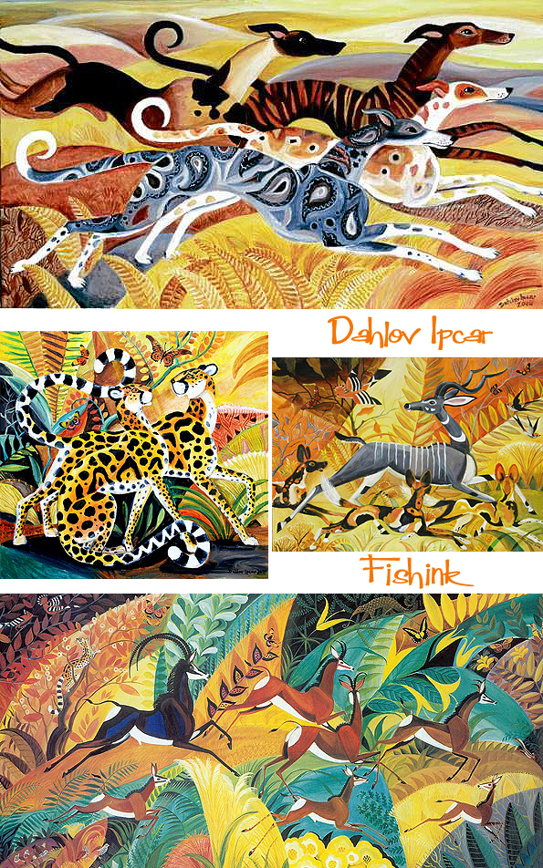
Dahlov Ipcar 50 years a Painter and Illustrator

In a career spanning more than half a century, Maine artist Dahlov Ipcar has written and illustrated more than thirty children’s and young adult books, starting with The Little Fisherman (by Margaret Wise Brown) in 1945 and including The Cat at Night, One Horse Farm, and My Wonderful Christmas Tree.
She was raised in Greenwich Village, New York City, attended City and Country School, Caroline Pratt’s progressive school, and grew up surrounded by bohemian influences.Encouraged by her parents, she started painting at a very young age. She briefly attended Oberlin, dropping out after only one semester, frustrated with the academic restrictions on her artistic expression.

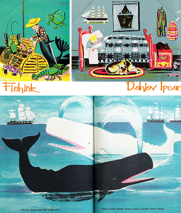
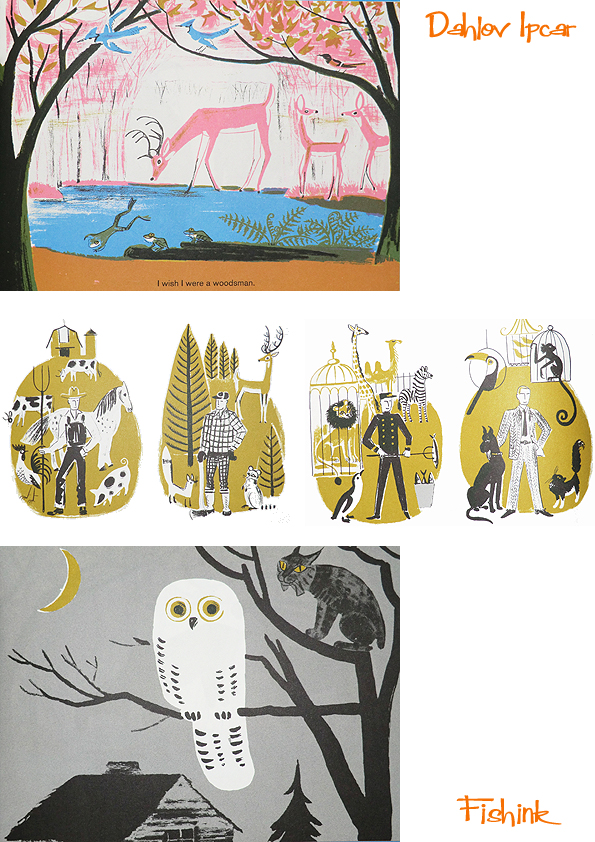
I love the colours in her ‘Lobsterman’ book. It does remind me of my own time in Maine a few years ago.

In 1936, at the age of 19, Dahlov married Adolph Ipcar, a young man hired to tutor her in math for her college tests.They spent that year in New York City, Adolph working as a math tutor while Dahlov taught art two days a week. The following winter, they decided to move into the extra farm house on Dahlov’s parent’s property in Georgetown, Maine, and started a farm of their own. They became modern-day subsistence farmers: growing their own food, raising animals and their two sons, as well as selling eggs and milk on the side for extra money. Dahlov continued painting throughout her life as both a source of pleasure and income. Her marriage lasted until 2003, when Adolph died at the age of 98 after a brief illness.
I can imagine this book was inspired by her own farm life.

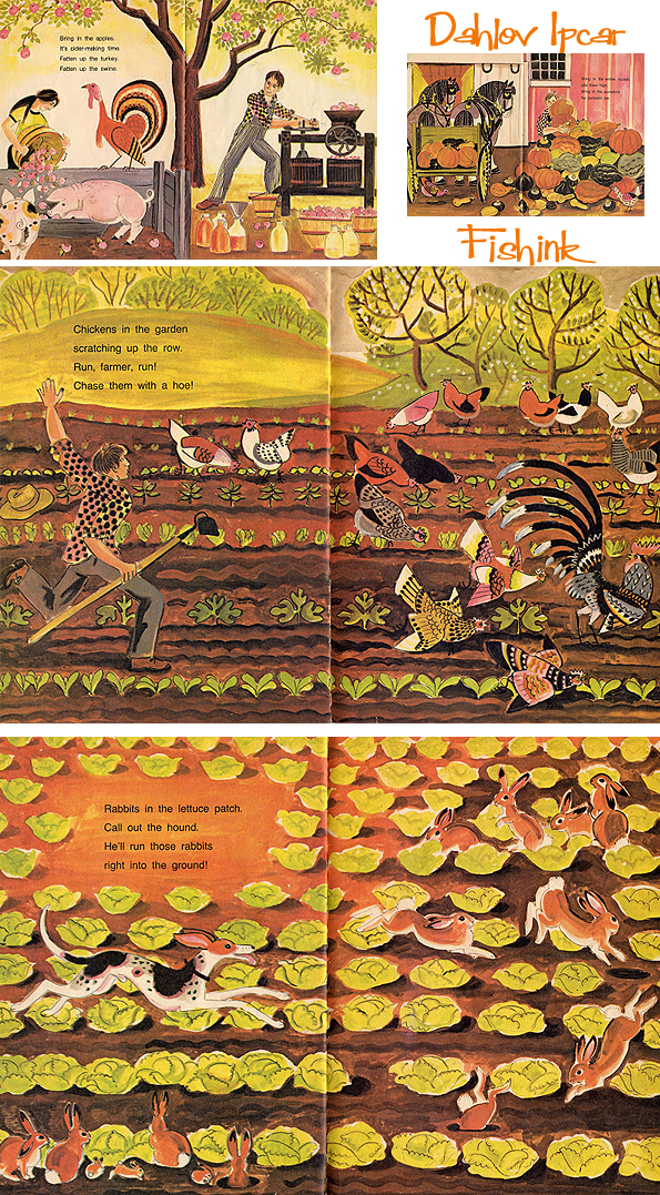
By the early 1940s, Ipcar had nearly given up thoughts of writing and illustrating books, but was contacted by a New York publisher to illustrate The Little Fisherman, the latest title at that time, by Margaret Wise Brown. The struggling young artist jumped at the chance, and this charming title helped launch a four decade run that saw her write and illustrate more than thirty children’s books of her own. She has also written four fantasy novels for a slightly older audience, as well as a volume of short stories for adults. While her art in general might be described as wild colours and cheerful, her writings for adults turn to a darker, almost grim intertwining of reality and fantasy. Here’s just a few of her book covers from over the years.


Flying Eye Books have managed to republish two of her books namely ‘I Like Animals’ and ‘The Wonderful Egg’. There’s a great deal of work that goes into reproducing a book in it’s original form and print processes. You can see more in this article on the Design Of The Picture Book site. They are beautifully printed and I was lucky to get a copy of I like Animals for myself.
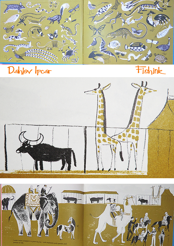

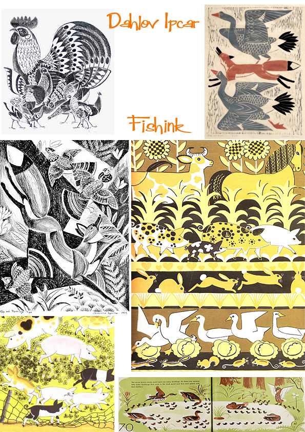
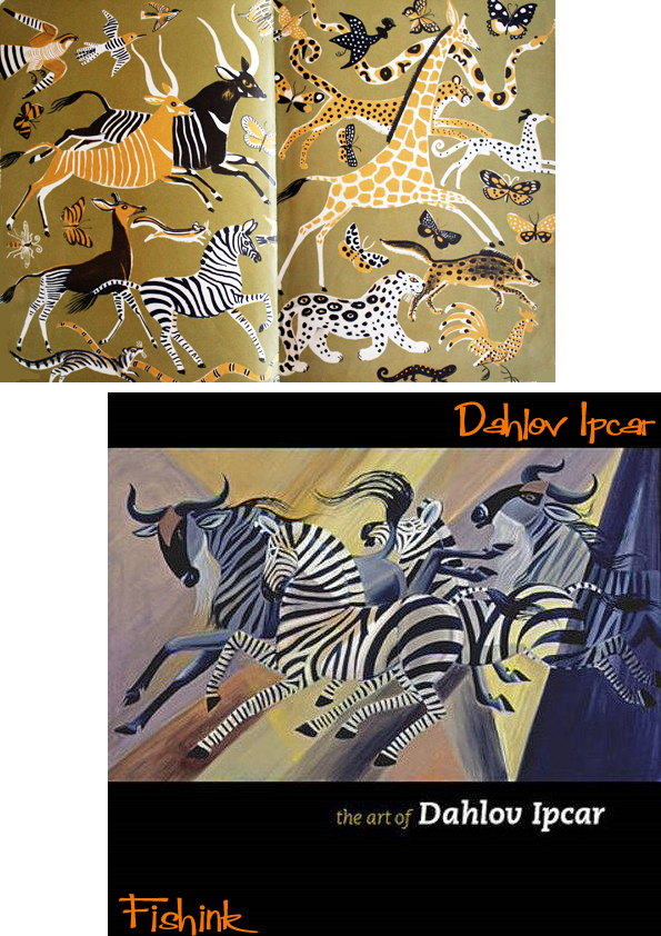
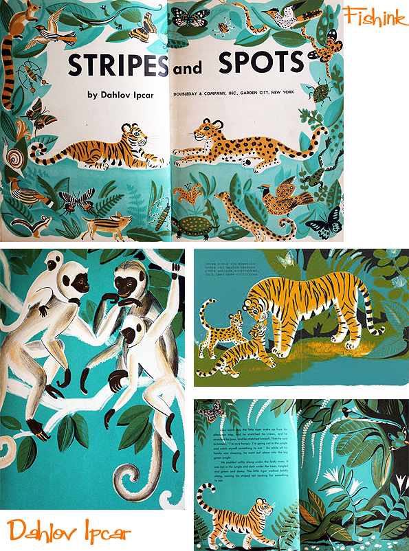
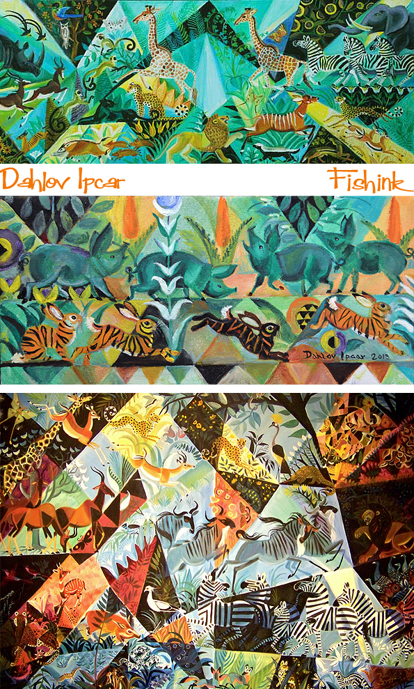
Her personal paintings appear to be animal centered and focus on a mix of slightly stylised and slightly realistic animal shapes with busy, patterned, geometric backgrounds. Colourful and fun.
I think my lurcher ‘Boo’ would like this crowd to run around with.
Today, Ipcar’s intricate, distinctive, and fanciful artwork is known worldwide, with pieces of her work in the collections of numerous renowned museums, including The Metropolitan Museum of Art and the Whitney Museum of American Art. Ipcar still lives and paints in the 1860’s farmhouse that she shared with Adolph for nearly seventy years.


In 2001, she received The Katahdin Award, a lifetime achievement award from the Maine Library Association, and in 2010, she was awarded the New England Independent Booksellers Association’s prestigious President’s Award for her outstanding contribution to arts and letters.
Dahlov says about her work ” I have lived most of my life surrounded by the serenity and natural beauty of Maine, yet my art is done entirely from imagination. I strive to create my own unique vision of the world. I am intrigued and inspired by the endless variety of patterns and forms in nature; they arouse in me the desire to create forms and patterns of my own.
While many people view the world through the eyes of past artists, I feel that it is up to the artists of the present to reveal new ways of seeing the world and to create new worlds never before seen. Increasingly, I have come to feel that the reality created by the artist is more important than actual reality. The real world may come to seem oppressively dull and barren unless transformed and revitalized by imagination ”
Check out more on her most colourful site here.

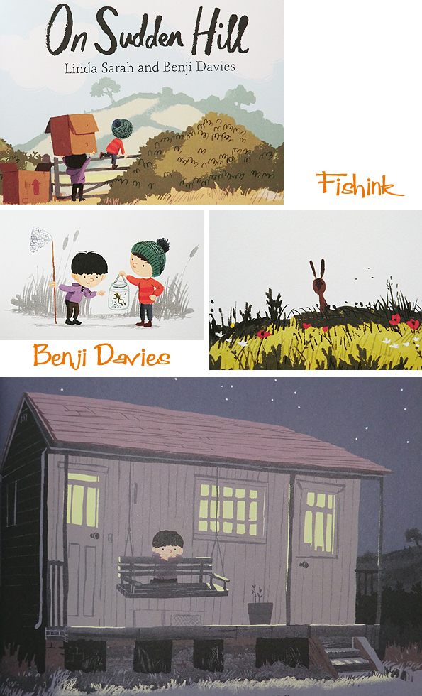
Benji Davies is no stranger to Fishink Blog. He happily answered a Q&A session last year and very kindly donated a signed copy of one of his books to feature in a competition. Well I’m delighted to say he’s back and initially I’m here to tell you about his latest achievements. Benji now lives with his wife Nina in Walthamstow, where he wrote his first self illustrated and self penned book ‘The Storm Whale’, which came out this time last year.

This is an enchanting story about a lonely little boy called Noi, who finds a washed up whale on the shore after a storm and decides to take care of him. As the story develops both animal and boy develop a relationship in which Benji’s captivating illustrations convey the warmth and affection of their relationship. ‘The Storm Whale, was the winner of the inaugral Oscar’s First Book Prize in 2014, and is shortlisted for Booktrust’s Best Book Awards.

Some of the scenery and feel of the setting is based on Whitstable. Lovely to see these early sketches too.

Benji’s latest book is due to be released at the end of August, called ‘On Sudden Hill’, and this time written by Linda Sarah. I started researching this post by contacting Linda to find out more about how the story came about.
” It was actually first written as a much more angry, adult story – one of my first clumsy attempts to try and write longer stories for older readers. In the original, the main protagonist is quite a bit older – and when he gets mad, he goes wild, setting fire to the box. You can tell more in the original book idea, that the relationship with his dad is pretty poor for him. So it was much bleaker. Then, months later, I adapted a story in my notebook into a picture book and re-found ”On Sudden Hill.’ It seemed that this was maybe a story that young people could relate to if re-written – so I tried and it tumbled out as is.
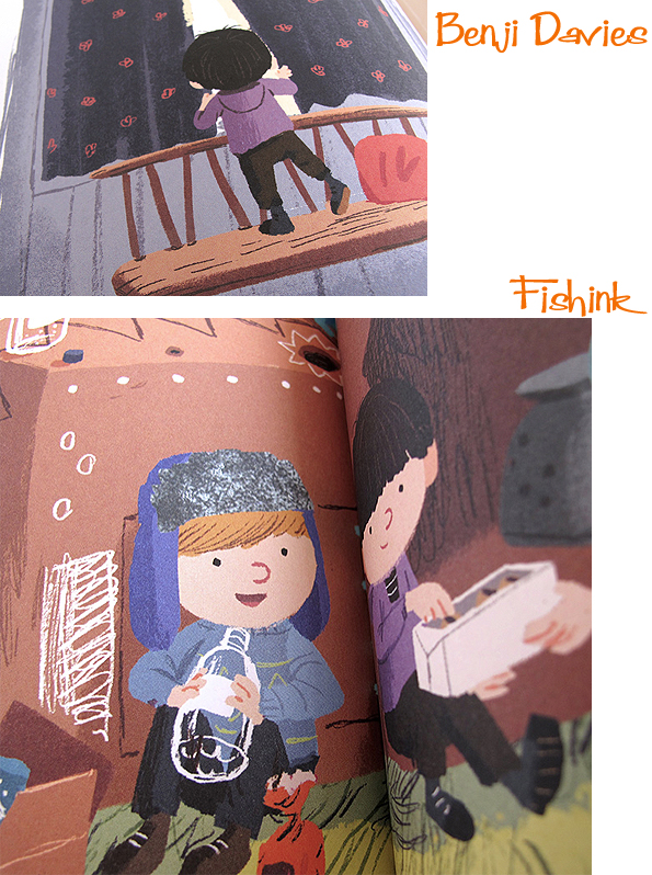
When I first saw the finished book illustrations it was just magic. Like the story in my head, but Oh! So much better, brighter, bigger, magnificent! The little boys, their expressions, the landscapes mirroring feelings and Benji’s gorgeous depiction of ‘Mr ClimbFierce’ etc. – pretty swoony (as you can tell I am a very big fan of Benji. I have no idea how he creates such awesome visual coolness!)
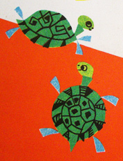
And maybe there is a tiny bit of me in the book too, those left-out feelings when small – when you feel kind of yucky and unwanted, alone and all wrong…and hide away turtle-like…
The title just came out, I’m not sure from where ” Sarah has already written and illustrated another book ” Mi and Museum City ” available here.
I was also lucky enough to track down Benji again for some feedback and questions on his new work.
Hi Benji, It’s been a year since we last ‘spoke’ and congrats on the success of The Storm Whale, it’s done amazingly well.
Thanks Craig, great to be featured again on Fishink Blog.
Was it a different experience composing the illustrations for your own story, as opposed to working with another author’s script ? Was one harder than the other ? and generally which came first the story or ideas for images ?
I’ve been asked this before and I keep changing my mind on which is easier. Sometimes I think its illustrating someone else’s words, because its all there on the page, you just have to see where its takes your imagination. But on the other hand that can often be easier said than done, and some texts appear more obvious than others.
Writing stories is harder in essence, but easier in other ways because you have created the whole thing and can often see exactly where it needs to go. Its quite clear when something is wrong for the story – you always have your original idea and motivations to write it, that you can refer back to.
With someone else text it could be that you’ve totally misjudged it and because you didn’t write it, its harder to see where you might have gone off track with the imagery.
When writing my own stuff, the words and pictures come hand in hand. Neither truly comes first because essentially its a thought, an idea in my head. So I suppose it is visual but almost immediately there are words describing the beginning of a story to go with that image – otherwise it wouldn’t be a idea – if that makes sense. The task is then to describe it on paper. I can either write something and make a note, or do a sketch whichever feels more appropriate to capture the idea.
For your new book ‘On Sudden Hill’, is the landscape taken from a real place or a mix of ideas from your mind / photographs etc ?
Really its a mix as you describe, taken from my own memory of times and places, backed up with visual references here and there. I spent many summers at my auntie’s house in rural essex when I was younger, and there’s a lot of the atmosphere evoked by that time period that I’ve been able to put into the imagery.
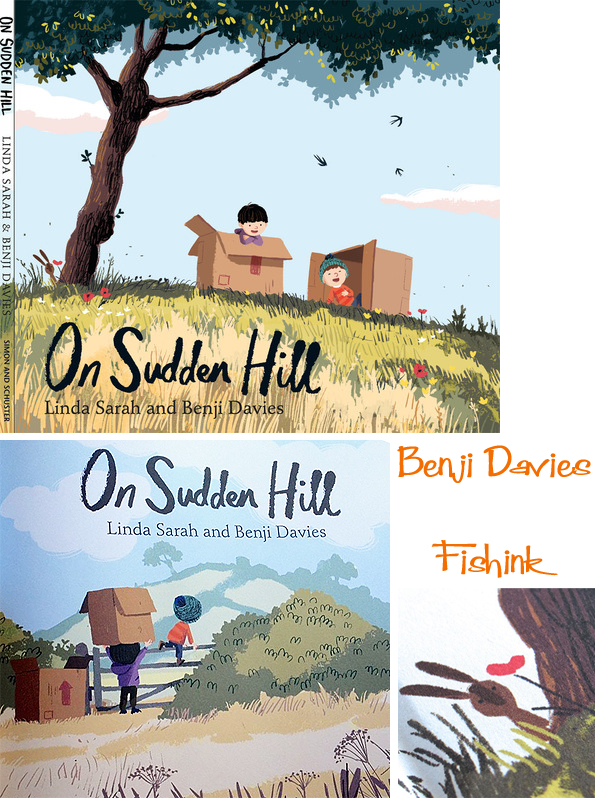
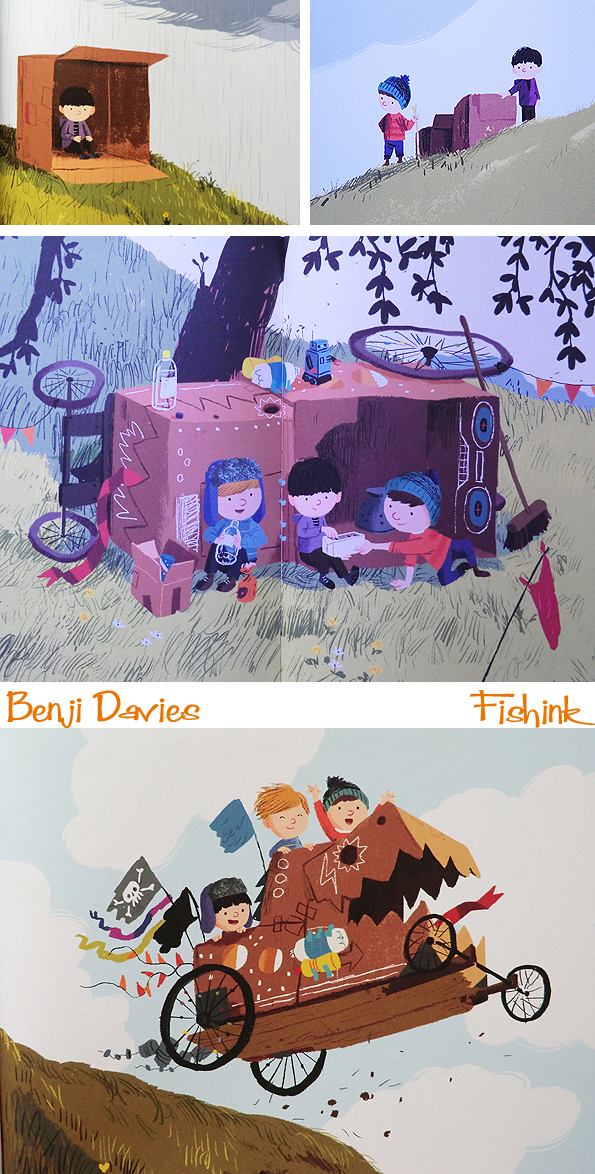
Birt and Etho are best friends, they play on Sudden Hill, making marvellous contraptions out of cardboard boxes. But then a new boy, Shu, wants to join in too. Birt isn’t sure that he wants Shu to join them. Eaten up with jealousy, he goes home and refuses to come out to play. Until Etho and Shu come to his house with the most marvellous cardboard contraption so far…A compelling story about accepting someone new.
I read somewhere, and wondered if it was true that one of the boys appearance is loosely based on your wife ? Do you tend to use people and places you know as inspirational material ?
Hah! That was a bit of speculation by a journalist. A visual similarity to a haircut was made. Although that wasn’t the case here, I think sometimes it can help to visualise a character through an existing person as a starting point, it helps to give you something to work with. It can be a quite a playful approach to take someone well-known and turn them into a child in your own style. It gives them added character and something to draw from and develop even if it becomes unrecognisable by the end. I often take photos of places, buildings especially, that I find interesting and think could feature in an illustration – again it gives added depth and character to an image, a bit of truth. The way the light falls on some brickwork, the odd angle and shape of a chimney pot that you could never have made up without seeing it – that makes it more believable.
It looks very summery in feel, full of long shadows and beautiful sunsets. How did you decide what the feel of these illustrations would be ? (i.e. talks with the author or trying out different seasonal/ colourful ideas ?)
Really just by reading the text and seeing what imagery that evoked in my mind. There is so much atmosphere in Linda’s words, a lot of it came to me very quickly, how it should look and feel. The characters were harder to get right and I even swapped two of them at a late stage in the process.. like switching the actors to play each others parts. This was the editor and art directors idea, because they felt the strength of the characters personalities wasn’t ringing true, and although it was at odd at first to re-artwork them, it made perfect sense.
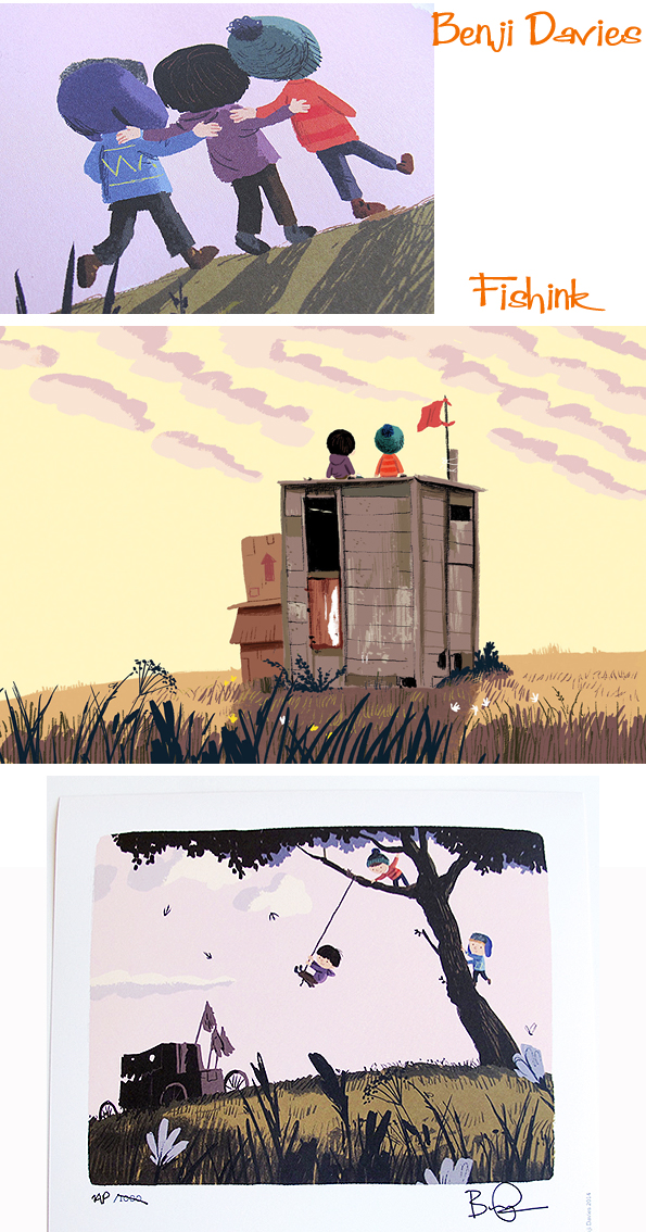
As a special treat if you order a copy of the hardback directly from Benji’s site, you can not only get your copy personally signed by the man himself, but you also get a free, limited edition print (above) too. My copy is already being prepared, get yours here whilst stocks last !
How long may it take you to create a 2 page spread for instance ?
It takes a couple of days for each spread, but maybe take place over a week or longer, interspersed with other things, so that I can walk way from it and come back with fresh eyes.
Do you have any other self penned stories up your illustrators sleeve that you can tell us about or indeed plans to do more in the future ?
I have just finished writing my second – it will be out with Simon & Schuster middle of next year, although thats all I can say for now. And yes, excited to say, plans for more to come!
Benji very kindly sent some of his initial sketches for the book, which can be seen here for the first time.

I believe that Simon and Schuster (the publishers) have arranged a blog tour for next week from the 25th to the 30th so do look out for that.
Many, many thanks, to both Linda and Benji for their time and thoughtful responses to my questions. Great to see another british masterpiece in the making, keep up the great work both of you
Fishink Sketches

I am keeping my hand in by sketching every now and then when I can find the time, playing around with different lines and styles. It does create new ideas and keeps my eye focussed on different ways of drawing and helps to build up a portfolio of imagery that I like too. Here are a couple of pages from my sketchbook.

With a splash of colour on brown paper and other textured surfaces.

Here I played around with the idea of doing a scribble with the brush pen and then quickly making it into something recognisable from the shape it suggested. Each dog took no more than 30 seconds. Some I like more than others, but generally, I think they have a good sense of movement. I added some colour to the top three dogs afterwards.

Some scruffy hounds in this bunch !

I like the butch one above (probably called Spike or Brutus) with the eye patch and the frantic one below chasing his tail. More hounds over on my Fishink website here.

A few more splashes of colour to add texture, movement and variety.


Happy day everyone and all comments, as ever, are most welcome.
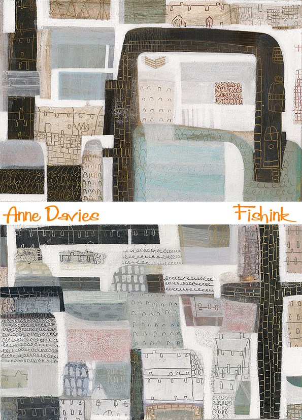
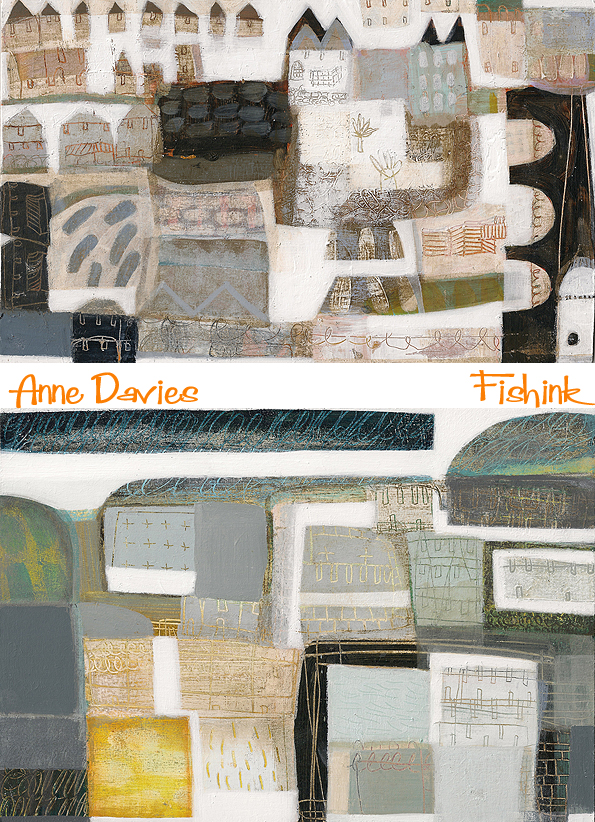
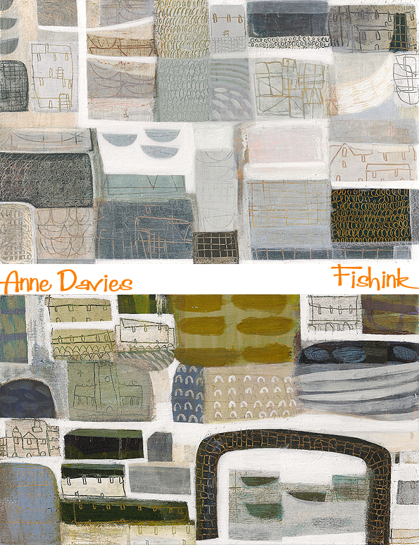
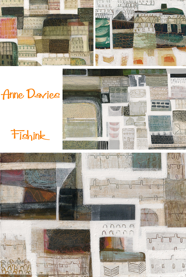
Anne Davies Aerial Views
Following on from my Blog Hop from last monday, the three friends I’d nominated to answer 4 questions about themselves and their work should all be publishing their pages today. Please do check out their blogs later and see what they have to say.. I can’t wait to read more about all three creatives. As a reminder here’s the line up…
The first is Stained glass artist Jane Littlefield who also writes a creative blog hi-lighting her processes and the classes she teaches. She makes some incredibly rich and colourful art, do check out her classes and website. Jane’s involved in a wonderful event at Manchester’s Victoria Baths on September 13th – 14th. You can see more below about who’s exhibiting.

The second is a relatively new blogger and friend Lizzie, who’s site, called Dream Discover Italia, is quickly taking off and is all about living in Italy (at the moment Venice). You can gather a sense of it’s culture and local happenings from an English gal abroad ! Wonderfully peppered with interesting photographs and snippets of news and knowledge that she’s gleaned only by being there.
My third nomination nomination is to Laura Weston who’s blog is wonderfully honest and descriptive, but could really do with an update, as we don’t all tweet to the same degree as you Laura lol. Let’s hope this is a positive prompt to see some of Laura’s fab new work on her blog. (sorry Laura, no pressure at all then !) : )
So onto today’s blogpost about Lancashire born Painter Anne Davies who grew up in the Derbyshire Peak District. On completion of a Fine Art Degree at Newcastle University, she embarked upon several projects creating art work with adults and children with special needs. Since she moved to London in 1995 Anne has focused on making and exhibiting her own work. Here’s a little of Anne’s less typical work, the children’s prints are available to buy through Easy Art.

When I saw Anne’s latest work, I was drawn to it for two reasons. Initially, because of it’s beautiful, yet minimal, colour palette and the scratchy, intricate marks. Secondly because the paintings are mostly landscapes from above. Why this aerial view constantly fascinates me I can’t tell you… but it does. Anne uses her sketchbooks to try out colour combinations and mark make with more freedom. She explains ” I don’t use the resulting images to directly translate into ‘finished’ pieces, this part of my creative process allows me to play with colour and line and experiment with ideas in a less formal way.” I got in touch with Anne to discover more.
Can you tell me a little about how your life as an artist came about and how you came to develop your current style of artwork that we can see on your website .
I wanted to be an artist since I was at school. I did a degree in Fine Art at Newcastle. I did lot of printing during my time there and always had a strong interest in colour. It wasn’t until after I graduated that I really found my style which comes from a love of landscape, colour and line. I think my time printmaking influenced my painting style, the layers etc.
How do you go about creating a new piece of work, do you use elements from your sketchbooks, painting in real environments or from photographs etc ?
I draw everyday, usually from my imagination, sometimes from life. I use my sketchbooks as a place to loosen up and mess about with colour. I don’t try to transfer compositions from the sketchbook as that doesn’t work with my style of painting. I start a painting with a very basic composition blocked out and then layer colour, draw into the paint, strip back and edit until I feel the painting is complete. I respond to the painting and things that happen during the process so the painting evolves. The finished composition is usually quite different from the starting point. Although the paintings are usually inspired by particular places they aren’t usually meant to be accurate depictions of a specific scene. They are more about the feeling or memory of a place, the feel of travelling through an environment. The painting takes over and it’s more important to me that it works as a painting than that it looks like a particular place. So elements that would be recognisably of a specific place that start off in the picture might get edited out if they don’t work with the rest of the piece.

Your site mentions you working from memories of places in Lancashire, villages and houses etc How do you create using memories in this way ?
I think my answer above covers this one too. I love the architecture of the industrial revolution, the way huge mills and rows of terraced workers houses are set into the most beautiful countryside. Both Derbyshire, where I was brought up, and Lancashire where I spent a lot of time as a child are rich in this kind of landscape.
Can you give us a rough guess as to how long one painting may take, ie how many layers are laid down to build up the effects that you desire ?
They are only small, but for example a 7 x 10 inches piece can take a good five or six hours of focused work because they are so layered. Having said that sometimes things are just flowing well and can be much quicker.
There’s something quite intimate about looking at these landscapes. Perhaps it’s just me, but I wonder if the feeling of flying overhead, like in a Chagall painting plays any part in making the viewing of Anne’s work more dreamlike and comforting ?

The ghostly white-washed effect in some of your work that you scratch into is lovely. Is this created by a thin layer of acrylic paint that covers the whole canvass and then is sponged off certain parts whist still wet ? What processes do you use to give such an array of ‘peep-through’ effects ?
The layers of colour are built up bit by bit. I work on board so it’s very resilient to stripping back and drawing into. Sometimes I will put a layer on and then ‘blot’ it with paper to strip some of it straight back off leaving a very fine layer. I use white to ‘carve out’ space in the picture or add movement and line. Because acrylic drys so quickly I have to work quickly if I want to remove layers or draw into wet paint. I’ve been building this style of working so long now that it has become instinctive and I know how long to leave a particular colour before lifting it to create the effect I want.
Don’t you just get drawn into investigating these aerial snapshot views, looking at the streets, fields and tiny details.
I’m always drawn to paintings with aerial views, partly because of the perspective and maybe partly because they give me the rare feeling of flying when I look at them. What made you decide to work in this style and were you influenced by other artists (ie Alfred Wallis) etc along the way ?
I’ve always loved maps and aerial views. The lines and shapes are interesting to me, the man made marks on the landscape and I like the feeling of taking in whole landscape rather than just one small view of it. I do enjoy the altered perspective of painters like Wallis. It’s more interesting to me, his paintings have more feeling and human warmth in them than traditional landscapes.
There are lush green landscapes.
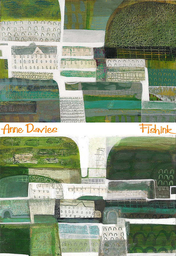
Colder, paler seascapes.
But all the time there’s that sense of watching/ hovering over these distant places.
What does the future of painting hold for you ? Do you have any aspirations of displaying in bigger galleries or producing a book or other items (cards etc) from your paintings ?
If I can continue to paint and enjoy it and make some kind of living out of it I will be happy. It’s always rewarding to have gallery shows and feel you are progressing and reaching more people but it is the painting itself that motivates me.
Lovely work Anne and many thanks for your time in answering my questions too.
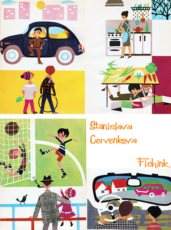
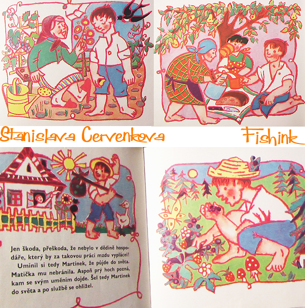
Stanislava Cervenkova Midcentury Czech Illustrator
I discovered this charming work by Czech Illustrator Stanislava Cervenkova. Sadly there isn’t anything written about her that I can find online. There are many different styles of illustration that she created and this is definitely my favourite.
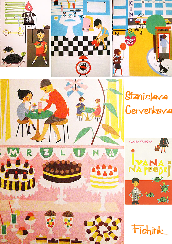
Her work is dated in the late 50’s/ early 1960, such calm, yet colourful work.
Great use of check fabric in these coats.
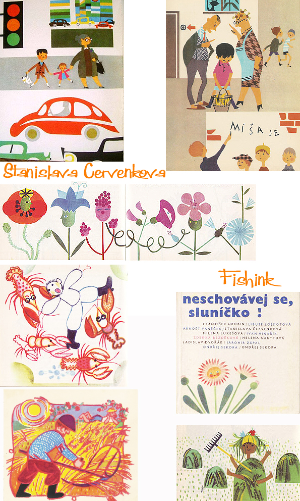
This book is dated 1962 and looks to be about working life in the countryside .

More work in a very different style again. Bold bright colours and defined lines around shapes.
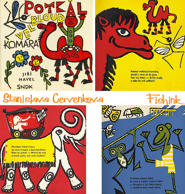
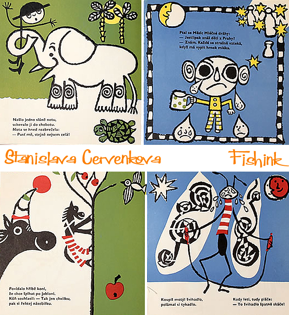
If anyone knows anymore about this artist then please let me know.
Modern Publicity 1953 – 54. Illustrated Mid century Art, Advertising and Graphics Part 2
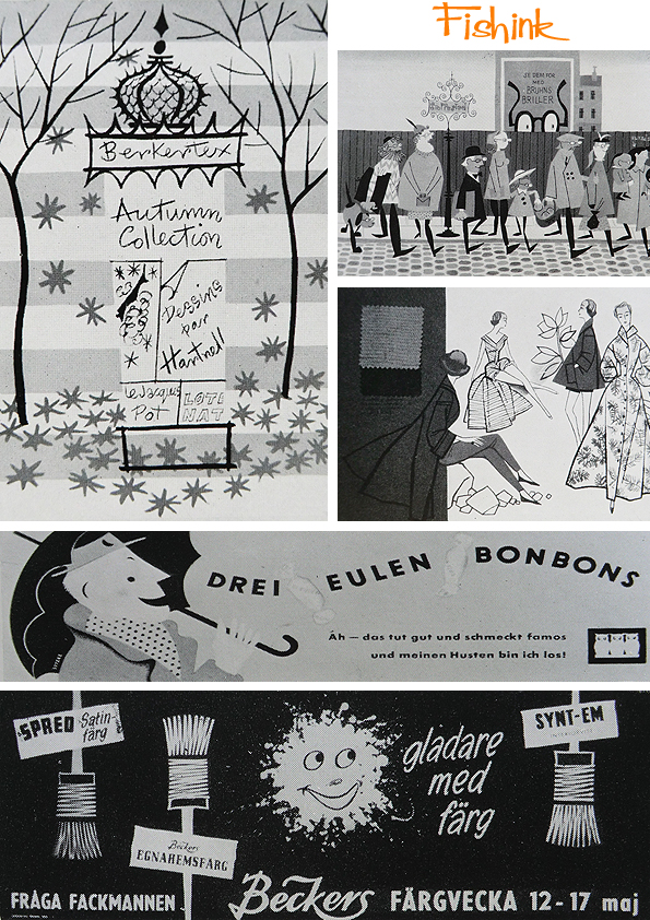
Welcome to part 2 of a series of posts about the world of advertising back in 1953 -1954, part 1 is available here. There’s no better way to start off a blog post than with a little Edward Bawden (top left).

Some of the well known companies like Shell, BP, Osram etc were using great work and great names, in their advertising campaigns to attract the public’s attention.

As ever with this mid-century period, there’s always beautiful design, textures, linework, style and humour in the work.

This Berkertex ad looks as fresh as if it had been published today and the illustration of the people stepping off the kerb, is a dead ringer for the modern day, yet retro work of Matte Stephens.
Beautifully simplistic travel posters. They make me want to fly there.

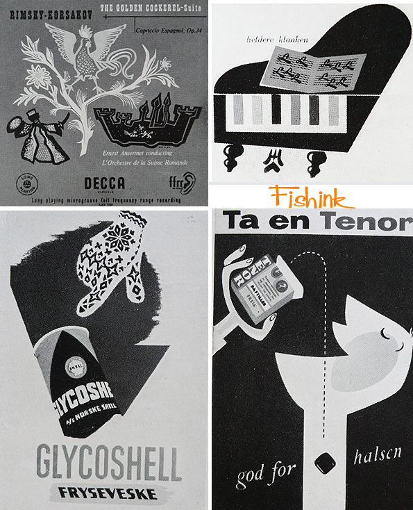
Record covers and packaging designs, all cleverly considered.
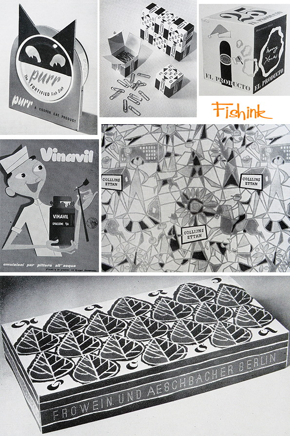
Love the ‘Purr’ point of sales advertising.
Do let me know if you remember any of these, or have just enjoyed seeing them for the first time too. You can find more posts in this style by searching for ‘Modern Publicity’ using the search function on my blog. Happy investigating !


