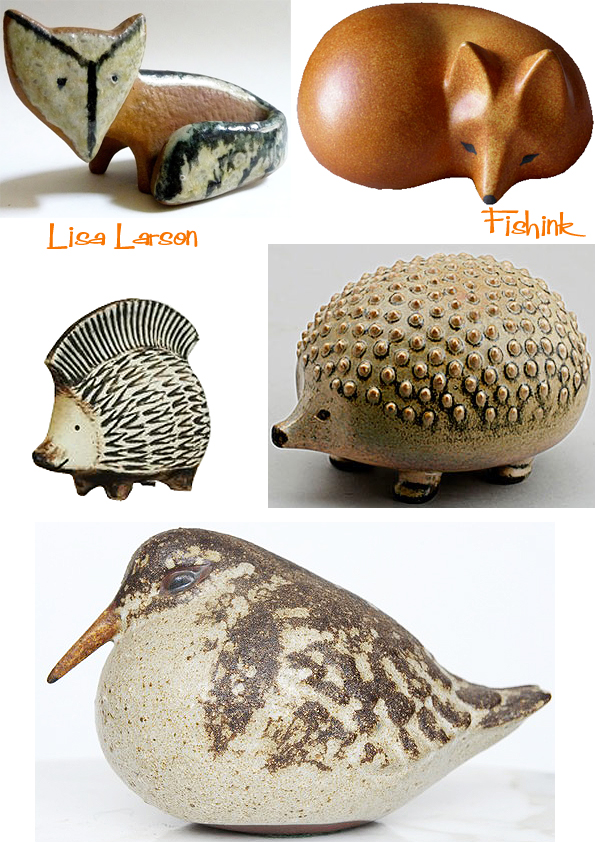
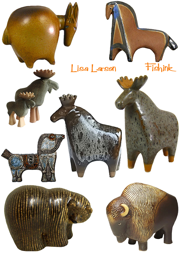
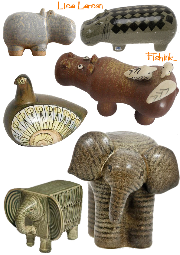
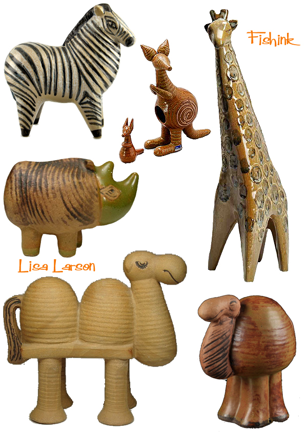
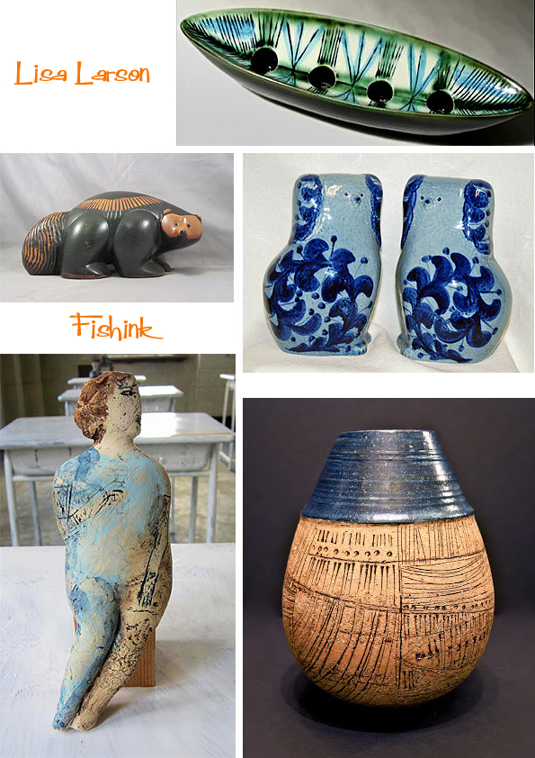
More Lisa Larson Ceramics
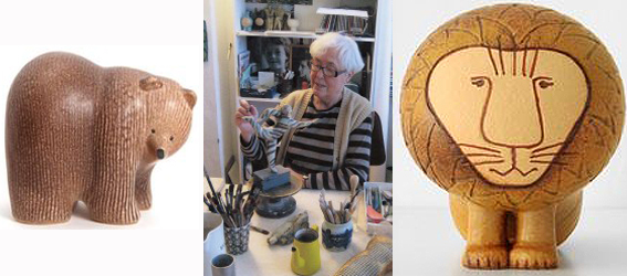
It was way back in 2010 that I first featured the work of Lisa Larson on my site. Since then, I keep being reminded of how much I like her ceramics, when coming across images of her work online. So I decided to group some more of her fab animals together for an update, starting with her famous Cats. I love they way these skulk about on their little legs.

There appears to be many versions of the same animal with different glazes or colourations. Again this probably helps to keep them highly collectable.

A few animals from the hedgerows.
From the fields to the prairies, the plains to the mountains too, she’s covered them all.
Even those from the zoo !
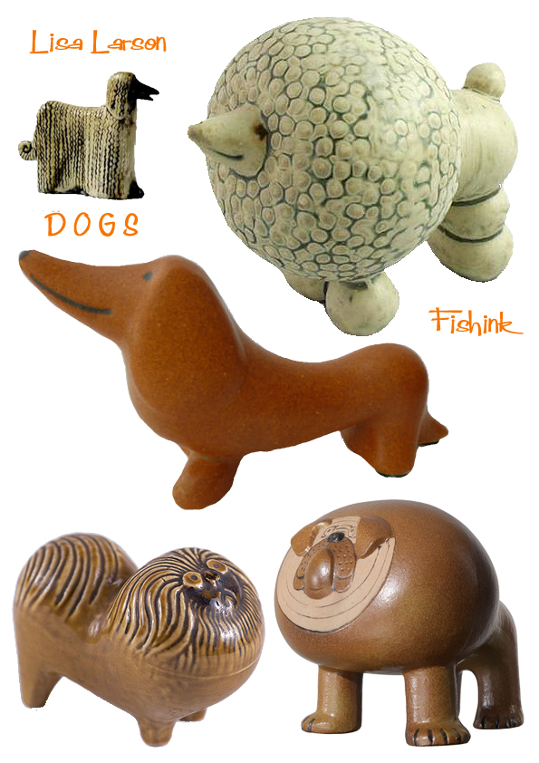
We all know that dogs come in many different shapes and sizes. Her ‘pom-pom’ poodles and gruff bulldogs both made me smile.

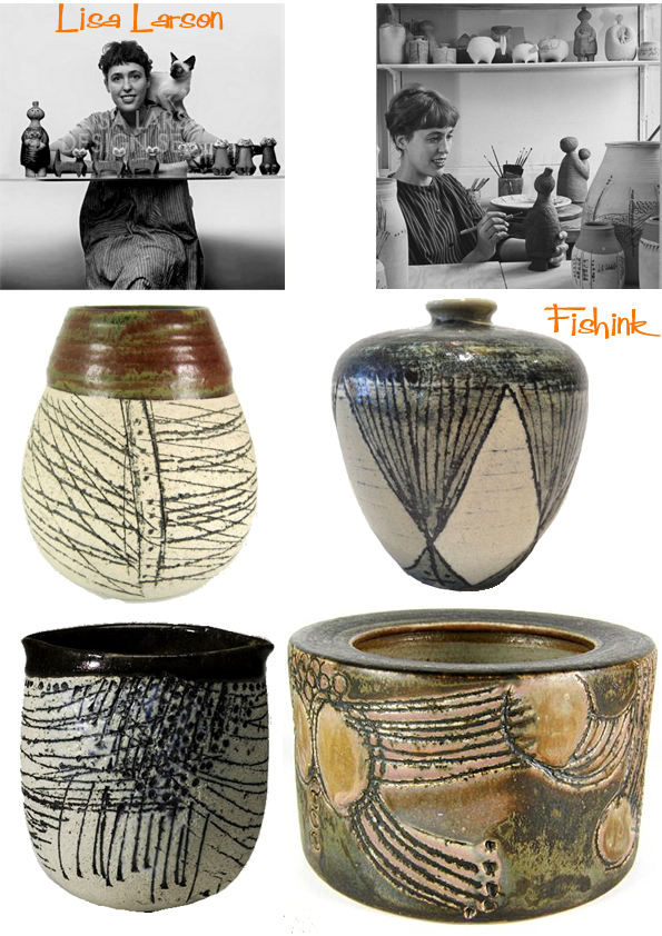
A few of her pots and vessels.
In the last few years, Tokyo has been so inspired by her work that not only is Lisa having exhibitions there, but a company called Powershovel has started producing towels, toys and books for a new generation to appreciate.
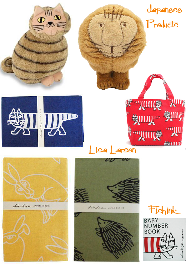
The T-shirts are sold through Uniqlo.
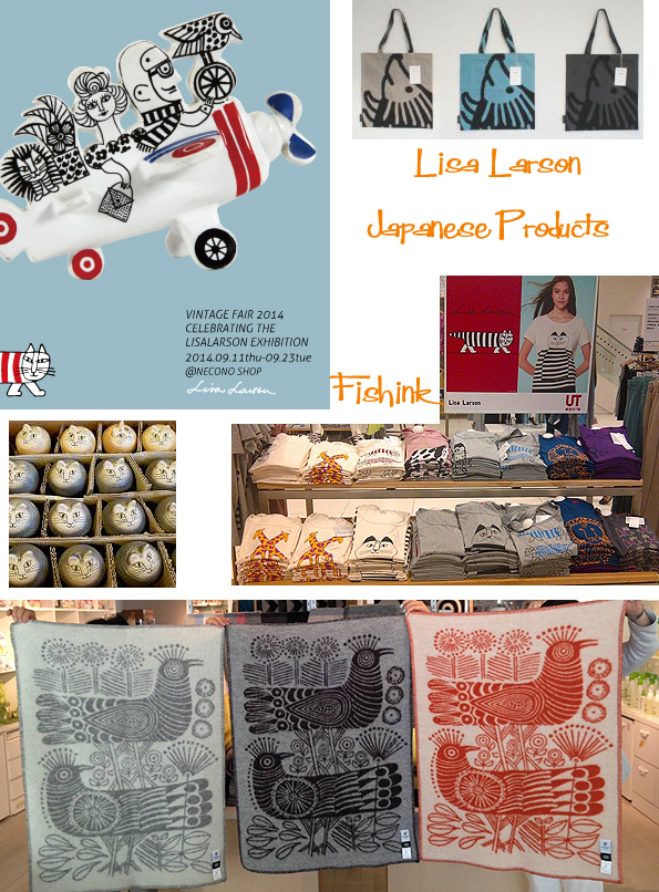
Also a collection of keyrings, presently retailing for about £25 ! Keen prices for a keen market.

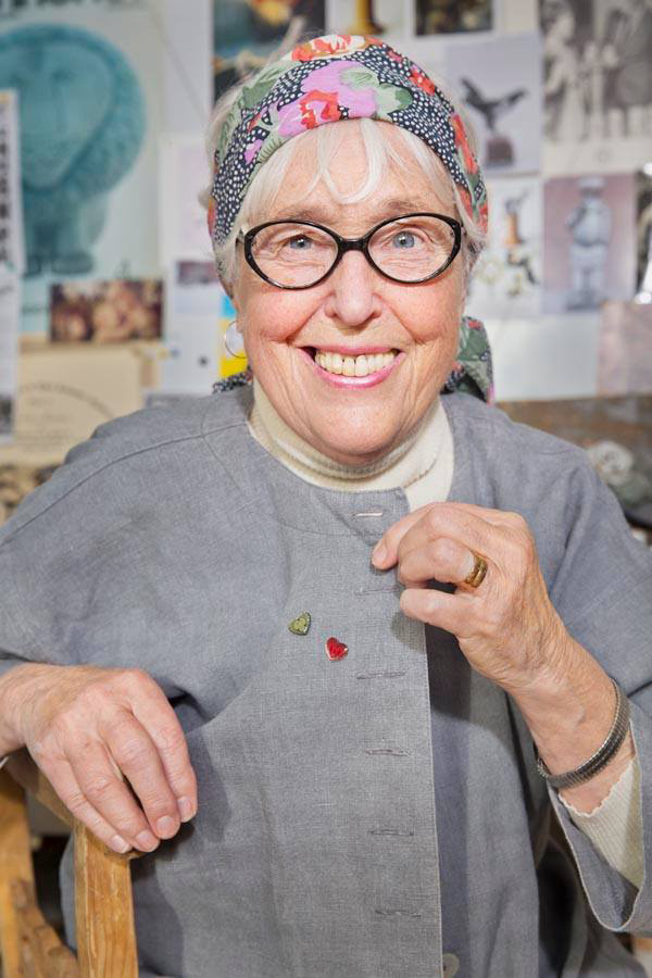
Such a great feel to this mid century work, you can find out more on Lisa’s website on Facebook, (where the lovely pic below was taken from)….or from the japanese site here.
Such a talented lady.
If you enjoyed this post you may also like the work of Jonathan Adler.
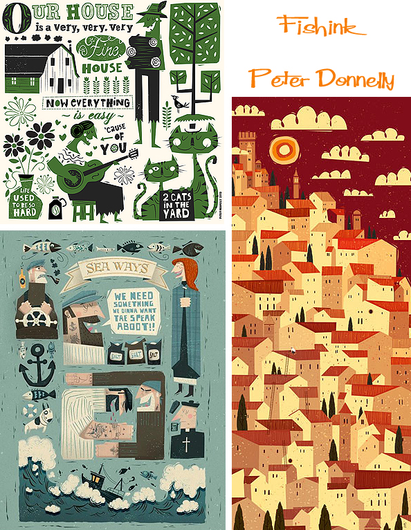
Peter Donnelly Illustrator and Art Director

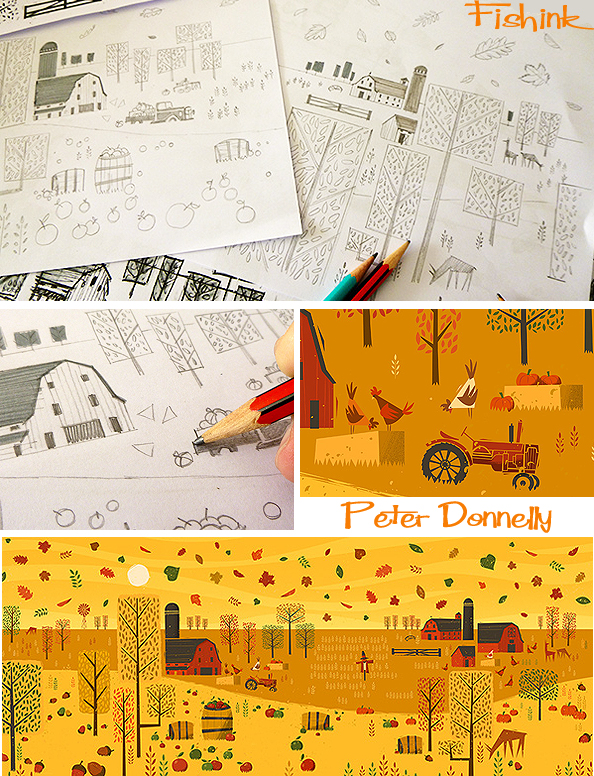
Peter Donnelly is an Irish illustrator and art director. His work displays a love for folk art and vintage print design. He works in a variety of media including screenprinting, drawing and digital. His background is in animation where he originally trained under 1950s UPA studio artist, Harry Hess, then he ran an art department for Don Bluth in 20th Century Fox and continued on for spells in Dreamworks, Hahn Film and various other companies in Europe. Since returning to Dublin in 2000, Peter has gradually stepped away from film and thrown himself more into illustration. What a great landscape to behold below.

Peter tells Yeller website “I always try to introduce a narrative into my work and then leave the door open a little for the viewer. Sometimes it comes natural, while other times I have to work hard to find that right combination. I’ve always found illustrations that go beyond just an appealing looking image much more interesting. If my work can hold someone’s attention for more than a minute, then I feel I’ve achieved something in that piece “
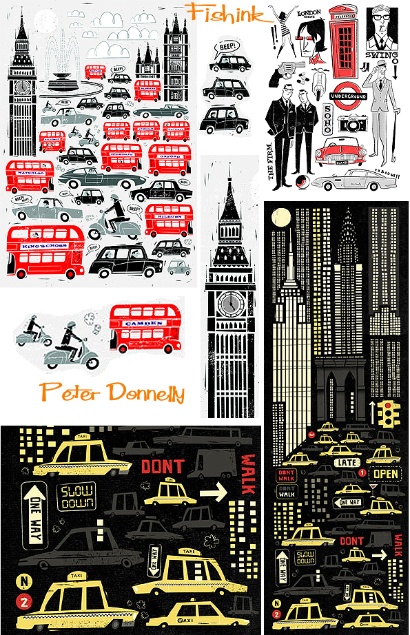
Peter’s distinct style attracts creative agencies and clients from Ireland and the UK through Europe and the United States. He has been awarded by The Creative Quarterly Journal of Art and Design, American Illustration, and the 3×3 Professional Illustration and Children’s Book showcases. You can buy a print from his Society 6 Site.

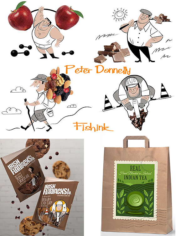
Whether it’s food….

or Music … (the food of love according to Shakespeare) … you can find it here.

Here’s a little advertising work.
I love the fact that Peter shows his doodles and sketchbook work on his blog. He says on Yeller ” I made a conscious decision about two years ago to introduce more hand craft into my illustration. There is a lot of good work out there but much of it looks the same to me and unfortunately it becomes boring. I experiment with linocut and study old printing techniques. I try to bring that into my work to give it an identity. Fifty percent of what I do is in the pencil work, it’s my favourite part of the job, it’s where the ideas get fleshed out and I find the solutions to my briefs. The other half is working digitally “
On receiving a new brief he initially cleans up his desk, re-reads the brief a few times and then writes down a list of words that come to mind from the brief. He says ” If there’s time, I’ll give it some space then come back to it with a pencil and begin sketching ideas down. I still get a rush when I read a brief, partly fear, partly excitement ” (Yeller)
Here’s he is working hard surrounded by his many sketchbooks of ideas.
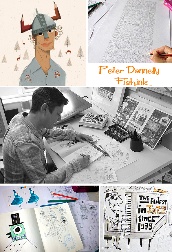

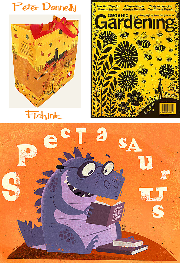
Peter has illustrated over thirty books for clients including, Little Red Riding Hood, Fras na nGaeilge, Leabhar Breac, Mentor Books and the Educational company of Ireland. You can see more of his individual projects over on his Pinterest site under the title of donoart.

Here’s a commission for a children’s room.

He has some great advice for new illustrators hoping to get into the industry. ” First of all you’ve got to LOVE it. If you do, it will show in your work. If you go in half way your work will look half baked. Work hard, its like every other thing in life in that you’ve got to nurture it. Have patience, it takes time to develop a style and a body of work. When you look at someones work that you admire, try and figure out what makes it successful and why it works. Adapt that information rather than copying the work straight off…otherwise you will only be a second rate them. Finally and most importantly don’t work for nothing, even if its only a small reward, you’ve got a duty to educate people that what you do is your job. People need to learn to respect that ” ( Yeller )
Superb work Peter, it certainly keeps me smiling anyway. Many thanks.
Great Northern Contemporary Craft Fair 2014 Part 2
Welcome back to part two of my visit to this years Great Northern Contemporary Craft Fair last week.
One of my ‘favourite stand awards’ goes to my first entrant, Ceramist Penny Withers. Her beautiful studio ceramics are first thrown on the wheel, leaving the ridges as a feature and later reformed to a different shape when a new base is also added. They are then fired and glazed and finally re-fired to reach their finished forms. Lovely crackle glazes and subtle colours made these firm winners in my mind. Penny was lovely to chat to and also runs pottery courses in Sheffield too.
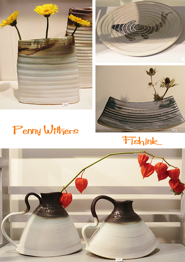
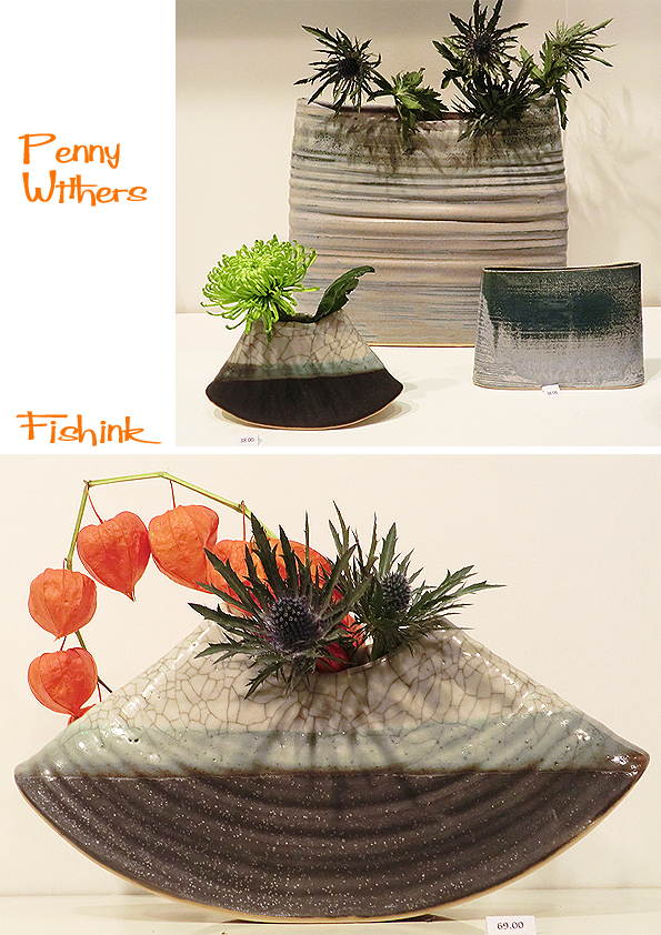
How well these chinese lanterns compliment the shape and colours in this piece. Wow !
Elizabeth Terzza has taken the seeds of nature as the inspiration for her delicate silver jewellery. Her tiny cones and sycamore seed necklace, are stunning pieces.

Detailed and friendly animals on Julia Smith’s Ceramics.

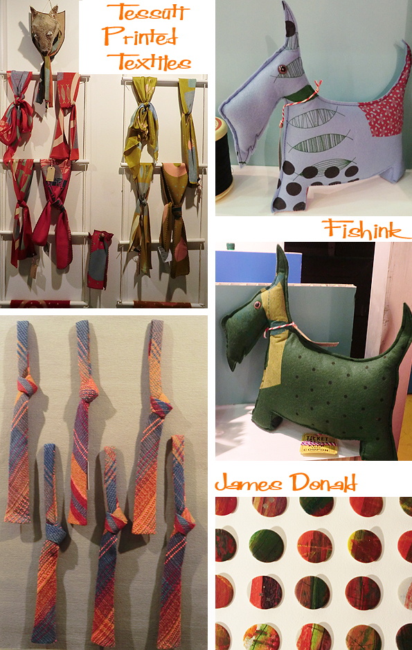
I discovered two familiar faces from the stands of Fiona McIntosh of Tessuti Printed Textiles and James Donald of Pick One, both of whom I know from selling my work through their boutique gift shop in Edinburgh called Concrete Wardrobe. I loved these new scottie dogs in fiona’s fabric, they work very well. A fab and colourful stand full of soft woolen weaves from James too, hope you both had a good show.
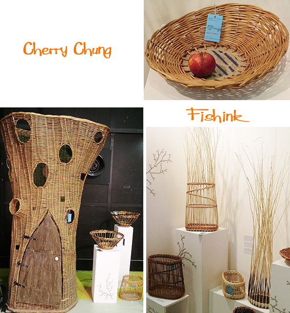
Manchester based Willow weaver Cherry Chung has made some lovely baskets and bowls that combined her stoneware bases and the dyed or natural willow surround. She has been commissioned to make huge storytelling tree or magic tree puppet theatre like the one below. Cherry also runs local courses (info on her site), if anyone fancies trying this out for themselves.
Lovely to see how Tone Von Krogh‘s new work is getting larger and larger. Look at these stunning vases, what a centrepiece they would make.

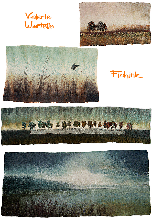
Lastly I spotted the felt work of fibre artist Valerie Wartelle. Her textile landscapes with their dyed and embroidered surfaces were like textural snapshots of the countryside. Sadly I didn’t get to speak to Valerie in person as she was busy with a potential customer but I wanted to include her beautiful work in my post.
A fab and busy show, congratulations to the organisers and to everyone who took part and made the exhibition the event it was.
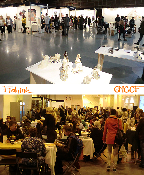
Thanks again to everyone who generously gave of their time and let me take photographs to show you all. Here’s to the next one !
Great Northern Contemporary Craft Fair 2014 Part 1

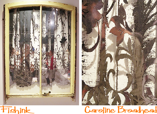
Great Northern Events was established in 2007 by Ann-Marie Franey and Angela Mann. I’ve covered the fair on my blog since 2010 and have eagerly followed it’s progress and become familiar with the talented wealth of designers and crafts people who participate in the show. Based this year in the old Granada Studios building at the end of Quay Street in Manchester, the show started off with ‘Ornament’, a curated selling exhibition of museum quality collectible craft from eminent UK makers. I picked up on quite a few pieces from Caroline Broadhead.
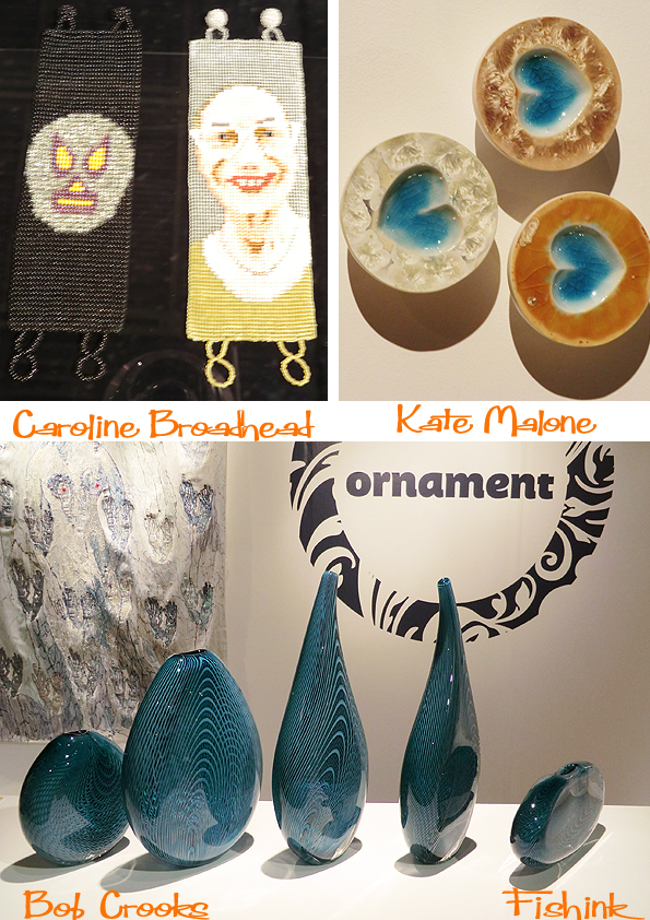
This beautiful idea of the mirrored lace curtain print, what a clever notion to reflect the viewer’s eye from looking in and to mimmic old lace.
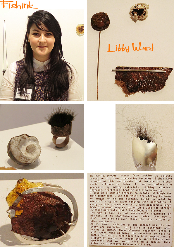
As one of the emerging makers in this section, Jeweller Libby Ward created a wild and slightly unearthly display. Using varied influences and materials ranging from actual toasted marshmallows to pieces inspired by visual elements from the Bubonic Plague ! she’s sooo passionate about her work. I gave Libby 10 out of 10 for enthusiasm and for creating that little curiosity factor, far away from the more traditional jewellery. Incorporating fur, precious metals, amber and lichens … her little gems have got it all : )
Brittany Delany displays some delicate porcelain vessels, some hand thrown some slip moulded, but with their makers joins left in place for decoration. Stitched with wire and delicately decorated with coloured blue-green glazes to give an essence of the sea.

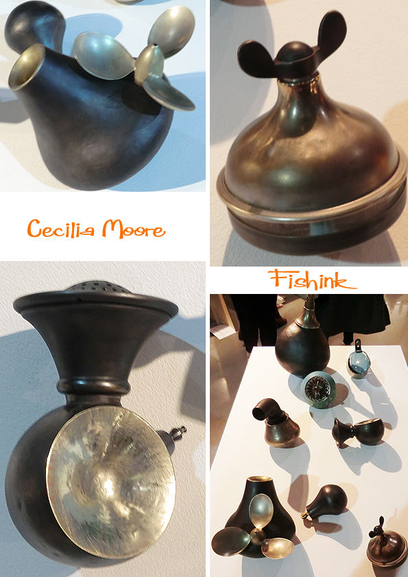
I’m always happy to encounter a designer’s work, which is technically brilliant and has enough ‘quirk’ to also make me smile. Cecilia Moore‘s mystical pieces definitely possess both qualities. Her work encompasses metalwork, sculpture, furniture making, drawing, print and animation, with a strong emphasis on found objects and reusing materials in all aspects of her work. The little animations that she creates through her object’s journey to discover what it will become, are worth watching and also reminded me of kid’s cartoons from my youth. Brilliant.
Charlotte Morrison‘s porcelain is both decorative as well as functional. She works by handbuilding each item but also creates some pieces by slip casting. Hand decoration using ceramic paint known as underglaze is also a key look to the collection. Her stand looked fab as it had a coherence and visually held together. The work is inspired by her interest in historical events and everyday life around the early 1900’s, it particularly reflects vintage advertising and packaging which she enjoys collecting.

Two quick mentions, firstly to Adam Slade over at Swarm Design who skilled, and highly detailed screen prints, reveal a fascination with Victoriana and the eclectic mix of flora and fauna with a weird and often sinister side to the artwork. I couldn’t help but be reminded of the work of Timorous Beasties, who were exhibiting their early work (also based on Victorian insects) when I took part in the ‘New Designers Show’ in London way back in the late eighties ! Secondly the huge wicker sculptures (this year being Cows, originally created for the Glastonbury Festival) by Juliette Hamilton who’s work I spoke about last year.

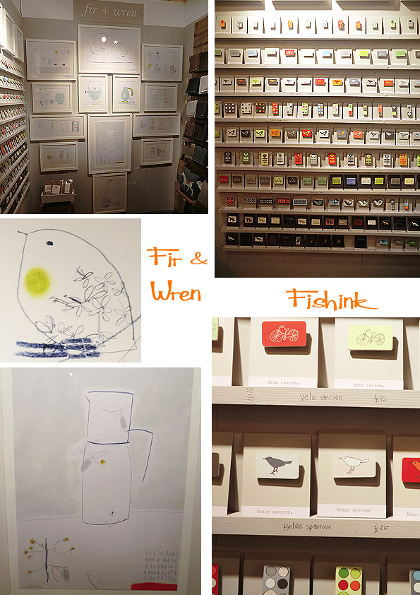
Another eye-catching stand was that of familiar friends Fir & Wren at Holm namely Susan Kane and Clint Pilkington. I loved their soothing yet fresh colour palette and Susan’s beautiful lines in her drawings create an almost Japanese calm in her work. The little bird with the foliage inside, which started life as a leaf, was a firm favourite all round. Based at Manchester Craft and Design Centre, which is always worth a visit especially for some present buying inspiration.
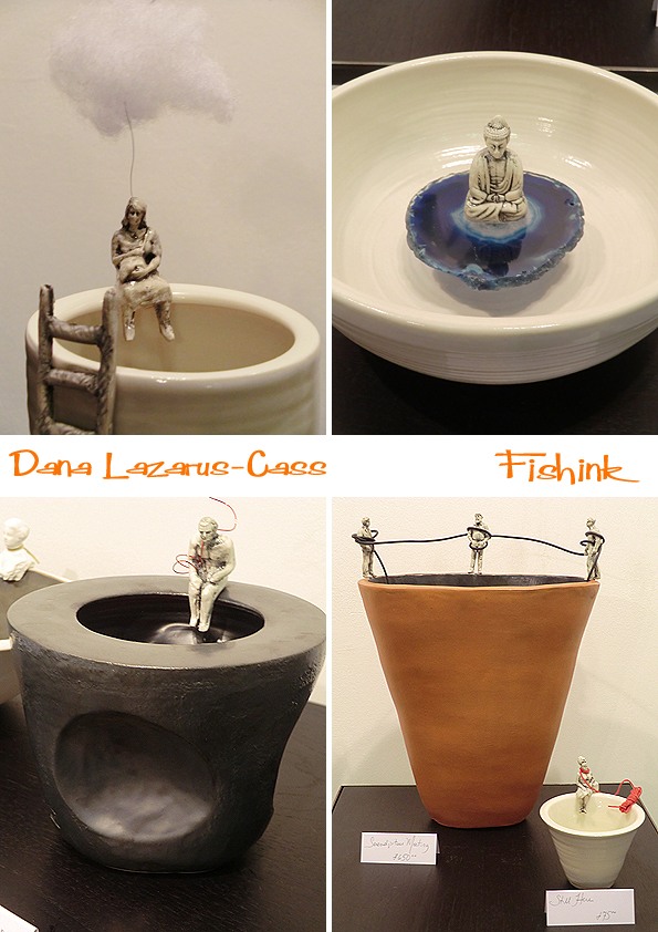
Finally for today, I bring you the contemplative ceramics of Dana Lazarus-Cass. Dana’s website describes her as ‘ Combining a range of potter’s techniques; throwing, slab building, slip casting, and extruding’. She says ‘I endeavour to explore ways to express a variety of ideas through the medium. None of my pieces are perfect; some suffer from their innate fragility but all sit on firm foundations. Tensions are exposed between characters or isolated figures on their structure which further reveal known and unconscious anxieties, both personal and universal.’
I thought the vase with the lady under the white cloud was a stroke of genius, apparently Dana used to make the cloud black, but people found them a little too gloomy so she changed them to white. It’s the little details that make it all work ! Part two of my show report on wednesday. Thanks to everyone who kindly told me about their work and let me take photographs, much appreciated.
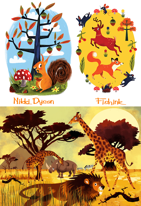
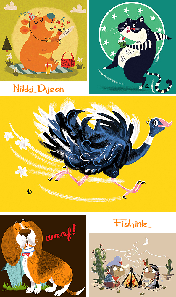
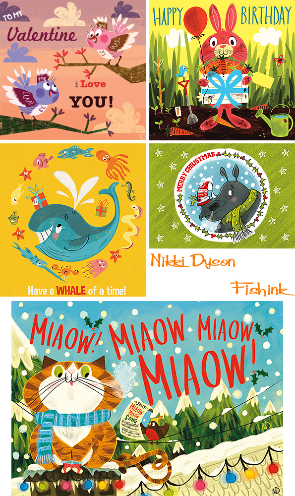
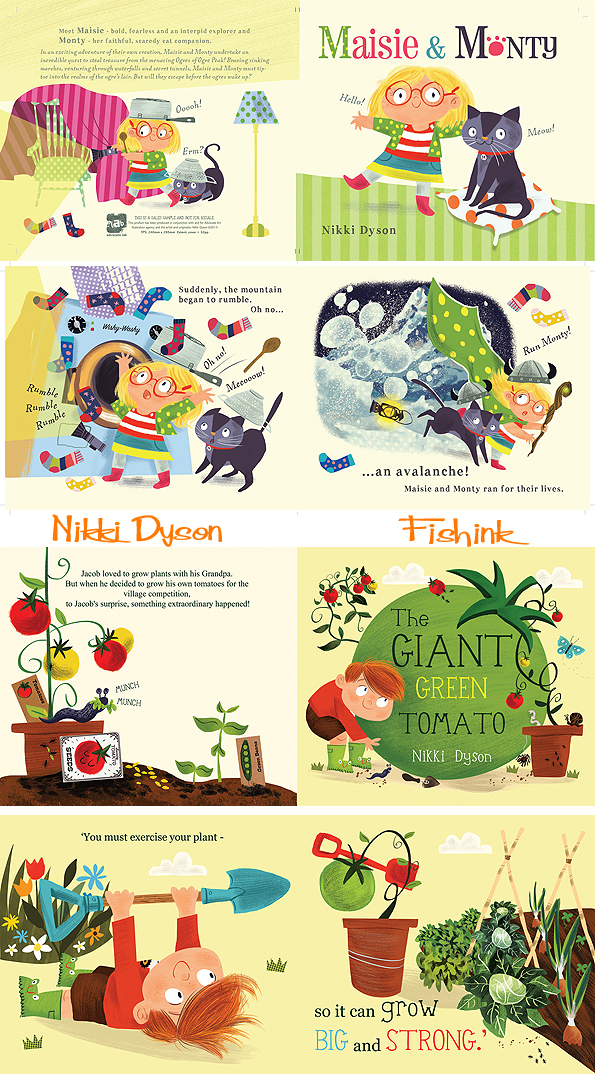
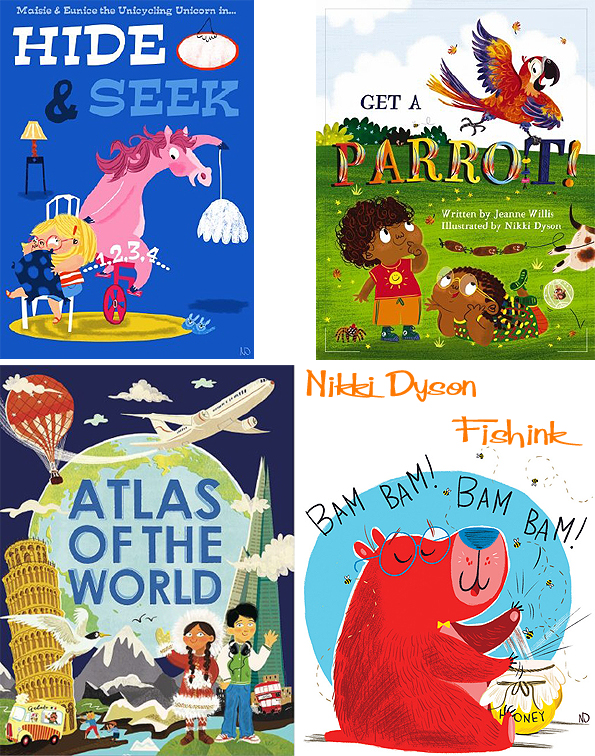
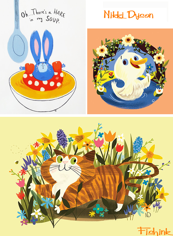
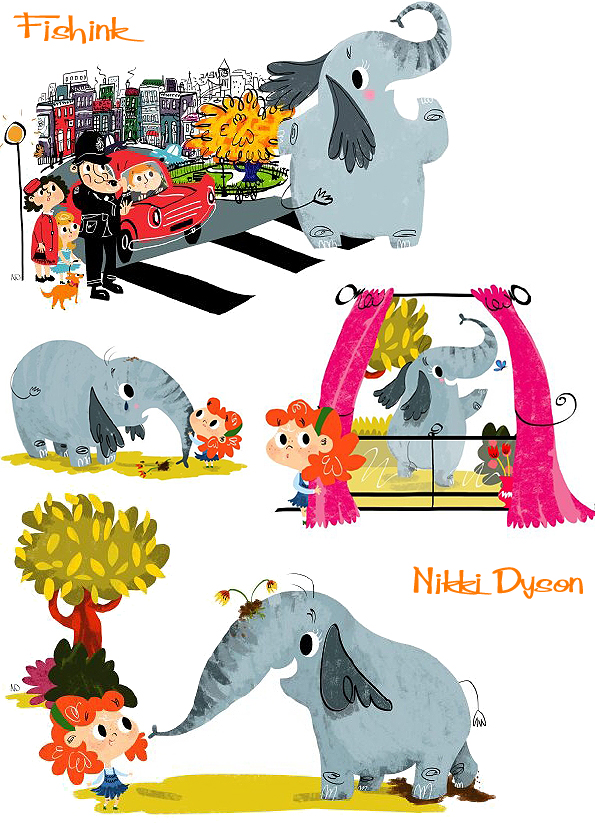
Nikki Dyson Contemporary Classic Illustration
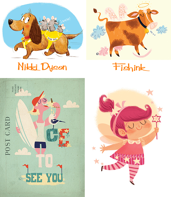
Some time ago I discovered the illustrator Nikki Dyson on Twitter and have long since admired her work. It’s full of fun and vibrancy and has that wonderful mid-century nod, that always makes my heart beat a little faster lol
When I asked Nikki about the American style to her work (for a UK artist) she told me ” I’m really influenced by american animation art like UPA, Maurice Noble, Chuck Jones and especially from early Disney…that’s how I discovered Mary Blair‘s work and that led onto discovering more amazing artists that were involved in the concept art for the films ie Gustaf Tenggren, Alice and Martin Provensen and Al Dempster ! All of whom have illustrated Little Golden books so that led me onto knowing about these little gems and being hugely influenced by them in my work too.
Lovely modern renditions here of 1950’s and 60’s traditional travel posters, cleverly turned into post cards. Love the knotted hanky : )
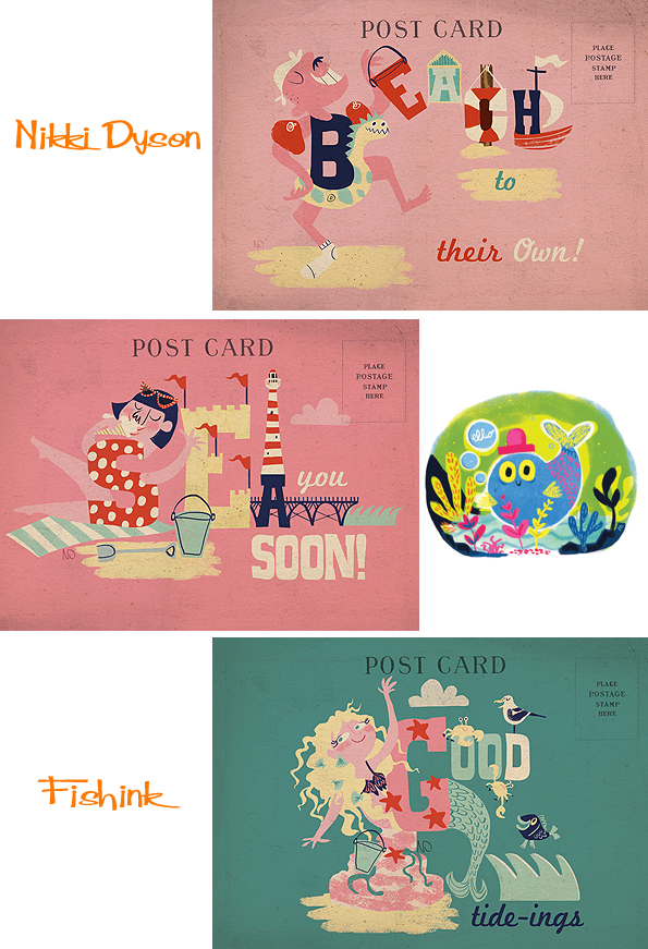
It’s difficult not to smile looking at these colourful images.
Some greeting cards.
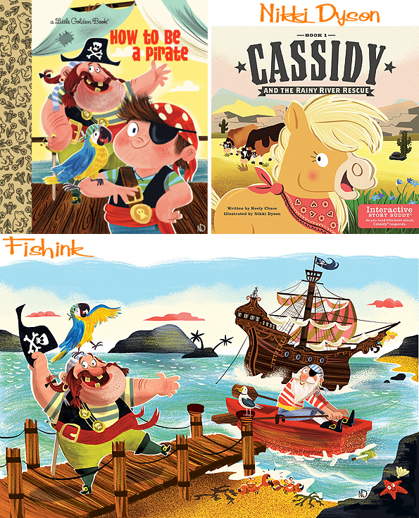
Nikki has an impressive client list too, she’s worked with names such as Usborne Books, Macmillan Children’s Books, Walker Books, National Geographic Kids, Macmillan Education as well as the famous Random House (Little Golden Books). Here’s a few of her books.
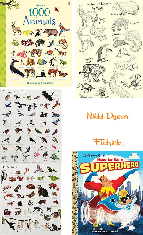
For those of you old enough or English enough to remember the children’s programme “Vision On” and its presenter Tony Hart then you’ll also be amused by Nikki’s Art Gallery section on her blog (make sure you have your sound on for the full effect lol)
I mentioned this to Nikki and she said ” Haha yes, I can’t forget my british roots too ! So the theme is a tribute to Tony Hart as I adored watching him as a child and loved the gallery sequence and would always try and create what he did on the show (though not to the same degree of success!) I also admire the work of Quentin Blake, Judith Kerr, Shirley Hughes all amazing inspirational people ! ”
More of Nikki’s work over on her agent’s site Advocate Art ,or if you fancy a fab print (like this chunky cat for example), then pop over to Nikki’s Etsy Shop and have a browse.
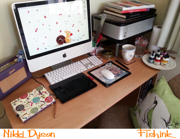
All of this amazing work comes from such a wee little workspace too, small but very productive I think ! Great illustrations Nikki, keep up the lovely work.
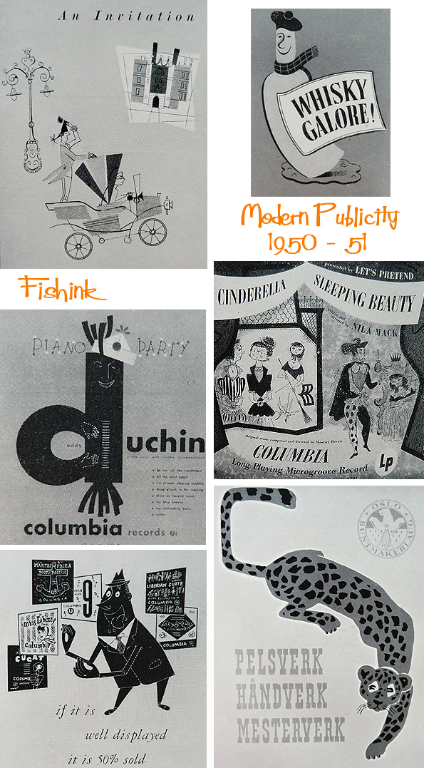
Modern Publicity 1950 – 51. Illustrated Mid century Art, Advertising and Graphics Part 2
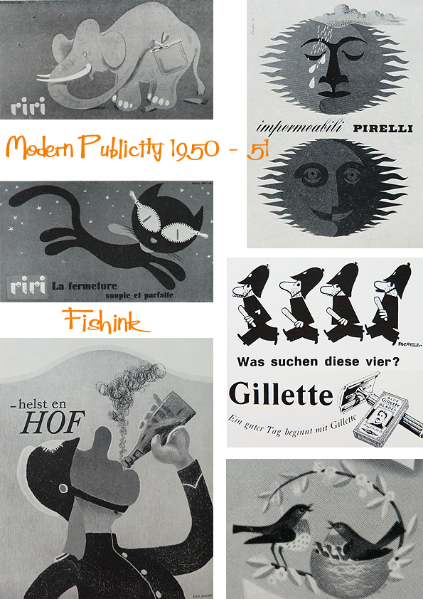
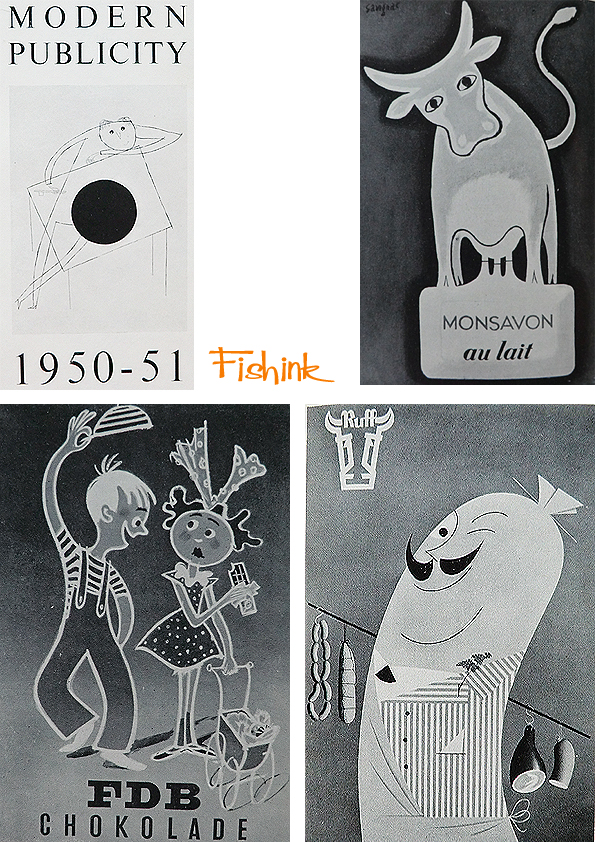
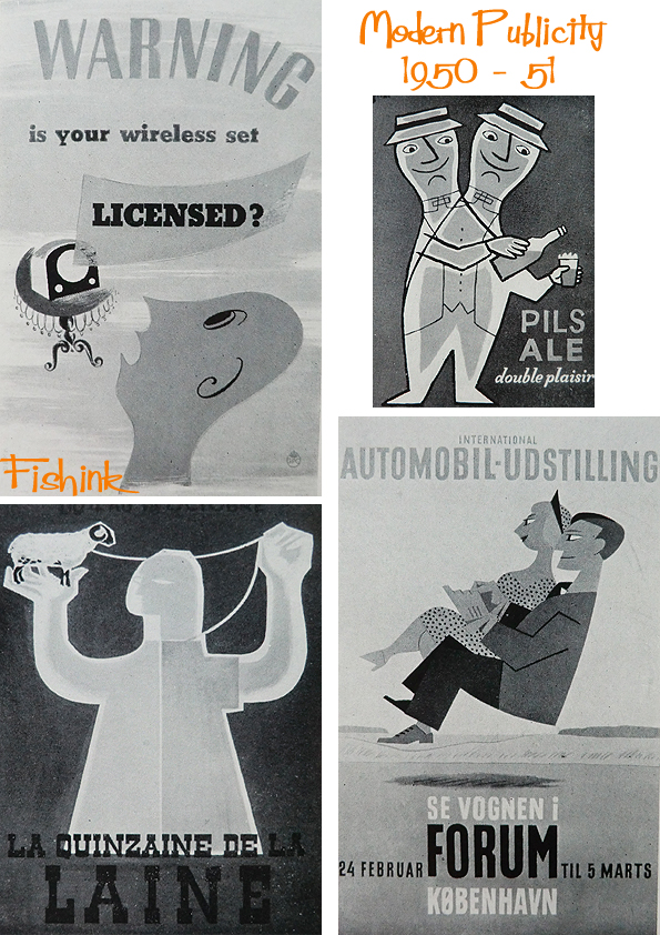
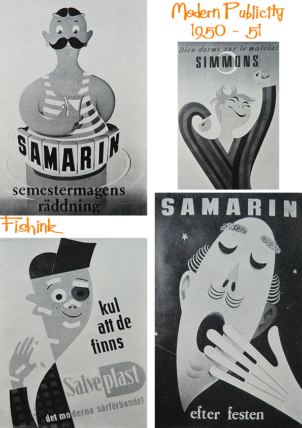
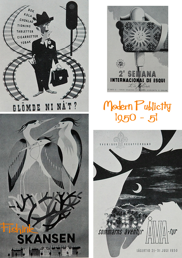
Welcome back to part two of the graphic and advertising illustrations in the Modern Publicity Annual from 1950 -51. No surprises how many of the illustrators use animals to help add interest to their message.

Who wouldn’t remember a giraffe on the phone.
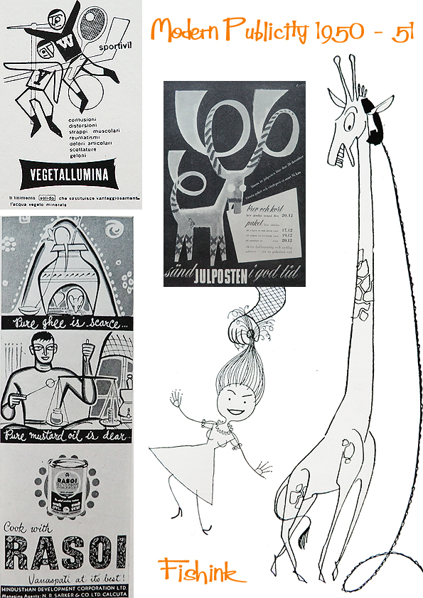
Or this fab kangaroo in a box !


A couple of record covers.
And a little colour to finish with. These eskimo blankets do look warm and inviting, but I’m less convinced by a smoking Walrus… each to their own I suppose !

You can find more posts and illustrations in this series by typing the words Modern Publicity into the search function on the right of this post. Don’t forget to share it and tell your friends about Fishink Blog. Thank you.
Fishink Camping … in October !
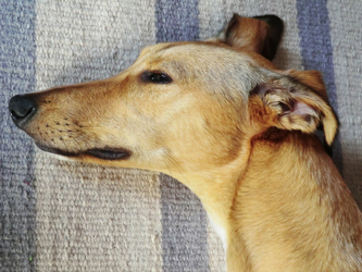
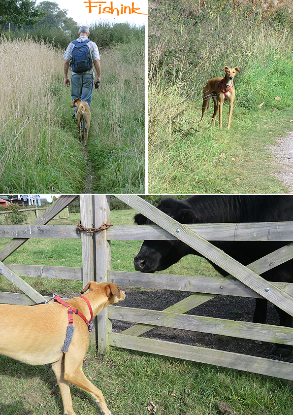
Looking out of my window on this cold, wet and dark October Monday morning, it’s almost impossible to imagine that just 4 days ago I was camping overnight at the foot of the Bowland Fells in Dolphinholme, lancashire. It was to be Boo (my dog’s) first campsite experience, and hopefully all would go well so we could plan on doing longer stints under canvass.We started our walk in this lovely sleepy hollow, where Autumn had definitely arrived.

Not being used to the countryside, Boo was overly excited, smelling and seeing hares, sheep and scuttling pheasants for the first time. She’s a curious soul so any opportunity to see what lay over a wall… was seized with relish lol
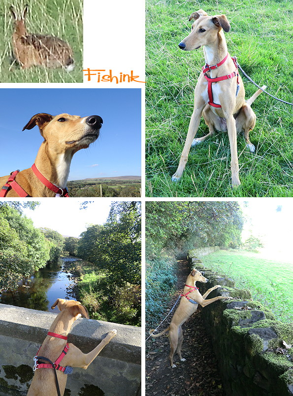
Fantastic countryside in this area, lush fields, beautiful variation in both the low lying vegetation and the forests of tall commanding Oak, Beech and Horse Chestnut trees overhead.
I can’t believe it was shorts and Tee shirt warm too ! A treasured late summers day.

With a dog, (who looks a little fox like from a distance) it was hard to go unnoticed wherever we ambled

We passed some well tended allotments, that were almost post-card perfect. I couldn’t resist snapping these marrows and wheelbarrow.
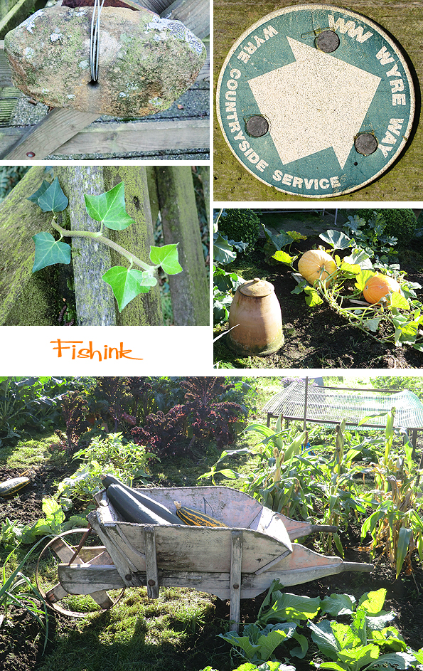
Some local stone mason has created beautiful markers for the Wye Way. I loved this walking chap with his cap on. Humour in stone, what a great idea to preserve laughter in this way.

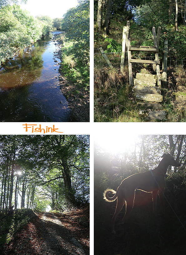
The banks of the river were ablaze with trees that were slowly starting to change their hue and with the sun stretching through their canopies, the whole place looked awash with colour.


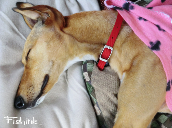
I think Boo adored her days in the countryside with all the new smells and sounds. The only downside was that the campsite was near enough to a motorway which didn’t appear to quieten down throughout the entire evening ! With the rattling wind on the tent and the cold evening breeze, I don’t think she got a great deal of sleep that evening. Then the next day, she got stung simultaneously by two wasps. How or why they felt provoked into doing this I don’t know and luckily she didn’t get to bite one which could have then stung her in her mouth. After a half hour lie down and plenty of water we headed back and she had perked up a little at her first smell of rabbits : )

Beautiful bridges.

Again, so lucky with the weather, I felt we really we’re given the gift of two last sun kissed days. So glad we took them too !

This was Boo for most of the following day, time out, doggie dreams and Zzzzzzzzz’s and perhaps me too !
Angie Rozelaar Scary Monsters and Super Kids

Originally from Kent, Angie Rozelaar has lived in London, Brighton, Devon, and Sweden before moving to Normandy in France where she presently resides with her family in an old farmhouse. Having a converted hayloft for a studio, seven cats and a collection of hens running around, it’s no wonder that she draws such smiley characters !
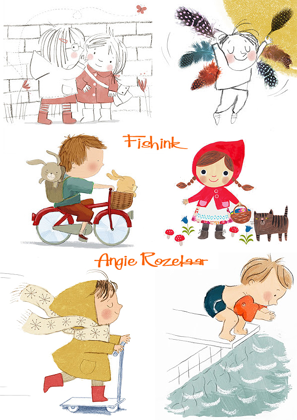
Her sketches also have a fresh charm of their own.
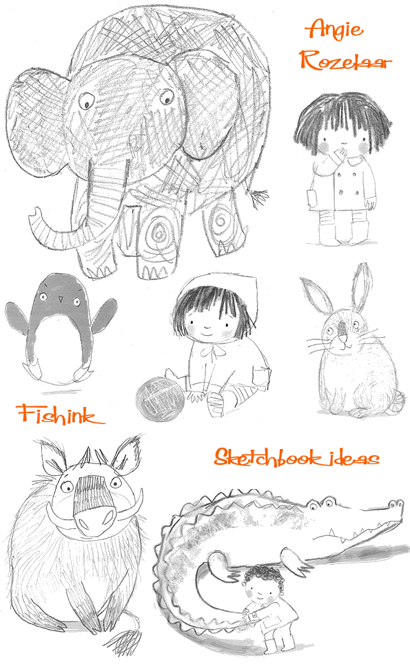
Angie loves using all sorts of materials to create her illustrations, including conté crayons, inks, watercolour, graphite sticks, a wide variety of pens and a computer.
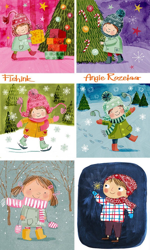
You can even see the brush strokes in some of these illustrations.

A few friendly wild cats and a sheep who knits, well why not !

I really like these little snapshots where child and animal are off on their travels.

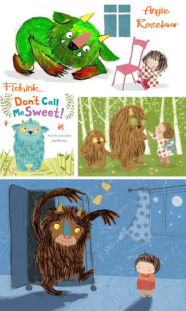
The natural next step on, is small children and scary monsters, or small monsters and scary, bossy children lol
Earlier this year Angie’s latest book Don’t Call Me Sweet was published by Bloomsbury. Everyone thinks that little monsters are cute and cuddly, but this monster’s grumpy and grouchy. Honest ! He does REAL monster stuff, like stomping around and eating squishy, squelchy food like bug eye stew. He’s brave, too – he’s not scared of ANYTHING. Not even big, hairy ogres …Wait, is that a big, hairy ogre ? HELP !
Angie has worked with great names like with Hodder Children’s Books, Bloomsbury Children’s Books and HarperCollins US.
After a childhood spent mostly drawing and painting pictures, she went on to study at Chelsea Art School, and later graduated in Humanities from Exeter University.
Since then, her path to becoming a full time illustrator has been a meandering one. Although she continued to enjoy drawing in her spare time throughout a variety of jobs, from West End theatre technician to gallery assistant, it was not until she began working with a local primary school on a project to support literacy that she discovered an aptitude for children’s book illustration in particular. She started posting her work on her blog and launched her career as a freelance illustrator in 2009, securing early commissions for greetings cards and from educational publishers.

I’m loving this slightly retro look here too.

Not only is Angie a fellow illustrator on my agent’s site Yellow House Art Licensing but best of all, she told me she is also a firm fan of my Fishink Blog too ! What great taste she has lol
I caught up with her, in her French abode, to give us a flavour of how she works. She told me ” A typical day would see me in my studio by about 9.30 (after packing the kids off to school and feeding my 7 cats!) I generally work until about 6pm. My studio is a converted hayloft right next to our house, so I don’t have far to go.

Keep up the superb work Angie, look forward to seeing many more illustrations from you in the years to come and do keep us posted as to any future developments with your Etsy shop.
Dunham Massey . Canal side Colour . Fishink Walks .
Following on from my post about Colour and the fact that it inspired a regular Fishink blog reader Joy (on the other side of the Pond), to get out on her bike and go explore some nature. On Sunday we went over to Cheshire and explored Dunham Massey and it’s surrounding area. I still can’t quite believe how great the weather is, this late in the year.
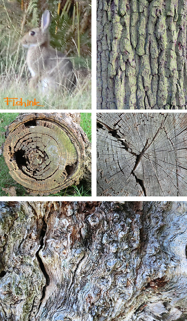
Boo meeting some of the locals before we walked along the canal and had a picnic.
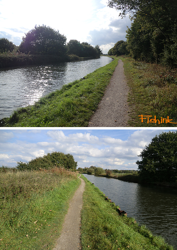
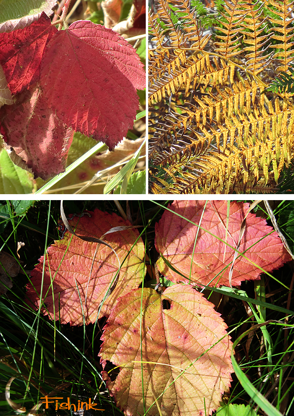
I decided to take some photos of the fading plantlife along the canal side, and again got to marvel at the tremendous colours that nature had to offer.

You can either view these as a collection of dying leaves and twigs or an inspirational colour palette for your next painting or design it’s all about how you look at things.
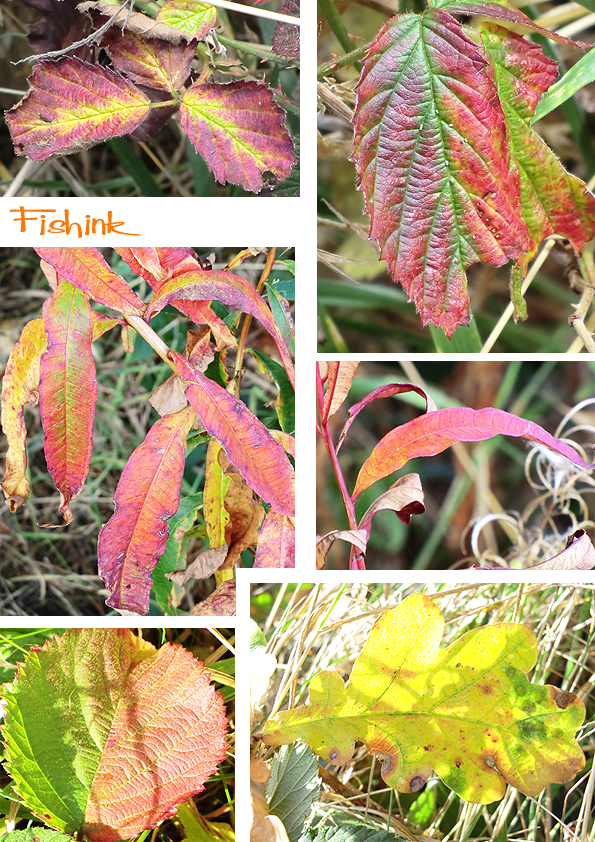
This beautiful little school caught my eye as well as the ducks. These sunlit stems looked like rich, crackling flames, which have been magically paused in time.

A short diversion past some cut and pre-harvested fields and then we headed over to Dunham Massey itself.

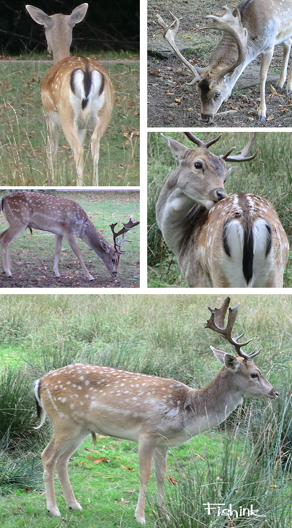
A couple of watery shots before meeting the deer in the Park. “Hello there”, they really were surprisingly tame, allowing us to get closer than I’ve ever been to deer before. Boo was very curious and they didn’t appear too bothered by her either, thankfully she rarely barks, so a quiet animal must be less of a threat than a noisy one … I would assume.
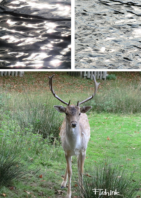
Beautiful markings and such tiny heads, do you think Boo could pass as a deer ?, I might get her in training for christmas !
Enough squirrels and rabbits around to keep us all active.

Some lovely old pieces of trunk left to feast our eyes on.
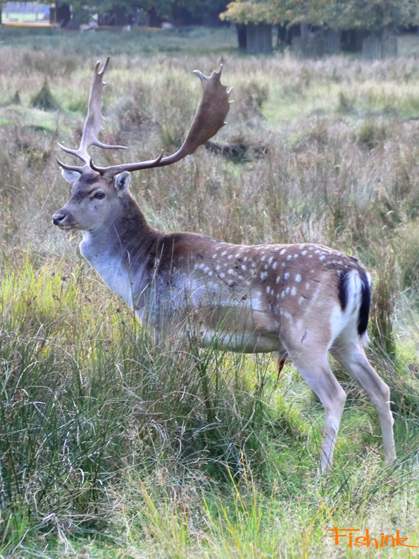
Just before we left, this wonderful creature appeared out of nowhere and stood quietly a few meters away and allowed us to take a few pics of him. I can see why people use the word ‘majestic’ when talking about deer and stags … another great day.
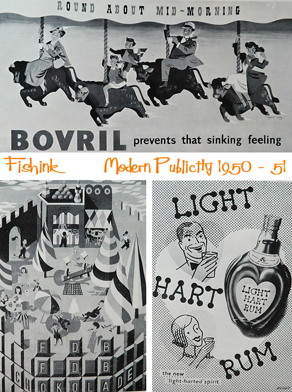
Modern Publicity 1950 – 51. Illustrated Mid century Art, Advertising and Graphics Part 1
This was the very first Modern Publicity book that I encountered. Many of the images are in black and white but it doesn’t detract from their beautiful retro style and vintage va va vooom !
Perhaps you also find that drinking Bovril prevents that sinking feeling… to be honest I get a sinking feeling at the thought if drinking it ! lol
Some beautiful curves here.

A touch of travel with a lovely poster from B.O.A.C. and that mix of man and nature.

You can find more in this series by typing the words Modern Publicity into the search function on the right of this post. Don’t forget to share it and tell your friends about Fishink Blog. Thank you


