Fishink Blog Hop

Happy Monday to one and all : )
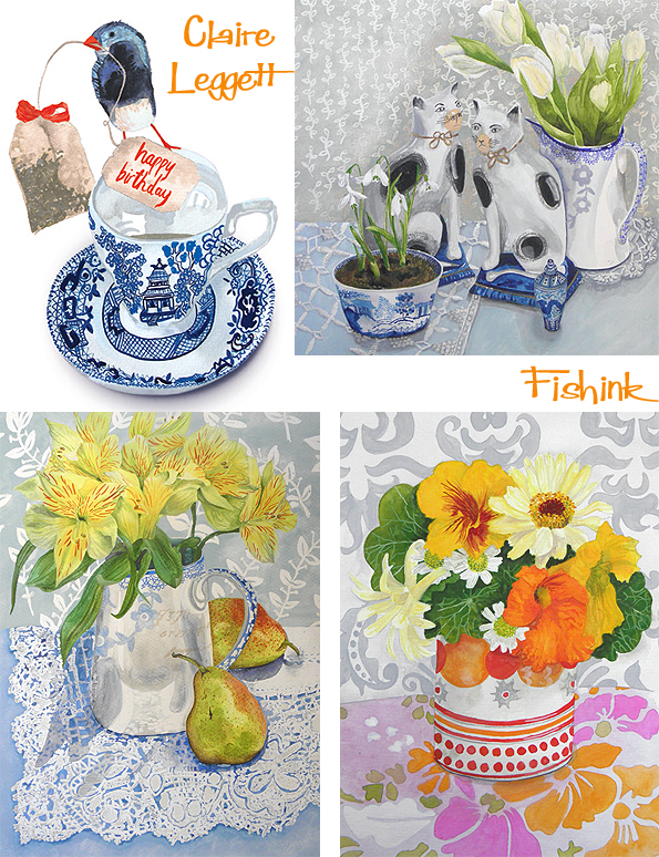
I was kindly invited by the talented artist Claire Leggett to take part in the ‘Around the world creative blog hop’. I ashamedly had to admit that I hadn’t heard about the idea, it’s basically when different artists, designers, makers etc hop onto other creative blogs and answer the same four questions. They then pass the idea onto three other creative peeps who’s blogs they like. A great idea I thought, as you also get to find out a little more about what the people you admire are up to too ! For starters, here’s a little of Claire’s work.
The first question is What am I working on ?
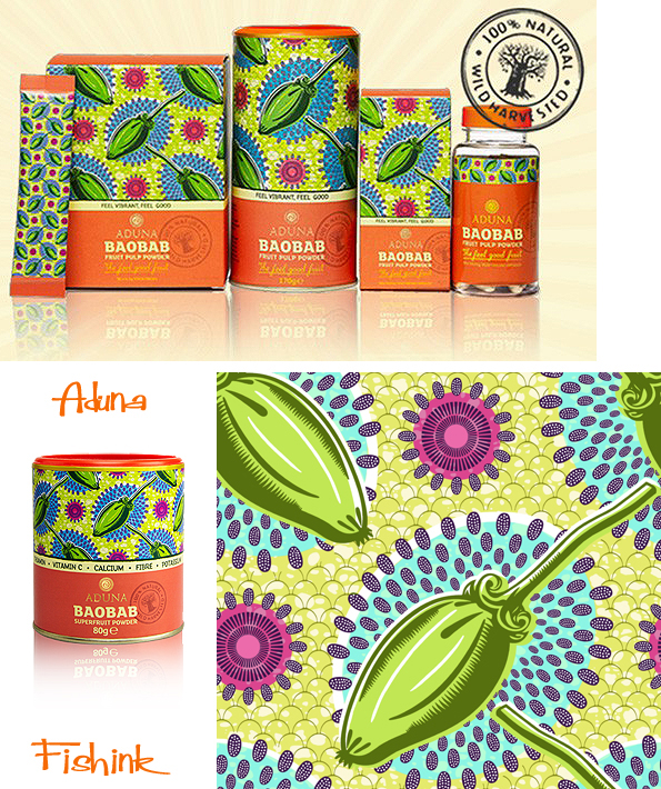
Well right now, as usual, a number of different things. Firstly I’m doing some graphic packaging design illustration for a company called Aduna, who I’ve done some work for previously. It is still a little hush hush so I can’t show you the new work, but this is the design that I created for them last year, which is already selling in Selfridges and Liberty.
Then I’m working on a new card range for my agents Yellow House Art Licensing based on bears.

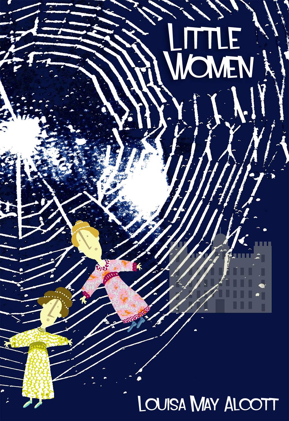
And also illustrating some classic book covers, for my own portfolio development.
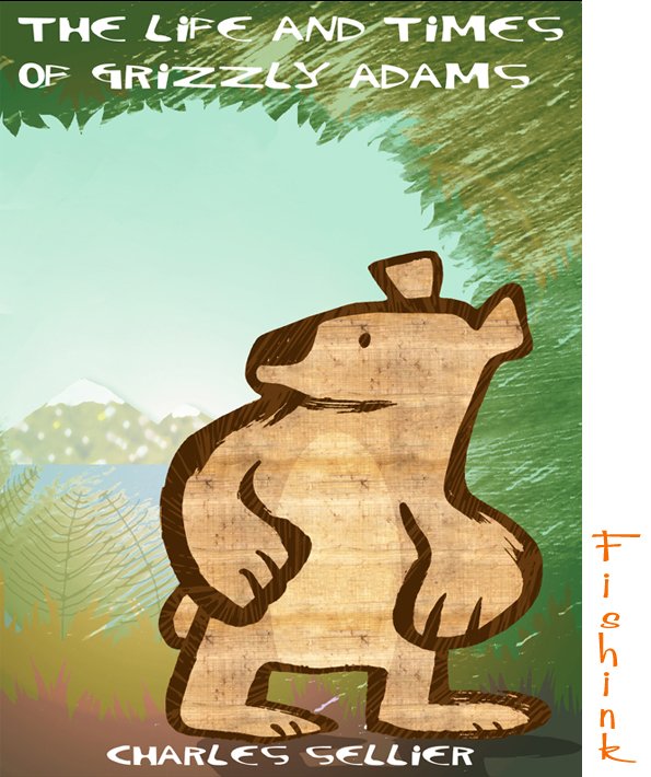
I was particularly happy with this one as I’ve been trying out a new way of illustrating with a more retro/mid century feel to it. I finally hope that I’ve cracked it !

The second question is How does my work differ from others of its genre ?
This is a difficult question to answer, as there is such a mixed array of illustrators work out there. I’d say that my work is bound to be similar to some illustrators and less like others. I also feel that I don’t have one style or way of working that defines me as an illustrator, whether that is a good or bad thing I’m never quite sure. I would hope that my art always shows a degree of wit, charm and humour (which I feel is always important) as well as being pleasing for the eye and soul too : ) But only my audience can be the true judge of that : )
Thirdly, Why do I write / create what I do ?
Why do I write my blog ? well the answer to this is simple. Firstly because I can and by that I mean that I’m in the lucky position of having a totally free reign to be able to write about whatever I find inspirational to me.
Secondly, I feel that the work I select of other designers / makers / illustrators should be seen by as many different people as possible, because it’s relevant, beautiful and most importantly, makes me (and clearly those who read and follow my blog) …. happy !
Thirdly I write my blog to feel part of and gain the support of, a larger artistic community. Who, in turn, appreciate similar things and give one another valuble opinions, comments and introductions to other lives and illustrative work that I would never have encountered had I not started Fishink Blog. Don’t be under any misunderstanding about writing for a blog, it takes a lot of hard work to create the three posts a week, but I really enjoy the process and love sharing other creatives beautiful and amazing work, that alone drives me to keep doing it.
Why do I create ? For most of the same reasons really. I love working with different surfaces that I can put my illustration onto. Whether they appear as textile designs, graphic packaging, fabrics, stationery /paper products or even as framed artwork. It’s all different parts of me as a designer. To express all those different sides of my artistic self, is clearly both important and creatively nurturing too. More available on my Fishink Site.


Finally, How does my writing/illustration/creative process work ?
Well I would normally start off with sketching in one of my many sketchpads. I repeat shapes and ideas until I produce a few that I’m happy with, sometimes I can even do this whilst watching TV or listening to music. I’m not always inspired to draw, but often I find that by selecting different media to work with, or having a book that isn’t considered ‘precious’ in terms of what marks end up on it’s pages, can I feel more inclined to work freely.

The images I’m happiest with will then be used as they first appear or scanned into photoshop and redrawn or altered until I get the finished effect I’m seeking. I may decide at this point, whether the character is more suitable for a card, print or all over repeat. I hope you enjoyed finding out a little about the process behind the Fishink Mask lol
So enough about me, I’ve passed on the baton or Blog hop challenge to a few of my blogging friends, who should be publishing their own blog hop adventures on their posts on monday 18th August.
The first is Stained glass artist Jane Littlefield who also writes a creative blog hi-lighting her processes and the classes she teaches. She makes some incredibly rich and colourful art, do check out her classes and website.
The second is a relatively new blogger and friend Lizzie, who’s site, called Dream Discover Italia, is all about living in Italy (at the moment Venice). You can gather a sense of it’s culture and local happenings from an English gal abroad ! Wonderfully peppered with interesting photographs and snippets of news and knowledge that she’s gleaned only by being there.
My third nomination nomination is to Laura Weston who’s blog is wonderfully honest and descriptive, but could really do with an update, as we don’t all tweet to the same degree as you Laura lol. Let’s hope this is a positive prompt to see some of Laura’s fab new work on her blog. (sorry Laura, no pressure at all then !) : )
Thanks to Claire for the suggestion for this post in the first place and to everyone who has (or will or may) take part in the worldly creative Blog Hop. I love seeing and hearing how other people work. Keep up the great community vibe everyone and keep spreading the FISHINK word too.
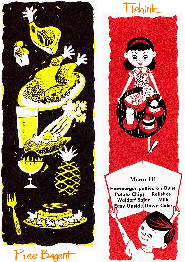
Cook Book Illustration from the 1950’s

Many thanks to Fishink regular reader Joy for the inspiration for this collection of images. After seeing my post about Helen Borten’s picnic cook book, she remembered having this little book around the house when she was growing up. The Gas Cook Book for Young People is a fun little booklet from 1958, with illustrations by Pres Bagent.
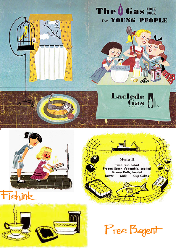
I can’t find any info on the illustrator but he did collaborate on a number of similar cookery pamphlets, like this one over at and everything else too, thanks to Karswell for scanning in the images.
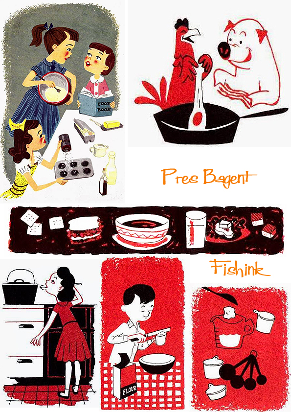
I’m always struck by how effective a three colour image can be and I’m liking their diffused edges too
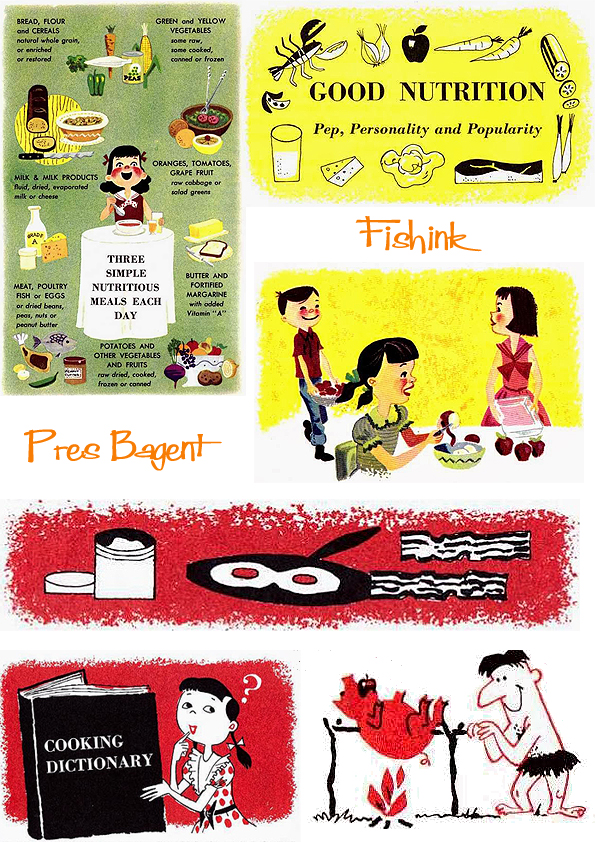
Some more fun images I came across over on Carolyn’s Stamp Store here. Thanks again Joy.
Fishink Blackberrying and Beaching
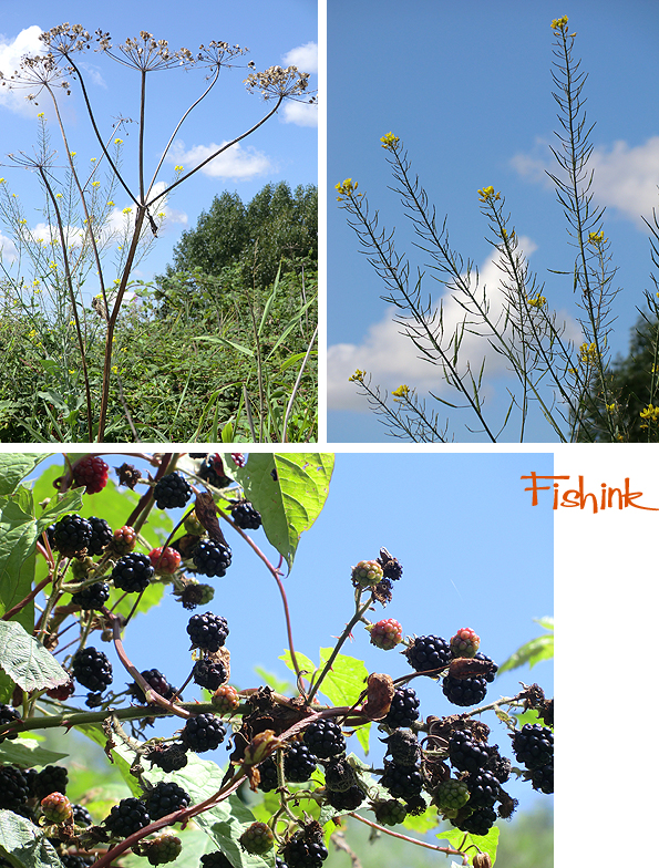
Monday was all about collecting…. memories of summertime, images of the day and blackberries
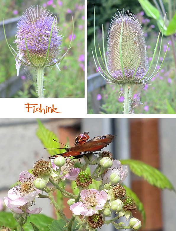
I don’t actually like blackberries to eat, something about the seeds getting stuck in your teeth and I’m not a fan of the taste either, but my partner loves them so we went a picking. It’s certainly the time to get a good harvest of them in the sunnier parts of the UK and many berries we’re still red so it can only get better.
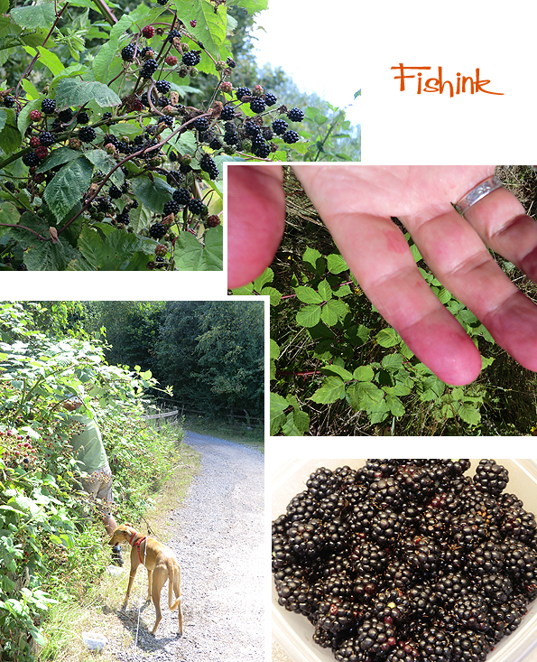
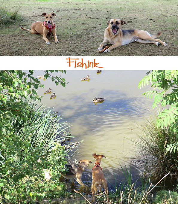
Boo (the dog) was helping, kind of, by chewing back some of the lower brambles so we could reach up for those huge ones that always remained.. just out of reach!
She met up with a friend for a mad cavort by the riverbank and to look at the ducks, which weren’t bothered that they were being dog watched. They both jumped when one duck let out a huge QUACK, I don’t think they quite knew what to make of it all. All good clean summer fun : )
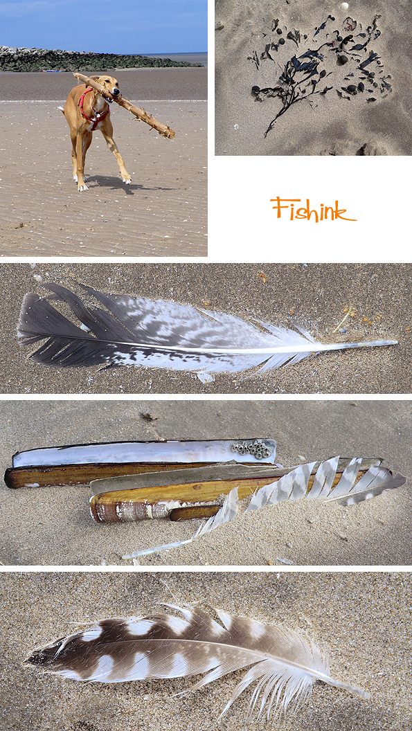
Yesterday we headed over to see my parents and take Boo to the beach. I like it when the wind turbines visually align to form a mechanical flower out to sea.
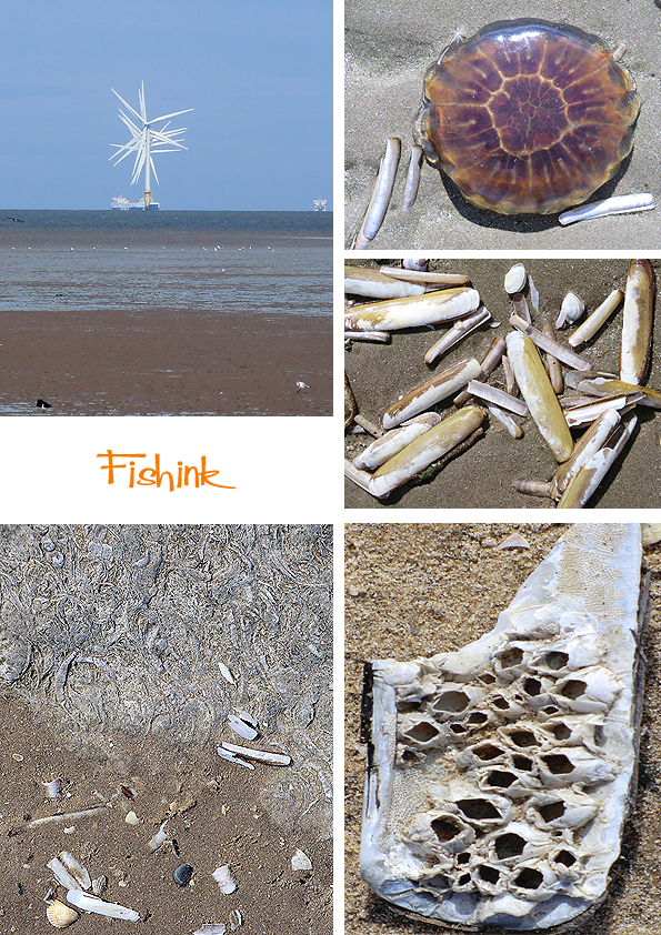
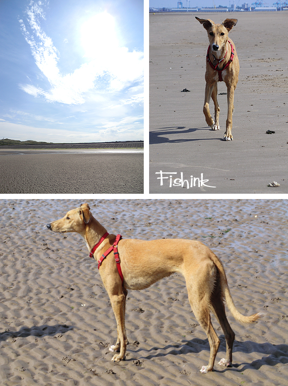
Boo is a great beachcomber, but for her it’s mostly about wood. I like the seaweed, shells and feathers.
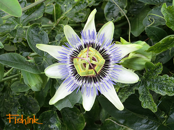
Back in my parent’s garden I spotted their passion flower plant and reminded myself how complex and beautiful their flowers are. Happy day everyone.
Fishink In Manchester, Art, Jewellery and Boyhood Cinema !
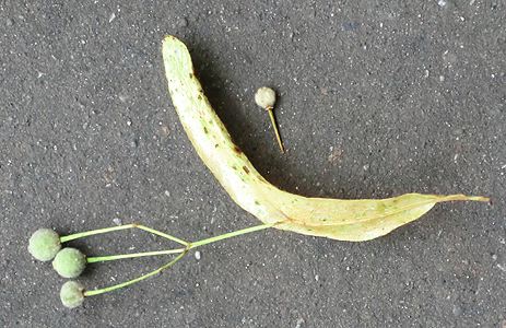
I had a fab afternoon off in Manchester on wednesday, which started by spotting this ingenious, floating, seed-carrier on the pavement on the way to the tram stop. A parachute designed to carry the seeds safely to their final destination… Isn’t nature great !
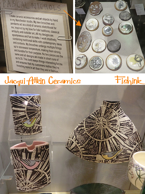
Off the tram I headed to the Manchester City Art Gallery where there were a number of interesting pieces on show. First looking at some of the contemporary work in the gift shop…
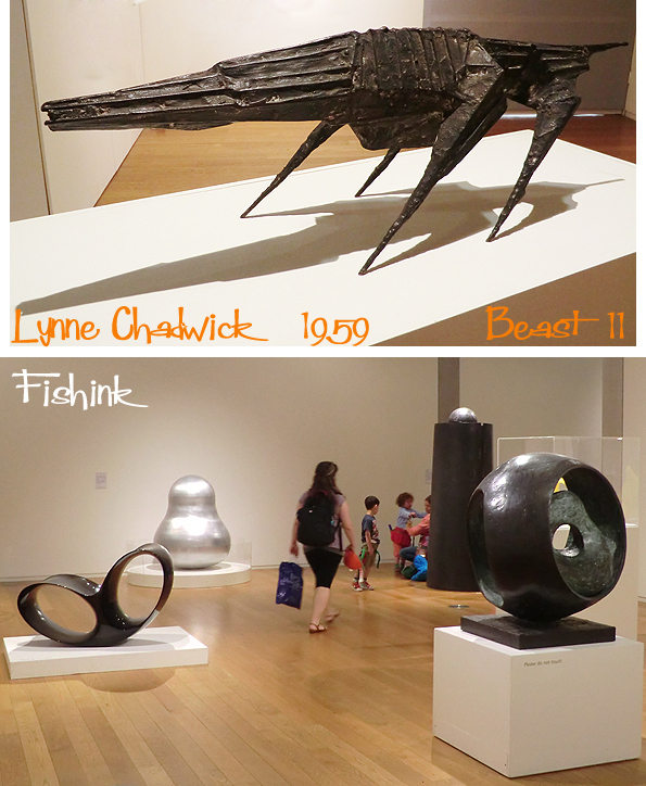
before heading to the Sculptural Forms exhibition.

I loved how the light, serene Eric Gill sculpture of the sleeping Christ was contrasted by the dark, edgy, angular, almost creepy, ‘Beast 11’ by Lynn Chadwick. A whole 34 years separating their makings.
This beautiful form, by Claire Malet, 2014. Made from an olive oil can with red gold and copper leaf on it. It looked almost like a fire was blazing inside or the fires of Mordor from The Lord Of The Rings : )
Henry Moore usually does something to please my eye. I smiled at the baby’s squat chunky face and marvelled at the curvaceous flowing lines of his seated studies.

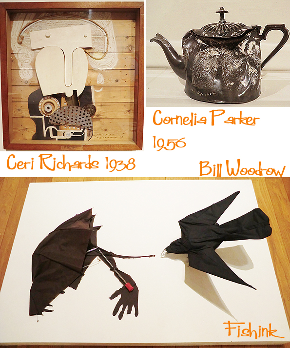
I kept seeing elephants (where there weren’t any) in this piece by Ceri Richards and my friend Sarah may well like this crow attacking the umbrella man.
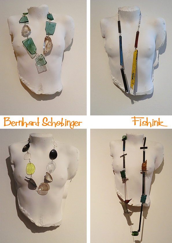
Moving onto a display of the work of Bernhard Schobinger, a jeweller who likes to work with rough found objects.

“Recognised as a key figure of avant-garde contemporary jewellery, Bernhard Schobinger’s subversive approach to making spans more than forty years and has earned him a reputation for rebellious innovation. His work skilfully transforms discovered objects into pieces that allude to past and present, precious and leftover. Something of an alchemist, Schobinger gathers and processes all manner of matter, which frequently includes discarded detritus. From coloured pencils, spent knicker elastic, precious stones, combs or worn eraser nubs, to coins, diamonds, prickly saw files or poison bottles – such scavenged materials are all sources of aesthetic and physical richness. At once anarchic and collectible, Schobinger’s work unites these materials to create hybrid jewels that irreverently express their provenance while challenging conventional histories of body adornment. ” (text from Manchester Art Gallery Website).
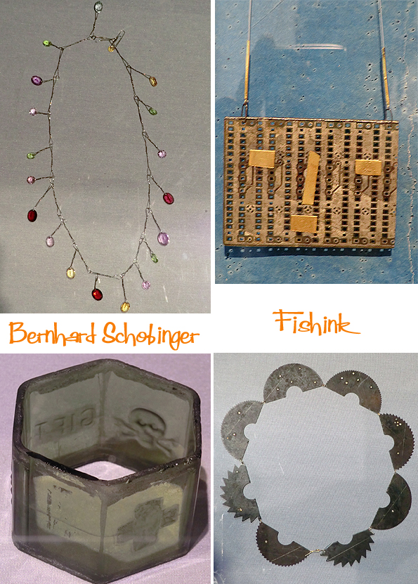
I thought these ‘plaster busts’ were a wonderful way to display the necklaces.
There’s an interesting interview over at Cheshire Resident. A superb selection as ever in the City Art Gallery, always worth popping in, even if it’s just for a cup of tea !
Last but my no means least, I headed over to the Cornerhouse to go and see ‘ Boyhood ‘ a truly amazing film following the life of a boy of six through to his university years. Here’s a flavour of it..
I hadn’t read anything about the film before seeing it and so kept wondering how on earth the characters kept ageing during it’s unfolding. Apparently it was shot over just 39 days, spanning a period of 12 years so the characters did age naturally during it’s making ! Wow I’ve never heard of something like this before. Looking into the work of the producer Richard Linklater, I realised it’s the same talented guy who made Before Sunrise and Before Sunset which were also classic stories.

I’d recommend seeing this, it’s not an out and out, wow movie but more like an extremely comfortable road-trip-style-ride through a young man’s early life. Well worth investigating, and do let me know your thoughts if you do see it. On Saturday I also went to see Finding Vivian Maier which I’d wanted to see since I first heard the back story to this amazing photographer’s life. It’s filmed as a documentary, mostly with commentary from people she knew or who knew of her, all of them saying what a strange, private and secretive person she was but her work, tells a different story. Quite a sad overall feeling to this film but interesting to know. Wow no films for half a year and then two in the same week, whatever next ! ; )
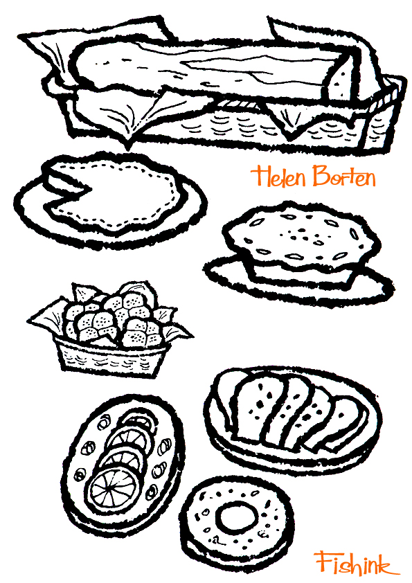
Picnics with Helen Borten

Fans of this site will know how much I love the work of mid century illustrator Helen Borten, in fact I’m hoping that later this year to be able to share some exciting news with you about her work which is hush hush just now ! This must about the tenth post on the Fishink Blog that features her work. Today I’m showcasing ‘The Picnic Book’ by Marian Tracy printed in 1957 by Charles Scribner’s Sons in New York.
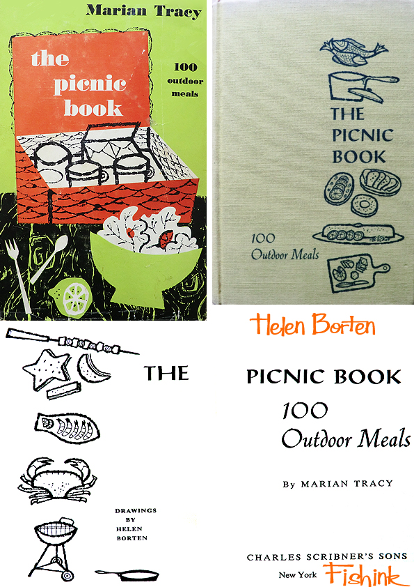
When I asked Helen what she remembers about doing the illustrations for this book, she said she didn’t remember doing it. That is not to say that Helen is forgetful, it merely acts as a reminder of just how many books she created artwork for over her long career as a children’s book illustrator. 
Helen said that if she couldn’t even remember the illustrations for this book then they obviously didn’t leave much of an impression on her and therefore the book probably wasn’t worth tracking down and buying. Well I’m sorry Helen but I disagree, these are wonderful, and feel as fresh as the day you drew them some fifty seven years ago ! Do you not agree readers ?
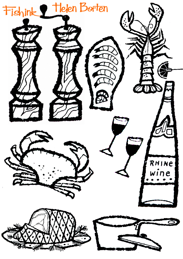
Simple, yet uncluttered, each drawing is instantly recognisable as to which culinary delight it’s meant to be. 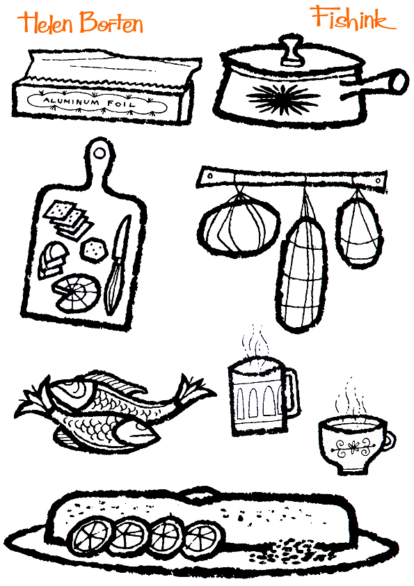
The mix of the different weights of line, are a perfect combination. Some of those cakes and pies simply look good enough to eat ! 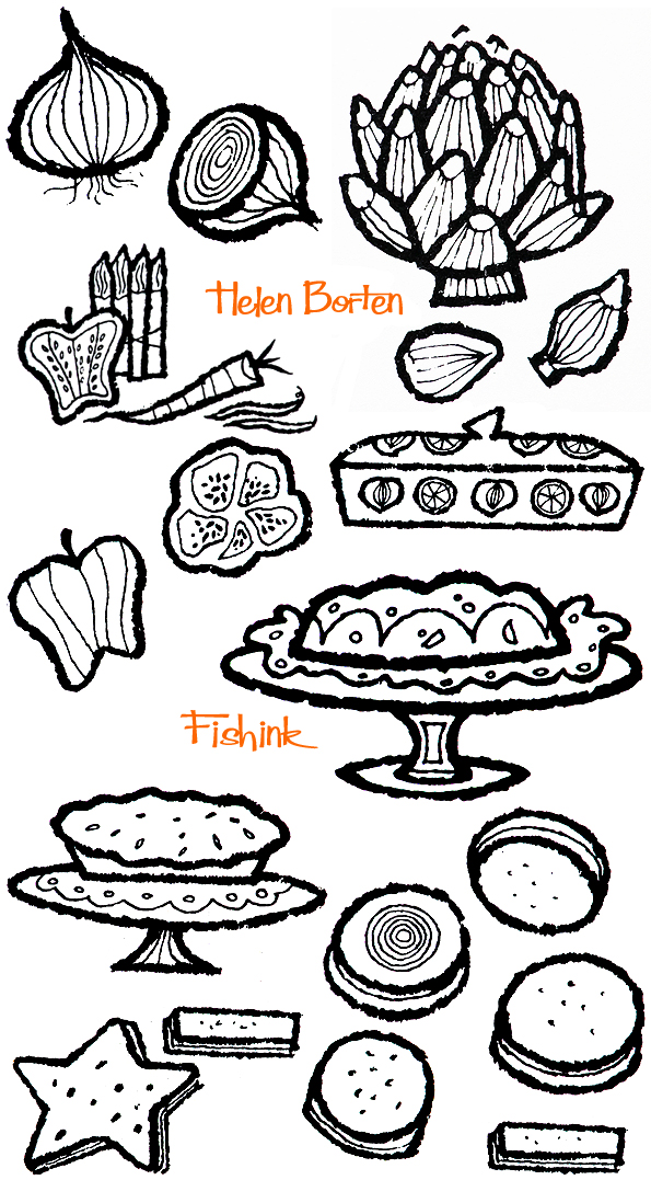
Great work as ever Helen.
Look out for other cookery-illustration related articles coming in the next few weeks. Do any of you have a similarly illustrated and dated book you’d like me to feature on here. Please get in touch.
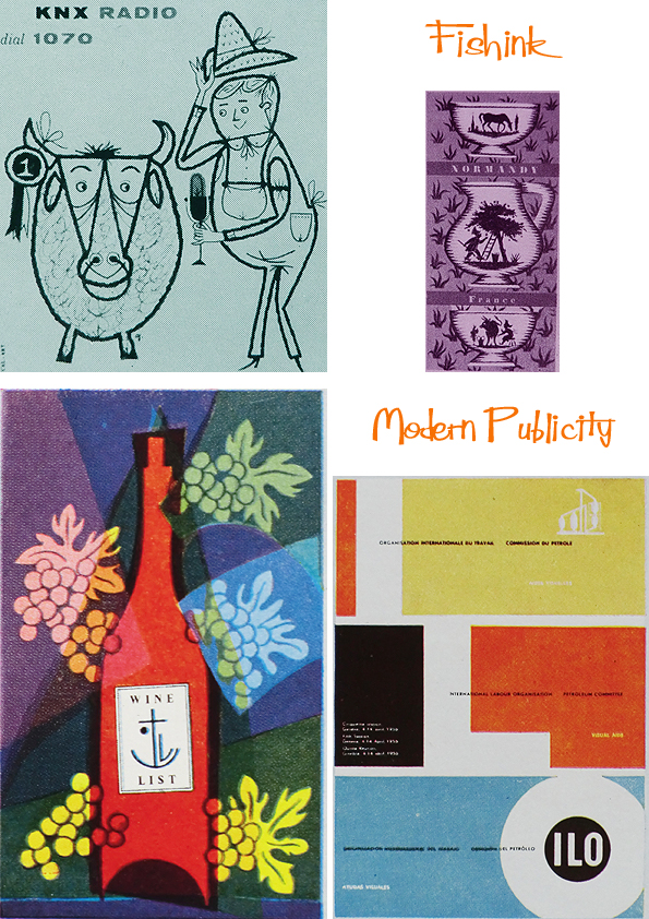
Modern Publicity 1953 – 54. Illustrated Mid century Art, Advertising and Graphics Part 1
This is my 800th post !!!!!!! WOW, Many thanks to everyone for keeping up with your comments and support.
Following on from the series of blog posts about Modern Publicity here’s part one, looking at the period of world Illustration around 1953 to 1954.
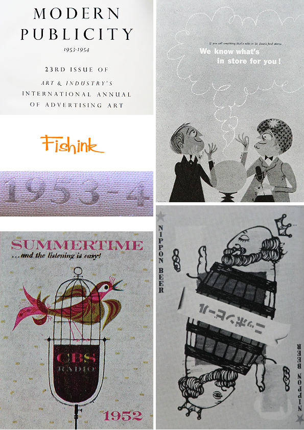
I just love the style of work that was being featured back then and this series of books seems to capture the best of it. Look at the ad for these ultra strong men’s underwear being tested with a spear .. who’d have thought of it ! : )
The only shame is that a large percentage of the books are in black and white, but they still manage to capture the essence of the times better than many illustration books from this time that I’ve seen.

This top poster simply oozes Jaaazzzzz from every pore !

And this Trix advert says as much about wool.
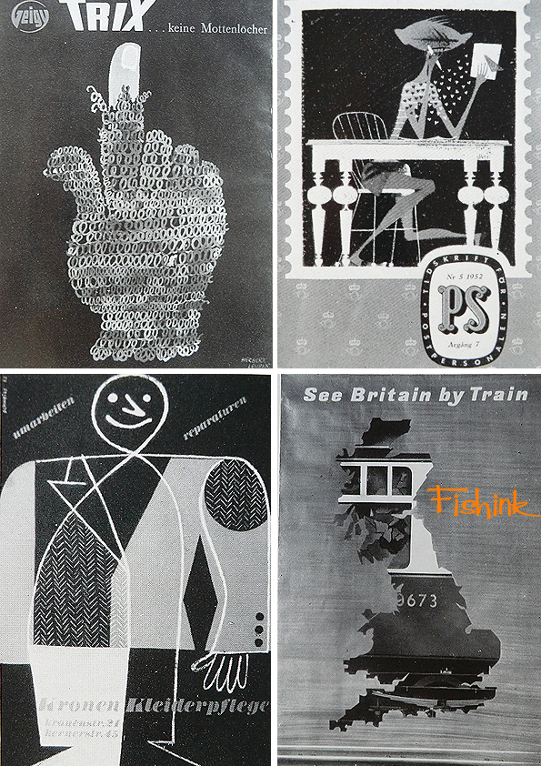
Superb ideas and styles. Look out for more posts with this theme, or search for ‘modern publicity’ in my search box function for any that you might have missed. Thanks.
Fishink at the Treacle Market, Macclesfield.

I had a great day out yesterday at The Treacle Market in Macclesfield, Cheshire. It takes place on the last sunday of each month and there’s over 140 stalls selling vintage goods, art and crafts, food and much more, all of a high quality, but not at silly prices. Due to the extra nice weather, it was bustling with people and the local multi storey carpark was free all day too ! Some colouful characters as you can see : )

This little chap was very happy sitting in his tin bowl, and I kept spotting animals everywhere, even knitted ones.

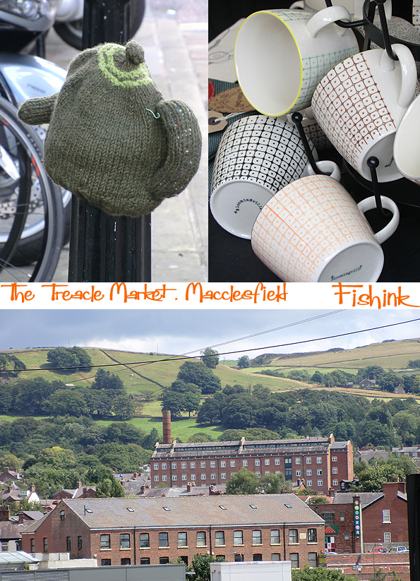
The story goes, that centuries ago, a horse drawn wagon lost a wheel on the cobbles and spilled it’s treacle all over the streets. Hence why Macclesfield got the nickname of Treacletown ! Great to see people sketching on the streets too.
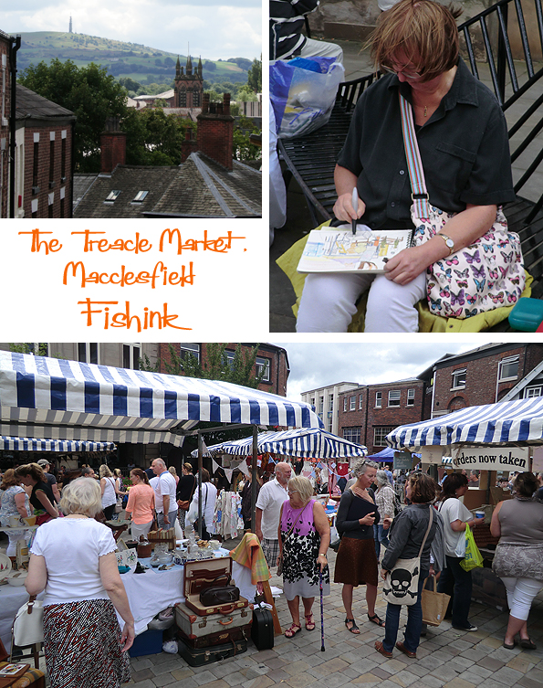
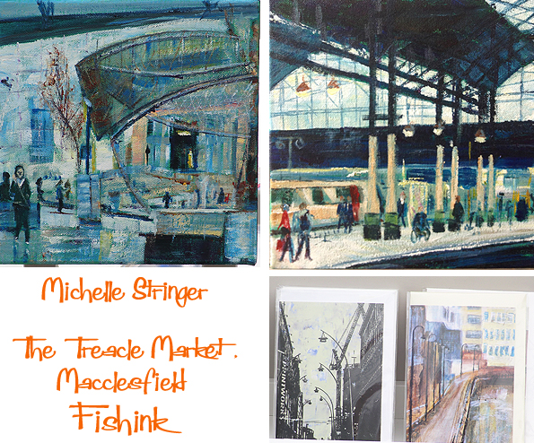
I spotted this lovely work by local artist Michelle Stringer, who’s paintings and collages were colourful and slightly Lowry-esque.
This band of Ukelele players were drawing in the crowds too, some interesting antiques like these pub taps and lots of beautiful foods like these mushrooms.

This lady’s plant stall really caught my eye. What a beautiful display !

This was my prize find of the day, a jug with a 50’s or 60’s design from Heron Cross Pottery, right up my street. A great day out if you fancy somewhere new to discover, and plenty more to see in and around Macclesfield too. Thanks to my friend Paul for the suggestion.

Fishink Morning Walks
I’ve heard people say that working from home as an artist is not a proper job. Apparently us artist-folk, don’t take life seriously, we spend time sleeping a lot, playing around with interesting shapes and frittering away our time in less serious, non-office pursuits like working out the moves from the cast of Fame (for example) !

I’d like to tell those people that our world is complicated and beautifully unique. Sometimes there is darkness, prior to stepping into the light. Searching, before finding realisation and often cloud before clarity, vision and creativity.

Most days are bright, sunny and colourful, where there is meaning and purpose and wellbeing.

Sometimes we need to creep into the shadows, or be carefree and adventurous, or placid and contemplative to allow our minds to see more clearly.

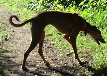
Us homeworker artists are a complex mix, and by allowing our minds to wander freely, we discover doors that open into places we never even dreamt existed. Please don’t pity our small lives, because secretly we’re living the best life possible ! Thanks to my dog Boo, and my morning walk for helping me see life more clearly.

Interestingly I met a new fellow illustrator Craig Cameron the other week. He lives not far from me and also has a dog that he takes out for morning and evening walks. He sent me this illustration today that he did last week, before he’d seen my post… what a great surprise ! It seems we think alike : ) Lovely work mister C.

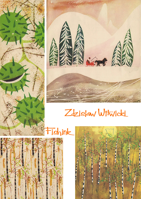
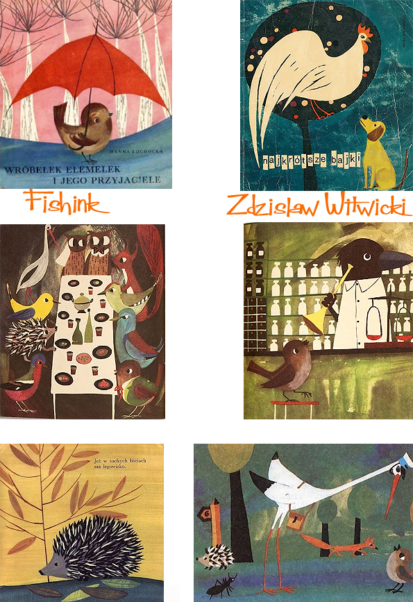
Zdzislaw Witwicki Polish Children’s Book Illustrator.

Zdzislaw Witwicki is a Painter and Illustrator. Born in 1921, he studied at the Academy of Fine Arts in Warsaw.
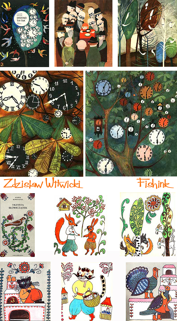
After the war he became editor of a graphic arts and publishing company whilst still illustrating.
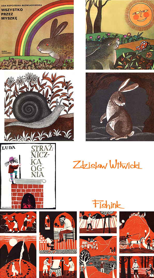
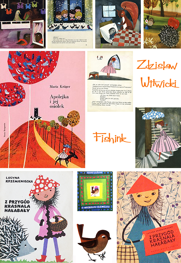
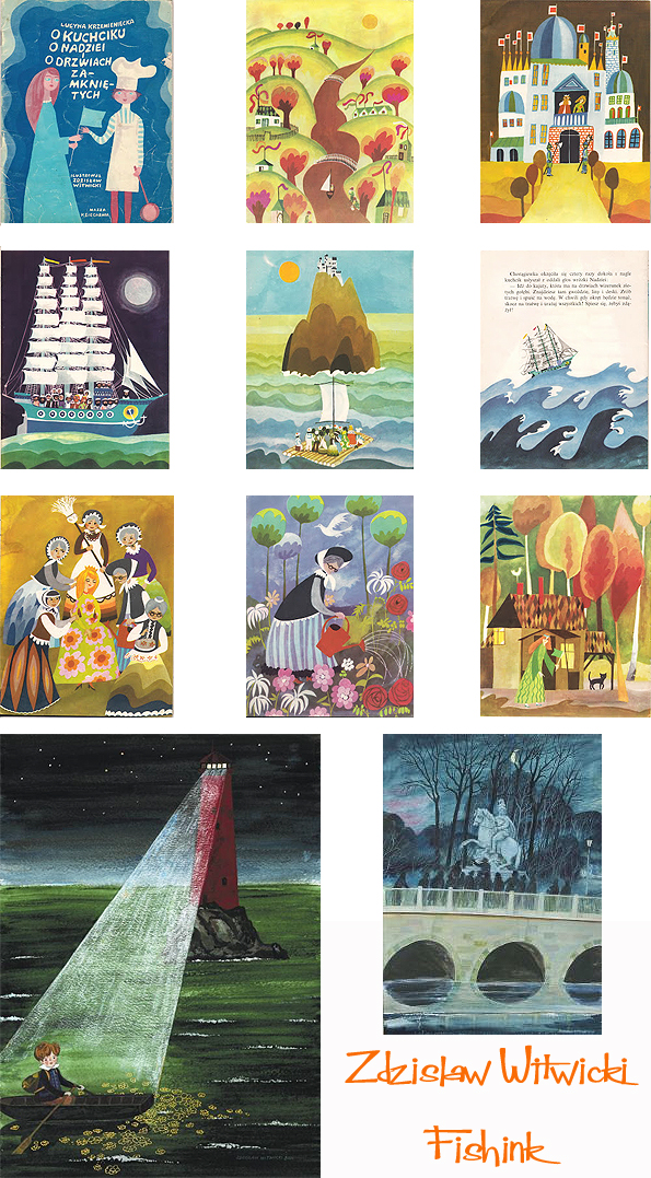
One of the originators of the Polish School of Illustration. He has created about 70 books. One of the most recognizable figures drawn is Hałabała – lovable dwarf hero, written by Lucina Krzemieniecki, and Elemelek – a small sparrow with author Hanna Łochockiej.
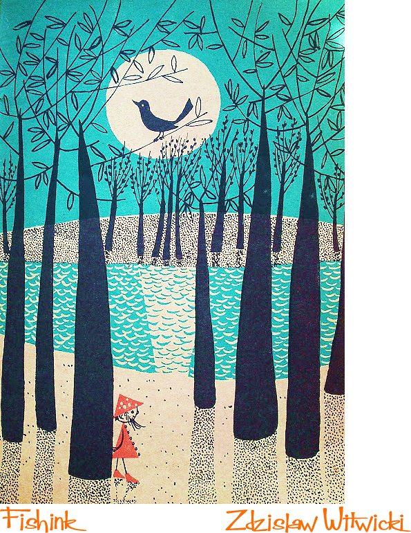
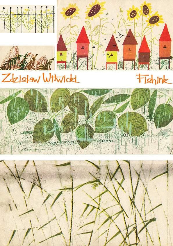
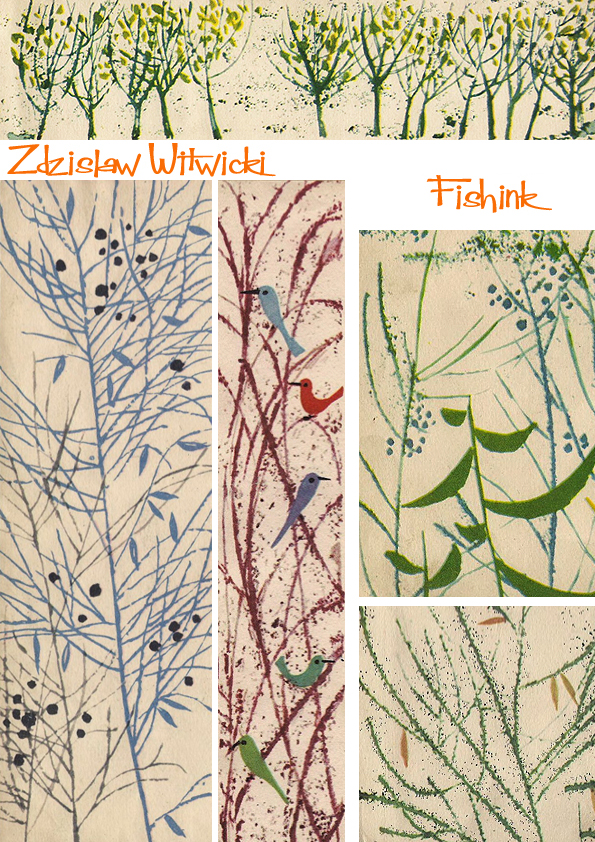
He certainly has a fair few design styles to his work.

Lovely marks in this illustration and in the nature inspired ones below. They have a slight Charley Harper feel to them.

Zdzislaw Witwicki has had more than 250 exhibitions of his works in his country and abroad (Bologna, London, Prague, Bratislava, Budapest). His works are stored in BWA – Gallery Zamoyska in Zamosc, in the National Museum in Warsaw, as well as in private collections (especially in Japan, Germany and Italy).
This railway station illustration has such a lovely perspective and images of Ivor the Engine spring to mind.

Another style.
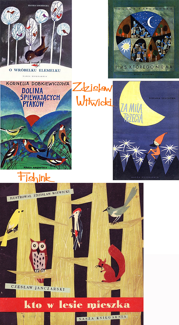
Something earlier and more simplistic.

Major awards:
- 1961 prize in the competition PTWK Most Beautiful Book of the Year 1961
- 1978 Prize at the International Art Exhibition of Editorial IBA in Leipzig for illustration.
- 1983 Prime Minister’s Award for Lifetime Achievement
- 2000 award in the competition Contemporary Polish Book Art in Warsaw for the images to accompany text
- 2001 Medal of the Polish Section of IBBY for lifetime achievement for children and young people
- 2010 Medal Gloria Artis
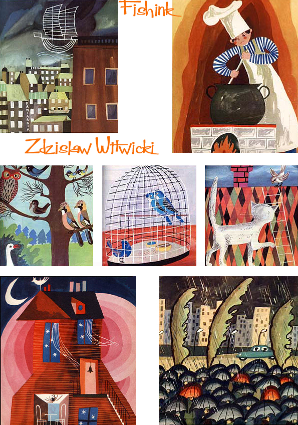
Love this red house above, superb ! Many thanks to the sites To DLA Pamieci and Garaż ilustracji książkowych for their images.
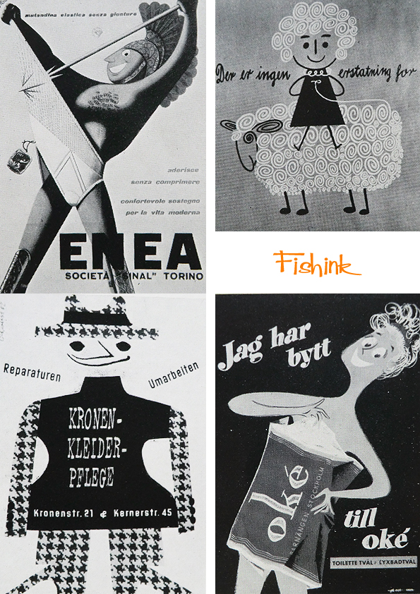
Modern Publicity 1957-58 Part 2
Welcome back from the weekend and a happy Monday to one and all. Did you know that it was 45 years ago (yesterday), Neil Armstrong and Buzz Aldrin left their footprints on history. I was only a toddler at the time so don’t remember it but hey …. what a feat ! Here’s my tribute.

Following on from Part One, here’s a few more gems from the 1957 to 1958 edition of Modern Publicity.

Love this characterful old boy with his Olympia Typewriter…. does anyone still use a Typewriter these days ?

Some mighty fine packaging too… have cigarettes ever looked so good ? This should be for party poppers or party hats surely !

The above packaging is for, bird food mix but I hoped it was for biscuits and not budgie stuff lol !

A little about fashion.

Fine colours.
And fancy football boots ! Hope you enjoyed the mix !


