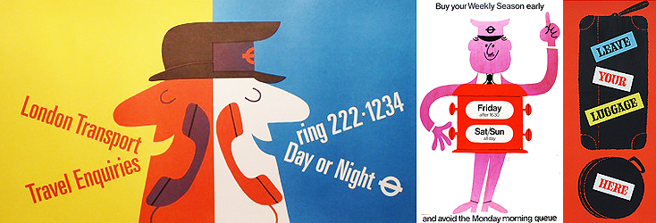
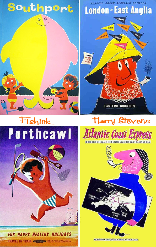
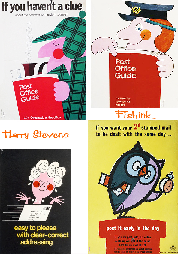
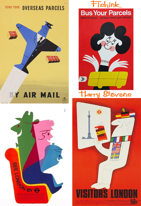
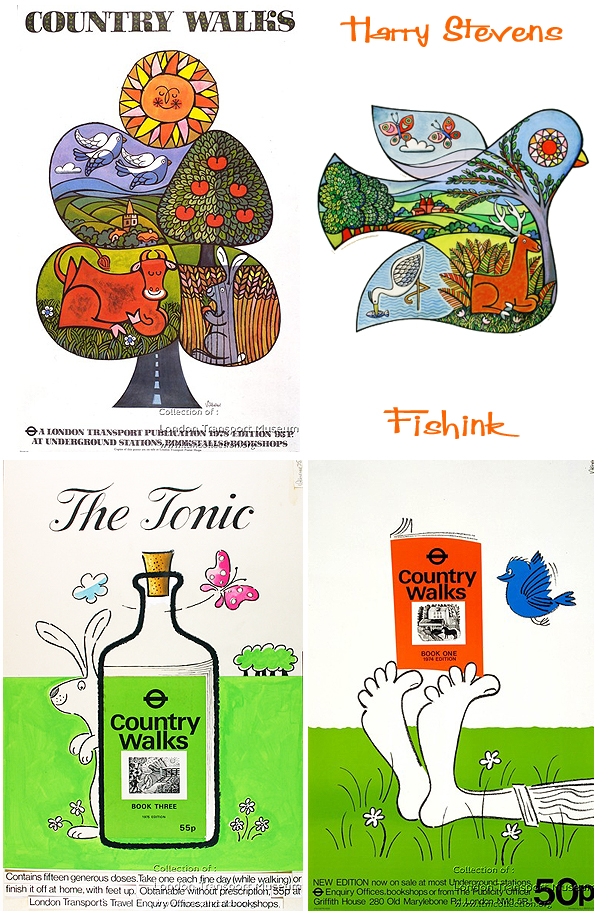
Harry Stevens, was born in Manchester in 1919 and died in 2008. He designed posters for London Transport 1960-1978 and you can find some great examples of his work on their site. What a lovely fun style, at times I think his work is a subtle mix of other poster designers of the time, Daphne Padden and Tom Eckersley. Look at these fab travel posters.
With no formal art training, Harry Stevens started his design career in the exhibitions and display trade. 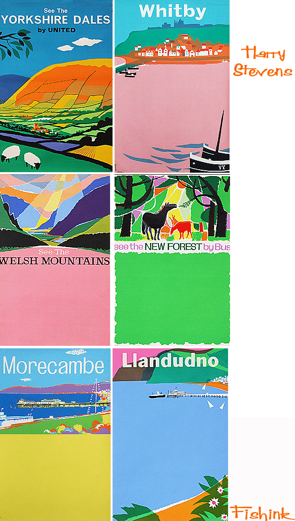
He went on to become a prolific freelance commercial artist, specialising in poster design. He worked for a wide variety of clients and agencies and in 1963 won the Council of Industrial Design Poster Award. In 1955 he joined the Society of Industrial Artists and was elected Fellow ten years later. He was also a member of the Society of Modern Painters.
Work for the Post Office and London Underground.
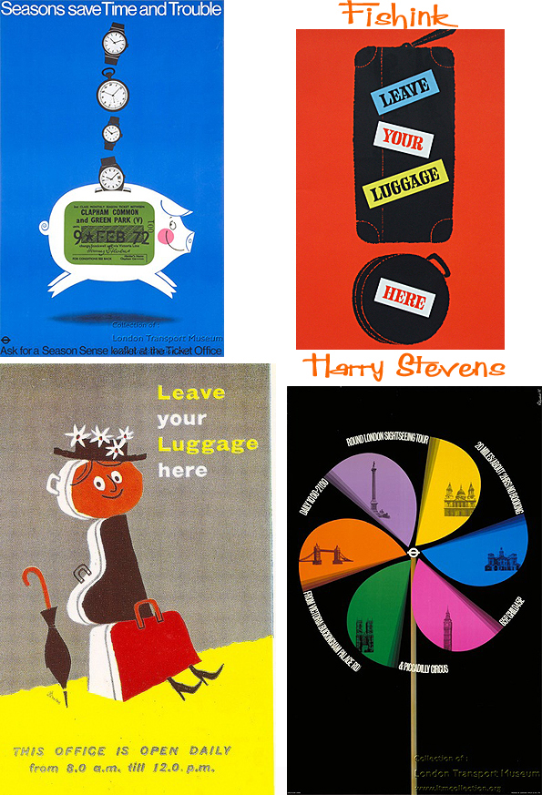
Do you think more people would be more conscious of litter if we had fun reminders like these around ?
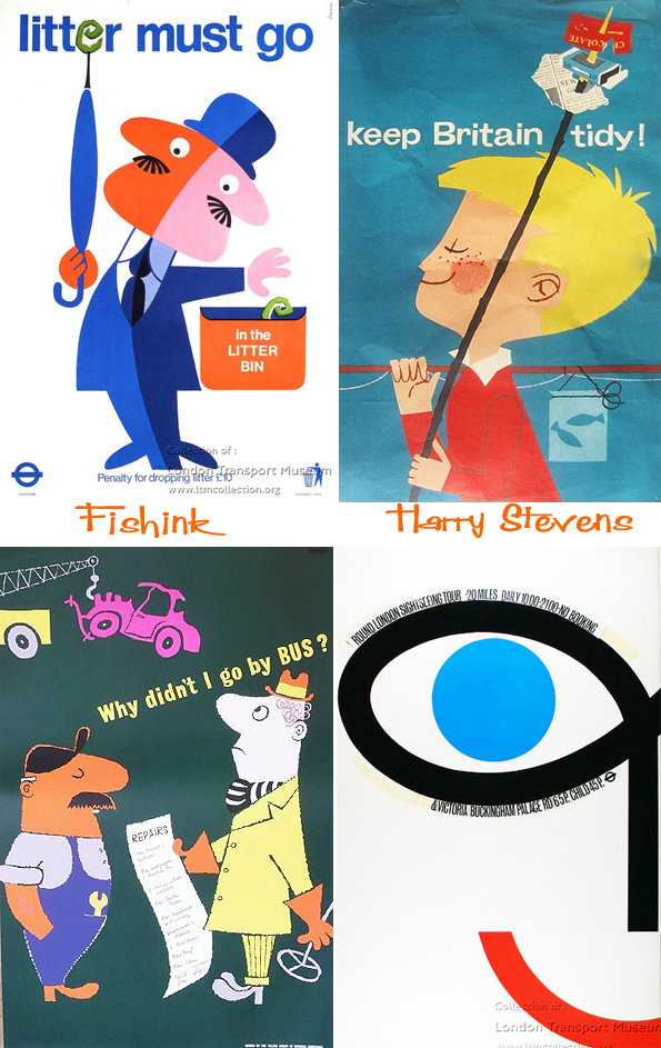
I love these great colour combinations, very eye catching !
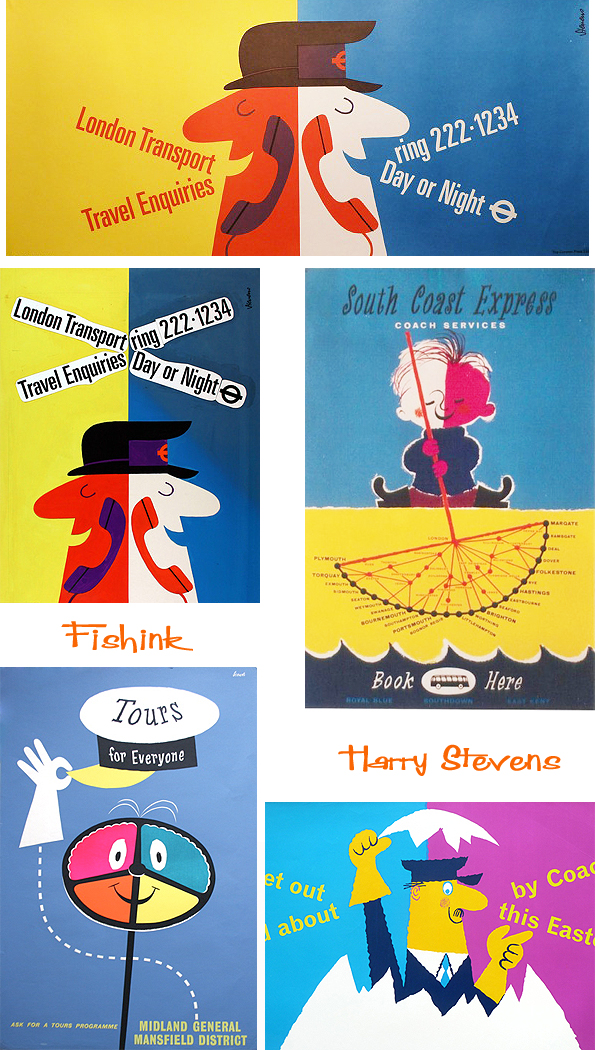
Some different styles emerging in Harry’s posters for Country Walking, from almost cartoon to painterly and even slightly cubist. What a versatile designer !
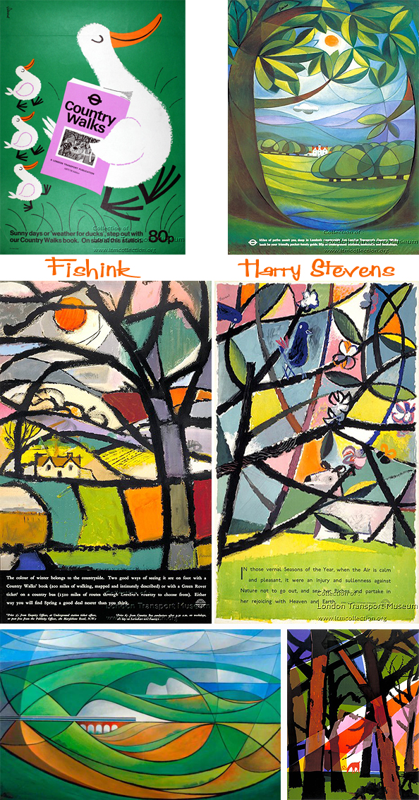
A lovely collection of colourful and feel good poster designs. I’ll remember to smile when next putting my litter in a public bin : )

There’s a great exhibition on at the Special Collections Library at MMU at the moment called ‘Tigers, caterpillars and other wild things: children’s books in the 1960s’ and is on until Friday 5 September 2014, so you have plenty of time to see it.
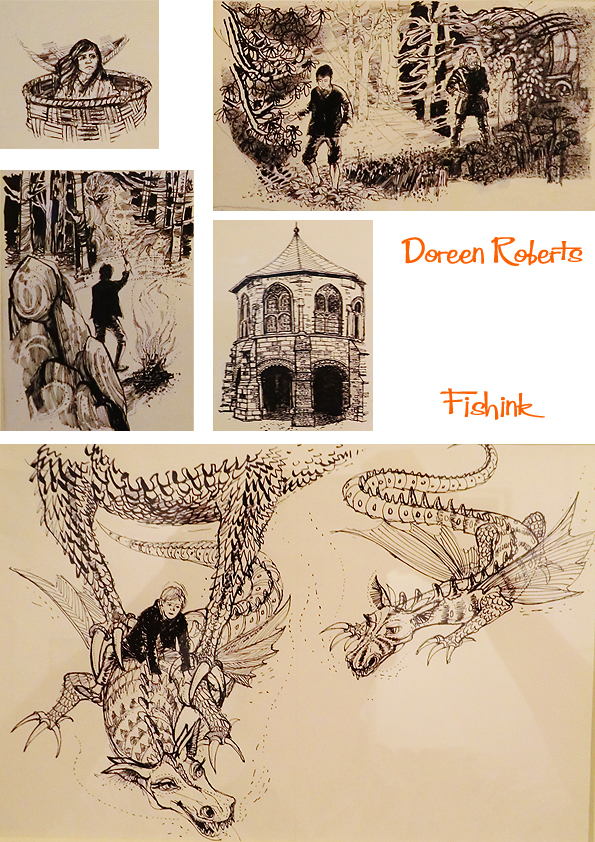
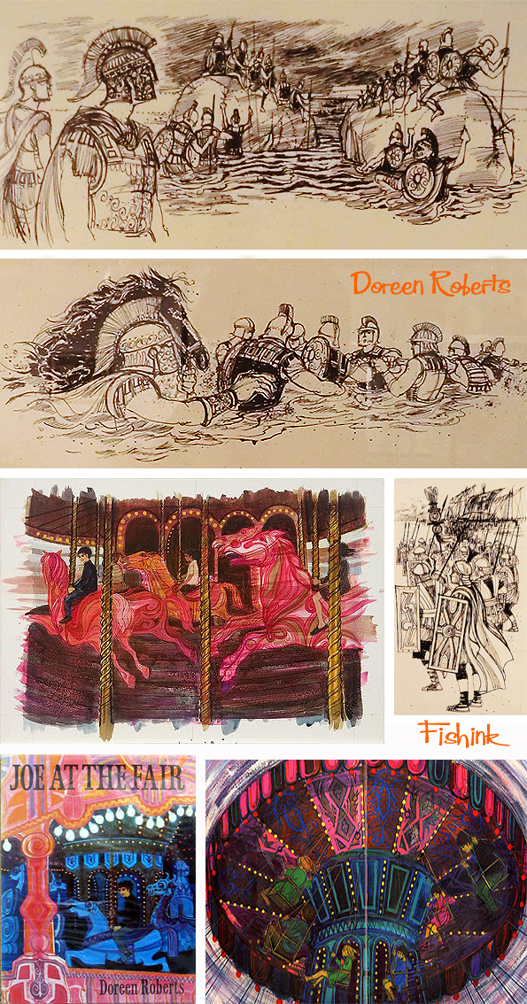
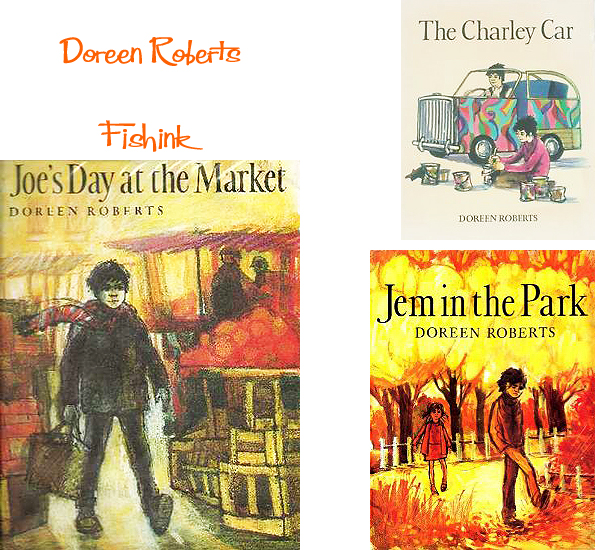
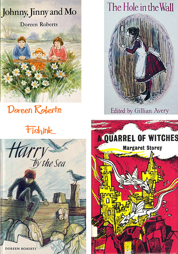
One of the featured artists is Doreen Roberts. Born in Walthamstow, London, in 1922, Doreen has recalled developing an early interest in drawing. Her family could not afford to send her for the formal training that might have allowed her to pursue that interest professionally, so instead she began work as a civil servant in the Registrar General’s Office.
In 1942 she joined the Women’s Land Army. Whilst serving in the W.L.A. she was given the opportunity to attend evening classes at Southwest Essex Technical College. From 1945 until 1947 she attended the college as a full time student gaining a Ministry of Education Certificate in Art and Craft. From 1947 to 1950 she studied at the Slade School of Fine Art, University College, London, where she received a University of London Diploma in Fine Art. This was followed by a short period working as a freelance textile designer and illustrator which included a commission to design and execute a mural for Aldenham School, Hertfordshire.
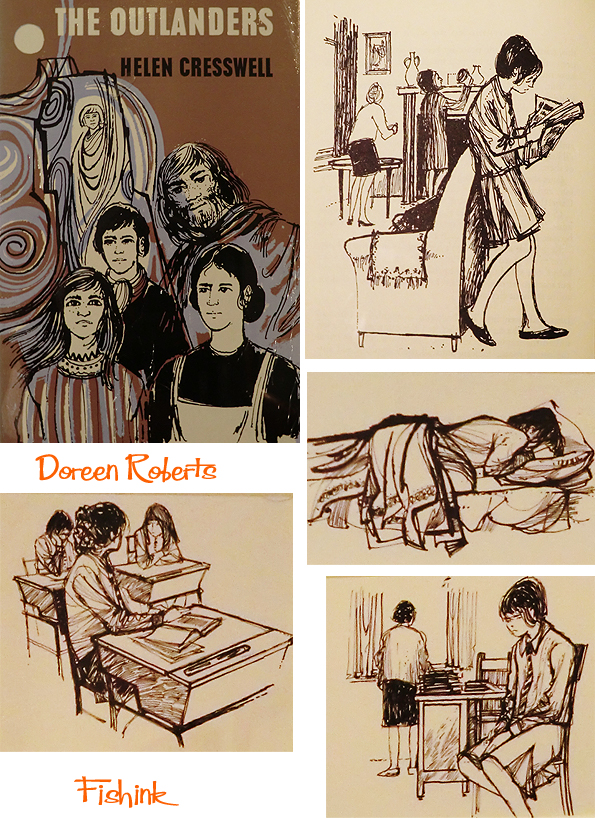
In 1951 Doreen Roberts returned to full-time education at the University of London Institute of Education were she was awarded an Art Teacher’s Diploma. In 1952 she was appointed as the Head of the Art Department at John Howard Girls’ Secondary Grammar School, London, a post she held until 1968 when she began to teach art and to lecture in art education on a part time basis whilst also working as an illustrator of children’s books.
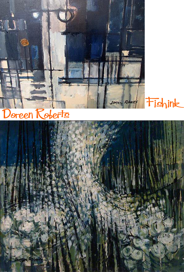
In 1977 she returned to full-time teaching as a lecturer in Art and Design at All Saints Teacher Training College, London. When the College merged with Middlesex Polytechnic she became lecturer and then senior lecturer there. She retired from teaching in 1984 and returned to illustration and writing and also pursued her interest in textile and jewellery design and photography and film.
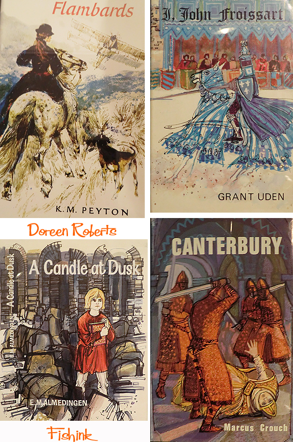
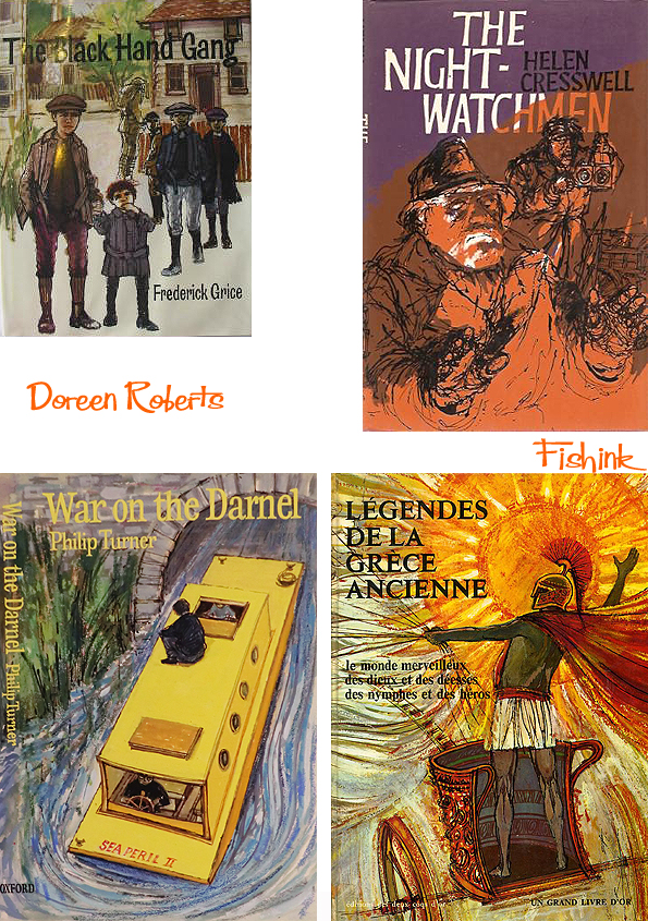
Doreen Roberts has illustrated and/or written over 40 books for such publishers as Oxford University Press, Harper Collins Publishers, Constable Books and Methuen Children’s Books. Her work has been exhibited widely and in 1967 her illustrations for The Story of Saul the King, London, Constable Young Books, 1966, were commended in the Kate Greenaway Medal for the best illustrations for a children’s book published that year.
Doreen has been elected as an Associate of the Royal Photographic Society and as a member of the Society of Authors.
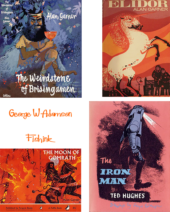
Further work on show at the exhibition, included that of illustrator George W Adamson (1913 – 2005). Who illustrated the first cover for one of my favourite children’s books by Alan Garner called The Weirdstone of Brisingamen. On seeing the book cover for the first time, Alan stated ‘I could not have hoped for the mood of the book to be better expressed. George Adamson has caught it exactly. Fenodyree is just as I imagined him and the eyes are the best part of the jacket. I am delighted ‘. George trained as an etcher /engraver and graphic designer in both Wigan and Liverpool.
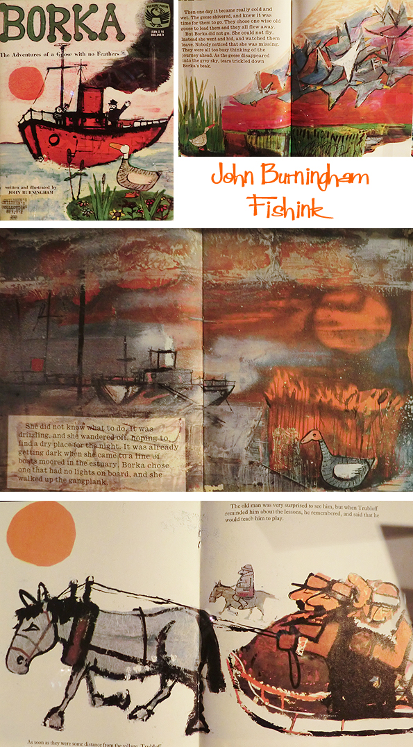
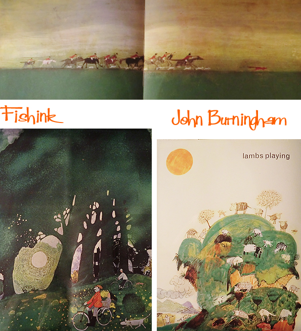
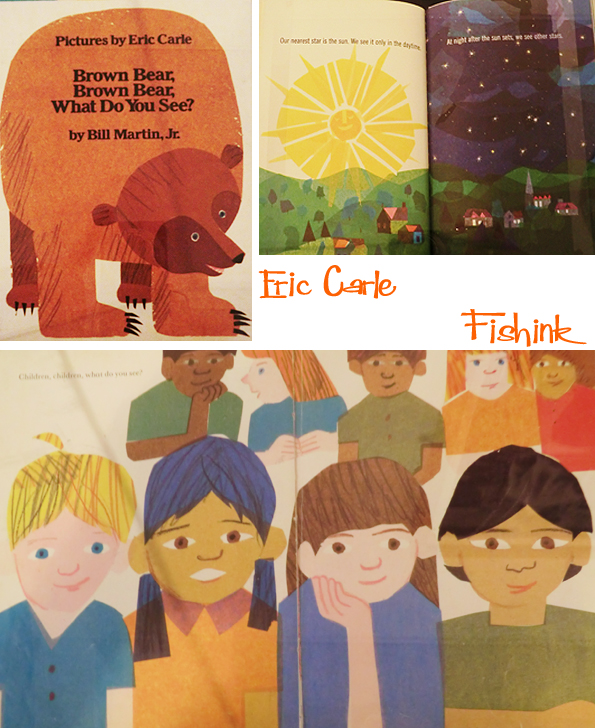
Other work on show by fav illustrators John Burningham and Eric Carle.
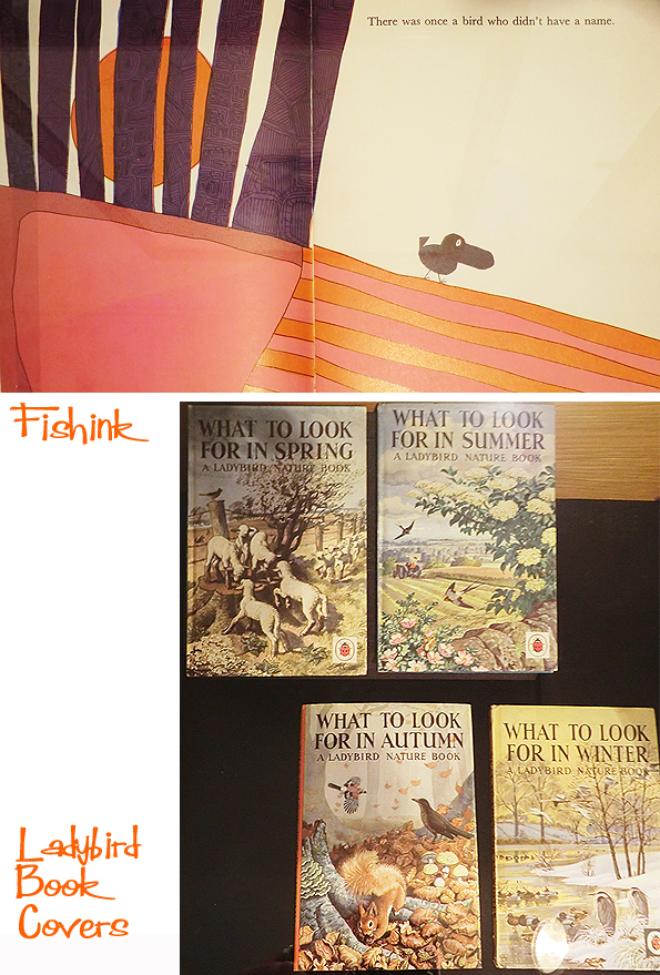
I didn’t catch a name for this last one but the book looks fab, and a few Ladybird covers I remember from the days of my youth.
Great exhibition everyone. Well worth popping along before september to check it out.
Fishink Summertime guest blogger

Yay, it’s officially Summertime with today being the Solstice and also with my ‘guest Summer blog’ being released by my agents Jehane and Sue, over at Yellow House Art Licensing. You can view my portfolio with them here.

Fortunately the timing of the summer has coincided (in the UK at least) with a lovely warm spell so we’re making the most of those green grassy areas that tend to get a little neglected (in some peoples lives), for the rest of the year. I’ve been getting out and about for local walks with my dog so have been enjoying the long evening sunlight for a while now. I know my dog ‘Boo’ has been making the most of the weather too and her chance to get some leafy shadow tattoos done : )

I must have known she was going to appear in my life at some point, as she had been anticipated by one of my illustrations some time ago.

This and other illustrations are available over on my site, please feel free to wander over and have a peruse. Happy summer everyone and do share any thoughts on what the summer means for you or any summertime memories from your youth.
Manchester School of Art Degree Shows 2014 Part 2

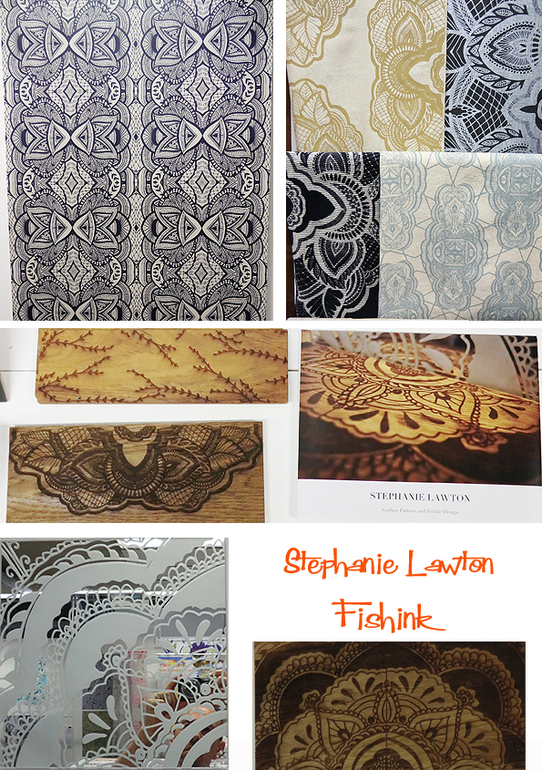
Following on from wednesday’s blog here is the remaining work I saw on tuesday at the Manchester School of Art degree show. Beginning with some intricate lazer engraved work from Stephanie Lawton.
The Benzie building is a lovely airey space, it looks a great relaxing place to work in.

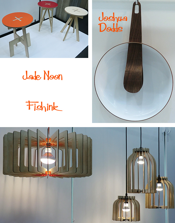
I liked the clever details in the beautiful, simplistic stools, lamp shades by Jade Noon, and a salad bowl (with tongs as it’s hanger) from furniture designer Joshua Dodds.
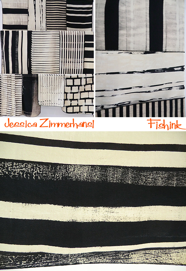
Natural mark makings and delicate bleached textiles from Jessica Zimmerhansl.
Emily Ann Shaw and Chris Woodcock explore shape and texture of the natural landscape through textiles.

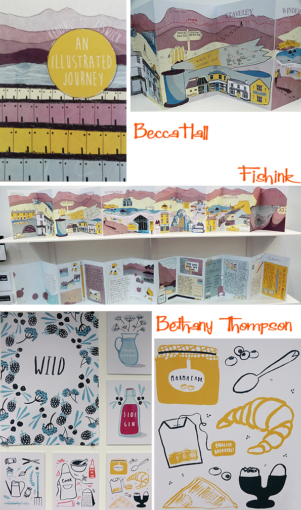
As ever, I was excited to see the Illustration graduates work. Beginning with a fun, illustrated journey, from Kendal to Keswick by Becca Hall, who’s home is in the Lake District. Succulent fruit and foodstuffs from Bethany Thompson certainly drew me in for a closer look.
Ornate irons, thimbles and old ephemera from illustrator Nathalie Izquierdo Collins. A sea tale of wood engravings from Bea Shireen.
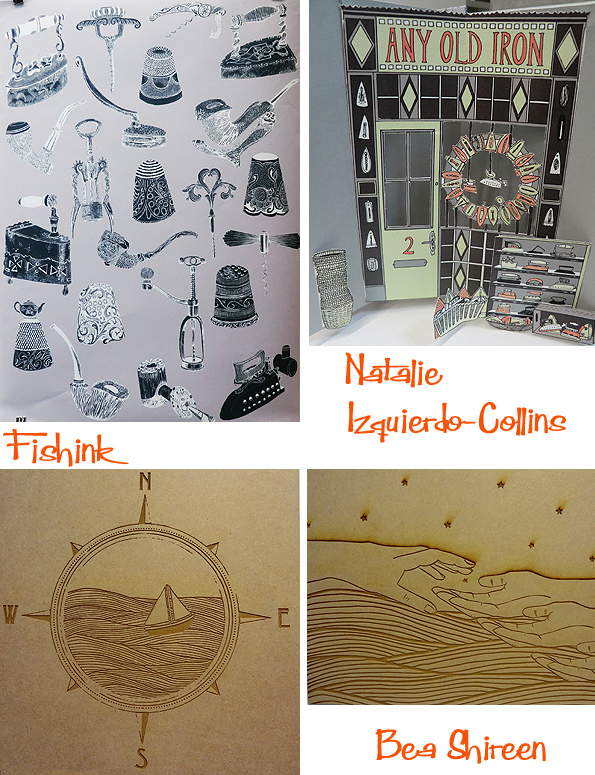
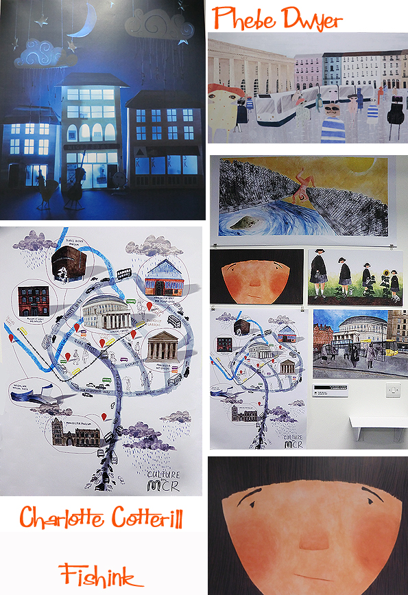
Some lovely puppet theatre imagery from Phebe Dwyer and a wealth of talented and charming work, some illustrating Manchester, by Charlotte Cotterill.
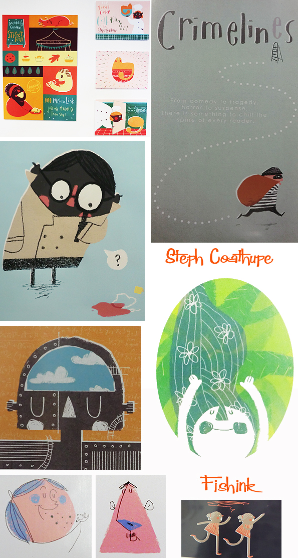
Saving the best for last was the work of talented illustrator Steph Coathupe who apparently lives in Manchester with her houseplant called Carrot and drinks far too much tea ! The little girl with the glasses and magnifying glass was a strong favourite for me.
Well done and good luck to everyone who’s work either featured of didn’t get featured on my blog this year. I look forward to seeing more amazing creations from you all in the near future. Keep me posted and don’t forget to follow and share this blog if you’ve enjoyed reading this today. Thank you.
Manchester School of Art Degree Shows 2014 Part 1
 Poster by Abbie Baxter
Yesterday I went into town to see the degree shows at Manchester School of Art. There’s a rather grand entrance to the Grosvenor Building on Cavendish Street just off Oxford Road. You can only really appreciate it’s beauty by crossing the road and looking up. I’d like to start with some 2D and 3D wallpaper designs from Lucy Petts. I’d love to see how much impact a whole room of the green and white stripe would have…. Wowsa ! 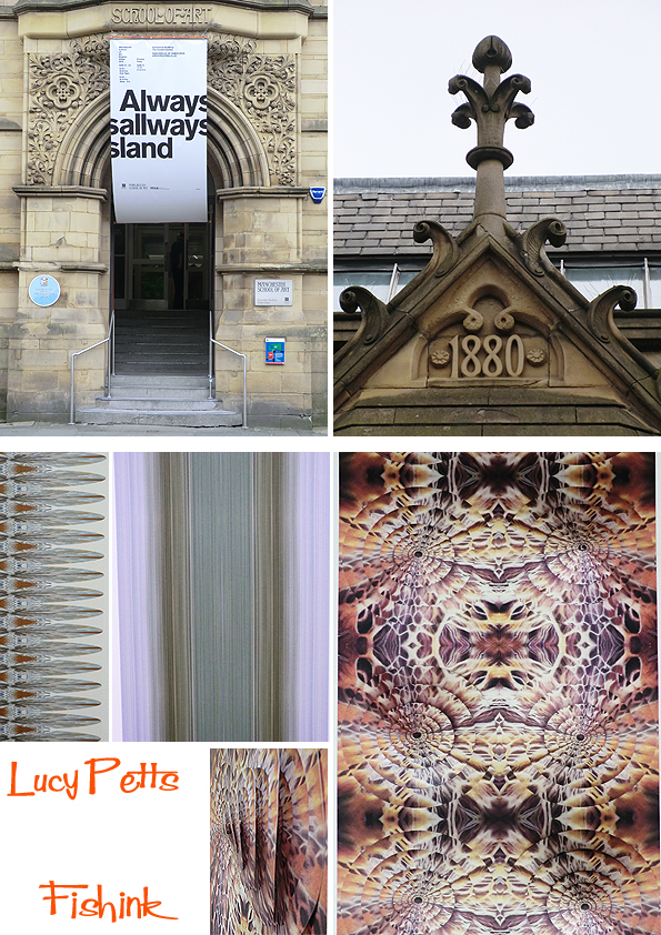
Wonderful tessellations by Ilias Mavrovas, groping (or caressing) hands projected onto a mannequin by Jake Tibbits, and moving projected grasslike lines by Nicole Kent.

Some eye-catching landscapes by Fine Artist Naomi Litvack, their colours were even better when standing infront of them. 
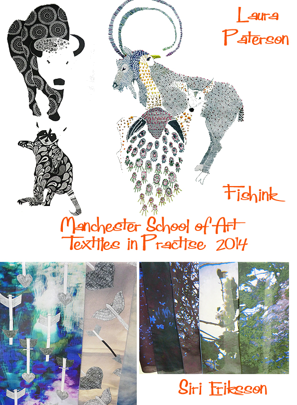
Moving onto the Textiles section and some great animal textures from Laura Paterson and silk scarves with photographs and hand drawn birds and arrows by Siri Eriksson.
Fun Children’s wallpaper designs by Ellie Shindler and some new tribal influenced wear by Emily Otchie. 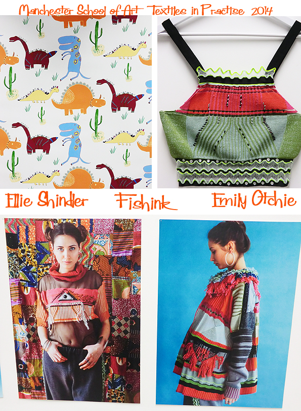
Jenny Bardoli, has created some beautiful felted cylinders, which looked great in their collective formation. Pip Pittman had been very busy making cushions, ceramics, tote bags etc with her natural wood and flora designs. Rosemary Grace Booth had very patiently pierced an intricate design into paper, which when viewed over a light source, danced and came to life like mist on the sea or a wave of stars in the night time. 
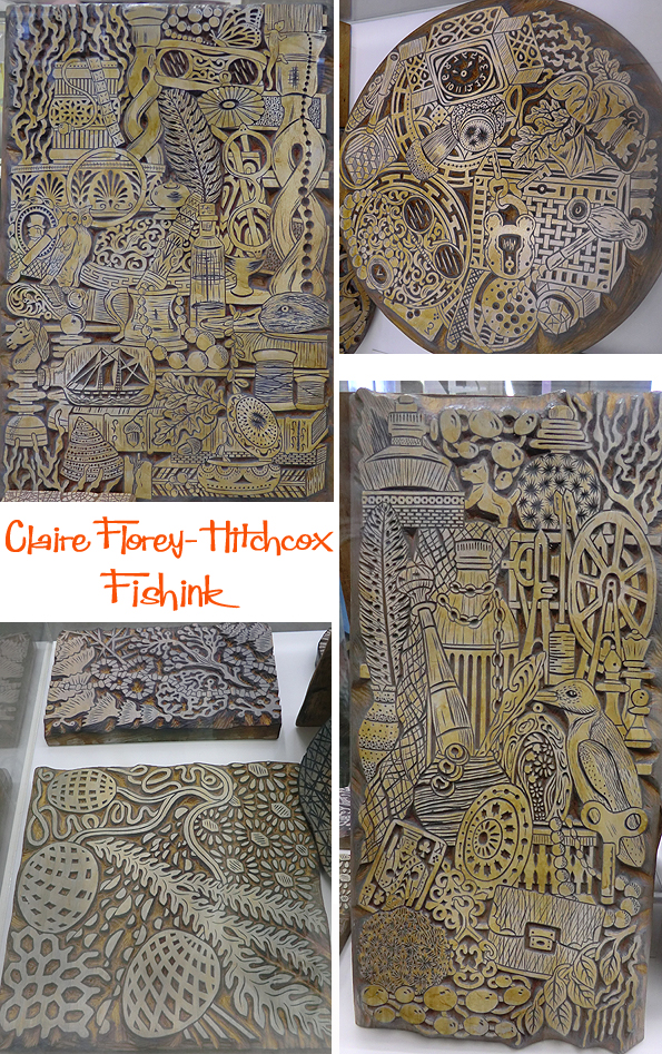
By far my favourite work in this section was by Claire Florey-Hitchcox. Her hand-printed wood block wallpapers were truly enchanting, creative and very skilfully executed too. A true joy to view and with the wooden blocks on show too.. you can really appreciate how much work and what a labour of love the whole process has been. Beautiful work. Part two of this blog to come on friday. 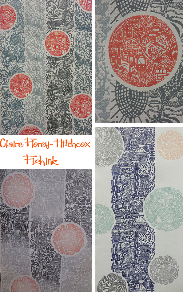
Look at these beautifully engraved blocks.
If you’ve enjoyed this post, then please spread the news about Fishink Blog. Thank you. 
The shows run from the 14th until the 21st June. Get over to see a real variety of amazing art.
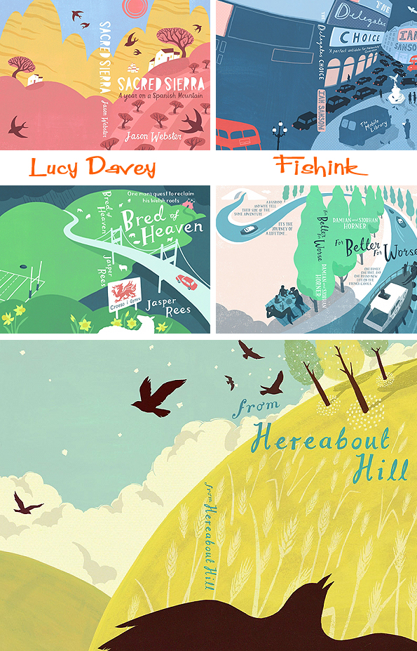
Lucy Davey Illustrations and Book Covers from Bristol

Lucy Davey has been a freelance illustrator since 2005 when she graduated from UWE Bristol. In that time she has created illustrations and lettering for over ninety book covers ! Quite an achievement.
She is represented in the UK by The Artworks illustration agency and lives and works in Bristol. I asked Lucy a few questions.

How did you formulate your slightly characteristic ‘muted’ palette ?
Such beautiful colours in this piece above. A wonderful feeling of tranquility too.
I like the bit right at the start when I’m just sketching out ideas and there’s still so much potential! Sometimes my roughs are quite finished so finessing the details for the final artwork can be a little dull – mechanical rather than creative.

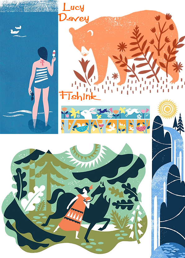
Here’s a taster of Lucy’s editorial work.

Do your illustrations start life as sketches or photos of places from real life ? Can you talk us through how you might compile an new piece of artwork ?

Maps, magazine covers and repeat patterns.

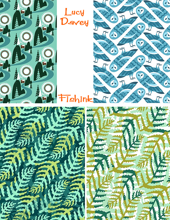
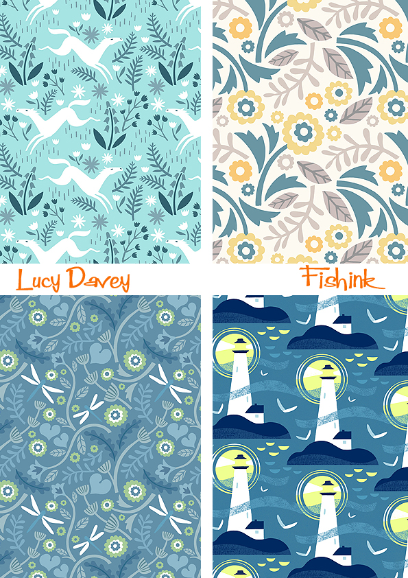
Some of her personal illustrations.

Her Clients include Orion, Penguin, Hodder, Macmillan, Transworld, John Murray, Quercus, Egmont, Harper Colllins, Faber, RadioTimes, Waitrose, Woman and Home, Financial Times, Starbucks, Colonial Williamsburg and Royal Mail. Here’s a sneaky look at her work space and a fresh recent commission by Waitrose for their Summer Eating Range. Look fab and I love the colours too.
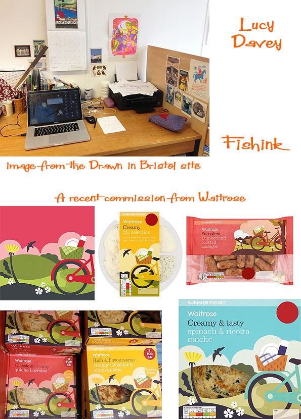
There’s a great interview from the end of last year, with Lucy who’s busy screenprinting over on the Drawn in Bristol site and much more information on Lucy’s own Blog. I must say the thought of a summer picnic hamper on your bike, filled with these beautifully packaged quiches, is making my mouth water ! Many thanks Lucy for taking part and keep up the great work too.
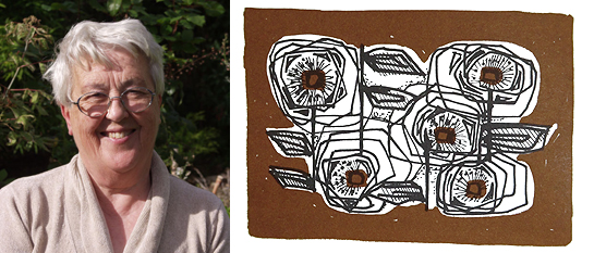
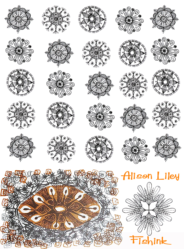
Alison Liley, born on 13th June 1929 was the daughter of two RCA graduates, her father had been trained as a painter and her mother as a bookbinder and embroiderer by Mrs Christie.
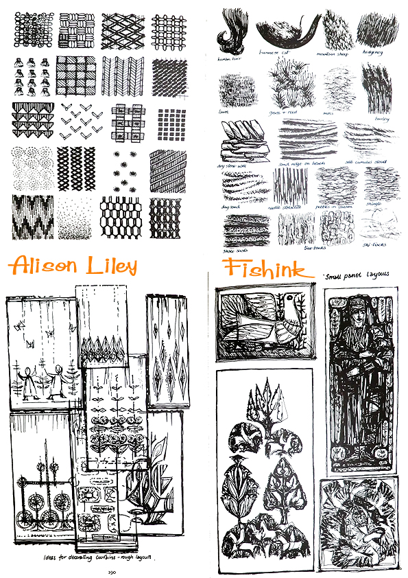
Having left her father’s art school in the North of England Alison joined Bromley school of Art to begin a qualification in embroidery. The staff of the department were at the time involved with the Needlework Development Scheme and this also became a part of Alison’s experience. From Bromley, Alison left for Denmark to study embroidery returning to a part time job in the Art School system at Canterbury. Years of teaching and travel followed, plus a marriage, children and the production of two books of embroidery technique and design. During the same period Alison started the department of embroidery at Loughborough School of Art and the idea for an exhibiting group followed. In 1962 Alison, with a small group of her fellow artists founded the very successful ‘62 Group of Textile Artists‘. In 1964 she published ‘Embroidery – A Fresh Approach’ and I came across this book recently which sparked this post. I don’t often buy embroidery books but I really liked the sixties feel to her illustrations. I thought I’d share a selection of them with you.

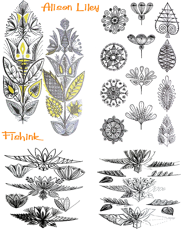
Tons of patterns and floral inspiration here.
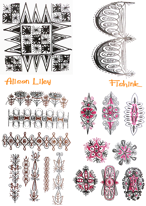
Alison has a wonderfully free style and her ideas spring off the page with a lively quality.

She experiments with different mark making exercises.
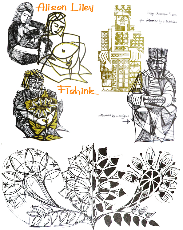
Some figurative studies. This mermaid is wonderful, is she a giant with a host of tiny sailing vessels beneath her ?

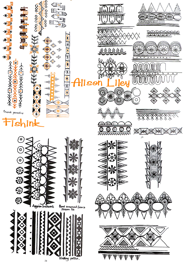
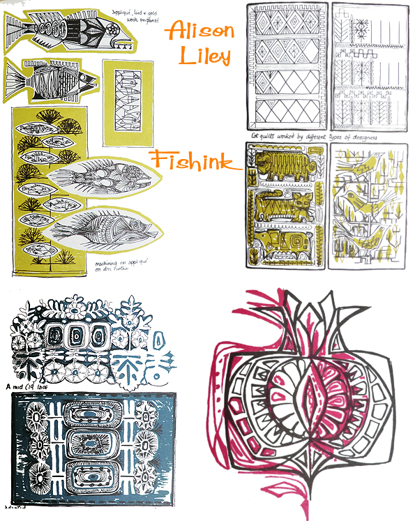
More considerations of drawing styles and techniques. The book covers so many areas, it’s not simply about Embroidery.
Roses and designs from roses. Detailed studies encourage more ideas for alternative ways of illustrating.

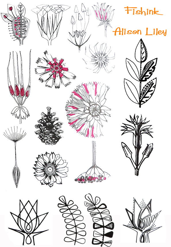
There’s plenty more in the book ranging from Birds, botanical cell structures and animals too. It’s well worth grabbing yourself a copy.
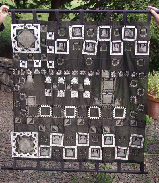
Alison decided to join her husband in Ireland and eventually moved to her house in County Clare. Here a new career developed in the making and selling of Irish Crafts, (like the piece below.) Wonderful illustrations and a great inspiration to us all.


RNCM Craft Event Manchester

Yesterday I spent a cultured day at a craft event organised at the Royal Northern College of Music on Oxford road, Manchester. It’s a fantastic building and wonderful venue for the event. Entertained by a very talented harpist for a couple of hours was a rare treat too.
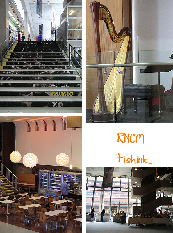
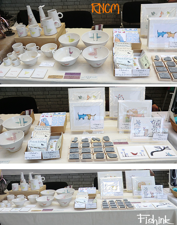
Here was my stand, you can find more of my stationery range on my Fishink site.
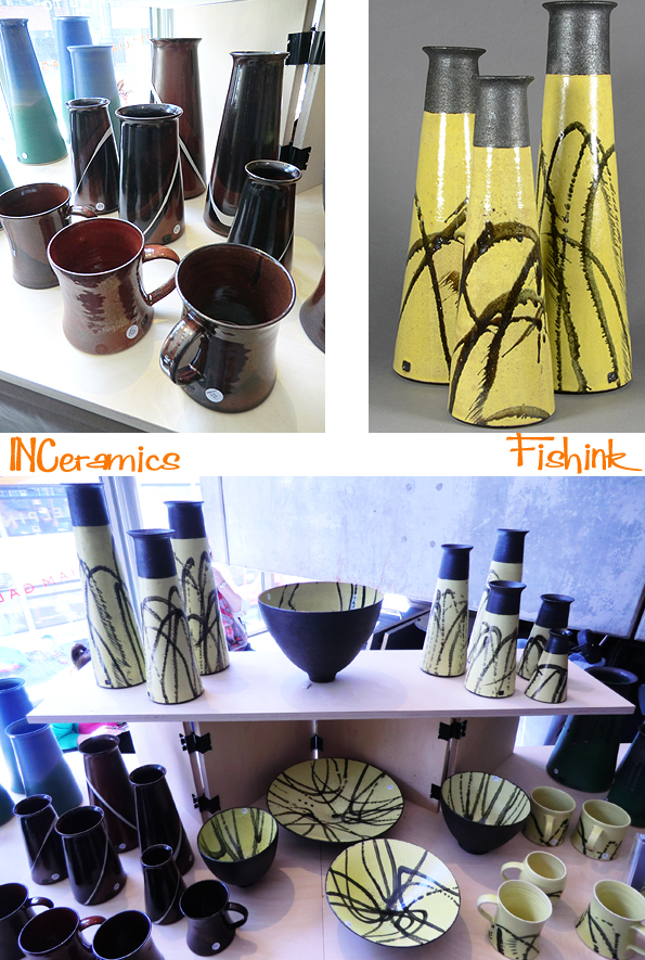
I chatted to quite a few of the other designer makers and of course took a few images to share with you too. Ian Nash, had a lovely collection of Ceramic forms. His company INCeramics is based near to Warrington and with his black and yellow range, where I saw a slight touch of the 1950’s.
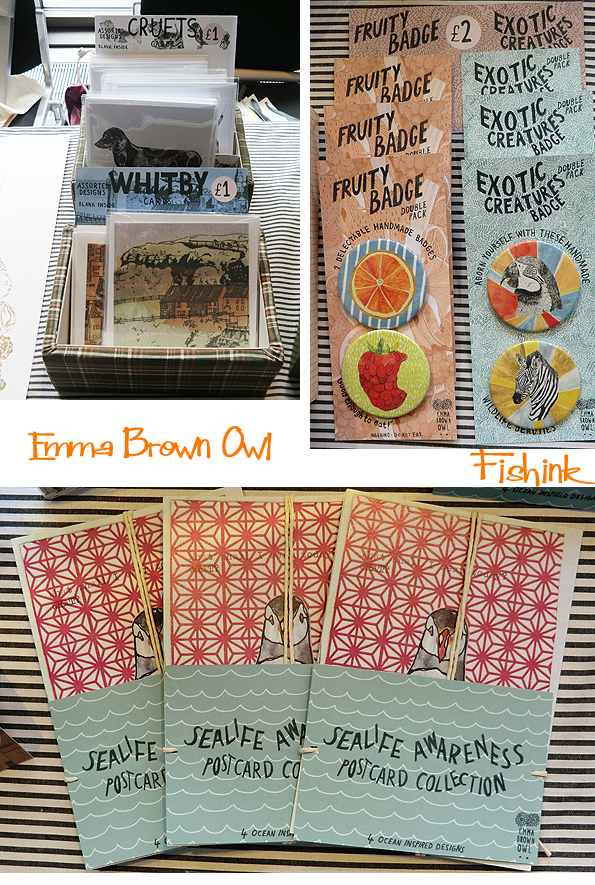
Emma Brown Owl who graduated from Manchester School of Art in 2010, had put together a charming collection of contemporary seaside ephemera. Birds, badges and Whitby featured in illustrative abundance. The stand looked great and the stripy cloth somehow gave it even more of a beach / coastal feel.

Sally from Bower Bird had a great double-length stall, full of sanded and treated driftwood sculptures. Boats, birds and other animals formed a visual treat for the lover of natural woods and pieces with a nautical feel. For more info and commissions you can contact Sally-marsden@hotmail.co.uk.
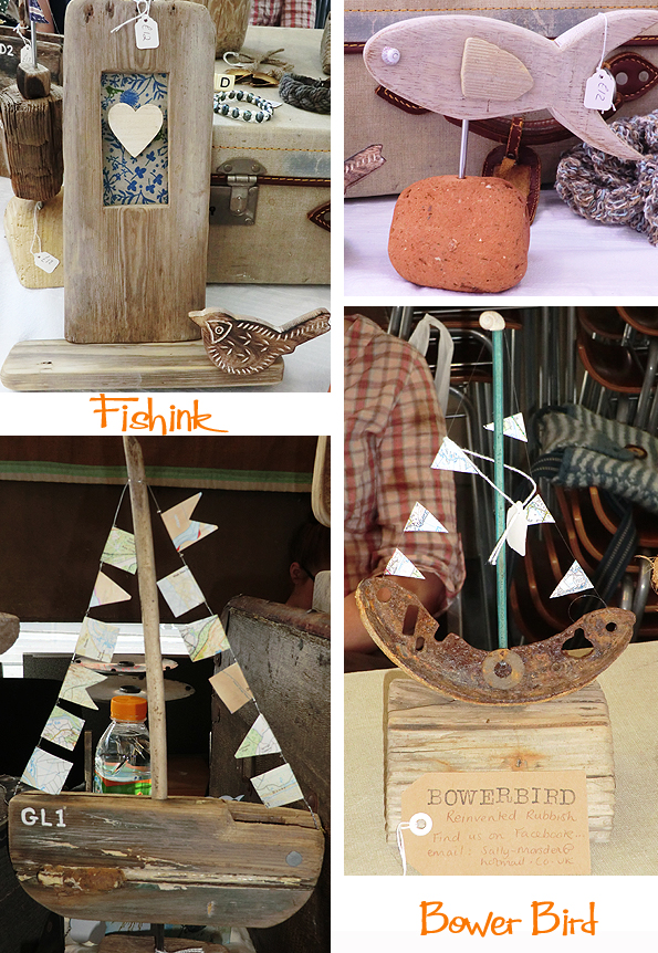
These driftwood boats looked even more impressive when all together.

One of the most impressive and well considered stands was that of Jill McCarthy and her Button Boudoir display. Inspired by old nature Observer and Ladybird Books, Jill had put together a wonderful array of bird and butterfly inspired items that followed a well considered palette from that era. They looked great all together and Jill had a 50’s style bird print skirt which completed the picture so well.


Also fab to see Sally Newall and her beautiful range of lampshades and hand printed notebooks again, we last met at the LNCCF back in April.
Sadly a quiet day for customers and takings alike but the cheery other designers and general setting and ambiance certainly helped.
Fishink . Planting, painting and poorly dog
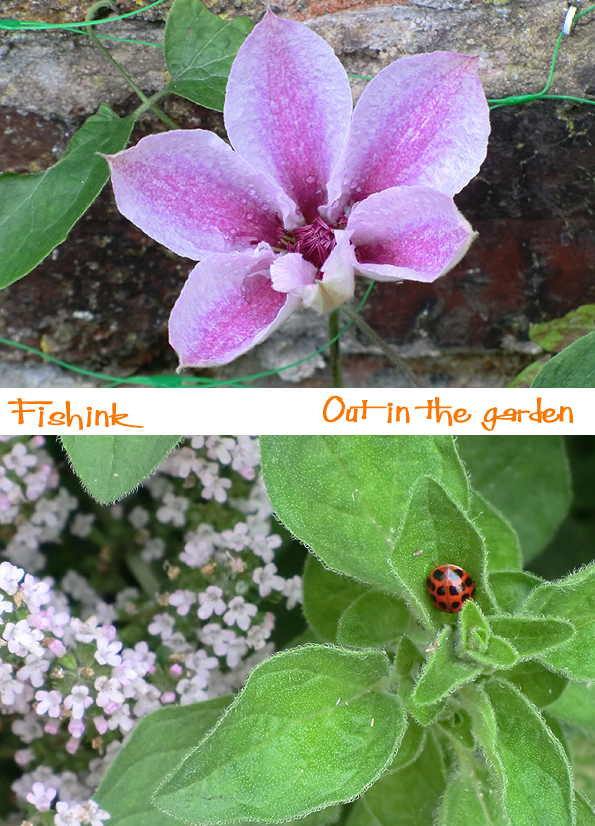
I was glad to see that some of my time spent in the garden this year was finally paying off. The Sweet Peas I’d grown from seed and the Clematis plants were managing to survive the nightly snail-army manoeuvres and had actually produced some flowers … I was very impressed.
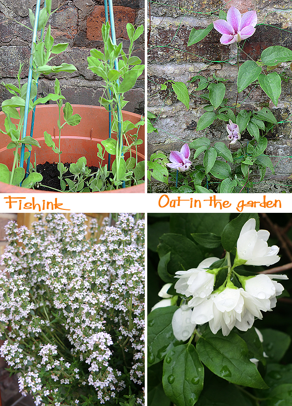
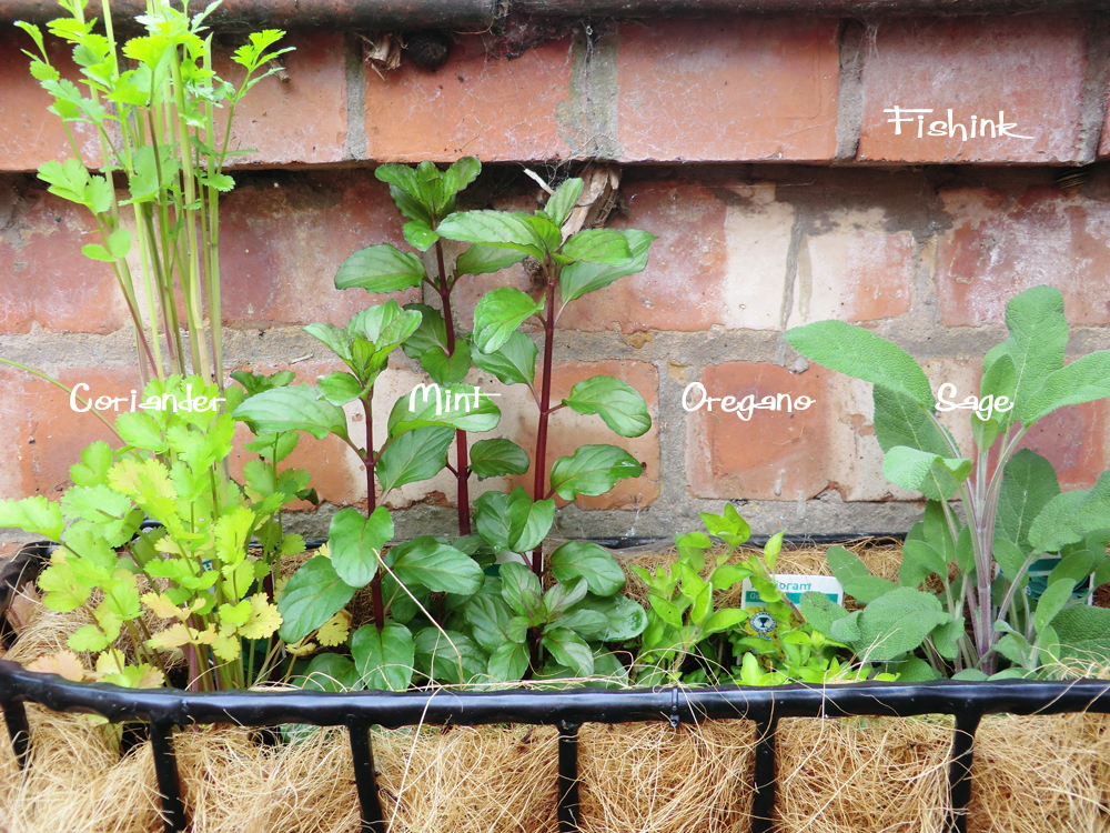
The herbs were doing well too, that’s thyme (above left) with the small white flowers,
I really enjoyed discovering this ladybird tucking herself into these new leaves as an overnight bed.
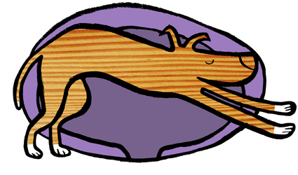
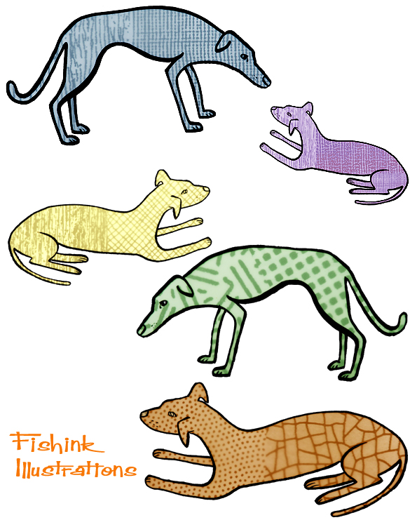
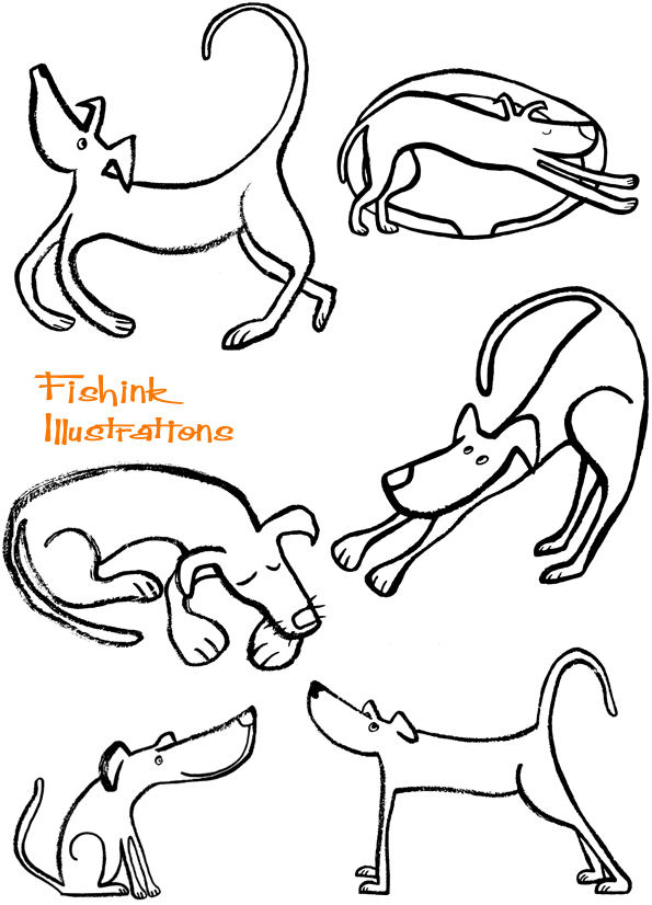
I’ve been playing around with a few loose lurcher drawings and different textures.
My dog, Boo, had her big op last week and hasn’t been feeling quite herself. Apart from having itchy stitches that she can’t do anything about, she’s had to wear ‘ the cone of shame’ which always seems far too big and makes other dogs stare and bark at her in a slightly wild-eyed and frightened way.
The ray of sunshine is that today is her ‘prison-release’ date, so she can have the stitches removed and the cone too. YAY ! No more having to carry her up and down stairs every five minutes too, double Yay : )
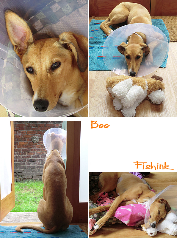
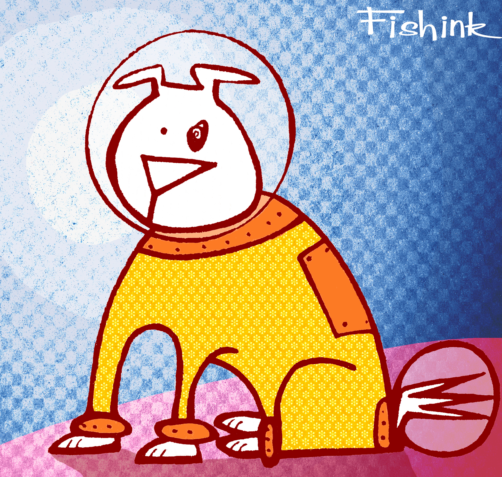
She’s longing to get back to her crazy running games with her canine companions. Hey and it seems I got my space dog after all !
A few more curvy lurchers that I’m sure will appear somewhere soon. I quite liked the wood effect in the first pic of this post, it matches her colouring too !
What do you think readers ?
More dog themed artwork and framed prints available over at Fishink here.


