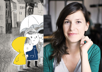
photo: Martine Boisvert
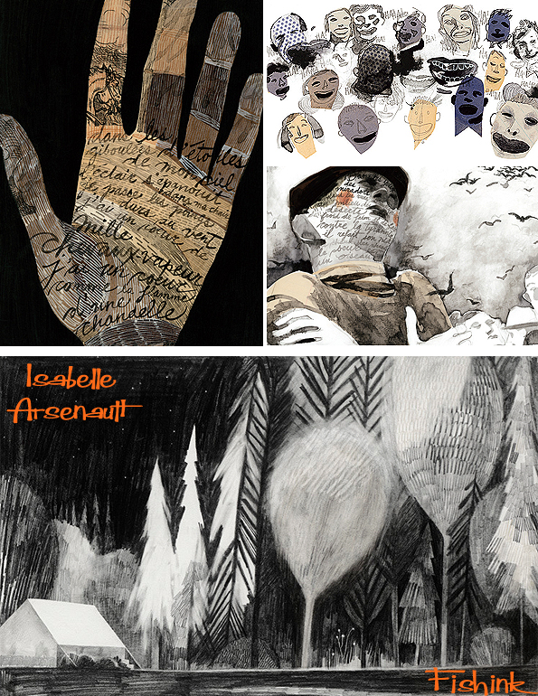
Isabelle Arsenault is an illustrator who studied Graphic Design at the Université du Québec à Montréal (2001).
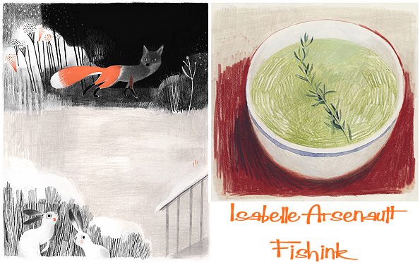
After her studies, she quickly contributed to several magazines in Canada and the United-States. In 2004, Isabelle illustrated her first children’s book, for which she received the prestigious Governor General’s Award for children’s litterature in French (illustration).
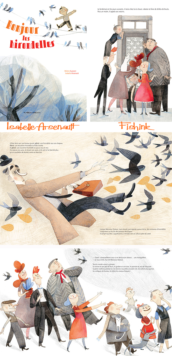
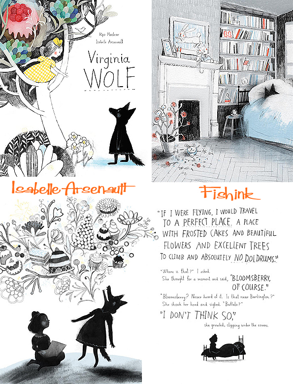
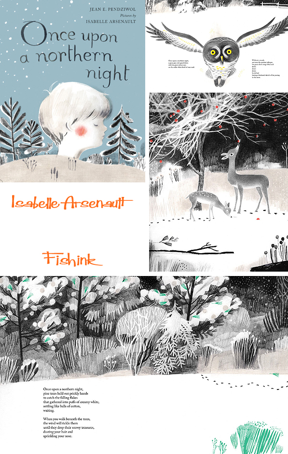
Her passion for illustrated books has led her more and more to continue pursuing this path. Since then, she was a finalist on two other occasions for the GG’s (“My Letter to the World”, “Migrant”), finalist for the Marilyn Baillie Award in 2011 (“Spork”) and her book “Migrant” is among the 10 best illustrated books of 2011 according to The New York Times. In 2012, she received her second Governor General’s Award for the illustrations of “Virginia Wolf” in addition to winning Le Prix jeunesse des libraires du Québec for “Fourchon” (French version of “Spork”).

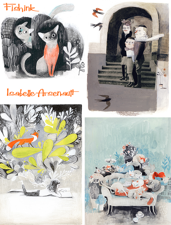
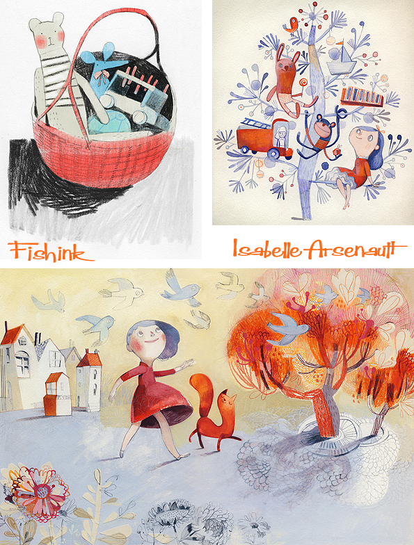
Isabelle, who enjoys working intuitively, adopts an approach to her work that is inspired by the projects she is given. Her style is infused with sensitivity and finesse. It attracts the attention of the young as much as that of older people, who can sometimes have a more in-depth understanding of it.
Today Isabelle still lives and works in Montreal.
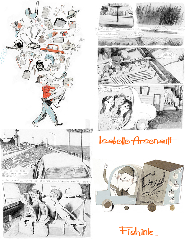
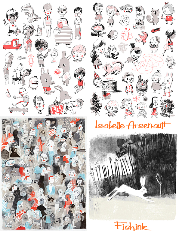
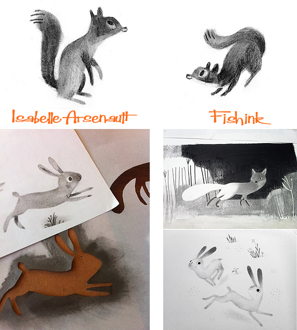
You can find out more about Isabelle from this Q and A session in 2012 on the Perogies And Gyoza site, or through her Blog or treat yourself to a beautiful print from Sur Ton Mur. Captivating work.
Welcome to the end of the week.. are you glad to get here ? I have two friday findings that I’d like to initially mention.
Firstly a HUGE vote of thanks to the lovely Claire Ireland, whom I blogged about three weeks ago. Claire makes the wildest range of ceramic creatures that I’ve seen for ages, and as a thank you to me for writing about her, she very kindly sent me a Saggar Beast of my very own !! How excited was I to open the box yesterday and see him wrapped up in his bubble wrap nest : )
I’ve called him ‘Humphrey’ as I think it kind of fits the bill and he’s already taking pride of place on my studio fireplace. He hasn’t said anything yet but perhaps the journey has rendered him speechless… time will tell ! Many, many thanks Claire for your thoughtfulness, he will be loved.

Secondly I’d like to ask all artists who read my blog, to consider contributing an hour of their time, in creating a postcard piece of artwork for a worthy cause.
The Williamson Art Gallery and Museum are looking for artists to create and donate a postcard, (artwork size 14 x 10.5 cms) to support a gala fundraising night for the gallery. The sale night will be held on the 1st of May, 6.15 – 9pm. There will also be a pre-sale viewing on April the 30th, 10 – 5pm. The deadline for submissions is the 22nd of April, the decorated postcard should be left anonymous on the front with just the reverse signed and completed, with your email address and the title and medium used.
Please send your postcards to;
The Williamson Art Gallery and Museum,
Slatey Road, Birkenhead, CH43, 5UE. Great Britain.
For event details Email; Laura Weston, laurawestonart@Hotmail.com and Jacqui Chapman, jacqui@jacquichapman.com

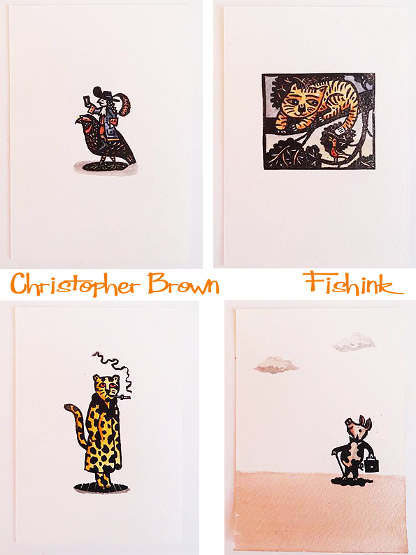
I know that the talented Christopher Brown has already made some great contributions to this worthy fundraising event.
Ok onto the main blog story for today….

Two Sundays ago we travelled over to Wakefield to The Hepworth, the northern tribute to Sculptor Barbara Hepworth. This musem opened on 21 May 2011 in the city where Hepworth was born and grew up. It had over 500,000 visitors in its first year of opening and, on 5 December 2013, celebrated its millionth visitor. I did find the tinted grey concrete exterior a little austere, but also dramatic in it’s approach.

Initially you’re treated to work by fellow sculptor Henry Moore. I loved seeing this little girl drawing one of the pieces.
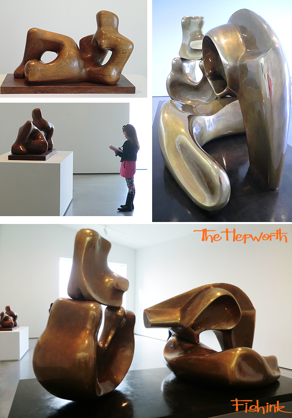
The next room was a collection of mother and child or two figures sculptures. How wonderfully the pieces fit together.


There was a fascinating room with a whole host of other artists work. Some lovely Paolozzi, like this collage which really caught my eye.

The gallery then covers more about Barbara’s work. Her tools, how she formed her work, the mediums she used etc.
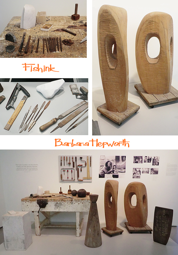
Lovely to see images of Barbara working on pieces and the different stages of the forms taking shape.
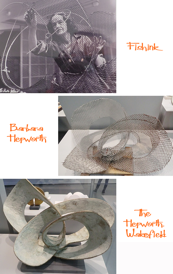

I loved the light in the gallery and seeing her sculptures grouped together.

I also enjoyed looking through them to capture other shapes and aspects too.


Don’t forget that it’s not only the sculptures that make for an interesting gallery trip : )
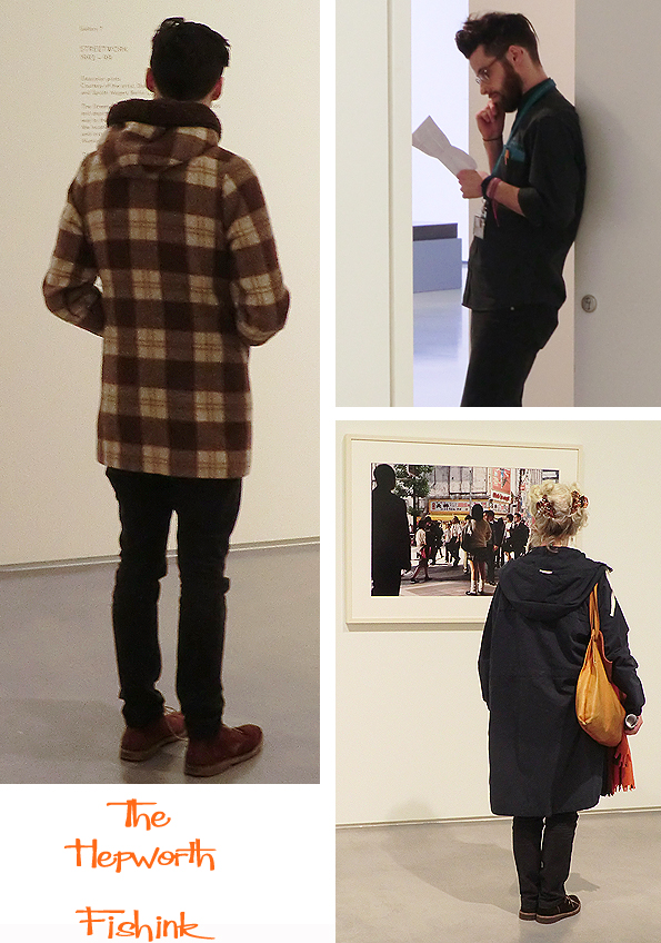
Finally there was another sculpture exhibition by Erika Vogt (which to be honest didn’t do very much for me), but the walls of the building were amazing… (sorry).. and Erika’s prints/ textiles and film show was also worth a look.


There is also the St Ives, Barbara Hepworth Museum which was opened in 1976 by Hepworth’s family, following the wishes expressed in her will. The Museum has been owned and run by the Tate since 1980. It contains the largest group of Hepworth’s works, permanently on display at Trewyn Studio and garden where she lived and worked from 1949 until her death in 1975.
More detailed info about Barbara Hepworth over on this website here. All in all a grand day out, (Gromit !)
Chris Haughton Illustrator Shh! We Have A Plan

Illustrator Chris Haughton, who I was lucky to do an Illustration Masterclass with last year, has a brand new Children’s book called Shh! We Have A Plan. The author and illustrator of ‘A Bit Lost’ and ‘Oh No George !’ has crafted another wonderfully simplistic book.
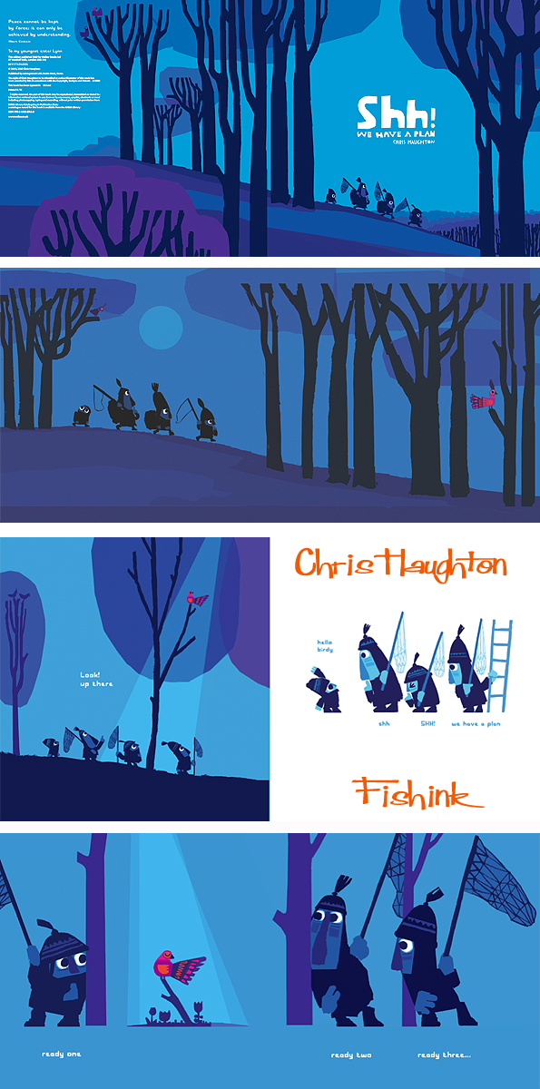
Chris is great at building up the page turning tension in his books. This always goes down well with young readers and listeners alike.

Chris gives a detailed description of his ideas for the book over on his blog here. I like the way that he shows his workings, sketches and thought progressions there too. Early sketches below.

Chris says ” For my other two books, I am always asked if I used paper cuts, as they look quite like it, but in fact I did not use paper cuts at all when creating the artwork and it was all pencil and digital. For this one though because it had five characters on each page it needed some sort of drastic simplification for it to be read clearly. Not only that but I was keen for the conversations to read across the page, matching each line with the action of the character. There was so much shifting of compositions around on the pages that it became clear the best way to compose each page was by collage. In fact it made perfect sense to create a mainly silhouette image from paper cut and in fact the design of the birds also benefitted from it too. “
You can see how the image above translated into it’s digital book version by scrolling back up and comparing the two.

As ever Chris is also helped to establish Kipepeo cards in the Kibera slum in Nairobi, Kenya, where a group of local women hand screen print this great range of Chris’s designs. You can purchase them here. Chris says ” The intention with setting up this screen print facility is to be able to produce many other new designs, if anyone has some saleable designs that they would be willing to volunteer, I am sure they would be very gratefully received.” Great idea and as ever fab work Chris.
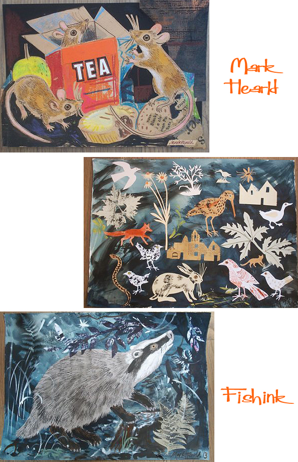
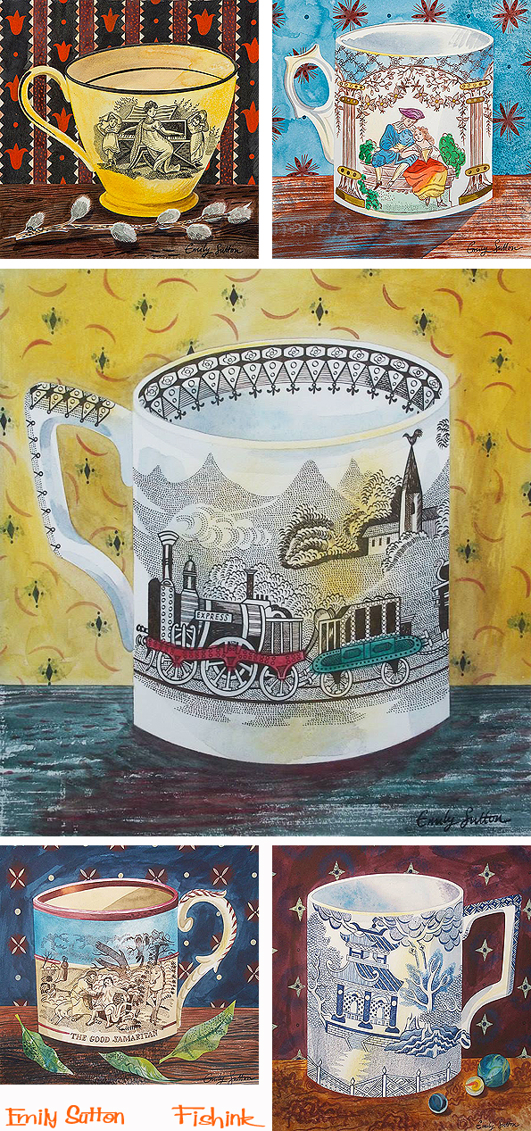
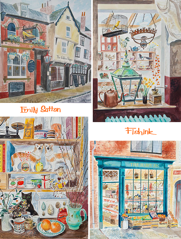
Mark Hearld and Emily Sutton’s York Open Studio.
Next weekend is another chance to not only meet fellow illustrators Mark Hearld and Emily Sutton, in the surrounds of their own home, but also to purchase an original collage or watercolour from the artists themselves. Here is some of the work on show, first from Mark. Beautiful collage work, nature and animals in their natural surroundings.
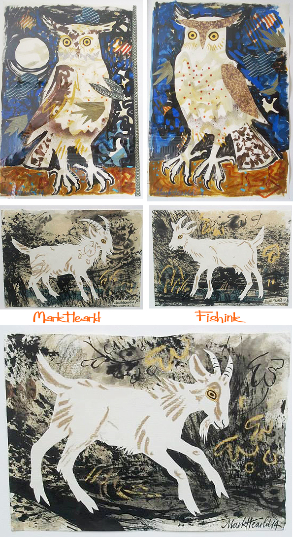
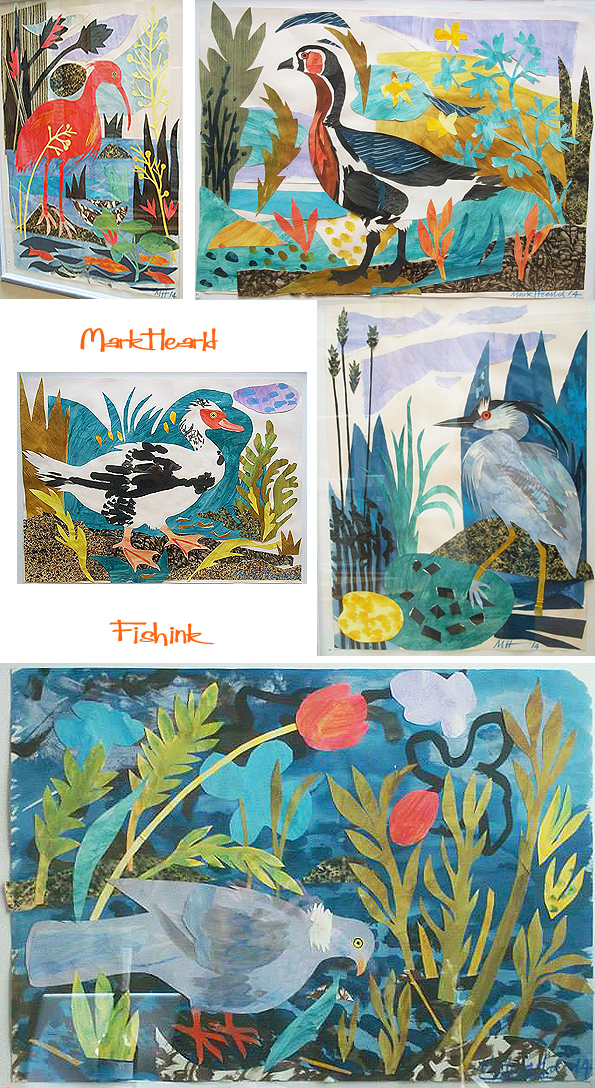
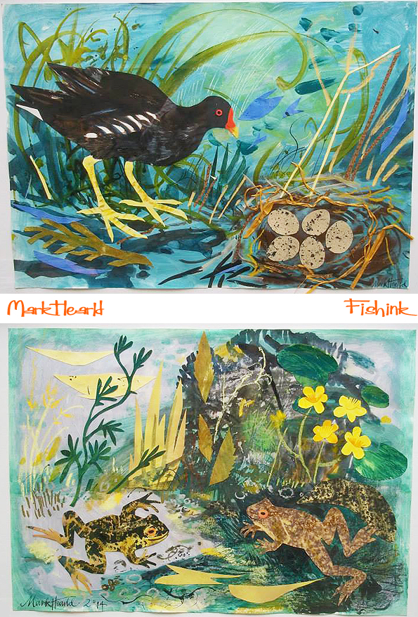
The chicken illustrations are some of my favourites here. I like that extra level of detail with Mark’s painted lines.
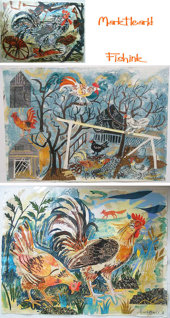
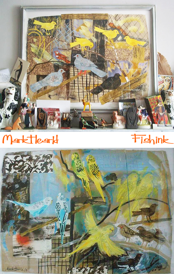

This sparrow is fab too. You can see much more of Mark’s work by typing his name into the search function on this site.
Emily has her usual, wonderful array of antiquities and curiosities captured in watercolour.
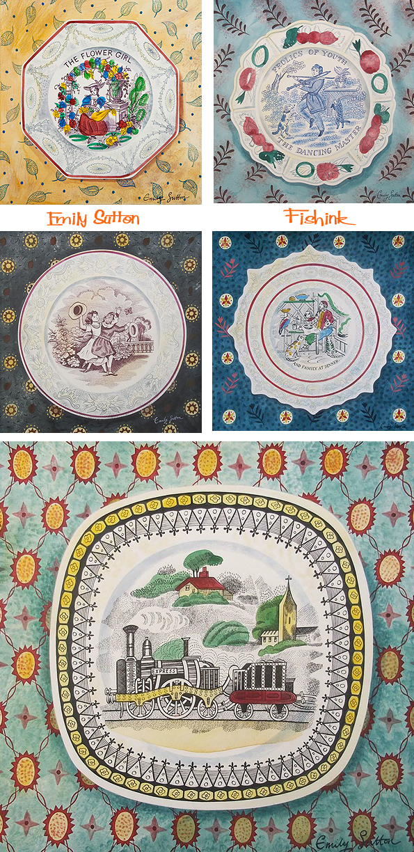
There’s always great attention to detail. Her line work perfectly replicates the feel of the engraved transfer that would have appeared on the plate. Lovely work.

Her scenes around towns and villages depicting shops and pubs are wonderful too.
But I must say that he watercolour of the Wards the Florists is my favourite here.
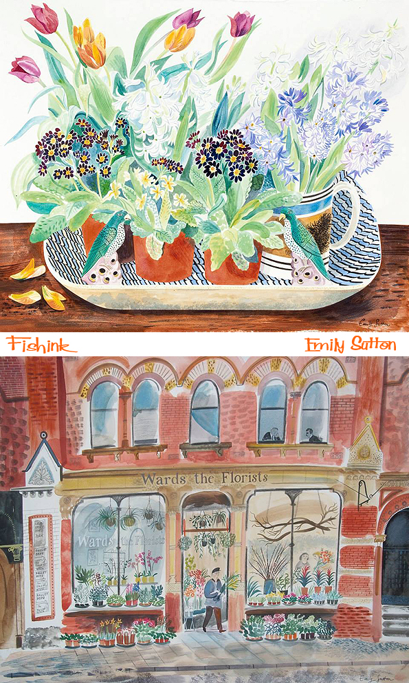

Beautifully observed illustrations as ever.
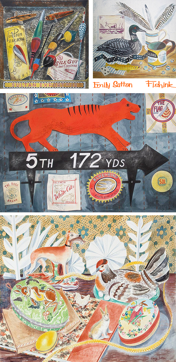
More of Emily’s work to be seen on my site also, just search for her name.
Details of how to get to their home studio can be found here. There are around 70 artists in the York area taking part in the Open Studios weekend so there’s plenty to see once you’re in the area. Have fun and if you do go, say hello from me and send me some photos. : )
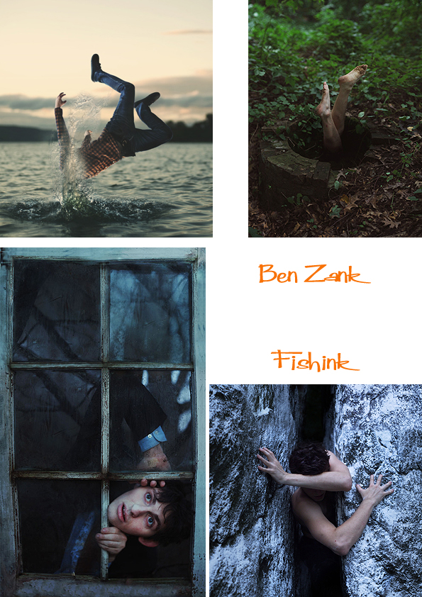
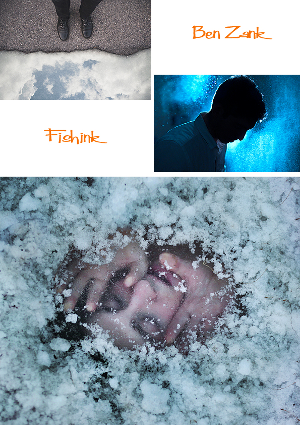
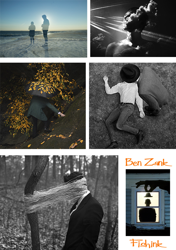
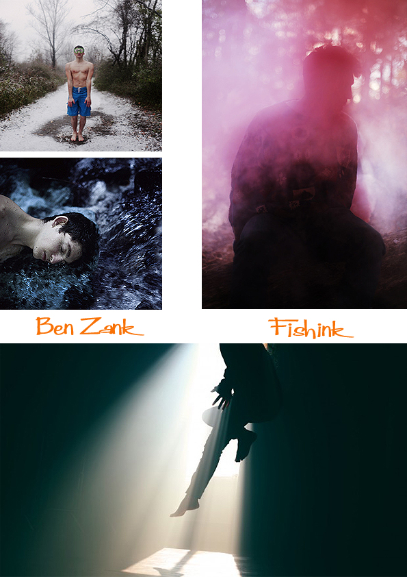
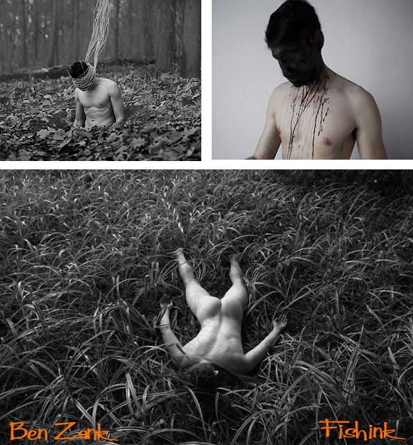
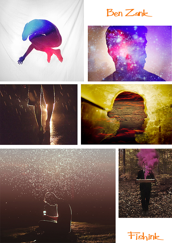
Ben Zank . Dreams, schemes and otherworldliness
I recently came across the work of New York photographer Ben Zank. Before I knew anything about him, I was captivated by the images and visual ideas behind his work. I instantly loved the humour and offbeat feel to the imagery.
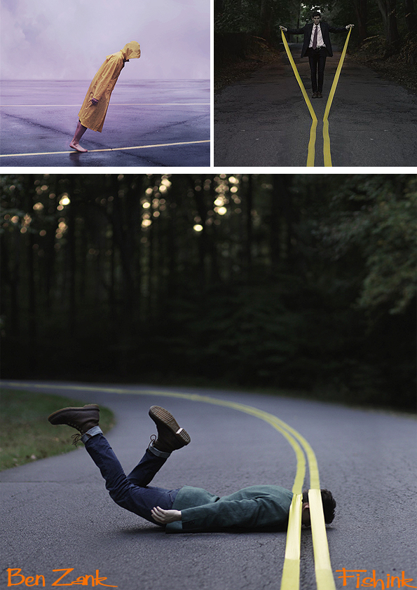
I discovered than Ben was 23 and that five years previously had found a Pentax ME Super camera in his grandmother’s attic and from that day forward, he had grasped the challenge to capture and create his own world. I caught up with Ben who lives in the Bronx, NY to discover what makes him tick.
Hi Ben, so it’s five years on from when you first discovered the camera in the attic at the age of 18. Can you tell me a little about what you feel you have learned during that time and how difficult the journey of self teaching has been from then till today?
I’ve learned everything I know about photography in that time. I had no interest in any kind of art or photography before I picked up a camera. Photography really showed me how to appreciate things on a deeper level. I never felt like being self-taught was challenging. I mean it certainly was and still is, but I enjoy doing it so much that I don’t really find it to be an inconvenience.
I love the sense of ‘otherworldliness’ that you create with your images. Where do your ideas come from ? Many other sources (you mentioned dreams) anywhere else ?
I have a very active imagination. Unfortunately my skills as a photographer are not comparative to my imagination yet. I started keeping a dream journal. I actually had a lucid dream last night for a few minutes. I woke up and looked out my window to see a bunch of men in coats walking around in the courtyard. I didn’t think much of it until I noticed one man was attacking another, and as he did, he started to grow in size. It was at this point that I said to myself, “I’m in a dream!” I was actually able to levitate through my closed window and could feel the cold air outside blowing up against the part of me that was through the window. When I looked at my hands they were distorted mirrors. Then I woke up.
Who (if anyone) would you say are your main influences, whether they are photographers, artists or just regular folk doing other totally unrelated careers and how do they spark your enthusiasm ? Is there a line of artists or creative peeps that you’re related to ?
Inspiration comes from so many places. It would really be unfair to list a few people when there are probably hundreds who have inspired me. and more than just people. I find the most inspiring things to be locations. Nothing gets my brain working more than when I come upon a perfect environment.
What get’s you out of bed in the morning ? Either my alarm clock or when I have to pee.
How do you manage to create self portraits ?
There’s a short answer and a long answer to this…… short answer: tripod and a self-timer. Long answer: I didn’t start photography with the intention of taking self-portraits. I don’t think I’ll ever consider myself to be a “self-portrait photographer”. Let me tell you though, Taking nude photographs (and in public places) of yourself doesn’t just happen. It takes time to grow comfortable with yourself in front of the camera. I remember being afraid to take off my shirt for a photo. Everyone’s different, but the more you photograph yourself, the more comfortable you’ll be with being uncomfortable.
I saw you’re project #365, well done in achieving that, it’s quite a feat in itself. Where there many times when you thought, this is too hard, or I’m stuck and don’t know how to go forward. What drove you on when the going, got tough ? : )
Also what were the high points ? It was more than just tough. It was almost impossible. That’s why I took me a year and six months to complete it. There were days where I was just completely drained and had no ideas… and I would shoot anyway. In fact I took a photo every day for way more than a year. I just became so picky with what I uploaded that I would miss days for weeks on end.
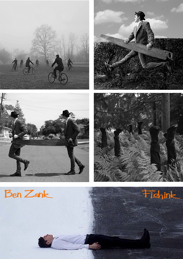
You mentioned that when you first started taking photographs, you didn’t have any intention on making yourself the subject matter. What changed and how easy was it to not only be the main subject, but later often a nude subject in your work too. Has doing this made you a more confident person ?
It’s kind of inevitable when you get into self-portraits that you start taking nudes. I’m excited to start taking more this summer. Looking back a few years, I would say my confidence has increased quite drastically. Either from photography or just inner peace.
I was wondering if it feel strange for you, when you’re at a show of your photography, for others to see you naked in your work ? Do you somehow manage to detract yourself from the person in the images at the time ?
I haven’t shown any nudes in my exhibitions yet. so I haven’t had that experience yet. I don’t think it would be a big deal, though.
I know you often have other subjects in your work, are these mostly friends. Are there increasingly new people who either want to work with you, or people who you would like to work with ?
Yes and no. Yes, everyone who models for me is a friend. No, I haven’t gotten many requests for people wanting to model me… or maybe I’m just very picky.
Plans for the future ? I imagine they include job, trying to make a living etc ,good luck with the sales of the prints, a great idea. How much is photography a part of your life now ? Could you see yourself doing anything else ?
Not really. I plan to pursue photography for the rest of my life.
Ben has recently had over 20,000 likes on his Facebook page and is also creating quite a stir on Tumblr too. If you’re around midtown Manhattan area then pop into Bar Catalonia and see his latest exhibition ‘We Are Dust’.
I wish him well.. watch this space !
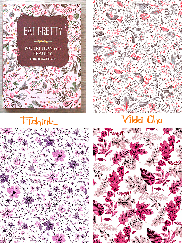
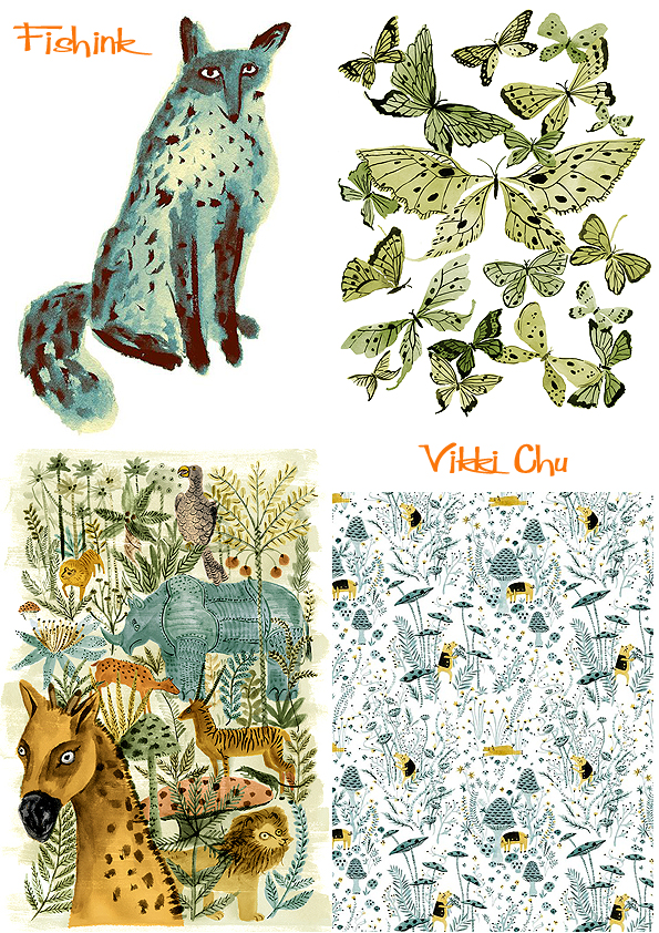
Vikki Chu Watercolour flowers for all occasions
Vikki Chu knows a thing or two about watercolour delicacy when it comes to painting flowers. She has a keen eye for colour and doesn’t shy away from producing intricately flowing and ornate illustrations. Vikki originates from Richmond, Virginia but is now based in New York.

I love the feeling of movement and fluid rhythms in her work, I got in touch to discover more.
Where did your interest and fascination with flowers come from ?
I used to work as a textile print designer and a lot of the patterns I created at that job were floral. Since then, it has become more of an influence on my work.

I can see your watercolours translating well into fashion fabrics. Have you ever thought of doing a range of womenswear summer fabrics ?
I would love to do a range of fabrics, but I haven’t had the opportunity to do so yet.
What has been your favourite commission to date ? Is there anything that you wouldn’t like to paint ?
My favorite commission has been working on the illustrations and patterns for the book Eat Pretty which just came out. Making patterns to be printed in a book was different than making them for fabric that is meant to go on a body. It was a fun project that really let me utilize my experience as an illustrator and textile designer.
I see that you already produce some lovely designs for cards and sell prints of your work too. Are there any other areas that you would like to move your artwork towards ?
I would love to make wallpaper.
What is your favourite way to work ? Direct from nature, from photographs / sketchbooks or from your imagination ?
Unfortunately, I don’t draw from life as much as I used to but I’d say that drawing using nature is really my favourite way of working.
How long do some of your intricate designs take to create from start to finish ?
It can take anywhere from half an hour to weeks. Really depends on what it’s for, but it’s definitely the digital part that takes the longest for me. I really tend to get stuck in that stage.
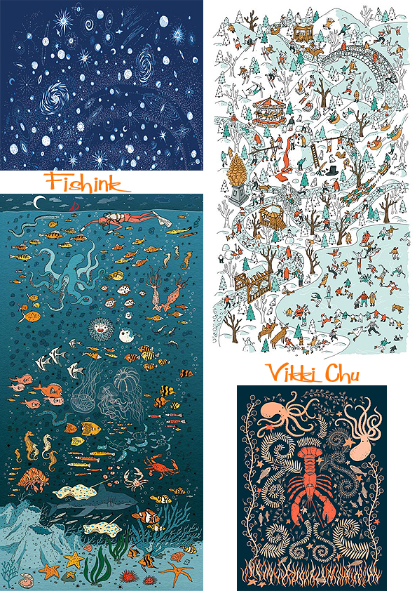
Fortunately for us, Vikki takes her sketchbook wherever she travels. You can sense the vibrancy or tranquillity of these cities from the way in which she has drawn them.
I sense that along with very good eyesight you must be quite a patient and articulate person to paint the intricate work that you do. What do you most / least like about your chosen profession ?
Of course I love being able to make money from something that I already love doing. My least favorite thing is definitely the long hours of sitting hunched over a desk, which is sometimes needed. It really has taken a toll on my back and I often feel like I’m actually 80 ! I’m going to make the switch to a standing desk soon.
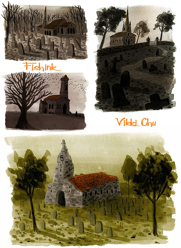
I love your animals and little church scenes too, are there any plans for more of these painterly views or delicate blue foxes ?
Yes, I’m sure there will be more of them in the future !
Thanks I’ll be keeping an eye out for them then. You can buy Vikki’s designs on cards here at Betty & Dupree.
Boo to you !

I’m sitting here with one of the biggest grins on my face, no I haven’t finally lost the plot, far from it. In fact I’ve found the plot, along with a new member of the household ! Feeling like all my Christmases have arrived at once. I’m talking about the very recent acquisition of my 5 month old Lurcher pup : )
We’ve been ready and seriously searching for a dog for about 6 months now. After a few near misses at the rescue centres (‘I’m sorry Max was adopted about half an hour ago, you’ve just missed him’) and a definite ‘no thank you’ for a very excited Collie Cross (who was literally ‘bouncing’ off the walls), I found Boo.

Boo came from a litter of thirteen, you can see some of her early day shots here and one of her mum and dad too. She was the only one who had a little white patch near her nose, and so was distinguishable because of that. Her last owner had two dogs, and sadly the other dog didn’t really take to this young newcomer, this caused friction in the house, so it was with great regret that the owner decided that it would be better to re-home Boo. This is her now.

I’m sure I won’t regret saying this, as she’s been with us for only 5 days now, but she is such a little star. Her last owner had worked hard with her and she already knows words like sit, paw, (other paw), lie down, treat, no, and comes to tell us when she needs to go outside. She doesn’t bark (aside from when she dreams), which is great when someone knocks at the door, and for her age, she is incredibly calm and relaxed around the house… apart from her mad half hours when her toys had better watch out ! (pictures ‘Toy Story’ figures scarpering for their lives) and she’s recently started eating ants !

She’s quite nosey so, when I’m working in my studio, she likes nothing better than to stand by the window and watch the world go by; making little ‘smeary-wet-nose-prints’ on the glass. I’ll have to put some opaque perspex because apparently seeing outside all the time can lead to some anxiety issues.
Outside she gets easily spooked by other dogs/ flies and is happy with a few short running sessions chasing a ball rather than a huge walk. I’m going to take her to some puppy socialisation classes so that she can meet other dogs her age and get a chance to play a little too.
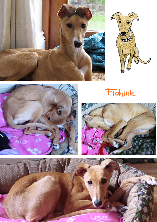
She has incredibly expressive ears and finds a whole wealth of positions to fold all her long limbs up into, whilst snuggling into her fleecy blankets.
I feel so lucky to have found her. I do believe in fate. As she had been advertised for 6 days when I saw her and her owner said that he’d had a lot of interest but out of all the people who had made appointments to go and see her, I was the only one who actually turned up ! How crazy is that, our good fortune I think.
I don’t even mind when she jumps on my bed at 6.30 am and licks my face to ‘politely’ say ‘get up I need to go out’ : )
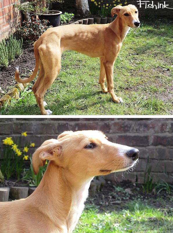
She’s made me laugh and smile so much this week with her antics and movements, I already feel blessed by her company. No doubt you’ll be seeing more of Boo from time to time in my blogs, but I thought I’d get the doggy photos over in one fell swoop lol.
This made me smile too.
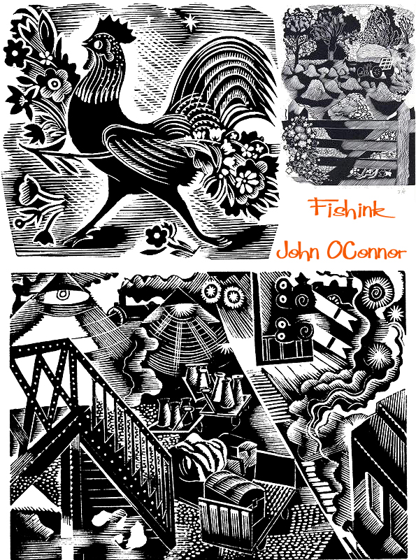
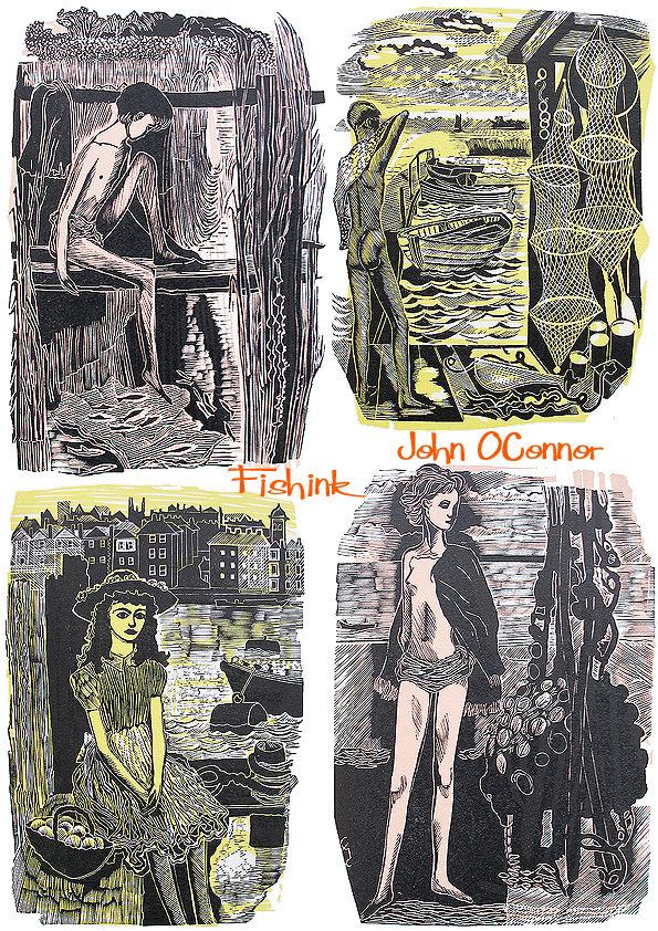
John O’Connor Engravings from Nature

John O’Connor (1913-2004) was born in Leicester where his father, whose family had come from County Tipperary, was an optical instrument maker. After Wyggeston school and Leicester College of Art O’Connor attended the Royal College of Art (1933-1937), where his teachers included Eric Ravilious, John Nash and Robert Austin.

Each influenced him, but from Ravilious he learned a great love of wood engraving.In 1936 Ravilious introduced him by letter to Christopher Sandford at the Golden Cockerel Press.
Following WWII where he served in the RAF O’Connor taught at Hastings School of Art, before moving, in 1948, to become principal of Colchester School of Art (later the Colchester Centre for Art, Design and the Media). His colleagues included Richard Chopping, who designed dust jackets for the James Bond novels, his own former teacher John Nash, and Edward Bawden, one of the finest British printmakers. After leaving Colchester in 1964, he was a visiting lecturer at St Martin’s School of Art until 1975, and at Glasgow School of Art from 1977 to 1984.

Despite these commitments, O’Connor continued a varied output of illustrations and writing. In 1948, he produced illustrations for The Funeral Oration Of Pericles and The Young Cricketer’s Tutor; two years later, he provided text and engravings for Canals, Barges And People (1950), subjects dear to his heart.

In 1949 O’Connor moved to East Anglia to take up a post as principal of the Colchester School of Art, where he persuaded John Nash to come and teach. He persistently warned students against being carried away by the ‘niggle bug’ of niggly details and scratchy engraving. One student created such a bug to hang in the studio as a caution.

His later books included Landscape Painting (1968), a guide to the practical techniques and intellectual aspects of landscape painting from the 15th century onwards, which covered everything from the use of insect repellent to the theatrical element in landscape art. He also contributed to Harper’s Bazaar, House And Garden and the Radio Times.

In the 1950s and 60s, O’Connor exhibited at the Zwemmer Gallery, in London, and had many exhibitions throughout Britain. His work was purchased by the Arts Council, the Tate Gallery, the British Museum and the Contemporary Art Society, as well as by several local education authorities; it can also be found in the Oslo Museum, the Zurich Museum and at New York central library. He was elected to the Royal Society of Painter-Etchers and Engravers in 1947, and, in 1974, to the Royal Watercolour Society. He was an honorary member of the Society of Wood Engravers.

In the early 1970s, he left Colchester to move to a converted bothy in the Stewartry of Kirkcudbright, seeking the wildness which was fast disappearing from the Suffolk countryside. He also undertook a visiting lectureship at Glasgow School of Art. Always heavily influenced by medieval art, especially Gothic stained glass, manuscript illustrations and painting of the 14th and 15th Centuries. O’Connor was also inspired by the works of Munch, Lucas Cranach, Wright of Derby and Murillo. As well as engravings, he produced his own stained glass window designs (for the Betton Memorial window in St Mary’s, Hadleigh) and painted many watercolours as well as powerfully coloured, slightly abstract oils. He said that watercolour should be experienced as a ‘taste’, giving ‘the sense of a thirst being quenched, as if by a pool of water on a long and tiring walk’.

Until 2001, O’Connor produced a monthly wood-engraving for Richard Ingrams’s Oldie magazine, work which involved considerable physical effort. This drive to create was typical, however, and he remained active as an artist – and full of energy – despite using a wheelchair and suffering from increasing deafness. His work is held in permanent collections at the New York public library, Columbia University and the public galleries of Oxford and Cambridge. He also wrote and illustrated his own books: Canal Barges and People and A Pattern of People.

You can buy a print of John’s work over at the Emma Mason site or a greeting card over at Xantha Cards.
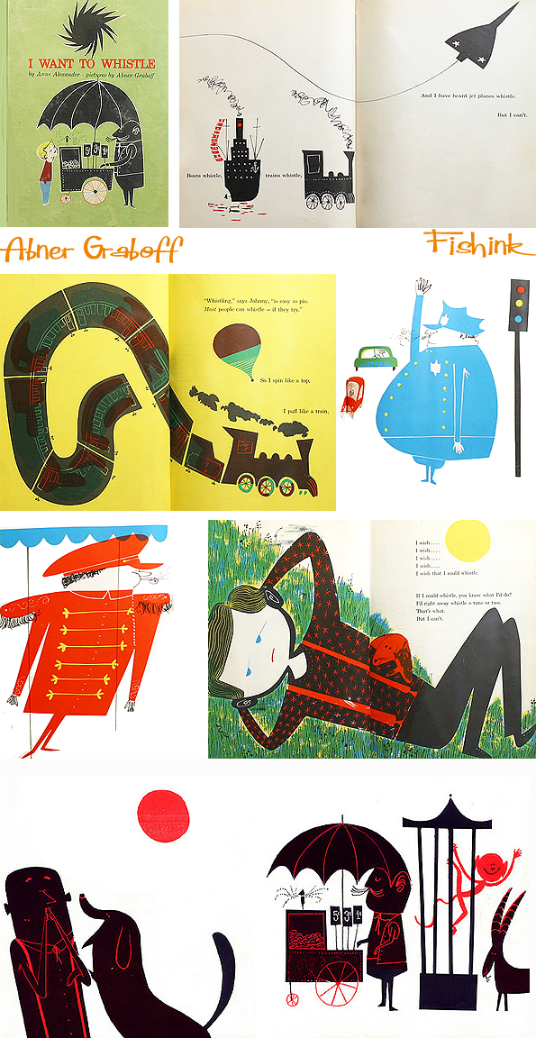
Abner Graboff Illustrated Smile therapy

I love the work of Abner Graboff, purely due to the fact that every time I come across his work, within seconds I’m smiling. How often can you say that happens ? I may have posted a few of these before and happily make no excuses or apologies for it. Enjoy your free smile therapy ….


Just look at that leaning cat or the shaving cat… are you smiling yet ?

Ei Ei OO !


If anyone has any more bits and pieces of Abner’s work they would like to send to me, that I haven’t already featured online… I’d be very happy to post more.


I love these curly giraffe legs and elephants trunks.

He created some classic books for children, you can read more about his career on one of the links below.

Time for a hoedown.


So be honest …are you happier now then when you first opened this blogpost ?
Perfect Illustrated Smile therapy from Fishink Blog, and a big help from Mr Graboff too : )
You can find more Abner here, here and a little here too. If this made you smile today.. please pass it on !
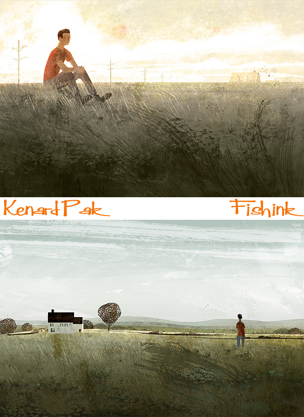
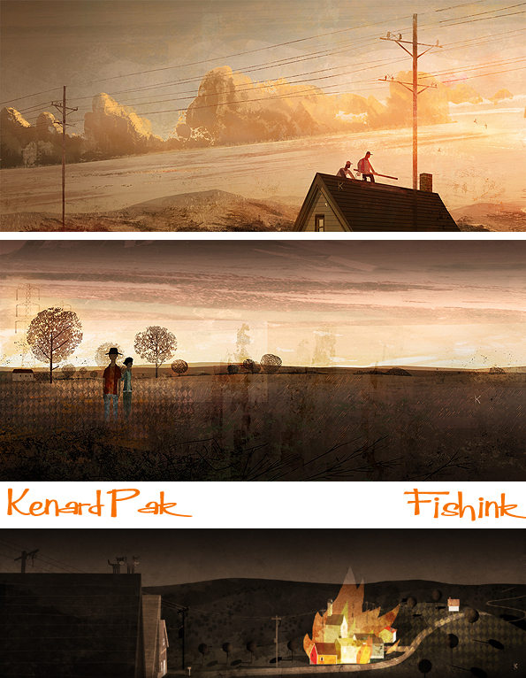
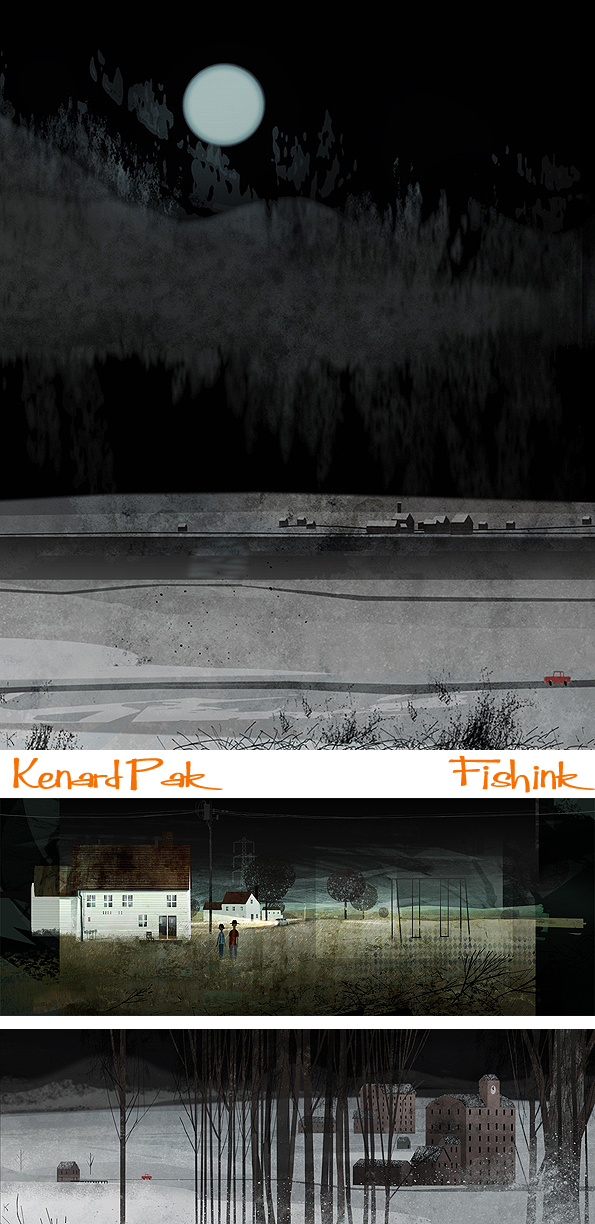
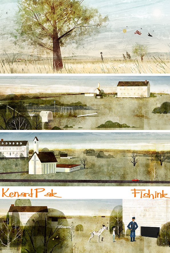
Kenard Pak Illustrations for Disney, Dreamworks and Books
Growing up in Baltimore and Howard County, Maryland, after studying at Syracuse University and California Institute of the Arts, Kenard Pak now calls San Franciso ‘home’. He is a very talented illustrator, who has worked not only for Disney but also for Dreamworks and somehow finds time to illustrate children’s books too ! He likes to work with themes of memory, nostalgia, loss, nature, and the general mystery of our every day lives.
I love his calm, restful style of illustration and managed to track the busy man down and he graciously agreed to answer a few questions exclusively for Fishink Blog.
You mentioned in another Q&A session that you had quite strict parents and chose to do art almost as an ‘act of rebellion’. I wondered if some of the lonely, quiet, figures in your empty roaming landscapes are based on any childhood memories, or are perhaps a visual escape for you, taking yourself off to ‘pastures new’ ?
These landscapes are revisits to my family’s pastoral life in Howard County, Maryland. My parents had different food businesses in the heart of Baltimore, and the farm suburbia of our neighborhood was a relief to downtown’s hardships. Those lonely figures are memories of my mother/father/brother going for long walks in the meadows and parks you find around Howard County. These images are visual strolls into memory, but they also function as reminders of where I am right now and what I need to do. As for my youthful rebellious artwork: most of it was copying cartoon and anime robot drawings.

When creating your personal work, where does your starting point begin ? Photographs, visualisations from the landscape, sketchbook drawings. Do you work from real environments at all ?
My personal work always starts with memory, some moment floating around in my mind. Sometimes, a photograph or a painting will inspire a memory. My sketchbook is more like a list of thoughts and groceries, and some chicken scratch that eventually becomes artwork. I think artists, conscious or not, are always inspired by their physical environments.
I love the use of textures and layering in your work, are these hand-drawn or created in photoshop with brushes and effects? (perhaps a mixture of both). How would you start putting textures and shapes together for a new piece. How much is the landscape developed in your mind prior to you beginning a new illustration and how much does it evolve within photoshop, during the images creation ?
My textures are mostly scanned rough watercolor paper with wet and dry paint washes. I also have a good collection of personally built PS brushes that I’ve been tweaking through the years. I first start with basic shapes, use adjustment layers with my scanned textures, and finesse or paint over with my brushes. Lately, I’ve been integrating more and more traditional drawing and painting. The landscape, or whatever subject, does start in my mind, but I don’t necessarily understand it or know how to relay it. There’s a lot of coaxing, which may explain my meandering process. Everything I do is ultimately unplanned (no matter how hard I try). What I start with often has very little nothing to do with where I stop, but a general story or theme does carry through.
Who would you say, are the people from the past and present, who’s work continues to inspire and amaze you ? Would you say that you have equal admiration for someone who can use painted media as you would for an artist working digitally ?
I used to be more impressed by how final artwork looks (and you can’t deny good art its credit), but these days artwork that communicates something personal, how quaint or severe, gets my attention much much more. Funny part is sometimes the artwork I’m talking about isn’t always what most people typically deem as noteworthy. To this day I love Andrew Wyeth, M. Sasek, Richard Scarry, Adrienne Adams, The Provensons, Richard Bunkall, etc. As for contemporaries, I really like Ed Panar’s photographs. I like to read WG Sebald. I’m still impressed by that game Limbo. Most I know work with both traditional and digital, but we all seem to yearn for pencil, paint, ink, and paper. I wonder if that’s because we give some sort of assumed gravitas towards the traditional arts?

Would you confess to being a bit of a twitcher ? or are the bird illustrations more early research for your latest book ?
I’m far from twitcher, more like local bird watcher. My cousins in Vancouver are good bird watchers, and I learned from them that you don’t have to go to special places to admire feathers. I just know the birds that I see on my street, where I often drive to, the pool I swim at, or what I remember from Maryland. Have You Heard The Nesting Bird? is wonderful, fortunate circumstance: an editor had noticed my blog bird illustrations! These birds have nothing to with picture books. They were just fun to study and draw.


When you’re working for Clients, pretty famous ones at that, how much free reign are you granted when creating new illustrations. What I mean is, is the brief you are given quite specific i.e. ‘We want a mountain with a sunset and a view looking from above’ etc or do you work from sketches and discuss how the image will form from those ?
So far I’ve been very, very fortunate with my editors and art directors. Other than basic, simple notes I’ve been encouraged to explore and work with my themes. That said, we always work from sketches, and I’m always open to good suggestions. My organic process may also provide my clients space to explore as well. I hope this is the case because I do believe in group, communal efforts.
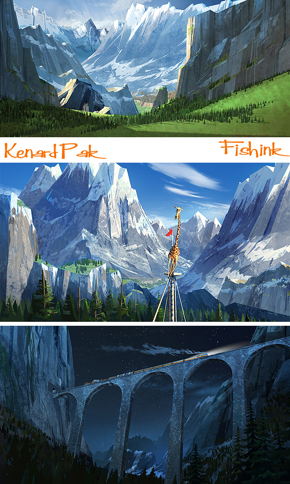
The animation artwork I’ve seen on your website has stronger colours and more dynamic angles etc than you’re personal work. Do you make a conscious effort to work differently in these two areas, or does it naturally work out that way. One then becomes a pleasant change from the other in this way.
Yes, I make a very strong, conscious effort to differentiate between the two. My layout background in Hollywood animation favours classic cinema grammar, deliberate lighting, and a broad colour palette. Especially with 3D animation, the demand for realistic, cinematic detail is necessary. In visual development, you’re paid to work as a versatile jack of all trades. What I love about picture books is I can get much more specific and personal look with my artwork. I can work with colours, themes, and spreads that closely remind me of things that I treasure. I also love the book format because the reader has the time to explore a picture, versus cinema where the viewer more or less passively stares at a glowing box for a restricted period.
Kenard did some amazing illustrations here on ‘Madagascar 3’ to name but one film he’s worked on.

Where do you see your work going in the future ? Any areas (like children’s books) that you would like to explore further or break into ?
I’m working on new picture books right now, but I’d like to write and illustrate one! I really like the idea of children and adults slowing down and learning something from a picture book. I’m exploring this.

Finally, what was your finest hour, favourite piece of work, or happiest memory connected to your illustrative life to date ?
Working on my Sore Churchyard series was a great experience. These paintings are based on very strange, childhood memories, and at the time I had a lot of time, quiet, and space to explore them.
You can discover a little more about Kenard here at Illustration Mondo…

and also over at the wonderful Ape On The Moon blog with Alex and Philip.

Thanks again to Kenard for taking the time out to answer these questions so concisely. I know you’re a busy guy, much appreciated and I’ve really enjoyed getting to know more about the man behind the work. You can purchase some of Kenard’s prints here on the In Prnt site.


