Fishink in Northumberland
I was lucky enough to catch up and visit my friend Sarah last weekend in Northumberland. There are lots of roman roads, some that run like big dippers with blind summits like you’re about to drive over a cliff and drops that make your stomach turnover.

Sarah’s house is always a safe haven for tranquil thoughts and beautiful nature.
Lovely to wander amongst the snowdrops and honesty.

And indoors, rich bursts of natural colour and views of nature both inside and out.

We headed over for a few hours browsing to Alnwick (pronounced Annick) and Barter Books. The station that became a second hand book shop. My kind of place. I loved this tea-towel design which I thought may have belonged to Paul Bommer but apparently it’s someone called Peter Dodd. Fab style.

We also made it down to the beach at Alnmouth too. This dog spent it’s whole day digging up a huge rock, carrying it a few yards, digging another hole, burying it and then starting all over again ! Lovely to be with the sea and sun for a day.

Some great views across the landscape too.

Sarah’s dogs Queenie and Albert were my company for the weekend and we would get up at 6 am, and steal out of the house whilst everyone was asleep and go for a lovely walk. They got so excited … bless them, and I did miss them when I got back home too. Thanks again Sarah for a lovely weekend.
Butter wouldn’t melt pictures lol.
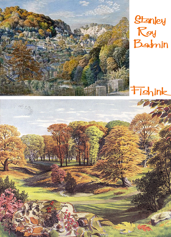
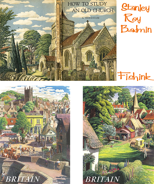
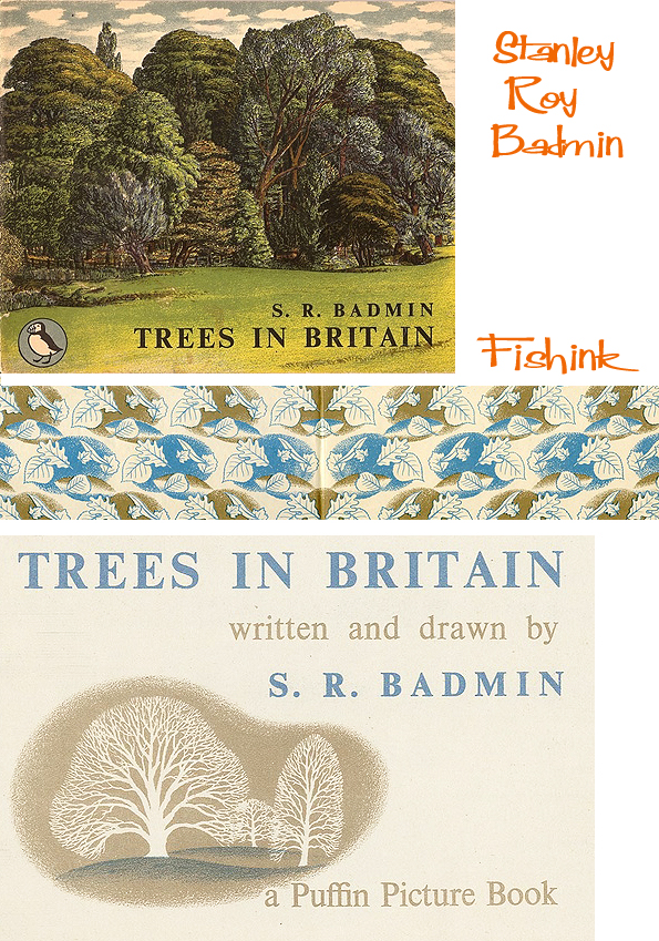
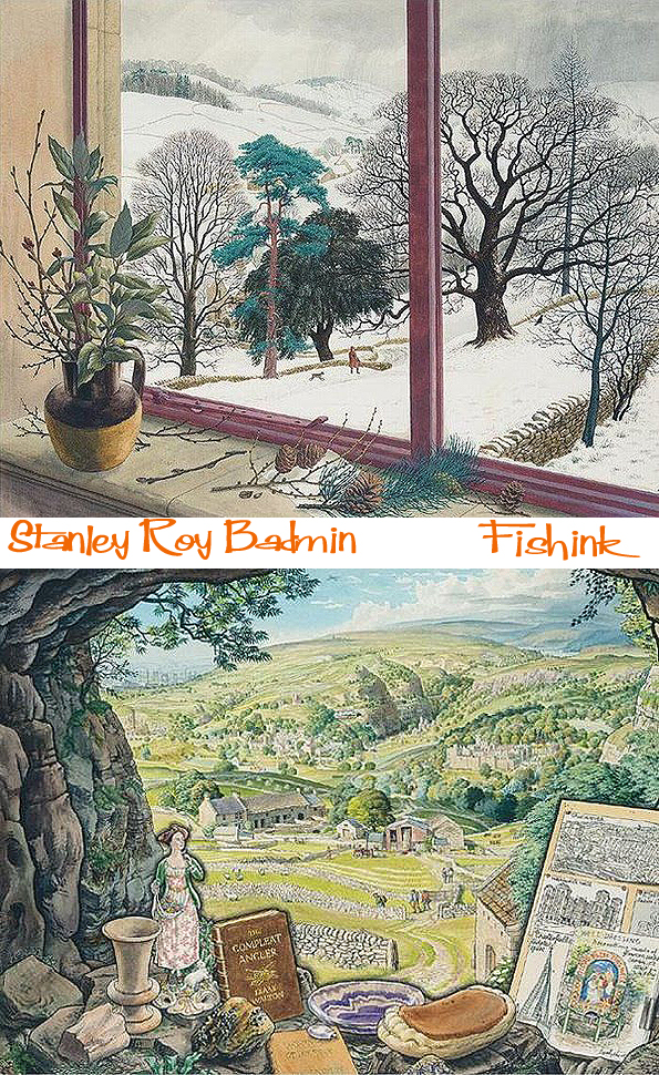
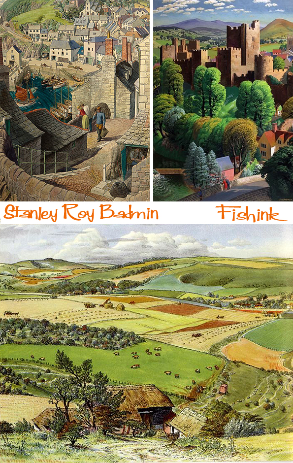
Stanley Roy Badmin Painting Britain in the 1930’s
A prolific landscape watercolourist, etcher and lithographer, Stanley Roy Badmin studied at the Camberwell School of Art and the Royal College of Art. After graduating in 1928, he began to establish a reputation for his landscape watercolours and etchings, and earned his first one-man exhibition at the Twenty One Gallery in London in 1930.

In 1931 he was elected to the Royal Society of Painter-Etchers, and the following year, at the age of twenty-six, became one of the youngest Associate members of the Royal Society of Painters in Watercolours. At the exhibition of the Society in April 1932, the first to which he contributed, Badmin’s work was singled out for particular praise by several reviewers, one of whom noted that ‘The most interesting drawings in this show are provided by S.R. Badmin, a young etcher who uses line with almost an etcher’s delicacy and precision.

Badmin is almost miniaturist in the fineness of his work he packs into a small picture area, but in spite of all this wealth of beautifully designed detail, he contrives, with the aid of washes of tender colour, to preserve a seemly order in all his drawings.’

Working from a studio in Clapham Common, Badmin enjoyed a second successful London gallery exhibition in 1933, this time at the Fine Art Society. A review of the exhibition noted of Badmin that ‘the most wonderful thing about his work is that, while he is scrupulous – but not over-scrupulous – in his precise drawing of minute detail, he contrives to combine this quality with breadth and simplicity of effect.’ In 1935 Badmin received a commission from Fortune magazine for a series of illustrations of American views, and spent several weeks travelling in America and Canada, visiting New York, Williamsburg, Philadelphia, Quebec and a farm in Illinois; his American water colours were exhibited in New York in 1936.
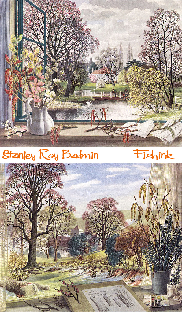
Badmin is best known for his watercolour landscapes; charming and affectionate depictions of the English countryside. As one recent author has noted of Badmin, ‘his craft has been based on hard work and experience, and his talent on a love for and deep knowledge of the British countryside.’ In the 1940’s and 1950’s he illustrated a number of books on pastoral or topographical themes, notably Village and Town and Trees in Britain, published in 1939 and 1942 respectively, and The British Countryside in Colour, which appeared in 1951.

Badmin also contributed to the Shell Guide to Trees and Shrubs, published in 1958. Among his other commercial projects were designs for Shell posters depicting the various counties of England, as well as covers and illustrations for Reader’s Digest and Radio Times magazines, advertising images, calendars, and designs for over a hundred greeting cards. In 1959 Badmin and his family moved from London to Bignor, near Pulborough in West Sussex, where he lived for the rest of his career. In 1984 a small exhibition of his work was held at the Royal Watercolour Society. Several watercolours and prints by Badmin are today in the collections of the British Museum and the Victoria and Albert Museum.

Badmin produced a handful of views of the picturesque fishing port and seaside resort of St. Ives in Cornwall. Another watercolour view of the town, inscribed by the artist ‘A Corner of St. Ives’ and ‘The Room with the View’, was on the London art market in 1985, while a view of St. Ives from Porthminster was exhibited at the Autumn 1953 exhibition of the Royal Watercolour Society.
Many thanks to Masterart.com for the written information on this artist. If you liked this post you may also enjoy similar posts on the work of James McIntosh Patrick and Rena Gardiner.
Claire Ireland Ceramic Beasts

Busy Ceramist Claire Ireland not only spends her week moulding and creating new pieces in her studio at the Kew Bridge Steam Museum but she also teaches and takes on commissions for her beautiful sculptural forms. You can see a few of these below.
Claire says “Teaching has been an important part of my creative life. Sharing ideas with others and passing on skills and techniques is something that I enjoy. It is getting the right balance between the teaching and making that is important and on the whole I have managed to do that.”
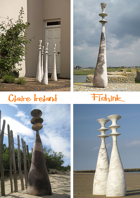
Sometimes her work adds a presence to a space, that almost makes that space feel whole again. It’s as though the area hadn’t been complete until Claire’s sculpture joined it. It completes rather than competing with the forms surrounding it.

Here are some of the drawings Claire made at the Pitt Rivers Museum in Oxford. A great place for texture and detail discovery.


But for me it’s Claire’s creatures or ‘beasts’ (as she likes to refer to them), that really caught my attention. Here are some early creations, the lion was inspired by an african gold lion and the larger image was based on a Chagall Painting and was made for a client for their wedding cake.
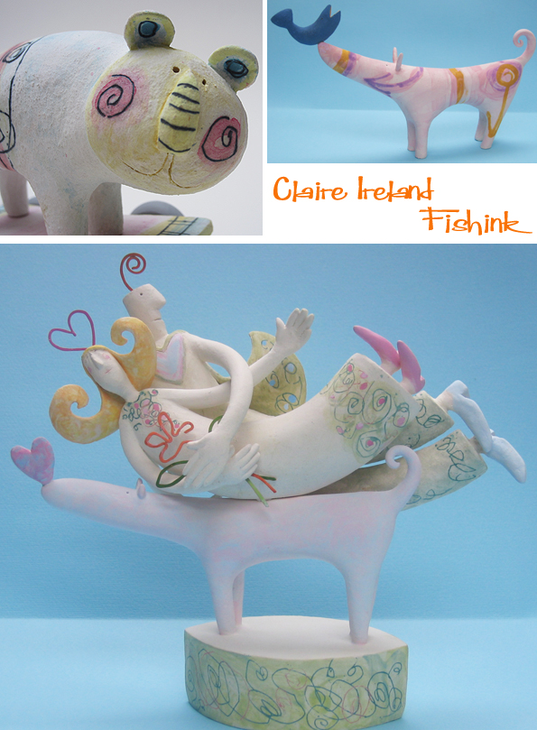
I feel the latest versions of Claire’s Beasts are wonderful. I love their earthy colouration and the fact that in some instances you’re left uncertain as to what the creature is, pure genius. And before you comment…obviously, I do know a horse when I see it lol : )

But what are these ?

I asked Claire where the notion for her remarkable creatures came from.
” The beast was originally inspired by a wonderful exhibition at the Museum of Mankind here in London, which sadly no longer exists. It was part of the British Museum at the back of the Royal Academy and a real favourite of mine. Curated by Eduardo Paolozzi and called ‘The Lost Magic Kingdoms’ (1986) where he selected works from the museums archives. Among the exhibits was a small creature made by the Inuit people which might have been a bear. It had fragments tied to his tummy which was apparently to ward off evil spirits. So I have made various creatures but as they are all been hand-built – they have varied over the years in proportion and size and decorated in different ways. More recently I also came a cross a cave painting of a bear which also help to inspire another variation. The ancient world and tribal culture has always held a great fascination for me. I tend to call them beasts or creatures because they resemble several animals and I quite like that ambiguity ”
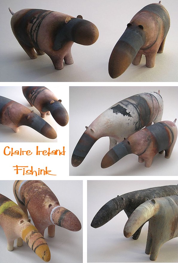
And finally a few elongated and animated dogs, OOOOWWWWW they’re fabulous. I’d love one of these.

The next time you’re making some dogs Claire can you make me a tiny one of these please ?
Thanks for your help and in answering my questions too. You can discover more about Claire’s talents through her website here.
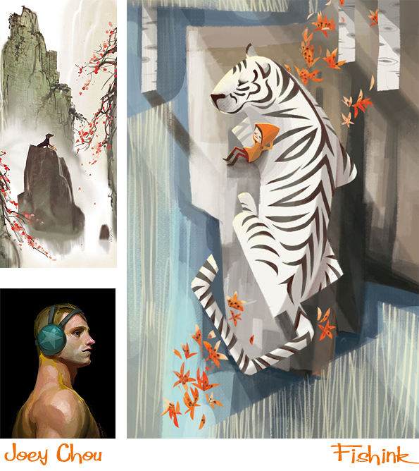
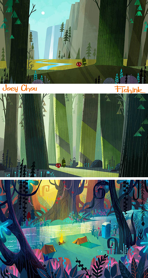
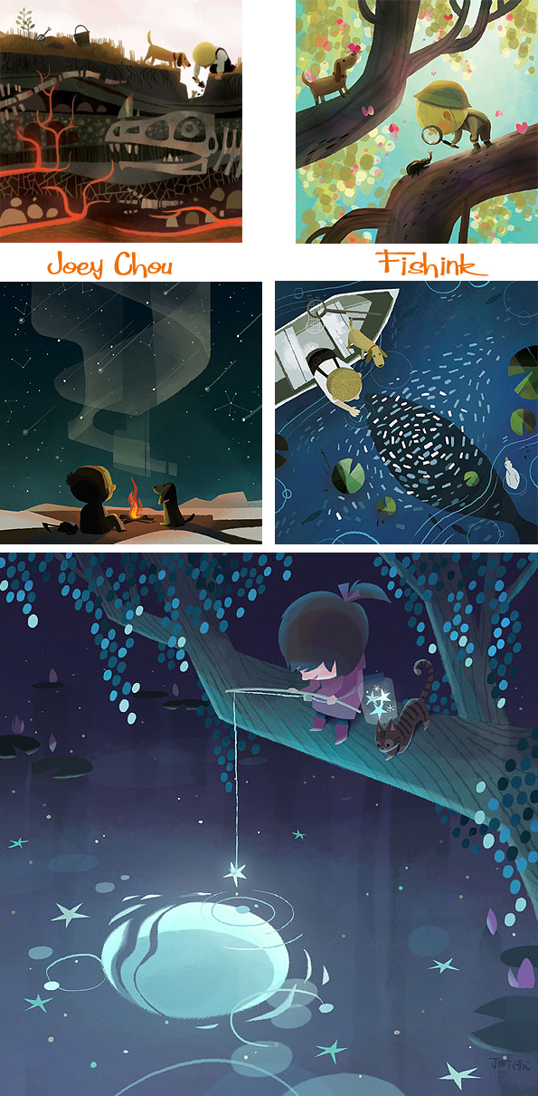
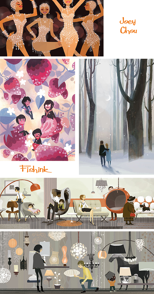
Joey Chou Mid century inspired Artist and Illustrator

Joey Chou is an alumni and graduate of the Art Centre College of Design in Pasadena, CA. Joey was born in Taiwan and moved with his parents and sister to the U.S. when he was 15. He is strongly influenced by the work of Disney artist Mary Blair, comic books and 1950’s and 60’s geometry, as am I ! He has a wonderful vision for creating scenes and settings.
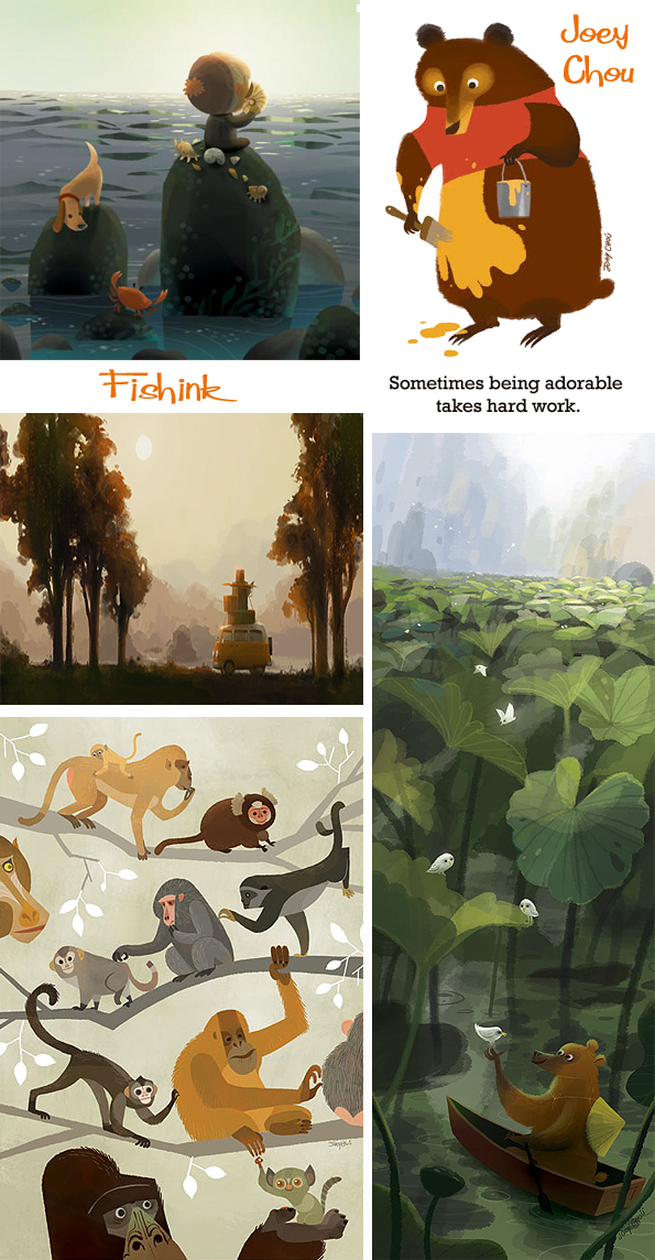
His art reflects influences by prominent and obscure artists as well as influences by the Southern California lifestyle and culture.
When not painting or sketching, Joey enjoys independent films, surfing, video games, and travelling.
He was the artist chosen to illustrate one of the latest ‘It’s A Small World Book’ which much have been a real privilege since Mary Blair was involved in the creation and decoration of the original set at Disney World.


For me his work is colourful, bold, fresh and happy, everything that works for children’s illustrations.

There’s an element of exploration and adventure at times.

A few familiar images from some Disney (and other) classics. How many can you spot ?


I really admire his painted work too. He is often involved in small gallery events where his work is on sale. Framed or painted onto plates and also crafted into clocks.
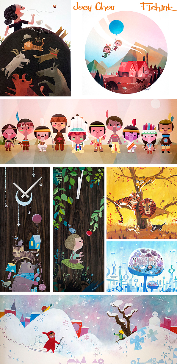
Young adventurers.
Travels with a clockwork VW.

Lovely brush strokes here.

Glitz, glamour and fame too… he’s got it all ! : )
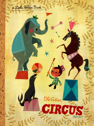
You can find some original work to purchase over at Q Pop Shop. Also it was interesting to discover that Joey has just taken part in an exhibition with a theme of ‘Little Golden Tales’ this was his entry. Fabulous !
Joey is now working for Sony Pictures Imageworks. If you enjoyed this post you’ll probably also like these posts on J.P Miller , Flora Chang and Neiko Ng.
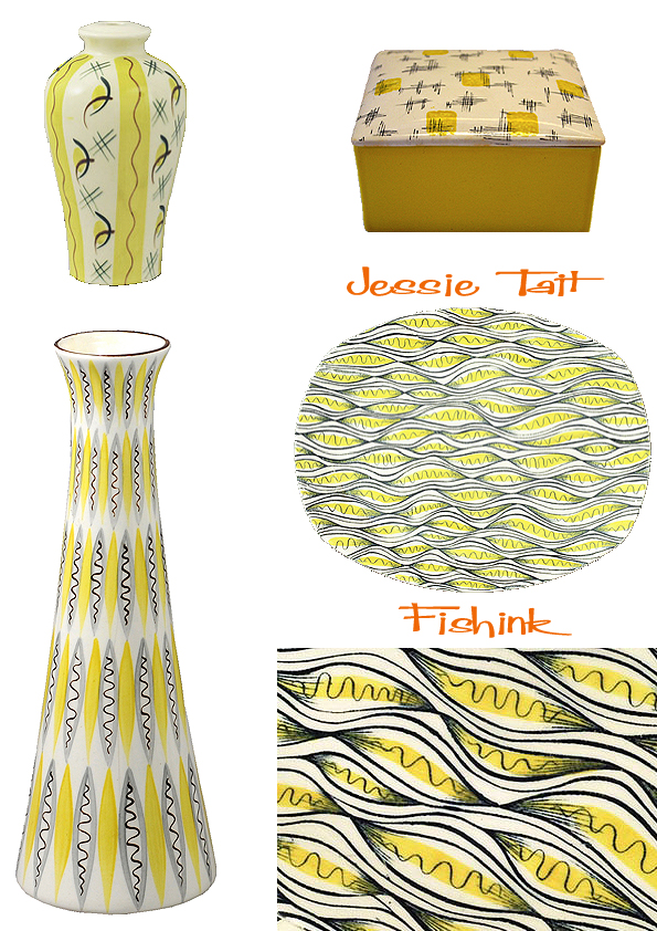
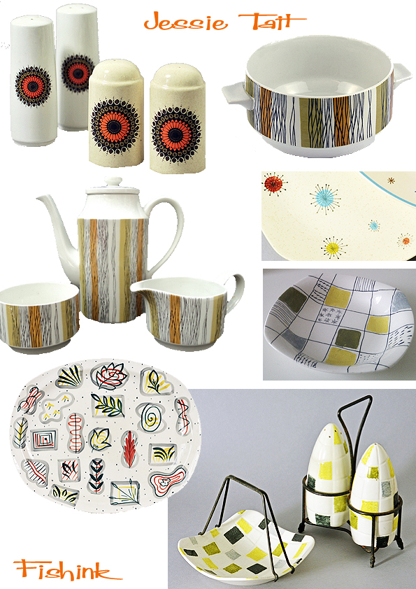
Jessie Tait A natural ceramic decorator
Jessie Tait was born in Stoke-on-Trent, Staffordshire, the youngest of three children.

At the age of 13, she began studies at the Burslem School of Art, in Stoke, where she remained for five years. Perhaps someone as evidently talented from a more privileged background would have ended up at the Royal College of Art; for Tait, the child of a working-class family, the route lay directly into the factories.
After a brief and unsatisfactory stint as assistant designer to Rhead, she joined the family firm of WR Midwinter in 1946. Like much of the pottery industry, Midwinter took time to find its feet in the immediate postwar period.
A turning point came when Roy Midwinter, the son of the boss, William, took a research trip to the west coast of America, where he observed the sales success of the new, fluid, modern forms by designers such as Eva Zeisel. Chintzy patterns and fussy florals were on the wane. The public wanted something more streamlined, stylish and in keeping with the fresh looks emerging in furniture and fabric design.

Roy designed a new set of shapes, called Stylecraft, with television-screen-shaped plates and neat, unfussy cups. The range was launched in 1953. Tait took to the new look immediately, creating such patterns as Homeweave, an all-over design resembling a gingham tablecloth laid over the ware, and Primavera, with an exuberant design of abstracted florals. Red Domino, its red rim dotted with white, became one of the most recognisable pottery designs of the 1950s. Innovative abstract designs included Fantasy, which had a central design of swirling lines and spirals recalling motifs by Joan Miró against a grey cross-hatched ground.
I loved her sensitive eye for nature and natural forms.

The next year a yet more radical shape, called Fashion, was introduced by Roy – it dispensed with the rather nugatory rim on the Stylecraft plate and was even more neat and streamlined. Tait’s skill at finding just the right design motif for a particular shape could now flourish – despite her initial fears that the new shape might be too radical. Festival nodded to the Festival of Britain, its all-over design reminiscent of cells seen under a microscope; Flower Mist is a neat, simple floral design recalling the textile designs of Lucienne Day. Zambesi is one of Tait’s most striking designs of the period: a chic zebra-stripe that on some shapes was enlivened by a splash of red. Aside from the commercial rigours of the mass-produced ware, Tait continued to attend evening classes during the 1950s, making her own tube-lined ware in terracotta and throwing pots. She also made work for the studio pottery Clayburn.
Tait continued to produce accomplished work for Midwinter on a range of new shapes introduced in the 1960s. The Fashion shape had begun to look outmoded: in its place came new, cylindrical forms with straight-sided cups. On the elegant, fine shape designed by the Marquess of Queensberry, Tait created chic striped patterns such as Mexicana and Sienna. Her Spanish Garden became a bestseller, its attractive design based on a pattern for a Liberty tie. Her last design for Midwinter was Nasturtium, a brightly orange floral pattern on the Stonehenge shape that was introduced in the 1970s – another range redolent of its time, it evoked a homespun, wholemeal feel.

Midwinter was taken over by Wedgwood in 1970. In the same year Tait married Albert Hazlehurst, a train driver. In 1974 Tait moved to Johnson Brothers, another division of the Wedgwood empire. The creative freedoms of the 1950s would never be replicated in the more corporate environment at Wedgwood, but she continued to produce extremely successful designs.
After her retirement in 1993 she worked as a freelance designer. A deeply modest, practical woman, she never lost the desire to make fresh work. The recognition given to her early designs – which included an exhibition at Richard Dennis Gallery in London in 1997, and Steven Jenkins’s book Midwinter Pottery: A Revolution in British Tableware – gave her great pleasure.
Credits for the text from Charlotte Higgins at the Guardian, and equally for the images from Rob Mc Rorie and Dee Beale.
Fishink Drawing Day

Yesterday the weather was glorious. The first really sunny spring day and I felt inspired to have a day of drawing.
When everyone else seemed to be clambering to rush outside and take in the maximum amount of rays possible, I also felt alive and excited (about the good weather) but in a totally different way. I’m curious to know how many of you fellow reader-artists would feel the same way here, but sometimes when a good weather day comes along, how many of you think …. yes today is an excellent day to do my artwork ?
Some friends would think I’m crazy not to set off for a 5 mile hike at the slightest sign of the sun, and I’m not opposed to this either, but what I’m trying to capture is that feeling of when good weather puts you in the mood to create and stirs your imagination in a way that you really just want to go with it. This desire (at that moment) appears to overpower the urge to do anything else.
Another friend of mine likes to work, undisturbed by calls for lunch or tea and would carry on until her body needed food and her ‘creative flow’ had got to a point where it felt right to leave her work, or perhaps also at a point where the work was going so well, that it would be easy to return to. After all we all know how tricky that ‘creative block’ can be when it comes visiting. Please offer your comments below if any of this sounds or feels familiar.
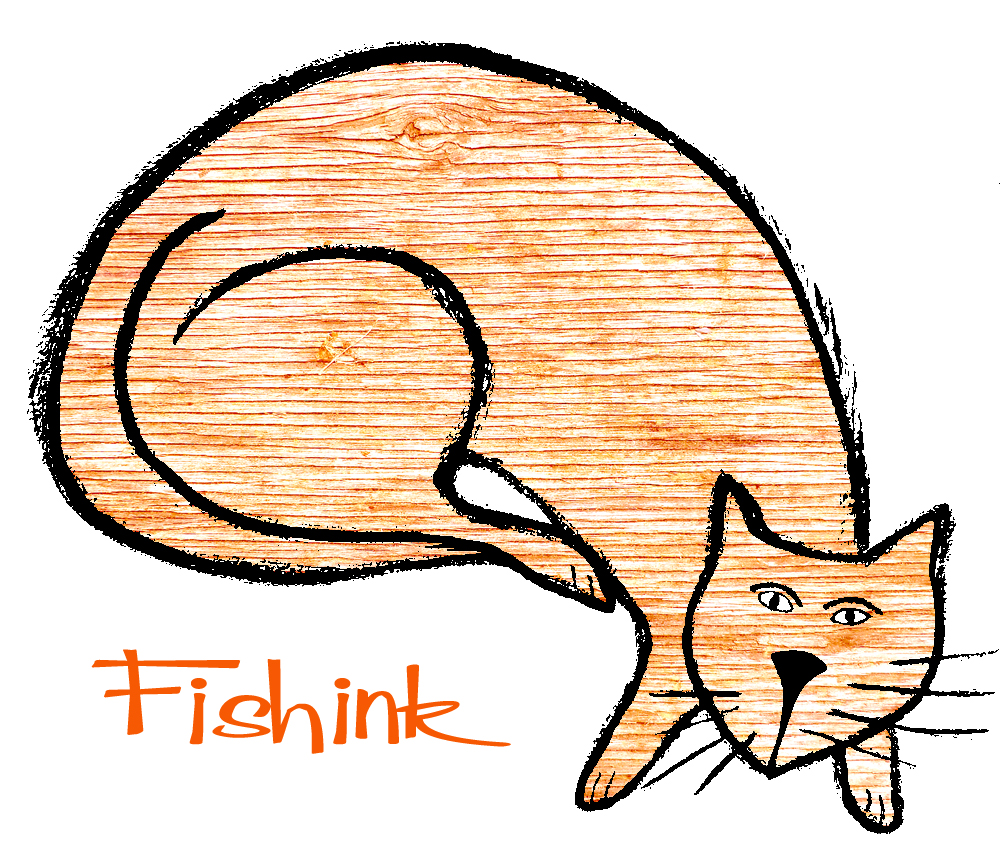
I digress, lol and had a great, inspired day, visually soaking up the sun whilst trying out my new Pentel brush pen. I heard about this from my friend Laura Weston who happened to tweet about a new pen she was trying out. I ordered one from China and love the sense of line it gives my work. Quite different from my usual way of working, but sometimes… that’s a good thing too ! Thanks Laura for sharing your thoughts : )
Here’s a wooden cat, don’t ask me why she has orange wood grain for a coat, sometimes you just have to go with these ideas. Lol. I do like the way she feels quite 1960’s though !
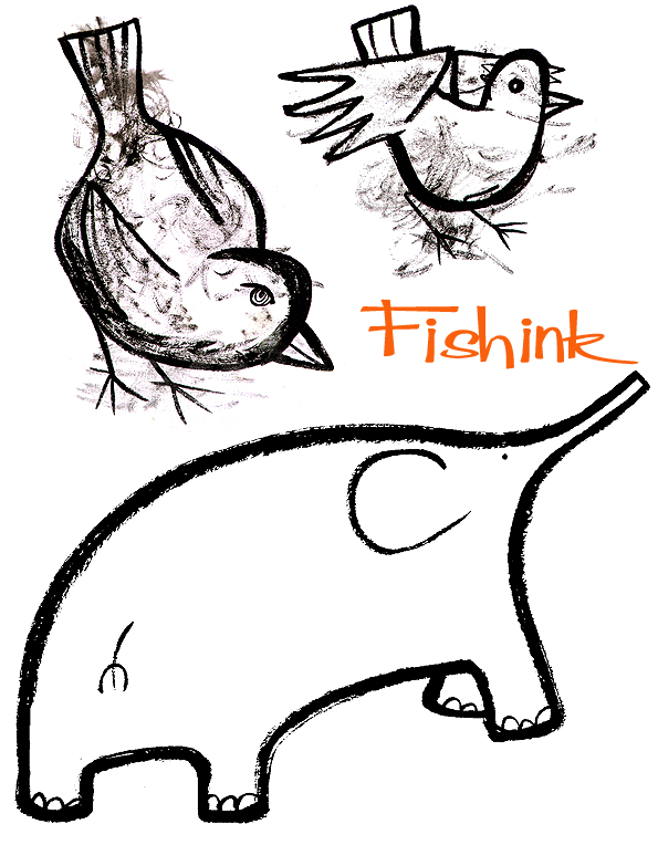
I spent a lot of time playing around with elephant shapes. The pen allows you to make long continuous curves, where the ink splays out and creates wonderfully textured and expressive lines, that it would be tricky to create as easily, if done digitally.
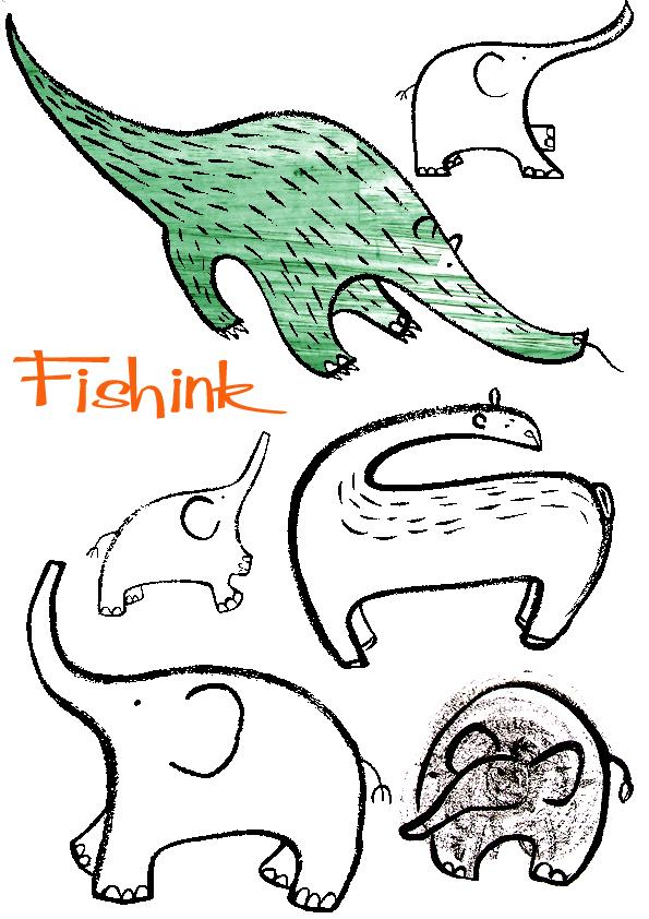
I even did some mark making or just plain ‘dabbling’ on the page to try out the nib and later turned the ‘random shapes’ into whatever animal seemed to suggest itself from the scribble beneath. It does add another layer to the work that’s different again and sometimes a feeling of movement too.
I think some of my elephants will be heading over to the Yellow House Art site once I’ve ‘dressed’ them with some colourful textiles. More of my artwork can be found available for sale here.
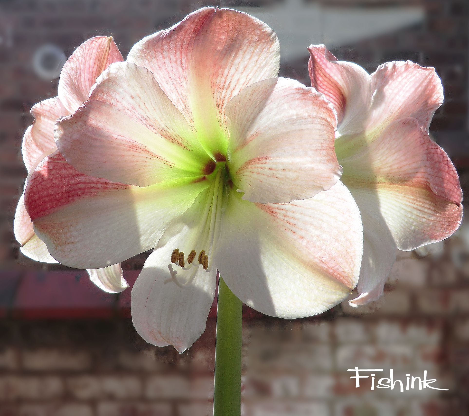
I noticed that the Amaryllis, my mum had ‘donated’ at Christmas was now fully ‘exploded’ and illuminated, what a three headed monster !
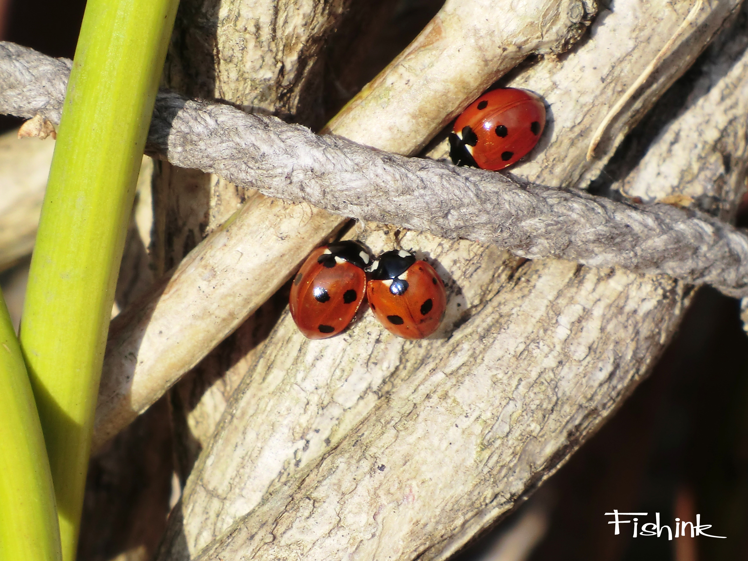
At least the ladybirds in the garden had been enjoying an outdoor sunbathing session yesterday, even if mine was more indoor : )
Please don’t forget to leave a comment below, if sometimes the desire to draw / create / paint etc grabs you in the same way I described at the start of this post. I’m curious to know how many artists need to go with their creative flow when it comes calling : )
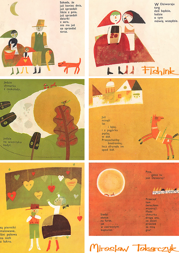
Miroslaw Tokarczyk Mid century Polish book Illustration
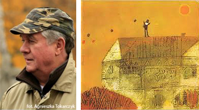
Miroslaw Tokarczyk was born in 1934 – a painter, illustrator and chairman of the board and co- publisher for ” Our Books ” .

He studied graphics in the studio of Jan Marcin Szancer at the Warsaw Academy of Fine Arts.
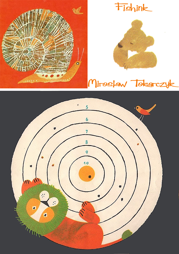
He was artistic director of the ” Movement ” , and chief graphic designer in publishing and Pedagogical School and the Institute of Publishing ” Our Books ” and artistic advisor Publishing House “Alpha”. Characteristics of Miroslaw’s work is intense , contrasting colours and simplicity of form .

Miroslaw developed graphically and illustrated more than two hundred books for children and young people.


He has participated in many exhibitions (eg in Bratislava, Vienna , Munich, Bologna) and has received numerous awards and honors – including the Silver Cross of Merit (1988) , as well as the award and prize competitions Polish Association of Book Publishers for the most beautiful book of the year (1987 , 1990). In a series called ” Read to me , Mom ”
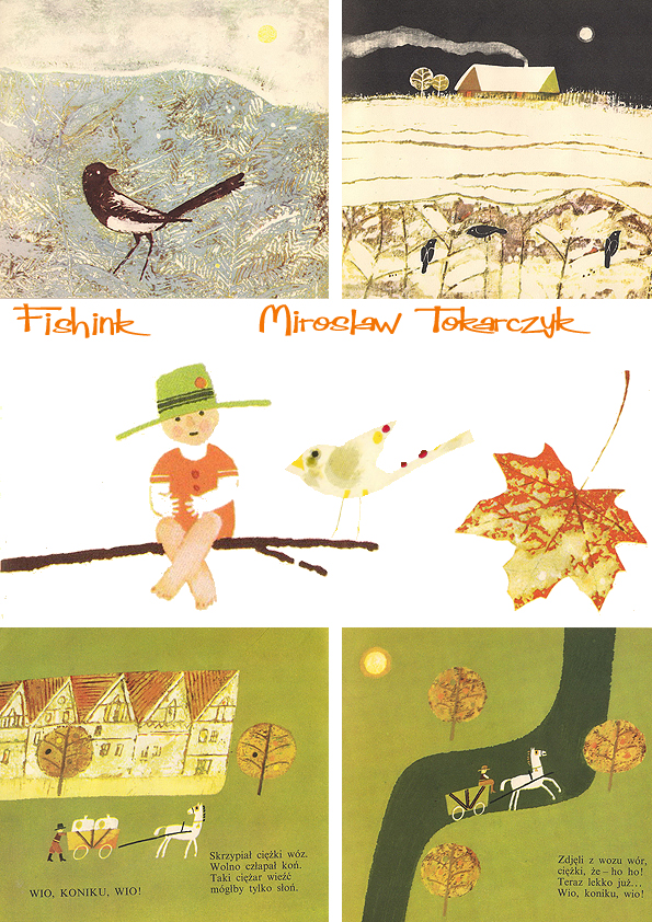
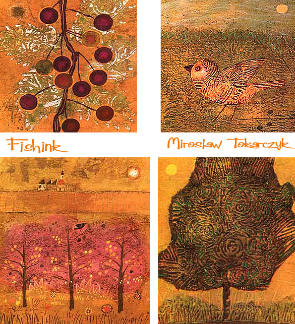
Lovely colours and textures. Thanks to Pstrobazar Blogspot and Jarmila09 for posting the images and for their wealth of Polish Children’s Book images. Well worth checking out.
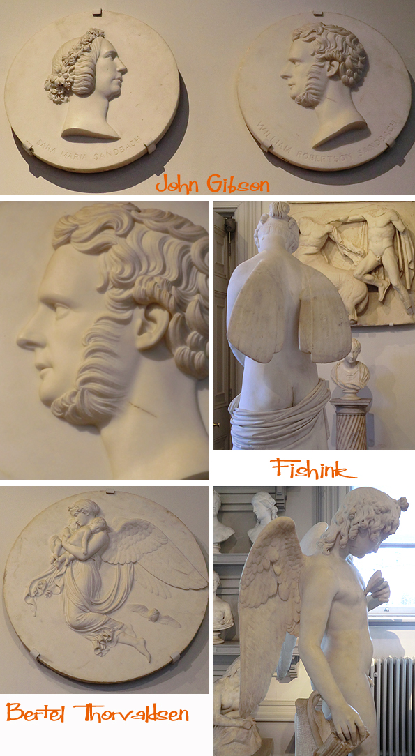
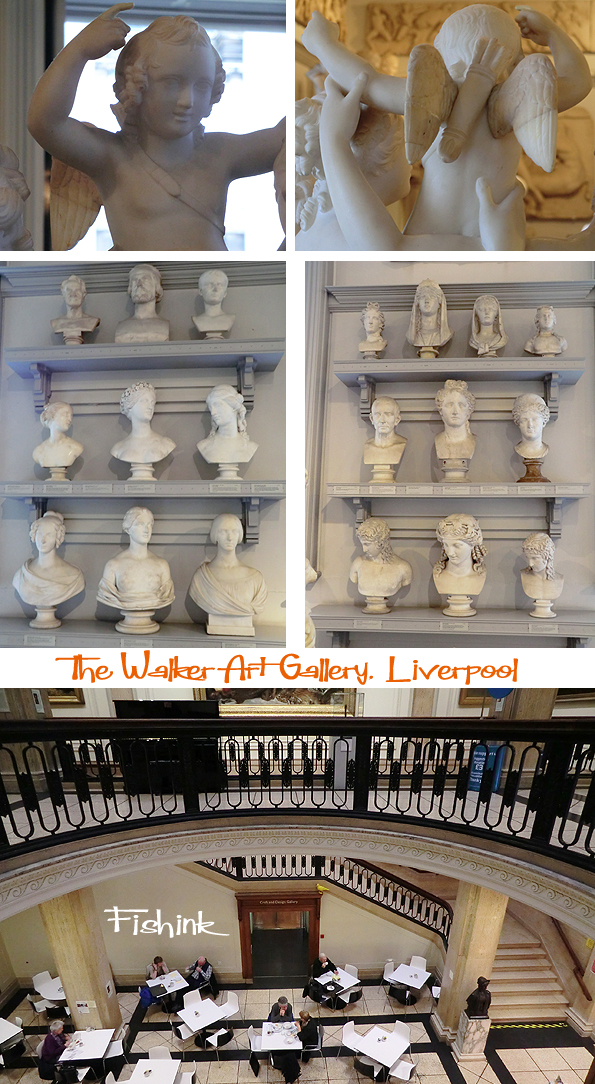
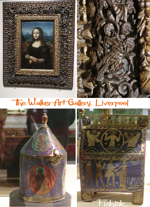
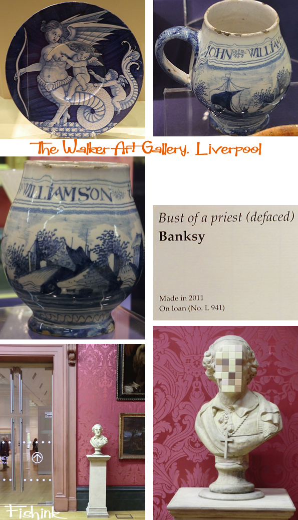
Fishink Travels. The Walker Art Gallery, Liverpool.
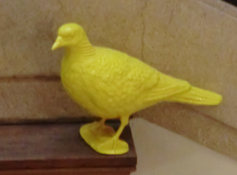
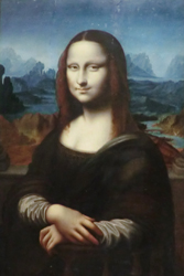
What does this yellow pidgeon, the Mona Lisa and Banksy have in common ? Well I bet you didn’t know, but you can find all three at the Walker Art Gallery in Liverpool at the moment ! I took a trip there last sunday, and I must say I’m not usually a big fan of sculptures, but there was a certain charm with Harriet Hosmer’s version of ‘Puck’ from A Midsummer Night’s Dream. There were a few more angelic faces to keep him company.
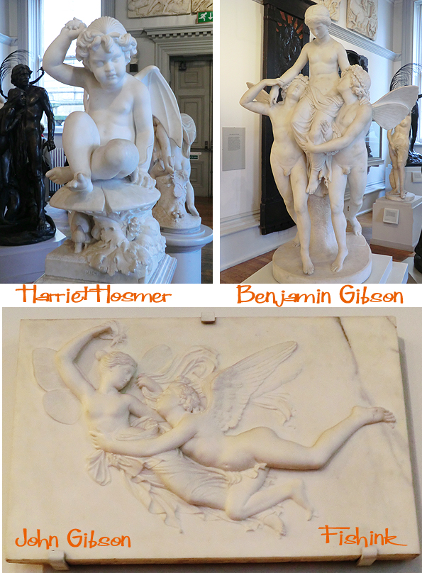
Some great textures in the hair of John Gibson’s sculptures, and just check out that facial hair ! Oddly impressive lol
It’s easy to get a little spooked out with a room full of faces and figures so we moved onto see some of the paintings.
We learned a lot from one of the gallery staff, who showed us their version of the Mona Lisa, the Walker has dated this painting between 1630 and 1660. I didn’t realise there were so many similar yet different versions, more info here. In case the Mona Lisa didn’t catch your eye, I’m sure the richly carved frame would do the trick !
I didn’t catch the maker of this wonderful cat throne but liked its regal and quirky stance.

Wonderful use of coloured wallpapers really add something to the walls and compliment the work.. even when the customers try to clash !

A few ceramics and another story about the artist Banksy who paid the Walker a visit and was so impressed with it that he offered to loan them a piece of his own creation. They gladly accepted and again it sits quite happily nestled in amongst the Turners, Rembrants and Pre Raphaelites. When viewed from a distance the pixelated face becomes a real one again. Quite clever !
If you’re planning a day out in Liverpool the Walker is always worth popping in, even if it’s just to eat some of their lovely home made cakes… which of course I would never do : )
Blog update… sadly I believe the Banksy has now moved onto pastures new. Gosh you have to be quick !!
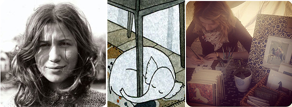
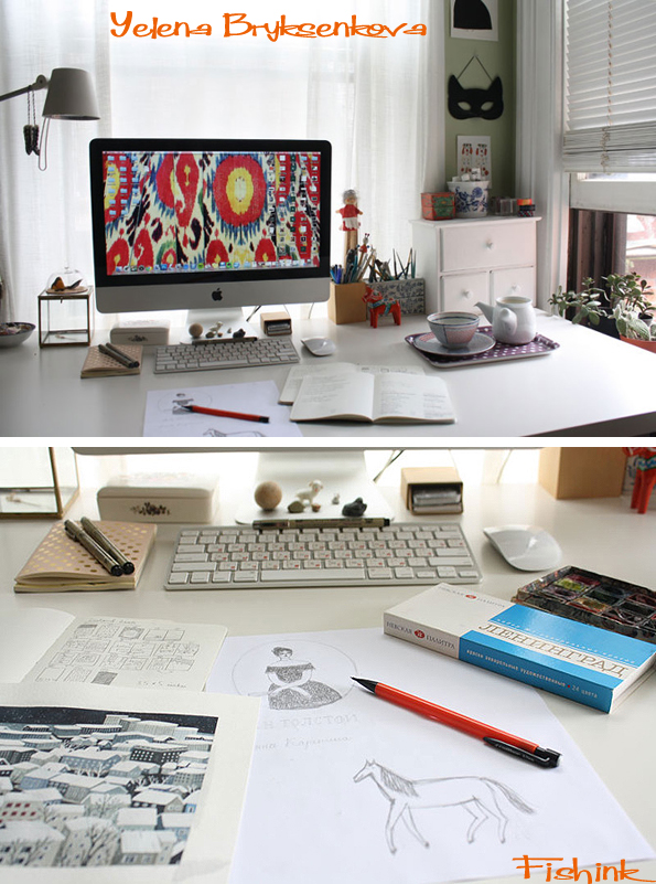
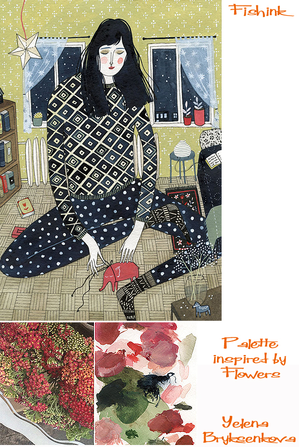
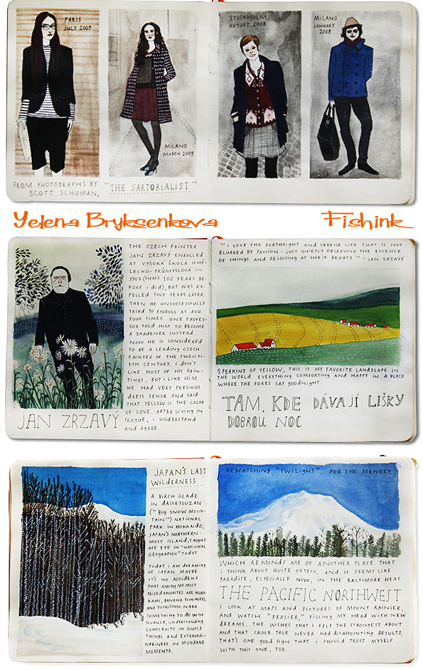
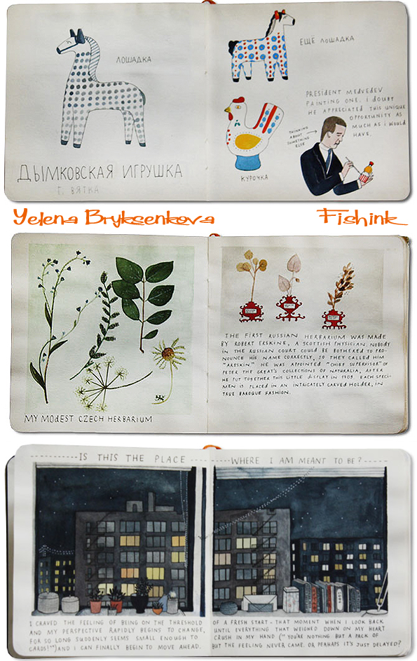
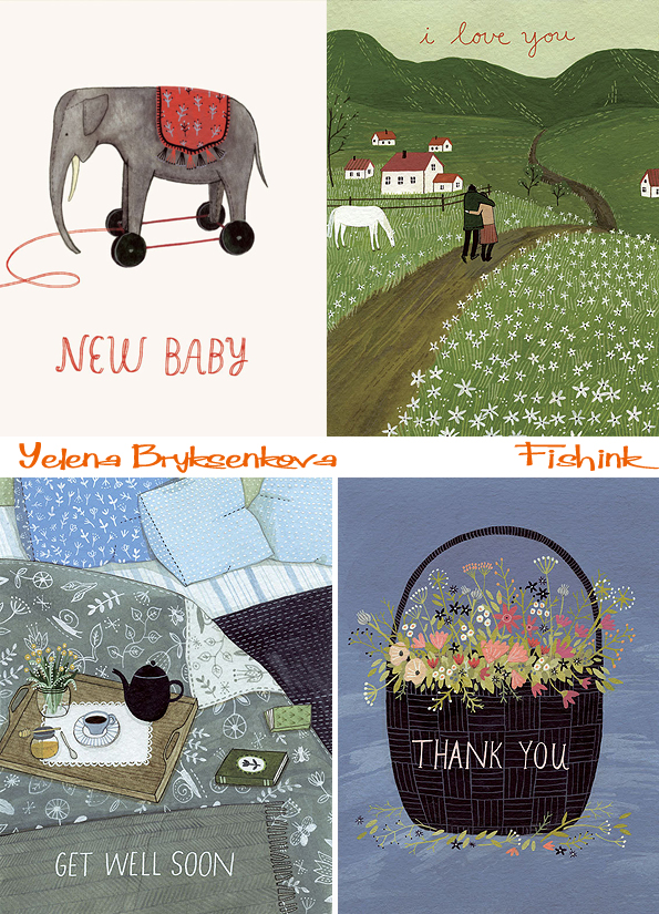
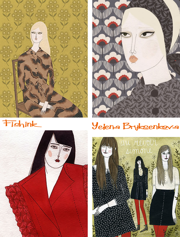
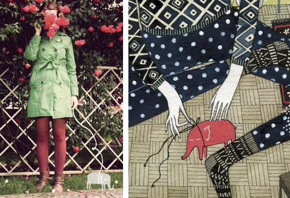
Yelena Bryksenkova is a cultured soul who lives partly in a beautifully illustrated world of her own creation. Born in Russia and brought up in Cleveland USA she now lives in New England, with her imaginary pet elephant and works as a freelance illustrator and fine artist. Like many of us illustrators, she likes to collect objects, and have familiar, comforting things around her. Using 005 Micron pens, watercolors, and Acryla gouache to work with. It’s no coincidence that her watercolors are “Leningrad” brand cakes, as they are something Yelena tells me she “absolutely cannot do without.”
I sent Yelena some carefully chosen questions and she kindly and enthusiastically replied.
How much of your Russian heritage do you feel has formed the person that you are today ? How did your parents come to make the move from Russia to Cleveland ?
My mom and I moved to the US in 1996, when I was eight years old, during the post-Soviet wave of emigration. We already had relatives in Cleveland who helped arrange our move. The language – spoken, read, written – is a part of my everyday life, and my heritage will always be a beautiful, mysterious and painful part of me which I’ll never be able to truly verbalize. Russia’s rich visual and literary culture is deeply meaningful to me, but unfortunately it’s one with a very tragic fate, and who I am today and the opportunities I’ve had to grow as a person and artist I owe largely to having grown up elsewhere.
You moved from NYC to New Haven ( I also love New England) was this move away from the big city, a decision based around finding a smaller, more personal space to call ‘home’ ?
After a brief stint in New York – which I had never really dreamed of – I jumped at the opportunity to live somewhere smaller and more manageable. I do like this little city, which is small enough to get to know well but so charming that it feels new every day (I go on long daily walks and it never gets old; Yale University’s old campus alone is a marvel!) I am inching my way toward Boston, though – that’s a city I have dreamed of living in, ever since I was a tenth-grader on a school trip.
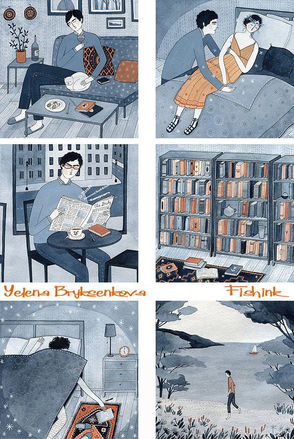
You appear to be well read and a painter of characters loving solitude and quieter times. Does this reflect you as an artist or a world that you see around you as perhaps an ideal place to live ?
This absolutely reflects me as a person; as much I enjoy time spent with friends and family, I am quite solitary by nature and really value time spent alone, which I suppose is a handy quality to have in my line of work. My carefully curated world, in which I am surrounded by things I love, never feels lonely or boring.
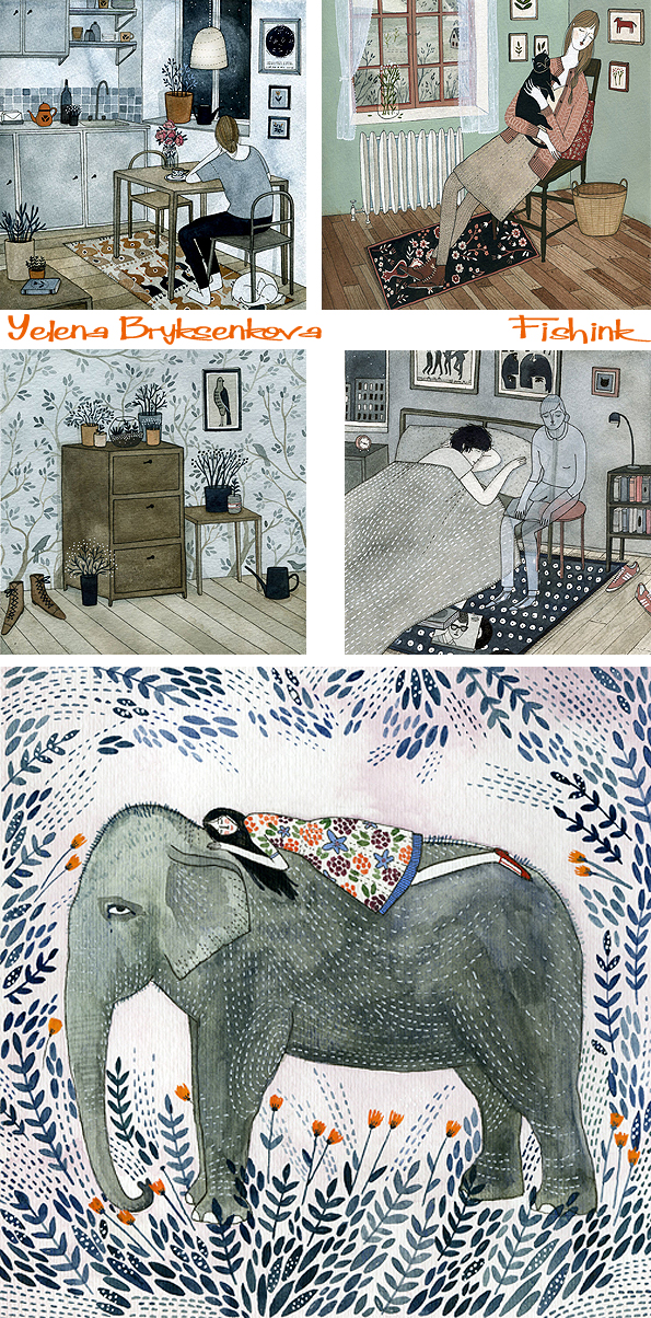
I noticed that you have a ‘healthy obsession’ with detail and textural patterns, whether it be on fabrics, in the home, or flowers in a garden, stars in the night sky etc. Is this desire to capture detail just a part of your developing illustrators style, or part of a painters way of putting more information into a piece of art for the viewer to ‘read’ ?
Details – in clothing, in furnishing a home – are deliberate choices that one makes, appreciated by oneself and by those who care to look closely enough, which is why, for me, patterns and colours are very important in communicating the mood and personality of my subject (and inevitably my own). Plus I find the physical process of drawing small details highly meditative, so I can sometimes get carried away! The decisions of which surfaces could use a pattern and also when to stop are completely intuitive.
This colour in this illustration (below) was inspired by the flowers and Yelena’s chosen palette from above. A small series about solitude.
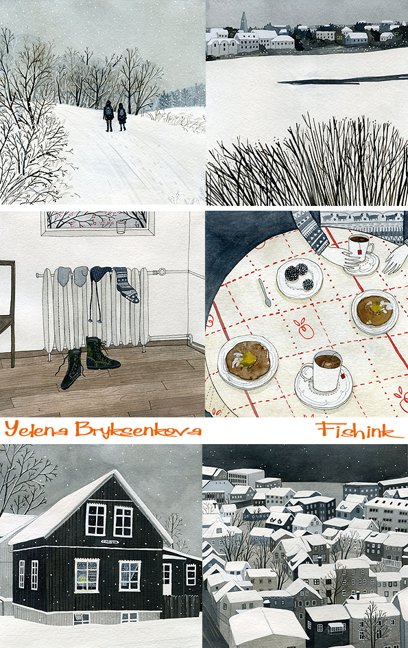
I really like the feel of these images Yelena created from a trip to Reykjavík. You can sense the cold, still climate perfectly.
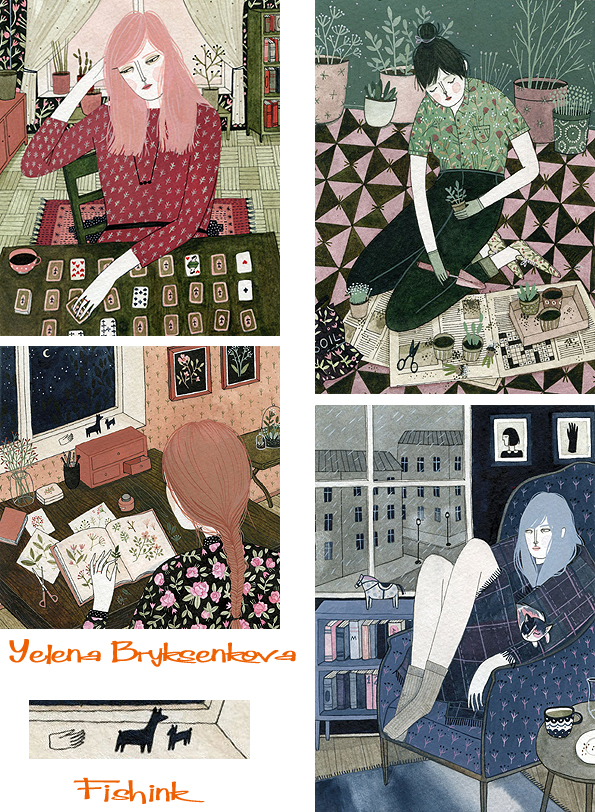
Barbarella, wolf girls and ladies with jewellery are all captured here in Yelena’s personal and editorial work.
Her sketchbook work is so beautifully laid out, it’s almost like a published book in itself.
What have been your favourite commissions to date and who / what would you most like to create artwork for ?
My favorite job to date is one that I just completed – it’s a special illustrated edition of Mrs. Dalloway’s Party for Random House Spain, which will probably be published later this year. I love the 1920s and this was an absolute dream come true; the research alone – clothes, cars, furniture – was intoxicating.
Here’s a couple of other book covers Yelena has illustrated.
And some greeting cards.
Fairy tales.
You mentioned that you love painting girls and their environments and pastimes, where did this interest stem from ?
Art imitates life, and my penchant for that subject matter is always reinforced when I look at Impressionist painting. People (mostly women), in quiet repose, surrounded by cherished books and objects. Just a moment in time, nothing more. Although magically, complete strangers in different corners of the world pick up on some secret transmissions that I guess I inadvertently broadcast, and they write me lovely, very moving notes of emotional solidarity, sometimes even in very broken english.
Here’s some girls wearing Orla Keily fashions and patterns.
I love the notion of your imaginary pet elephant, can you tell us a little more about, where he came from, does he have a name, what does he like to do when you’re busy working ?
His name is Vaclav and he just materialized one day, about eight years ago. He’s a dream pet, a comforting thought and a kind of talisman. I imagine he just sleeps all day; very low maintenance and his mere presence at all times is all that is required.
Where to next ? any plans for the future and details about new work etc ?
I have been very busy working on a couple of special books, and there are two middle grade novels – Aaron Starmer’s The Riverman and Laura Marx Fitzgerald’s Under the Egg – coming out later this month, for which I illustrated the covers. I am so excited to be working with books, finally!
We’ll look forward to seeing more of your book covers later this year then. Thank you so much for your thoughtful and well considered replies Yelena. It’s been a joy to look through your work and discover more about the illustrator and your elephant : )
You can see more of Yelena’s work on her Blog and pick up a card or a print or two from her Etsy shop here.
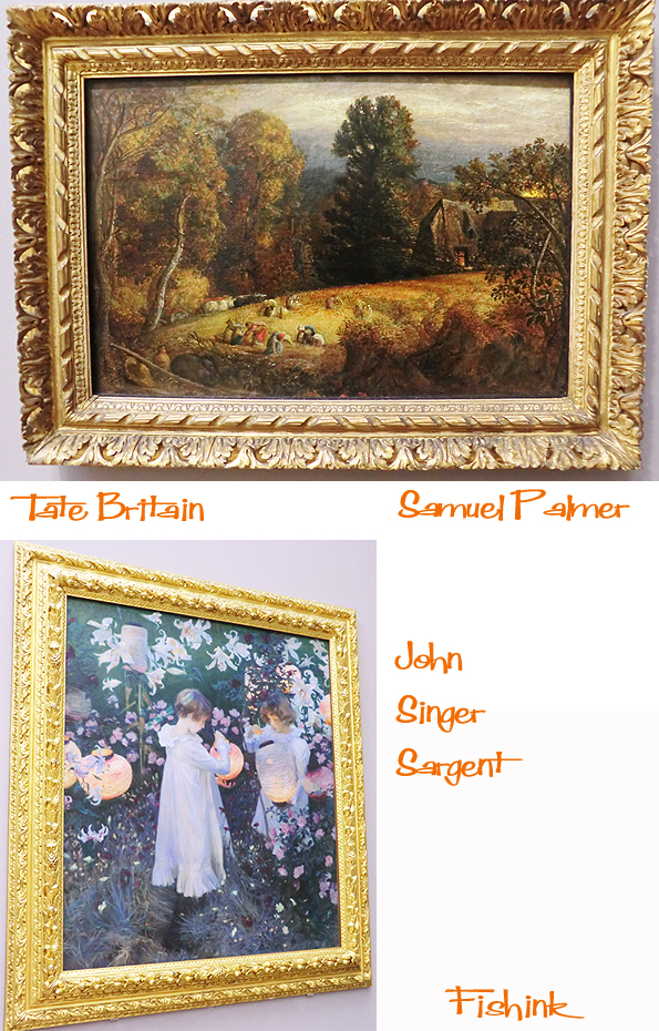
Fishink Travels. The Tate, Henry Moore and Spring light.

I’m a little late with this post as the content is from January, when I visited Tate Britain in London. It’s been a fair few years since I was last there. To be exact, I was last there doing some research for my A level Ceramics essay on Lucie Rie ! You do the maths.
This week, as Spring seems to have sprung (a little more anyway), I’ve seen some wonderful morning and evening suns which I thought I would share with you. This is the morning sun bursting in my bathroom.
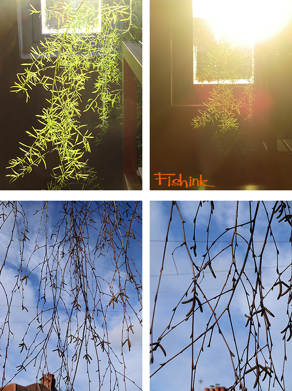
This is what I’ve christened “Bird foot tree” : ) and some fiery evening skies.
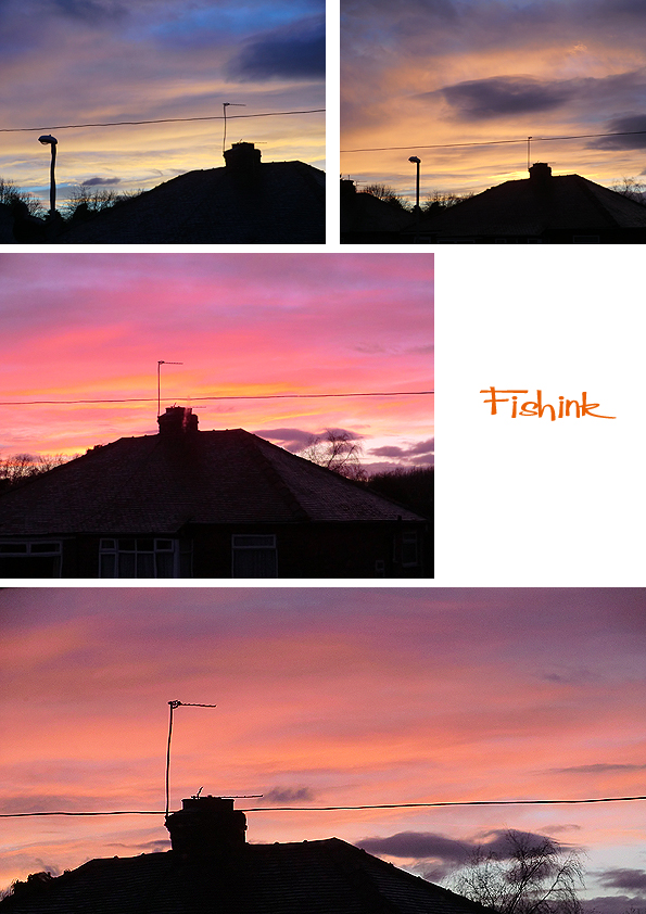
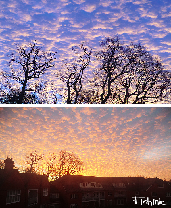
These dappled morning skies were like inverted snowscapes.
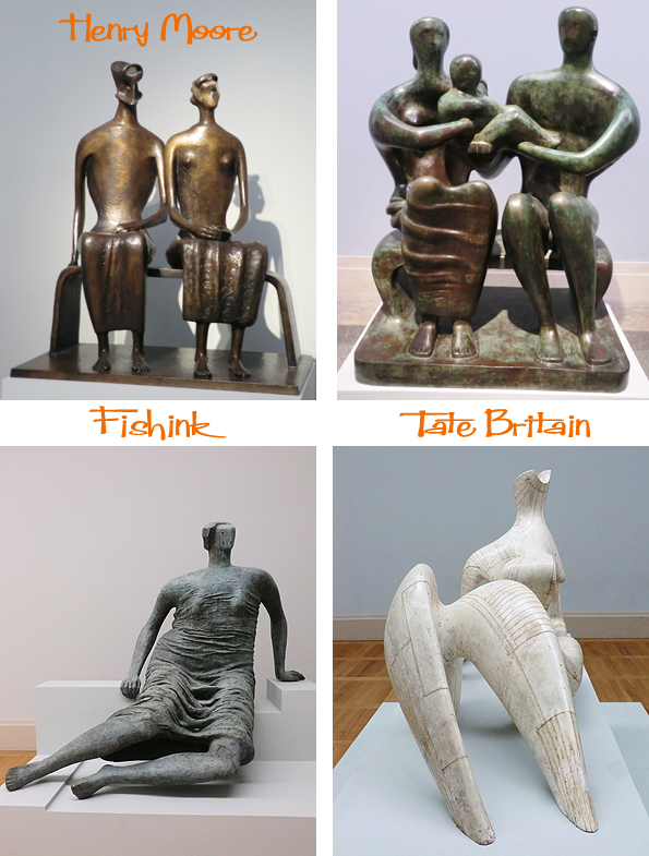
In January, I spent a great afternoon rambling around Tate Britain. Another calm and peaceful gallery space. There’s a fine collection of Henry Moore sculptures there at the moment.
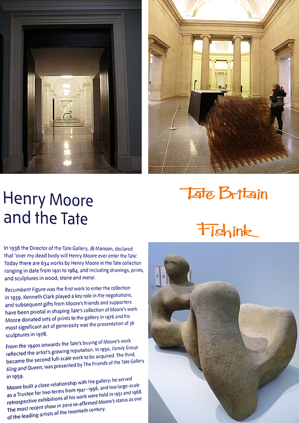
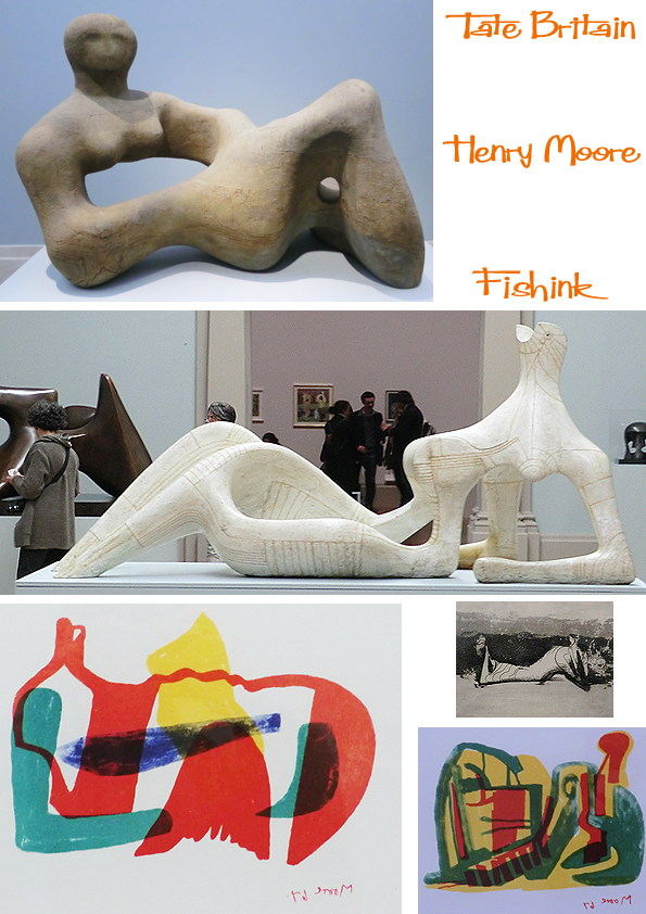
Lovely to see some of Henry’s sketches hanging alongside his figures.
This eerie collection of figures seemed to have some weird connection to McDonalds. The space they were in felt cold and uninviting, which added to their spookiness.
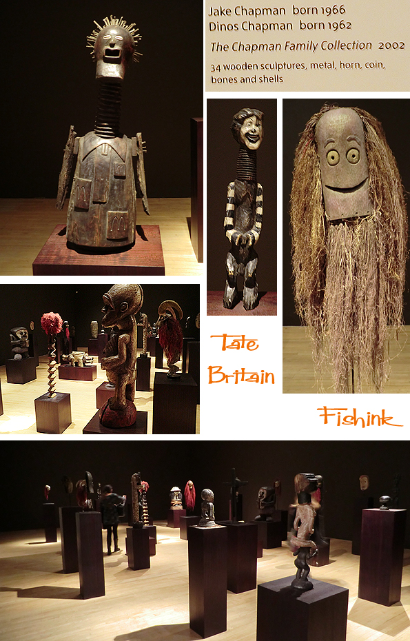
Two beauties that caught my eye.
On the way home from the Tate we encountered this coppiced row of trees, also looking a little spooky in the lamplight ! We’re they shaking their fists at us ?

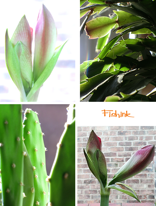
A few more glimpses of sunshine on the house plants.
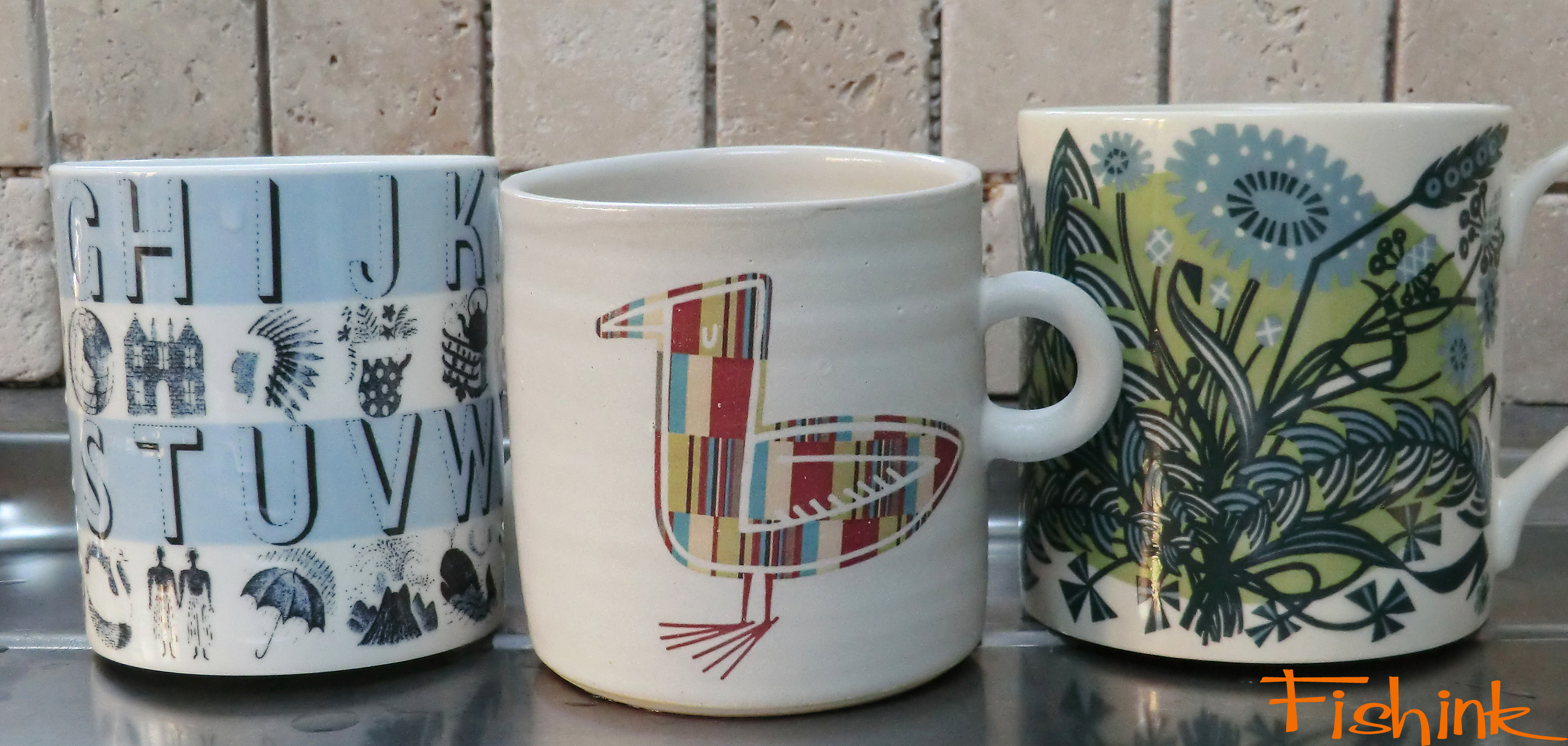
Somehow I think that this is the nearest I’ll get to sitting down with Eric Ravilious and Angie Lewin for a cup of tea ; )