Sandra Jávera A Brazilian Illustrator in New York.
Happy February to one and all and a slightly late Happy Chinese New Year to all too : ) It’s going to be an exciting time, starting off with being featured on my agents site as Yellow House Art Licensing‘s artist of the month ! There’s an interview to follow mid month and I’ve created quite a few fresh images which will appear this week too.
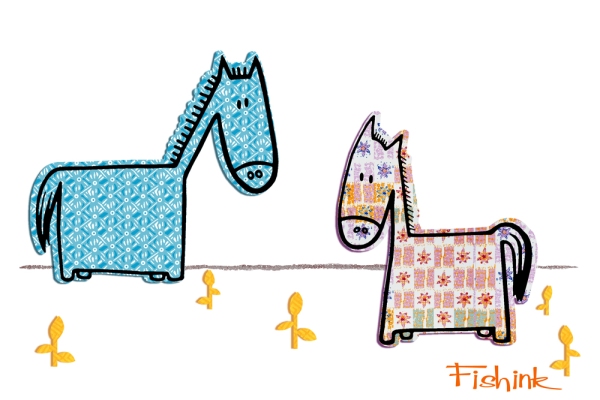
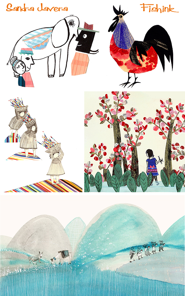
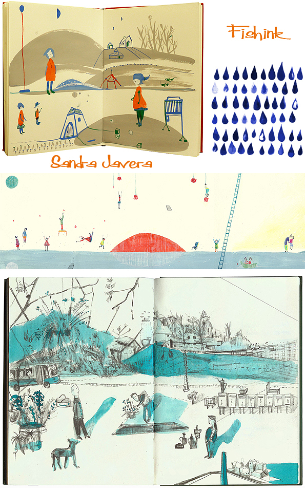
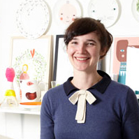
Starting off our second month of the year is the work of Sandra Jávera, a talented Brazilian artist who originally studied architecture.
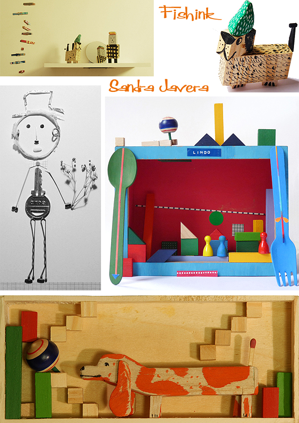
Many of her visual references come from the time she was in college, the drawings of the architects that she studied and the artists and illustrators that her and her friends liked. People such as Paul Klee, Matisse, and Saul Steinberg, influence her work. Her little wooden characters are truly eye-catching. I caught up with Sandra as she returned to NYC (which is now her home) and she kindly gave me some more information to accompany these images.
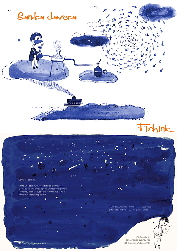
Sandra says “I always liked making things with my hands, and as I got interested in drawing I took courses in different areas. In illustration, etching, book making, collage. The more I saw other stuff and worked with new materials, the more I was eager to learn something new.” Her work is varied, decorative and exudes charm in many ways.
“I love children so a lot of what I do is influenced by their universe or what I think is their sense of humour.” I think it works for children and adults alike… quite charming, what do you think Fishink viewers ?
Again I love the way in which Sandra’s work explores so many different forms and styles.
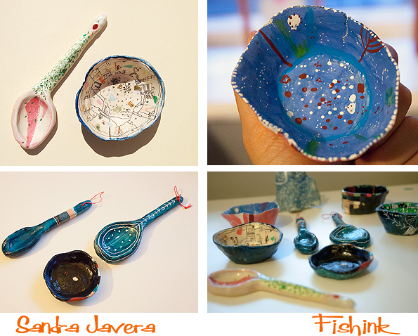
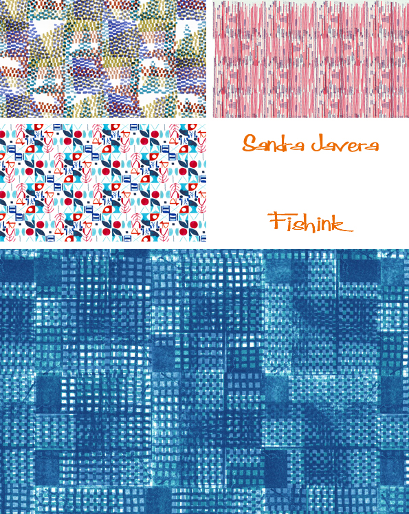
“Recently I have started working with ceramics and I am very excited with its possibilities.”, I noticed too, her journey into textile designs and repeat pattern.
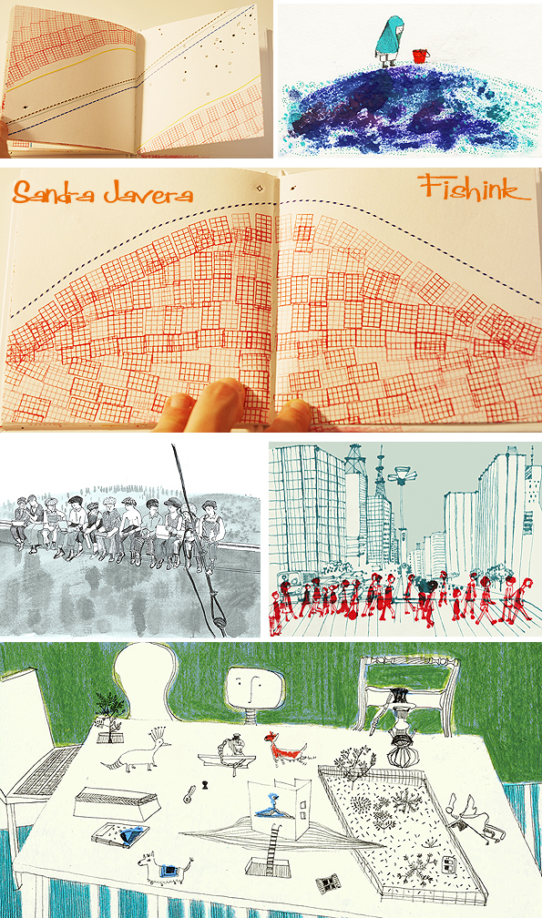
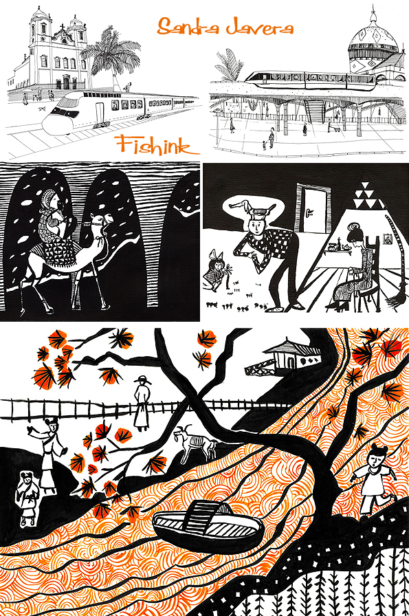
She has wonderful line control and fun filled sketchbooks too.
“My main focus is illustration but I intend to dedicate myself a lot to ceramics this year. I also plan to illustrate more children’s books.” Wonderful work Sandra. Many thanks for sharing your work and thoughts with us today.
Paul Bommer Cor blimey guv’nor, a Cockney geezer Illustrator
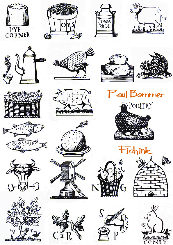
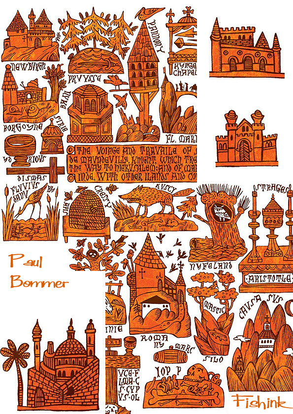
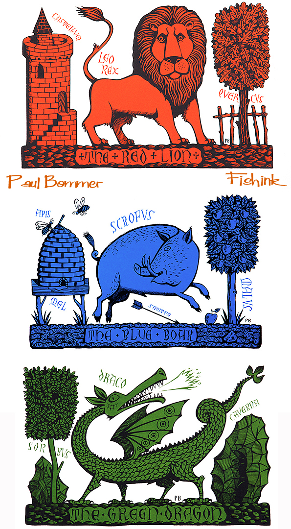
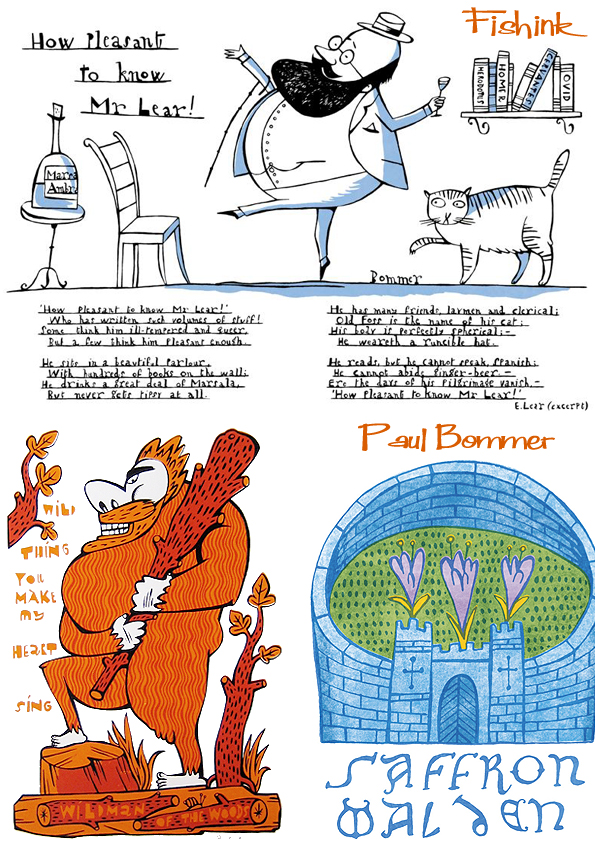
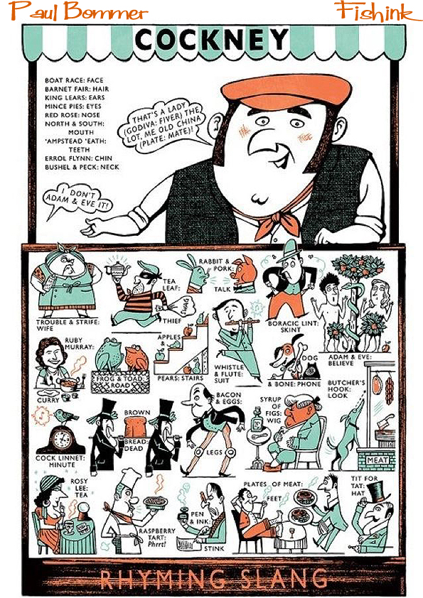
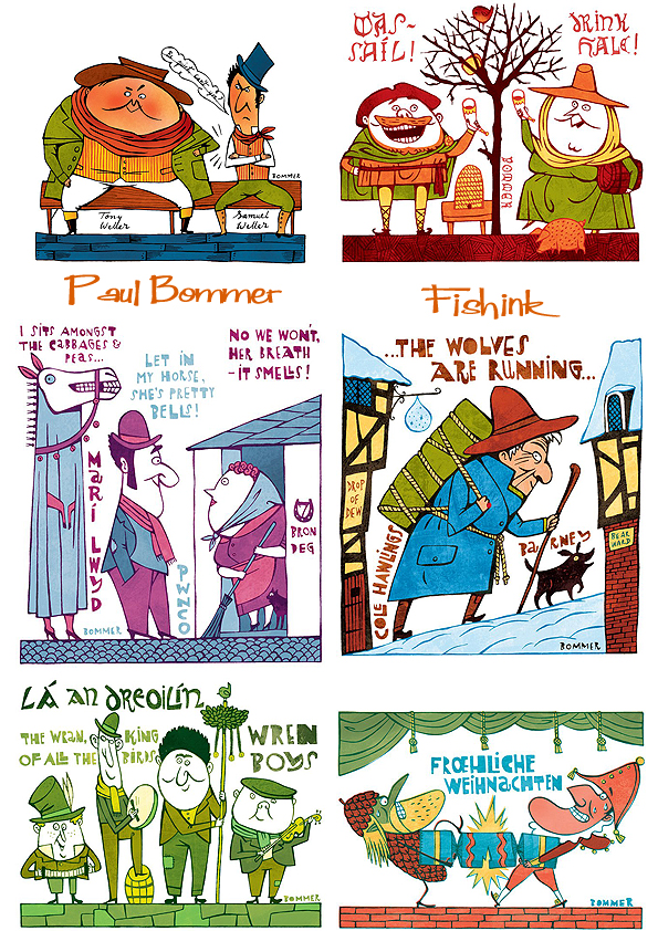
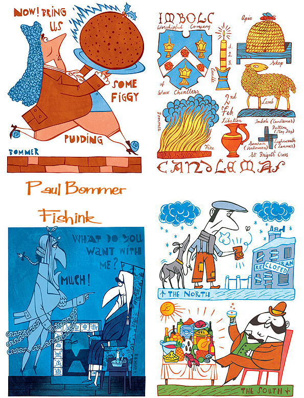
Chirpy chappie and dapper dresser Paul Bommer is a graduate of the National College of Art & Design in Dublin. He lives in Cromer, a small coastal town in North Norfolk, UK. With a talent for illustrating people and objects from English times gone by. Paul has created artwork for all kinds of uses including beer labels, delft-like tiles made out of board and acrylic paint, book covers and beautiful screen prints. I’ve been a fan of his work for quite some time now and as we are friends on facebook, I took the opportunity to have a catch up chat and find out a little more.
Paul comes from a large family, but had quite a solitary childhood, preferring to spend time with his pencils and paper and creating imaginary friends and worlds where his characters could live. His grandfather was a painter, and although Paul wasn’t exactly encouraged in his art, he strongly felt a need, no… more of a desire, to keep drawing and now he’s created a full time career from his skills. Proving just how important it is to remain true to ones desires and beliefs.
Here’s a selection of his tile imagery.
There’s a flavour of the sea running throughout Paul’s work too, seen here more strongly in his illustrations of Old Neptune and a tattooed sailor. I watched the 1949 Ealing ‘comedy’ classic ‘Whisky Galore’ over christmas and so really enjoyed seeing Paul’s take on the sleeve cover for the book. Incidentally this turned out to be one of Paul’s favourite commissions too.
I was asking Paul how he generates new ideas for his work. He explained that he carries an A4 sketchbook wherever he travels so that when things pop into his head he can sketch them down and also puts a light bulb next to them, if they’re the start of a new idea. At home he has a huge sheet of paper on the wall onto which his thoughts and doodles can literally run wild. Here he creates hundreds of little sketches, sometimes far more than he may ever have time to use ! Using a large sheet of paper, gets away from some artist’s ‘terror of the first white page’ and using minimal lines to get an idea down, somehow gives the image more focus and almost intensifies its meaning or significance.
Brought up by a Polish father and Welsh/Danish Mother, Paul was born in Wembley in northwest London. His catholic school was filled with Italian, Spanish and Polish children so even though he was British, he began to view the country almost through the eyes of a foreigner. He believes that his catholic upbringing and being amongst their statues, colour and religious iconography is perhaps what gives him his love for signs, symbols and story telling today.
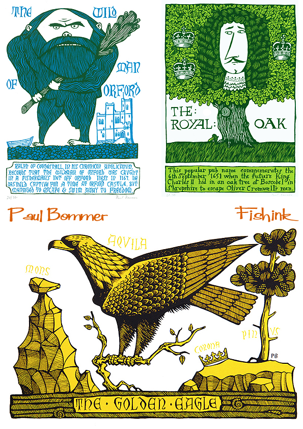
He doesn’t view history as a’dusty old thing’ but rather a series of stories that may have been forgotten and need bringing up to date with a fresh approach. His love of different periods in English history, are where he draws much of his inspiration from, for his contemporary screen prints.
I noticed how important humour appeared to be in Paul’s illustration and he agreed that by making people smile through his work, he can somehow paint a more favourable light on historical events and bring them back to life in a way that contemporary folk, like you and I, can more easily identify with. Look at these modern interpretations of the traditional pub sign, don’t they just make you smile straight away ?
In the future Paul is hoping to spend some time working with ceramics and producing one off pots in his wonderfully personal decorative style, which I think would look amazing. He’s presently working alongside another artist involving puppetry and is creating new lines for Fortnum and Mason, who are apparently superb to work with as they give high respect for the artists space and style. I suggested that a wallpaper design from the tattoos of his sailor from an image higher up in this post, would work splendidly and that he should get his illustrations onto fabric too. Who else apart from me, wants a cockney rhyming slang Tea Towel ? lol
It wasn’t until the end of our conversation that we discovered our childhoods were spent about 5 minutes from one another, on the wirral peninsula, when Paul would come to visit his grandparents there and go down to the sea in summertime. How funny to think that we may have met and not known it lol
You can buy prints of Paul’s work on the St Judes website or on Paul’s own Etsy or Big Cartel sites.
Lovely work Paul, keep up your truly individual style and it will always look fresh, exciting and yours alone. Hope to catch up sometime soon.
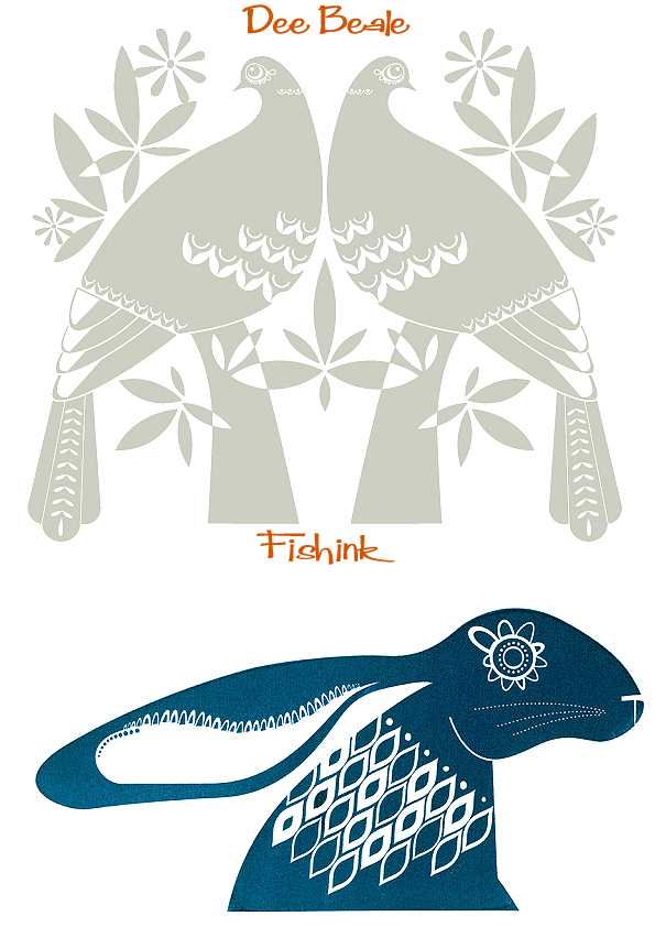
Dee Beale UK Designer and Printmaker
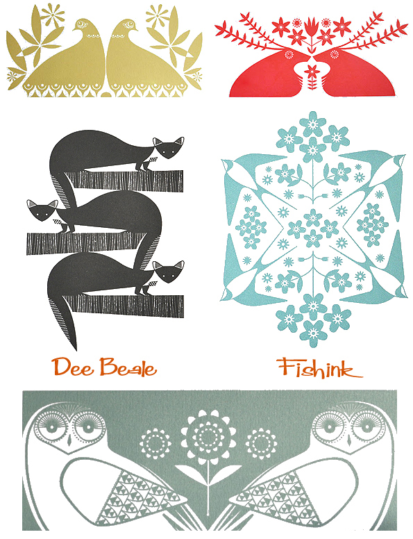
Dee Beale lives in the Peak District, Derbyshire, with her partner, two small children and a few chickens. She studied Graphics & Illustration and after graduating, continued to work in Graphic design. Having been in design agencies for over 10 years, Dee began hand printing her own work using the Japanese Print Gocco. Print Gocco is small self-contained tabletop screen-printing machine. It was first produced in Japan in the 1970s, the process is very similar to screen-printing and you can produce a print which is up to about 22 x 10 cms in size.
Dee confessed to being a fan of Fishink Blog and as I’m a follower (and am followed in turn) by Dee on Twitter, we caught up this week to do a Q & A session on the finer side of Illustration and our love for mid century ceramics.
You trained in Illustration and Graphic Design before spending some time in design agencies. Are you freelancing with your own work full-time now and if so how difficult have you found it to ‘go it alone’?
I presently work part-time. I became freelance so that I could choose my own working hours and work around family life. I don’t take on any freelance design work at the moment and mainly produce prints for galleries, craft shops and my own online shop. I’m lucky enough to have a small studio at home and do most of my printing on our large kitchen table.
I’ve looked at the Gocco print machines before and have been tempted to buy one myself in the past. As an ex-screen printer, my only concern would be getting frustrated by size of the print constraints. Do you find it easy enough to get the ink supplies etc that you want, at a price that is affordable and do you ever feel compromised by the size of the printing frame?
Sadly In December 2008 ‘Riso’ the company that makes the Gocco and its supplies stopped manufacturing them and although there are plenty of supplies around at the moment, I know eventually supplies will get scarce and more expensive. I find it relatively easy to get hold of supplies, the main issue for me is they all have to be shipped from Japan and that adds considerably to the cost of the inks screens etc. I love my Gocco but for me the size constraints are definitely an issue, but I think I’d struggle to produce traditional screen prints at home. The great thing about the Gocco is that it is so self-contained, clean, quick and easy to use.
If you could spend a day with anyone who may have had an influence on your work (living or dead) who would it be?
That’s a hard one to answer, so many amazing designers to choose from but I think it would have to be the Swedish designer Stig Lindberg I’m a big fan of mid century ceramics and in my opinion he produced some of the best.
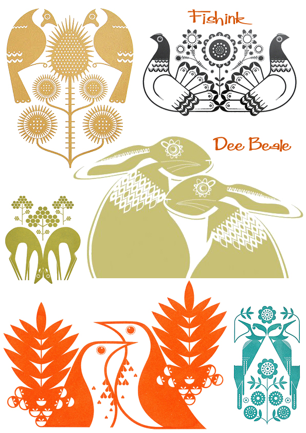
I love the way that nature plays a huge part in your work. Where does your love of birds and plant life originate?
I can’t really think of a time when I haven’t been interested in nature, it’s just something I’ve always loved. My dad was always a big fan and when I was a child he kept various birds in large garden aviaries… Exotic Finches and Chinese Painted Quail are the ones I remember most. I’m now lucky enough to live in the Peak District… in my opinion one of the most beautiful parts of the UK where I’m surrounded by nature and spoilt for choice.
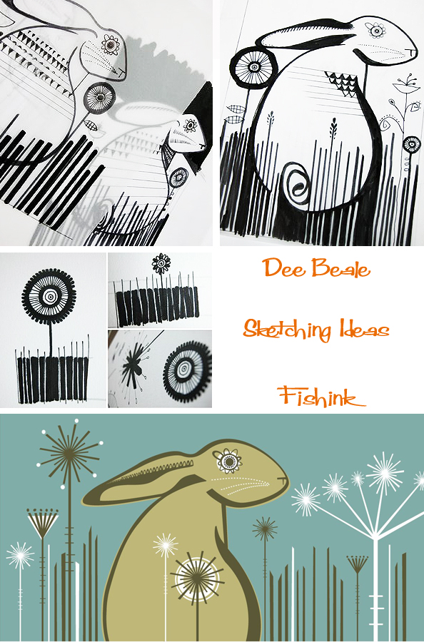
If you have any other sketch book images that haven’t been online before or can you show us a glimpse of something that you maybe working on now?
Most of my work starts in my sketchbooks and then I work the designs up on my computer, I’d like to spend less time on the computer so recently I’ve been experimenting with some paper cuts and painting techniques I’m hoping this will maybe evolve into another avenue for my work.
It’s easy to see where some of Dee’s influences may stem from, with a love of 1950’s and 60’s ceramics and forms.
What ideas do you have for the future ? Any plans for branching out into other products, wallpapers, lampshades, stationery etc?
I think it would be a natural progression for me to apply my designs onto some more products. I’d especially be interested in applying my work to fabrics and ceramics. I’d also like to apply to a some small trade fairs, I have been approached to take part in a few, but I don’t think I have enough work at the moment to make it worth my while. I’m always looking for new stockists and this year I’d like to add a few more to my small list.
Oh and that reminds me, where can people buy your cards from?
I have a small range of note cards available from Attic Cards at King and Mcgaw.
You can find Dee’s beautiful prints on Etsy, Folksy and Big Cartel. It’s also well worth dropping in on Dee’s Blogspot to see what else influences her work and how she makes sketches to form her illustrations. She certainly knows how to style a mean photograph too. Many thanks for your answers and images Dee, hope we get to catch up in person someday soon.
Menswear 2014 / 15
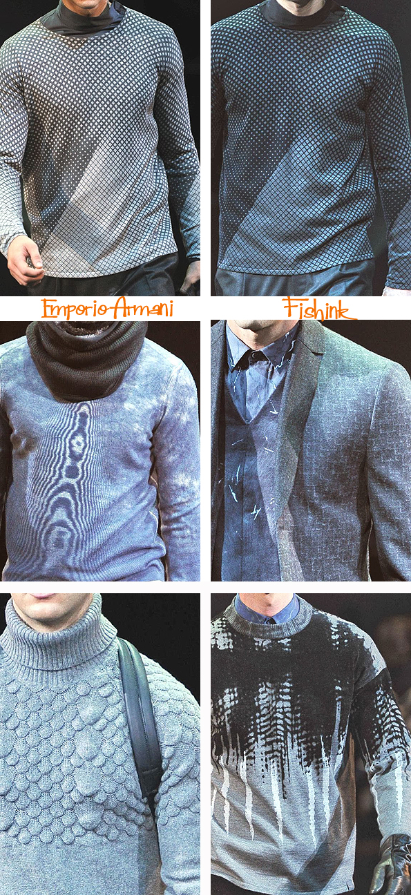
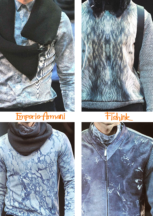
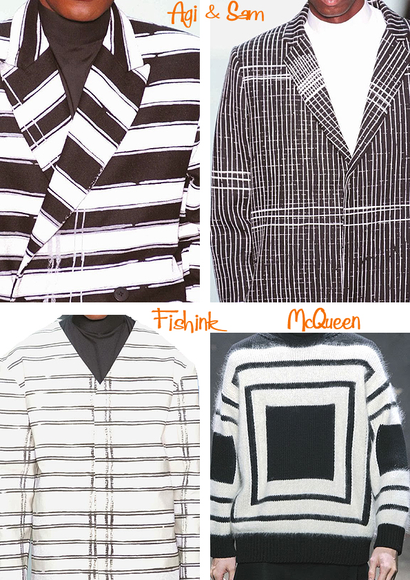
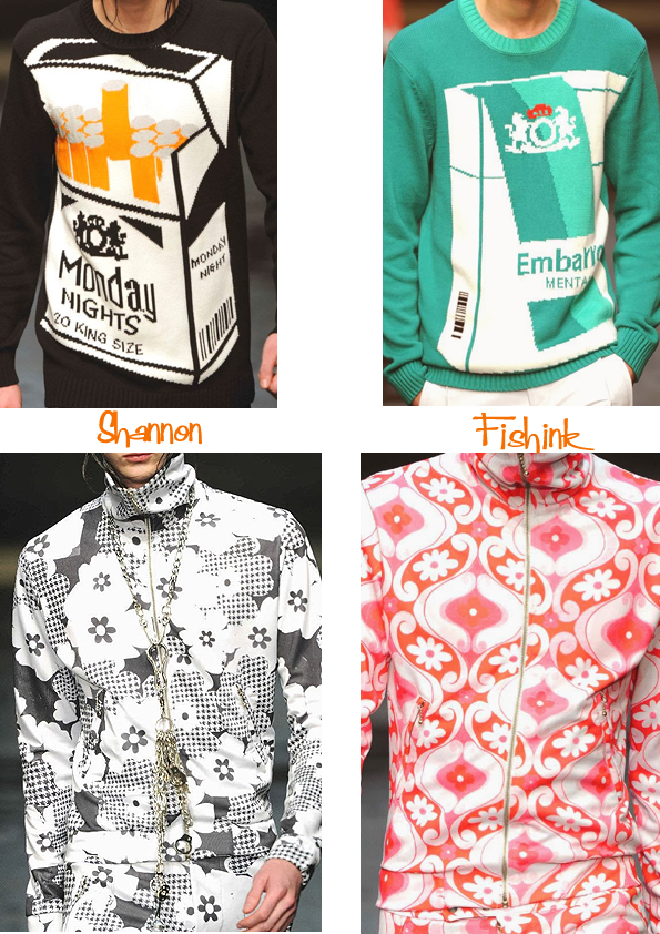
I’ve been looking through the Milan, Paris and London fashion forecasts for the winter/fall menswear collections 2014/15. Not surprisingly there’s a lot of grey and a huge amount of strong, bold geometrics, but also some subtle play with textures and imagery too. Emporio Armani starts us off with some lighter tones (of grey) and some clever, yet delicate, printed mark-making.
Wood grains, marbling and fur make wonderful part prints here.
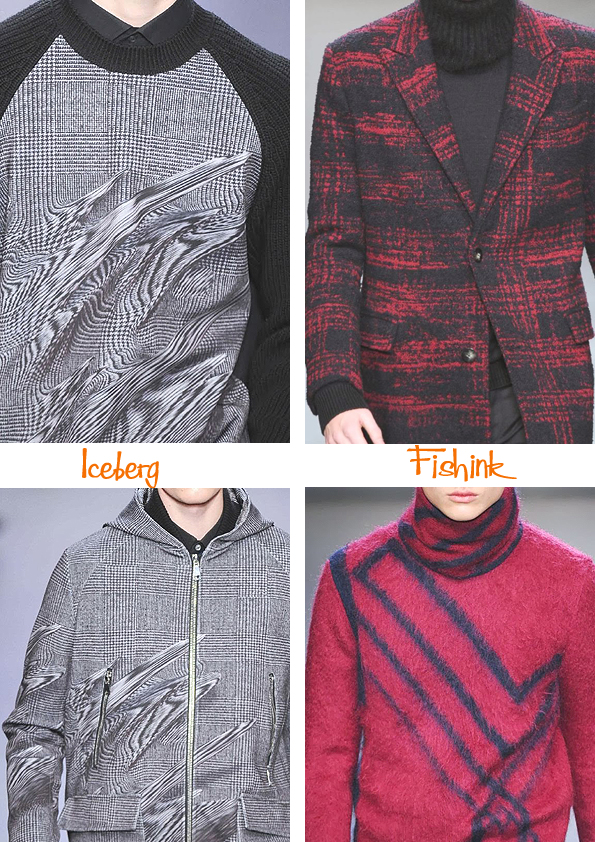
Iceberg plays around with checks and smudges, I think someone’s discovered a new tool in photoshop !
Agi and Sam and McQueen introduce some of those large linear patterns I mentioned.
Tautz also has bold tessellations but mixed with floral, almost medieval looking fruit and vines.
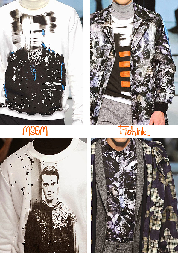
MSGM are still convinced that grey is the way to go but have a slightly rebellious posh punk theme coming through.
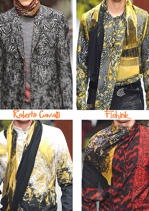
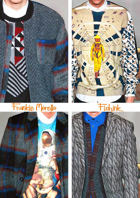
Finally Roberto Cavalli and Frankie Morello show us how to introduce some welcome splashes of colour, with your greys. Some clever layering and beautiful textural prints too.
I thought the fake knitted prints were quite fun too.
And finally for those of you who haven’t yet given up smoking, here’s the reason to do so. Oooo what a no no ! With some fancy print ideas for women’s silk scarves to close the post… but menswear ? … seriously ! 10 out of 10 for trying I guess.
Many thanks to the lovely Barbara over at Pattern Prints Journal who keeps me up to date on what (or not) to wear.
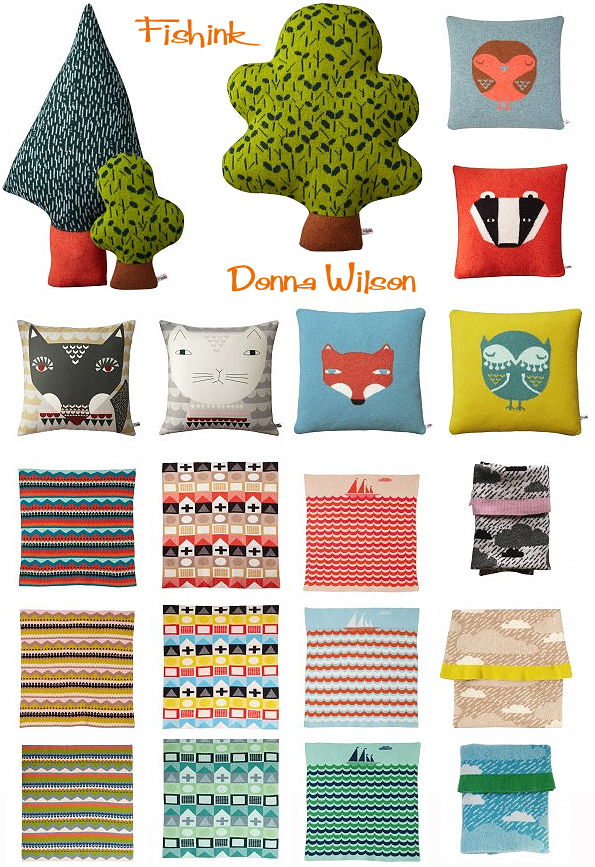
Donna Wilson Creature Comforts
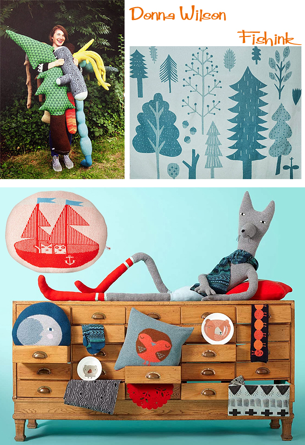
Established in 2003 Donna Wilson‘s company has gone from strength to strength and over the years, her work has moved from children’s toys to kitchen ceramics, cushions and interior throws. In 2010 Donna won the coveted accolade of ‘Designer of the Year’ at Elle Decoration’s British Design Awards. She has exhibited a solo show of knitted sculptures and paintings, entitled ‘Endangered Species’, at the Yorkshire Sculpture Park, designed fun filled scenes for hospital wards and interior fabrics for children’s prams and fair trade rugs made by Node.
Her masked Fox is a favourite of mine, he looks ready for a little ‘stand and deliver’ don’t you think.
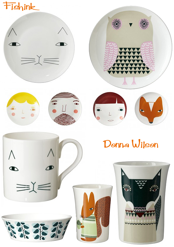
Donna’s ceramics are fun and playful. With a childlike style they have a strong draw for kids and adults alike.
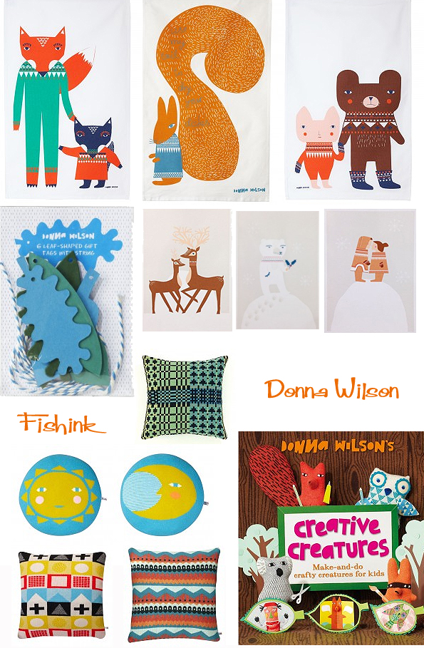
Why not have a fox mug and tea towel to match ?
Or there’s a superb array of cheerful cushions and throws to suit all tastes and interior colour palettes.
Hats, scarves and socks for these chilly wintery days, and hot water bottle covers for the nights ! Brrrr.
Vegetable creatures.. who would have thought it !
It’s well worth visiting Donna’s Blog site too as she’s kind enough to share all of her inspirational photos from her travels on it. There are even features on her latest products like these sewing kits, reminding us that the huge revival for making things at home is still going strong.
More about Donna in this great video that Uppercase magazine made. It reveals a little more about how Donna works, thinks and creates.
Lovely work Donna, please do carry on designing and keeping us all smiling at the same time.
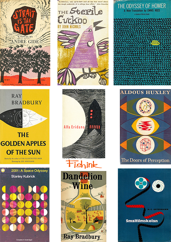
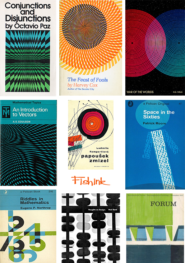
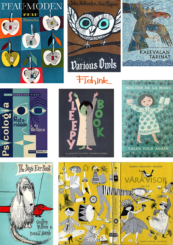
Fishink’s selected Vintage Book Covers
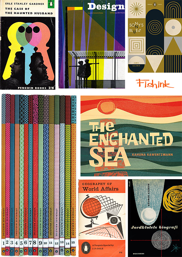
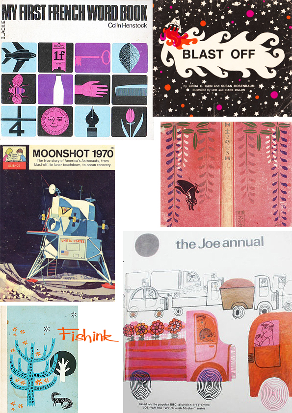
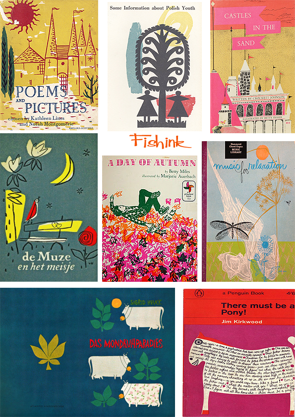
For me, some of the best book covers that you may see on the internet or in secondhand shops from the 1950’s through to the 1970’s, are concerned with a few core elements. Colour, shape and movement all wrapped up in a feel-good factor. Here are some classics,
also a few not quite so well known.
Repetition of shape, geometry and colour certainly ruled the day. Gosh they even make ‘Riddles in Mathematics’ by Eugene P. Northrop look kinda funky !
Colour and movement were key elements when attracting the customer to the cover.
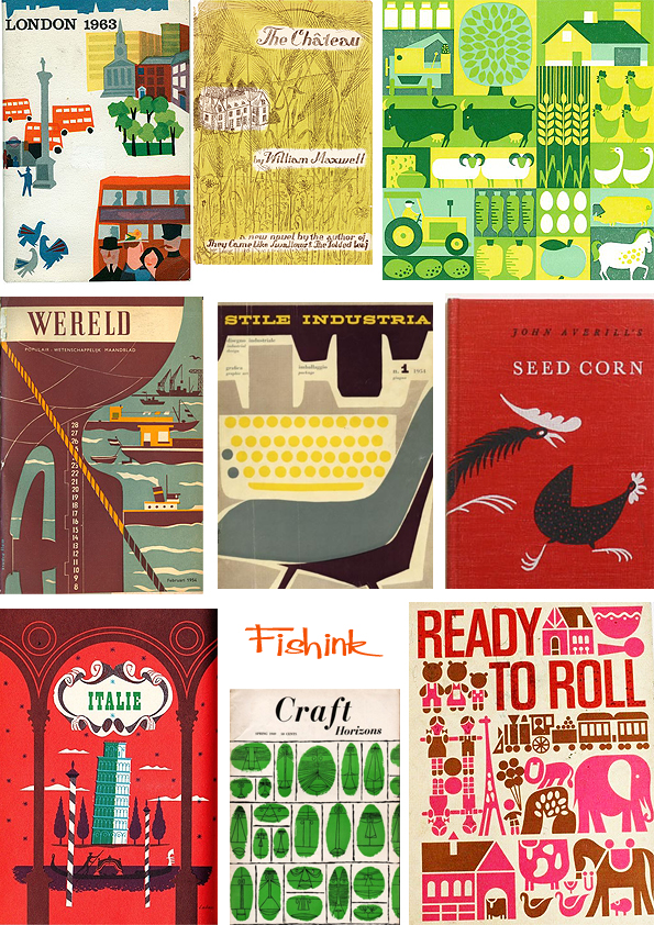
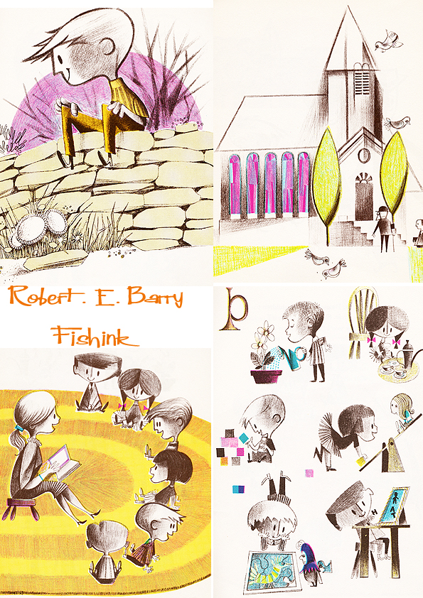
This happened across the board. Boys and girl’s books…
Travel …
How to… where to…
Books about relaxation and music.
Farming, industry and life in the city.
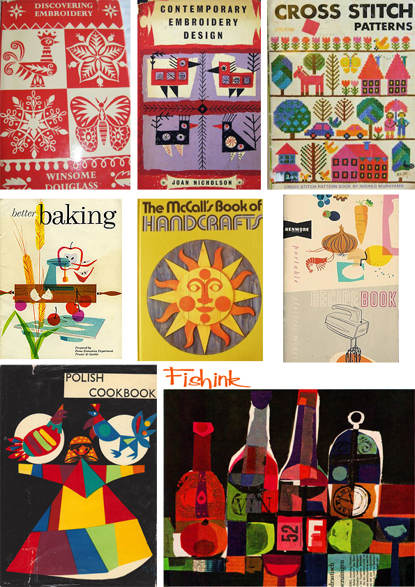
Even craft and cookery covers all got that special treatment .
Fab covers don’t you think.
More Gerald Rose Illustration
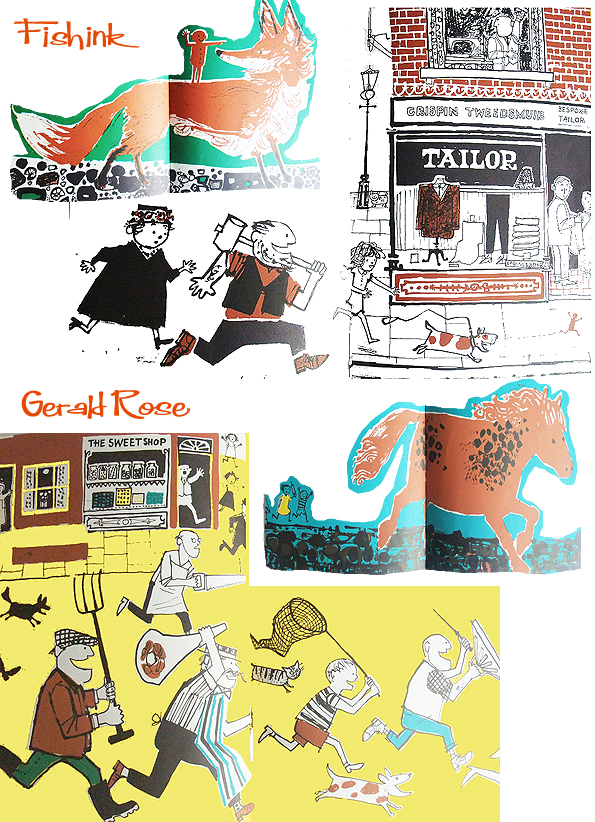
Gerald Hembdon Seymour Rose (born 1935) is a British illustrator of children’s books. He won the 1960 Kate Greenaway Medal from the Library Association, recognising the year’s best children’s book illustration by a British subject. The book was Old Winkle and the Seagulls, written by his wife Elizabeth Rose and published by Faber and Faber. I have written about Gerald previously here, but I thought I’d add a few new images as I’ve spotted them.
His images are always friendly, accessible and easy to understand what’s happening in the narrative.
I think Elizabeth and Gerald make the perfect team, no wonder they produced so many books together between 1958 and on into the early 2000’s !
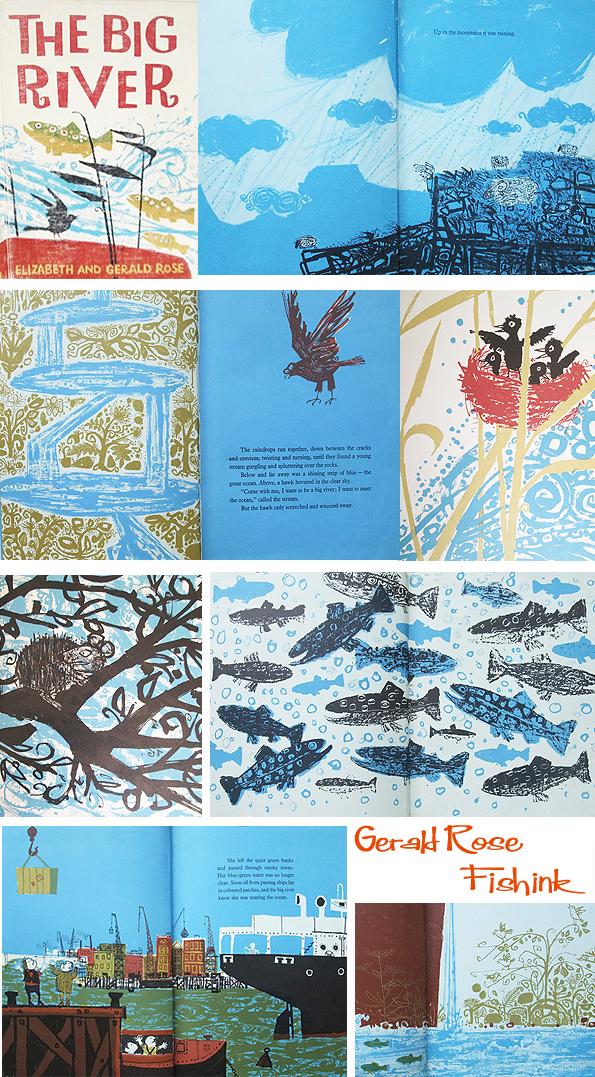
There’s a wonderful sense of nature and layering of colours and shades here.
Wonderful strong and textural illustrations in The Big River from 1962.
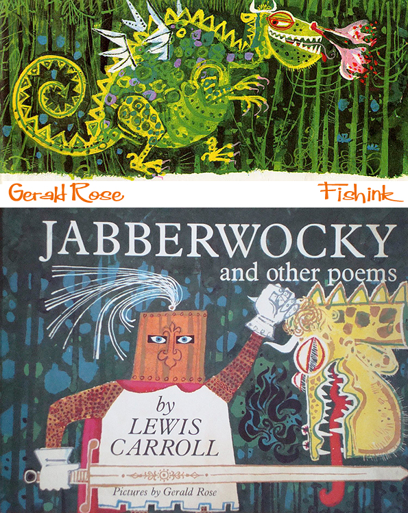
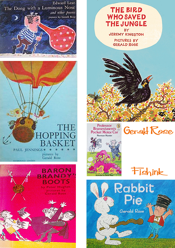
Here’s a few more of Gerald’s book covers, I love his Jabberwocky.
Thanks again to Hazel Terry over at the Art Room Plant for posting some great images of Gerald’s books. How many people do you know with Hembdon or Seymour as part of their name ? Such a talented man.
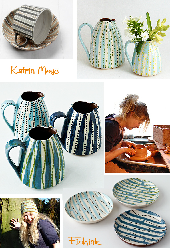
Katrin Moye Sending us dotty for her ceramics
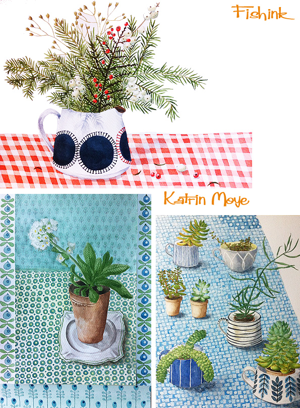
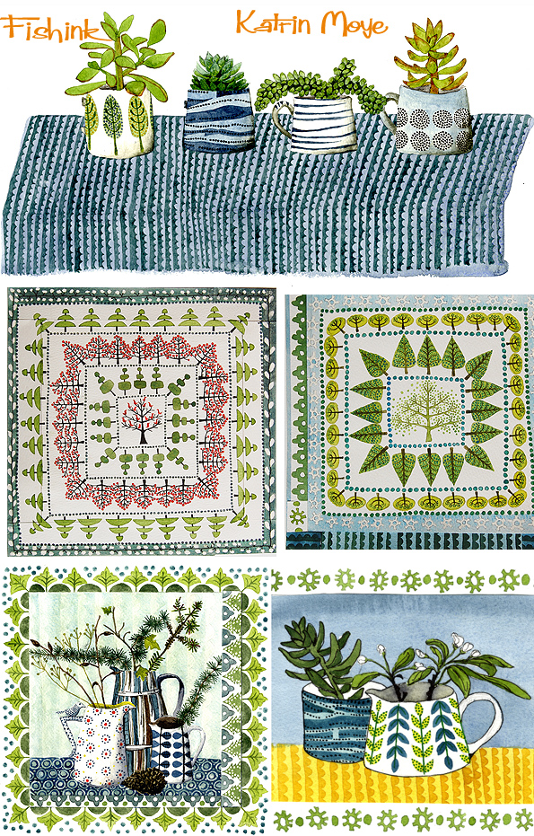
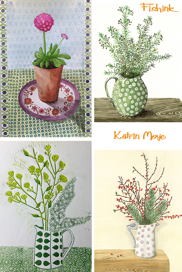
Katrin Moye creates such beautiful ceramics and watercolours. Here’s a few images of items from her past ranges.
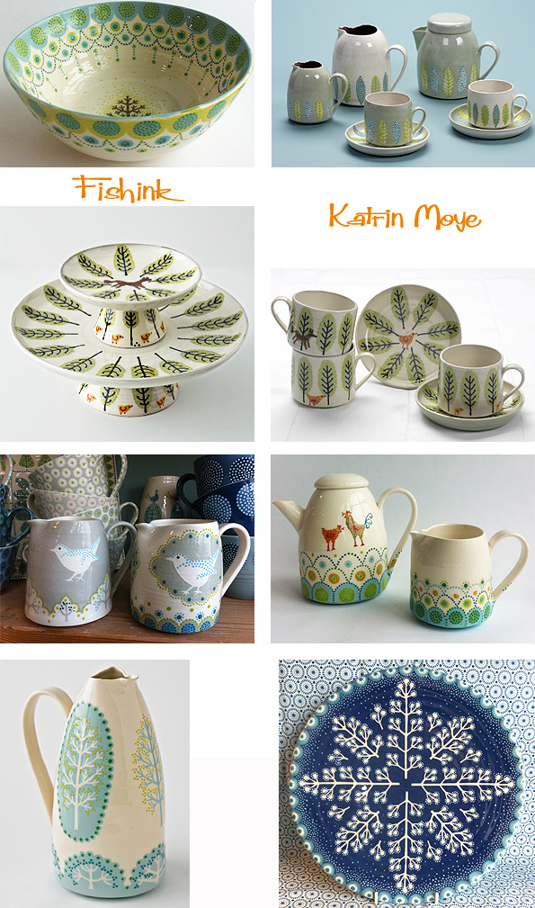
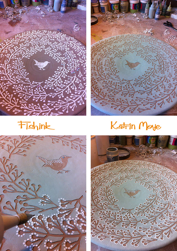
Presently, her work has developed into a different style. Using paper stencils and dots of glaze applied by hand, Katrin builds up these elaborate and almost magical designs. Inspired by natural woodland, farmland scenes and forest animals, she carefully layers delicate and harmonious colours and shapes.
To me, these designs appear christmassy, almost Scandinavian and visually bursting with a soft explosion of stars, that draws the viewer in to explore the work in more detail.
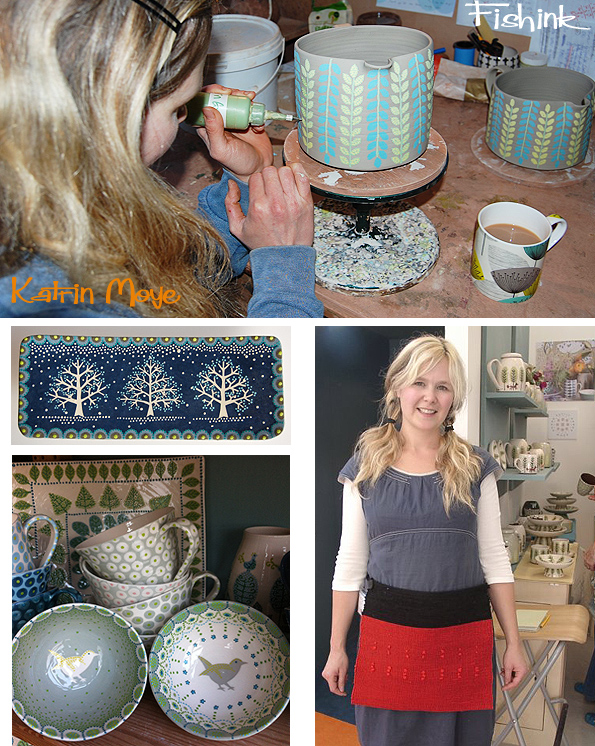
A few images of Katrin and her detailed work in progress.
She has also released a set of four 1960’s inspired designs, produced with transfers to cater for a mass market demand. Lovely work.
When she’s not creating masterpieces out of clay, Katrin is busy with her watercolours. Painting illustrations which reveal her love for pattern, foliage and light.
Katrin translates these beautiful watercolours into designs for greeting cards, you can see more on the Down To Earth site.
There’s more info and images on her website here.
Janusz Stanny Polish mid-century Illustration
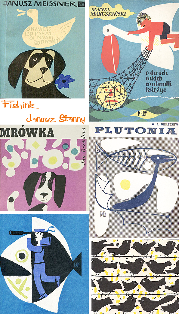
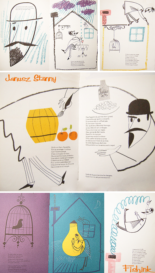
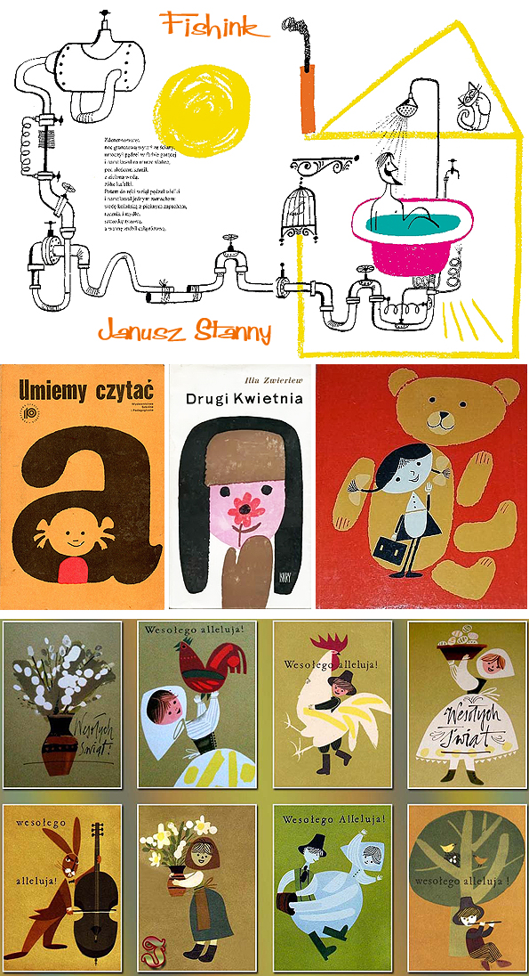
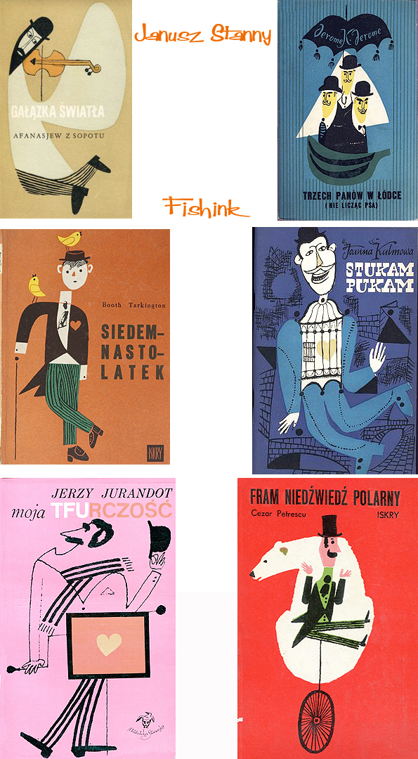
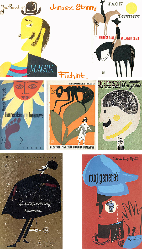
Janusz Stanny, was born in 1932. He is a legend in the world of Polish book illustrators, as well as satirical, he studied at the Faculty of Graphic Arts in Warsaw Academy of Fine Arts in the years 1951-1957. He graduated under prof. Henryk Tomaszewski. In the years 1960-1964 he was an assistant professor in the Laboratory of illustration, and from 1975 to his retirement in 2002, led the Design Studio Books at home faculty. In 1989, he received the title of professor. Here’s a few of his charming covers.
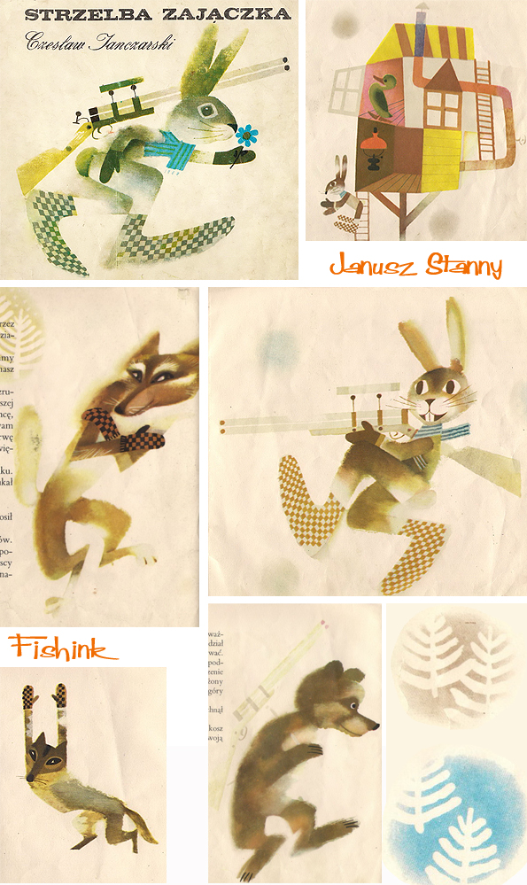
Rabbits with a gun, unusual to say the least !
He created a couple of hundred books. He made his debut in 1951 in “Pins” as a cartoonist. He published a drawing in “Around the World”, “World”, “Communications Cultural Rights”, recently in “Gazeta Wyborcza” and “Review”. He collaborated with many publishers as a consultant or graphic manager. He deals with graphics, drawings, posters, and is also a writer and author of animated films. However, the core of his work is an illustration.
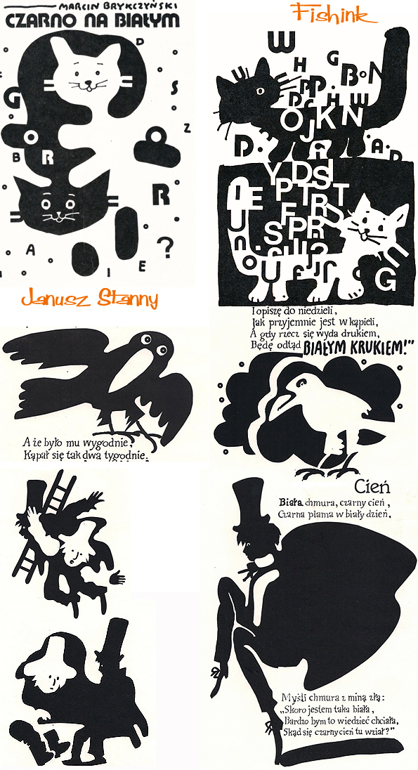
He has to his credit several hundred illustrated items for children, such as in the field of classical literature (among others. “Fables” of La Fontaine, “Pan Tadeusz” by Adam Mickiewicz, “Fairy Tales” by Hans Christian Andersen, “The Promised Land” Reymont ). Look at these fun and quirky drawings, I love his combination of the crayon and pen and ink characters.
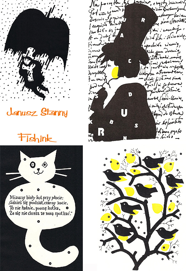
Janusz has had many exhibitions in Poland and abroad. He has won many awards in the field of book illustration (among others. “Premio Europeo” in Padua, Grand Prix illustrator art exhibition in Bologna, and a gold medal at the International Exhibition of Editorial Art (IBA) in Leipzig. His world must have been filled with men in Bowler hats as they feature prominently in his work.
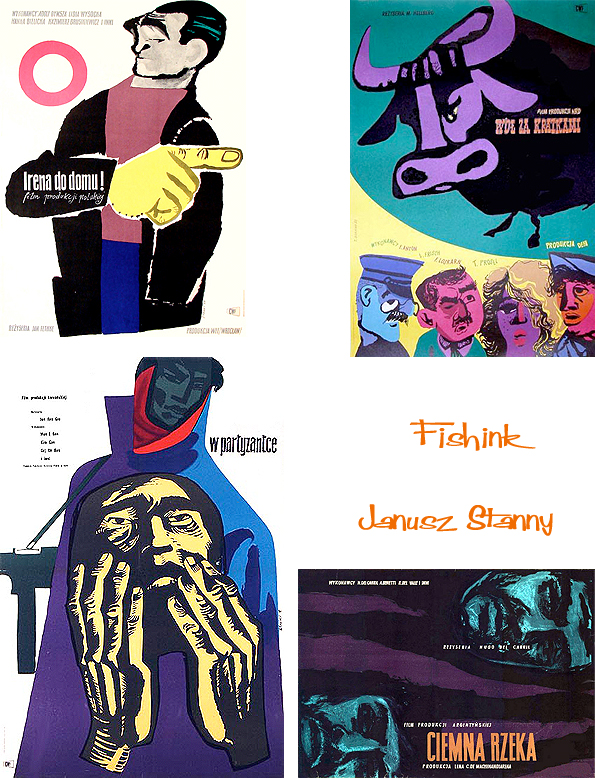
He also created film posters.
And a few more wonderful book covers. A skilled and creative artist.
