James McIntosh Patrick. Spring is in the Air !
Spring is definitely in the air and it’s a very appropriate time to talk about it, not only because there are snowdrops and daffodils out in the parks and woodland. But also because Spring is the very subject of my first guest blogpost for my agents site. Yellow House Art Licensing.

You can read the article here.
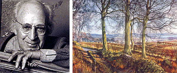
I had another fab day at the Walker Art Gallery in Liverpool last sunday. It’s such a wonderful space and the mood of the building is light, joyous and refreshingly uplifting for what I would call a more traditional style of Gallery. I had forgotten this painting (below) ‘Springtime in Eskdale’ by James McIntosh Patrick, but soon got a sense of how comforting it was to come across it again. For me his work has strains of Lucian Freud, Stanley Spencer and Pieter Bruegel all rolled into one. I love the perspective, use of colour and how James paints a tapestry of walls and fields that encourages our eyes to linger, explore and visually wander down those same lanes, that he painted back in 1935.

James is regarded as one of the greatest Scottish painters of the 20th Century. Born in Dundee in February 1907, his work has enjoyed a long and distinguished career. His father and brother were both architects and it was no real surprise when he enrolled in the Glasgow School of Art in 1924.
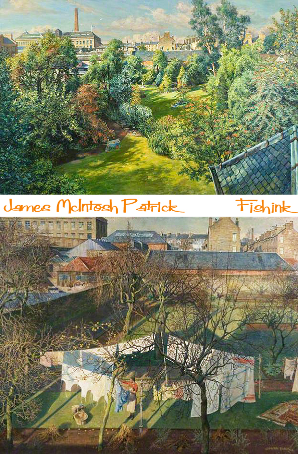
By 1927 he was selling etchings in London, and he exhibited for the first time at the Royal Academy whilst still studying. He left the Glasgow School of Art in 1928 and had won many prizes for portraiture and landscapes, and the prestigious James McBey Prize for Etching. The success of his paintings during the 1930s established his reputation, with many acquisitions made by public galleries and institutions. Since then his work has been displayed regularly at major exhibitions. I love his use of light here depicting Dundee High School.

In 1940, James McIntosh Patrick was called up into service with the Camouflage Corps, and was stationed in Africa during the Second World War. Upon his return to civilian life, he concentrated on exhibiting in Scotland, especially at the Royal Scottish Academy, and in 1957 became a full Academician. He started painting outdoors and loved it, which changed his working methods from then on. His work is full of detail and rich textures.
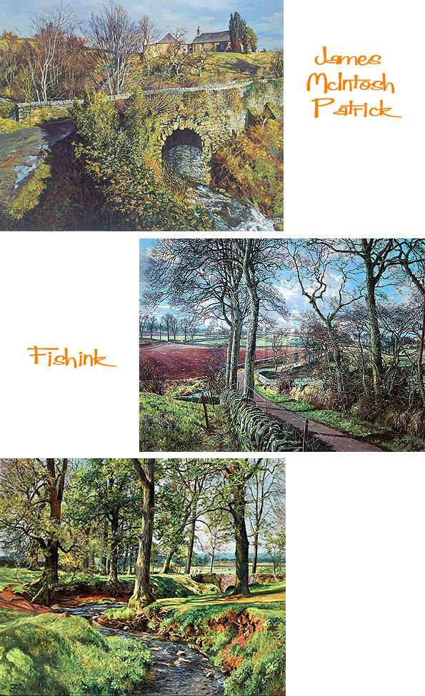
He captures the landscape around his hometown of Dundee so well. The light and shape of the hills and understands the movement of the land, it’s undulations and grassy patch-work fields.

The light and colours here are beautiful. We can sense that mid afternoon sunshine and the feeling of the summer months approaching.

Summer at last, but soon comes more wintery climes.

Patrick loved to paint out of doors, believing that his landscapes could encourage people to appreciate nature: “I don’t suppose there is much sentimentality about my paintings, but I have a deep feeling that Nature is immensely dignified when you are out of doors. I am struck by the dignity of everything.”

By the 1950’s he had perfected his style and technique in outdoor landscape painting and began recording his beloved Angus countryside on canvas, working in all seasons and all weather conditions.
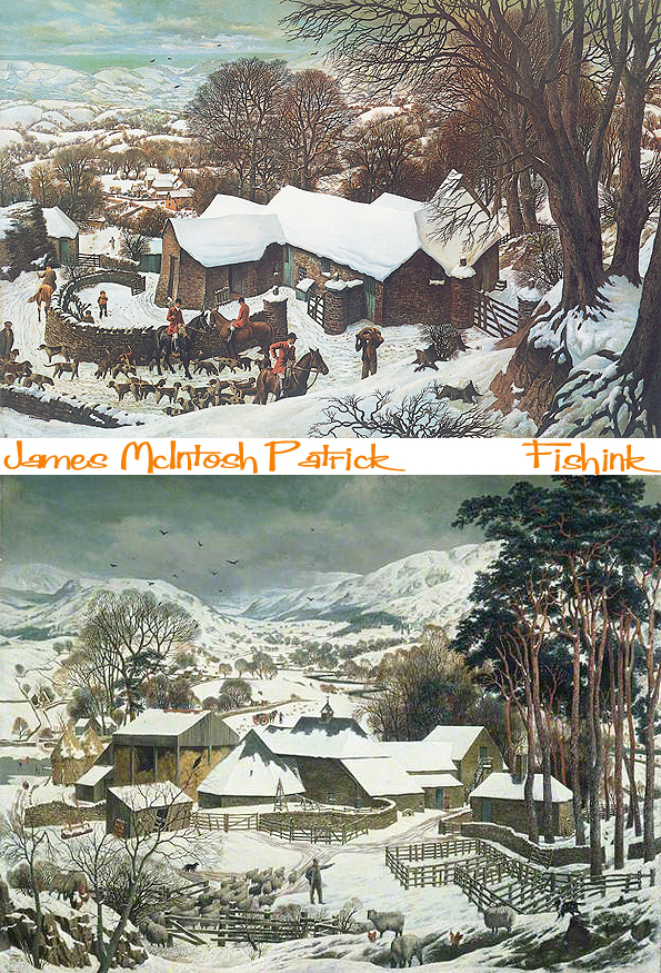
In the same way that Bruegel’s ‘Hunters in the Snow’ captures my attention in its use of space and the aspect of the landscape. The same happens for me in this last piece ‘Winter In Angus’ acquired by The Tate Gallery in the same year that it was painted, 1935, when James was just 28 years old. Stunning !

Only last week The Courier newspaper announced that some of James early drawings had been rediscovered.
Long may his work be rediscovered, I’ve certainly enjoyed doing just that.
Finally I just wanted to point out a fine tribute for the site that I received, after covering the work of Matt Dawson here on Feb the 14th. Thanks Matt : )
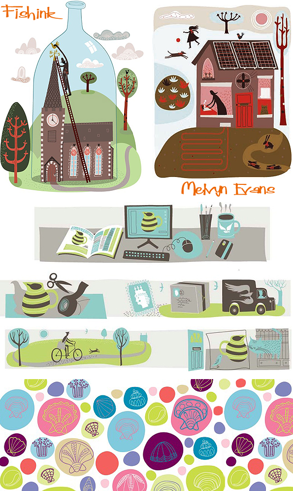
Melvyn Evans The Worry about Bees. Creative Illustrator

Melvyn Evans began his working career as a marine engineer, working mostly on submarines, but even then he was drawing and painting. After finishing an apprenticeship at Portsmouth Dockyard he went to Camarthen Art college to do a foundation year and then to Exeter to complete a degree in Illustration. Then onto Goldsmiths College in London for a year where he took up drawing classes at the Royal College of Art under the tuition of Bryan Kneale RA. During this period he started getting illustration commissions for magazines such as Elle, Red, Homes & Gardens etc. This generated illustration work for design, Sainsbury’s wine labels, Marks & Spencer food packaging and advertising work for Network Southeast, Mini Cooper etc.
“I’ve been illustrating ever since, and if I get a bad day I know it’s never as bad as working on those cramped noisy submarines.”
I contacted Melvyn to ask him a few questions about his present day career path.
Can you describe the start to a typical day in your working week ?
The day always begins with walking Bessie the dog. She’s a hyperactive working Cocker Spaniel and quite a socialite, she’s always happy and when she’s excited she tap dances like Bruce Forsythe (she even has the chin). I love getting out first thing in all weather, it’s a great way to formulate ideas. The countryside around where I live is very inspiring even though we live close to London. There are many ancient trees, woodlands and copses. Sometimes in late January or early February the light as the sun rises is spectacular, a red orb silhouetting the trees, or a shaft of bright light penetrating through the dark purple clouds.
How did your creative path develop to bring you to where you are today? Did you always know you wanted to illustrate and be an artist ?
I think I always knew I wanted to be an artist, although I didn’t know which path this would take. My mother is an artist and we always had all the drawing materials at hand, and she didn’t mind the mess her four children made. We’re all artists now, from jewellers, woodblock engravers and etchers. My father was an engineer, very practical and inventive, I think he gave us a lot of confidence in our abilities, something every artist needs.
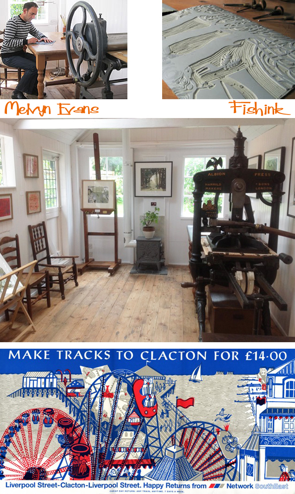
What a fabulous studio space Melvyn has to work in. These images show his old press (top) and the new Albion Press (below) built in 1860.
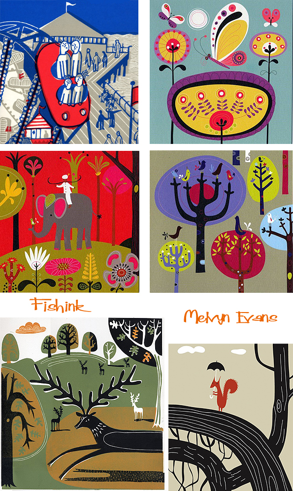
There is a mix of lino cut (hand rendered) work and photoshop or illustrator created illustrations amongst your portfolio. Is there one way of working that you prefer or do you see equal merits in both ? Does one provide a welcome change from the other ?
I started out as an illustrator whose style was relief printmaking, and I worked like that for nearly fifteen years before touching a mac, so I really like hand making and mark making, cutting and getting my hands dirty. I think this is my natural way of working and the way I prefer working. I think this goes back to my childhood with all the crayons, paint and glue covering the table and not knowing which to use first. Having said that, I do think the mac is wonderful as another tool to allow artists to create, scanning in drawings and then quickly blocking in colour alongside colour, testing combinations altering compositions. I think the ipad is the next stage forward, I’ve used a Wacom tablet for years, it’s good but it’s not like drawing on a surface. The ipad with the right stylus works really well, and there are some great drawing and painting apps, I’ve sketched on the beach at Whitstable and loved using it.
Some of your work looks like it’s specifically created for children. Along with the greeting cards and stationery products you’ve worked on, are these areas that you would like to expand into or perhaps create more one off commissions that were interesting asides from your preferred forms or illustration ?
I’ve been commissioned to create cards and other stationery products over the years. I’d quite like to expand the print work into this area, there are some great companies like Art Angels, producing cards from the artwork of printmakers. Another area I’d love to explore is patterns for textiles and papers, collaging the print with paint, texture and line.
Melyvn kindly shares with us, some of his initial sketches for a series of printed pieces called The Worry Story .
He says “I would love to create a children’s book at some point, I have ideas in sketchbooks dotted around the studio. I created an image for a book I had in mind called The Worry, in which worries were tangible things that could be lost and forgotten. It’s something I would to love to explore further, filling the book full of relief print illustrations and almost making the books limited editions for adults and children. The Worry story is centred around the the little character in the print. He has a worry in his bag but he has no idea why it’s there. At night, in the dark he can see the bag on the table by the bed and the worry seems to get bigger, but in the morning it’s still there same as it was previous day. The story goes on with a series of encounters and in one he is so engrossed he puts the bag down and forgets where he put it. So now he’s finally free of the bag and the Worry that was in it. ”


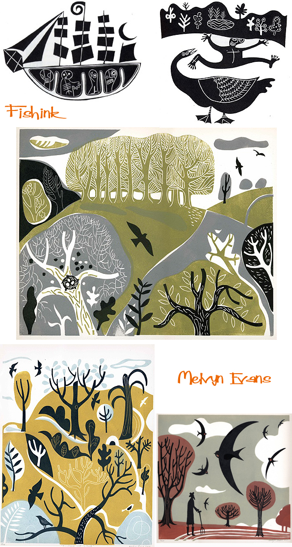
Some lino-prints featuring the London shorelines, Whitstable and Hastings.
Who’s work, would you say, continues to inspire and amaze you ?
There are so many artists, I love looking at new paintings or discovering new work by artists I’ve admired for years. I recently bought a catalogue of Henry Moore lithographs of Stonehenge produced in the 1970’s. The drawings are beautifully, dark and heavy, the almost abstracted forms of the stones stand like sentinels or lie like fallen giants. I’ll list a few favourites but it’ll read like a wish list of paintings prints and drawings I’d like to have on my walls. I think my first is the early work of Samuel Palmer, the woodblocks of Graham Sutherland, the work of Henry Moore, William Scott, Ben Nicholson of course Edward Bawden and Eric Ravilious, John Piper, Terry Frost and then bringing it up to date Laura Carlin, Emily Sutton, Ed Kluz, and Charles Shearer. It’s quite a list and these are only a fraction of the artists who have really inspiring qualities to their work. Recently your Fishink blog introduced me to the Chinese artist Zhou Sheng Hua who’s work is stunning. There are so many gems yet to be discovered.

Are there any companies that you’d like to create some work for ?
I like companies that give illustrators and artist a lot of creative freedom. I’d really like to create textile designs for St Judes Fabrics and sell prints through the St Judes Gallery. They have a fantastic group of printmakers who contribute to their textile designs. I think they’re very much like the Omega Workshops and the Edinburgh Weavers, allowing artist to create and interpret designs. I’d also like to create a cover illustration for Penguin which sits within the classic and timeless Penguin paperback design.

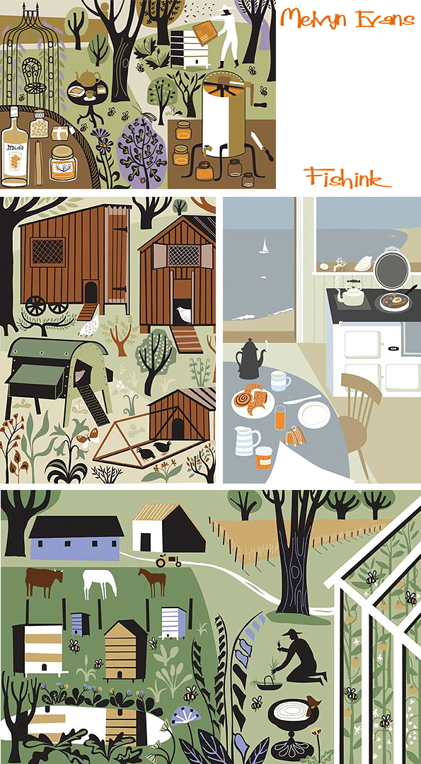
I really like your collection of work featuring bees and hives in the garden. Was this something inspired by your personal interest in the area or prompted by the increasing talk about their dwindling populations in the world news ?
Up until a few years ago my parents kept bees, so I’m aware of the devastating effects of the verroa virus, genetically modified crops and climate change have on bee colonies. So I was really pleased to be commissioned to illustrate a book called ‘The Wisdom of Bees’. I produced the front cover as a lino print, and the inside illustrations are all digital, there wasn’t enough time to complete all the illustrations as prints. It was a wonderful commission I really enjoyed illustrating the different rural setting and discovering more about the small insects we all rely on.
Nature plays a large role in your work. Is this due to a personal interest / what happens to surround you / or what has a large appeal to your creative audience ?
Nature is very important in my work, as I get older I think its importance has grown. Its relevance is more apparent, especially pieces like ‘Le Morte d’Arthur’, or ‘The Greene Knight’. These are figures in the landscape relating to our aural traditions and sense of place. I feel a connection with nature, sounds very hippy I know, but I feel it’s a similar kind of connection I see in the work of artists like Henry Moore or John Piper, where there’s a search for a deeper understanding of landscape history and prehistory.

Do you have any specific plans for the future ?
Thinking further ahead I’d like to exhibit more. It’s something I’ve only just started doing even though I’ve been illustrating all these years. It allows me to concentrate on my own ideas rather than commissions. The other thing I’d love to do more of is paint. The trouble is I’m addicted to painting, I don’t do it very often because I know if I pick up a brush I can’t put it down. Oils are my favourite medium, they’re great for working into, pushing and pulling the paint around, marking the surface with scratches and textures until the idea forms into something concrete. I think this would be my ideal for the future, continuing to explore illustration, but spending more time delving into the infinite possibilities of printmaking and painting.
Thanks Melvyn for sharing your work and thoughts with us. I hope some of the items on your ‘future wish list’ come to fruition. Superb work, I’d love to see more of The Worry Story, and some more textile design work too.
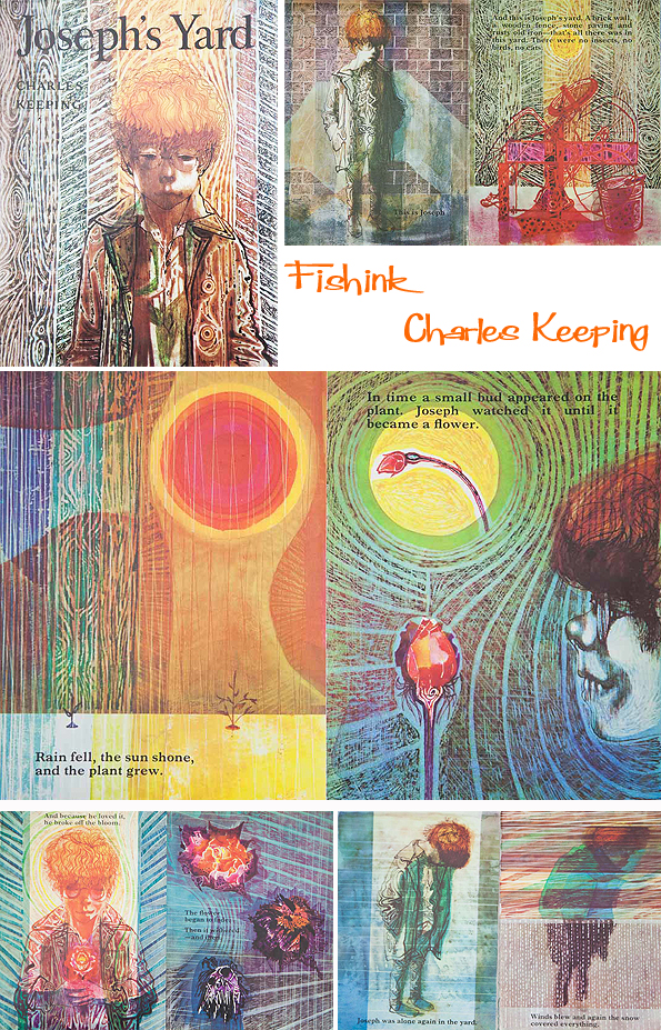
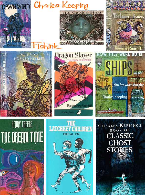
Charles Keeping Illustrating paintbox picture books
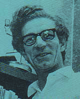
Charles Keeping (1924-1988) an illustrator and lithographer, produced dynamic and emotive images. Born in Lambeth, East London, his secure and happy upbringing had an unusually important effect in shaping both the man and the artist. Entering a working class family, there was no obvious route for Charles to get into art school. He spent his childhood in a house that overlooked an active stable yard, and became a frequent and accurate observer of horses and carts. He attended the Frank Bryant School for Boys, in Kennington, leaving at the age of 14 to become apprentice to a printer.


He joined the Royal Navy Army at the age of 18, and fought in the Second World War, serving as a wireless operator. He received a head wound which he became convinced would make him become a Jekyll and Hyde figure, but after being institutionalised, he recovered. Determined to pursue his love of drawing, he applied several times to study art at the Regent Street Polytechnic, but was unable to get a grant. He kept on applying, supporting himself by reading gas meters, and continuing drawing in the evenings. It was at the Regent Street Polytechnic (1946-52), where he met the designer and illustrator Renate Meyer, whom he later married. His books explore amazing roads into colour and texture, whilst dealing with solitary, often lonely figures in their tiny worlds.

He took various jobs, including cartoonist on the Daily Herald, before starting work as a book illustrator. In 1956, he was commissioned by the Oxford University Press to illustrate stories for children written by Rosemary Sutcliffe, and with the encouragement of the doyenne of children’s book editors, Mabel George of OUP, was launched on a career which for three decades made him one of the best known and more prolific illustrators (1960-1980s). He made brilliant use of colour and the new printing techniques, using a mixture of gouache, tempera, watercolour and inks. He was an early enthusiast for Plasticowell, the grained plastic sheets designed by the printers, Cowells of Ipswich, for lithographic illustrations.
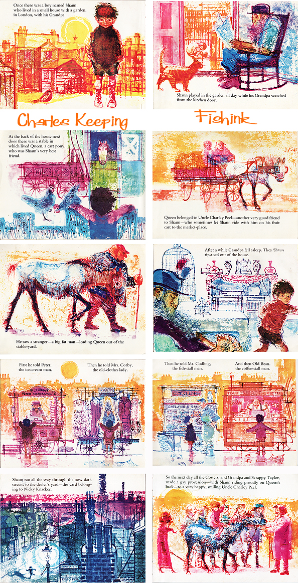
Charles Keeping was always concerned with the lot of the working horse: having been born in Lambeth, he was surrounded by them. He wrote two picture books, Black Dolly and Sean and the Carthorse about ill-treated working horses, and one Richard, about a working police horse whose treatment is always fair. Illustrating Black Beauty must have been something of a dream commission: he dedicated his version “to all those concerned with the care and welfare of horses and ponies.”


Keeping won the Kate Greenaway award for Charley, Charlotte and the Golden Canary (1967), and again for The Highwayman (1981); he was a prize-winner in the Francis Williams Award for Tinker, Tailor (1968), and for Kevin Crossley-Holland’s The Wildman (1976); and he won the Emil Award in 1987 for Jack the Treacle Eater. He became particularly well known for his work on historical novels for children, especially tales by Rosemary Sutcliff, which often depicted Vikings, men in battle or war situations. Or similarly for Leon Garfield books about ghosts, creatures from the dark and other sinister characters.

His commitment to the immense project to illustrate the complete Dickens for the Folio Society was total, and he completed it just before his death on 16 May 1988. He became the first illustrator to complete a full edition of Dickens illustrated by a single artist. His wife Renate, also an artist, set up a website called The Keeping Gallery so that both of their work can be treasured.

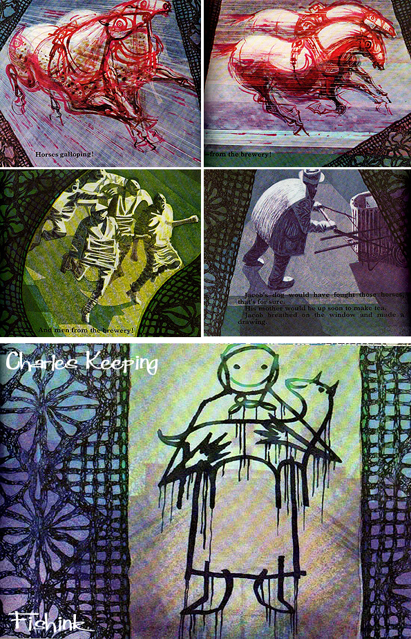
Have you ever seen such colour in books before ?

Thanks to Matt for sending in these scans after seeing this post.

Amazing use of rich shading and textures. Wonderful work Mr Keeping.
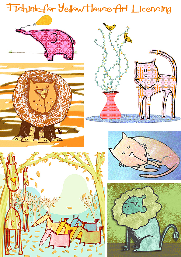
Fishink Card ideas
I’ve had a busy few weeks lately, really enjoying designing a new range of greeting card ideas to show on my agents site Yellow House Art Licensing.
They haven’t even seen them yet, so I’m giving you a sneaky preview ! Everything starts off with a sketch, either on paper or on the mac. I’m still thinking about animals, because I believe they make so many people smile. Warning …. rough sketches below ! Lol

These roughs, then get manipulated, sometimes not, occasionally totally reworked, until I get the look that I want. Colour and decisions about the quality of line are made at this stage too.
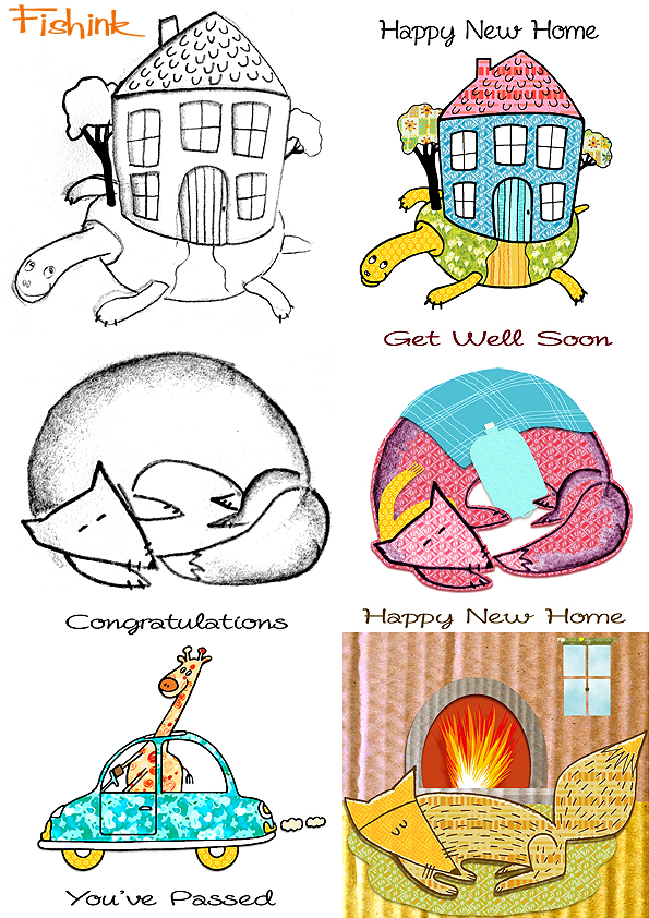
I’m even thinking about other reasons why you might buy a card for someone. Reasons for which there may not even (yet) be cards for !!
How often have you known a friend to be feeling sad or pretty low and you wanted to send them that perfect card, that said all the right things and managed to cheer them up at the same time ? Well this is where I was going with my thoughts here.
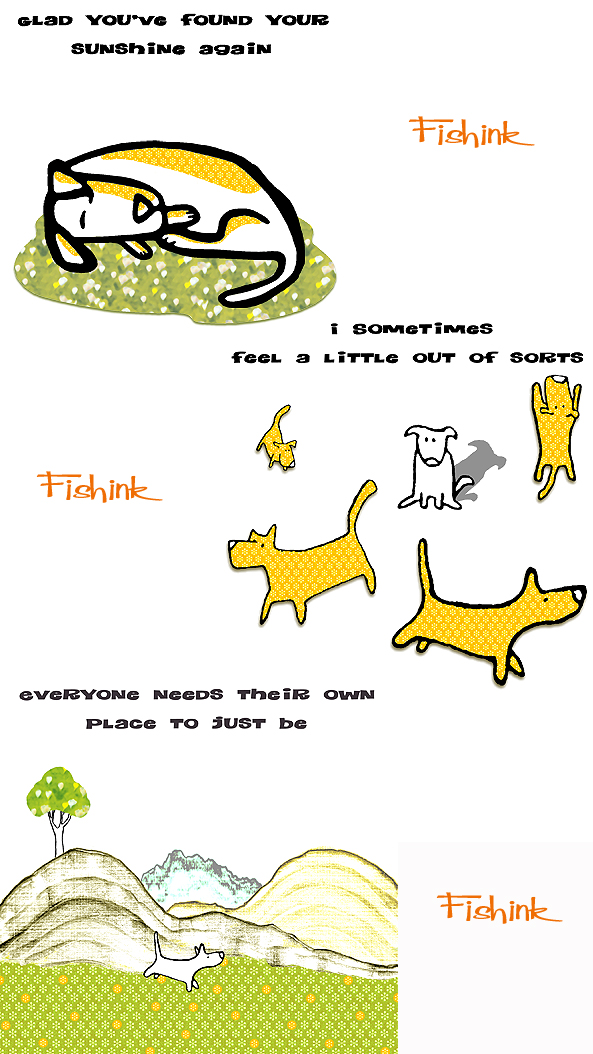
And finally something a little more obvious ! What do you think Fishink peeps ? Would you buy any of these ? All comments appreciated.

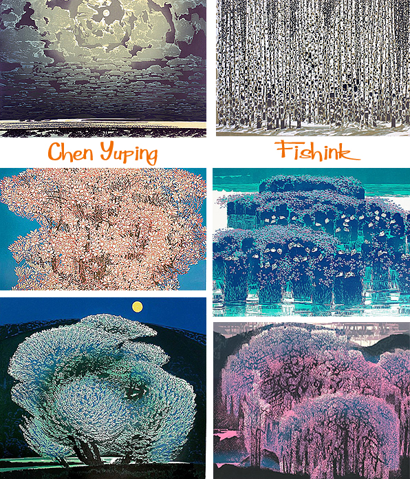
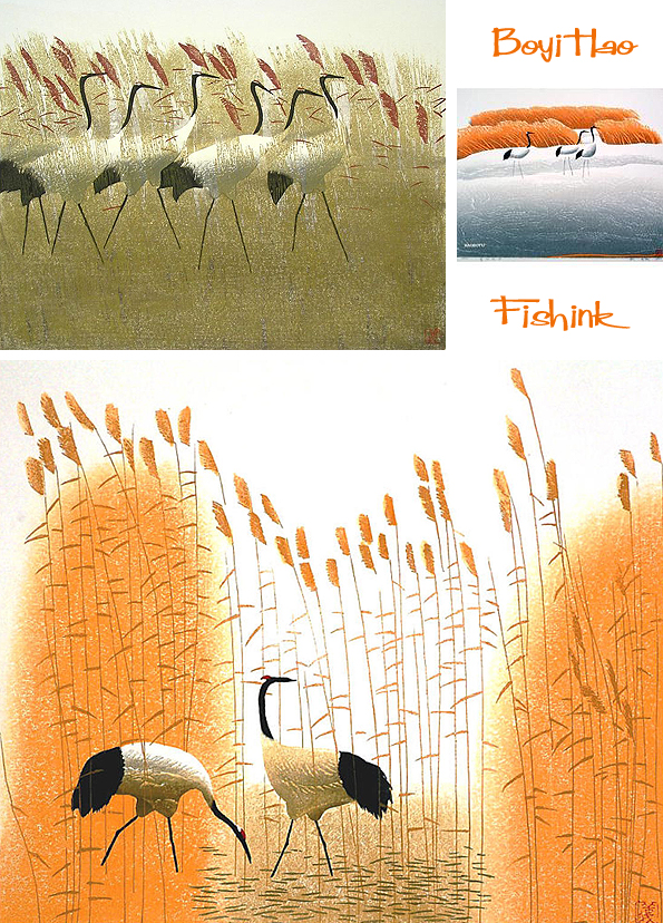
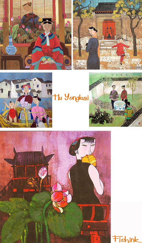
Chinese Artists Chen Yuping, Hao Boyi, Hu Yongkai, Zhou Sheng Hua
I now have over 150 blog followers who subscribe to my blog and get notified each time I post something, you too can sign up using the button on the right of my post under the prompt ‘Follow Blog Via Email’. One of these followers has a blog which I also follow called Cuaderno de Retazos or Patchwork Notebook as the translation goes. They have an amazing knowledge of Eastern art and a huge listing of Chinese Artists whom I know very little about. I decided to look into the work of just a couple for today’s post.
The first being the work of Zhou Sheng Hua He is one of the most famous chinese modern woodcut artists. He’s part of The Great Northern Wilderness School of Prints. Sadly he passed away when he was only 49.

He has amazing control over his lines and a keen understanding and appreciation of the landscape that surrounds him. Looking at these prints you gather a sense of the solitude and silence that accompanies this way of life.

The next artist is Chen Yuping, born in 1947, and who came to art quite late in his life.

He had studied Hydraulic Engineering and worked as a hydraulic technician in the transformation of the “Great Northern Waste Land” into an agricultural centre. In 1973, he had begun to dabble in printmaking and in 1983 the hobby turned into his new profession, after he had completed a course in printmaking at the CAFA (Chinese Academy of Fine Arts) in Beijing. Since then, he has made his way inside and outside of China.

His usual edition is around 100, relatively high for a printmaking artist in China, where a commercial market has not been existing until only a few years ago. It shows the appreciation that he has been enjoying in China and elsewhere since the 1980s. His work uses such strong and vivid colours. Chen Yuping works in the traditional woodblock technique and uses oil-based inks.
The next artist is Hao Boyi who is the leading artist of the Bei Da Huang Art School. Bei Da Huang is a remote province in the North-East of China, known as the former wastelands. In the 1950s hundred thousands of young Chinese were sent to this remote province to transform the wasteland into an agricultural area.

The art style of Bei Da Huang artists is characterized by the landscape and the experience of its cultivation. Bei-Da-Huang is an area of huge plains with cold and clear nights. Chinese people say that even the night sky has a different colour which is often a dark intensive blue.

Hao Boyi’s art works reflect the nature of his home province to an incredible perfection. On some of his images you can virtually feel the cold. On others you seem to experience the warmth that comes in spring time and brings nature back to life. Bei-Da-Huang has even a short cherry blossom season. His birds and the use of palms, stems and leaves becomes almost textural, there is a lovely serenity here too.

Matt Dawson Illustration with explanation

Busy artist and freelance Illustrator Matt Dawson is far from wandering around with his head in the clouds (even with the Llamas !) Although a little shy when it comes to discussing himself, his info on his twitter account says ” I’m a freelance illustrator and much prefer drawing things than talking about myself ” However I luckily managed to twist his arm and answer a few prepared questions for you all.
Please start by telling us a little about yourself. What led you to draw and become an illustrator and a brief history of the road that led you here. Your earliest memories of drawing.
” I’ve always drawn, as far back as I can remember. Despite the never ending struggle to capture on paper what you have in your head, it’s always made me happy to draw, and I try to do it everyday, even if it’s just a doodle on a scrap of paper. Somewhere at home my mum still has all those scribble drawings from primary school and earlier. I found one a while back I really liked… my dream home with a harrier jump jet landing pad on the roof ! My earliest drawing memories are probably kneeling on the floor at home, trying (unsuccessfully) to get crayola wax crayons to lay down a smooth flat colour ! I’d have loved marker pens as a kid, though it would have proved pretty expensive I imagine. It’s funny but now I’d much rather have the textures than the smooth colour fills. From art and design A-levels, through a foundation course in art and design to a BA degree in 3D product design, I’d never planned a career not related in some way to drawing. ”

Quite a lot of your work features a combination of words and imagery. Are you often thinking about word derivations or pondering on funny ways to see something in a different way ?
” I suppose there is a frustrated author in me. They say everyone has a book in them and I have notebooks full of story outlines and sketchbooks crammed with characters, locations and storyboards. The words are a little trickier. I’ve been known to dabble with the odd (and they usually are) rhyme or two (although poetry is a mystery to me). I do love to marry up words and illustrations, whether it’s just a title or a more involved piece of typography within the illustration itself. Typography alongside images can be an economical way to get your subject across… a picture can speak a thousand words but, sometimes, a word or two here and there saves you drawing a thousand pictures. I just like the marriage of words and pictures in a children’s book, or on a book’s cover you shouldn’t always show visually what’s in the accompanying text or, conversely, write down what the illustrations can better show. I also really enjoy hand drawn typography and some of my strongest creative influences such as Ronald Searle or Edward Gorey, or Saul Bass come to it, are masters of words and pictures, whether it is what the words say or what they actually look like too, the letter forms themselves as illustration. Some words are just plain funny… ‘smorgasbord’ always makes me smile and I’ve yet to find a way to illustrate it to my satisfaction. ”
How do you decide what to draw each day, do you have a plan or formula to stick to ?
” When I have project to work on there is no problem. I know, for the most part, what I must do that day and I can work ‘on rails’. If I’m between projects I just like to keep myself creatively active in some way, whether it be a more involved personal project (say a self directed book cover or a screen print design) or maybe just a quick sketch or five on scraps of paper. Maybe hand drawn typography on my shopping list (this is actually a disease I’ve picked up and short notes can take me more time than they ought to complete!) or some photography. I always have a sketchbook on the go but, increasingly, I find myself working on loose sheets of paper. It’s so much easier to make use of several reference drawings at once side by side, instead of flicking between several sketchbook pages, and, more importantly, it’s much easier to scan loose leaf work into the computer. You can also pick your paper type too for the drawing / painting you need to do. I also find myself using greaseproof paper a heck of a lot for compositing together elements. It’s almost as good as tracing paper (and far cheaper) for having layout drawings underneath to work to… and I kind of like the slight cloudiness greaseproof gives as opposed to tracing paper as you aren’t tempted to accurately match your layout underdrawing exactly… keeps things fresh. I do miss having my sketchbooks as objects though, like a visual diary. I try and make an effort to draw something everyday, just because it makes me happy and it’s a ‘muscle’ I need to keep flexed not flaccid. Example… today I brush pen sketched (pentel brush pen) … for no particular reason save it was there and I like the design… my toaster for a warm up sketch… It almost doesn’t matter what I draw, so long as I draw something… I’ve also done a batch of camera ink sketches in a similar vein too. Style wise they are vastly different from my other illustrations and they are just, for the most part, pleasant exercises for the joy of just drawing, but the observational drawing, dry brush texture and looseness of line bring something to my regular illustrations I hope ”

How much does humour play an important role in your work ? Do you ever get uninspiring commissions that don’t call for that fun element that your work en-captures ? What was your fav commission to date or who would you like to work for / with ?
I’d say humour is a vital part of what I want to achieve with my work. Even if the brief doesn’t call for ‘slipping on a banana skin’ to the sound of a swanee whistle I’d hope my visual approach to a subject has a quirkiness that, when appropriate of course, raises a smile and gets the message across. I suppose illustrators do, to some extent, get pigeonholed by their approach and past work and if I end up being seen as quirky, well I can think of worse things.
Favourite commissions to date…. well I’d like to think I find something to like about each project I work on as there is always an opportunity to inject a little of what makes me tick into the job. Of course it goes without saying some projects stand out more than others. Some are a joy to work on, others more of a challenge. For example, a while back I seemed to have cornered the market in magpie themed company logos of all things. It seemed that everyone who was planning to open a jewellery business found the first magpie logo I had designed on google images and wanted something the same… only different. I don’t exaggerate when I say that I easily had enquiries well into double figures and I could have sold one particular, already sold, design several times over. I also had to nicely ask one small business to stop using one of my existing magpie concept sketches without permission. I never look a gift magpie commission in the mouth (well beak) but, after one magpie logo for sorrow and two for joy, I can think of several emotions for five plus magpies… !
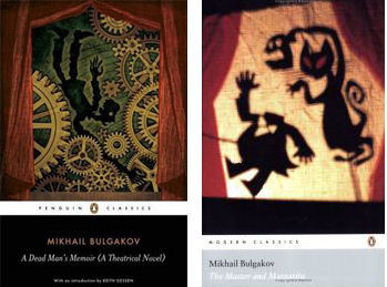
Stand out favourite commissions….? Well I love doing book covers. The Mikhail Bulgakov covers for Penguin books were an immensely satisfying project to work on and Penguin books were a dream client and a delight to work with. I really enjoy the process of reading the text for clues as to how to distill essence of the book for it’s cover. Then you have this established set of requirements for the book itself, cover size, spine width, endpapers legibility on shelf…and so on, all to marry with the internal text. Hopefully, if you do things OK the cover can augment the writing and bring something new to that edition. There’s nothing wrong in judging a book by it’s cover I say… though my bookshelf is overloaded and I have my reading list set for the next twenty years ! ”
Who or what would you list as your influential artists / items that inspire your work ?
” Well in no particular order, and this list grows with every google image search I do: Walt Peregoy (his colour design for 101 Dalmations- one of my favourite animated films- are just breathtakingly good!), Tom Oreb (a brilliant character designer for Disney, UPA etc…), Ed Benedict (genius character designer and Layout artist, Yogi Bear, Flintstones etc…), Jim Flora (amazing mid century album covers), Mike Mignola (perfect use of layout, graphics, line and colour in storytelling), Egon Schiele (terrific fast paced yet assured linework) . Saul Bass’ film titles, Mary Blair; especially her work on Disney’s Alice In Wonderland colour design, Maurice Noble’s layout and colour design work for Warner Bros, UPA studios animation design, Chuck Jones pencil sketches, Alice and Martin Provensen’s book illustrations, ditto Gerald Rose, ditto Eric Carle (being read The Very Hungry Caterpillar is one of my earliest book memories) , ditto Miroslav Sasek, Roc Riera Rojas… His Don Quixote illustrations in particular are superb, Benton Murdoch Spruance’s Moby Dick lithographs, and Rockwell Kents epic Moby Dick illustrations too, Ben Shahn’s lovely loose drawings, Ronald Searle’s draftsmanship, Joan Miro’s shapes, ditto Matisse, Paul Klee, Edward Hopper, Alexander Calder’s wire sculptures, David Weidman’s screen prints and editorial illustrations, Edward Bawden’s lino cuts, Willie Rushton’s cartoons, Edward Gorey’s haunting and sometimes enigmatically baffling words and pictures, Tove Jansson’s otherworldly stories and visuals, Raymond Briggs (Fungus the Bogeyman was one of my favourite books growing up), Quentin Blake, especially his latest work outside of children’s books, Pacific Northwest Canadian and Inuit prints and sculpture (perfectly observed distilled character design and beautiful touches of humour, similarly Australian aboriginal artwork, 1950’s / 60’s homeware (espcially Lucienne Day and Susan Williams Ellis, Kay Bojensen wooden animals, Danish homewear… … I could, and would, go on and on… Google image search is a blessing and a curse! lol ”
Thanks Matt what a fab list, certainly a few for me to look up in there too !


What first inspired you to start you making little creatures i.e.’egg box rhino’ , os this something that you can see some future work in or just to satisfy some old Blue Peter memories ? lol
“Well there’s only really been two or three such creatures, two of which (rhino you know, and pinecone pangolin) were done for monthly submissions on a group blog I co-started with a couple of friends called a little bit bunny (I’d forgotten about toilet duck elephant! till now… I wouldn’t bother mentioning this last though… many moons back and best left there too…). Both the rhino and the pangolin were just meant to be surprising alternatives to the usual illustration for the group blog… and a prime reason for establishing the bunny blog was to shake things up creatively a bit each month and produce that months chosen creature ‘a little bit’ skewed from the norm… and what could be more skewed than use an egg box or pine cone. Both were spur of the moment choices and it’s good to work without a safety net and jump into things without any prior planning from time to time! I wouldn’t say I had a grand plan to use such an approach in the future but, that said, I had fun doing them both and wouldn’t rule out more of the same. It’s all just about being creatively active, whatever that might be.”
” It just occurs to me, on the photos of my book shelf you might notice a grey boxer dog head sculpture. Well this a rough resin cast I did a while back from a soft wax sculpture of my pet. I’d love to cast it in bronze someday! I also have a great interest in primates and there’s a Gorilla death mask online I’d love to buy and use as sculpt ref for my own Gorilla head sculpture one day!! ”

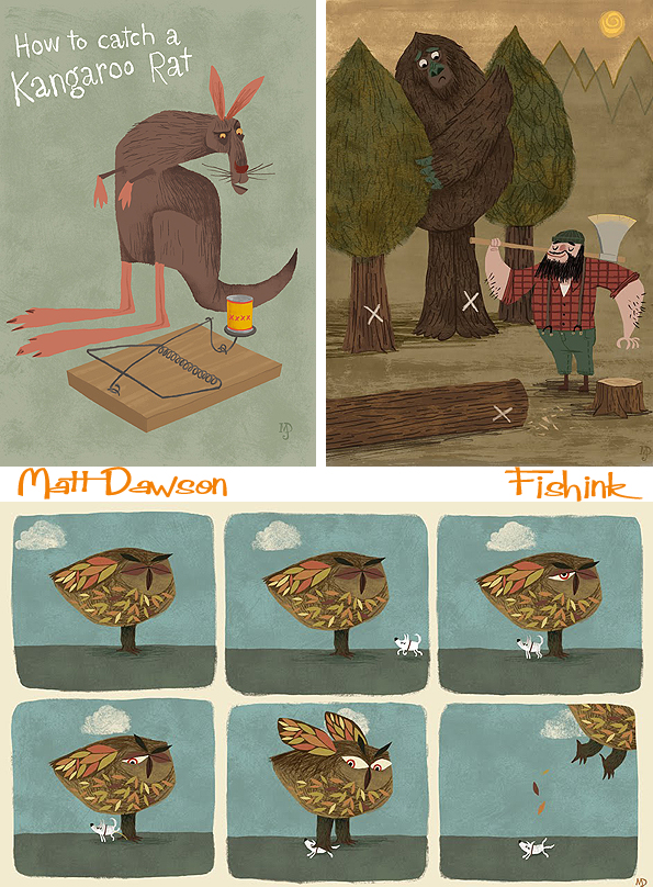
There’s always a lot of sketchbook work that goes on ‘behind the scenes’ in the life of an illustrator. You can see some of the thought and illustration processing here.
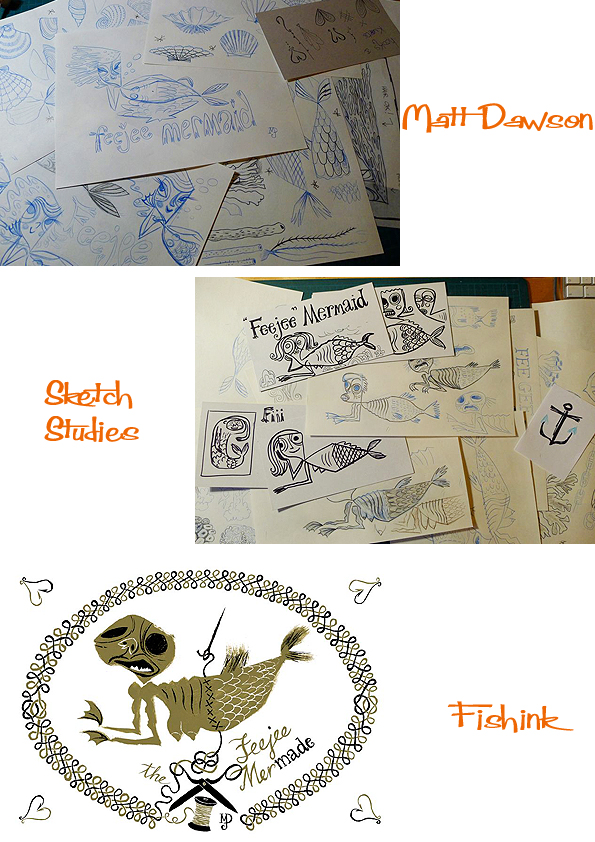
It’s always exciting when an illustrator shows their sketchbook pages. How often do you work initially in a sketchbook and how important is it for you to work in this way ? Is this how you ‘brainstorm’ your ideas ?
” As I mentioned earlier, my sketchbooks now tend to be a pile of loose leaf sketches for each project. I miss the compactness of having a bound sketchbook but the advantages of having everything on loose sheets makes it worth it. My preferred way of working means I love to brainstorm ideas out via sketch after sketch (save for the odd improv egg box rhino) and, sometimes, I have to stop myself ‘over sketchbooking’ an idea and loosing it’s freshness. There is usually (without fail) something in the first one or two sketches I do that I have to try and keep in the final illustration… even to the point of scanning these first roughs and using them for layout ref or, occasionally, using them directly in the final illustration. ”

I love these sketchbook pages and the fact Matt allows us to view, piece by piece, how the final, stunning illustration comes together.
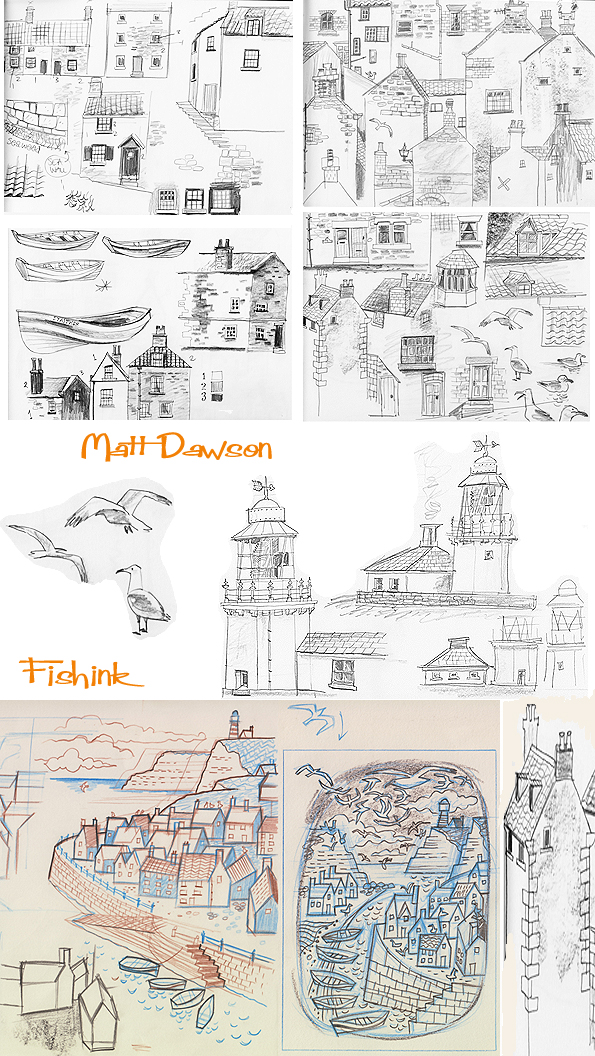
What a great capture, you can really smell the sea and hear the ‘ark ark’ of the seagulls.
I also like the way that the coloured illustration has been given that 1960 twist. Classic !
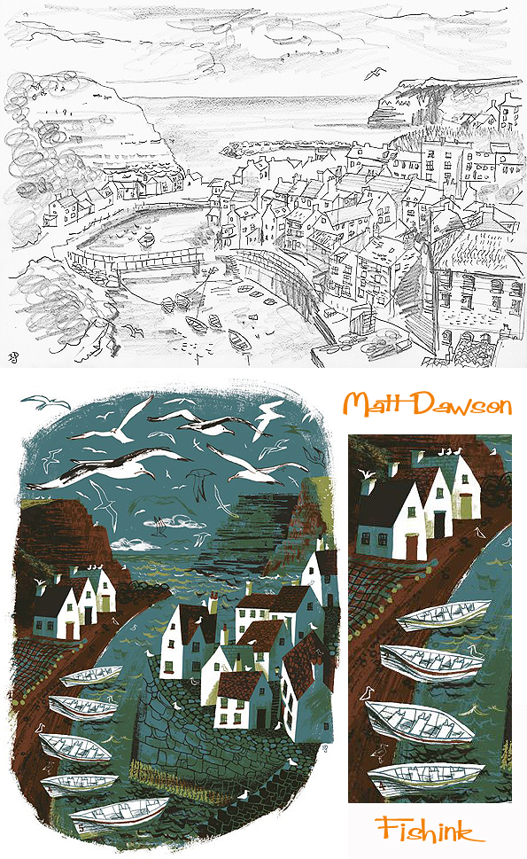
This ‘Staithes’ inspired design has now been turned into a card and is available through Art Angels.

You can see more of Matt’s influences here in his extensive library. I think we share a lot of the same tastes !
And his studio is where all the really good stuff goes on.

In 2012, Matt also illustrated his first book with author Giles Paley-Philips. Many many thanks Matt for all the time and energy that went into answering my questions. (Fishink makes a mental note that Matt’s perhaps not as shy as I initially thought : ) ) Great to find out how you tick (and tock), keep up the fab work (and word play) too.

Fishink is Artist of the month !

On Monday, I sent out my 4000th tweet, my 725th blogpost and by way of a triple celebration today,
I’d like to thank my agents Jehane and Sue over at Yellow House Art Licensing, who have kindly made me Artist of the Month and created a rather cool Q & A session about my work. You can read the article here.
Over the last few months I’ve been busily creating new artwork for my agency portfolio page, here’s a wee taster.
I’m interested in exploring more illustration with a textile feel (like above). Which encompasses both my textile design and illustration backgrounds. Any thoughts /comments ?
I have some Original collage illustrations for sale here on Pinterest or am selling mount framed prints of these Illustrations at £25 and £35 for a 10 x 8 0r 12 x 10 inch, contact me if interested Craig@fishink.co.uk. Greeting cards, stamps and notebooks are still available here on the Fishink site.
Please keep up the great work of telling your friends and family about my blog, you can get Fishink blog straight to your mailbox by clicking on the link near the top right of this page.
Share, like and tweet about Fishink Blog and let our art community grow ! Thanks for reading and a Happy Day to you.
Terry Runyan Character creator
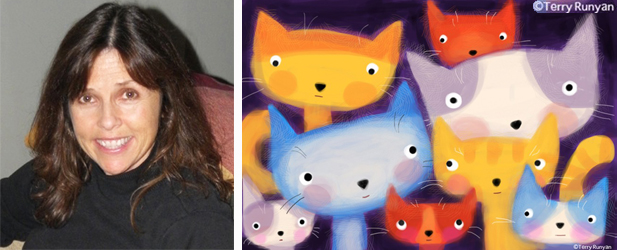
Terry Runyan is an American artist who works full-time for Hallmark Cards in Kansas City. She also does artwork for fun featuring quirky cats, dogs and animals of all kinds. I messaged Terry to find out a little more about her creative illustrations. Graduating from San Jose State University with a degree in Design and Illustration, Terry was snapped up by Hallmark recruiters within 6 months of finishing her degree and has worked there ever since.

” I love to draw with a pencil, scan my work and bring it into Photoshop where I colour and mess with it. I don’t use pencils much in my day job so I get a different look for my personal work. I also enjoy messing around with the Procreate and Brushes App on my iPhone and iPad.”
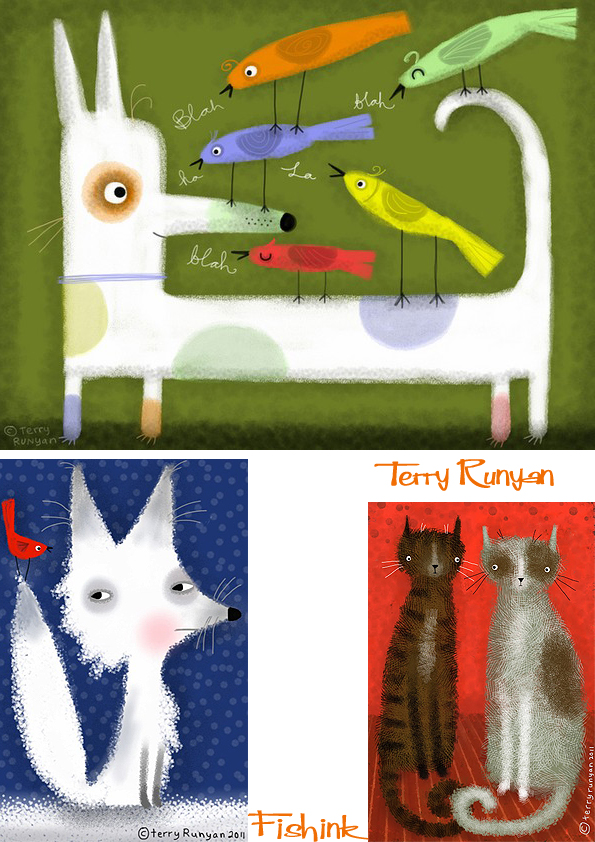
Terry says ” A few years ago I started messing around with drawing again after spending the last 15 years of my career working digitally. Suddenly I found myself posting to flickr and it grew from there. I keep my personal work separate from what I do at Hallmark. The work is usually a bit edgier. The cute stuff sneaks through though. Guess you can only be who you are right? I save the sad, mad, suspicious, serious, mysterious, bizarre, or just plain strange characters for what I do at home.”

” I’ve always been a huge animal lover! I remember when I was a kid, all I did was draw horses, then dogs and eventually cats found their way into my work. I’ve always had a cat or several around the house. I must say they are my best friends. They are lying in their beds, next to me, on my computer table as I write this. There’s no lonely work time here at home ! “ 


It looks like Terry’s cats get to model for her quite often these days ! Great characters to make me smile. Terry has a range of posters and prints that she sells here through Society 6. Thanks Terry for a great introduction to your work.
Costumes, customs and ritual attire.
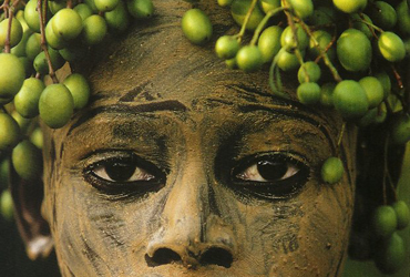
For some time now I’ve been collecting images of tribal and English costumes. Quietly putting them to one side, not quite knowing what I might do with them, but finding them both fascinating and intriguing at the same time. I was recently reading some very old scrapbooks I had assembled whilst a student in the mid eighties, and I realised that my interest in this area had originated way back then. These images are taken from my 1980’s scrapbooks. The Bruce Weber photographs probably initially sparked my interest in the idea of people using foliage as body adornment.
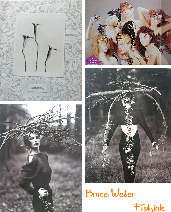
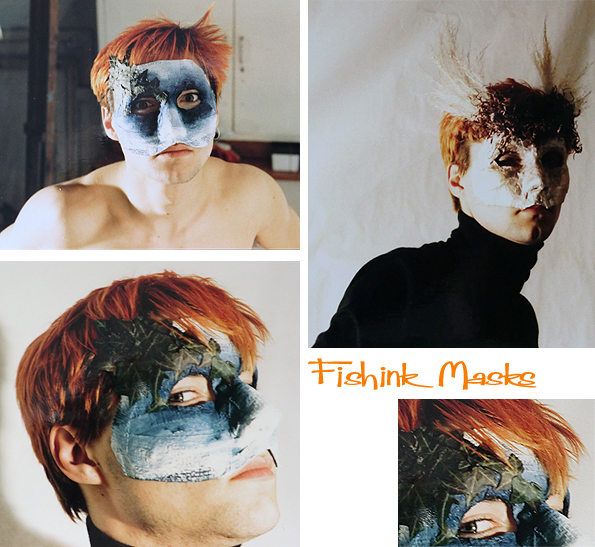
These were a couple of masks I made in my first year at Fashion collage in 1984, no I’m not the model, (I think his name was Peter Morris) I’m the photographer. Although I did remember liking his Toyah inspired hair colour lol.
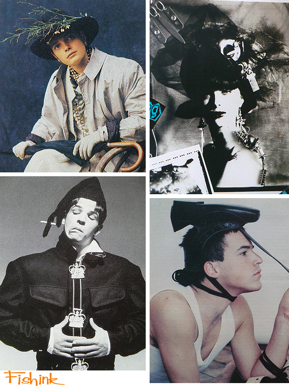
These images were taken from eighties magazines such as I.D. and The Face.
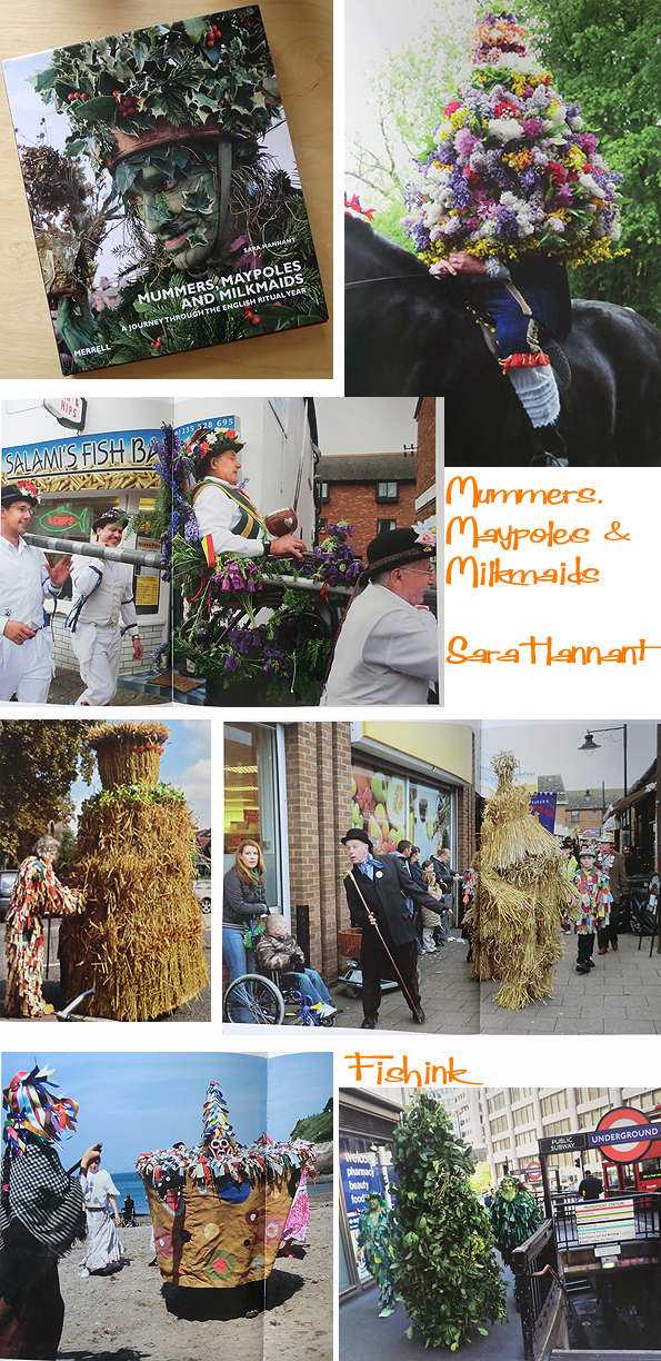
Last year I came across this fascinating book from Merrell Publishers called ‘Mummers, Maypoles and Milkmaids’ by Sara Hannant. It features photographs capturing festivals and ritual costumed processions that are still happening in the UK today. I believe there is an exhibition of Sara’s photos due to be exhibited at Forty Hall Estate in Enfield, from April-July this year. You can get copies of the book here. I imagine that the idea of being adorned in straw or flowers has been around for quite a while.
In England during the Early Medieval period, various forms of folk magic could be found amongst the Anglo-Saxons, who referred to such practitioners as wicca (male) or wicce (female), or at times also asdry, practitioners of drycraeft, the latter of which have been speculated as being anglicised terms for the Irish drai, a term referring to druids, who appeared as anti-Christian sorcerers in much Irish literature of the period. I imagine that costumes were used to ward off bad spirits or as parts of festivals to celebrate good harvests or to give praise to the gods or spirits of the land, which would help ensure healthy crops and good hunting stocks.
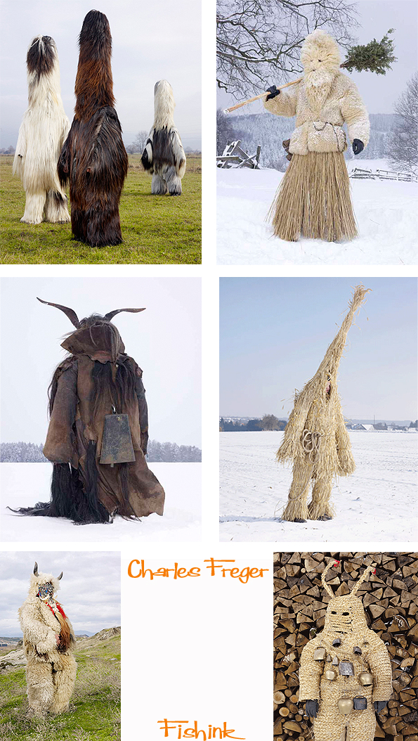
I was amazed to see how similar some of the English traditional folk costumes were to those of other countries. I discovered an equally beautiful and (slightly scary) set of world costumes, wonderfully captured by French photographer Charles Freger. Charles had spent a long time in many different countries capturing these amazing outfits worn in their natural habitats.
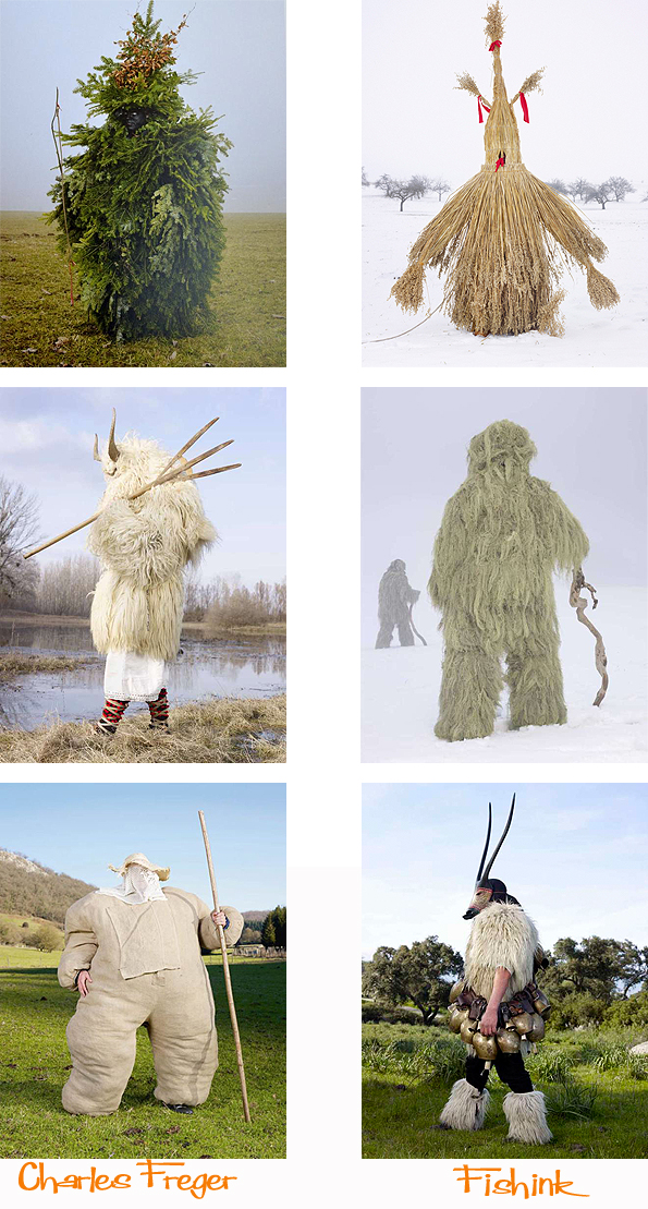
Can you imagine bumping into someone one evening, dressed in any of these costumes whilst you’re casually camping in a remote area, halfway up a hillside in Spain, Austria or Finland ! More here.
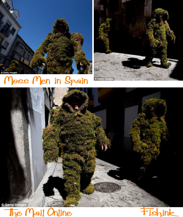
Only last summer there were Moss Men featured by the Mail online roaming around Spain.
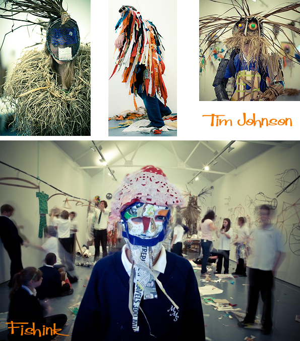
The more I looked into this I found it oddly comforting to discover that every country had their own version depending what was locally available to wear and fashion into a garment. Artist and Basket maker Tim Johnson is currently using his skills to play with the idea of costumes today.
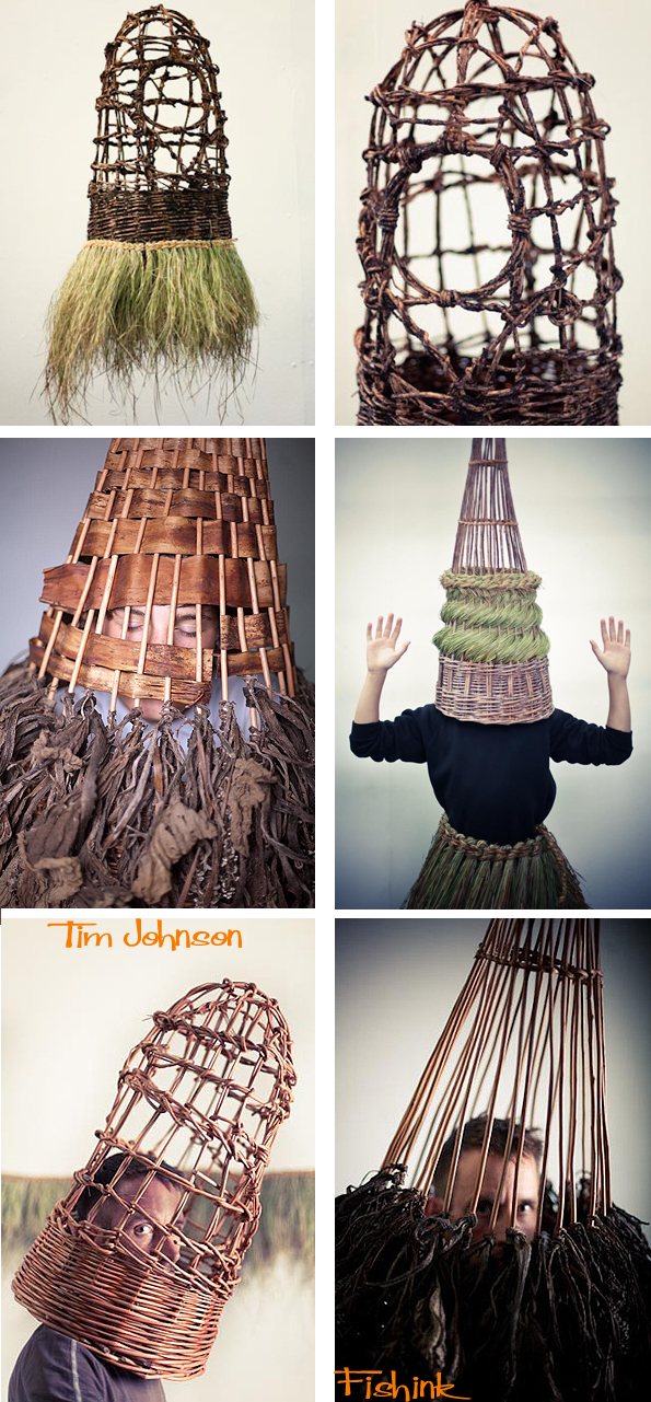
Here’s some he made with a group of children in a school workshop.
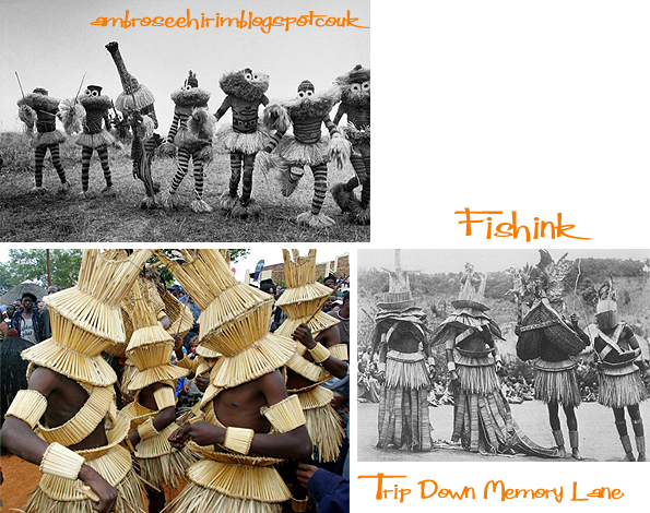
Of course we also think of countries such as Africa, as still having a strong links to the idea of wearing straw, face painting, and body adornment. Here’s some images I found on a couple of sites.
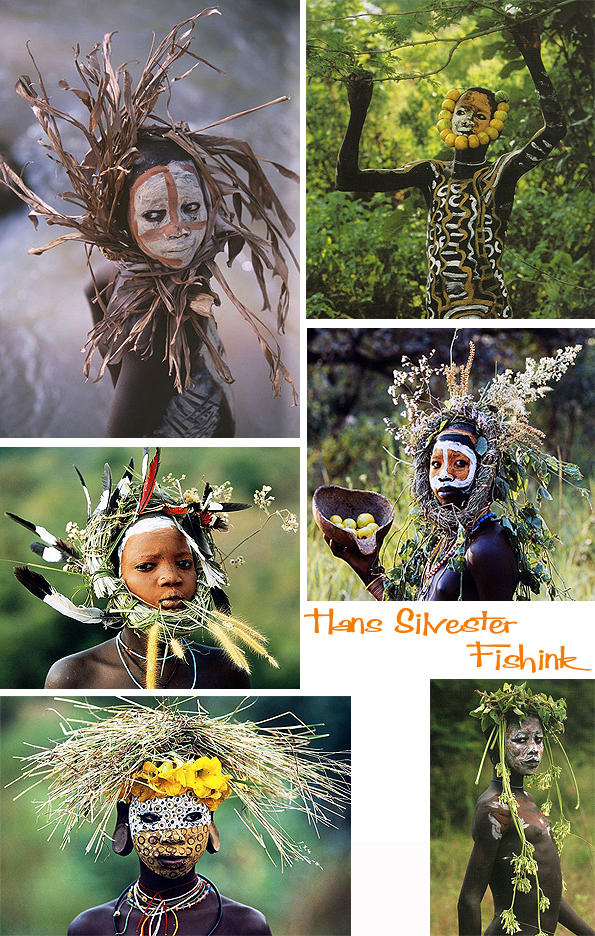
And these wonderful shots by Hans Silvester who’s work is covered by the Marlborough Gallery in NY.
Which in a way seems to bring us full circle from Bruce Weber to Africa. If you’re interested in exploring more about costume, Hazel Terry has created a fascinating site called Thread , Fashion and Costume which is well worth having a search through.
A Fishink weekend in Tarporley
Another great weekend escape to visit my friends in Tarporley in Cheshire. There are always lovely floral displays sunning themselves in the light about their home.
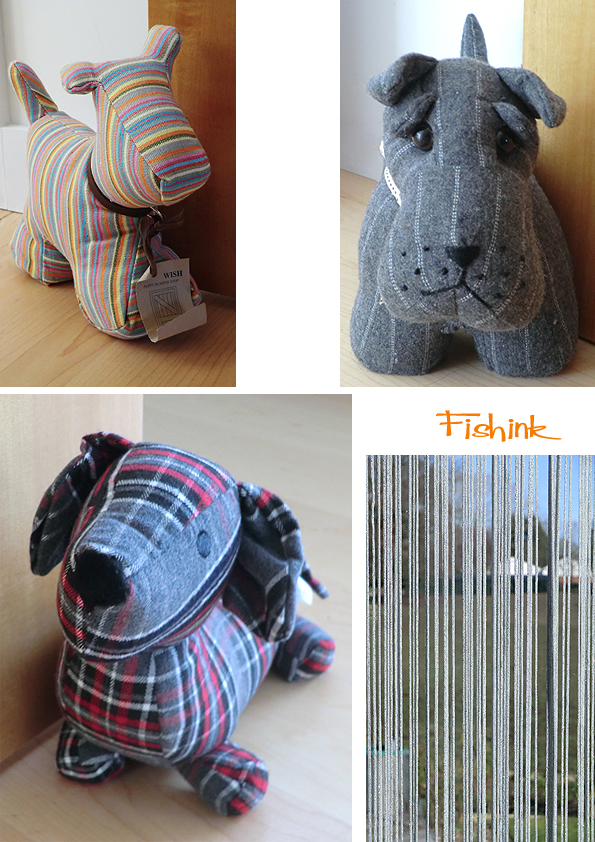
These little critters were keeping watch and keeping doors open upstairs !
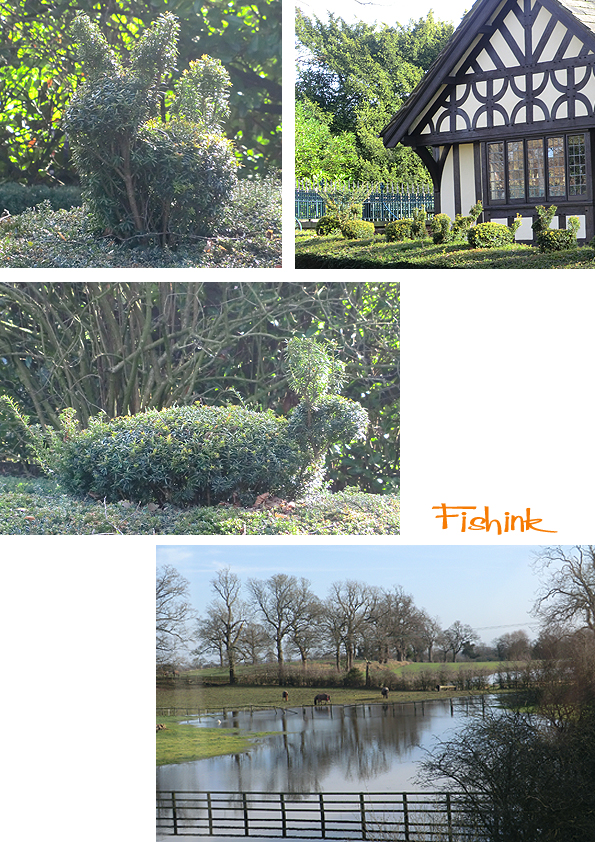
I loved this hedge we saw on a walk around the village, what a great idea. Some of the shapes are still mid rabbit ! You can see how the excessive rains have flooded the local fields, the horses didn’t seem to mind too much.
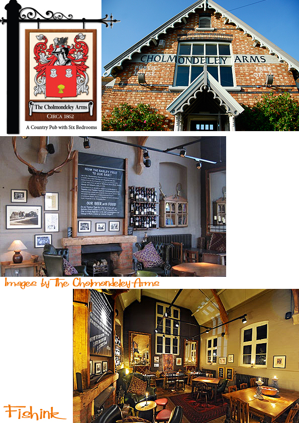
For our sunday lunch we went over to the Cholmondeley Arms and had a fantastic meal. Beautiful setting, friendly staff and huge afforable portions, an all round winner. I took these images from their website.
As ever thanks to our generous hosts Paul and Clare for another fab weekend. Happy Wednesday everyone : )


