William Stobbs A Children’s Illustrator

William Stobbs was born in South Shields in 1914, and raised near the same North Sea that later figured in many of his drawings, Stobbs graduated from the Durham School of Art in 1938. A year later he signed on as a draughtsman in the Rolls-Royce firm, where he was involved in the development of Merlin engines. After the war he worked briefly for Alvis before becoming head of the design department at the London School of Printing and Graphic Art. This was followed in 1958 by a twenty-one year stint as Principal of Maidstone College of Art. I like the lofty expression on his cats and particularly the hard stare of his sleek and silvery Siamese.


His first experience as an illustrator was on Hakluyt’s Sea Stories(1948), a child-friendly version prepared by Ronald Syme. Very soon Stobbs’ fascination with detail and his capacity for meticulous research made him a favourite with other children’s historical novelists, at a time when such novels were still expected to maintain consistently high standards of accuracy in text and pictures. Six years later, he illustrated Ronald Welch’s Knight Crusader, winner of the Library Association’s 1955 Carnegie Medal for the outstanding book of the year. Few doubted that this decision was also influenced by the brilliance of this now forgotten novel’s accompanying pictures.


In 1959 Stobbs won the Kate Greenaway Medal, this time for his colour illustrations for Chekhov’s Kashtanka, a translation of one of the author’s dog stories, and for his drawings in Ruth Manning-Sanders’ compilation A Bundle of Ballads. The same compiler later co-operated with Stobbs on Damian and the Dragon; Folk and Fairy Tales from Greece (1965). His drawings of maidens and their suitors appear somewhat wooden, as if they were inanimate objects rather than living characters. The sense of detail though is as always superb, with what initially look like thick black lines gradually revealing an intricacy of texture and decoration. Only some of the larger illustrations fail to work, with too many swirling shapes making for a sense of confusion. As an illustrator of black and white vignettes however, he remained by now the clear leader of the field.
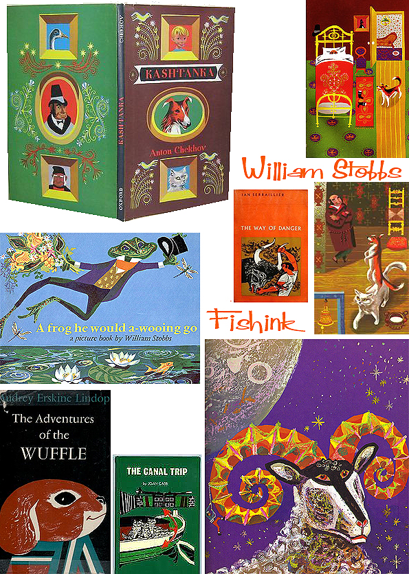
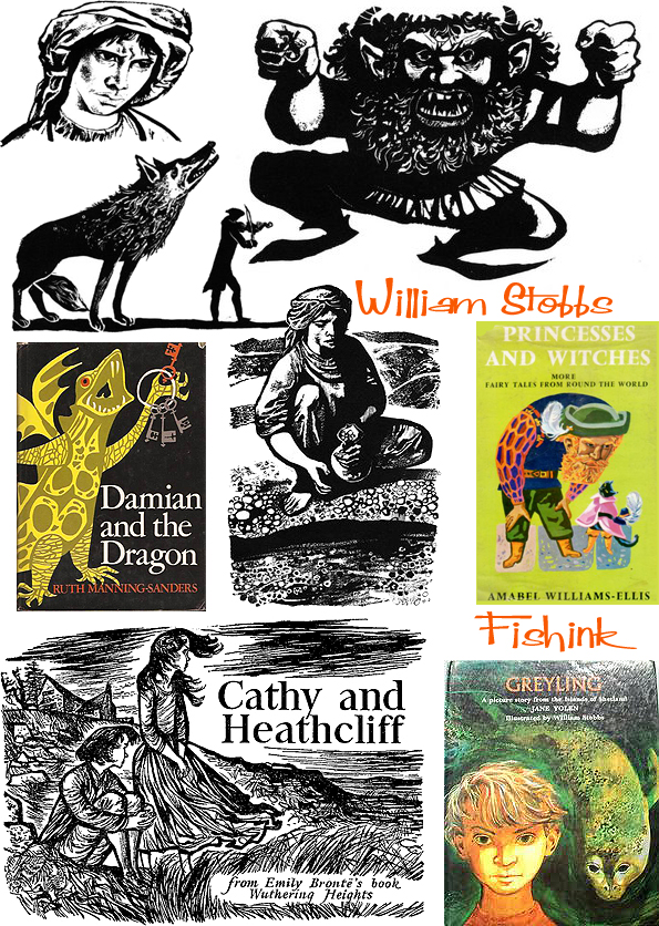
William Stobbs illustrated over a hundred books for children, (some listed here), all witness to his own distinctive standard of artistic integrity. His sensitivity to the subject matter in hand made him much in demand from publishers, whether illustrating nursery rhymes, fairy tale anthologies or historical fiction. Stocky and broad shouldered, as befitted an ex-student boxer, he actually possessed a sly sense of humour never far away from his work for younger children. Sadly William passed away in 2000, leaving behind a wealth of amazing illustration.


Many thanks to N Tucker for the description of the life of William Stobbs, that made this blogpost possible.
Vintage book covers
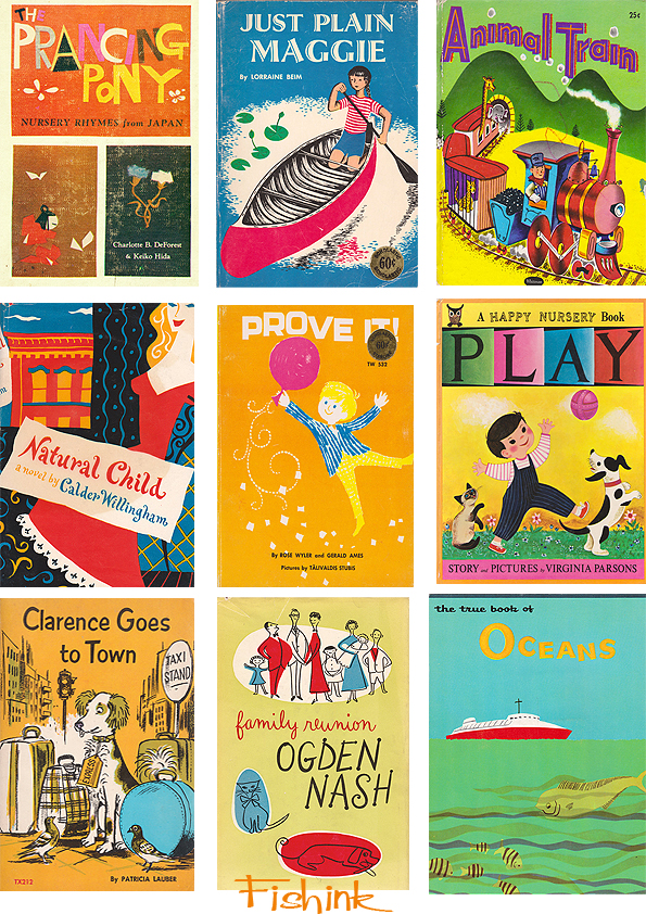
I’ve pulled out a few more of the lovely book illustrations I come across on the internet. The first few from a site on Etsy that sells books Elwood and Eloise, always worth a look for that vintage find.
A few foreign finds. This wonderful mermaid illustration by Stig Lindberg.

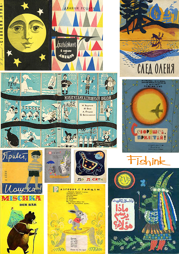

Some for the younger kids.
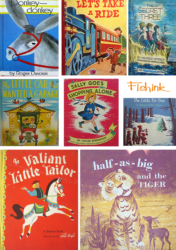
My finds always introduce me to new illustrators like this beach book by Barbara Cooney.

A few for the older children and some featuring travel and transport.


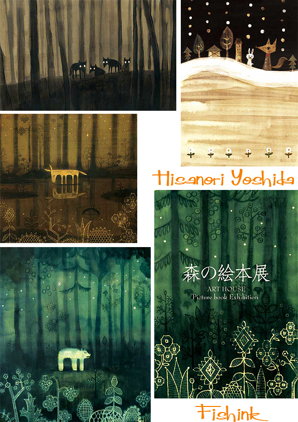
Hisanori Yoshida Japanese Illustration
It’s with thanks once again to the lovely Helen Terry and her inspirational blog The Art Room Plant that I came across a link to the work of Hisanori Yoshida. He manages to create, beautiful scenes and moods using inks and bleach. I feel a great delight in his lights and starry skies, a nod to Chagall perhaps but definitely a warmth and safe feeling there too.
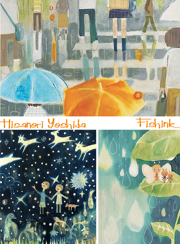
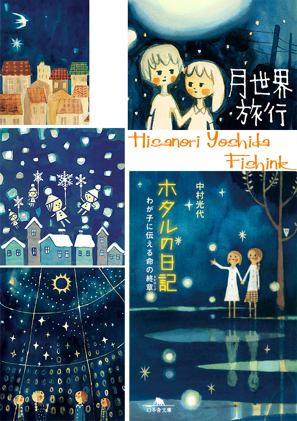


I must say my Japanese doesn’t stretch much beyond speaking one to ten so I can’t find out much about this amazing illustrator apart from that he graduated from Osaka Prefectural modern craft Konan High School in 1990 and then started working as a freelance illustrator in 2004, until the present day. Here are some of his magical creatures in the woods and animals on the land.
A beautiful sunburst, again offers a warmth to Hisanori’s work.
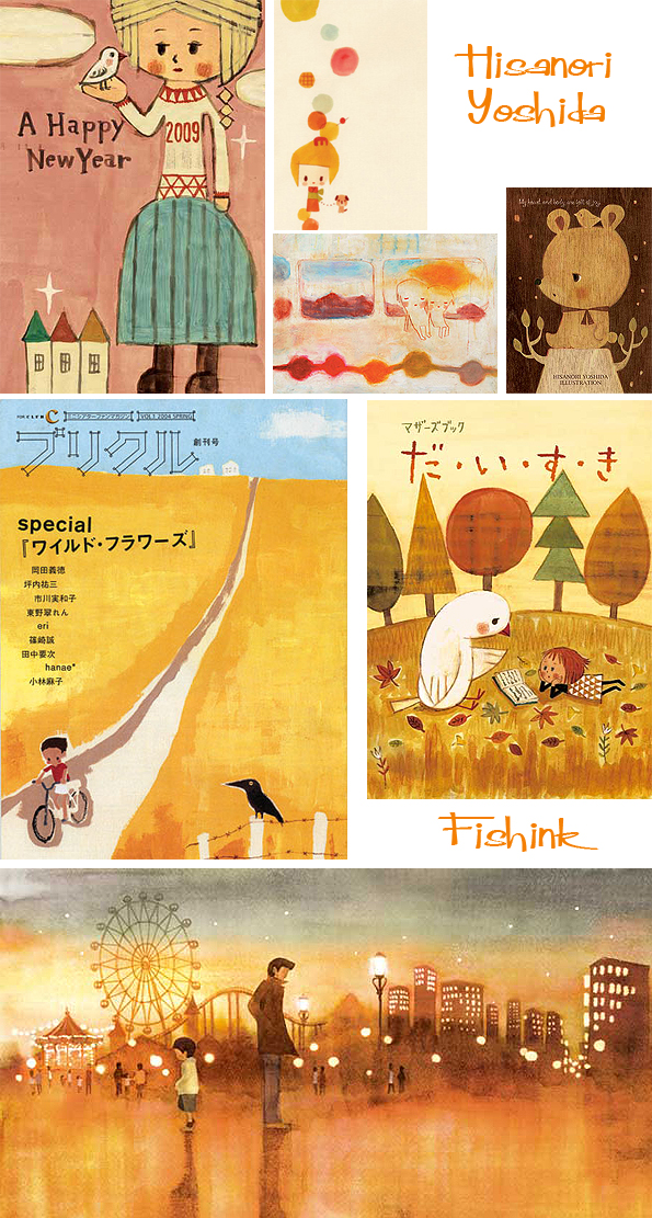
It’s the soft and often fragile moments in his work that capture my attention. They force you to pause and observe, and suddenly your life slows down and you feel quietly peaceful. Well it works for me anyway lol
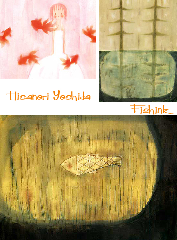
His fish (above) really reminds me of the work of Paul Klee (below), what do you think ? Beautiful work.

Chris Moss Wire sculptures of wild life
Chris Moss lives in Harrogate, North Yorkshire where she has a farm yard of animals that constantly live and thrive in her back garden. These animals are Chris’s creations, as she works with wire to construct beautiful garden sculptures, inspired by nature’s wildlife. I got in touch with Chris to discover a little about her work.
Can you tell us a little about your artists journey so far and what inspired you to work with wire initially.
“My degree, many years ago, was in Fine Art Painting which although I completed it, left me with more questions than answers about my ability or desire to create. The questions were put on hold for a few years and life and jobs generally got in the way of finding a solution, until I started a life-drawing evening-class. These sessions were an opportunity to look and draw, a catalyst for exploration and expression without a fixed agenda. During the same period, I spent a lot of time on sewing, knitting, embroidery and woodwork projects, all of which require a high degree of hand/eye coordination. At some point I decided I was going to make a papier-mache figure and procured some random wire to make an armature. Handling the wire was the turning point because of all the possibilities that became apparent. What I loved about it was its immediacy, it’s basic and fast and as with drawing, there’s a direct via the making process to the end result.”

She also makes wonderful indoor pieces, often centered around bird themes.
Can you describe your process of creating shapes from lines.
“If drawing is a way of understanding a subject by making an image of it, then the wire sketches are a natural extension of the same process, a way of drawing the world 3-dimensionally. When I add pieces of mesh to a wire armature it’s like sketching light and dark areas to bring emphasis to an outline. Chicken-wire sculptures are like fully modelled drawings describing contour, mass and underlying structure. Each sculpture is an original response to a subject at the time so that even when I work through familiar themes, I enjoy the potential that each piece has, to be different and individual. ”
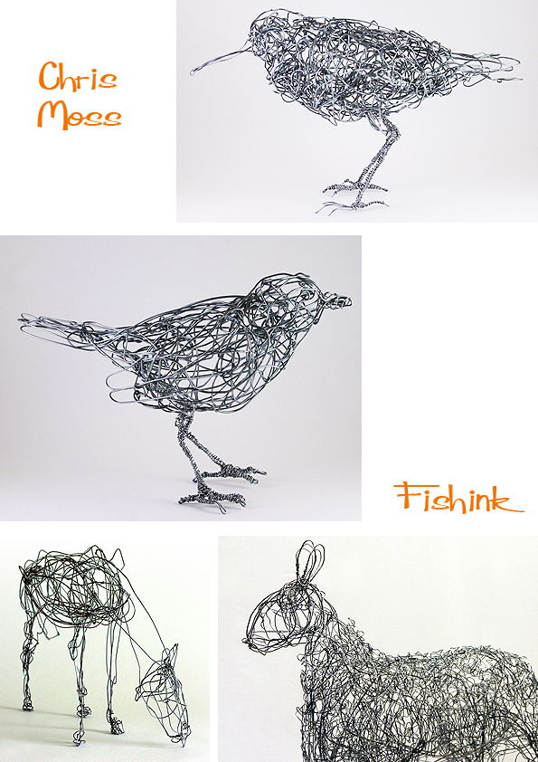
Her inspirational drawings and line work has a lively fluidity to it, which must help to make her sculptures spring into life.
You show a natural love and affiliation through your work for the animals around you. Do you ever have desires to work with more exotic animals or other subject matter ?
” I’ve a consuming passion to make sculptures of animals, both domestic and wild but mainly those that I’ve actually seen in the UK; I think this is based on the desire to capture the quirks and characteristics of an animal accurately, to give the sculptures life. I’m not particularly interested in the exotic subjects so much as those that are considered quite common, which I can study easily. I don’t think my need to make animals will ever diminish but recently, other ideas have been forming that would add new dimensions. I’ve already made some samples of plants and flowers which will form the background to the small birds that I make from recycled or pre-used metal and wire. In addition, I find myself thinking about the human figure again, but purely as a vehicle for costume, drama, colour and artifice. People can be taken so much less seriously than animals.”
“With hindsight I’m making it sound like a more conscious journey and streamlined process than it actually was. There was never a mission statement or 5 year plan, there probably should have been but all the meandering and experimentation has contributed to the sculptures I’m making now, both in my approach and the techniques I use. 2013 brings a cross-section of gallery shows, private commissions, workshops and, for the first time, some school projects.”

I’d like to think that in the evening, when no one is looking, these animals all run around the fields and gardens that they inhabit. lol

Chris even has her own personal Narnia in her wintery back garden as you can see below.

She takes on commissions of all sizes, so contact her here if interested. Thanks Chris for letting us all know a little more about your creative processes. Keep up the great work.
Womenswear Prints and predictions for Spring Summer 2013
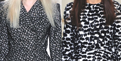
Following on from the menswear, here are some suggestions for what maybe ‘in’ this spring / summer. Looks like prints are big news again, and I like these photographic ideas.

Strong constructed garments from Vanherpen, possibly inspired by the paper cut trends of the last few years ? Black and whites and looks like the first Armani Spiderwoman outfit !

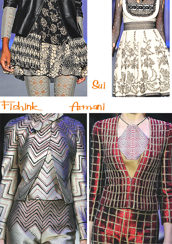
Dior showers us with 3-D pretty florals.

Some more sculptural forms, possibly inspired by shells and sea-life.

Finally a few, slightly impractical garments that do carry a WOW factor. Possibly not the frock to choose when popping down to the corner shop for a pint of milk in your slippers ! Joking apart some beautiful ideas and inspiring forms. Thanks once again to Prints Pattern Journal for allowing me to use the images from their site.

Menswear print predictions from Paris and Milan for 2013 / 2014.

You probably won’t know that in my early education, I spent a year studying on a B.A. Fashion course at Ravensbourne college of Art and Design. Which in those days was based in the sleepy area of Chislehurst in Bromley. It was a good course, but I found that my desire to want to create the shapes of garments diminished quickly, when I discovered the printed textile department ! This led to my escape to a 3yr Textile degree at Nottingham Polytechnic, which was much more exciting than creating toiles and pattern cutting.
I still have a glance at menswear from time to time but to be honest I’m usually unimpressed and find the garments either far too O.T.T for your average Joe on the street to want to wear, or uninteresting and somehow ‘done before’.
Thanks to the wonderful blog of Barbara Mazzoleni called Pattern Prints Journal I discovered some exciting menswear ideas from the Paris and Milan shows, predicting trends for 2013 and 2014. I would classify the designs as ‘exciting and fresh’, through to ‘interesting in concept’ and finally ‘bizarre and largely unwearable’. I’ll let you decide, which collection of images falls into which category lol
Some lovely knits and colourations from Missoni.

John Galliano has created a bold new canvas.

Looks a little Star Trek or something from a 70’s Tv Sci Fi show. Givenchy shows us where baseball meets bows !
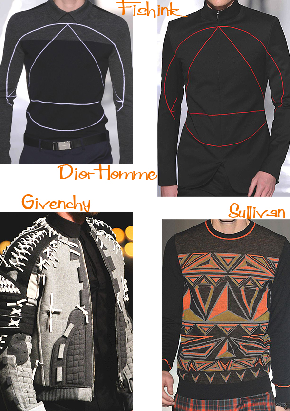
Some very masculine shapes, patterns and colours here. I quite like the draughtmans’ jacket, would be even nicer with star charts on it.


Graffiti meets high fashion.
Something new, suits meet sweat pants.

Getting a little weird now.

Finally Brocade meets bathroom towels, and it looks like the Lilac jacket has trousers to match, now that’s fortunate 🙂

Food for thought and do let me know what ‘Suits you sir’ !
Jaakko Mattila Colour and pattern

I recently came across the colourful world of Jaako Mattila.
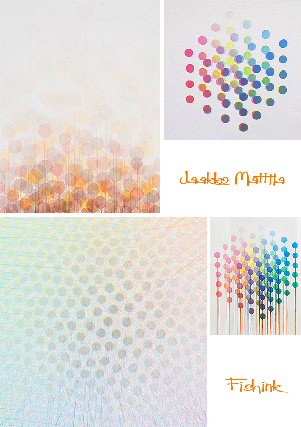
He is a Finnish painter who graduated from the Surrey Institute of Art and Design in 2001 and has since displayed his artwork in Finland, UK, France and Italy.

He is mainly influenced by the structures of nature and the constructive principles of the universe such as infinity, smallness, greatness and time.
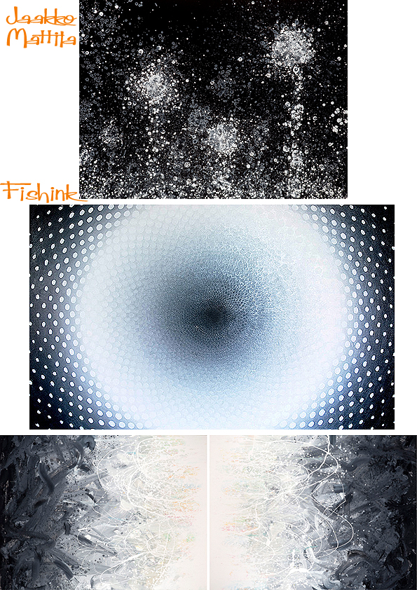

I love the subtlety of some of his colourations, they strangely reminded me of a leaflet I picked up for a science festival in Manchester last year.

Lovely work to loose yourself in.
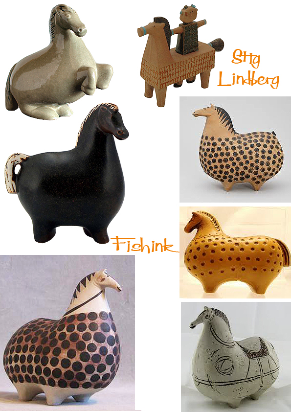
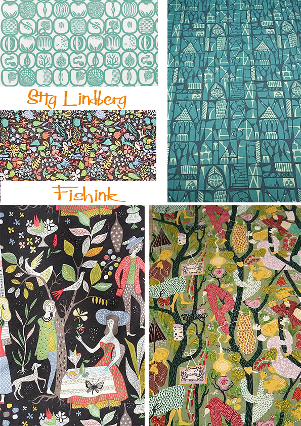
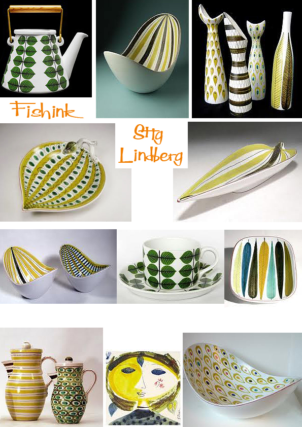
Stig Lindberg A Swedish design Icon

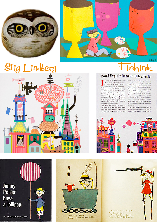
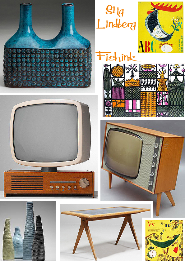
Stig Lindberg – Industrial designer, ceramist and illustrator. He was born in Umeå, but began his career at Gustavsberg´s Porcelain factory in the summer of 1937. After many years of work, he became Wilhelm Kåge’s successor as the artistic leader. His decorated faience, with a character totally of its own and his fanciful stoneware were pioneering during the whole of the 1940’s and 50’s. His horse have such character to them.
Lindberg also created decorative works of art for public environments, several of them in enamel, mostly during the last period of his career. His co-operation with NK’s Textile Studio was initiated in 1947, when the legendary leader of the Textile Studio, Astrid Sampe and Stig Lindberg became friends.


Some of the best Swedish textile design was created in the 1950’s under the leadership of the legendary Astrid Sampe. Design House Stockholm has chosen to reproduce Stig Lindberg’s widely acclaimed Lustgården (Garden of Eden), andPottery, which bears the hallmark of the Swedish Modern movement. Thanks to collaboration with Ljungbergs Textiltryck, the textile printing company responsible for the prints in the original launch, the quality is as high as when Astrid Sampe’s Signed Textile Collection was first shown in 1954. The fabric is sold in 10-metre rolls and is suitable as upholstery textiles. You can find out more here.
More textile designs and you can also find samples to buy here.
Lindberg is mostly known for his work during the golden age of the Swedish art industry ranging from the 1940’s to the 1980’s. Especially during the 1950’s and the 1960’s, Lindberg was one of the most prominent Swedish designers. Today, his work is highly coveted, and even the small, simple pieces of his work generate high prices. Such beautiful shapes and colours.
Some fun and figures.


Lindberg studied at the Swedish State School of arts, crafts and design in Stockholm, hoping to become a painter.

It’s interesting to note that fellow swedish ceramist Lisa Larson must have worked with Lindberg at Gustavsberg. See here how they each interpreted similar themes.

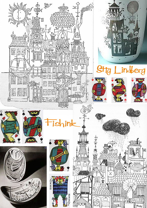
Stig Lindberg illustrated Lennart Hellsing’s children’s books and together they renewed books for children in Sweden towards the end of the 1940’s and onwards until today. Stig even designed beautiful television sets for Luma.

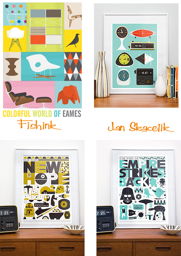
I came across the work of Jan Skácelík who works as a graphic designer / photographer / composer in Olomouc Czech Republic. He has created a wonderful set of inspired prints based on Lindbergs’ work, and very reasonably priced too ! Jan writes a blog, all about stylish mid century design, have a look here.

Stig Lindberg achieved fame for his eccentric forms and whimsical decoration and his stylish work will continue to influence and inspire.
The London Underground in 2013

Not only is it 150 years since the London Underground first opened it’s doors for travel, but last week was also 100 years since the iconic typeface, used all over the underground was created. “Underground” later known as “Johnston” was circulated as a lettering guide for sign-painters and also made into wood and metal type for posters, signs, and other publicity materials used throughout London’s transport network. Edward Johnston, a British calligrapher and lettering artist, was asked to create a typeface with “bold simplicity” that was truly modern yet rooted in tradition. Johnston’s design, completed in 1916, combined classical Roman proportions with humanist warmth. This mix of qualities, driven by Johnston’s approach to the written letterform, also influenced his student Eric Gill, who assisted with the design of the Underground typeface and developed some of its ideas in his own Gill Sans in the following decade. (txt and images taken from Wired article and London Underground )

Artist Sarah Morris’s new art work, Petrobras [Rio], commissioned by Art on the Underground is displayed on the front cover of millions of Pocket Tube maps from December 2012. This vibrant, abstract work is loosely based on the Tube map itself and the colours are an expanded version of the Tube map colours. The work is a diagram of movement depicting a series of interactions. Petrobras encourages us to think about a journey – not a linear journey from A to B but more a slippage where thoughts and interactions occur that cannot be measured or contained.
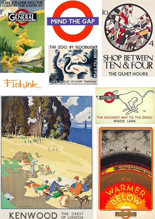
As part of the 150th anniversary of the Tube celebrations, the London Transport Museum has selected 150 of the best London Underground posters from its archive of more than 3,300 for a special exhibition which opens next month.
A collection such as this has not been seen since 1963 when a similar exhibition was held to commemorate LU’s centenary. This 150th birthday show is called Exhibition: Poster Art 150 – London Underground’s Greatest Designs and feature posters by well-known artists such as Edward McKnight Kauffer and Paul Nash, and designs from each decade over the past 100 years. Iconic images, including the surrealist photographer Man Ray’s Keeps London Going pair will feature alongside lesser-known gems, such as rarely seen letter-press posters from the late 19th century.
There are six themes: Finding Your Way, Brightest London, Capital Culture, Away From It All, Keeps London Going and Love Your City. More about the events can be found here.
I know some of the slightly elderly Brits sometimes think we still have an empire, but surely even this is going a little too far lol.


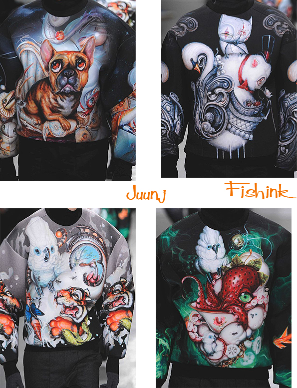
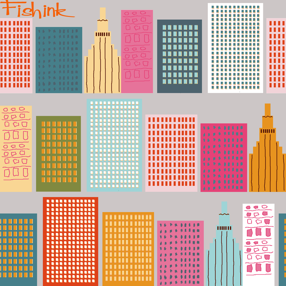
Fishink Textile designs
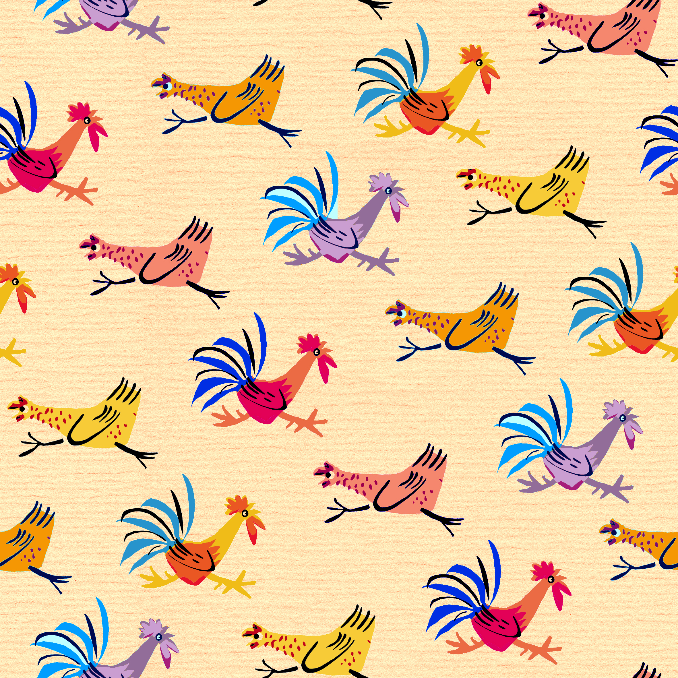
I loved the response I received to the Fishink blogs about Illustrator Roger Duvoisin here and here. It turns out that his granddaughter, Jeanne Blackmore has written and published her first children’s book, so it seems the talent still runs in the family. More on that story here and some memories from Jeanne of knowing such a talented grandfather.
I was inspired by Roger’s work and not only did I create a few images for fun from his illustrations, I was also encouraged to carry on a create a few more of my own. The first two designs are inspired by Roger’s work. I’m not claiming that they are my designs, just my ideas for a Duvoisin design.
I can hear his chickens squawking as they dash around the farmyard.
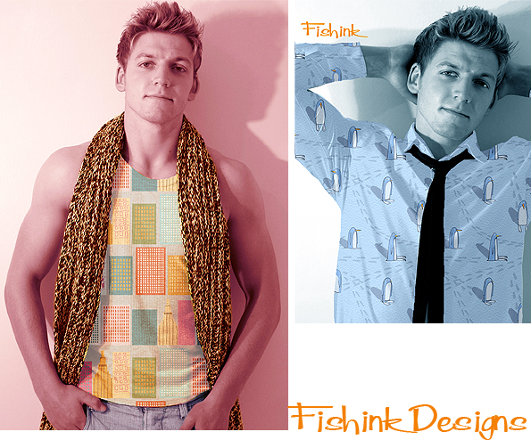
The rest of the designs are all my own work, illustrations and ideas. I do like the shifty-ness of these penguins and as it’s been snowing in the UK lately I’ve been inspired to think of little else. I thought they should have shuffley little snowy tracks.

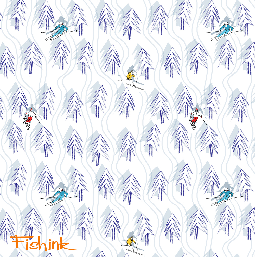
This one I dedicate to a friend Melanie, who spends her time skiing in Chamonix.
I felt this was my version of Orwell’s ‘1984 ‘ for Penguins. They’re all lined up the same… but one doesn’t quite fit in !

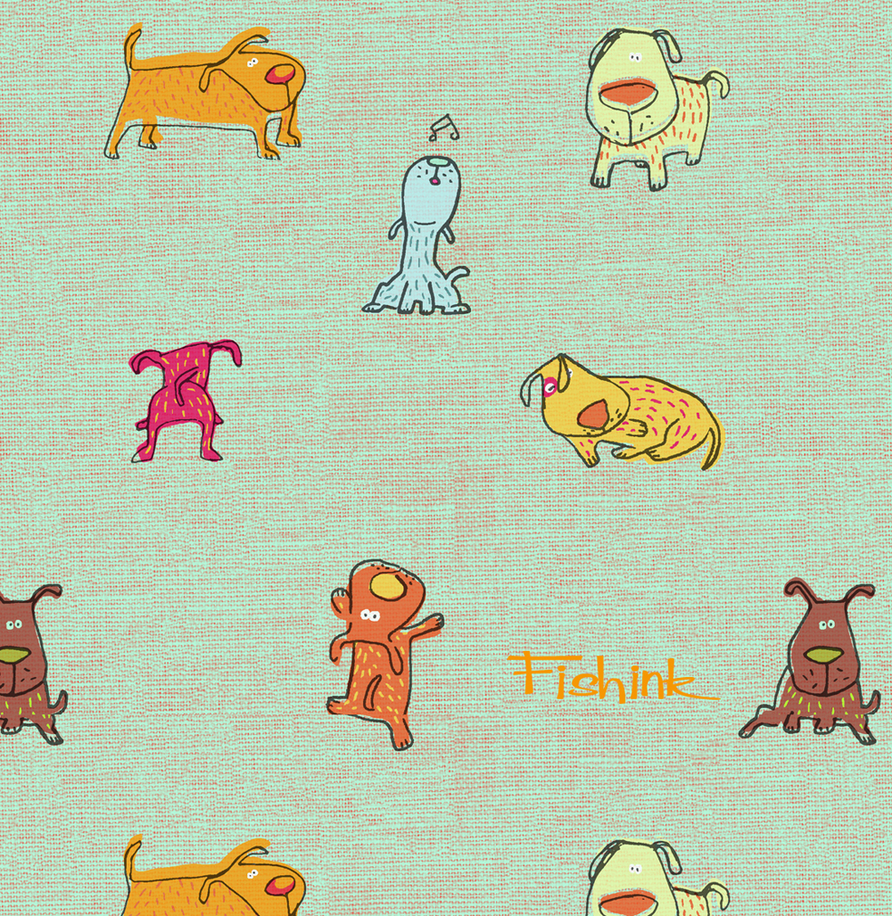
I liked drawing these scatty dogs and thought that they should sit on a linen type background.
And then my friends all said ‘It’s not fair, where are the cat designs, when are they coming’. So by popular demand….

What do you think ? Gift wrap ? Table Mats ? Fabric ? I’ll let you decide. Hope you like them.
All designs are Fishink copyrighted and are not to be used without prior permission.


