60 years of John Moores Painting Prize. Part 1
It was a grey drizzly day yesterday so making the most of it, we headed over to Liverpool’s Walker Art Gallery to take in the Sean Scully exhibtion, also view and help celebrate 60 years of the John Moores Painting Prize.

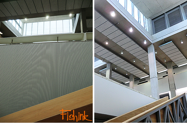
Taking in some of the sixties, seventies and more recent architecture on the way.
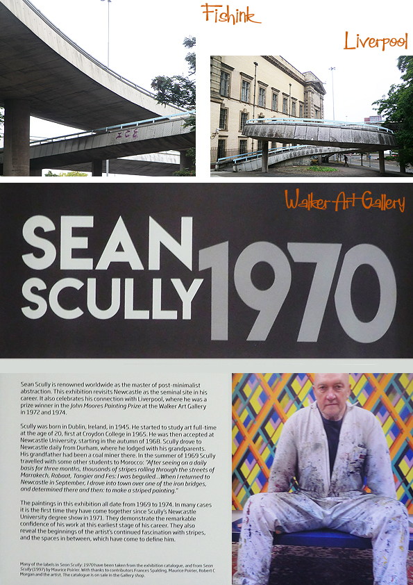
Sean Scully was a prizewinner in the 1972 John Moores Painting Prize and again in 1974. He is widely regarded as the master of post-minimalist abstraction. Revolutionising abstract painting with grid systems of intersecting bands and lines, his artwork uses the shapes and forms of concrete geometry, infused with a lyrical emotion. They create great visual depth and textile-like complex structures.

in this exhibition, Sean revisits his early works which reveal the origin of his continued fascination between stripes and the spaces inbetween. In the summer of 1969, he travelled to Marrakech and saw for three months, thousands of stripes in the streets. On returning to Newcastle he drove over one of the Iron Bridges and made his mind up there and then to make a striped painting.
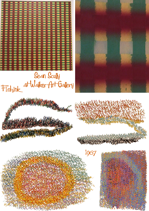
These works on paper are taken from his student sketchbooks and made between 1967-69. He had left school by the age of 15 and trained as a typesetter amongst other part time jobs. In his apprenticeship he was trained to work with a pen and ruler, These drawings show Sean’s reliance on these tools, until the confidence of freehand expression begins to assert itself.

The John Moores Painting Prize entry criteria, award structure and prize money has changed over the years. Until 1965, although not every year, as well as a painting section there were categories for sculpture, French and junior artists. From 1969, sculptures, kinetics, watercolours and graphic arts were firmly excluded in favour of painting.

Here’s a small selection of some of the past winning finalists.


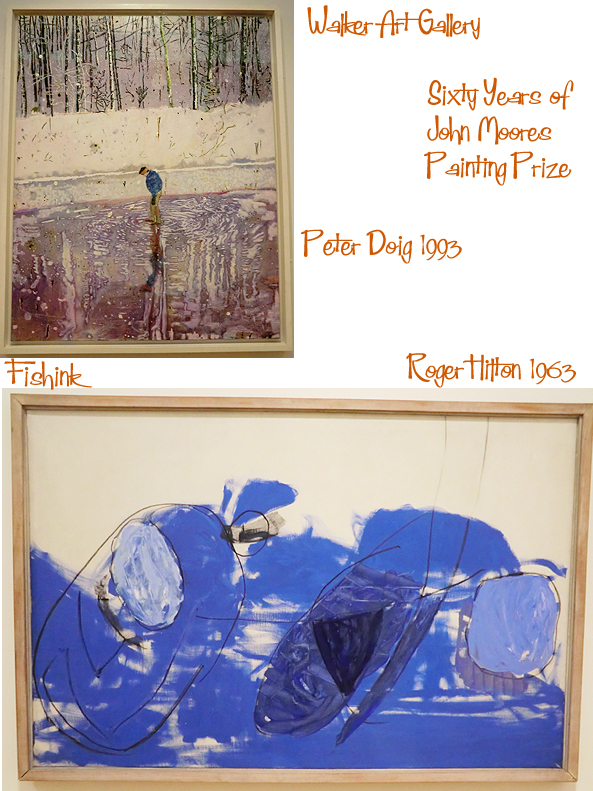


This is one of my favourite paintings from past years. ‘Harmony in Green’ by Dan Hays, 1977. It demonstrates a traditional artistic concern with te truthful representation of visual reality. Dan adopts a very shallow perspective and an unusual treatment of the spaces between the bars. The colours form a random, harmonious pattern. The work’s title is also the sub-title of a water-lily painting by Monet. Dan recalled Impressionism as he worked on this, stating “Green is the colour of nature.” Since winning the John Moores Painting Prize in 1997, he has continued to exhibit internationally.
This year the exhibition at the Walker Art Gallery in Liverpool is open now until the 18th of November so you’ve plenty of time to pop over and see it. I will be revealing my own personal selection from this years entries, later this week so catch up again here at Fishinkblog then. Happy start to your week everyone.
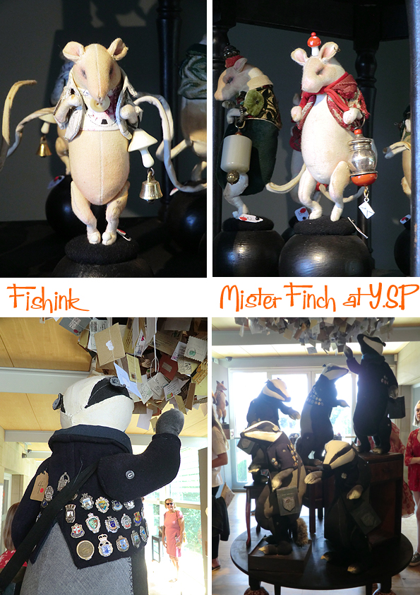
Mister Finch at the YSP
Hello readers, how are you all ? doing well I hope. I wanted to mention that I’ve just become aware of a change on my site, in that my last few posts weren’t allowing you to comment on them. Many thanks to keen reader Deidre from Australia for pointing it out to me. Hopefully all back to ‘normal’ again now and you can share your musings and chat away to your hearts delight once again lol.
I have missed your thoughts and did even start to wonder if you were all on holiday at the same time lol.
Returning from a sunny holiday in North Yorkshire myself, I stopped off at the Yorkshire Sculpture Park and by chance there was an exhibition on the work of Mister Finch. I thought it apt to re-post this article I put together back in 2013, with some added photos from the exhibition at the end. Enjoy.

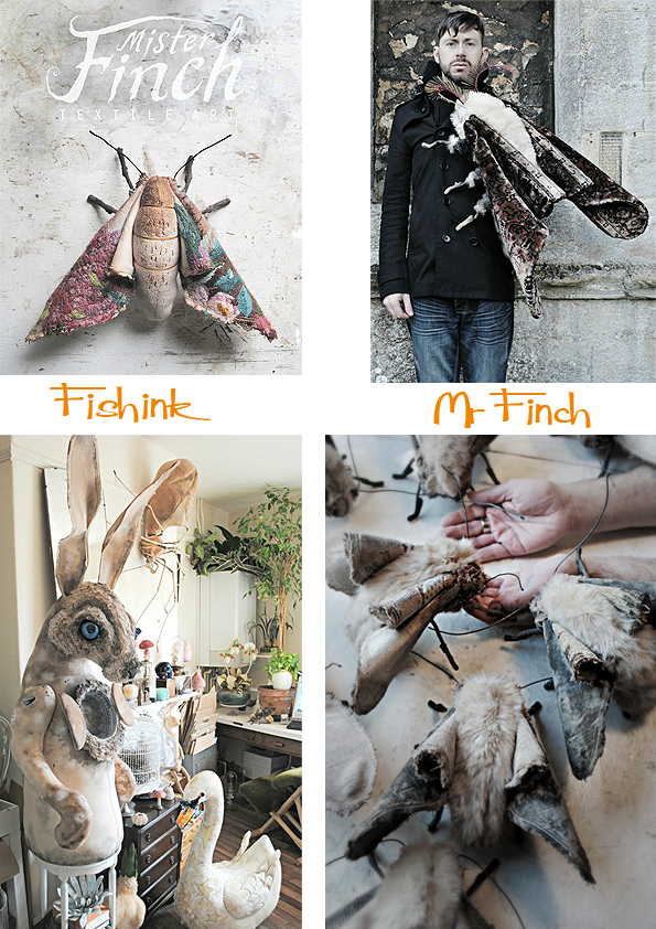
Mister Finch lives in Leeds. Finch is actually his surname but everyone calls him mister Finch so he named his business just that. He is almost completely self taught in his sewing and creating skills and when he’s not making things (which isn’t often), he likes nothing better than to watch an old movie or read a book.
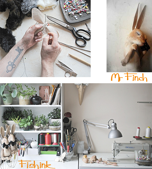
He has a collection of dead insects, which provide inspiration as well as being first hand research material for some of his more insect based forms.

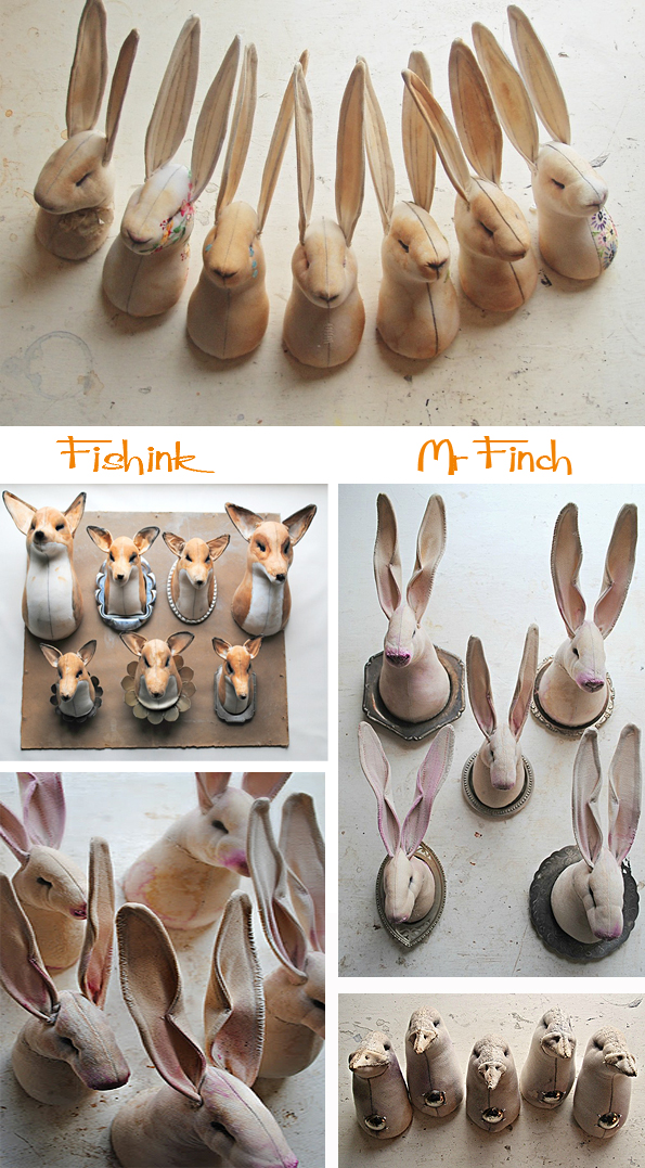
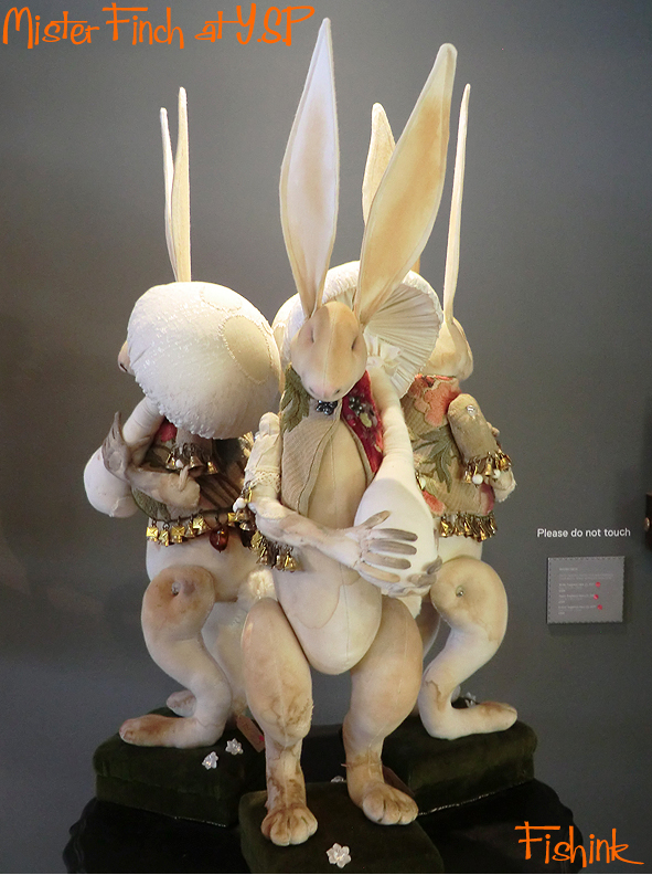
He has a flair for hares, and it doesn’t stop there. These wall mounted heads are quite wonderful.
He says ” My main inspirations come from nature and often I return to certain ideas again and again. Flowers, insects and birds really fascinate me with their amazing life cycles and extraordinary nests and behaviour. British folklore is also so beautifully rich in fabulous stories and warnings and never ceases to be at the heart of what I make.”

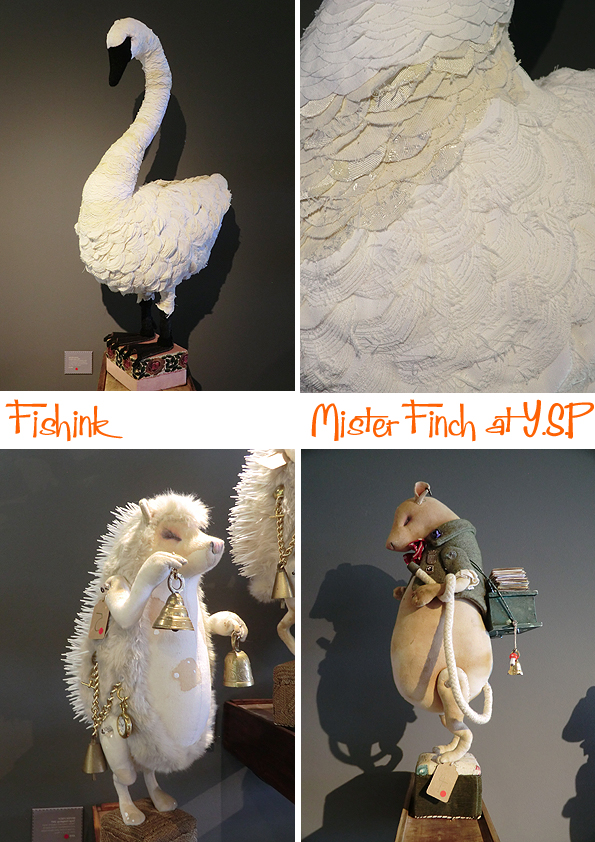
There’s a quiet peacefulness about the sleeping, curled up animals and even if you’re not the worlds biggest fan of moths, you must admit that their furry, velvety textures and florally wings capture the essence of the creatures perfectly.

” Humanising animals with shoes and clothes is something I’ve always done and I imagine them to come alive at night. Getting dressed and helping an elderly shoemaker or the tired housewife. Making things has always been incredibly important to me and is often an amazing release to get it out of my system. It’s a joy to hunt for things for my work…the lost, found and forgotten all have places in what I make. Most of my pieces use recycled materials, not only as an ethical statement, but I believe they add more authenticity and charm. A story sewn in, woven in. Velvet curtains from an old hotel, a threadbare wedding dress and a vintage apron become birds and beasts, looking for new owners and adventures to have. ”

Mr Finch’s creations sell on Facebook when he has some available or there’s more info on his Site.

Storytelling creatures for people who are also a little lost, found and forgotten… aren’t we all ?
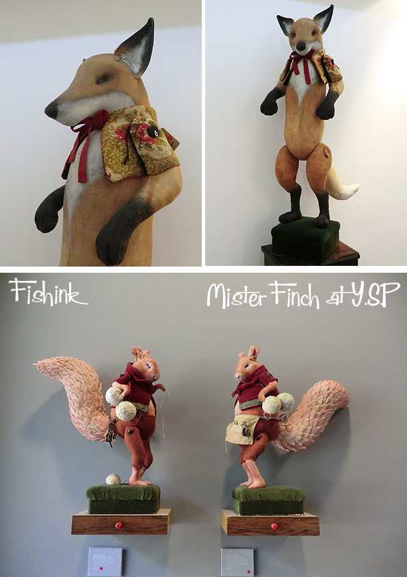
Here’s a few shots from the Y.S.P show itself.
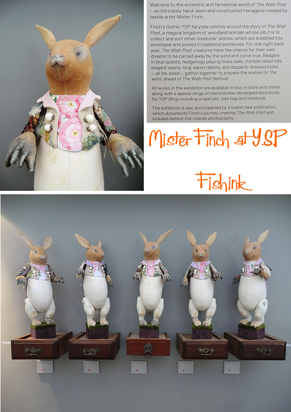
The exhibition has been an amazing success as everything appeared to have sold. The attention to detail and clever use of fabrics help bring these magical creatures to life.
You can see the layers in this swan, it just looked like the real thing.
The exhibition at YSP is on until September 23rd so do pop over and have a look at this beautiful work for yourself.
If you found this interesting, you may also like my post on Vraid Lee and Michael Sowa. The animals also reminded of ‘The Science of Sleep’ a film with Gael García Bernal and Hartley Hare from ‘Pipkins’ from my childhood memories. Of course don’t forget to leave some thoughts by way of a comment too…. now that you can again lol.
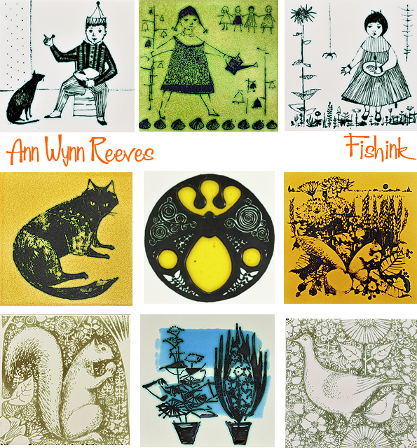
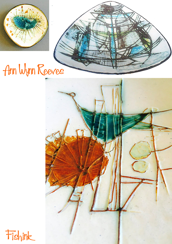
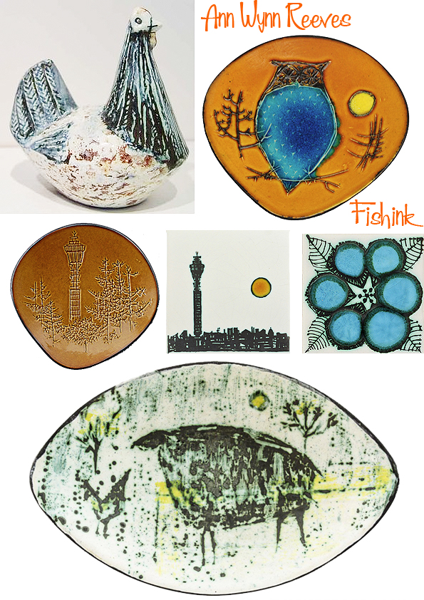
Ann Wynn Reeves Mid century Ceramic design
Little has been documented about today’s designer Ann Wynn Reeves (born 1929). However, I do know that in 1954, she married the famous ceramist Kenneth Clark and also created motifs to decorate his household ranges of tiles. This was carried out by means of silk screen printing.

As well as tiles, Clark made single hand-thrown domestic ware items, and in the 1960s designed for the Denby and Bristol Potteries, including the “Mooncurve” range for the latter. He virtually single-handedly reinvented the form and function of tiles for modern times. He elevated the humble glazed wall tile from a low cost practical wall covering to something that could be used creatively in public or private spaces to entertain and inspire. I’m fairly certain that Ann’s wonderful array of artwork was also instrumental in making that happen.
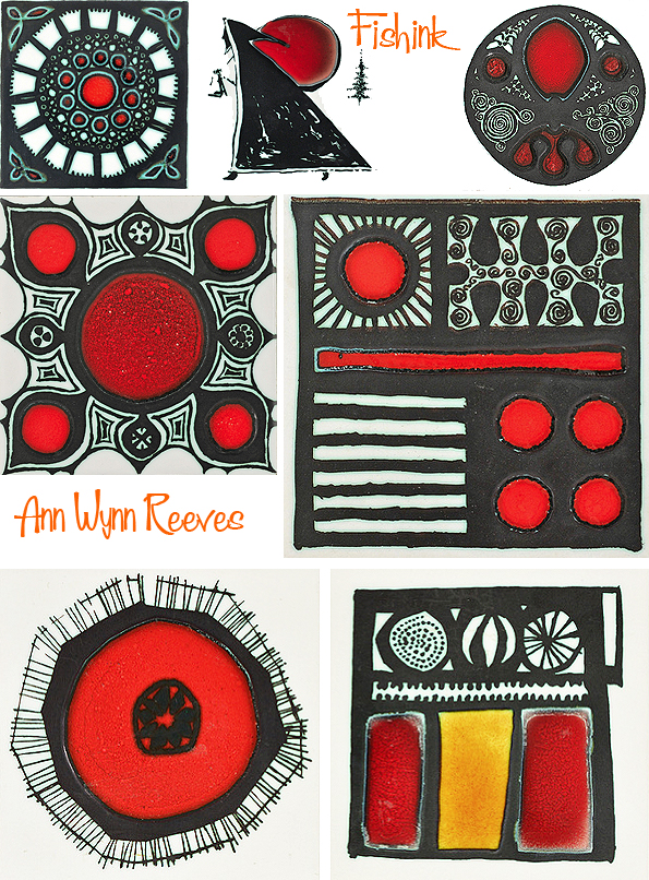
Themes that seem popular include food and drink, nature (birds, fish and insects) and natural forms.

The colours varied from time to time so you could mix and match reoccurring ideas to create border designs, add variation to a wall or build up a whole narrative of imagery and ideas. I like the detail in her fish and skeletal leaf prints.


Tiles could even be mirrored (as in the case of the tree design above) to allow the tree to ‘grow’ up the wall with different features, leaves, insects etc which could appear higher up.
Musical instruments…. not sure where you’d put these.
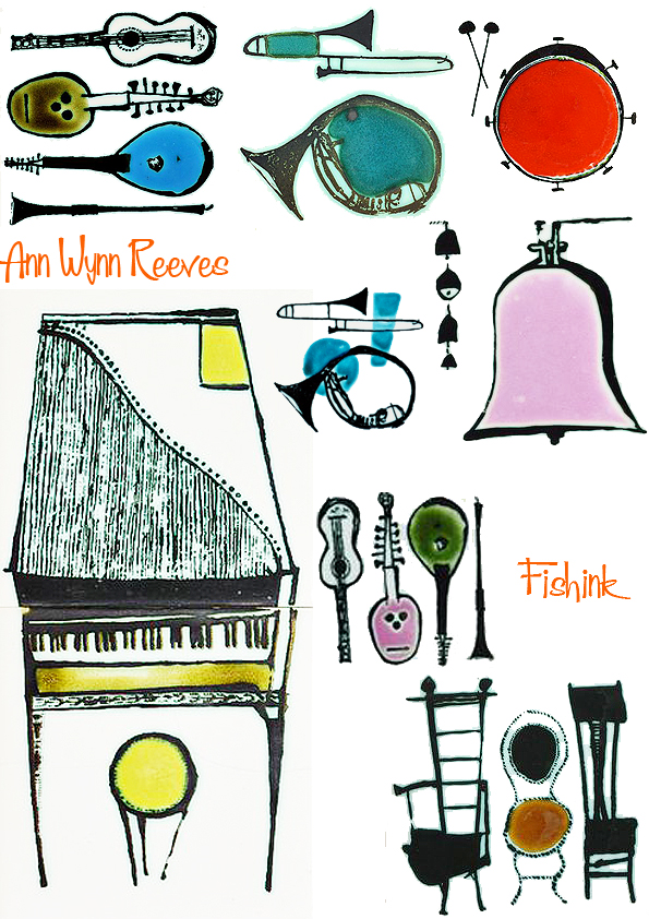
Children’s nursery stories, images from nature all made successful designs.
Some tile designs even transferred onto plates and wall plaques.

Interesting to see how the same design appeared totally different on ceramics by just changing the colours.
Even the Post Office Tower gets featured.
I believe Ann’s later work was signed Ann Clark. A wonderful designer. If anyone knows anymore information to help fill in the gaps, then please do let me know.

Fishink Random Mix
Since about 2008, I’ve been collecting images from the internet that have caught my eye. Way back then, I wasn’t so diligent in keeping records as to where images came from, or who had painted, photographed, illustrated or indeed created the artwork in the image. So I apologise in advance for their lack of referencing, but to be honest, it was purely about seeing groups of imagery together, that for whatever reason, I enjoyed.
As I have managed to amass quite a few of these ‘collaged sheets’, I thought I would share them with you, in the hope that they may also provide some inspiration to you the readers, from their shape, colour, texture or out and out randomness : )
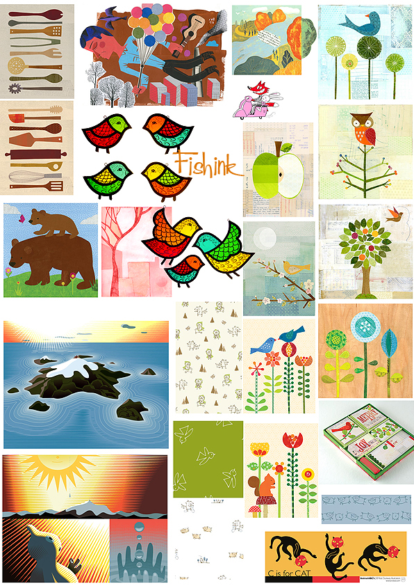


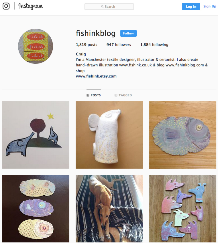
Do let me know your thoughts and which images catch your eye for whatever reason. Also I’d like to mention my Instagram page for Fishink Blog. The link is (https://instagram.com/fishinkblog) or you can click on the button on the right of my site. I am building up the collection every week, so if you lovely folk would like to follow me, or leave a comment or see more of my illustration artwork, then please pop on over and check it out today. I’ll look forward to sharing more of my own drawings and ceramics with you.
Nordic Craft and Design at Manchester Art Gallery
Perhaps it’s not coincidence that I settled in Manchester with two of my favourite galleries on the doorstep. I popped into town the other weekend to visit one of them Manchester Art Gallery and see it’s fab Nordic Craft and Design exhibition on the top floor. It’s on display for a whole year (til 7th July 2019) so you’ve plenty of time to get to see it and it’s wonderfully curated, displayed and free to get in !
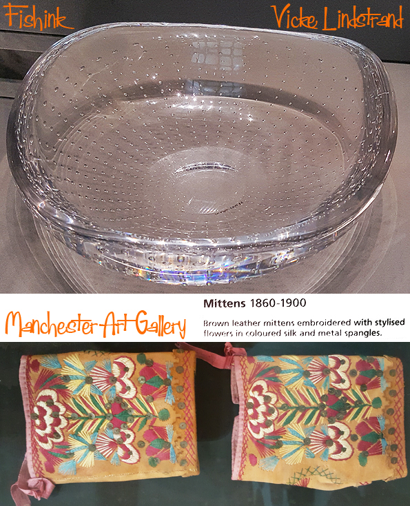
Let’s start with some stylish glassware.


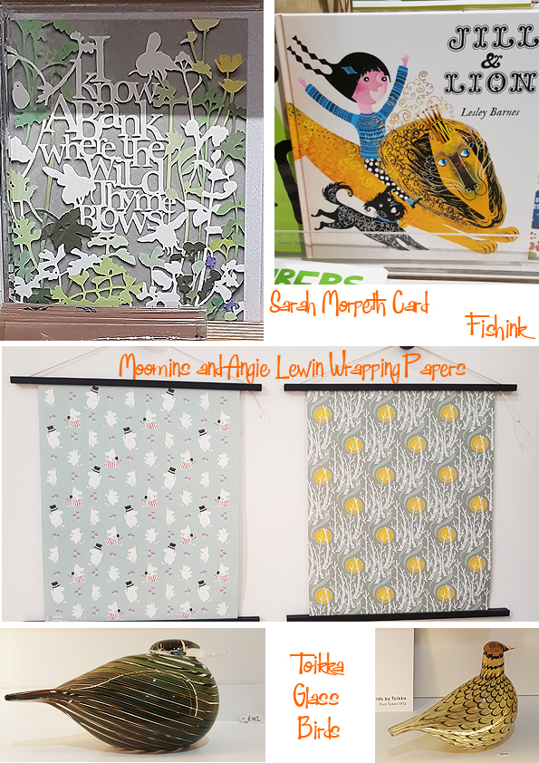
It wouldn’t be a true Nordic exhibition without a glimpse of the Moomins.

This amazing dress was worn by Bjork for one of her concerts, I also admired the beautiful Ribbon Chair by Katie Walker.

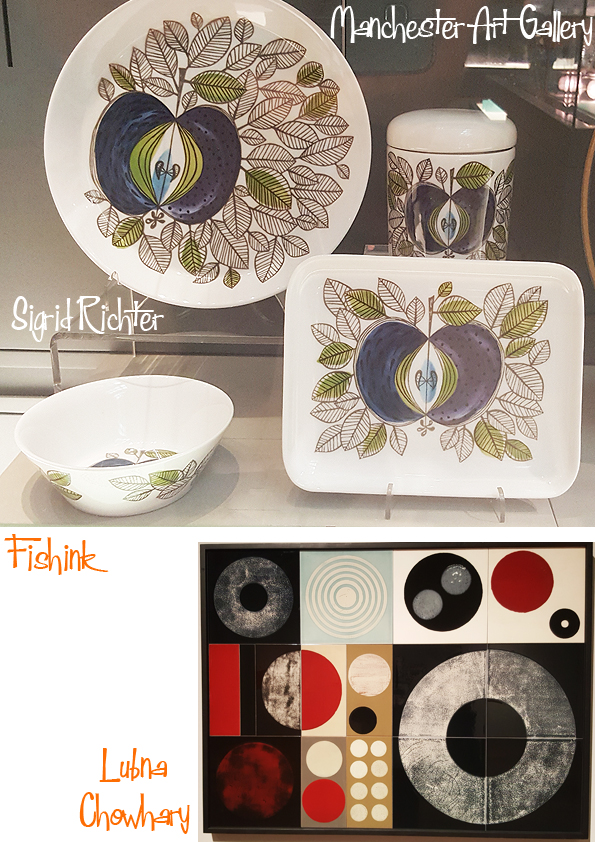
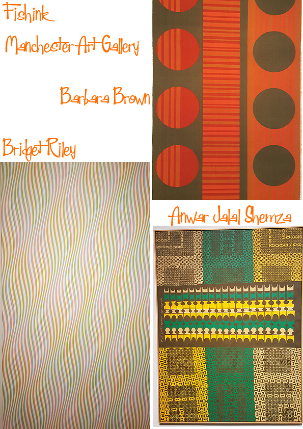
I really enjoyed seeing some retro fabrics from the 60’s and 70’s.

Unusual bag with etched wood and fabric, depicting a forest scene.
Two famous shaped chairs that proved to be exceedingly popular (and probably well copied) worldwide.
Amazing detail in these embroidered gloves from the late eighteen hundreds.

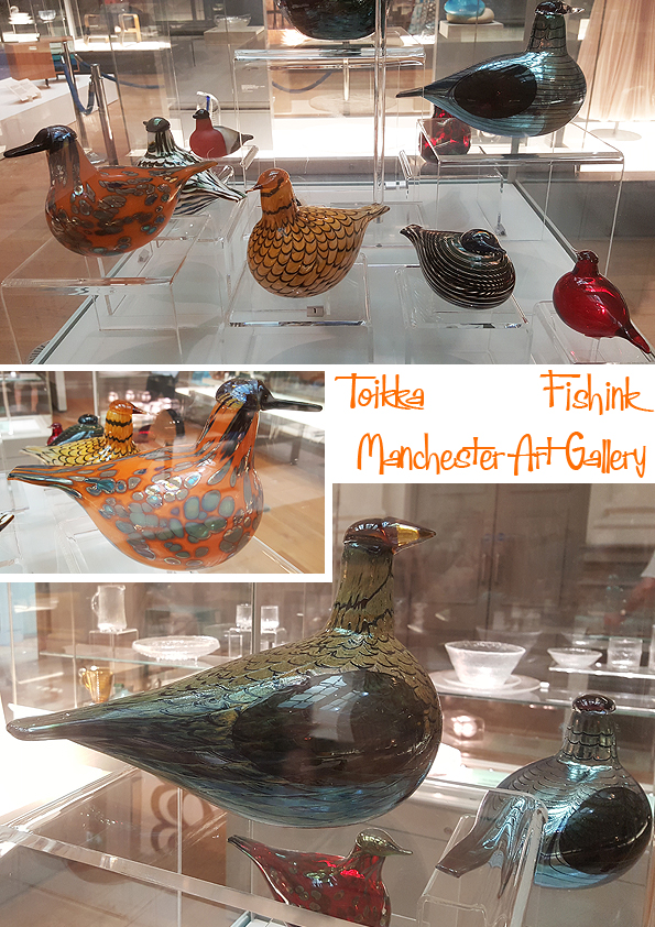
Not seen these wonderful glass birds by Oiva Toikka before, they even had a few for sale in the giftshop.
Even some impressive lights to feast your eyes on.

Another new ceramic artist for me was Mari Simmulson. Born in 1911 and died in 2000. She was one of the leading designers for Gustavsberg and Upsala-Ekeby in the 1940s-1960s

More interesting textiles and new names to research.

A few snippets of other exhibitions on at the gallery at the moment.
Also a great new addition are some wonderful paintings on the cafe walls.

Especially these two by Nash.

Well worth having a browse in the gift shop too. I try to buy something to contribute back to the gallery.
This has just given me more desire to plan a Scandinavian trip away. Anyone want a well behaved visitor ? : )

So pleased I saw this exhibition.
G-Force Eighties Clothing Company in Nottingham
Anyone who remembers names like Cocky’s Shed and Culture Vulture in Hockley, Nottingham, was probably (like me) around there in the mid eighties when different forms of street fashion were establishing. I was chatting recently to a friend from my Trent Poly days about living in Nottingham and the name ‘G-Force’ came up, as we remembered the boutique clothing shop with it’s strong, bold knitwear.

Funnily enough we had both bought our own G-Force knits, to wear and be ‘in with the in-crowd’ of the time.
Although to be honest I didn’t always have the guts to wear it as often as I would have liked. This was my jumper.

Their label and logo with great details, heavy zip and characteristic stitching on the seams.

G-force was often worn by bands like the Stereo MC’s, the performance artists Stomp, celebrities like Cher and Eric Cantona. I started googling the name to see what was available and the name of it’s founder Robin Kerr appeared. As luck would have it, Robin not only had an accessible email address but is now a Senior Lecturer in Fashion at non other than the Manchester School of Art ..small world again eh !! I got in touch with him to ask a little more about this iconic brand…
How and when did the company G-Force first form ? ( can you explain a little of it’s back ground, the main contributors etc )
It was set up in 1979 after graduating from NTU with a degree in fashion. Initially it was a small studio on Bottle lane a back street in Nottingham it was only open on a Saturday as the rest of the week was used to make the garments that usually sold out on a Saturday. A range of hand knitted sweaters were produced and sold to Paul Smith. By 1980 it hand moved to the shop on Goose gate with a small factory on Fletcher gate. The shop remained until 2006 when it finally closed, the factory moved around the lace market and eventually ending up on Alfreton road as the rents became too high.
Who were your customers, where were your garments being seen (magazines etc). Was it an exciting time to be starting out int he fashion world ?
In the beginning it was the punk era that started the brand, also selling to Johnson’s on the Kings Road along with some Japanese stores in Tokyo. Shoes designed and made with the DM sole were a major part of the retail growth. The brand went trough many changes from suits worn by Depeche mode, rockabilly suits and leathers, zoot suits and finally moving into work wear which became synonymous with the brand. G Force became one of the forerunners of what is known as street wear selling all over the world. We always used to advertise in ID Magazine which was the bible in Japan and we would have small Japanese independent stores coming to Nottingham to buy stock that when we realized there was a massive market in Japan, so I took a collection over in 1983 and it sold out.
What was your day to day roll in the company and did you yourself originate from a textile back ground ?
Pretty much everything from design, pattern cutting, fabric and production sourcing and sales abroad.
I remember the shop being very metallic, solid and bold (as well as that fabulous construction of the metal gate). Where did the ideas and motifs for the knitwear originate and what was the main themes behind the collections ?
The shop went through many changes but the strongest look was the industrial metal interior which went with the work wear collections, the interior was designed and fabricated by John Eager a graduate from NTU who went on to do all our shops and the shops for FREELANCE in Paris and New York At the time the collections were very work wear based with heavy denims and waxed cottons stitche with large white stitching. The most successful range was the one with engineered garments designed to give maximum movement of the body, there were worn all over the dance floors and picked up by many bands like the Stereo MC’S. There were strong graphic images on boiled felted woo knitted jackets that can still be seen being worn today.
I remember the stitch detail being a defining look on each piece. Did details like that help to flow one collection into another, or where they kept separate by colour, design, shape etc ?
Stitch, cutting and construction were very important in building the collection, garments were designed to last, all were made in the UK, shapes tended to be over sized. Collections tended to evolve from one season to the next.
Your customers were often strong, confident, sometimes famous individuals. At what point did the one shop in Hockley turn into a much larger expanding business ?
The mid 80’s saw a massive growth, we started to sell all over the world and opened stores in Paris, Brussels, Amsterdam, Lisbon and London. Garments were seen being worn by, Eric Cantana, Stereo Mc’s, Take That, Cher and many more.
Hockley in the 1980’s was full of amazing small businesses like Culture Vulture and Cocky’s Shed. When you first opened G-Force, was the lace market still a developing, area, or was already quite arty and defined as a new place to be and buy ?
When we opened in 1980 we were the first independent store to open in Hockley it was very much a working area with a fruit shop, butchers and bakers servicing the workers in the Lace market, as the area declined more independents moved as the rents were low, it was a great place to be until the council realized it was becoming fashionable then the rates and rents doubled overnight. It is now full of bars and restuarants, busy at night and dead during the day.
Is G-Force still around in anyform at all ? Do you have any plans for it’s reissue ?
There is production of hand made leather bags under the label System G. Currently there is no production under the G Force label but here are several collaborations happening shortly which will bring a retrospective collection onto the market. I am also working on a collaboration with a French company, designing a range of fishing and shooting garments to be launched next year, this has the G force signature, heavy fabrics from Scotland and all made in Nottingham.
You heard it here first, watch this space !!

Another small piece of 80’s and 90’s culture. Who else remembers these ?
Reginald Montague Lander Midcentury Posters Part 2
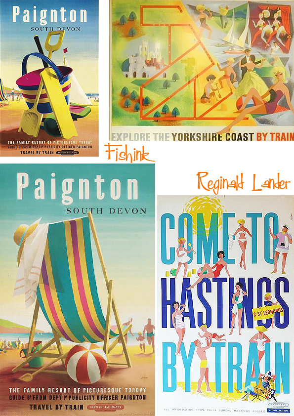
Welcome to part 2 of my posts about the wonderful mid-century posters and illustrations of Reg Lander. He worked predominantly using gouache and watercolour and had many distinct styles. A very painterly rendition of Conway to start us off.

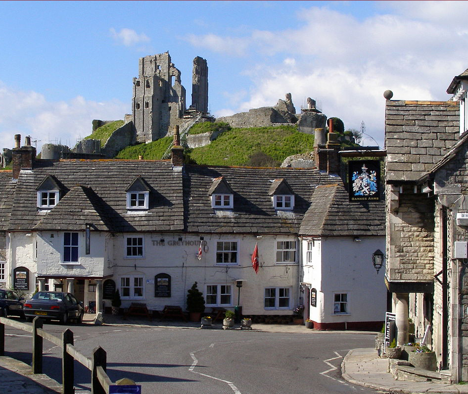
There’s not been a great deal of change as this photographic view of Corfe Castle in Dorset (below), clearly shows.
Sadly as there isn’t a great deal of information online about Reg, I don’t know if he worked from real life, sketches or from photographs. I’m guessing a mixture of all three.

I love these rural views. The texture and colours work so well together.

Slightly strange yellow and orange, cloudy borders, I must say.

A beautiful harbour rendition above and a very different style of work below, almost like a grey-green version of a Seurat painting lol.

If the images I found online hadn’t been attributed to Reg, I doubt I would have believed that they were all the work of one person. Great to see how adaptable he was as an artist.

One of my favourite styles is this truly midcentury 50’s and 60’s one below.
He must have created hundreds of posters during his lifetime.

Quite a prolific and hopefully affluent artist.

Look at these beautiful scenes.

More uplifting scenes to make you smile here.

These remind me of the work of Harry Stevens and Daphne Padden.

If anyone has any more information about Reg Landers I’d love to hear it. Which of his work makes you smile the most ?
Reginald Montague Lander Mid Century Poster Artist

Reginald Montague Lander was born in London in 1913 and lived until he was 67.

Educated at Clapham Central School and studied art at Hammersmith School of Art.
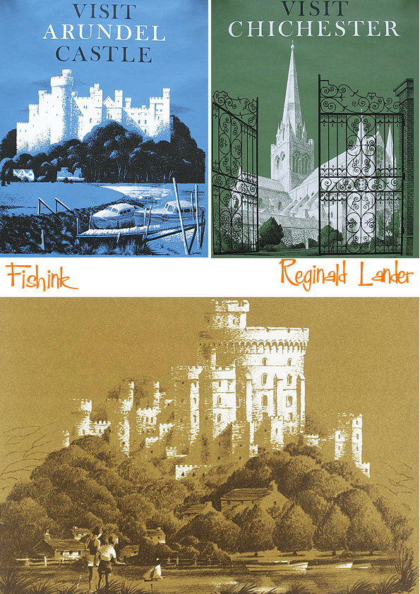
He produced a wealth of work in the 60’s and 70’s for travel companies. Look at these beauties !

A close up to appreciate the detail in his work.

He became the chief designer and studio manager at Ralph Mott Studio from 1930-9, and worked for Government Ministries and the British Transport Commission.

He produced a huge number of posters for GWR, LNER, British Railways and the Post Office, right up to the late 1970s.

He worked in a few different styles, painterly, graphic, architectural and even quite cartoon-like.

Tune in next Monday for a second post of Reg’s amazing work.

MMU Degree Show 2018 Part 2

Hi and welcome back to part 2 of my blogpost about the Manchester School of Art Degree Show 2018. For you local peeps it’s open until 20th June so you’ve still got a couple of days to pop along and see it. For those readers who live a little further afield, I’ve taken some images to share with you.
Let’s begin with some wire-work from Rosemary Brown.
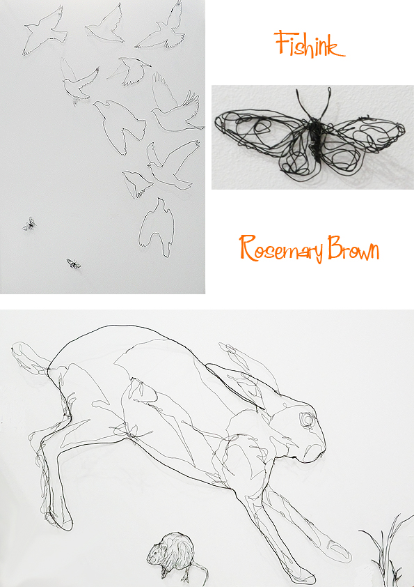
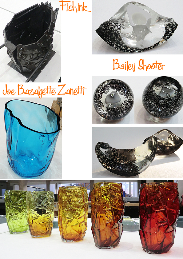
Joe Bazalgette Zanetti revealed the time consuming process of making a mould for a glass vase. I did think about those sixties vases from Whitefriars when I saw all the colours lined up. Great work Joe. Bailey Shooter showed us that shards and segments could equally be as beautiful as the whole form.
Francesca has gathered sand from 16 places in Italy, near to where she’s from and used it in her ceramics, to add texture and distinction to each piece.

Silver pieces from Maisie Smith, a beautifully designed table with inlaid wood by Anna Evseeva and some contemporary retro cabinets from Samuel Ellis.
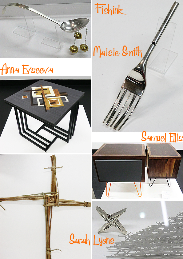
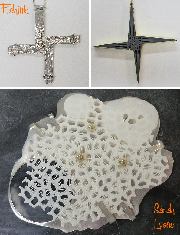
Sarah Lyons takes reference and influence from old rural wheat weaving forms like the Irish St Brigid’s Cross (above left). She’s made some wonderful pieces based on this one idea alone.
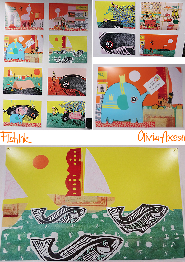
Moving onto the Illustration department. Some fresh quirky work from Olivia Axson.
Folk tale illustrations from Nafeesa Khaliq.

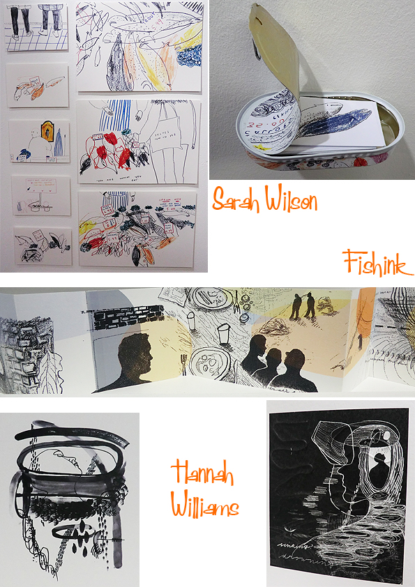
Fresh, vibrant lines from Sarah Wilson and Hannah Williams.
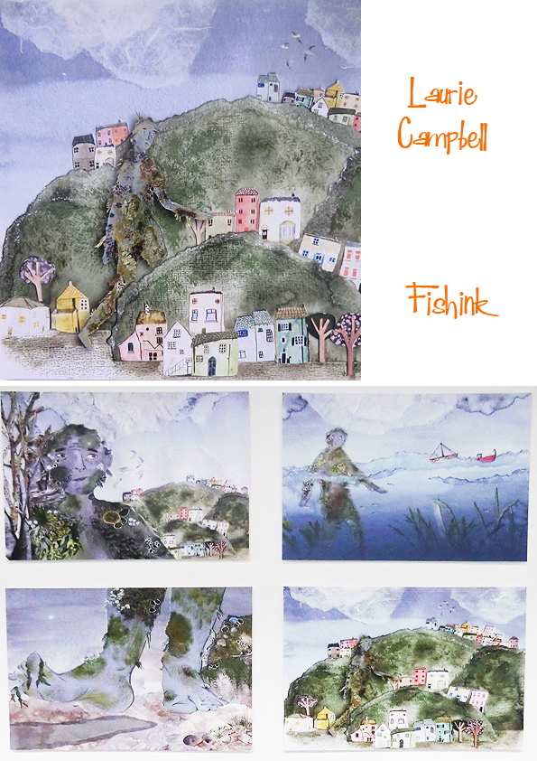
Laurie Campbell explores myths and legends.
Maisy Summer Lewin-Sanderson reveals some fabulous cutout singers and musicians, inspired by the Night and Day Cafe.

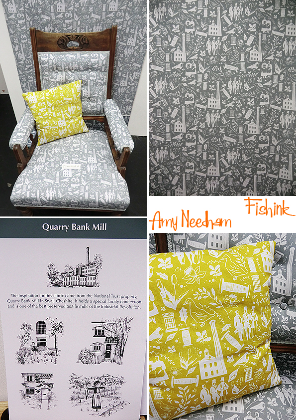
Ravilious style retro print from Amy Needham.
Lines and angles everywhere.
Finally to this years favourite choice for me, sumptous food illustrations from Alexandra Boocock.
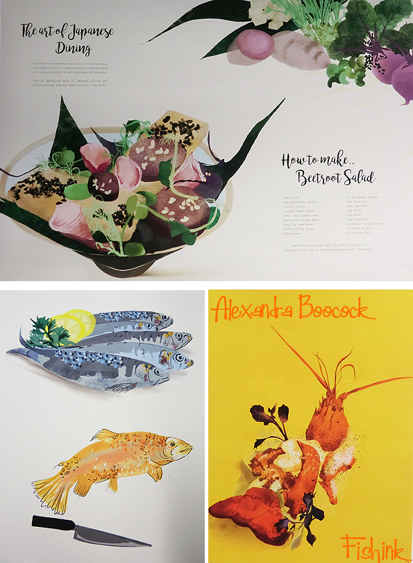
Good enough to eat !

I hope you’ve enjoyed my trip to this years MMU Degree Show, which was your favourite.
Save
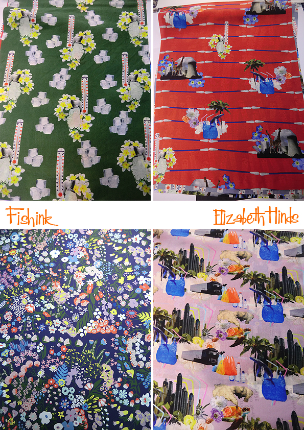
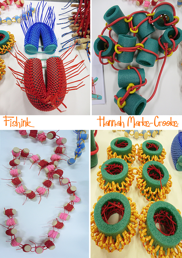
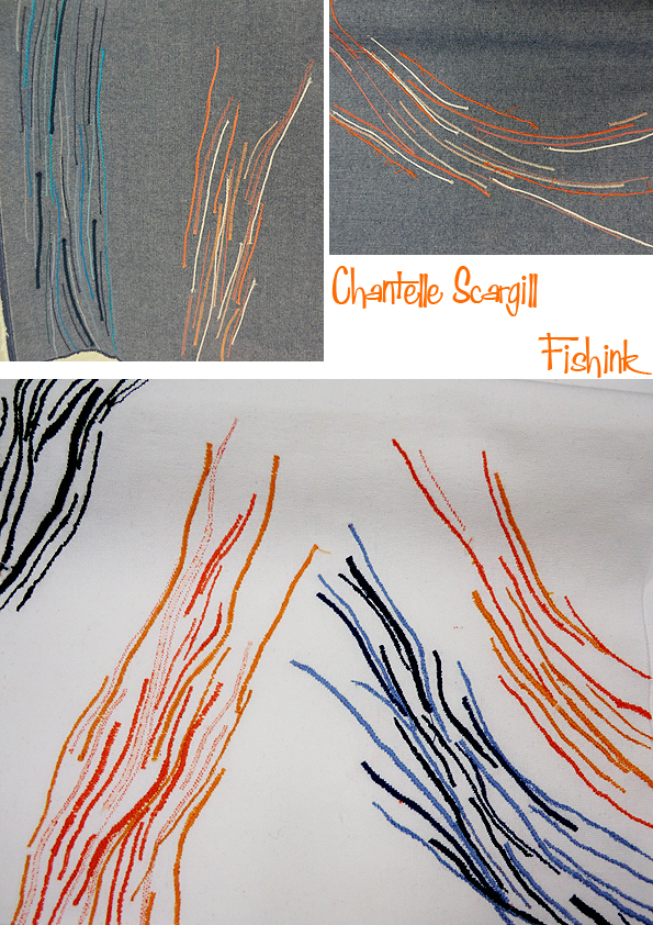
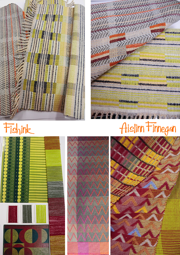
MMU Degree Show 2018 Part 1
I went to the Manchester Metropolitan University Degree show this week and caught up with a few creative graduates work. In case you are interested the show is on until June the 20th. Opening times: Mon – Fri 10am – 6pm, Sat/Sun – 10am – 4pm at Manchester School of Art (Benzie, Grosvenor and Chatham Buildings, Cavendish Street, M15 6BR) and 99 Oxford Road (Old Manchester Met SU, M1 7EL). Starting off on the Textiles in Practice Course, and the painterly work of Amy Pham.

Some beautifully delicate floral work by Gemma Barton, painted onto Muslin and Organza and layered to create depth.

Some aquatic prints from Alice Veevers.

Bold and beautiful, 1950’s weaves by Francesca Shimmin.

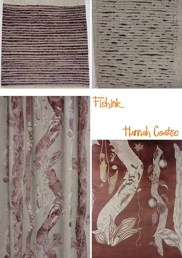
Textural exploration and visits to the jungle with Hannah Coates.
Fun and quirky, Hot, hot, hot Prints by Elizabeth Hinds.
Extraordinary tactile objects in foam and plastic from Hannah Marke-Crooke.
Elizabeth Birch brings an array of busy and buzz with colour and disjointed lines.


More to see in Monday’s Part 2.


